News
Recasting Electra as Aluminia
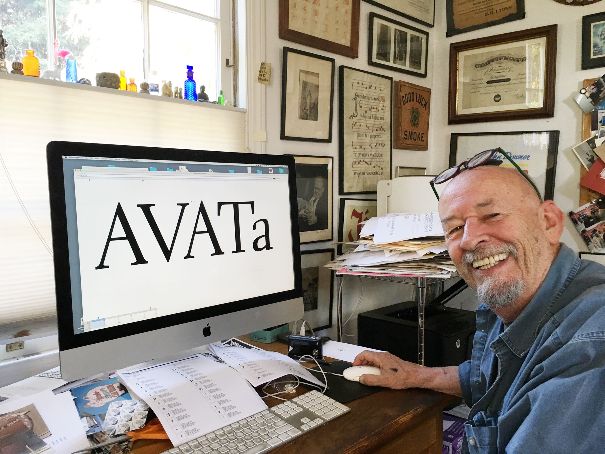
Jim Parkinson tells us about reviving Electra for Bruce Kennett’s W. A. Dwiggins biography.
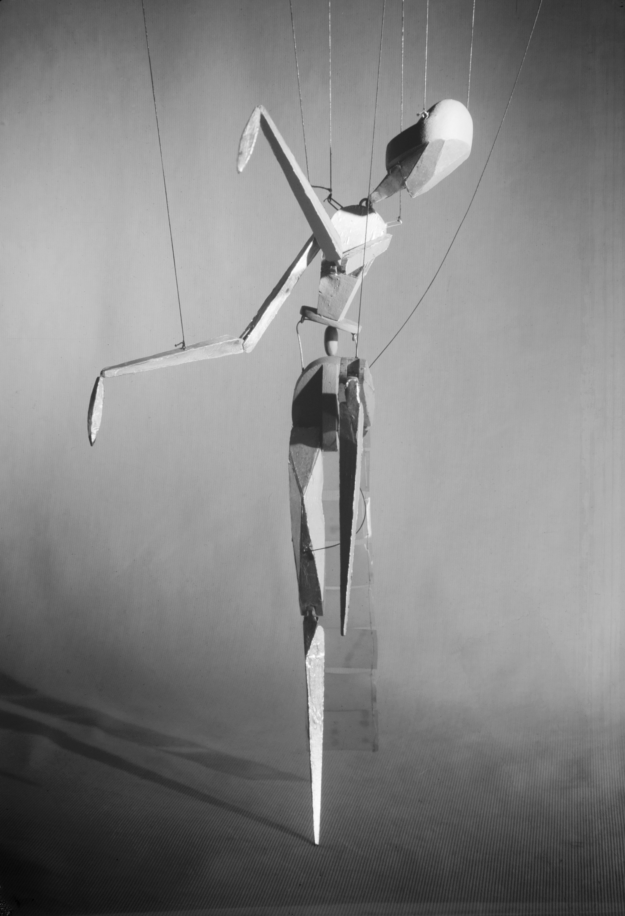
Those of you who have followed the progress of Letterform Archive’s first publication, the forthcoming W. A. Dwiggins: A Life in Design, already know that this book will be both a celebration of this prolific author, artist, and designer, and also the culmination of forty years of passionate research and collecting by two of his biggest fans — the book’s author, designer, and chief visionary, Bruce Kennett, and Letterform Archive’s founder, Rob Saunders. At nearly 500 pages and including 1,200 illustrations, the book is a labor of love and has received unstinting attention to the writing, editing, design, and production. In keeping with our ambition to present Dwiggins in a publication worthy of him, Letterform Archive also commissioned Oakland-based type designer Jim Parkinson to create a digital revival of Dwiggins’s Electra typeface that honors the design’s original personality and strength. The resulting fonts — which we have named “Aluminia” after one of the marionettes Dwiggins designed and fabricated in the 1930s — will be used throughout the Dwiggins biography and are now available for purchase.
For backers who have already purchased the fonts, we expect to deliver these along with your license within the next two weeks. Watch your inbox and, if you haven’t yet responded to our survey requesting your delivery address, please do so as soon as possible, or email us directly at [email protected].
Now that the fonts are finished, we are making steady progress towards sending the book to press and will soon follow this update with additional news and information. In the meantime, we hope you enjoy this recent interview with Jim Parkinson, in which he shares both the challenges and the delights of this intriguing project.
Can you mention any specific eccentricities about the drawings?
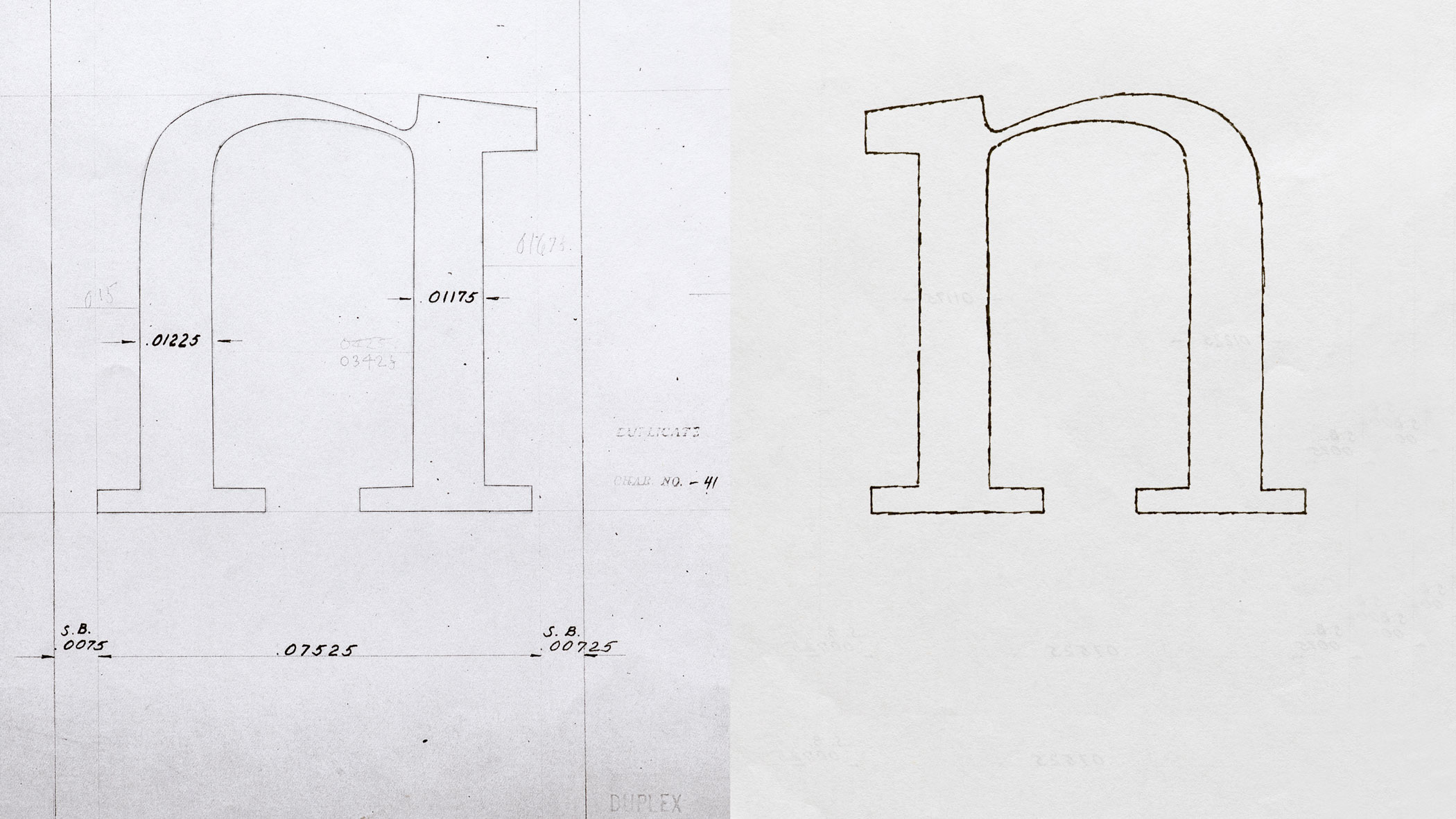
These days there is a tendency to shy away from eccentricities as if they were flaws and lean towards a robotic look. I have had many encounters with Dwiggins‘s Electra both inside the San Francisco Chronicle and out. In the past I was furnished with scant research (specimens in type books, a couple of small pamphlets letterpress printed). For this book, Bruce and Rob wanted a new cut of Electra, since the digital versions available weren’t giving them quite what they were looking for. This time, I got my first look at Dwiggins’s original drawings (actually photographs of the drawings).
The drawings were careful and precise and revealed a design full of eccentricities that were clearly deliberate. Some serifs have round endings, but most of the serifs were drawn with square endings. Some serifs were thicker than most – again deliberate. Some corners were bracketed. Some were not. Every once in a while, it seems a letter wants a little freedom and a character is graced with an unexpected curvy stroke. And the crotches (inside angles) of the caps like A, M, N, V, W, X, Y, and Z are not sharp. They are not opened up à la an inktrap. They are rounded off (very carefully with a 9H pencil) which, together with a bunch of similar moves, gives the design a sensitive, soft, handmade feeling.
Anything you can add about what’s new about this digitization compared to previous attempts. Something in particular you were trying to capture?
The Electra references available to me were either very precise pencil drawings or metal type printed on rag paper. For the book, the weight we were aiming for was the weight of the letterpress samples. The letterpress samples when enlarged lost all detail. It was impossible to conjure the true letter details from these samples. The way the ink squeezed out from the pressure of the printing usually left letters that, when magnified looked like little groups of fuzzy black clouds belching out of some factory chimney. So we made a font from the Dwiggins drawings, preserving all the details. Then we started doing some crude tests, adding small amounts of weight and making a few test fonts until we had one where the weight felt right. Then I tightened down the screws on the Roman and finished off the four-font family: Roman, Oblique, Cursive, and Small Caps.
What is your type design process like these days? What tools do you use? Anything changed for this project?
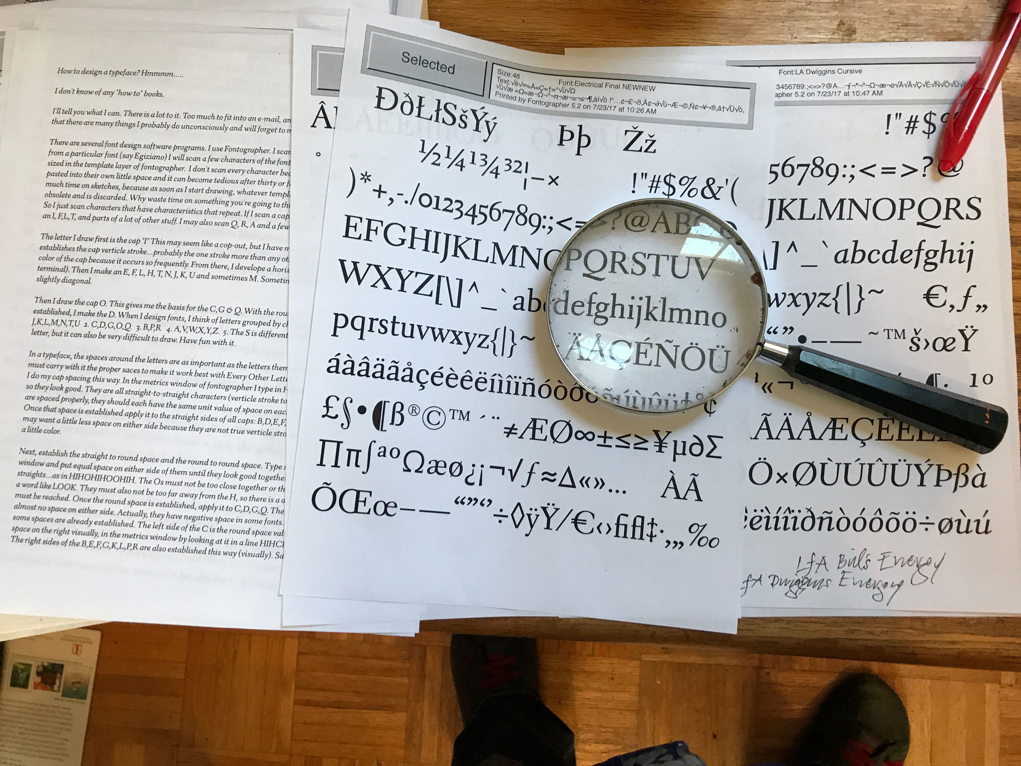
I bodyslam fonts together on Fontographer. It’s the first font design program I learned. It’s perfect for the way I work. When I get a font as far as I can in Fontographer, I export it to FontLab. There, I tidy things up a bit, go through the hinting, and finish it off. And, I draw with a mouse. I don’t use a pencil anymore (except for drawings and paintings). This software will keep me happy for the rest of my life. I’d rather spend my time drawing. I know if I wanted to spend it learning new software, that option is available.
Is this the first time you’ve designed a typeface for a specific book? How is that process different than for newspaper or magazine projects?
This is the first time for a specific book. I have done a number of fonts for magazines and newspapers and they all have one thing in common. At the start, nobody knows where they are going to wind up. They just evolve. With this project the goal was clear, in the distance. A big target to aim at.
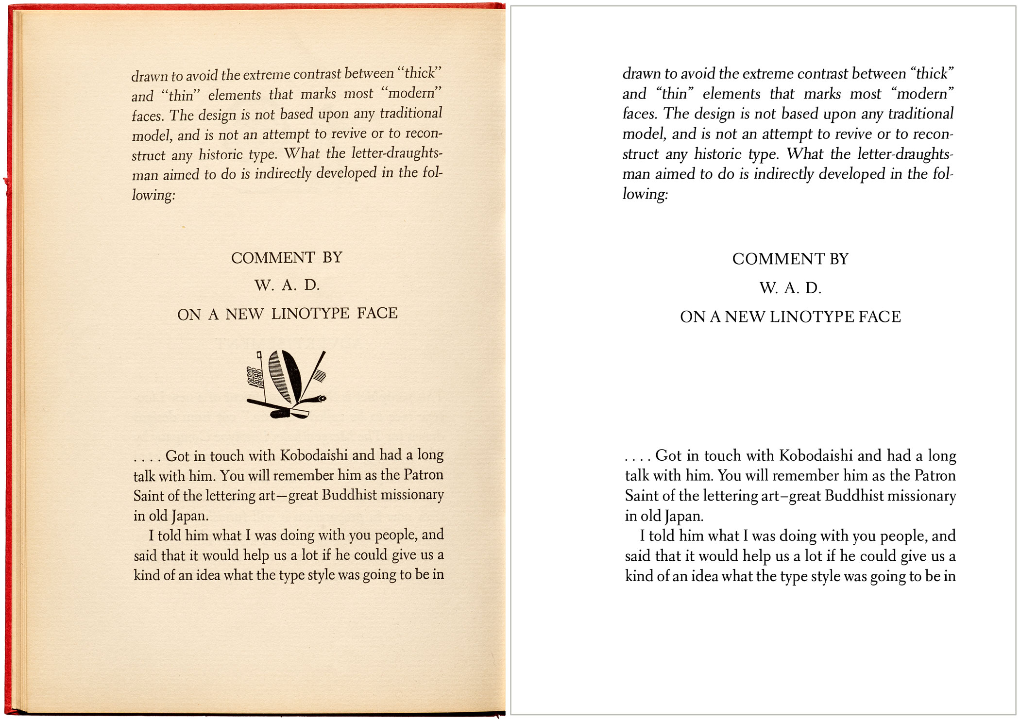
Comment by W. A. D. on a new Linotype face
We thought you might enjoy reading Dwiggins’s full original text from the first specimen of Electra.
.... Got in touch with Kobodaishi and had a long talk with him. You will remember him as the Patron Saint of the lettering art — great Buddhist missionary in old Japan.
I told him what I was doing with you people, and said that it would help us a lot if he could give us a kind of an idea what the type style was going to be in the next ten years — what was to be the fashionable thing, etc., etc.
He wouldn’t say directly. He said: “The trouble with all you people is that you are always trying to reproduce Jenson’s letters, or John de Spira or some of those Venetian people. You are always going back three or four hundred years and trying to do over again what they did then. What’s the idea?”
“Well” I said, “we think those types were pretty good — about the best that anybody ever made, and we’d like to make some like them.”
“But why like them?” he said. “You don’t live in Venice in 1500. This is 1935. Why don’t you do what they did: take letter shapes and see if you can’t work them into something that stands for 1935? Why doll yourself up in Venetian fancydress costume and go dodging around in airplanes and automobiles dressed up that way?”
“I know” I said. “But you can’t play tricks with the shapes of letters. If you do, people can’t read ’em. People are used to type that looks like that, and you have got to keep mighty close to the old designs.”
“Used to the 1500 types? Don’t you believe it. People are used to newspaper types, and typewriter types. Your Venice types are just about as queer-looking to your friends in Hingham as Greek letters. What people are used to in your time…. That’s no argument.”
I didn’t say anything for a little while and just let him smoke, and then tried to get him back to giving me an idea of what the trend in type-face fashion was going to be.
“Electricity” he said, “sparks, energy — high-speed steel — metal shavings coming off a lathe — precise, positive — say it with a snap.” I waited to see if he would get closer to something that I could use. “Take your curves and stream-line ’em. Make a line of letters so full of energy that it can’t wait to get to the end of the measure. My God — these Lino machines that you tell me about — what kind of letters would they spit out if you left it to them? 1500 Venetian? Not!”
“But now look” I said, “take that Fell type. That’s got a quality that I’d like to get into a face — kind of warm, human, personal quality — full of warm animal blood. How are you going to get that kind of feeling into a type that looks like a power-lathe? We are still human, you know. And if you don’t get your type warm it will be just a smooth, commonplace, third-rate piece of good machine technique — no use at all for setting down warm human ideas — just a box full of rivets… By jickity, I’d like to make a type that fitted 1935 all right enough, but I’d like to make it warm — so full of blood and personality that it would jump at you.”
“All right” he says “all right. All the personality you want. The more the better. All I’m saying is that the personality of Jenson, or Caslon, isn’t the personality you want. You want the personality of an individual living in A. D. 1935. Take yourself, for instance. You’re a student of letter forms. What would your personality be, expressed in a type?”
Of course this pretty much put it up to me, and I didn’t know just what to say.
“‘I’ll show you” he went on. “I’ll show you…” and he showed me these letters.
“Whose design is that?” I asked.
“It’s your design. It’s a design that you are going to make. And it gets pretty close to your idea of what a modern roman type letter is like.” He grinned at me.
I had to admit that it was more or less the kind of letter I would make if I weren’t trying to please somebody else — If I were just making letters to please myself. “What’s it called?” I asked.
“It’s called ELECTRA. The Greeks spelled it Elektra but the Greeks had nothing to do with it, so ECT goes. Now notice how you are going to get the ‘personality’ you mention out of the unusual shapes of some of the characters — and see how the letters ramp along in the line — and, more than anything else, notice how they fuse and melt together, into words. What about it?”....
Well… I don’t know… it looked the way Kobodaishi said, when he showed it to me. But when I look at it now, cut, and cast, and printed — I have a feeling that the Saint knew more about his lotus-ponds than he did about power-lathes. Maybe I didn’t keep my own hand out of it enough — changed his design here and there… It’s active. It moves along in the line nicely. But I can’t quite see the metal shavings part, the high-tension power-lines and those things …
There are a couple of touches that I’d like to point out, though. The weighted top serifs of the straight letters of the lower-case: that is a thing that occurs when you are making formal letters with a pen, writing quickly. And the flat way the curves get away from the straight stems: that is a speed product. Things like that were what Kobodaishi meant, no doubt….
For more about the history of Electra, we strongly recommend Bruce Kennett’s Letterform Lecture from June of this year, where he tells the type’s story, along with scores of great images of the design in development.