News
This Just In: Saul Bass
Bass’s timeless minimalism made him the godfather of the modern movie poster. Several original prints recently arrived at the Archive.
You’ve seen Saul Bass’s work. During his 40-year career, he did a little bit of everything, from dynamic film title sequences to corporate logos of incredible endurance. Whatever the medium, Bass’s influence on the world of design is pervasive.
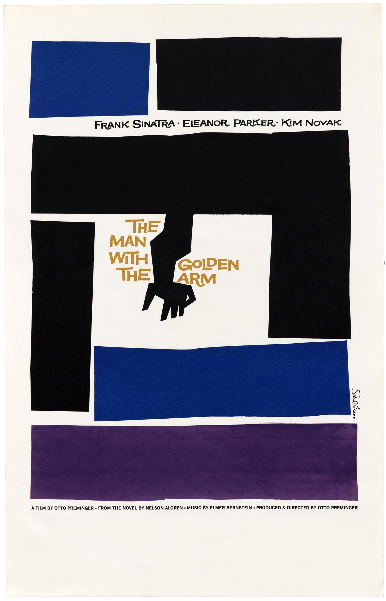
Among his wide body of work, Bass may be best known for his iconic movie posters. We’re pleased to announce that five original prints recently arrived at Letterform Archive. These “one-sheets” average about 3.5 by 2 feet and are an absolute joy to see in person. Their sheer size envelops you in bold, beautiful colors and allows you to examine every detail, from the subtly jagged imprecision of the lettering to the nakedness of the copious negative space.
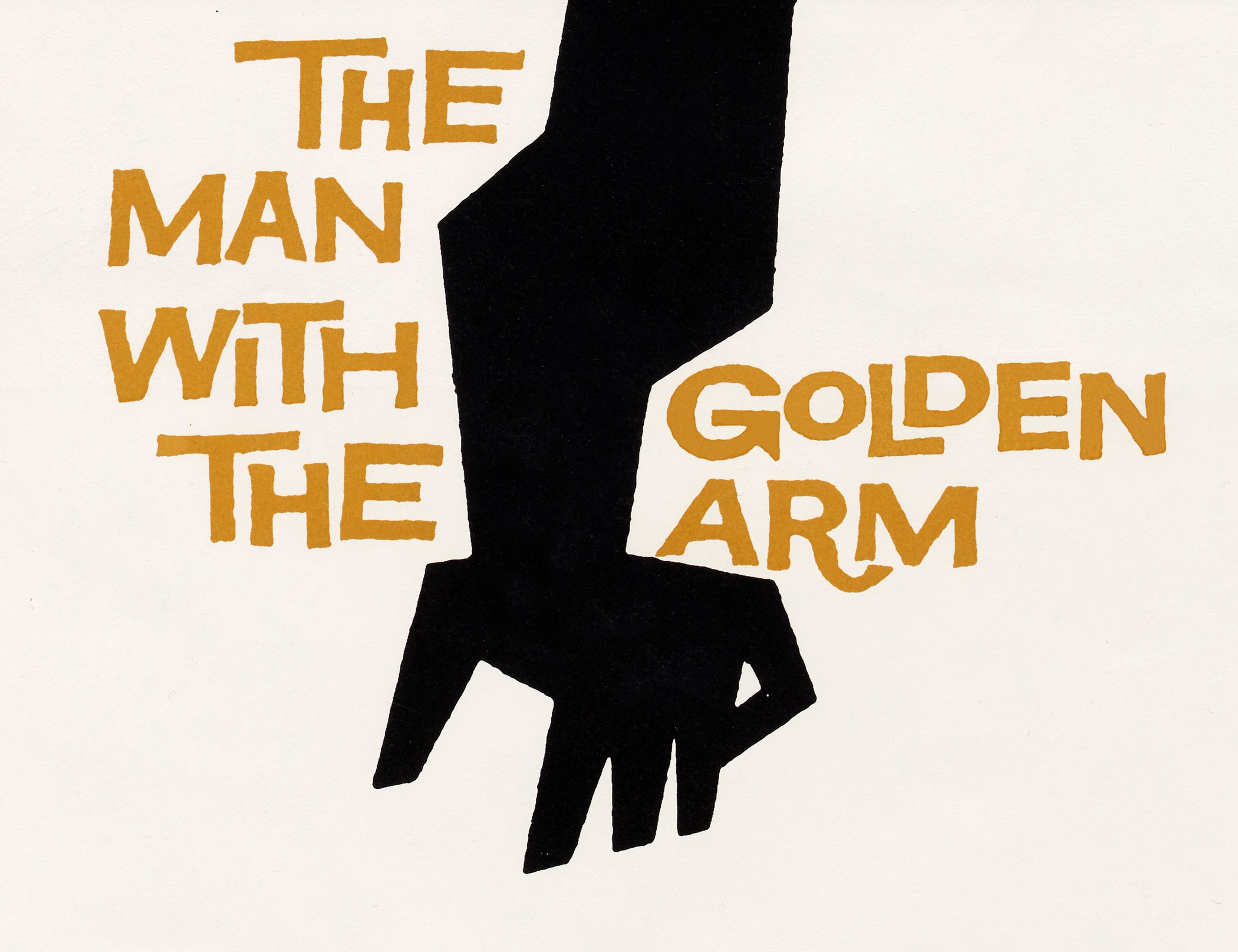
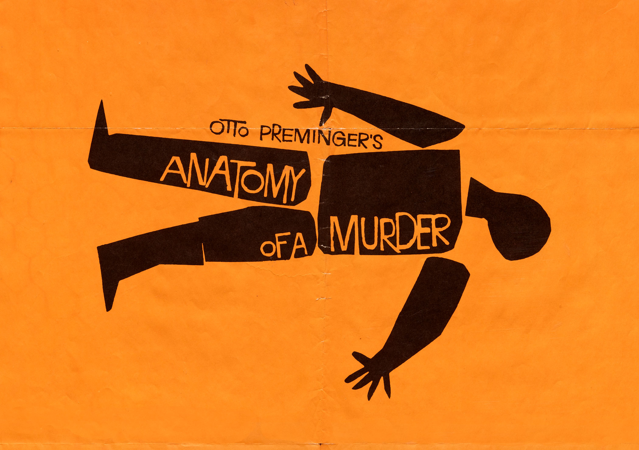
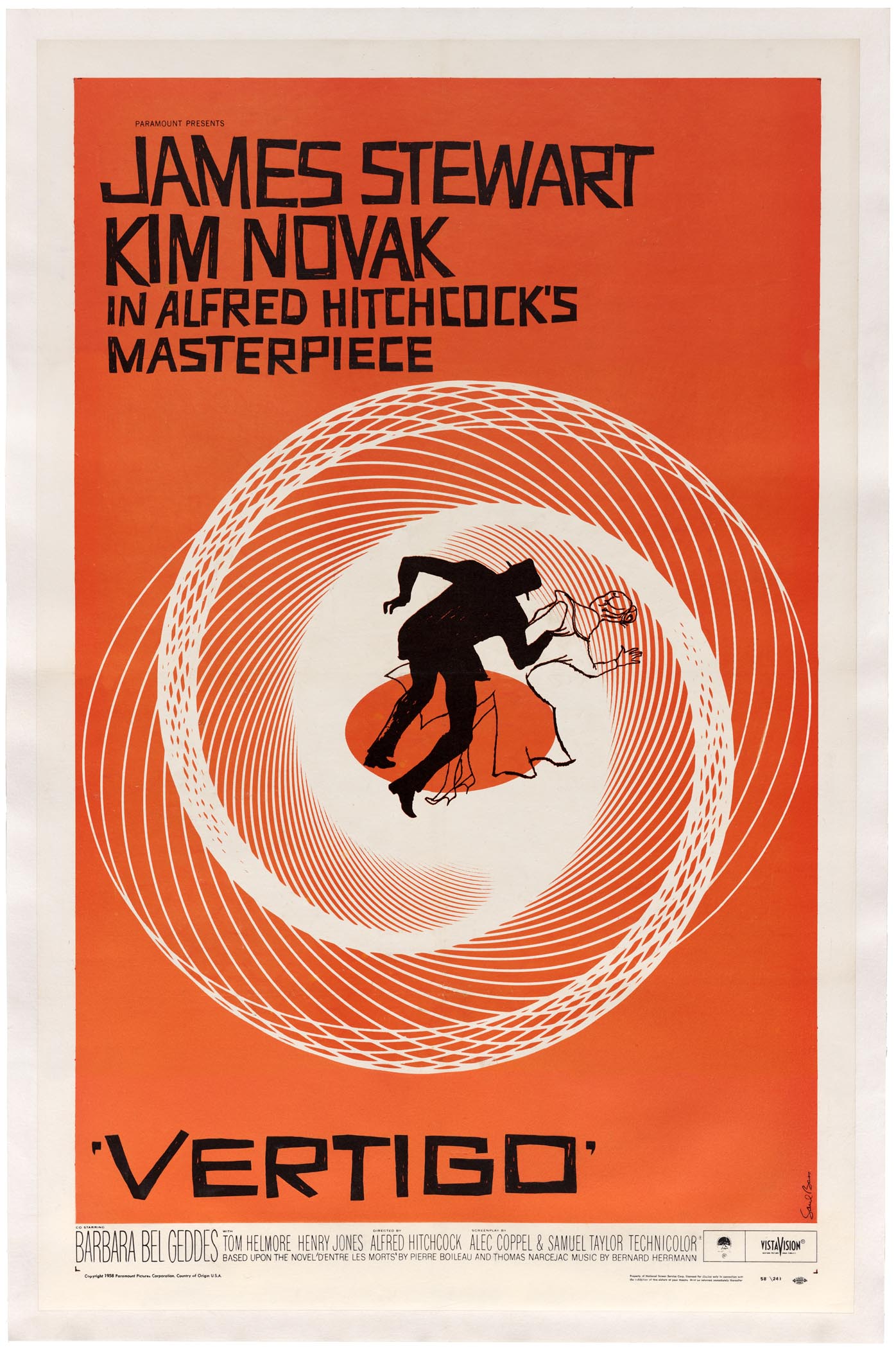
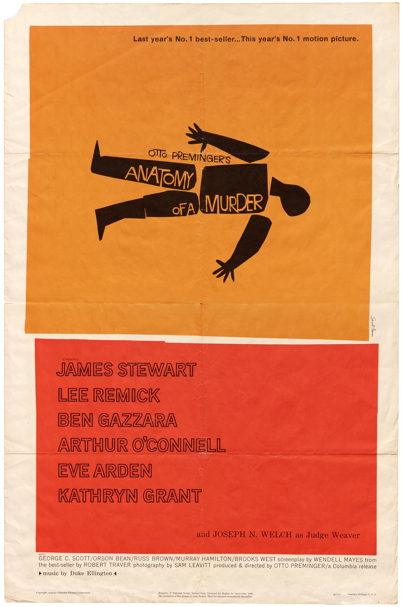
Bass got his start in the 1940s, designing print advertisements for films like Death of a Salesman and Champion. His career took off in 1954, when he landed the job of designing the poster for Otto Preminger’s Carmen Jones. From that point on, Bass created titles, posters, and ad campaigns for myriad films and well-known directors. The long list of recognizable designs includes The Man With the Golden Arm (1955), Vertigo (1958), and Anatomy of a Murder (1959), all of which can now be seen at the Archive.
Even before this string of successful projects, he was pushing the industry to embrace more sophisticated design solutions. He believed that filmgoers were smarter than Hollywood assumed and they could appreciate advertising that was less blatant and predictable. As he wrote in Graphis, No. 9, Vol. 48 (1953):
It is important to note that there is relatively little creative and mature film advertising produced in the United States. That which is produced, comes about sporadically, and does not grow out of a consistent attitude or policy of any business organization. There are many reasons for this, but they all focalize in the lack of confidence of the advertiser in maturity and taste of the audience.
Bass had the ability to pare down ideas to their simplest form and turn them into eye-catching images that capture everything you need to know. This was especially apparent in his movie posters. Rather than feature headshots of the actors from the film (the conventional movie poster method, both then and now), he introduced its story like a book cover, with thoughtful composition and minimal form. A common theme is a fearless use of bold colors and open fields of empty space. His unique, paper-cut lettering styles also give the posters movement and tension.

The specific process behind Bass’s unusual lettering is not well documented. What we do know is that although Bass was responsible for the overall look of each project, there were many craftspeople behind the scenes at his studio who executed the lettering itself. As was the case with many mid-twentieth-century design studios and agencies, attribution is often limited to the lead designers and art directors. Robert Trogman, who worked with Bass on a few films, recalls that Art Goodman often supervised the work, and that Dave Nagata completed some of the lettering. Mamoru Shimokochi also passed through Bass’s office and tells us that he helped execute the lettering for Such Good Friends. Lettering artist Jill Bell, who worked with Bass in the 1980s, mentions that Harold Adler completed many of the titles for the Alfred Hitchcock and Otto Preminger films, while Maury Nemoy contributed to some films like St. Joan. We welcome more insight on the topic from Bass researchers or those who knew designers at the studio.
Bass’s work can catch you by surprise at how deceivingly simple it is. His distinct talent for distilling ideas into a kind of universal language pushed the boundaries of graphic design. He proved that simple design is timeless, and 20 years after his death Bass is still a household name. We are thrilled to hold a small selection of his distinctive work, which continues to inspire a new generation of graphic designers.
— Joyce Yin, Editorial Intern
Saul Bass Posters at Letterform Archive
All images in this gallery are high res and zoomable. Click an image to enter fullscreen view, then pinch (on trackpad or mobile) or use browser zoom (on desktop).

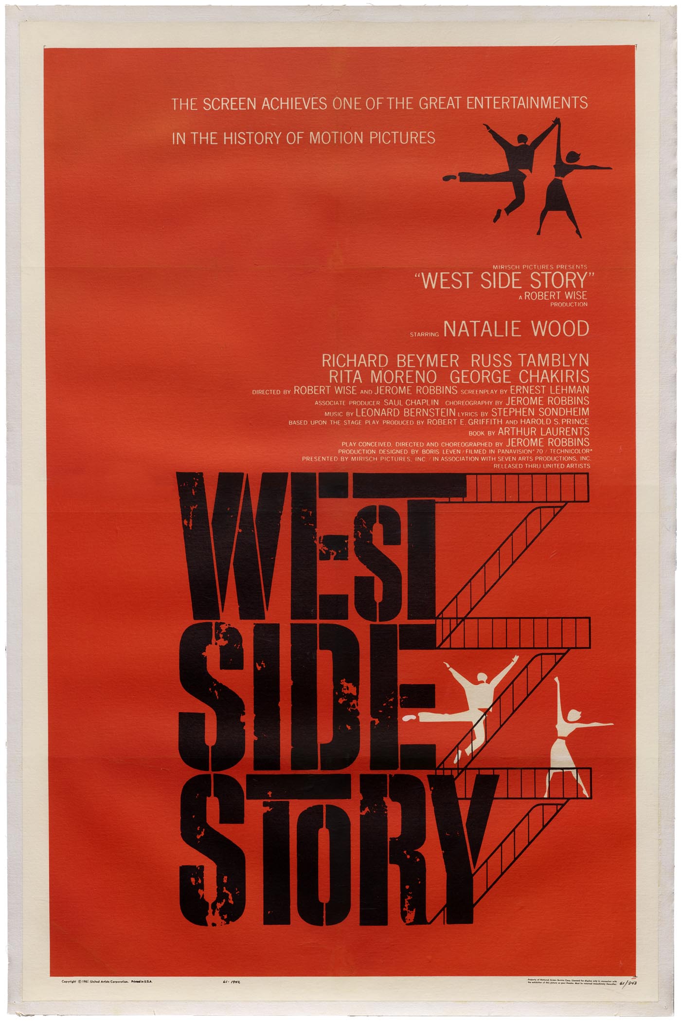
Update: An earlier version of this article misattributed the West Side Story poster to Bass. Thanks to The Poster Boys, we’ve since learned this is a common, but incorrect, assumption. Bass created the titles for the film, but according to Steven Heller, the poster was designed by Joseph Caroff. We regret the error. You can still see the poster (shown below) at the Archive.