News
This Just In: Trajan Rubbing and Recutting
A 1970 rubbing by Father Edward Catich and a 2021 recutting by Paul Herrera bring the classical Roman capitals to life at the Archive.
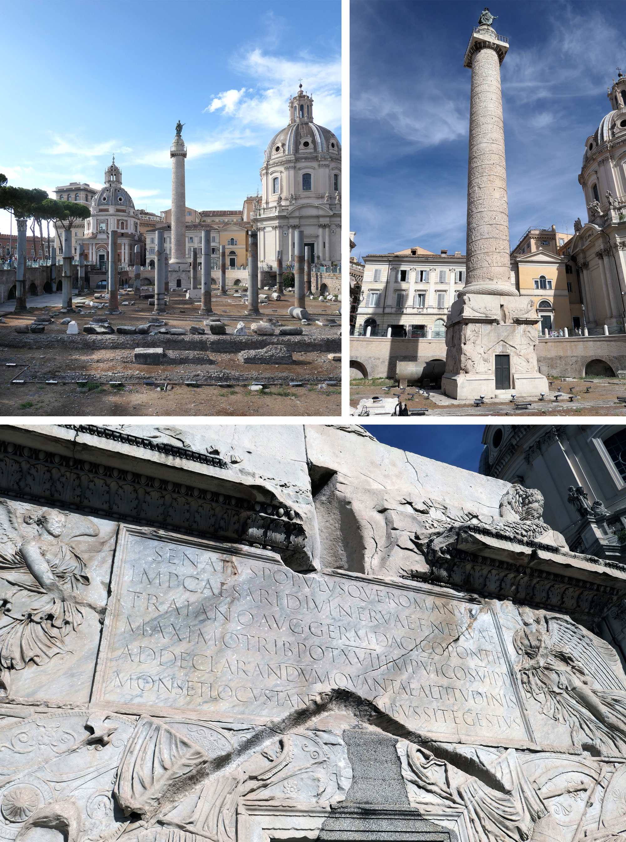
The letters found at the base of Trajan’s Column, a second-century celebration of the Roman emperor, are widely considered the archetype of Roman capitals. Their shapes and proportions have inspired calligraphy, lettering, and type design for centuries. While we can’t transport the 100-foot, 700-ton marble monument to San Francisco, two recently acquired works offer some of the most true-to-life representations of the inscription.
Edward Catich’s Rubbing
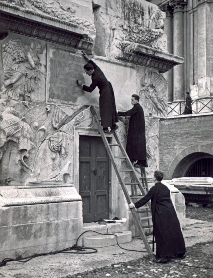
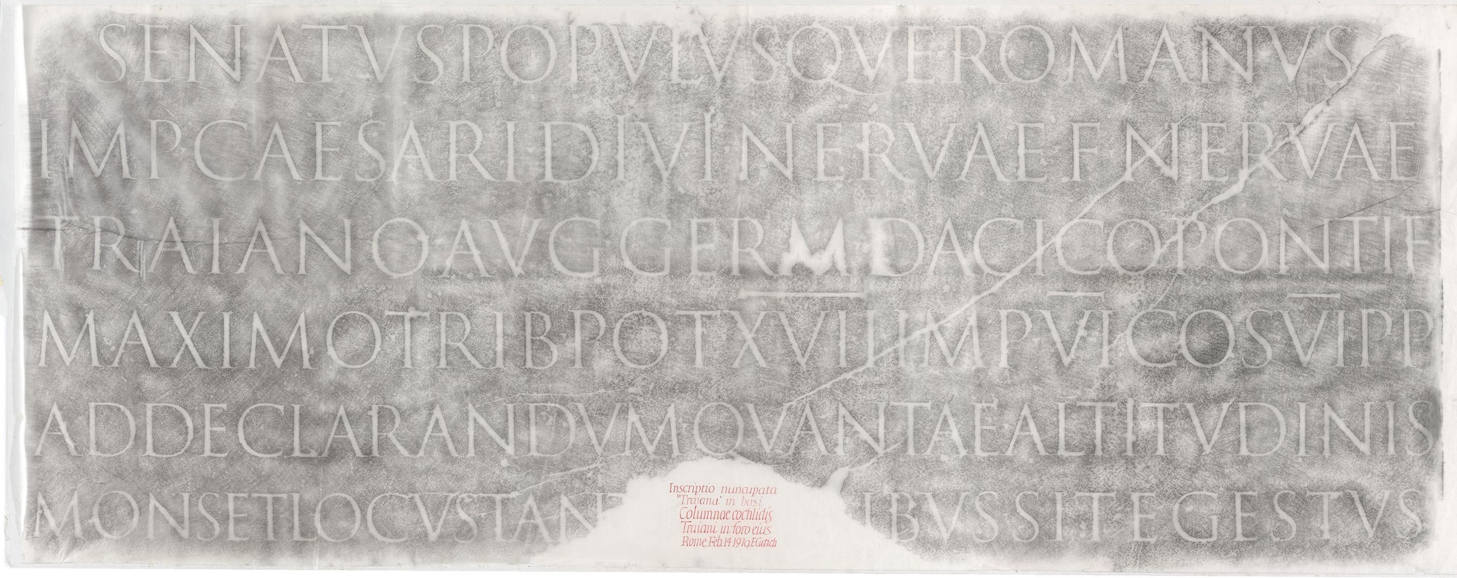
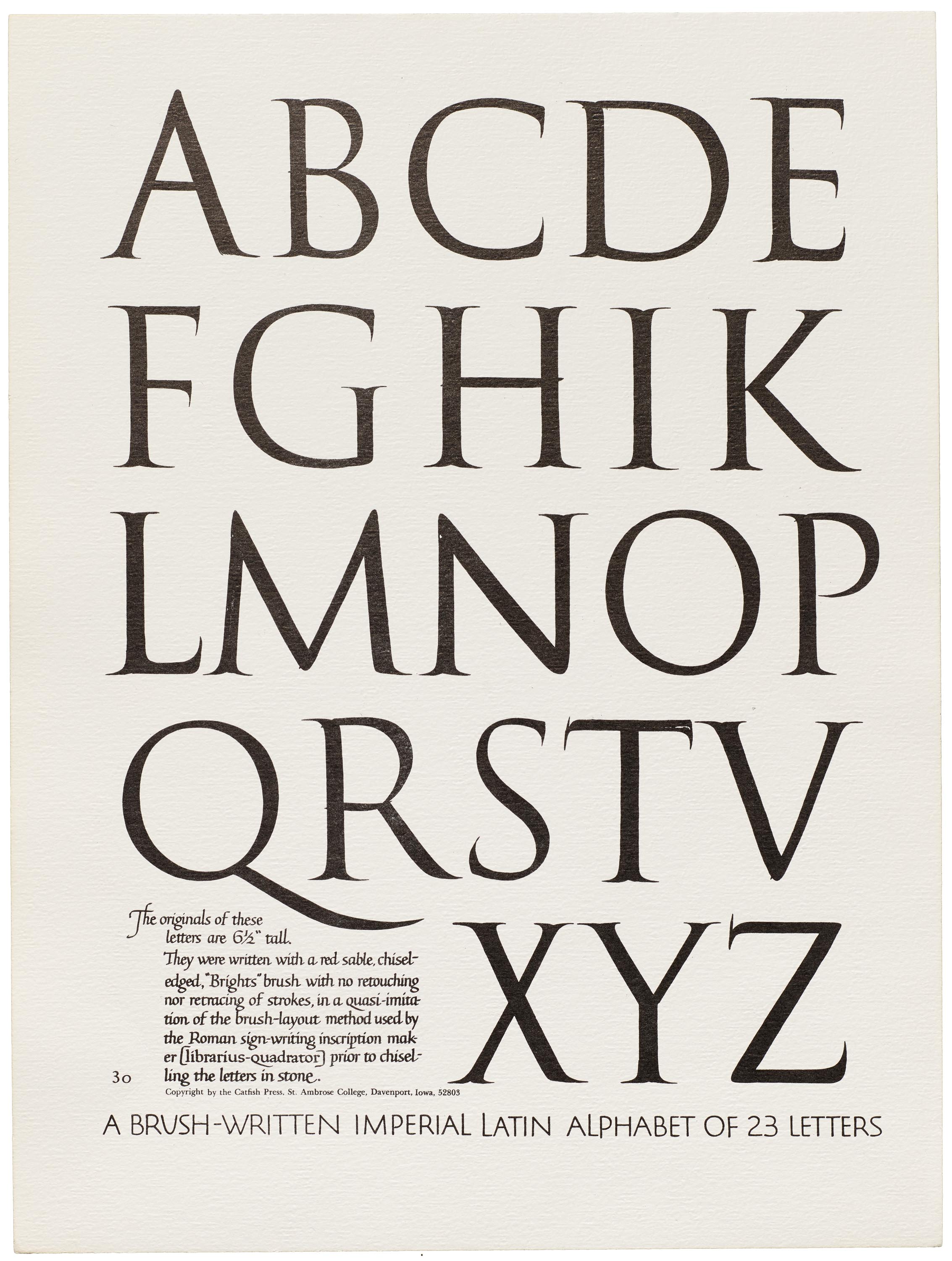
From 1935 to 1970, Father Edward Catich, a priest and calligraphy teacher from Iowa, made several rubbings of the inscription. Many supported his research for The Origin of the Serif, his seminal treatise on the letterforms and a set of brush-written letters that also resides at the Archive. Catich’s groundbreaking theory showed that inscriptional letters like those on the Trajan column were painted with a brush before they were cut with a chisel.
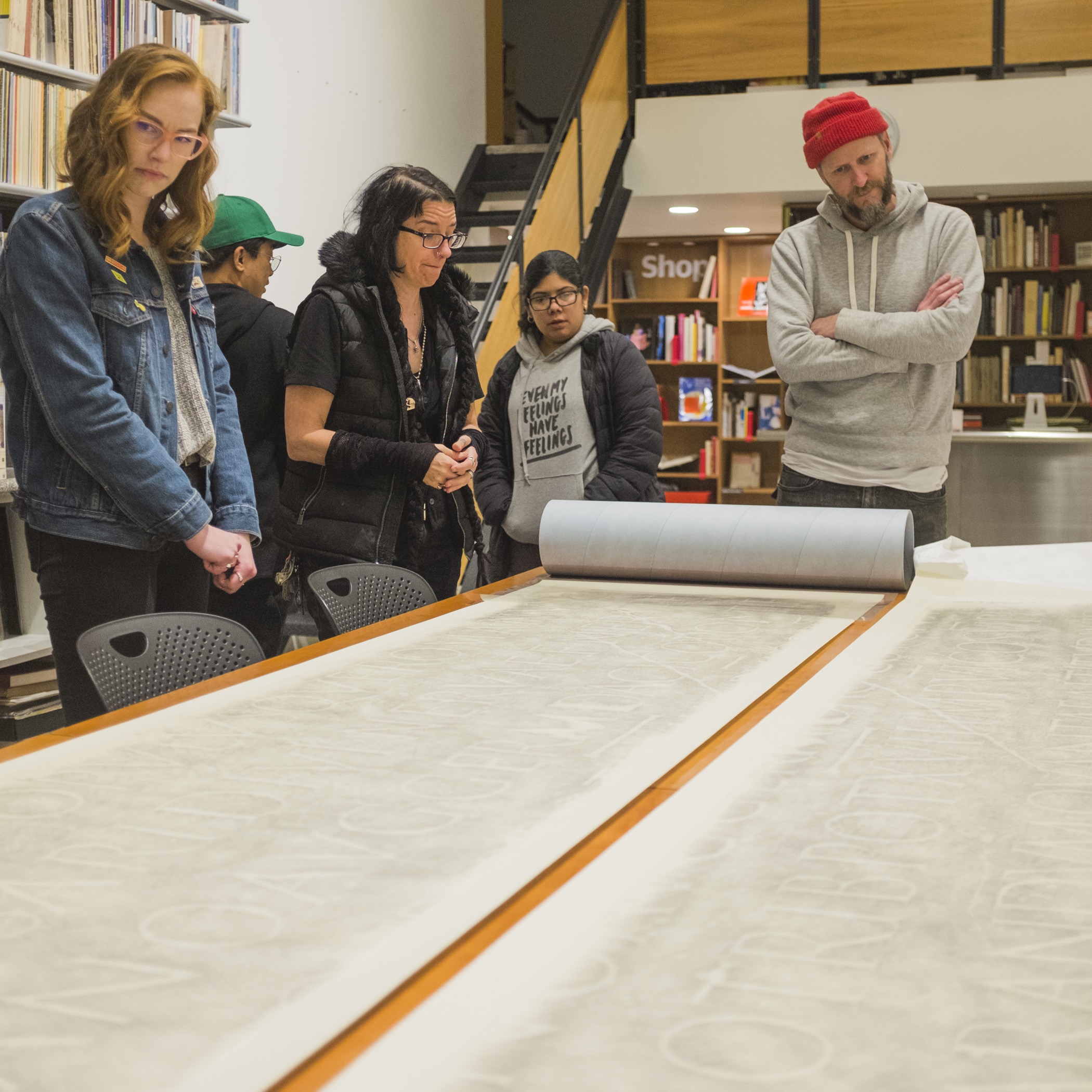
Our February 14, 1970 rubbing is one of about a dozen sets made by Catich. The two nine-foot-wide sheets of thin paper come from the collection of calligraphers Julian and Sheila Waters. We’ve been thrilled to be able to show this direct copy of the inscription to type design students and visitors in person. The Trajan model is a core element for learning the design of capital letterforms, and seeing them at actual size is a rare opportunity.
The Waters family also supplied a painstaking digital capture that merges the sheets into a single image. That image is now available to all in the Online Archive.
For more about the Trajan inscription and Catich, see this excellent Twitter thread by Incunabula. Paul Shaw’s 2015 book, The Eternal Letter is also a great reference on the Trajan capitals’ legacy.
Paul Herrera’s Recutting
The rubbing gives us an excellent sense of the outline and scale of the Trajan letterforms, but what’s missing is the third dimension and physicality of the inscription. Imagine our delight when we received the following message from Paul Herrera, a protege of Catich who worked directly with him for decades:
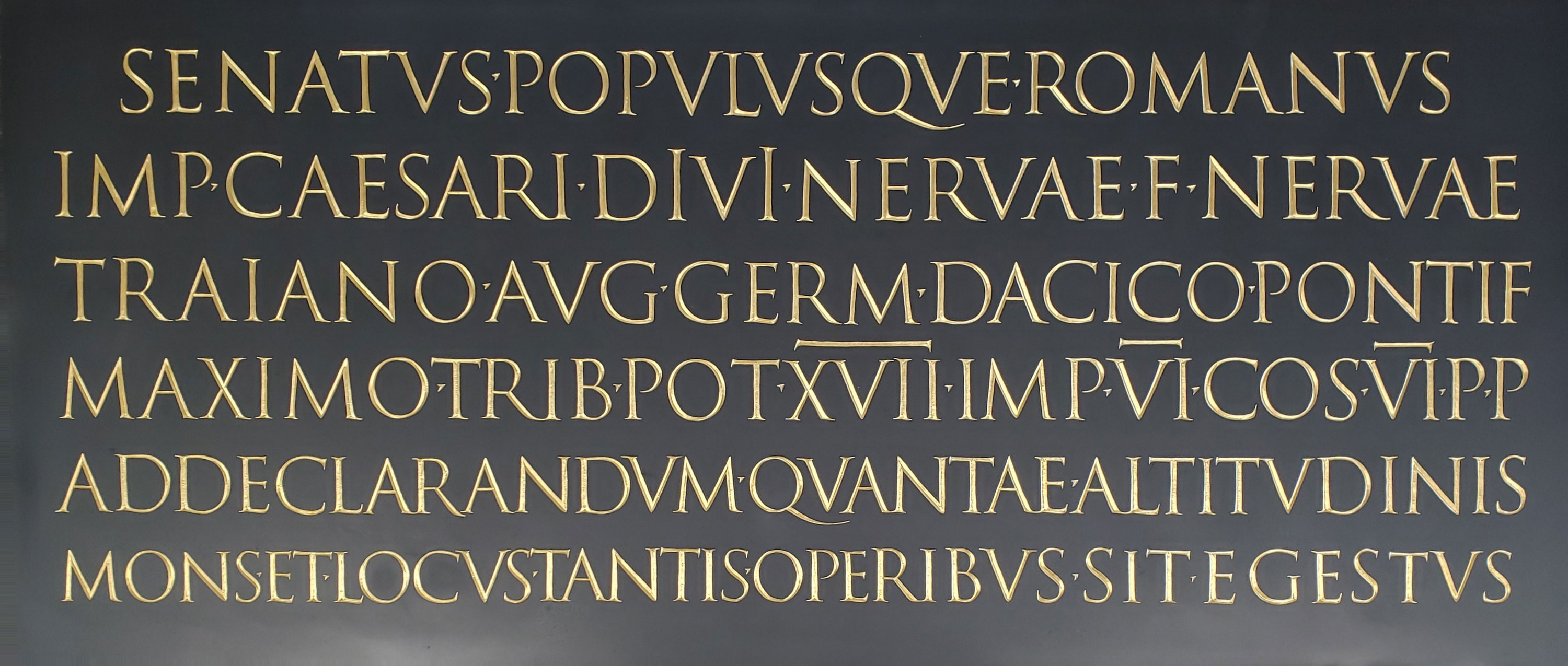
I have recently completed a project that might interest you. It is something that has been on my mind for quite some time. You know that I worked with Father Catich for a number of years and that most of our commissioned work was done in slate. You also know of his place in history regarding his scholarly work on the Imperial Roman letters of the Trajan Inscription in Rome. It seemed natural for me then to combine those aspects into a half-scale replica of the Trajan Inscription in slate. Of course I used Father’s documented research as the source for my piece.
I started by reducing his drawings from the portfolio in his book Letters Redrawn from the Trajan Inscription, 1961. I then measured the space between the six lines from his full-sized partial cast at St. Ambrose University and reduced those measurements by 50 percent. Another essential reference was to take his photograph (Plate 70) from Letters Redrawn and enlarge it to the size I needed. That provided me with the proper layout for the lettering. Finally, I used a drawing of his that does not appear in Letters Redrawn to fill in the missing letters at the center bottom of the Trajan Inscription image. In summary: I went to the best source and took the most care to create this half-scale replica.
The finished piece is black slate. The letters are gilt in 23 karat gold leaf. Again I say those are the most common elements that Father and I used in our work. That is why I chose them.
The piece measures 25 1/4 inches by 57 5/8 inches wide by approximately 1/4 inch thick and sits in a black oak frame. The slate itself is quite strong for its thickness. I can testify to that because I have spent the last 2 years working on it.
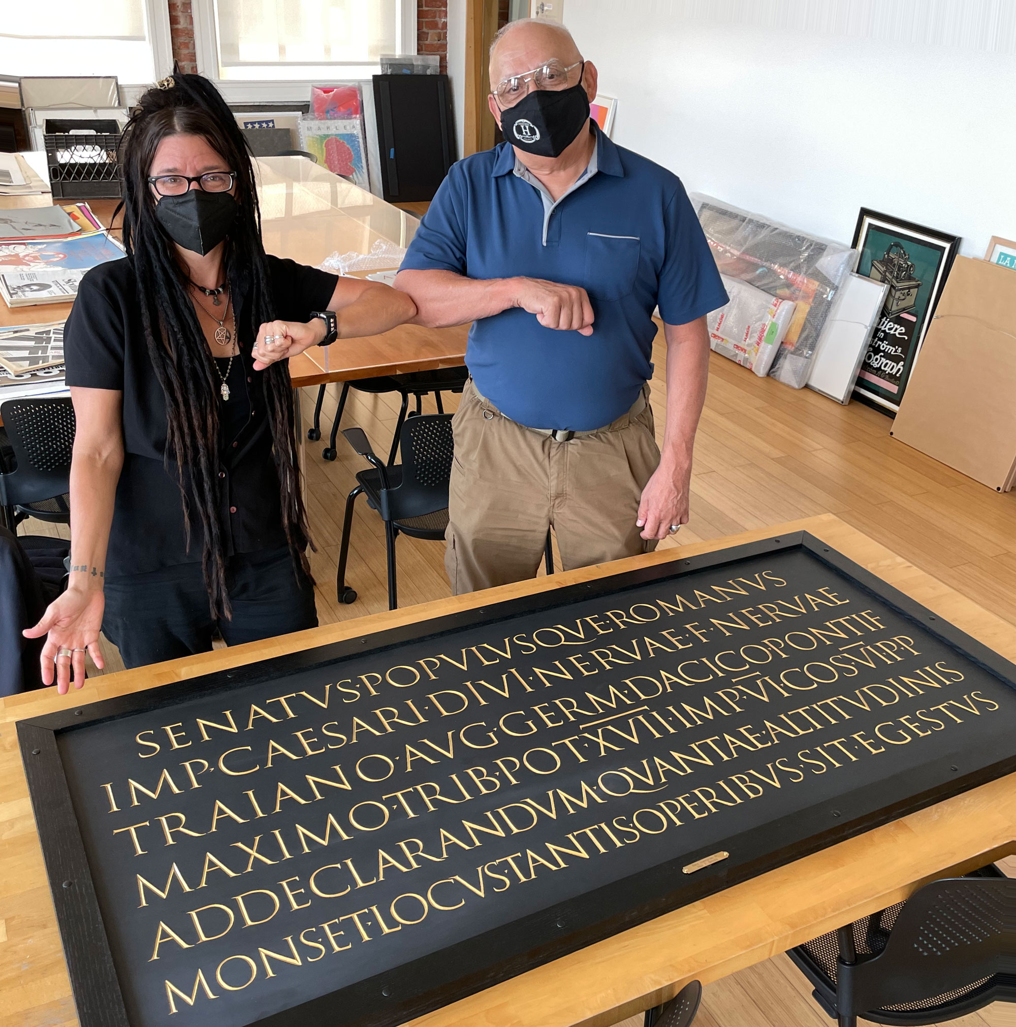
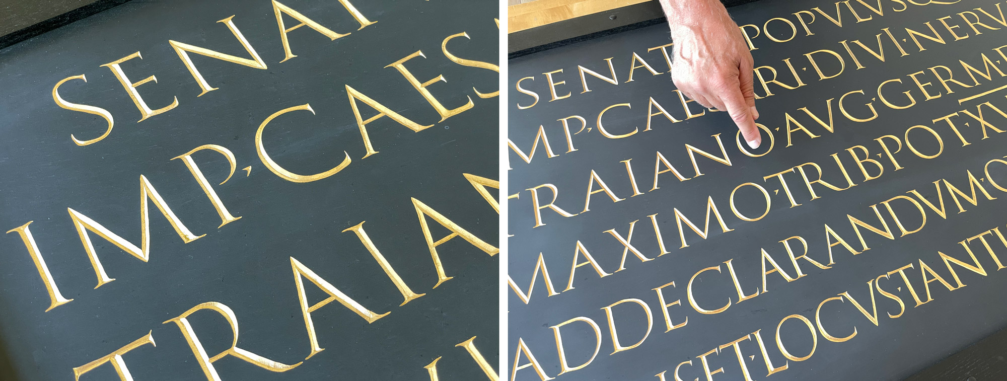
Paul hand delivered this unique reproduction late last year and we soon hung it on the wall of our new classroom. Now future students can view the letterforms from below as they were intended to be seen in the original inscription, with each line of text cut progressively larger to give the impression that all the letters are the same size. We’re thrilled that Paul will join us in the spring to teach a Brush-Written Romans workshop (along with a taste of letter cutting) to our Type West In-Person cohort. He’ll return in the summer to offer the same workshop to the public, so keep an eye on our newsletter for details!
— Stephen Coles, Associate Curator & Editorial Director