News
From the Collection: Utopian Construction — Judaism and the Soviet Avant Garde
Yiddish work by Kulture-Lige, El Lissitzky, and Natan Altman demonstrates how dreams of a new society revitalized typography.
-rooster-1919.jpg)
Judaism and designs of utopia have a long history together. Many Jews have dreamed of a perfect and socially just society, and created art that reflected this desire. Jews played integral roles in the Russian Revolution and in Bolshevik communism, as well as in building intentional communities around the world. Jewish artists expressed their utopian visions in a variety of ways, but many artists such as El Lissitzky and Natan Altman used painting, design, and the abstract shapes of constructivism to illustrate an upheaval of the old social systems and a radical transformation to something new. This coincided with the rise of communism in Eastern Europe, and with talk of protection of ethnic minorities after centuries of pogroms and discrimination.
Many Eastern European Jews saw Bolshevik communism as an opportunity for a truly egalitarian society. Art critic Jason Farago describes this in his 2018 article for The New York Times, “The Jews Who Dreamed of Utopia”:
Most Jews, of course, were not revolutionaries. But Jews did make up a disproportionate percentage of leftist utopians ... And for poor East European Jews — especially the millions in western Russia who faced political repression and frequent pogroms — the international workers’ movement offered a tantalizing freedom.
After the Revolution, some legal restrictions began to be lifted and laws were passed barring discrimination based on religion. These changes, along with ideological connections to old Jewish concepts of community and interconnectedness (known as kehilla), formed a vision of utopia. While these promises of Soviet communism didn’t pan out in the long term, the government passed legislation allowing Jews and other ethnic minorities to hold positions in government and public office, which made the possibility of social change seem imminent.
This movement demonstrates how the mere presence of hope can give rise to new ideas and revitalize creative endeavors.
Letterform Archive holds several works from this movement, roughly between 1917 and 1928. I show them here not to glorify the Soviet Union, but to demonstrate how the mere presence of hope can give rise to new ideas and revitalize creative endeavors. In this case, we can view utopia as liberation from the ills of discrimination and years of oppression. But, it should be noted that many of these artists’ relationship to the Soviet government was complex and multifaceted. Sometimes these artists saw their identities as Jewish, Russian, intellectuals, and activists all at once, and others lived these identities out in separate areas of their lives. As curator Susan Goodman writes,
An ambiguous situation was faced by many who saw themselves simultaneously as Russians, artists, and Jews. Their lives were colored by a society in which identity was determined by a particular religious, ethnic, or national inheritance. For Jews, the effect of being outside the ethnic mainstream in a country renowned for its nationalism had a significant impact on their creative life and work.1
As we’ll see, these identities often overlapped and coincided in their art. Either way, their relationships with the government were not simple and held layers of nuance. As time progressed and anti-Semitic policies were enforced again, some Yiddish artists had to denounce or hide their Judaism, and many were killed or left the Soviet Union altogether. Eventually, many were forced to create art which only glorified the Communist government, while other forms of creative expression were banned or limited. As Russian museum curator Masha Chlenova explains, examining and appreciating Soviet avant-garde art…
is not about aligning the Revolution with the West’s ‘achievements’ in civil rights, retrofitting the Bolsheviks to make them palatable for a modern western audience; rather, this is about understanding 1917 from the viewpoint of individual rights and freedoms that continue to require advocacy in Russia, the US, and elsewhere.2
The Kulture-Lige
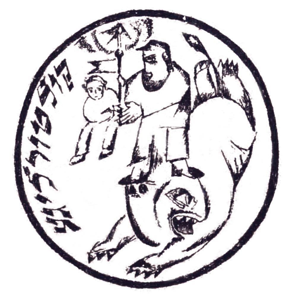
During the birth of the Soviet Union, the Kulture-Lige (Culture League) was founded to celebrate and foster a Yiddish sense of identity and culture through art, literature, and theater. Many of the participants, including El Lissitzky, who worked on a Kulture-Lige periodical called Folks Farlag, were politically active on the Left, and after the Bolshevik takeover, the Kulture-Lige chapters received subsidies from the Soviet government (although, sadly, some chapters were later taken over for purely political aims to become propaganda arms of the state).3 Chapters were established throughout Eastern Europe, with locations in Ukraine, Poland, and Moscow, among many others. The Kulture-Lige established a press for the publication of Yiddish books, an art studio and music school in Kiev, and a literary journal called Bikher-Velt (Book World). The organization brought together a rich artistic tradition and a novel national pride; the environment this created was one of cultural optimism, and both Yiddish and experimental art forms flourished.4
El Lissitzky
Lissitzky, before becoming immersed in the constructivist world, illustrated Yiddish children’s books and created folk art lithographs of scenes of Jewish life. When the Kulture-Lige expanded and began establishing schools and creating pedagogical material, Lissitzky illustrated many of the Yiddish educational materials, which promoted socialist principles.5 Even after producing constructivist pieces, Lissitzky continued to illustrate Yiddish children’s books, such as The Four Billy Goats and Had Gadya, a Passover song. His diversity of work hints at the overlapping complexities in his identity: Jewish, Russian, Artist, Revolutionary, Yiddish. This is a recurring theme in both his work and life. While working fervently in realms of the Yiddish cultural sphere, he also imagined a greater unity among all peoples. As Johnson elucidates,
Neither wholly Russified nor convinced of the possibility of an autonomous Jewish national culture after the Revolution, Lissitzky was instead dedicated to the development of culture beyond the framework of the nation… The break from a national tradition was a great internal struggle for Lissitzky, but the evidence points in the opposite direction. Lissitzky’s international education, his multilingualism, and his messianic view of the Revolution all contributed to his final embrace of the avant-garde in late 1919. It was entirely in keeping with his views to affirm with Kazimir Malevich the following year that “I belong to no people and consider no tongue native, I go along the path of the supreme unity of human beings of the spirit of dynamism and the language of the future.6
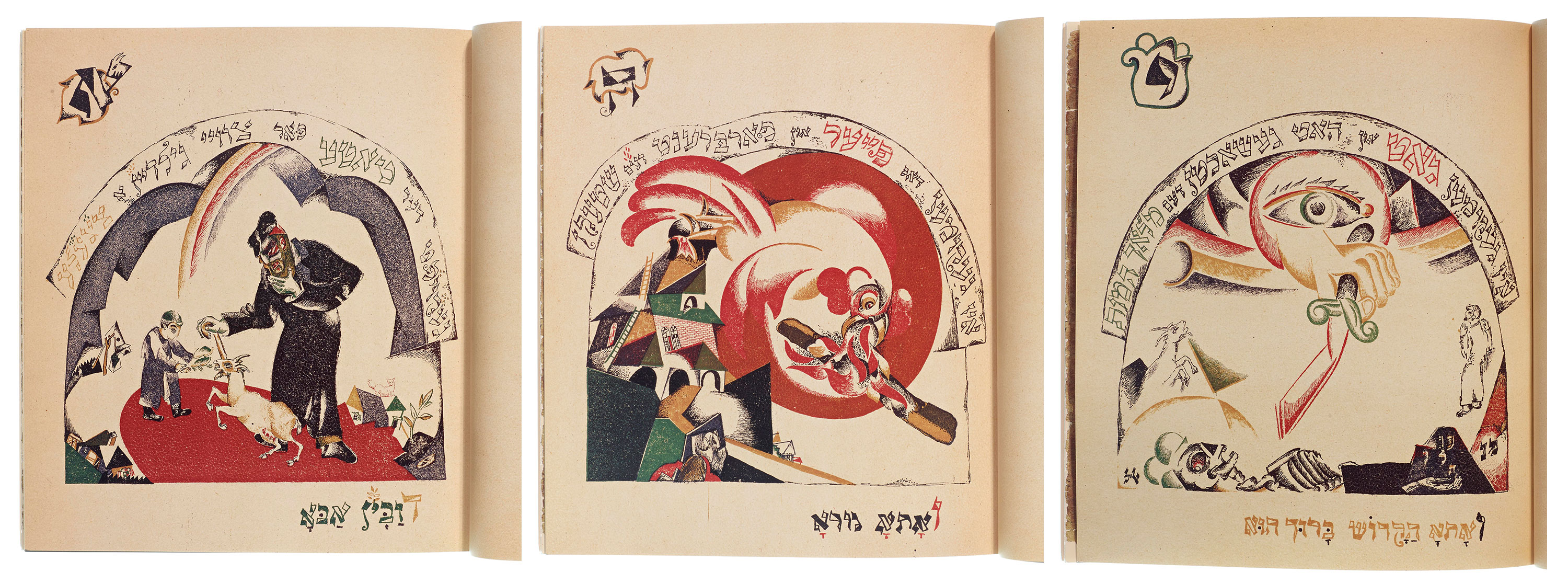
Lissitzky continuously wove themes of social revolution-as-messiah throughout his work. This is especially true in his illustrated children’s song for Passover, Had Gadya (One Little Goat), in which a goat is killed by a cat, which is bitten by a dog, which continues through many iterations in a cycle of death and destruction until the hand of God intercepts and stops the cycle from continuing. That a messianic figure intervenes to liberate all creatures has been viewed by critics as a metaphor for the Bolshevik Revolution liberating the oppressed,7 in the same way that Judaism hopes for the arrival of a messiah to liberate all peoples. And similarly, the Passover holiday teaches about the sacred nature of freedom and justice, and that if some of us are oppressed, none of us is truly free. Had Gadya is also a perfect example of the ways Lissitzky combined Yiddsh folk art and constructivist and cubist schools of thought. The animals and colorful images are joyous, while the buildings are angular and sharp in a playful way, which is also reminiscent of Marc Chagall’s work at the time.
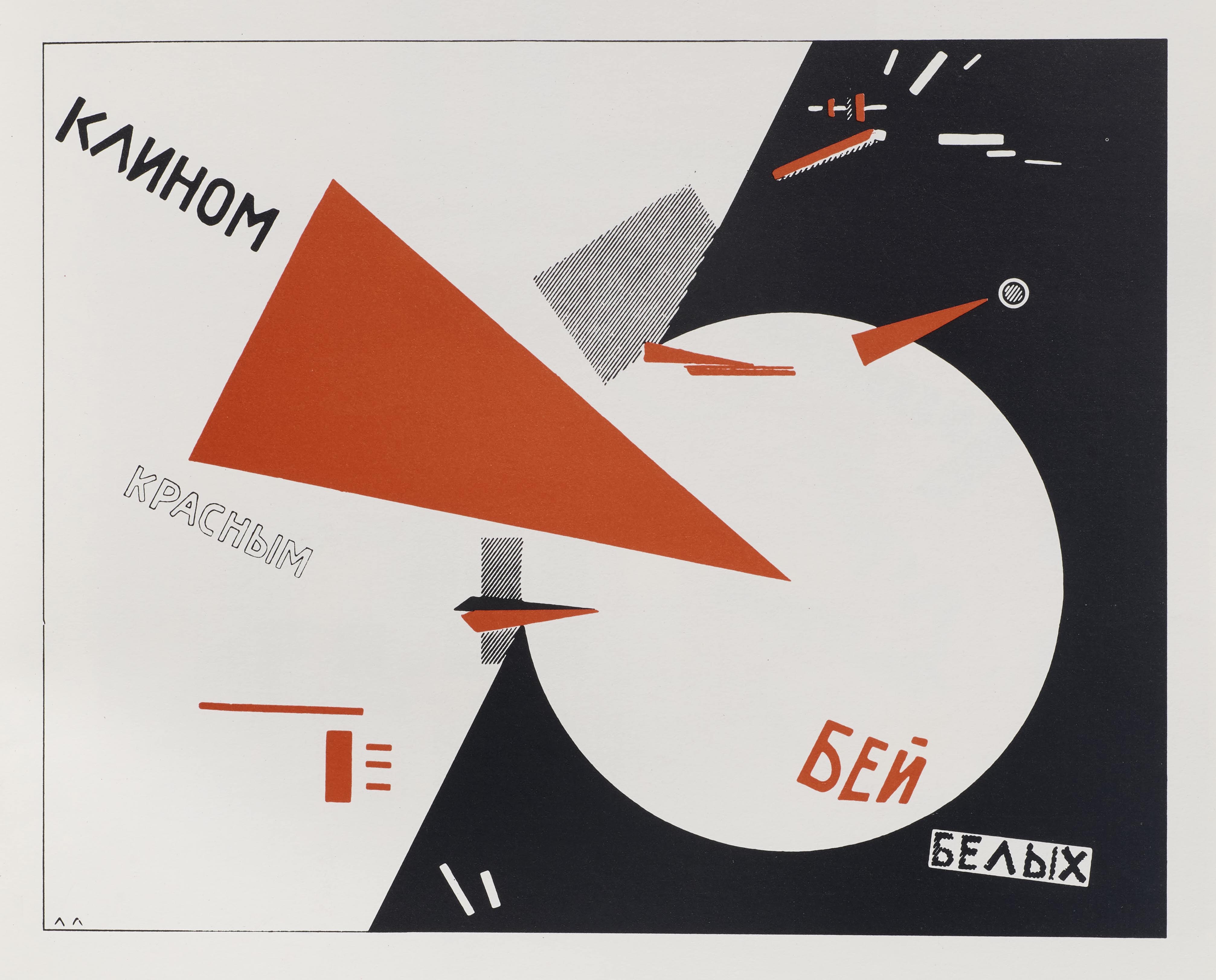
Lissitzky’s Beat the Whites with the Red Wedge may be his most well-known revolutionary piece. At first glance, the painting (a play on the commonly used phrase “beat the Jews”),8 seems like an abstract rendering of shape and color, but it is overtly political, and almost forcefully so when one places the piece in context. The date of the poster’s creation, 1919, is a significant one; the Russian Civil War was raging, and Communists sought to overturn the old monarchist regime. At the left, a small, but sharp, red wedge (the Bolshevik revolutionaries) pierces the large, white circle at the right (the status-quo, the Monarchists, the Conservatives, and anyone anti-Bolshevik). The middle, going from black to white, represents division, marking a period of upheaval and a tearing away from the old regime.
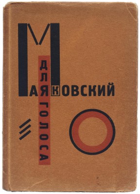
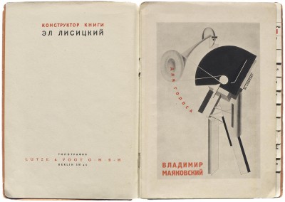
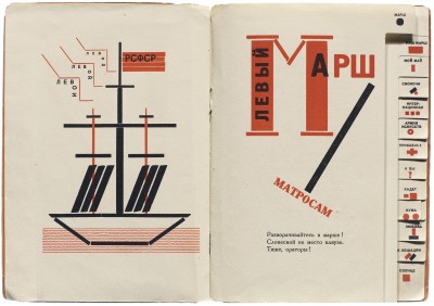
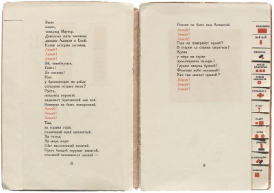
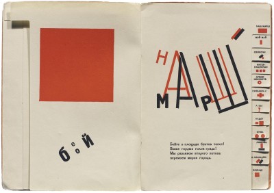
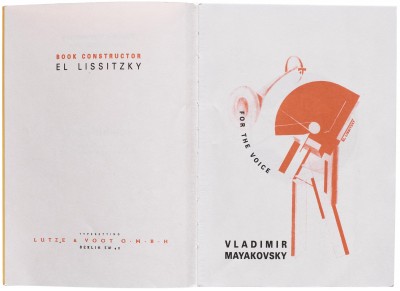
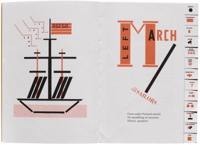
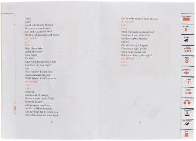
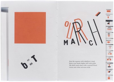
Lissitzky also collaborated on a book of poems with Russian poet Vladimir Mayakovsky called For the Voice. This piece is also dominated by the powerful triad of black, white, and red, with illustrations constructed with block-like shapes, and the poems are delineated with tabs (see image gallery below). For the Voice is made up of revolutionary poems that evoke powerful proletarian imagery, as seen in Left March and My May. The book was originally meant to be read aloud, on the street as a performative and political act, and Lissitzky had the idea of creating tabs for the poems so that they could be referenced quickly and easily.9
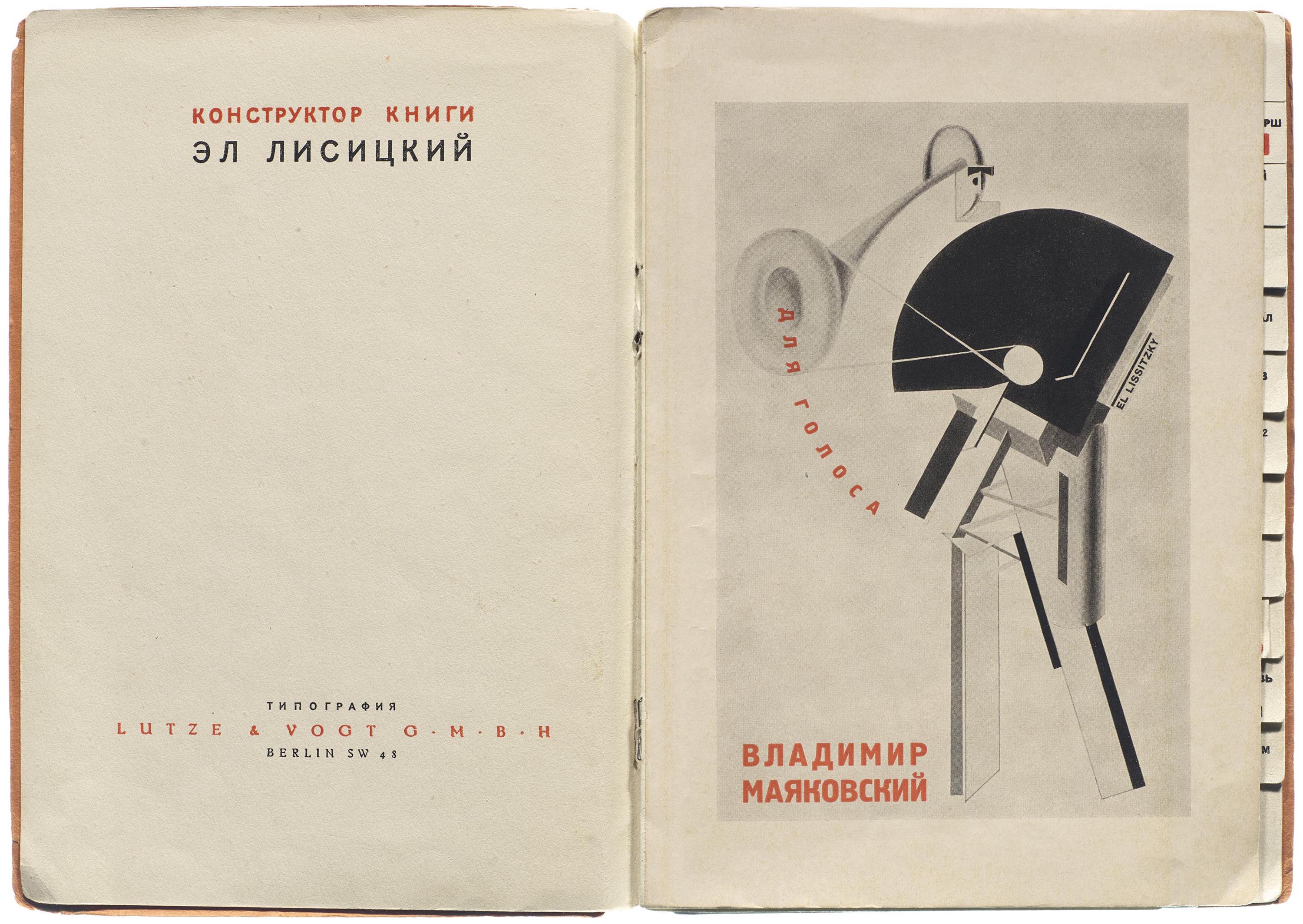
For the Voice (original and English facsimile)
Lissitzky infused For the Voice with his ideas from The Topography of Typography, a treatise on the visual characteristics of text and reading. It was published on the back cover of Merz magazine, issue 4.
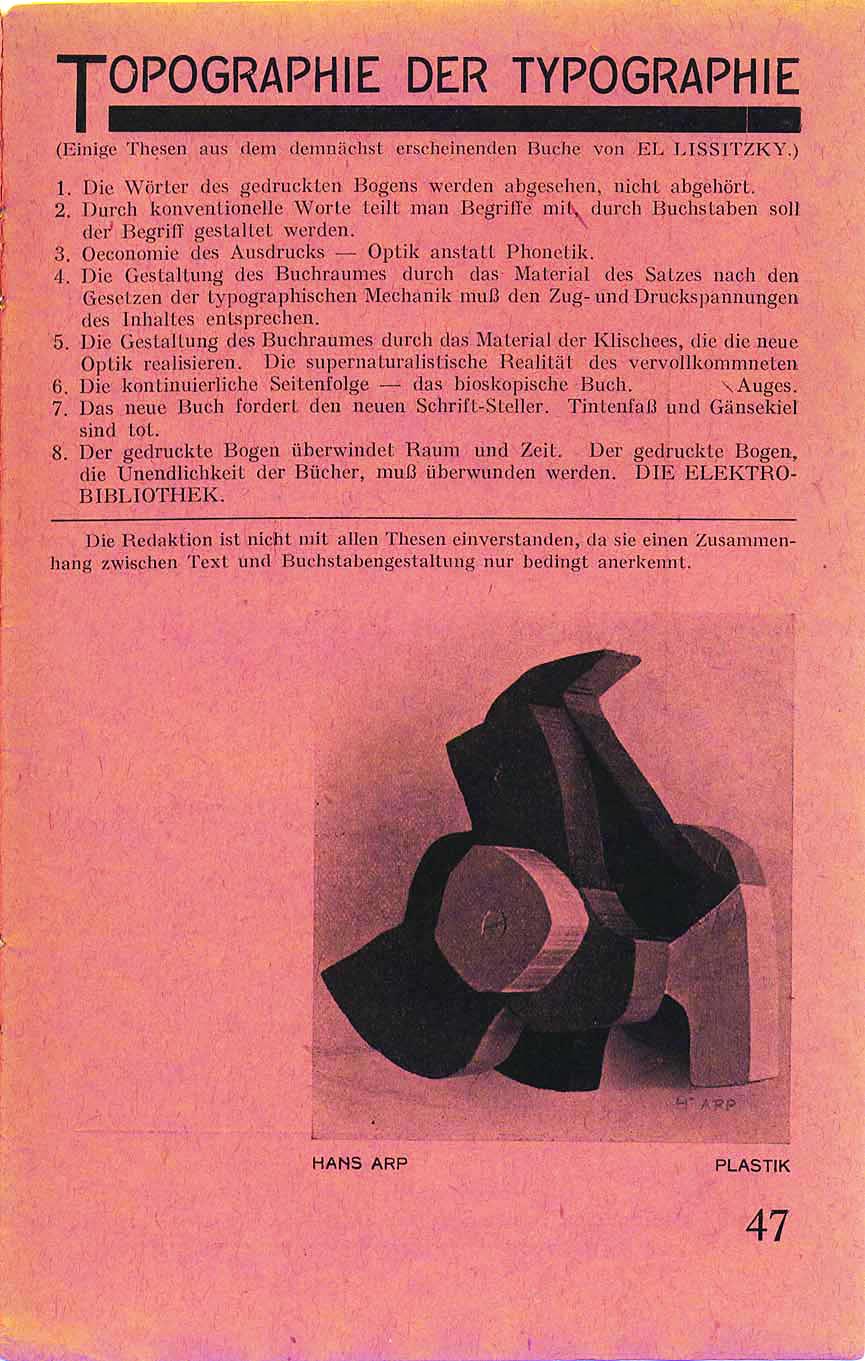
Lisstzky’s Topography of Typography
- The words on the printed surface are taken in by seeing, not by hearing.
- One communicates meanings through the convention of words; meaning attains form through letters.
- Economy of expression: optics not phonetics.
- The design of the book-space, set according to the constraints of printing mechanics, must correspond to the tensions and pressures of content.
- The design of the book-space using process blocks which issue from the new optics. The supernatural reality of the perfected eye.
- The continuous sequence of pages: the bioscopic book.
- The new book demands the new writer. Inkpot and quill-pen are dead.
- The printed surface transcends space and time. The printed surface, the infinity of books, must be transcended. THE ELECTRO-LIBRARY.
The Topography of Typography is an aesthetic and ideological manifesto, and Lissitzky believed that book design and illustration should both echo the ideas of the text and stand alone as text in optical form, transcending the traditional idea of a book. As Lisstzky wrote,
My pages stand in much the same relationship to the poems as an accompanying piano to a violin. Just as the poet unites concepts and sound, I have tried to create an equivalent unity using the poem and typography.10
This idea especially shines in For the Voice, where words and letters tumble, turn, and blast across pages, and where “meaning attains form through letters”. This constructivist “building” of a book, rather than a designing, is demonstrated in the book’s title page, where Lissitzky is listed as “book constructor”, with Mayakovsky as poet. Lissitzky viewed himself as an architect, rather than a designer, of the printed word.
Natan Altman
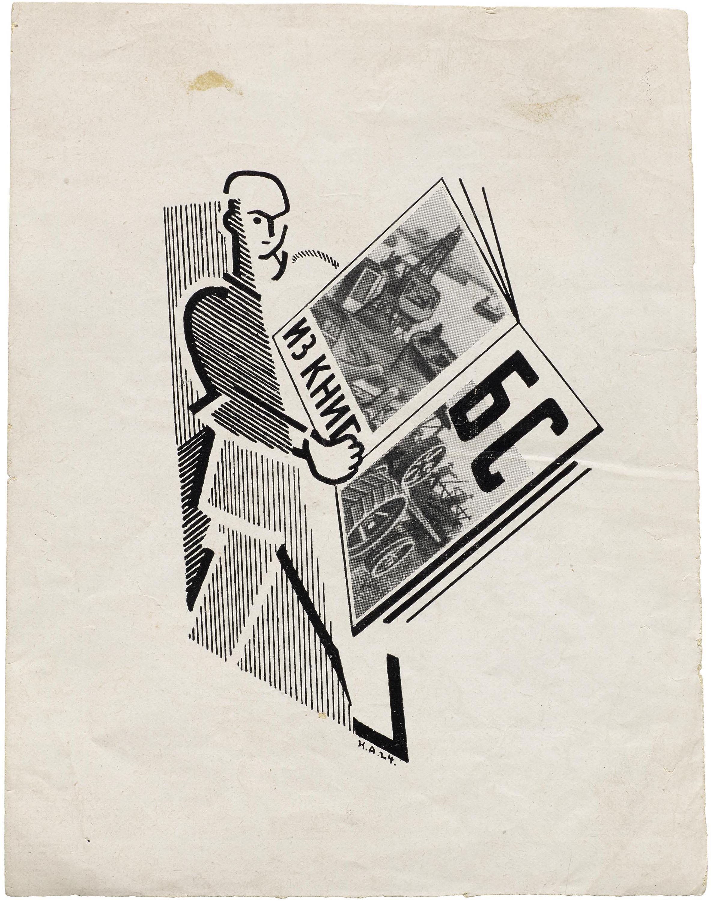
Natan Altman is another artist who participated in revolutionary art and the Yiddish cultural renaissance. While best known for his oil paintings, he was incredibly prolific, creating works in sculpture (including a bronze bust of Lenin), illustration, lettering, set design, and other media. As a young artist, he found inspiration in the designs and ornamental shapes in synagogues and on Jewish tombstones, and spent a summer appreciating religious forms and sketching them.11 He frequented Soviet modernist circles, and like Lissitzky, found a way to combine Jewish folk art and avant-garde imagery. Altman participated in Kultur-Lige exhibitions, created poster and set design for Jewish theatre productions, and became an appointed member of the Fine Art Department for the People’s Commissariat of Education, for which he received government commendations.12 He also co-founded the periodical Iskusstvo Kommuny (Art of the Commune), an avant garde futurist publication with poetic “editorials” by Mayakovsky and contributions by Chagall and Malevich.13 When Jews were allowed more freedom to move and cultivate land post-1917, Altman designed the lottery ticket which raised money to relocate Jews who were previously exiled (known as the Pale of Settlement).14, 15
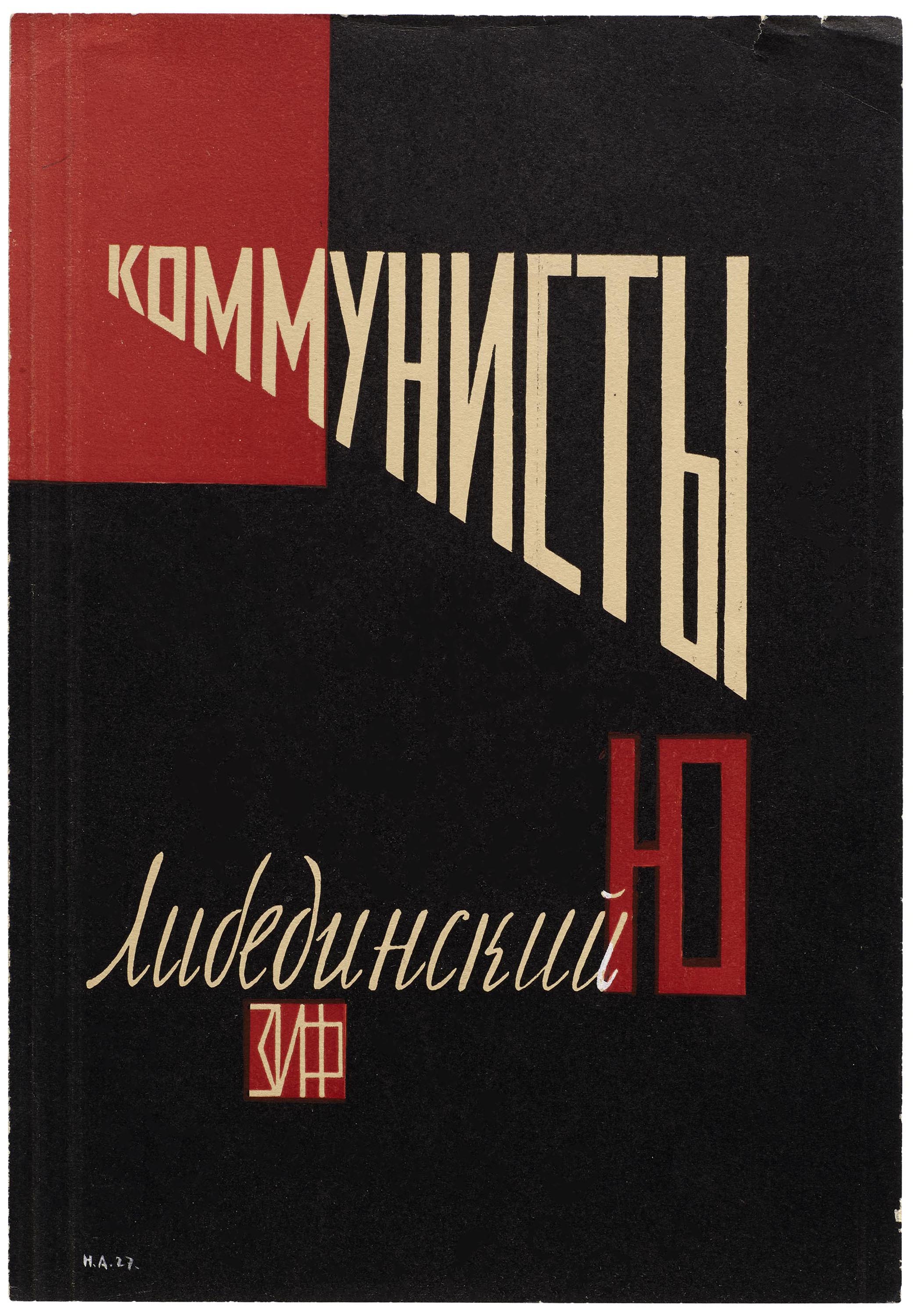
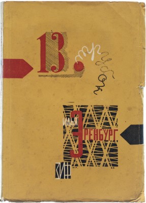
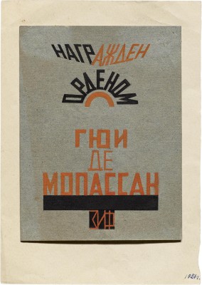
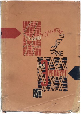
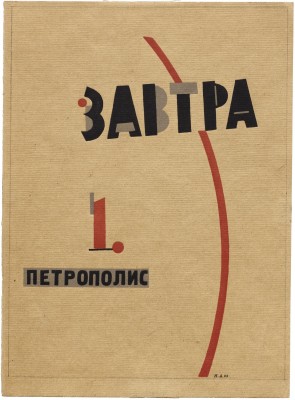
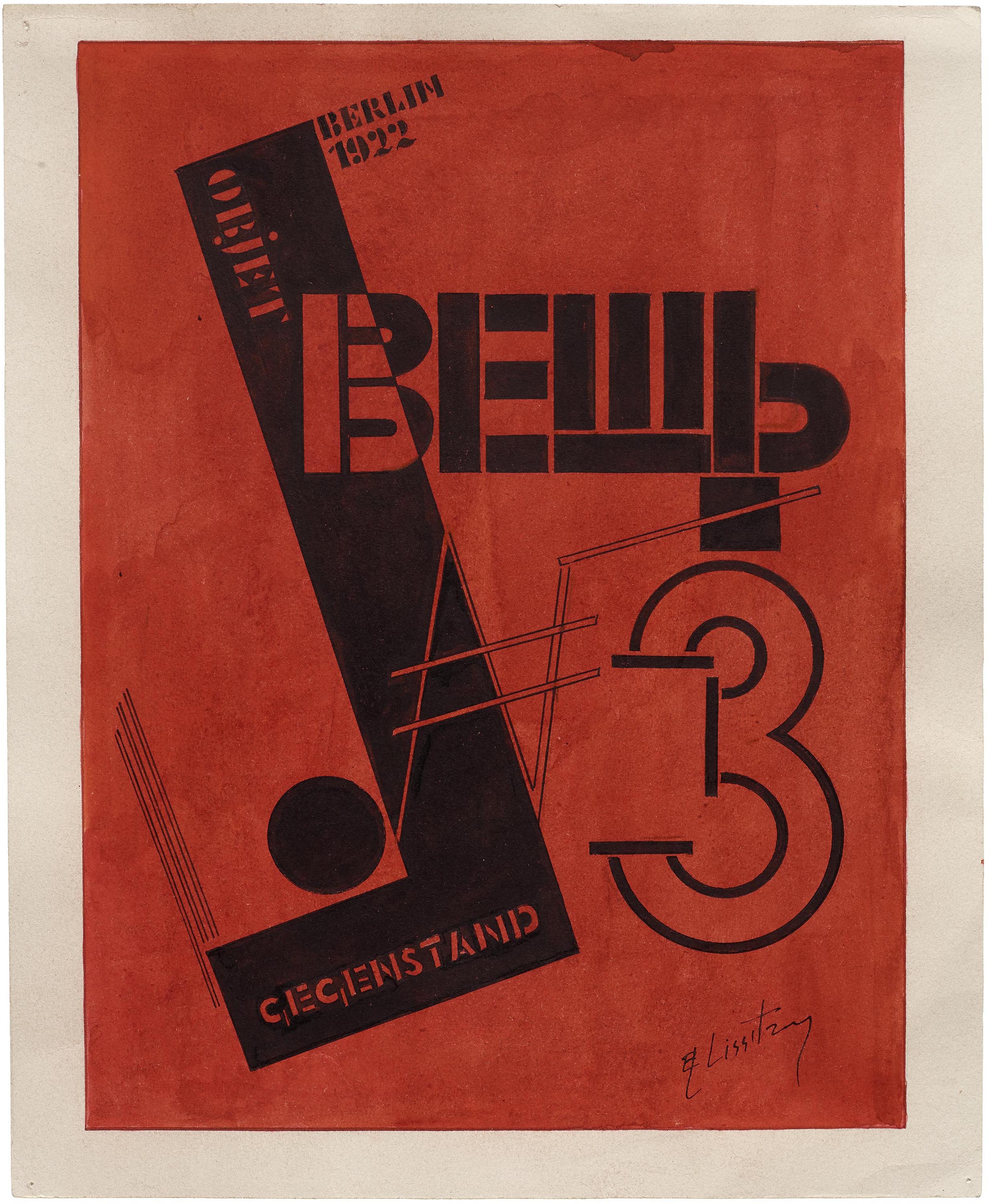
Letterform Archive’s collection of Altman’s work is composed of book covers in Russian and Yiddish, many of which are for the author Ilya Ehrenburg who co-founded the avant garde periodical Veshch/Gegenstand/Objet with Lissitzky. Altman plays with the size and angle of text, with letters curving and arching, while also using recurring images of maps and street grids. He designed a cover for a book by Soviet writer Yuri Libedinsky, titled Communists, shown here. It’s reminiscent of Lissitzky’s treatise, the words rising up and getting louder, as if the words are being visually shouted through a megaphone, in the same way Mayavoksy’s poems are meant to be shouted from the street corner.
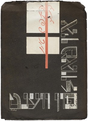
Altman’s Yiddish piece in the collection is a cover for poet David Hofstein’s On the Tablet on the Wall, published in 1923. A constructivist piece, it uses a unique white-on-black color scheme, with the author’s name written vertically in curly red script. The geometric square shapes recall building blocks or frames, and the powerful red/black/white color scheme, also used frequently by Lissitzky, recalls revolutionary spirit. The lettering’s dotted fill gives the page texture and depth, while the contrast of stroke weights is reminiscent of cubism.
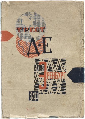
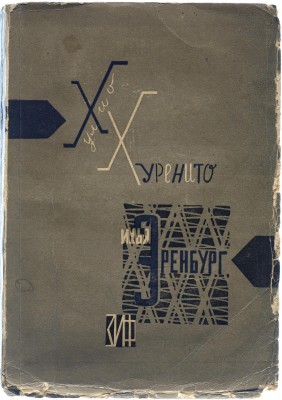
Altman’s cover design for Ilya Ehrenburg’s Trust D.E. has a pronounced anti-capitalist character that still resonates today. Trust D.E. (Destruction of Europe) is a story about American millionaires which plot to destroy Europe with poisonous gas, but the proletariat rises up, digs a tunnel to the U.S., manages to ignite the revolutionary fervor of the American working class, and ultimately prevails.16 The globe design so well represents an evil corporation, it almost seems ahead of its time, and the implications are of capitalism as a cartoon villain. Julio Jurenito is another novel by Ilya Ehrenburg for which Altman designed a cover. This story is interesting for its criticism of both capitalism and late communism, seen through the eyes of a foreigner from Latin America who finds it all absurd.17
Book covers by Natan Altman
Unfortunately, like many Yiddish artists of the time, Altman’s prolific abilities were limited due to tightening censorship laws in the Soviet Union. As Stalin rose to power, he promoted the idea that avant-garde art was only for the bourgeois and thus didn’t constitute “true” proletarian art. The government began to force the style of Socialist realism on artists in the hope they would mythify the USSR and its policies.18 If art didn’t specifically idealize life in the Soviet Union, it was considered superfluous and thus anti-communist, an enemy of the people. (Interestingly, one of the first pieces Stalin chose to censor was Lissitzky’s Had Gadya.) These new restrictions limited the styles and forms in which artists could express themselves, and it ultimately forced Altman and his contemporaries into smaller jobs to make a living rather than the creation of pieces which expressed authentic utopian visions.
While it’s no secret that the Soviet Union did not become a utopia (and for most — Jews included — became quite the opposite), we can still appreciate and examine the ideas and art that came out of its early Yiddish renaissance. The desire to build a better and more equitable society is still something worth fighting for, and movements like Black Lives Matter remind us that they are continually relevant. While the social circumstances are different, the idea remains the same: when some of us are oppressed, none of us is truly free. A century later, people are still fighting for a better, more just society, and using art and letterforms to communicate messages for change. We could all learn from Lissitzky and Altman’s messages of radical inclusivity.
— April Harper, Digitization Librarian
Thanks to Slava Starikov and Irina Starikova for translation assistance.

