Events

Brushing up your Letterforms
with Aline Kaori
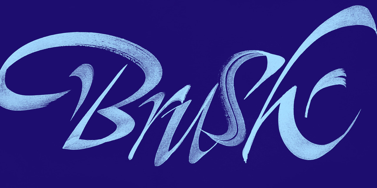
In this inky workshop, students will learn how to work with brushes to create unique letterforms.
- Date
- Time
Unlock the potential of brushes to create unique shapes and letterforms full of personality. First, we’ll get acquainted with the tools: see what they can do and learn how to handle them. Then we’ll break down the basic properties and dynamics of each kind of brush (pressure, twists, speed … fun!) and understand how we can make the most of them when designing letters.
Along the way, we will be working on top of a simplified roman skeleton to understand, through practice, how the pen and different kind of brushes can affect the shape of letters. We will also break some rules (responsibly!) and combine different brush properties to create shapes that go way beyond the obvious.
By the end of the workshop, students will have made friends with brushes and rendered a word in different styles, using distinct brush properties. These explorations will become a visual library of their process, as well as a repertoire of possibilities and combos that they can use in the future when crafting letterforms. Their artwork will be ready to be applied as is—in its brushy glory—or it can be developed further into a lettering model or a full-blown typeface.
Learning Outcomes
- Handling the flat and round brush, paints, and surfaces to make fresh letters by hand
- Understanding the basic skeleton of roman majuscules and experiencing how brush handling can affect the body of letterforms
- Hands-on experience on how to make the most out of brush properties and dynamics
- Exploring the potential of different kinds of brushes to create unique shapes and letterforms full of personality
- Repertoire and tools to keep exploring and practicing way beyond this workshop
Required Materials
- Flat brush, natural or synthetic hair, around size 3–5 (medium). Look for soft brushes with medium bristles that are tied together and form a sharp line even when wet.
- Round brush, natural or synthetic hair, tip size around 1–1.5 cm (0.4-0.6 in). Look for soft brushes with bristles that are tied together and hold a fine tip even when wet.
- Sheets of Kraft paper or A3 Paper pad (29.7 x 42.0 cm) or similar to/bigger than 12 x 17 in, 90 gsm or more. Any brand is fine so long as it holds ink/water mediums without bleeding.
- Any dark color(s) of gouache or poster color. Recommended brands: for gouache, Windsor & Newton, Royal Talens; for poster color: Nicker, Pentel, Sakura. Any brand should be fine as long as it’s a student-level or professional kind of paint.
- A water container (for brush cleaning)
- A palette (with some flat part to pallet the brush would be ideal)
- Any soft pencil (for guidelines and sketching)
- A ruler compatible with your paper size (for guidelines)
- A phone, camera, or scanner to capture work
- A computer to watch the classes on and do basic photo editing
- Optional: any other kind of flat or round brushes you already have or wish to take for a ride
- Optional but good for beginners: felt-tip brush pen (preferably dark). Recommended brands: Tombow dual, Sakura Koi, Faber-Castell, or Zig. Medium-to-big tip. Avoid alcohol-based markers or tips that are too stiff.
- Optional but good for beginners: Pilot Parallel Pen or any broad-edge nib you already have (suggestion for beginners: Leonardt, Speedball, Brause)
Note: This workshop is only open to students enrolled in the 2023 Type West Online Postgraduate Certificate Program in Type Design.
Aline Kaori
Aline Kaori (she/her) is a freelance lettering artist, calligrapher, in-progress type designer, and educator based in São Paulo, Brazil. She is also part of Cyla Costa Studio. Her custom letters have helped brands such as Budweiser, Natura, Prada, and Tiffany&Co connect with their audience in a unique, personal way.
Since 2013, she has been fully dedicated to honing her craft, teaching workshops, and offering consultancy and critiques on lettering and calligraphy. Her work has been featured in Tupigrafia and Typism Book, and her very first typeface, Pitaya Italic, was selected for the Tipos Latinos Biennial in 2018. She recently finished the TypeParis program, where the Empadinha type family was born and awarded distinction.
