Events

Compared to What?
with RJ Andrews
How masterpiece data graphics use shapes and letters to create meaning from data.
- Date
- Time
Whether it is a bespoke darling or an everyday plot, like bar charts and line graphs, there is untapped value in the design of data graphics. See how to make them more effective through inspiring examples from past centuries, today, and RJ's own work.
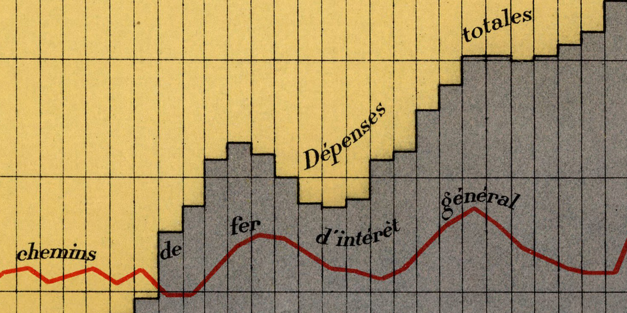
Our session will anchor on the one question that helps create meaning in the mind of the viewer—COMPARED TO WHAT? With this question you can make better graphics, and become a better infovore, too.
We will also spotlight lettering in data graphics to see how table design, labeling, annotation, and typeface selection have helped the best data graphics soar.
Letterform Lectures are a public aspect of the Type West postgraduate program. The series is co-presented by the San Francisco Public Library, where events are free and open to all.
RJ Andrews
Data storyteller RJ Andrews is obsessed with data graphics. He helps organizations solve high-stakes problems with visual metaphors and persuasive graphics. He recently produced designs for The White House, Google, and MIT.
RJ’s newest book is Info We Trust: How to Create Value with Data Graphics (2025). He is also author of Florence Nightingale: Mortality and Health Diagrams and co-translator of Étienne-Jules Marey: The Graphic Method. In 2022, he published Information Graphic Visionaries, a series celebrating spectacular data-visualization creators. Learn about all publications at Visionary Press.
RJ recently taught “Persuasive Data Graphics” workshop at Letterform Archive using his collection of rare information graphics. He lives/works in the Dogpatch neighborhood of San Francisco.

