Events
Holy Comic Lettering Batman!: A Retrospective of Comic Lettering and Fonts
with Kirk Visola
From Charlie Chan to the Caped Crusader, we will explore the impact and evolution of lettering and typography in comics.
- Date
- Time
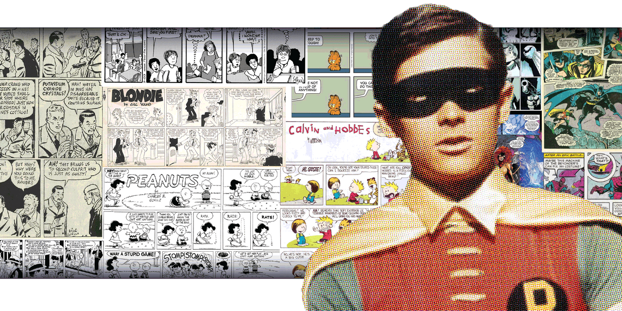
The history of comics is often defined as a unique marriage between type and imagery, telling a complex story—a story could be told in four images, or four hundred. Each comics’ style heavily influenced its lettering or type.
The storytelling aspects and production of comics have changed tremendously since they were first introduced in the late 19th century. Comics are continually evolving and changing with the times. And with those changes, the lettering that was created needed to follow suit.
Join Kirk Visola, creative director at MIND THE FONT™, as he explains how these lettering and typeface styles were developed, and how those developments play a role in mainstream pop culture.
Letterform Lectures are a public aspect of the Type West postgraduate program. The series is co-presented by the San Francisco Public Library, where events are free and open to all.
Kirk Visola
Kirk Visola is a proud Blerd (hence the Batman mug) that loves to think inside the box.
Beyond being inundated with new movies every year (which he finds amazing), comics taught him how to view imagery, type, composition, hierarchy, color, and most importantly, work within a confined area like a box. And, as shown by comics, there are myriad options that can be done inside that box.
Visola has spent his life creating compelling and innovative design solutions—independently, and in the corporate environment. He is also a creator and conceptor, passionate about any job he does.
Keep him boxed in. He doesn’t mind.