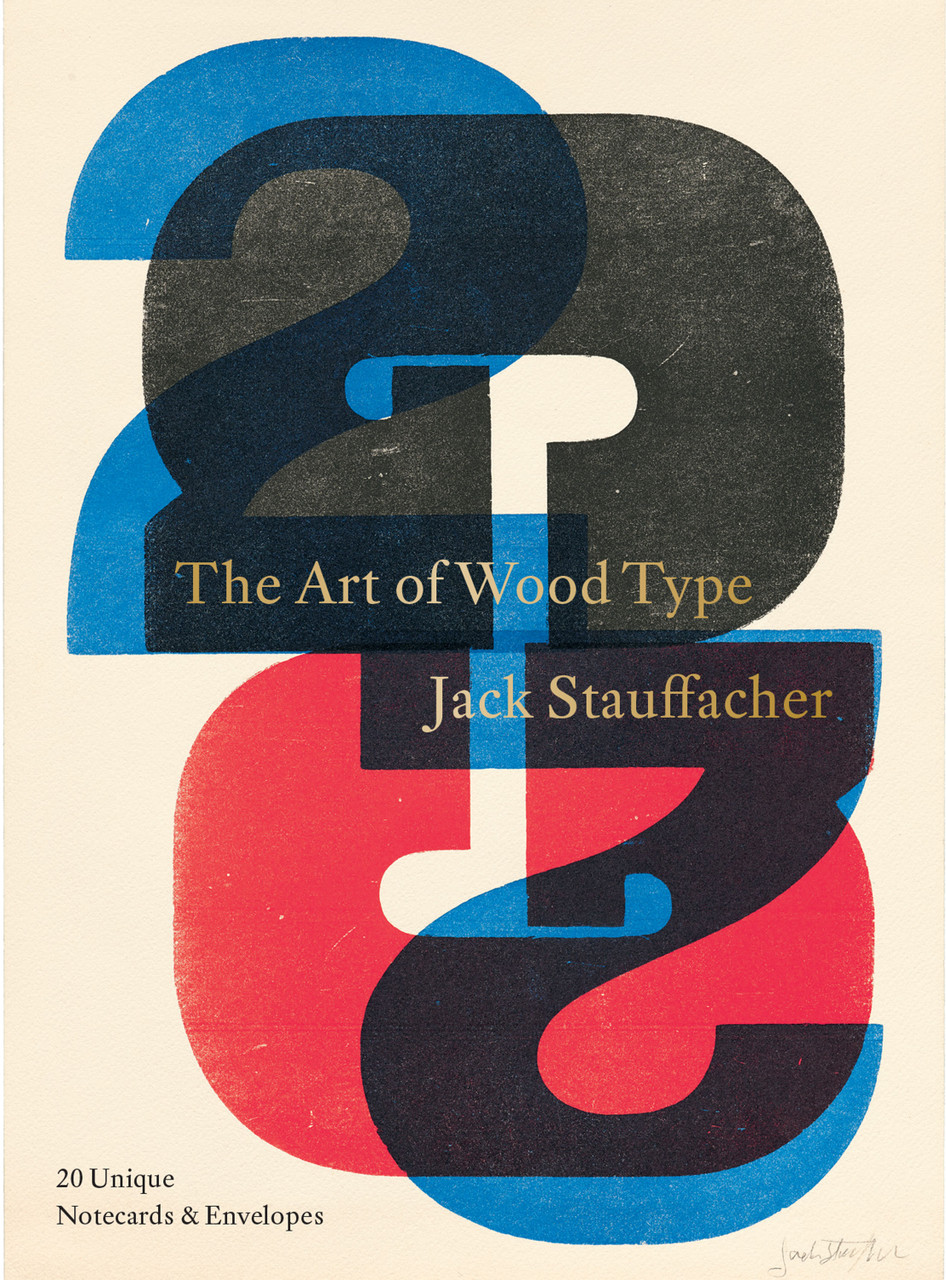
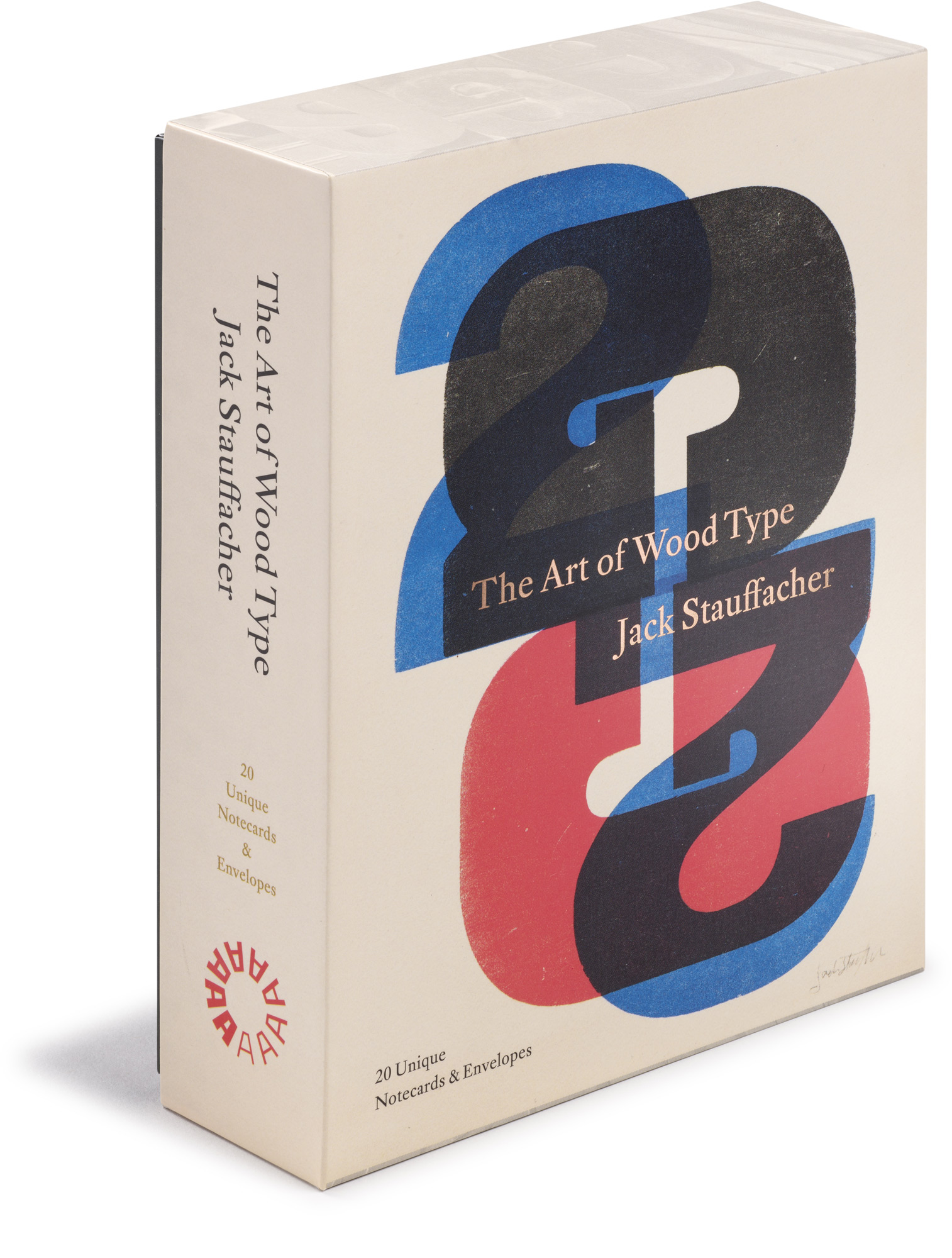
An elegant set of notecards and envelopes with beautiful reproductions of prints by San Francisco printing legend Jack Stauffacher
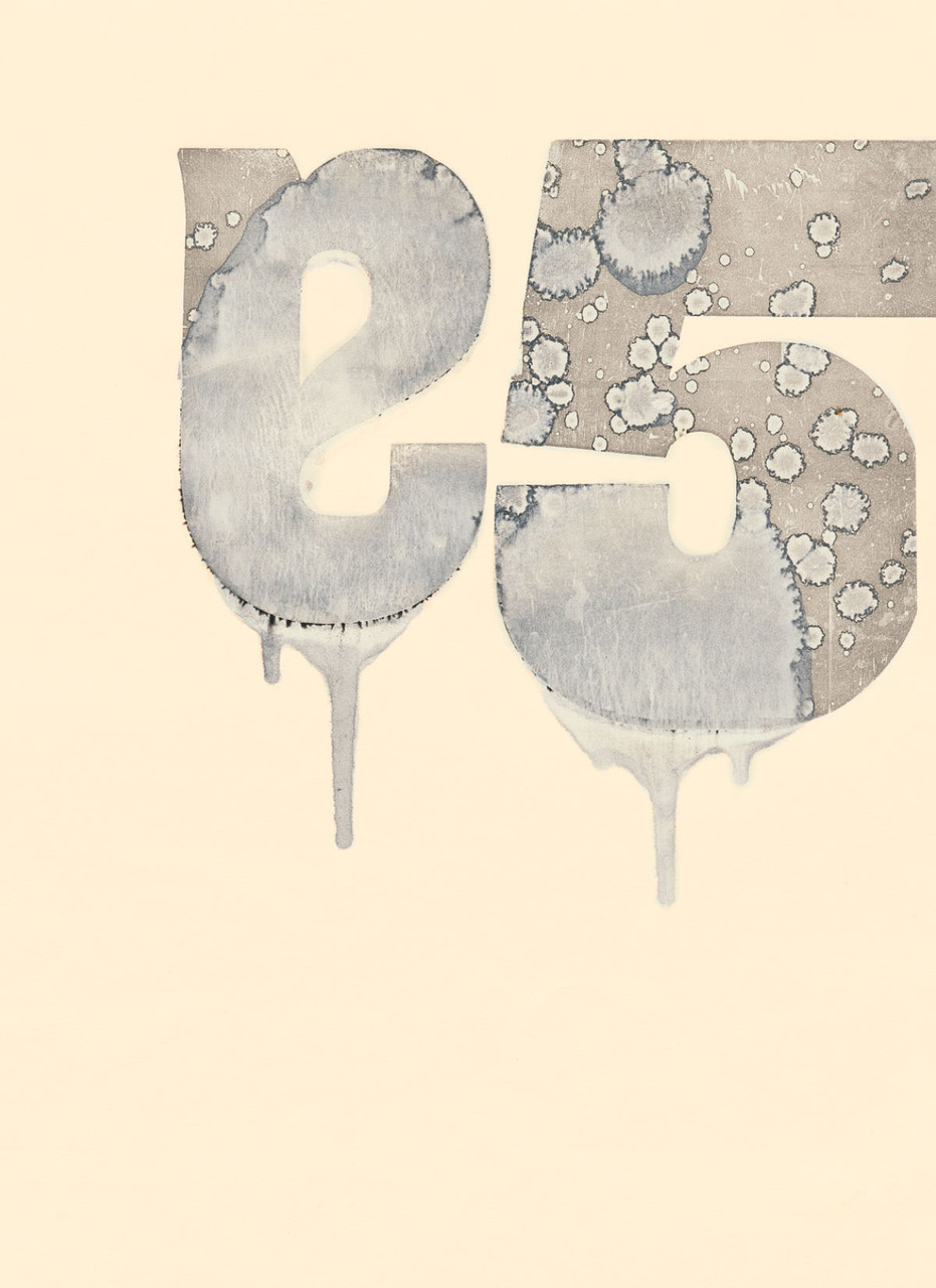
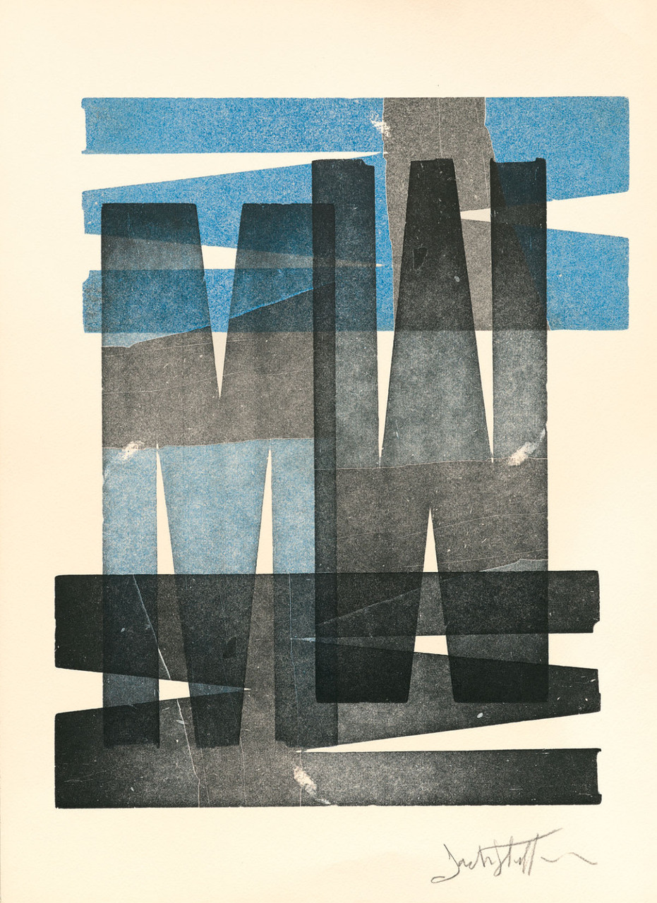
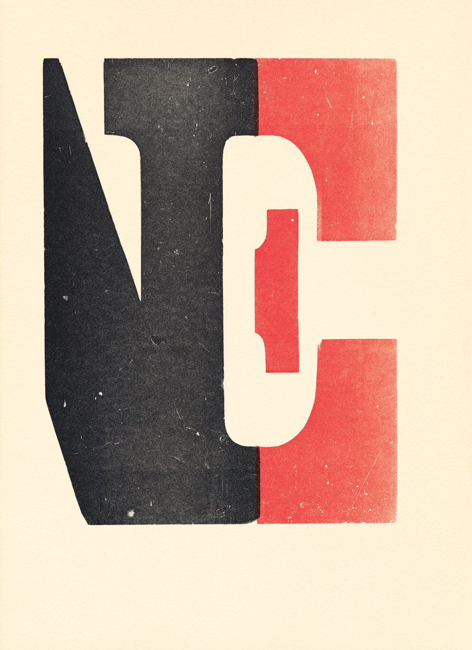
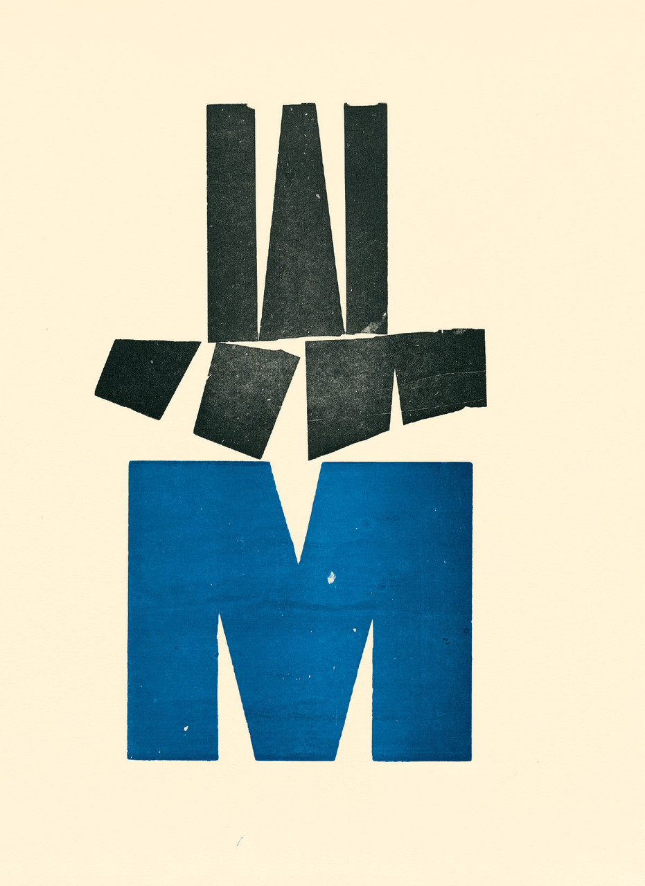
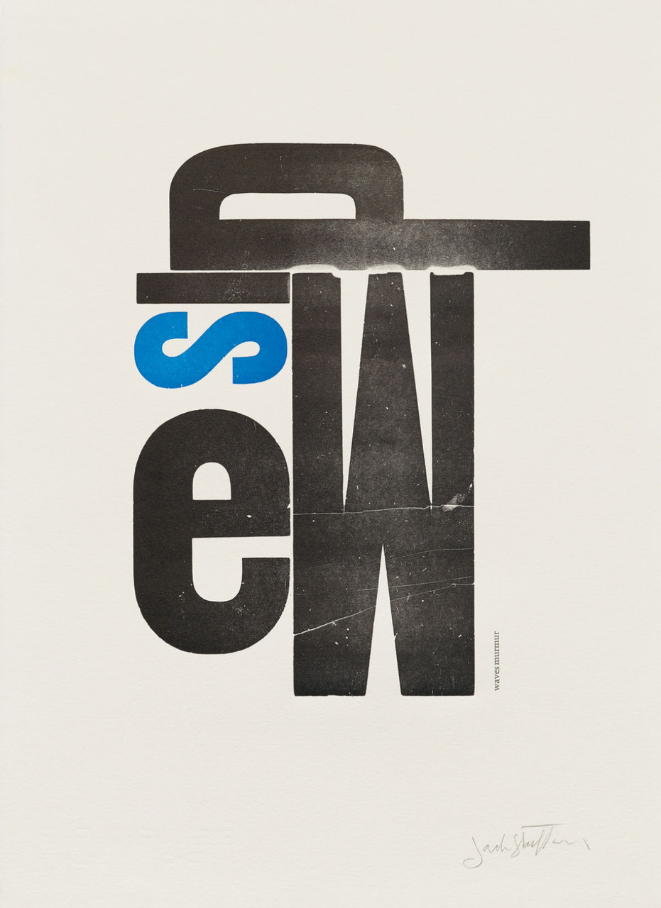
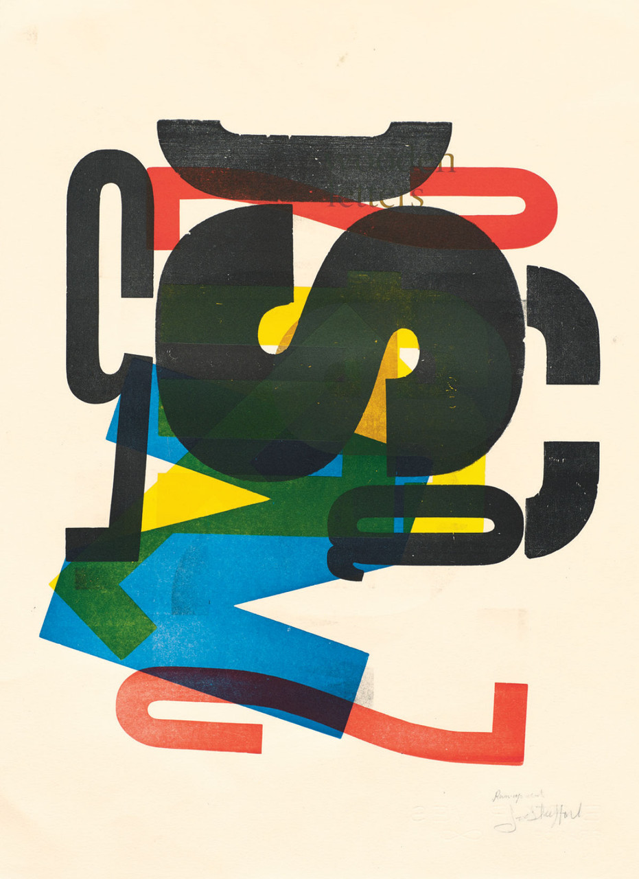
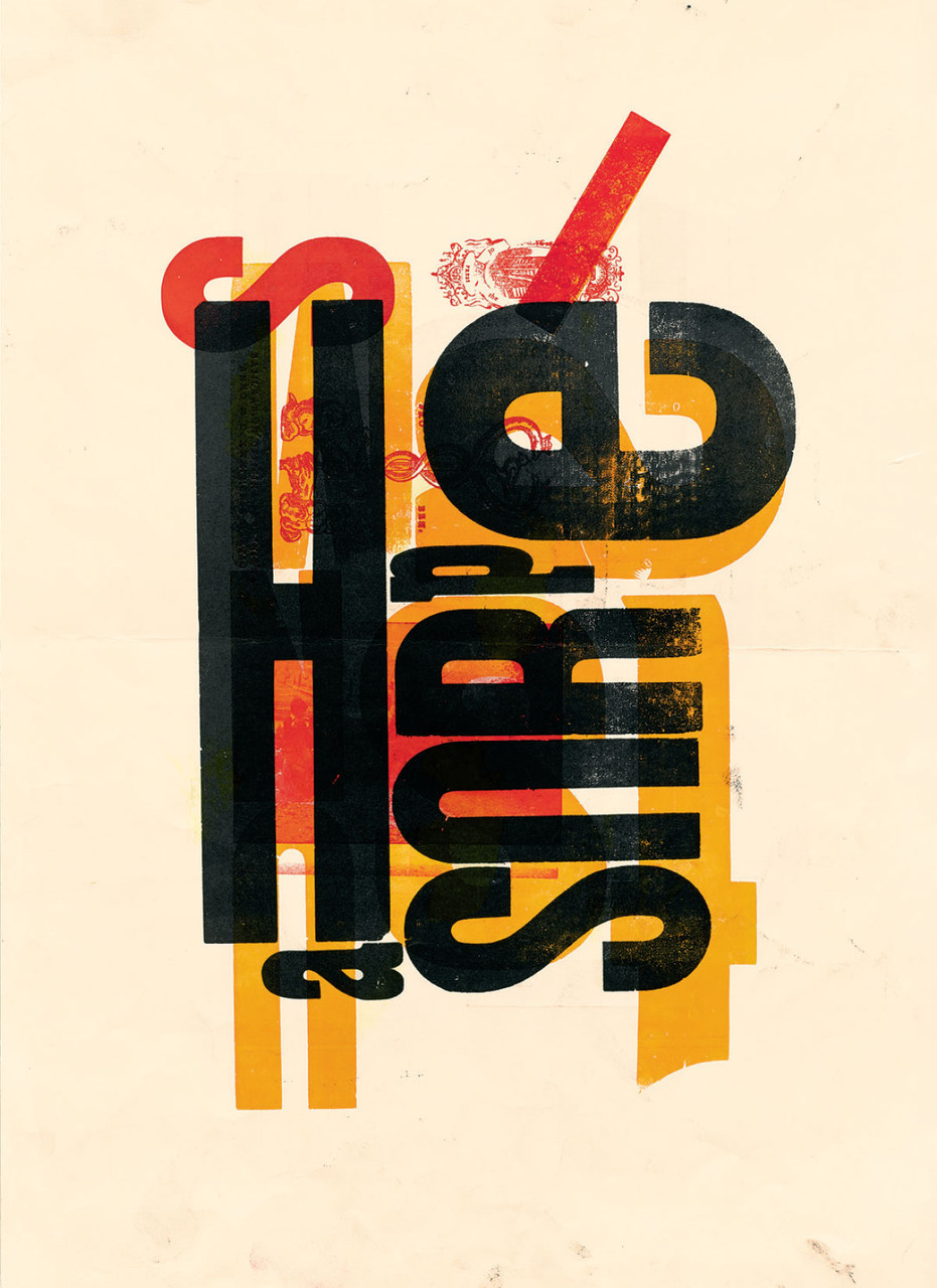
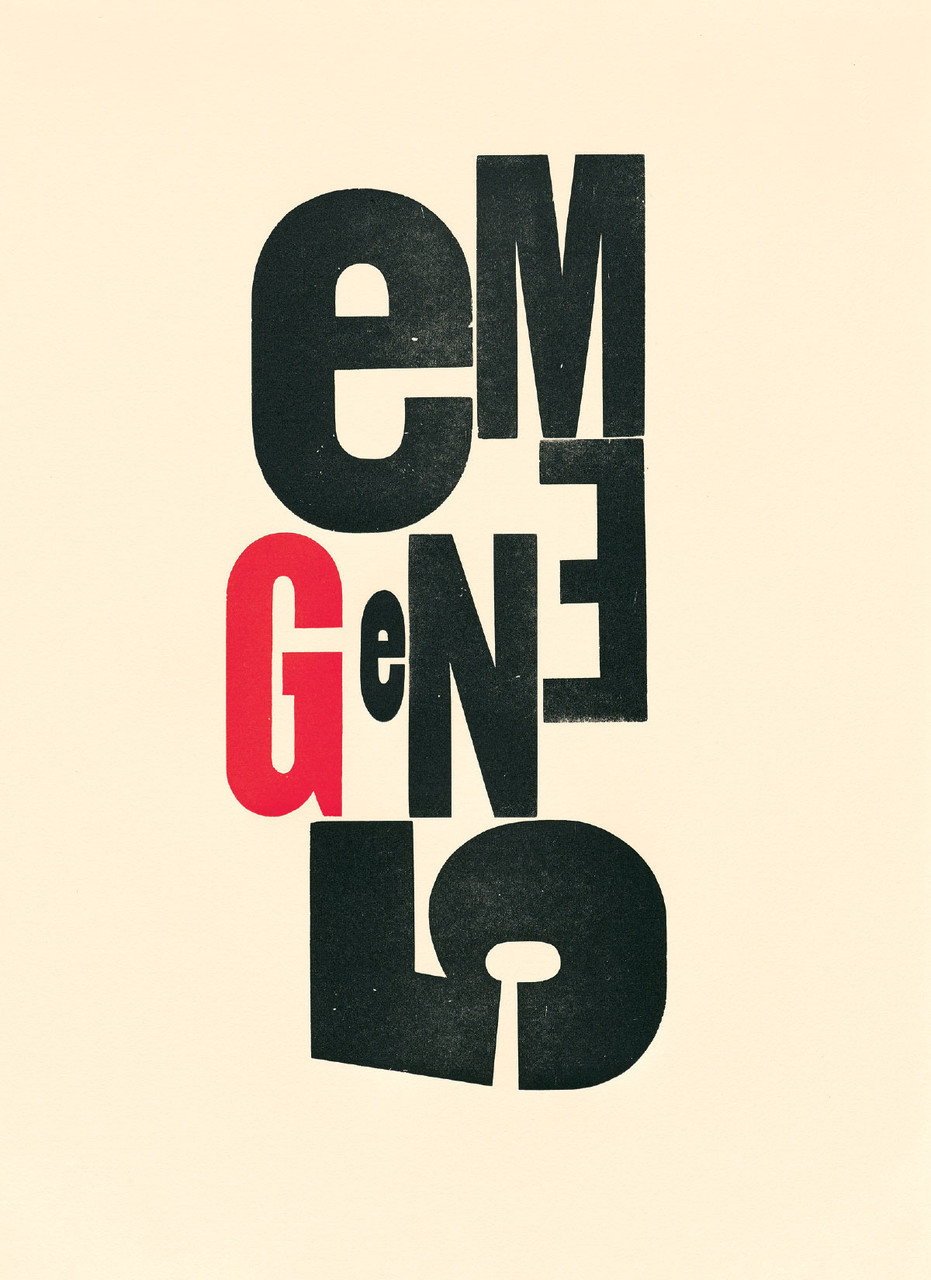
This keepsake box of 20 different notecards and accompanying envelopes showcases the range of the abstract and playful typographic art Stauffacher composed with his beloved mismatched wooden letters and experimental methods of inking and printing. An ideal gift for lovers of letterpress, type, and modern art.

About Jack Stauffacher
Born in 1920 in San Mateo, California, Jack Stauffacher was a printer, typographer and fine-book publisher whose delicate yet graphic sensibility landed his work first in library rare book collections and then in museums such as SFMOMA and LACMA, who sought out his typographic prints. A printer of exceptional skill who began his apprenticeship at the age of 16, Stauffacher created books for his Greenwood Press off and on for eight decades. He taught typography at Carnegie Mellon and the San Francisco Art Institute, and served as typographic director at Stanford University Press. But it was his later wood type prints that ushered his career into the realm of fine art. Stauffacher created these innovative and elegant prints from 1966 until his death in 2017 at the age of 96. In recognition of his contributions to typography and design, he was awarded an AIGA Medal in 2004.
“The last of San Francisco’s traditional bohemians of the 1930s, Stauffacher became known as an articulate participant in the local literary and artistic avant-garde, as well as an inspiring mentor for young people and newcomers to the Bay Area. . . . [He was] the dean of San Francisco printers.” San Francisco Chronicle
“As typographers, designers, and printers, we translate words into written communication. Jack had done that all his life, making words visible. Then, after he had designed pretty much everything worth designing for a purpose, he started doing the opposite: he picked random wood letters from a case he had stumbled upon and made images with them. We aren’t supposed to read those letters as words but to go back to where they came from: pictures of those things. A large red B can be a sail, a blue A on its side is the sea, and the little black letters are birds or stones or ripples. . . . When I asked Jack about the prints, he said that those letters had become such intimate friends over time that he could behold them just as beautiful objects; they didn’t have to work for a living anymore.” Erik Spiekermann
“Jack was a very special person: easy to meet, hard to fathom, fun to be with, stimulating to listen to, effortless to learn from, and difficult to forget. . . . His cheerful and gentlemanly demeanor masked a determination to think and work at the highest level. His modern old-fashionedness found its way into everything he did and provided me with yet another model of how to live a fulfilling life in design.” Chris Pullman, Design Observer
“Jack Stauffacher . . . spent his long career in an intimate relationship with typographic form, content, and the craft of assembling letters — one at a time — to create beautiful and meaningful communications that will be relevant five-hundred years from now.” Terry Irwin
Details
| Publisher | Letterform Archive Books |
| Publication date | February 2024 |
| ISBN | 978-1-7368633-6-7 |
| Size | 4 × 5.5 inches |
| Printing | 4 colors throughout |
| Format | 20 unique notecards with envelopes in a keepsake box |
Write A Review
Related Products
