News
From the Collection: A Few Staff Favorites
We miss sharing unexpected gems with you in person at the Archive. In this new series we’ll share them from afar.
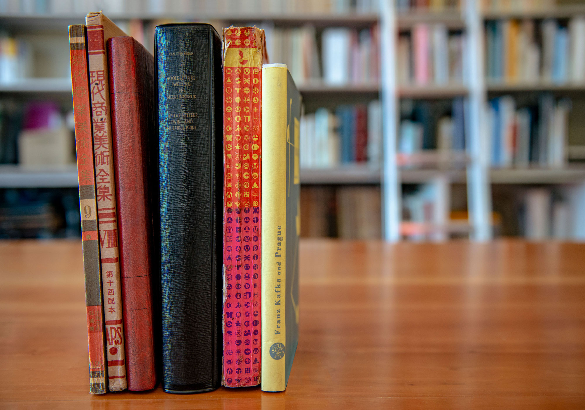
A while back, the design publication It’s Nice That invited us to share some of our favorite books for their “Bookshelf” series. It was a nice way to introduce an international audience to a few of the unusual and delightful objects we regularly show in our on-site tours. As we continue to be closed to visitors during the pandemic it’s a good time to reprise that piece, along with more images of the books, and a new selection from Florence Fu, which is not a book at all.
Scans by Timothy Ely
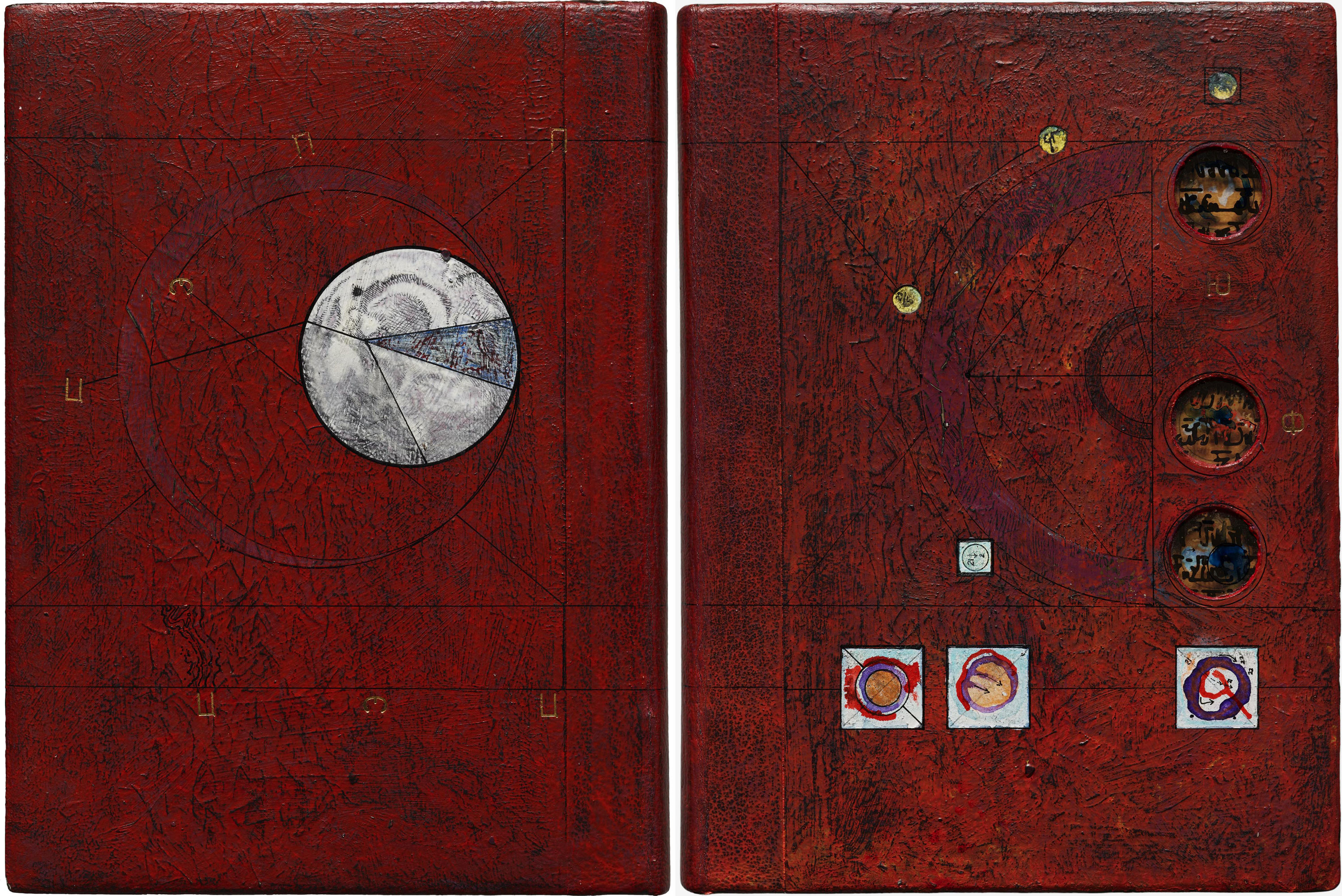
Upon first experiencing Scans, a beautifully hand-crafted artist book by Timothy Ely, I couldn’t help but feel as if I was on the verge of finding some kind of lost magic. Within the publication, Ely creates a portal into a secret place, and each turn of the page reveals even more mystery to decipher.
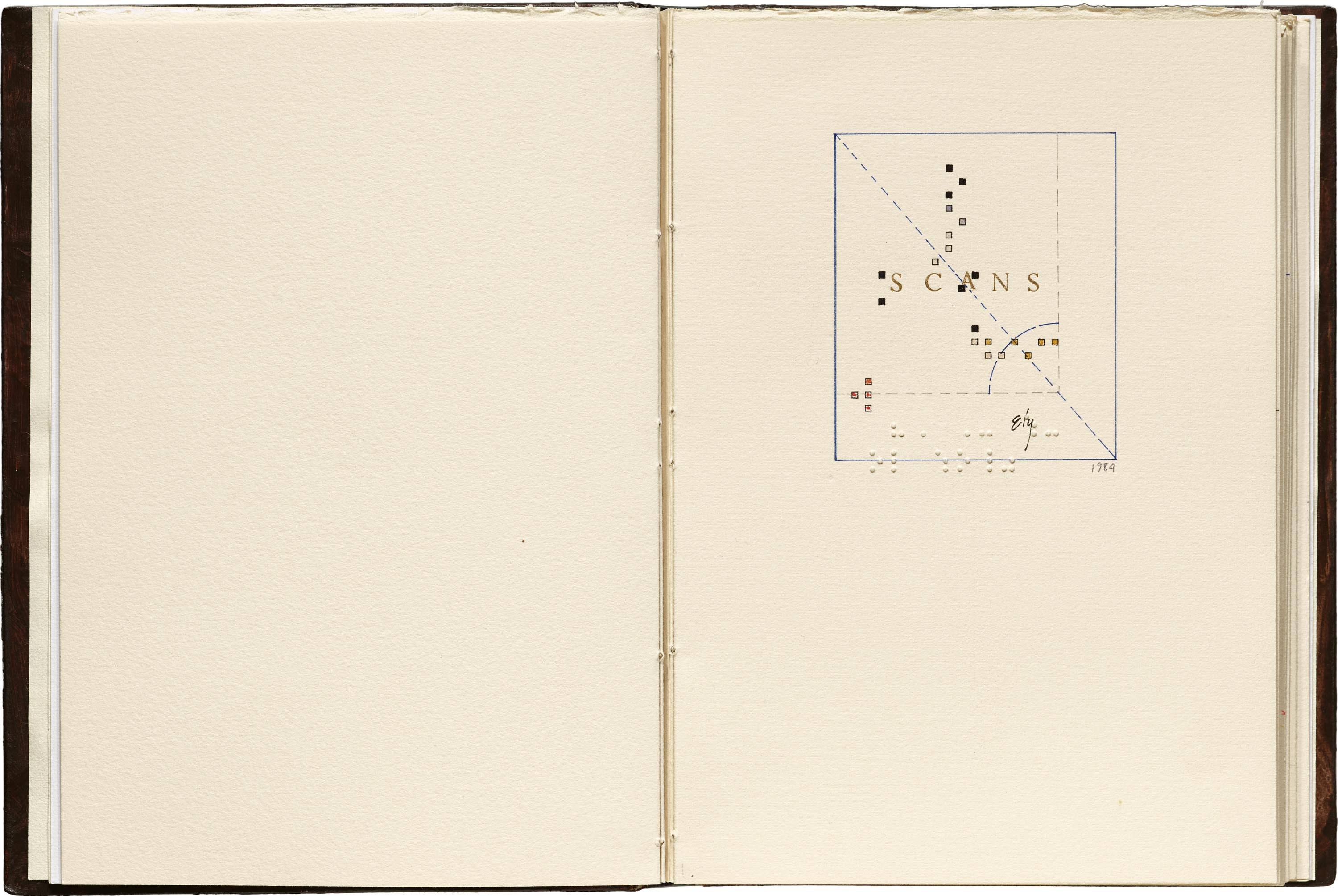
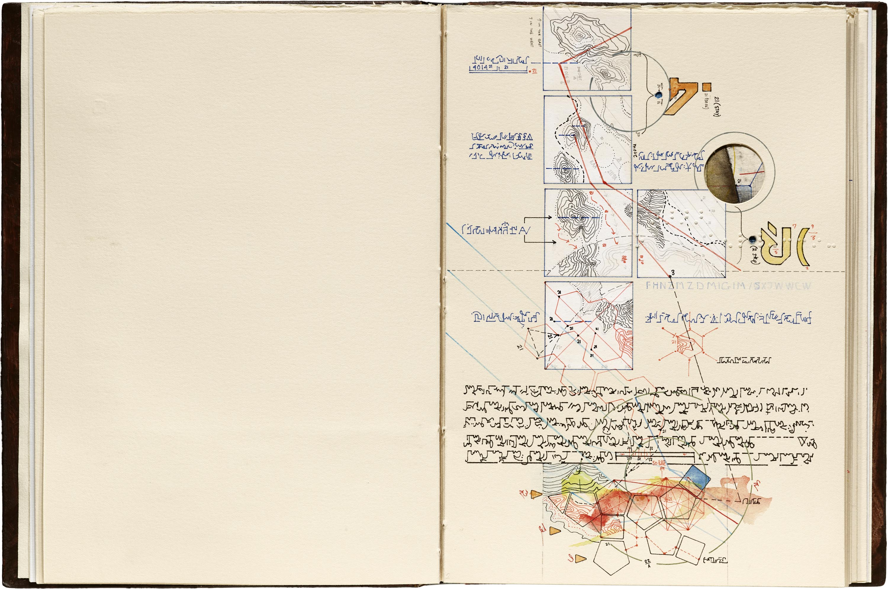
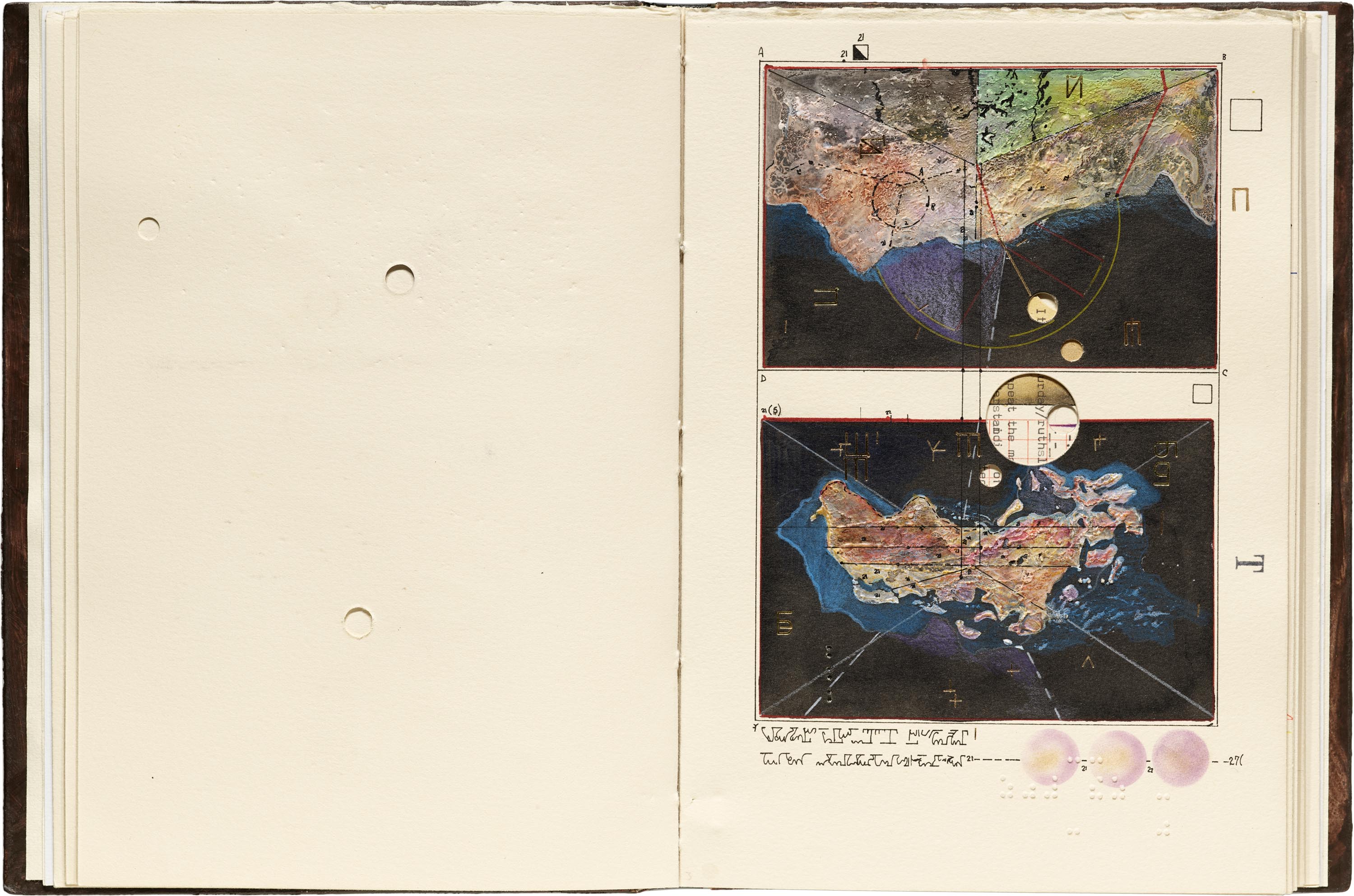
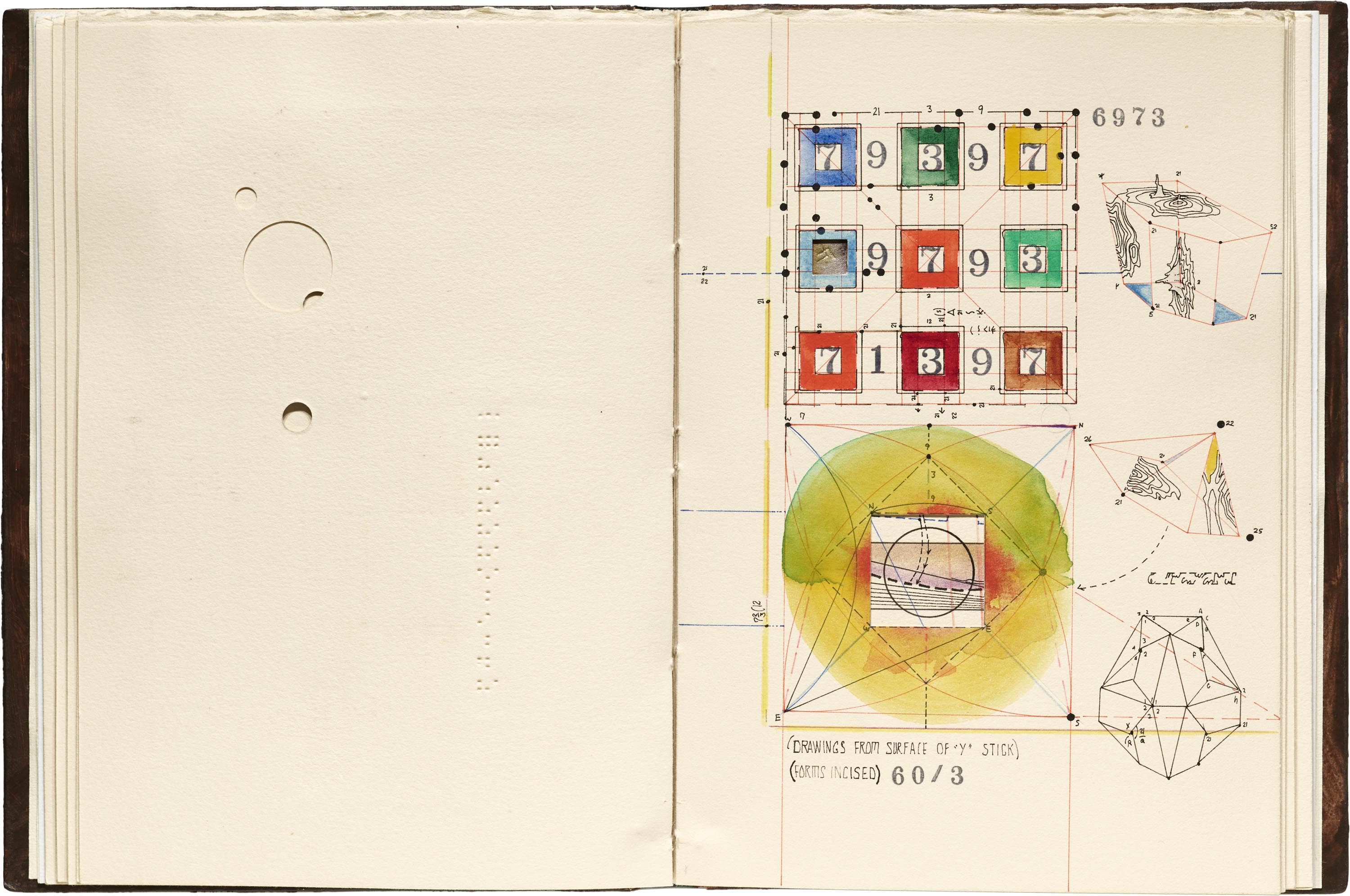
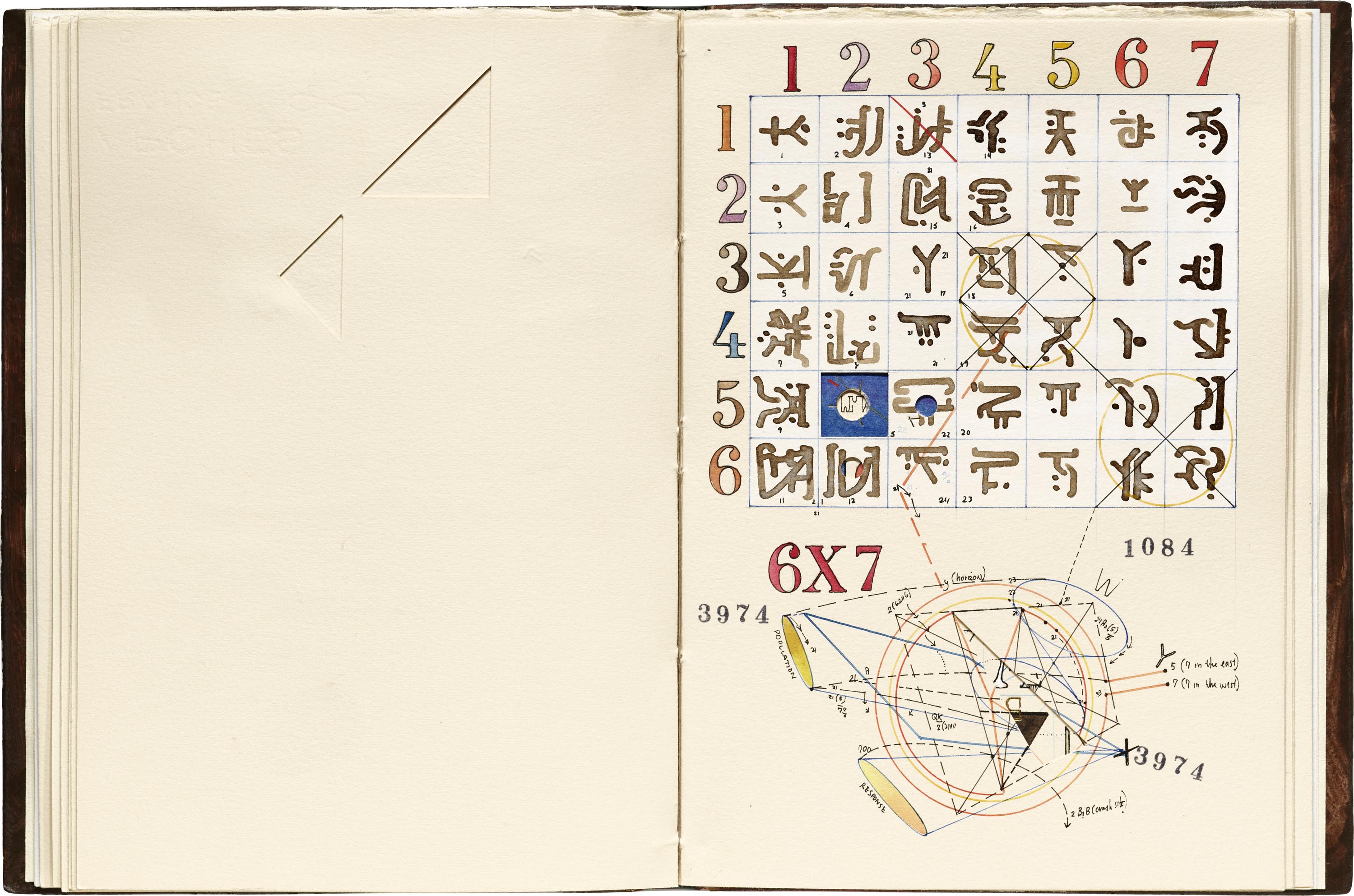
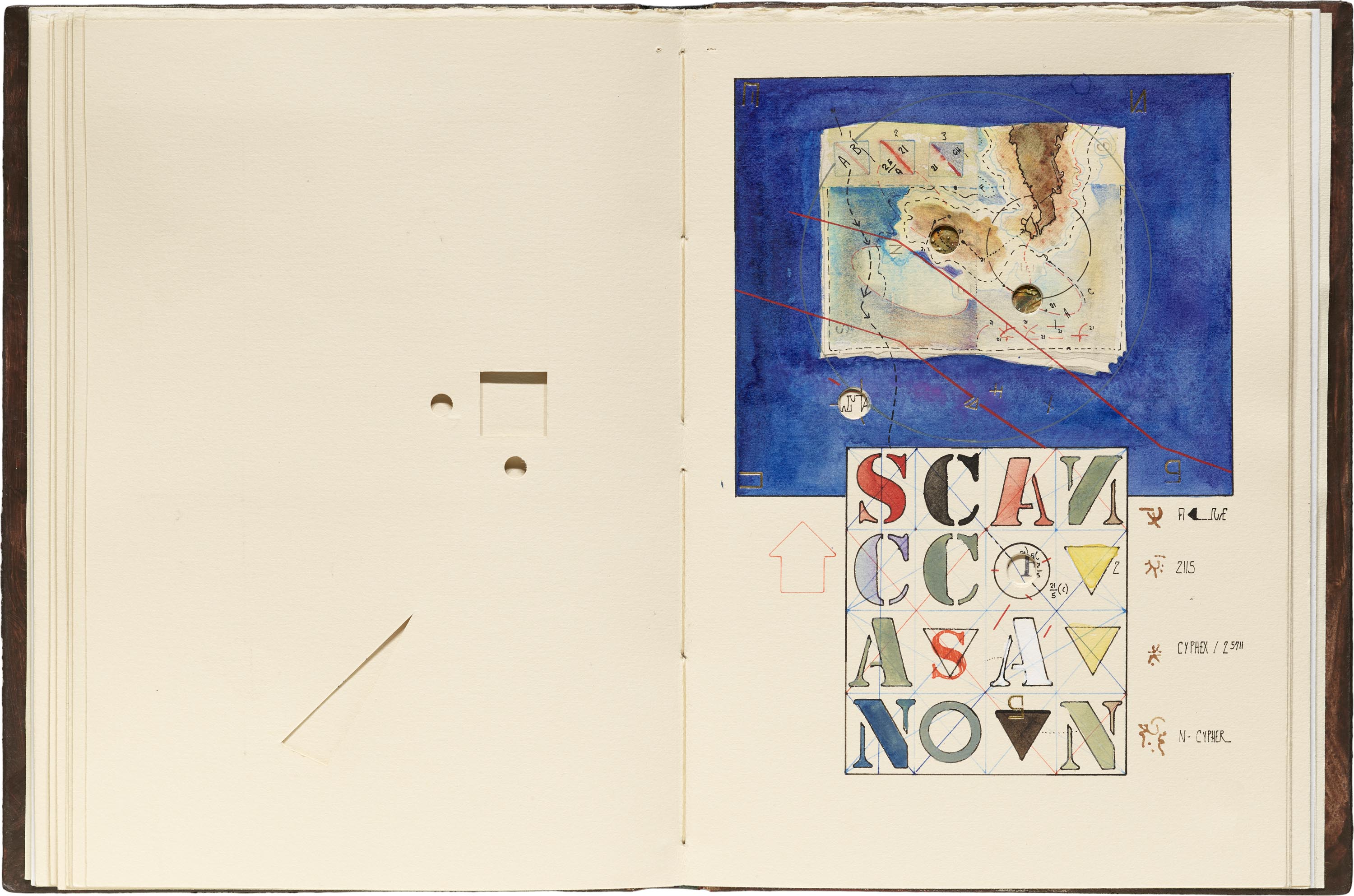
I am delighted by the evidence of material alchemy at work throughout the book, whether it be sewn into his stub binding or fused to his unique pigments. There are die-cut windows, painted paper inlaid in the cover, gold tooling, and a curious hand-drawn syntax of marks — known as “cribriform” — used for describing sounds. Illustrated charts, graphs and sacred geometry are all part of Ely’s illusory systems. They are combined with precise topographical maps, defining the pseudo-geographical context from which these secrets are born.
It is like being transported to an alternate universe — just on the edge of the familiar, teasing at comprehension, yet still shrouded in a curious riddle.
— Rachel Daniels, Former Photographer
Capital Letters: Twin- and Multiple-Print by G. Van den Bergh
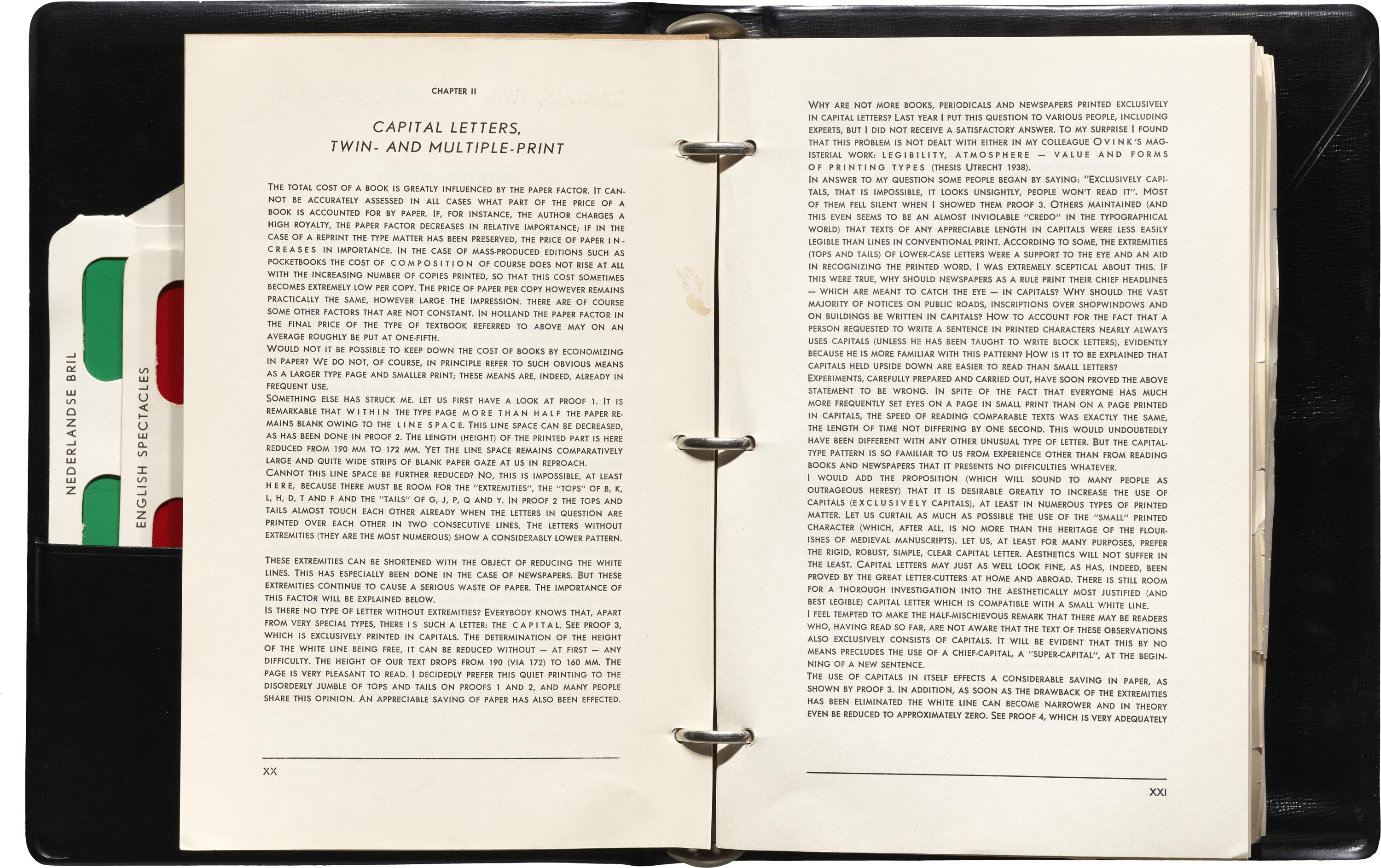
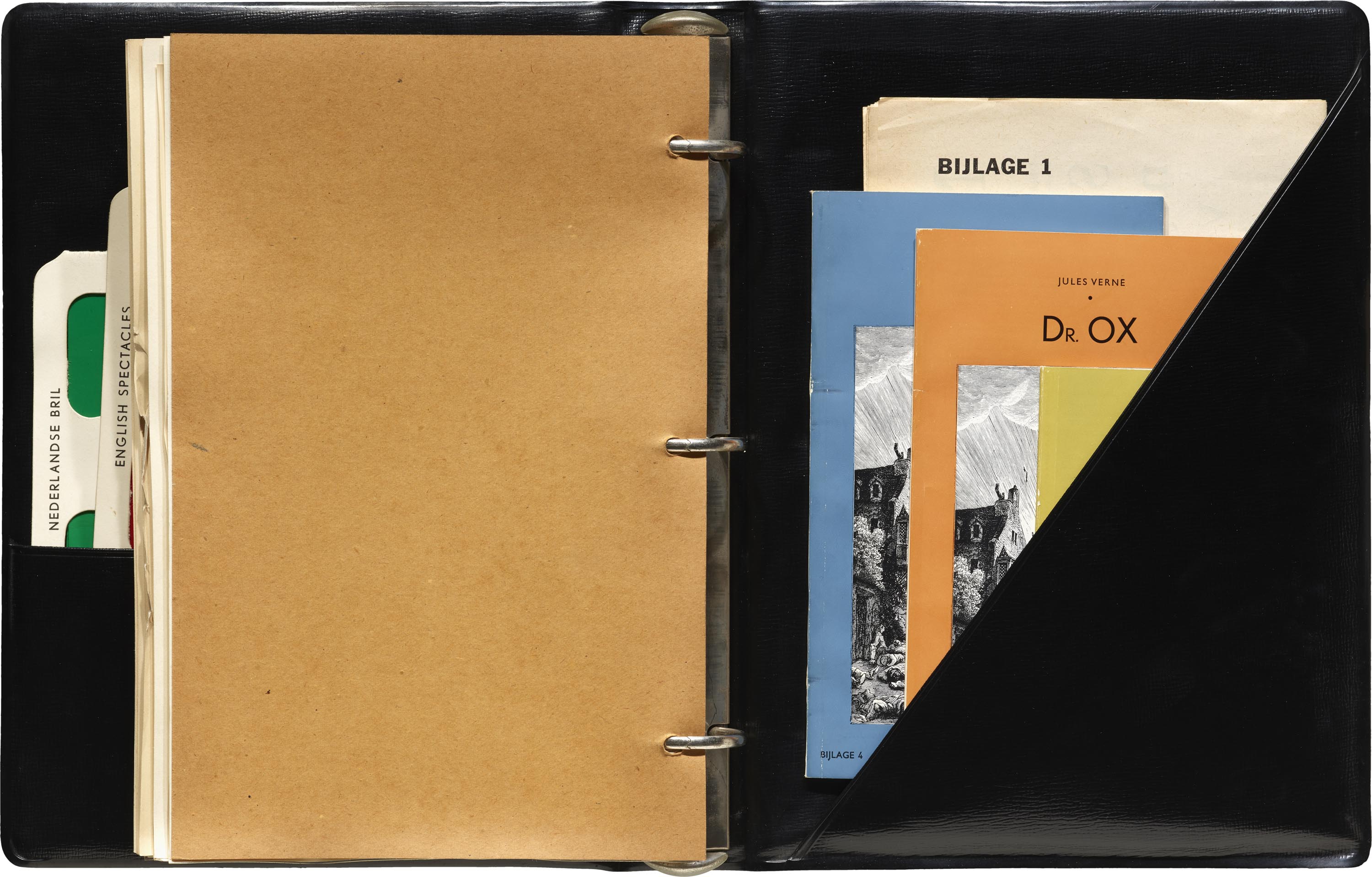
This was one of the first books (really it’s a three-ring binder) I picked up on my very first day working at the Archive, and three years later, I’m still not sure I’ve topped it in terms of eccentricity. Capital Letters, Twin- and Multiple-Print publishes the experimental research of one “Prof. Mr. Dr.” George van den Bergh towards significantly reducing the cost of books, especially academic books.
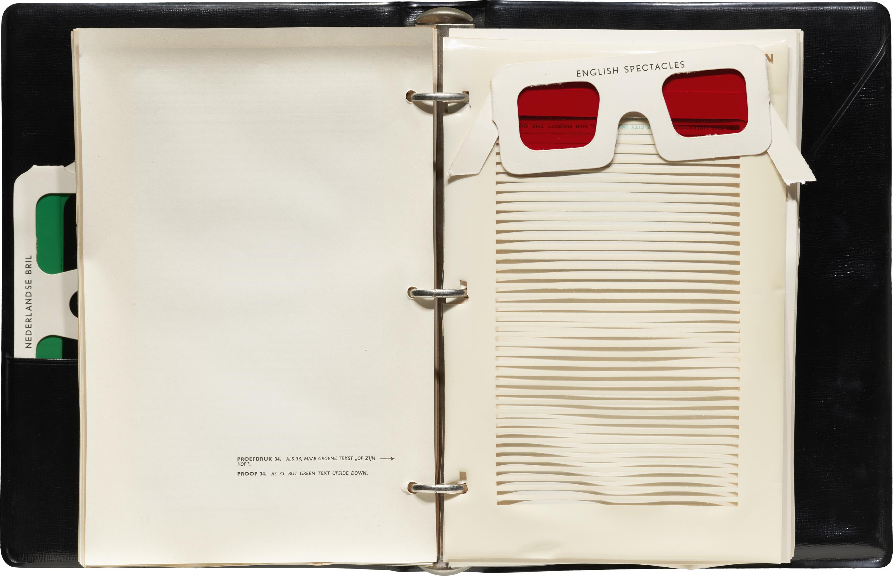
What this amounts to is an almost neurotic obsession with maximizing the efficiency of paper usage through typographic methods — most of which are novel ideas for printing as much text on a single page at once. Text is set much smaller, and in all-caps, so that lines of text can then be smashed together as close as possible. This inevitably makes legibility a problem, and so at this point a “reading-screen” is employed to artificially reintroduce line spacing, and on each page we’re meant to read first all the odd numbered lines, then shift the screen down one line to read all the even numbered lines. (In some versions, the alternate lines are printed upside down, so the book would be read front to back, flipped around, and then read the other way.) These techniques are then combined with his most eccentric idea: printing alternate texts (such as different languages) on top of each other in red and green, and using colored lenses to filter out one or the other colored text.
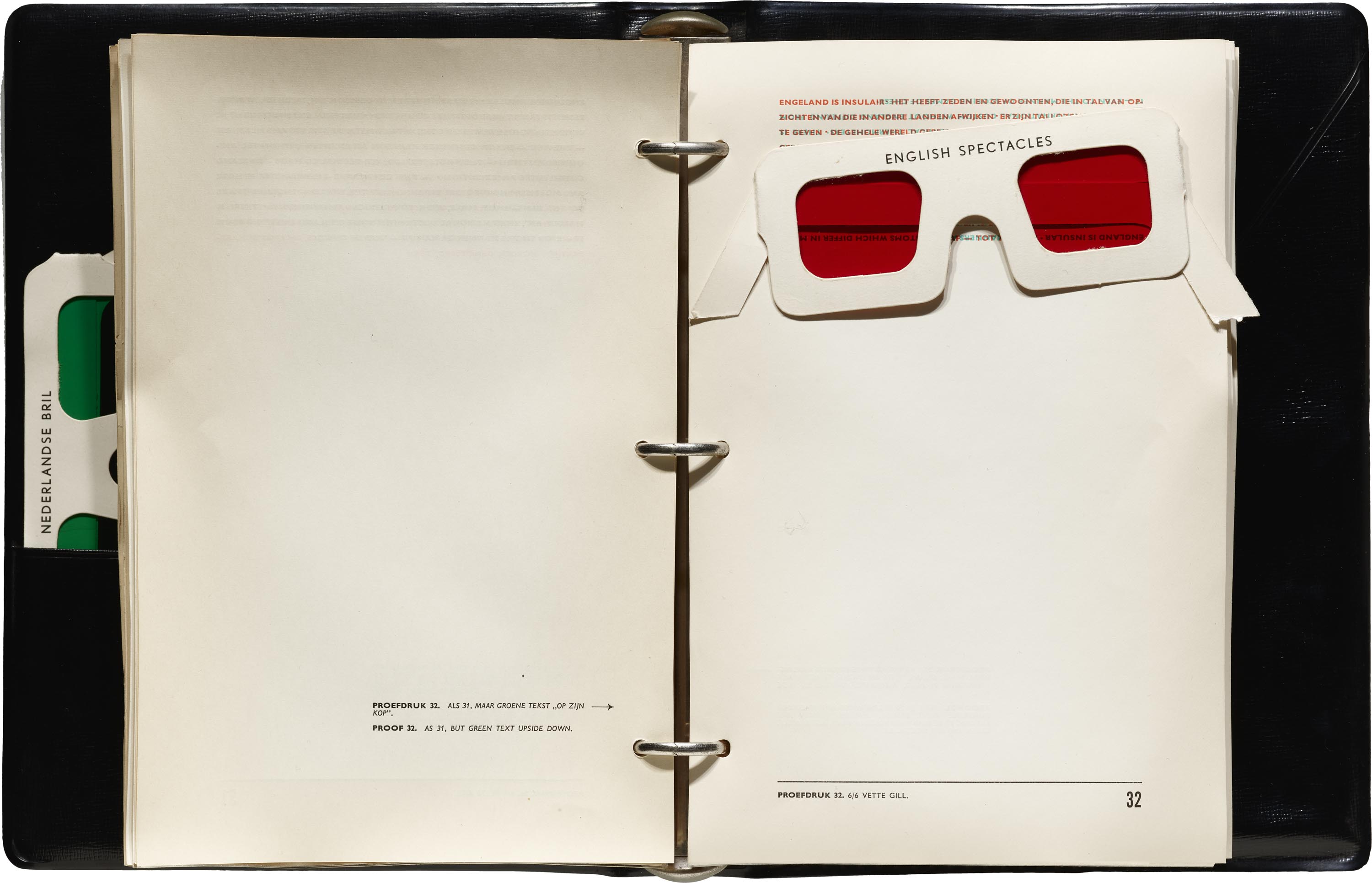

Van den Bergh’s proposals sit in a perfect grey area where they perform hilarious satire despite apparently total sincerity. And, truthfully, at a time when academic publishing is in a precarious (and expensive) state, Capital Letters, Twin- and Multiple-Print might still have something to tell us today.
— Hank Smith, Collections Assistant
A Marca e o Logotipo Brasileiros by Wlademir Dias-Pino and João Felício dos Santos
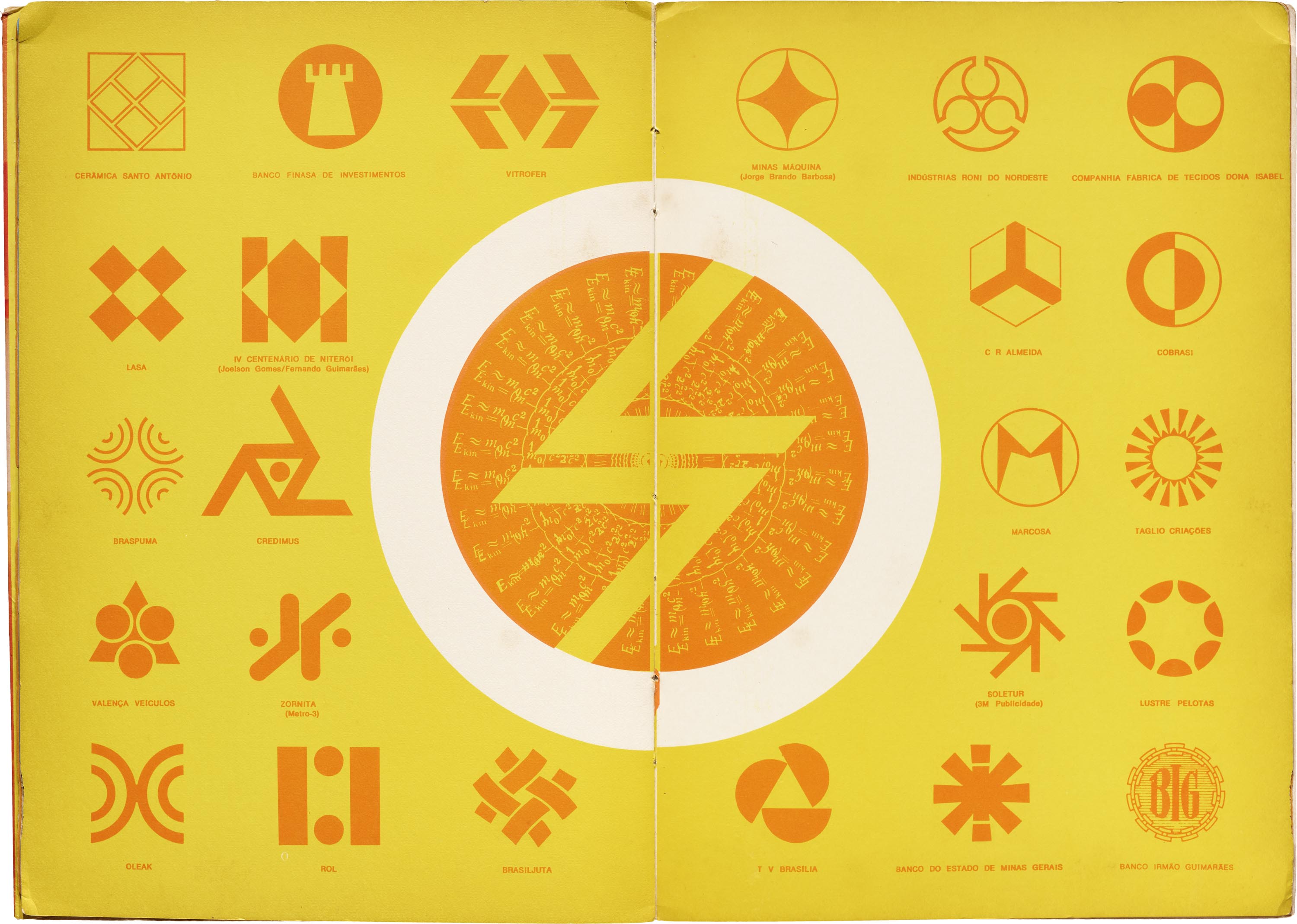
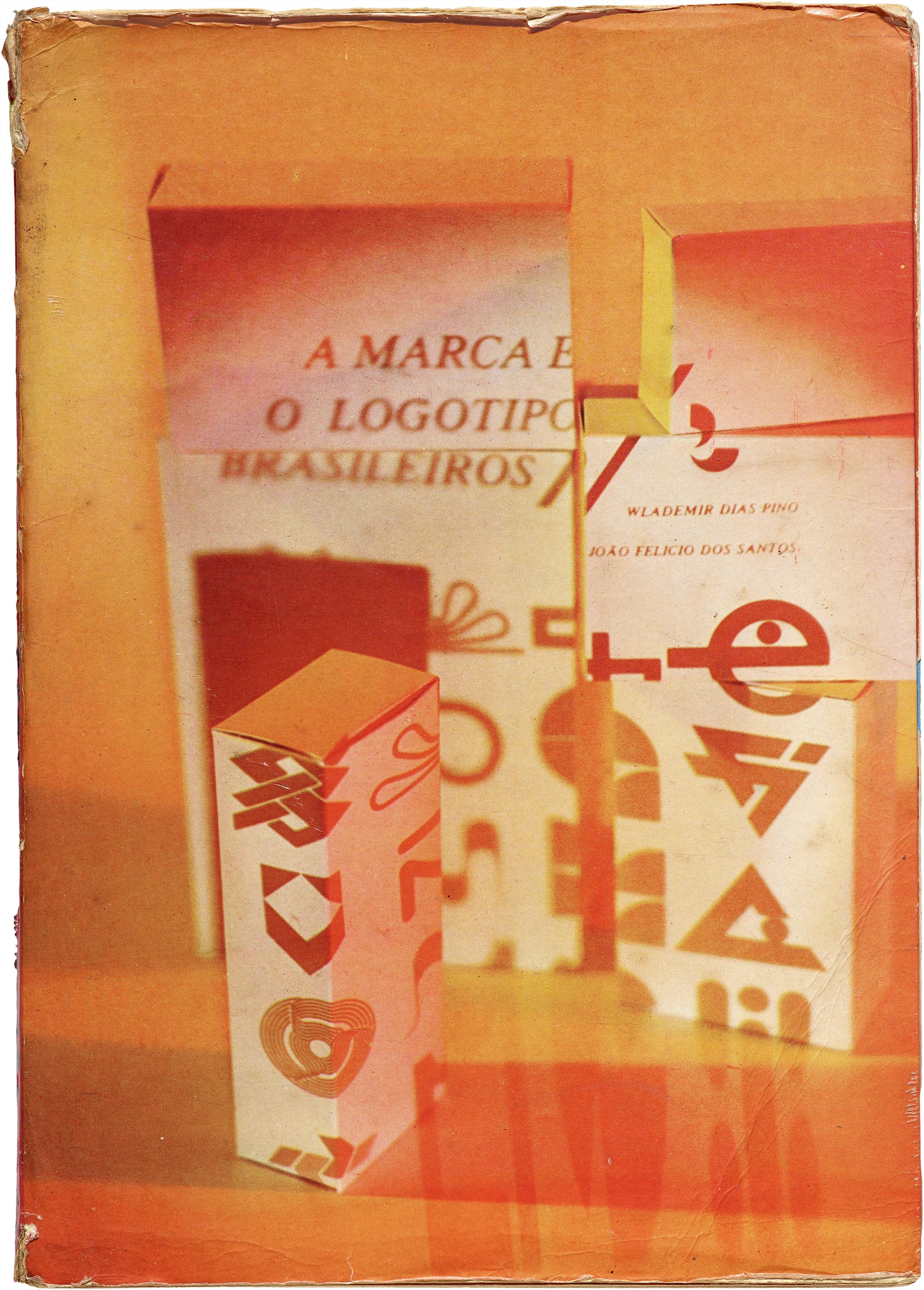
A Marca e o Logotipo Brasileiros is a catalog by Brazilian designers Wlademir Dias-Pino and João Felício dos Santos, found in the “Marks and Symbols” section of the Archive’s reference library. The book is not only a great way to explore the possibilities of logo design, but it is also a beautiful example of editorial and print design. While many logo reference books tend to be in black-and-white, to focus on the mark itself, A Marca e o Logotipo Brasileiros is unique with its dynamic use of color and unconventional approach in composition. The designers play with multicolor inks and duotone printing techniques to create contrast on the page — green on orange, red on blue, or yellow and black.

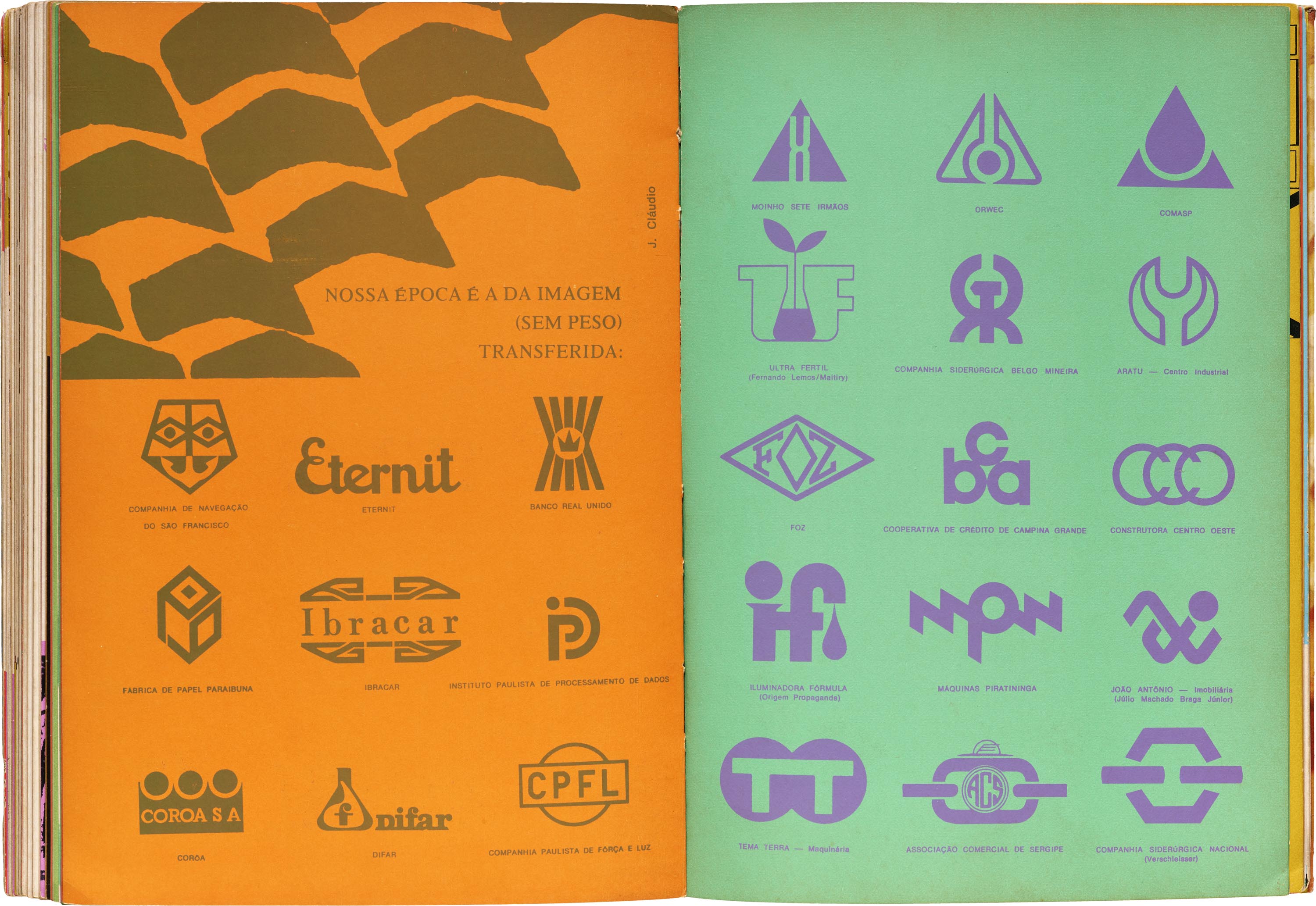
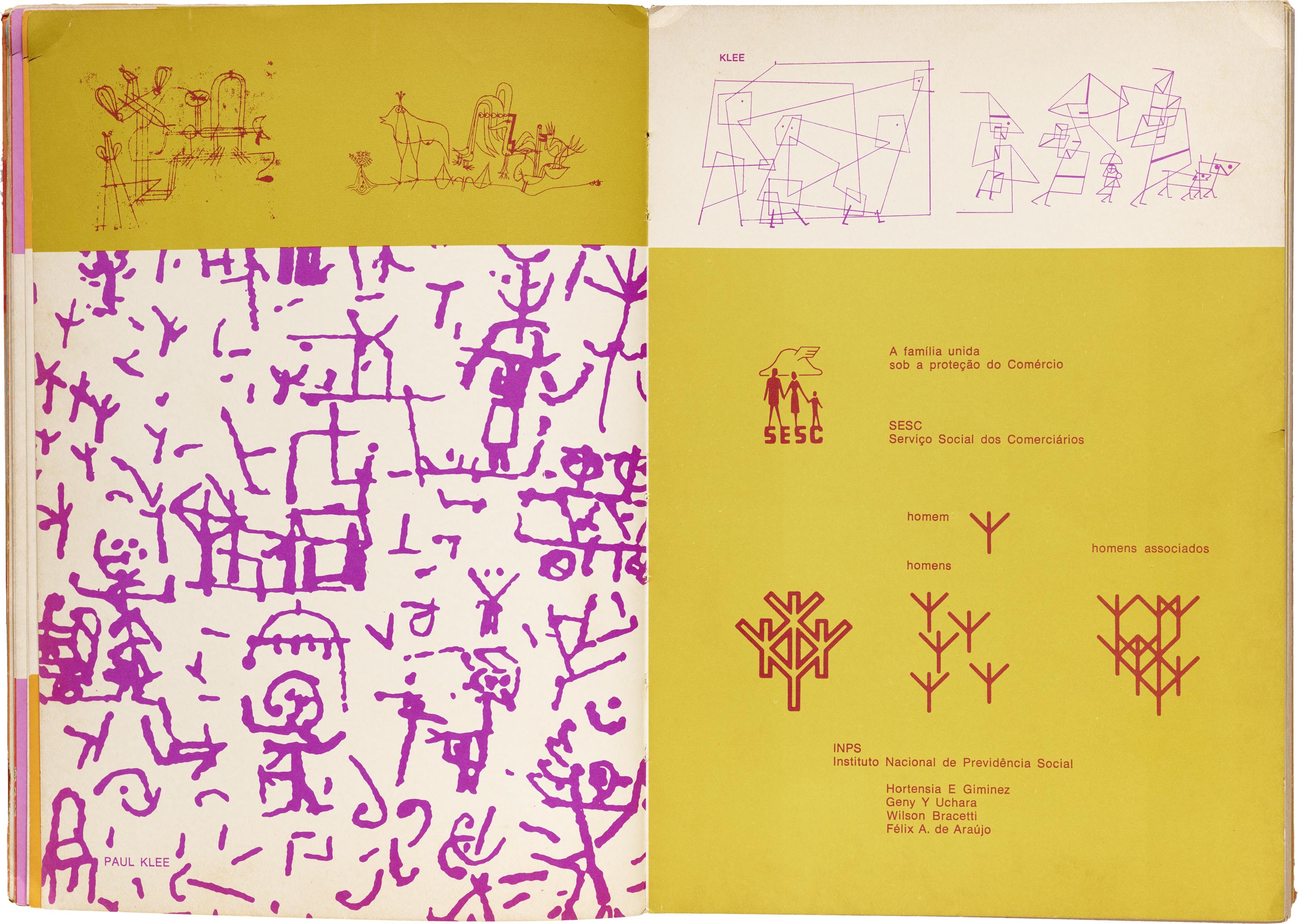
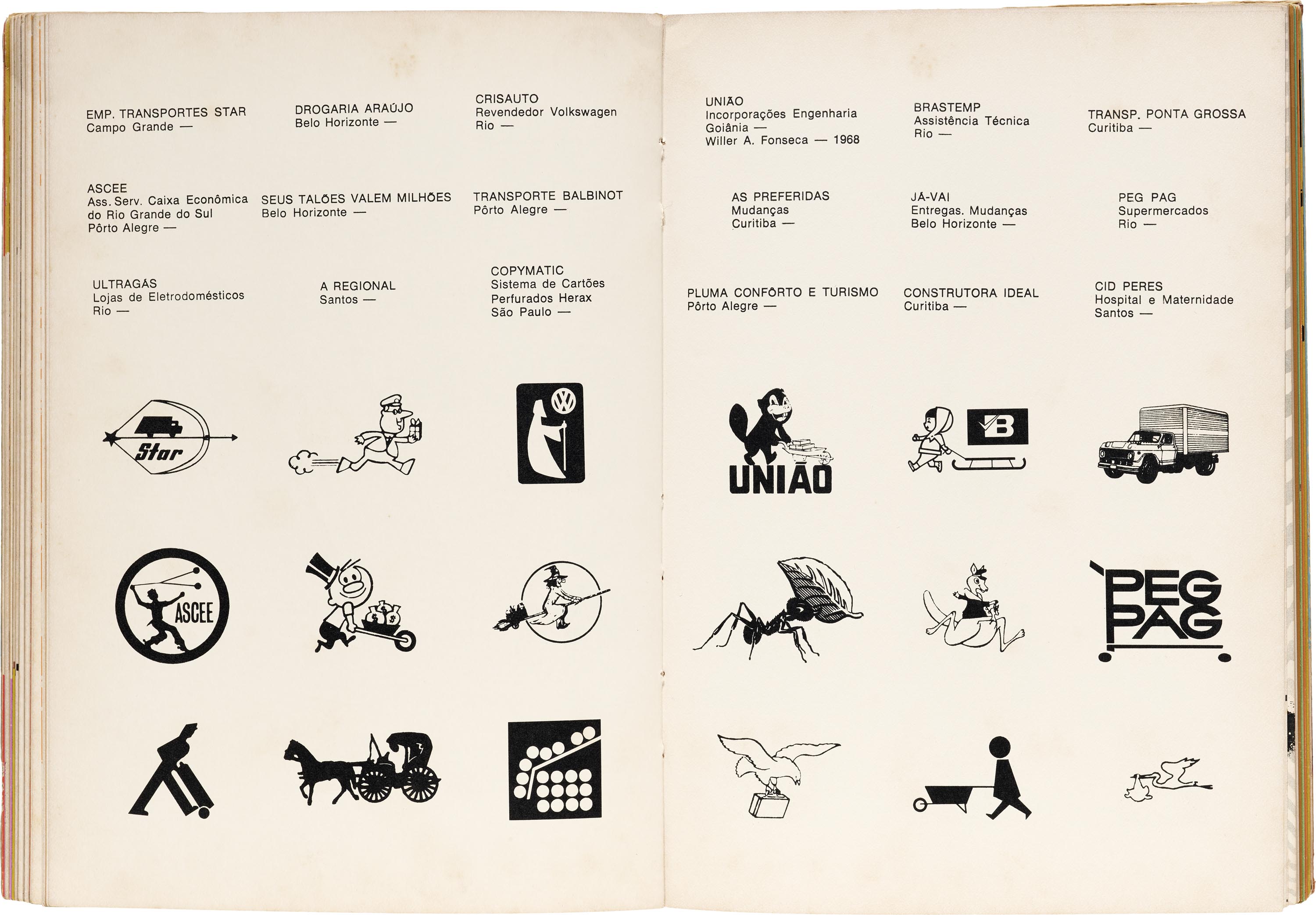
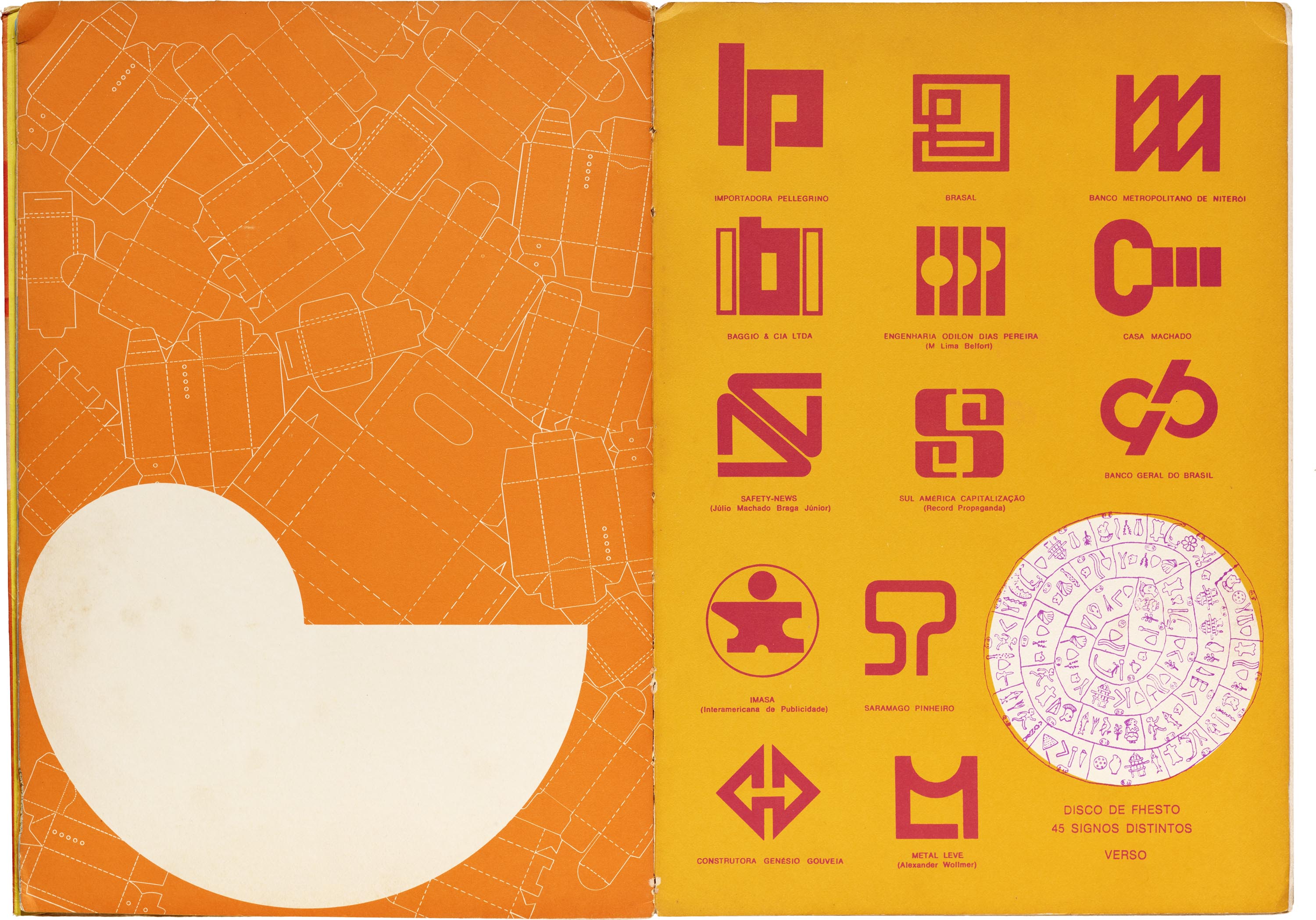
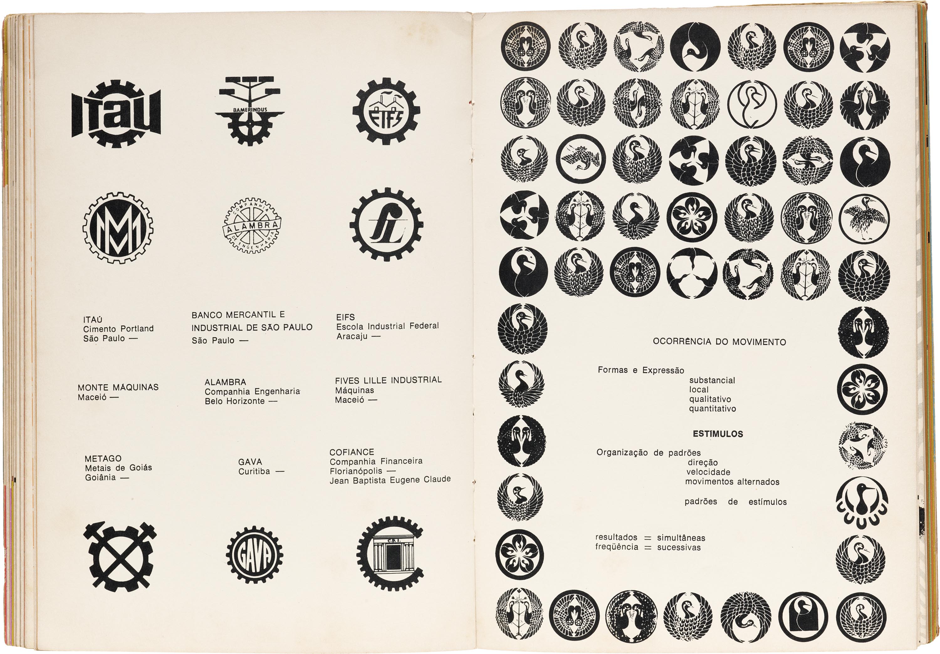
The logos are classified by visual or conceptual theme, (e.g., human body, movement, city, animal) combined with scientific diagrams, visual poems, and other contextual information. Between these sections are short interludes that contextualize each theme, collaged with images, vocabulary words, and short essays that encompass the universal ways human beings have communicated with marks and symbols since the beginning of time. Flipping through the book, you’re met with surprises with each turn of the page — everything from prehistoric cave paintings, calligraphy, and tribal tattoos, to acupuncture diagrams, Rorschach ink blots, and Paul Klee’s symbolic drawings. Antônio Houaiss, captures the essence of this unique book best in the epilogue:
“On the one hand, this book is a rational and thematic catalog of Brazilian trademarks and logos capable of providing users with a very rich repertoire of specimens of this nature. On the other hand, it goes far beyond this, for it constitutes without favor a precious initiation to the faculty and art of seeing.”
— Paola Zanol, Collections Asssociate
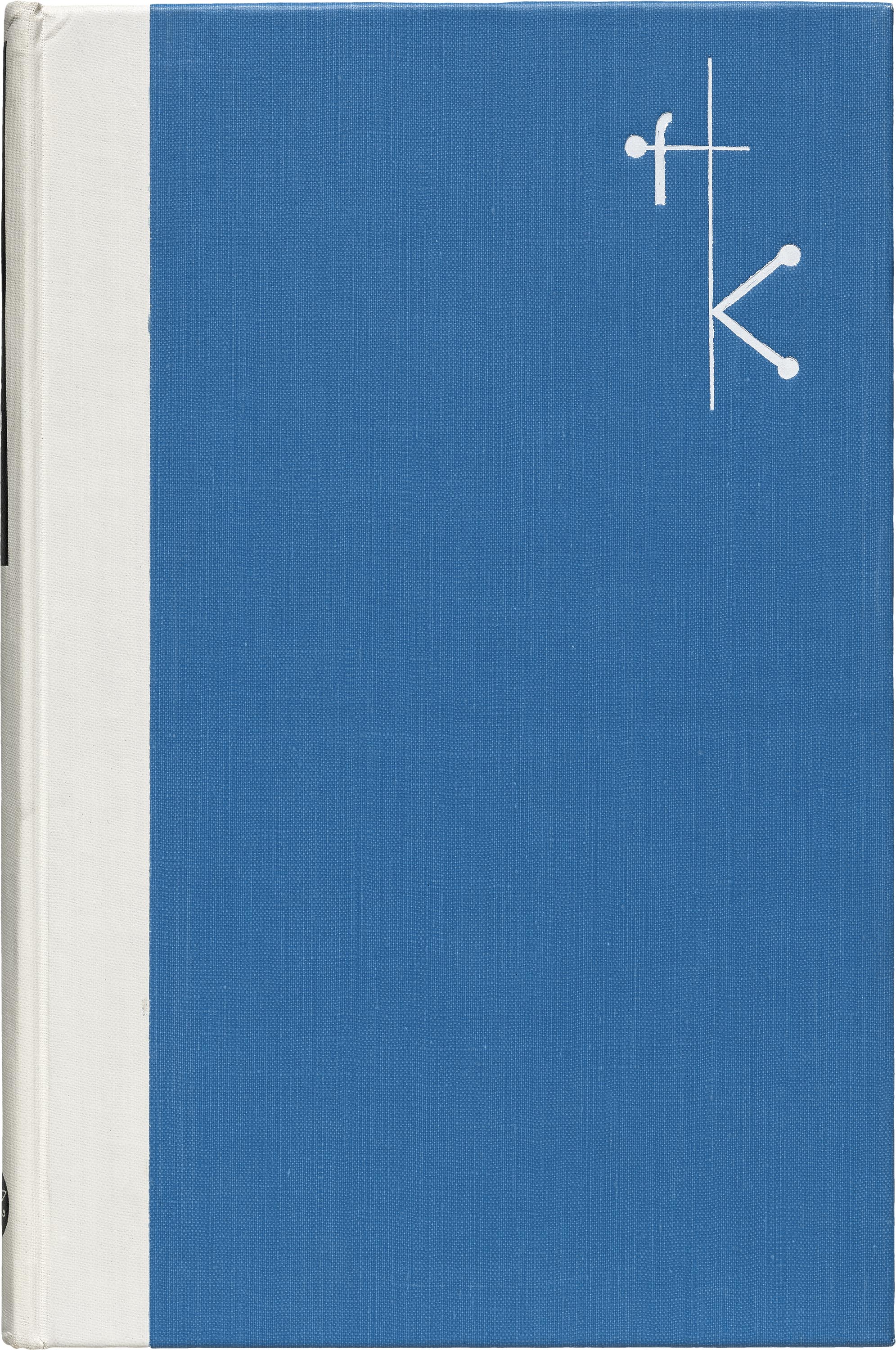
Franz Kafka and Prague by Pavel Eisner, designed by Ladislav Sutnar
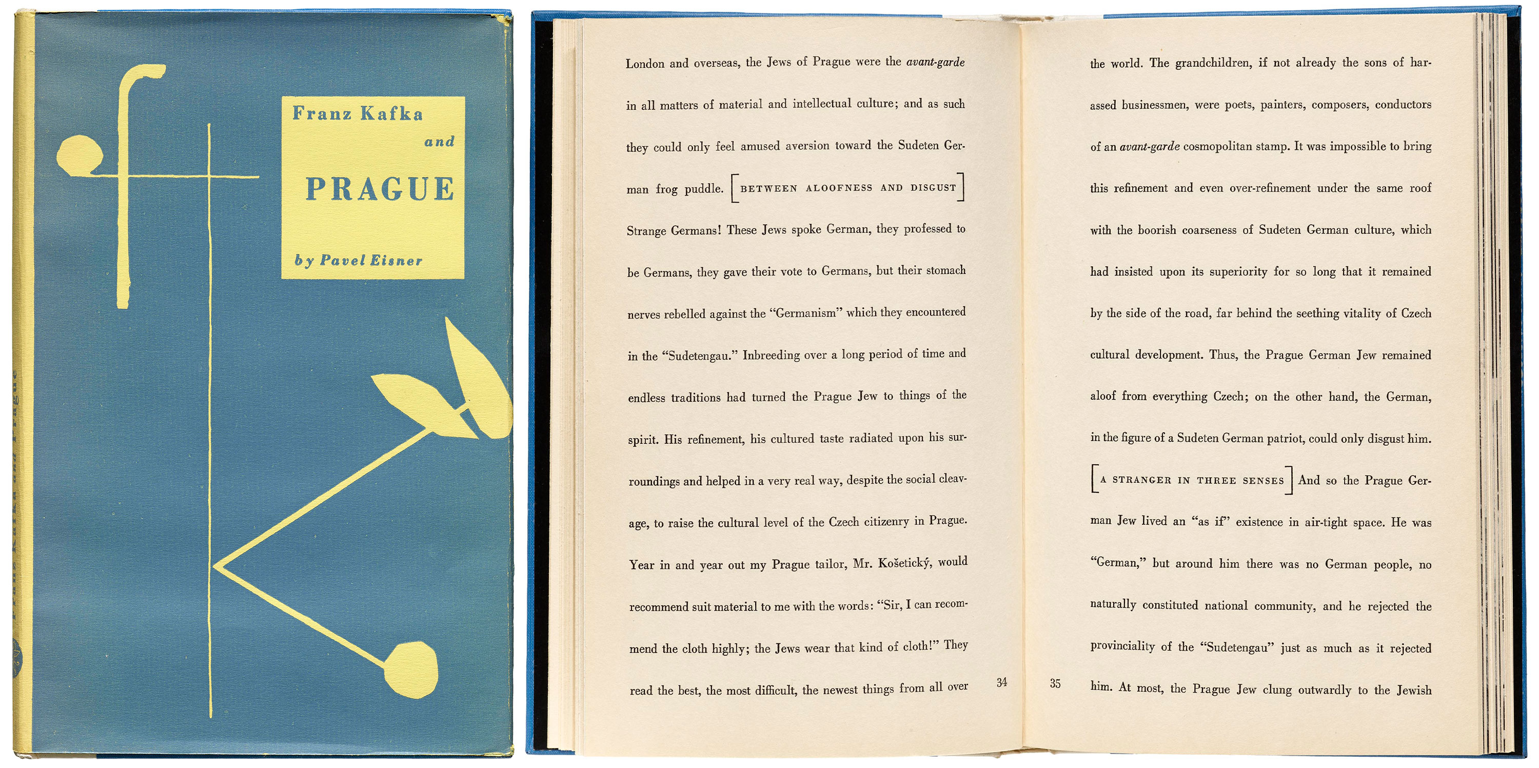
This little book is unassuming, but packs a visual punch. I like to show it to visitors who are interested in book design, because it won’t let readers lean too heavily on expectation. Ladislav Sutnar’s work (of which the Archive holds a large collection) is typically clean and methodical, and Kafka… is no exception. The cover is quietly pleasing, with its simple illustrated monogram and gentle colors. But then you open it, and it blows your mind.
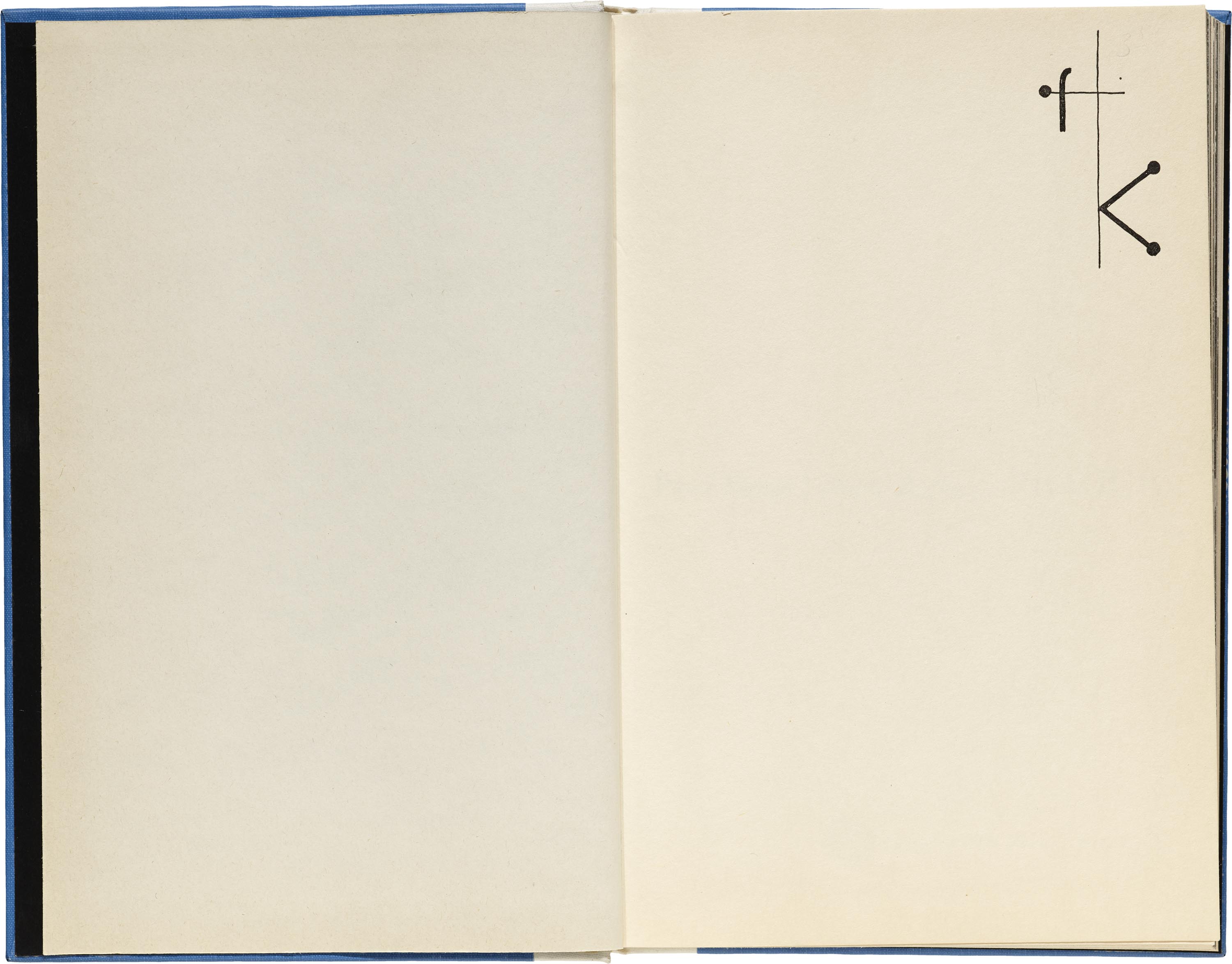
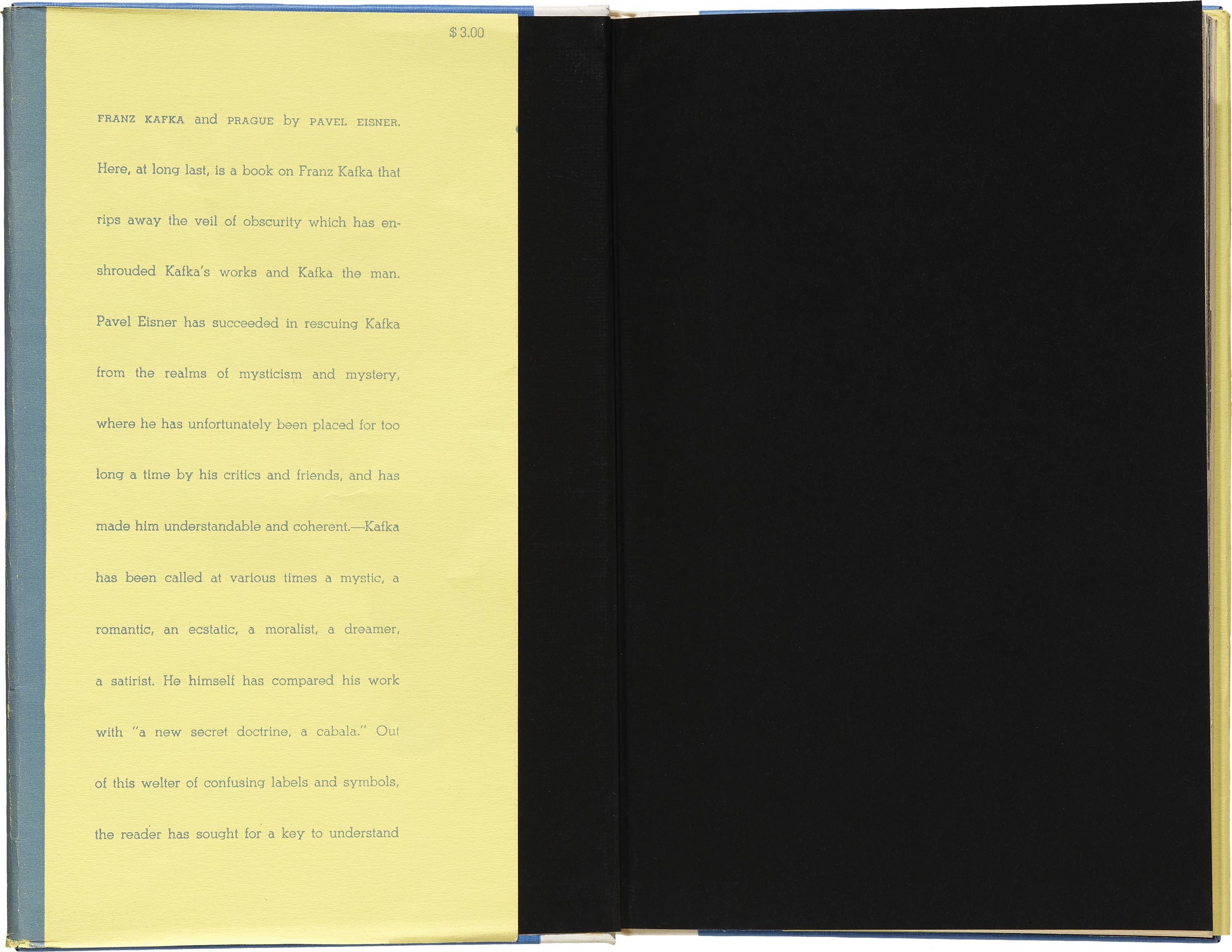
The minimal frontispiece has only a recurrence of the monogram, which might be my favorite detail in the book. We also see that charming mark embossed on the cloth cover. Sutnar was known as a pioneer of information design. He literally wrote the books on designing catalogs, packaging, and point-of-sale. I like seeing how someone who knew intimately all of the rules of design decided to turn them on their heads, leaving us with surprising page layouts. In that regard, this book feels like a tiny, beautiful rebellion. And that’s what I love about it.
The endpapers are black and unexpectedly stark against the fold of the book jacket. Sutnar makes some subtle (and some not-so-subtle) adjustments to your reading experience. The line spacing is quite loose, and the essay sections aren’t separated with line breaks — they are indicated by subheadings in all caps and enclosing brackets. The page numbers hang out in the interior margins and are aligned with the last line of the text. Everything you expect to see is there, just not always where you expect to see it.
— Kate Long, Librarian
Morisawa Phototype Glass Font Plate
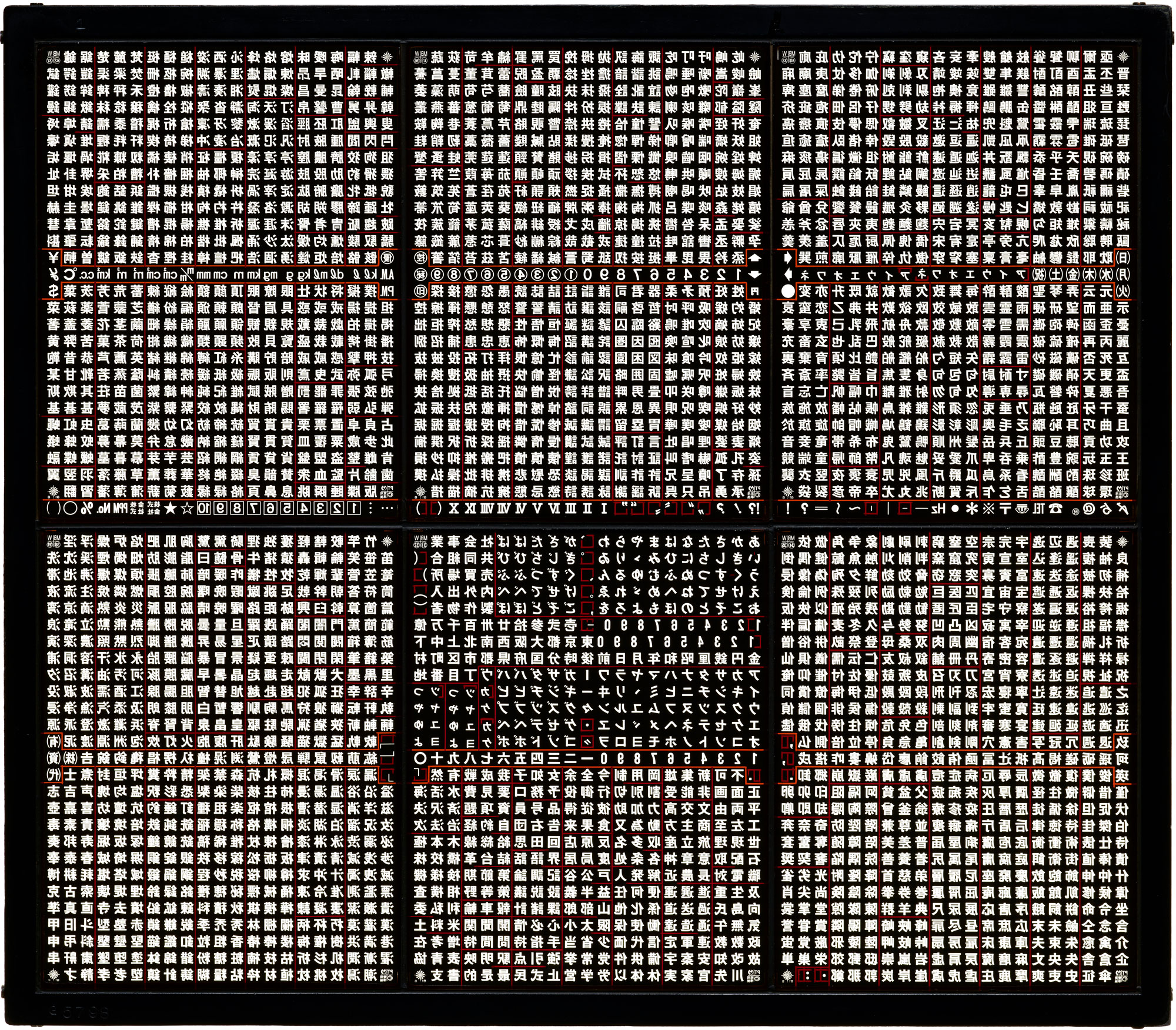
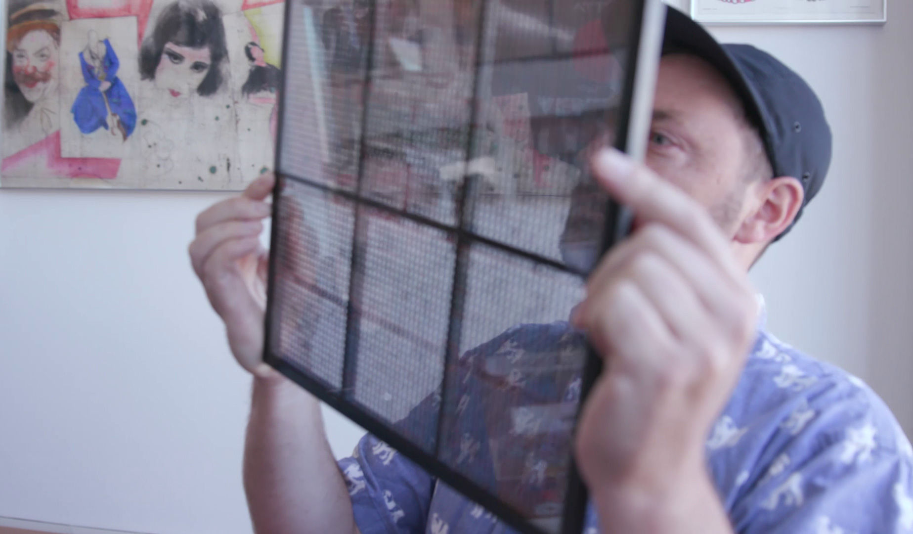
The Archive houses thousands of examples of how letterforms are used, and it is equally inspiring to see the tools and technologies that made the letterforms possible. From metal type and wood type, to typewriter type and phototype, these formats reveal the tangible physicality of typesetting’s past. in contrast to the ethereal invisibility of today’s digital design, type was handled with one’s hands.
In the 20th century, phototypesetting was introduced and leveraged photography’s use of film negatives and light. Phototype was found in various formats, and letters could be transferred from film reels, sheets, or plates, like this glass “letterboard” manufactured by Morisawa Inc in 1977 and donated to the Archive a few years ago. The Japanese foundry was established in 1926, when it invented the first Japanese phototypesetting machine, and it continues operation as a digital foundry today.
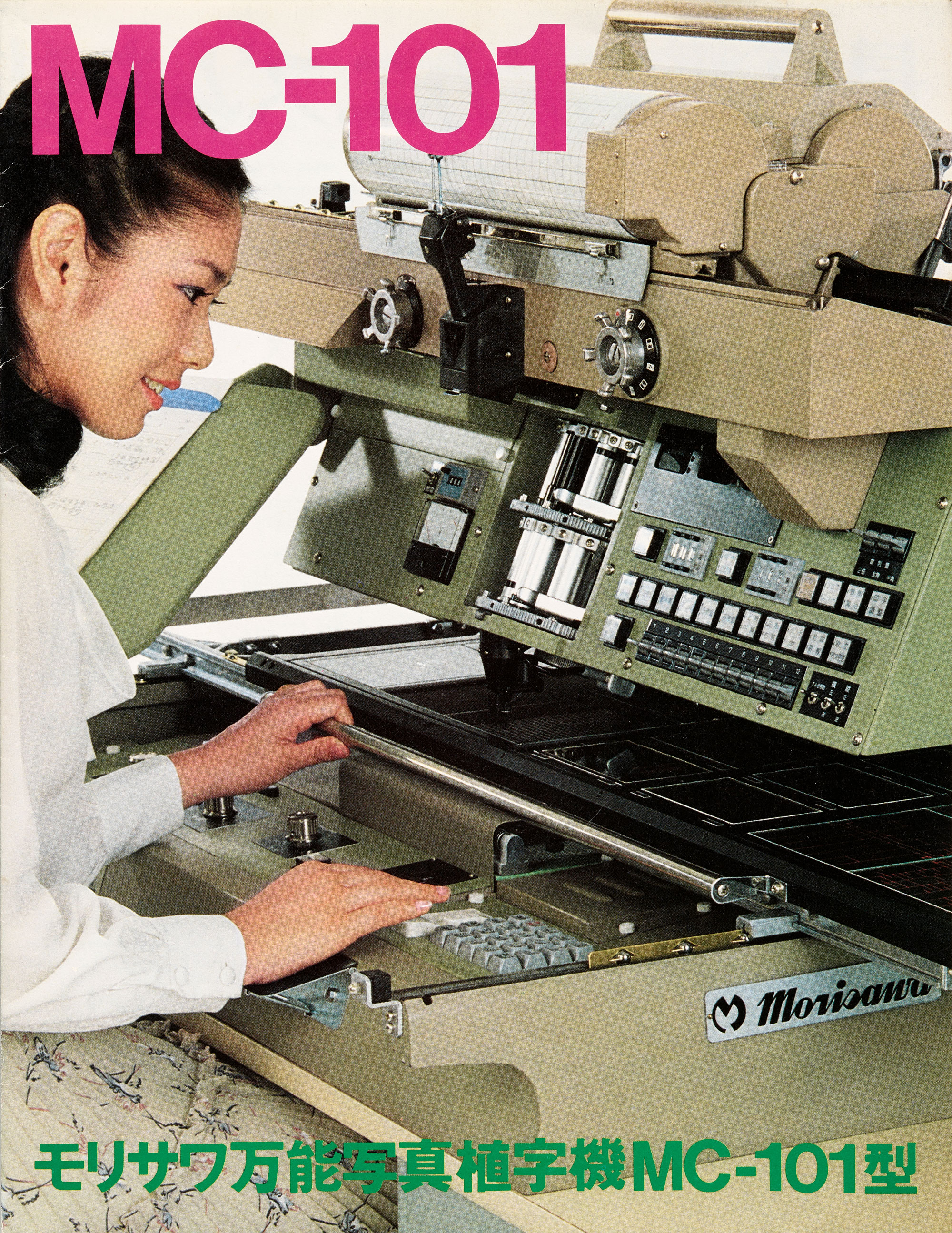
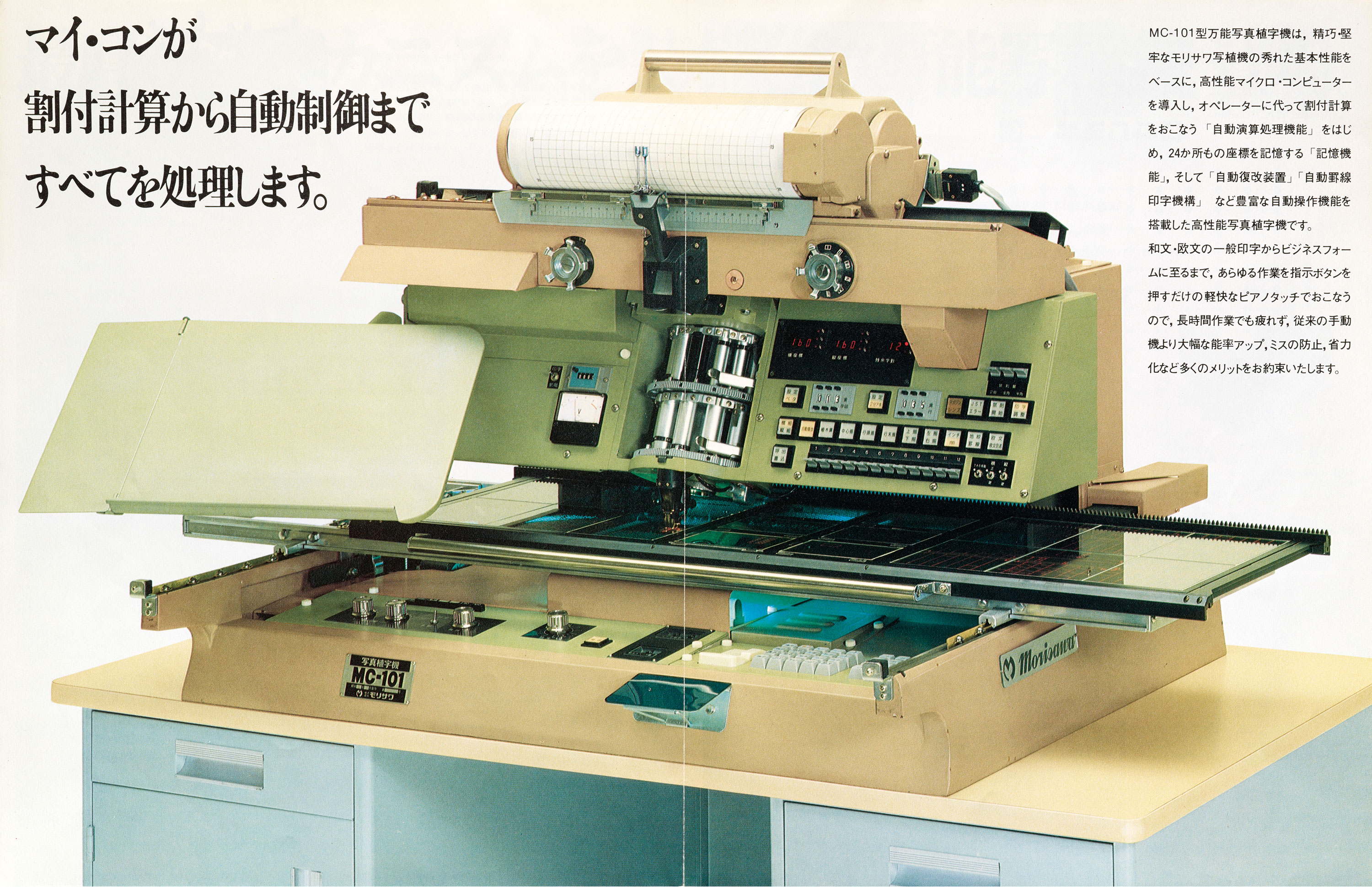

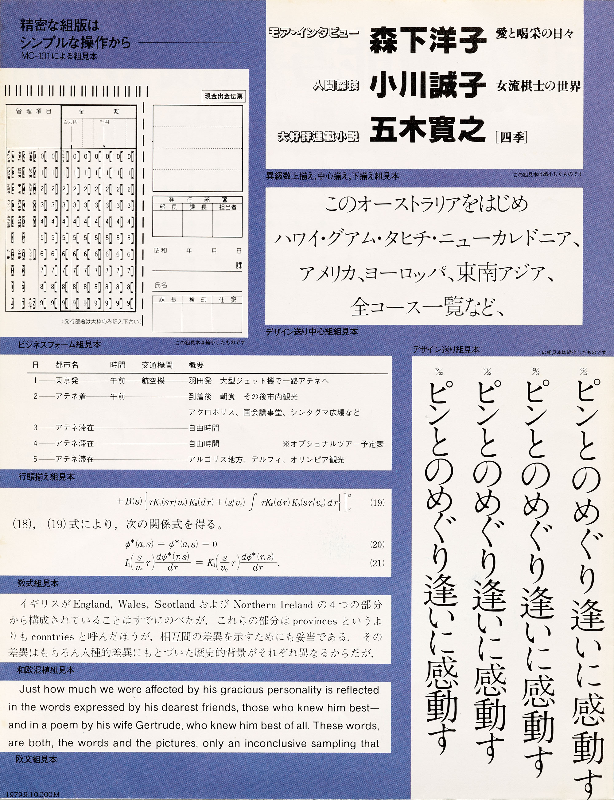
Compared to metal and wood, which require separate fonts for each point size, this phototypesetting machine uses different lenses to adjust the point size and expose characters one by one on photo paper. The single plate includes the three scripts that make up the writing system: hiragana, katakana, and kanji. When in action, one plate is just not enough since Japanese uses hundreds of kanji. The brochure demonstrates how up to three plates could be used at a time. Navigating such a large character set and tending to the chemical reactions of phototype, phototypesetters understandably practiced an art of patience. The sheer scale of the machine blows me away and I am only left to imagine what it was like to play this instrument. Read about Morisawa phototype machines and the women who still operate them in TYPE magazine.
— Florence Fu, Contributor