News
From the Collection: The Art of Lettering Instruction, 1716–2016
The diagrams, illustrations, models, and methods used to teach people how to make letters can be as engaging as the resulting letters themselves.

Earlier this month we participated in the LetterWest Conference with a mini exhibition using hi-fi captures from objects in our collection. Historical instructional material can be found throughout the Archive, from the regal copybooks of Baroque writing masters, to informal lettering manuals for mid-century modern advertising. Here are a few highlights spanning the last three centuries.
17th- & 18th-century Writing Books
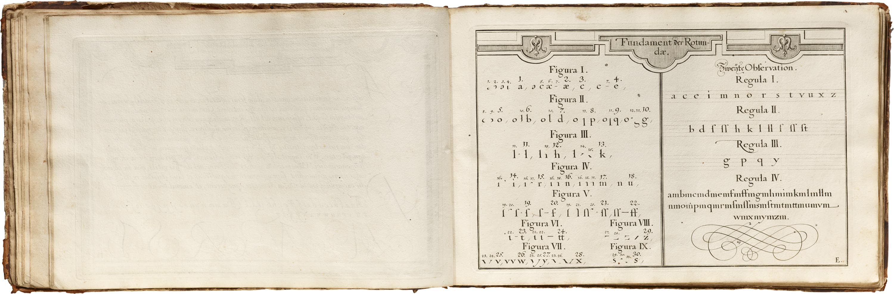
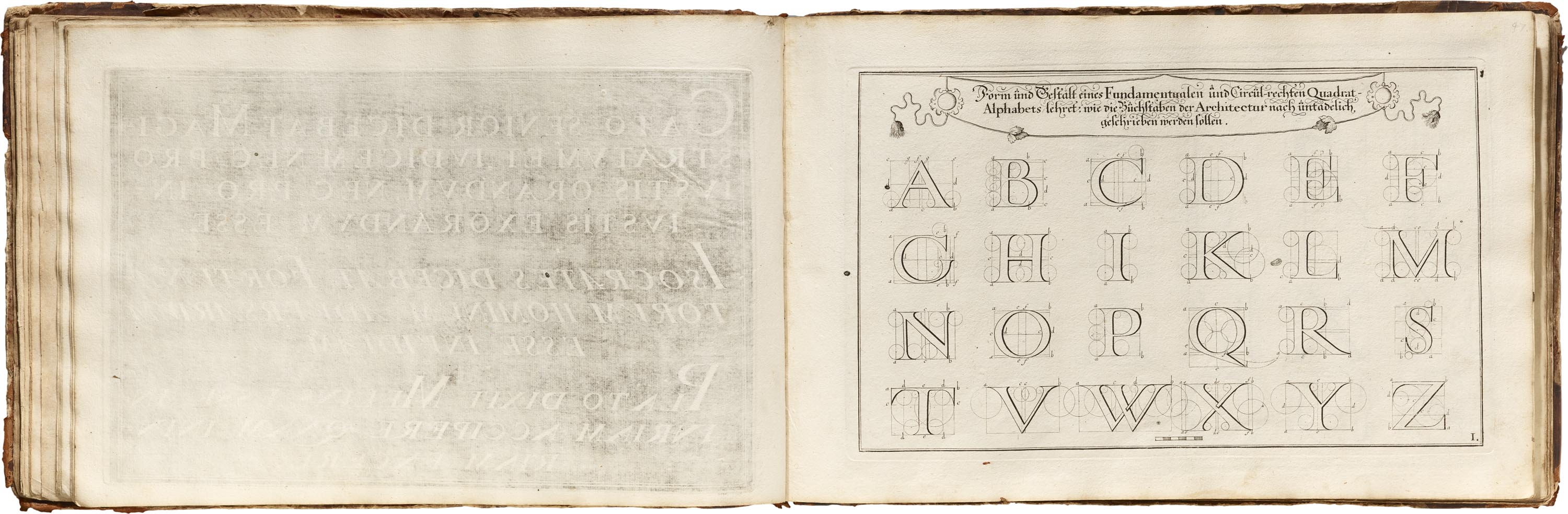
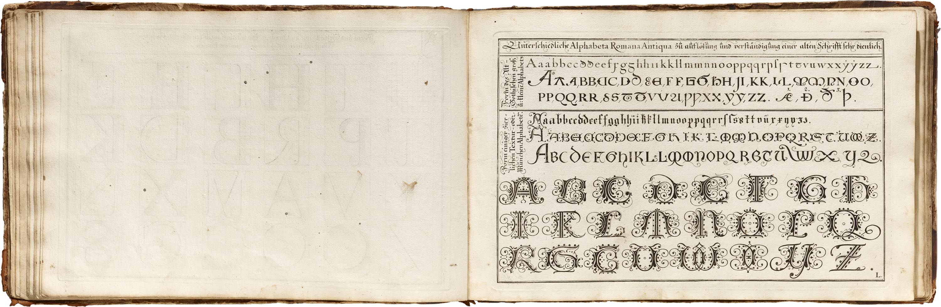
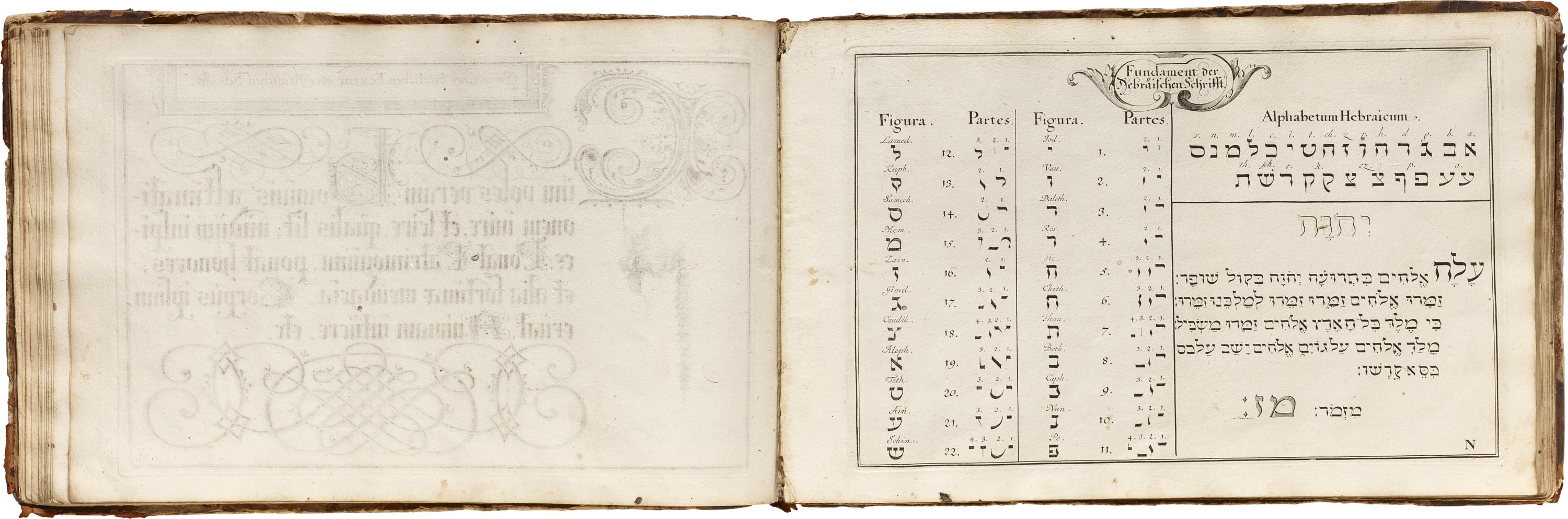
, Christoph Weigel (engraver/printer), Nürnberg, 1716")
, D. DuMortier and son (calligrapher), J. De Lange (printer), J. Oomkens (printer)")
, D. DuMortier and son (calligrapher), J. De Lange (printer), J. Oomkens (printer)")
Writing books can be all-inclusive, with hundreds of pages, but this Dutch example is much briefer. What sets it apart are its multiple foldout plates with instructions for cutting and holding a quill (including a curious ribbon restraint to maintain the hand position), planning page layouts, and determining stroke angle.
Early 20th-century Manuals
")
")
")
At the Zanerian College, founded in 1888, business clerks learned the elegant Zaner-Bloser Script and the role of muscle movement in good penmanship. This later manual includes exercises to practice the “hinge action of the forearm” for creating round and straight strokes.
")
")
")
Widely regarded as the father of modern calligraphy, Edward Johnston championed the use of the broad-edged pen as a writing tool and sparked a generation of British lettering artists and typographers, including Eric Gill. He’s also known for his logo and sans-serif type for the London Underground. The Archive holds several editions of Writing & Illuminating & Lettering, including the first edition.
Signs and Showcards
")
")
Frank H. Atkinson’s collection of model alphabets, sample layouts, and real-world examples was a staple in sign shops throughout the country. Like this copy, the elaborate covers of early editions are often well used and loved. The Archive holds many other sign painting manuals, from colorful alphabet portfolios of the 19th century to practical how-to guides of the 1940s–60s.

Countless showcard (interior advertising signs) writers and lettering artists got their start with Speedball pens and the easy-to-follow Text Book, which just celebrated its 100th year. Ross F. George’s family donated his archive in 2016, including prototype pens and original artwork for the books. Update: see more original artwork by Ross F. George in the Online Archive.
20th-century Calligraphy

including Lettering Design and Creative Lettering Today.


Hollis Holland used these handwritten exemplars to teach calligraphy at Columbia University. Our collection also includes sheets for Roman, Schwabacher, and Uncial.
Lettering Manuals


Eugen Nerdinger’s Zeichen, Schrift & Ornament is an exhaustive and charmingly illustrated guide to making letters, especially in the context of their use, whether it’s for architecture or advertising. This section presents a range of lettering styles and breaks them down to their elemental strokes. Nerdinger worked with fellow professor Lisa Beck on many of the illustrations in this book, as well as its predecessor Buchstabenbuch (1954), and the later Schriftschreiben, Schriftzeichnen: Grundlagen der Schriftdarstellung (1984).
Beyond the alphabet and stroke models, Nerdinger and Beck’s books offer a wide range of diagrams which explain letter-making in clever ways, relating the craft to various genres of illustration, architecture, and industrial design. One example, shown here, demonstrates the legibility of lowercase letterforms using the metaphor of human faces versus legs.

This selection unearths just a few items from the hundreds of instructional works at the Archive. Our exhibit also displayed diagrams from Hildegard Korger’s insightful Schrift und Schreben from 1972 and Gerritt Noordzij’s groundbreaking The Stroke: Theory of Writing, first published in Dutch in 1985. We invite you to schedule a visit so you can see these and many more. And, if you haven’t already, become a member to get early access to the Online Archive where we’ll soon be adding a selection of writing books from the 16th to 19th centuries.
— Stephen Coles, Associate Curator & Editorial Director