News
Typefaces Used by the Bauhaus
The school’s main typographic story is not about inventing radical typefaces, but using existing typefaces in a radical way.
Letterform Archive’s inaugural exhibition, Bauhaus Typography at 100, displays nearly 200 objects representing the school’s influence on printed design. From its start in 1919, the Bauhaus incorporated mass production techniques in the creation of artworks across various programs offered on campus, from architecture and product design to textiles and graphics. While the school has come to be known for a simplified, geometric approach across all these disciplines, the exhibition narrates an evolution of letterform styles and illuminates the many people who developed what we now recognize as Bauhaus typography. As a companion to December’s Archive Salon, this two-part article series focuses on the core material that shaped Bauhaus typography: the typefaces.
Our first installment showcases the various typefaces used in official publications and other objects by Bauhaus masters and students.
Early Visions


The Bauhaus began in Weimar, and its first preliminary course was directed by Swiss-born designer Johannes Itten. In these early years the school had no letterpress or typography workshop on-site, so all graphic design was printed with techniques such as stone lithography, intaglio, or relief work. Some materials were produced at an external press with whom specifications were shared. In those early years typeface selection was limited to what the printer had on hand.
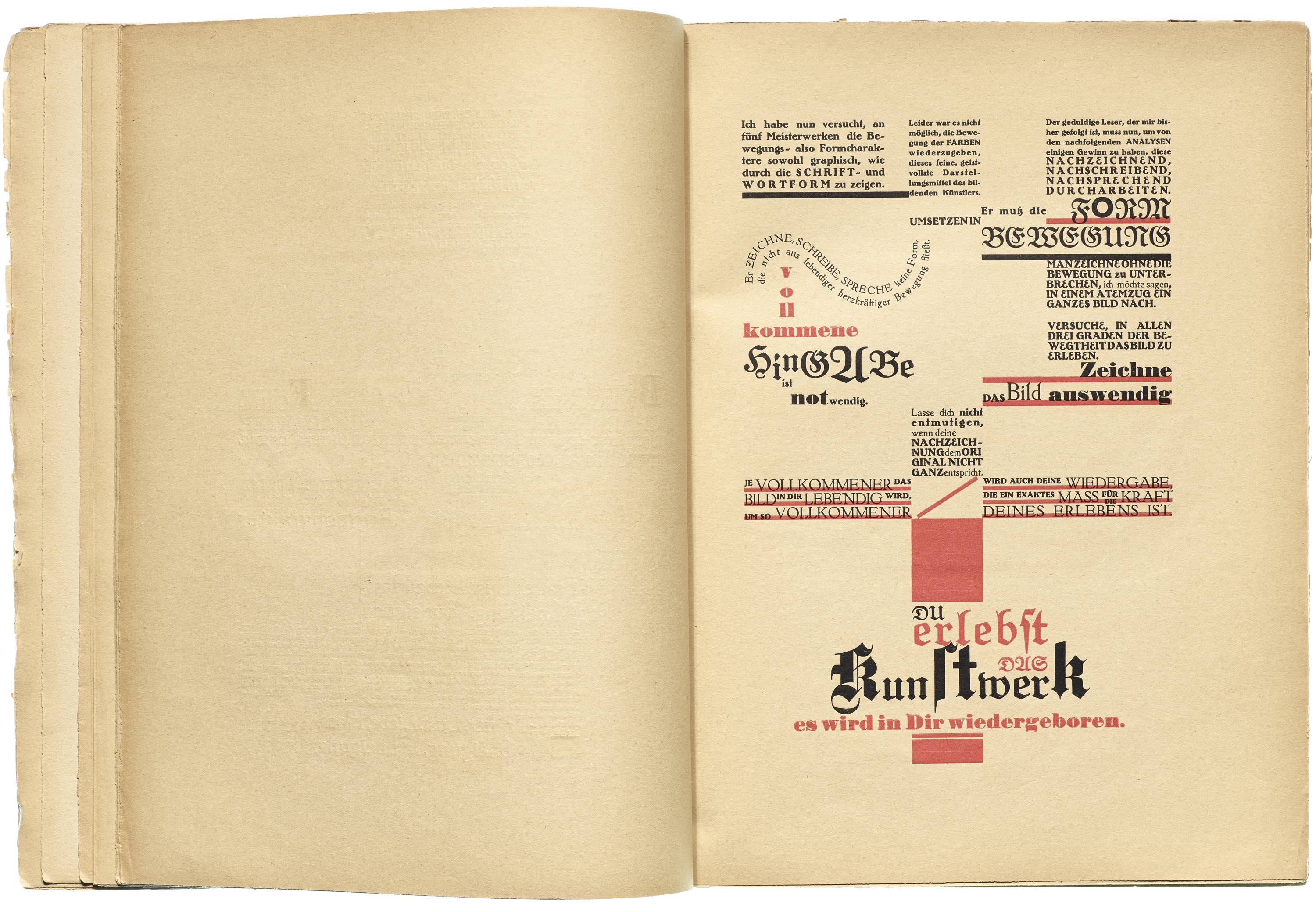
For the privately published Utopia, Itten paired reproductions of classical art with commentary in the form of dense and chaotic hand-lettered compositions, the likes of which are rarely seen in graphic design history until the punk and grunge movements of the late twentieth century. While not a Bauhaus publication, he collaborated with his students from the school. Margit Téry-Adler designed the cover, and Friedl Dicker is credited for typesetting and directing the printing at large. Dicker’s pages complement Itten’s lettering, in some ways translating his wild sketches into typographic form. Yet they have a refreshing look all their own. She practically painted with type, setting words on curved baselines, mixing cases and fonts, and using red backgrounds and underlines to highlight and bolster the black text. It must have required immense skill and patience to create these light and dynamic designs with metal type on a letterpress which resists anything beyond the default rectangle.
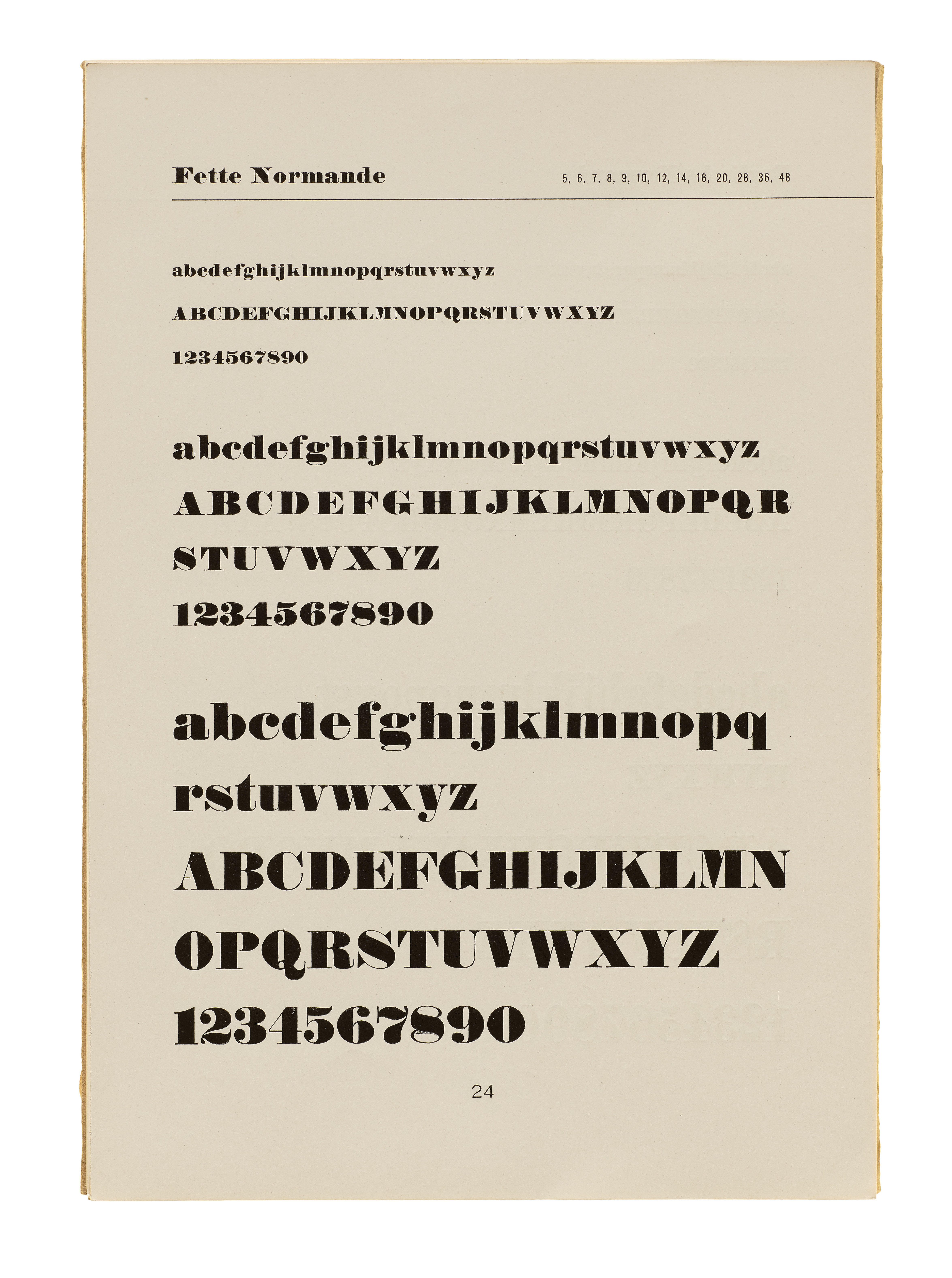
At the time, fraktur was the traditional style of type used in Germany for everyday text, but Dicker used it expressively, and freely mixed typefaces within sentences and sometimes even words. She weaved the recently reissued 18th-century design, Unger-Fraktur, with a younger Fette Gotisch, which itself had been around for almost half a century and would have been widely available. The bold blackletter with a much lighter and spikier style would have been a surprising mix. Normande, an extra heavy Didone, is sprinkled through the book as well. The freshest face, Bernhard-Antiqua, is a bold roman serif with wobbly outlines emulating the lettering seen in Lucian Bernhard’s posters and advertising. Despite being a relatively modern design, the typeface’s centered and symmetrical specimens show that it was intended for a very different typography than Dicker’s.
Related Type Specimens
All images in this gallery are hi-fi captures from Letterform Archive’s collection unless otherwise noted. Click an image to enter fullscreen view, then pinch or use browser zoom to enlarge.


Even after the Bauhaus established a rigorous system of grids and typographic sobriety (more about this below) its designers occasionally let loose. Felix Klee celebrated his friend, Karla Grosch, who was just appointed as a gymnastics teacher, with a booklet of collage and watercolor compositions. The cacophony of phrases are cut from pre-existing prints, such as newspaper headlines, advertising, and other ephemera. Like in Utopia, Klee’s assemblage reveals the typefaces that were commonly used in the day, like Block and Tages-Antiqua, as well as display (decorative and novelty) designs such as Bravour, Carola, and Herold.
Bauhaus Publications
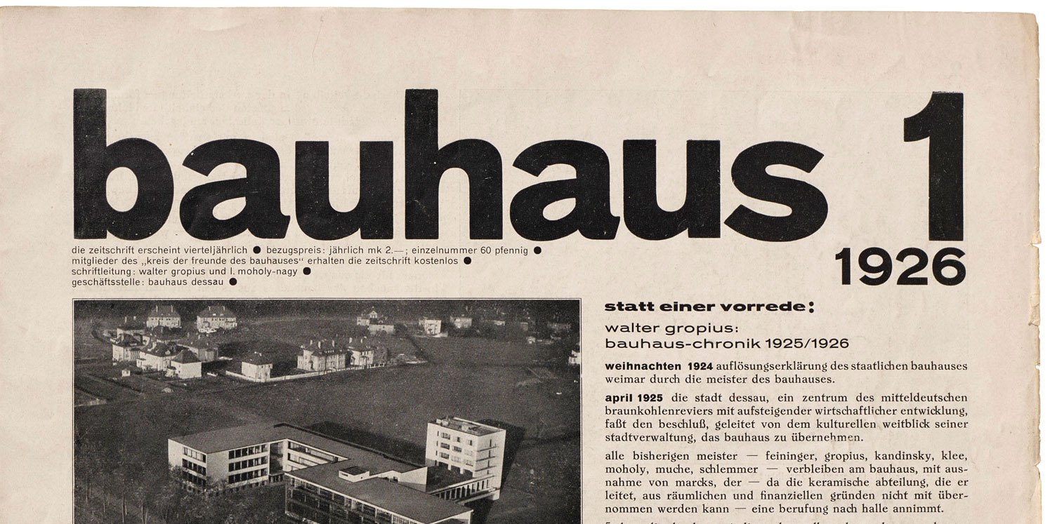
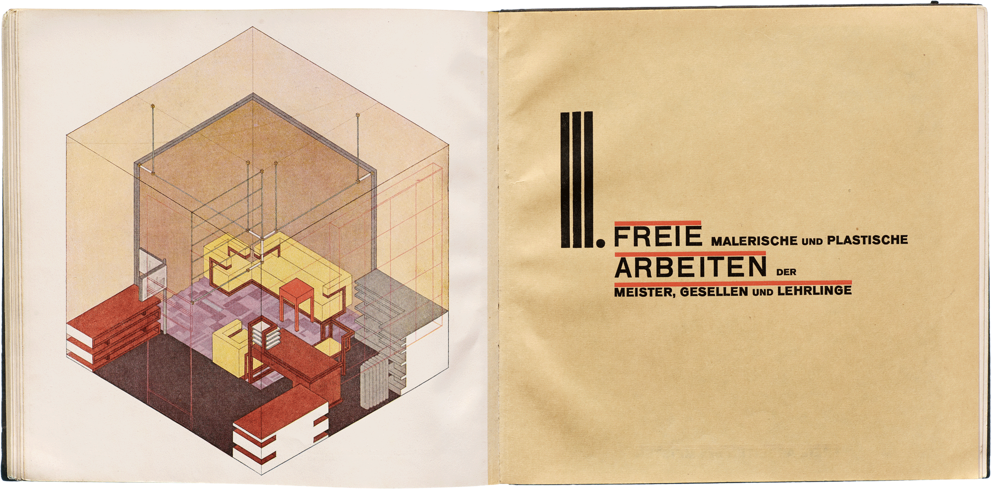
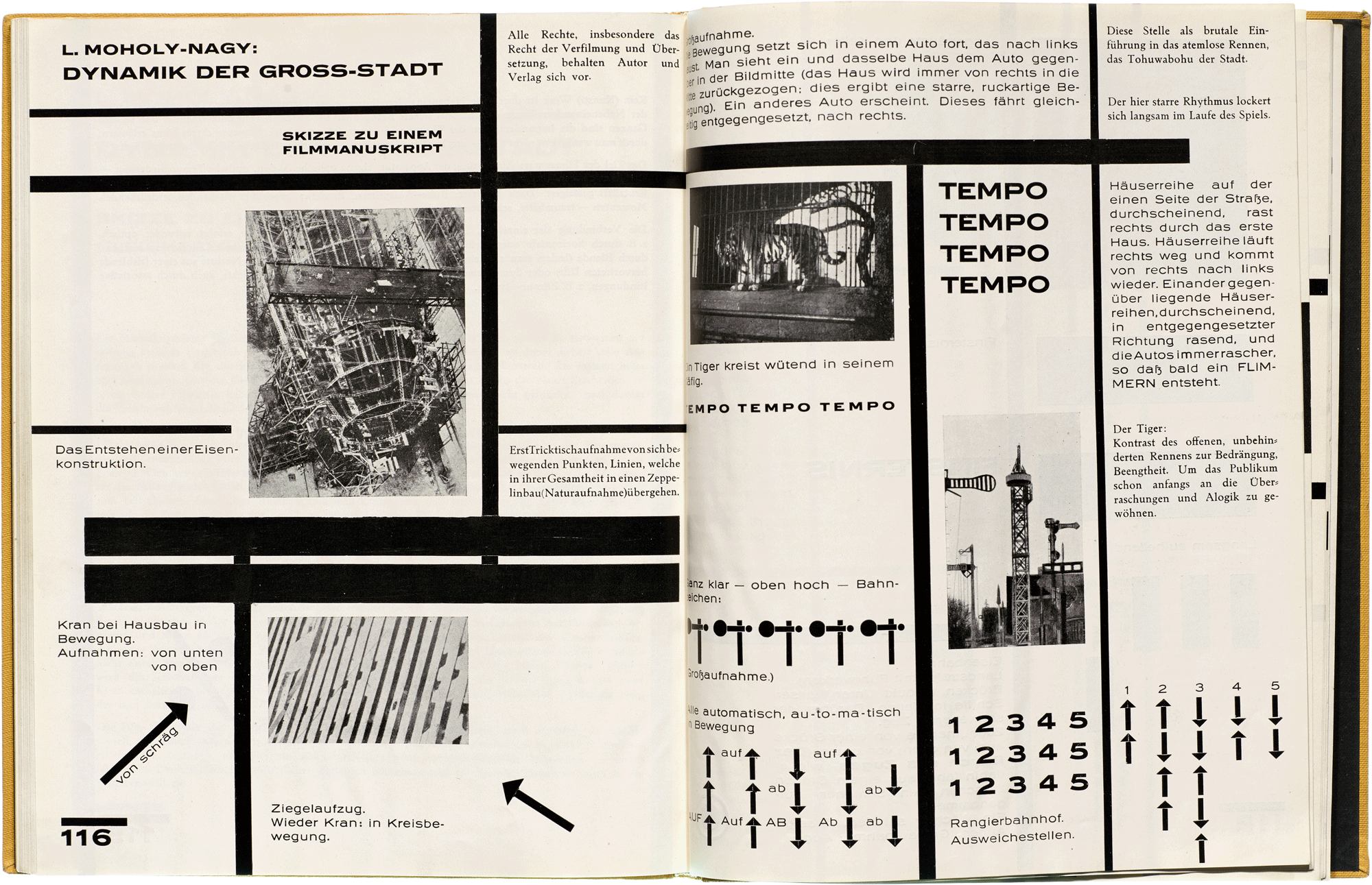
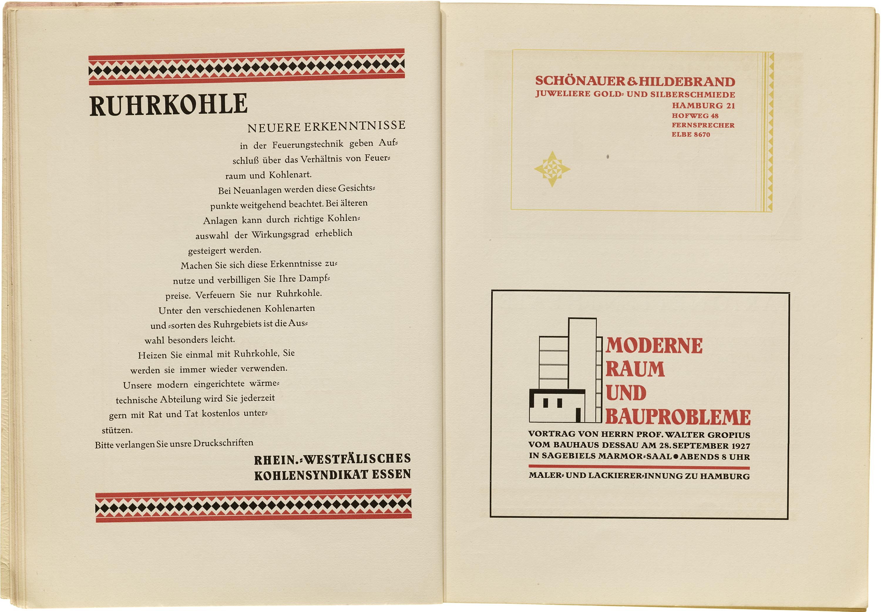
In 1923 Lázló Moholy-Nagy replaced Itten and soon established the typography standards for the school. While at Weimar he designed Bauhaus publications such as a catalog for the school’s exhibition in 1923. Once the school moved to Dessau in 1925, it finally had its own letterpress workshop and stock of metal type. It was then that the institution could better express its design and typographic sensibilities. Moholy-Nagy worked closely with Gropius to create a lot of these publications, notably the catalog, the Bauhausbücher, or Bauhaus Books series, and bauhaus magazine, all of which demonstrate a progressively simplified and systematic typography.


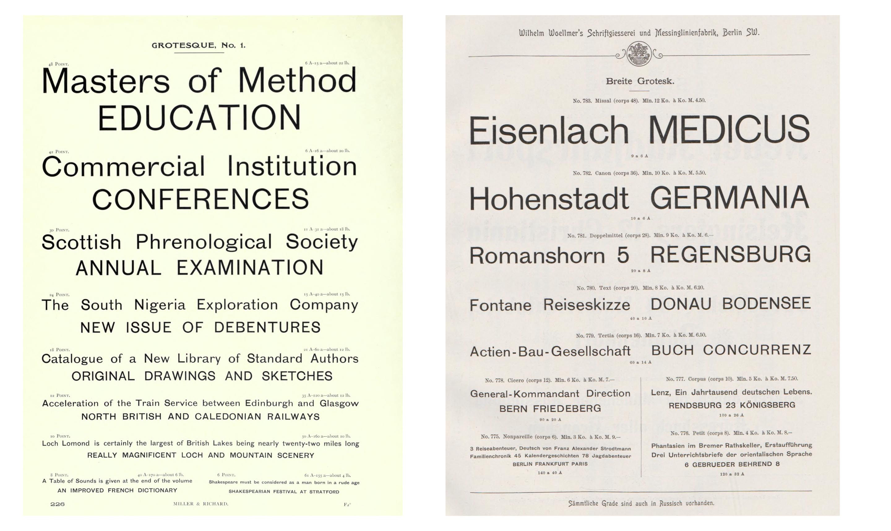
In designing the Bauhaus’s 1923 catalog, Moholy-Nagy conveyed his intended layouts and type choices (two sturdy and widely available sans serifs, Breite Grotesk and Venus) to the printer, who oversaw the details of the typesetting and printing. Knowing little about typography, Moholy-Nagy plunged in with naive gusto. Excessively wide text blocks fill the book’s nearly square pages. Departing from convention, headlines and bylines meet at dynamic right angles — but they have little space to breathe. Moholy-Nagy knew that avant-garde artists — from Schwitters to El Lissitzky — were transforming the medium of print. Moholy-Nagy’s own essay in that 1923 catalog, “The New Typography” (“Die neue Typographie”), is considered the first use of that now famous phrase. He wrote, “The new typography is a simultaneous experience of vision and communication.” In his view, typography is functional. Typography is active and present, not passive and invisible. To German readers of the early 1920s, the dynamism would have been strikingly apparent in the atypical layouts and extensive use of bold grotesks.
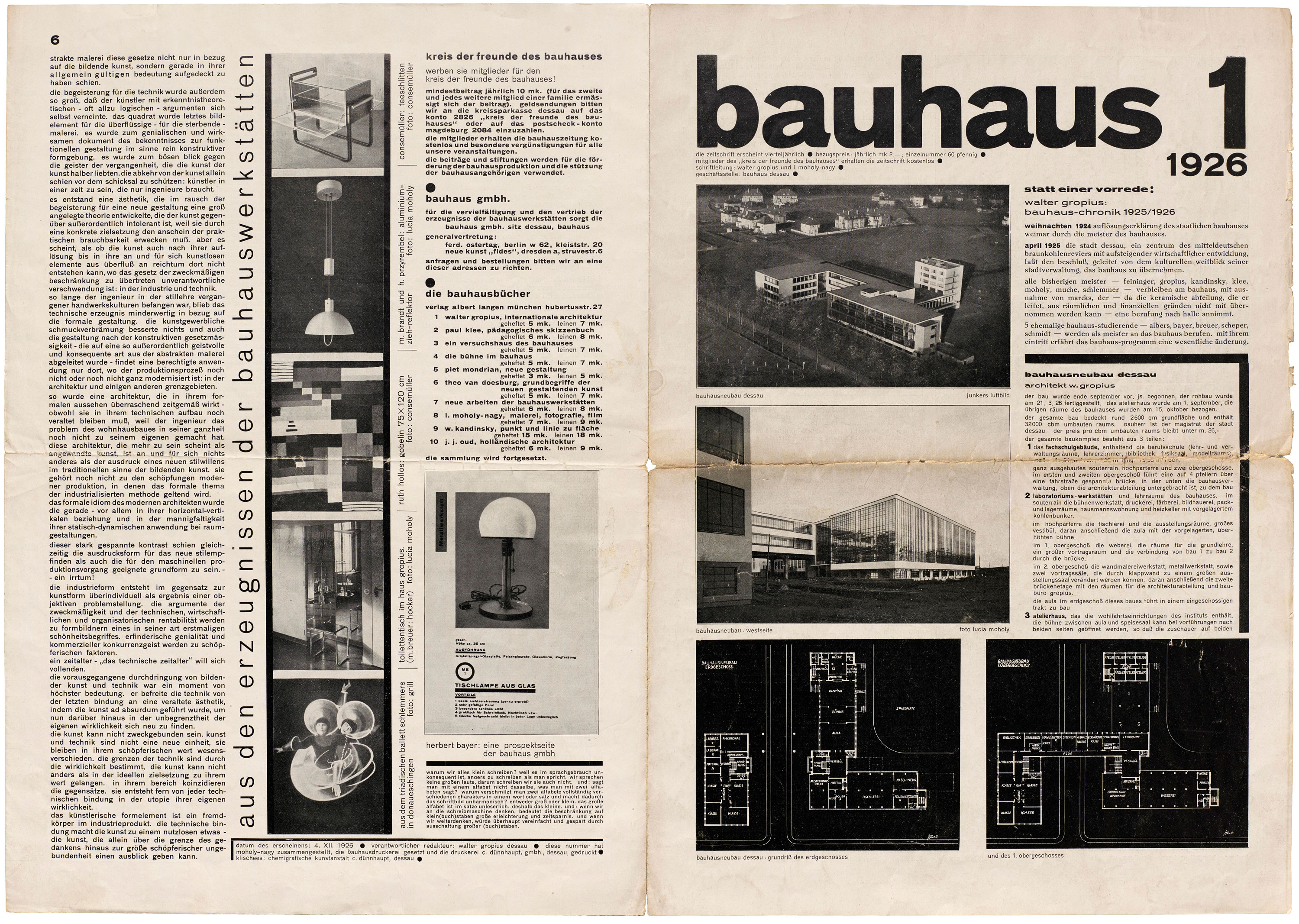


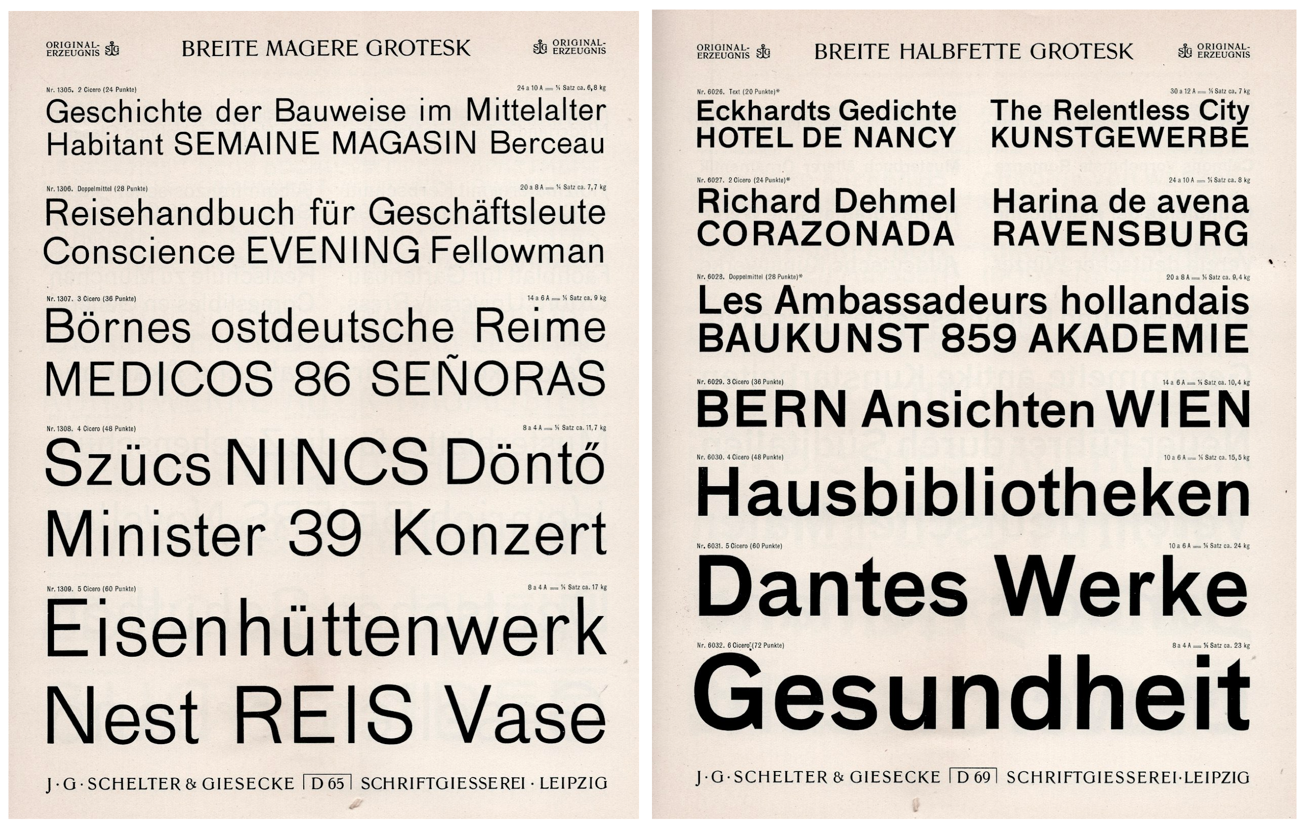
The first issue of bauhaus magazine was published in 1926 and designed by Moholy-Nagy. Our exhibition’s co-curator, Henry Cole Smith, dives into its pioneering role in a blog post and two walkthrough videos. Moholy-Nagy chose to not defy German convention and use a roman serif (not a fraktur) for text. This, coupled with the decision to eliminate the upper case alphabet, would have caused a stir in various circles but also set the tone for what its readers might expect from the school. The use of sans serif typefaces for various typographic roles is a leap towards simplifying the typography, and the decision became a part of the enduring legacy of the Bauhaus. Breite Grotesk, a utilitarian sans serif that was used for the nameplate, went on to become a signature typeface for official Bauhaus publications. Schelter & Giesecke offered three styles of their Grotesk: mager (light), halbfett (semibold or medium), and fett (bold).
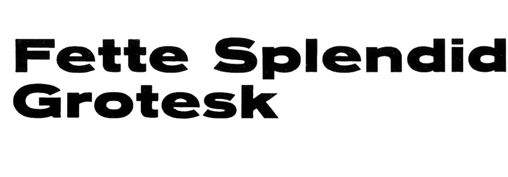
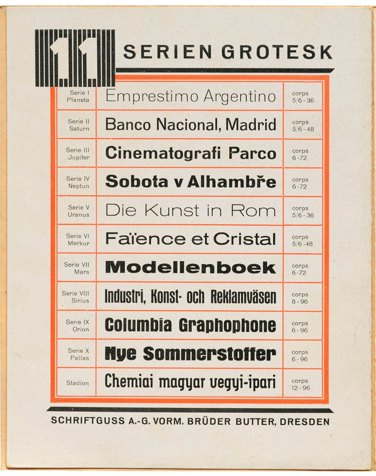
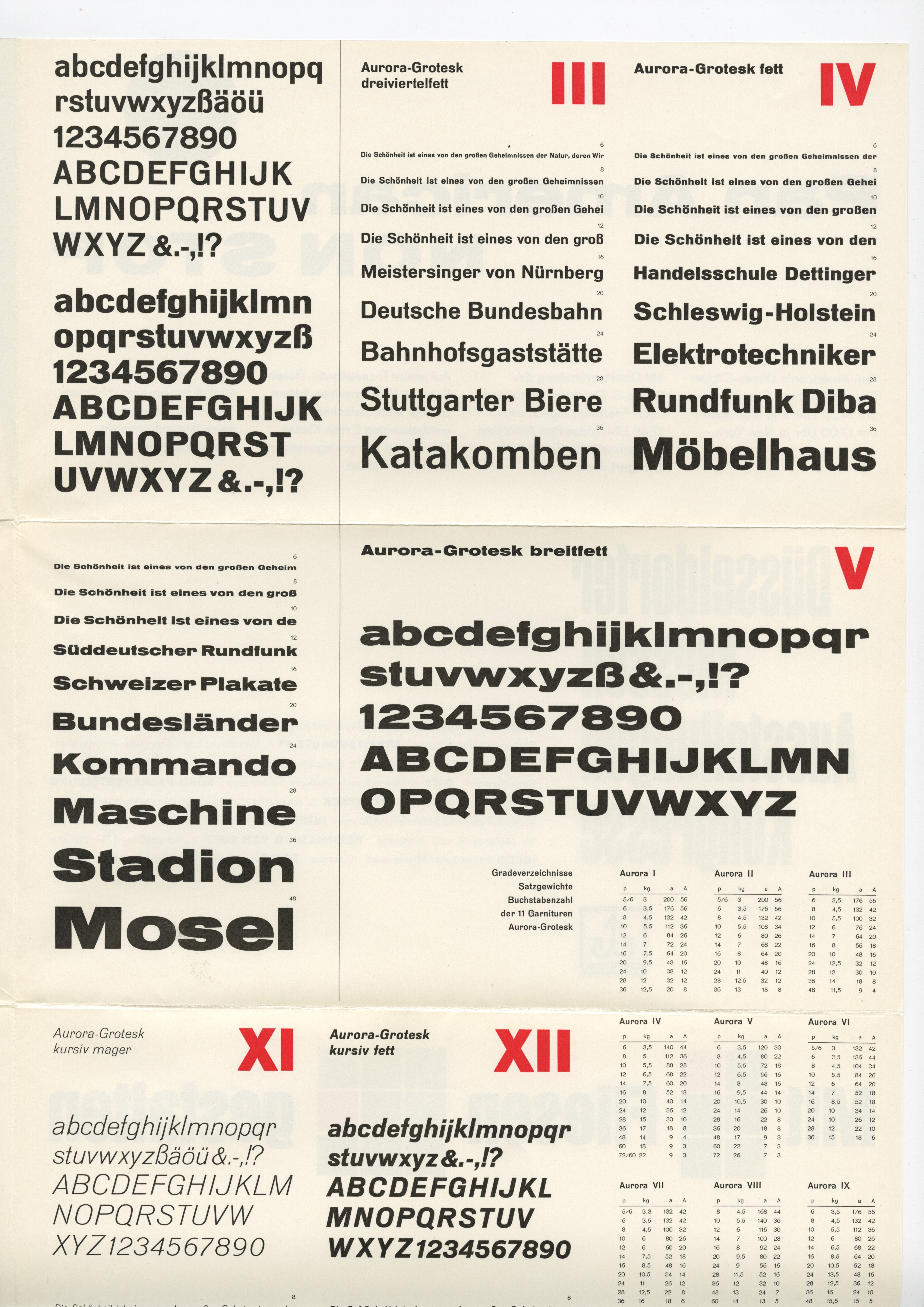
Another sans commonly seen in Bauhaus publications is Aurora-Grotesk. An early example of a “superfamily”, Aurora was designed from the start with multiple weights and styles by Wagner & Schmidt who then licensed the design to many different foundries, evidence of its broad popularity. That said, Molohy-Nagy may not have had the complete Aurora palette on hand, because he put a very similar grot to use for small, wide headlines in bauhaus 1: Woellmer’s fette Splendid-Grotesk.
Consul was another sans serif used in the magazine, but unlike the others above, hasn’t been widely available digitally so has gone forgotten. While Consul is mostly another straightforward grotesk, it has a few distinct features, such as the hook-like f and a flat-topped a. The Archive holds a 1903 catalog from the Woellmer foundry which shows an even more showy Consul II counterpart with an art-nouveau flair. Of course, New Typography would never have approved of these ostentatious undulating forms. Read more about Consul in a newly published article by Florian Hardwig.
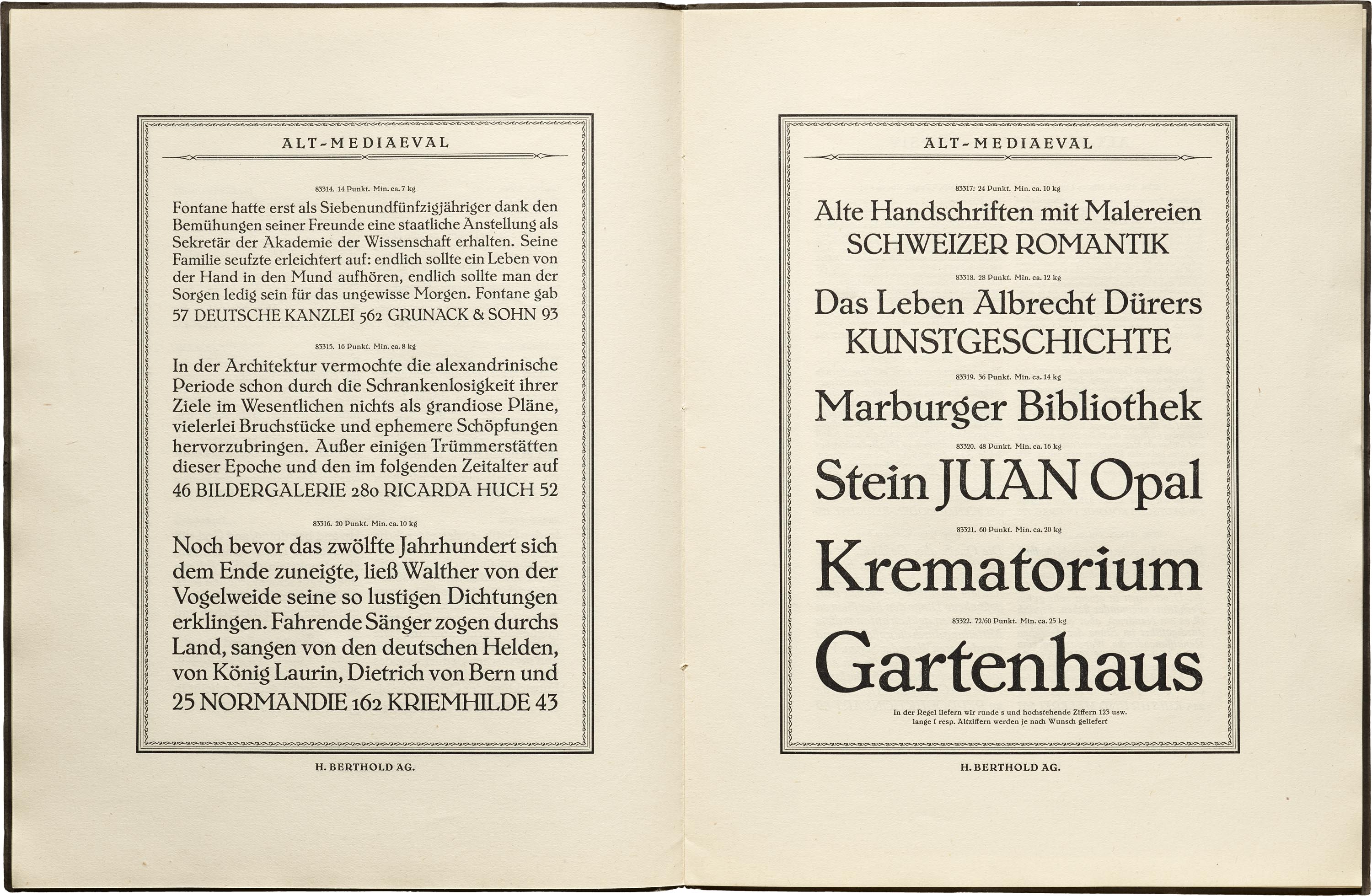
The one serif typeface used in the magazine is Alt-Mediaeval designed by Max Hertwig for Berthold. As its name suggests, its roots lie in early roman type but the design was relatively new to the market. Its wobbly outline and prominent serifs makes it quite expressive at larger sizes, yet it serves as a functional text reader in the magazine itself. While its name and appearance seem old fashioned to a contemporary audience, setting long texts in any roman at all was already a modern statement against Germany’s blackletter norm.

In 1923 then student Herbert Bayer used a single typeface, Breite Fette Grotesk, for a state-commissioned design of inflation currency, dramatically setting it apart from all bills that came before. The nearly exclusive use of typography helped the emergency notes get to press quickly, and it’s a stark contrast to the illustration and ornamentation common on most currency, especially within the Weimar Republic.
Related Type Specimens
All images in this gallery are hi-fi captures from Letterform Archive’s collection unless otherwise noted. Click an image to enter fullscreen view, then pinch or use browser zoom to enlarge.

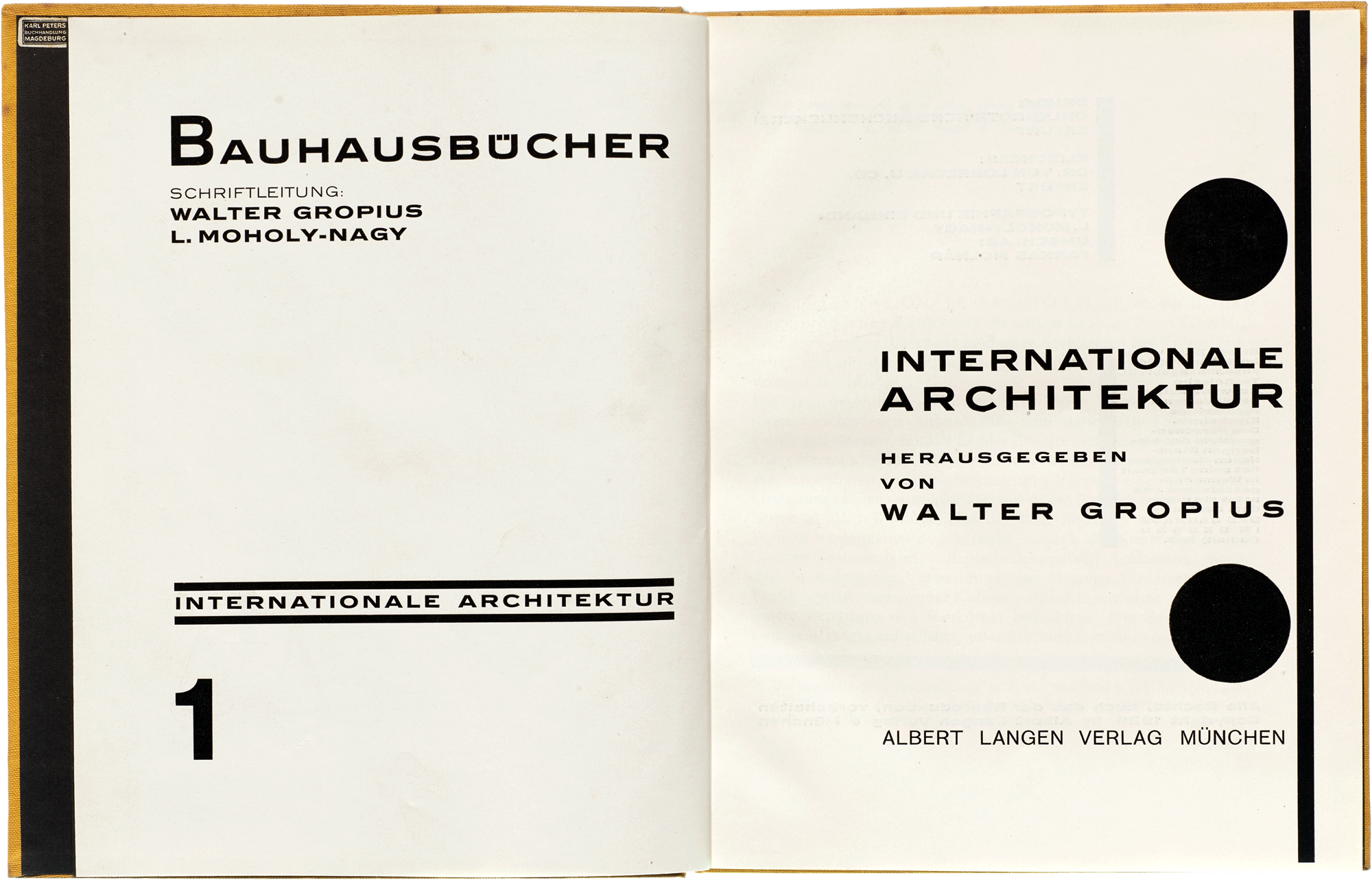


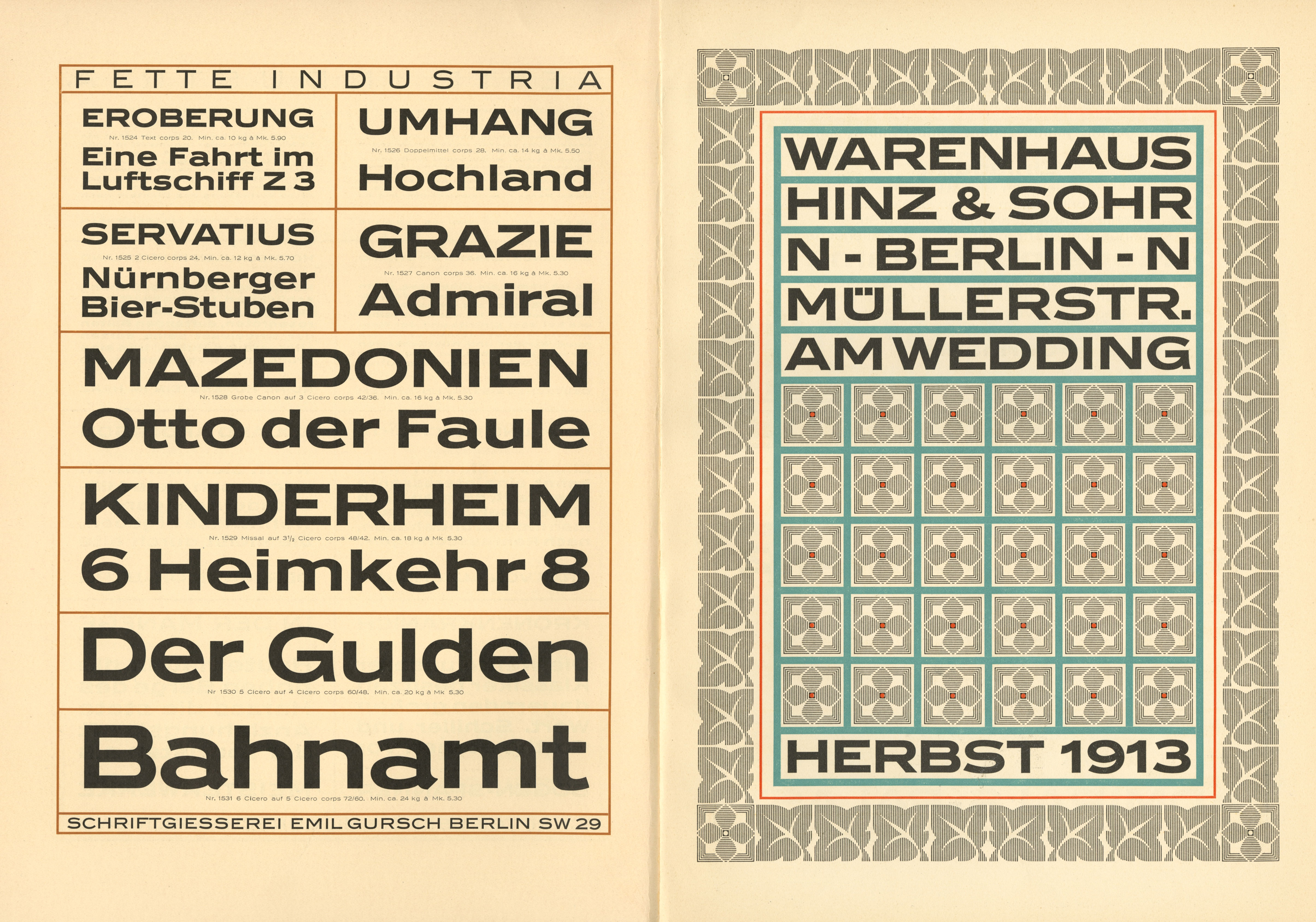
The fourteen Bauhausbücher (Bauhaus Books) issued between 1925 and 1930 collected the instructors’ most essential ideas, condensing and delivering Bauhaus pedagogy to a wider audience. Art directed by Moholy-Nagy, they are an exceptional example of a cohesive typographic program. They consistently showcase the geometric elements and asymmetric layouts associated with the school’s legacy. An extra wide typeface stretches across the opening spread of the first volume, perhaps echoing the broad stance of modern buildings. Like Aurora, Industria is a plainspoken, multi-weight sans, but its shapes are more geometric and constructed, again emulating architectural forms. Its minimalist use in the Bauhausbücher is in stark contrast to its Gursch foundry specimen, where it is densely typeset and surrounded by ornamentation.
Another sans that found its way into the Bauhausbücher is Grotesque No. 1. Issued by Scottish foundry Miller and Richard in the late 1800s, it was imported to Germany by various foundries. The typeface already had an auspicious modernist pedigree: renowned architect and designer Peter Behrens used it in Feste des Lebens und der Kunst, one of the first books composed entirely of sans serif type. While Behrens was not directly connected to the Bauhaus, two of its directors, Walter Gropius and Ludwig Mies van der Rohe, worked with him at the beginning of their careers.

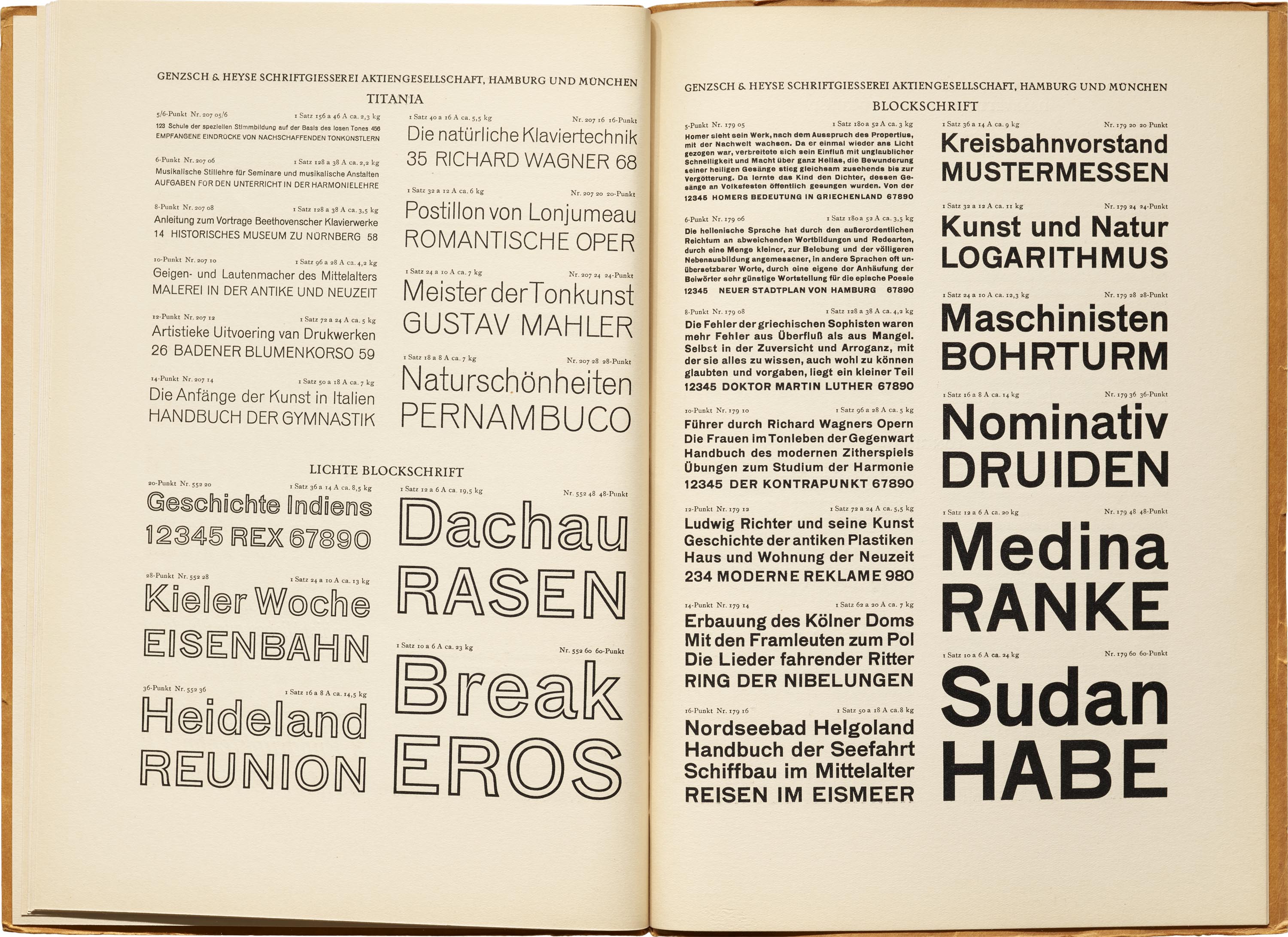
The body text in most of the Bauhausbücher is set in Genzsch-Antiqua. Like Alt-Mediaeval, it is an “oldstyle” roman, though closer to Jenson’s renaissance-era model and much sharper and cleaner, giving it a more modern air. Our Online Archive has multiple Genzsch-Antiqua specimens, but one booklet from the late 1920s shows a direct response to the school’s use of the type. Its layouts depart from the traditional center alignments seen in most specimens, and one sample even directly references the Bauhaus. It’s a clear sign that the type market, like much of Continental graphic design, was quickly accepting Bauhaus typography.
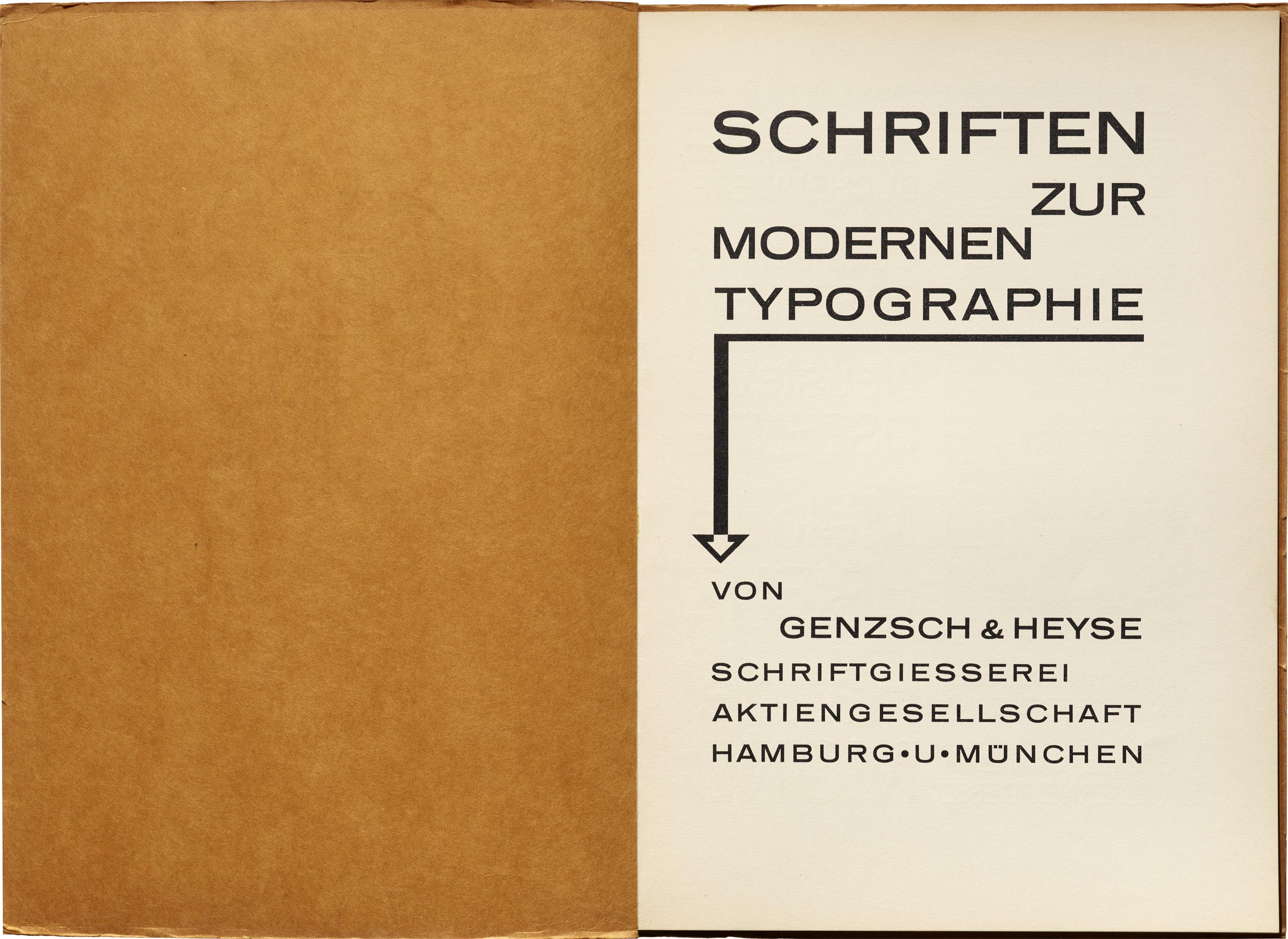
More evidence of the foundry jumping on the Bauhaus bandwagon is a specimen called Schriften zur Modernen Typographie (Fonts for a Modern Typography). Along with newly released typefaces, it included older grotesks from the turn of the century, such as Cartolina and Blockschrift, to pad their contemporary inventory. Another grot, Monument, followed Aurora’s superfamily naming technique, applying number labels to its various styles. The specimen also showcased geometric ornaments and layouts to pair with the New Typography it was championing. Even the title page arrow appears to mirror Moholy-Nagy’s arrows from Bauhaus Book 8.
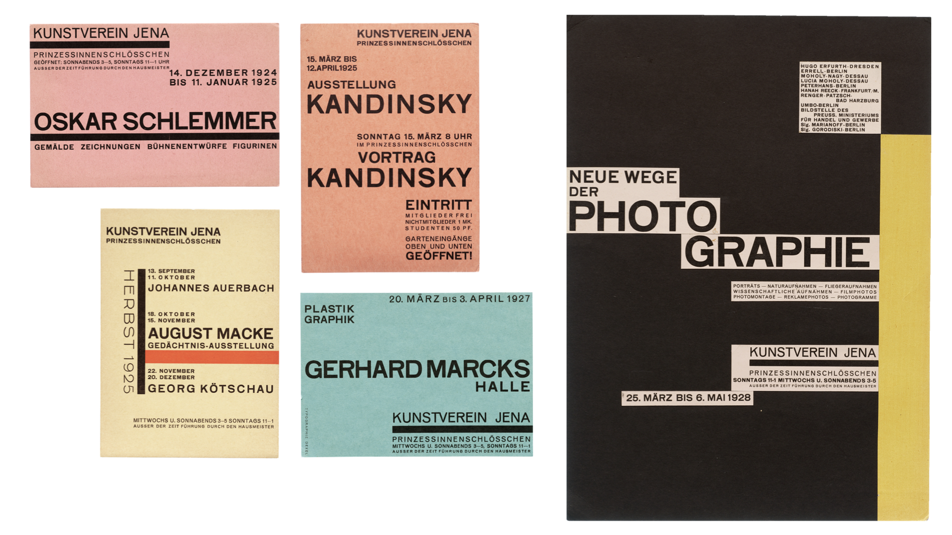


German painter and gallerist Walter Dexel, while not a student of the school, organized several Bauhaus-related exhibitions for Kunstverein Jena, an art association with a gallery near Weimar. His purely typographic treatments set a visual identity for the series that relied on asymmetrical layouts, heavy typographic rules, and all-caps text set almost entirely in a single typeface, Blockschrift, Genzsch’s answer to jobbing sans serifs like Breite Grotesk. Occasionally, type like Koralle provided a contrasting style in some of Dexel’s flyers, such as “HERBST 1925”. The Archive’s exhibition includes several cards and an original poster maquette.
Related Type Specimens
All images in this gallery are hi-fi captures from Letterform Archive’s collection unless otherwise noted. Click an image to enter fullscreen view, then pinch or use browser zoom to enlarge.
The story of Bauhaus typography is not so much about inventing radical typefaces as it is about employing existing typefaces in a radical way. From the beginning, the school’s masters made a statement with the type that was on hand. Unadorned, “jobbing” typefaces served the ethos of simplicity, functionality, and mass production, while marking a severe departure from the ornamentation of the Jugendstil movement that preceded it. Beyond typeface selection, the push for dropping capital letters further cemented the Bauhaus commitment to experimentation. It all resulted in an instantly recognizable aesthetic that became a visual symbol of the school’s mission.
Experience Bauhaus Typography at 100
In part two of “Bauhaus Typefaces” we will highlight type designs that were influenced by Bauhaus principles, both during its lifetime and long after. In the meantime, visit the Archive to see this work in person. If you can’t make it to San Francisco, the Bauhaus Typography at 100 website will be available to all until the show closes on May 21, and permanently accessible to Archive members.
— Tanya George and Stephen Coles