News
Charter Member Keepsake
Here’s a peek at what’s on its way to our charter members — and how the design came together, thanks to Design is Play and Dependable Letterpress.
In retrospect, the brief seems perhaps a smidge vague: The team at Letterform Archive wanted “a deconstructed membership certificate to make our charter members feel welcomed. One that was beautiful and inspiring and nodded in some way to the collection, but that was playful and not too certificate-y, so that members would want to actually display it. Bonus points for some sort of tactile element!”
For this open-ended challenge, we turned to Design is Play, the award-winning San Francisco design and branding firm of Mark Fox and Angie Wang. Design is Play specializes in smart identity and systems solutions that often frontload a masterful use of type, with a penchant for working with refreshingly analog tools along the way. Plus, since Wang and Fox are charter members themselves, we were curious to learn what they find unique about the Archive — and to see how they might translate that into a finished design. “Over the years we have come to love the Archive and what it represents,” the two share. “It is utterly catholic in its attitude toward design and typography, and its collection reflects that openness: high and low, sacred and profane, non-commercial and commercial. It is a mecca for anyone (and everyone!) who loves type, design, printing, and relevance of these practices to the larger culture.”
“High and low, sacred and profane, non-commercial and commercial, the Archive is a mecca for anyone who loves type, design, printing, and relevance of these practices to the larger culture.” — Design is Play
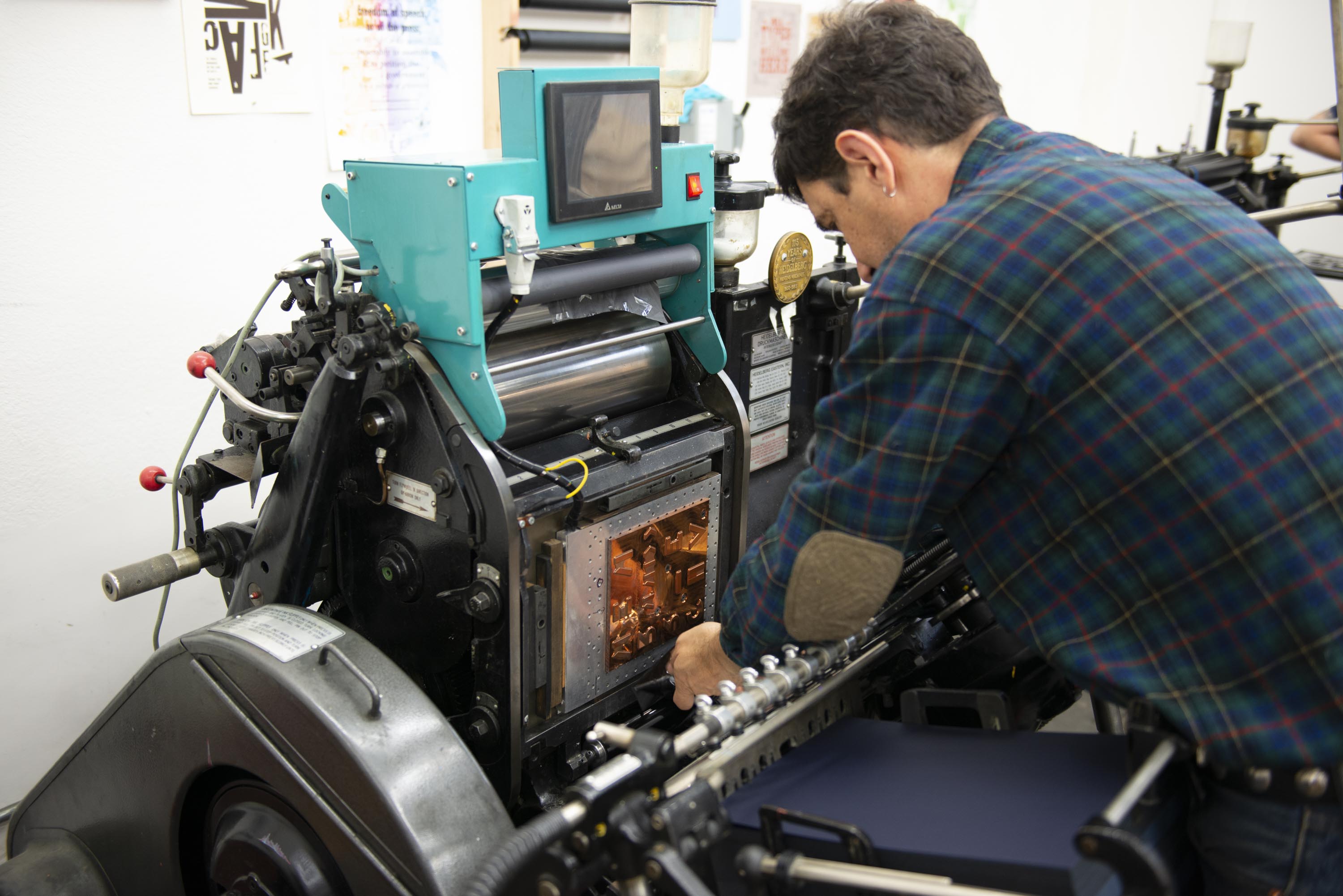
For the printing, we called on Dependable Letterpress, Joel Benson’s highly esteemed and understatedly named operation just down the street in San Francisco’s Dogpatch neighborhood. “I have great admiration for the community that the Archive is building,” Benson remarks. “And I’ve done projects with Mark and Angie before and they always do very thoughtful, well-planned work, so I was happy to get to do something new with them.”
No End of Good Ideas
After an initial conversation about direction, the designers took about a month to explore concepts, playing with different type and lettering approaches, colorways, and an array of iconographic and decorative touches.
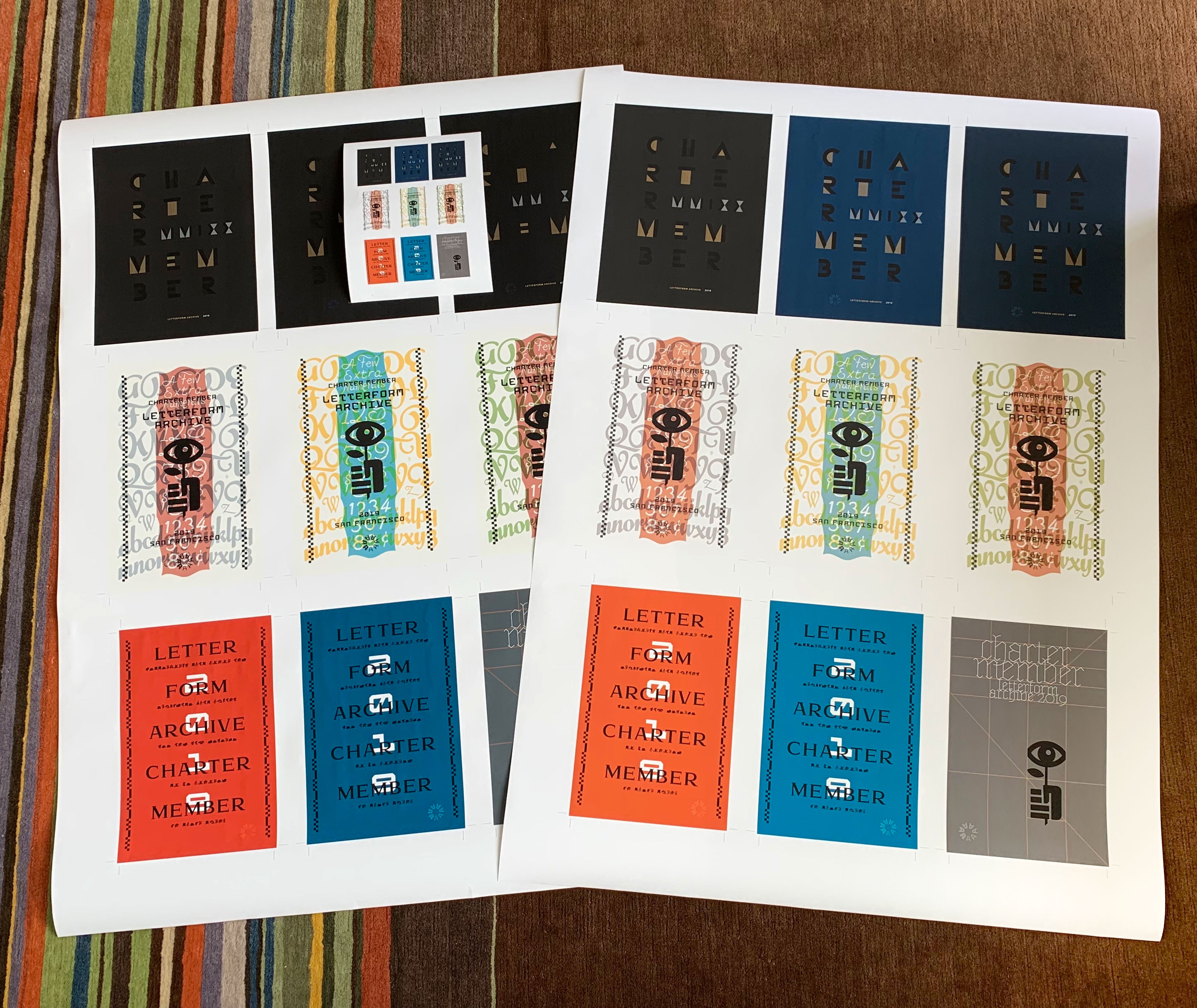
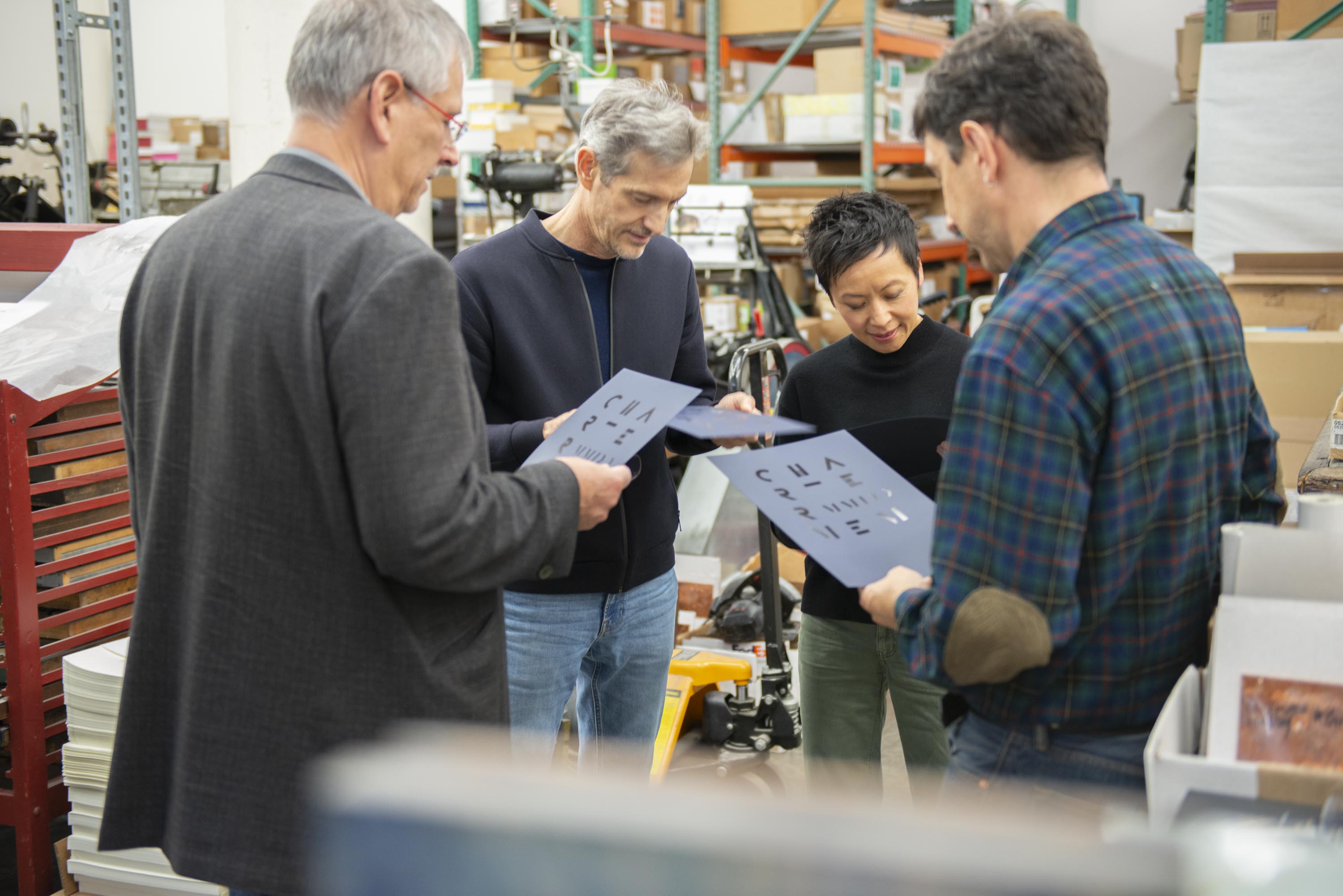
We sat down to review color mockups of four of their ideas, all rich in relationships with the Archive and its collection. There was a grid of gunmetal gray knocked out with Marian, a modern blackletter, with a blunt illustration of a hand offering an eye-shaped flower overprinted in black. “The illustration encapsulates three ideas,” Fox shares. “1) You can hold it in your hands! The Archive is a hands-on, tactile experience; 2) Growth, or the flourishing of (printed) culture; and 3) The Archive is a visual experience! The collection is a feast for the eyes.” Then there was an option in either bold orange or blue featuring the display face Hispalis, reimagined for another Design is Play project by Rod Cavazos. A quote from Robert Bringhurst — “Letterforms that honor and elucidate what humans see and say deserve to be honored in their turn” — is set in and thus rendered unintelligible by Big Cheese, designed by Bob Aufuldish and issued by Emigre, which Fox and Wang intended as “a cheeky, irreverent response” to the brief (though they of course express great admiration for Bringhurst, and quote him regularly in their classes at CCA). There was also a more embellished, lushly layered take, again punctuated by the flower-as-eye illustration. “An exuberant celebration of ink on paper, the design combines type designed by René Knip and lettering from a Speedball manual that Mark’s mother owned in college,” the two note.
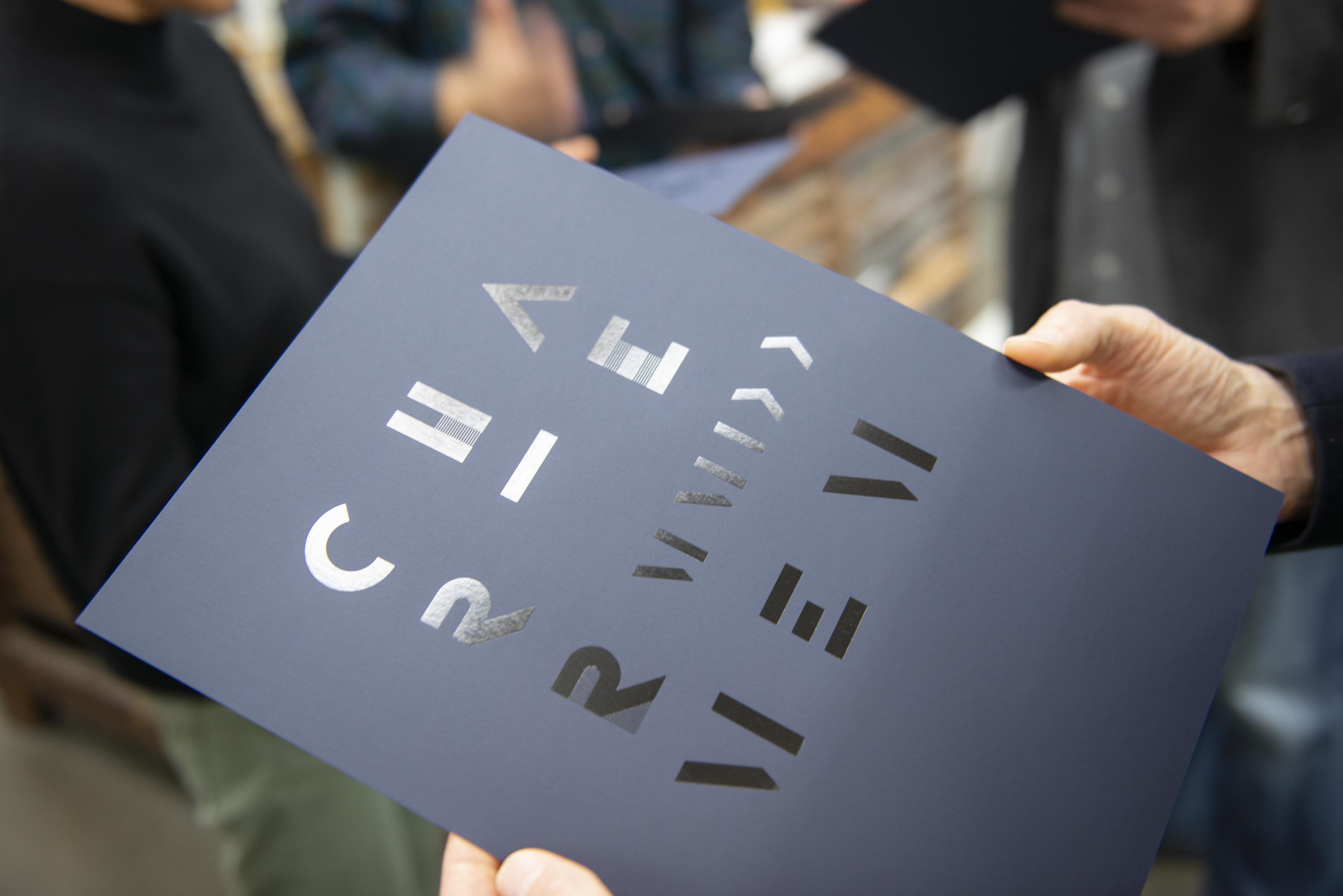
While these were all distinctly delightful in their own way, Fox and Wang were saving their favorite for last: a grid of graphic letters stamped in silver, gold, and black foils, shimmering and flickering against a matte blue so dark it was nearly black.
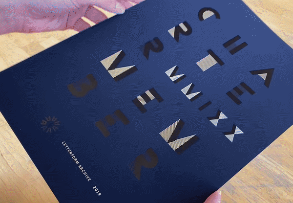
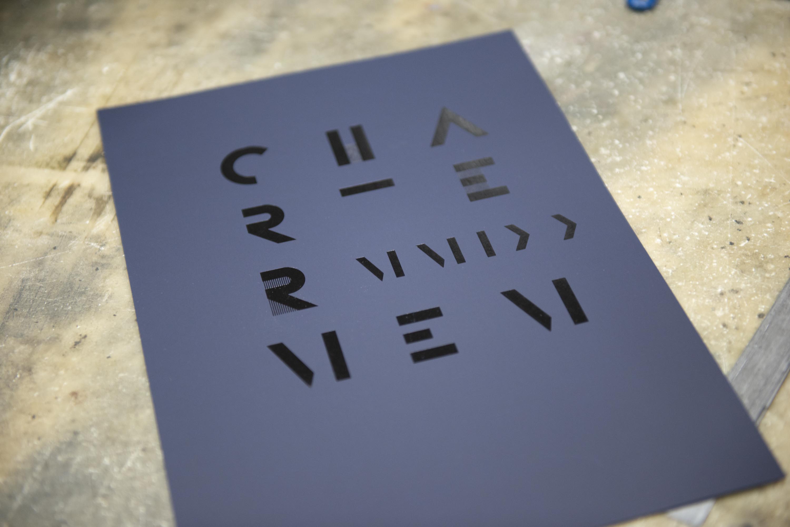
Oohs and aahs immediately commenced. The Archive team was drawn to the treatment of “charter membership” — the way Wang and Fox intentionally broke the phrase across four lines to obscure its content, further interrupting its legibility with the Roman numerals for 2019, and how they fragmented some letters by stamping them in a mix of metallic and black foils while mysteriously leaving other letters intact in black. The result defies conventional reading, dissolving the words’ meaning into a pure celebration of letterform.
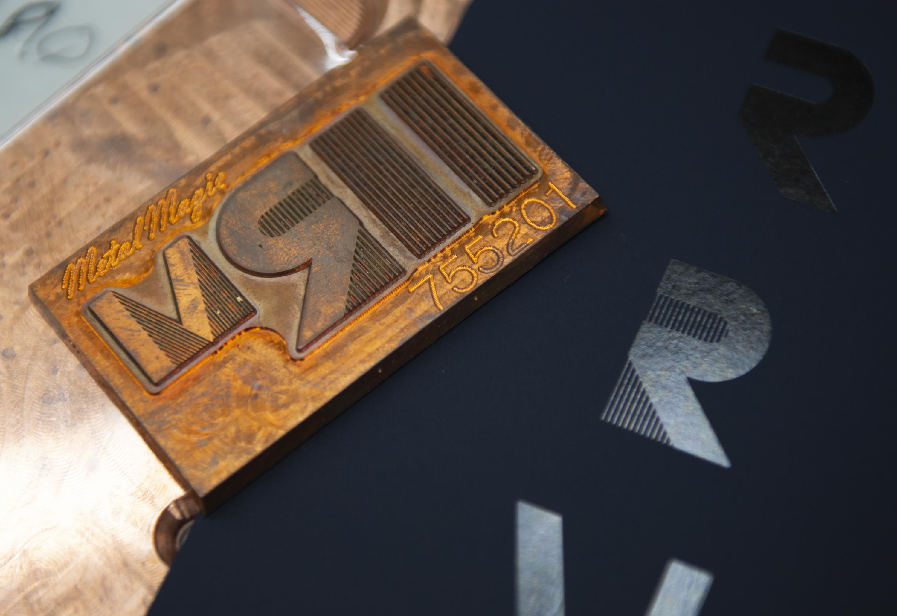
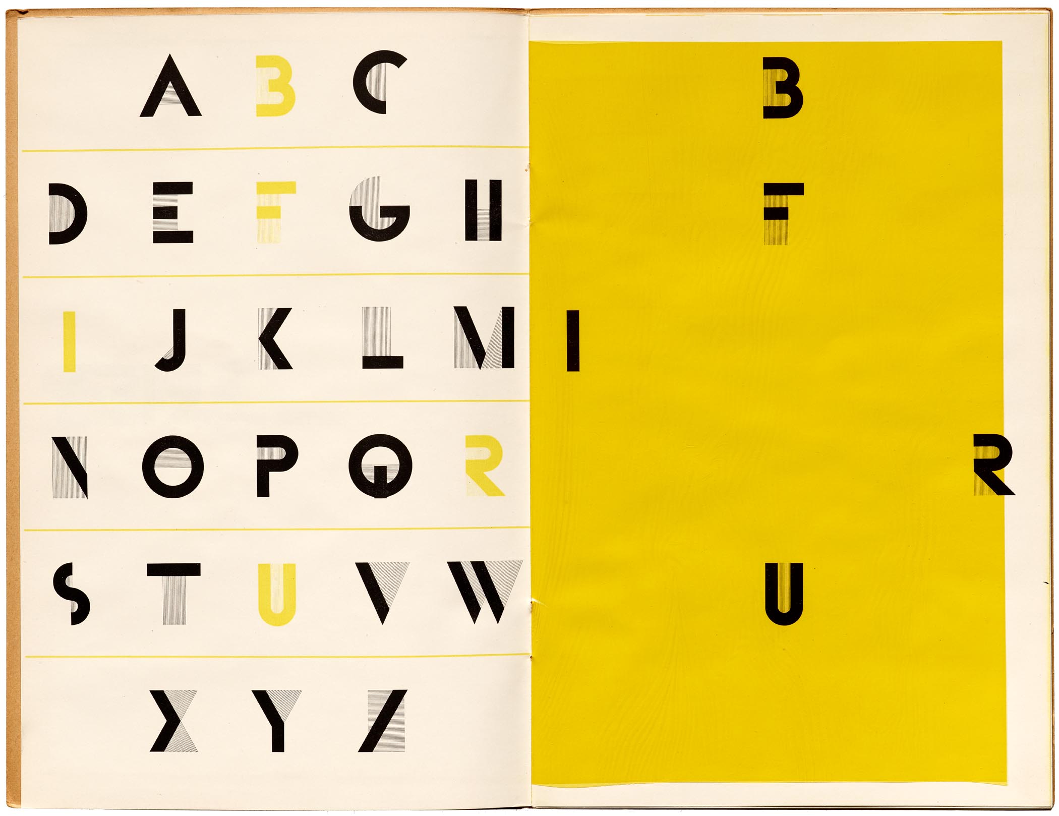
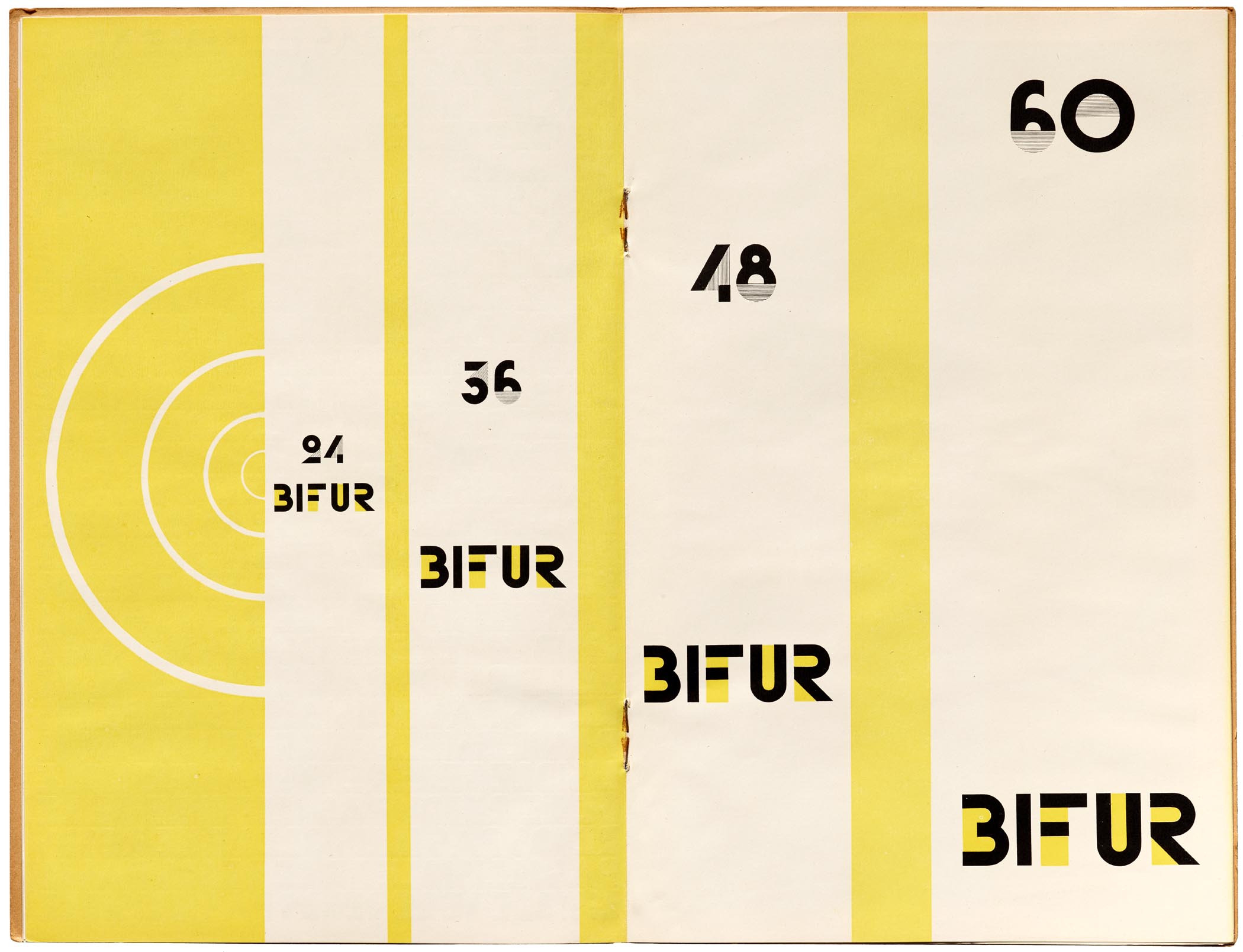
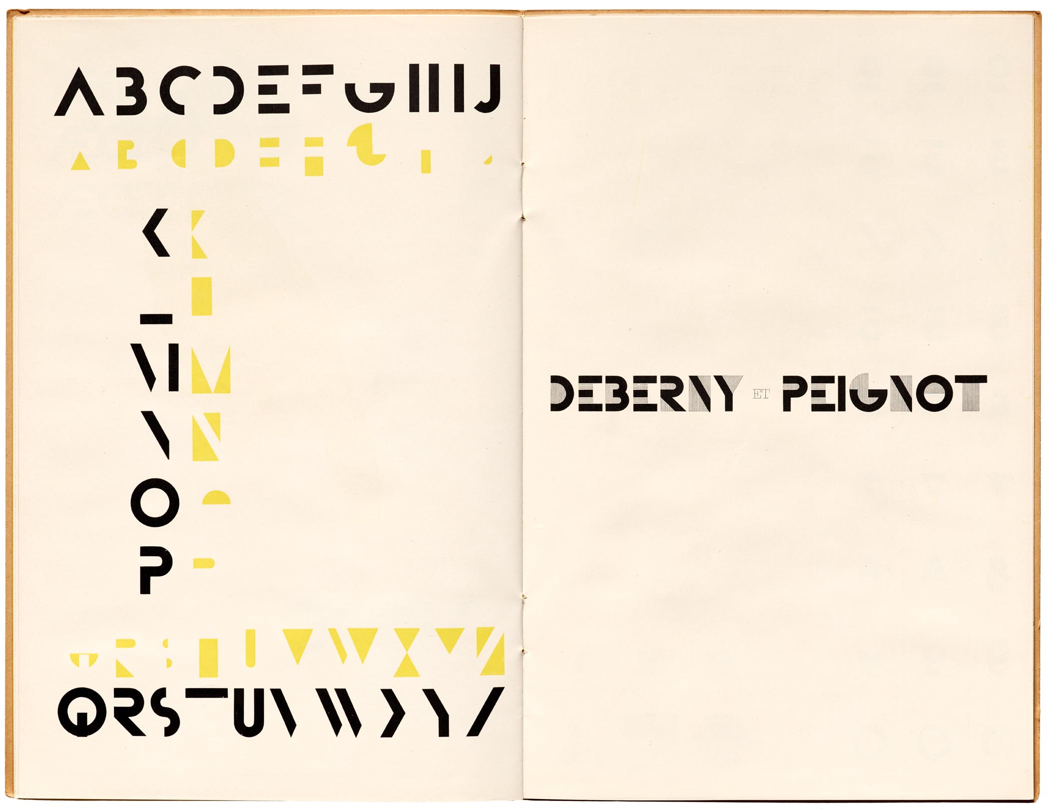
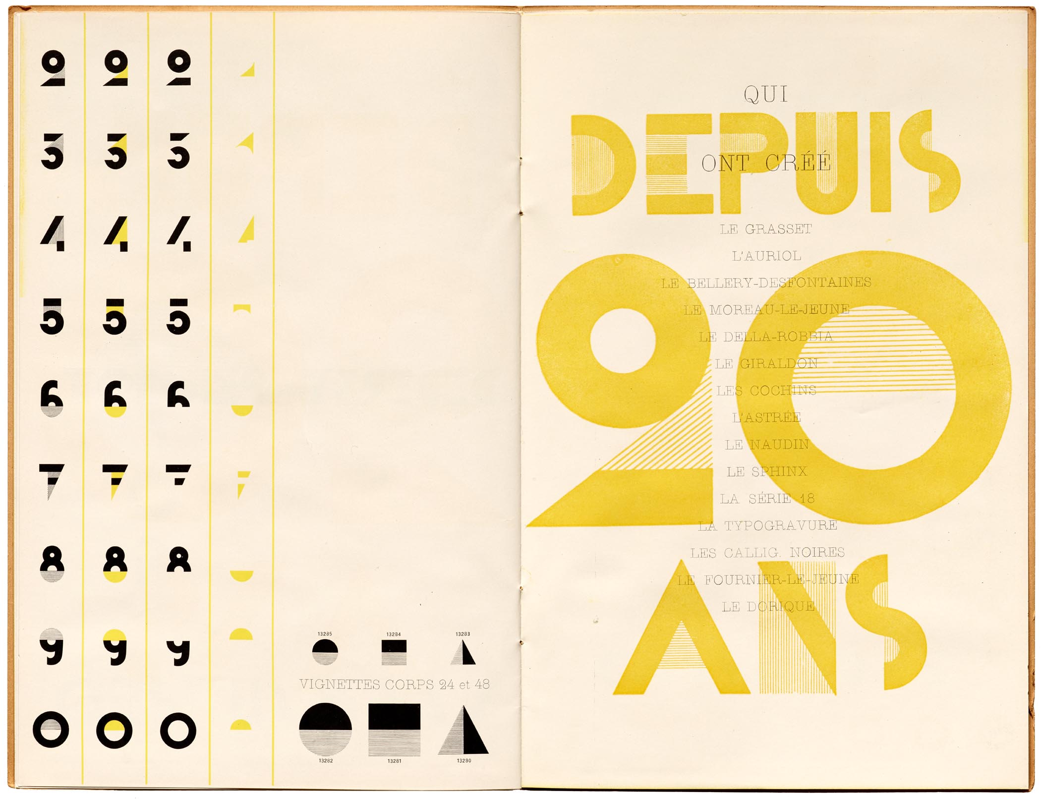
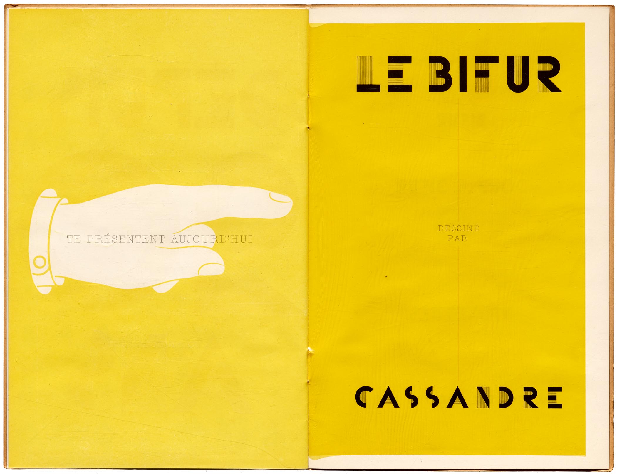
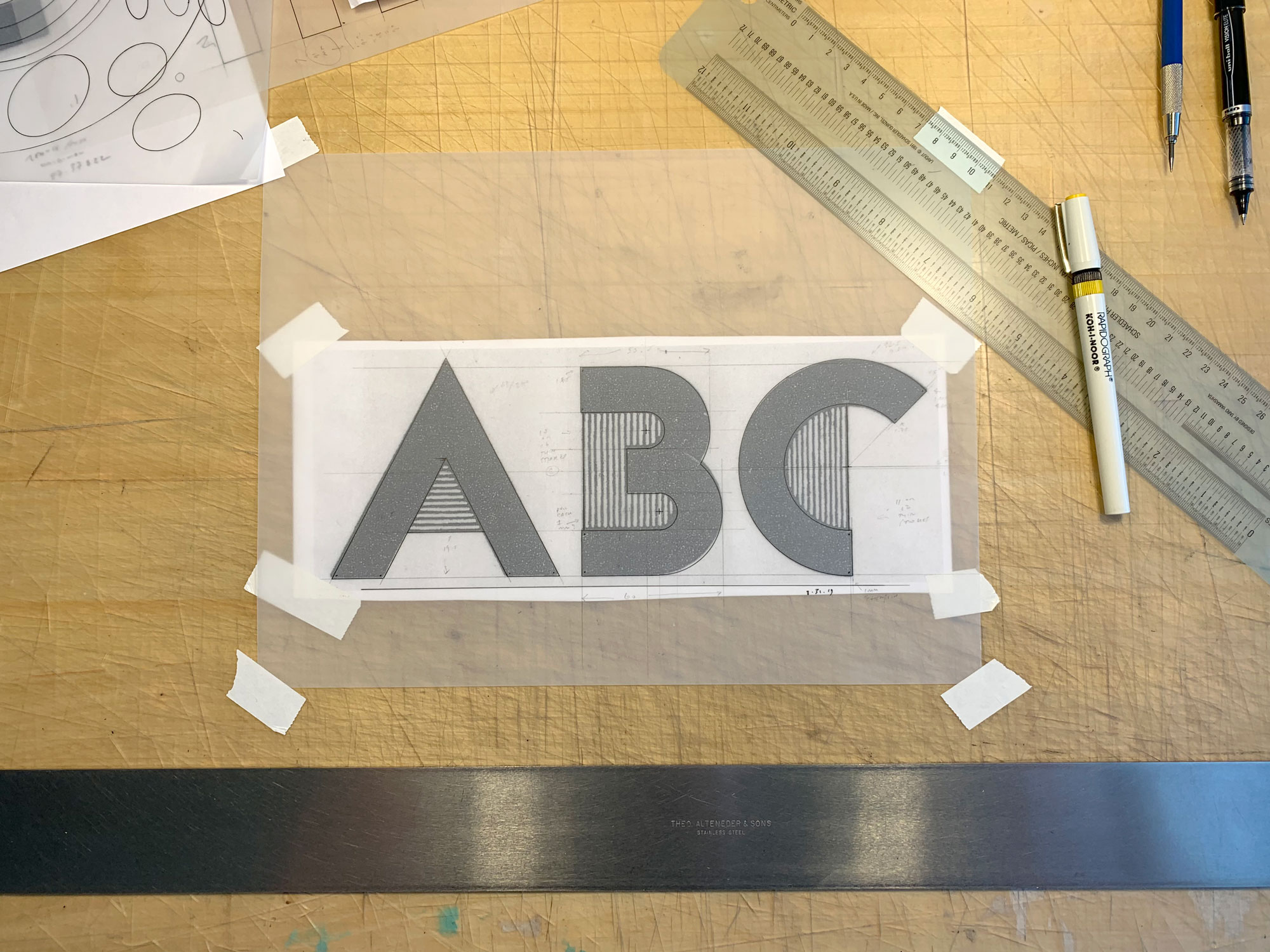
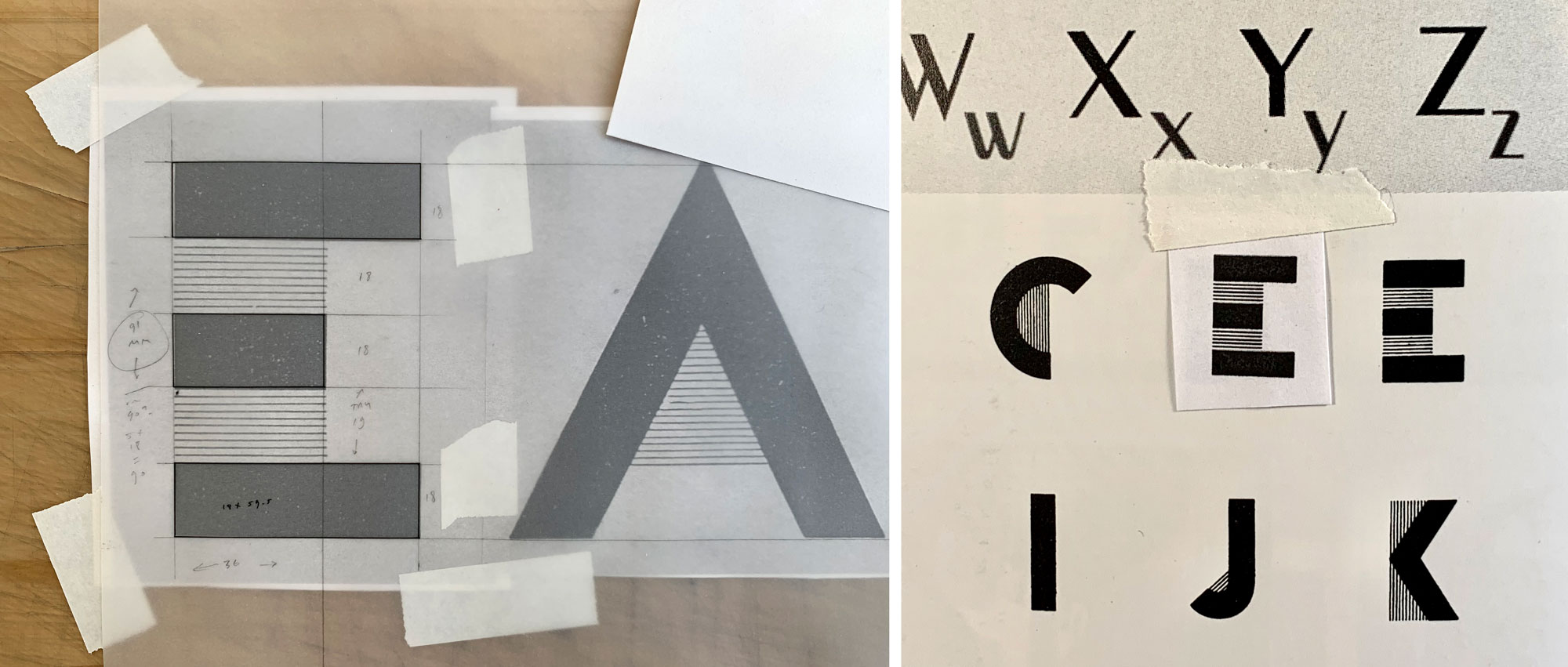
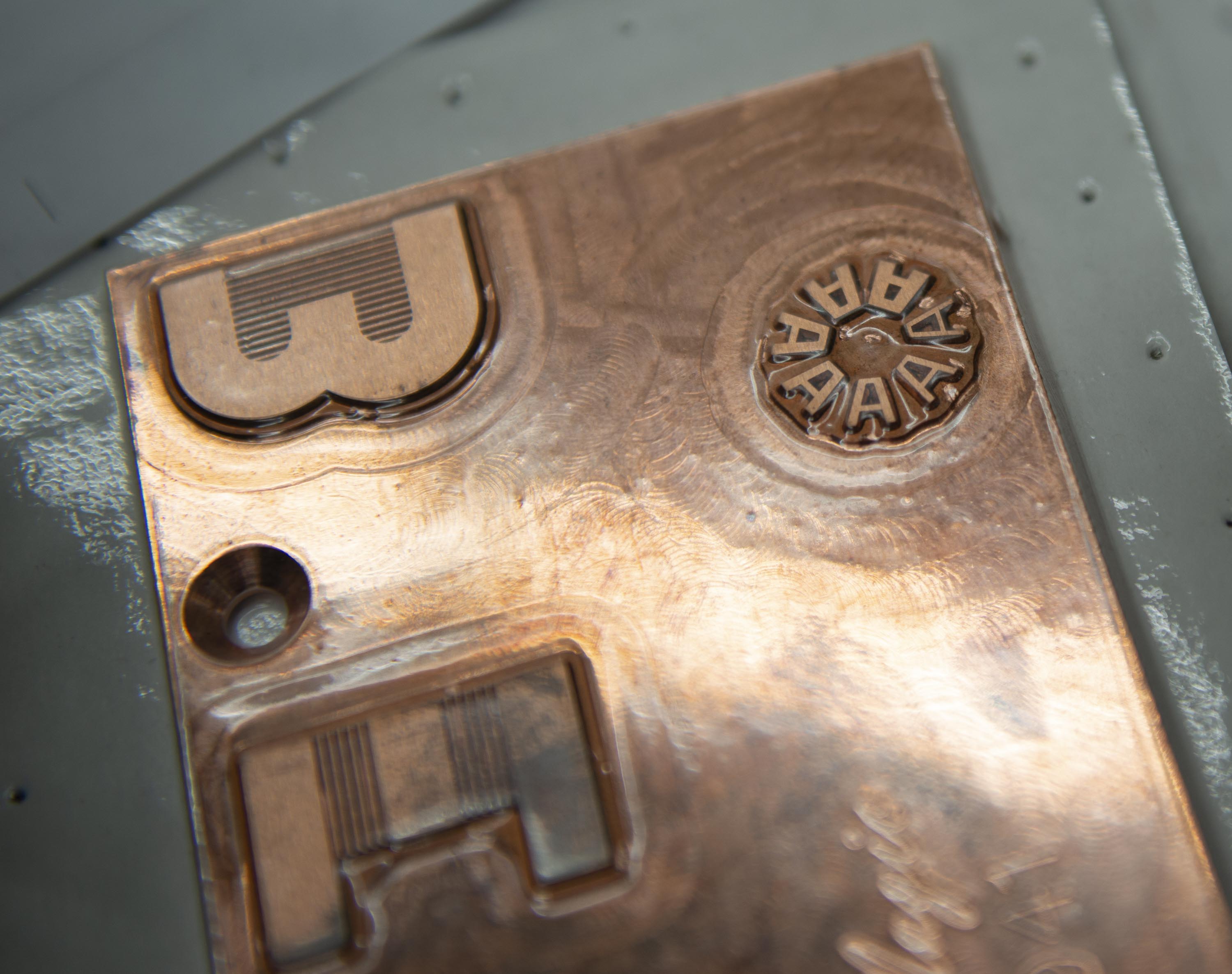
And what letterforms they chose: Bifur, the famed art deco typeface designed by French painter and poster artist A. M. Cassandre, issued in 1929 by Parisian type foundry Deberny & Peignot. In this striking and experimental typeface, fat and thin lines trade off as stems and crossbars, with thin lines extending into the letterforms’ counters as decorative fill. Bifur — which gets its name from the verb bifurquer (“to bifurcate,” or to divide into two) — was especially unusual in that it was also released in two-part fonts that allowed for chromatic printing, a potentiality revisited in Design is Play’s use of multicolored foils.
Bifur’s graphic duality appealed to Fox and Wang on a metaphorical level, too. “We were interested in exploring a modular typeface for the certificate,” the pair of designers relays. “Type comprising a ‘kit of parts’ that can be combined and recombined into varying forms seemed to us like an apt metaphor for the Archive community. Bifur isn’t as modular as some faces — Fregio Mecano, for instance — but its DNA is quite structured, and elements do repeat.”
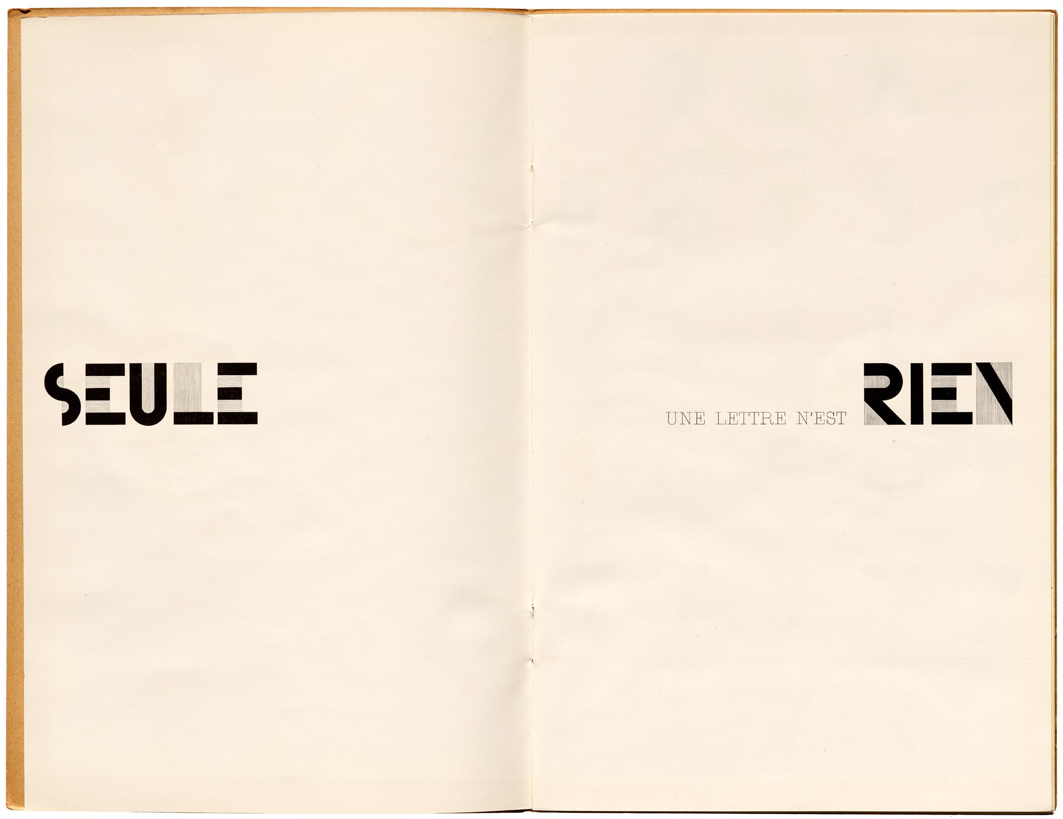
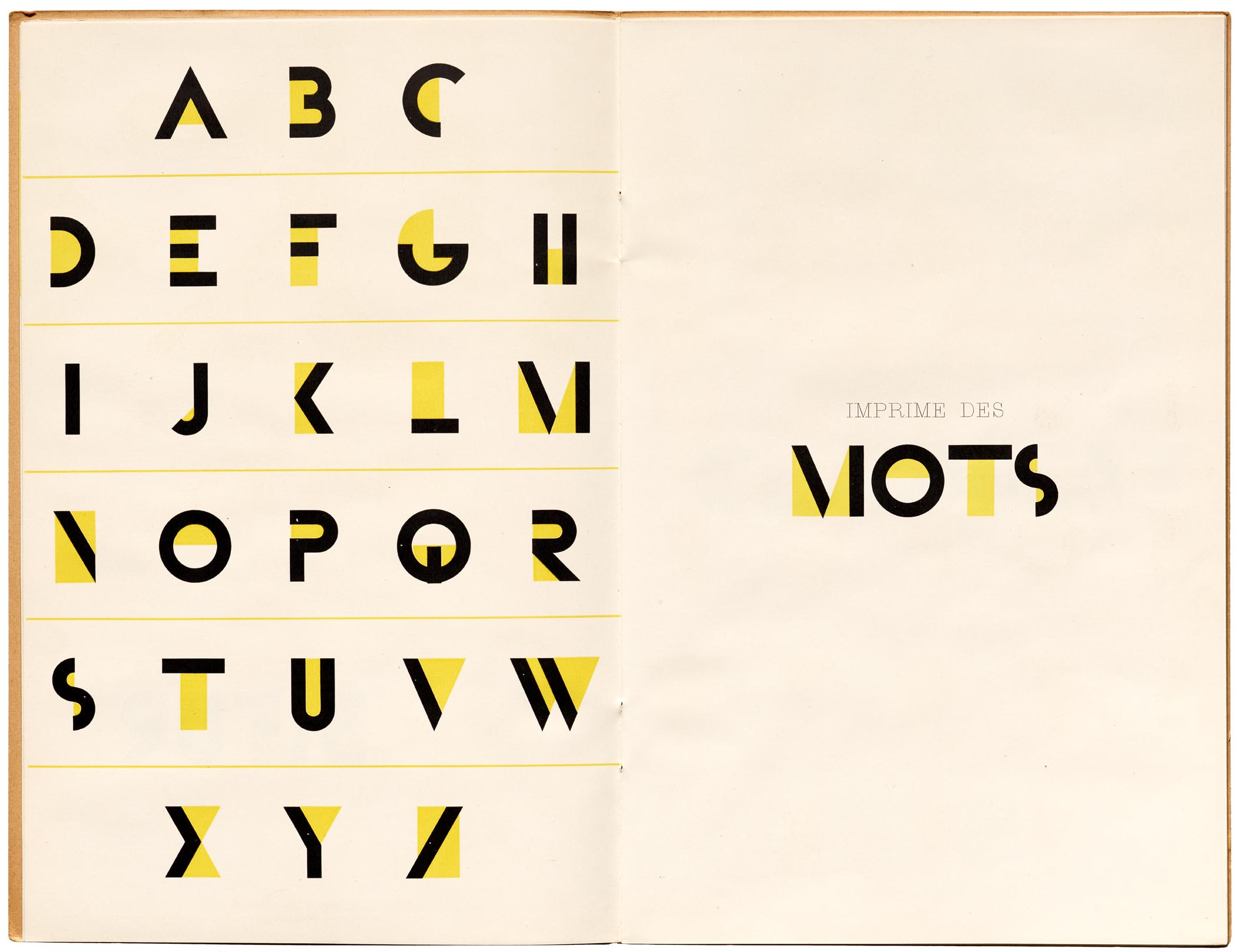
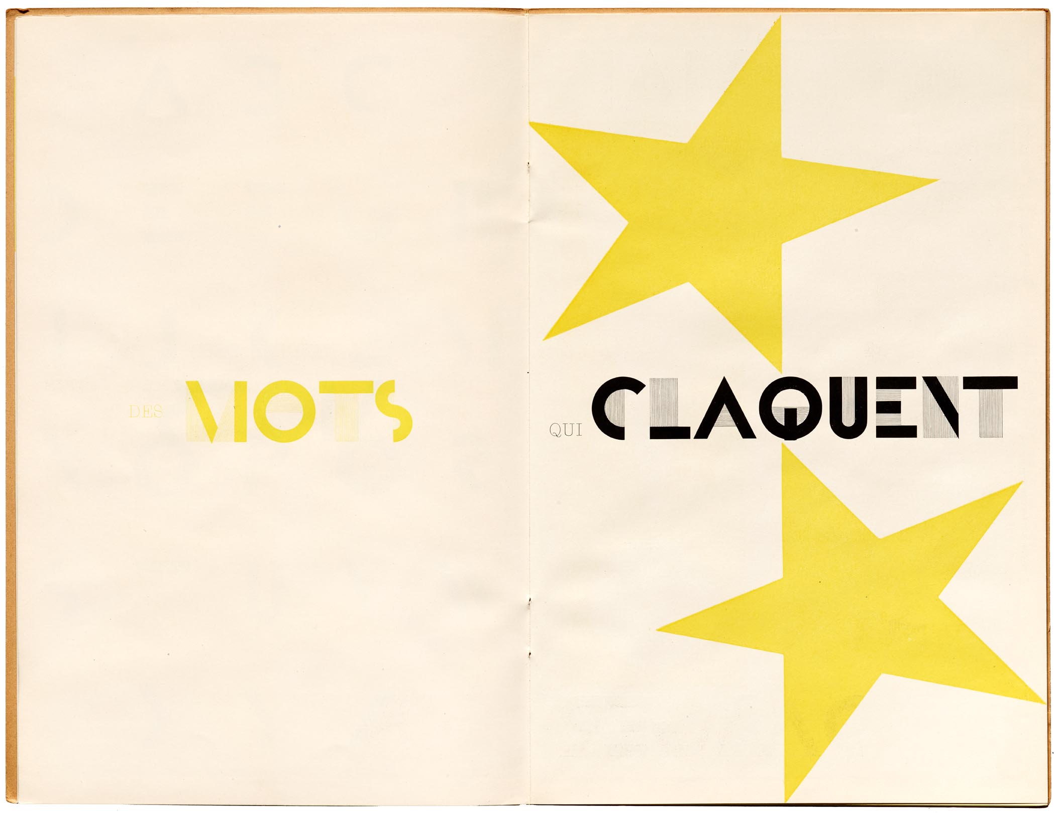
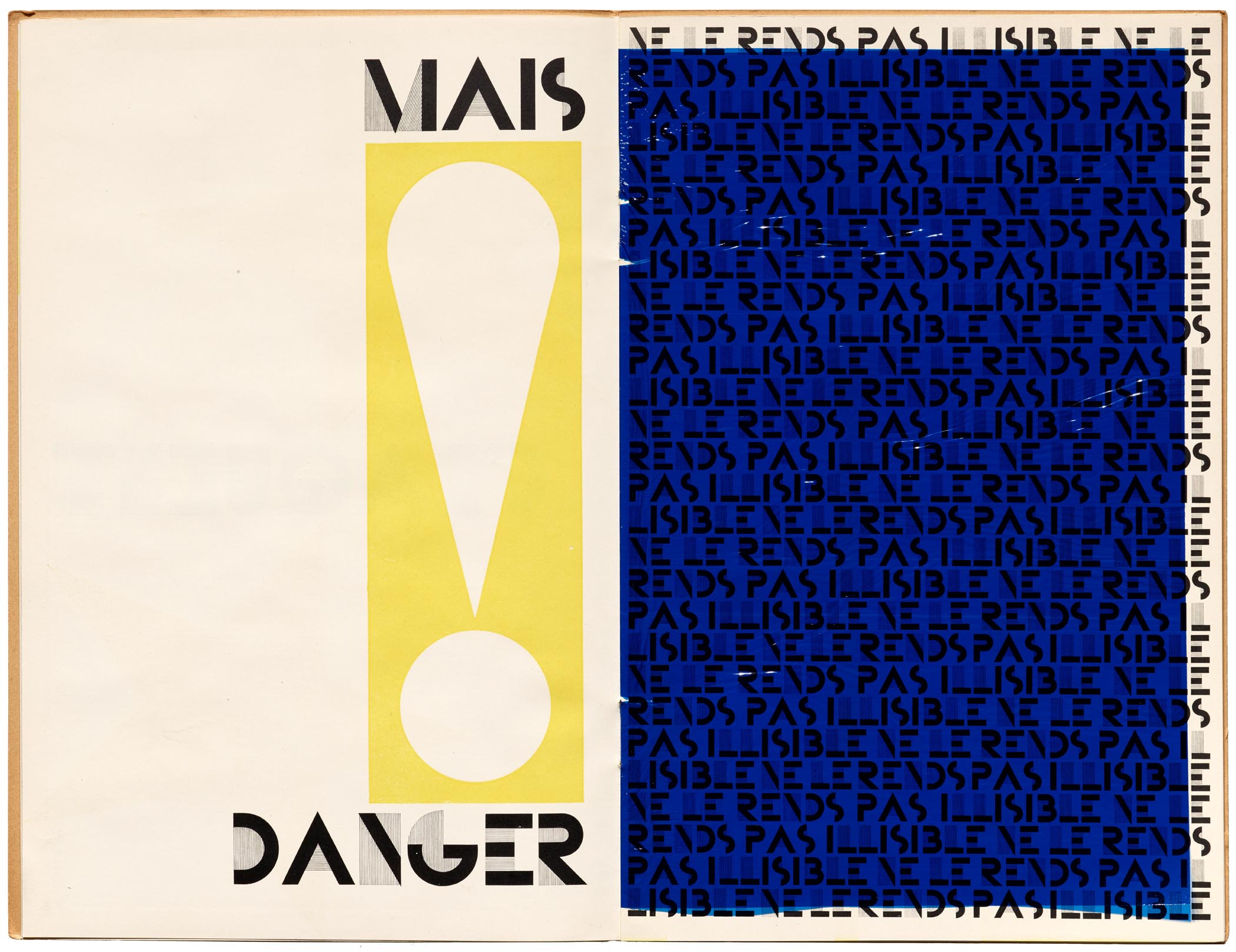
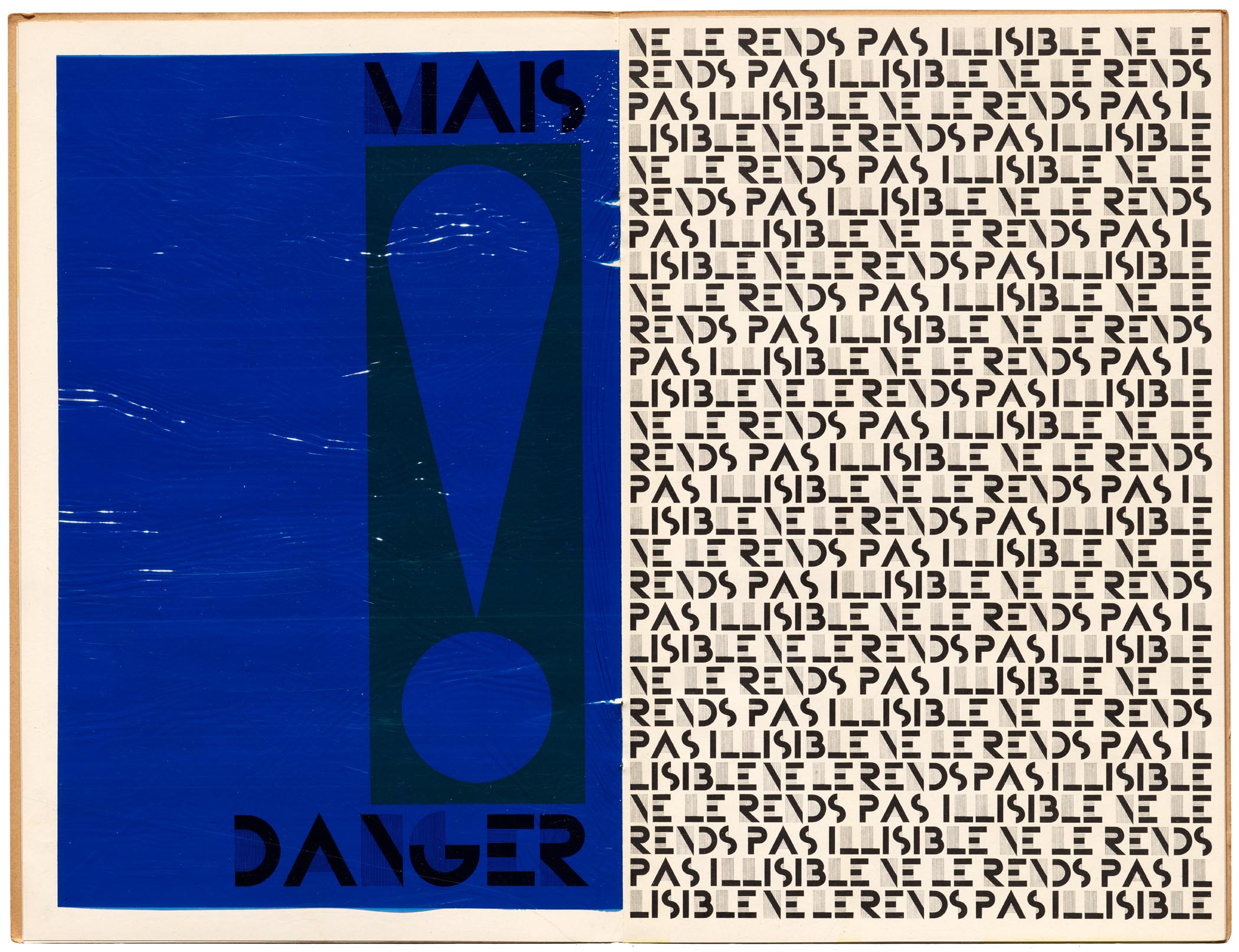
It was a choice that resonated with our team, since the Bifur type specimen — with its remarkably modern and playful use of colored acetate sheets and cheeky copywriting — is a perennial favorite among Archive staff and visitors. One especially popular page warns, “But use only for headings, not text: else, danger!”, followed by a page that endlessly repeats, “This is not the way to use Bifur” (or “Don’t make it illegible” in the French edition), typeset with chockablock spacing and line breaks often falling in the middle of the typeface’s name — an effect that Design is Play nods to in the keepsake’s stacked text and split words.
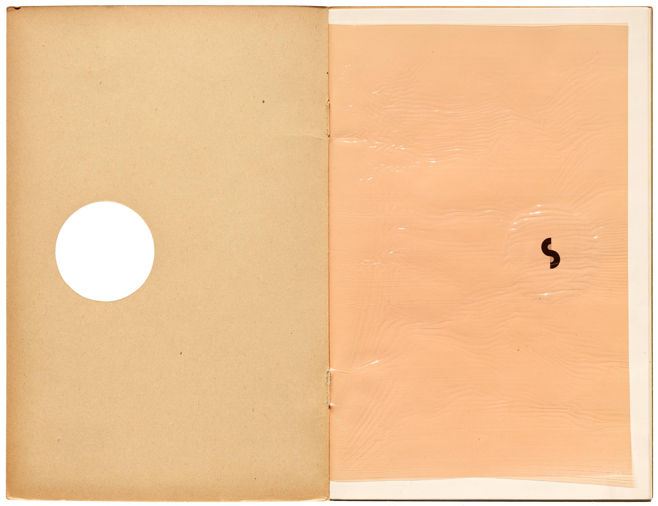
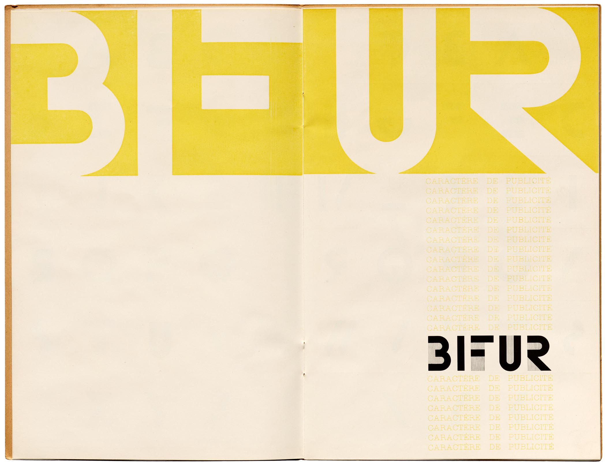
Bifur Specimen, 1929


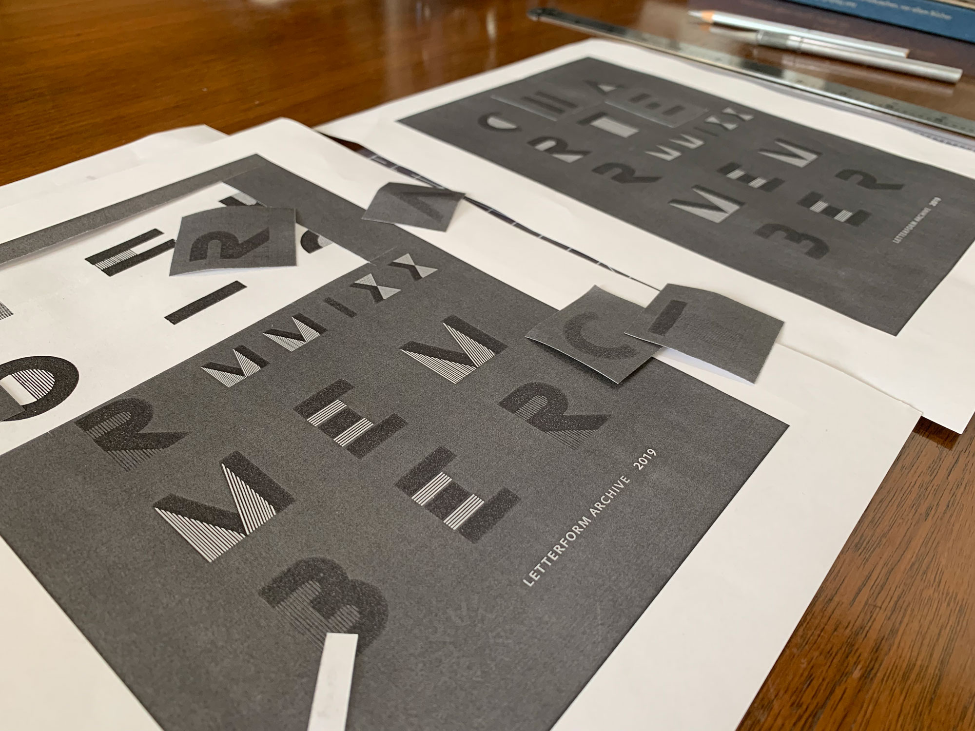
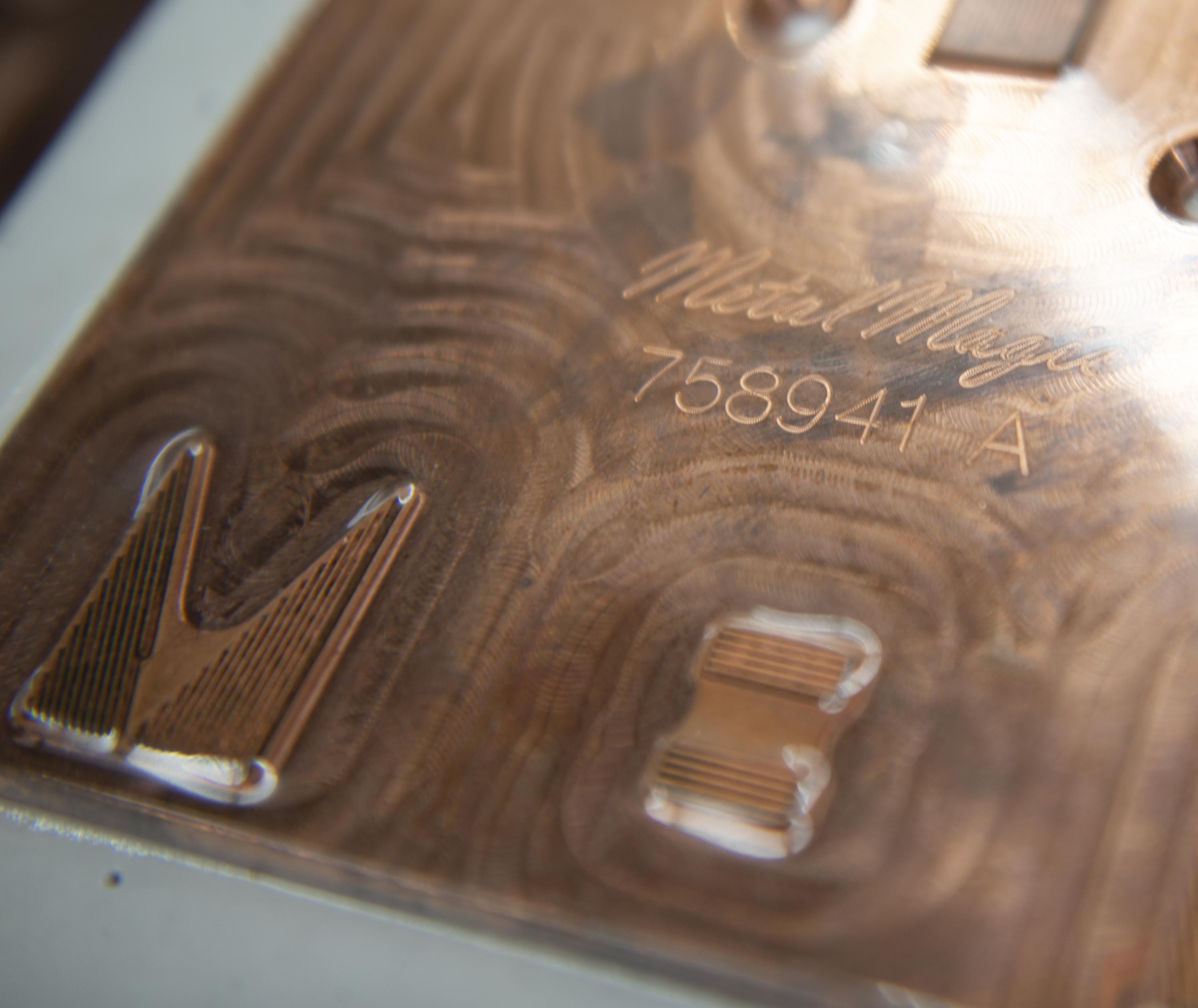
But Bifur didn’t come ready for off-the-shelf use in this case; Fox had to manually ink his own version, adjusting the letterforms’ spacing so it would work at size for the letterpress die. “When possible, I prefer to ink letterforms because doing so gives me a clearer understanding of a letter’s construction and its internal relationships. I also start to see relationships among different letters,” Fox says. “This process always brings me joy because it gives me access to the mind, eye, and hand of the original designer.”
Naturally, we were also drawn to the design’s bling. “The different foils are intended to reflect light in dynamic ways — the letters with black foil, for instance, recede or project from the surface of the paper depending on light and viewing angle,” Wang and Fox say. “As a result, one’s eyes move through the piece in a nonlinear fashion, which also abstracts (and deconstructs) the reading experience.”
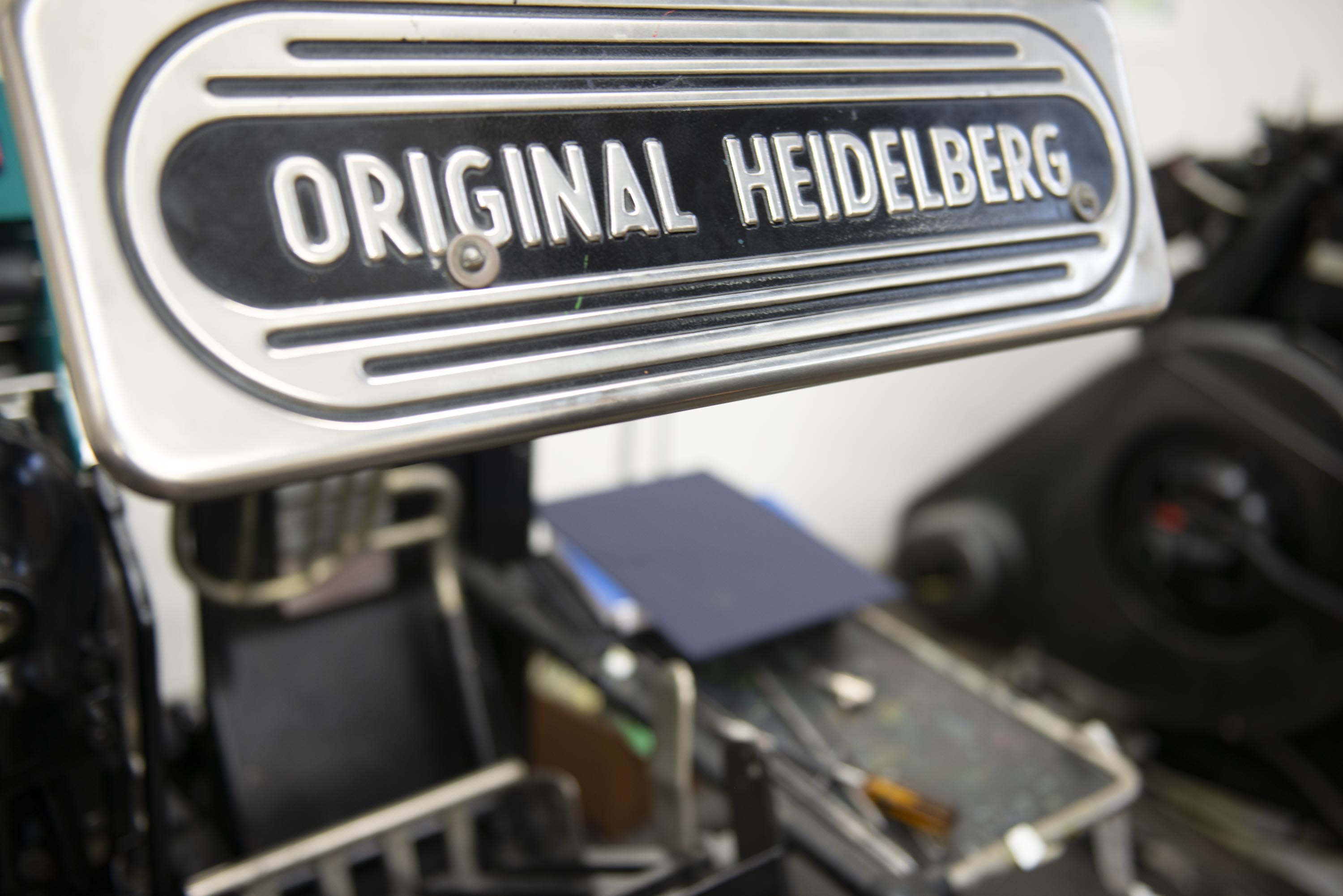
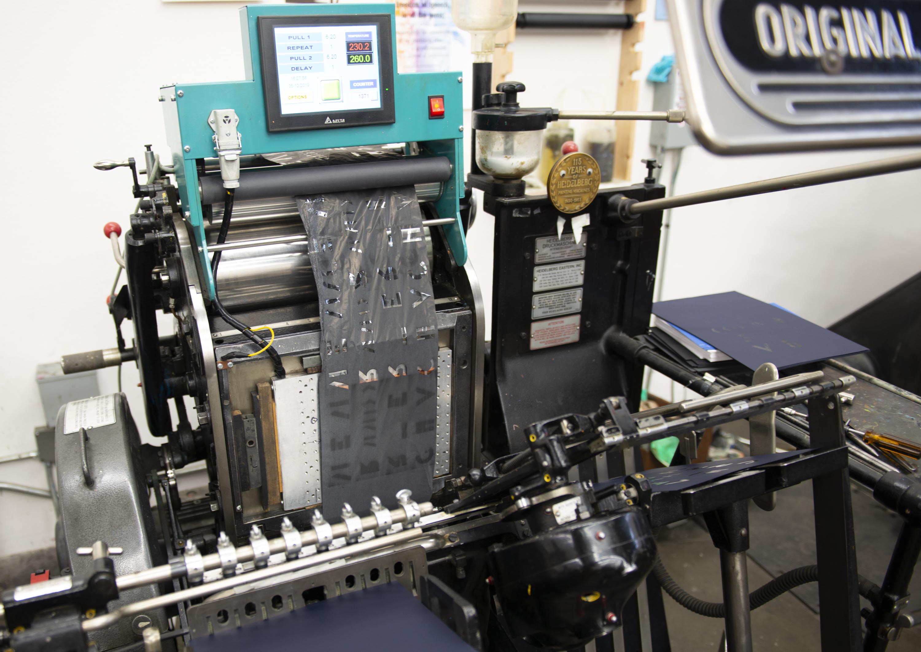
Putting the Keepsake on Press
Once we had a clear preference, it was time to troubleshoot the design on press. “I was concerned about how the fine parallel lines in the Bifur letters would look when foil stamped. With some foils and substrates you can sometimes have some bleed out of the foil, which can fill in fine negative spaces,” Benson explains. “So we made a test die and tested four different foils on five or six different papers to make sure it was going to print cleanly, and to prevent selecting an unfortunate combo of paper and foil.”
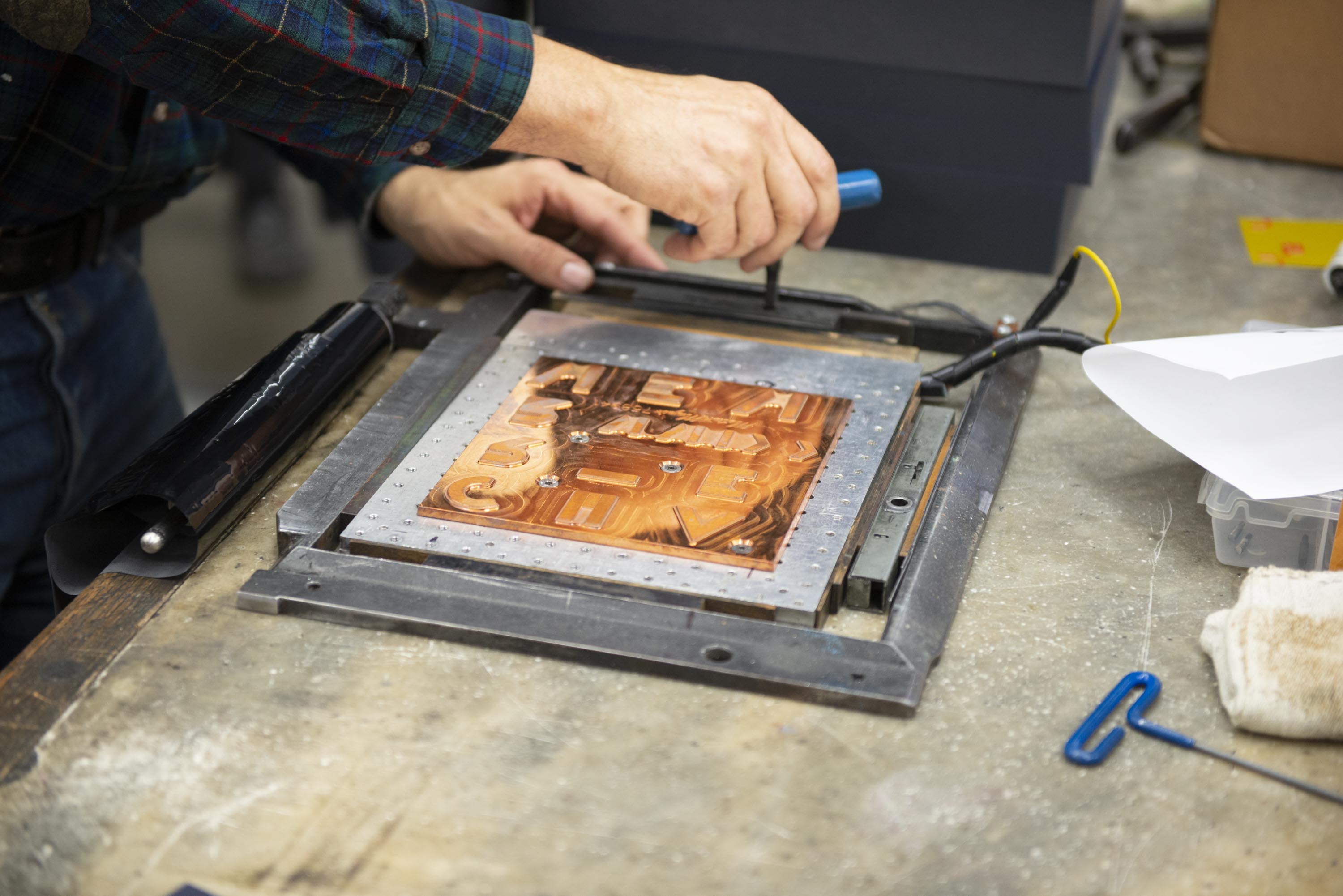
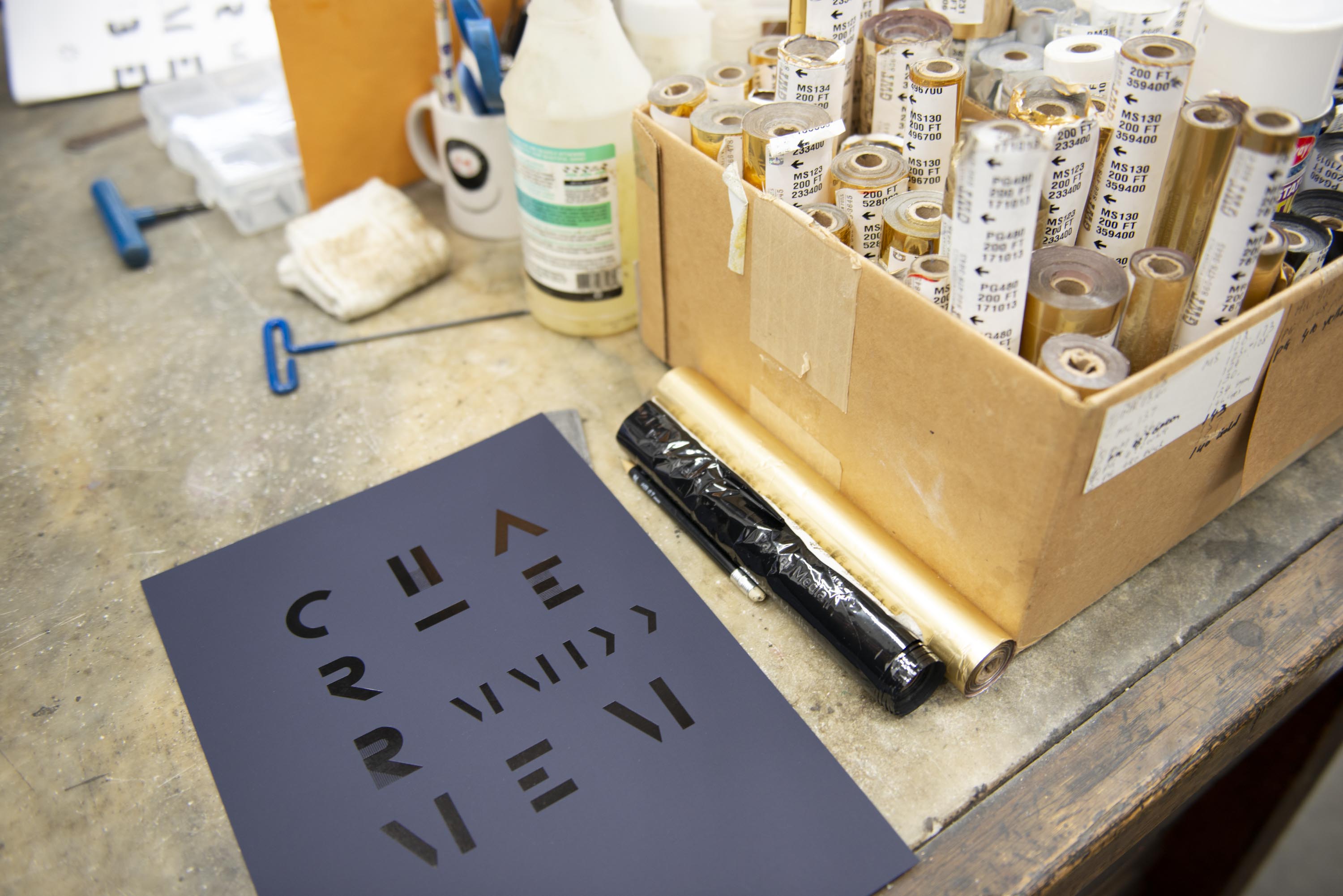

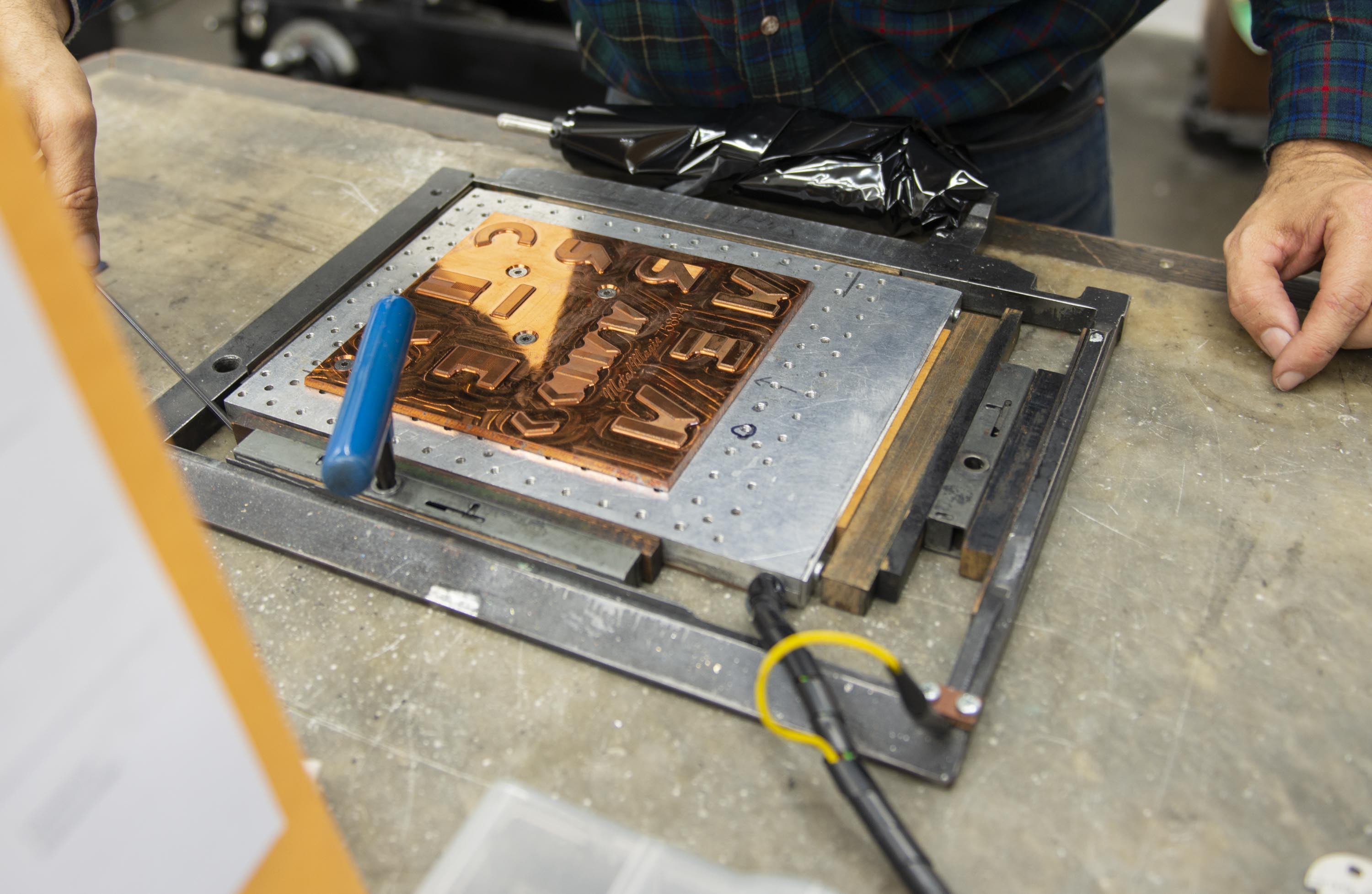


The paper did prove crucial. While a more classic, toothy stock in black or navy took the letterpress imprint nicely, the team was really drawn to a hypermatte, almost rubberized stock called Curious Skin. “There were several of the papers that were very good and we could have been happy with, but the Curious Skin was far and away the best of the lot and the most interesting,” Benson tells us. Design is Play chimes in: “The deep blue matte-coated paper provides a perfect contrast to the gloss black and metallic foils. Joel stamped the forms crisply, and every letter sits in sharp relief against the background. Although the certificate is a flat, two-dimensional artifact, we wanted the design to create a sense of tactility and depth, and to invite touch.”
Here’s a video of the first foil pass coming off the printer:
Thank You, and Keep an Eye Out!
This letterpress keepsake — along with facsimiles of several objects in the collection — are en route to charter members now, and should begin arriving at your doors later in January. Thank you again for supporting the Archive, with special thanks to Design is Play and Dependable Letterpress for the great experience — and of course a great end result. We hope you all love it as much as we loved creating it.
Lucie Parker, Associate Publisher