News
This Just In: The Darden Type Design Archive
Hundreds of annotated font proofs from Joshua Darden document and illuminate the process of making typefaces.
Joshua Darden, born 1979 in Los Angeles, California, published his first typeface in 1995 at the age of 15, becoming the first known African-American typeface designer. For the next ten years he honed his skills as an independent type foundry, and then as a staff designer at the renowned Hoefler Type Foundry under the direction of Jonathan Hoefler and Tobias Frere-Jones. He struck out on his own again in 2005, opening a new foundry, Darden Studio, and releasing his most ambitious and recognized design, Freight.
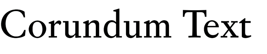
In the six years that followed, Darden and his studio created about a dozen retail type families, including Birra Stout, Corundum, Dapifer, Halyard, Jubilat, and the very popular Omnes, a pillowy soft sans serif used by AT&T, Carrefour, Crayola, Eventbrite, and many other brands. They also produced a slew of custom typefaces commissioned by editorial and corporate clients. While Joshua Darden is no longer working in type, the studio remains active and he still has a financial stake in it.
Letterform Archive is honored to receive from Darden Studio a donation of type design development files from 2006 to 2012. Several hundred sheets chart the development of typefaces through Darden’s own drawings, font proofs, design notes, and collaborations with staff. The archive offers a close and detailed history of type design rarely found elsewhere, especially in digital font making where much of the work is done on screen and not commonly archived in an accessible way. The Darden work joins Zuzana Licko’s archives for Emigre, expanding our collection of digital type process material.
The Typefaces


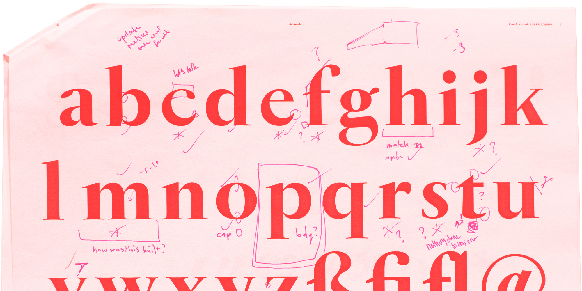
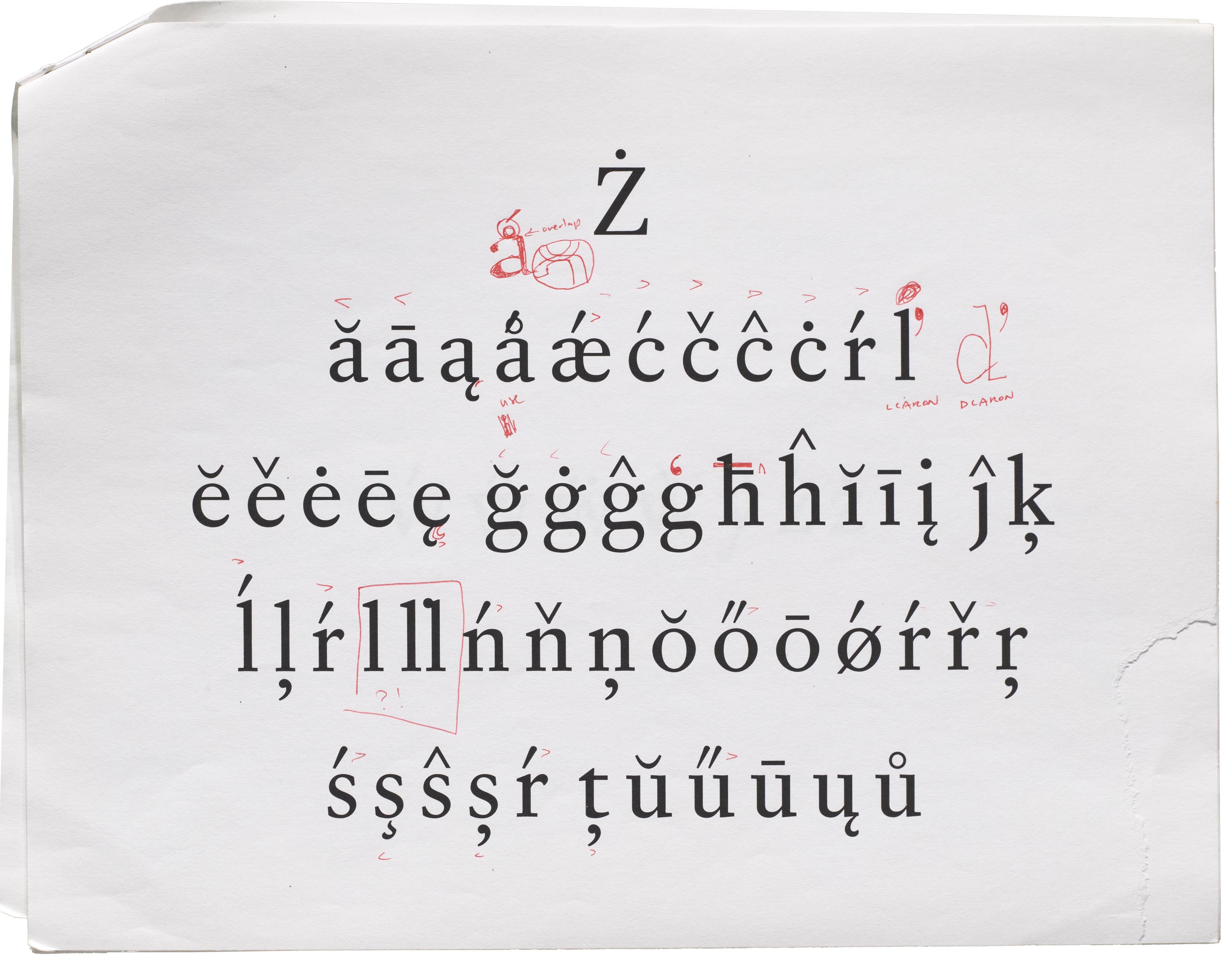
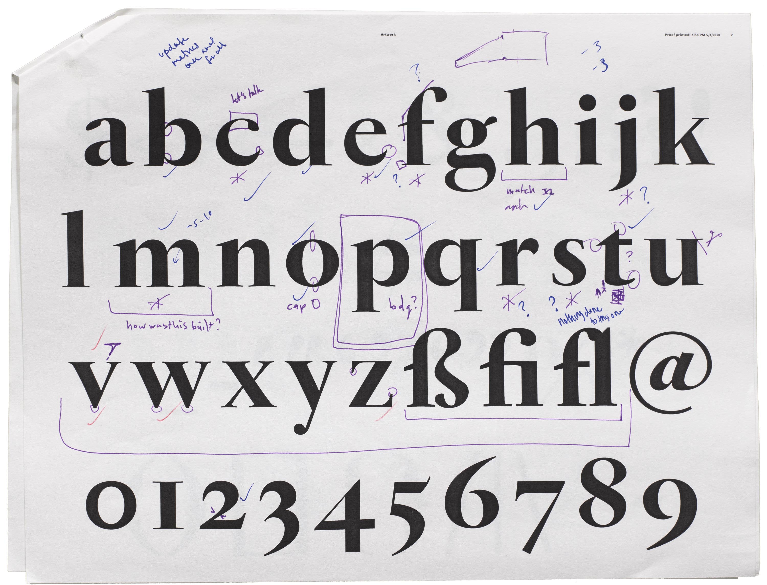
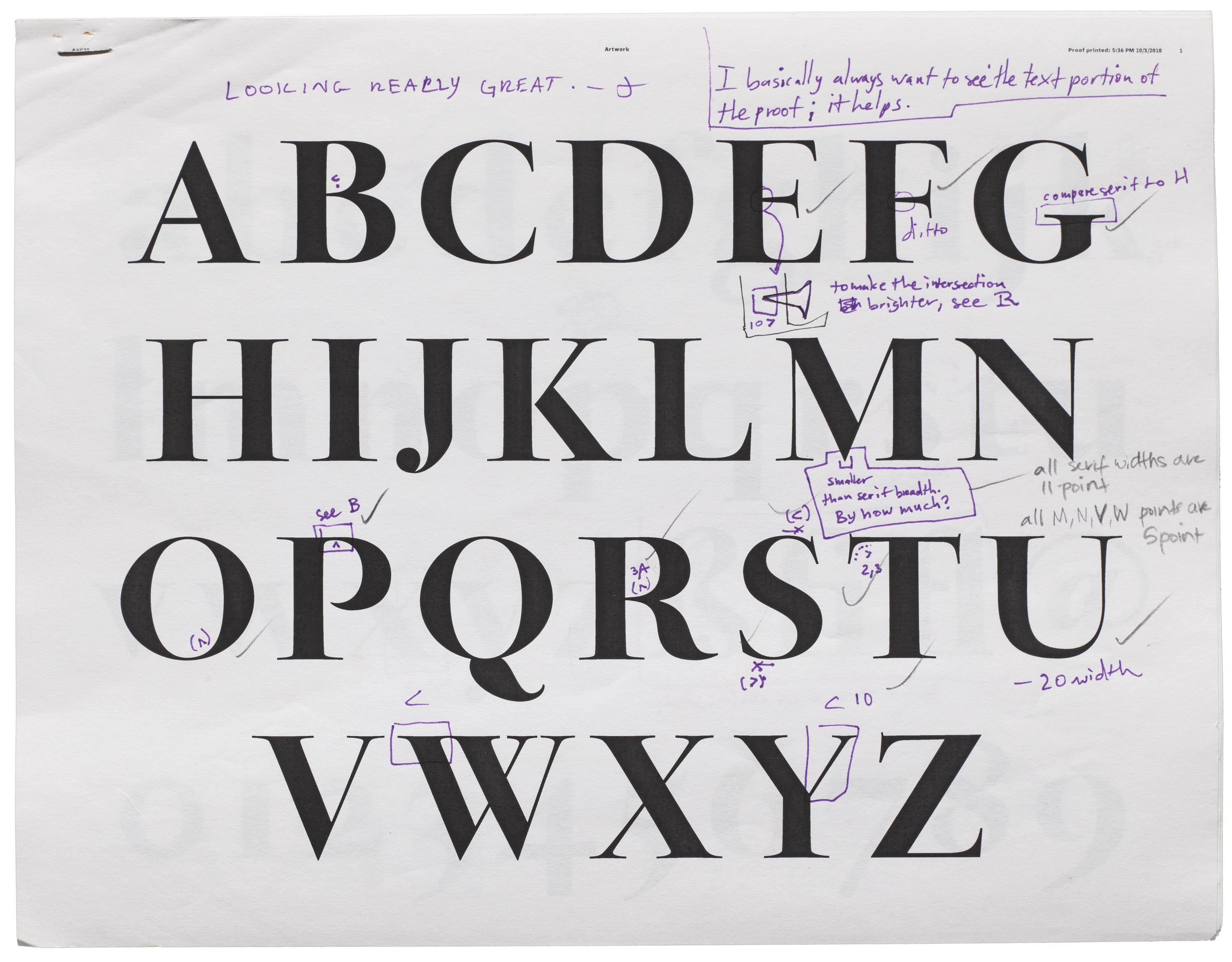
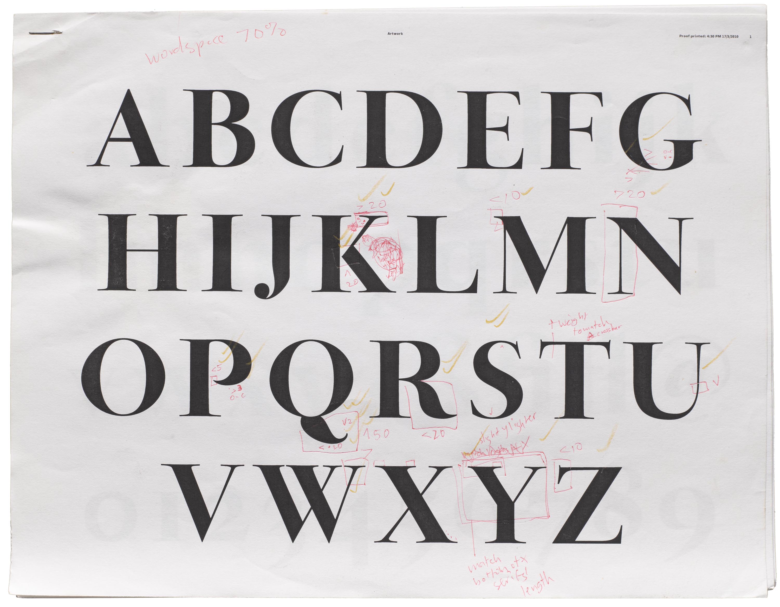
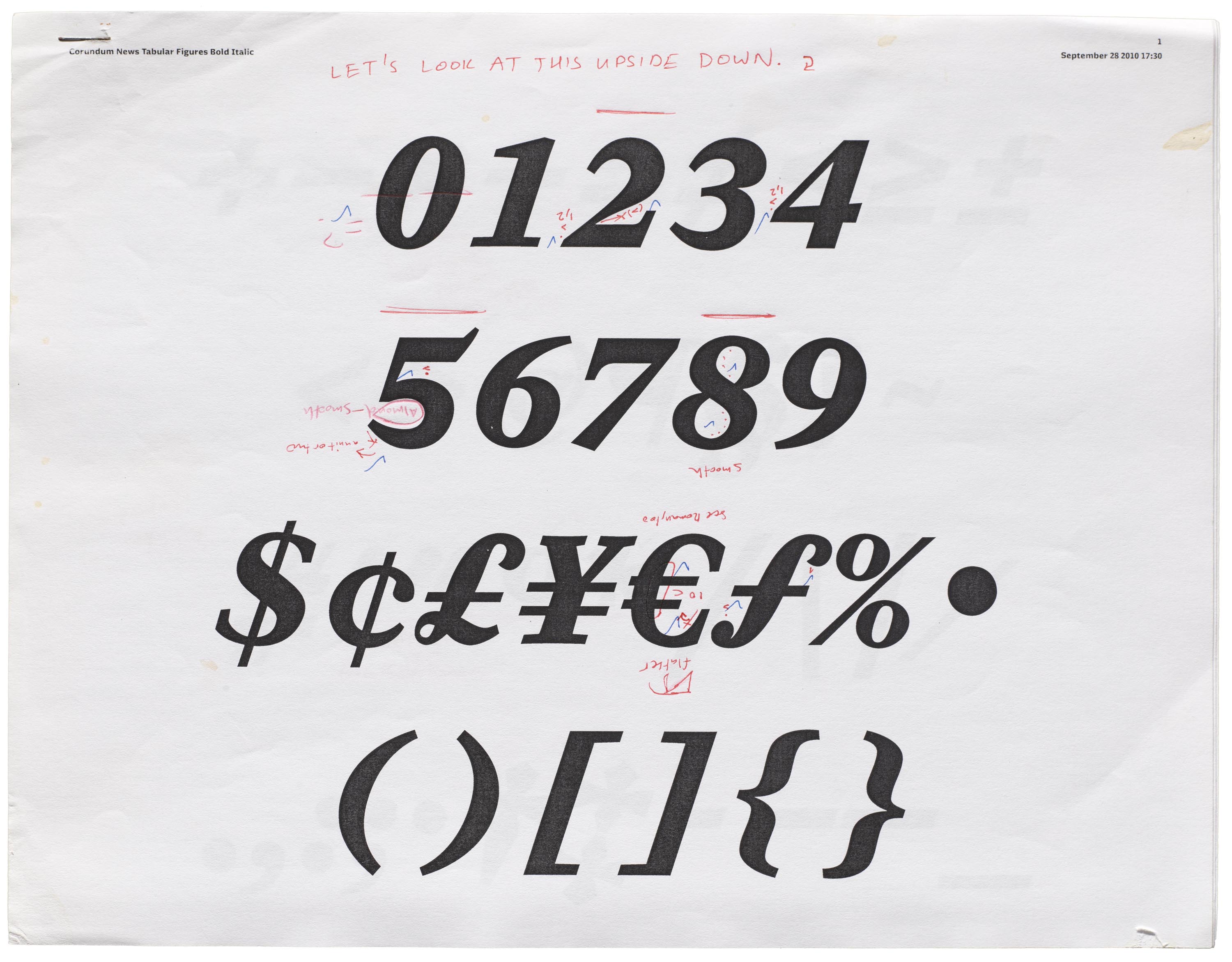
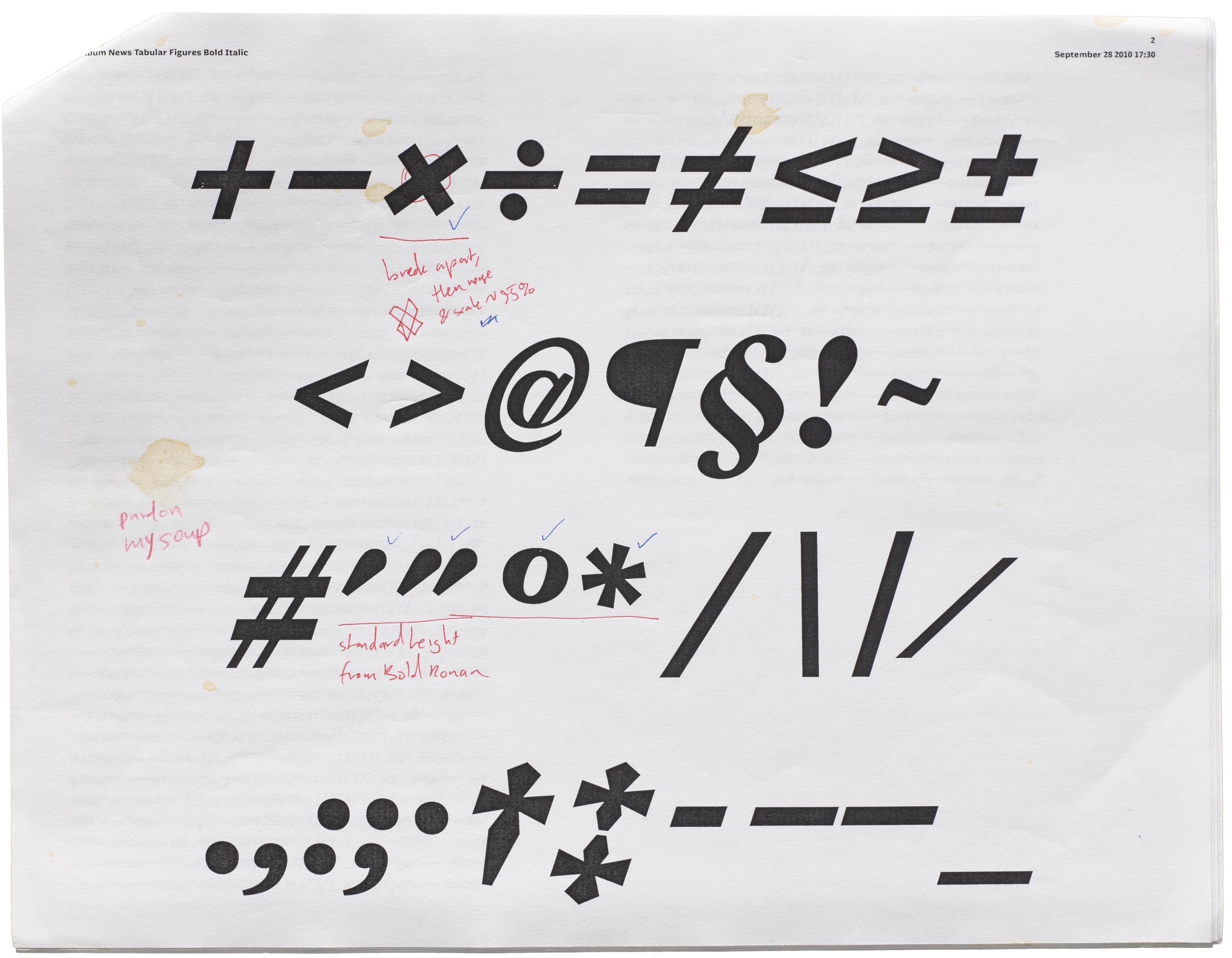
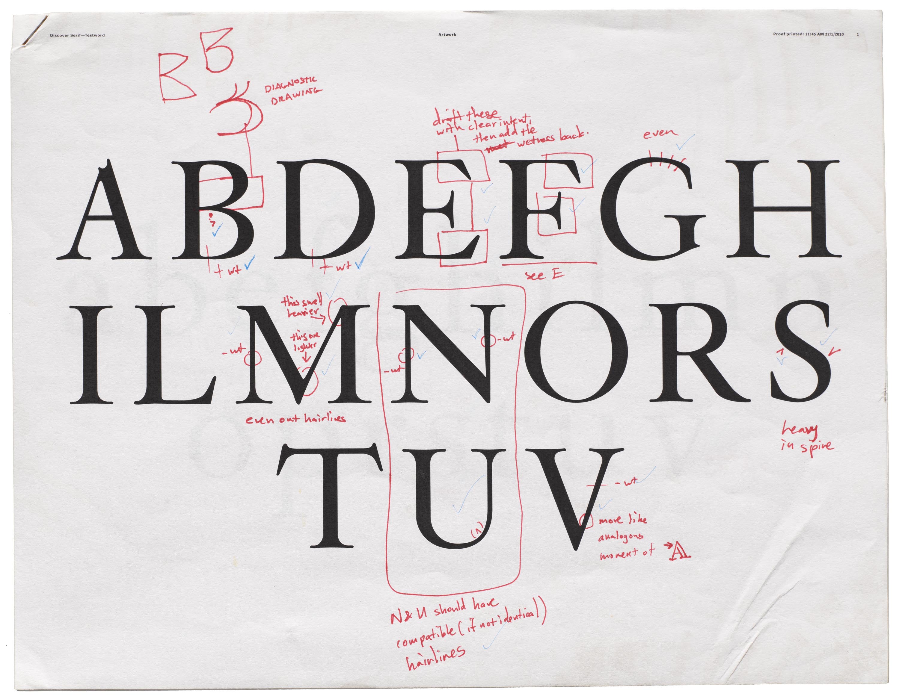
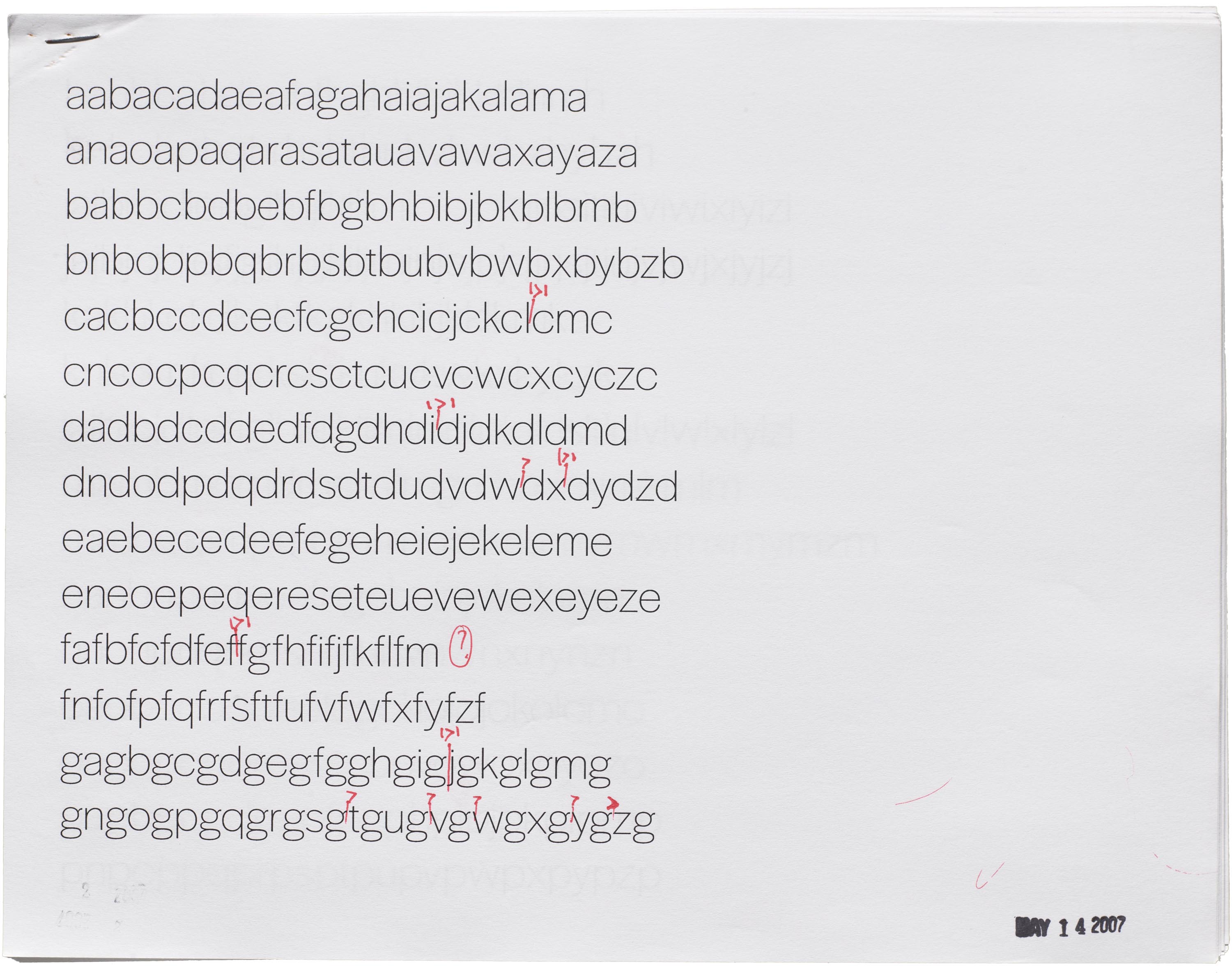
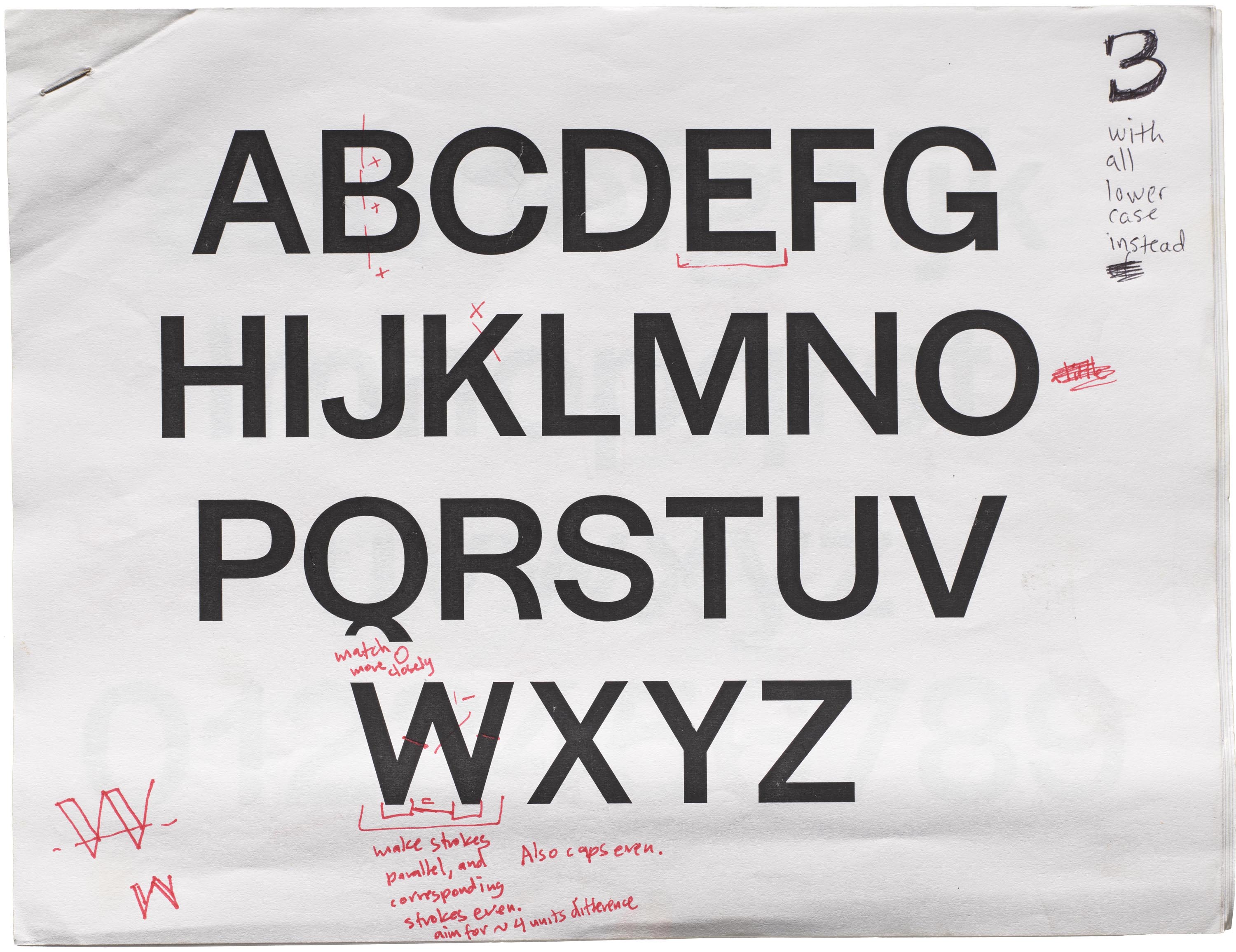
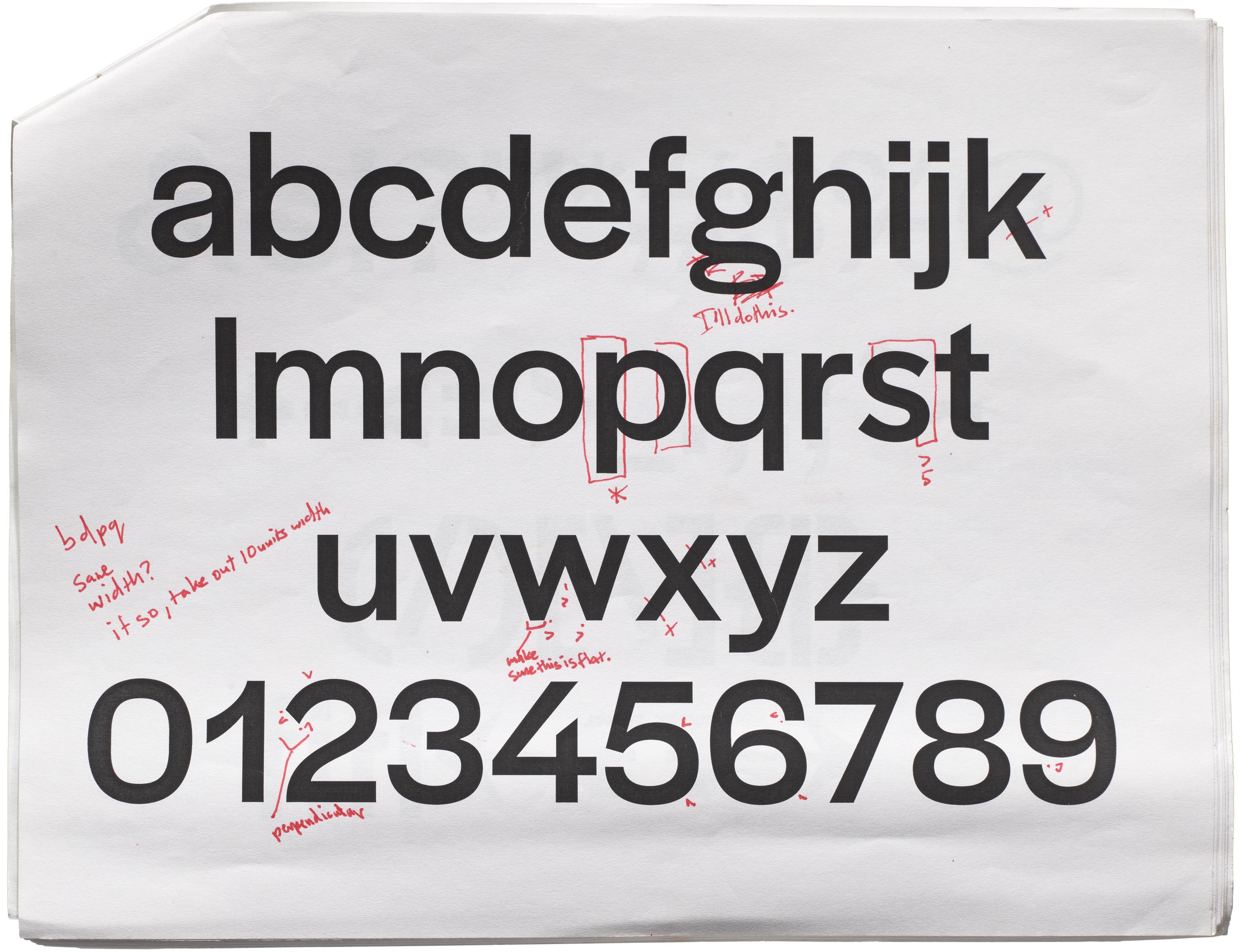
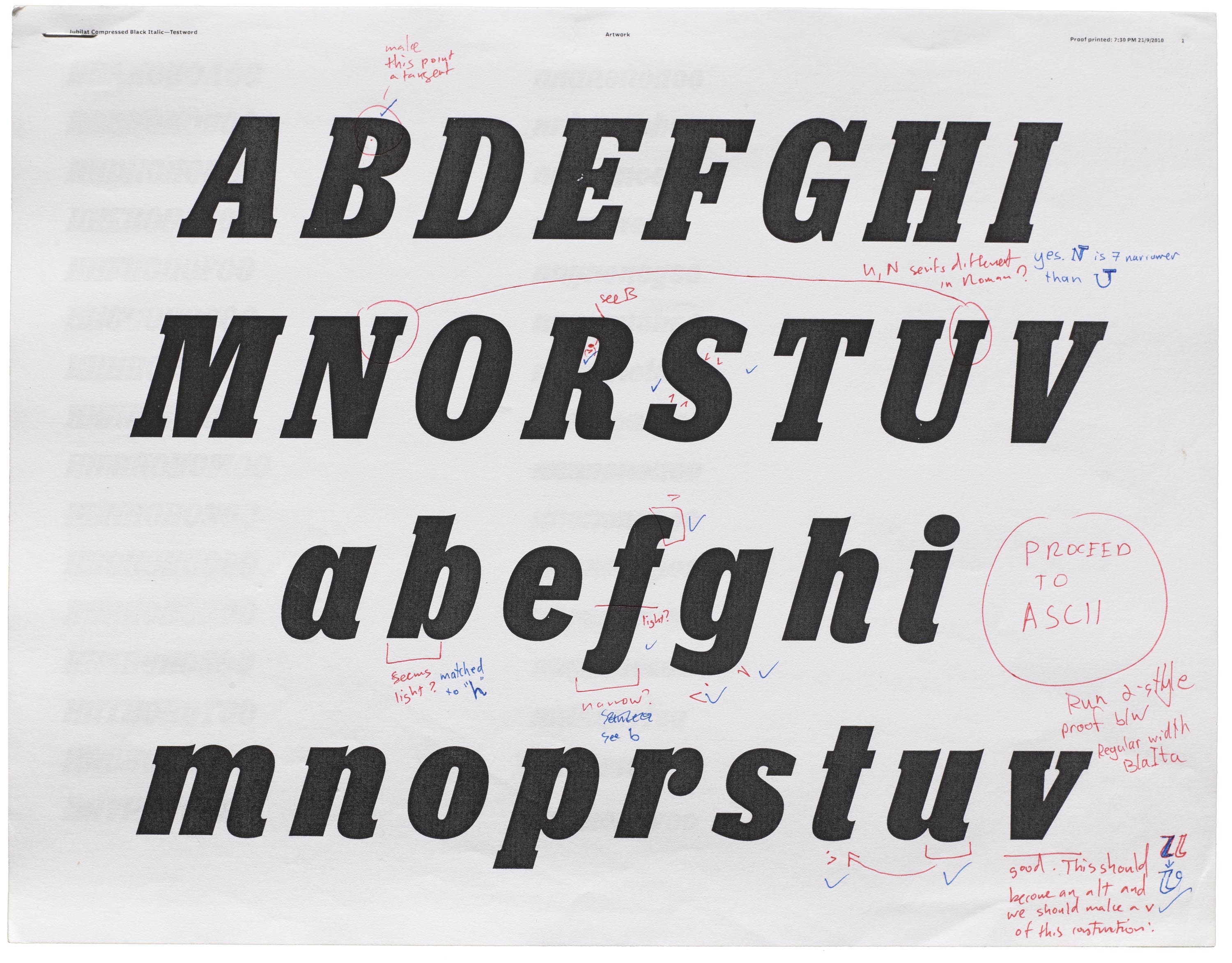
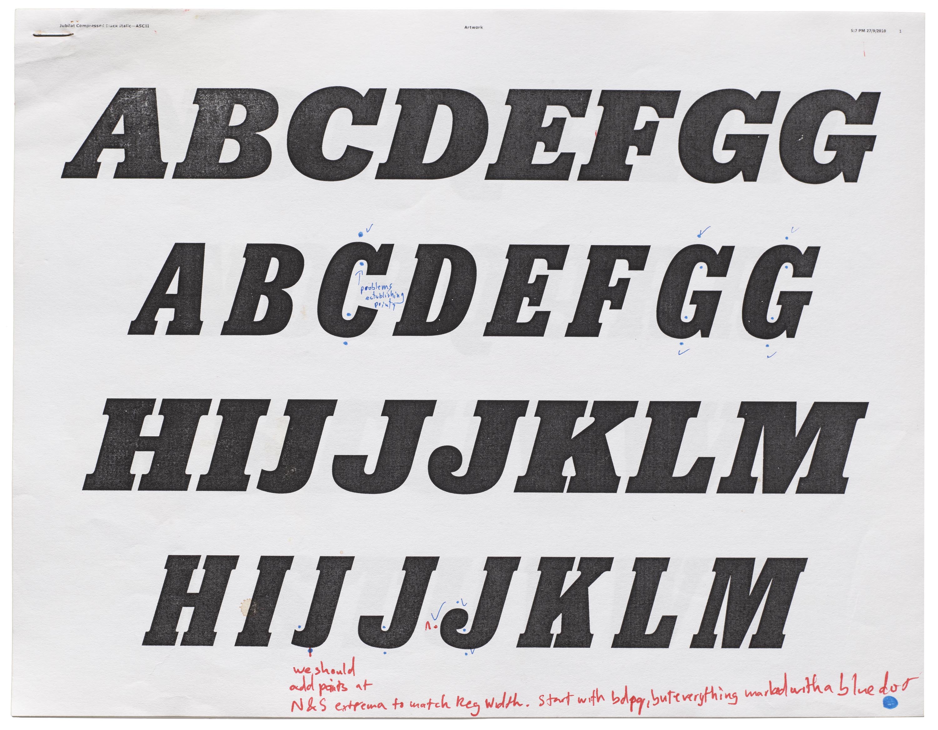
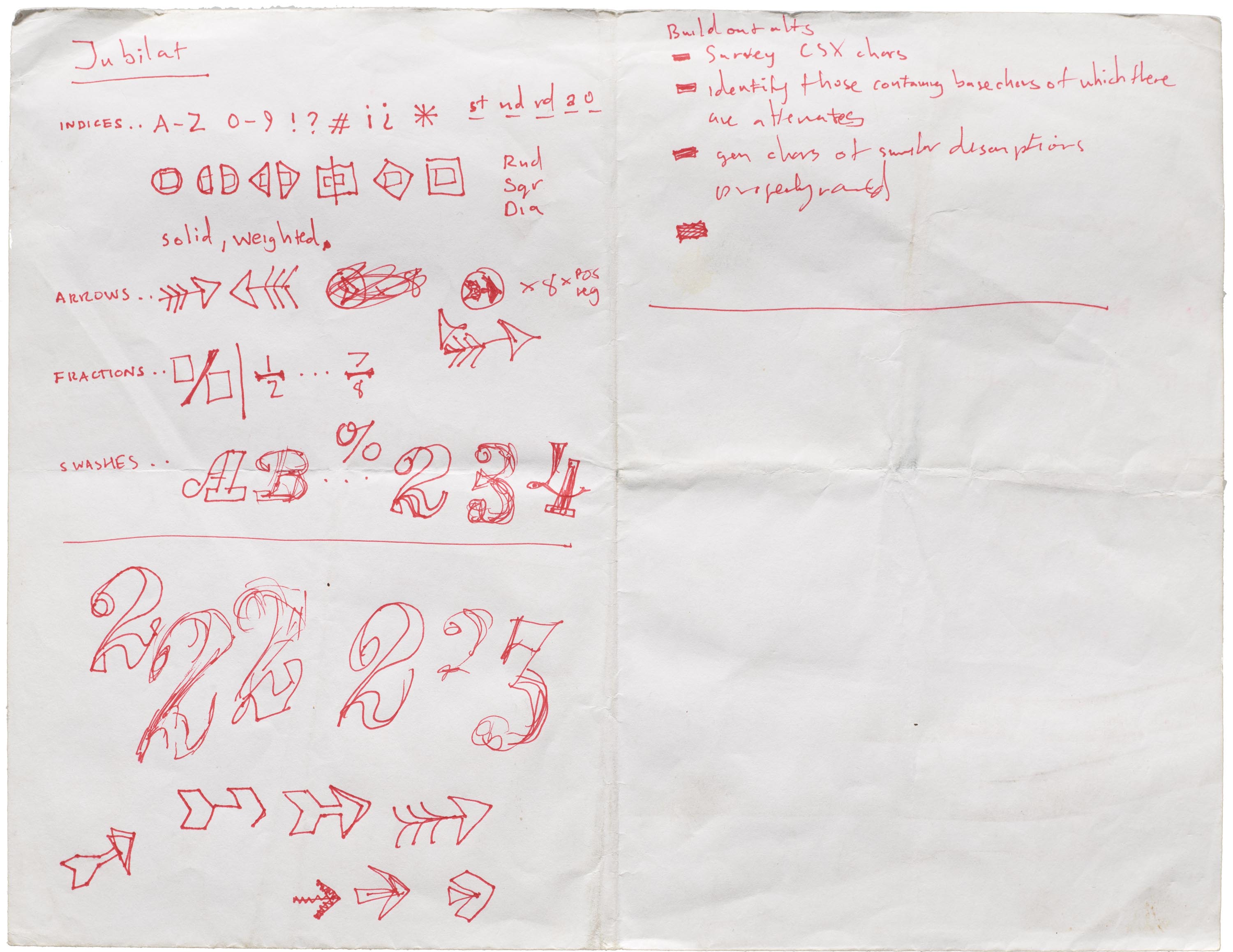
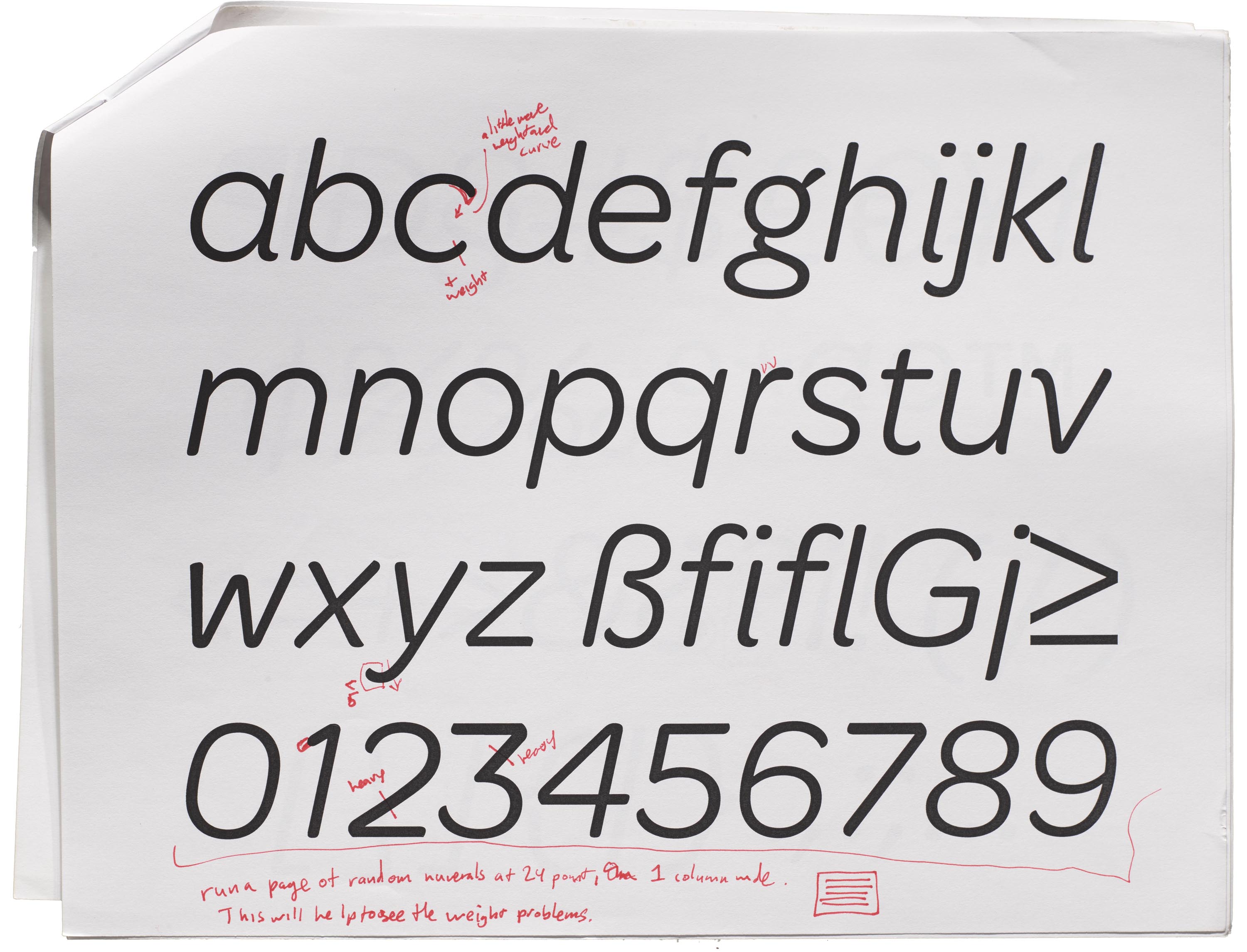
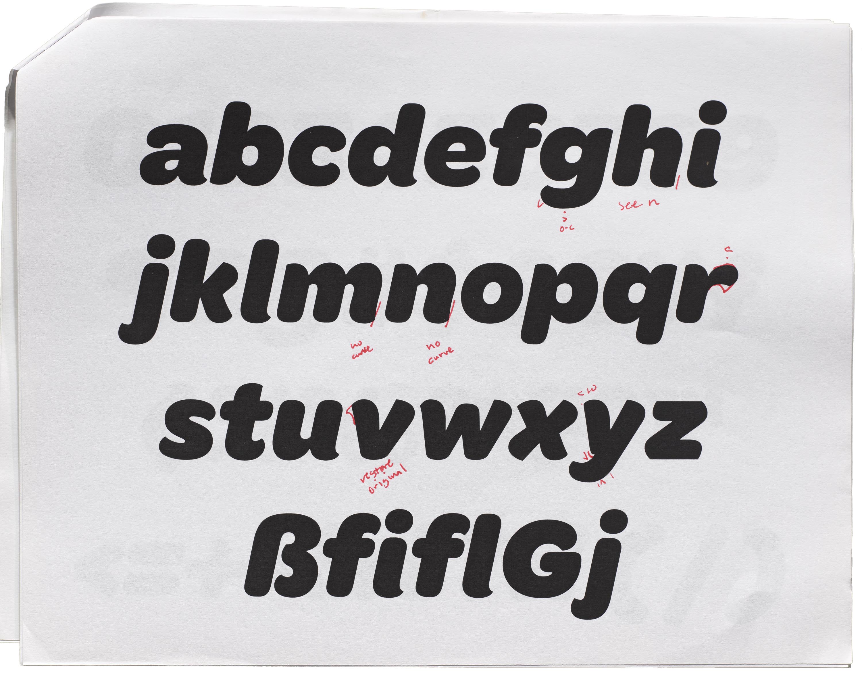
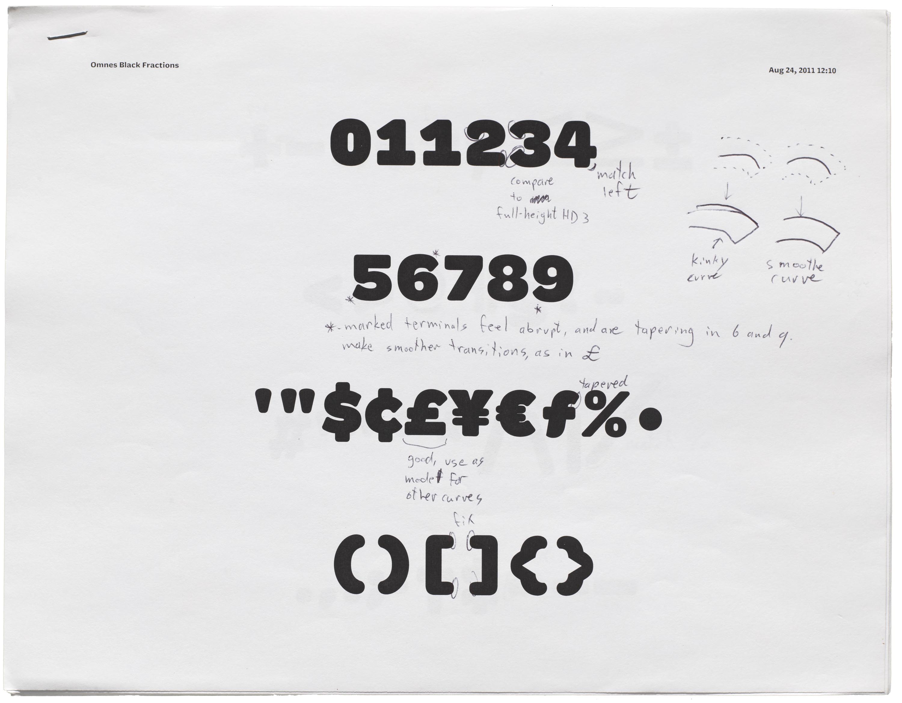
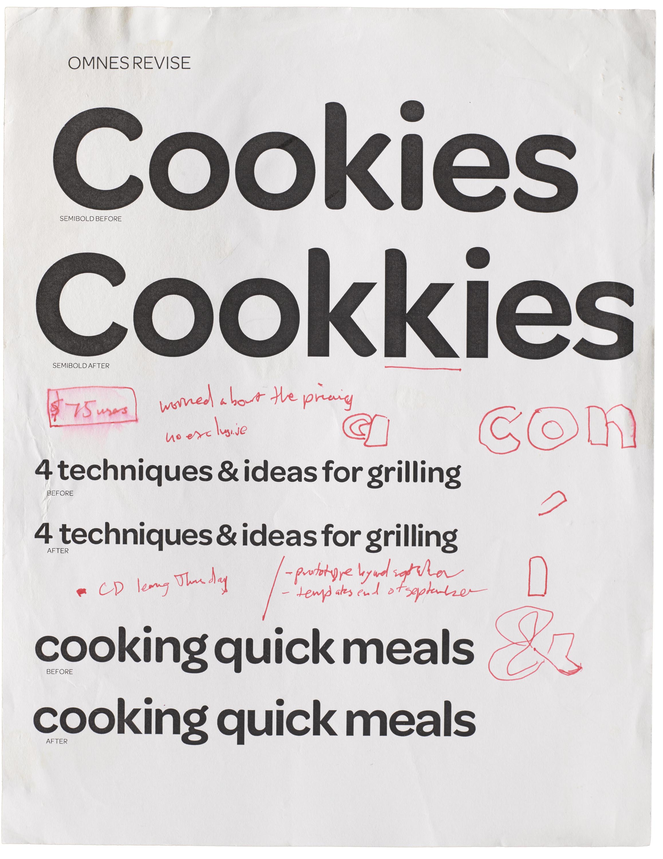
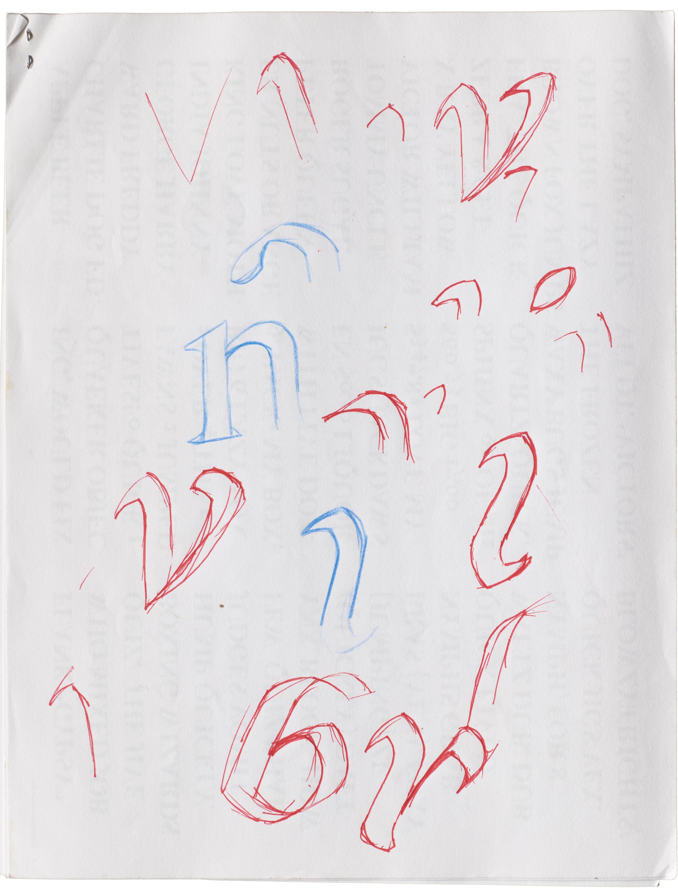
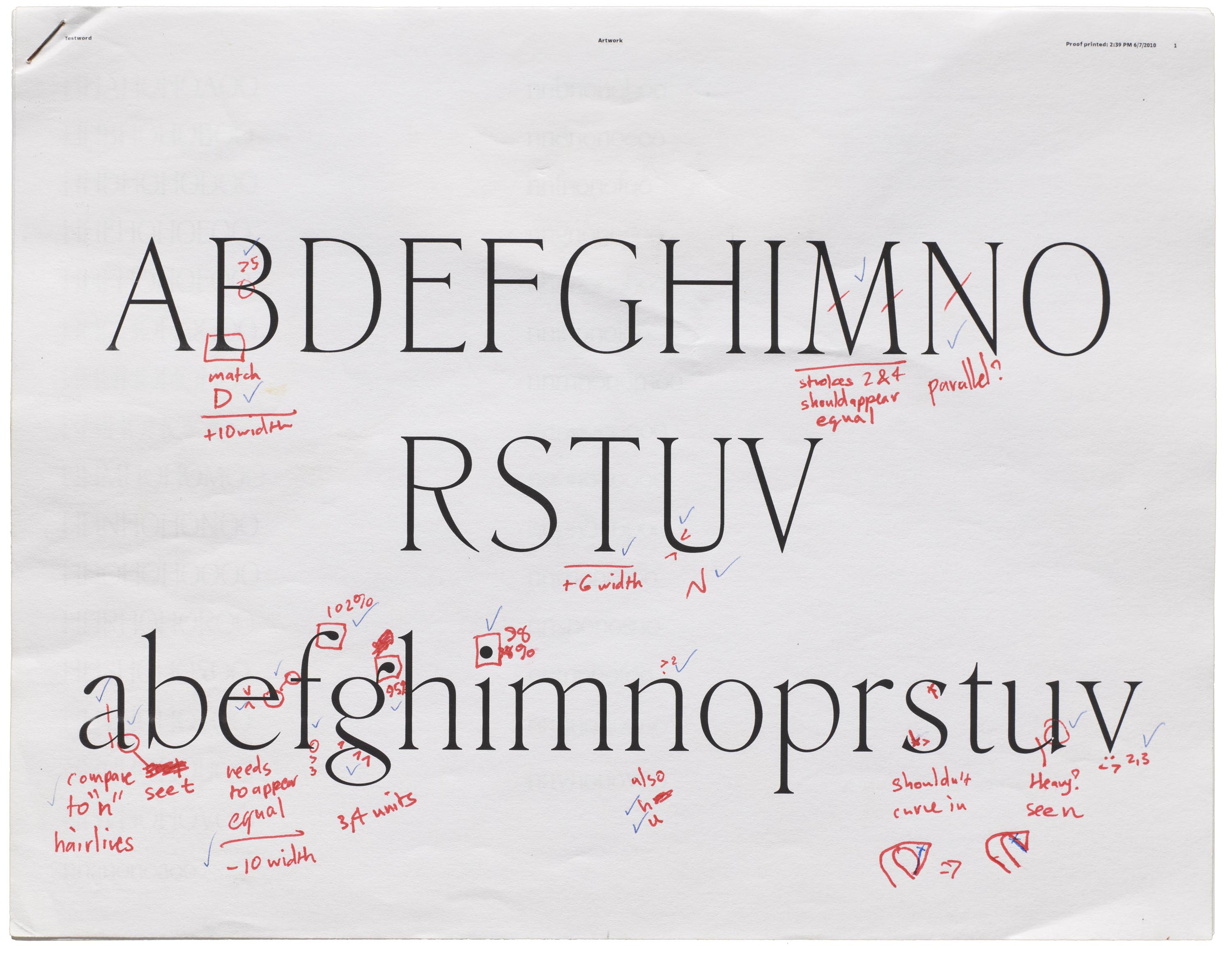
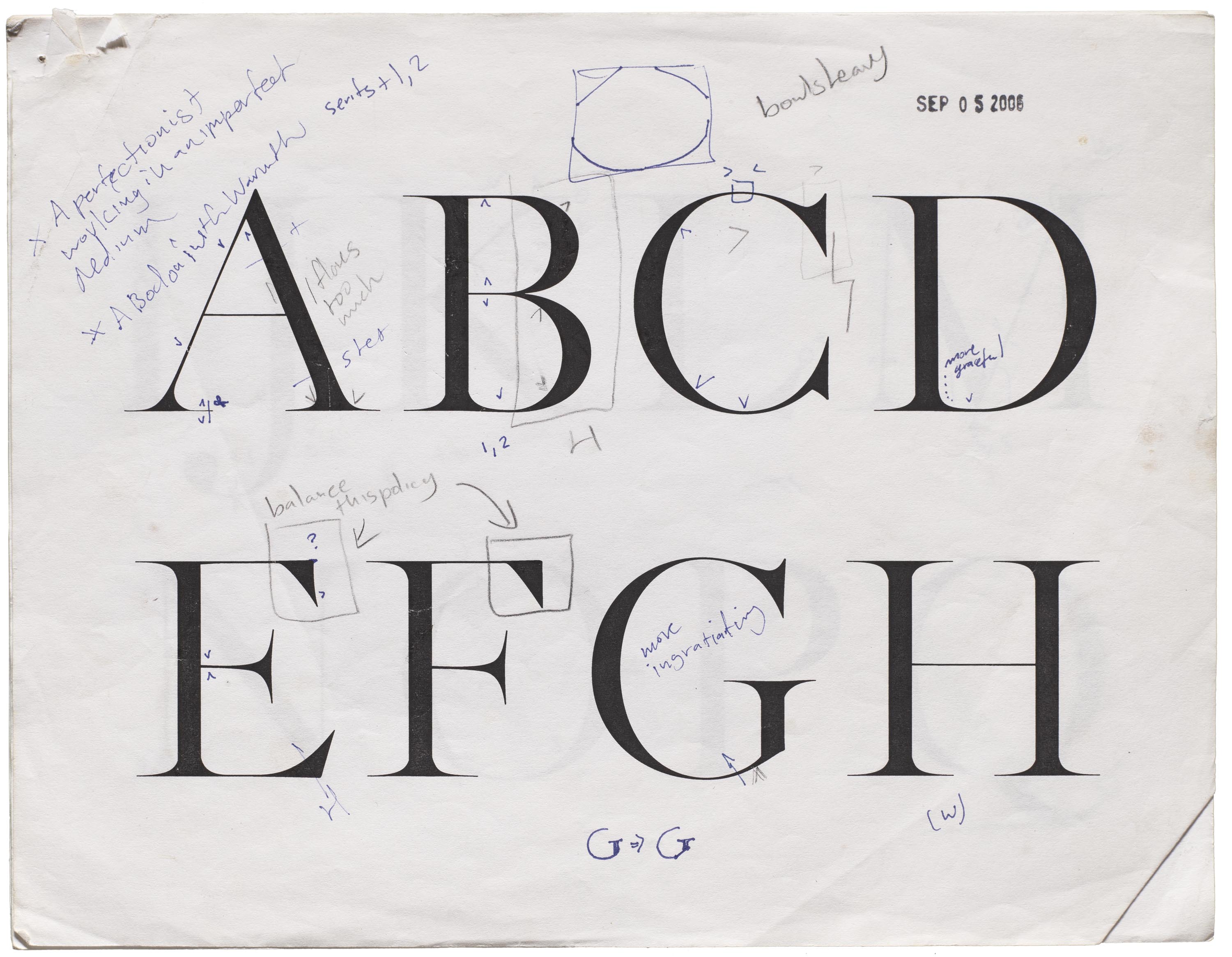
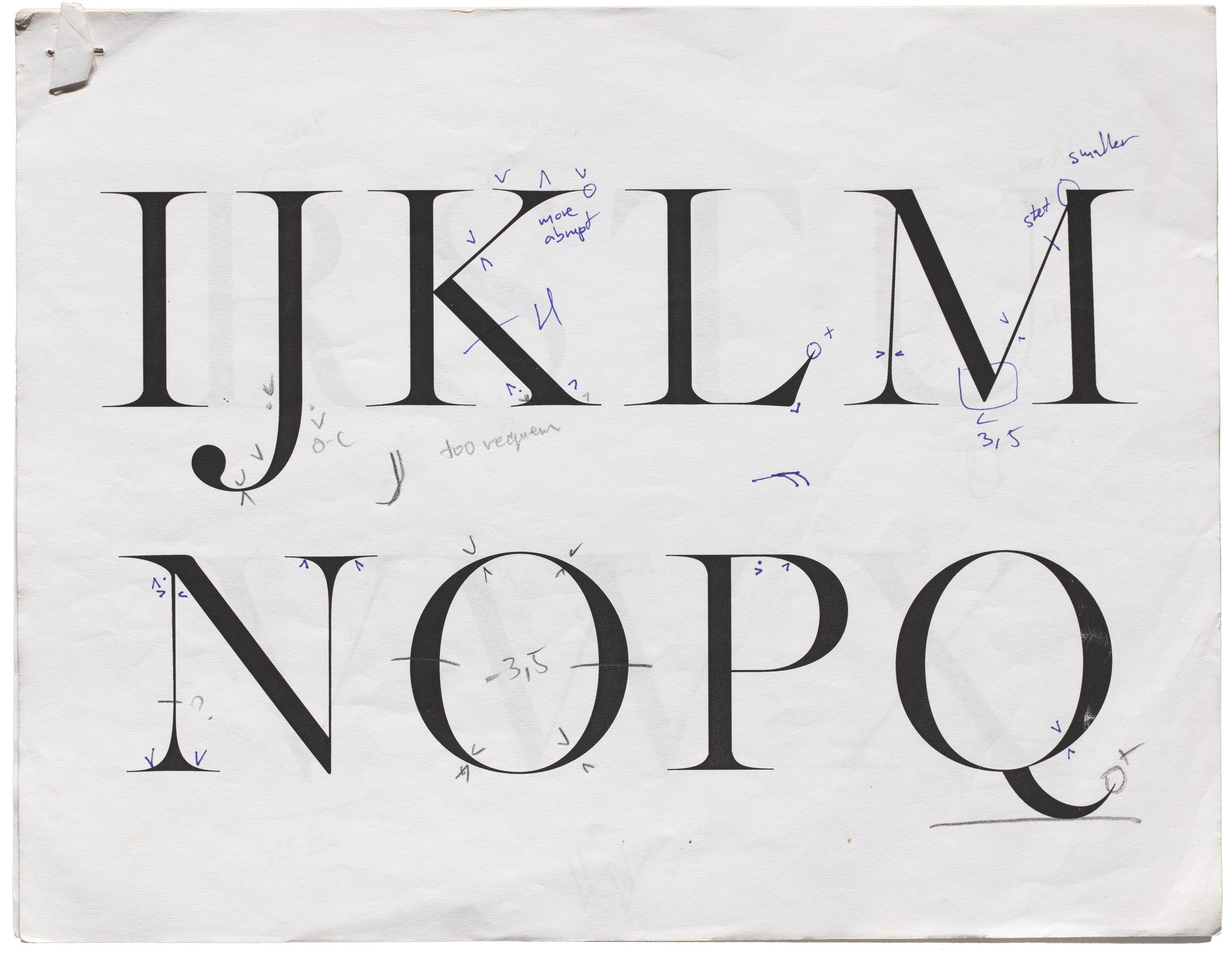
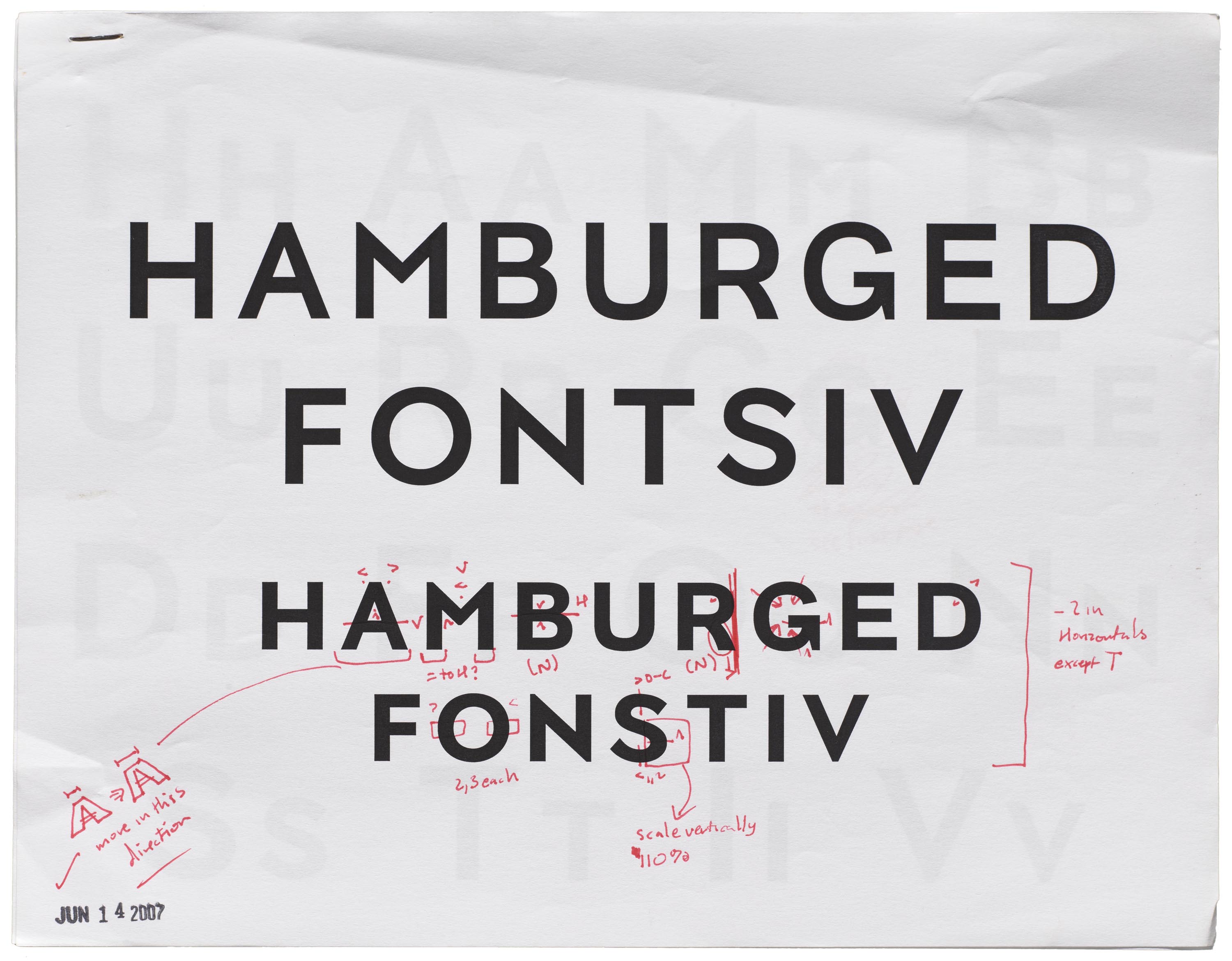
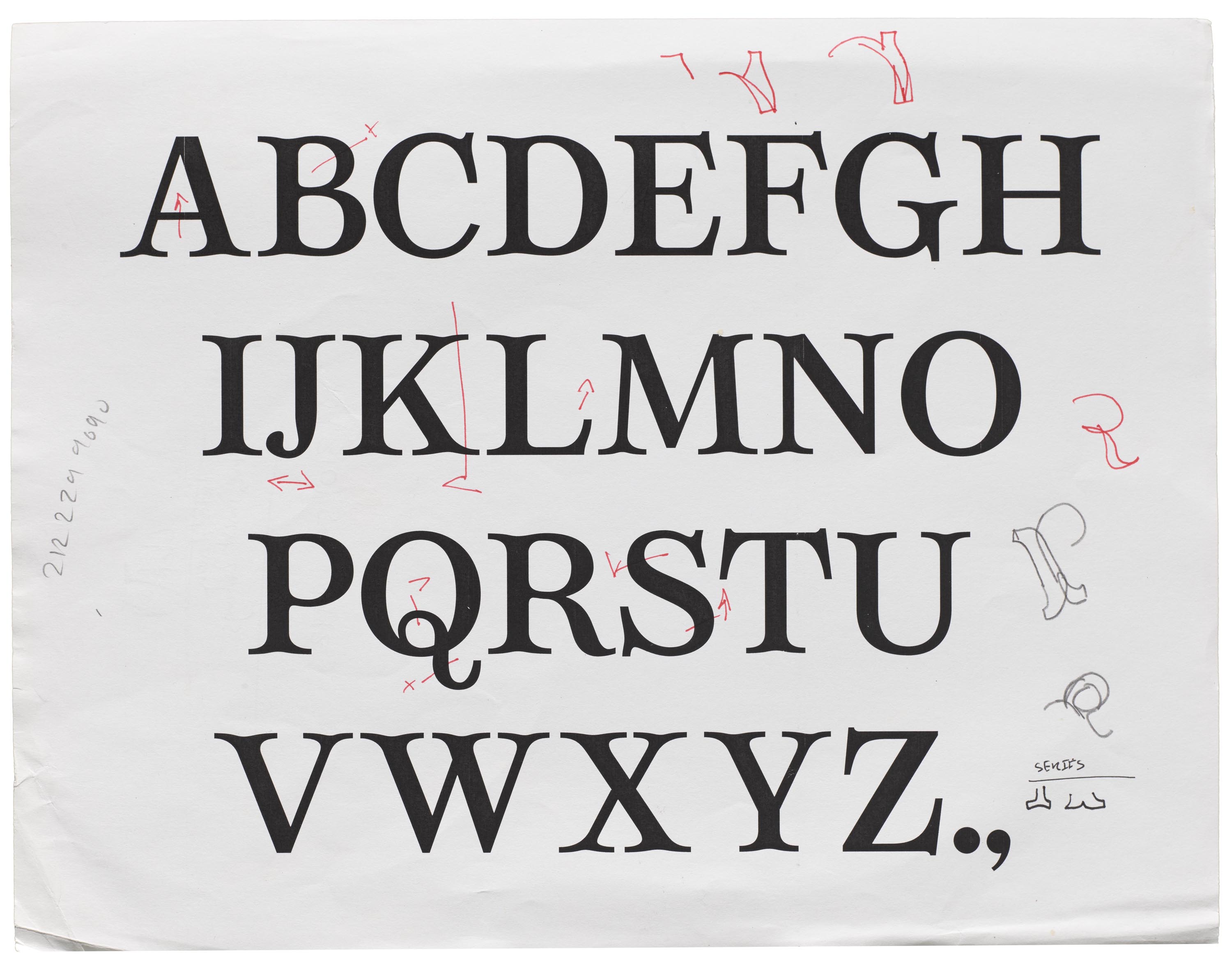
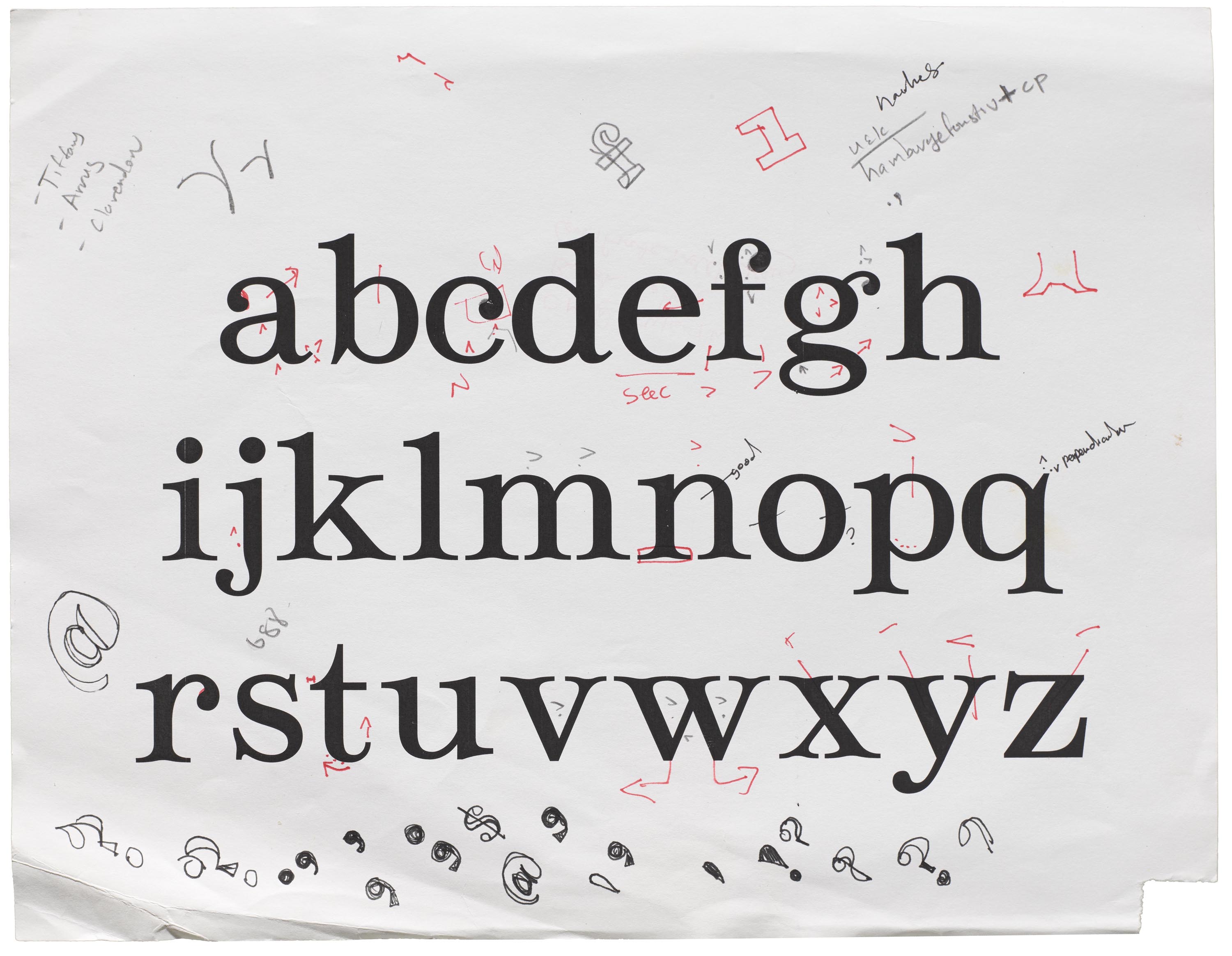
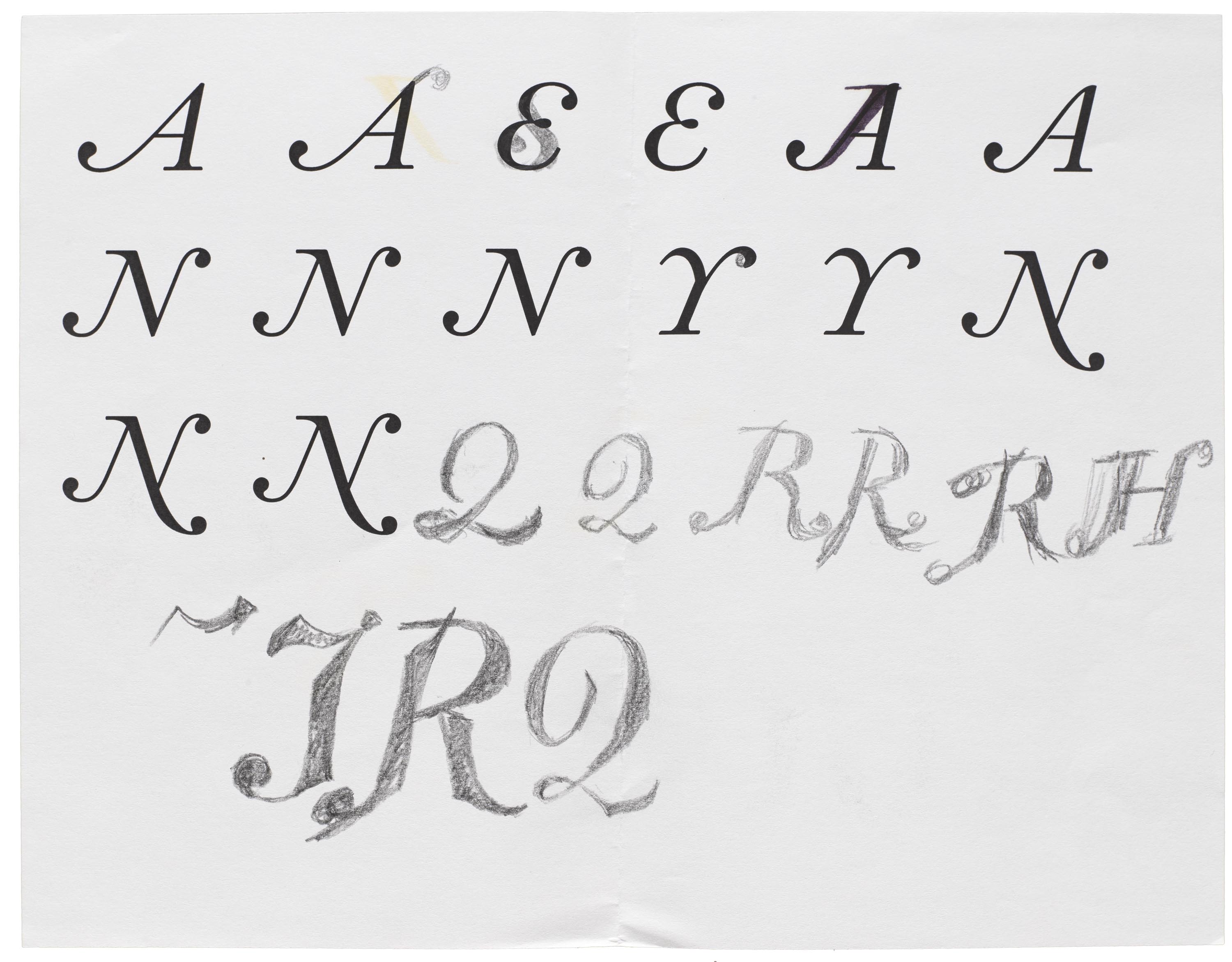
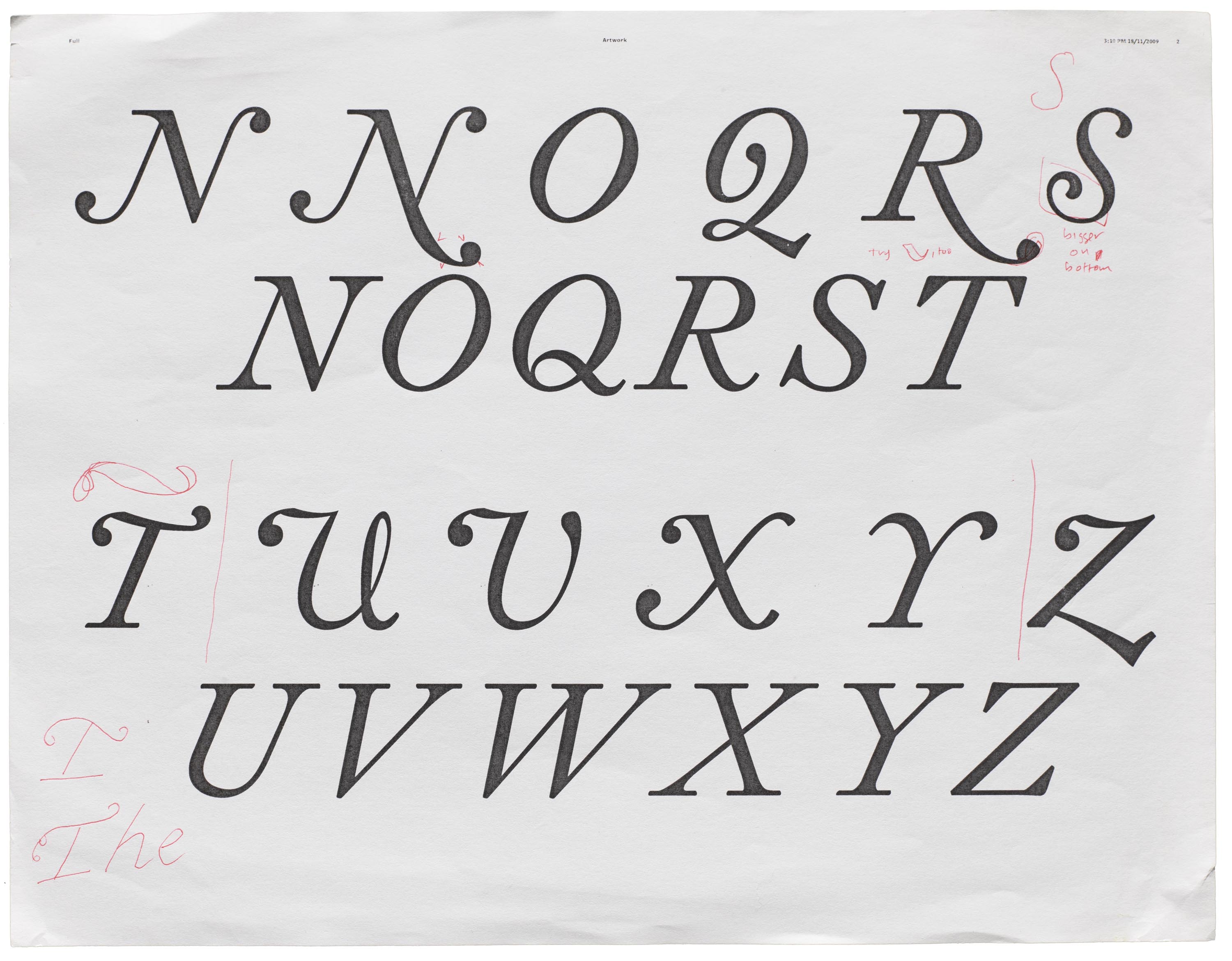
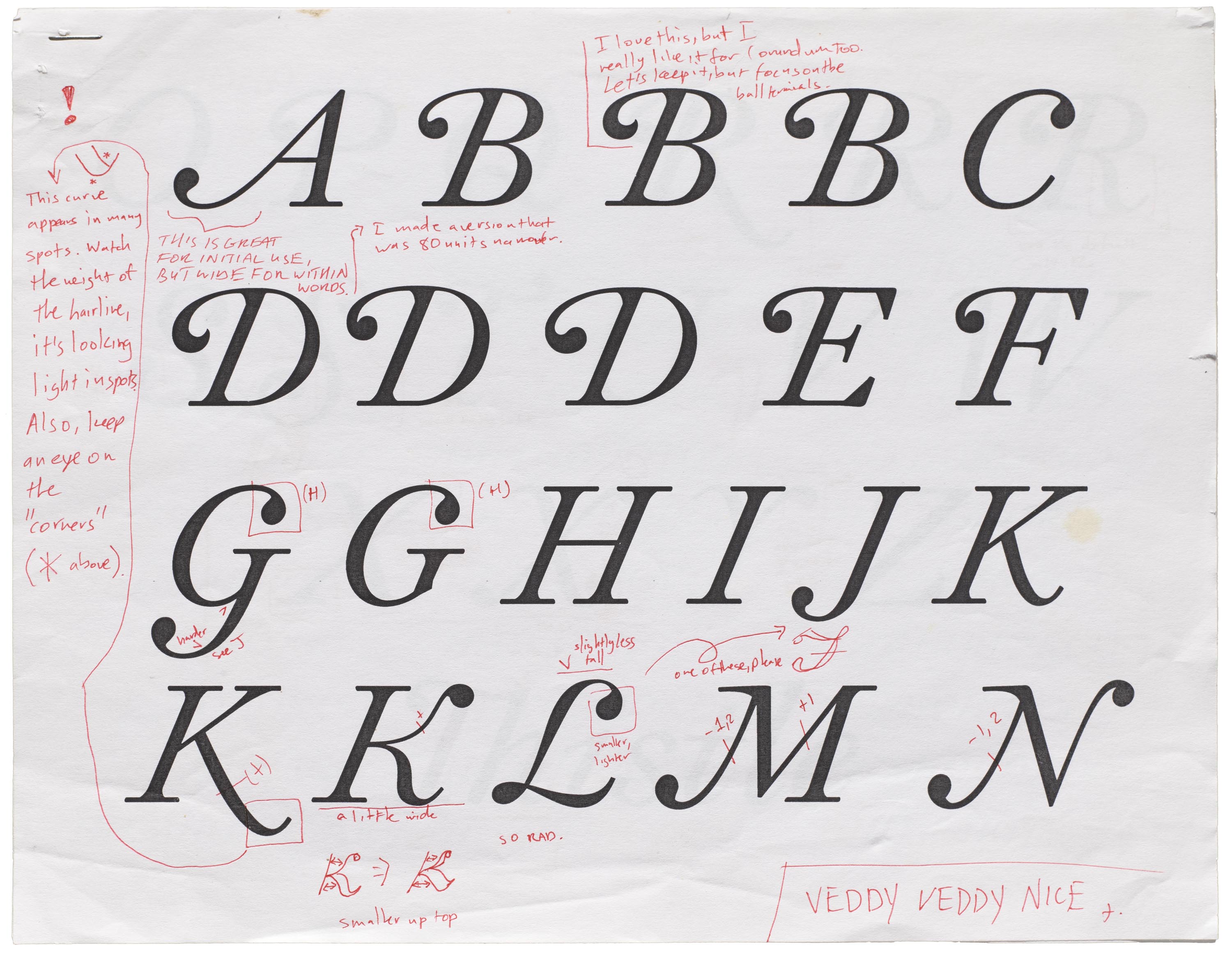
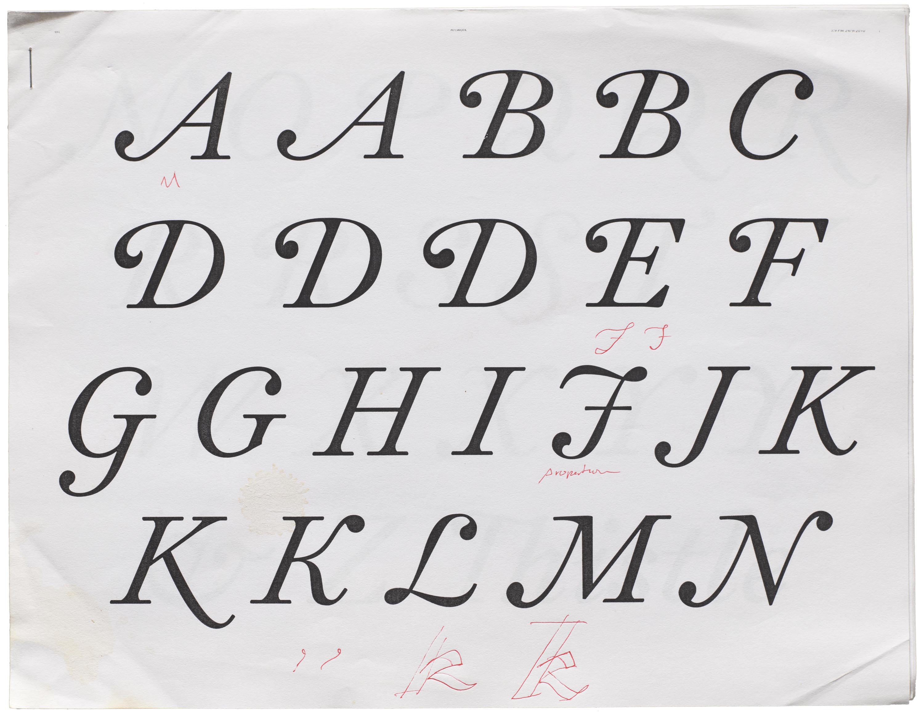
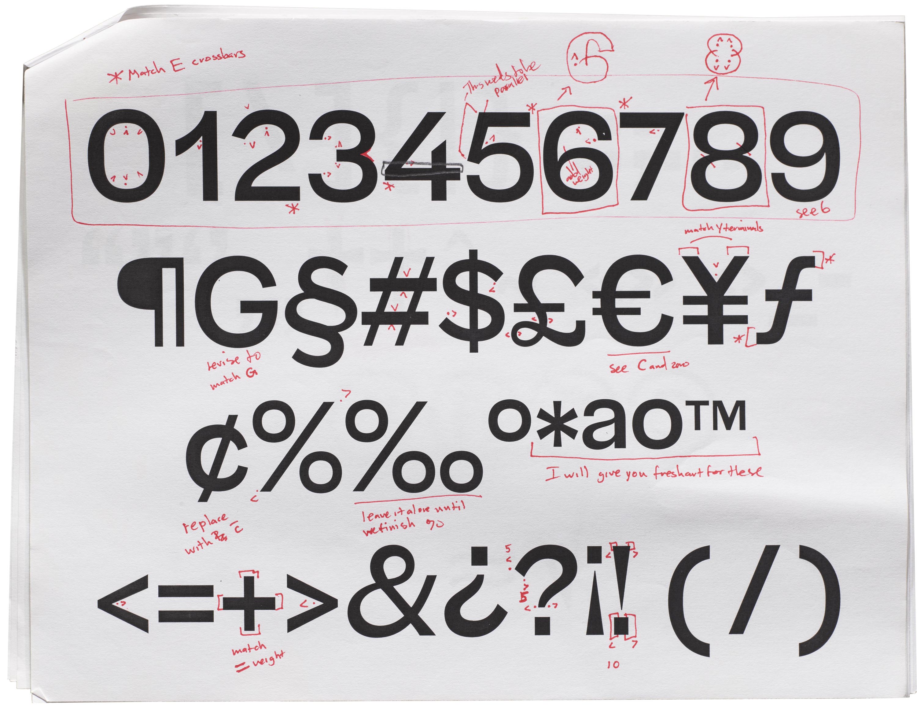
The bulk of the archive consists of annotated proofs. These laser prints are commonly used by type designers to test the performance of their designs in various sizes and conditions. They offer insight into the designer’s mind at work. In Darden’s proofs you can see him testing and adjusting weights and styles, marking corrections to curves and other details, testing different shapes for the same character, and doodling alternative ideas.
Proofs can include other data that help document the type design process, such as: date and time, name and version of software used, and typeface name changes. They also illustrate standardized type design practices, such as spacing techniques, character set development, and more.
Selected Proofs from the Darden Type Design Archive
Click or tap to see larger images and captions.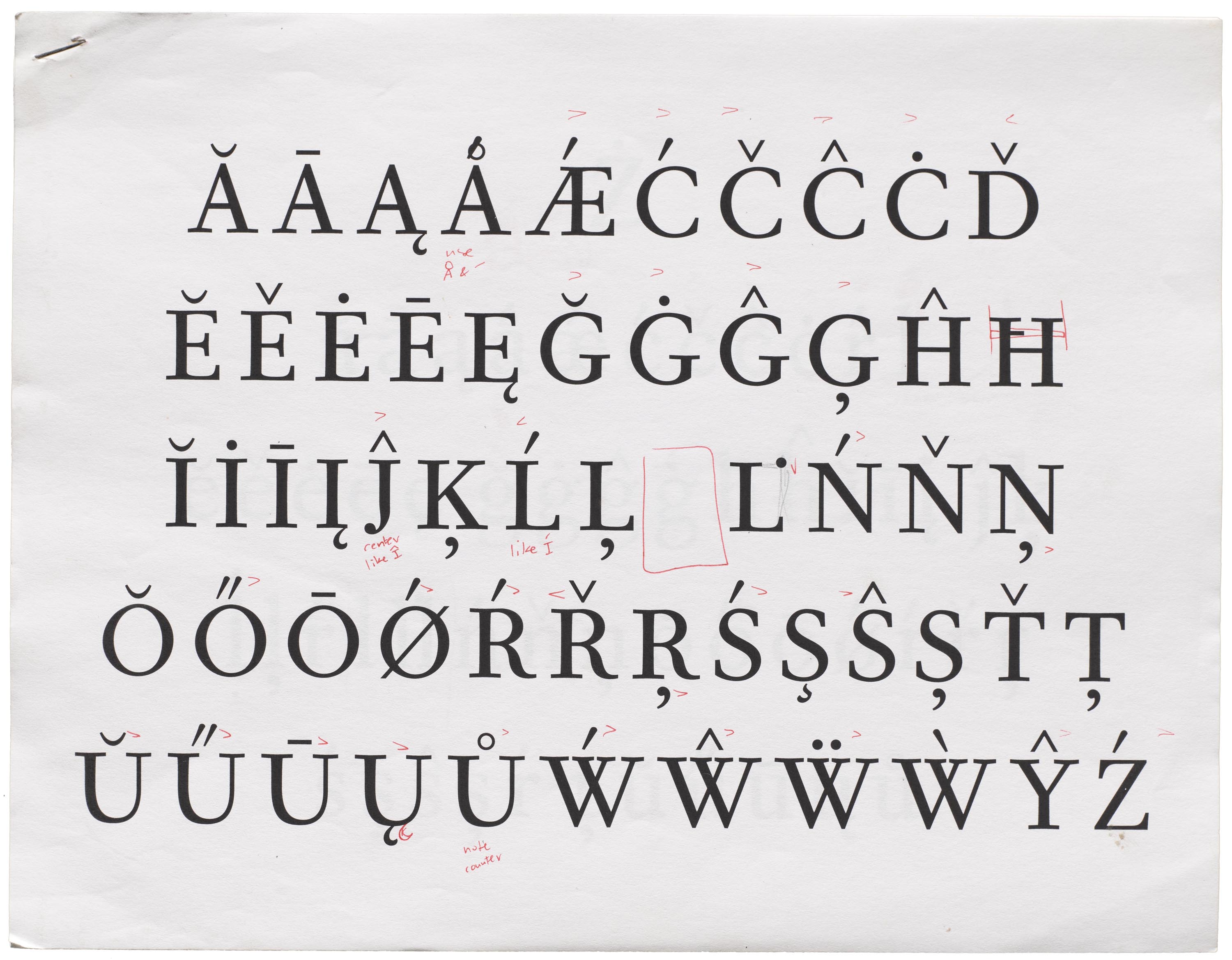
The Studio
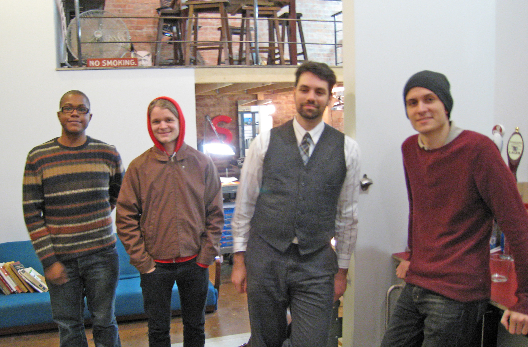
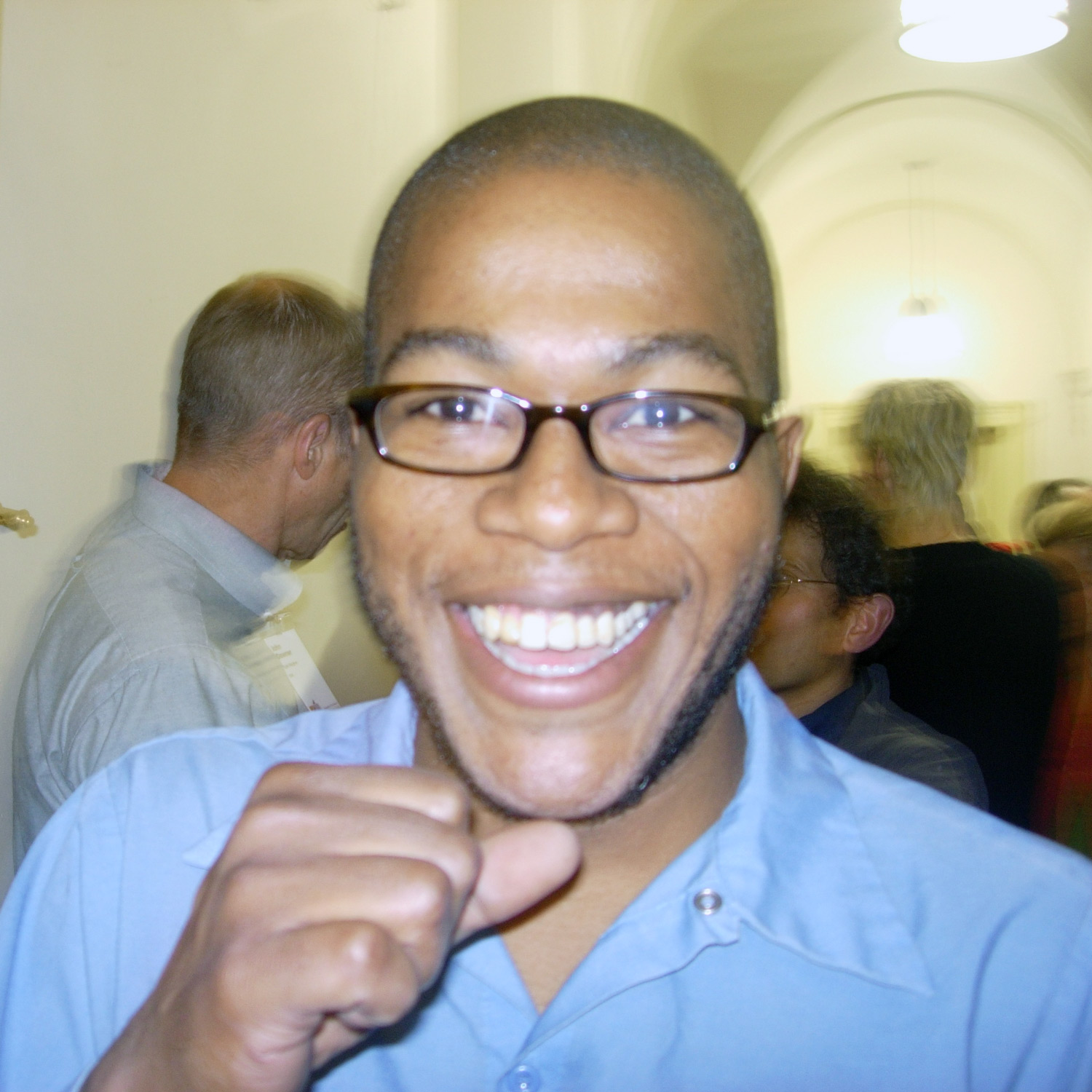
Thomas Jockin, 2006–2008
Noam Berg, 2009–2012
Scott Kellum, 2008–2010
David Fusilier, 2009–2011
Lucas Sharp, 2010–2012
Darden Studio employed at least five assistant designers (or “draftsmen”) over the period represented by this archive. We can’t identify the author of every mark on these proofs, but Joshua Darden’s notes are certainly most prevalent, often as tips given to staff as they worked together to refine and expand designs, adding new character sets or styles. Darden’s instructions were then checked off by his designers after they implemented changes.
The Process
“Josh was consistent about how he marked up proofs,” said Scott Kellum, a Darden Studio draftsman between 2008 to 2010 who later founded Typetura. “Taking in his feedback was straightforward and clear as these marks usually gave precise direction.”
The sketches of new or alternate forms were largely for him to explore later, but the other marks were reminiscent of the proofs we would get back from him. We would install the new font, nuke our font cache, restart our computer, print a proof, and Josh would mark it up at his desk. He knew exactly where all the points where. The arrows corresponded with where those points should be moved and the numbers indicated how many units they should be moved. At this stage most of the design work was handled on paper. The screen was a place to change the shape of the glyph, but we worked on these printed proofs.
At the time we, the draftsmen, were using FontLab and Josh used RoboFog with numerous custom scripts. Josh had a PowerMac G5 in legacy mode to run RoboFog. Exporting in and out of UFO format from FontLab was a chore but software like Superpolator, Prepolator, and MetricsMachine required us to change formats anyway. When it came to printing the proofs Josh relied only on high resolution PostScript laser printers. I recall Josh complaining that there was something lost in translation with newer printer drivers. He drew the letters using PostScript curves and he wanted the printer to print with them as well. We had a collection of texts we would set at various sizes in InDesign for printing.
Scott Kellum
It’s also possible that some of the proofs have the notes of designers from outside the studio. “Josh would regularly bring proofs to bar outings to mark up and discuss,” said Thomas Jockin, Junior Designer from 2006 to 2008. “At his monthly ‘First Thursday’ event (my inspiration for Type Thursday) designers like Christian Schwartz, Jessie Ragan, Chester Jenkins, Matteo Bologna, and Jeremy Mickel would debate the work over a drink.” Each of these designers — like many from Darden Studio’s staff — would go on to have an impact on the type industry at their own foundries and companies.
Joshua Darden’s Influence
Everyone who worked with Darden remarked on his importance in their development as a young designer. “I learned the art and discipline of typeface production and honed my aesthetic,” said Lucas Sharp, draftsman from 2010 to 2012 who now runs Sharp Type. “I was influenced greatly by Darden, who set a new standard for optical sizing in typography for the digital age. Whereas some designers would seek a rigid apollonian paragon, Darden’s typefaces find resonance in a more organic and complex way.”
“Josh showed me a new way to see things,” said Jockin. “Some of my most fond memories are in his Williamsburg studio where I worked as his apprentice after my classes at Parsons. I was always lacking as a draftsman but Josh believed in me and I love him for that. I’m a bit embarrassed to admit how proud I would be when a proof came back without many adjustments. That did not happen often until the end of my tenure.”
The Darden Type Design Archive tells a unique story. It’s a story of a Black designer doing groundbreaking work in a very specialized field. It’s a story of an independent maker contributing to a new era of typography, in which digital fonts rival the professional rigor of metal type. It’s a story of an artist’s growth, with visual evidence of how his thinking and skills expanded over time.
The breadth and depth of the archive also offers multiple opportunities for research and education in an increasingly popular craft, and the material for telling new stories that are yet untold.
Author’s Note
I have a connection to Darden, too. We met way back in 2001 at TypeCon in Rochester, New York, my very first type conference. We connected immediately as we were both a little shy, and spent most of the event hanging around the periphery. Little did I know, at the time, how incredibly talented he is. I am honored personally and professionally to have his work at the Archive, and I’m grateful that Josh (and Joyce Ketterer, longtime Darden Studio CEO and current owner) found us to be a good home for his work.
— Stephen Coles, Associate Curator & Editorial Director