News
Designing the Online Archive
We’re building a virtual discovery machine for letter lovers. Meet the designers who put you in the driver’s seat.
The Online Archive beta is running and members are taking it for a test drive. Meanwhile, we’re taking a peek under the hood and introducing you to the people who built it.
Database Design
Update: April 8, 2020 — Nick Webster wrote about the app he built for the Online Archive’s public release.
So much of Letterform Archive’s growth is due to our volunteers. Dozens have donated hundreds of hours and a diversity of talents. In early 2017, just as our librarians were weaving the first strands of a catalog, we were lucky to attract a volunteer whose background eerily matched our most pressing need.
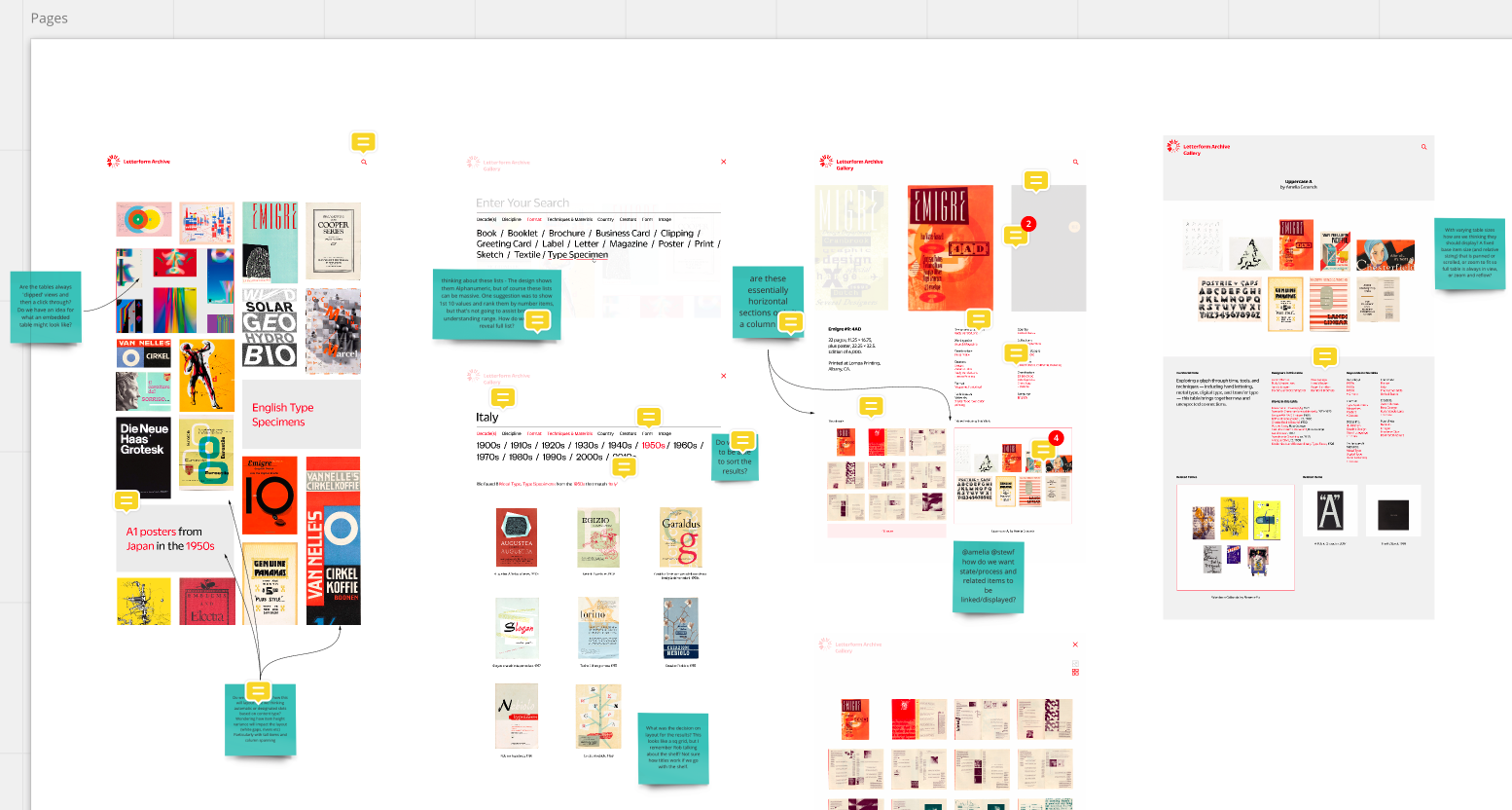
Murray Grigo-McMahon has a master’s degree in Design for Cultural Databases, a fact he humbly kept from us for a long time. After working on a few basic volunteer projects, and learning that we were many years away from an online catalog, he showed us something he had been tinkering with: a visual database pieced together from our Instagram feed. The ideas he introduced in that early proof of concept helped us realize we could be much closer to an online catalog than we estimated. Murray soon teamed up with our Librarian Amelia Grounds and Assistant Librarian Kate Goad, integrating their custom terminology into a data structure, and forming the basis for a visual discovery tool for the Archive’s collection.
“I’ve always found that most interesting things are those you discover on the way to a destination.” — Murray Grigo-McMahon
What were your main goals going into the project?
Murray: “For me the key was finding flexible ways to explore the potentially vast set of items. I wanted people to not be restricted by traditional hierarchical browsing or swamped by flat, endless search results. I’ve always found that most interesting things are those you discover on the way to a destination. I think of the Laurence Sterne quote ‘Digressions, incontestably, are the sunshine’, and I wanted to ensure that you could always digress. Building associations and threads between items was key to this, but also finding ways to surface the deep knowledge of the Archive team. It was essential to give them ways to create new connections and tell interesting stories through the collection.”
What part of this process has been most challenging?
Murray: “The first big challenge was to find a way to work with the library standard MARC record. Once we got past that we had a very rich set of standardized information we could plunder and connect with the Archive’s custom records. Today, the model has 25 data tables and almost 30 data sources (and that’s still growing). Keeping track of that and managing change is challenging.
“Another challenge is finding a good way to host and manage images. The model is essentially by item (e.g. a magazine), but there can be many images per item (e.g. cover and interior spreads), so images have to be organized and referenced in a way that everything seamlessly stays in sync. It took some time, but we found a good set of sizes that enabled the user to get readable, high-res images from the collection and allowed us to display many images per page whilst keeping up performance. That’s something we will keep working on, as we want the experience to be fluid and painless while visitors follow that all-important red thread.”
UX Design
After Murray’s data architecture took shape, we enlisted local designers Jon Sueda, chris hamamoto, and Omar Mohammad to create the look and feel of the site. They gave the machine a voice and personality informed by our visual identity, as well as their own personal sense of this place.
chris: “Jon and I have a strong connection to the Archive. We visit whenever we can. We bring our students from CCA, which is just a few minutes away. Our goal is to make connections between the physical site people can visit and the online site people can access anywhere.”
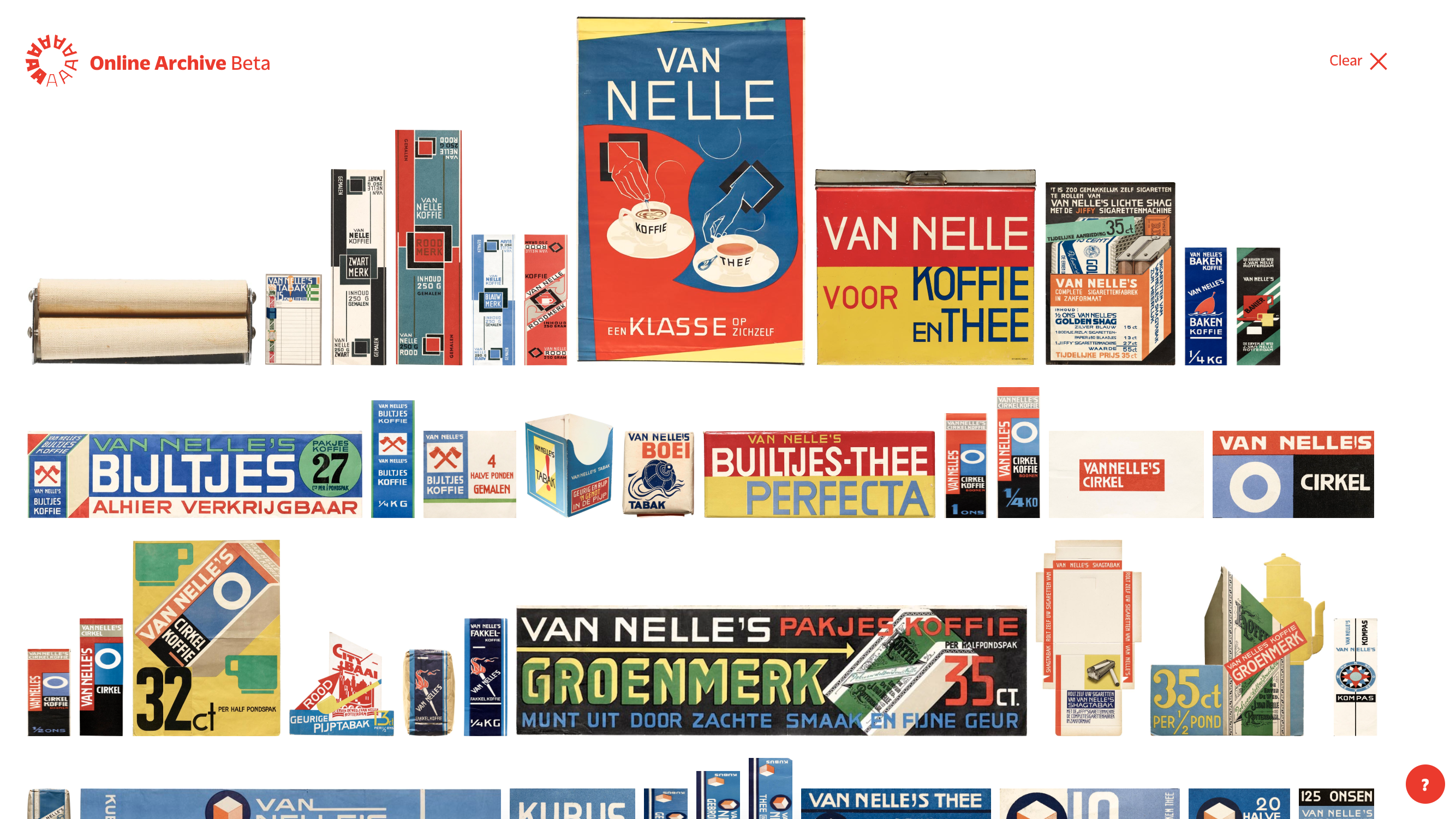
Jon: “We were also super-excited about the project as an opportunity to team with an institution we really believe in and to contribute to design education in a pretty significant way outside of teaching. We both love the Archive’s mission and the accessibility to material that you can see, but also touch and feel. This makes the image quality so important to the Online Archive, so you experience the fine details of a design, the texture of the paper, just as you would in person.”
Did you look to other cultural archives and databases for inspiration when designing the Online Archive? What did you see working and not working in other archives?
Murray: “I’d already played with exploring public data from MoMA, NY Public library, Tate Modern, and Cooper Hewitt. The experiences (mostly due to the data) always ended up feeling a little flat. In the early days Amelia, Kate, and I talked a lot about the ways we could connect items, so that we could build the richness into the data from the start. We looked for ways to satisfy the catalog needs and emphasize discovery, something that seemed to be missing from other systems.”
chris: “We researched many other archives and online collections. A couple of the biggest takeaways: The speed at which you received results was important — spending a long time on creating a query without feedback was often disappointing. We also wanted to avoid as many dead ends as possible, so you wouldn’t run into queries with no results.”
What were your goals for the user experience?
chris: “For the homepage, Amelia suggested a flexible ‘tile’ concept. We wanted it to be both visually compelling and clear, so we aimed to have a variable hierarchy without distracting or confusing people from entering into the search/browse experience, which we feel is the best way to traverse the collection.”
Murray: “We worked hard to build in ways to help frame the entry to a set of items. Essentially enabling the LFA curators to create narratives and trajectories (like predefined search queries) for the users to explore.”
“In general, the images students find on the web rarely have context and are often seen on a site with no labeling and at a resolution that only allows you to appreciate it in a very superficial way.” — Jon Sueda
How does your personal or professional experience inform this work?
Jon: “From a teaching standpoint, I observe that students use searches (mainly Google searches) to find inspiration for their work or do research. Always the downfall of this is that images rarely have context and are often seen on a site with no labeling and at a resolution that only allows you to appreciate it in a very superficial way (in most cases you can’t examine it close enough to read the text on the poster for example). As a result, students reference formal attributes of design completely void of historical reference. We joked in one of our meetings that the ’80s are back, but many people who are making the work are not conscious of this. I think this informed a level of contextualization that was important for the site. Fortunately this is a core value of the Archive’s and was already part of the database metadata.”
Murray: “I’ve always felt my particular ‘designer flavor’ is the facilitator. For me, helping others discover new things and create their own stories has been the driving force of my career. The Archive is passionate about that — not simply preserving, but sharing, collaborating, and expanding the use of these wonderful things. It felt like a very natural fit.”
What are some features that are particularly unique to the Online Archive?
Murray: “Right now I think it’s the relative scaling of items when filtering and browsing. That adds a wonderful rhythm to the page and helps us keep the connection to the physical experience at the Archive. I think some of features we are working on now will also be pretty unique.”
chris: “The ability to zoom in close enough to read a periodical like Emigre is unusual among online museums and collections. Also the fact that some items include every spread of the publication.”
Designing the Future
Now that the beta is out and getting feedback, how do you hope to expand or improve the existing site?
chris: “Initially, we had ideas about visitors curating a sort of menu of items online which they could then bring into the physical Archive to view in person. We also thought about connecting the work being shown at the physical Archive to what appears online. This kind of interaction will come later with the Tables feature, which emulates the experience of setting a physical table at the Archive.”
Jon: “I’ve been working in the area of exhibitions for quite some time both as a designer and curator, so I was really interested in the site’s ability to allow for some level of curation of materials. Using the Tables tool, collections and groupings will be created by Archive staff, guest curators, and members, or could even be automated in some way. This feature has the potential to facilitate new typologies and discourse to emerge through the examination of the collection.
“We are also interested in the vocabulary of design history and how this language could be less canonical, including a broader range of tags and more ‘contemporary’ or even ‘casual’ terminology that might emerge through design writing like ‘grunge’, ‘default design’, ‘algorithmic’, etc.”
Murray: “Lots and lots to do, mostly around opening up the connections between items and designers.”
“Having a passion for the collection was extremely motivating.” — chris hamamoto
What lessons have you learned or insights gained from this project?
Murray: “The 4 Cs come to mind: clarity, communication, collaboration, and consensus. With so many moving parts, technical challenges, and creative ideas, we needed to keep those in mind throughout the project. Otherwise we would have never launched the beta.”
chris: “Having a good relationship with the staff was invaluable. The whole team was so great to work with and willing to share their knowledge and feedback. That made a lot of tough questions about the logic of the collection much easier to understand. Having a passion for the collection was extremely motivating. Also, research up front is always helpful.”
Jon: “I’m still in the process of learning from this project. As the full capabilities of the site are implemented we will see how it takes on a life of its own. I’m hoping teachers utilize the Tables for teaching their courses, and designers create collections that make us look at the work in new ways. It’s all very exciting!”
You can get early access to the Online Archive and help us continue its development. Become a member.