News
The New Face of Letterform Archive
Tânia Raposo and Nick Sherman describe how they took on the challenge of representing 40,000 objects in a single visual identity.
Our new logo and website have been live for a few weeks, but now, after the rush of spring events, we finally have a moment to reflect on the redesign and ask its creators about their process.
The Identity
First, Tânia Raposo. Tânia is a graduate of the Type and Media program at KABK in The Hague and currently works as a freelance graphic and type designer in Oakland. A longtime friend of the Archive, Tânia was helping out with the collection before it was even an official institution, and she now serves as the Type@Cooper West Program Coordinator.
You’ve been involved with the Archive since its infancy, so you’re intimately familiar with the organization and its ambitions. How would you describe the personality of this place and its people?
Tânia Raposo: It has been a pleasure to see the Archive grow. I have known Rob Saunders and the collection since 2012 — before Letterform Archive was born — and since the first day I walked through the door (then Rob’s home, now the Reading Room), I was blown away!
I would argue that it is almost impossible to come to the Archive and not get inspired and learn something new — no matter how many times you visit. The collection is not the only thing that makes the Archive special, but also the people that work there. Every employee knows and loves the collection, and that is palpable the minute you walk in.
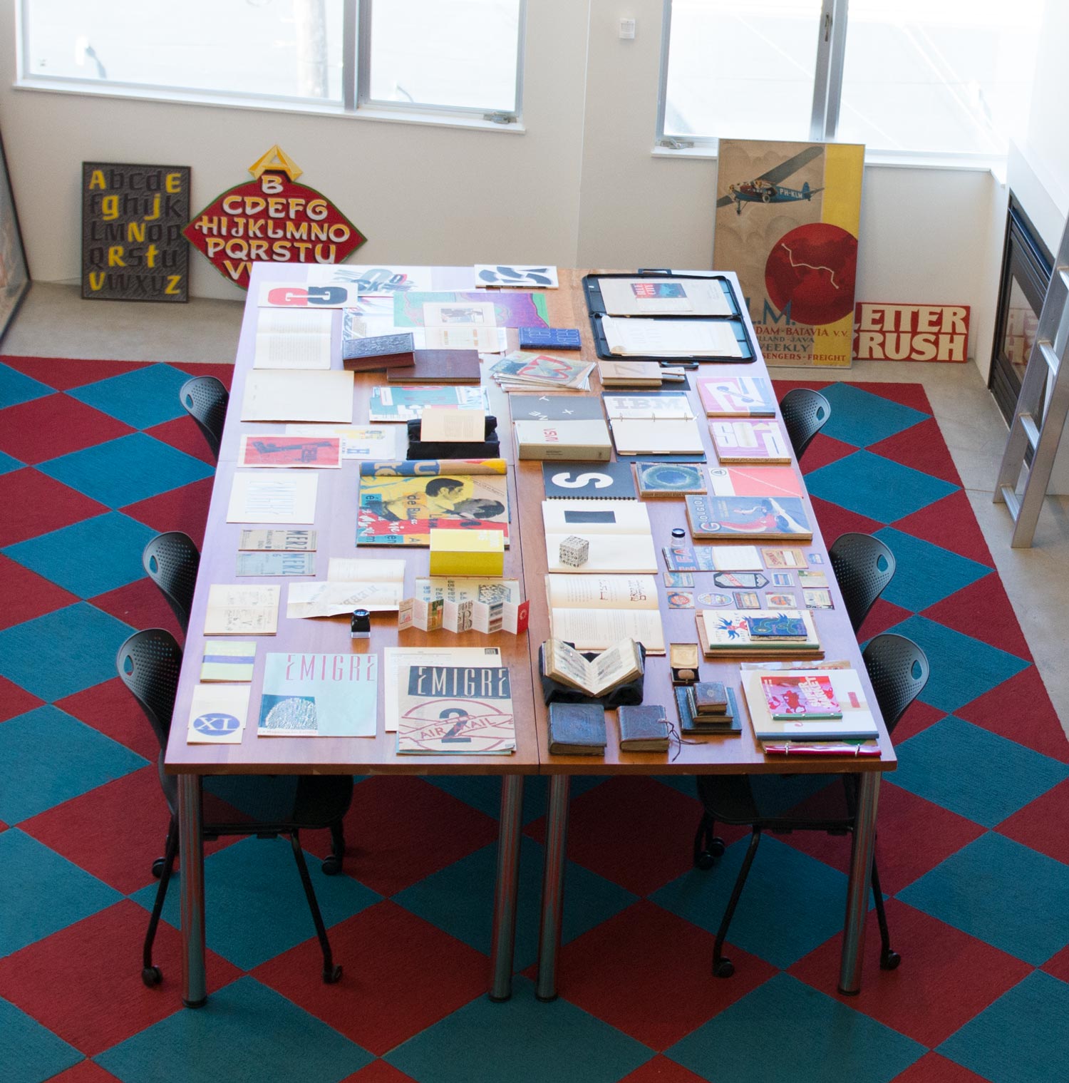
When you first visit the Archive, you will get an introductory tour of the collection. This is done by spreading a selection of representative pieces from across time and medium on the main table in the Reading Room. Being present in many of these tours, I could witness visitors’ reactions. At first they might feel lost and overwhelmed, but when guided through the pieces by a staff member, you see the guests’ experience transform into admiration, knowledge, and inspiration.
This feeling was one of my main sources of inspiration for the new identity. I tried to convey the diversity of material, and that being overwhelmed is sometimes a good thing because it can lead you to spontaneous discoveries.
How did you evoke these aspects in the identity?
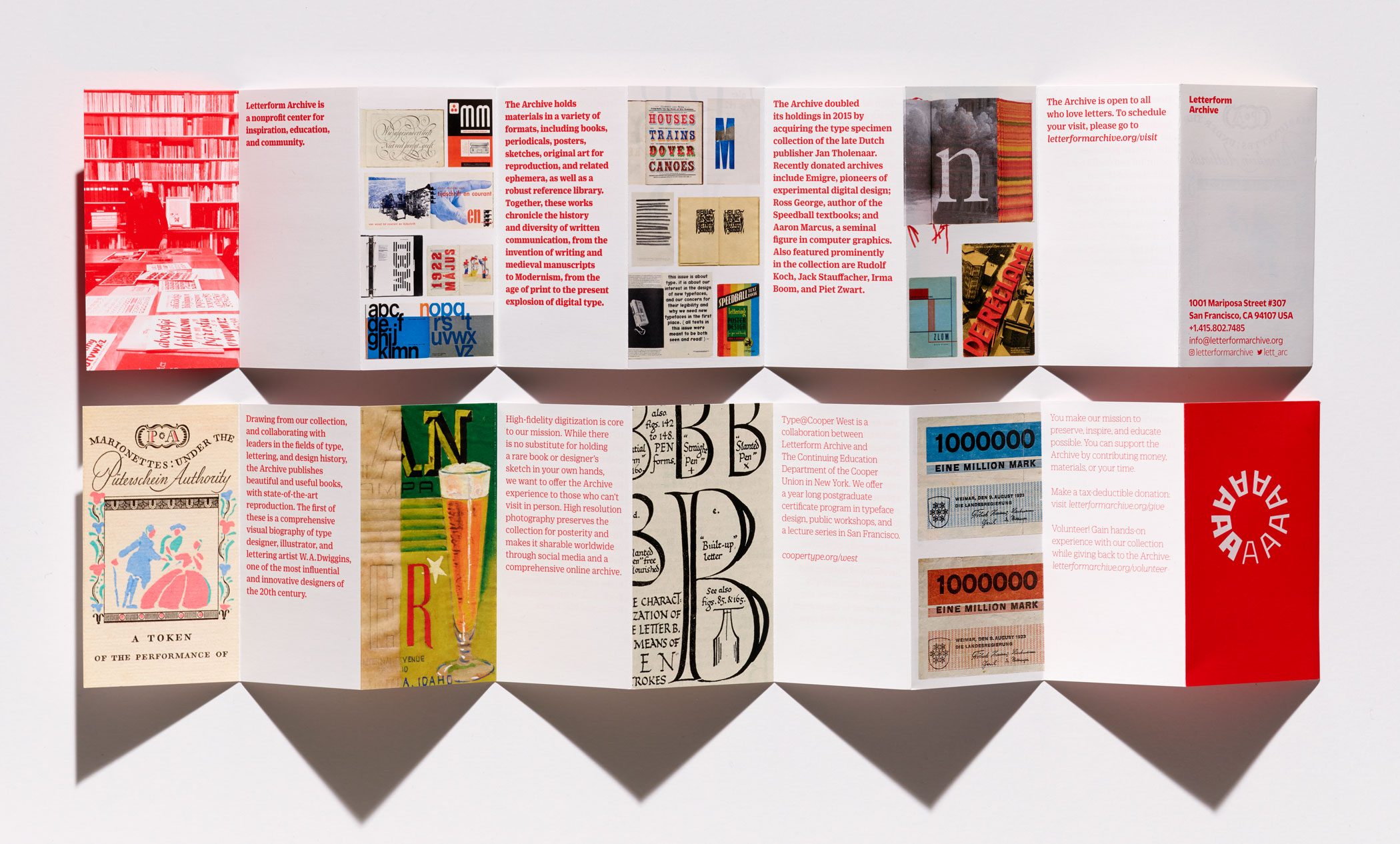
TR: The brochure and website are the main face of the Archive. I knew from day one that the brochure had to be special, and something that people would want to keep.
This led me to think of some special pieces from the collection that I really loved, and why I was so drawn to them. In the end, I realized that what was most spectacular was that I could actually wander through the Archive and pick up my favorite objects. This ability to be intimate with the collection is available to everyone that visits the Archive, as you are invited to go through the items on the table, get up close, and really touch them (without white gloves). It is a very different experience from most traditional libraries and museums. I think it creates a stronger connection between the people and the object, as they can see it with their own eyes and touch it with their own hands, instead of experiencing it through someone else.
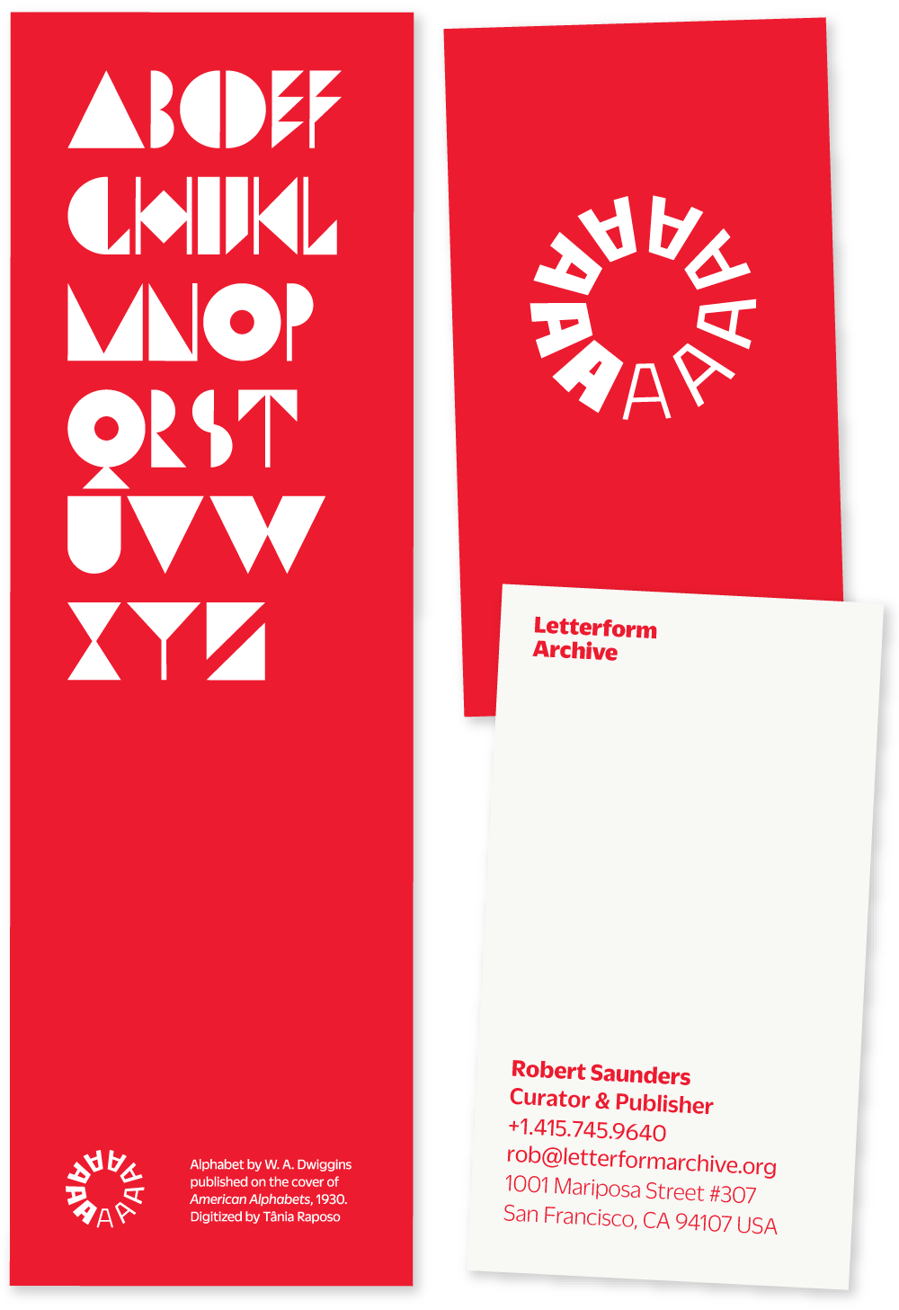
This is especially true for small pieces which really call for up-close interactions. So creating a brochure in the size of a business card allowed me to replicate this feeling, while showcasing some of the pieces from the collection.
What aspects of the previous logo did you want to retain? How does one represent the breadth of the Archive’s collection (spanning many styles and centuries) in a logo? Is it even worth trying?
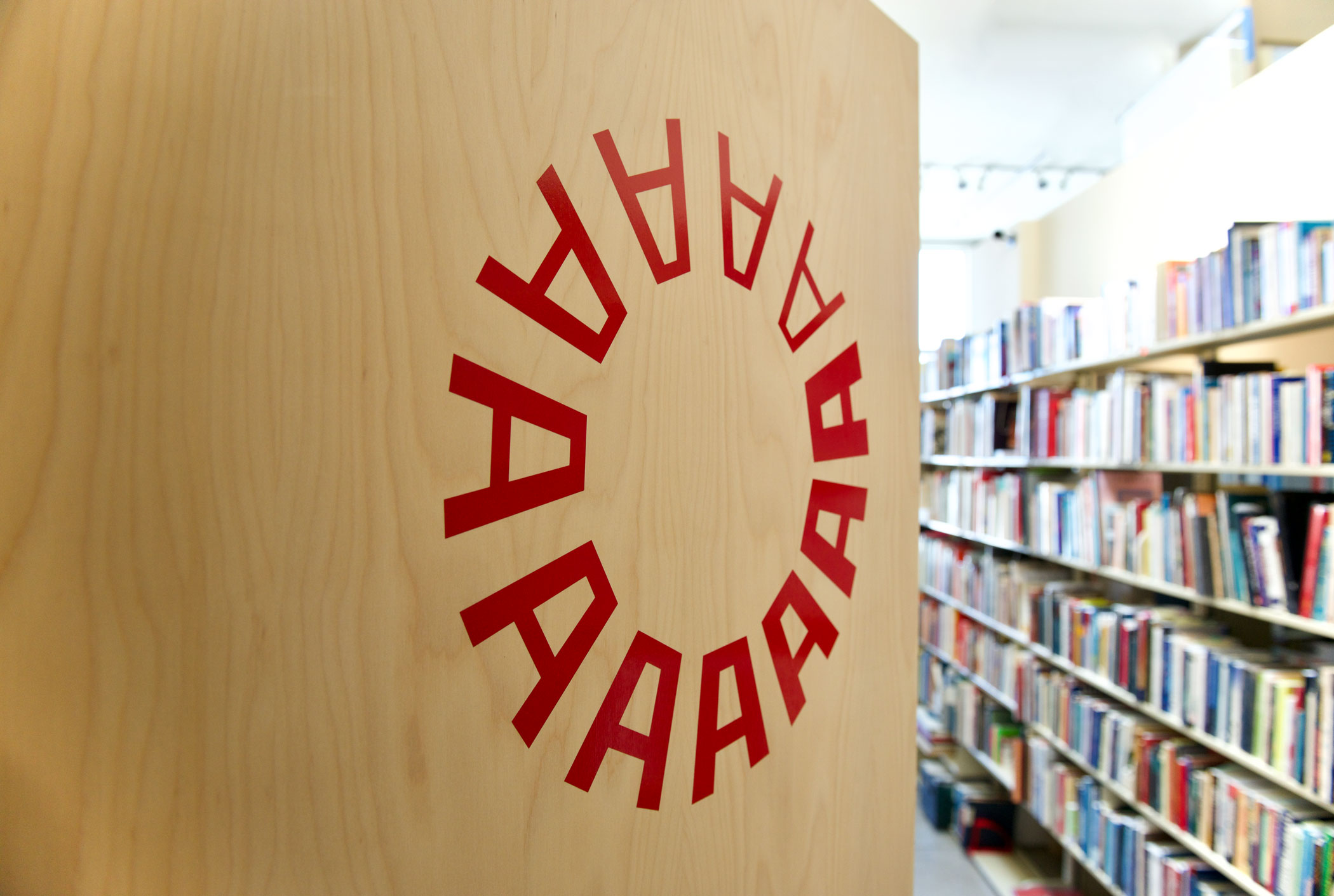
TR: The circle of ‘A’s was a symbol that was already recognized by the public as the Archive’s logo. From the very beginning, retaining this concept was clear to us. This symbol was also doing a good job at representing a range of feelings through the differently executed letters. But I felt that the ‘A’s of the old logo were too representative, yet not representing enough.
Some of our first ideas involved expanding the circle and representing more styles within it, or establishing a dynamic logo that generated different styles with every impression. But it eventually became clear we needed a better way to represent the breadth of the collection. The path was not easy, but in the end, simplification won over representation. We added more ‘A’s, which clarified the circle shape, while also conveying the idea of an iris as a metaphor for a visual experience. The variation from light to bold letters represents the full spectrum of the collection.
What are the challenges of setting type or lettering on a circle?
TR: That was a big, big headache. I have to thank Nick for being very knowledgable in the dark art of setting text on a curve. In the first iterations, we tried to set different type styles on the same circle, and saw patterns that worked best.
Fontstand was really useful for testing as many typefaces as possible in the exploration phase. Later, when I thought to use type weight (rather than style) to represent the collection, Delvard Gradient by Nikola Djurek immediately came to mind, as it would allow me to create a quick sketch of the idea. It was great to be able to do the first sketches of the logo with it and see how it could work. But setting type in a circle is tricky, and in the end I ended up drawing something new from scratch, based on the idea of Delvard. There are small details in the letters that no one will ever notice (like the bottoms not being straight), that exist simply to make those ‘A’s look their best while sitting on a curved baseline.
What about the Duplicate typeface family appealed to you for this project?
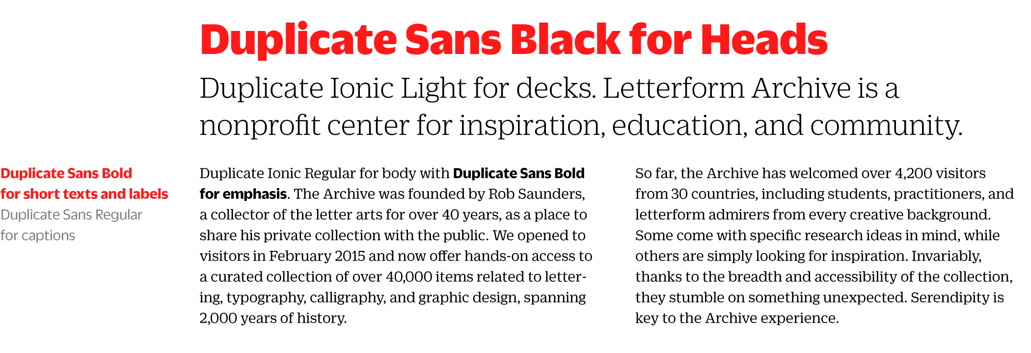
TR: When I started exploring type for the identity it was clear that I wanted to choose a contemporary typeface and not something from the past. The Archive should not only be a place where one comes to be inspired by the old, but also to discover the new.
At first I was looking for a typeface that was in the spectrum of not being either a sans or a serif. To not be overly representative of a style. A few days into my research, Commercial Type released Canela by Miguel Reyes. And I thought, “THIS IS PERFECT!” But, while Canela was the perfect hybrid, it was a display typeface, and we needed something that could work in many different environments and sizes.
I had always enjoyed the story of how Duplicate came to be — Christian Schwartz started the project by trying to draw Antique Olive from memory — and how the result of that experiment ended up having its own voice. The Archive should support such fresh and experimental approaches to typeface design. Duplicate also offers multiple styles: Sans, Ionic, and Slab. Through most of the design process, Nick and I were using all three styles, but settled on just Sans and Ionic. Duplicate’s large array of weights gave us plenty to play with. We are now using the Sans for short runs of texts, such as titles and captions, and Ionic for running text, such as the text in the brochure or throughout the website.
We have one other type trick to reflect the weight gradient found in the logo. Pieces that use a single type style can have a range of weight values. In the business cards, for example, the words Letterform Archive are set in the boldest weight, with each line — name, title, contact information, and Archive address — set in gradually lighter weights. This solution lets us convey the full spectrum of the Archive’s collection, even when the logo is not present.
The Website
Now we turn to Nick Sherman, who is behind the design and code of the new letterformarchive.com. Nick is a frequent collaborator with type designers and companies, and has had a hand in many typographic sites on the web, including Fonts In Use, TDC, Webtype, and Typographics (2015, 2016, 2017).
When we first approached you, what visual aspects of the existing site needed a change?
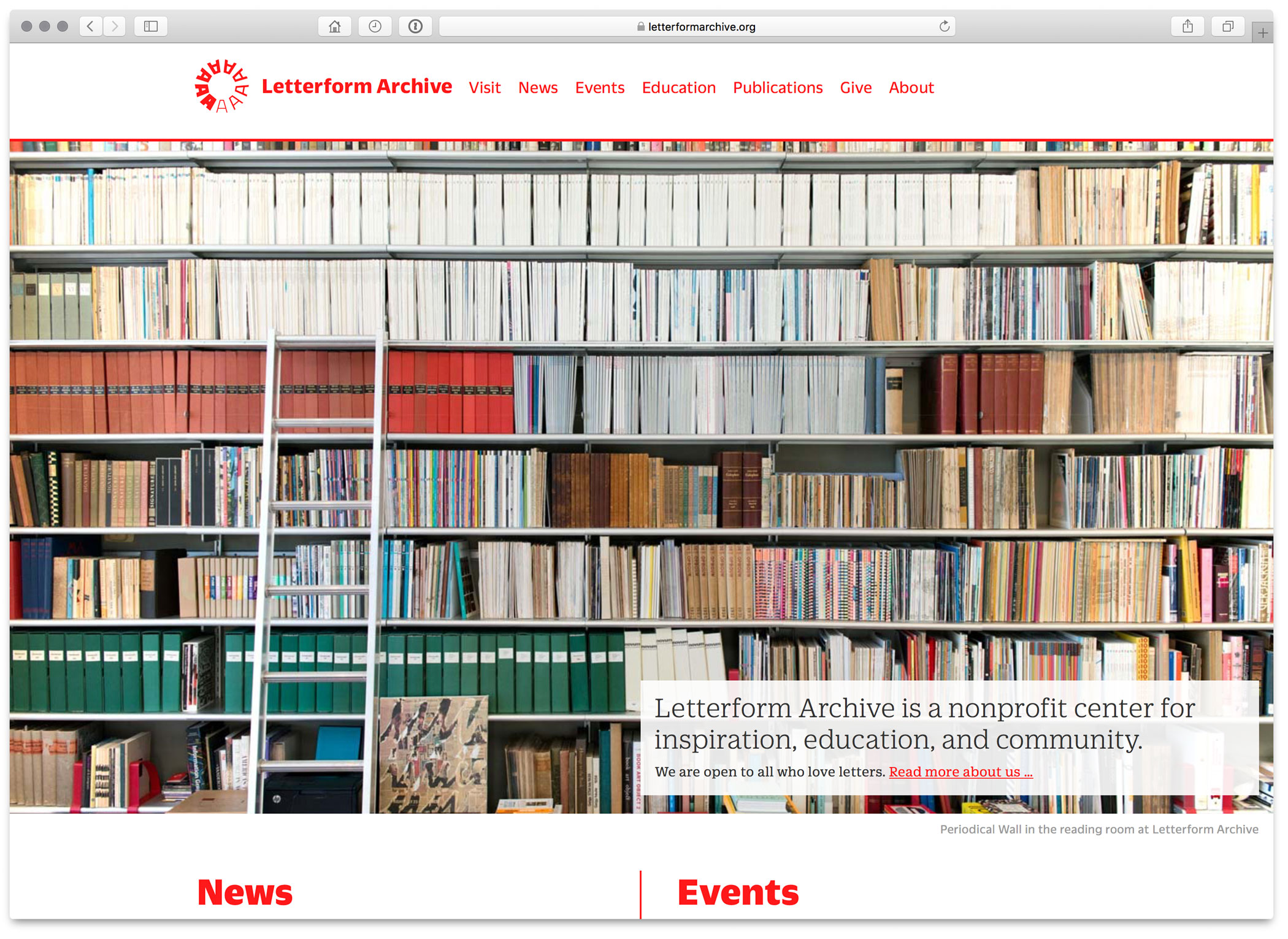
Nick Sherman: The previous site was a bit too dark with its black background. The typography was also not ideal, especially considering the context of what it was representing. A big part of the redesign was to make the site feel more contemporary and inviting.
… and the content?
NS: The brief for the first stage of a new website focused more on updating the design than adding new content. Naturally the process of rebuilding everything from the ground up highlighted various opportunities to improve the content and clarify the information that did exist.
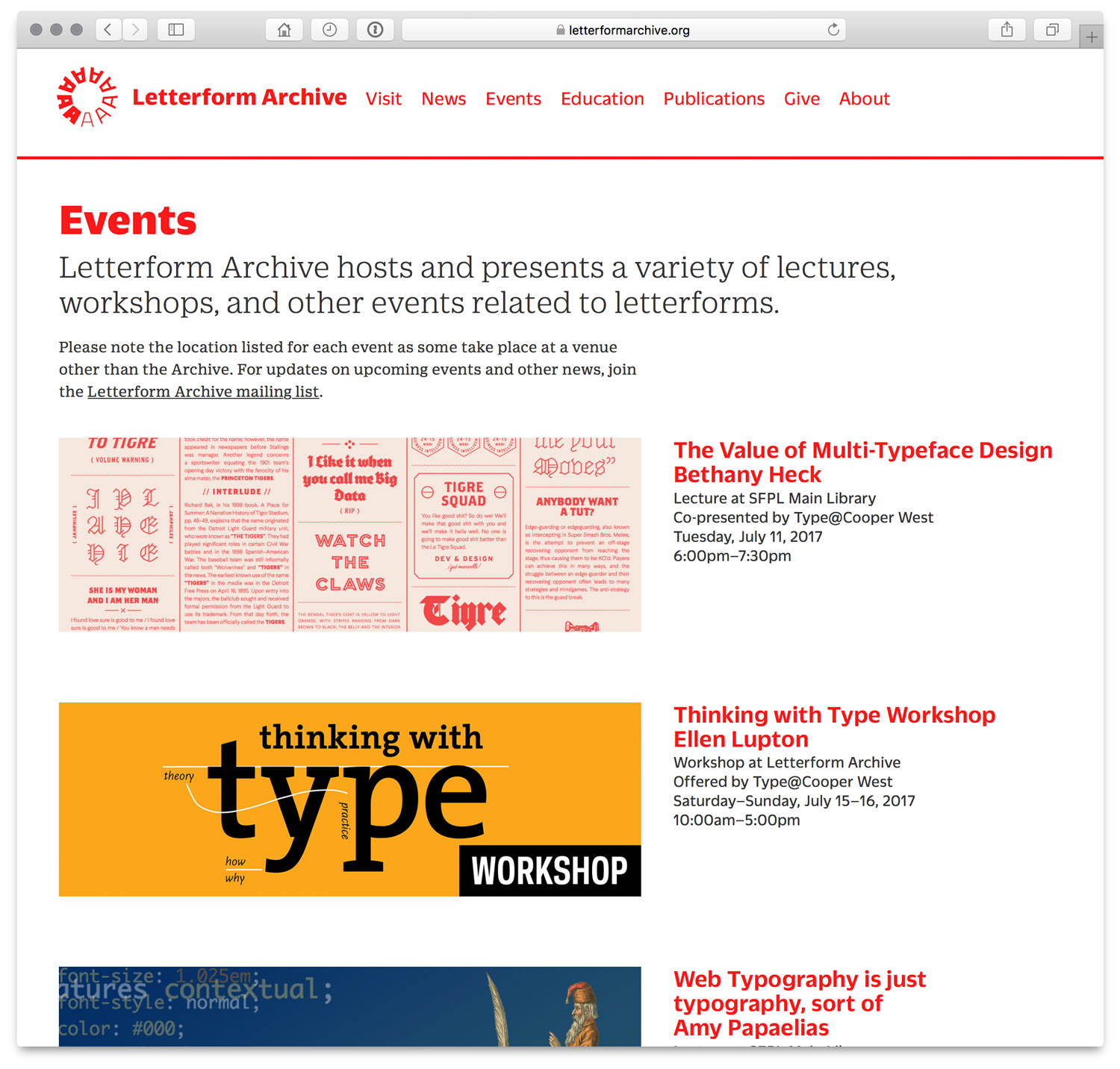
Content-wise, the most significant developments are probably the dedicated news section and listing for all the various events the Archive is involved with. Previously, that information was often published on one-off pages that were harder to discover without a standard, centralized home.
What’s the biggest challenge in designing a website whose audience is primarily designers?
NS: In some ways it’s easier to design for other designers – I can get away with stylistic choices that might be too outlandish for other clients/audiences, and it’s a demographic I understand inherently.
With that said, it also increases the pressure to get the layout and typography as tight as possible. I don’t necessarily see that as a challenge so much as motivation though, and I like the idea that the extra effort I put into the design isn’t in vain.
Unfortunately, there are still a few things related to typographic design that are simply impractical if not impossible to address properly on the web. For example, support for adjustments to hyphenation, justification, widows, and orphans on the web is still far behind what print designers have had for years. A lot of these things are details that would only stand out to designers, so that increases the pressure a bit.
Many of our followers will be interested in the technology behind the site. What made you choose ExpressionEngine for the CMS?
NS: There are a few reasons I like ExpressionEngine. First, because it isn’t focused specifically on blog-making, it’s extremely flexible to build different kinds of data structures for any kind of content, and its interface makes it easy to do so. I also like that it doesn’t come with all kinds of complex functionality activated by default. It takes a little extra time up front to set things up that way, but that time is quickly saved by not having to reverse-engineer some canned system to get it to work how I want. Consciously adding all the design and functionality I need is much more satisfying than just tweaking someone else’s idea of what is best. Additionally, because ExpressionEngine has such a wide user base, it’s always relatively easy to find helpful information whenever I’m stuck with some technical issue.
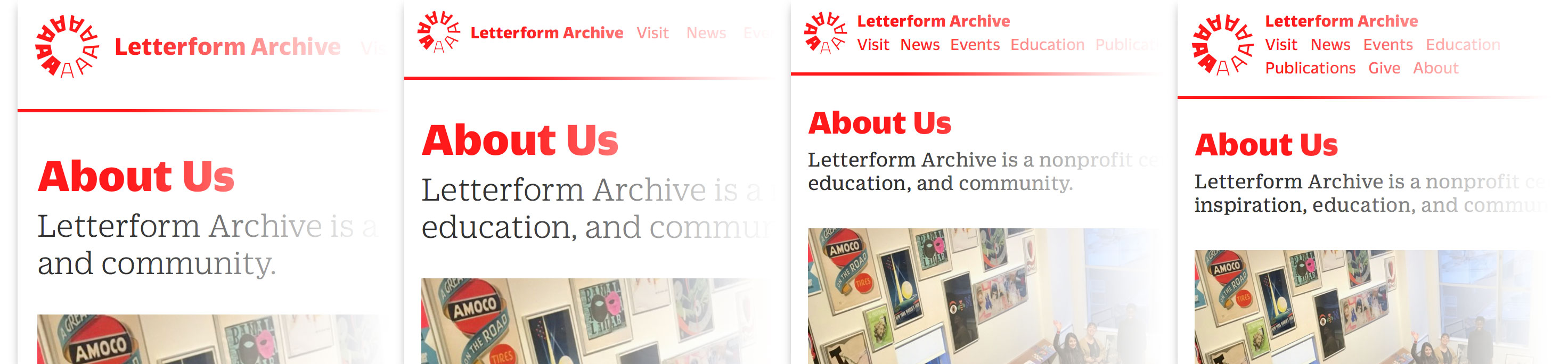
What is your philosophy behind responsiveness in website design these days? Any specific tricks used for this project that you’d like to share?
NS: There is no excuse for any new website to not be responsive. The amount of extra effort required to make a site responsive is relatively small if you use the right design mentality from the start. I have many ideas and opinions that inform how I approach a responsive website and I could talk about them for hours, but here are just a few quick notes:
- I move my design work to code as soon as possible, usually skipping static image-based comps altogether. To adapt the quote from Eric Gill: Websites are things, not pictures of things.
- Other than making the overall layout of a site responsive, I also often make responsive adjustments to lower-level typographic details. Adjusting things like line-height, letter-spacing, and even the fonts that are used can improve the typographic experience for different conditions.
- Whenever possible, I try to use live text with web fonts instead of resorting to images of text.
- I avoid using JavaScript for features that don’t require JavaScript. This is counter to some recent trends in web development, but I’ve found the approach usually results in websites that are less fragile, complex, erratic, or difficult to modify in the future.
- For similar reasons, I avoid using pre-canned code frameworks.
I should mention that these notes are just how I approach the kinds of websites I usually make. They aren’t necessarily rigid rules that every designer should adopt for every kind of website, but they’ve served me well.
Our News section has flexible type and image styling. In particular, the multiple image styles offer a variety of ways to present our collection in more of a magazine format.
NS: Letterform Archive features a wide variety of material and emphasizes high-quality imaging, so I wanted to allow some variety and flexibility with how content can be presented. The system isn’t terribly complex at the moment, but I thought it was important to at least offer a few more options than the hyper-linear, mono-width column that’s standard for so much web content these days. I’d love to keep exploring other possibilities, especially as support for complex layouts is increasing with things like CSS columns and grids.
Give us a hint at what’s in store for the future of Letterform Archive’s site.
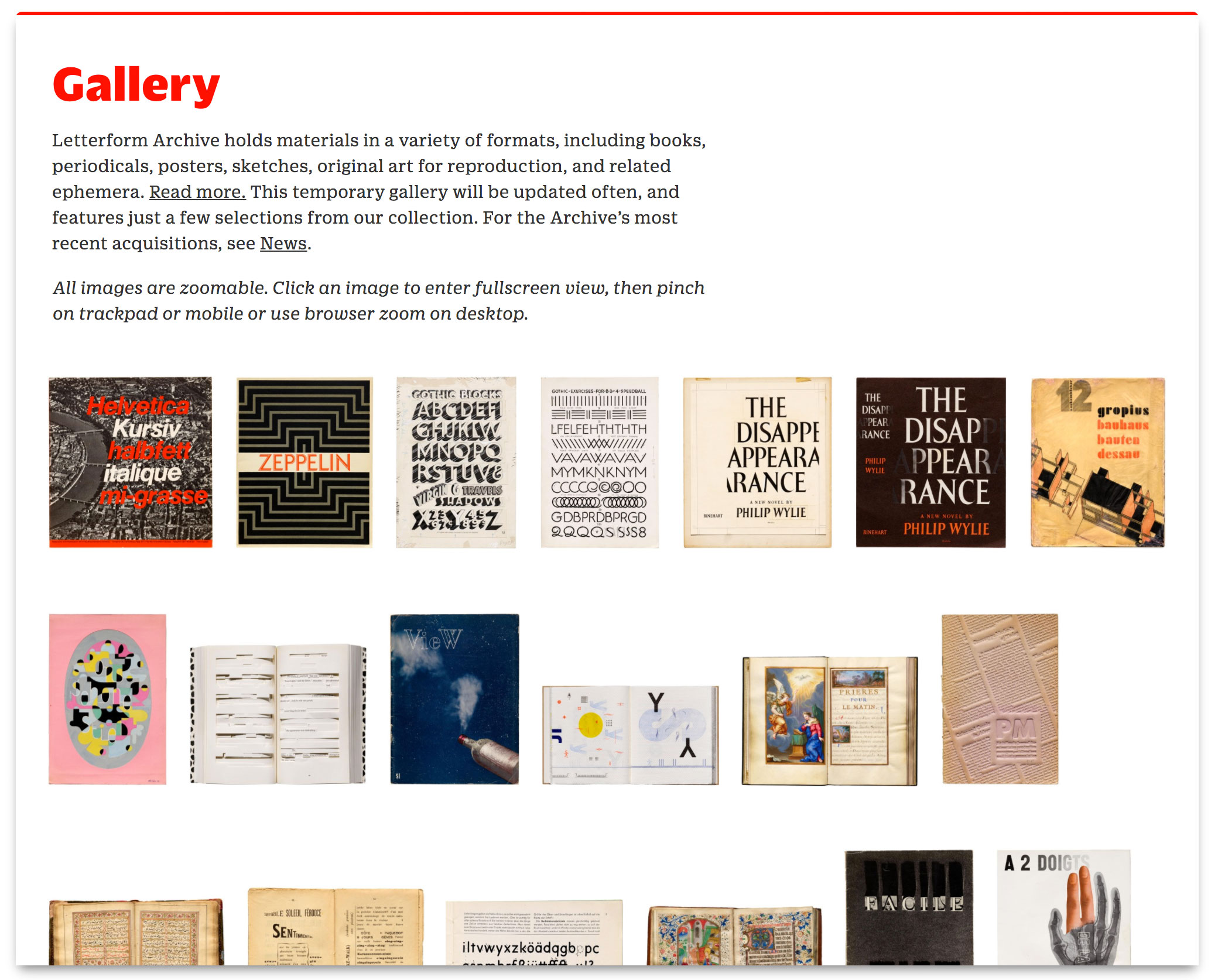
NS: The ideal goal for the site is to eventually host a fully-functioning image database for all the material that Letterform Archive digitizes from its collection. This is not a small undertaking though, especially when you consider how much material there is at the Archive. In the meantime, a smaller curated gallery of examples gives a sense of the kinds of things that are available to see if you visit the archive in person.
To get more looks behind the scenes at Letterform Archive join our mailing list.