News
From the Collection: Legacies of Swiss Style, Part 2—Wolfgang Weingart
We return to Switzerland to consider the impact of the provocative designer who pushed modern typography to its limits.
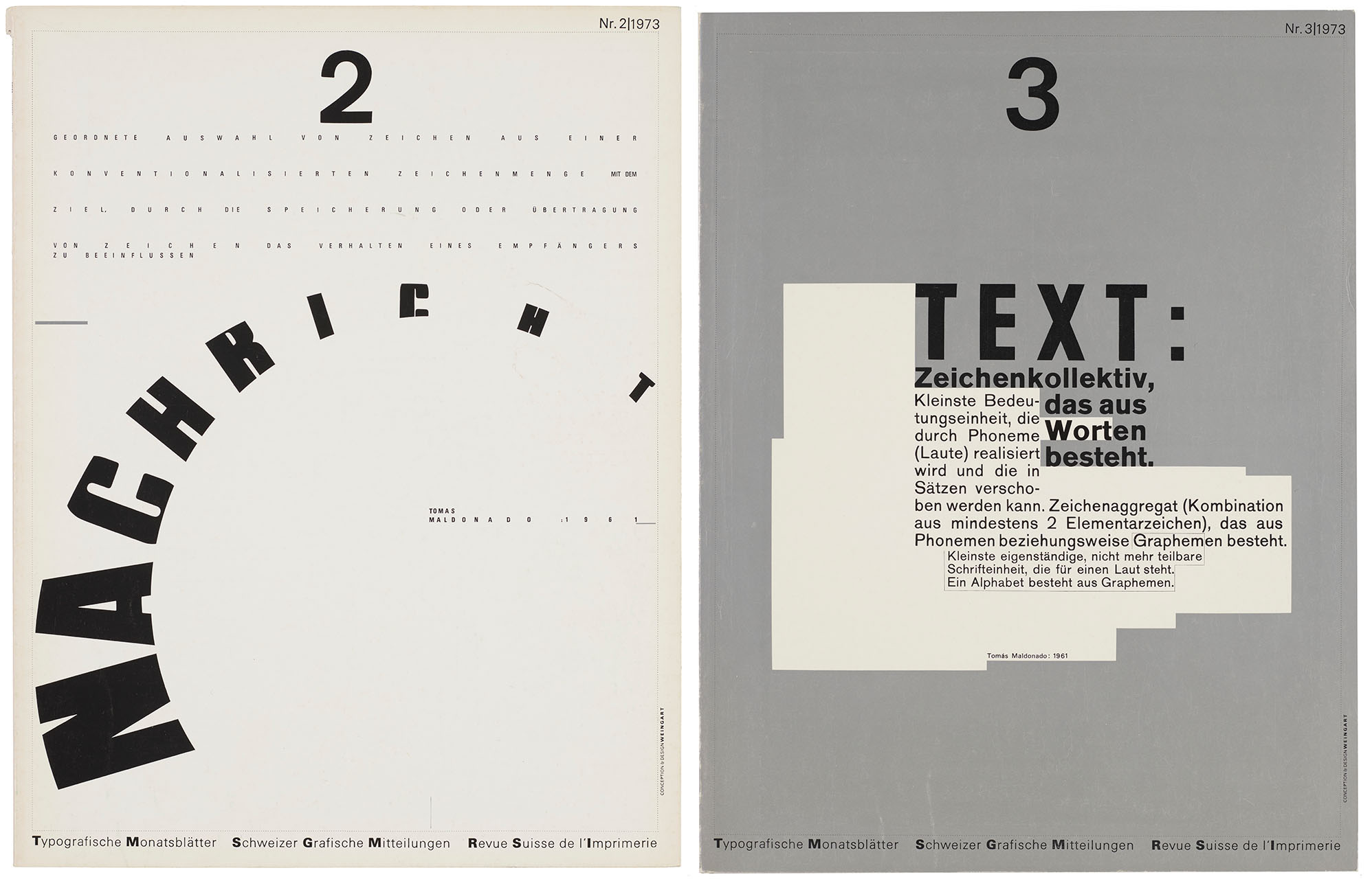
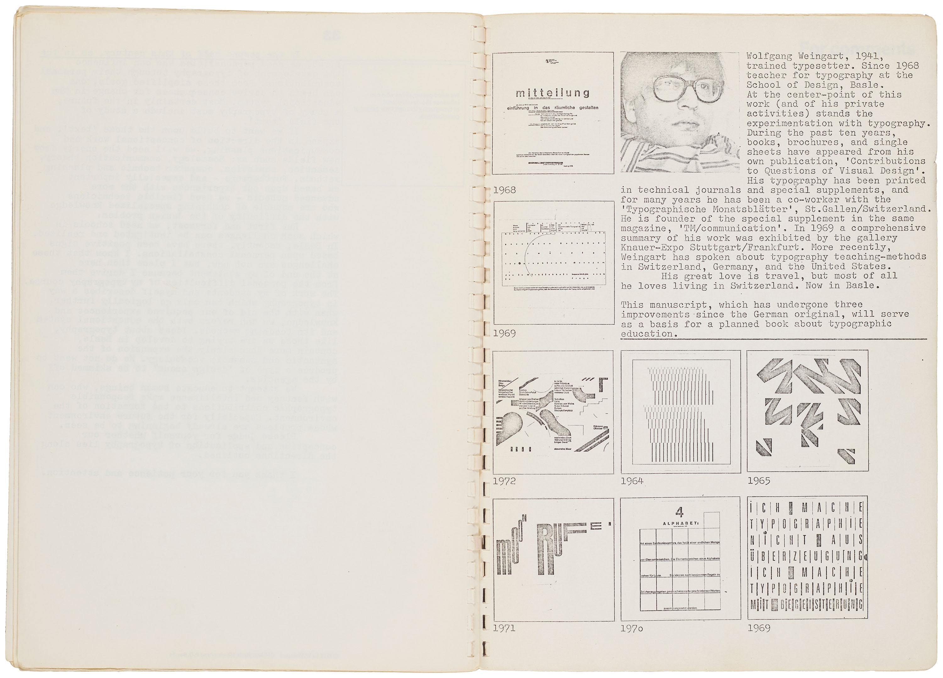
In 1972, the editorial board of Typografische Monatsblätter (TM), one of the leading trade journals in Switzerland, approved a series of cover designs intended to lay the groundwork for the publication’s new artistic direction. Enlisting newly appointed board member Wolfgang Weingart (1941–2021) to produce fifteen covers for the 1972 and ’73 print runs, the outcome inspired both high praise and harsh criticism from a design milieu accustomed to the quiet precision of former art director Robert Büchler (1914–2005) and regular contributor Emil Ruder (1914–1970). Weingart’s provocative covers invited an unprecedented level of controversy by appearing to flout the fundamental principles of modernist design. Instead, his iconoclastic approach struck at the very heart of the Swiss tradition.
Marked by rapid advancements in phototypesetting, the early 1970s represented a transitional moment for the Swiss typographic style, as young designers began to move away from the prescriptive idealism associated with midcentury modernism. Reflecting the conditions of a globalized and increasingly turbulent world, Weingart’s work responds to a growing skepticism towards postwar optimism. Sometimes described as “Swiss Punk,” his irreverent approach provided the means to expose the limits of modern typography from within.
Dead Letters
In a letter to editor Rudolf Hostettler (1919–1981), Jan Tschichold (1902–1974) unequivocally condemned the publication’s new design direction:
This is hopefully the last time that an issue of TM will be published with a cover by Weingart. I have my doubts as to whether the man is in his right mind.1
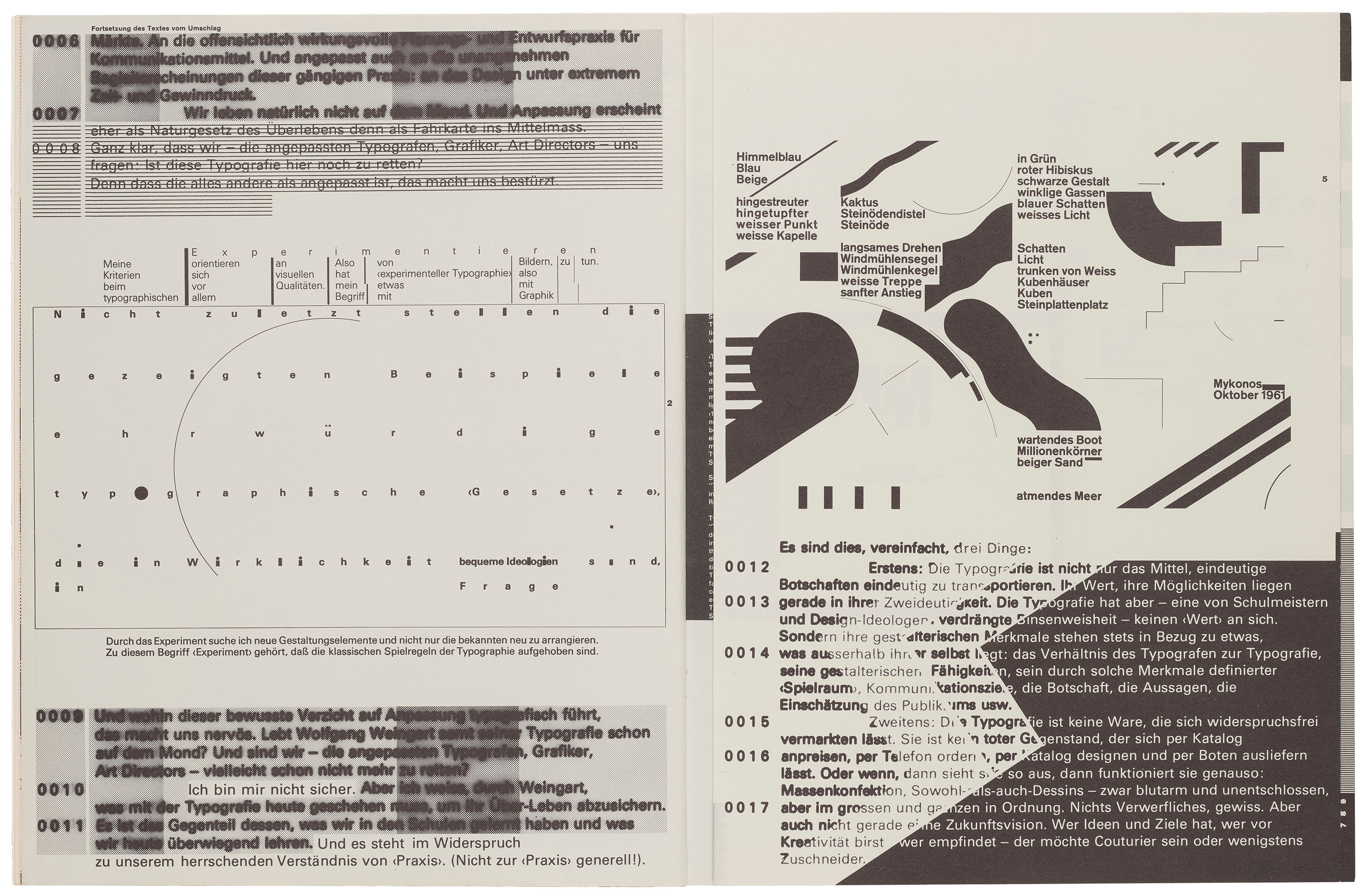
Set in Akzidenz-Grotesk, a late nineteenth-century typeface largely absent from the magazine following the enthusiastic adoption of Univers, Weingart’s covers feature a conspicuous variety of line weights, imbalanced asymmetries, and stepped text blocks intersected by bold rectilinear shapes that operate outside the bounds of the conventional grid system.
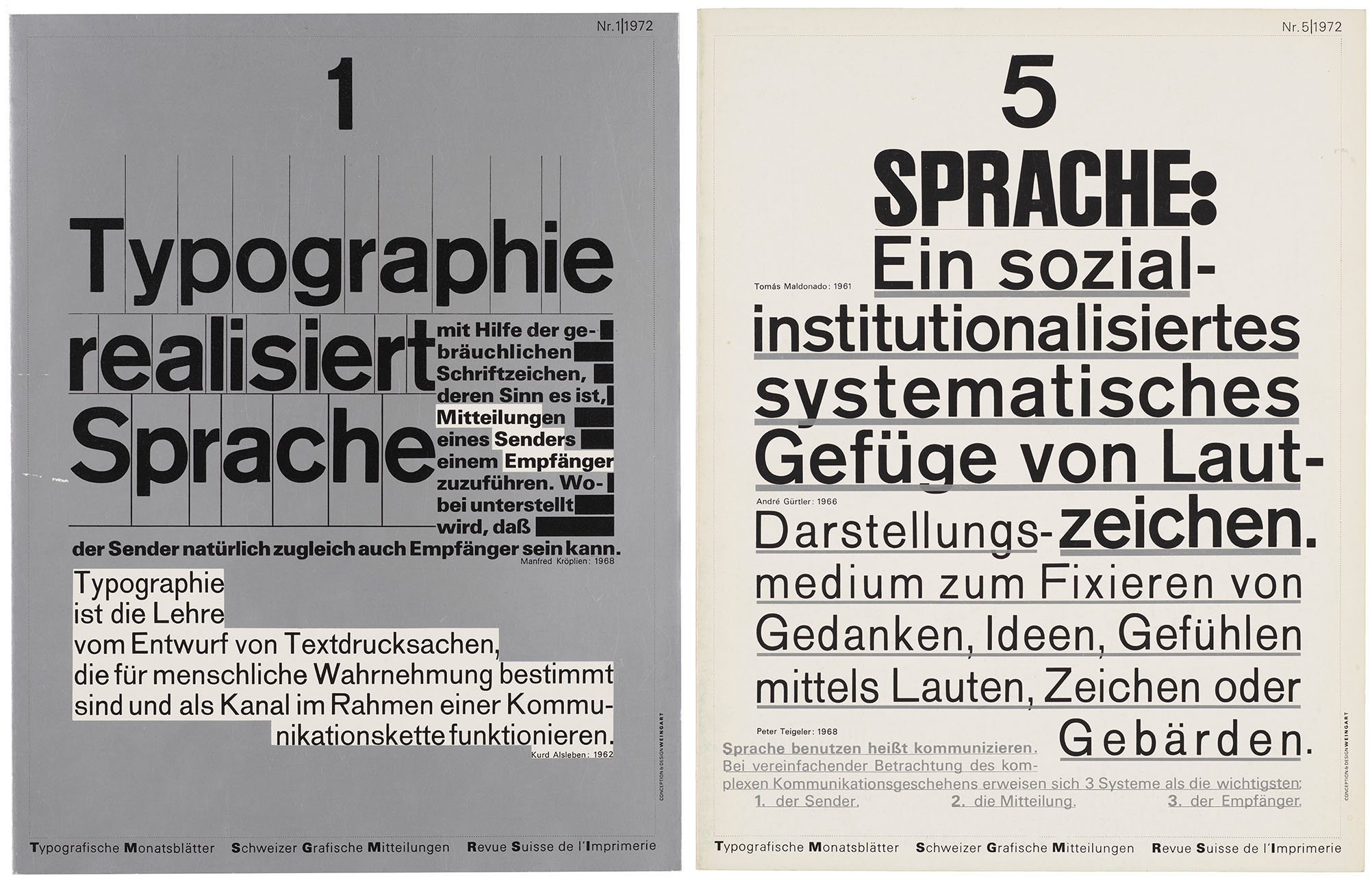
As demonstrated by his cover designs, Weingart was notorious for inhibiting the legibility of the text—an approach wholly incompatible with the established rules of Swiss design. For critics like Tschichold, who once described the work of emerging designers as “typographic barbarism,” Weingart’s renunciation of formal clarity was difficult to accept during a period when even the superfluous indent was considered an extravagance.2 Compared to the fully-resolved layouts that exemplify “good design,” Weingart’s compositions appear unfinished or even accidental, producing a visual tension some may find both seductive and unsettling.
Tschichold’s vitriol likely affirmed Weingart’s deliberate provocations in his work for TM. While studying under Ruder at the Allgemeine Gewerbeschule Basel, Weingart received a letter from Tschichold encouraging him to always remember that the best design is an invisible one.3 Reflecting on early conversations with Ruder and Tschichold, Weingart declared:
Everything that made me curious was forbidden: to question established typographic practice, change the rules, and to reevaluate its potential. I was motivated to provoke this stodgy profession and to stretch the typeshop’s capabilities to the breaking point, and finally, to prove once again that typography is an art.4
By this time, Weingart was already experimenting with materials and improvised compositions to answer Ruder’s rigorous project briefs. Their relationship was often contentious, and early disagreements might have ended with Weingart’s dismissal if not for the intervention of Armin Hofmann (1920–2020), who would later appoint him as a faculty member in the Weiterbildungsklasse für Grafik (Advanced Class for Graphic Design) postgraduate program established in 1968.
Wayward Spirit
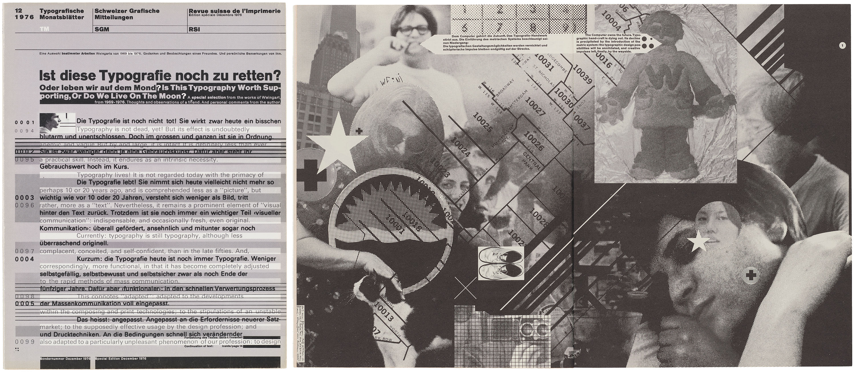
Produced under Weingart’s supervision, the December 1976 issue of TM marks the culmination of his early years as editorial board member, and retroactively frames the “Pioneers of Graphic Design” supplements (discussed here) as a legitimate series rather than a collection of disconnected editorials. Positioning him in the lineage of Swiss typography’s most prominent figures, the issue establishes Weingart as the reluctant inheritor of the Swiss design tradition.
All images in the gallery below are hi-fi captures. Click an image to enter fullscreen view, then click or pinch to enlarge.
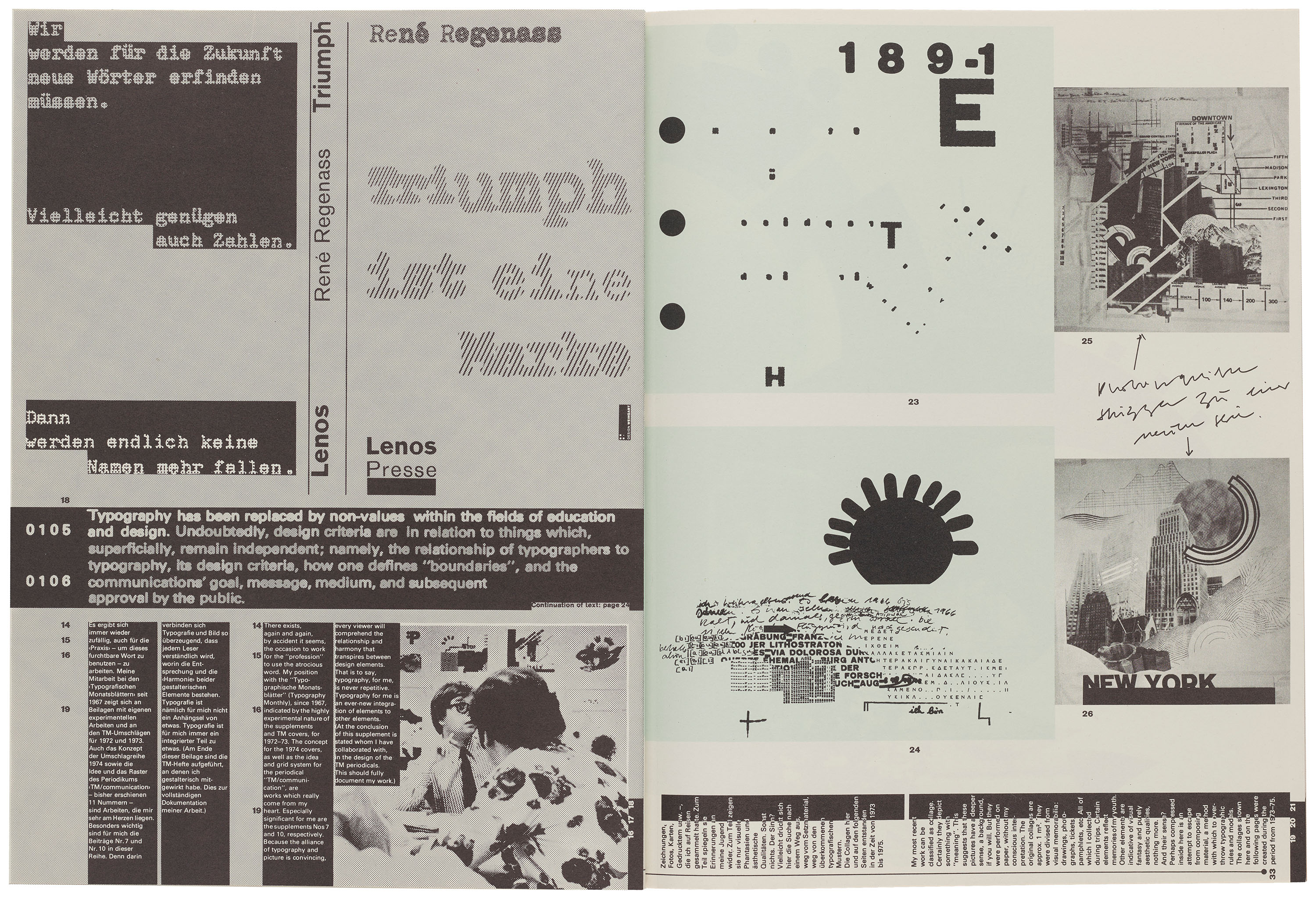
Highlighting seven years of the designer’s work, the supplement features Weingart’s signature collages of image and text, striking geometries, and passages of heavily degraded type. Text fragments disintegrate only to be reconstituted on succeeding pages, creating a three-dimensional information ecosystem that resists systematic interpretation. In one spread, spaced-out letterforms, misaligned images, thick black text boxes, and a broken grid appear over a photograph of a desert, where Weingart found inspiration in desolation and partially buried ruins.
Departing from readability entirely, the design of the 1976 supplement is less concerned with clarity than with cultivating an atmosphere that captures the depth and feeling of Weingart’s work. Unlike earlier “Pioneers” issues, the images are not presented as a proper gallery but woven into multilayered compositions that emerge as works in their own right. Weingart’s use of photomontage resembles the visual conventions later associated with digital design, yet these compositions were produced entirely through the complex layering of photographic films.
Shot in the Dark
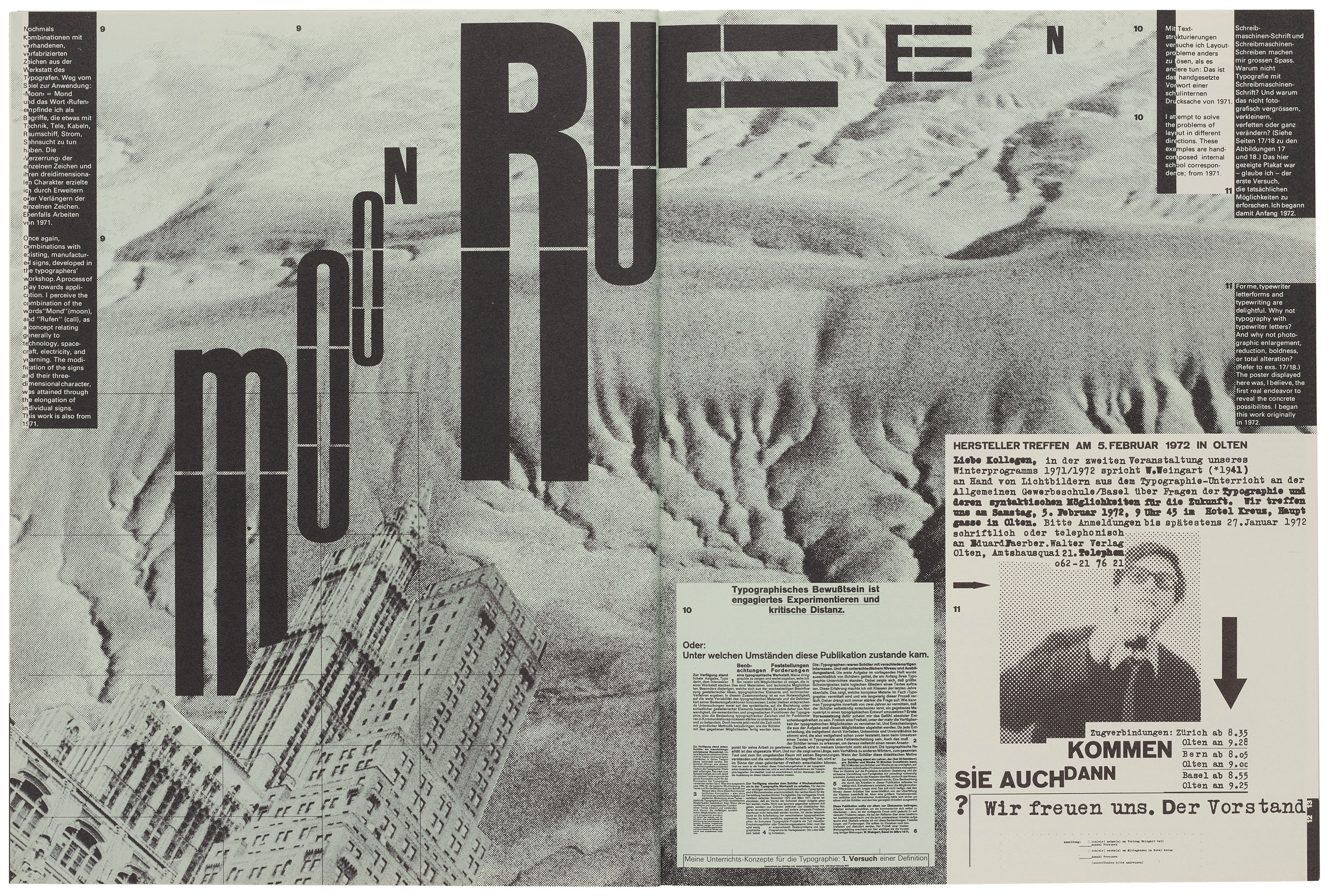
Recalling the methods of printmaker H. N. Werkman (1882–1945), experimentation was central to Weingart’s practice. During his apprenticeship in Stuttgart, he developed an early interest in distorting existing metal type blocks to create new letterforms and modular motifs. When tasked with working “inside the lines” in Basel, these improvisational tendencies intensified, as he spent long hours in the printshop working to fulfill Ruder’s creative briefs through the most unorthodox means possible.
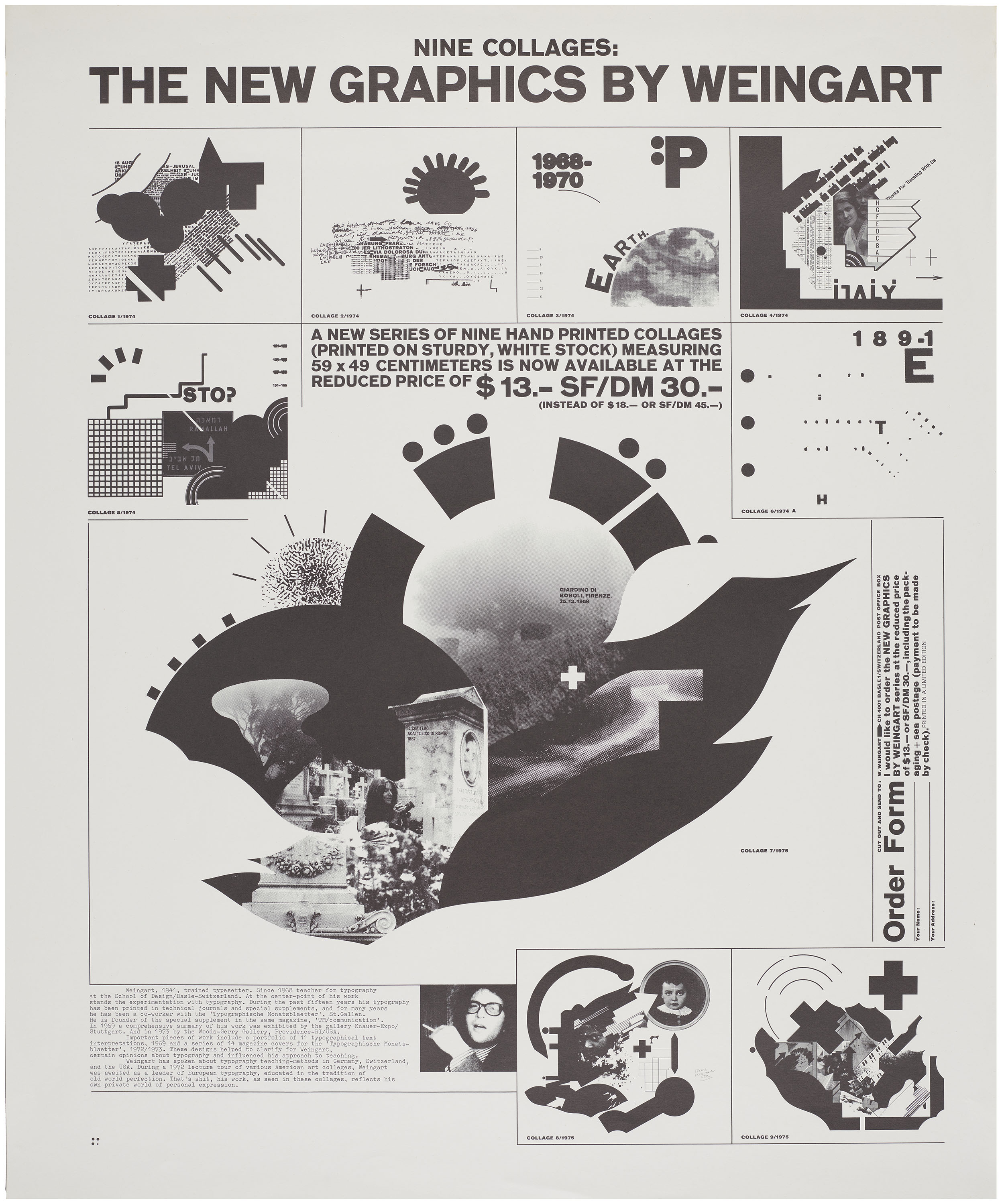
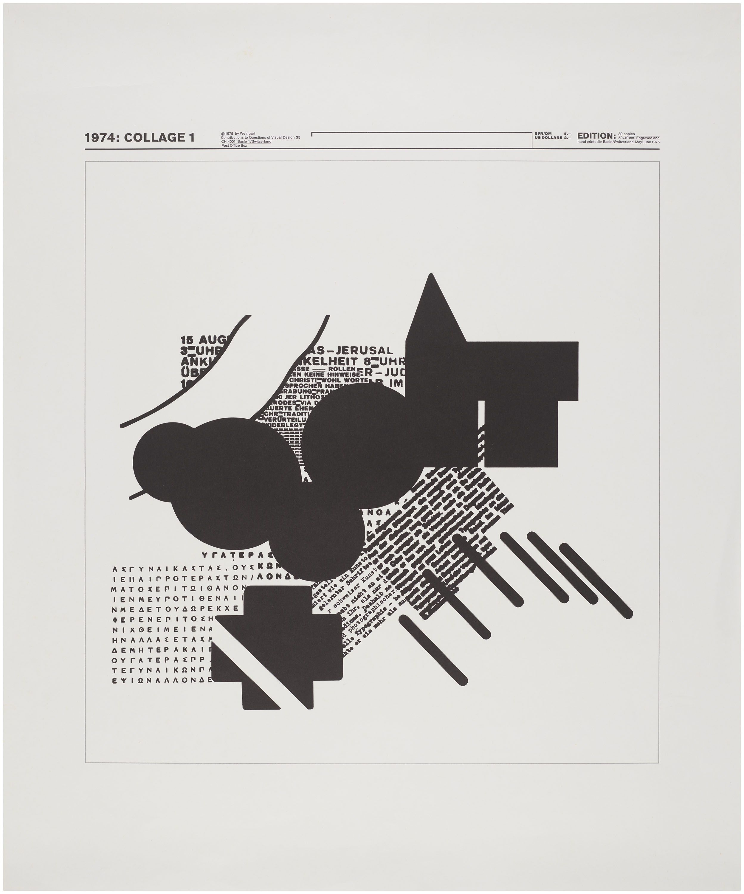
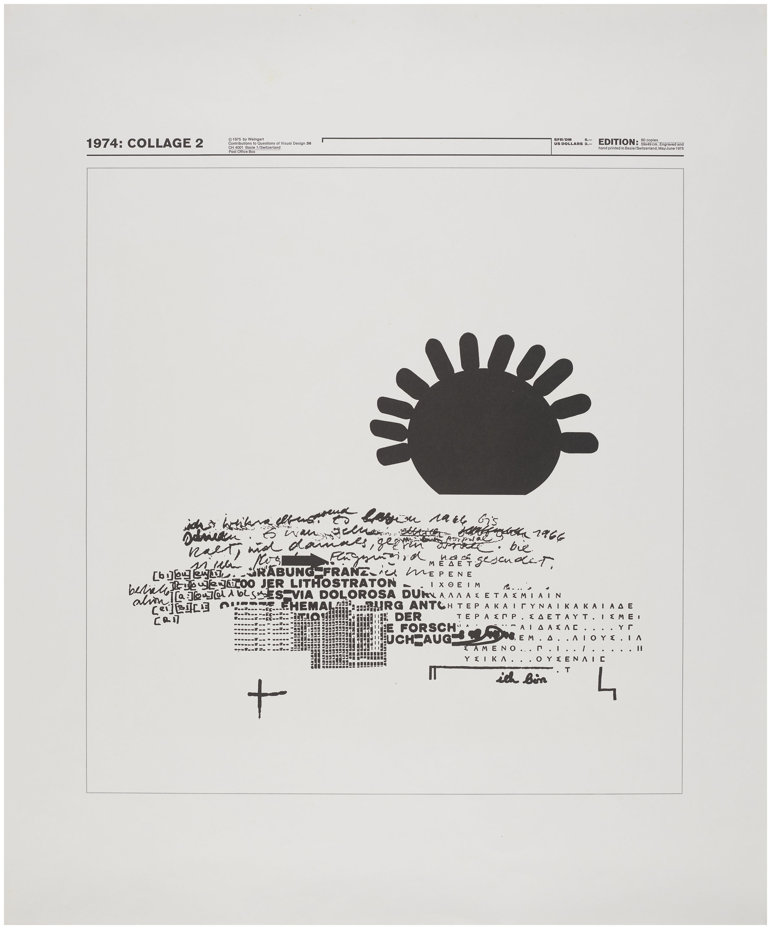
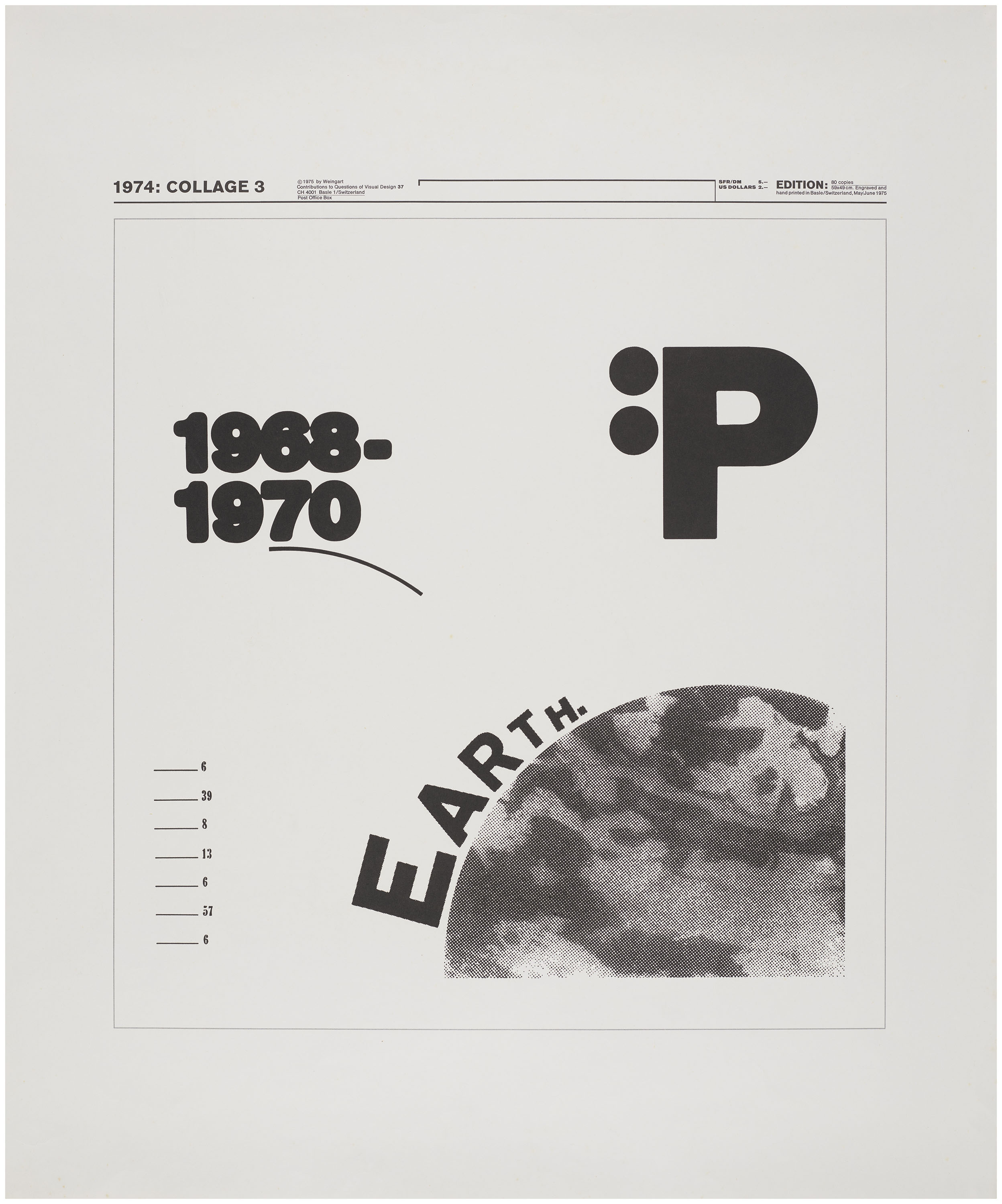
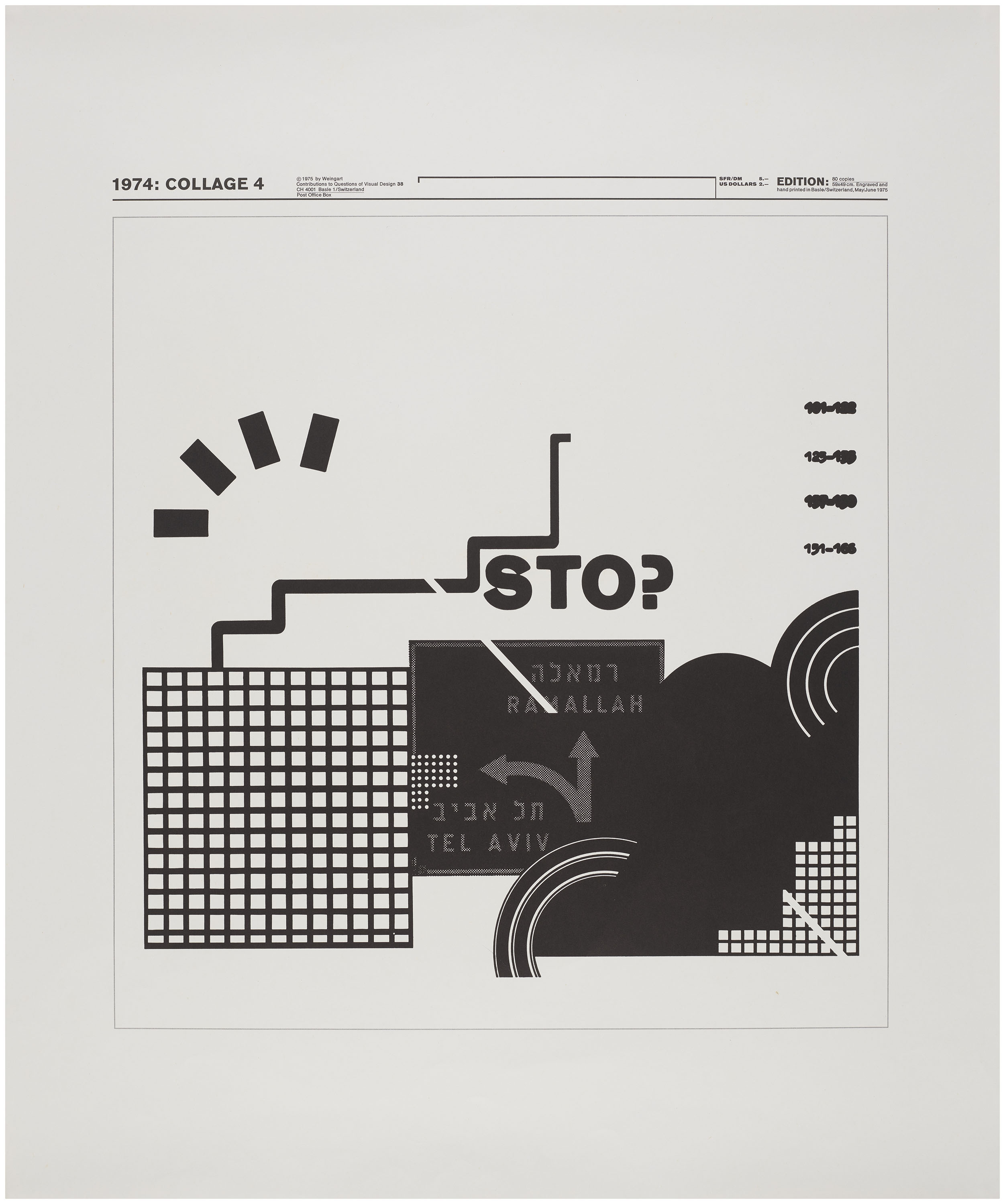
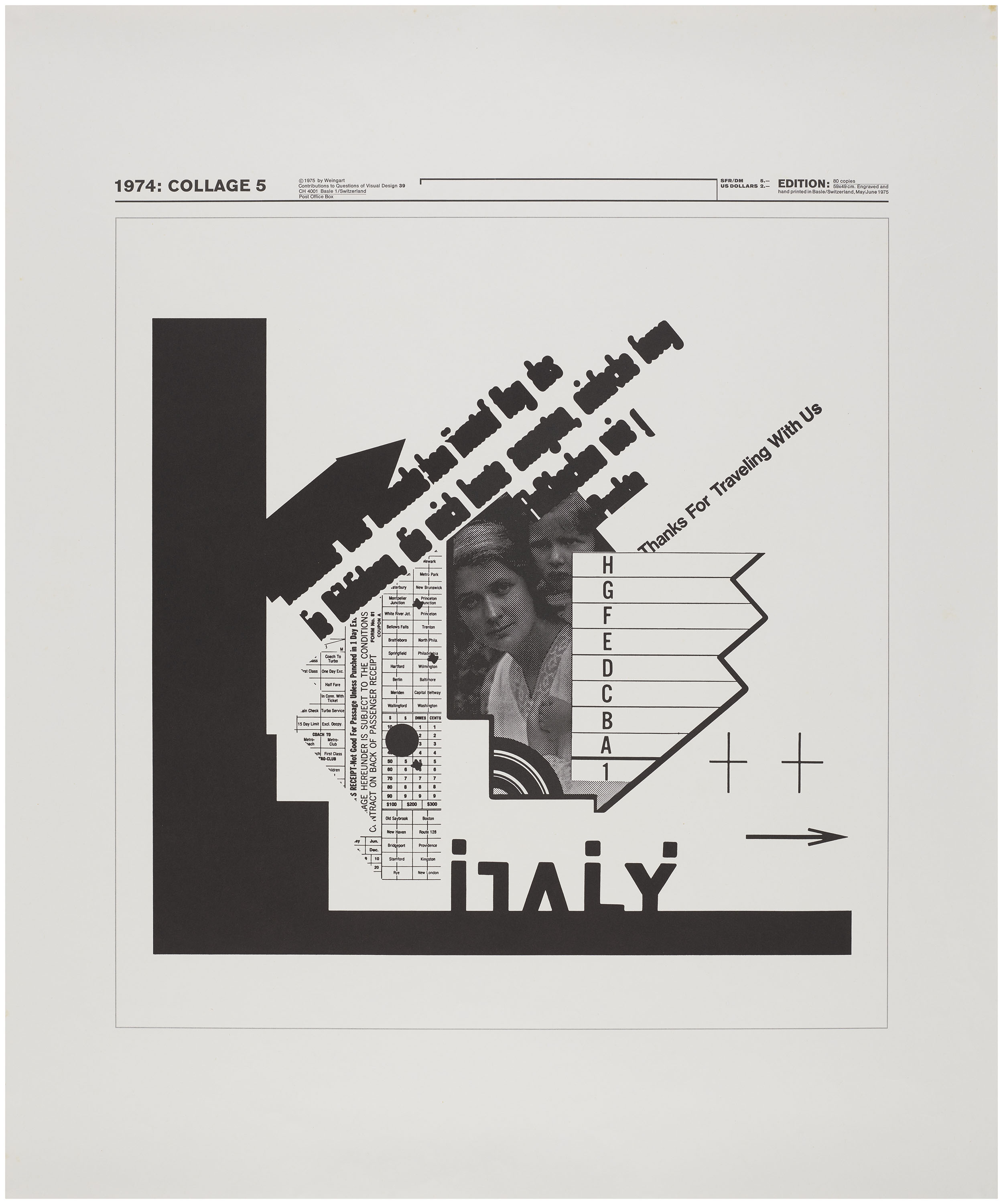
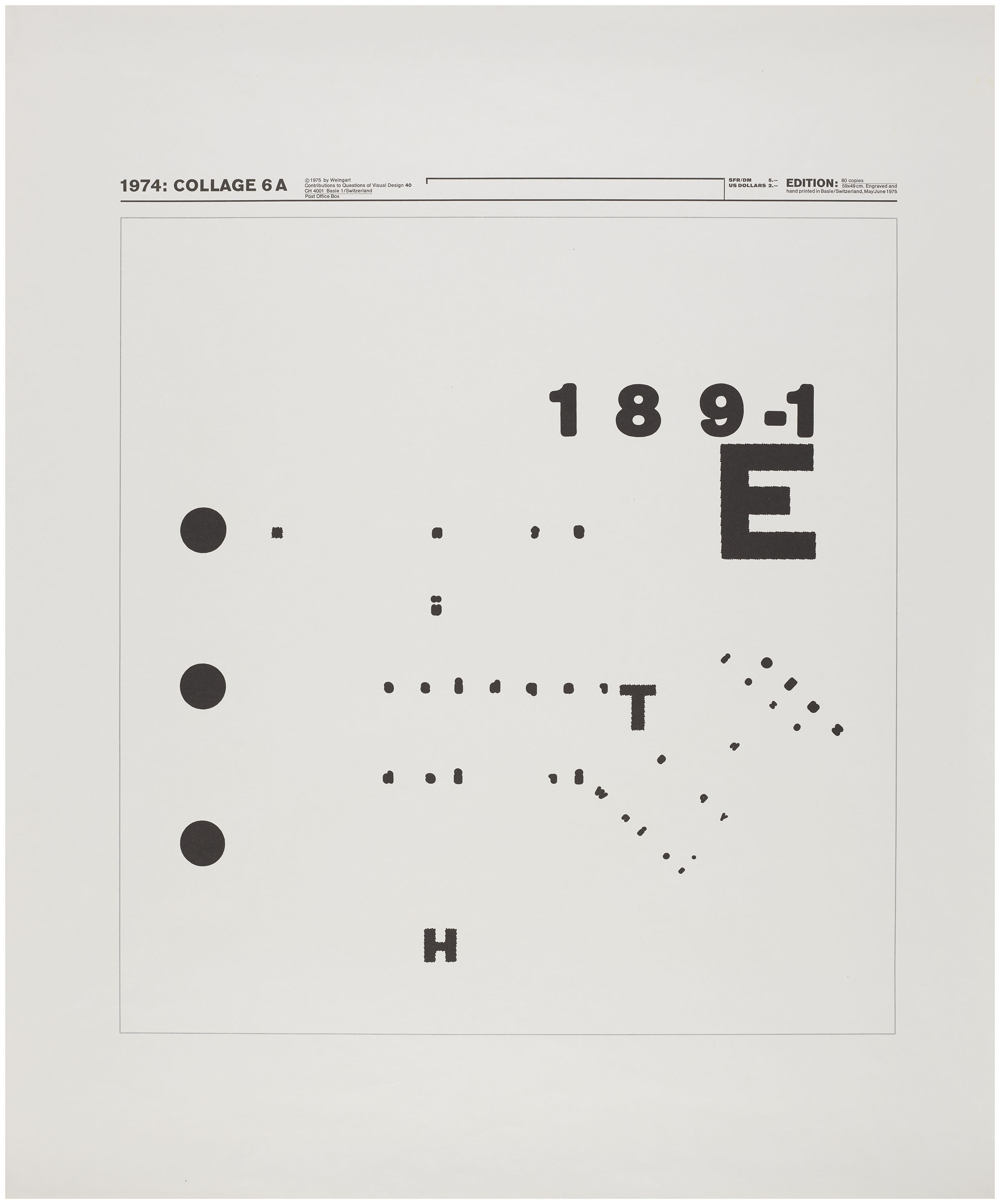
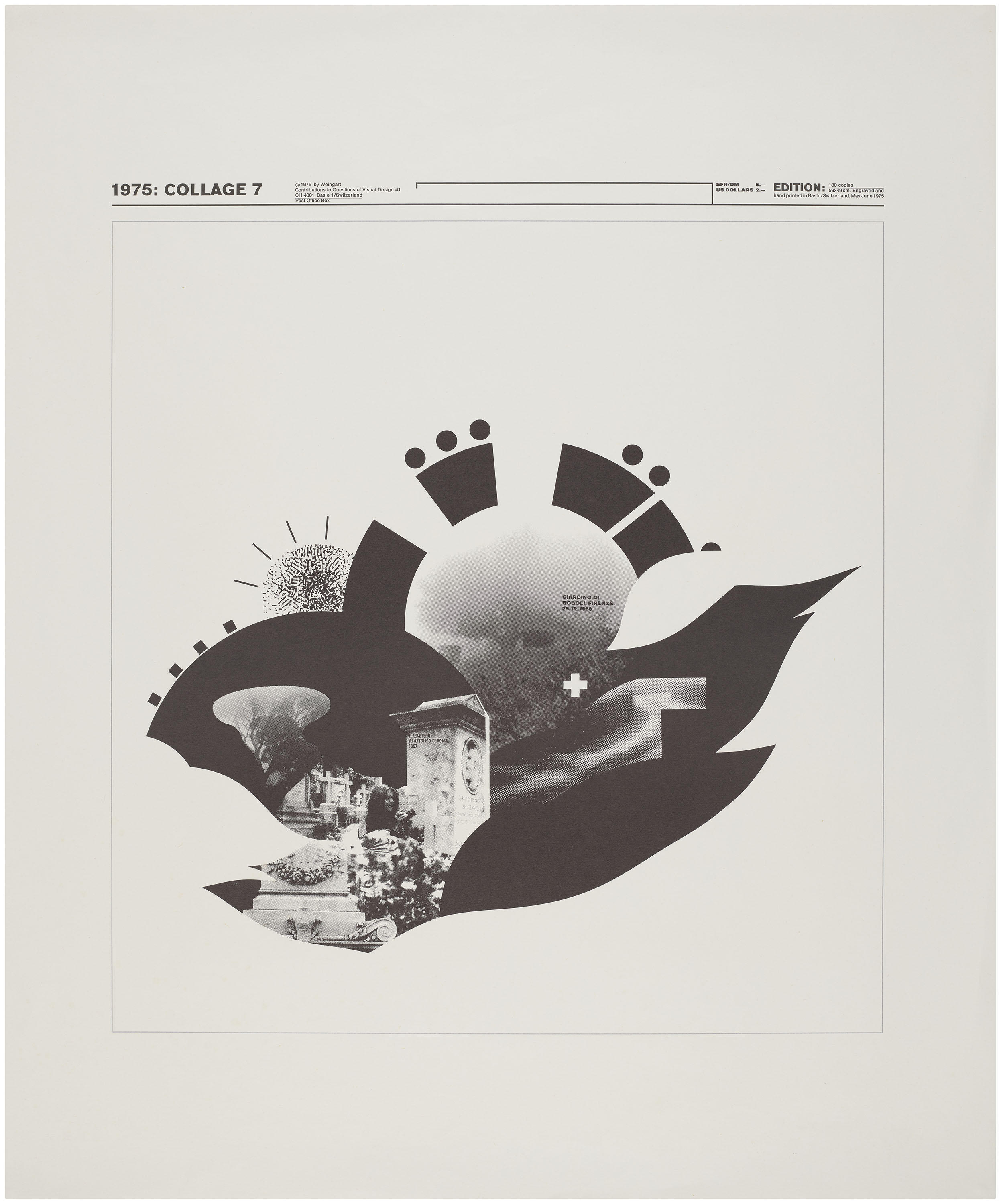
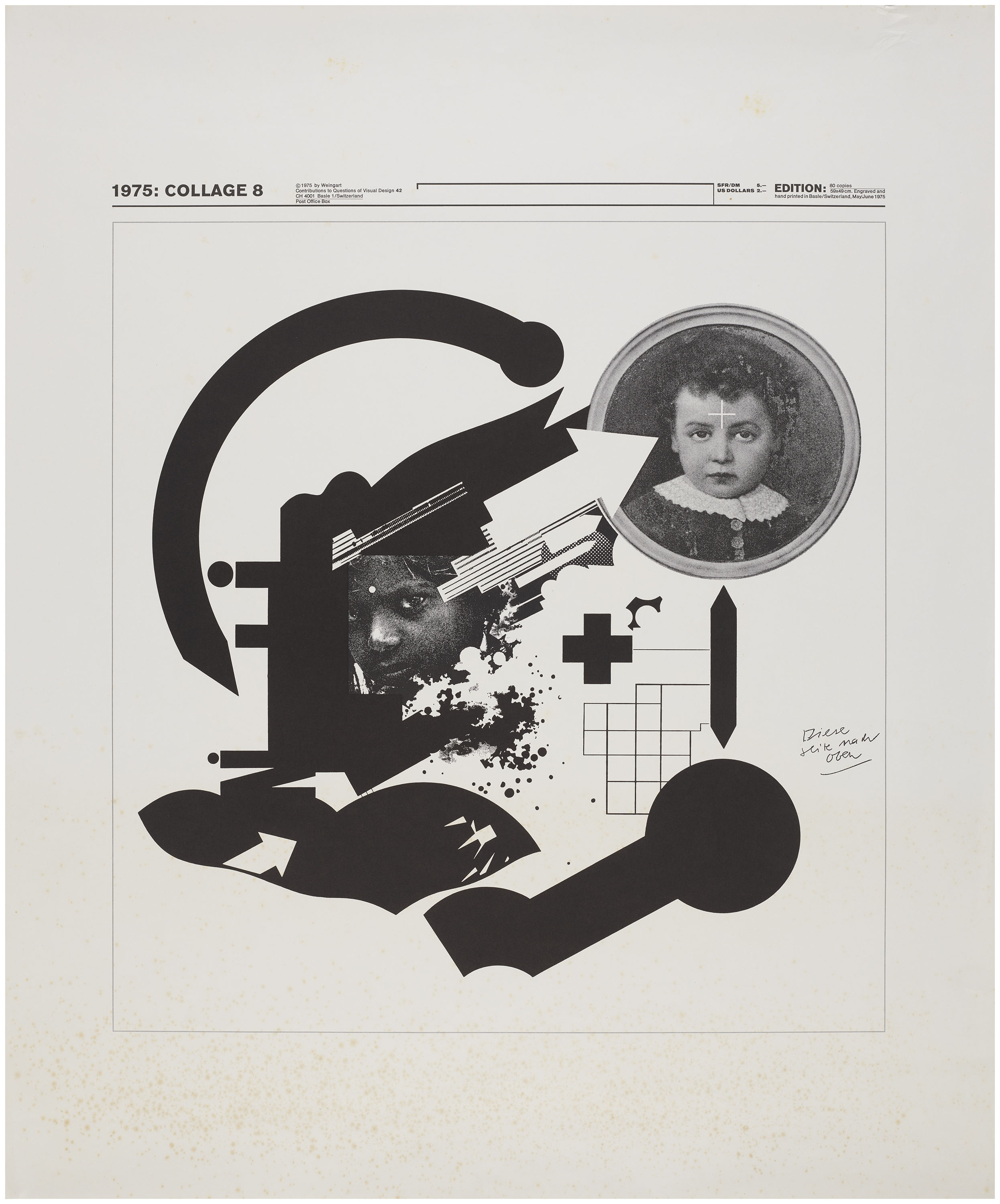
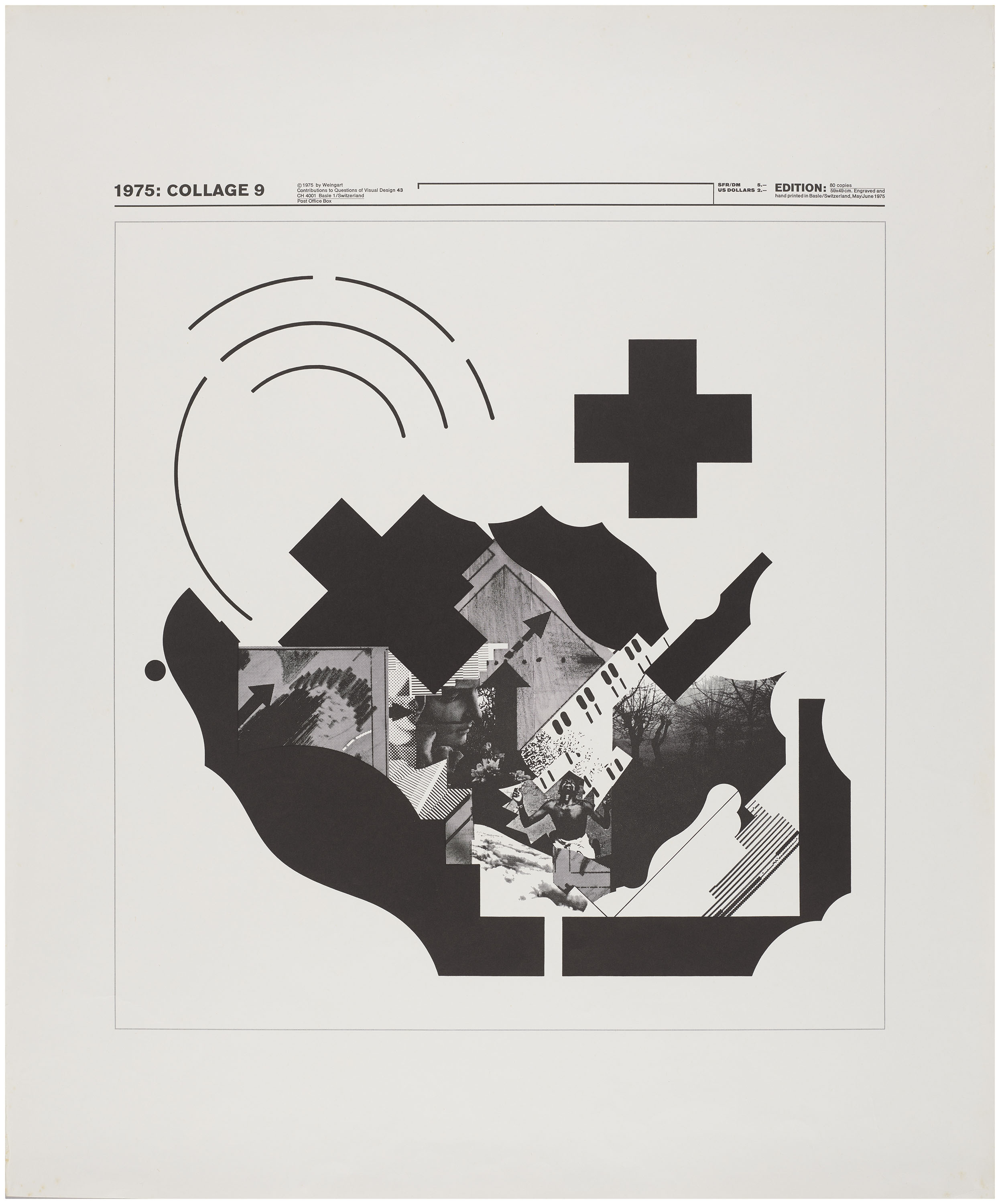
A decisive shift occurred at the beginning of the 1970s, when Weingart began experimenting with photomechanical techniques. Rather than relying on an experienced technician, he taught himself how to produce and manipulate films in an effort to oversee the process from beginning to end. Unlike letterpress, where type exists as fixed objects, photofilm introduces the possibility of continuous reiteration by quickly layering transparent films across multiple exposures rather than the time-intensive process of multiple printings on a conventional press. Weingart’s forays in the darkroom informed his well-known Nine Collages poster series, which derives from experiments conducted in the 1960s and early ’70s that utilized hand-cut films, barely-legible type, and the deliberate overlap of halftones to produce moiré effects. It was a meditative process that, as Weingart explains, brought him into contact with his inner world.
All images in the gallery below are hi-fi captures. Click an image to enter fullscreen view, then click or pinch to enlarge.
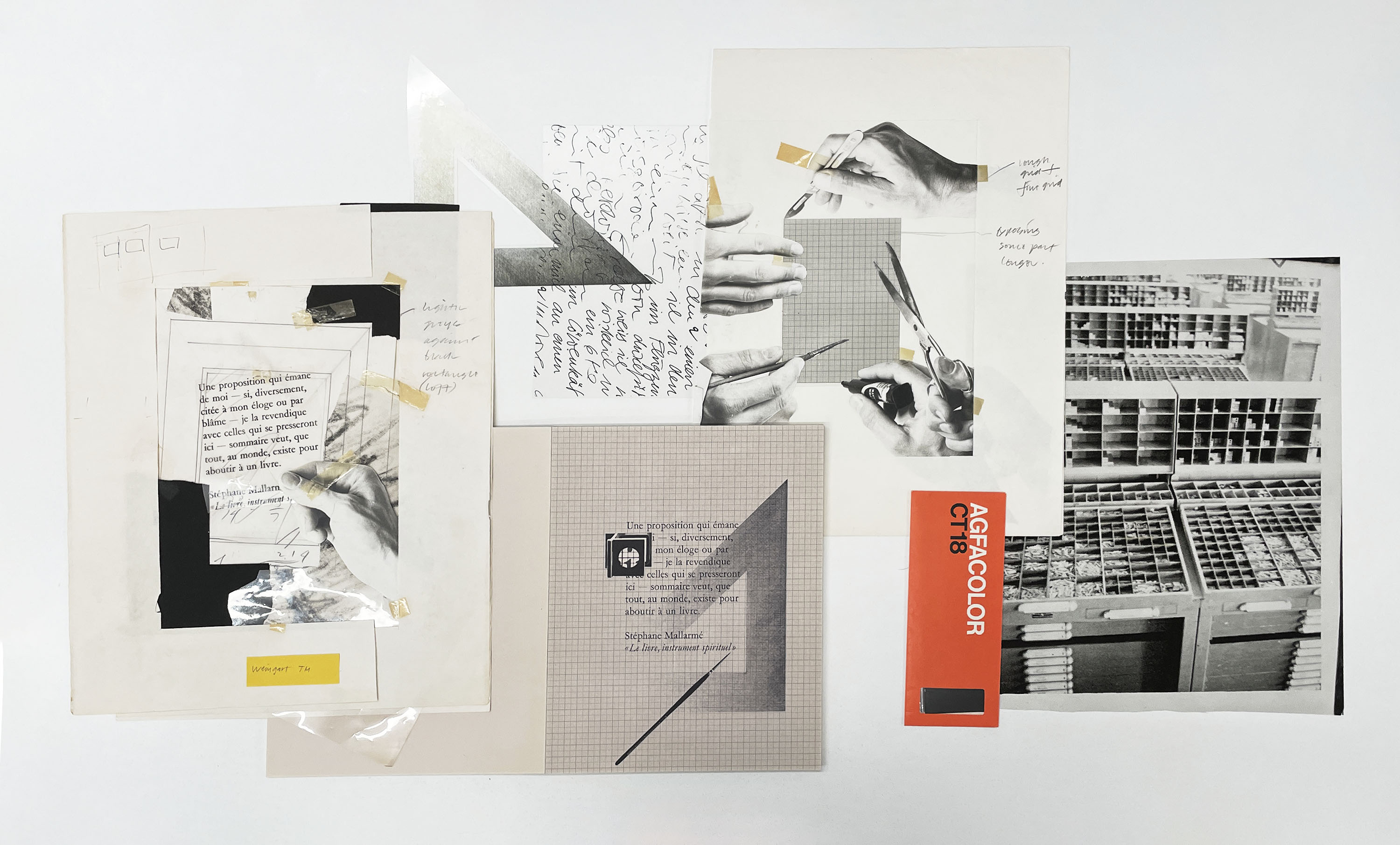
Donated to Letterform Archive by Weingart’s former student Jim Farris, a portfolio of process materials from an applied research project for the April 1979 issue of TM reveals the extent of these experiments. The collection includes numerous maquettes, paste-ups, and photofilms that provide an insightful look at the transformations of image and text made possible by the darkroom. Often collaborating closely with students, and at times presenting their work within layouts of his own design, questions of Weingart’s authorship are not always easily resolved.
Master and Apprentice
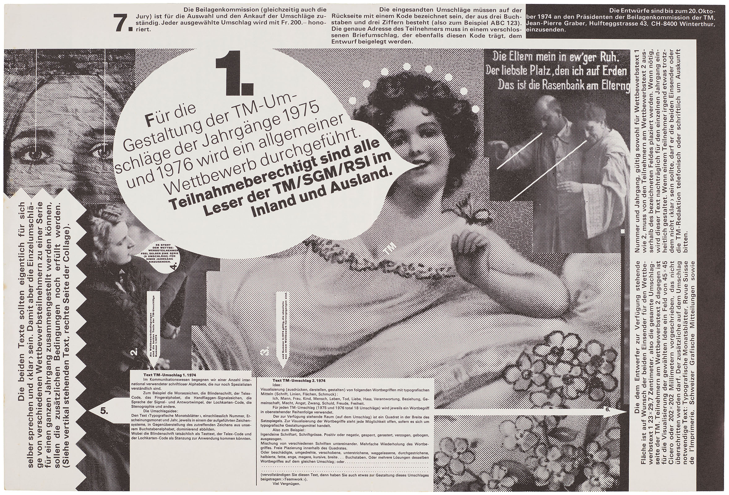
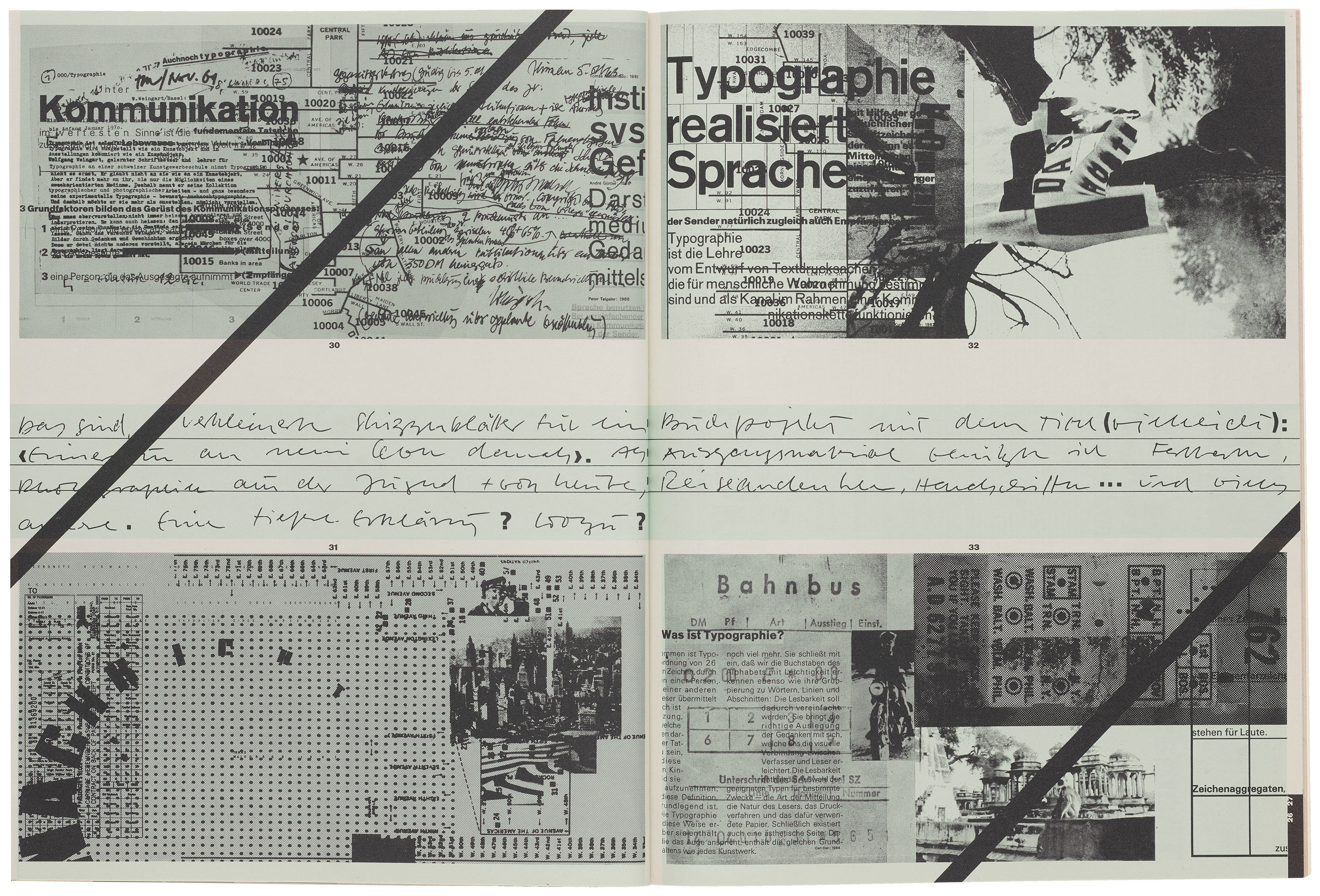
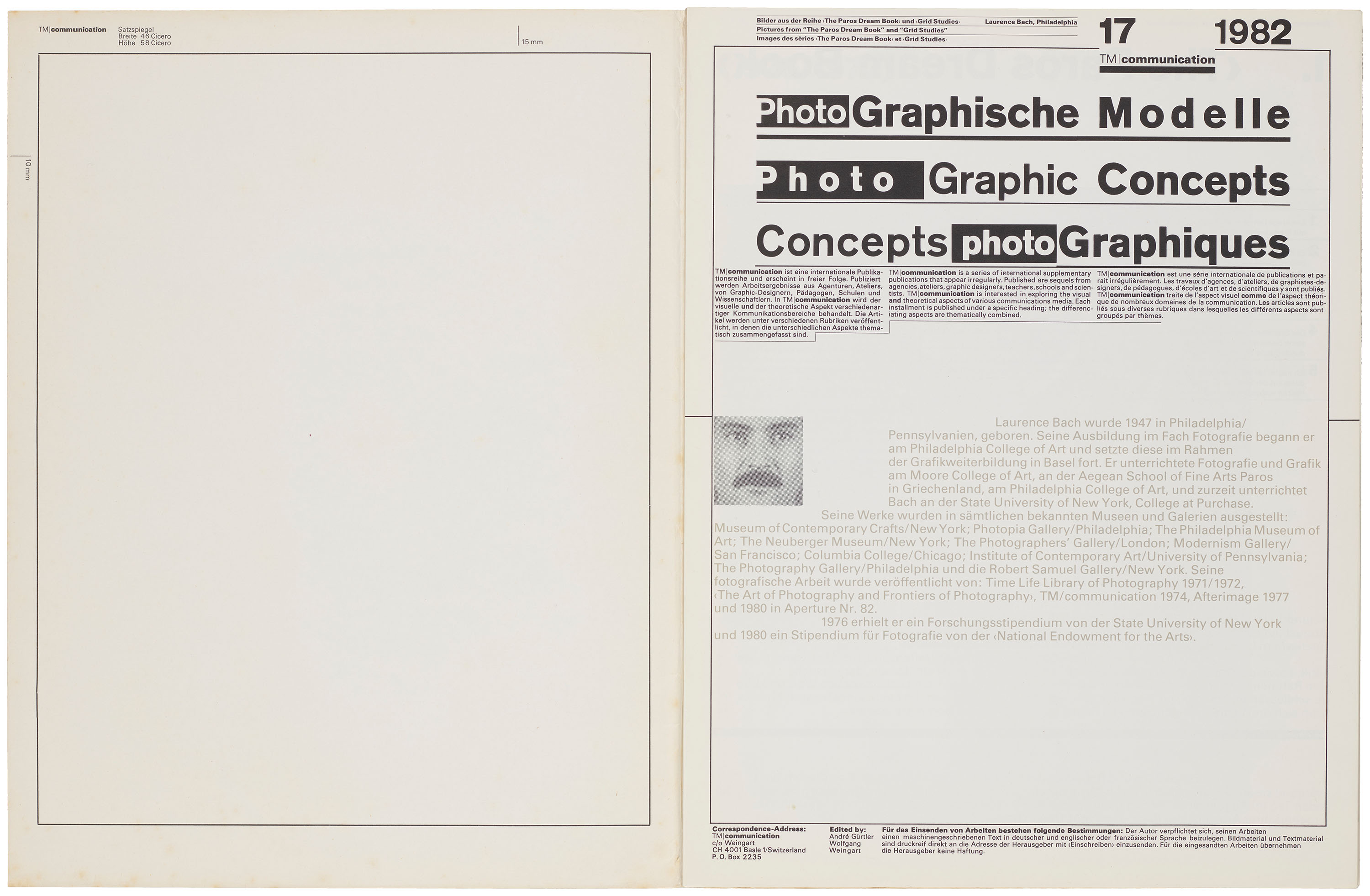
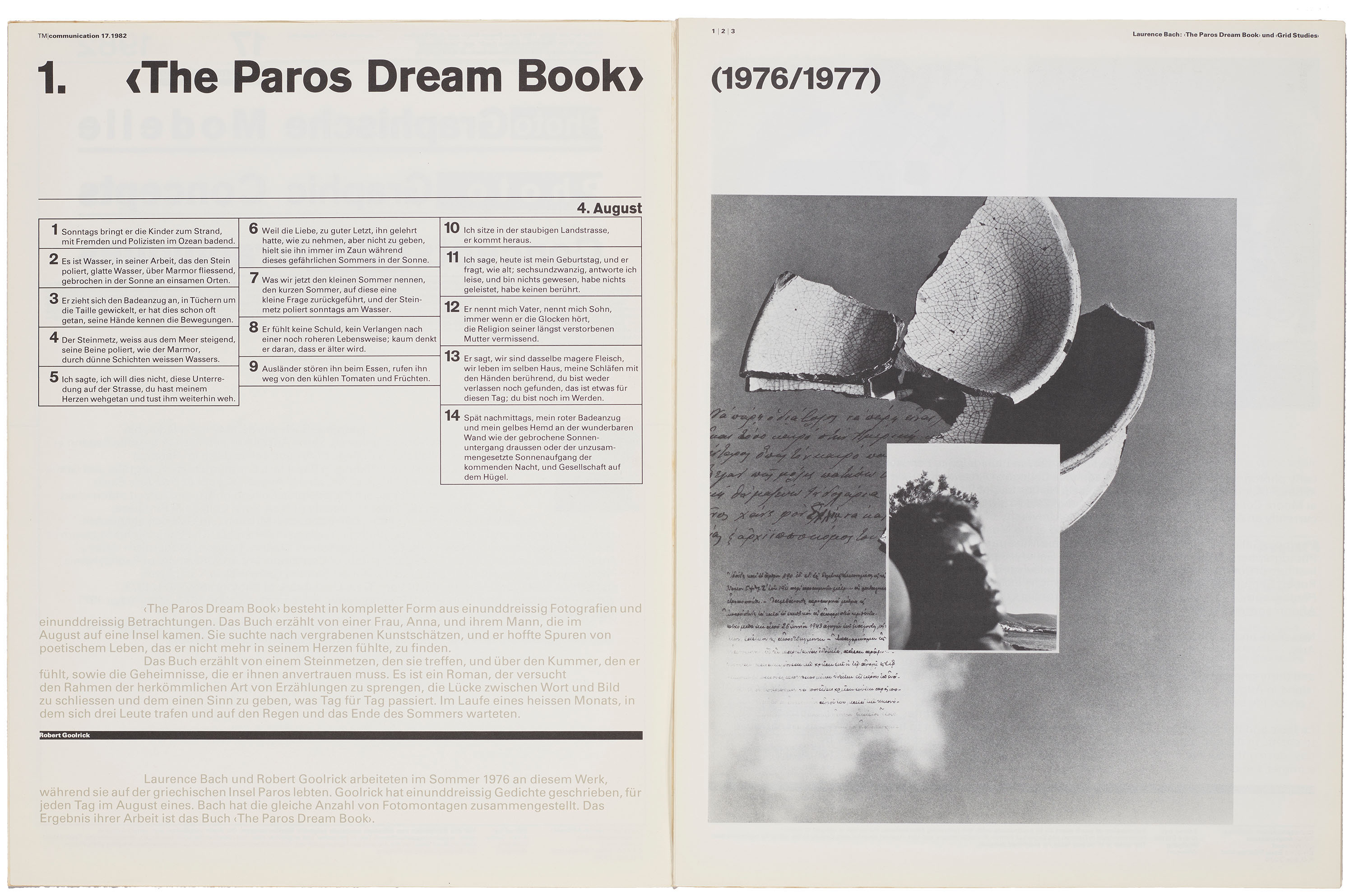
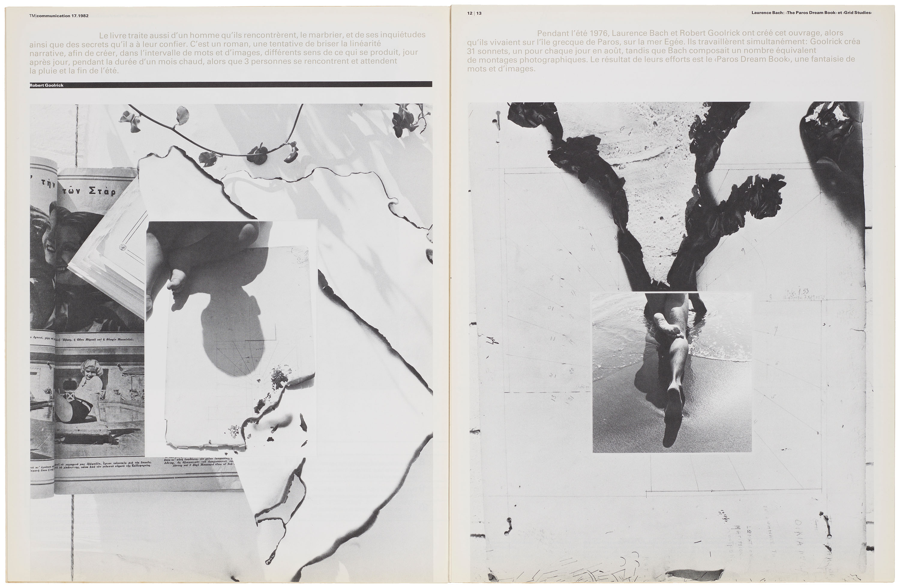
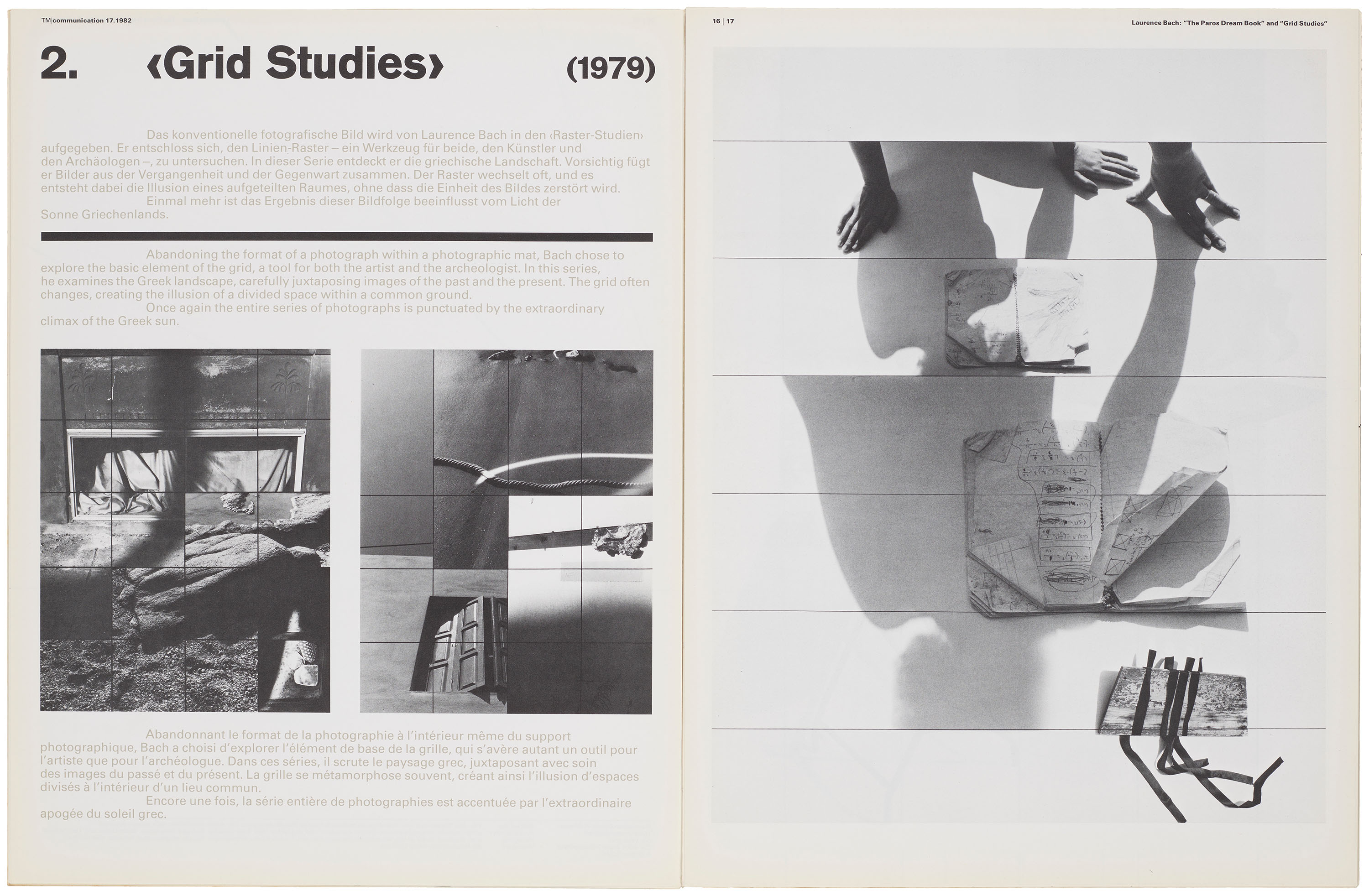
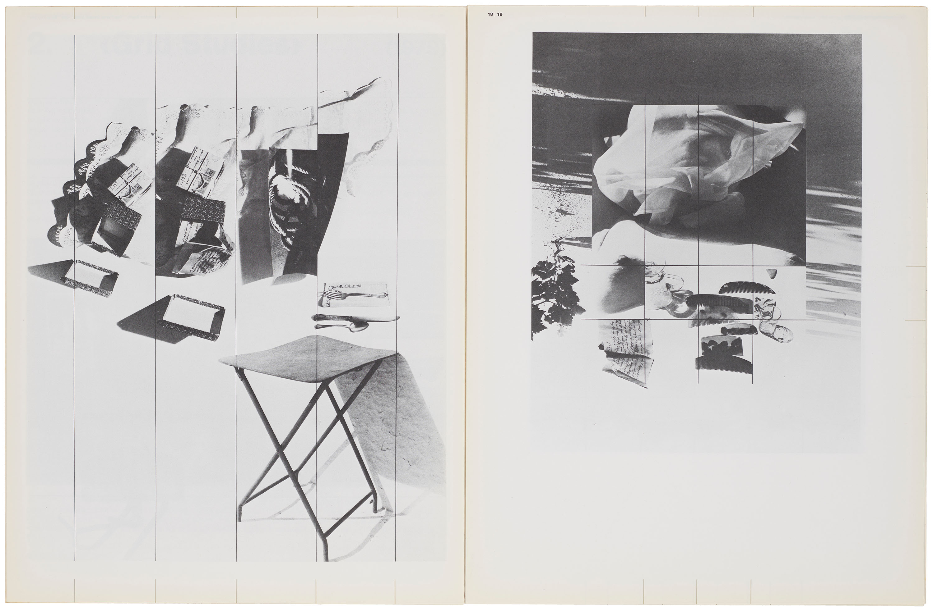
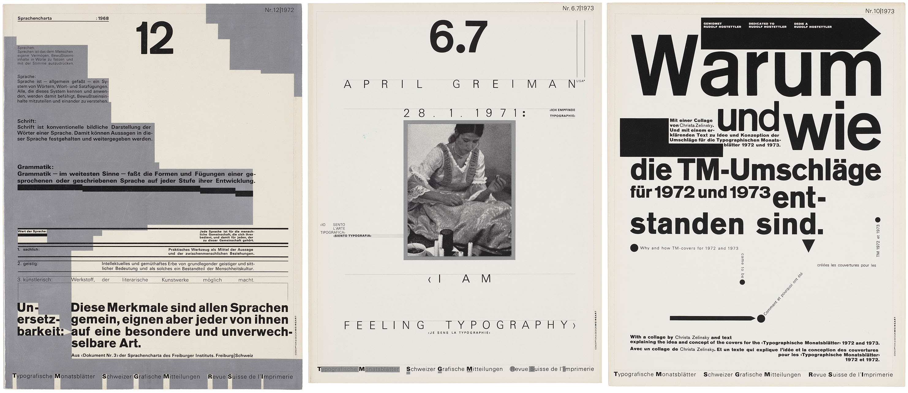
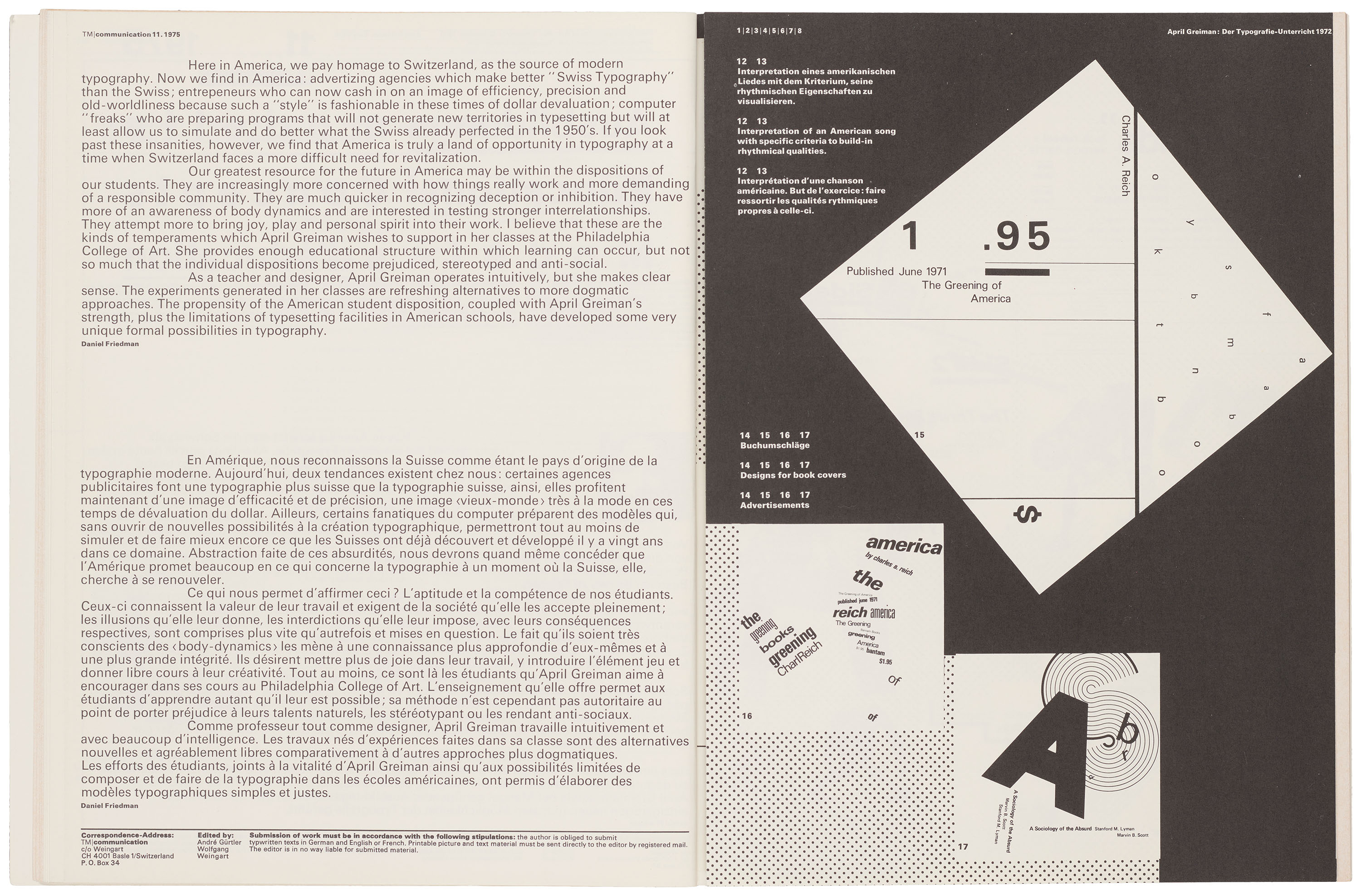
Although TM had long provided a platform for professional discourse, Weingart’s introduction of the “TM/communication” supplement expanded the scope of those conversations by inviting educators, institutions, agencies, and designers to directly engage with the magazine’s international audience. Like TM’s cover design competitions, which provided a venue for designers to showcase work, the supplement gave contributors considerable freedom in terms of medium and format, carving out a flexible space that reflected the increasingly expansive field of graphic design.
All images in the gallery below are hi-fi captures. Click an image to enter fullscreen view, then click or pinch to enlarge.
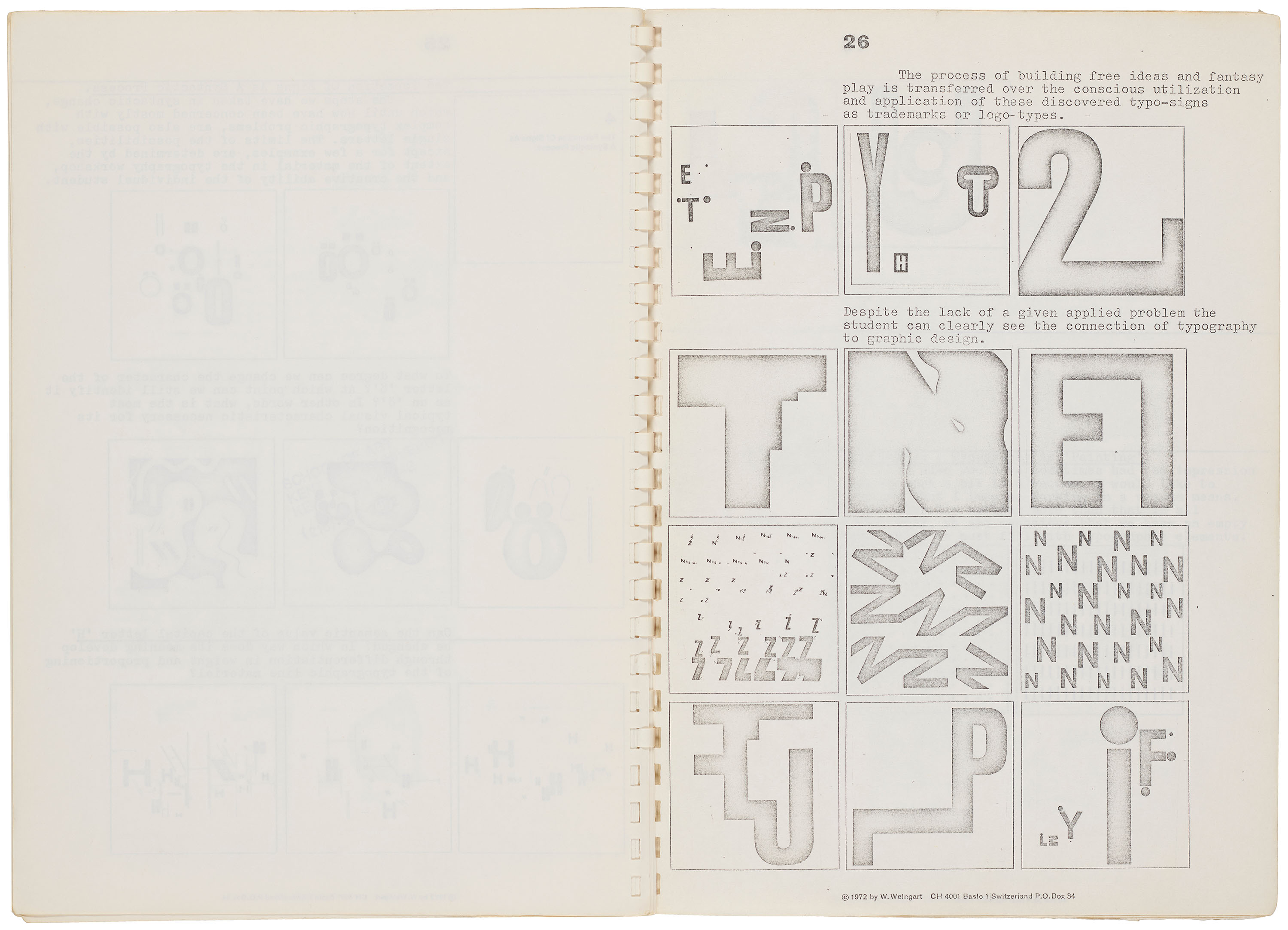
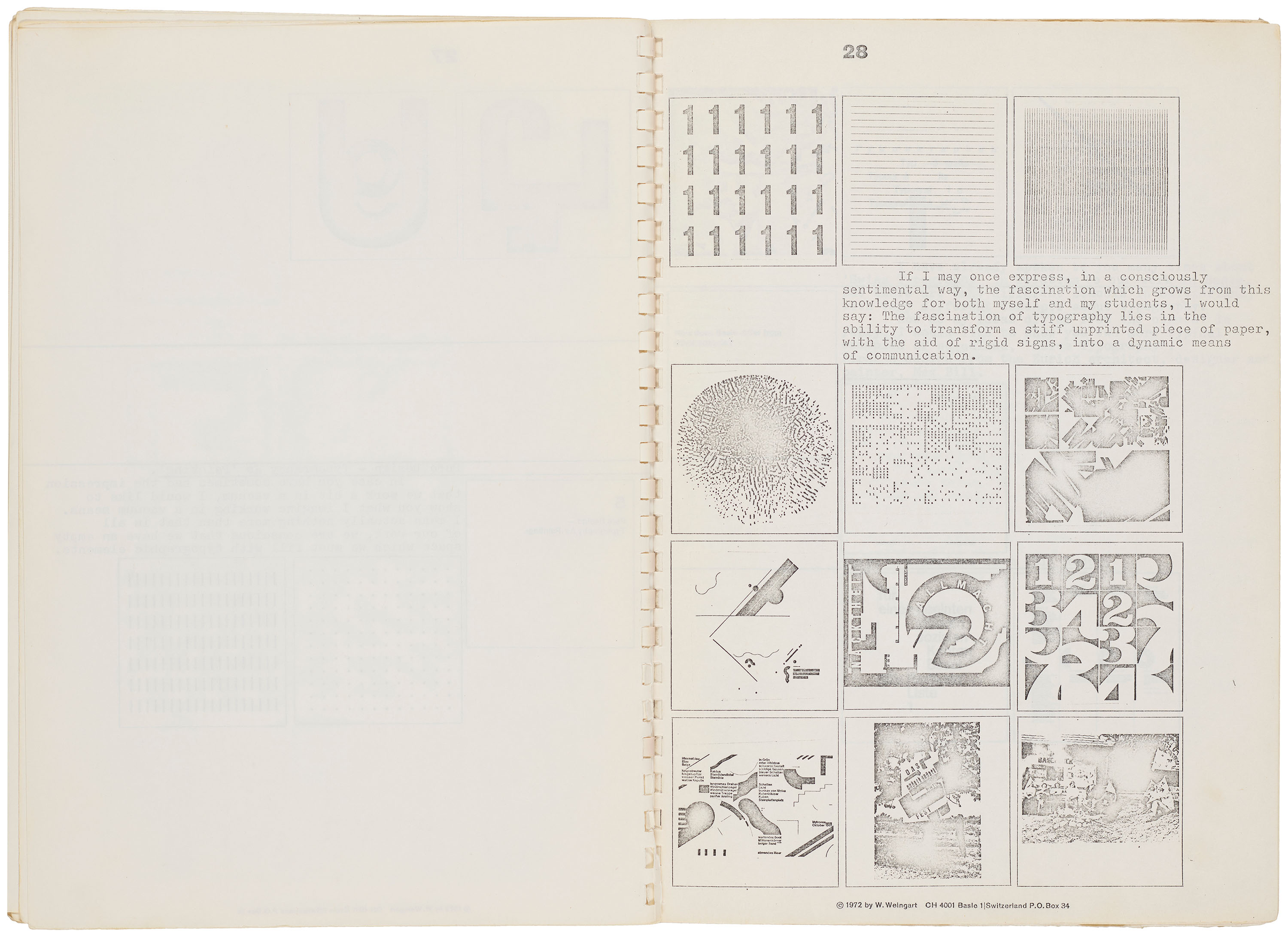
In a 1972 manuscript for a series of lectures delivered throughout the United States, Weingart addresses the impossible question: “How can one make Swiss Typography?” Noting that the term was already being redefined, he suggests “Swiss Style” consists of foundational principles that designers might learn well enough to question and adapt to their individual needs. By comparison, Ruder’s methodology, while similarly invested in process and experimentation, was oriented toward identifying objective solutions to design problems rather than examining the assumptions that sustained them.
All images in the gallery below are hi-fi captures. Click an image to enter fullscreen view, then click or pinch to enlarge.
Accounts of Weingart’s character emphasize a tension between rigor and levity. In the classroom, his demeanor might approach the brusque intensity of Ruder, yet he was equally celebrated for assigning his students playful German nicknames and organizing idyllic bike rides along the Rhine. Affectionately called “Weini” by a number of his students, he is described as a bold innovator driven by insatiable curiosity, one who regularly pushed students out of their comfort zones.
Ghosts of Swiss Typography
A student in the Advanced Class for Graphic Design from 1979 to 1982, Susan Vogt notes a particularly significant exchange with Weingart as she grappled with the usual anxieties that accompany any worthwhile challenge. Sensing her trepidation in the type lab, her teacher asked: “What’s the matter—afraid of Ruder’s ghost?”5 Interestingly enough, the Farris gift included a particularly special object: a composing stick belonging to Ruder. Used during the typesetting process to arrange lines of metal type for printing, it has lived on the shelf behind my desk at the Archive for a few months now. Sometimes, when no one else is around, I can almost feel someone watching me... Fearlessly channeling the specters of Swiss typography’s past, Weingart acted as both successor to and critic of the pioneers of twentieth-century graphic design.
After weathering nearly two full print runs of Weingart’s TM covers, Tschichold sharply remarked:
Very disturbing that one still has to endure more of these covers by the anti-typographer Weingart.6
Despite Tschichold’s critiques, both he and Weingart were united in their desire to move beyond modernist gridlock. Tschichold’s answer was to revive historical forms, while Weingart exhumed the past as a means to navigate an uncertain future. Although a competing movement had yet to fully emerge, the decline of modernism as the prevailing design philosophy had already begun. As Weingart’s spirit followed his international students home, the center of design discourse shifted from Europe to the United States.
Quick to disavow attempts to categorize his work while remaining fiercely protective over it, Weingart is often credited with establishing a distinct movement within Swiss design. In a 1986 letter to Aaron Marcus, Weingart noted that the April issue of TM would feature, for the very first time, designs produced with a Macintosh computer. In the end, Weingart certainly delivered on his promise to push the typeshop to its limits, inspiring a new wave of designers to do the same, everywhere from the banks of the Rhine to California’s Golden Coast.
—Zachary Sauer, Editorial Assistant
Letterform Archive holds numerous works by Wolfgang Weingart, including designs for Typografische Monatsblätter, large format posters, correspondences, and ephemera. You can see them in person by scheduling a guided tour or research visit.
- Jan Tschichold, quoted in 30 Years of Swiss Typographic Discourse in Typografische Monatsblätter: TM RSI SGM, 1960–90, ed. Louise Paradis, François Rappo, and Roland Früh (Zürich: Lars Müller, 2013), 134. ↩︎
- Wolfgang Weingart, Wolfgang Weingart: My Way to Typography (Zürich: Lars Müller, 2014), 131. ↩︎
- Tschichold's advice alludes to the seminal work of Beatrice Ward, who introduced the notion of typographic “invisibility” in The Crystal Goblet: Sixteen Essays on Typography (Cleveland, OH: World Publishing, 1956). ↩︎
- Weingart, 112. ↩︎
- Susan Vogt, quoted in Susan Knapp, Michael Eppelheimer, and Dorothea Hofmann, Wolfgang Weingart: The Man and the Machine (Basel: Kero Graphic Design & Publishing, 2014), 47. ↩︎
- Tschichold, quoted in Paradis, Rappo, and Früh, 153. ↩︎