News
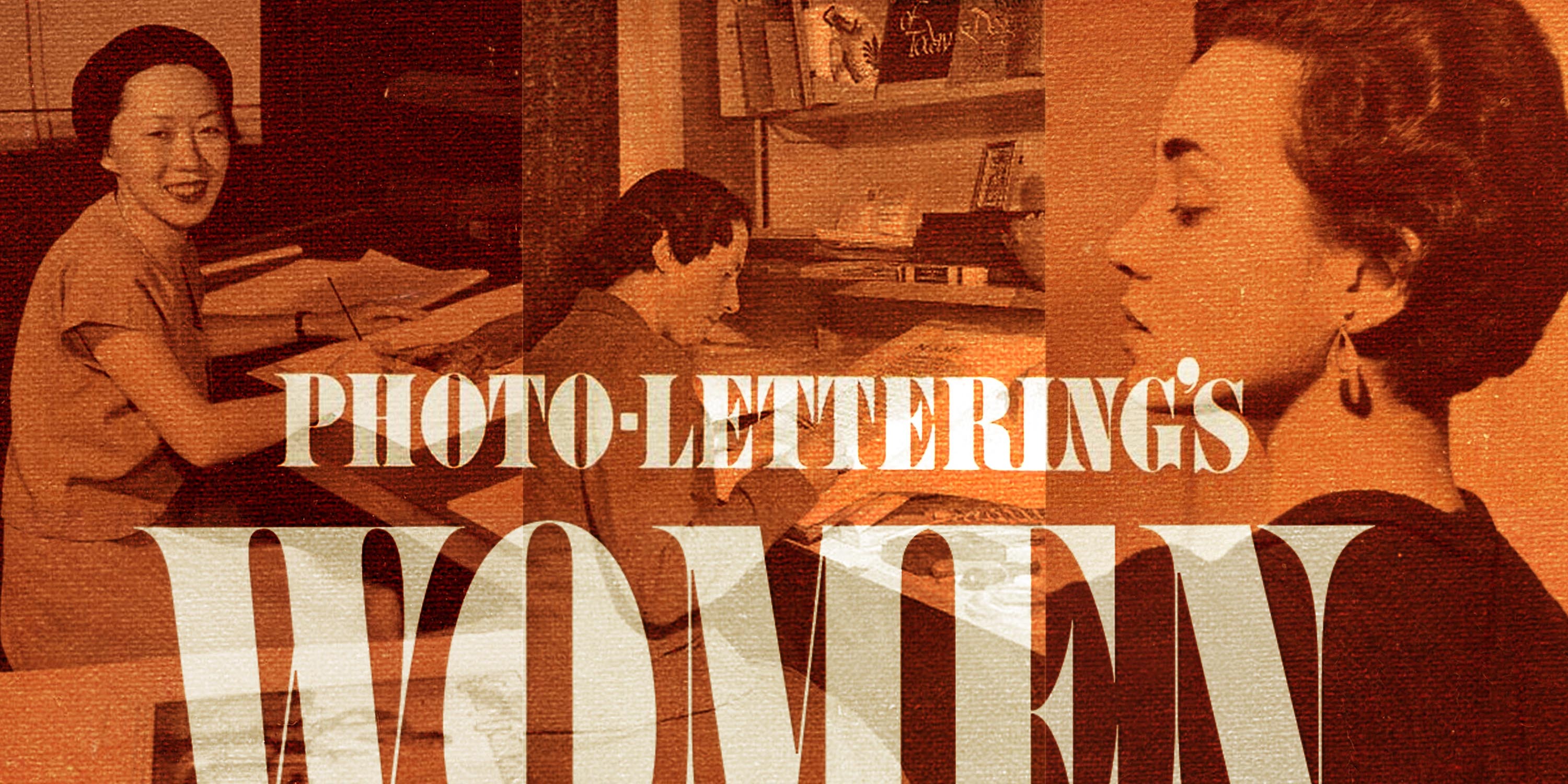
From the Collection: The Women of Photo-Lettering
Guest researcher Anne Galperin reveals unsung contributions to a major sourcebook of mid-twentieth-century type design.
Part 1: Ten of 252
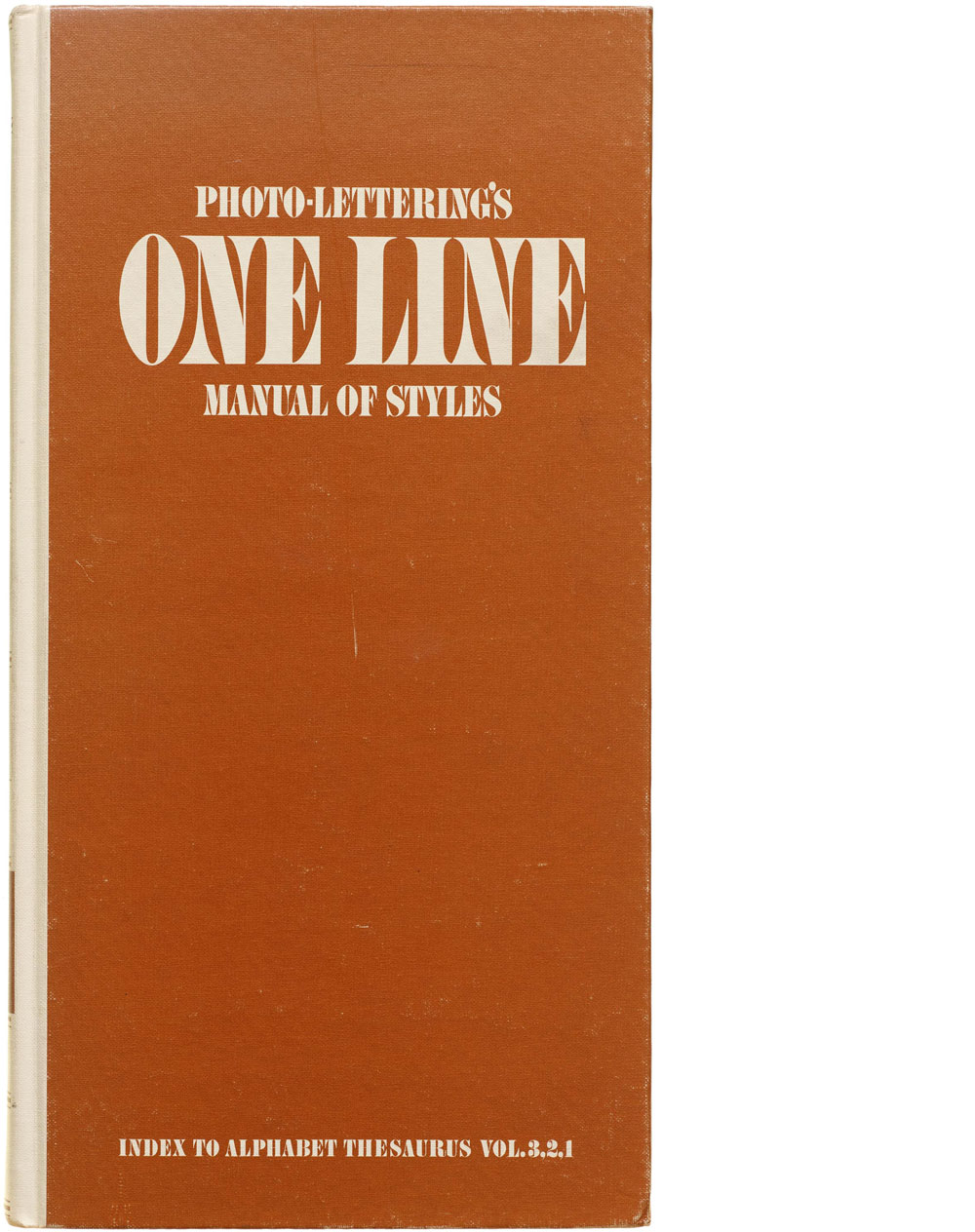
Sometime in the 1990s, my father-in-law Bill Hermes—who’d retired from his career as an art director—gifted me neatly organized boxes of his professional books, tools, and supplies. In this thrilling collection of stuff, which spanned decades, was the 1971 edition of Photo-Lettering’s One Line Manual of Styles.
This aptly named book is a mind-boggling, 470-page compendium featuring 6,500 eclectic examples of display typefaces from the most prolific supplier of phototypesetting. I browsed it often over the years, but, one day in the summer of 2018, something in the volume made me stop short.
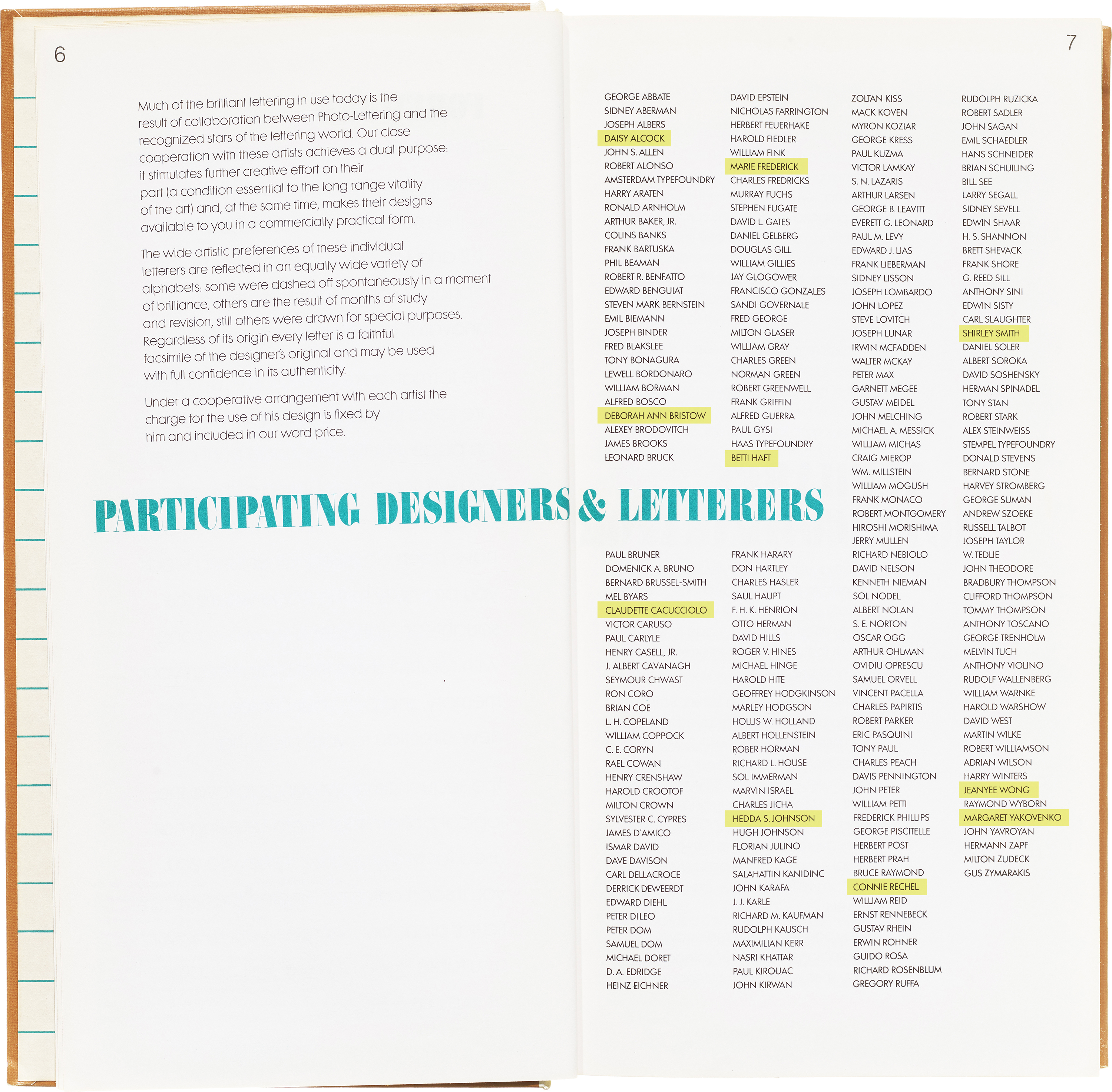
In the sea of 252 names—including titans of modern graphic design such as Joseph Albers, Milton Glaser, and Bradbury Thompson—I counted 10 women. At that moment I decided to try and find them.
Online searching quickly revealed the strong possibility that several had died before my spontaneous search had begun. I was able to find contact information for two women, so I wrote to them with an invitation to talk. Betti Haft called me back.
I didn’t realize I was about to encounter something akin to what Aurora Levins Morales, in her essay “The Historian as Curandera,” (in Aurora Levins Morales’s, Medicine Stories: Essays for Radicals, Duke University Press, 2019) describes as curative or “medicinal” history:
Tell what is untold or undertold
Center the woman/en in the narrative
Situate individuals within their social contexts
Restore social context to individuals singled out as the actors of history
But Haft knew this intuitively. Over the next three years we enjoyed several phone conversations and met twice in person. (Haft’s story, as she related it to me, is included in Briar Levit’s Baseline Shift: Untold Stories of Women in Graphic Design History, a collection of engaging correctives to conventional histories of graphic design.) Her perspective on history—her own and writ large—was clear from the first time we spoke. She very pleasantly, but pointedly, did not begin by answering my questions about how her typefaces came to be in the Photo-Lettering catalog. Instead, in lively conversations, she connected who she was, and where she came from, to what she did. She positioned herself within the ever-changing world around her. She described how she made her decisions based on circumstance. She acknowledged the role of serendipity in her life and career. Hers was a holistic story, not a “great (wo)man narrative.” I wouldn’t have known any of this had she been content for me to simply describe her work and write about when and how it was commissioned.
Betti Haft died in August 2021. She was the only woman of the 10 I was able to speak with. Claudette Caccuciolo, to whom I wrote twice without knowing if I’d contacted the right person, may have died in February 2023. She may also have been married to Frank Caccuciolo, a Photo-Lettering employee from 1966 to 1978. I had no contact with the other women. But one way into this piece about Daisy Alcock, Deborah Ann Bristow, Claudette Cacucciolo, Marie Frederick, Betti Haft, Hedda S. Johnson, Connie Rechel, Shirley Smith, Jeanyee Wong, and Margaret Yakovenko is to begin with a brief recapitulation of Photo-Lettering’s genesis.
Part 2: Photo-Lettering, Inc.
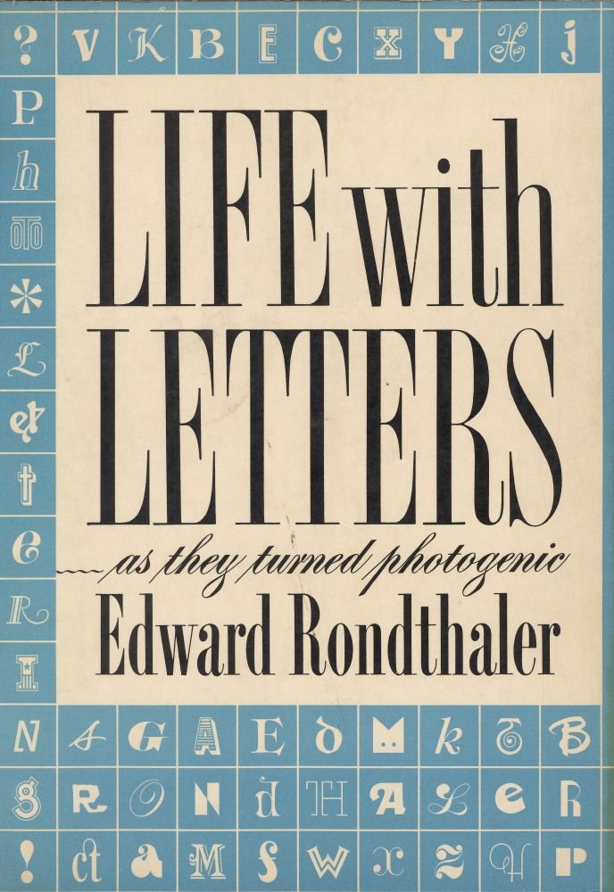
The Photo-Lettering Inc. (PLINC) origin story as retold here comes mostly from founder Edward Rondthaler’s book Life with Letters … as They Turned Photogenic. Online research into its corporate founding indicates that Photo-Lettering’s first roots were put down in the 1928 incorporation of the Electrographic Corporation and the Typographic Service Company as its subsidiary.
That year, Edward Rondthaler was a 24-year-old newly minted Chapel Hill graduate with a passion for typography and printing—at the age of five he received his first small printing press as a Christmas gift. As a college senior majoring in Psychology, he’d undertaken research to determine the readability of different typefaces, which helped him secure a job setting type and designing advertisements at the Montague Lee Company in Midtown Manhattan, NY. You could say that Rondthaler had ink in his blood; his father had also been a hobbyist printer as a kid, a not uncommon pastime in the late 1800s and early 1900s.
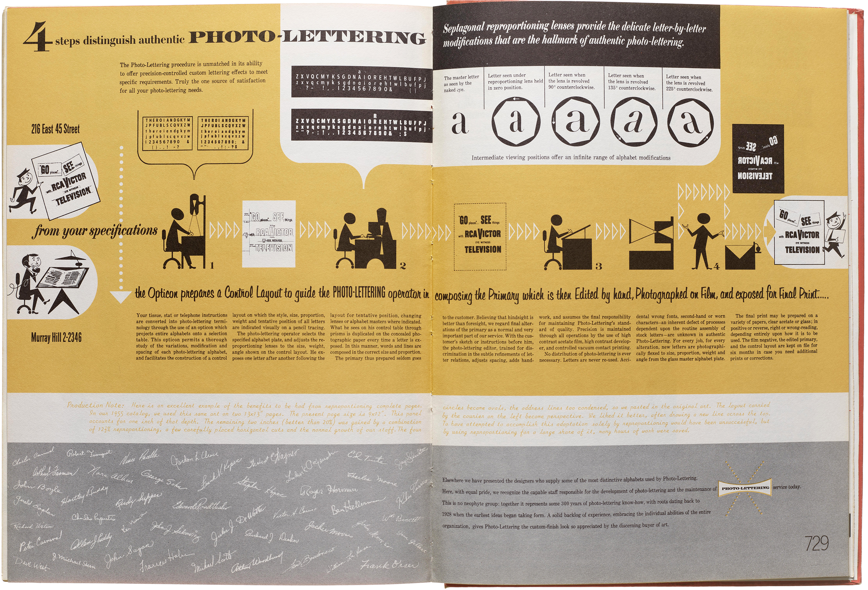
Since the 1890s, a consuming preoccupation to many in the printing trades was finding a way to photographically set type. The bar was high, and the high level of precision required to produce a successful outcome was technologically elusive. Rondthaler became obsessed with the potential for phototypesetting.
For most of its history, this is how phototypesetting worked: thin glass negative plates with letterforms on them were moved into position as letters were selected one by one by the typesetter. Above the plate a bright beam of light shone through a small opening at the isolated letter. Using a movable lens and shutter, the letter’s image was fixed on photosensitive paper or film. This being a photographic process, each letter’s size, width, and orientation could be precisely manipulated (if everything functions correctly).
Toward the end of 1933, Rondthaler was hired in a design position at Rutherford Machinery Company. He and Harold Horman, another young designer, got to work refining an early prototype of a phototypesetting machine.
By 1936 only a dozen machines, along with sets of type and operator training, had been sold to printing concerns, and Rondthaler and Horman realized that rather than hawking printing machines they’d be better off opening a phototypesetting business. Rondthaler called his friend Amos Bethke who worked at Typographic Service Inc. to arrange a demonstration of their machine to Bethke’s boss. This resulted in the machine and Rondthaler and Horman—its expert operators—finding a new home aptly launched as Photo-Lettering, Inc, at Electrographic, in 1936.
PLINC was housed at 216 East 45th Street, within what was then New York City’s typesetting district. The new company grew steadily, commissioning type designs, redrawing pre-phototype faces, and setting headlines and advertising. According to Rondthaler, PLINC ultimately supplied thousands of type designs to a global market. Photocomposition and manipulation were accomplished using successive generations of their proprietary phototypesetting process and equipment, engagingly represented in promotional material, much of which was designed by Ed Benguiat. In the early days, folks who set the type were known as “programmers.”
New designs were showcased in a regular catalog series, followed by books of type collections. The first edition of the PLINC catalog, released in 1946, featured 979 designs. My 1971 edition, a compilation of PLINC’s Alphabet Thesaurus 1, 2, and 3, includes some 6,500 styles of type. The One Line Manual visually encapsulates and unites in photo-lettering an accumulated history of mostly Western typographic forms. Works of the 10 women letterers themselves represent several historical styles, ranging from calligraphic and chiseled letterforms through those that emerged in response to printing innovations in letterpress and lithography, as well as others designed specifically for and during the phototype era. PLINC added many more styles in the 15–20 years of activity that followed.
Some styles of type included in the One Line Manual (Ruffa Computer Gothic, for example) anticipate the visual language of mid-1980s pixel fonts whose forms emerged both from screen rendering and dot matrix printing technology. But visually referencing the emergent is not the same as having the resources to make technological leaps. Lacking funds to retool from photo to digital typesetting, PLINC—which Steve Heller characterized as “the essential link between hot-metal and digital typesetting”—went out of business in 1997. In 2003, House Industries announced their purchase of PLINC’s physical inventory and assets.
Part 3: The Typefaces
Getting the word out about its type was an early challenge for PLINC. As the number of distinctive designs proliferated, cataloging them for easy reference was another. Rondthaler began by organizing type from simple to complex. Realizing this was subjective, he added an alphabet index of typeface names. But recognizing that folks who use type are likely to remember styles by how they looked, in 1955 Rondthaler layered on a visual index.
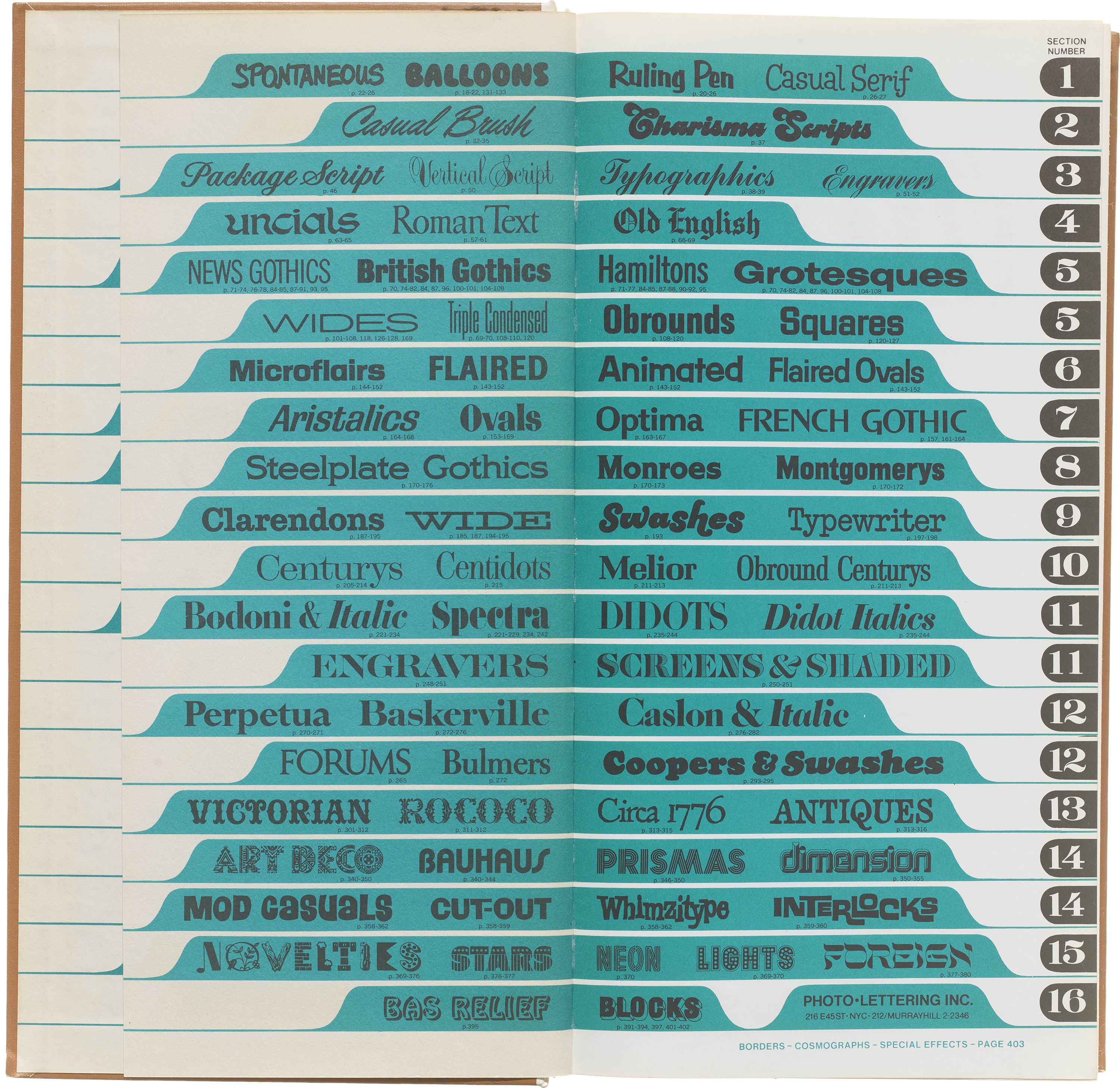
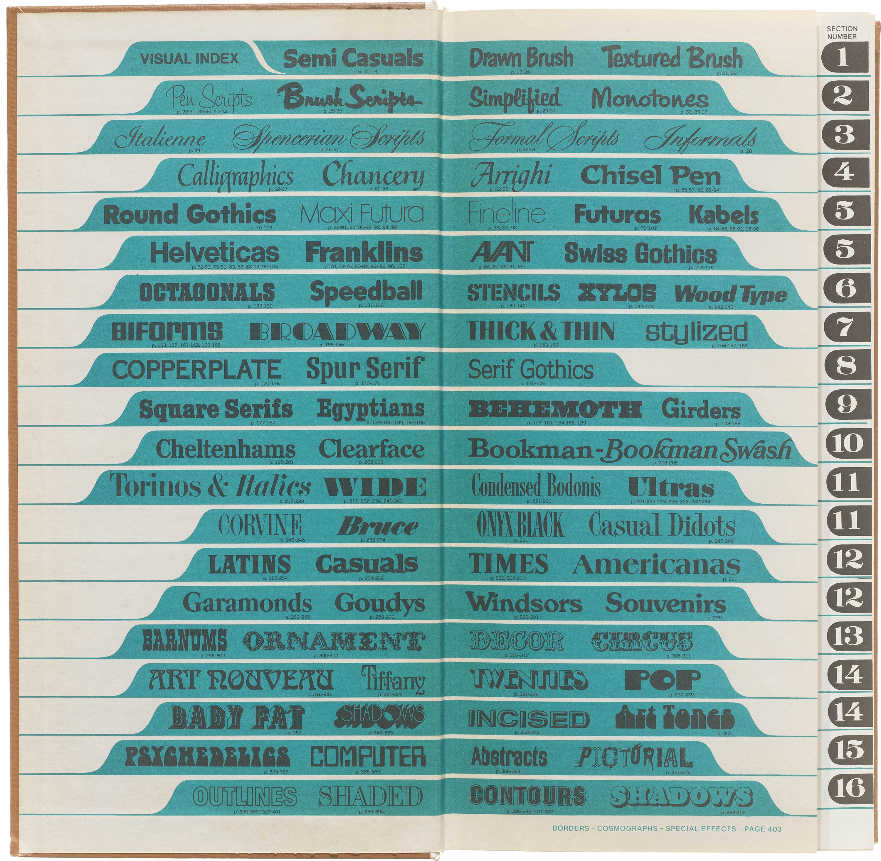
A further innovation was the One Line Manual, which displays just enough of a design to convey its distinctive features. The front matter’s bright green and black visual index included a thumb-indexed section indicator.
Within the manual, styles are divided into three categories: [1] Written (Brush-lettered, Scripts, Calligraphic), [2] Standard (“Popular” Serif and Sans Serif) and [3] “Speciality” designs. Designs in each category are organized by their visual index classification and introduced by witty and highly expressive interjections.
As you’ll see below, subcategory expository notes are delightfully varied in tone: some are descriptive, while others persuade through shameless adspeak, reflect on history, or indulge in alliteration. An alphabetical index of type designs concludes the manual.
Despite gender-based assumptions one might have about “feminine” aesthetics, the work of the 10 women letterers is a representative microcosm of PLINC’s catalog. Rechel, Alcock, Wong, and Smith are featured in “Written” styles; Caccuciolo, Johnson, and Haft in “Standard” styles, and Johnson, Frederick, and Yakovenko in “Speciality” designs.
Written Styles: Connie Rechel, Daisy Alcock,
Jeanyee Wong and Shirley Smith
Rechel Sprite, a pen script, exemplifies “Studied Casual Vertical Scripts with High-Key Styling.” I’d enjoy seeing someone use it and celebrate its verve.
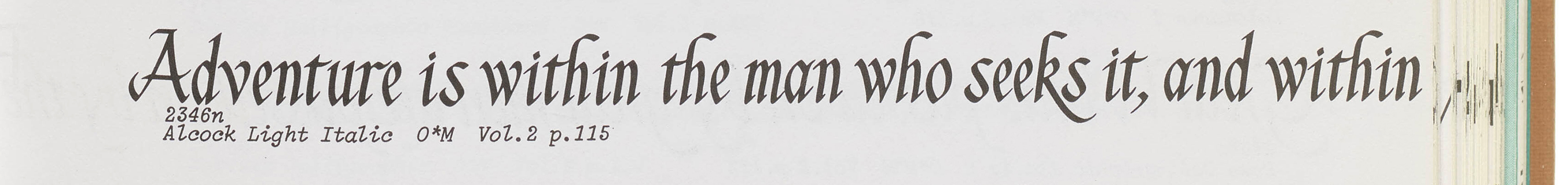
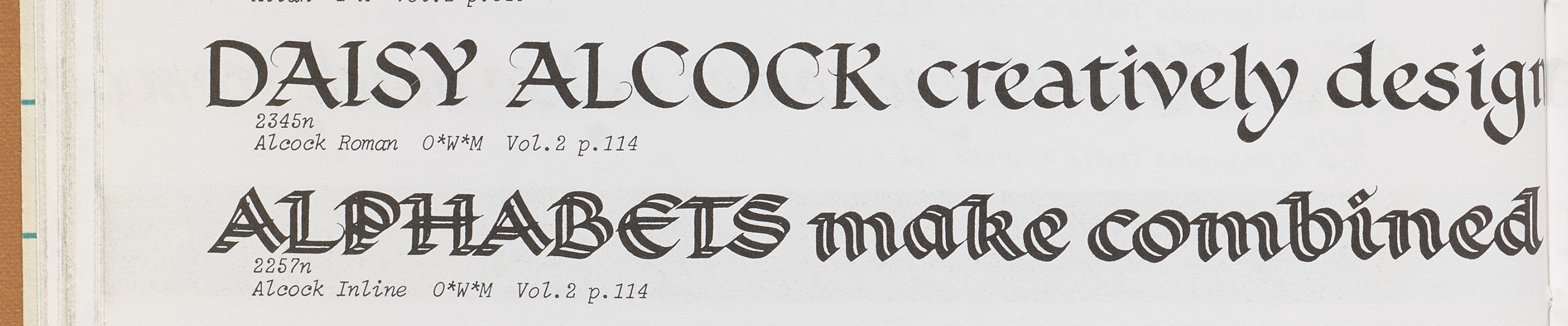
Daisy Alcock’s Alcock Light Italic, a chisel-pen calligraphic, is included in “Arrighi and Chancery Broad Pen Techniques.” Rondthaler first saw Alcock’s impressive lettering work in a 1953 tribute to the Battle of Britain during a visit to the Westminster Abbey Chapel. “I had never seen such magnificent calligraphy.” Sometime after meeting Rondthaler for tea, Alcock sent PLINC two complete alphabets of two styles used in the Battle of Britain book. Alcock’s typefaces were some of the first additions to the PLINC catalog designed by a woman, advertised as early as 1954.
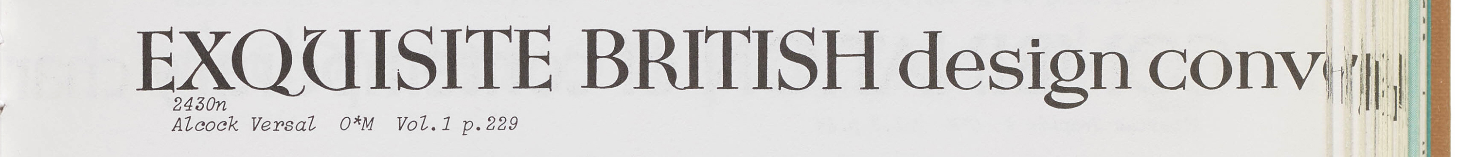
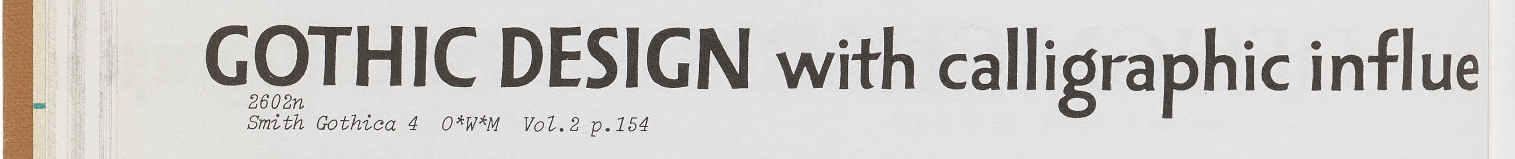
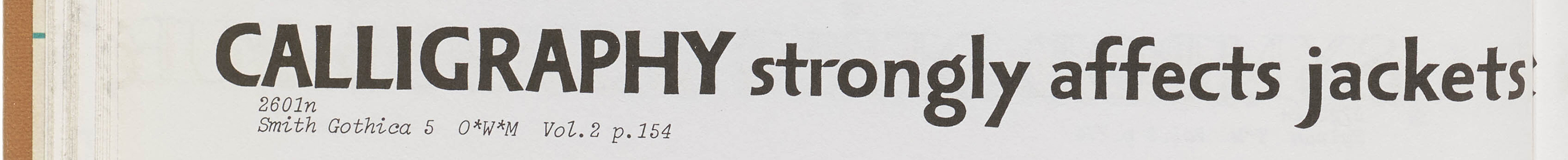
Alcock Versal, another calligraphic design, along with Shirley Smith’s Smith Gothica, were categorized under “Calligraphics with Strong Typographic Influences.” Smith’s humanist sans serif letters are sturdy, but their angled stroke ends, slight variations in stroke weight, and the way in which they tilt slightly, results in a conversational and accessible effect. Gothic was advertised in 1957.
Alcock herself is the entire subject of the note introducing the Broad Pen Calligraphic Styles section in which Alcock Inline and Alcock Roman appear: “Broad Pen Calligraphic Styles, including the work of Daisy Alcock, protégé of the celebrated British calligrapher Edward Johnson. Miss Alcock’s designs follow the styles she used in the memorial book to airmen killed in the Battle of Britain, on permanent display in Westminster Abbey.”
Referencing Wong Genie—and one wonders who named it—Jeanyee Wong is also directly cited in the category note (although her name is misspelled): “Calligraphics with a Slight Typographic Influence—Most of these styles are the work of contemporary designers well-known in the art world, including Herman Zapf, Ismar David, Jaynee Wong, and Oscar Ogg.”
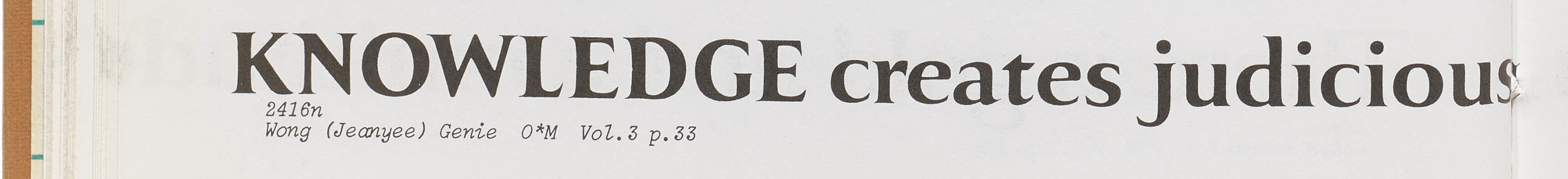
Jeanyee Wong is the first woman (along with several men) mentioned by Rondthaler’s Life with Letters in the context of the late-1940s “brilliant renaissance” in calligraphy.
Standard Styles: Claudette Caccuciolo, Hedda Johnson, Betti Haft

Claudette Caccuciolo’s Cubiform is designated as an example of “Square Gothics: Normal Width.” (The note for this group of designs takes pains to point out that although their proportions were frankly rectangular, PLINC retained the “square” designation in this category because of the terminology’s wide use.) Cubiform is hands-down my favorite, because its geometry is so uncompromising and tense.
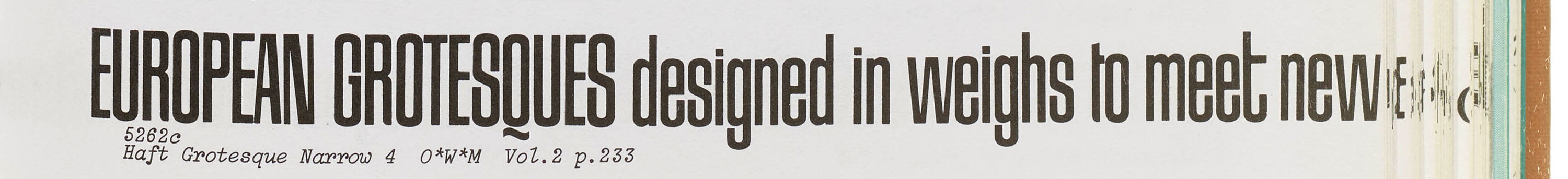

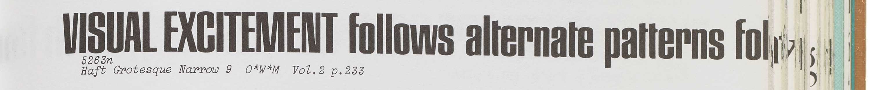
Betti Haft’s Haft Grotesque Narrow is categorized under “Thick & Thin Sanserifs: Medium Contrast: Triple, Extra Condensed, and Condensed,” their shapes described as "obround, square and oval shapes with many stylized versions.” Here’s how Rondthaler describes “obround,” a little-used term taken from geometry: “two half circles connected to two straights, just like a racetrack.” I love its tight curves and how the crossbar on the lowercase t and f stop short when they hit the letters’ stems.
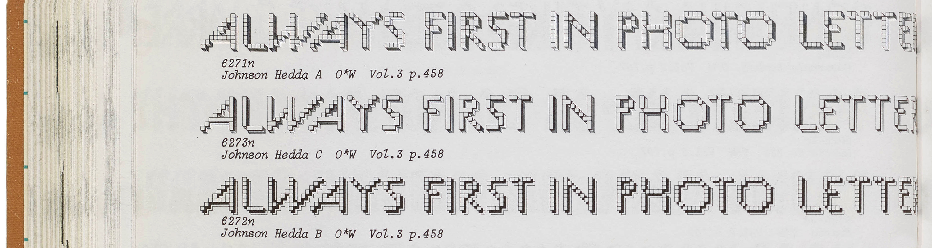
This group of designs defies easy categorization, as is made clear by the encyclopedic section note under which Johnson Hedda falls: “Pictorial Letter Forms including Trees, Lumber, Holly, Bricks, Stone, Glass Mosaic, Plastic, Snow, Fire, Newspapers, TV, Mechanics, Tinker Toy (sic), Stamps, Rope, Speed, Crunch, Frenzy, Music, Bewitched, Frankensteins, Bones, Samplers, Ribbons, Fabrics, Nervous, Paint Brush.”
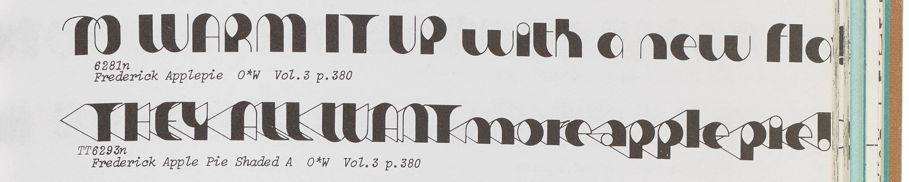
Marie Frederick’s Frederick Applepie appears under “Pop at its Best—Vigorous, contemporary interpretations of the Twenties and Thirties by designers fully attuned to the syncopated period...” The shaded version is sort of like Morris Fuller Benton’s Broadway on LSD.
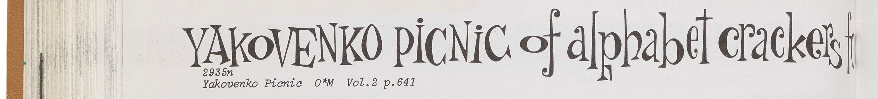
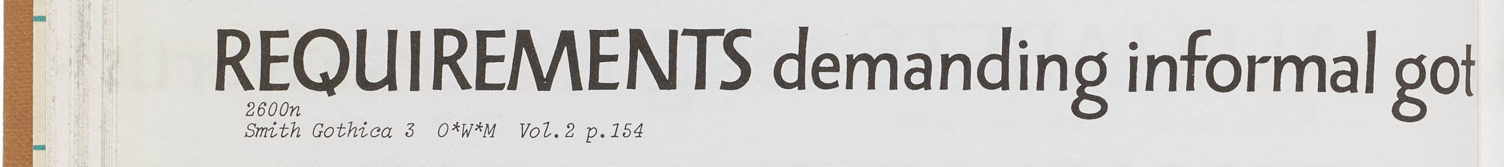
Margaret Yakovenko’s Yakovenko Picnic follows the marvelously improvisational note: “Mad, Mad, Mad at the quick brown fox jumps over the lazy dog, the flagrant knave coaxes jumpy zebu to chew quid, and the exquisite farm wench gives body jolt to prize stinker. They’re all turned-on animated alphabets ready to meet your requirements—just name it.”
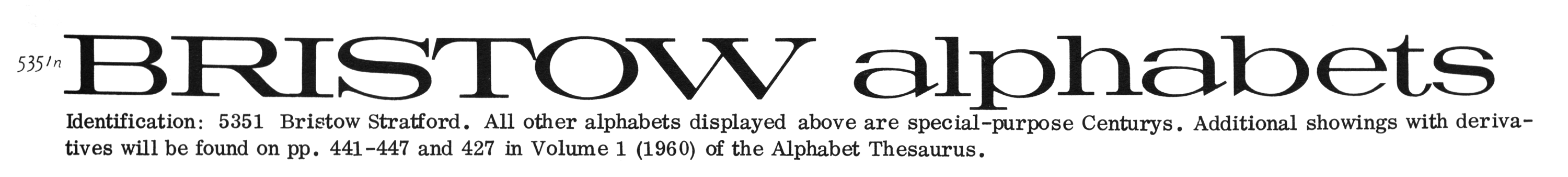
Deborah Ann Bristow is mentioned in the front matter list, but doesn’t appear to have work in the One Line. You can find her Bristow Stratford among the “Century” styles in PLINC’s Alphabet Thesaurus, Vol. 2 (1965).
Part 4: The Women
Of the 10 women listed in the One Line Manual, Daisy Alcorn, Jeanyee Wong, and Shirley Smith are best-known. Alcorn’s and Wong’s professional lives life and works are well documented. For others the record is more limited or frankly elusive.
Hedda Johnson
(dates unknown) Within the New York City art and design world, German-born Hedda Johnson (née Scharke) was known primarily as an illustrator. She is mentioned as an associate of the legendary Push Pin studio in the catalog for Poster House’s Push Pin Legacy exhibition (NYC, 9/2/2020–2/2/2021).
Johnson also appears in a few issues of U&lc, a tabloid-format magazine that was published quarterly on newsprint from 1977 to 1999 by the International Typeface Corporation (ITC). In 1969, Edward Rondthaler joined Aaron Burns and Herb Lubalin to found ITC, which in many ways was a successor to Photo-Lettering in terms of the size of its typeface library and number of designers represented. Largely designed and written by Lubalin until his death in 1981, U&lc was a lively showcase of ITC typefaces in use, along with articles and advertisements of interest to art directors, designers, typographers, and illustrators.
Johnson appears to have hosted a session of XPO1, The First Communications Exposition (1974), an event inaugurated by Lubalin, who at the time was also the president of the Art Directors Club. (See U&lc, vol. 1, no. 3, 1974). In the same issue of U&lc, Lubalin jokes about awarding Johnson two of his 3D designs, one of which was an isometric rendering of an “H”–for “Hedda.”
In a feature promoting “talented women in communications” Lubalin (presumably) writes: “To say Hedda Johnson is an illustrator is, perhaps, doing her an injustice. She is an artist with a vital personality. She is continuously searching for a more self-satisfying realization of her work in spite of the fact that her work is extremely satisfying to the people who buy it.” He goes on, somewhat jibing: “A good friend was once heard to say, ‘I think Hedda knows where she wants to go, but doesn't sit still long enough to get there!’” (See U&lc, vol. 2, no. 1, 1975).
Margaret Yakovenko
(dates unknown) Yakovenko’s creative output appears to have been quite diverse. She is cited in various late 1950s art director’s buyers guides as a package designer and an illustrator of both decorative and humorous works. Given Picnic’s styling the latter makes sense. The New York Times ran a small article in December 1961 (really more of an advertisement) promoting Yakovenko and colleague Tina Grant’s business of custom designed Christmas package-wrapping, directing interested parties to their agent, Jim York, at a New York City phone number.
Shirley Smith
(dates unknown) Though a “Shirley Smith” is the credited designer/calligrapher of book jackets including To Kill a Mockingbird (Harper Lee, published by J.B. Lippincott, 1960) and The Road From the Monument (Storm Jameson, published by Harper, 1962) several researchers have noted with regret that the record seems to begin and end there. It’s unclear if the designer of PLINC’s Gothica is the same Shirley Smith.
Daisy Alcock
(1901–1996) Likely to be the most senior member of the group, Alcock was born in Wednesfield, Staffordshire, in the West Midlands. A student at the Wolverhampton Municipal School of Art and Crafts, Alcock displayed notable skills in painting and developed what would be her lifelong passion for calligraphy. Attending the Royal College of Art during the 1920s, she studied with the renowned calligrapher Edward Johnston. Alcock earned teaching credentials and became a “nationally registered designer,” which may indicate that some of her works were recorded in the Design Registry, part of the British Board of Trade.
After graduation Alcock established a studio in Kensington and taught at the Hammersmith School of Building & Arts and Crafts. She took on bookbinding, illumination, and lettering. Many of Alcock’s calligraphy commissions came from high-profile clients including the British government and the Crown, and several pieces of her work are historic and national treasures. Alcock’s most famous work is the Battle of Britain Roll of Honour, in which she illuminated the names of 1,497 pilots and aircrew—not just British, but British colonial, Canadian, New Zealanders, Poles, Australians, Czech, S. African, Belgian, American—who perished during the Battle of Britain. Here’s how Rondthaler describes his encounter with the work in 1953:
I had never seen more magnificent calligraphy. Never. The custodian was kind enough to unlock the case and lift the glass. I turned to the colophon and there in a small neat legend was the name of the calligrapher: Daisy Alcock. In the telephone book I found a Daisy Alcock and soon we were invited to her flat on Kensington High for tea. Here was a delightful lady, a protege of Edward Johnson, surrounded by stunning examples of her calligraphic art … Back in New York six months later a large package arrived from London … Miss Alcock had sent to Photo-Lettering complete alphabets of the two calligraphic styles used in the Westminster Abbey book!
Jeanyee Wong
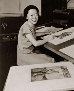
(1920–2017) Born in San Francisco to immigrants from China, Wong was a highly regarded calligrapher and illustrator. According to the Museum of Chinese in America (MOCA), Wong’s output included more than 2,000 book dust jackets and the content of more than forty illustrated books.
Her family moved from San Francisco to join extended family in the Bronx, NY, where Wong attended a vocational high school. Higher education didn’t seem to be an option until a friend suggested Cooper Union, which was tuition-free at the time if one passed the admission exam, which Wong did. At Cooper Union, Wong’s mentors—and eventual colleagues—included George Salter, a German émigré and a renowned calligrapher and book designer. Wong credits Salter with launching book jacket design as a distinctive professional practice. Another influential teacher at Cooper was woodcut artist and illustrator Fritz Kreidel, with whom Wong interned in 1940 immediately following her graduation. At age 20 she began designing books on her own. Her first commission was the Modern Illustrated Library’s Wisdom of Confucius by Lin Yutang.
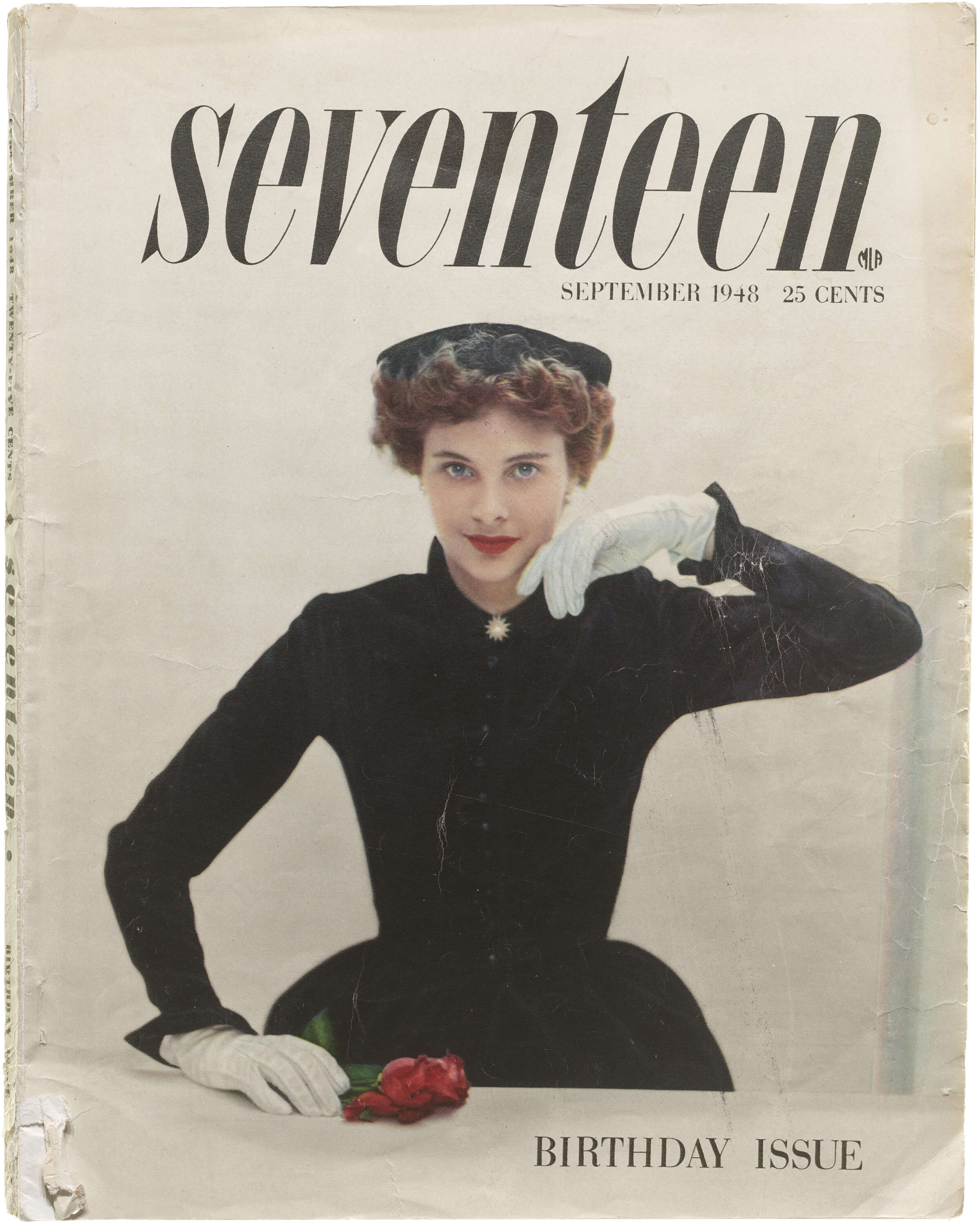
Wong’s reputation was established early, and as she described it: “I kept getting jobs, I kept getting money.” For the duration of her career, she worked from home, lettering and illustrating. The majority of her work was in book jacket design. As she described her internal process: “I always considered the text and the feeling in my choice of letterforms.” And referring to her skill, Wong said: “I have a steady hand.” She wasn’t bragging. As related on the MOCA site: “Wong built up letters with drafting tools or shaped them free-hand so accurately that experienced editors couldn’t tell the difference between her scripts and typographic alphabets.” Wong’s commissions for commercial lettering and logos included clients as diverse as BBDO (then an advertising company, now a global advertising network), Hermés (calligraphy for their flowered opera scarves), and the New York Times. Her output also included drawings, illustrations, including scientific illustrations, maps, and some 30 books for children, including two lettered for Maurice Sendak. “Whatever they needed I would just do,” she said. As a dedicated reader of Seventeen magazine back in the 1970s, I was delighted to learn all these years later that Wong hand-lettered the magazine’s original—still enduring—logotype for its inaugural September 1944 issue.
Jeanyee Wong's Book Cover Designs
All images in this gallery are hi-fi captures from Letterform Archive’s collection unless otherwise noted. Click an image to enter fullscreen view, then click or pinch to enlarge.
.jpg)
Having perused Wong’s work on Alex Jay’s tribute site, every one of her lettering examples appears utterly distinctive to me. Stroke length, serif styles, letterform width, angle of counters all seem unique. The number of nuanced variations, each creating a different read, mood, and tone speaks to her exceptional mastery of visual language in relation to text content. I was not able to find anything about the circumstances of Genie’s commission but it’s clear from his descriptive notes that Rondthaler held Wong’s work in the highest regard.
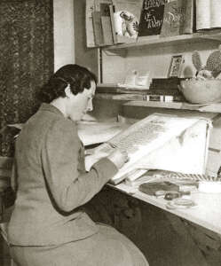
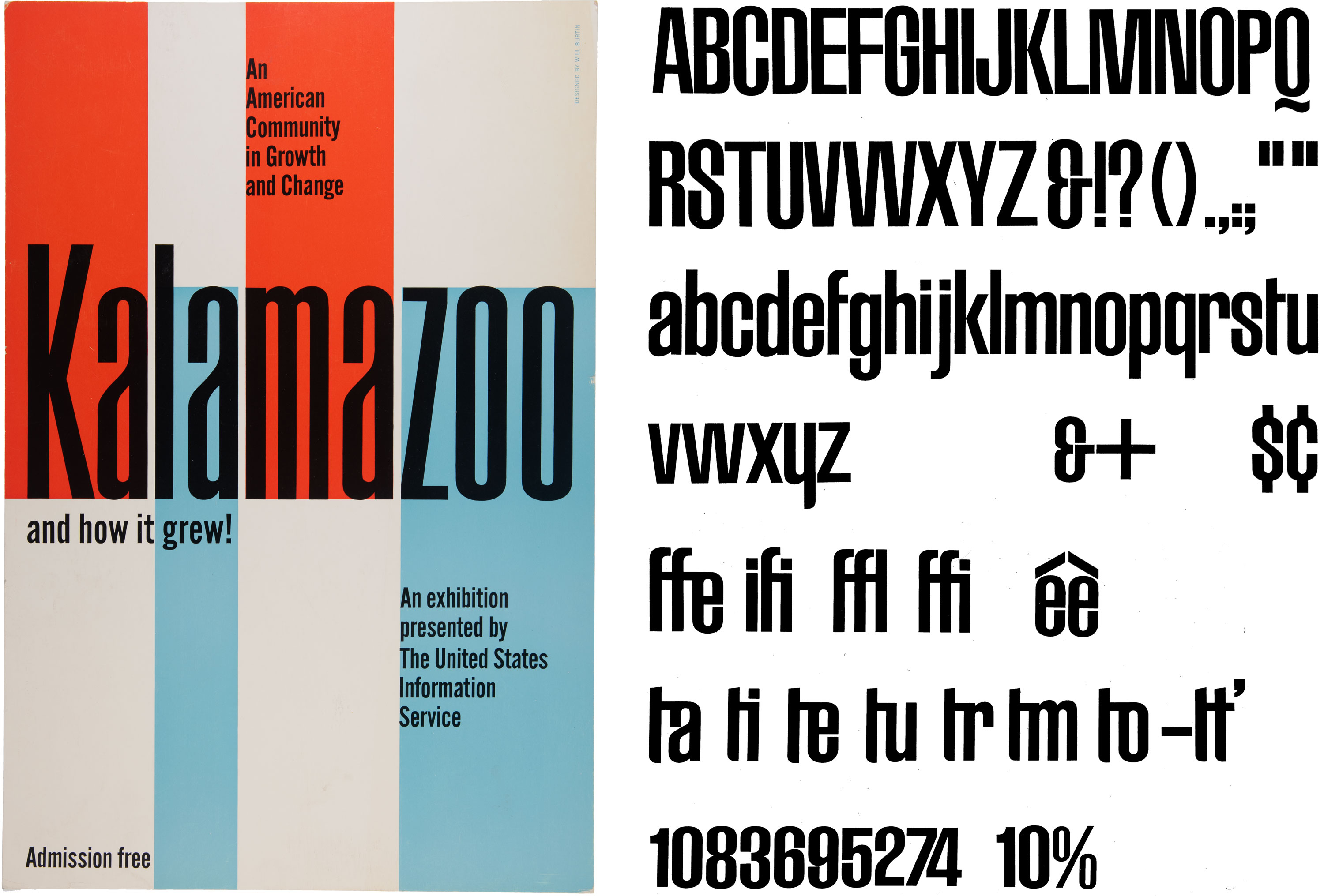
Betti Haft
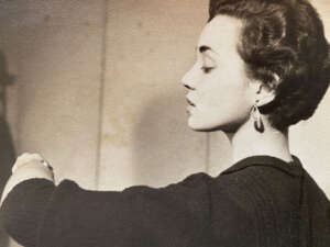
(1933–2021) Despite an early-career stint designing in the studio of noted German émigré Will Burtin, Betti Haft’s name is not well known. Haft’s early years were spent at her maternal grandmother’s home in Lookout Mountain, Tennessee. In 1941 her family moved to New York City. Haft studied art on a vocational track in high school and then earned a scholarship to The Workshop School of Advertising Art, where she studied with Paul Standard and prepared for a career in commercial art. As Haft worked as a designer, she continued her education at night, enrolling in Cooper Union’s certificate program.
From 1955 to 1958 Haft was a staff member at Will Burtin Incorporated. It was there that Haft Grotesque had its hand-drawn origins in a poster she designed for a United States Information Agency (USIA) project. In the early 1960s, wanting to complete the typeface, Haft approached Aaron Burns, her friend from the Burtin days, who’d become director of design and type at the Composing Room. Burns put her in touch with PLINC. Haft’s early design passed vetting and the typeface was commissioned. She completed the midweight Haft Grotesque 7 during the same week she delivered her first child. PLINC then commissioned two additional weights, which took Haft several months to complete. Embedded in her design is a critique of how typography and calligraphy were taught. In her words “calligraphy was [considered] a separate thing. I wanted to bring the two together ... [and] did a grotesque that was based on calligraphic thicks and thins.”
During Haft’s career she combined freelance work with in-house design positions at organizations including the Architect’s Collective, the Museum of Natural History, and a decades-long senior design position at the College of Staten Island.
Alcock, Haft, and Wong: Shared Roots
Alcock’s, Wong’s, and Haft’s biographies point to common educational and professional experiences. All three women appear to have attended vocational (studio/workshop-based) school, secondary school, or college programs. All three women actively practiced calligraphy, though Wong’s and Haft’s work included other methods of lettering. In my interviews with Haft she described drawing her letterforms, while in a Grolier Club presentation, Wong mentioned rendering letterforms using both pen (for English) and brush (for Chinese).
Both Wong and Haft studied at Cooper Union, and both were mentored by European-born designers who, along with their own talents and skills, helped launch their careers. Alcock’s path in the United Kingdom, under Edward Johnson’s tutelage, was comparable. All three womens’ mentors were largely, though not exclusively, born outside the US.
In interviews, both Haft and Wong expressed gratitude for their educational experiences and opportunities. Both women were inadvertent beneficiaries of World War II. During the War the American job market was—of necessity—more permeable to women, and numerous European-trained designers fled to the US and became seminal influences on American design education and practice. Haft described the atmosphere in Burtin’s studio as being more egalitarian than the American-run studios in which she’d directly experienced an embedded, toxic sexism.
In terms of how their letterforms were produced and reproduced, Alcock’s calligraphic works were mostly of unique, singular artifacts. Wong’s designs were originally rendered by hand and generally mechanically reproduced in multiple. Haft used diverse forms of typographic composition: she hand-drew headlines for many of her projects, used her typeface in commissioned work, and relied on letterpress, metal type, and phototype for running text. Most of her works were mechanically reproduced in multiple.
Alcock, Wong, and Haft worked full-time, combining design with teaching. Alcock was self-employed and seems to have been single. Wong, too, was self-employed, and was married. Haft was married with two children, and worked both as a freelancer and in-house, and in her later career was the in-house designer at the College of Staten Island, New York. All three womens’ careers in the cultural, publishing, and educational sectors were long and productive.
In the five years since I first wrote to Betti Haft and Claudette Caccuciolo, the women who designed lettering for PLINC have become quite real to me. Even though it’s impossible for us to know all the details of their lives, it’s clear that in their own ways each of these women produced work that is part of our cherished, shared typographic and design history. Let’s celebrate them.
Anne Galperin directs the Graphic Design program at the State University of New York at New Paltz, and teaches courses in design research, theory and criticism, and history. Her freelance practice includes book design and writing.