News
This Just In: Indian Movie Posters
From Bollywood to Tollywood, Tanya George looks at her country’s varied cinematic industries and writing systems through our new collection of film posters.
For several years now, Letterform Archive’s curatorial team has focused on expanding its collection to underrepresented parts of the world. One ongoing project under this umbrella includes promotion material from India’s diverse film industries as a way to showcase expressive lettering in multiple scripts, including Bengali, Devanagari, Urdu, and Telugu. In 2021, I was invited to help shortlist from a wider set of posters, designs that represent a wide range of lettering styles.
Some of the criteria I considered were the quality of the typography and the unique interpretations of the film titles. The posters covered scripts beyond my expertise, but I was able to benefit from other designers and native readers who also doubled up as film enthusiasts and tapped into their ability to tell me more about the design and films itself. The collection has examples of inspiring designs that I hope will highlight the possibilities of play and experimentation that are possible in Indic scripts.
Maybe you’ve already noticed the absence of the word “Bollywood” from the name of this collection. That’s entirely intentional as the following collection gives you a snapshot of the many different cinematic communities that reside in India. As a country that is home to hundreds of languages and scripts, it shouldn’t surprise anyone to find out that there are full industries dedicated to different language films. The term Bollywood worked as a derivative of Hollywood to indicate productions from Bombay (now Mumbai), and while it continues to be the best known portmanteau, Tollywood was the first such name in the country. It was used to denote the historically important film industry based in the Tollygunge area of Calcutta (now Kolkata), which at one time was the center of Indian film production. Today, the word is also used for Telugu cinema from the state of Andhra Pradesh, and other parts of the country have come up with creative derivations of their own. Malayalam cinema from Kerala is called Mollywood, while Karnataka, being the largest producer of “Sandalwood,” uses that term to denote the Kannada film industry. Up north Bhojiwood is used for Bhojpuri films while the Chhattisgarhi language film industry is colloquially known as Chhollywood. These are just a few of the Hollywood inspired nicknames used in South East Asia.
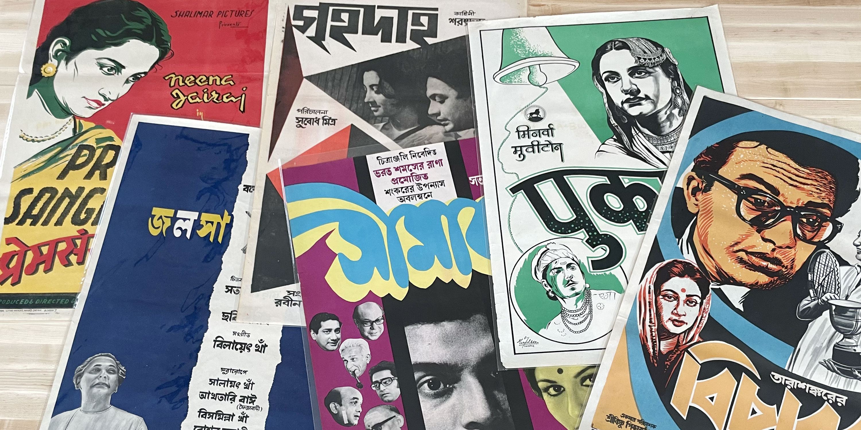
Bollywood and both the Tollywoods are the three industries represented in the first set of Indian film posters to be part of the collection at the Archive. The fifteen posters below cover a time span of almost seven decades, with some designs from a pre-independent India. They also cover a wide geographic area and capture some of the linguistic plurality of the country. The selection shows the use of English, Hindi (Devanagari script), Urdu, Bengali, and Telugu in posters. In some of the Hindi posters, the title is written in multiple scripts, which helps it speak to a wider audience, one that might understand Hindi but not read it.
Pukaar | पुकार, 1939
Script: Devanagari
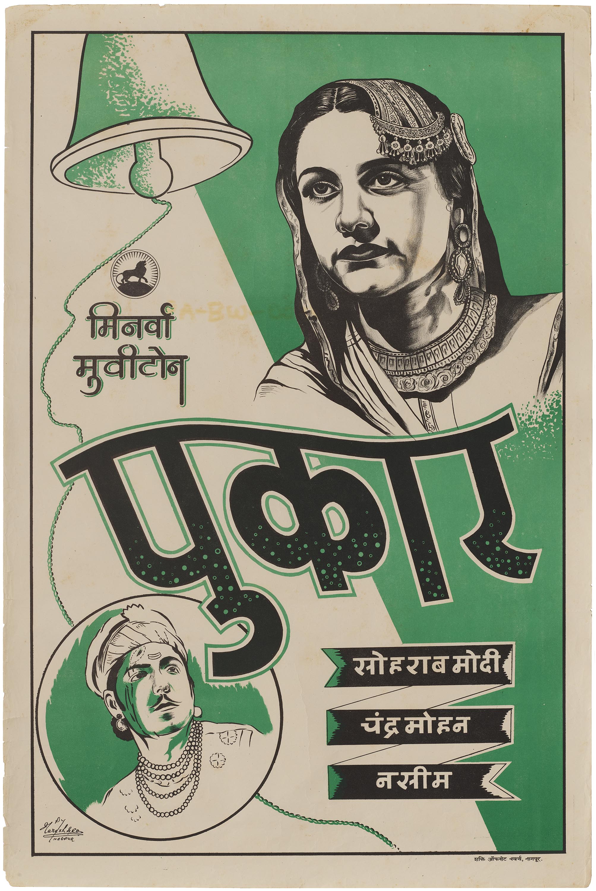
One of the first movies from the production house Minerva Movietone, this two-color offset poster advertises the lead actors with an illustration alongside the name of the movie in English and Hindi. Sohrab Modi, whose production house produced the film, came to be known for its period dramas. Pukar is set in the court of the 17th century Mughal ruler Jehangir as a Romeo and Juliet-esque love story. It is considered to be the earliest Muslim social film, and the use of the color green works as a strong symbol for the Mughal dynasty that was the focus of the story. Modi also directed and acted in the film, and his name is the top of the three cast members listed on the poster, but it’s the lead actress Naseem Banu’s illustration that gets prime real estate. This continues to be a common technique to attract an audience. She was already a prolific actor at the time and would have been considered a bankable star. The title itself stands out, with its central placement, outlined letterforms with a curved headline (or Shirorekha, the Devanagari equivalent of a Latin baseline), and decorative fill.
Prem Sangeet | प्रेम संगीत, 1943
Scripts: Devanagari, Latin
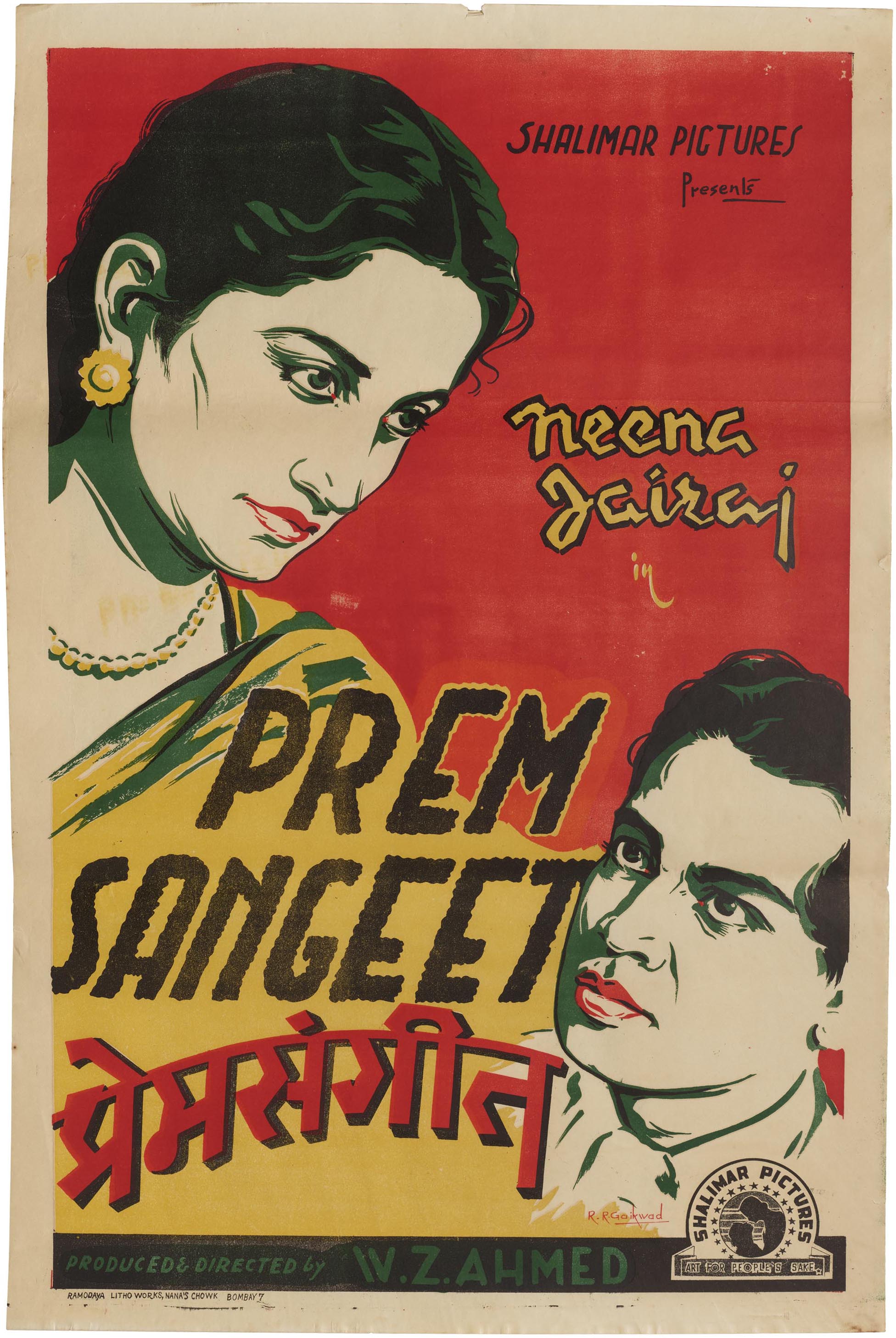
Prem Sangeet translates to “Music of Love” and explains why the passionate red color dominates the lithographic reproduction. The poster is diagonally split, and the left side is crowded with illustrations of its lead actors and titles in English and Hindi, while the red background highlights the names. Here again the actress Neena gets featured first and this ties in with the fact that at the time Bollywood actresses were paid a higher salary than the male leads. Produced by the Bombay-based Ramodaya Litho Works, the poster is primarily set in English, so the Hindi title already stands out. Here again, an arching headline grabs attention.
Kāśīnāth | কাশীনাথ, 1943
Script: Bengali
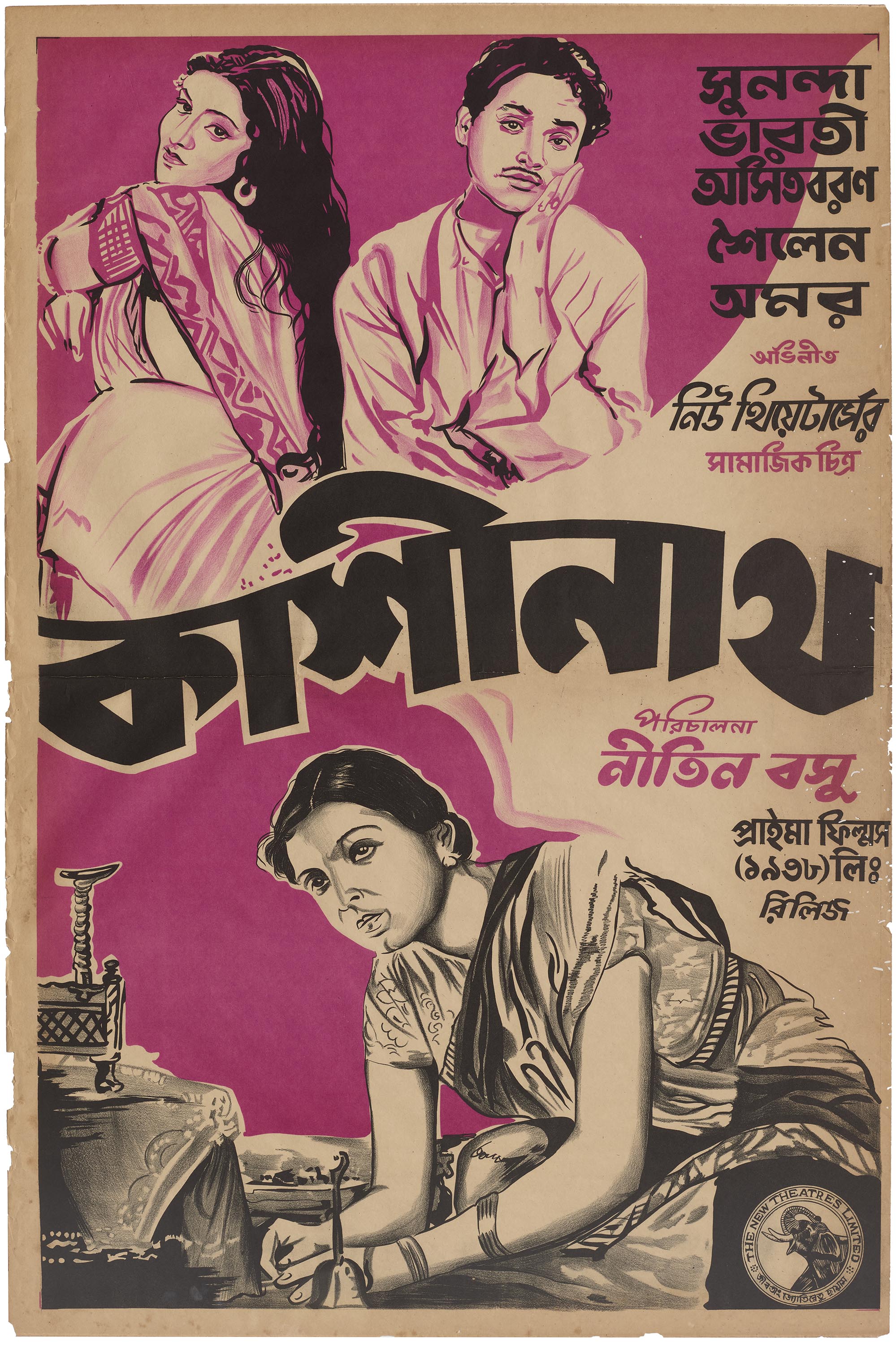
This poster for the Bengali drama Kashinath has a strong, bold title front and center. The low-contrast letterforms, along with the pointed terminals, suggest a sign-painter’s broad brush. The curvy headline would have used a thinner brush, and the wave brings a softness to the design. The rest of the cast names were made to neatly fit a column on the top right, while different lettering styles are employed to indicate hierarchy throughout the poster. The illustrator chose to show scenes from the movie itself, which is based on a novel by popular writer Sarat Chandra Chattopadhyay.
ShamSheer Baaz | शमशीर बाज़, 1953
Script: Devanagari, Nastaliq, Latin
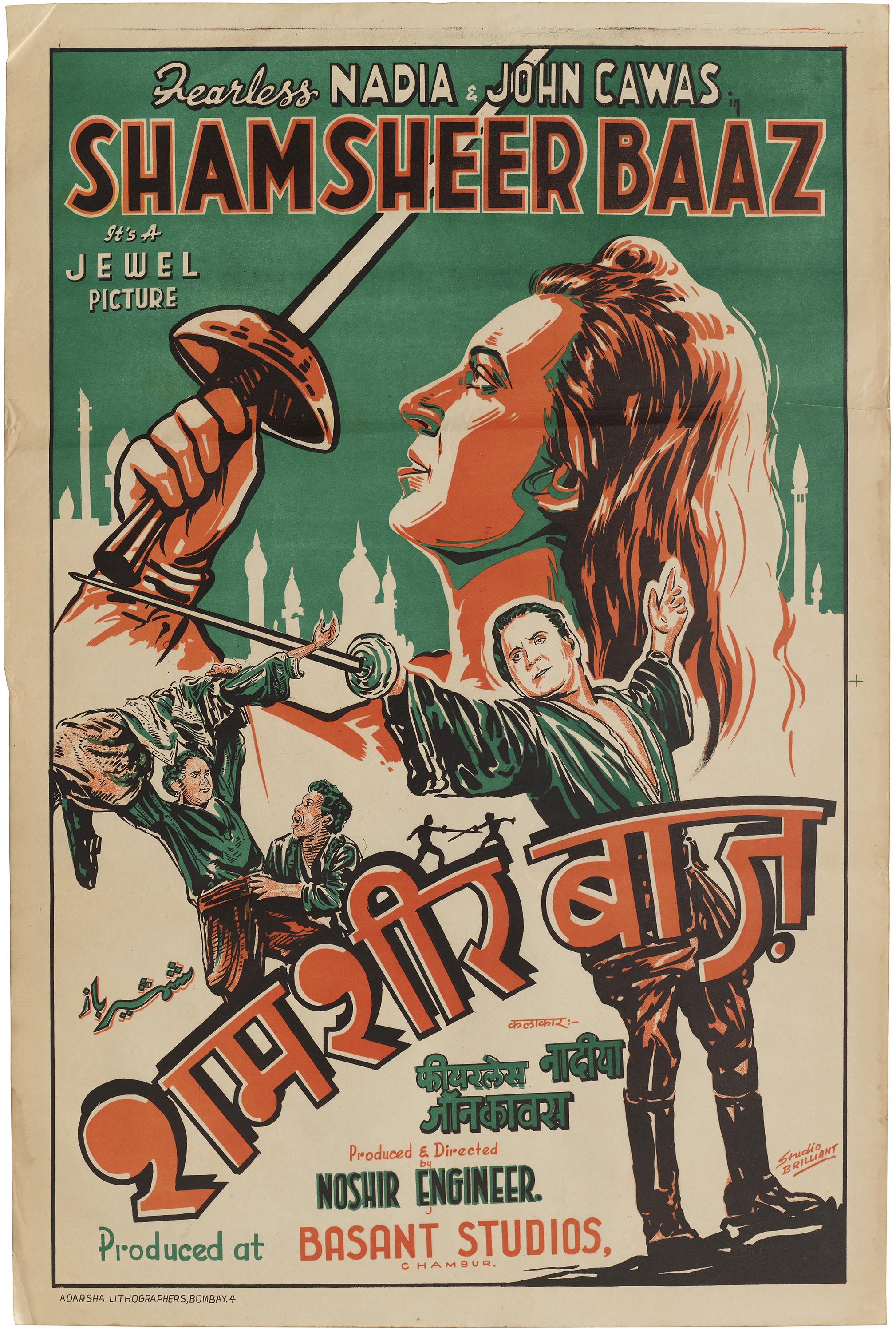
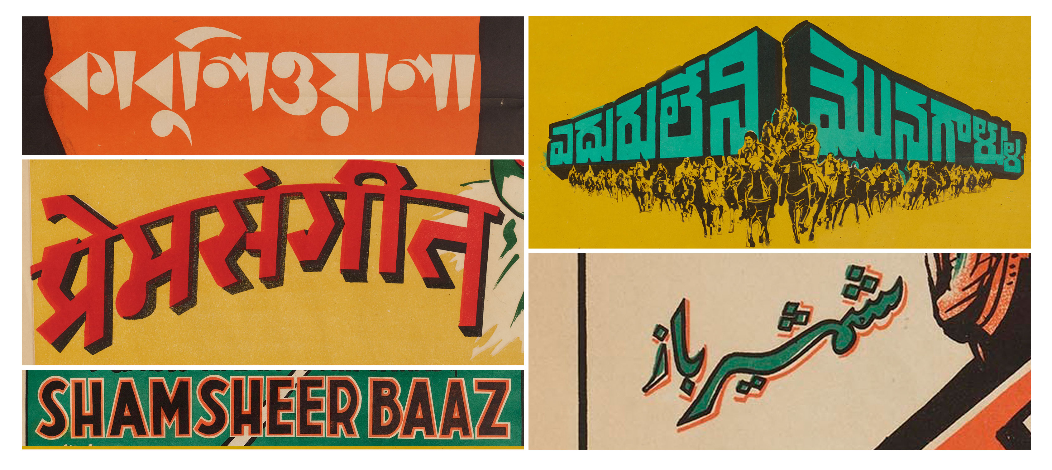
ShamSheer Baaz is an action thriller, and its poster has a very dynamic layout forcing the eye all over the canvas. The two leads, Fearless Nadia and John Cawas, are both illustrated holding swords. Fearless Nadia was one of the first actresses in Indian cinema to star as a lead action star. You can see her name getting top billing in English right at the top, and again in Hindi, as she is the swashbuckling heroine of the film. The English transcription frames the poster at the top while the original Hindi title arches closer to the bottom with its colors reversed. The Hindi title is also more expressive, with its curved headline serving as a platform for a sword fight, and its filled-in counter spaces for the repeating letter श. The final ज़ also swoops below the baseline, adding that little bit of flair to the lettering. A tiny Urdu title شمشیر باز can be spotted to the left of the Hindi, employing the cascading effect of the Nastaliq script to make it curve on top of the main title.
Ab Dilli Dur Nahin | अब दिल्ली दूर नहीं, 1957
Script: Devanagari
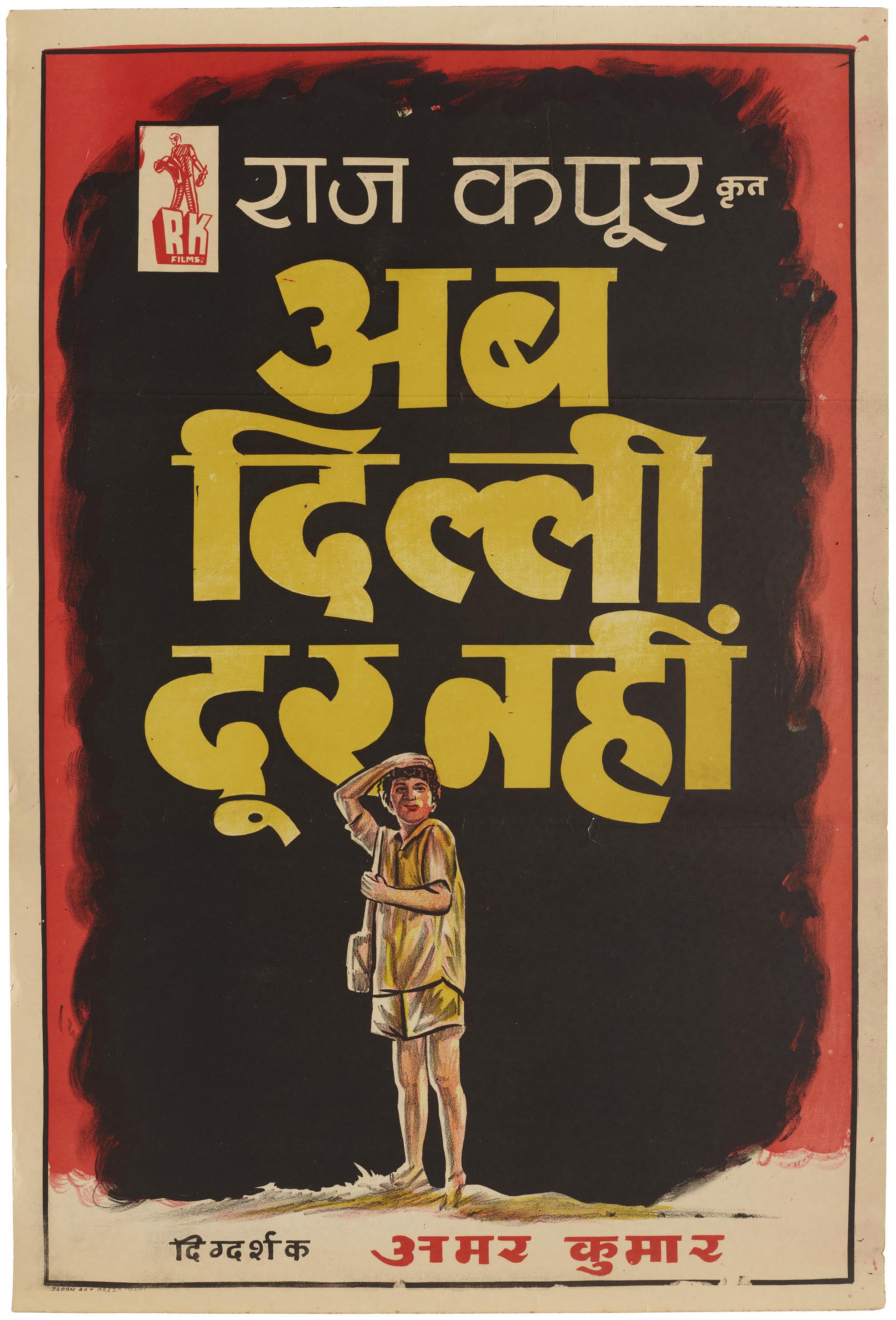
The poster for this Hindi drama has an uncomplicated design with a simple center-aligned title. The bulk of the space is occupied by the bold, bulbous Devanagari title with tight linespacing, which requires the matras (vowel marks above or below the Devanagari letters) to be drawn disproportionately smaller. The designer avoided tall matras ( ि, ी ) by giving them an elongated wave. They turn backwards before swooshing towards the letter or matra it sits on, always from left to right. The swash is less pronounced in the last letter to make space for the bindu ( ं ). A distinct feature of the Devanagari letters in this poster — from the name of the production house up top, down to the director’s credit — is that none of their headlines connect. If this was a typeset layout one might imagine the letters were tracked out in order to take up more horizontal space in the poster. But since no two repeating letters are the same, it suggests that no fonts were used. The lettering artist intentionally spaced out the characters and left the gaps. While less common, the disconnected headline is not an anomaly, but definitely a technique that makes the lettering unusual.
Kābuli’ōẏālā | কাবুলিওয়ালা, 1957
Script: Bengali
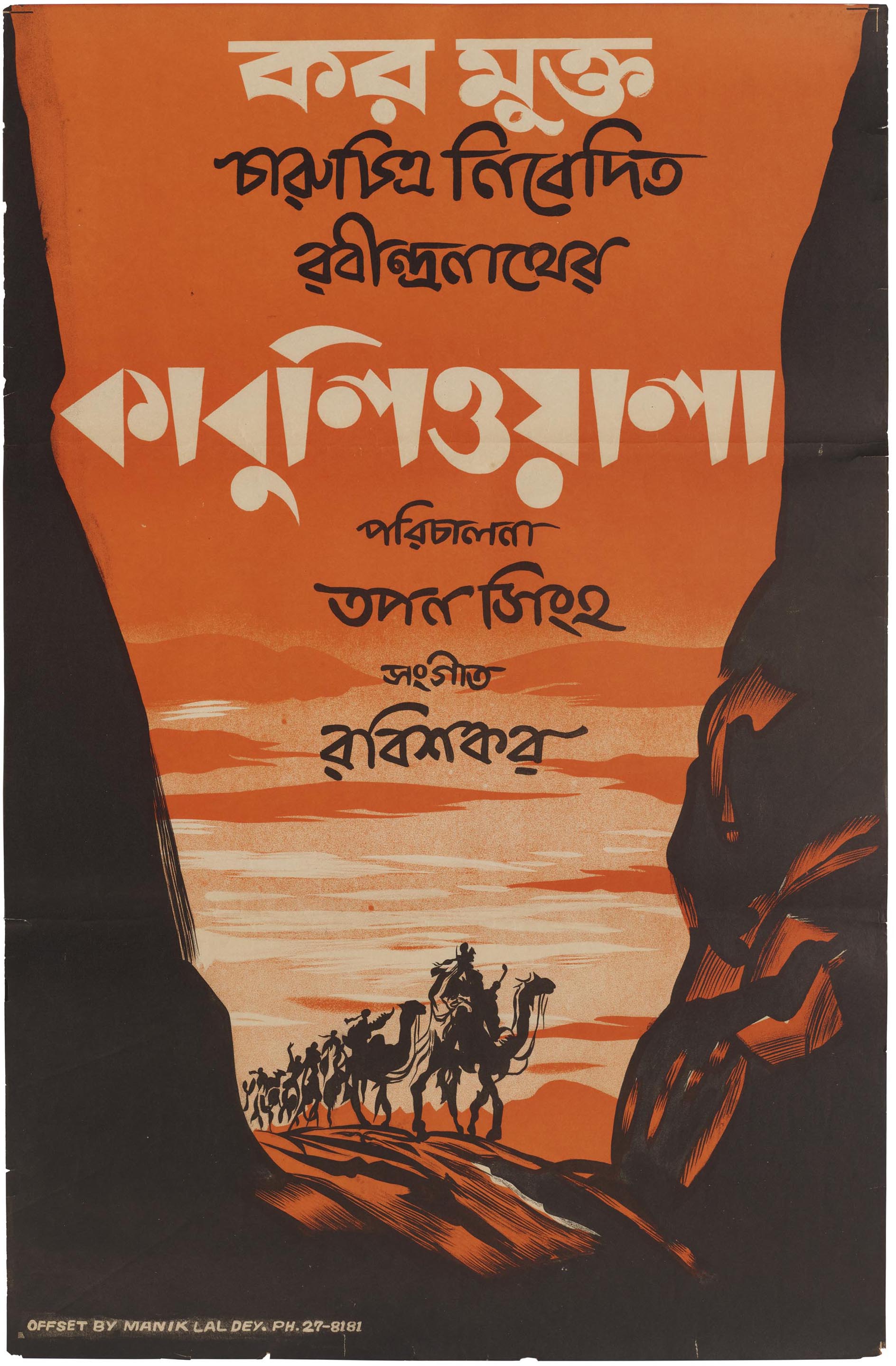
Kabuliwala is a drama based on the eponymous 1892 short story by the prolific writer Rabindranath Tagore, who also penned India’s national anthem. The poster breaks away from usual imagery of the actors and depicts the journey the protagonist makes from Afghanistan to Calcutta (now Kolkata). The title is a distinctive design that reduces the Bengali letterforms to their geometric forms, giving them a stencil-like quality. The curved forms feature a crescent terminal, which helps keep the letters readable. The remaining text on the poster has a more calligraphic, fluid feel contrasting with the geometric forms of the title. The distinctive titling serves as a logo that can be seen in other posters for the movie too.
Jalsāghar | জলসাঘর, 1958
Script: Bengali
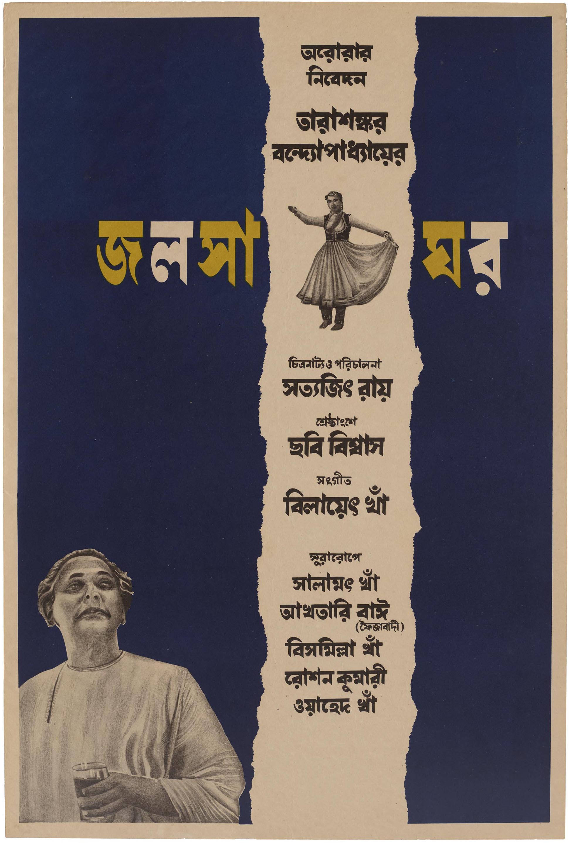
This poster was designed by the film’s director, Satyajit Ray. He divided the space into three sections, with the credits hanging down the middle, referencing a chandelier seen in the movie. The lettering has a more traditional, calligraphic stroke contrast, but Ray plays aloud with colors and placement to create a more contemporary drama. Ray breaks up the title (“The Ocean” in English) with Jalsa on one side of the torn paper effect, and Ghar on the other, while the cutout of the protagonist at the bottom left looks wistfully at the dancer, an allusion to the plot of the film.
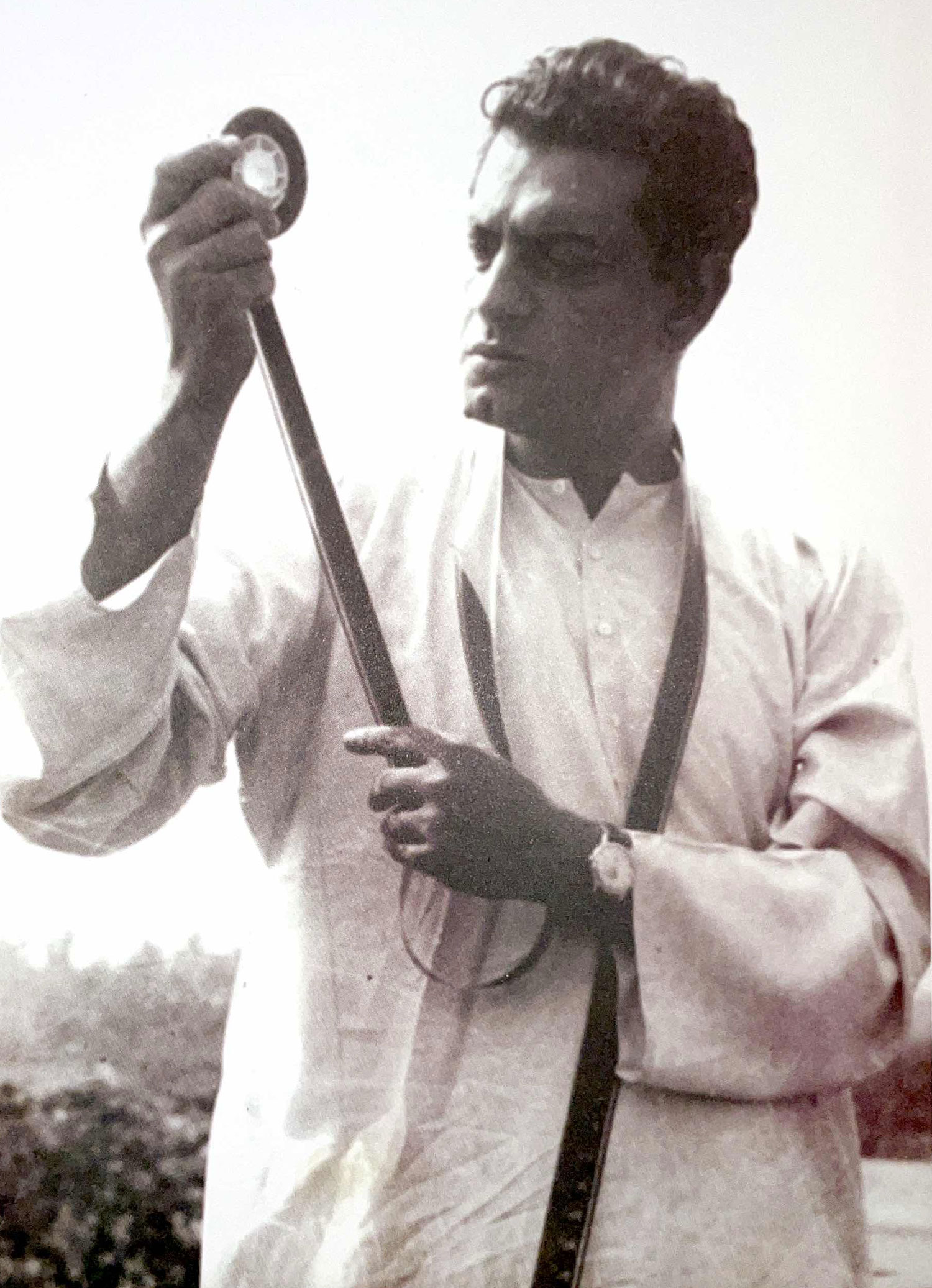
Satyajit Ray
While Satyajit Ray is best known as a filmmaker, he formally trained as a fine artist before joining an advertising agency as a designer. He went on to work as a book designer, reviving and publishing Sandesh, the Bengali children’s magazine founded by his grandfather. His appreciation for letterforms is visible in all his graphic work, so it would not come as a surprise that he also went on to create sketches for multiple fonts. His ability to narrate stories both cinematically through film, and graphically through his posters and covers was pioneering, and his visuals are considered pivotal in Indian history.
Bicārak | বিচারক, 1959
Script: Bengali
Bicharak translates to “The Judge”, referring to the protagonist played by one of Bengali cinema’s most successful actors, Uttam Kumar. The busy poster weaves together illustrated portraits of the characters engulfed by serpentine graphic elements that are anchored by the title lettering. A lot of the film’s story relies on flashbacks, which explains the spiral that consumes the composition. The title is lettered with a monolinear design and sharp scythe-like corners that feel fitting for an introspective thriller.
Gr̥hadāha | গৃহদাহ, 1967
Script: Bengali
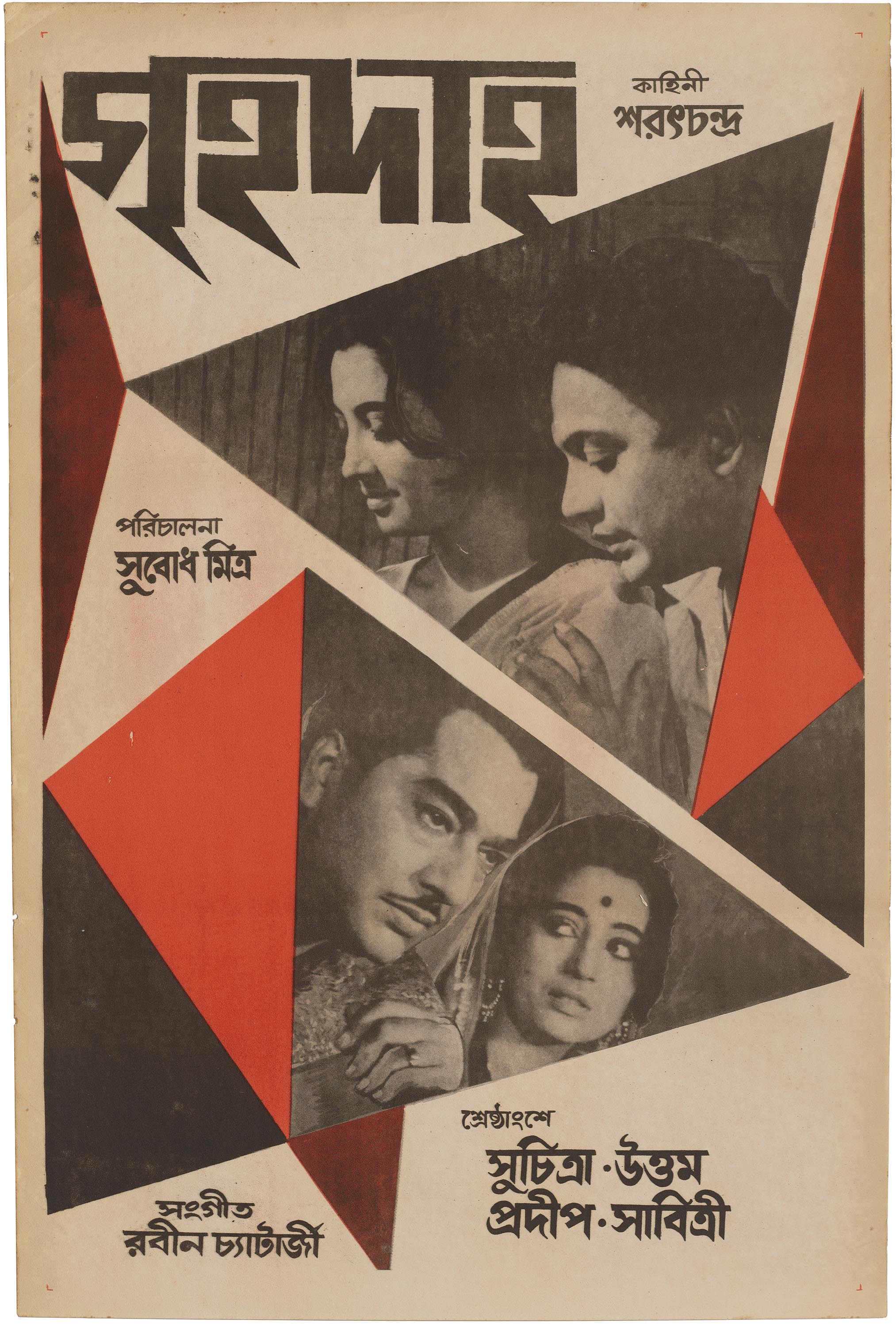
Like Kāśīnāth (1942), Grihadaha is based on the writing of Sarat Chandra Chattopadhyay. In the eponymous novel, Chattopadhyay weaves an intricate story depicting complex human behavior, at the heart of which lies a love triangle. The shape is put to repetitive use on the poster as a decorative element, and also to frame the stills from the film. The title lettering itself carries sharp triangular terminals, with the letters snugly fitting into the space available. The remaining text on the poster is a lot more calligraphic and traditional.
Bhakta Prahlāda | భక్త ప్రహ్లాద, 1967
Script: Telugu
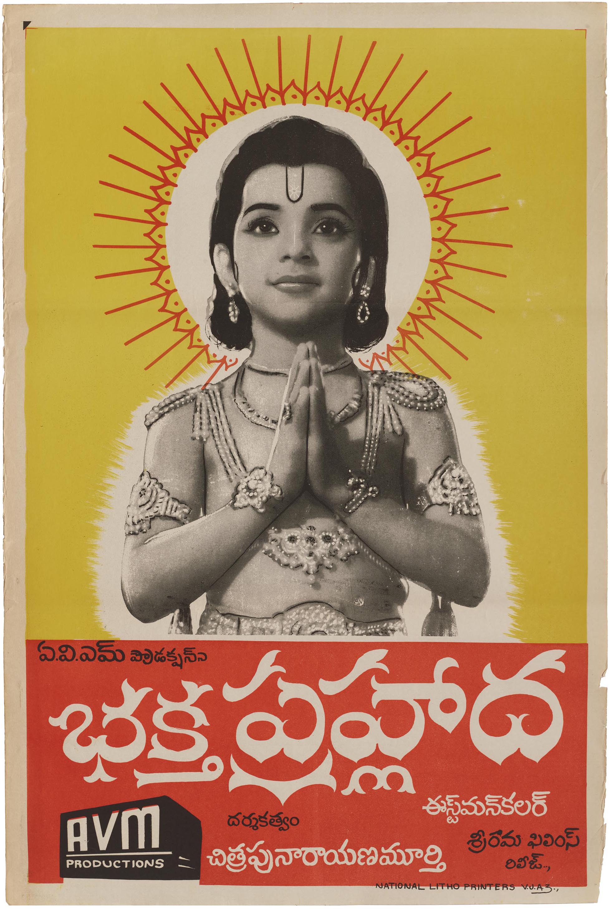
Bhakta Prahlada translates to “The Devotee”, and the religious themes are made evident with the image of the reverent titular figure, Prahlada. This Telugu poster has a clear demarcation of artwork and text. The title displays ornate designs that introduce leafy flares in the thicker parts of the letterforms that match the temple arch-motif in the halo around the main image. Bifurcated, Tuscan serif-like terminals are seen in the matras that have been drawn to fit into the space available. To make space for text above it, “Bhakta” is lettered at a smaller size than “Prahlada” and brings to focus the name of the devotee. You can also see this size variation in other posters for the film, each with different lettering styles. The flared motifs also behave like decorative elements to these letterforms, and such detailing is possible only because it was hand lettered.
Samaj Ko Badal Dalo | समाज को बदल डालो, 1970
Script: Devanagari, Latin
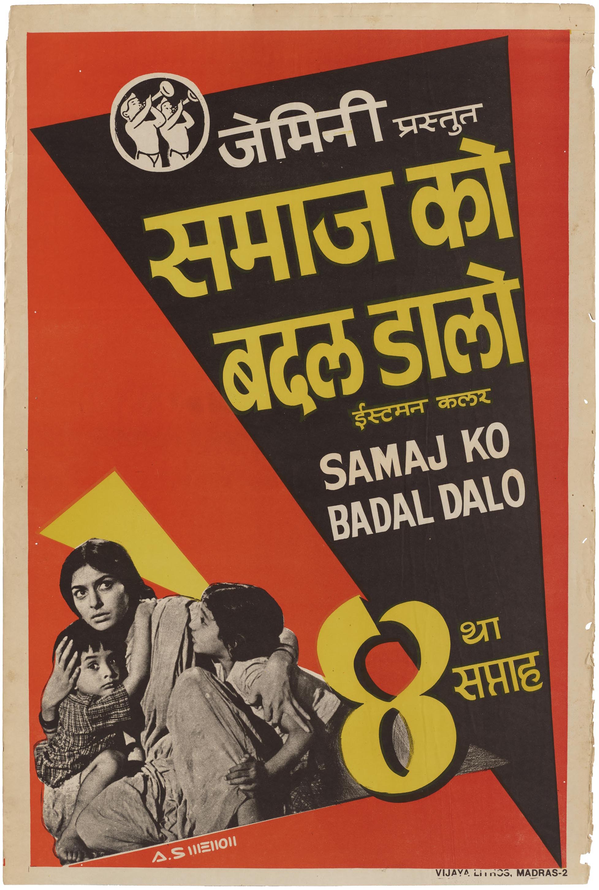
This film was a remake of a Malayali film by a South Indian production house Gemini Studios, who chose to remake it in Hindi. The imagery features a still from the film with its protagonist and her two children. The title calls for a change in society and deals with the topic of mill workers and their rights. The poster has similarities to Soviet revolutionary designs, with the strong use of reds and yellows, and wedge-like forms to anchor the text and illustration to one corner. These decisions might underline the socialist themes of the movie itself. The Madras (now Chennai) production company used a printer from the city itself for a Hindi film that was unlikely to have any viewership as the language would have been unfamiliar in South India. The poster uses Hindi and would have been used to advertise the film further up north.
Shimabôddho | সীমাবদ্ধ, 1971
Script: Bengali
Shimaboddho means limitations or boundaries. To express this, Satyajit Ray designed the looping, oversized ী matra to be cropped by the poster’s boundaries, making it look trapped within a limit. Like the design for Jalsaghar, Ray again splits the canvas into three sections, with the black bars made to feel like they’re trapping its protagonists. The bright colors paired with actor cutouts — two of his favourite techniques that he reused in many other posters — give the poster a modern feel that would have stood out from the two-color prints that were common at the time.
Edurulēni Monagāḷḷu | ఎదురులేని మొనగాళ్ళు, 1984
Telugu
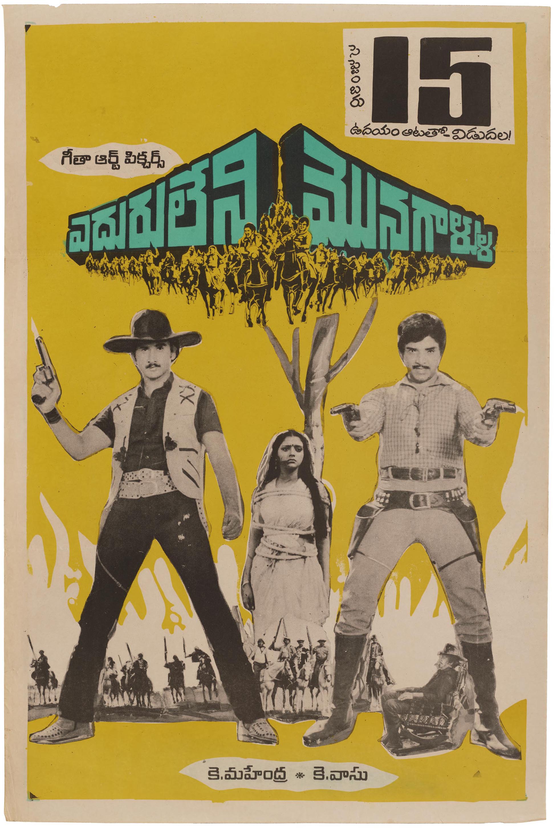
The poster for this Telugu drama wields photography, graphics, and color for a captivating design. The two-point perspective for the title lettering not only gives it heft, but also depth. Horse riders charging below the lettering bolsters the illusion of the title popping out at the viewer. The distinct design was reused in other posters for the movie. Its publicity design is attributed to S.V. Chalapathi Rao, with the art credited to B.N. Krishna. Type designer and researcher Vaishnavi Murthy Yerkadithaya, points out that the geometric, boxy style was not uncommon for movie posters of the time. She also pointed me toward the Anu Infotech catalog, which has a host of geometric typefaces for Telugu, but remarked that the title design treated the vattu characters with a lot of care, especially the మొ and ళ్ళు, each with marks above and below the letters drawn to fit well into the block.
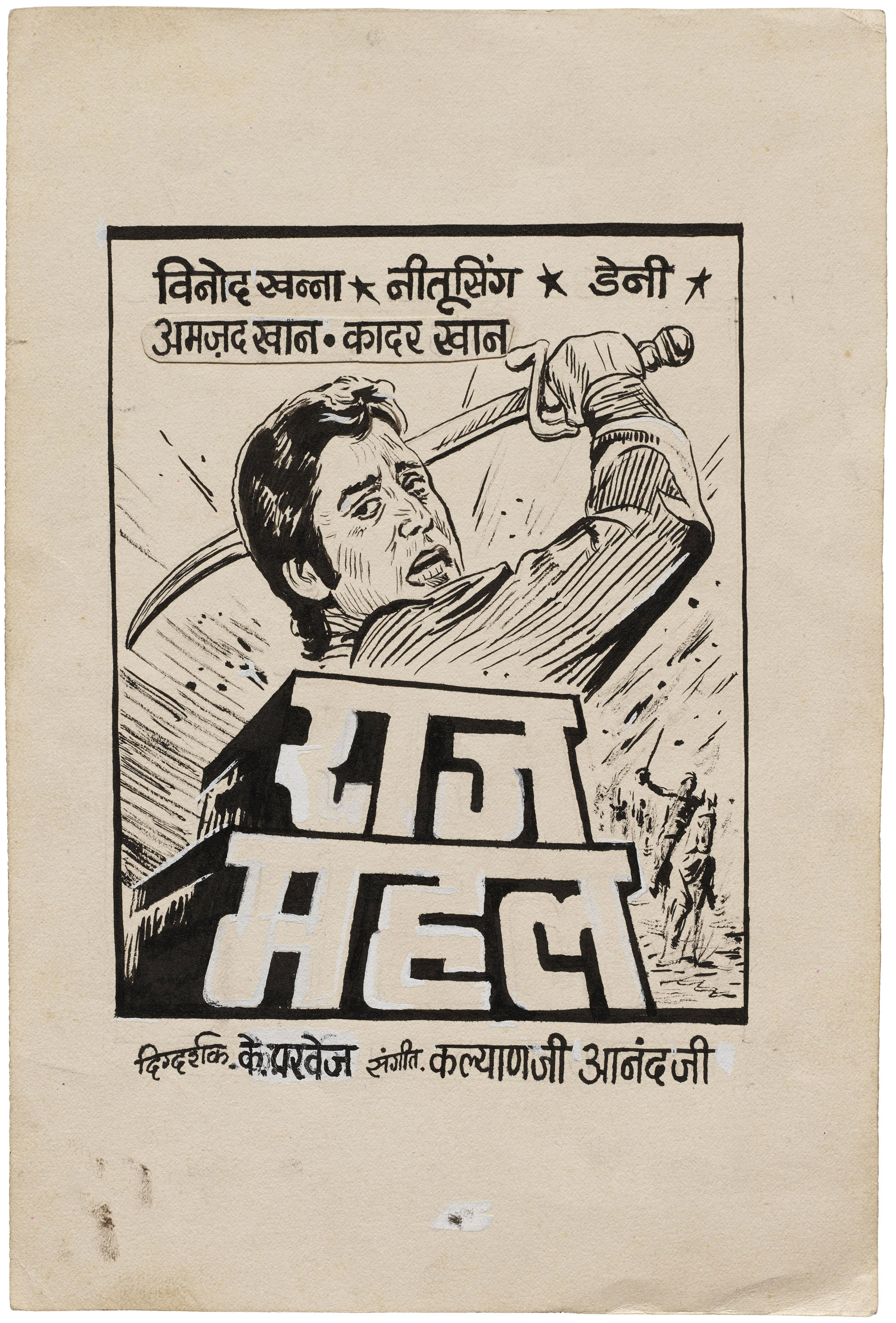
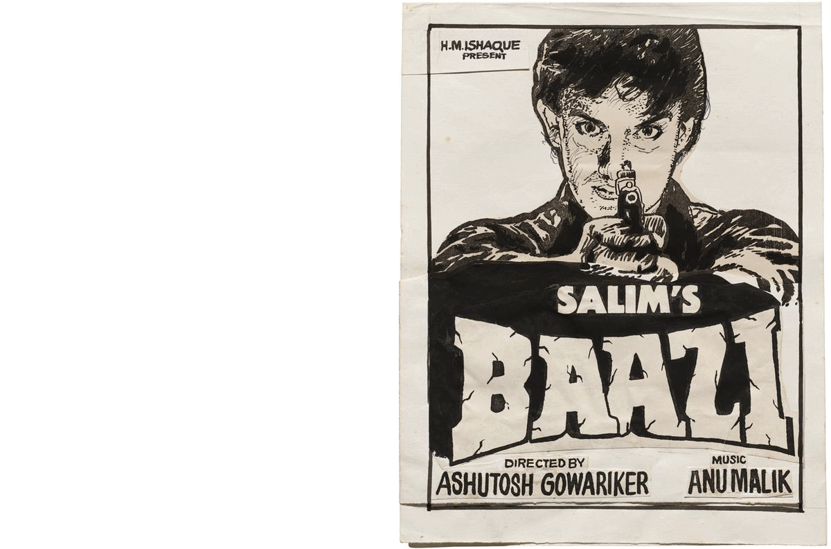
The Archive also acquired pieces of original artwork for two newer films films, राज महल Raj Mahal (1982) and बाज़ी Baazi (1995). Given their coarse detail and small size, around 7 and 8 inches wide, they were likely made for newspaper advertising or other promotional graphics. Both show illustration and lettering done by hand. The title lettering for Baazi features a flared-corners effect that was first used in the 1970s by publicity designer C. Mohan for the popular Hindi film Sholay. Rajesh Devraj, co-author of The Art of Bollywood (Taschen, 2010), says this monumental, three-dimensional look celebrated the expansiveness of 70mm widescreen projection, in hopes that it would further entice the audience. The stretched contours and dramatic cracks seen in Mohan’s lettering continued to be used in logos for various movies over the decades, particularly for action dramas, and you can see it being used in both the English and Hindi variants of the Baazi artwork. In both Raj Mahal and Baazi artworks you can also see evidence of white correction fluid to clean up the drawings, as well as cut and pasted paper for replacing words without needing to recreate the illustration. These give you a sense of the analog processes used to create promotional graphics before digital production.
Poster designs have always competed for viewers time and attention. Lettering by hand meant that designers were not restricted by the typesetting limitations of the time, which were particularly cruel to Indian scripts in the last century. The skill of the artists also afforded a flair and technique that was likely the result of disregard for more traditional typography. With the exception of Satyajit Ray, even within India, very few of the artists and printers that have been credited on the posters have any significant recognition. For some of these creators, these posters are the only record of their work. Hopefully, this collection will also help acknowledge lesser-known contributors to the Indian graphic design canon.
Tanya George is a Mumbai-based designer and educator with a wide-ranging freelance practice that includes designing letterforms for brand identities as well as fonts across different Indian scripts. She also conducts type walks around Mumbai, along with typography workshops, and writes about type.