News
Inside Lettres Décoratives: A Century of French Sign Painters’ Alphabets
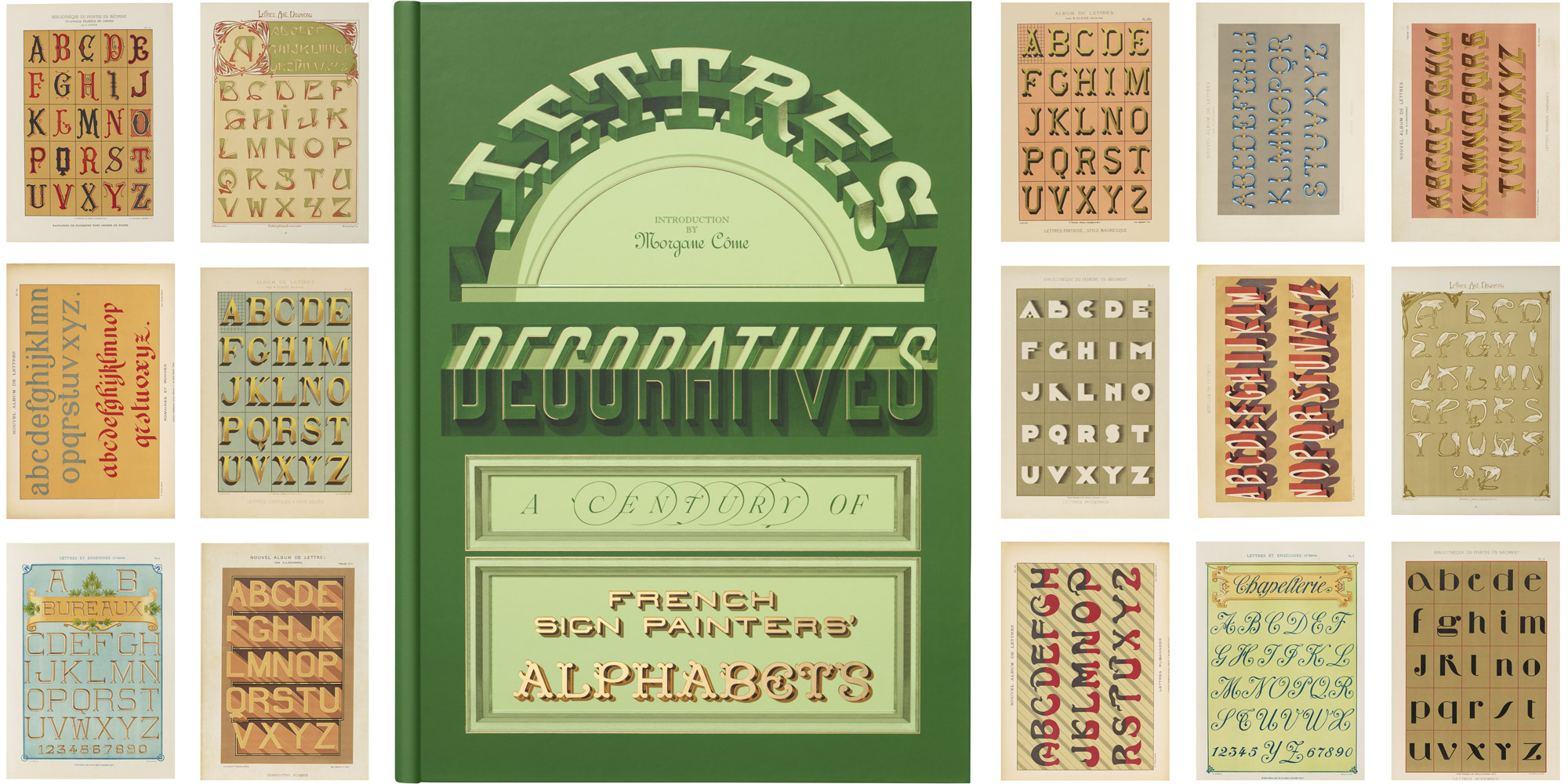
With alphabets from 12 grand portfolios that brought the sign painter’s art to the page, our new book is a trip through time to the golden age of urban lettering.
Hardcover, 9.5 × 13 inches, 216 pages
Sometime in the 1820s, new characters arrived on the streets of France. Above boulevards, they changed color and shape across decades of urban transformation and popular revolt. Their captivating forms hailed poets into crowded cafés, embellished neighborhood shopfronts, and, for those roving city dwellers Charles Baudelaire called “botanists of the sidewalk,” turned streets into galleries as fascinating as the Louvre. Thousands of skilled painters saw to their every need.
Climate and capital were hard on painted letters, always fading and displacing old signs. Two hundred years on, we sometimes struggle to appreciate their presence through black-and-white photographs and vanishing remains. Yet many have made their way to us in freshly painted glory, preserved in extraordinary nineteenth- and twentieth-century lithographic albums that share the defining alphabets of the sign painters’ trade.
Lettres Décoratives: A Century of French Sign Painters’ Alphabets offers a comprehensive look inside 12 of these rare alphabet albums, sharing over 150 large-scale reproductions, together with an eye-opening historical essay by sign painting expert Morgane Côme, detailed commentary on the materials, and archival photographs of the letters in use.
In this post, we introduce the sources and design of this new publication from Letterform Archive Books, exploring some of the ways it connects us to forgotten stories of a craft that brought color to the streets of France.
Belle Époque, Belles Lettres
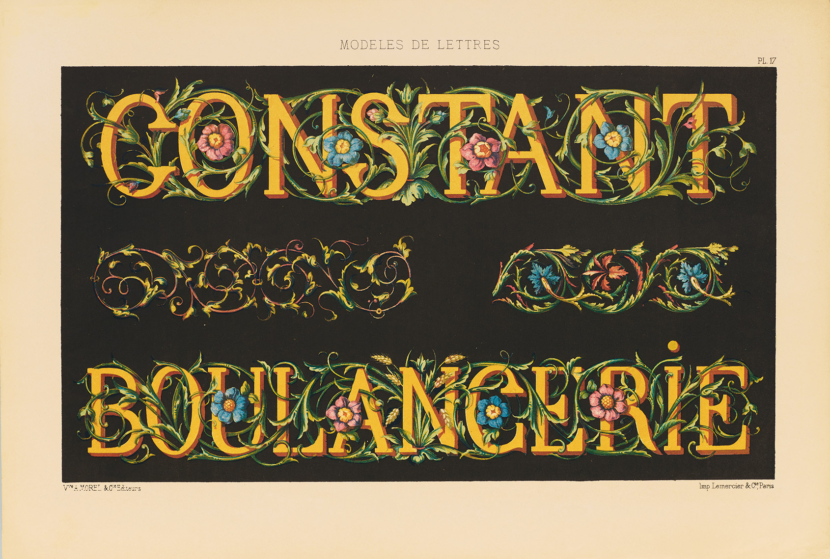
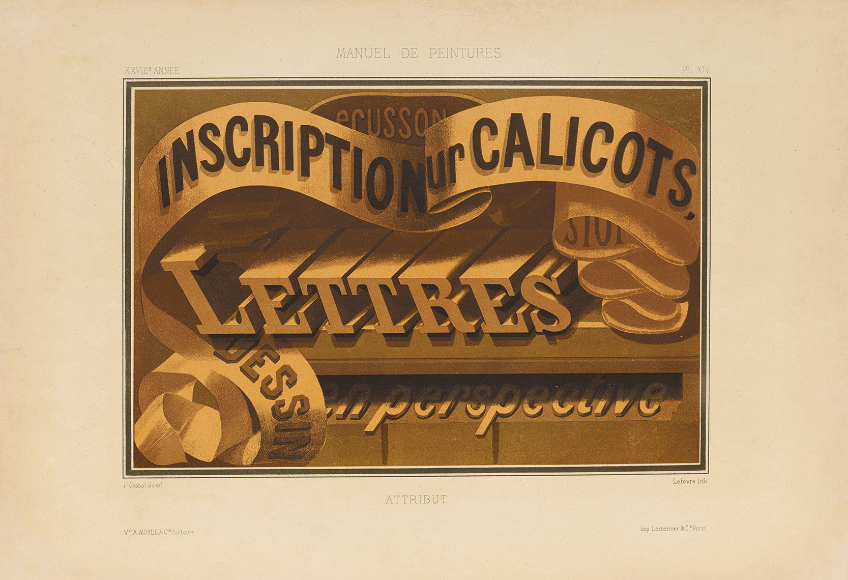
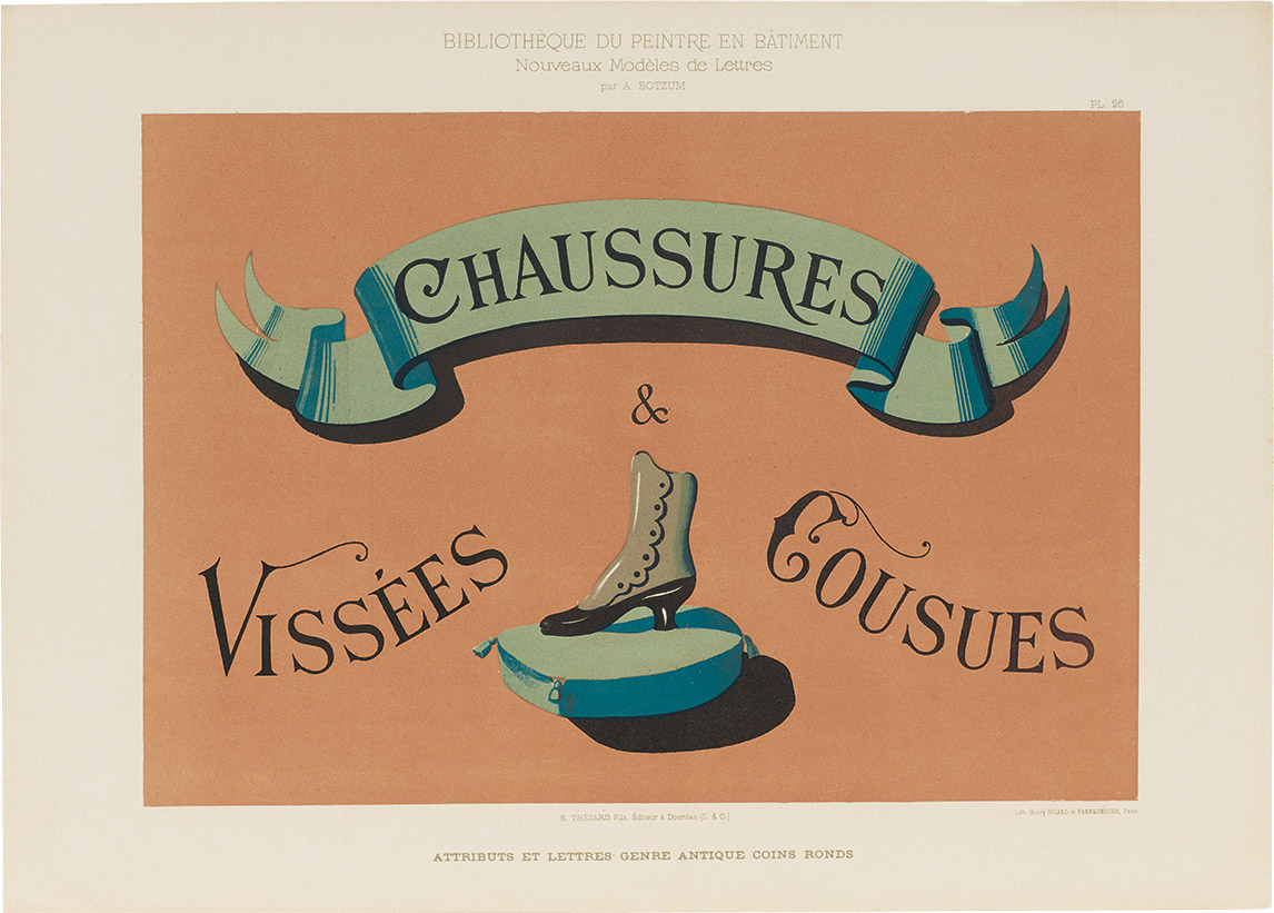
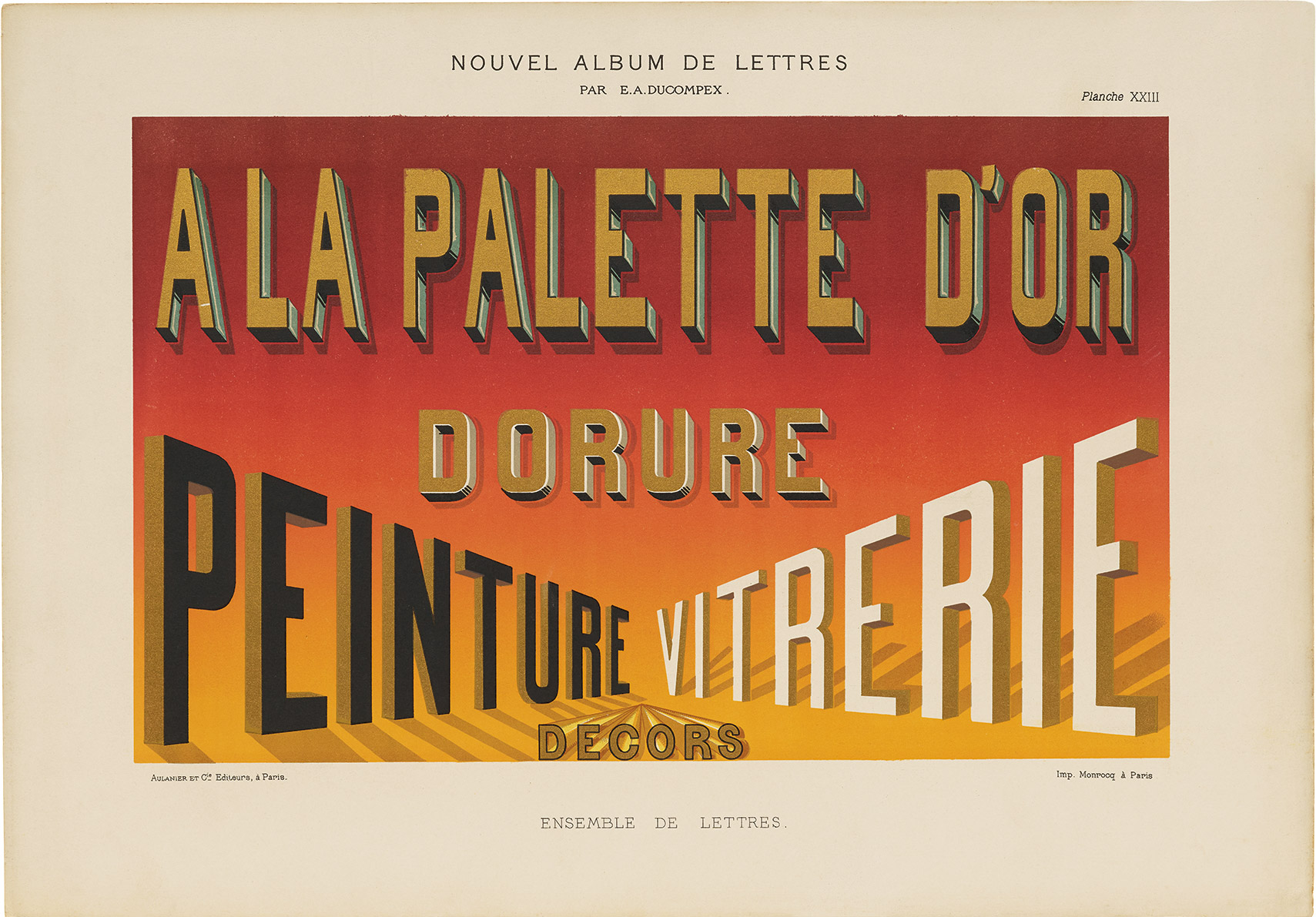
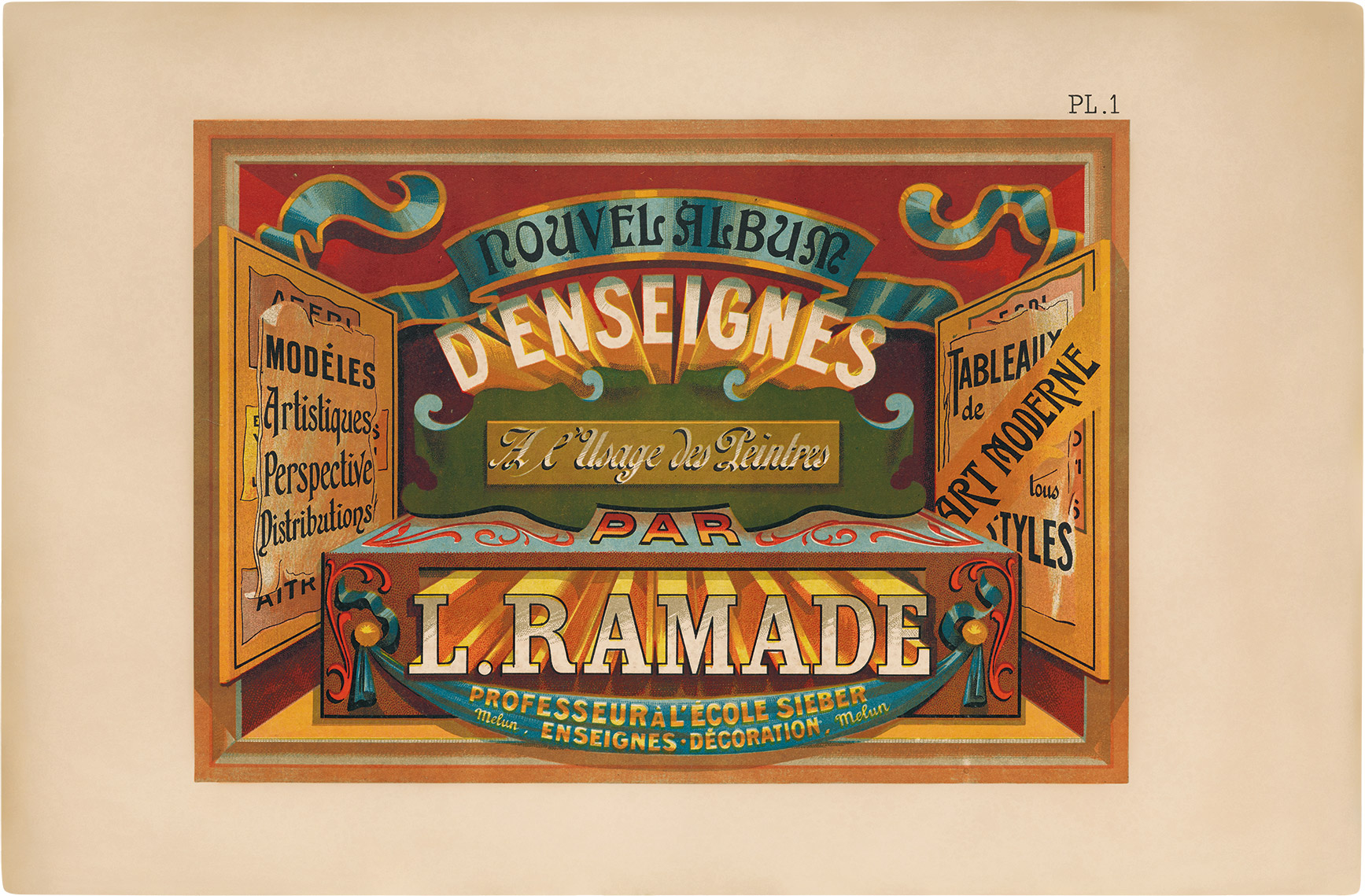
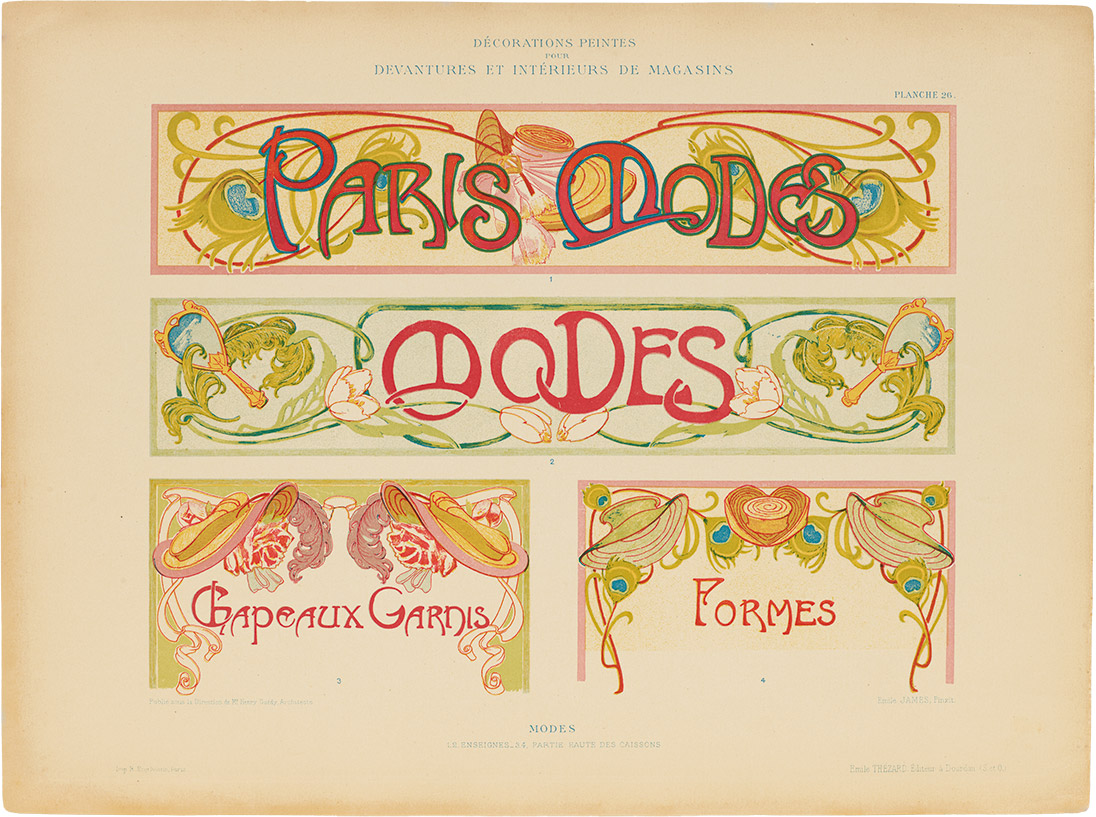
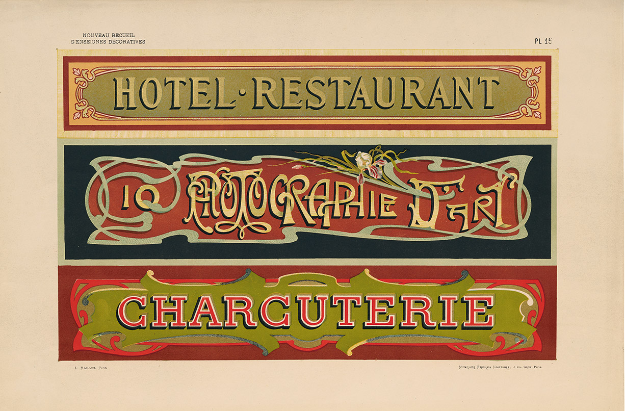
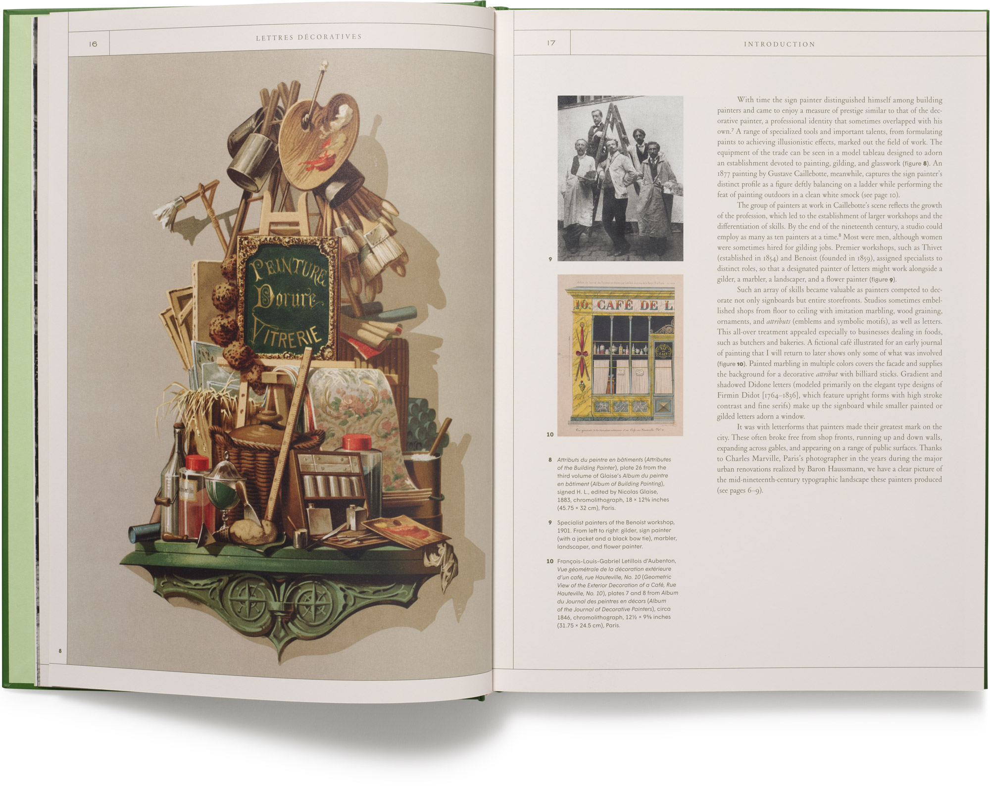
Measuring over eighteen inches tall and printed with as many as ten inks per plate, there’s something improbable about the alphabet albums that appeared in France after 1850. Meant to be used as models for sign painters—and other decorative painters wishing to keep up—their lavish colors and fine details, all made possible by the newfangled process of chromolithographic printing, sometimes give the impression that these are letters for letters’ sake.
Elaborate designs for completely realized signs only heighten the impression. With bold decorative flourishes and trompe l’oeil effects, the practicing painters who created these works seem not to invite imitation so much as awe.
All images in the gallery below are hi-fi captures. Click an image to enter fullscreen view, then click or pinch to enlarge.
In fact, French alphabet albums did not promise to teach sign painting, a craft that was passed along mainly through apprenticeships. They drop no tricks of the trade, and give little guidance for their use. What they offered, instead, were expansive stylistic palettes that established the traditional forms of letters while persistently inventing upon these forms, constantly extending the horizons of the sign painter’s art.
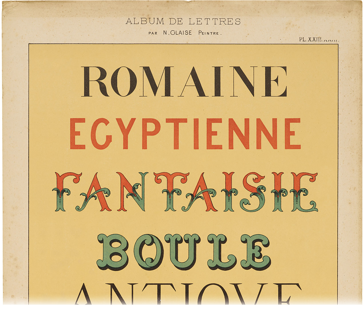
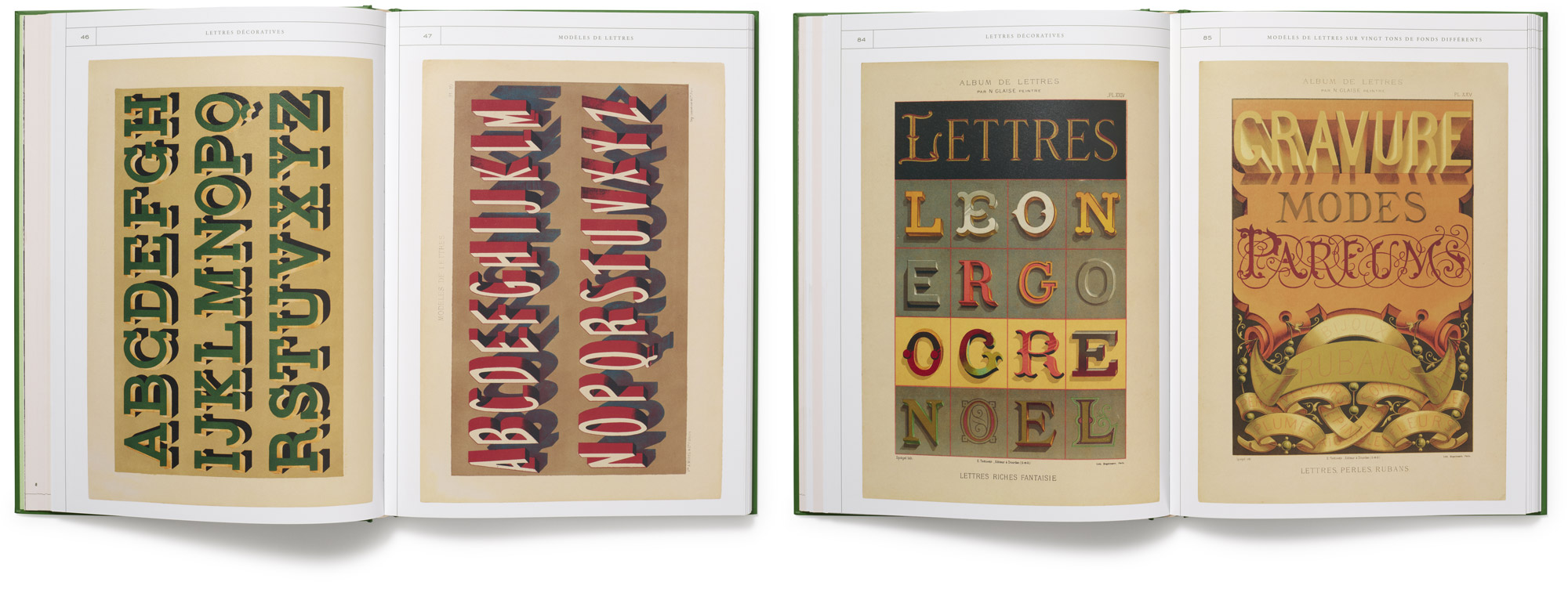
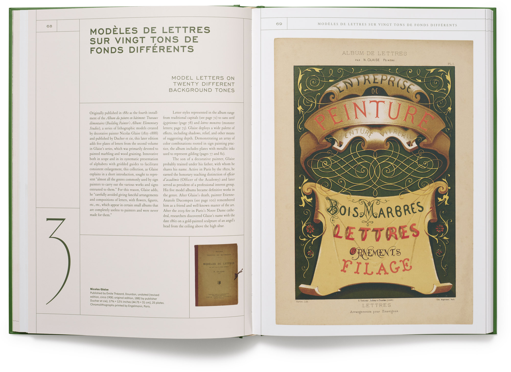
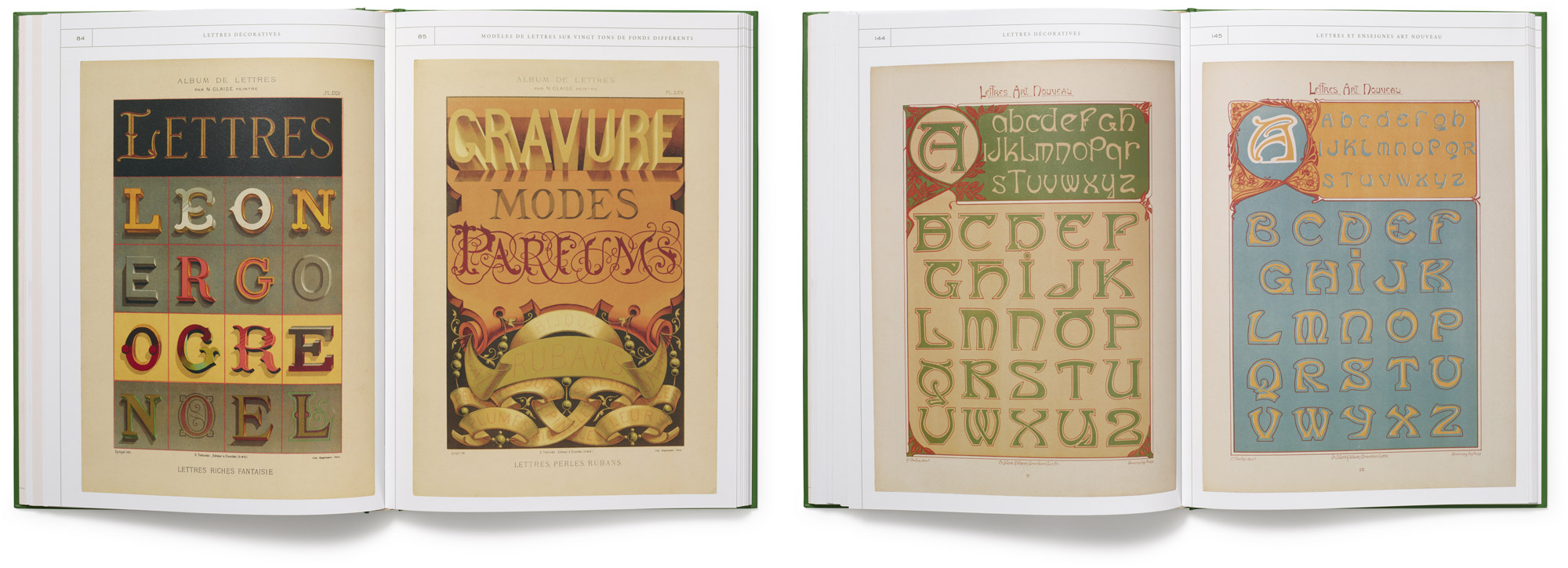
The aim of showcasing a spectrum of styles became the organizing principle of these albums from the first, published in 1875 (with plates designed as early as 1850), through Georges Léculier’s Modèles de lettres modernes in the 1930s. Labels such as romain (Roman), égyptienne (sans serif or slab serif), and even monstre (monster), appear at the bottoms of most printed plates, defining key lettering categories within which the tastes of an artist and an age could hold their sway.
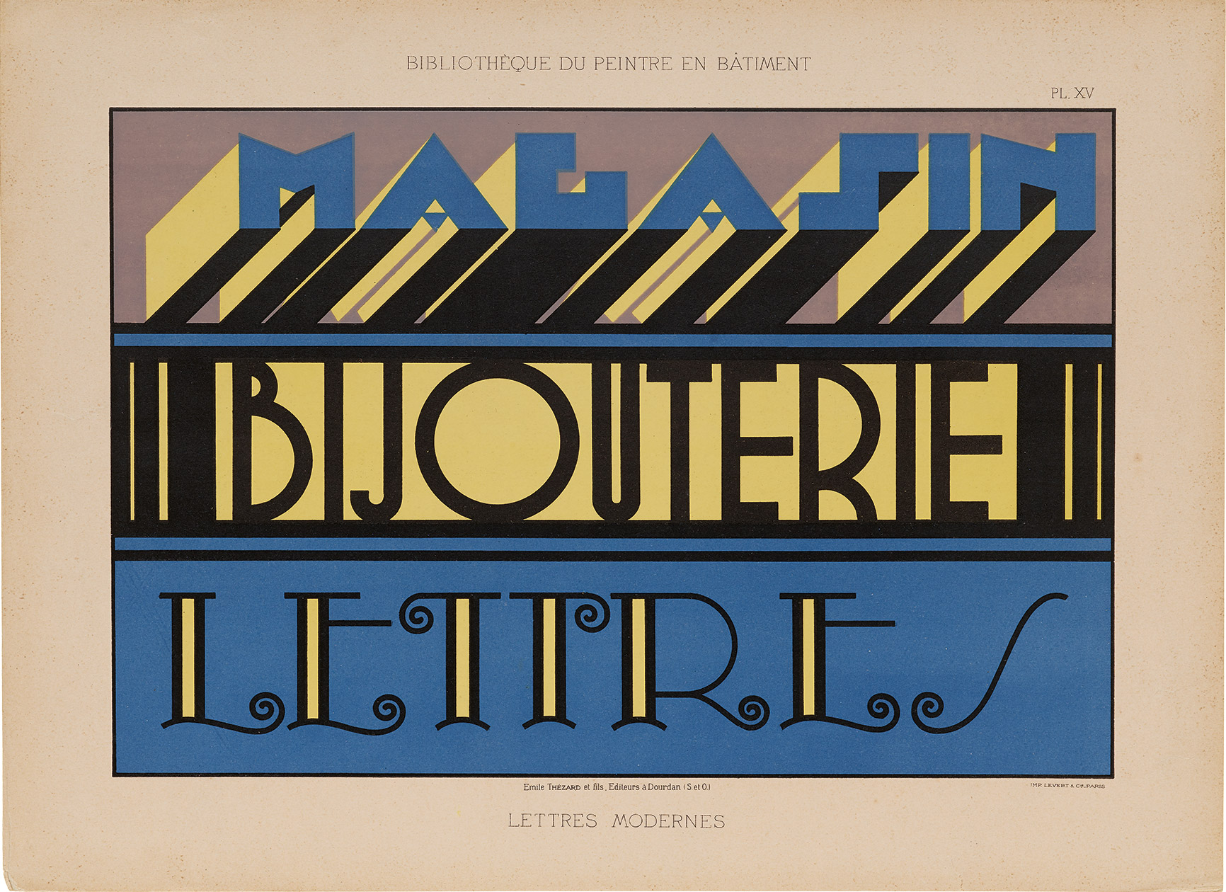
Viewed together, the albums raise up a parade of shifting fashions, one spanning the entirety of what some call the French Belle Époque, the Beautiful Age. From stately classical alphabets flow ornate medieval-inspired letters, then sinuous art nouveau characters, then the rhythmic geometries of art deco. Yet amid these recognized historical currents, many surprises also leap from the page—unfamiliar kinds of beauty and decades-old letterforms that could well have been made today.
The polish and originality of these forms leave us (and countless visitors to Letterform Archive) with a whirl of questions: Who were the artists that made them? What do we know of their lives as painters and of their contributions to the craft? As we discovered while researching the book, answers are not easy to come by.
A History Told By Traces
An example: In a “Notice on Letter Painters” published in the 1840s, a sign painter by the name of Ramet tells that a certain Davignon pioneered inventive and dimensional styles at a time when signs still used conventional flat letters:
An engraver (the late Davignon), abandoning the burin for the brush, rejuvenated letterforms and their construction, and innovated all kinds of writing with perfection. Painters came to imitate relief by accurately capturing highlights and shadows.1
Others sang this Davignon’s praises in his time, and his legacy survived until 1882, when Nicolas Glaise named him first among history’s great sign painters in his alphabet album Modèles de lettres. Yet only two years later, a historian of Parisian signs memorialized Davignon as one of the forgotten, better known by his death (caused by falling off a ladder) than by his creative oeuvre:
It is regrettable that no documents have been collected on the best sign painters, who would not be unworthy of a place in the history of painting, not simply because of their talent […] but because of their originality. One of these artists, named Davignon, died in 1842 from the effects of an accident that must have been quite common in the work of sign painters.2
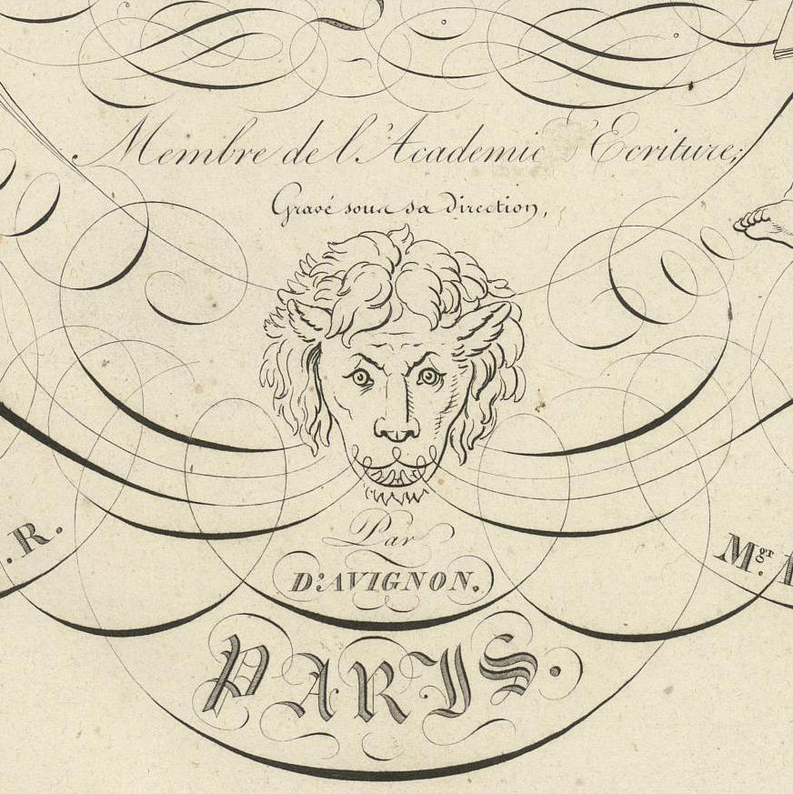
Perhaps we’ll never see a sign by Davignon, but documents like those preserved in French alphabet albums help us tell better stories of the craft he helped launch. We have been able to discover, for instance, that before taking to the streets, Clotaire-Philippe-Jean-Gabriel d’Avignon (to unshorten his name) made waves as an engraver of writing manuals not unlike those featured in our recent stationery set, Calligraphic Menagerie. We now know he passed his new profession down to his son, a registered sign painter at the time of his arrest for participating in the revolutionary revolts of June 1848.
At one corner of a daguerreotype showing the barricades erected at the height of these struggles, a sign with Didot-style lettering appears two stories up the side of a building. Below it, shaded sans serif letters advertise a chocolate maker. We can only wonder who painted these signs. Could it have been Davignon’s son? Or the painter behind an 1850 lithographic plate showing closely related letterforms?
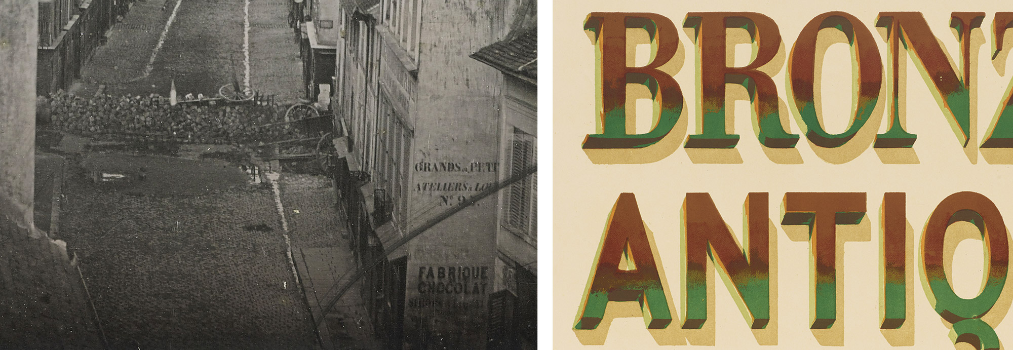
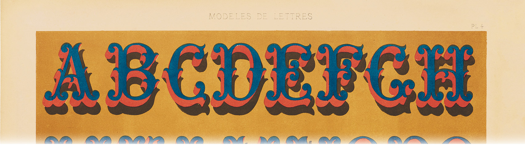
Right: Detail of a plate from Modèles de lettres: Extrait des vingt premières années du Journal-manuel de peintures (1875, with plates published in the 1850s and ’60s).
No doubt traces of the forms and techniques Davignon first conjured atop his ladder now live on in the alphabets of Lettres Décoratives. To shed clearer light on the history kept alive in these artifacts, we enlisted help from specialist Morgane Côme.
Rediscovering a Two-Hundred-Year-Old Craft
A practicing sign painter based in Quimperlé, France, Côme has been scouring collections and conducting interviews in recent years in search of the lost histories of her craft. Her enthralling introduction to Lettres Décoratives takes us back to the earliest signs in France, following their development from wordless icons and pictorial swing signs to the broad signboards of the nineteenth century. Drawing on archival sources and images, Côme then illuminates the sudden emergence of modern sign painters and the new tools, training, and techniques that formed their stock-in-trade. A craving for new letterforms, she reveals, led painters to borrow ideas from wooden poster type and lithographic prints before ultimately publishing colorful model albums of their own.
Côme uncovers the origins of these albums in journals held deep in the Bibliothèque nationale in Paris and pursues their development over decades of social and artistic change. Detailing the many genres of letters they contained within, she connects their designs to documentary photographs made as far back as the 1860s. Finally, Côme explores how letter painters made use of these albums, highlighting the role they likely played in twentieth-century sign painting schools and reflecting on their value for new generations of painters and designers.
Shorter texts introducing each of the book’s featured albums share vital facts about their creation while walking readers through their dense forests of forms. Short biographies of albums’ artists offer glimpses into the little-known lives behind the letters, unearthing fragments of stories that remain to be told.
Making Lettres Décoratives
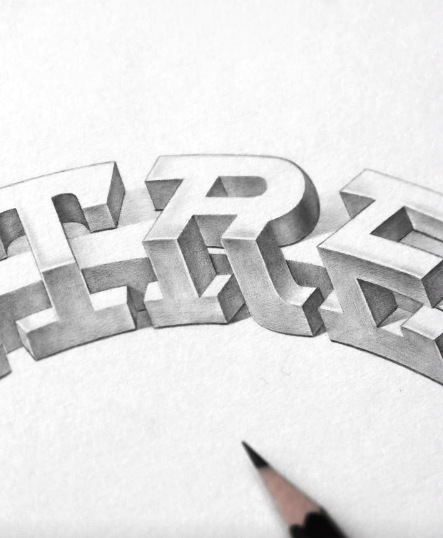
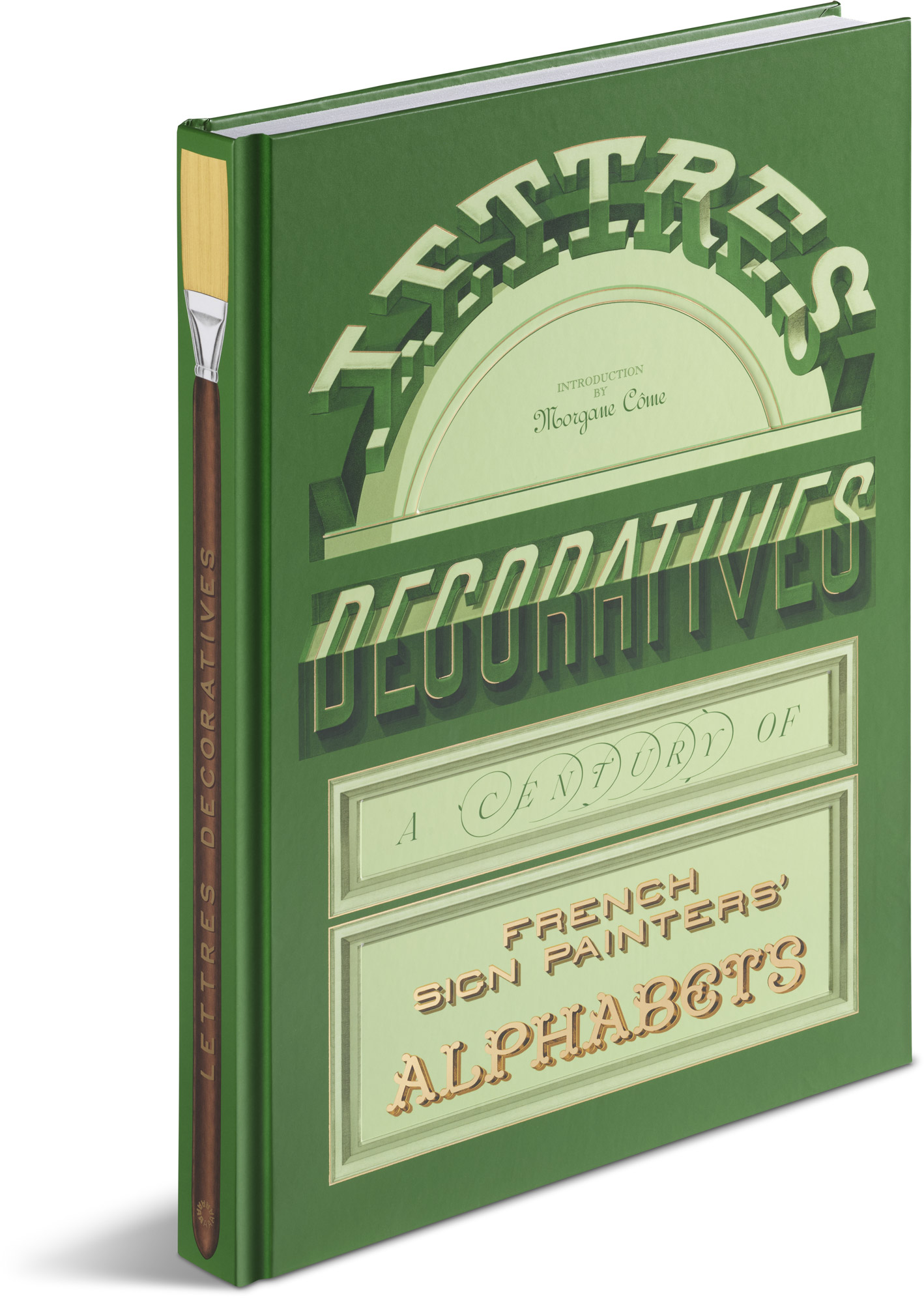
To design a book worthy of these remarkable objects, art director Alice Chau reached out to French design duo Violaine & Jérémy. Inspired by the manual practices of both sign painting and lithography, Jérémy Schneider hand-illustrated a full case for the book, then incorporated fine pencil drawings into the finished design. The cover’s titling previews various alphabet styles within, including mind-bending illusionistic letters and classically French boule letters with ball-shaped terminals. Its layout nods to the architecture of Parisian shopfronts, while the book’s spine depicts one of the letter painter’s tools of the trade. An attractive palette, light debossing, and elegant gilding with metallic foil all complete a charming volume to be kept on display.

The book’s interiors again reference turn-of-the-century façades with hairline frames that bring structure to expansive spreads. Using the typeface Henry, Matthieu Cortat’s interpretation of a French Garamond cut in the 1910s and ’20s, together with display styles Engravers, Engravers Gothic, and VJ Type’s art nouveau-inspired Eros Condensed, the design timelessly complements the remnants of temps perdu preserved in its pages.
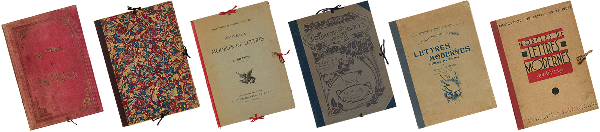
Reproduced from the Letterform Archive’s collection, the twelve albums highlighted in the book underwent careful preservation before heading to the photo studio for high-fidelity capture. Painstaking color work was done to ensure every image faithfully reflects the many-hued originals.
Printed at a generous scale and finished with a lay-flat sewn binding, Lettres Décoratives aims not only to translate the experience of seeing the albums first-hand but also to revive them as delightful, hardworking tools for future design and inspiration.
To learn more about French alphabet albums and sign painting history, join us on February 25th for an online salon with contributor Morgane Côme and BLAG (Better Letters Magazine) publisher and editor Sam Roberts.
To preview and purchase the book, visit our shop at the link below. Members receive 10% off all Letterform Archive titles.
- Ramet, “Notice sur les peintres de lettres,” Journal des peintres en bâtimens et en décors 5 (1946): 144. ↩︎
- Edouard Fournier, Histoire des enseignes de Paris (Paris: E. Dentu, 1884), 400. ↩︎
— Chris Westcott, Editor, Letterform Archive Books