News
Inside Michael Doret’s Alphabet City
Our latest book gives designers a seldom-seen peek into the studio of a lettering master, where logos, posters, and signs are drawn by hand.
At Letterform Archive we’re always looking for stuff that shows the way a designer thinks, and reveals how their work was made. People visit us not just to see final works on paper — books, ephemera, posters — but also to see all the other artifacts produced along the way to the final piece, including sketches, proofs, and variations that never made it to print. That’s why we were so thrilled in 2018 to accept a donation from Michael Doret that includes about half of his working archive. (The other half went to the Herb Lubalin Study Center at The Cooper Union in New York where he got his start.)

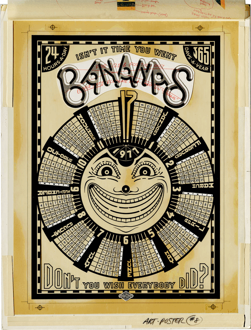
Doret is a lettering legend whose instantly recognizable artwork has helped define the look of popular culture for over fifty years. Since the 1970s, he has brought his unique style to magazine covers, posters, signs, and typefaces. He created logos for sports teams and fast food chains. He drew title graphics for comic books, record covers, and films. Doret’s archive includes rough-to-refined sketches, meticulous mechanicals and color studies, and other original artwork. The breadth of material, combined with his methodical way of working, provides instructive and delightful examples of how analog design happens. And it invites today’s digital designers to get off the computer and consider alternative ways to develop ideas.
Doret’s life and work are now captured in a visual autobiography from Letterform Archive Books: Growing Up in Alphabet City: The Unexpected Letterform Art of Michael Doret. Working with design historian Norman Hathaway, Doret traces his influences from 1950s Brooklyn to 2000s Los Angeles, and illustrates it with over 600 images, including photographic tutorials documenting his process.
Sketching to a Solution
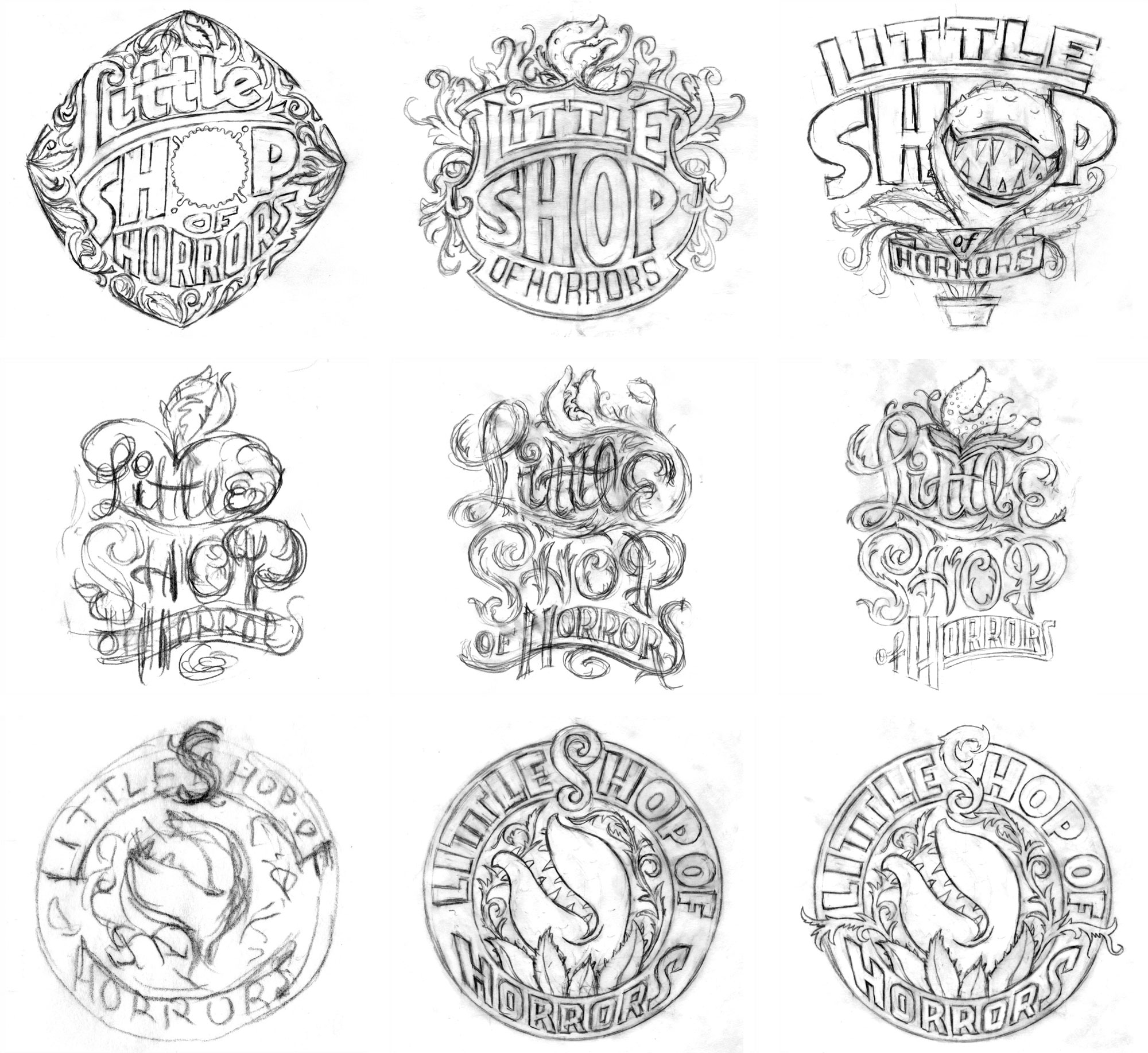
Unlike most designers these days who work primarily on screen, Doret drew everything by hand. And unlike most designers of any era, he saved many of his drawings, regardless of how early in the process they were made. Keeping his work was integral to how he worked — starting with very casual pencil sketches, and advancing to refined drawings, a monochrome inking, a colored pencil comp, and then a final design.
An array of rough drafts allowed Doret to visually develop a concept and show multiple options to a client before spending too much time on perfecting them. Having those drafts handy let him go back to an idea he previously scrapped. In an interview for our 2019 article about his film titles, Doret explained why his sketches matter:
It has always been puzzling to me that many design studios provide large numbers of digital iterations of designs with only minute tweaks between the designs. I have always endeavored to provide as many real alternatives as I can when working on design projects — especially in the early stages when the client may not be sure of the direction in which they would like to go.
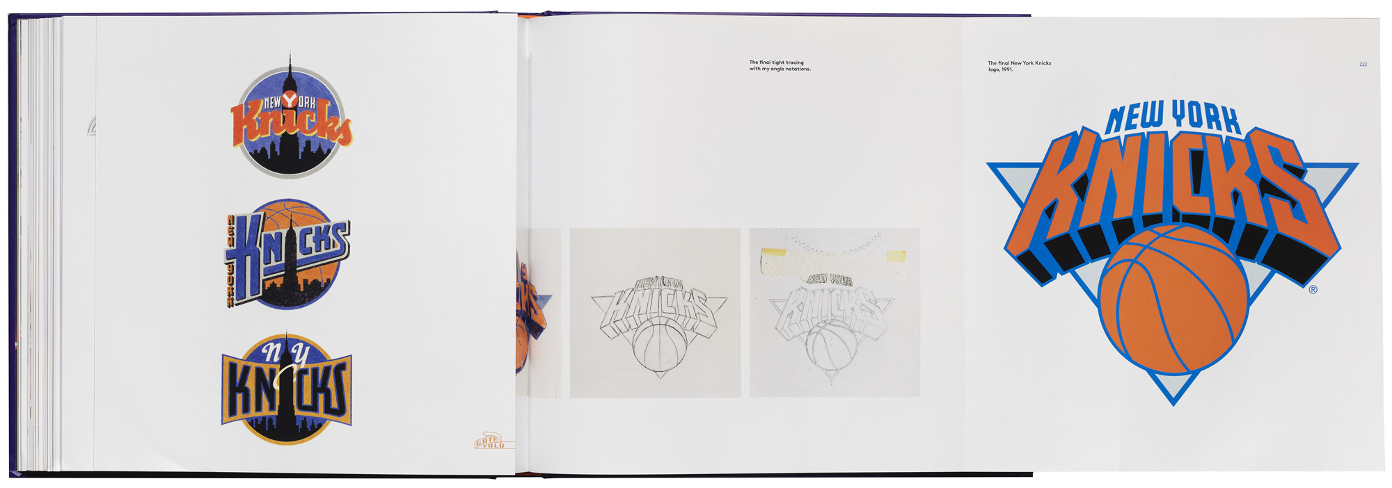
Tracing and Inking
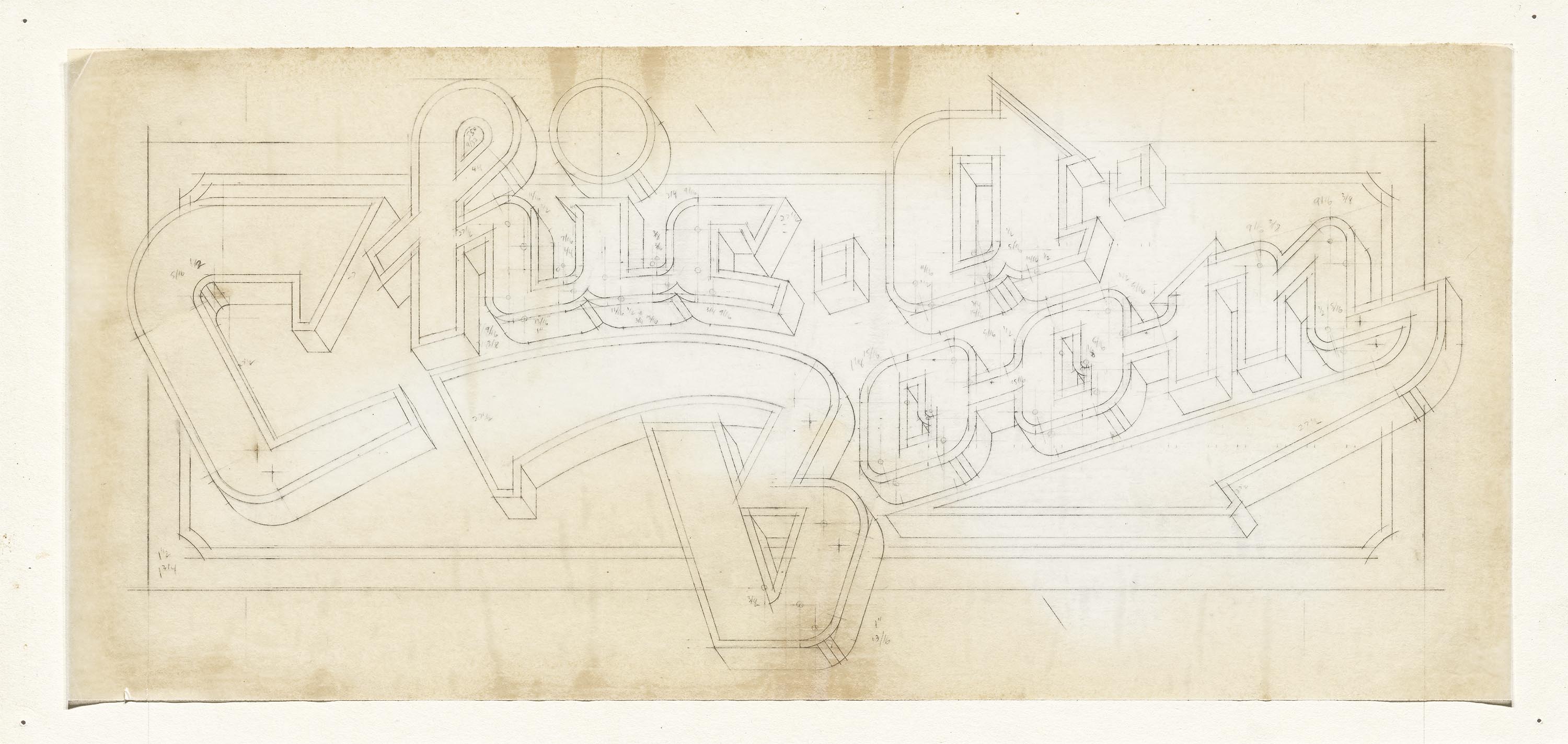
Once a concept was selected, Doret continued to work by hand. Even if a design eventually ended up as a digital file, the final drawing was almost always inked with a pen. Doret annotated the angle degrees and compass points of each penciled line so he could accurately replicate them later. A few weeks ago, at Type@Cooper lecture in New York, Doret demonstrated his inking method. It included a tour of his most frequently used tools and materials: pencil, eraser, rubber cement pickup, ruler, adjustable and metal triangles, French curve, circle and oval templates, X-acto blade, Rapidograph pen and compass, loupe, registration marks, and proportion wheel.
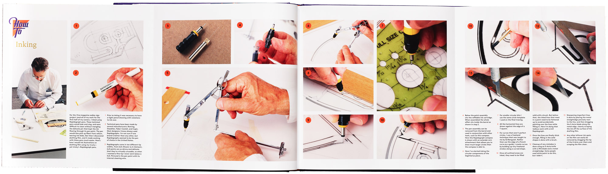
Growing Up in Alphabet City illustrates Doret’s method in step-by-step detail, with photographs and descriptive captions, all viewable at once through spreads that fold out from the book. Clear, visual descriptions of an analog drawing process are rarely published, even in design and lettering manuals of the pre-digital era. Doret aimed to fill a gap in design literature while shedding light on how he works. From the book:
Because geometry and mathematics are so important to how I think about design, when drawing a tight tracing I was using circle segments, specific angles, consistent widths, heights, and thicknesses. The tight tracing took the place of what’s called the template layer in Adobe Illustrator.… Back then, when inking over a tight tracing, the only way to accurately follow the drawing was to make notations on the tracing about angles, center points, widths, etc.
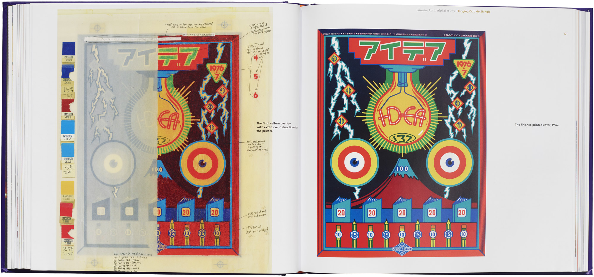
Prepping for Print
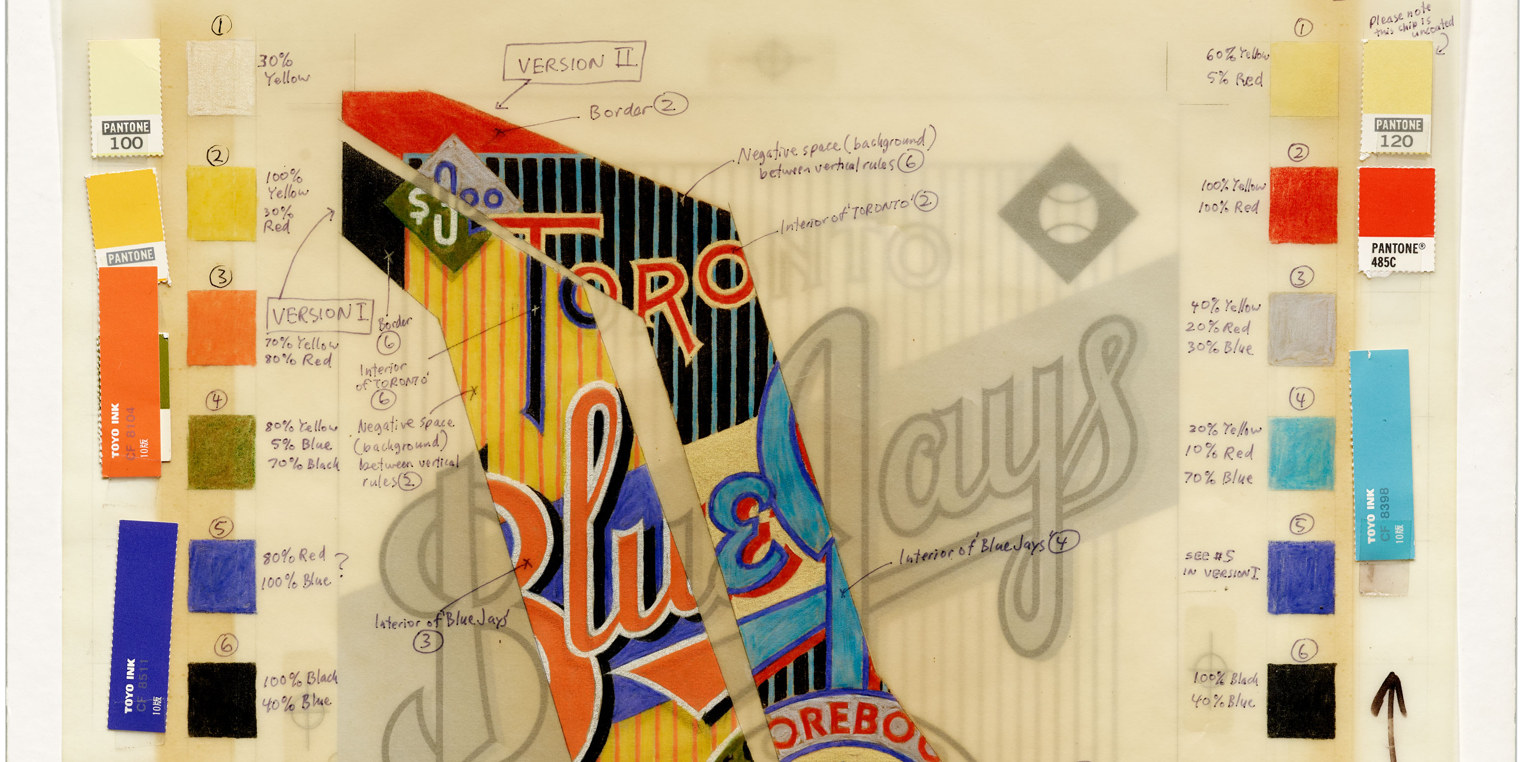
What might seem some of the most mundane aspects of Doret’s archive — instructions for the printer — happen to be some of the most visually dazzling. Once he and his client arrived at a chosen design, selected from a black inking or color comp, he set to work on the final art that would be reproduced on press. These “mechanicals” combine multiple layers of drafting film, each representing a color plate. As the top layer, Doret often added a sheet of tissue or vellum festooned with Pantone swatches, registration marks, and handwritten notes addressed to the printer. The overlays sometimes include a partial preview rendered in colored pencil, a vibrant slice of beauty that offers an intriguing peek at the final design. Though these artifacts were merely a means to an end, seen only by the printer, they could be considered art of their own.
As our visual world grows increasingly digital and automated, designers are longing for the physical, for evidence of the human hand. There are few bodies of work that answer this need better than Doret’s. The revealing, and often amusing, stories behind his work, as told in Growing Up in Alphabet City, offer contemporary makers new pathways for making.
All the images shown in this article are included in the book. To add it to your personal library and view a full video pagethrough, visit our shop at the link below. Members receive 10% off all Letterform Archive titles.