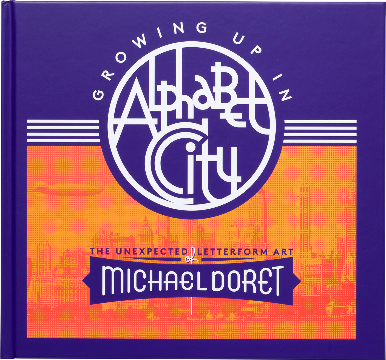
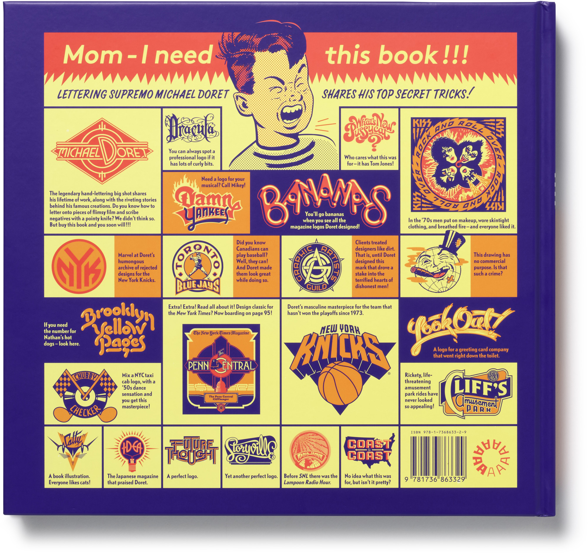
A visual autobiography from the lettering legend behind iconic artwork for Kiss, Disney, the Knicks, and many more
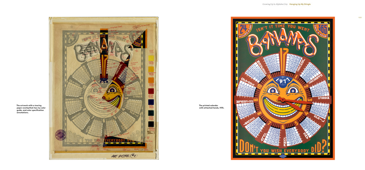
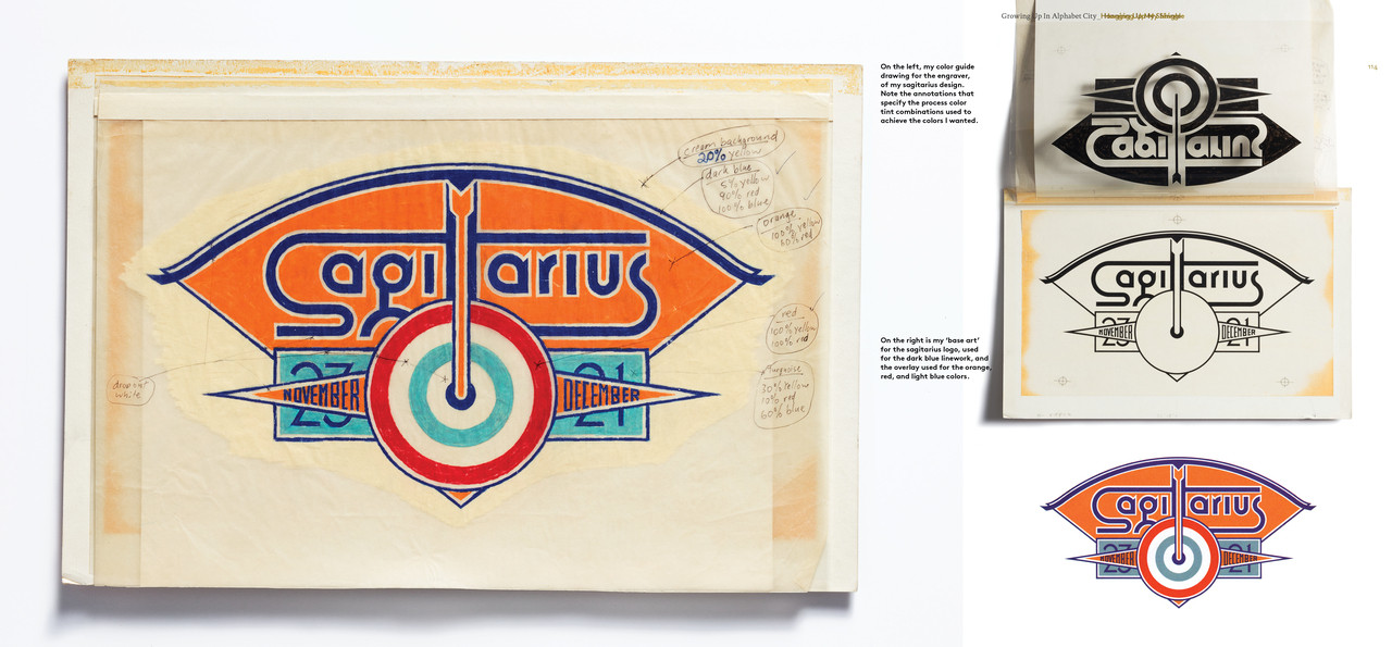
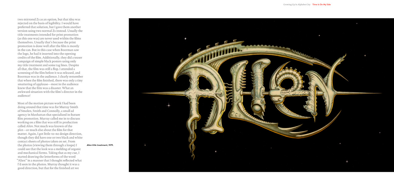
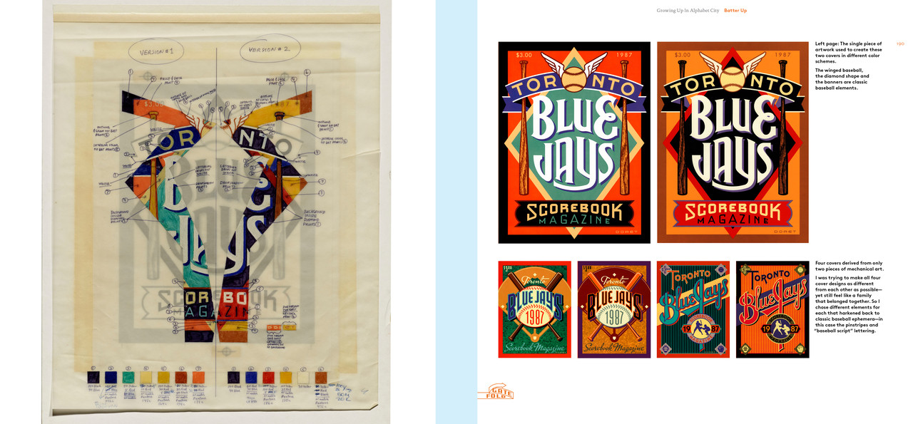
In this vivid and humorous monograph-meets-memoir, Los Angeles–based lettering supremo Michael Doret shares his top-secret tricks for making mere words into iconic words-as-images for clients such as Time, Pixar, the USPS, and more. With more than 600 images, Growing Up in Alphabet City traces Doret’s influences from 1950s Brooklyn to 2000s LA, showcasing his clever logo, signage, and poster projects along the way. It also presents and preserves the pre-digital process of custom lettering―from initial pencil sketches to printer mechanicals to final art (plus some spurned client proposals for good measure).
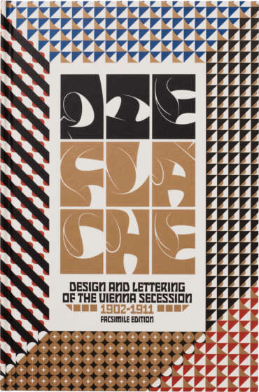
With original photo tutorials that teach all the classic lettering tricks, a foreword by type aficionado Nick Sherman, and a freshly commissioned cover by Doret himself, Growing Up in Alphabet City offers a dose of welcome nostalgia―and endless inspiration―for letterform lovers of any generation.

About the Author
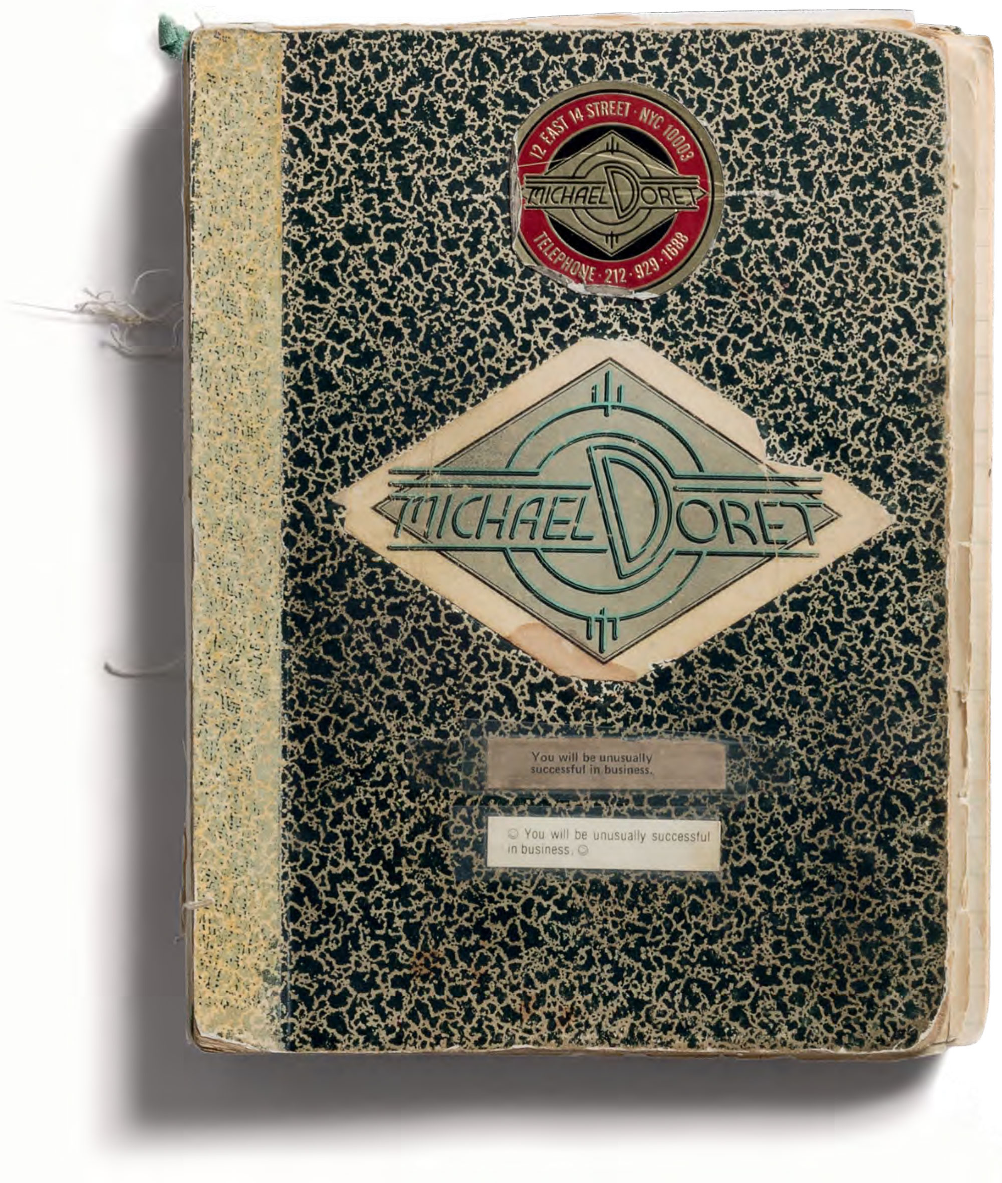
A graduate of the Cooper Union, Michael opened his design studio first in New York City and later in Hollywood. An eight-time winner of the New York Art Directors Club Silver Award, Michael is a specialist in logos and letterforms. His unique typographic vision blends elements of lettering, illustration and graphic design. The inspirations for his work come primarily from his early years growing up near the bright lights, signage, and brilliant colors of Brooklyn’s Coney Island, and later from such diverse sources as matchbook covers, theater marquees, enamel signs, and early-to-mid-20th-century packaging and ephemera.
In addition to designing many memorable covers for Time, Doret has designed album covers—from Rock and Roll Over for KISS to his Grammy Award–nominated design for the Squirrel Nut Zippers—and has created many famous works, including the logo for the New York Knicks, the Summer Harvest stamps for the USPS, the title treatment for Disney’s Wreck-It Ralph, and the classic poster for Simon and Garfunkel’s concert in Central Park. In the early 2000s, Doret branched out into the realm of font design by opening his digital foundry Alphabet Soup Type Founders. To date, he has released ten unique font designs.

Praise
“Doret’s life and art have been devoted to making words of all kinds jump off the page with precision—bespoke letterforms he’s been flawlessly drawing for over five decades.... [His work] defined a genre of ’70s-’80s-’90s hybrid sign painting. And this does not even take into account his original typefaces and typo-illustrations.... Alphabet City is filled with almost everything he’s ever done with pre-digital pencil, rapidograph, and drafting tools. The book is not just a trip down memory lane; it is memoir and process replete with sketches and roughs galore. For the type and lettering student, there is a lot of history to be had, but Doret’s brilliantly obsessive methodology has much to teach the digital fontographer and typographer in today’s world.”
— Steven Heller, PRINT magazine
“Doret peels back the layers of his creative process with the kind of honesty and depth that only a true master can. As a fellow lettering artist, reading his story is like tracing the roots of a visual language that shaped my own creative journey. This book is a gift to anyone who dreams of finding their voice through letterforms.”
— Ken Barber, lettering artist and typeface designer at House Industries
Video Preview
Contents
Foreword Nick Sherman
1 Brooklyn Baby / Coney Island and other influential environments
2 Getting Schooled / High school and Cooper Union
3 9 to 5 / Four years of working for the man
4 Op, Pop, Charlie, and the Massage Parlor / Zonkers and the Typositor
5 Hanging Out My Shingle / Independence, pals, and Kiss
6 Time Is on My Side / Time magazine, movie titles, and the union
7 Batter Up / Scorecards and stars
8 Nothing but Net / The Mecca, the NBA, and a bit of anthrax
9 Hooray for Hollywood / Stamps, manholes, and Jew food
10 Showtime / Theater titles
11 Ready-to-Wear / Making fonts, the mobile deli, and trucks
12 Sign Me Up / Working in 3D
13 Mouse Tales / Film titling and working for Walt
Afterword
Thanks, Typefaces
Colophon
Image credits
Index
My old kneaded eraser

Details
| Publisher | Letterform Archive |
| Publication date | August 20, 2024 |
| ISBN | 978-1736863329 |
| Size | 10 × 10¾ inches |
| Printing | 4 colors throughout |
| Pages | 328 (including 7 concertina fold-outs) |
Related Posts
This Just In: Michael Doret’s Disney and Pixar Title Treatments

