News
Jennifer Morla on Type Selection
The award-winning author of Morla : Design shares her secrets for choosing the right typeface for the job.
“Can type solve the problem?” That’s one of the first questions Jennifer Morla asks herself when a new design brief lands on her desk. More often than not, the answer is yes. This sets her off on a joyous hunt through specimen books, online type retailers, and her studio’s extensive font library with two more questions in the back of her mind: “What do I need to communicate, and what are the typographic possibilities for communicating it?”
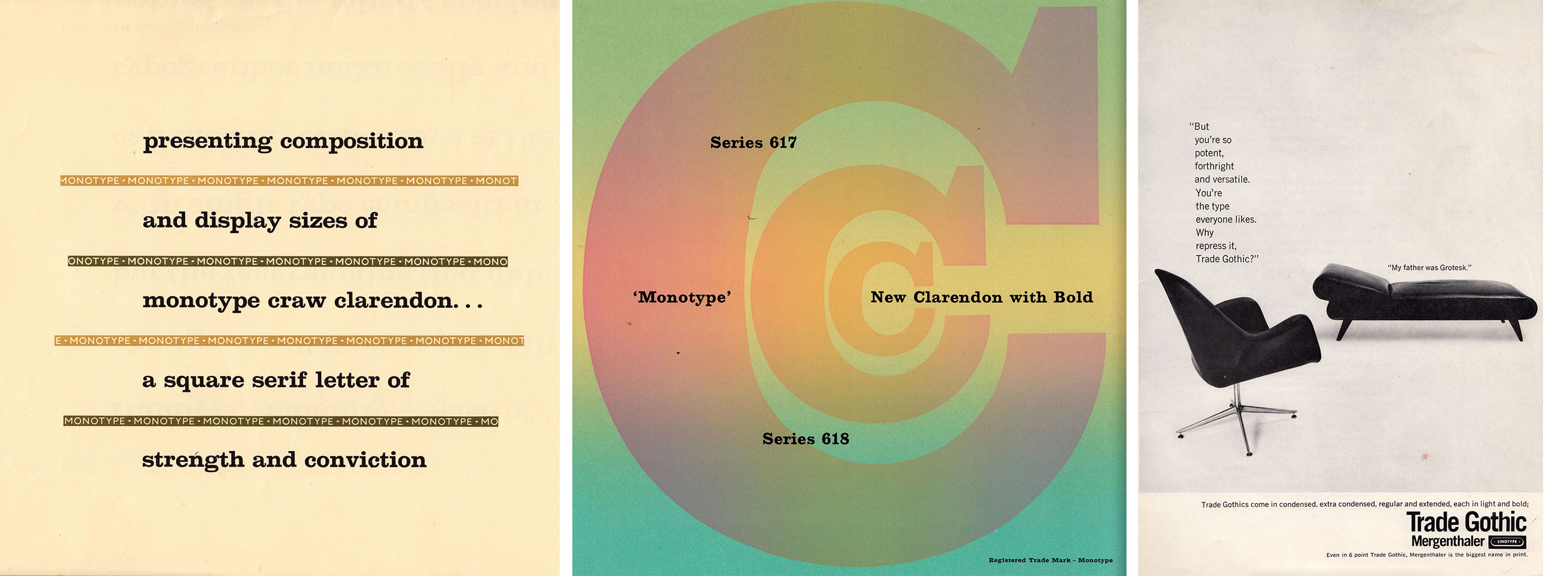
Some designers find a favorite typeface or two and rarely depart from them. Morla has her own favorites — Didot for its classic modern elegance, Clarendon for its combination of strength and playfulness, Trade Gothic for its versatility of style and weights — but she rarely repeats herself. This is one of the reasons why her work is so typographically interesting. And, with decades of experience as a designer and an educator, she’s nailed down the tricks of the trade. We sat down with her to learn about her tried-and-true tactics for type selection. Her work below is complemented by typeface specimens from the Archive collection.
1. Seek type with a point of view.
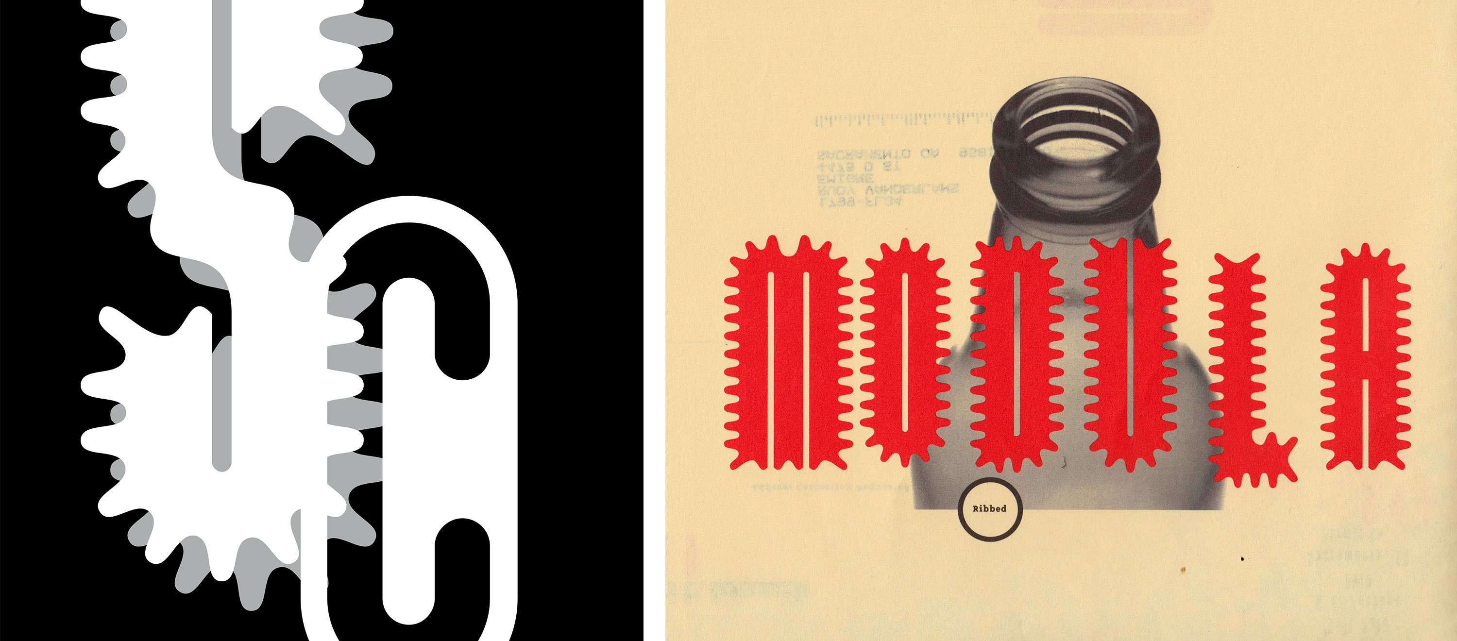
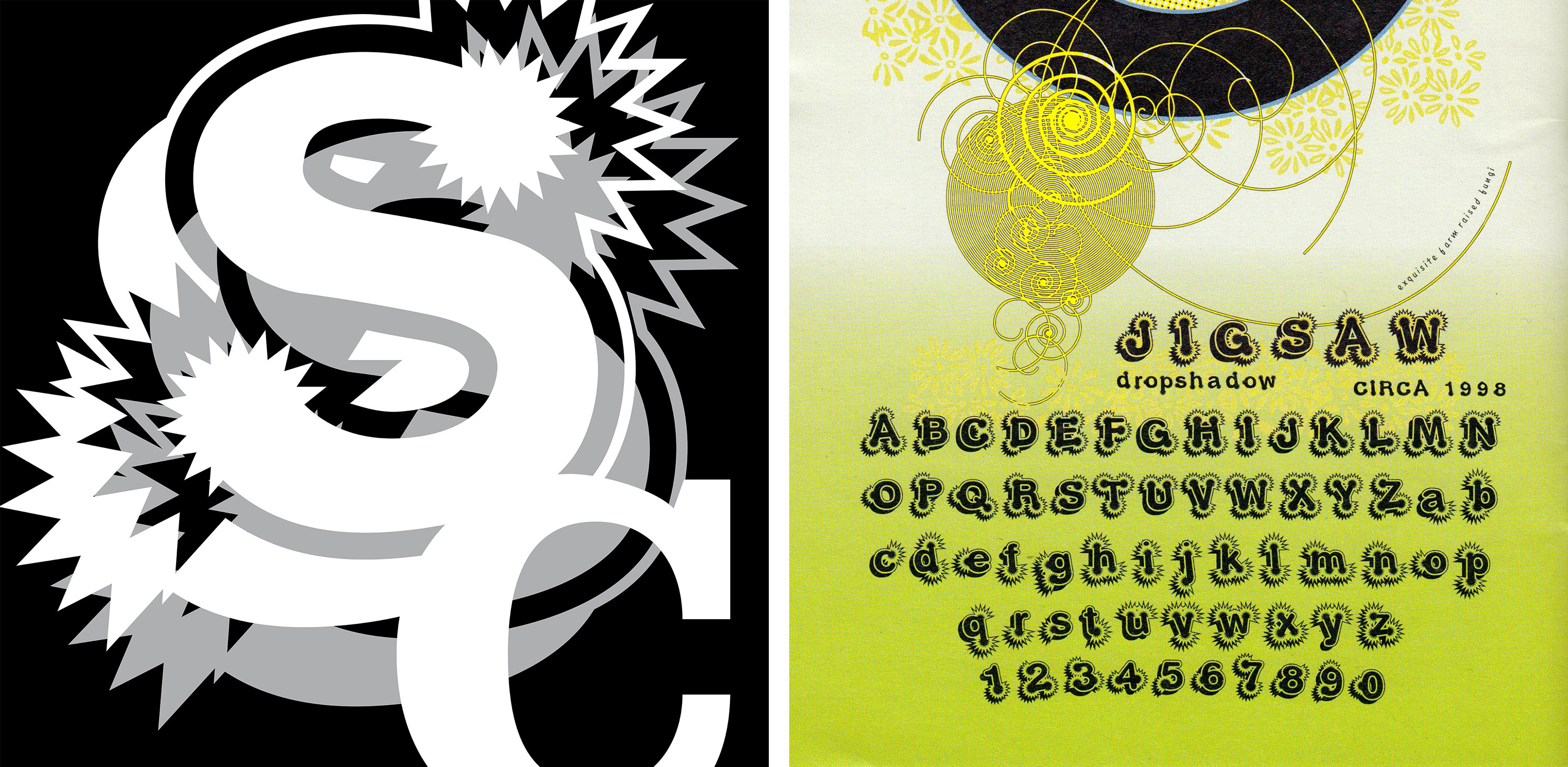
Gravitas, power, personality. These are characteristics that Morla looks for in a typeface. “I don’t use Optima for that reason”, she says, adding that the sans/serif hybrid is too wishy-washy. Instead, she goes for type that is sure of itself – even if its voice can have multiple interpretations. She frequently turns to designs from Erik Spiekermann, Neville Brody, and Zuzana Licko. Morla was one of the first to join Emigre’s mailing list, and their experimental typefaces play a prominent role in her portfolio. When SculptureCenter wanted to attract a progressive audience to their new location in Long Island City, Morla created monograms with Emigre typefaces (Dogma, Modula, Elliott’s Jigsaw, and Elliott’s Typhoid Mary) that referenced the dimensionality and sculptural qualities of the space.
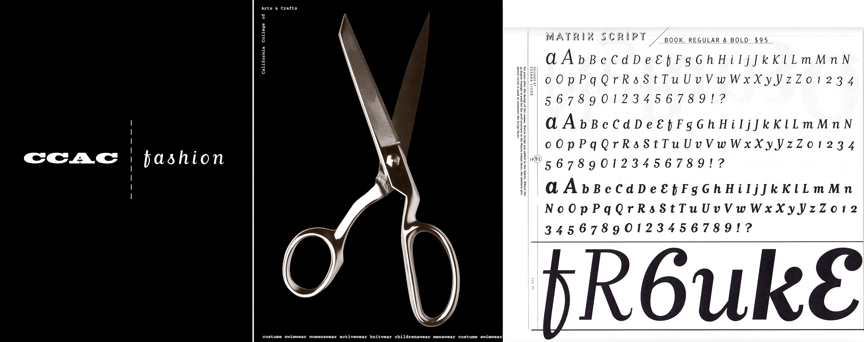
Another eccentric Emigre typeface, Matrix Script, makes an appearance in an invitation for the new fashion department at California College of Arts and Crafts. On one side is an image of scissors (for cutting both fabric and opening ribbons), and on the other side: just two words separated by a stitched line. When type has this much personality it can carry all the visual interest, allowing the overall design to stay minimal.
2. Capitalize on distinctive characters.
As an extension of the first technique, Morla often turns to a simple type-picking trick: look for unusual lettershapes that can drive the design concept. Typography isn’t always about semantic communication. Once you have a typeface that represents a visual identity, you can use single letters or simple type treatments to send the intended message. Typefaces with occasional idiosyncrasies can also lend moments of novelty to an otherwise straightforward page. For Levi’s Red Catalog, Morla deployed Bell Gothic. As an American workhorse, the type served the brand well. It’s also a sans serif with an unexpected twist: a seriffed capital ‘I’, a feature originally included in Bell Gothic to improve legibility at small sizes, but Morla took advantage of it in a display setting.
3. Illustrate with type.
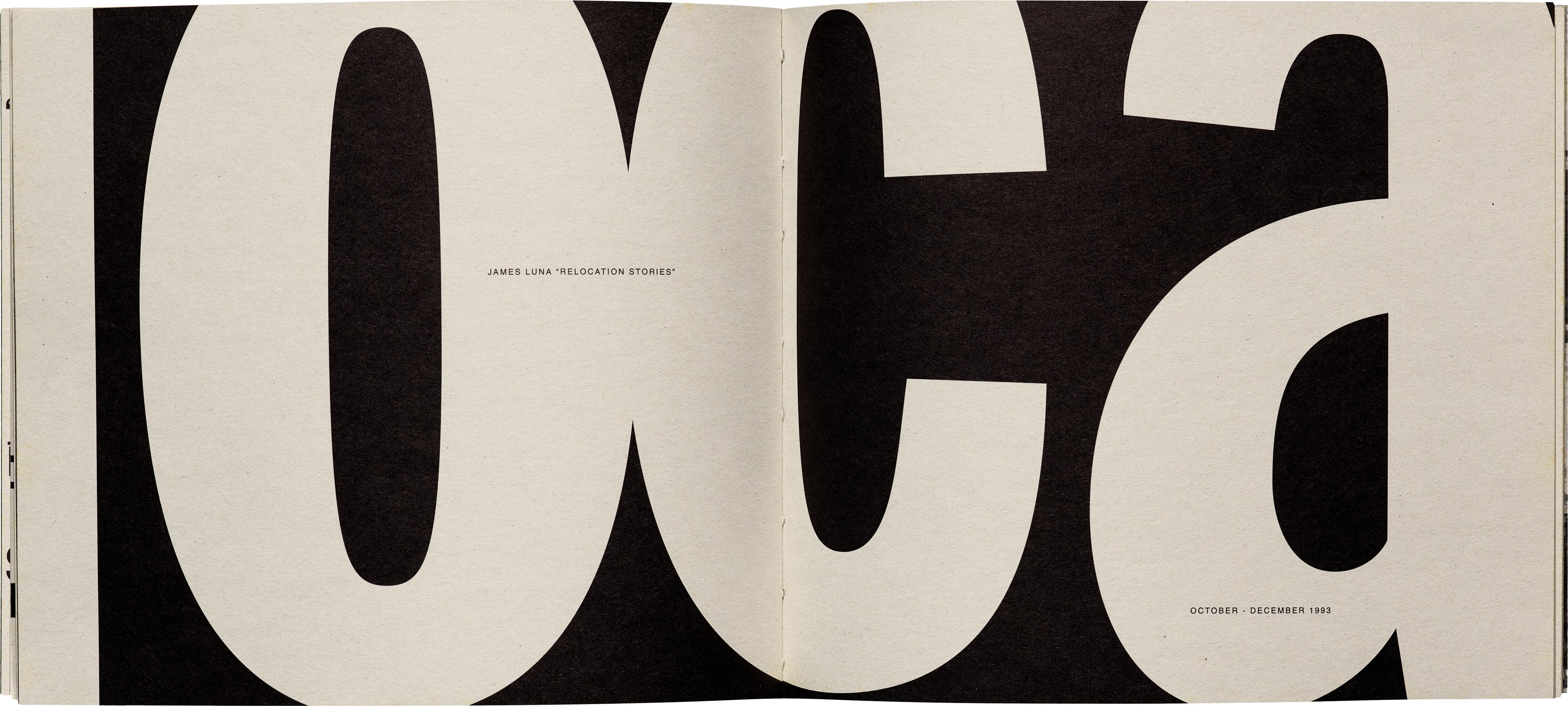
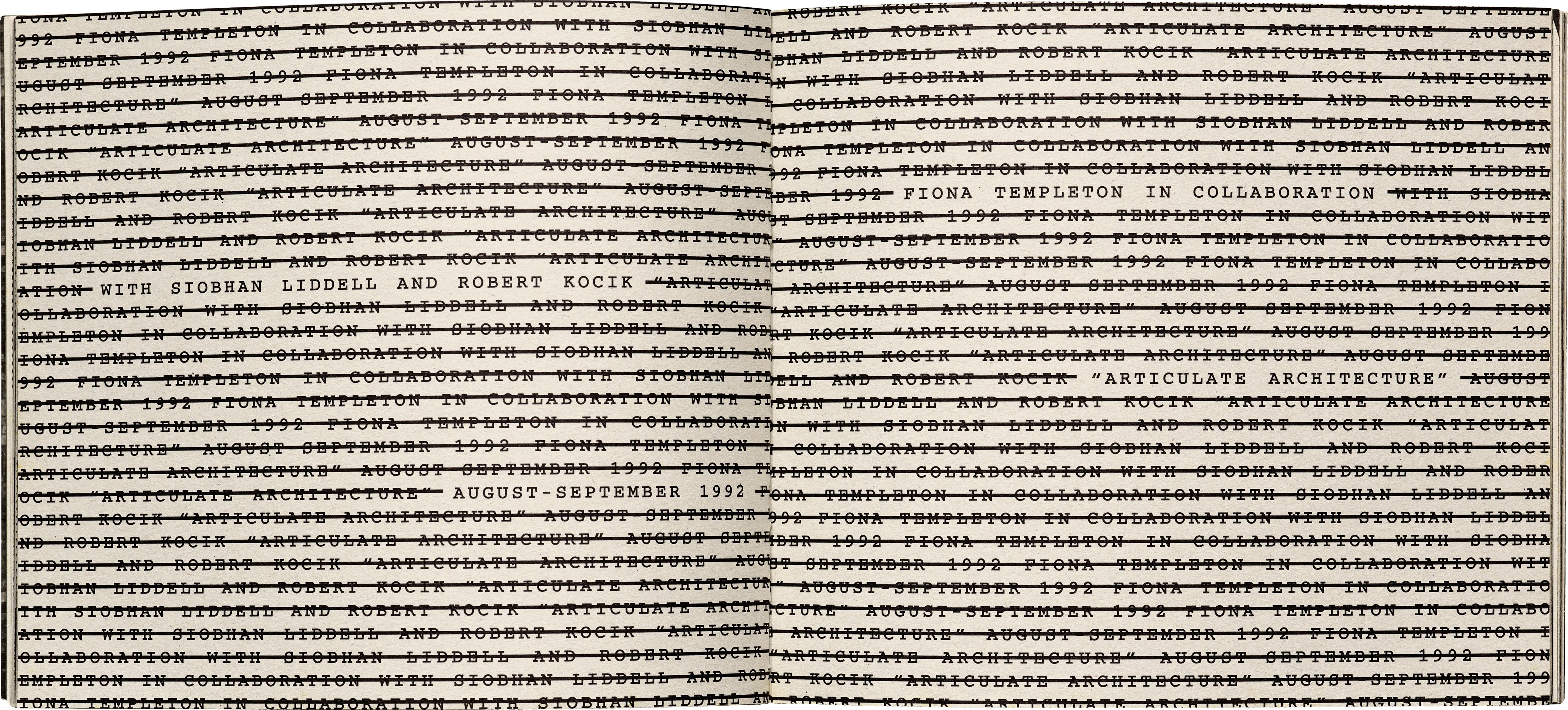
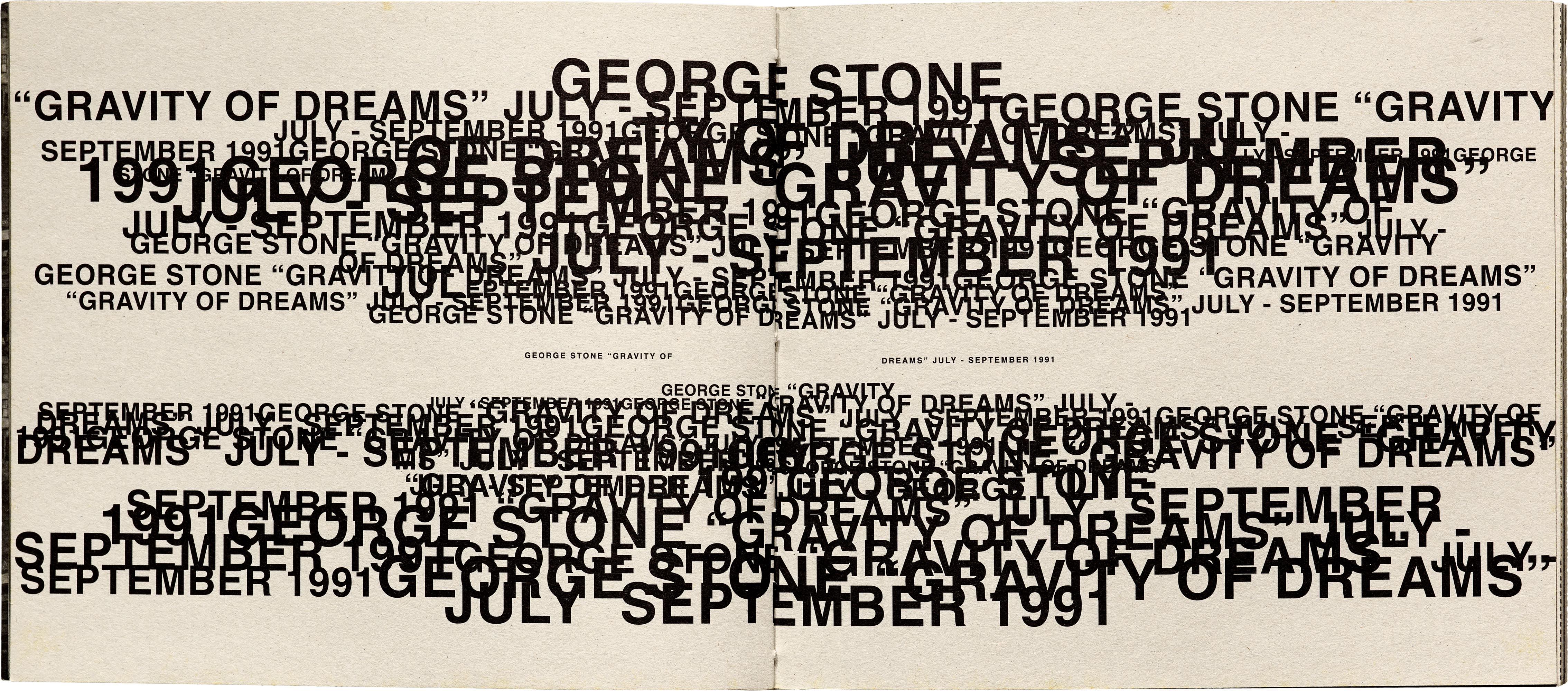
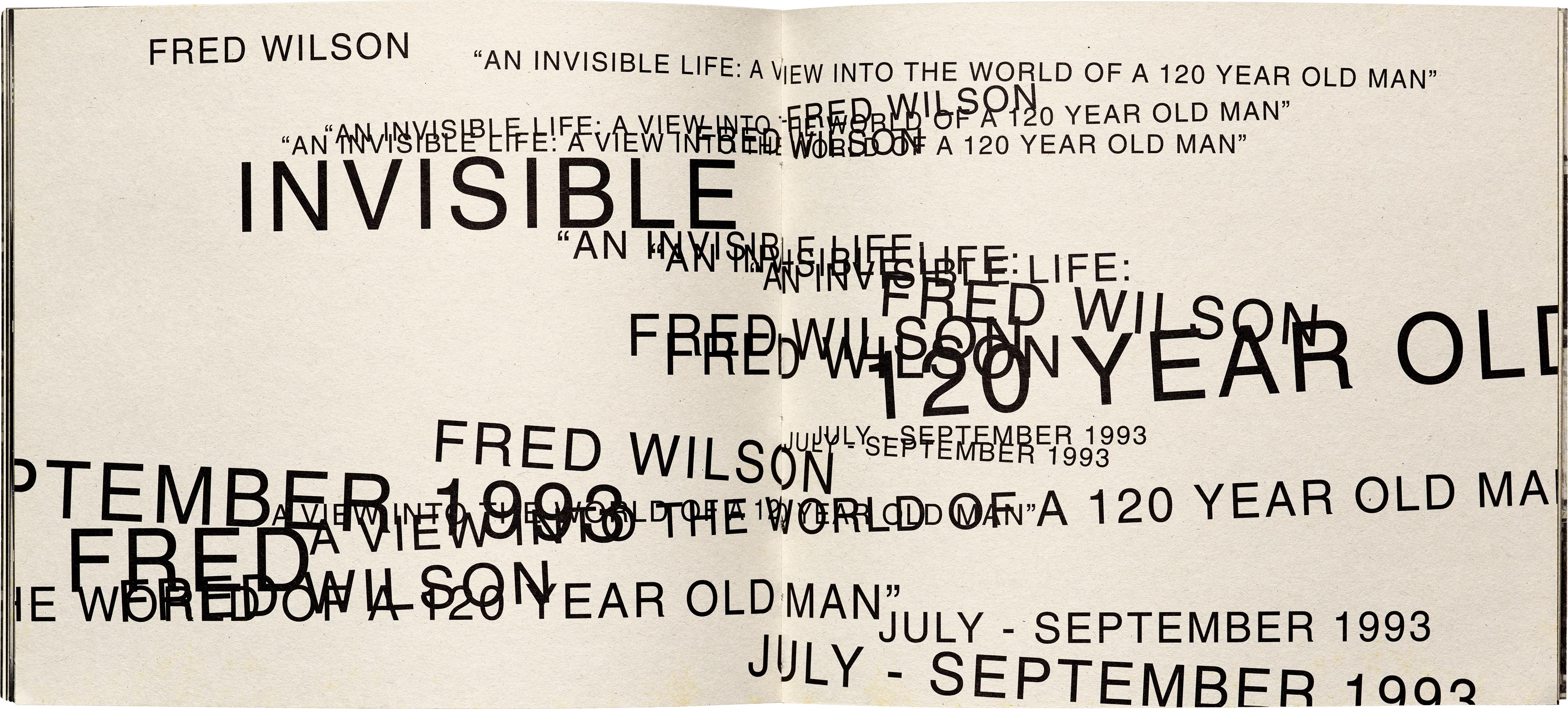
Expressive typefaces can take the place of imagery, and be just as powerful. Still, you don’t always have to rely on the type design itself. Morla has shown how plainspoken typefaces can have a role in illustrative typesetting. A captivating example of this is her 1993 catalog for Capp Street Project, a residency dedicated solely to the creation and presentation of art installations. Rather than depicting images of the art or the space, Morla opted for type-only spreads referencing each artist’s work. Through the use of clustering, layering, strike-outs, and dramatic scale, everyday faces like Helvetica, Courier, and Franklin Gothic are just the right brushes for these typographic paintings. This solution also solved for the project’s minimal budget – with no money for photos, color, or fancy printing, typography represented the art in an inexpensive and thought-provoking way.
4. Avoid stereotypes. Know your history.
Once you get it out of your system in design school, or your first few projects, one learns to avoid typographic clichés. A corrolary: Sometimes the most effective choice is the opposite of what is obvious. Don’t underestimate the element of surprise.
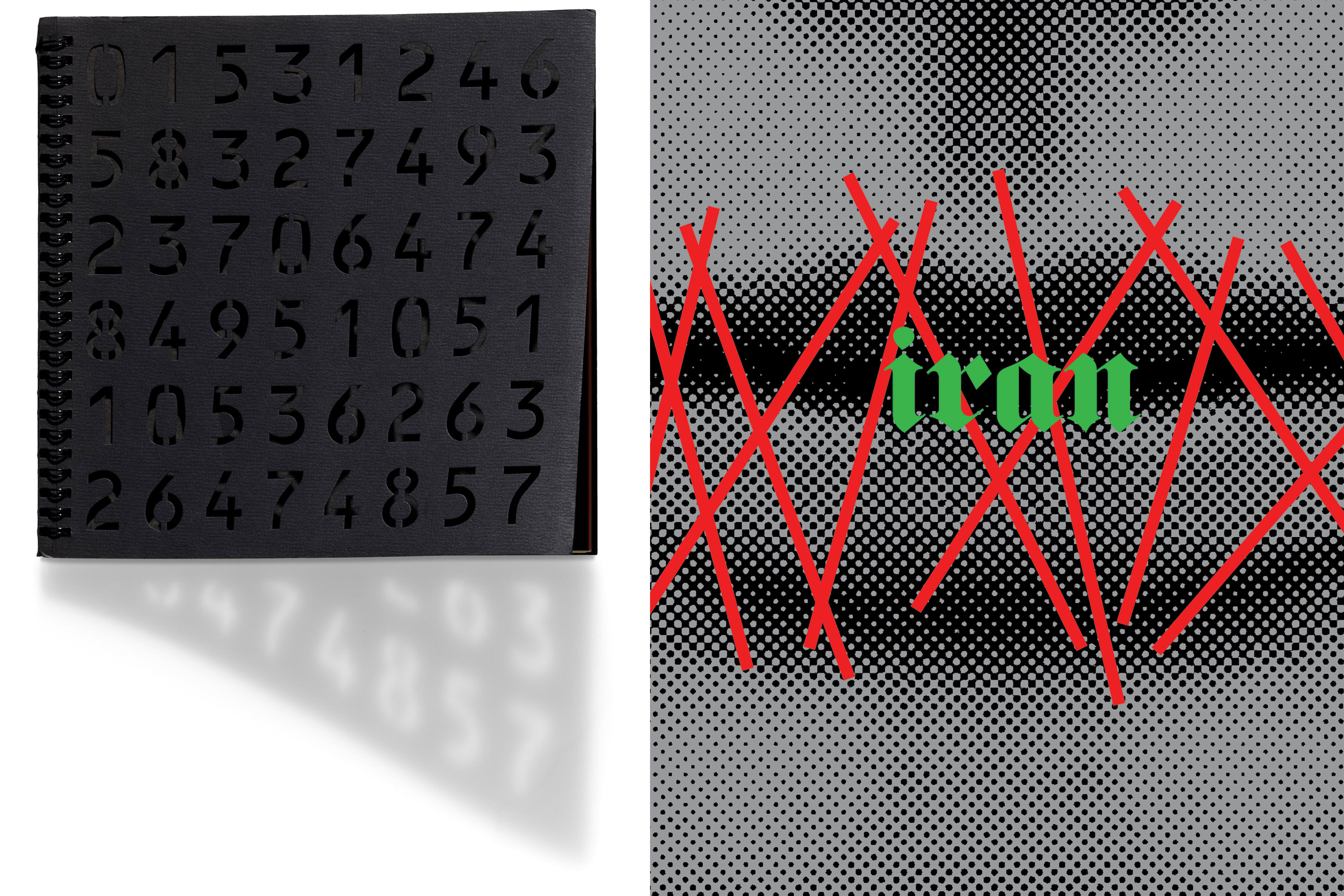
That said, it pays off to know a typeface’s origin and understand the cultural context in which it was created. Subtle references to a font’s original purpose can pay dividends in understated designs. For San Francisco Airport’s 1993 annual report, Morla referenced financial numbers in a tactile way by creating a stencil version of the typeface OCR-B and die-cutting it into the cover. The reader doesn’t need to know the technical roots of Adrian Frutiger’s computer-readable typeface, but data is quietly apparent in its appearance.
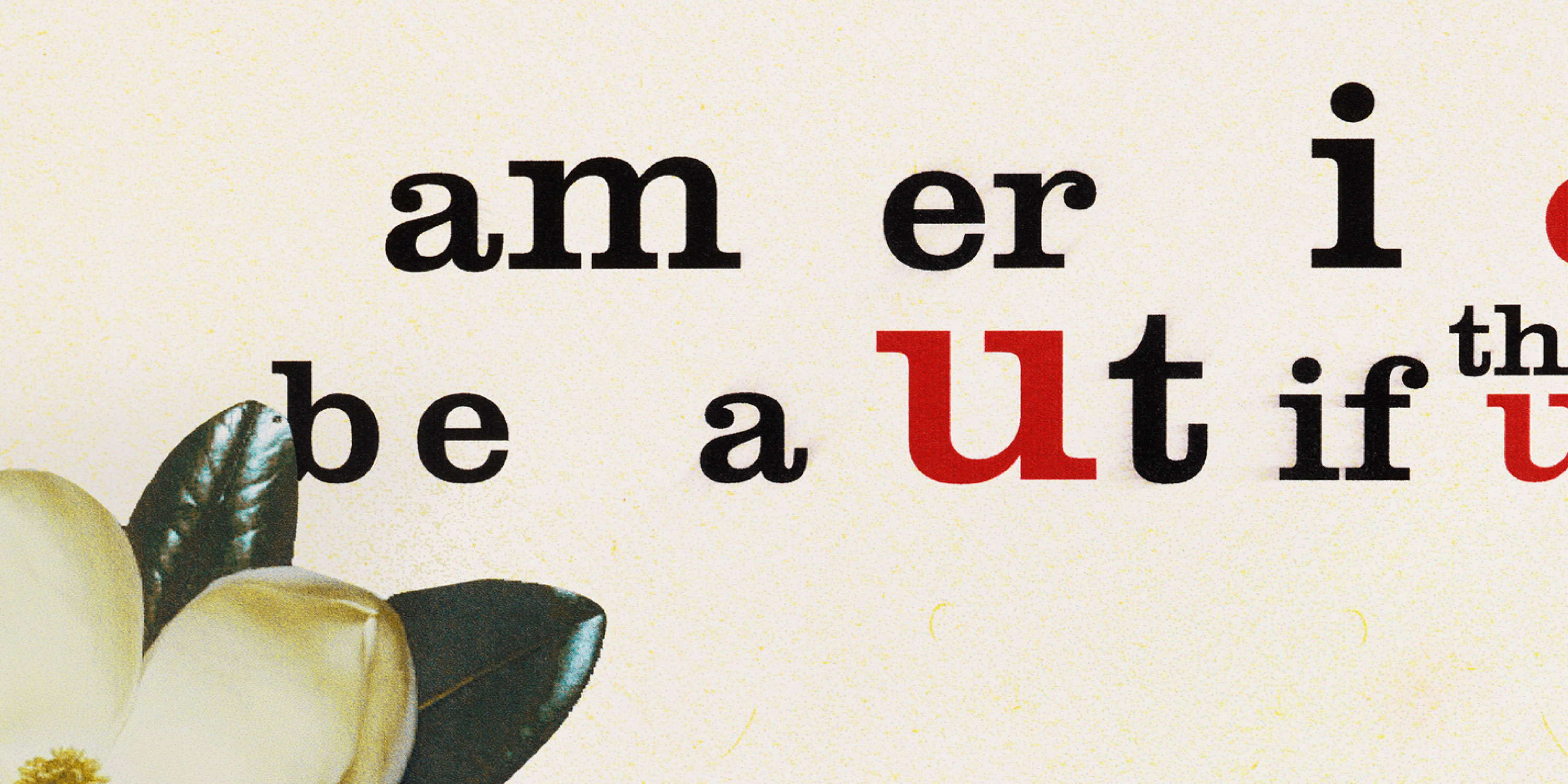
In 2009, Morla designed a poster in response to the Iranian freedom of speech protests and the radical curtailing of women’s rights. A woman’s mouth is stitched shut, referencing the silencing of women and alluding to the skewed election results. The typeface, Fette Fraktur, is a provocative choice. Blackletter has very little to do with Iran, but it conjures memories of another totalitarian regime.
5. Embrace constraints.
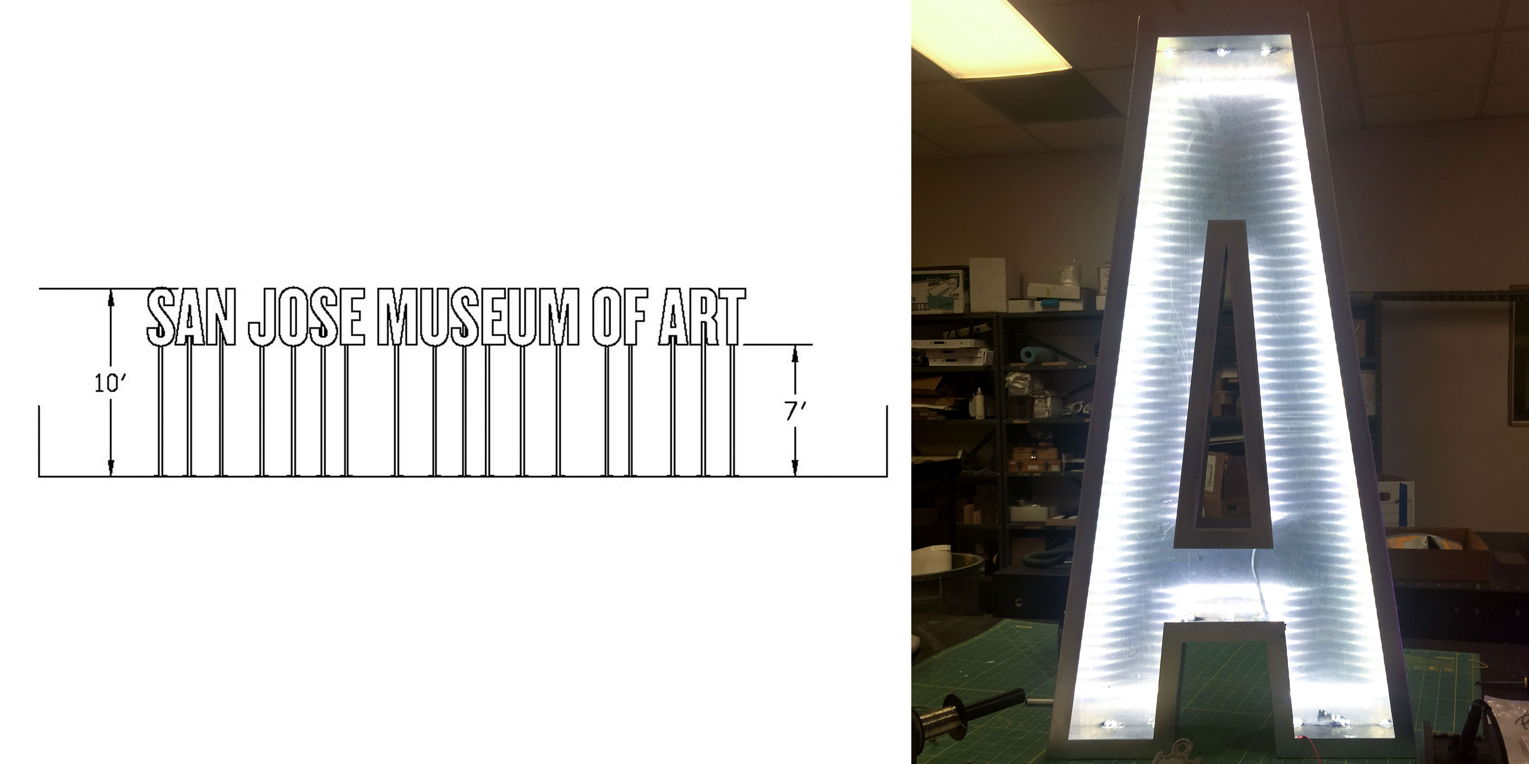
Like so much of design, constraints can give you the answers. Let limitations on space, legibility, cost, or materials narrow down the options and guide you to typefaces that fit the need. A very recent example of responding to physical constraints is Morla’s upcoming signage for the San Jose Museum of Art. The production requires type that is narrow enough to fit a long name on the building exterior. The letters also need a reasonably bold and consistent stroke weight to accommodate even and effective interior lighting. Knockout provided just the right proportions and weight to give the museum a striking entrance.
6. Sometimes type isn’t the answer.
The advantage of a font is that the type designer has done a lot of the work for you – the prefab forms are already designed to work as a system. But there are projects that require a more customized approach. Letters that are drawn or written by hand allow more flexibility of implementation.
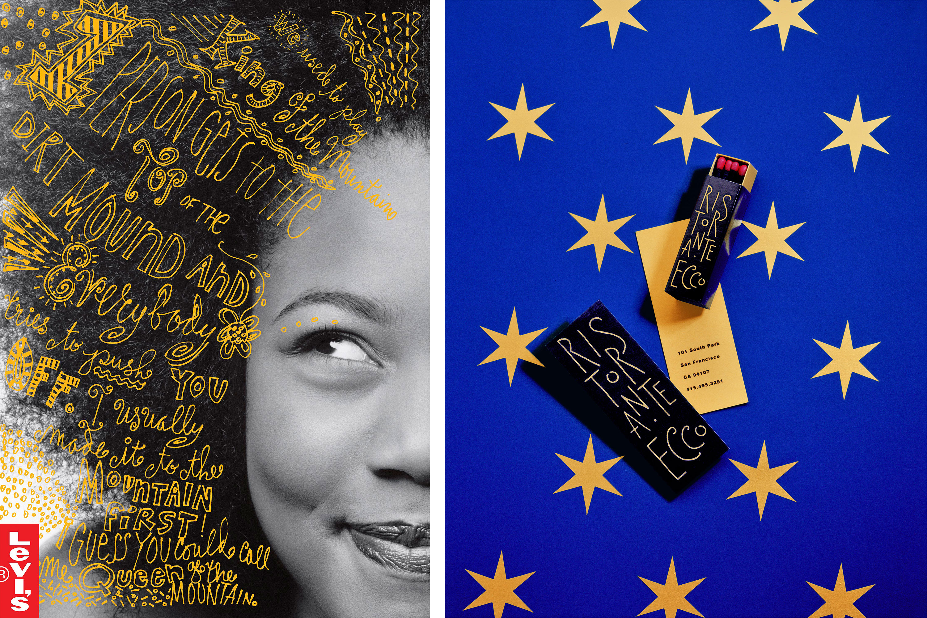
Lettering can also lend warmth, informality, and humanity to a piece. Case in point: When Levi’s wanted to reach out to young women, Morla used her “three-ring binder lettering”, reminiscent of school notebook doodles, to tell a more authentic story of empowerment. She also went to hand-lettering for the identity of Ristorante Ecco, reflecting a casual ambiance and Italian cuisine.
You can see much more of Morla’s work — and the stories behind it — in Morla : Design, a dynamic and essential monograph that spans her 40-year career. Help us make this project happen!