What happens after graduating from Letterform Archive’s type design program? Eight grads talk about how they’ve used their newfound skills.
As Type West’s class of 2025 rolls into its final term, we’re marking a major milestone: after this year, more than 200 students (including Type@Cooper West classes of 2017 and 2018) residing in 22 countries will have graduated from the yearlong certificate program.
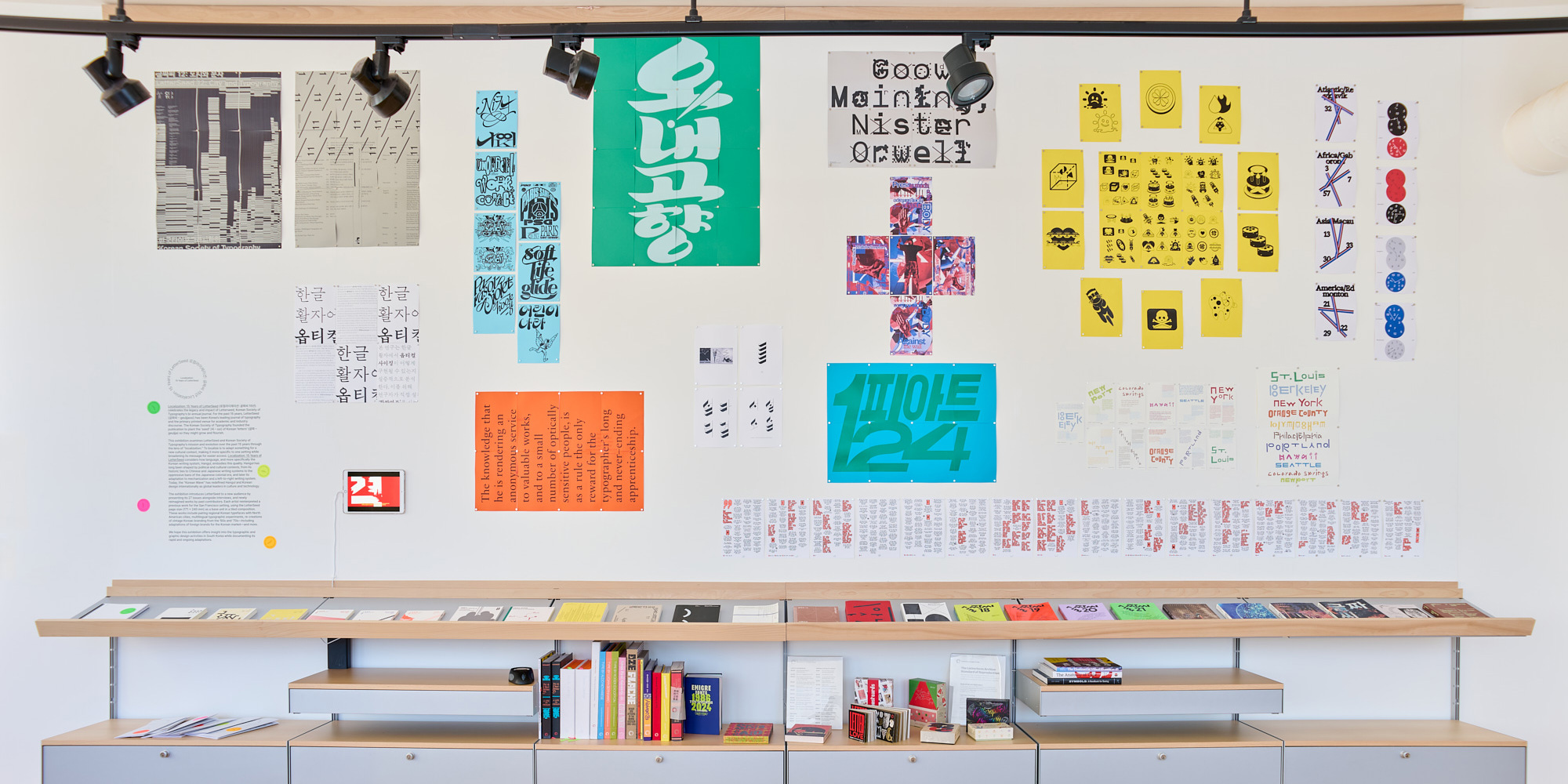
Our new pop-up exhibition celebrates LetterSeed, the seminal journal of Korean typography. Curators Chris Hamamoto, Su Hyun Leem, and Jeewoon Jung tell us how it reinvigorated the Hangul script.
Exhibition photo by Glen Cheriton
Letterform Archive’s reading room now serves as a display case for small, short-run exhibitions. Our third show, Localization: 15 Years of LetterSeed, opened this week and runs through the fall. It explores the rich typographic landscape of Korean typography and specifically Hangul, the unique writing system of the Korean language, through the lens of a single publication, LetterSeed, which has been published by the Korean Typographic Society since 2010.
We’re partnering with Stanford to keep languages alive through type design education.
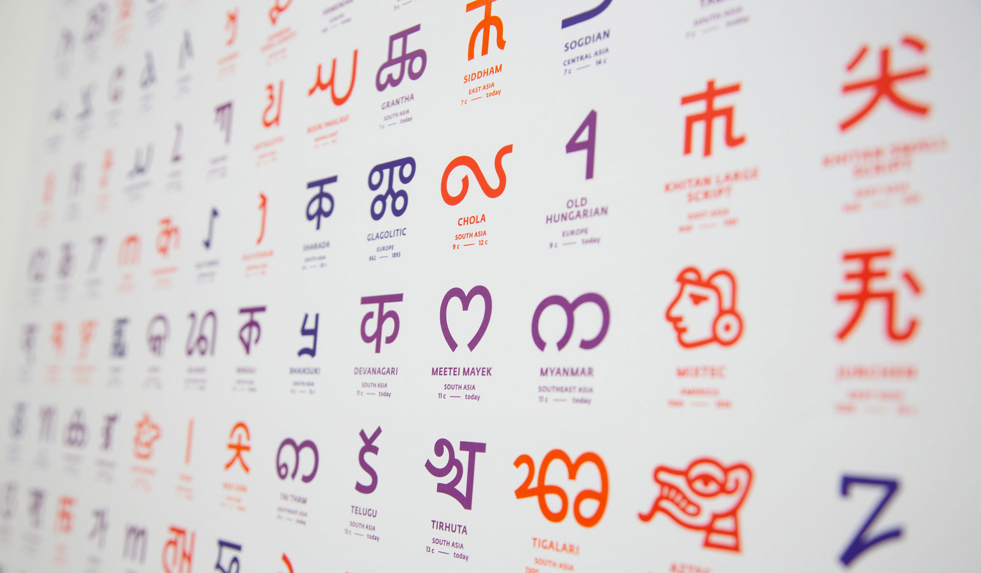
Detail from an early version of The World’s Writing Systems Poster which presents one typographic reference glyph for all 293 known writing systems in the world, living or historical. See the latest version.
Many of the world’s languages are under-supported by digital typography. A crucial step toward change is inclusive type design education that meets the next generation of font makers where they are.
Letterform Archive is thrilled to announce its participation in the Knuth-Bigelow Type Design Incubator (KBI), a new educational partnership with SILICON, Stanford University’s initiative to advance digital inclusion and protect lower-resourced languages from extinction. Stanford Professor Thomas Mullaney, co-director of SILICON, is the driving force behind this effort to support digitally-disadvantaged languages. The inaugural five-week course was developed jointly by Lisa Huang from Words of Type, and Grendl Löfkvist and Angela Riechers from the Archive.
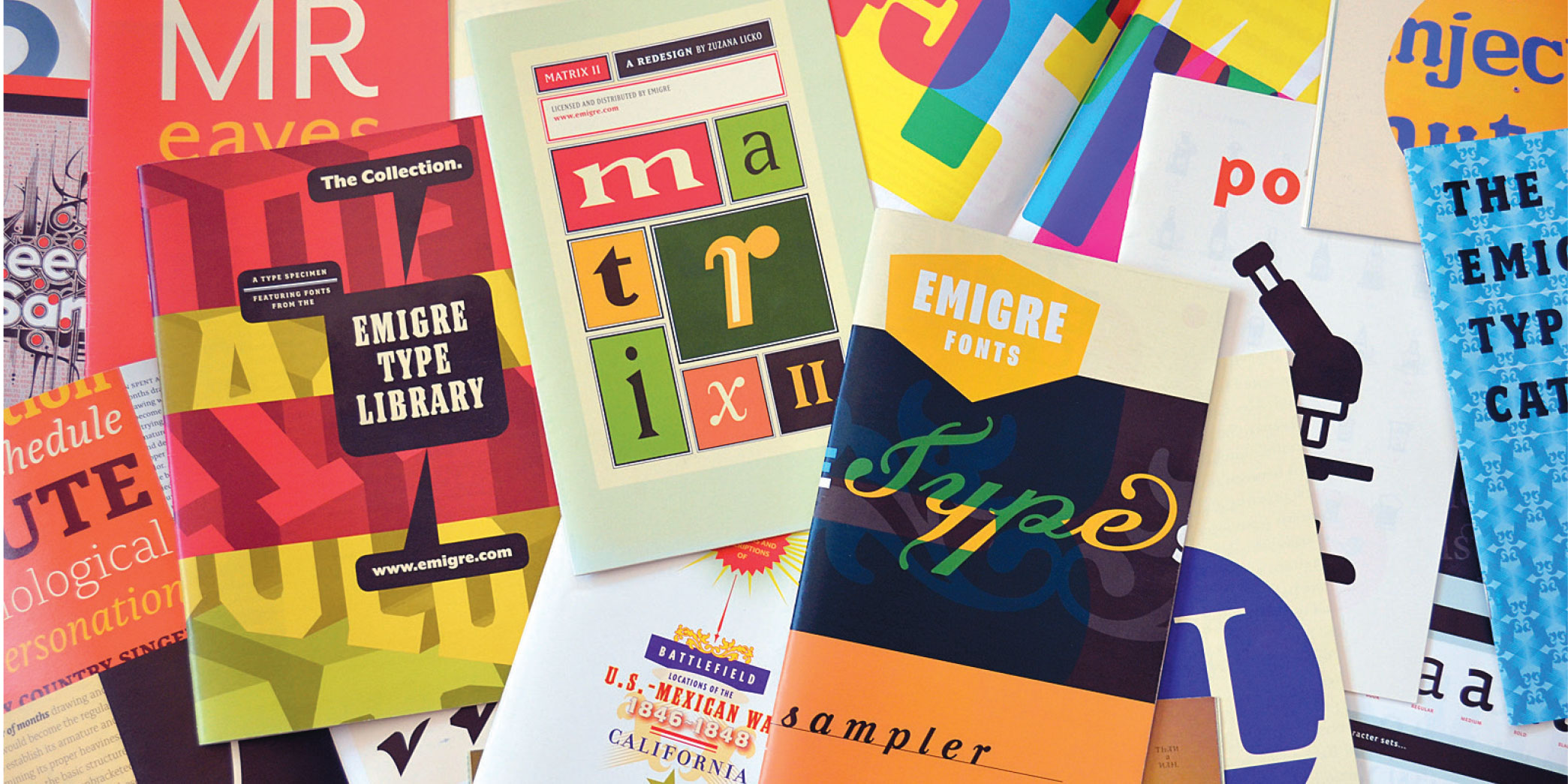
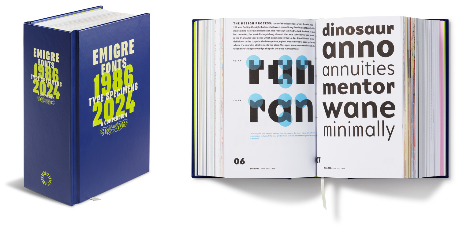
With cutting-edge fonts based on the bitmap as well as digital revivals that transcended the screen, Emigre Fonts pioneered type design in the early days of the pixel. But it was their formidable commitment to print that documented—and helped affirm—their contributions to twentieth-century visual culture.
Since opening in 2015, Letterform Archive has grown from a 15,000-item private collection, to a publicly accessible resource of over 100,000 objects. The works of lettering, typography, and graphic design span movements and continents, but what ties everything together is text, the essential material of culture. This common thread lets anyone—from type nerds to poets, coders to cooks—have an entry point into the collection. Our dedication to radical access has made the Archive a thriving community hub, welcoming thousands of visitors from more than 40 countries, and offering an unparalleled opportunity to engage directly with masterpieces of design.
With 40 complete type specimens packed into 5 pounds, this compendium documents the output of one of the earliest (and most prolific) digital type foundries. Here’s a peek at the book’s foreword.
When Rudy VanderLans and Zuzana Licko donated the Emigre papers to Letterform Archive not long after we opened our doors in 2015, we were spoiled for all collections to follow.
It wasn’t just that their archive was rich with material that defined an important era in design—one in which the new digital tools of the 1980s and ’90s created a surge in independent publishing and type design, with VanderLans and Licko’s innovative Emigre magazine and digital foundry at the forefront.
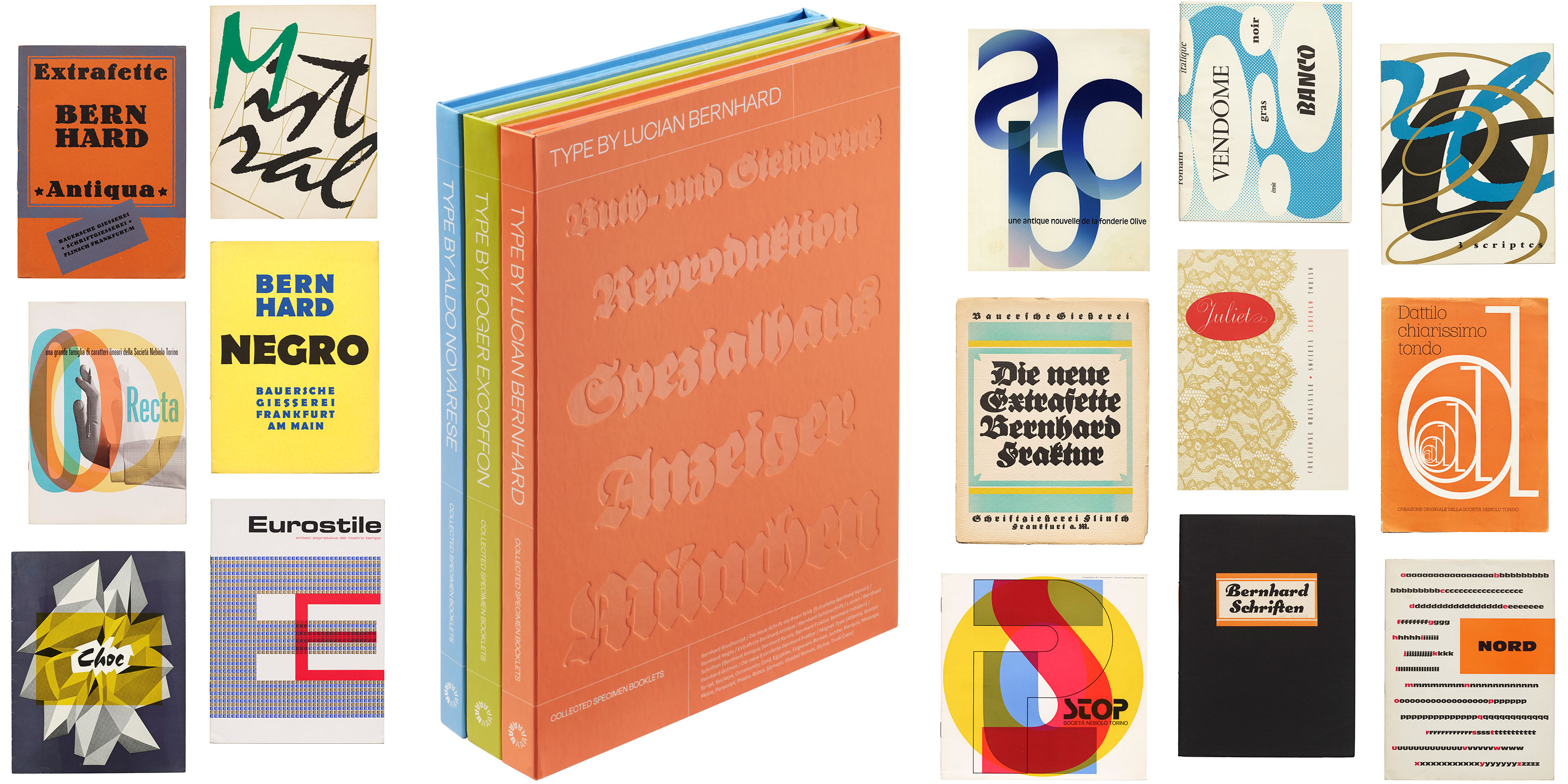
Three volumes of rare specimen facsimiles lift the curtain on twentieth-century type, gathering essential documents of trendsetting faces as they were first meant to be seen.
The first volumes of the Type By series with covers of select specimens reproduced inside.