We presented two dozen lectures and salons in 2024, both online and onsite at the Archive. Unless you’re our biggest fans (thank you!), you likely didn’t get to catch them all. So, here are a few videos that are worth some of your holiday downtime, from insightful looks at design history to new approaches that will exercise your typographic eye.
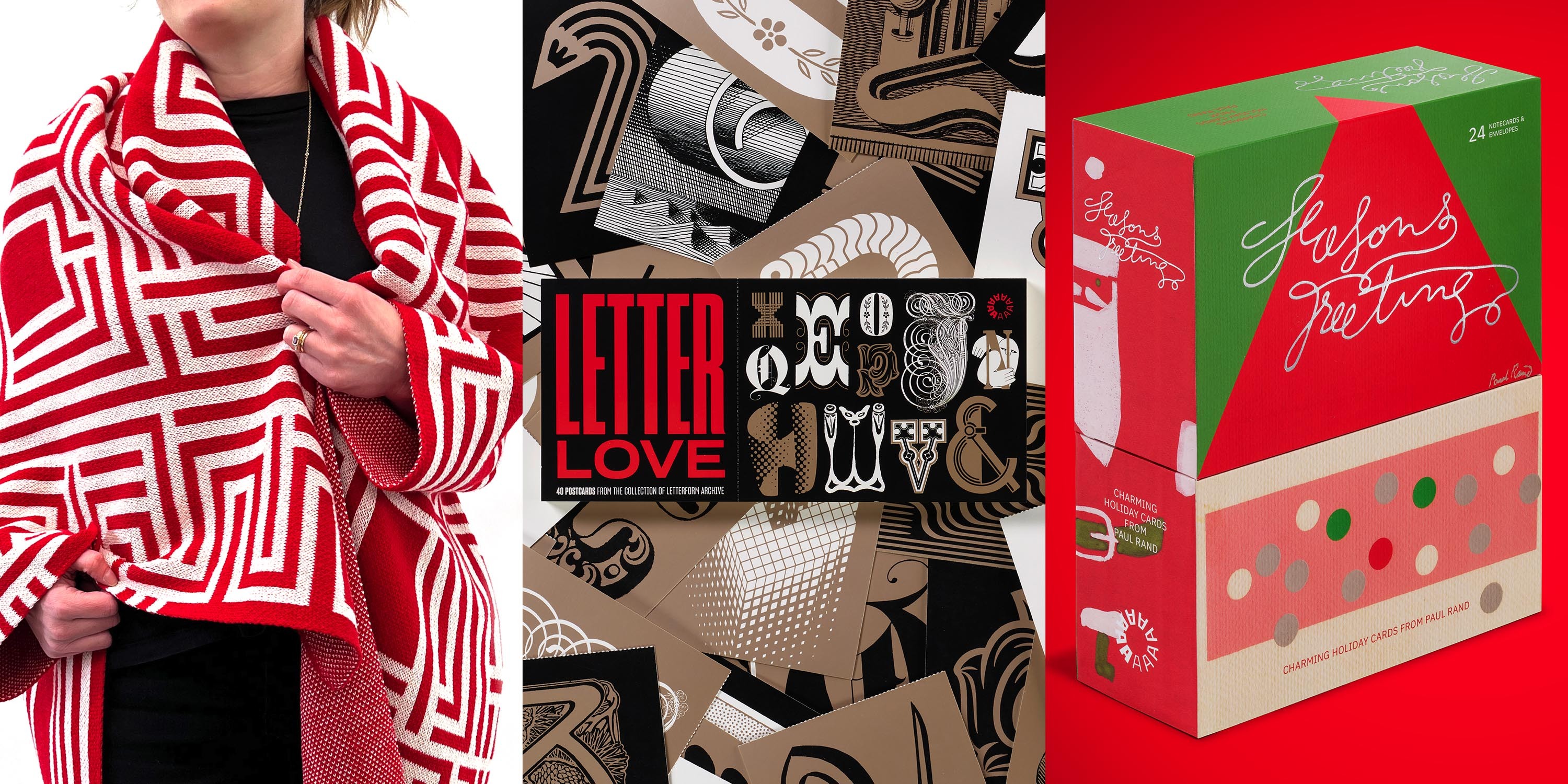
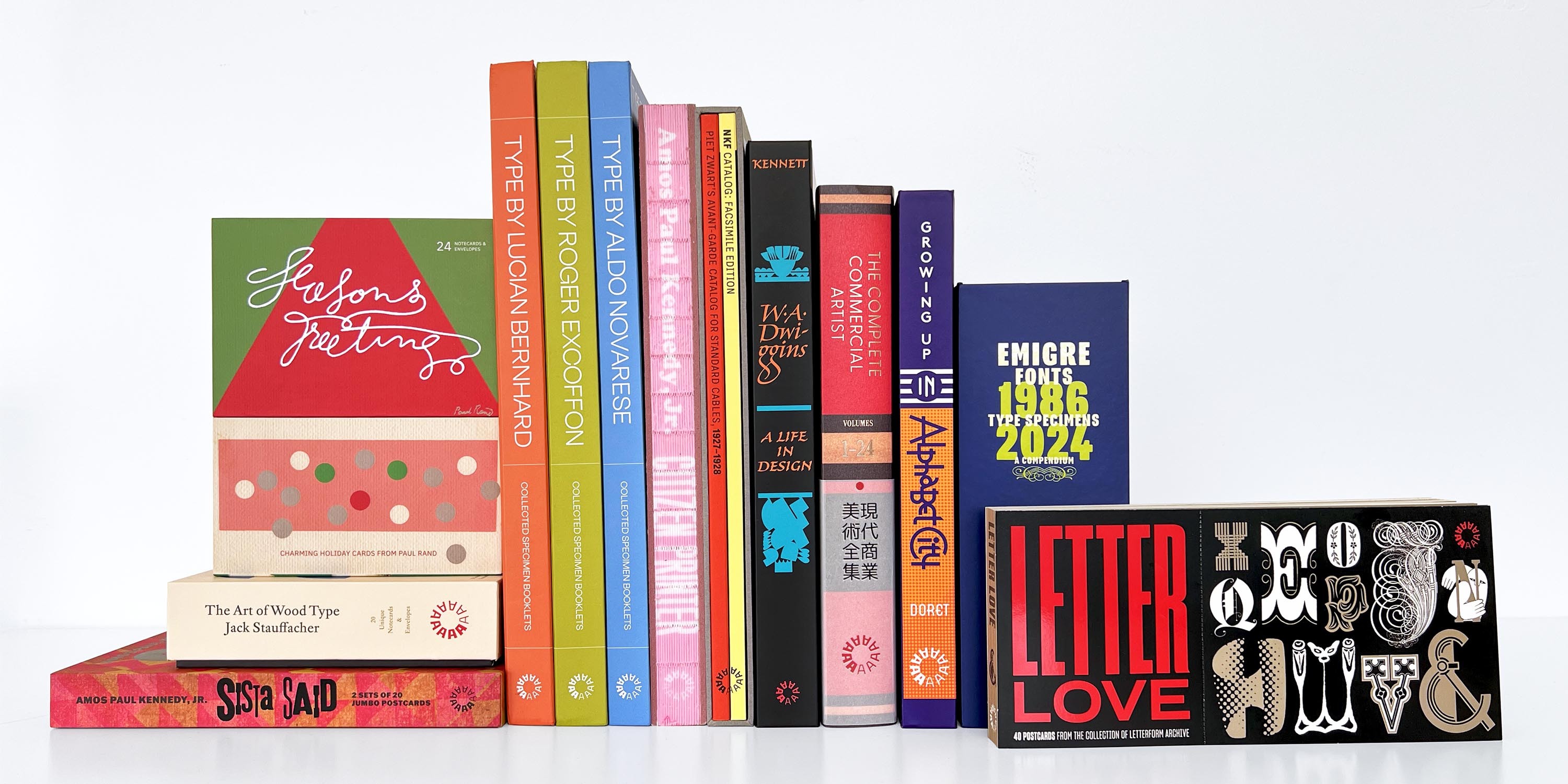
Got a discerning designer on your shopping list? We asked our team for their favorite gift ideas from the Archive.
This holiday season, Letterform Archive staff members bring you their favorite gift ideas from our shop. From letterpress postcards printed by hand to colorful design books and cozy, type-forward blankets, we’ve got unique ideas for every type and design lover on your list.
Every purchase you make helps support the Archive’s education, exhibition, and preservation programs. Dive into our favorites and find something for everyone you love.
Order your gifts now! Thursday, December 19 at midnight is the last day for delivery by December 24.
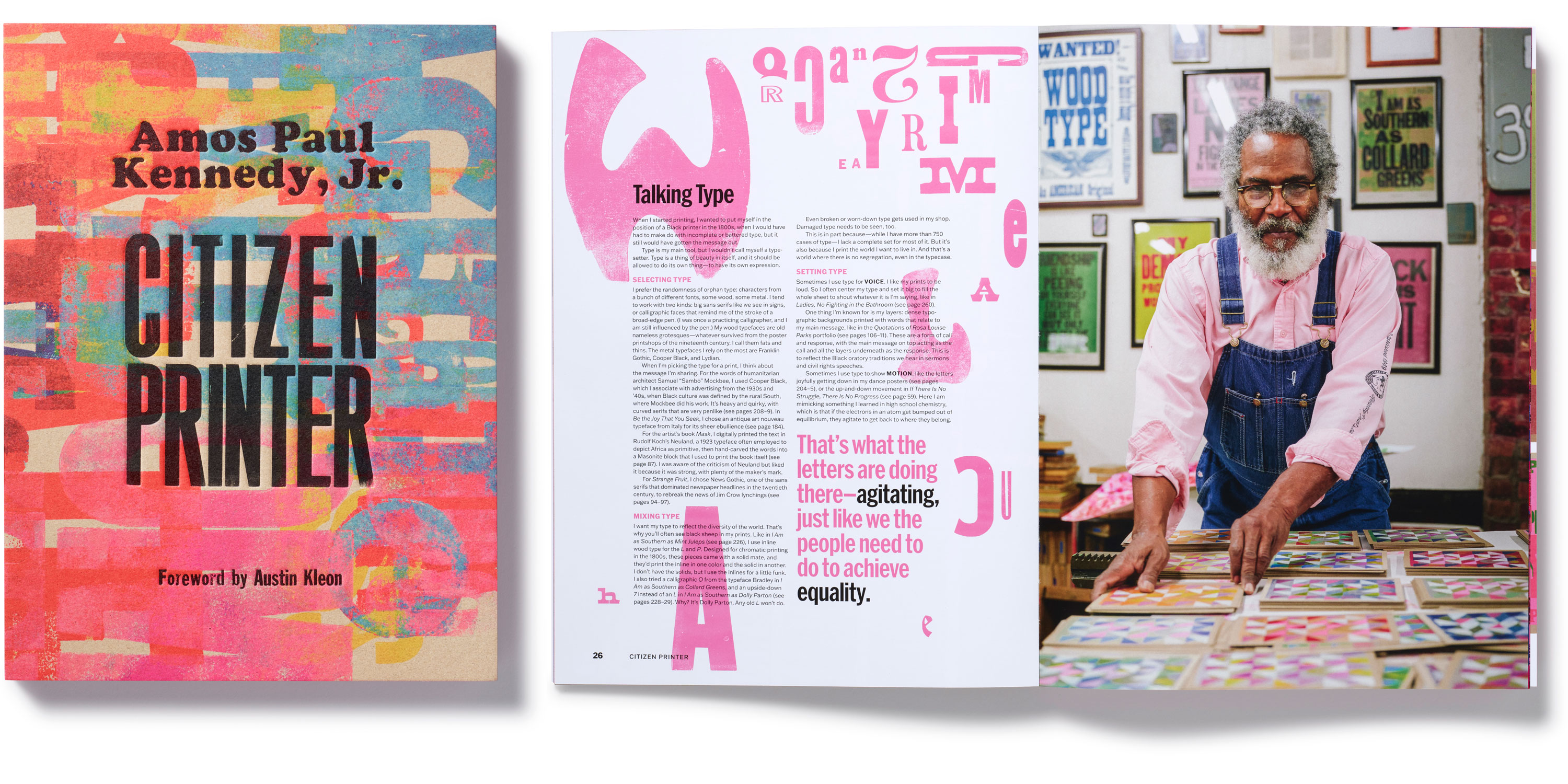
Letterform Archive’s monograph of Amos Paul Kennedy, Jr., packs a lifetime of letterpress achievement into an ecstatic meditation on the power of print.
I do not want to put blackface on so-called “fine printing.” I want to print negro. To use printing to express negro culture. To do to printing what the blues and spirituals did to music.
So begins Amos Paul Kennedy, Jr.’s Citizen Printer, a compendium of works spanning the 35-year career of a storied letterpress printer and righteous maker whose practice demands justice while delivering joy.
In 800 full-color reproductions, divided into chapters on social justice, shared wisdom, and community, Citizen Printer immerses readers in Kennedy’s bold and colorful output. Armed with salvaged ink and type, the self-described “humble negro printer” layers his audacious calls to action over dense typographic or geometric backgrounds. Sourced from civil rights activists across U.S. history, ranging from Frederick Douglass and Sojourner Truth to Malcolm X and Rosa Parks, Kennedy’s chosen messages revive the ongoing fight for abolition and ensure that its lessons still reverberate today.
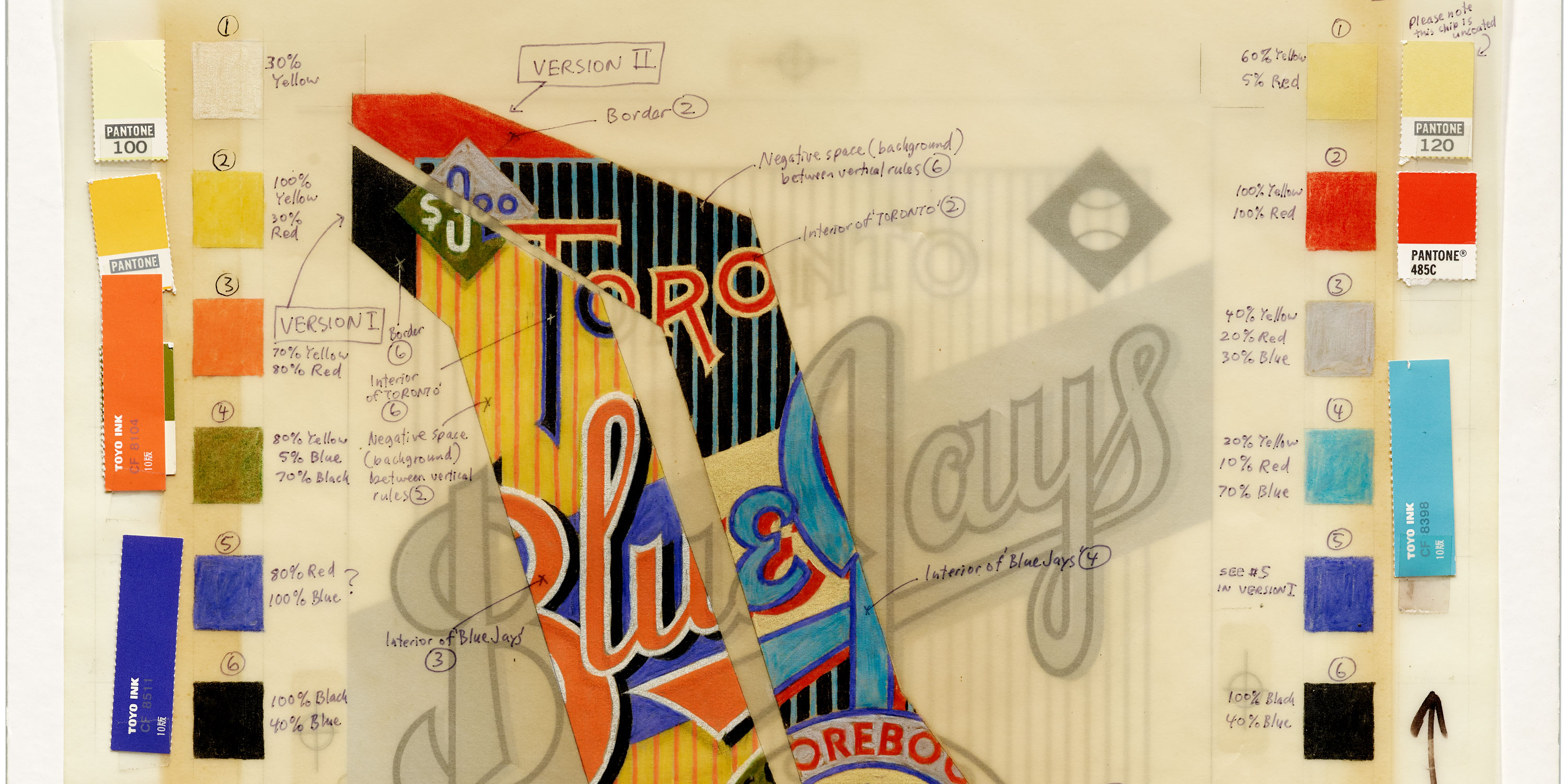
Our latest book gives designers a seldom-seen peek into the studio of a lettering master, where logos, posters, and signs are drawn by hand.
Mechanical for Toronto Blue Jays Scorebook Magazine, 1987. See more.
At Letterform Archive we’re always looking for stuff that shows the way a designer thinks, and reveals how their work was made. People visit us not just to see final works on paper — books, ephemera, posters — but also to see all the other artifacts produced along the way to the final piece, including sketches, proofs, and variations that never made it to print. That’s why we were so thrilled in 2018 to accept a donation from Michael Doret that includes about half of his working archive. (The other half went to the Herb Lubalin Study Center at The Cooper Union in New York where he got his start.)
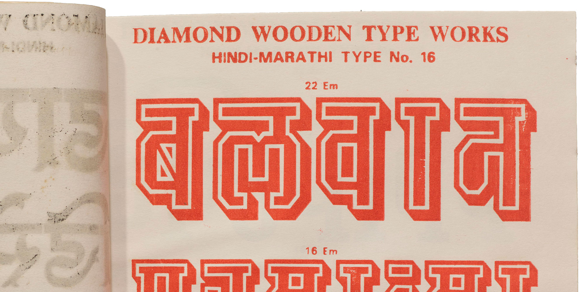
An untitled catalog and some tiny wood blocks from India invite us to rewrite type history.
In the North Indian city of Meerut, not far from the national capital of New Delhi, there was once a thriving wood type manufacturing scene. The industry there continued to operate much later than in other parts of the world, churning out letter blocks until the turn of the millennium, and contributing significantly to letterpress printing in the region and beyond.