News
Coming Soon: The Richard Sheaff Ephemera Collection
Nineteenth-century printed ephemera brought color and design innovation to the masses. Thousands of fine examples of this blossoming graphic design will join the Archive.
The first artists and printers to call themselves “designers” advertised their work in the mid- to late nineteenth century. This period of the industrial revolution marked a peak of experimentation and extravagance in the trade, when printed ephemera flourished to meet the demands of expanding commerce and increasingly urban populations. Engravers, lithographers, and letterpress printers used a wide variety of opulent colors, lettering styles and typefaces, illustration techniques, and production methods to attract customers—both companies and consumers. They added dazzle and vibrancy to the stuff of everyday life: advertising, calling cards, invoices, labels, packaging, postcards, and tickets.
Up to that point, most people experienced printed material that was relatively dull, drab, and monochrome. Innovation in technology and craft changed everything. It was as if someone switched on the light.
Richard Sheaff’s personal collection of this material was one of the finest in private hands. Now, thanks in part to a generous donation from Sheaff, over 26,000 items of ephemera will find a home at Letterform Archive. In terms of quantity and inspiration potential, it will be our most significant new collection since Tholenaar’s type specimens arrived in 2015.
Sheaff began collecting at the age of seven or eight. First, it was postage stamps, then antique objects, like glass bottles and furniture. Eventually he began to notice the paper associated with antiques—photographer’s marks on the back of vintage photos, trade cards with interesting graphics—and ephemera became his main focus.
As a practicing designer, Sheaff was directly inspired by the collection. In his decades-long career in philatelic design, Sheaff art-directed or designed over 500 issued stamps for the U.S. Postal Service. He jokes that he holds the record for creating the most stamps using items from his own home. Whether it was his 2006 Benjamin Franklin series, or a booklet featuring flag ephemera, printing history has always had a strong influence on his work.
Sheaff is not alone, and notes that many designers, including Yale’s Bradbury Thompson, looked to the past to create something entirely new. “Brad was doing very exciting, modern work in the 1940s and 1950s while using Baskerville’s type from the 1800s,” Sheaff said in a phone interview, reminding us also that fashions change, and certain periods of design suddenly become relevant again. “There are movements, for example the Bauhaus, which disdained what was dubbed as superfluous, such as overly decorative Victorian flourishes. Yet in recent years, young designers are saying, ‘Hey, wait a minute, they’ve been telling us to be Swiss, to be clean and pure, to always use a grid. But this earlier way of looking at design is in fact really interesting!’ And so there’s been an explosion of wonderfully elaborate typographic design.”
Immediate past president of The Ephemera Society of America (ESA), and a frequent presenter at its annual conferences, Sheaff has written many pieces about vintage ephemera as primary source information, as well as typographic and graphic inspiration, often tapping his own collection for examples. Here are a few selected articles by Sheaff from his own blog and the ESA:
- Artistic Printing
- Modern Victorian
- Other Times and Other Places
- Stamp Collecting and Collecting Ephemera
- So Much Stuff, So Little Time
- The Stratoliner
- Victorian Imagery
Sheaff looks forward to his collection inspiring future generations through Letterform Archive:
I am really delighted that this collection of pieces found individually over several decades will be made fully available to the public at the Letterform Archive. Every collector eventually must make a choice: Either put everything out on the open market so that other collectors have opportunities to build their own collections; or place it all in an institutional home. The danger with many institutional homes is that the public may have little or no access. Letterform Archive is dedicated to open access.
It seems to me that this collection begins to fill an important need for the Archive. It holds extensive trade catalogs and printers’ specimens from the nineteenth and twentieth centuries, and a great depth of knowledge about typography. For the twentieth century, it holds many, many printed items showing fonts in actual use. It holds examples of letterforms—many hand-drawn—from earlier centuries. But it had held very few examples of the typefaces from nineteenth-century foundry catalogs in actual use. Now, with this collection, it does. And perhaps this donation may inspire other collectors to add to this nucleus.
The period is central to any understanding of the evolution of typography and printing. In 1800, type and printing was being done the same way it had been done for several centuries. By 1900, color printing was ubiquitous and the halftone four-color process was well underway. In between, several technologies came and went (along with thousands of talented craftsmen): copperplate engraving, steel engraving, black-and-white crayon lithography, chromolithography, the replacement of most letterpress printing with lithographic printing, a massive evolution of printing presses throughout the industrial revolution.
“Our goal is to inspire creative people by giving them hands-on access to material that isn’t so common on the internet,” said Rob Saunders, Letterform Archive founder and curator. “This was an exciting period for printing and letterform innovation, and it is increasingly a source of inspiration for today’s designers. We can’t think of a better curated grouping of these gems than Richard Sheaff’s, and we’re honored to be its steward and share it with our global community.”
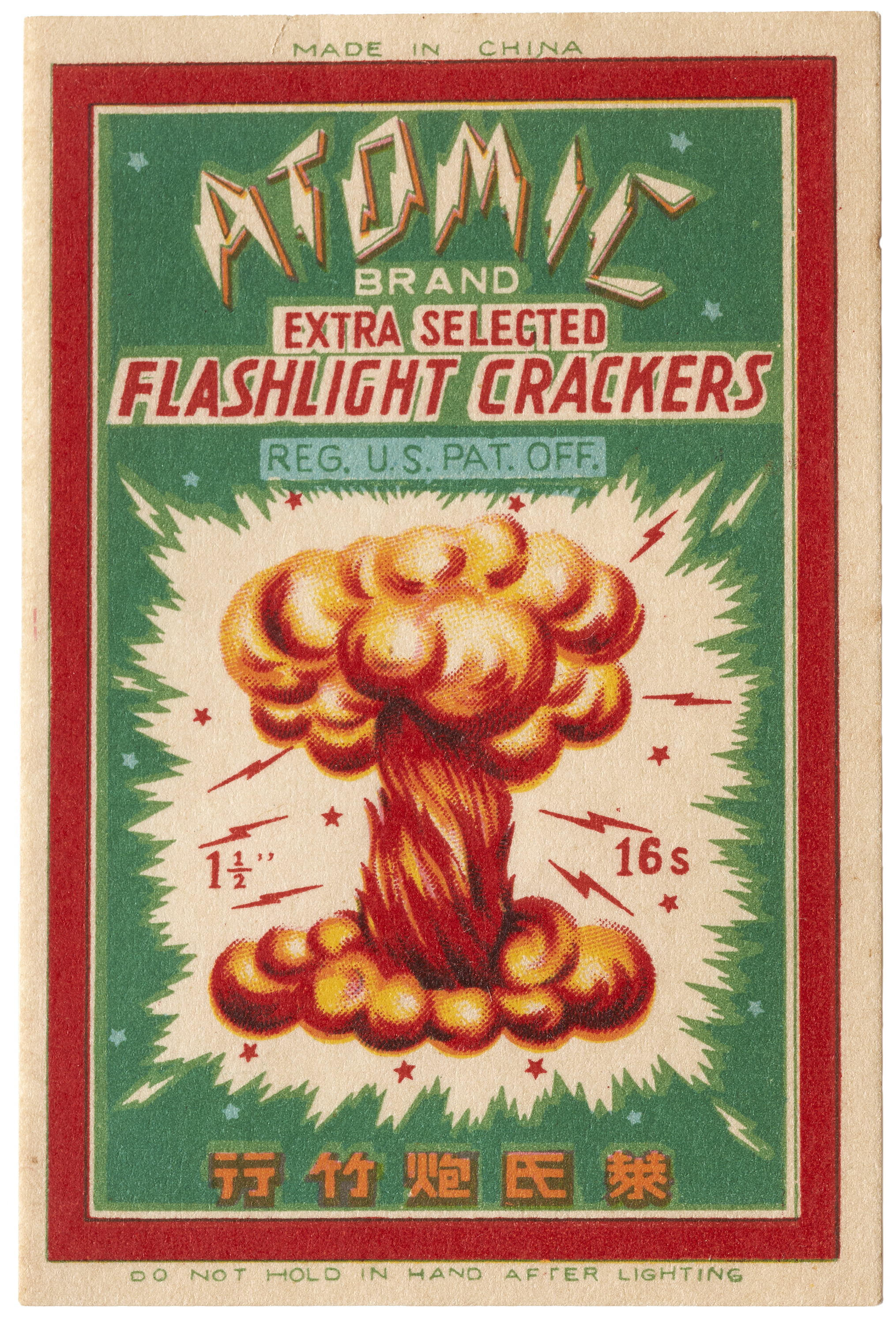
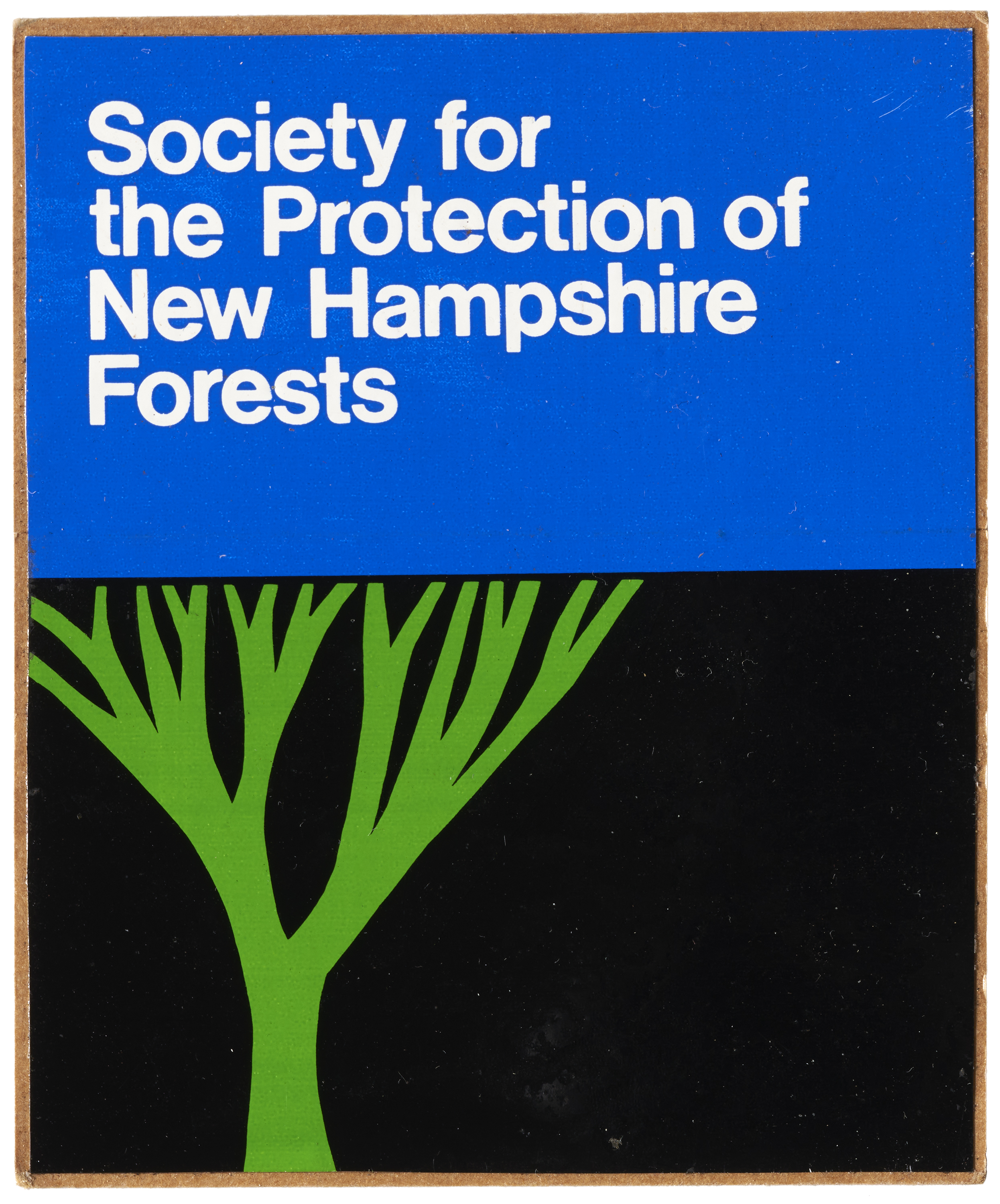
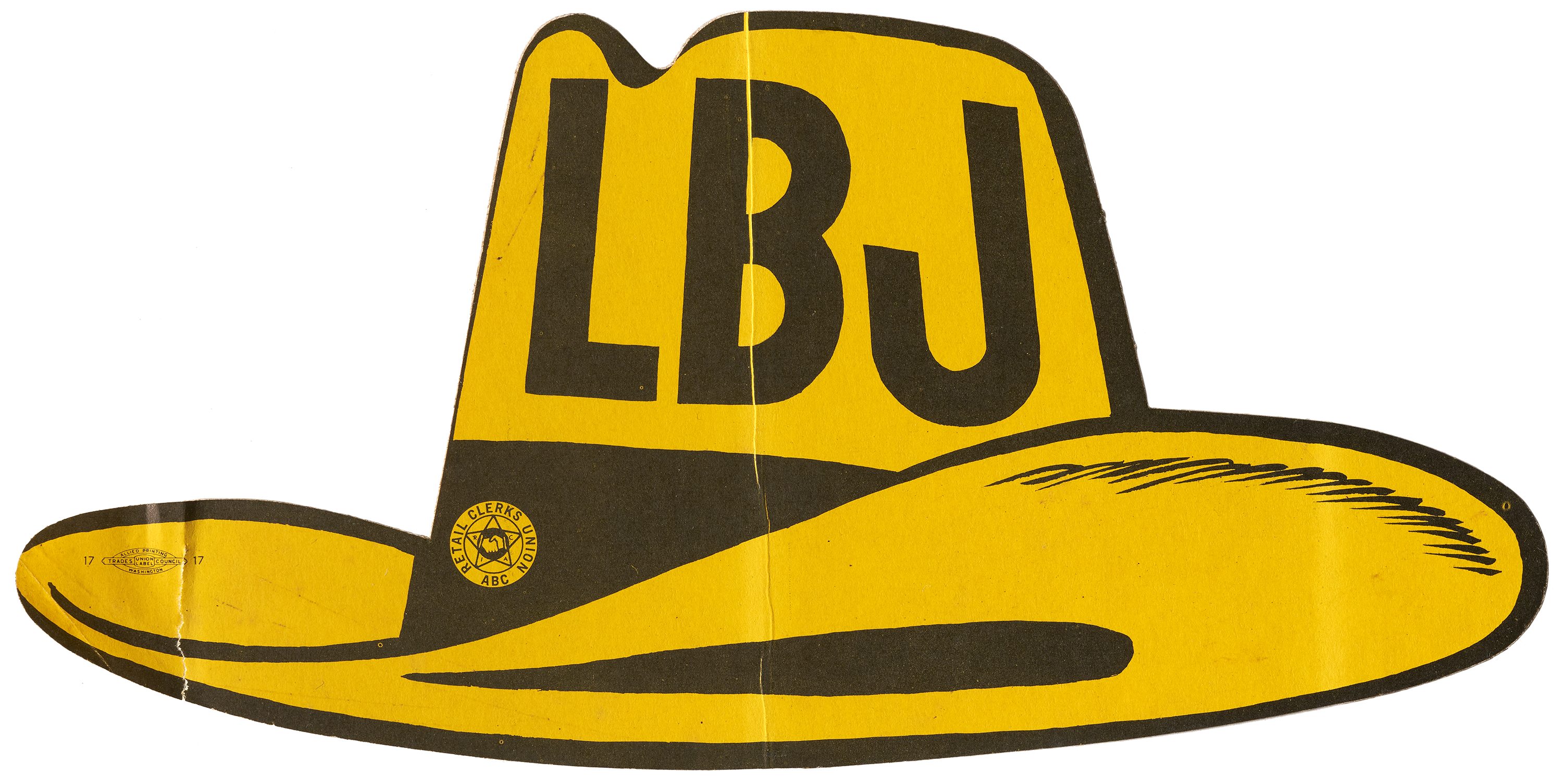
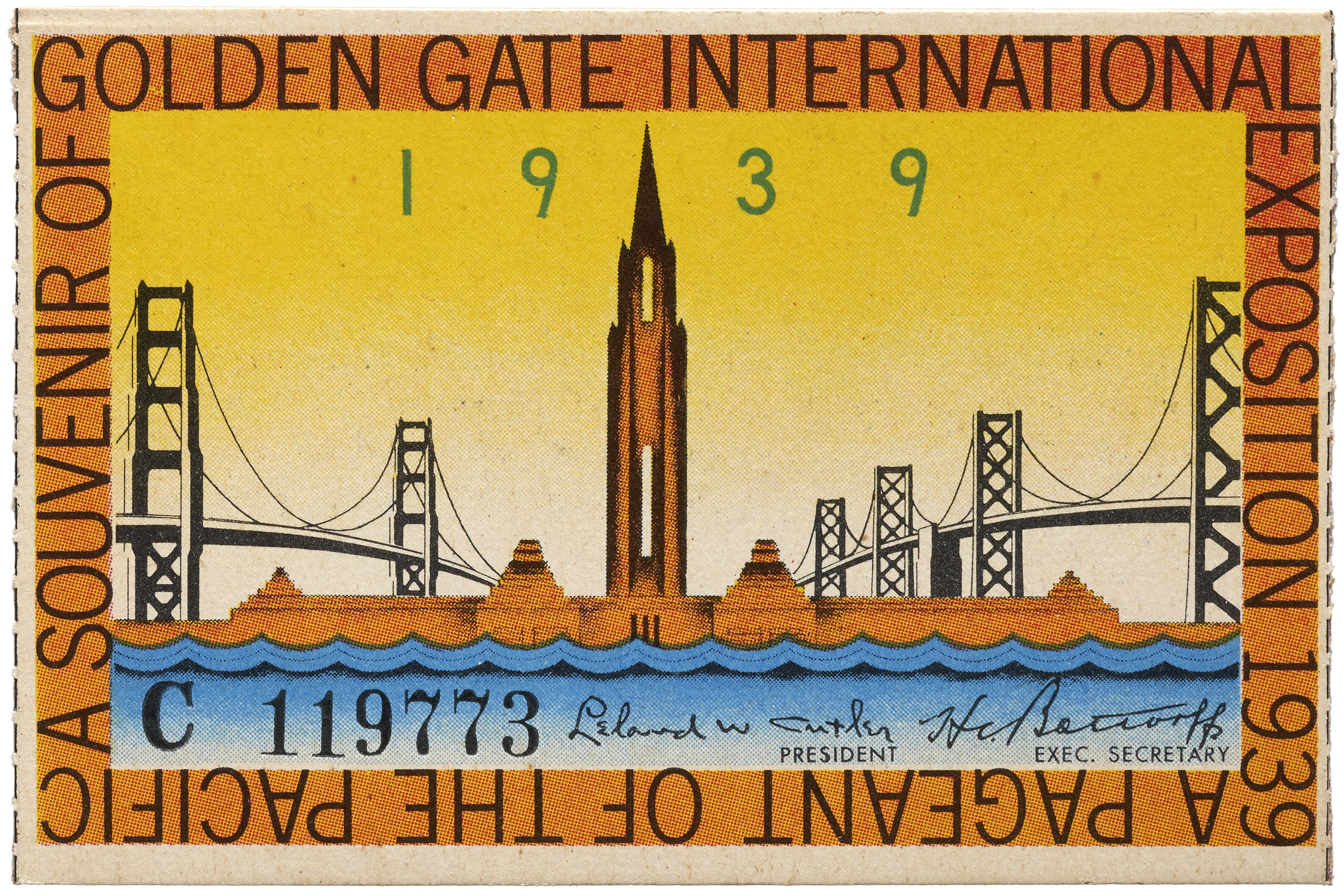
While his collection is particularly strong in nineteenth-century ephemera, it also includes typographically rich material from the twentieth century as well, such as advertising, trade catalogs, car brochures, and Jim Flora-designed record sleeves.
The Archive is hard at work digitizing a large portion of the Sheaff Collection. To date, over 10,000 images of over 7,000 items are photographed. Soon, many of these will be in the Online Archive. In the meantime, below is a preview of what’s to come.
Selections from the Richard Sheaff Ephemera Collection
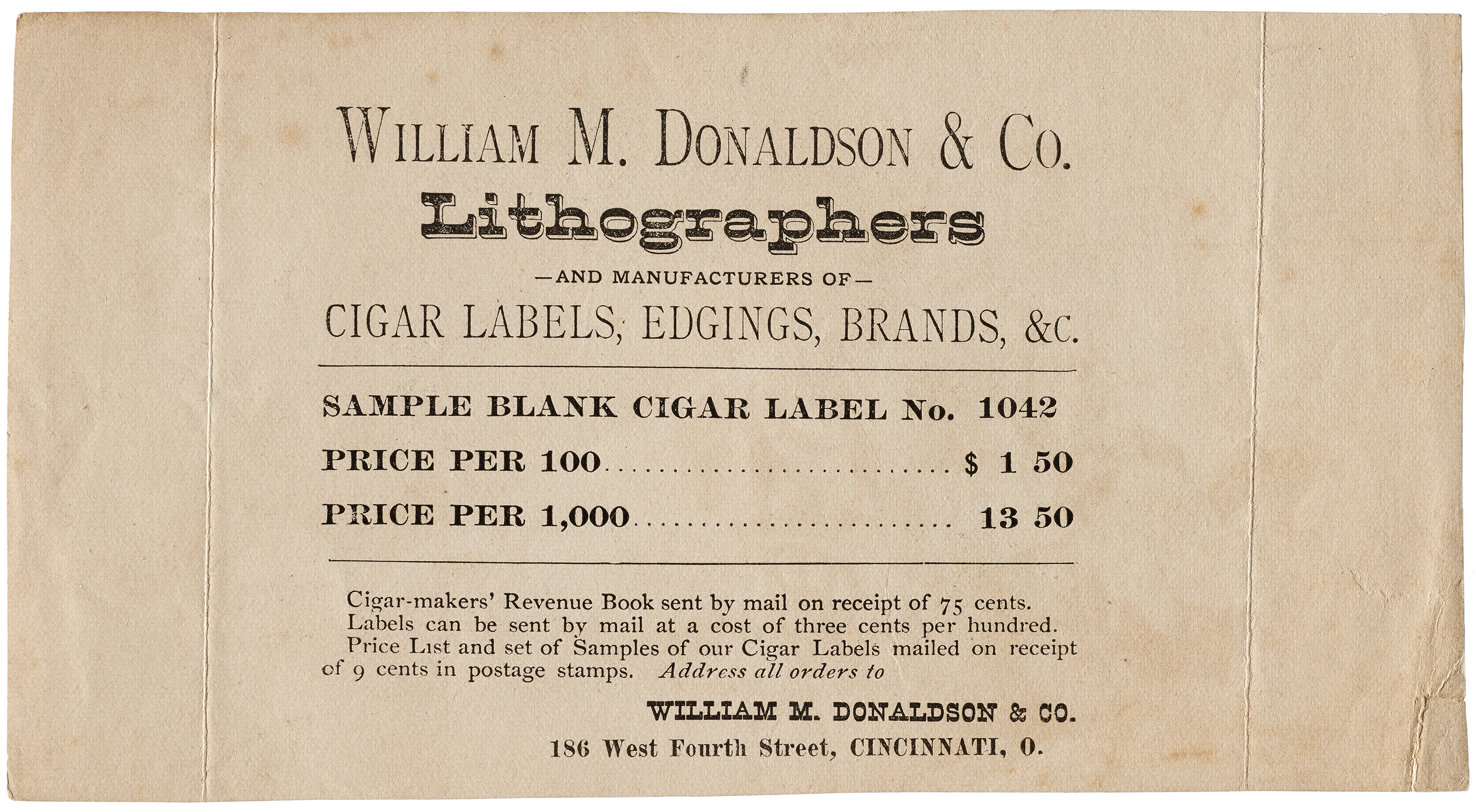
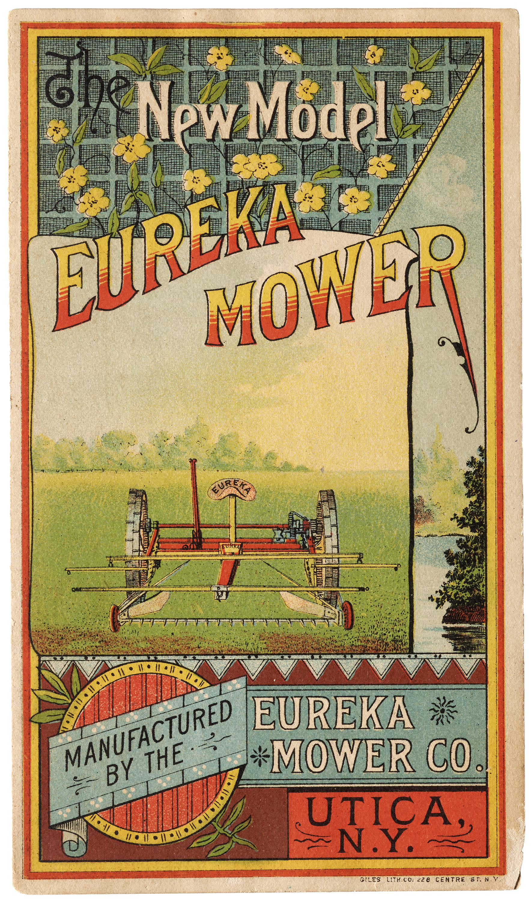
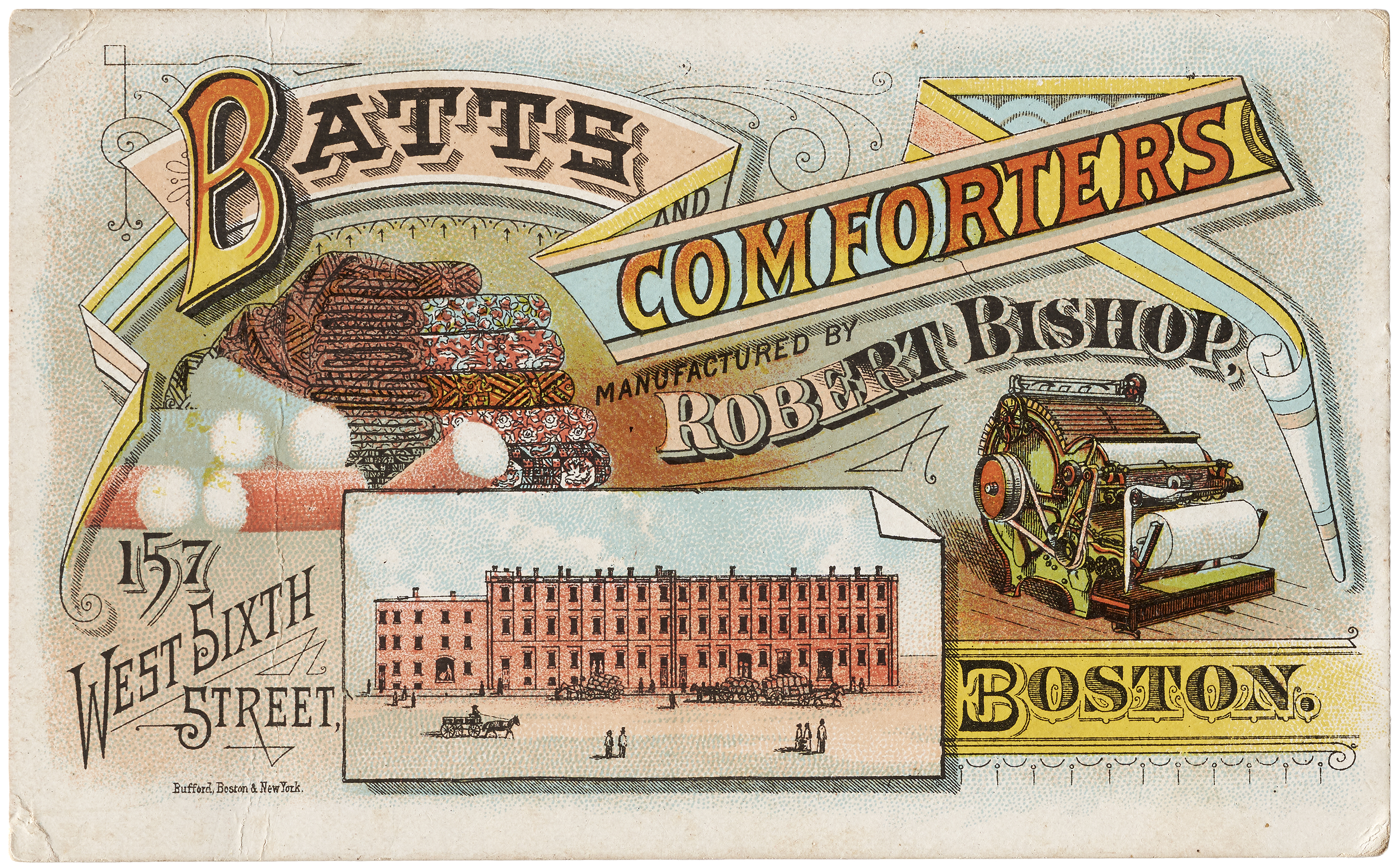
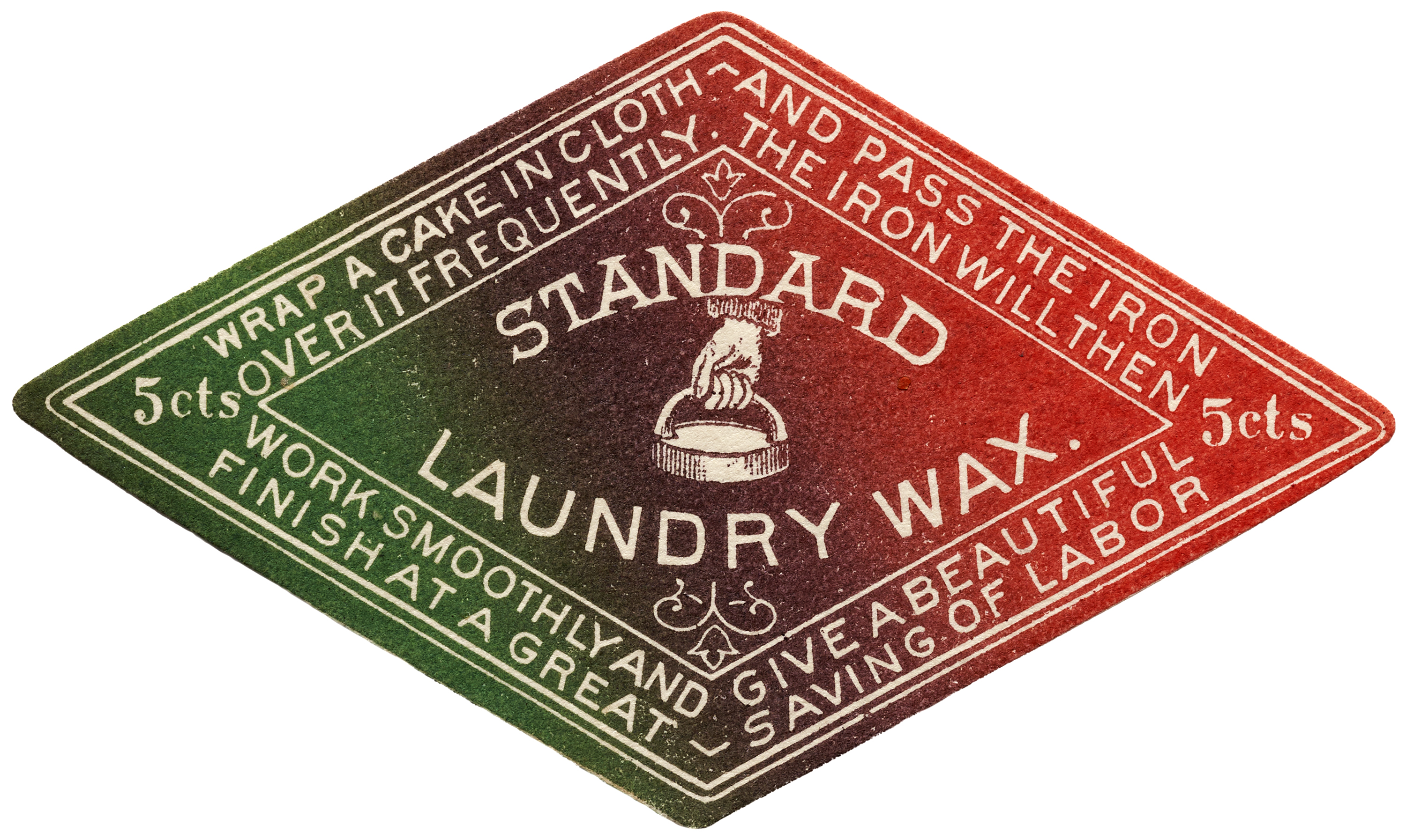
Printing & Design Innovations
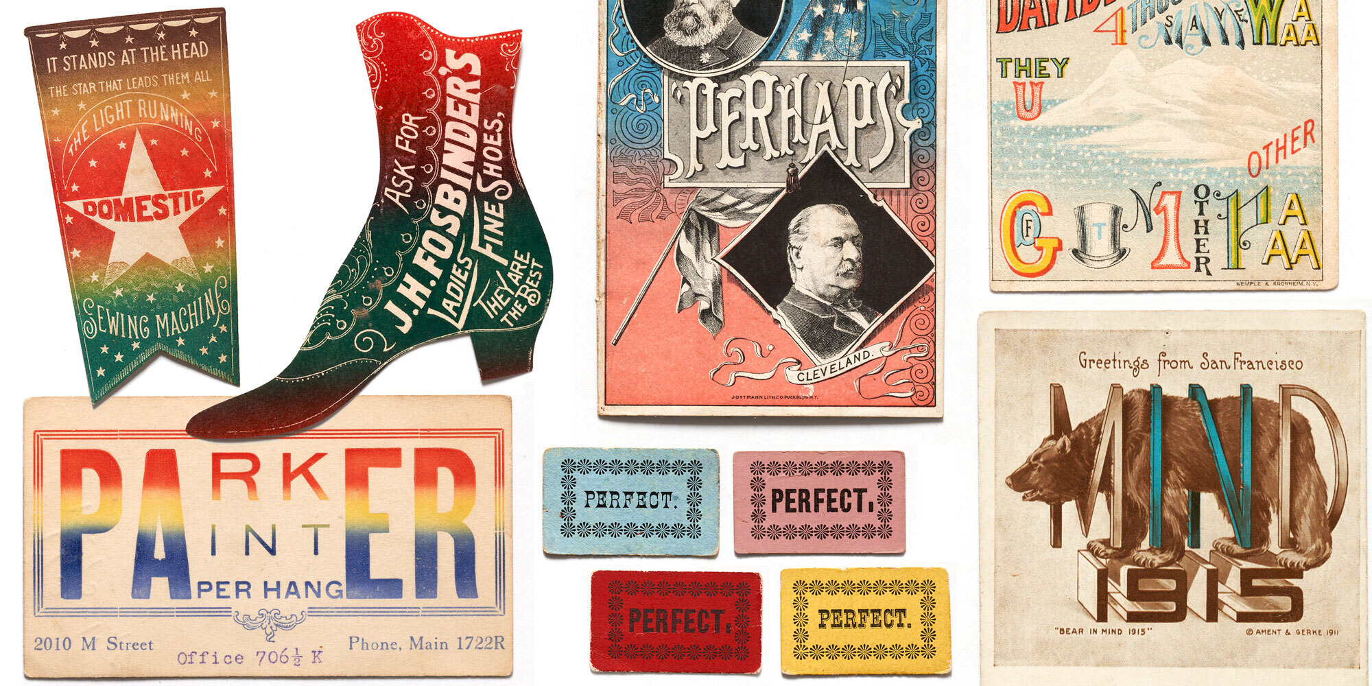
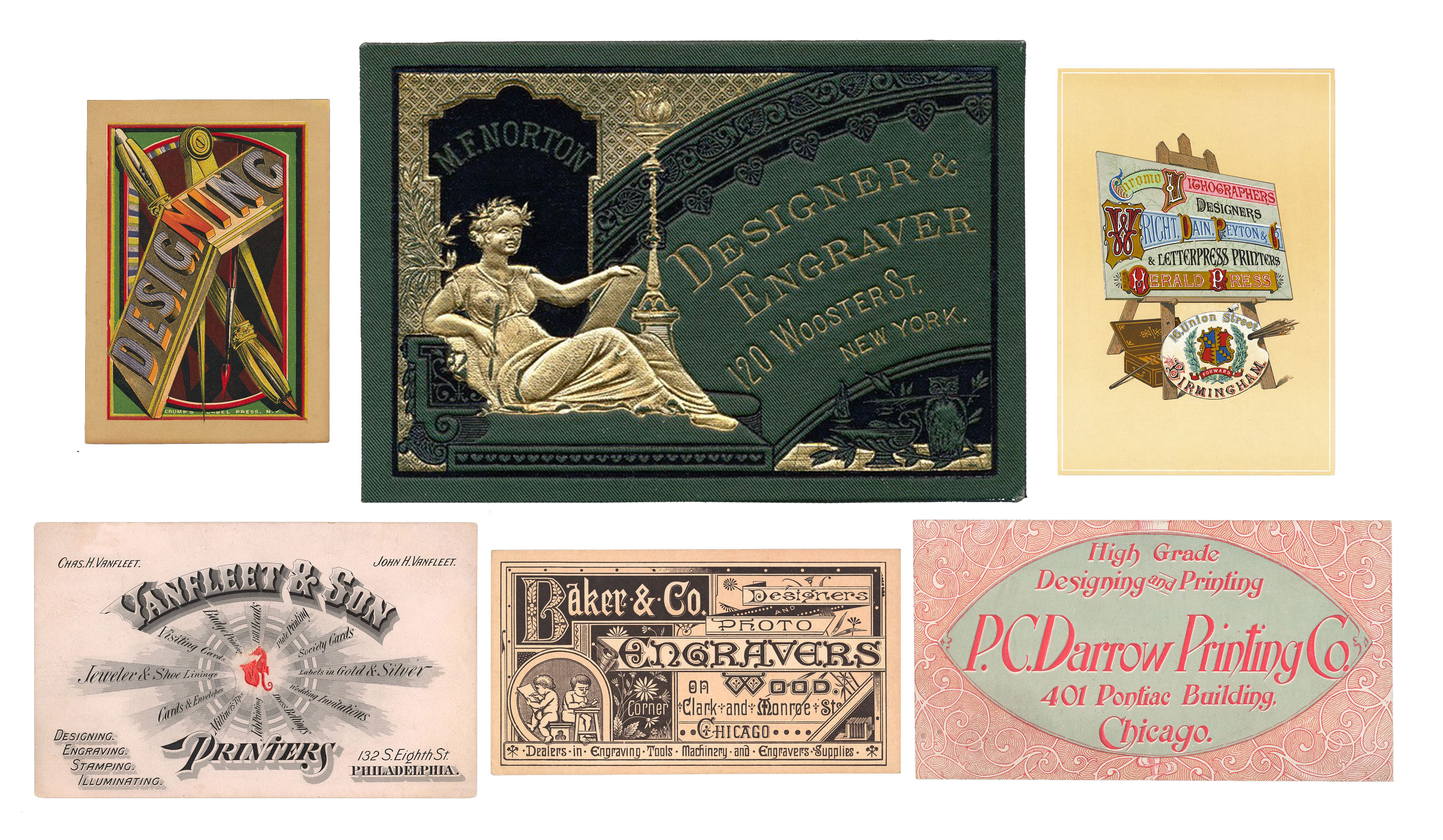
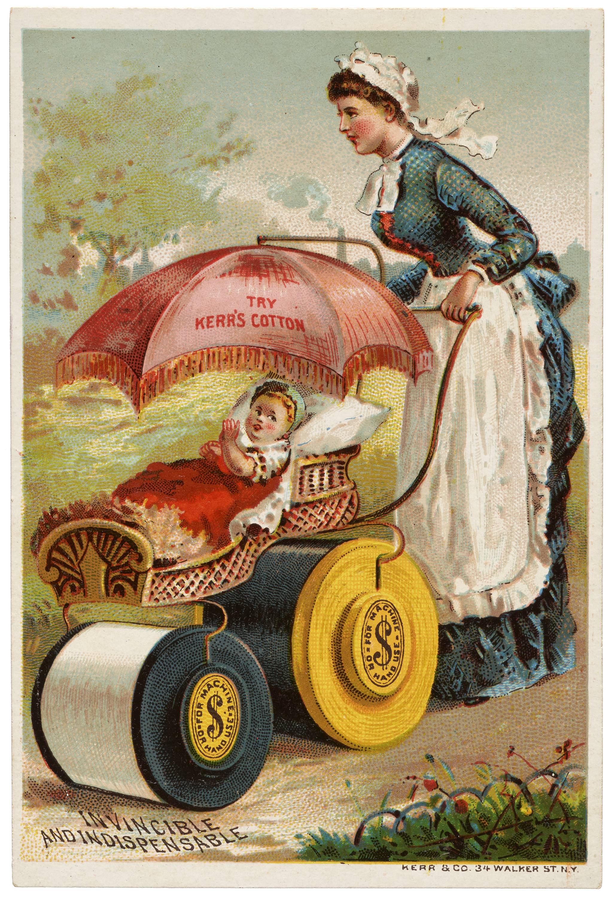
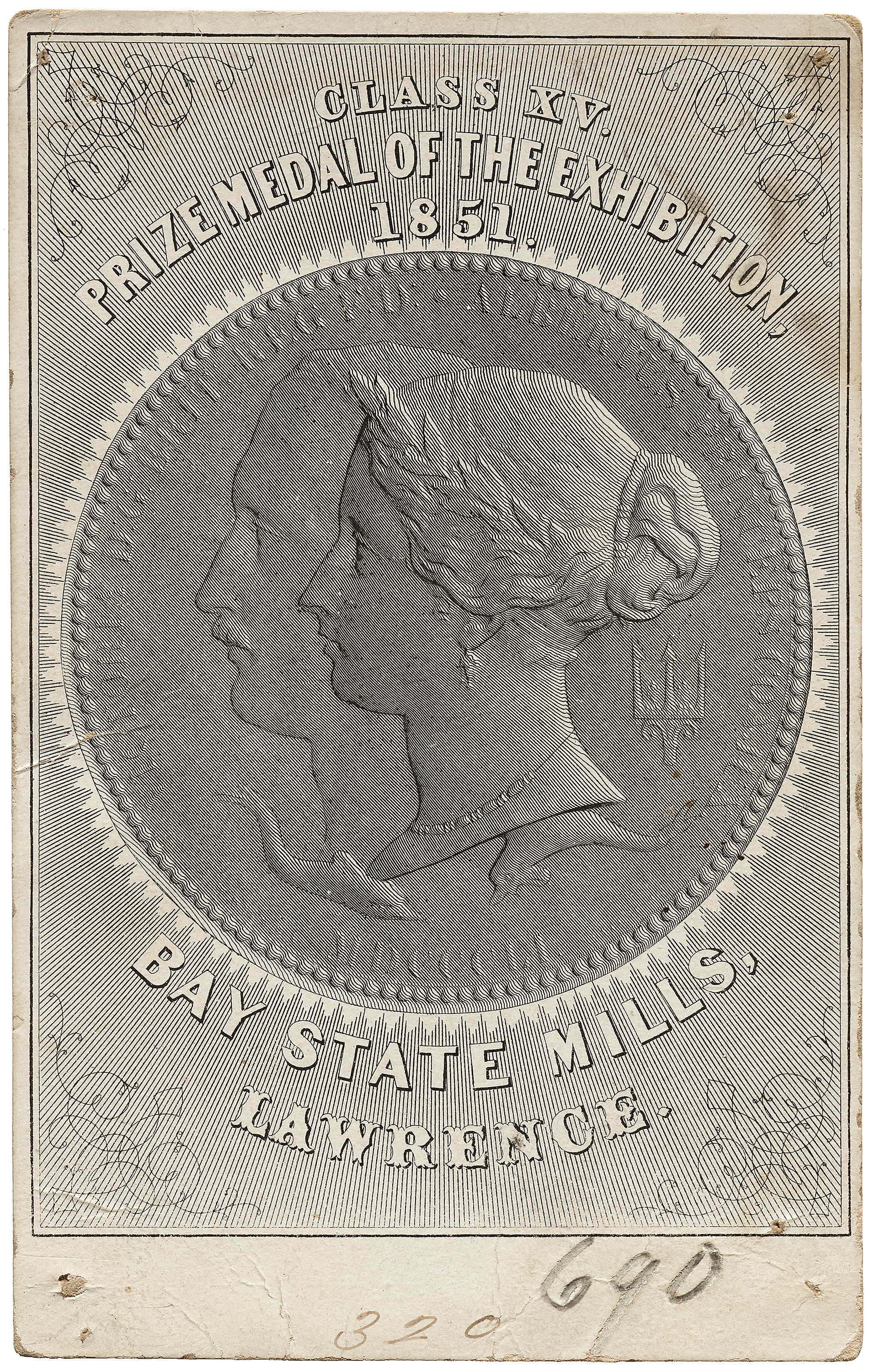
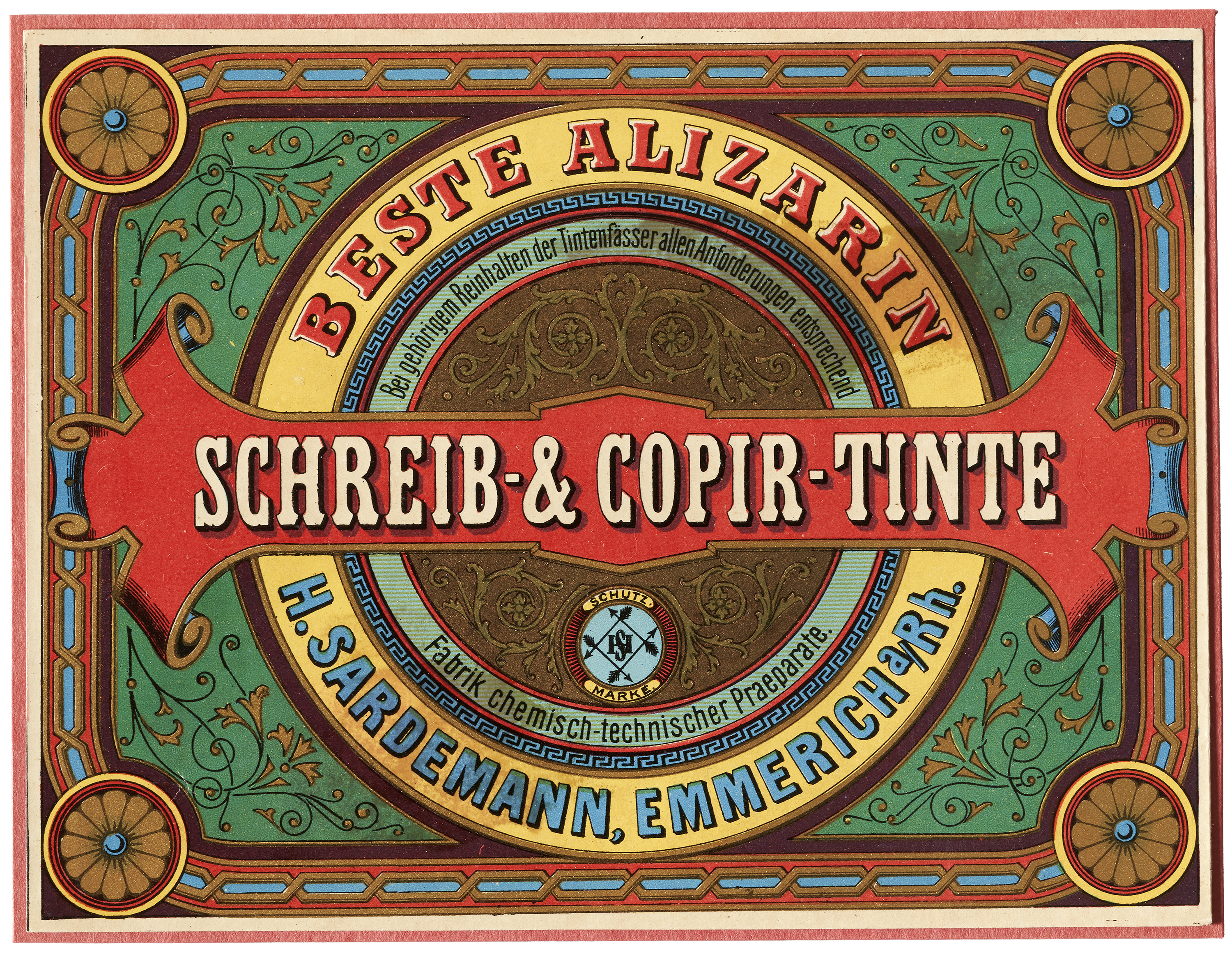
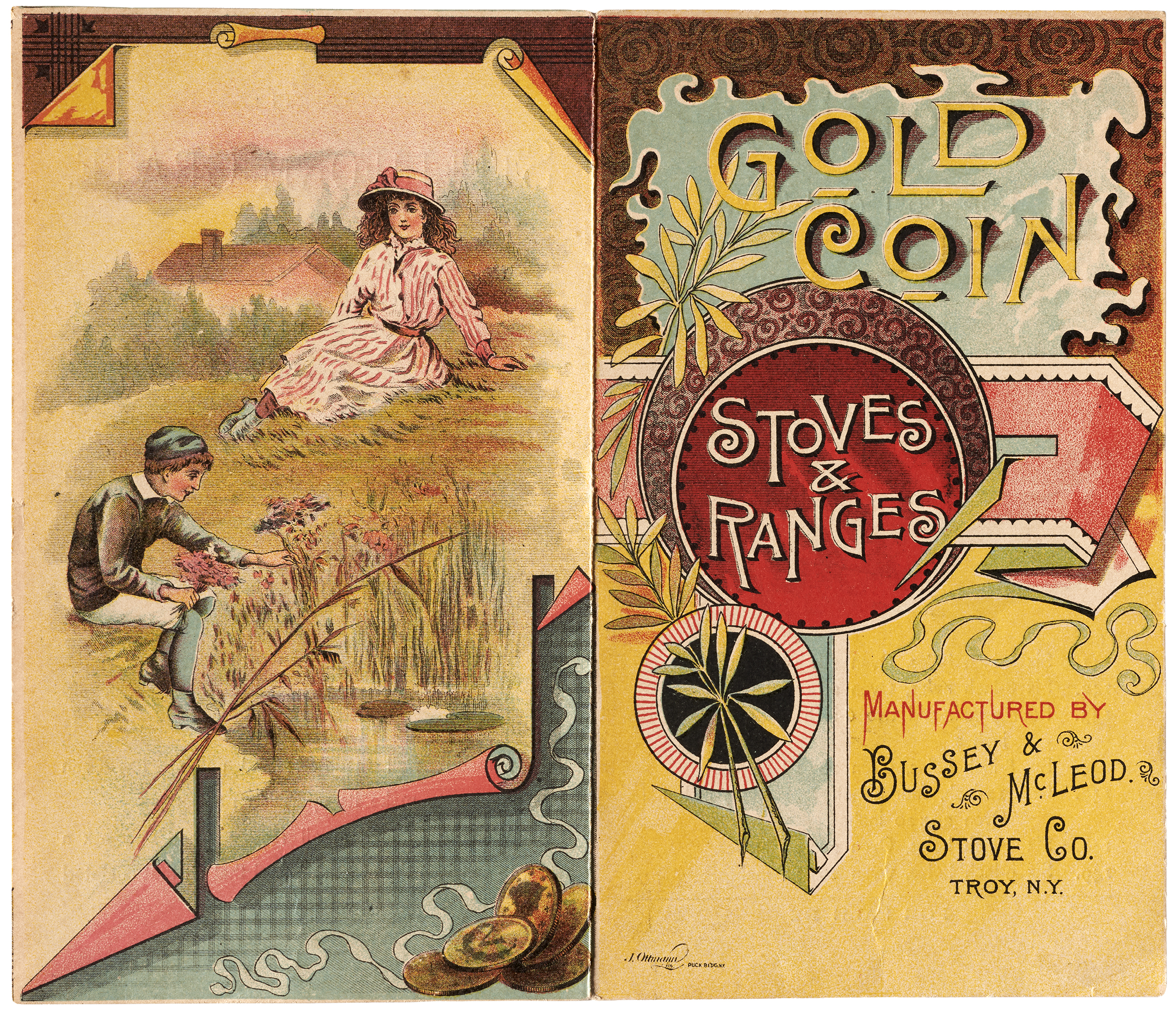
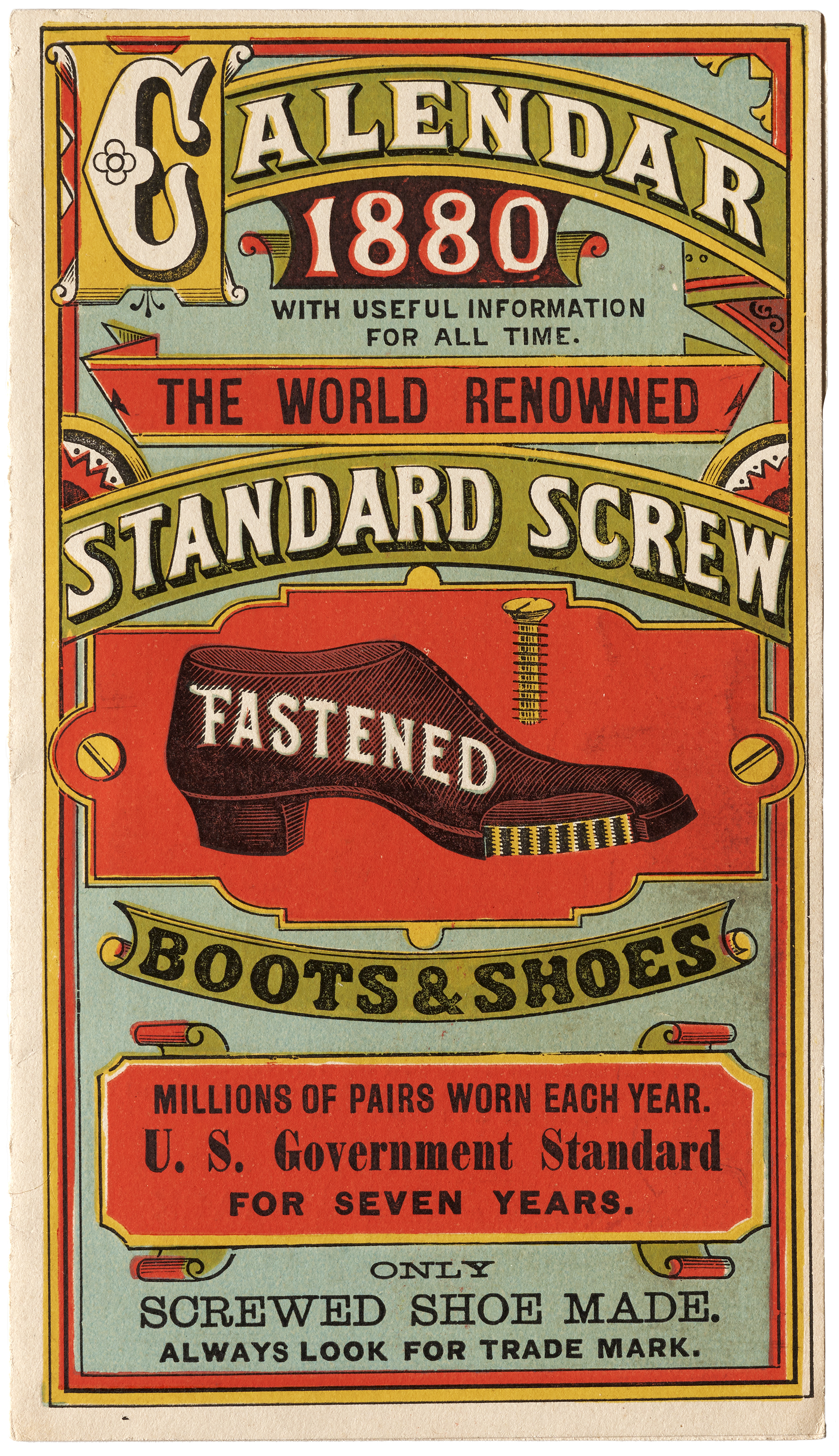
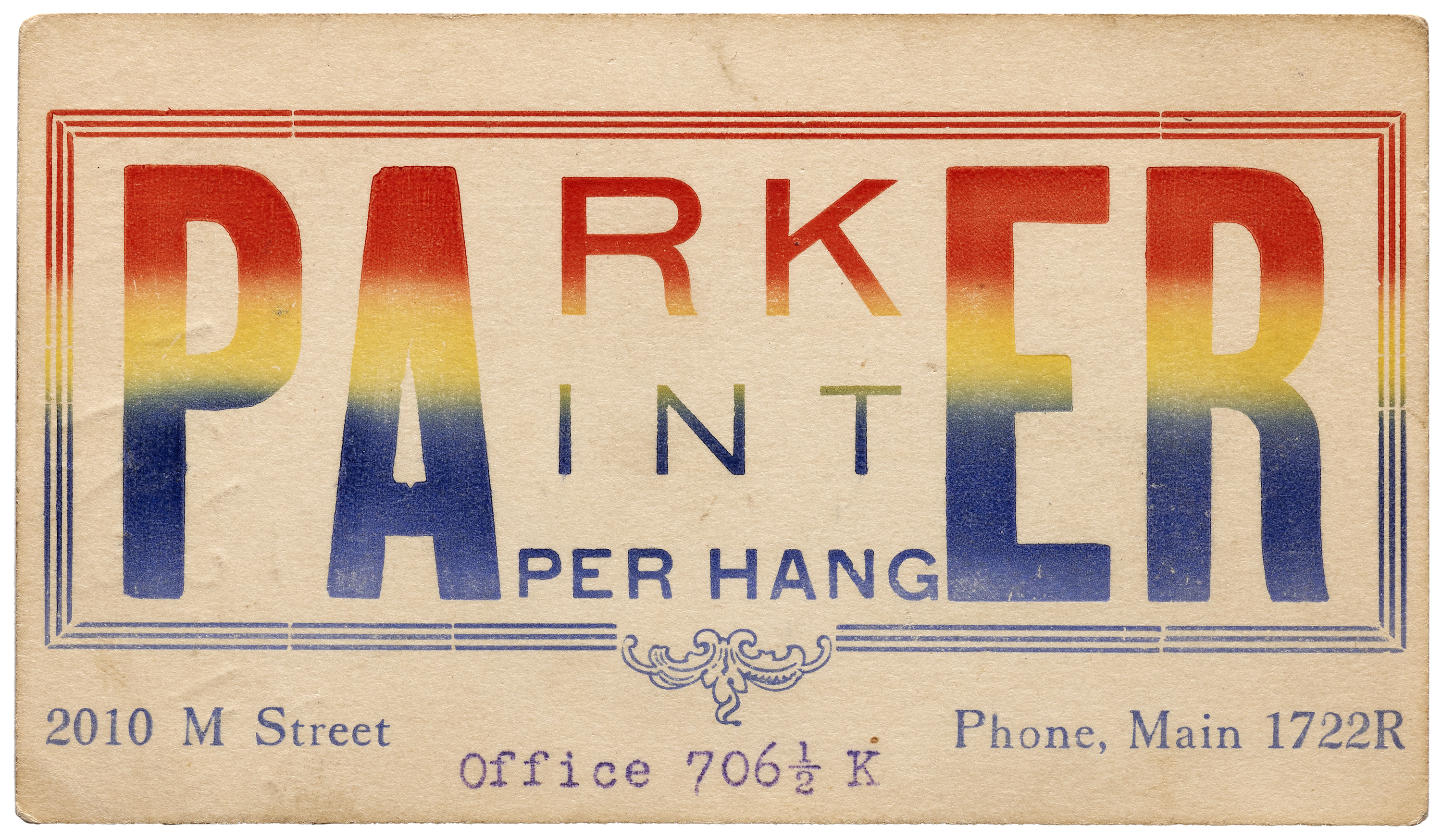
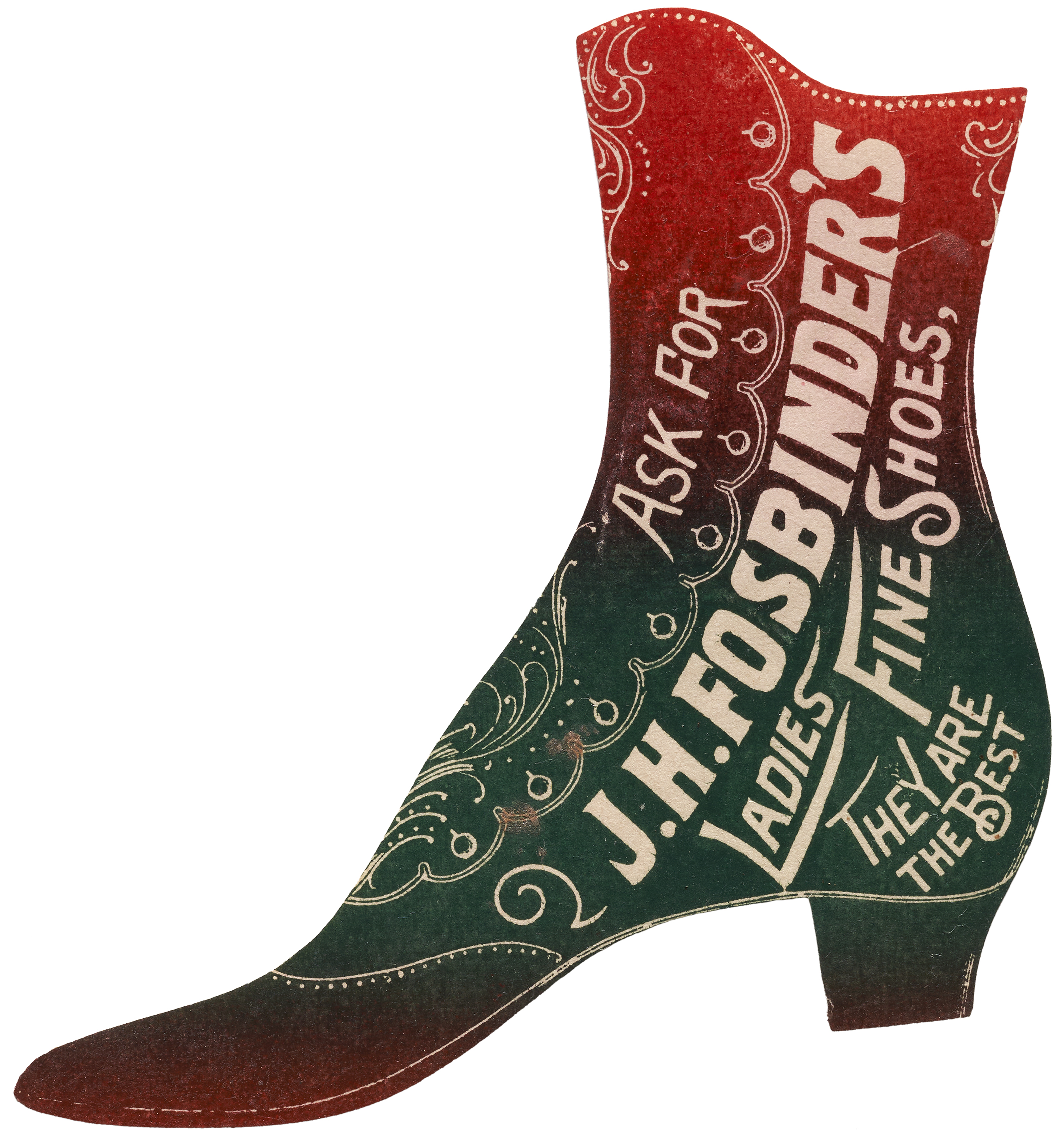
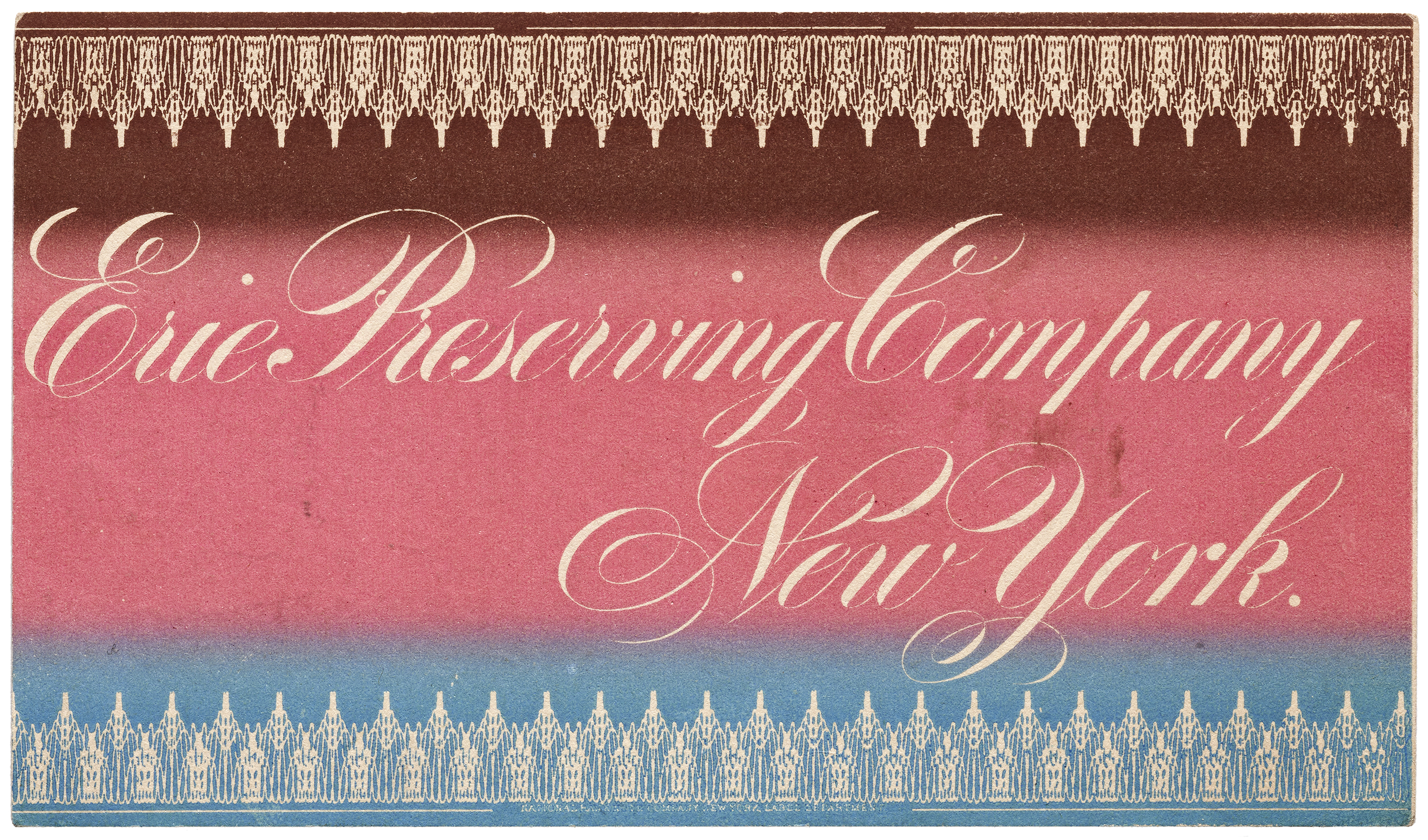
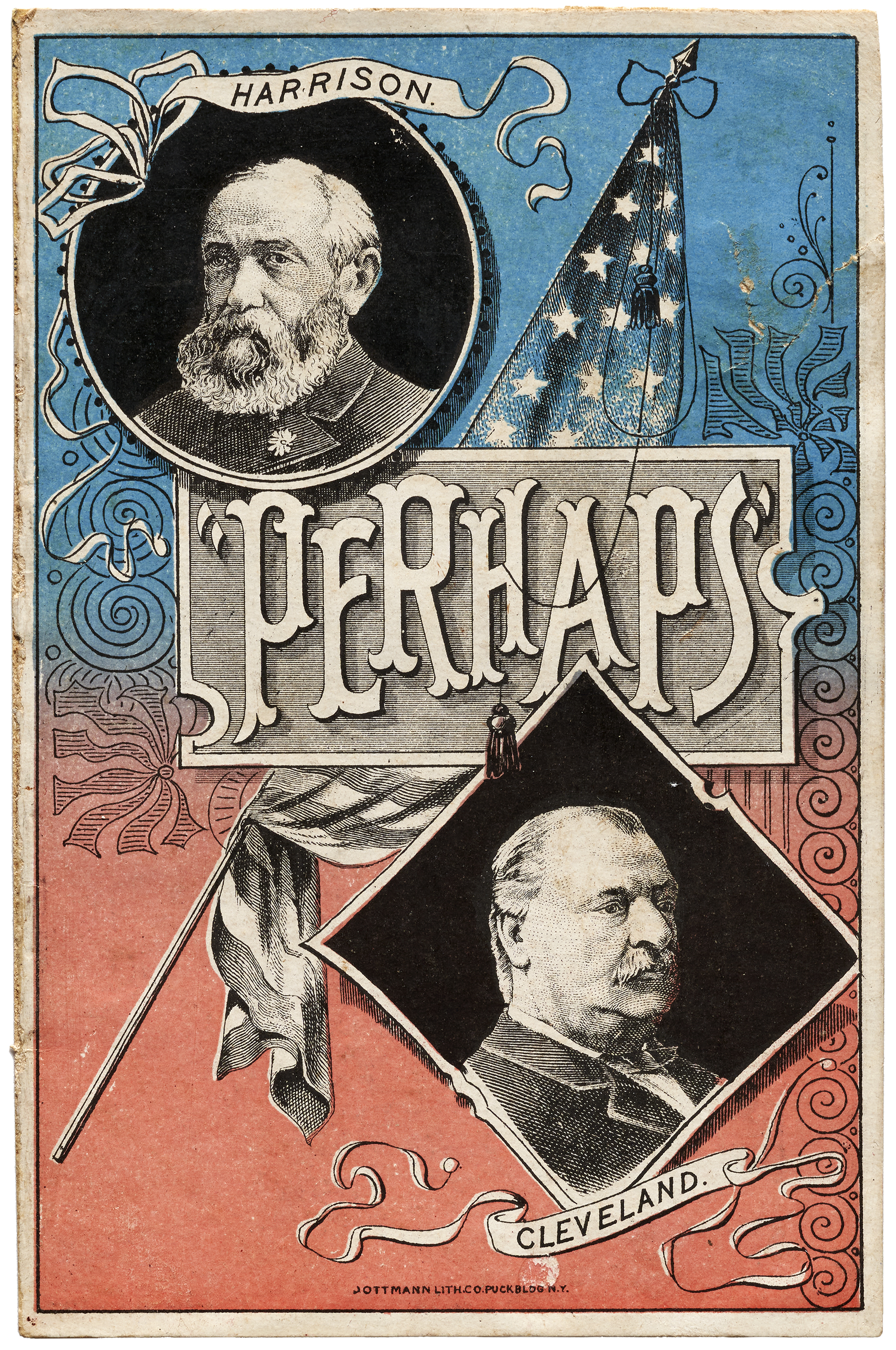
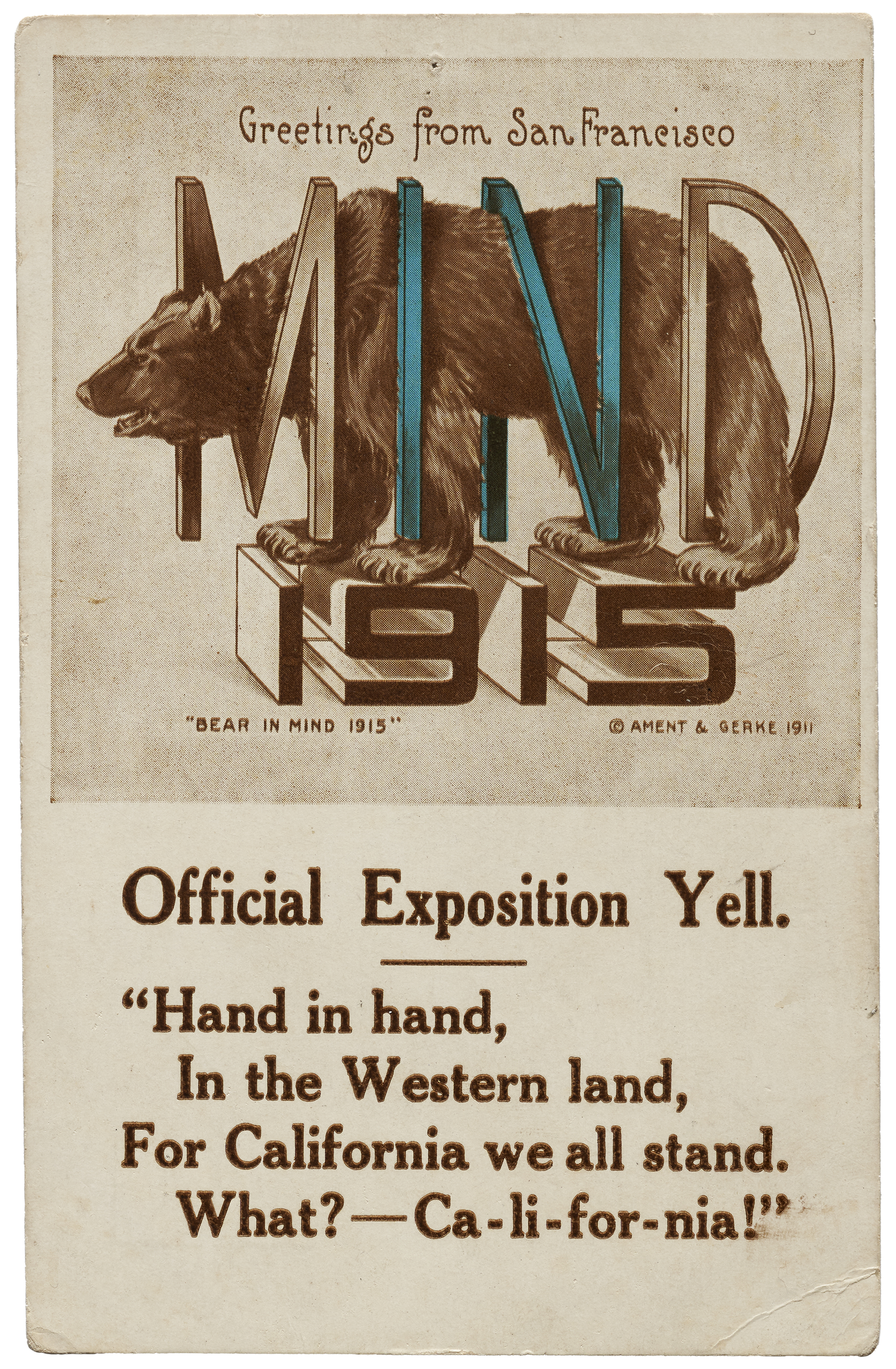
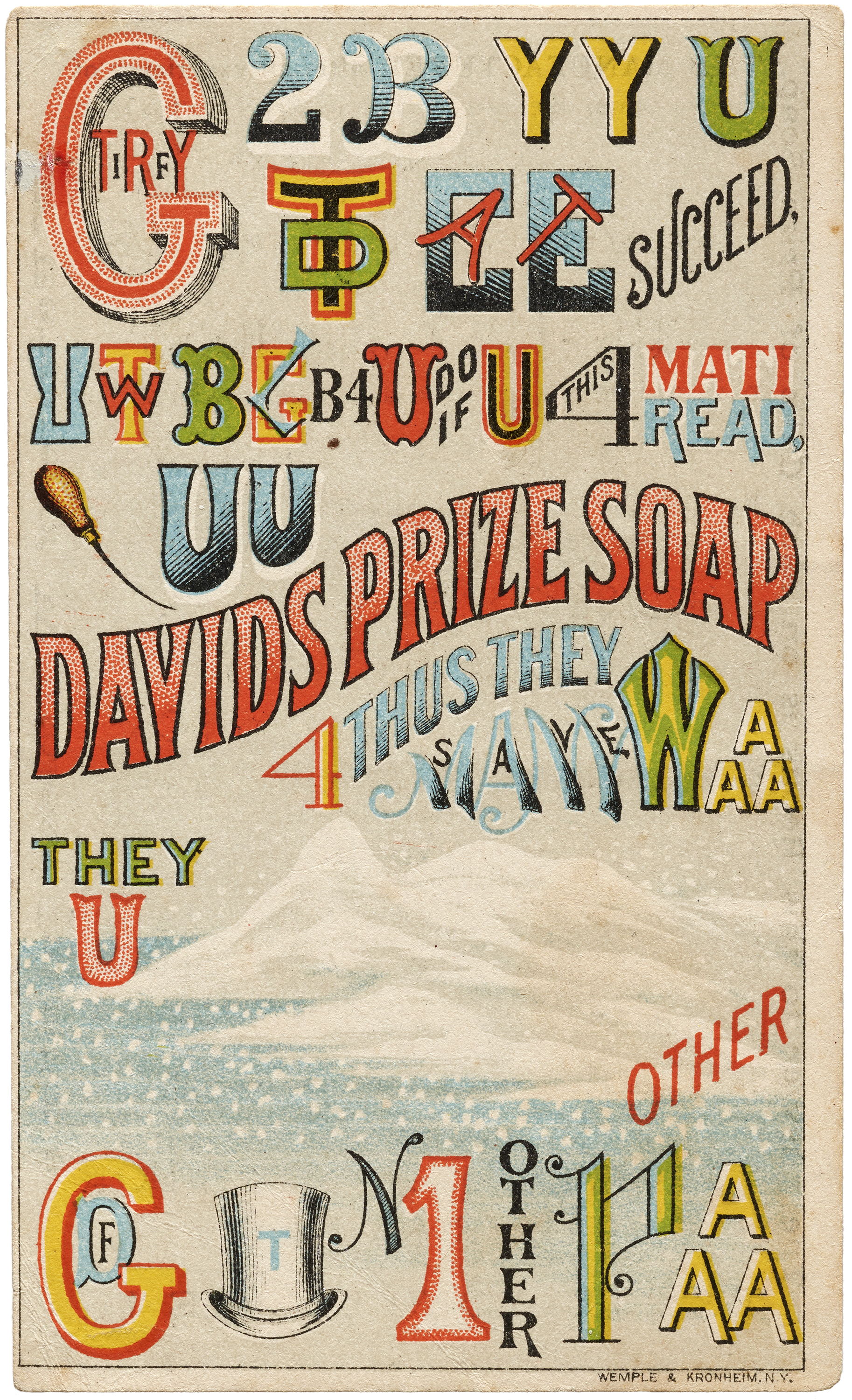
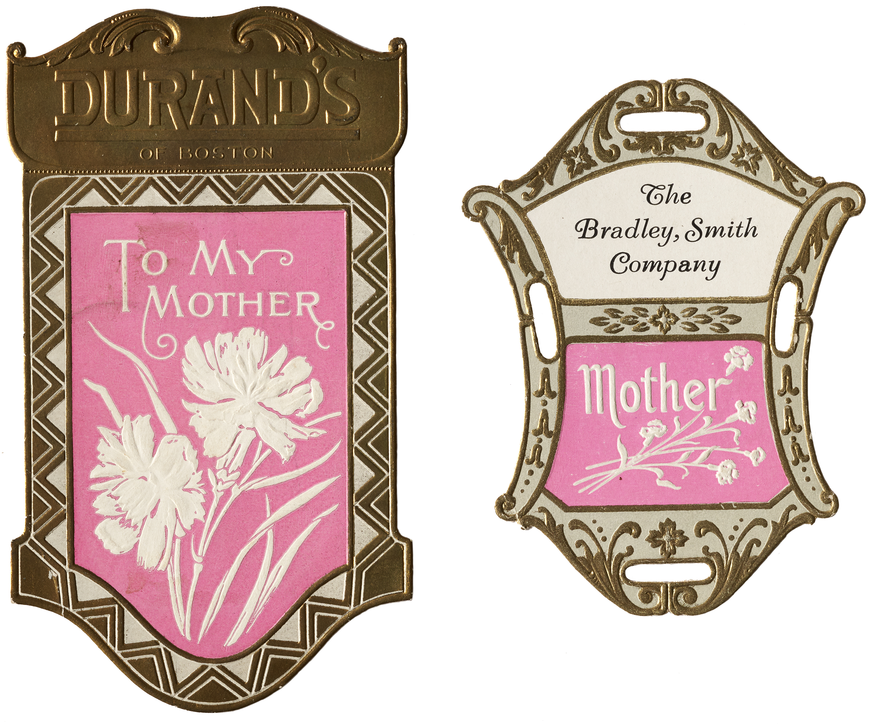
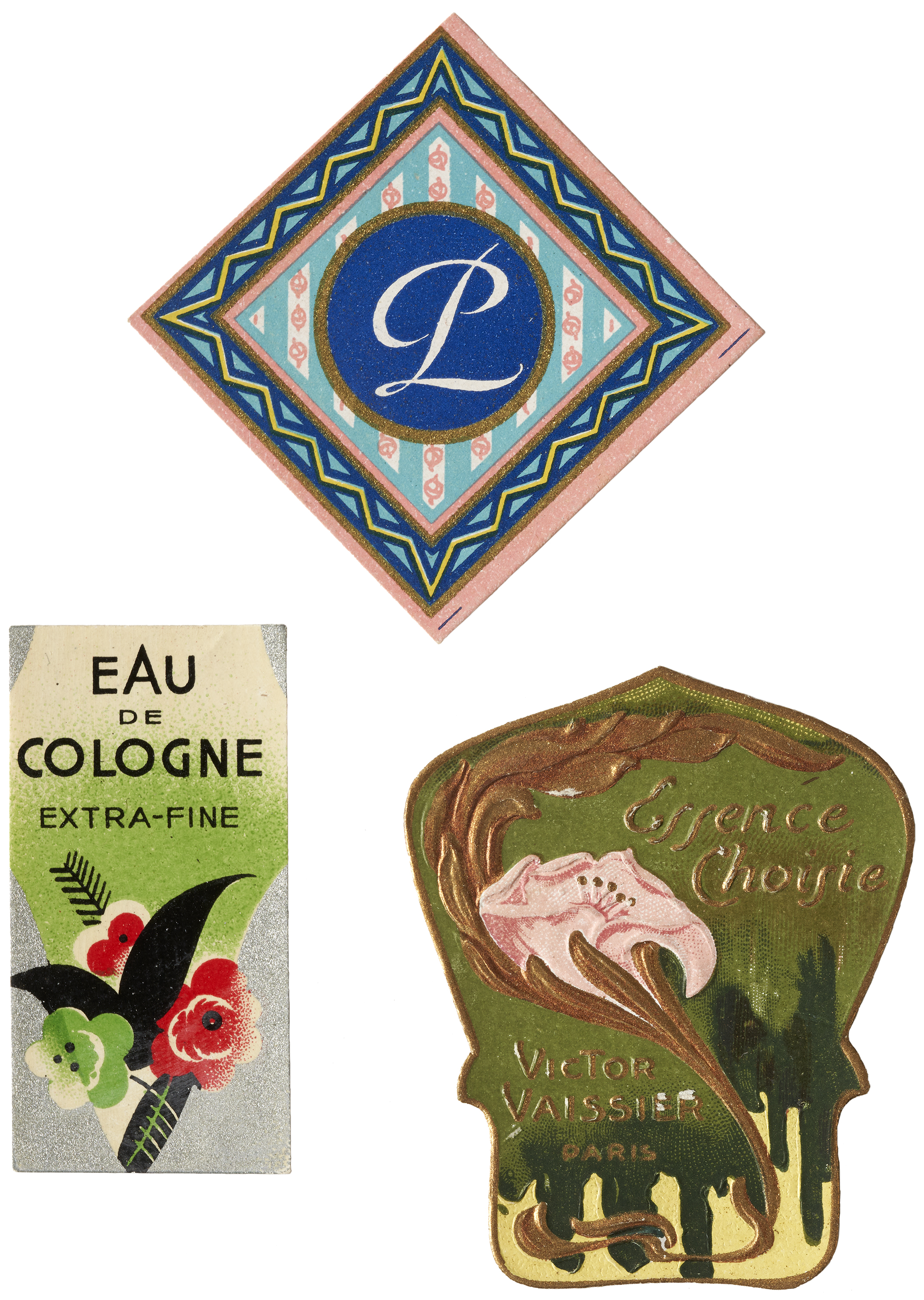
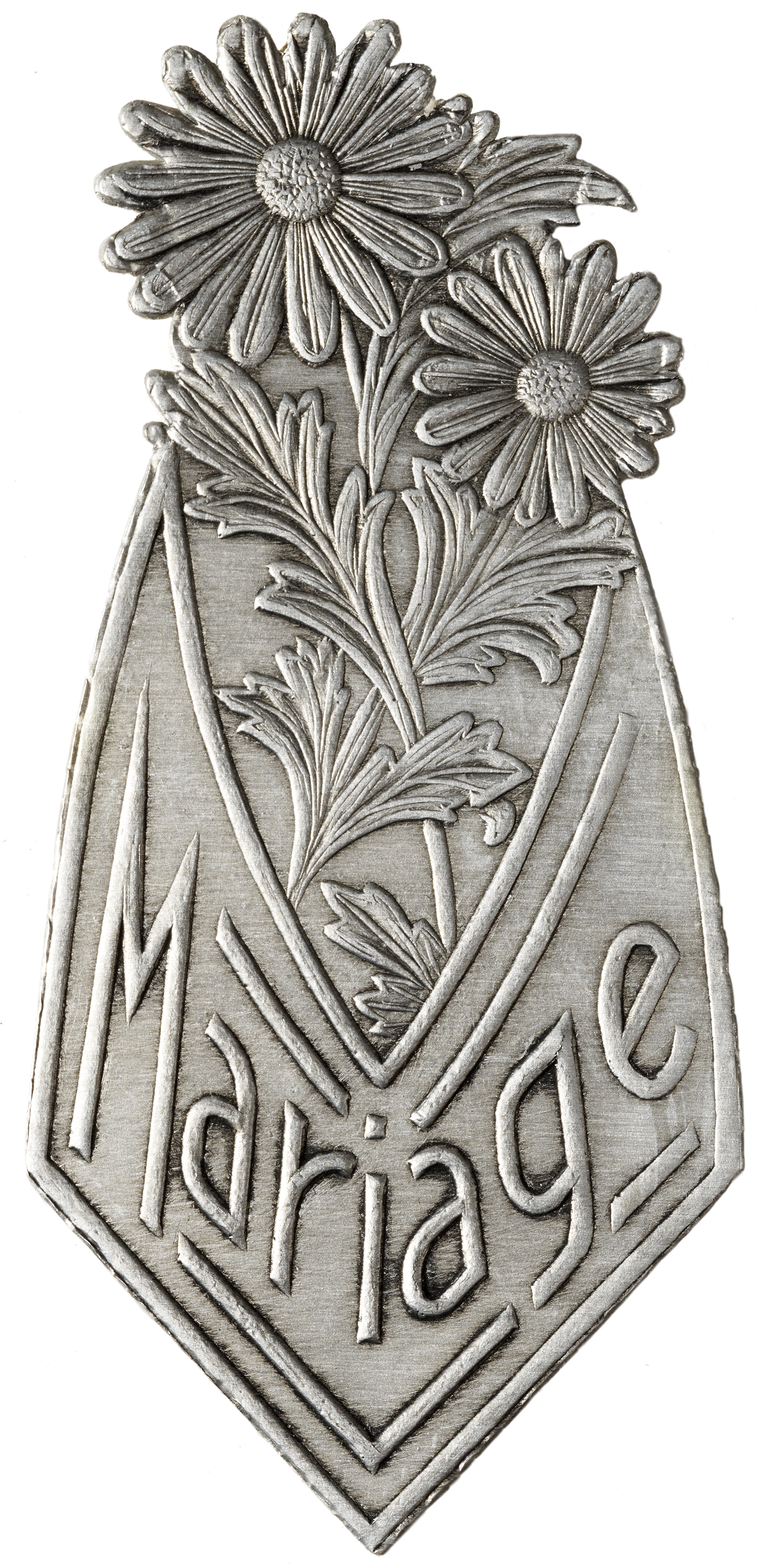
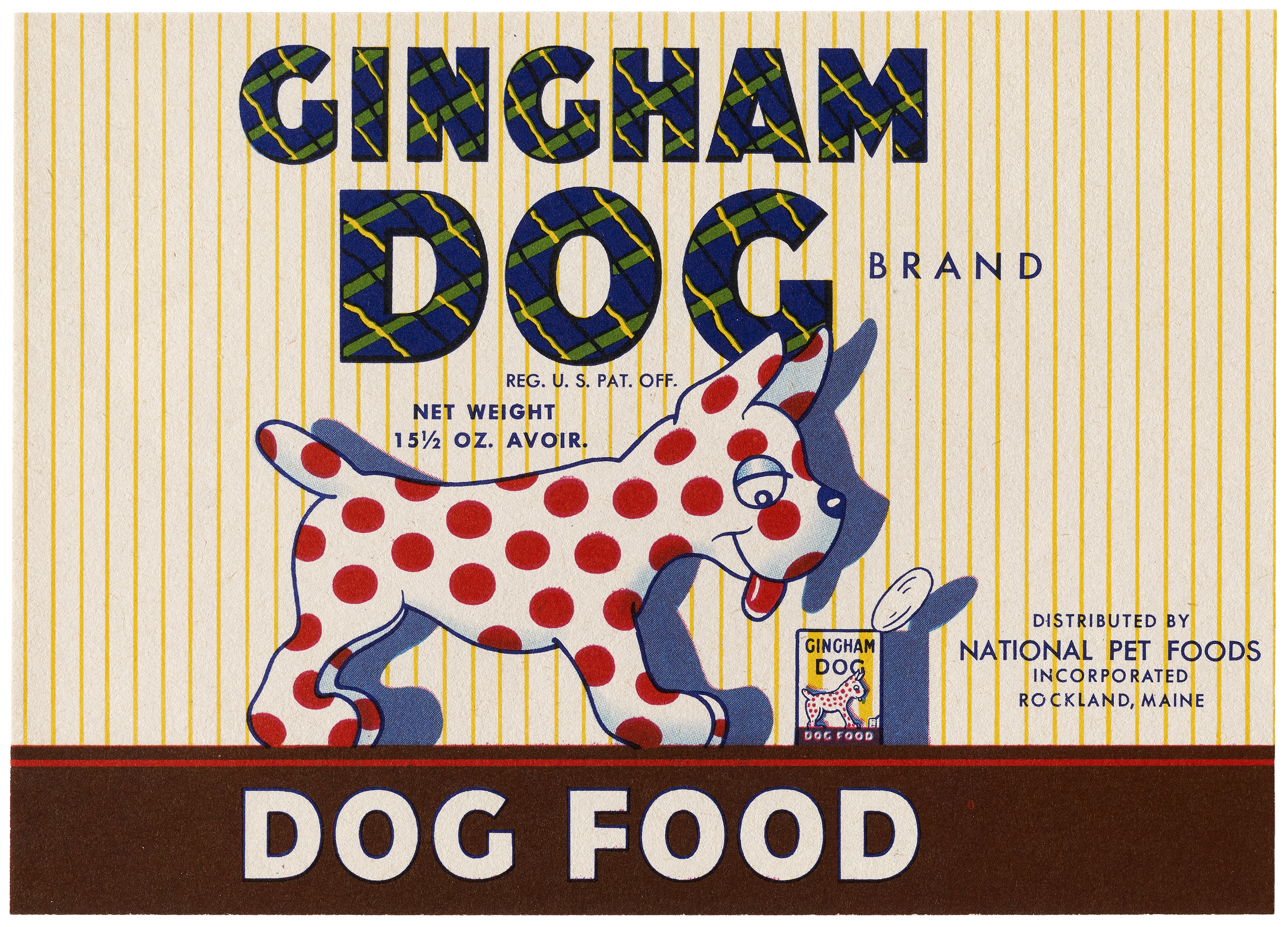
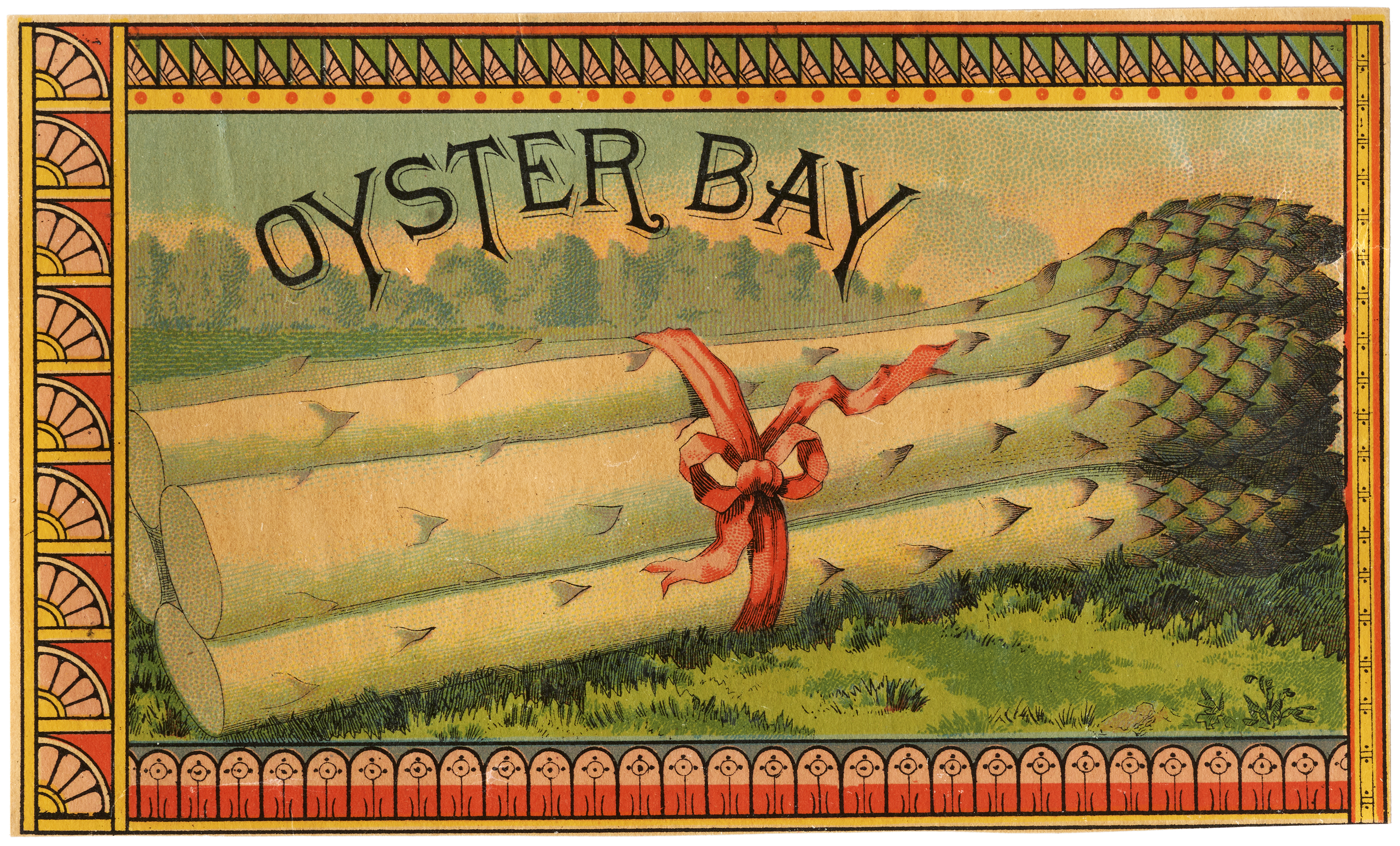
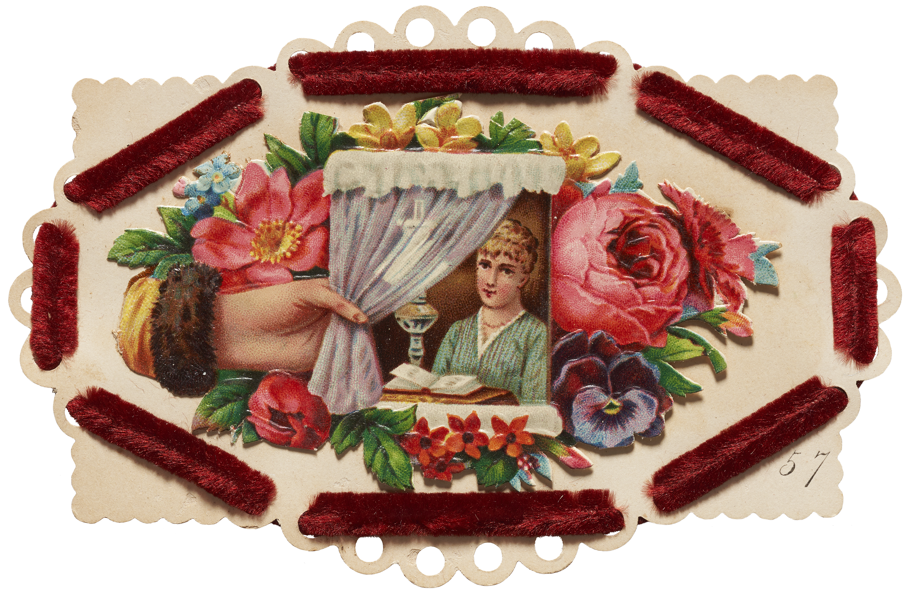
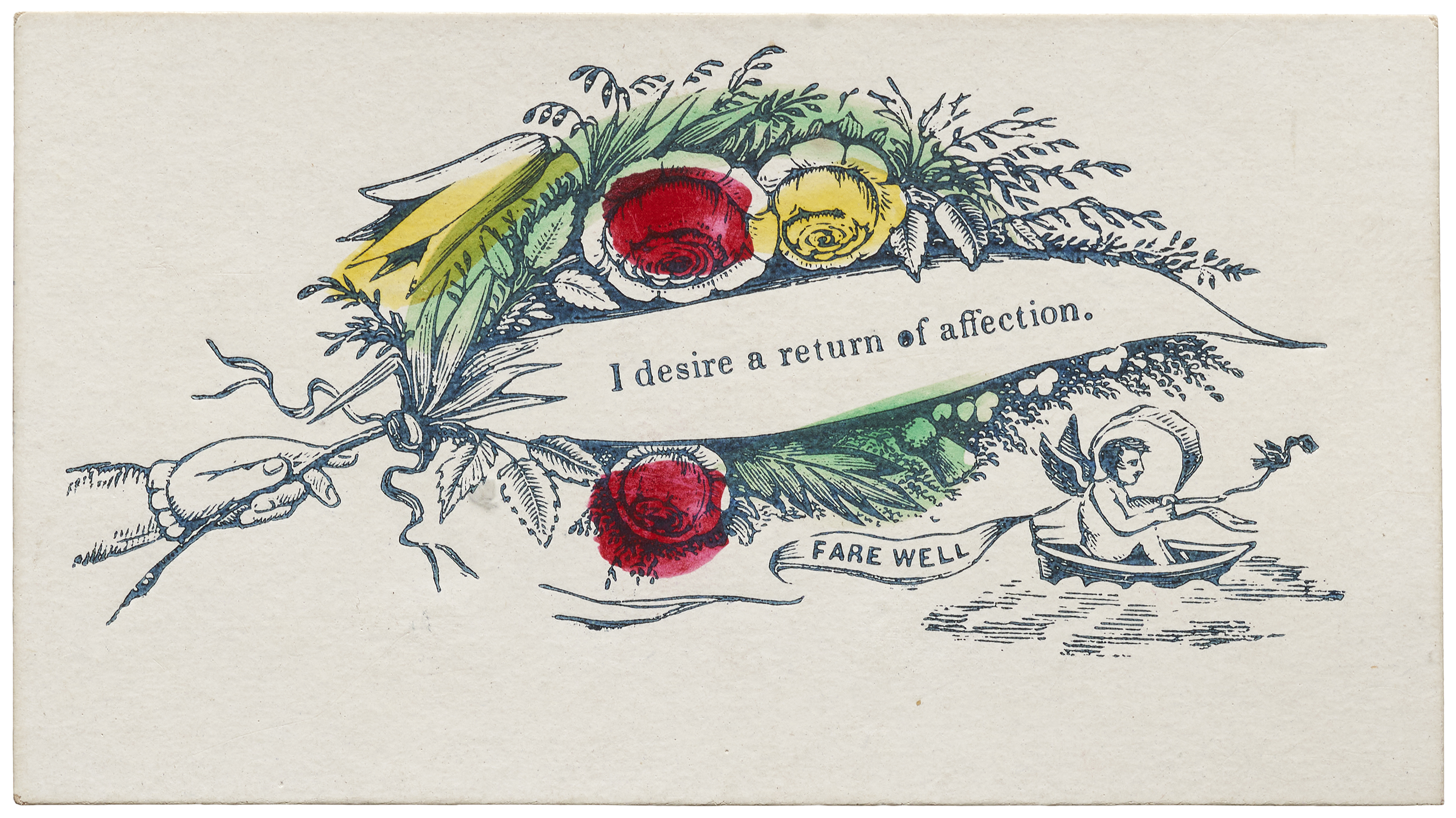
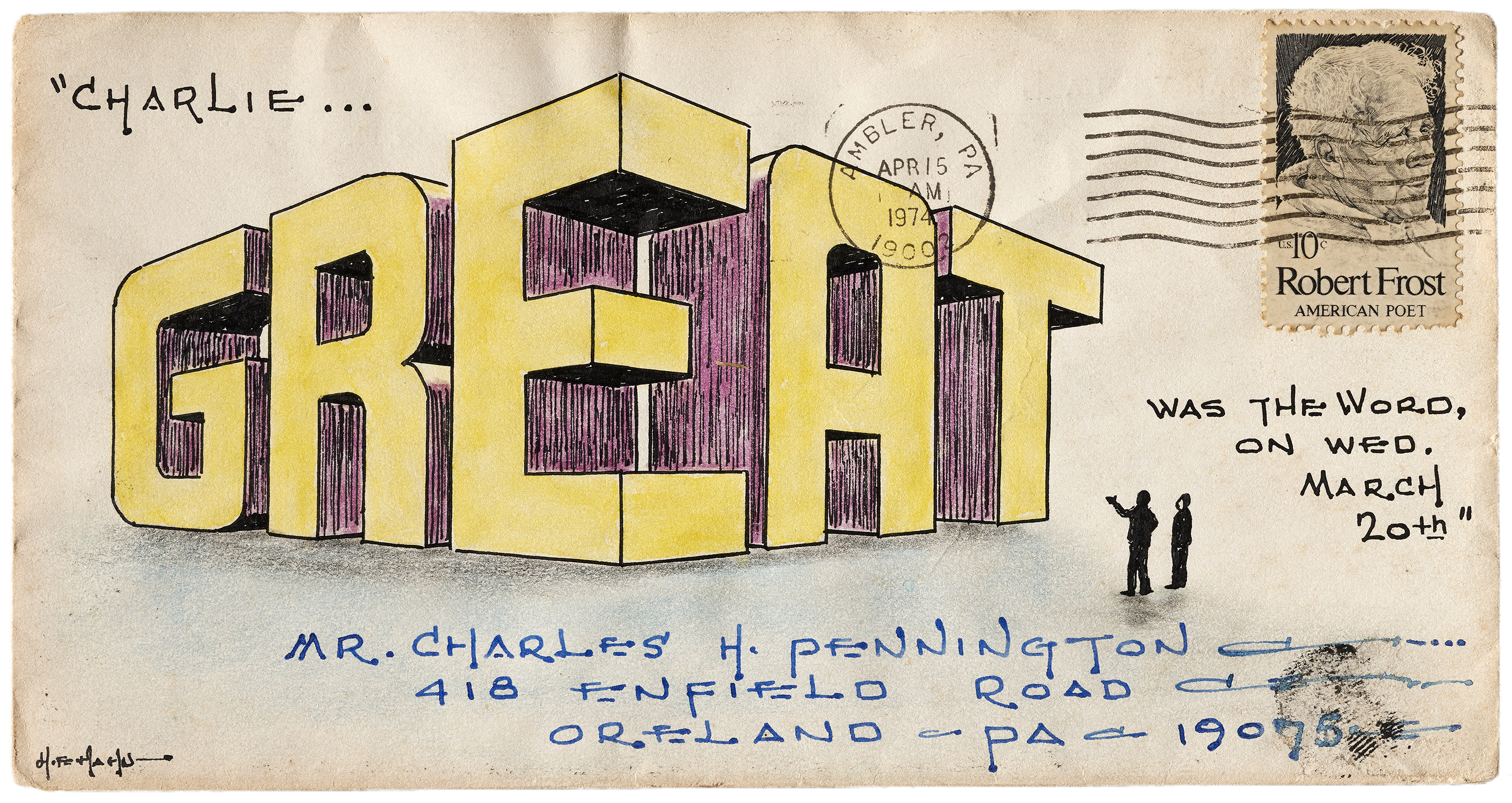
The late nineteenth century introduced and enhanced multiple printing technologies, like chromolithography (color printing), anaglyptography (a pantographic engraving process that emulates depth), quicker and more accurate presses, and the typographic point system, which enabled complicated intermingling of type, ornaments, and border elements. These advances launched a multi-decade era of intense competition in the field. Engravers, lithographers, and “artistic printers” outdid each other with increasingly elaborate compositions that often seamlessly blended text and images. Type was no longer limited to a horizontal baseline. Color was often bright, plentiful, and graduated between hues using the split fountain technique.
Through the 1880s and 1890s, the so-called “Gaslight Style” became prevalent around the globe. The genre simulated depth through the use of layered elements, cast shadows, overlapping type and images, ribbons, and diagonal bands.
All images in the galleries below are hi-fi captures. Click an image to enter fullscreen view, then click or pinch to enlarge. Photography: Camille Brown for Letterform Archive.


Expressive Letterforms
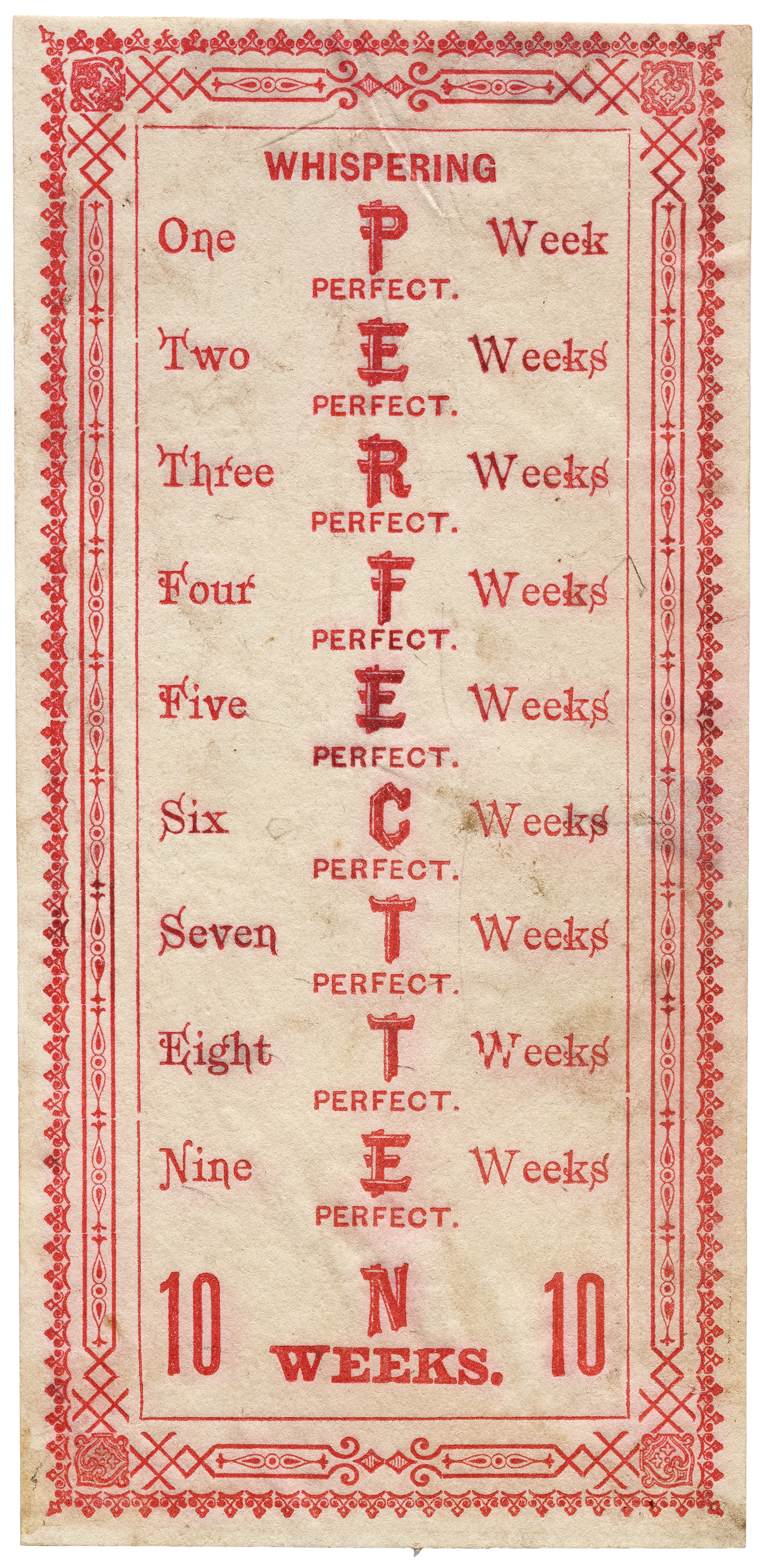
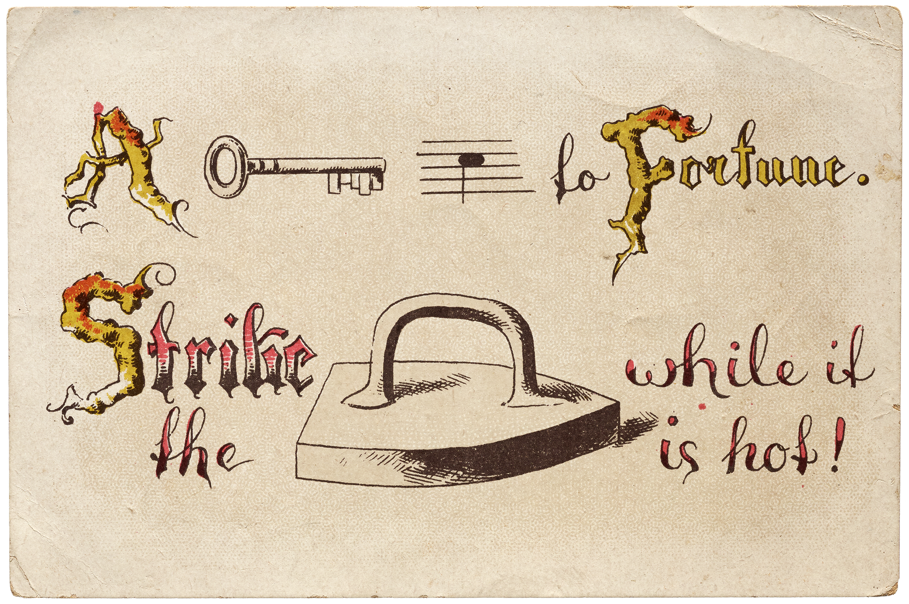
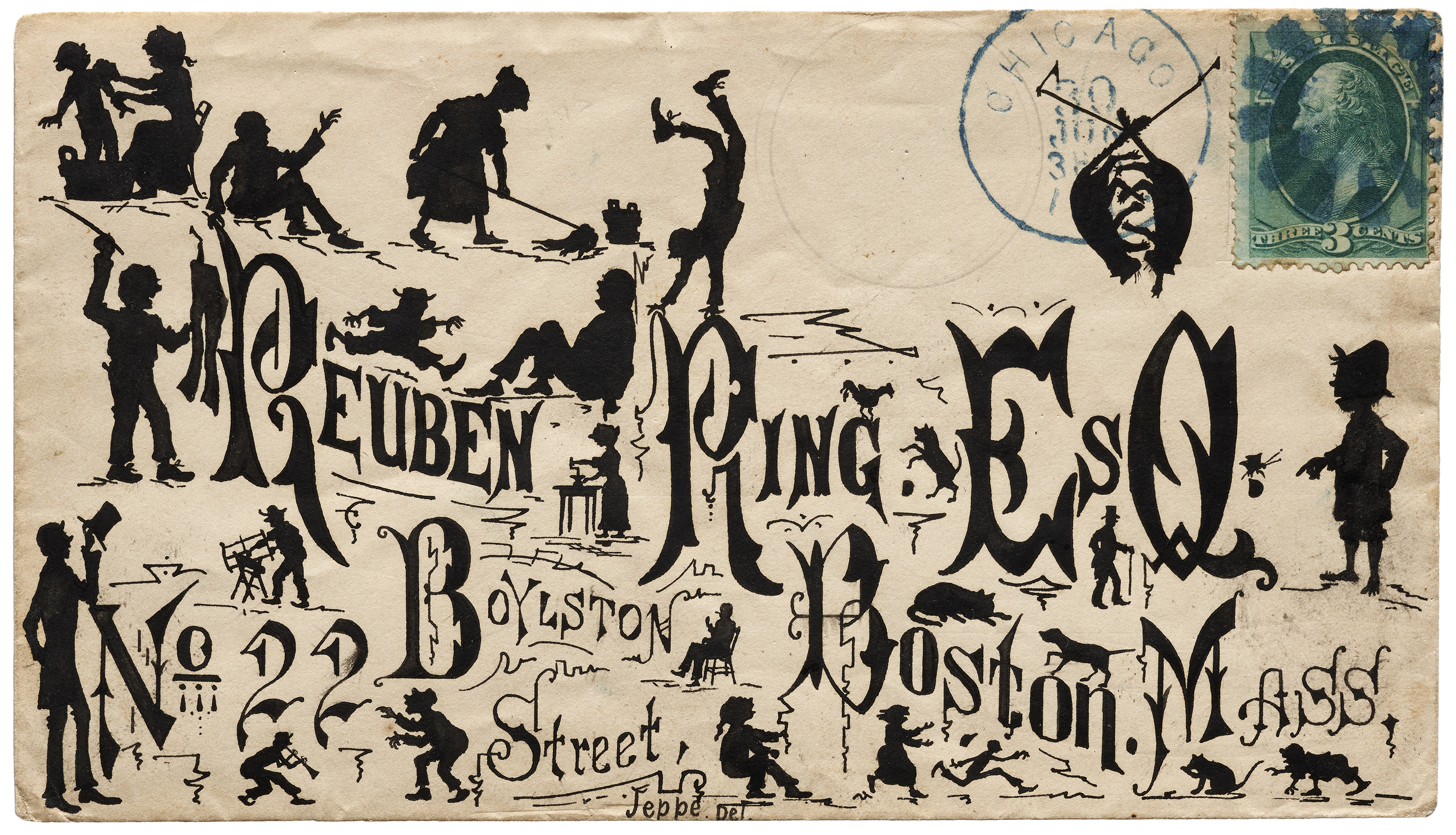
Along with the technological revolution, the arrival of eccentric display typefaces ushered in even wilder lettering techniques, and vice versa, each pushing more experimentation in the design and arrangement of text. The period also brought trick lettering, like rebus texts, where words are represented by combinations of pictures and individual letters (a sort of precursor to emoji), and “anamorphic” puzzles featuring radically stretched letters that require the reader to tilt the card nearly parallel to their eyes to reveal their message.


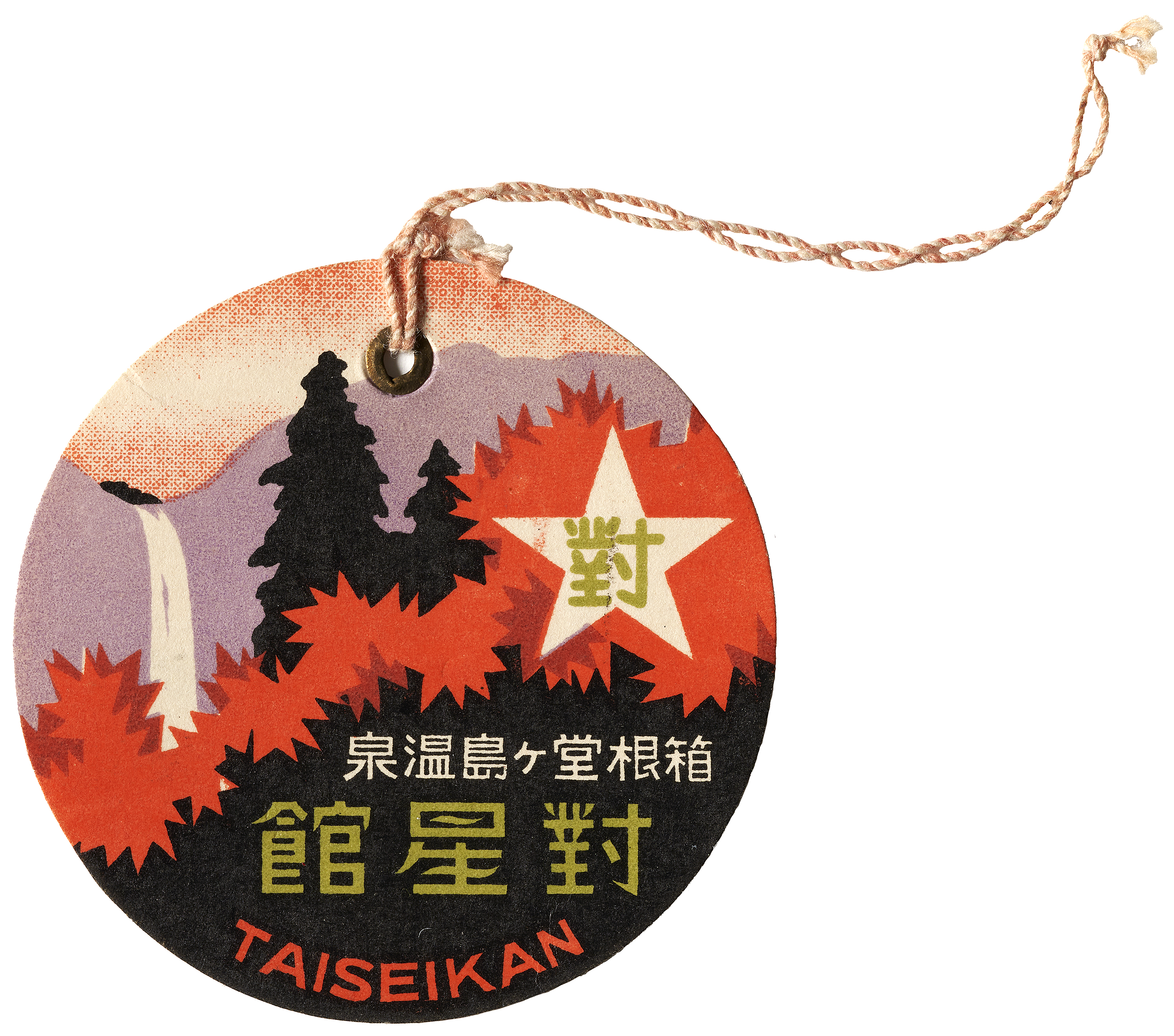
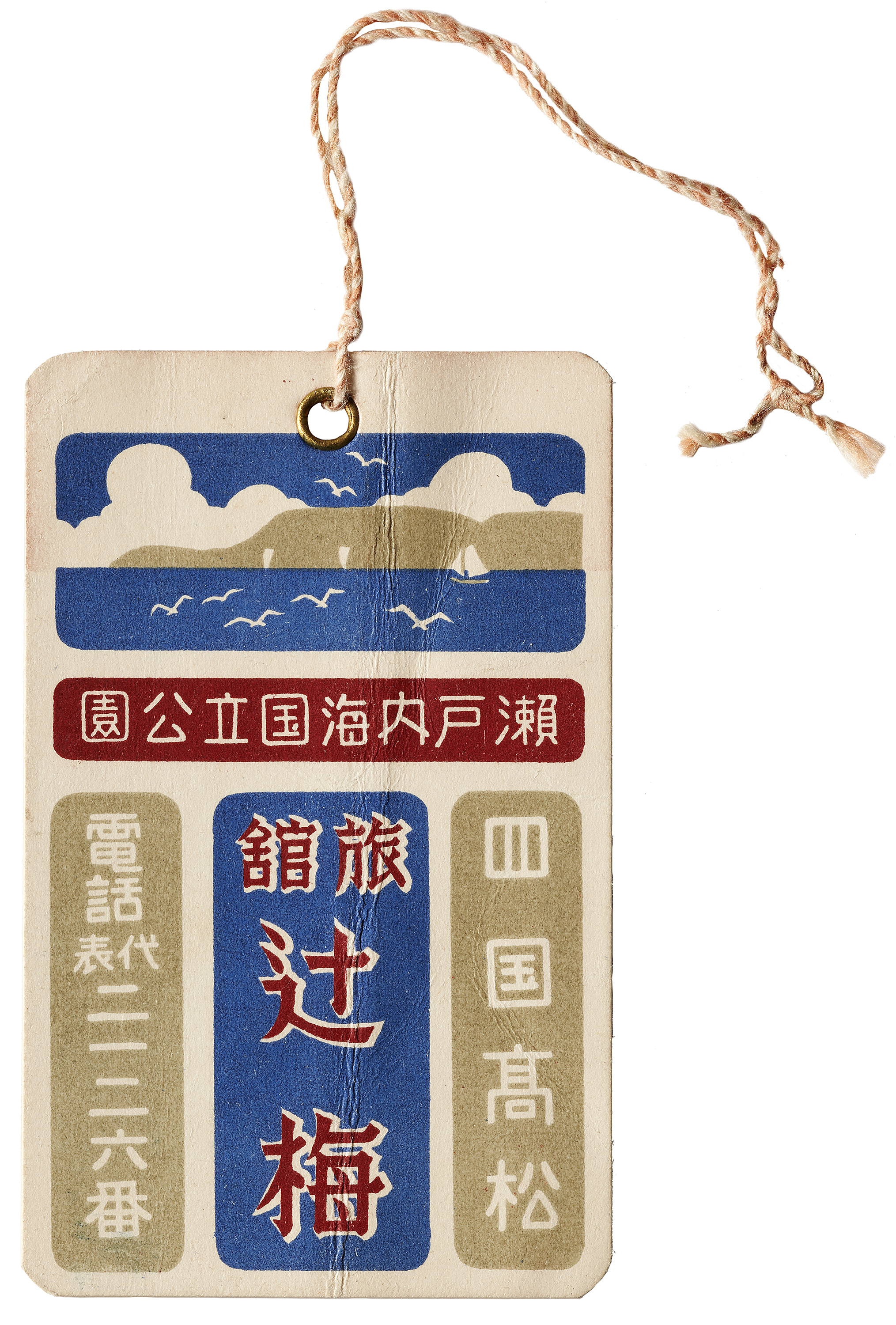
Emerging Formats
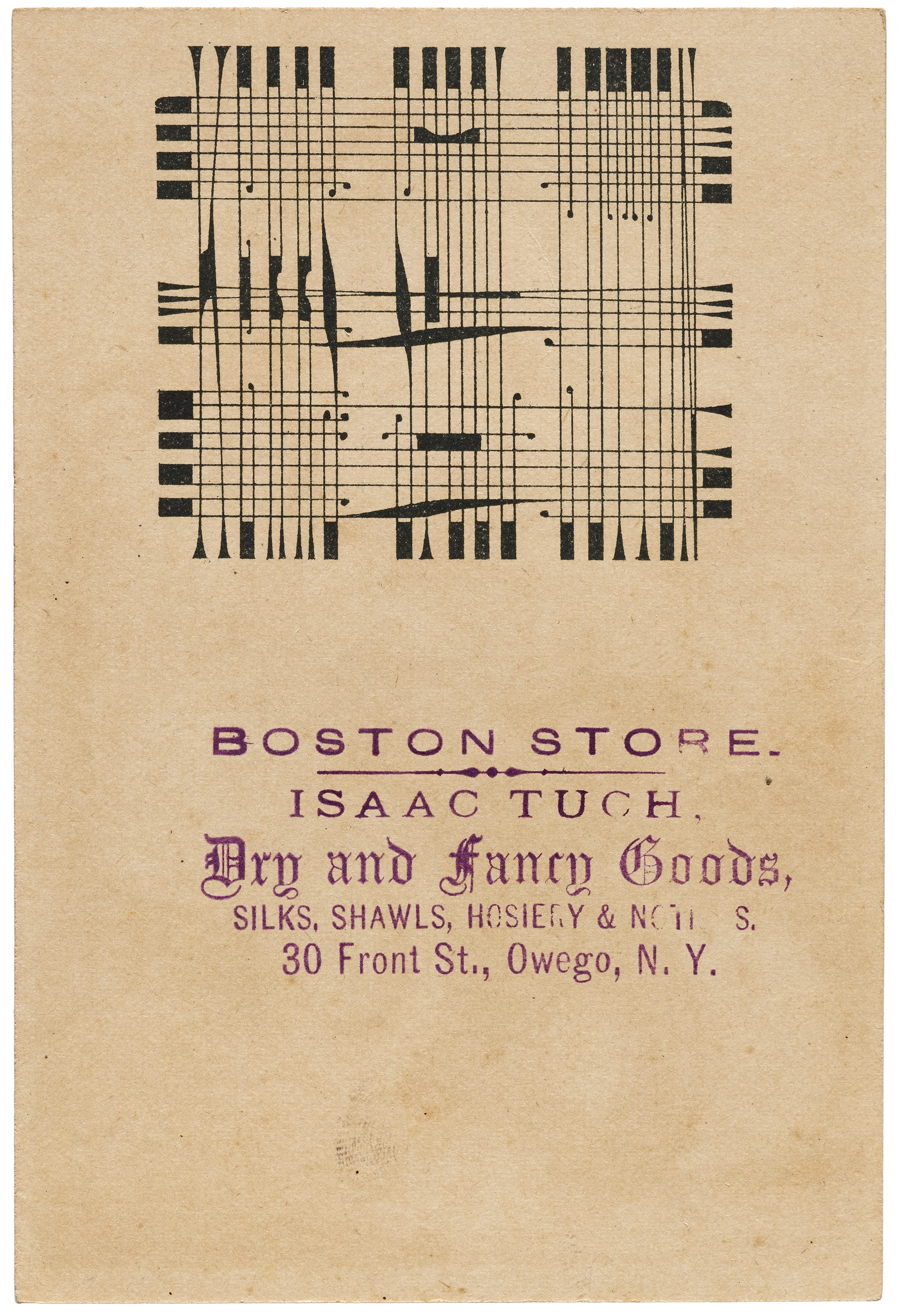
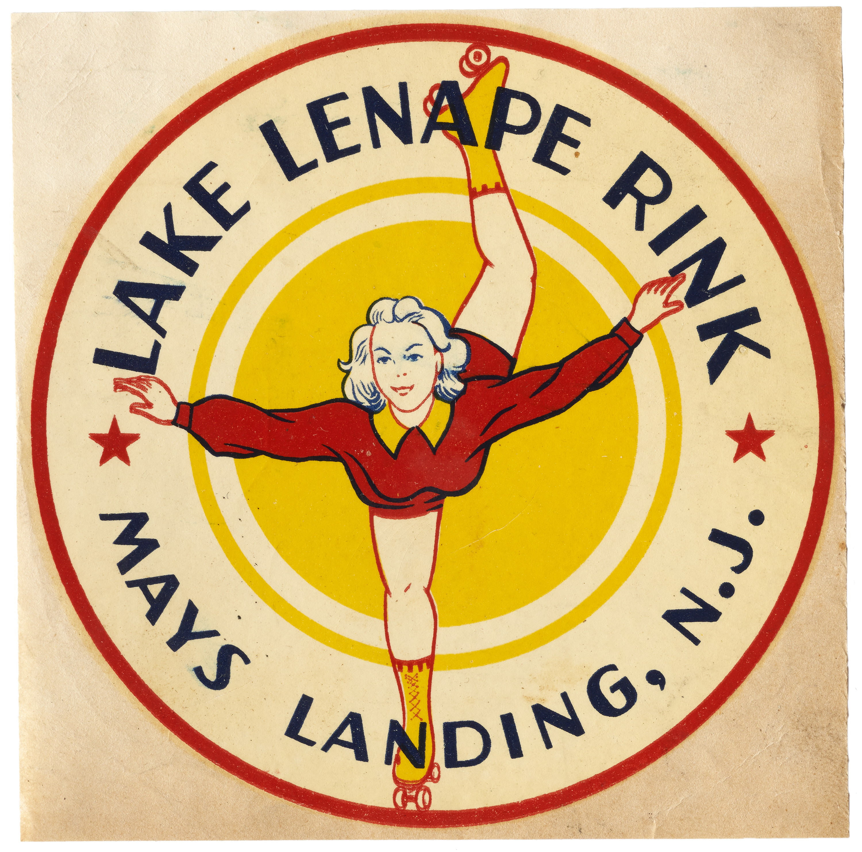
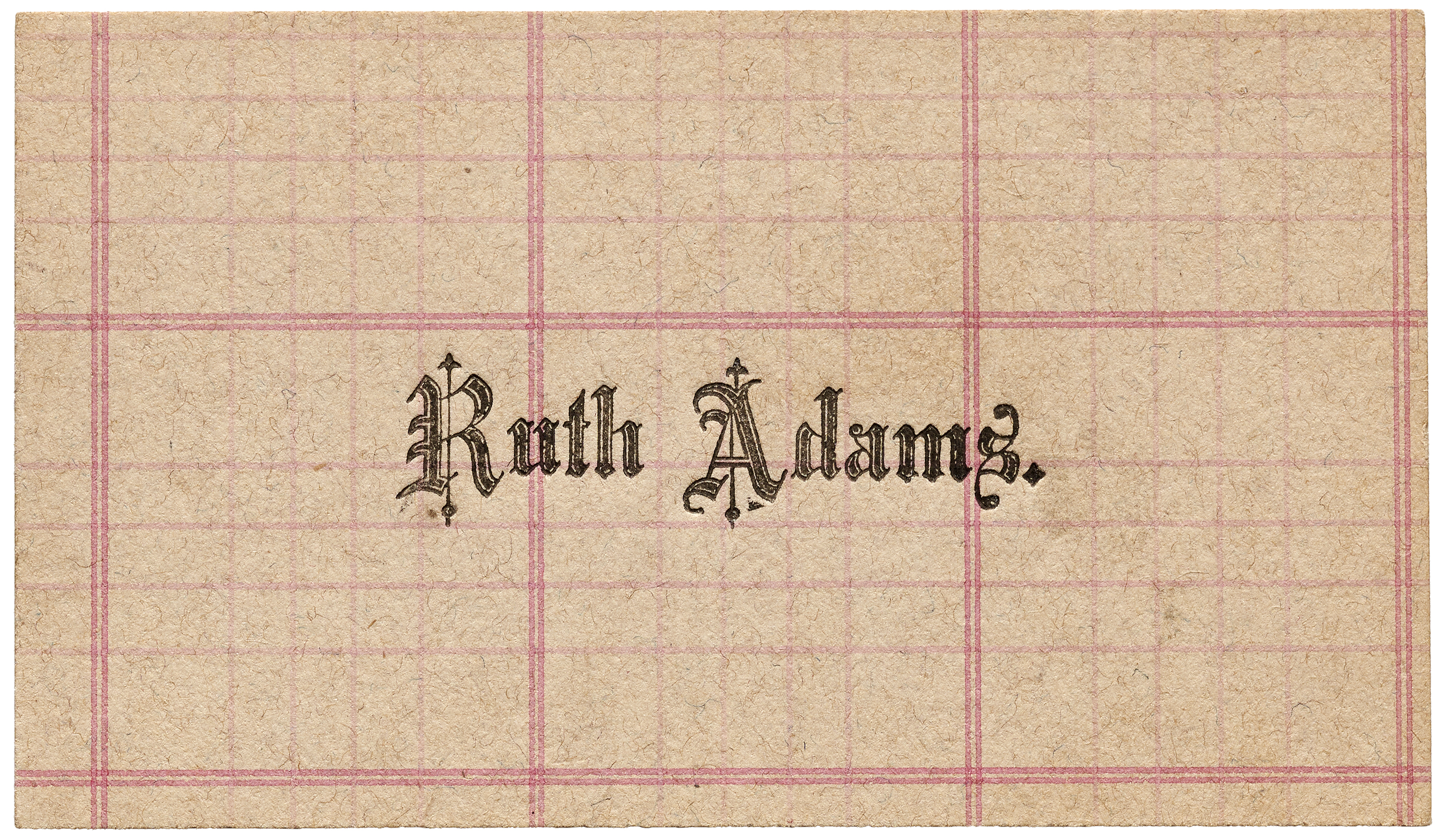
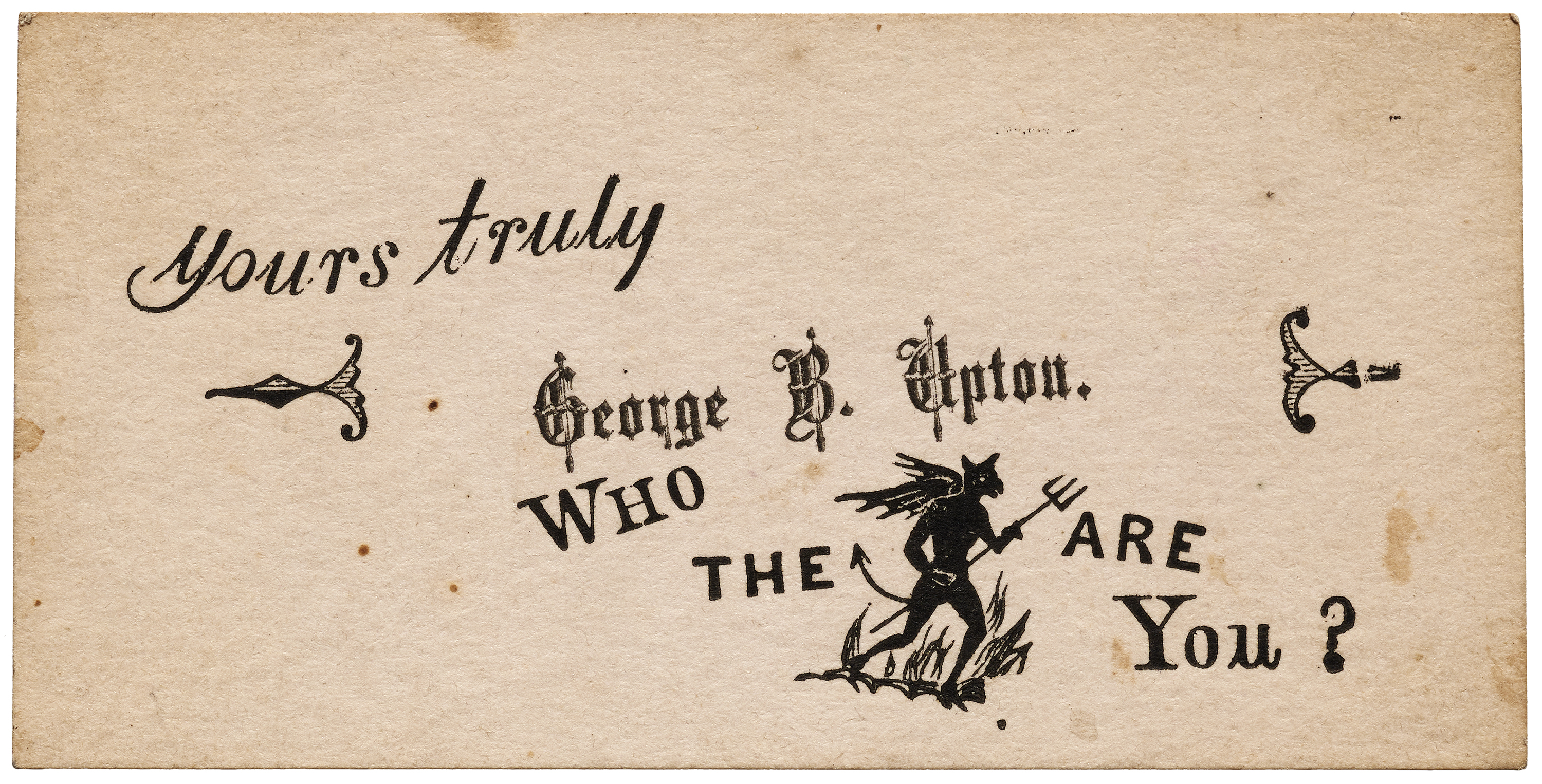
The industrial revolution also gave rise to many new ephemeral paper formats used for packaging, travel, and other emerging areas of commerce. Sheaff’s collection abounds in labels and stickers in various die-cut shapes and printing methods. He also gathered hundreds of visiting cards—the personal predecessor to the business card—with unusual materials and typography.
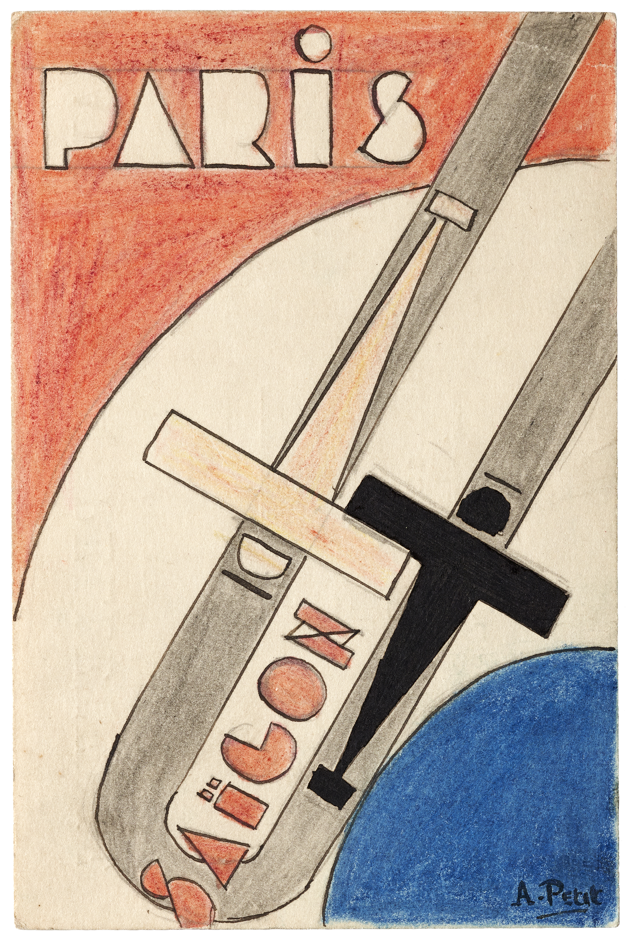
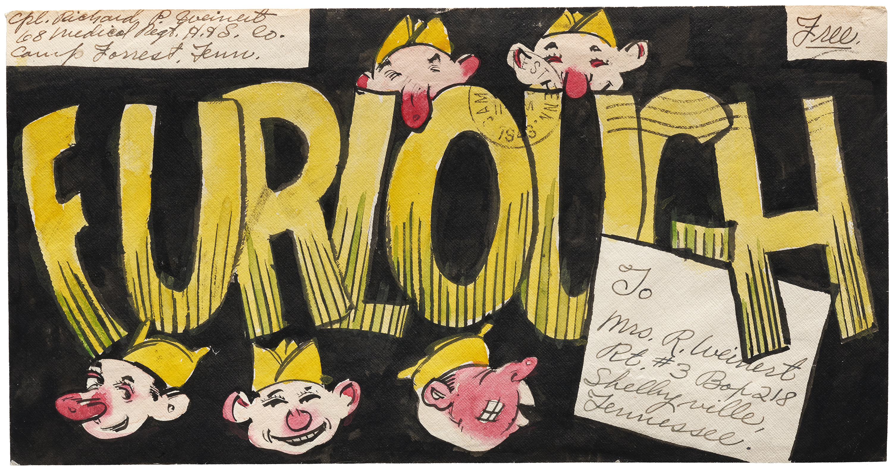
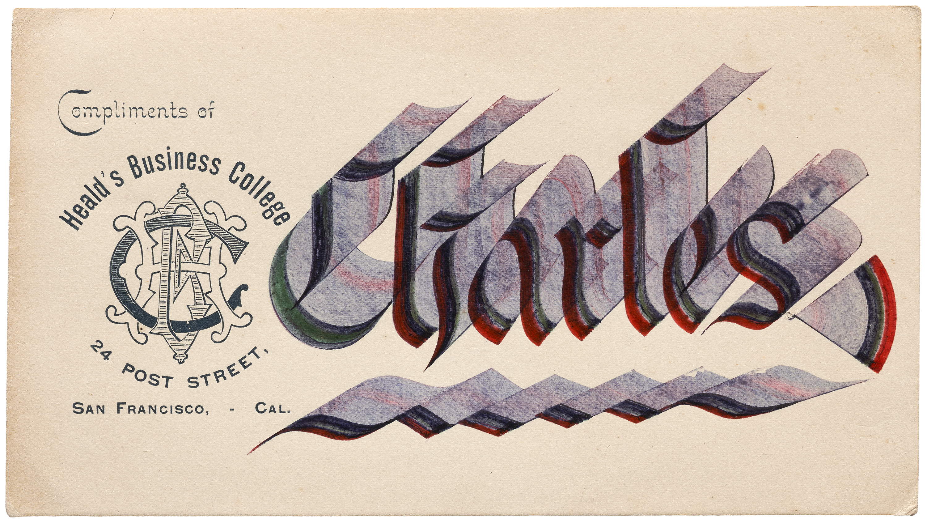
Original Artwork
Not everything in the Sheaff Collection is printed, or even on paper. Some objects feature original artwork, such as maquettes and sketches for a final piece, calligraphy and handwriting samples, or unusually elaborate hand-lettering used to address an envelope. Others have attached ribbons or velvet. Many of these benefit from our hi-fi photography.
— Stephen Coles, Associate Curator & Editorial Director
Further Reading & References
- Sheaff: ephemera — Sheaff’s personal site features collections from various sources and includes some items that will come to Letterform Archive
- The Ephemera Society of America
- Now Online: Color, Ornament, and Type at the Turn of the 20th Century
- Industrial Revolution in the Online Archive
- David Jury, Graphic Design before Graphic Designers
- Doug Clouse, The Handy Book of Artistic Printing
- Matthew McLennan Young, The Rise and Fall of the Printers' International Specimen Exchange