News
Thank you, Camille
For most of Letterform Archive’s existence, one woman has been behind our camera, capturing and sharing the collection for publications, research requests, and social media.
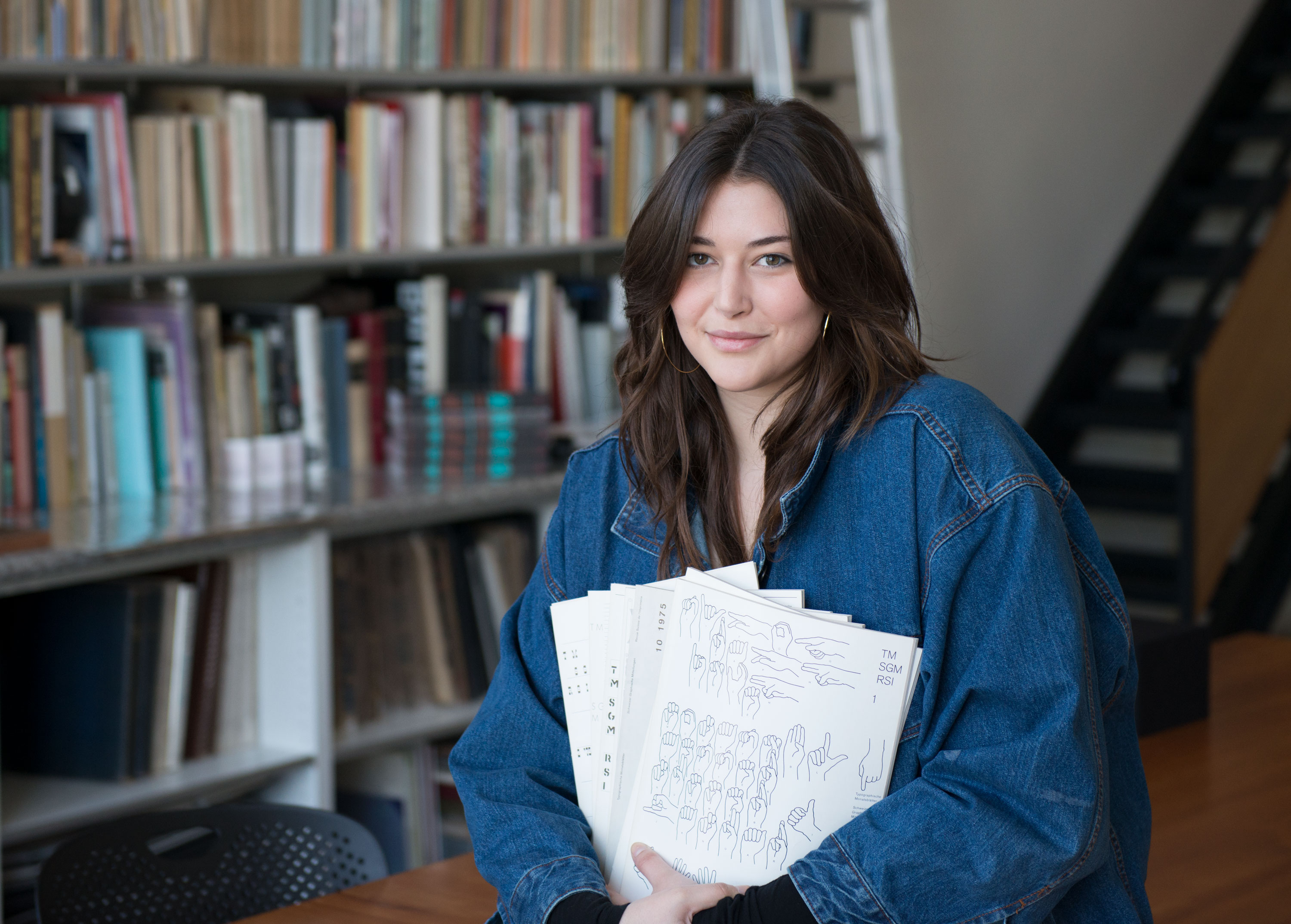
Camille Brown joined the Archive in May 2016 as an intern, and soon took a place on staff as Photographer. Her deft shooting and post-processing skills made large and demanding projects – like the Dwiggins book – possible. And her keen and curious eye set the standard for our social feeds, attracting tens of thousands followers on Facebook, Twitter, and especially Instagram. Now we bid Camille a tearful farewell as she leaves us for her next life chapter in New York.
What was your focus in school (MFA, San Francisco Art Institute), and what kind of work did you want to get into?
In school I was working conceptually, using tools like printmaking, photography and performance. I’ve always been interested in found material, prints & multiples, unbound books and the emotional experience of art when it’s tactile/hand-held vs. framed and viewed from a distance; most of my work included some form of that investigation. Towards the end of the program, my obsession with appropriating and “re-contexualizing” found materials from my personal collection (books about joinery, math, cosmology etc.) really took off, and I knew I wanted to be in some kind of a curatorial position.
When did you first hear about the Archive?
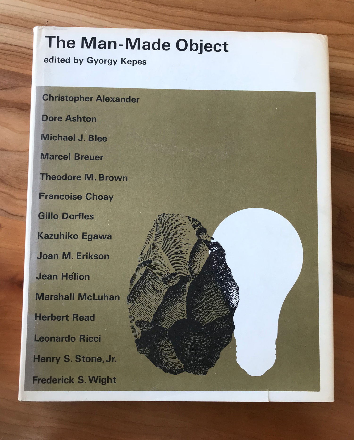
I think it was February of 2016, I had found a book by Gyorgy Kepes in the giveaway pile at the SFAI library and it sparked what was my first conscious trip down the rabbit hole of design. Literal days later I stumbled upon the Archive’s Instagram, truly by happenstance, and figured it was the perfect place to do some research. I booked a visit for the very next day. This is so cheesy, but the whole thing still feels like fate.
Do you remember anything about your first visit?
Everything. For one thing, I was introduced to the work of Piet Zwart, which honestly changed my life. I saw Sutnar’s Visual Design in Action, and the IBM graphic standards which was the first thing I ever posted from the Archive onto my personal feed. I had no idea what graphic standards were! I was so blown away by the fact that this place even existed – for so long, I’d been trying to articulate the things I was interested in, and all of the sudden I was surrounded by all of it at once. I applied to be a volunteer that same night. I knew I needed to be a part of the Archive in any capacity.
“For so long, I’d been trying to articulate the things I was interested in, and all of the sudden I was surrounded by all of it at once.”
The beautiful people that work here are the hardest working, most dedicated humans I think I’ve ever come across, which added to the main attraction: we share our big passion for the Archive. The mission of making this material accessible to the public is what makes being here so meaningful.
You have a great understanding of both graphic design (commercial work) and art (personal work), but you have an appreciation for art that is unusual among our staff or visitors. For those who are stuck on one side of that fence, could you describe how the Archive spans both kinds of work?
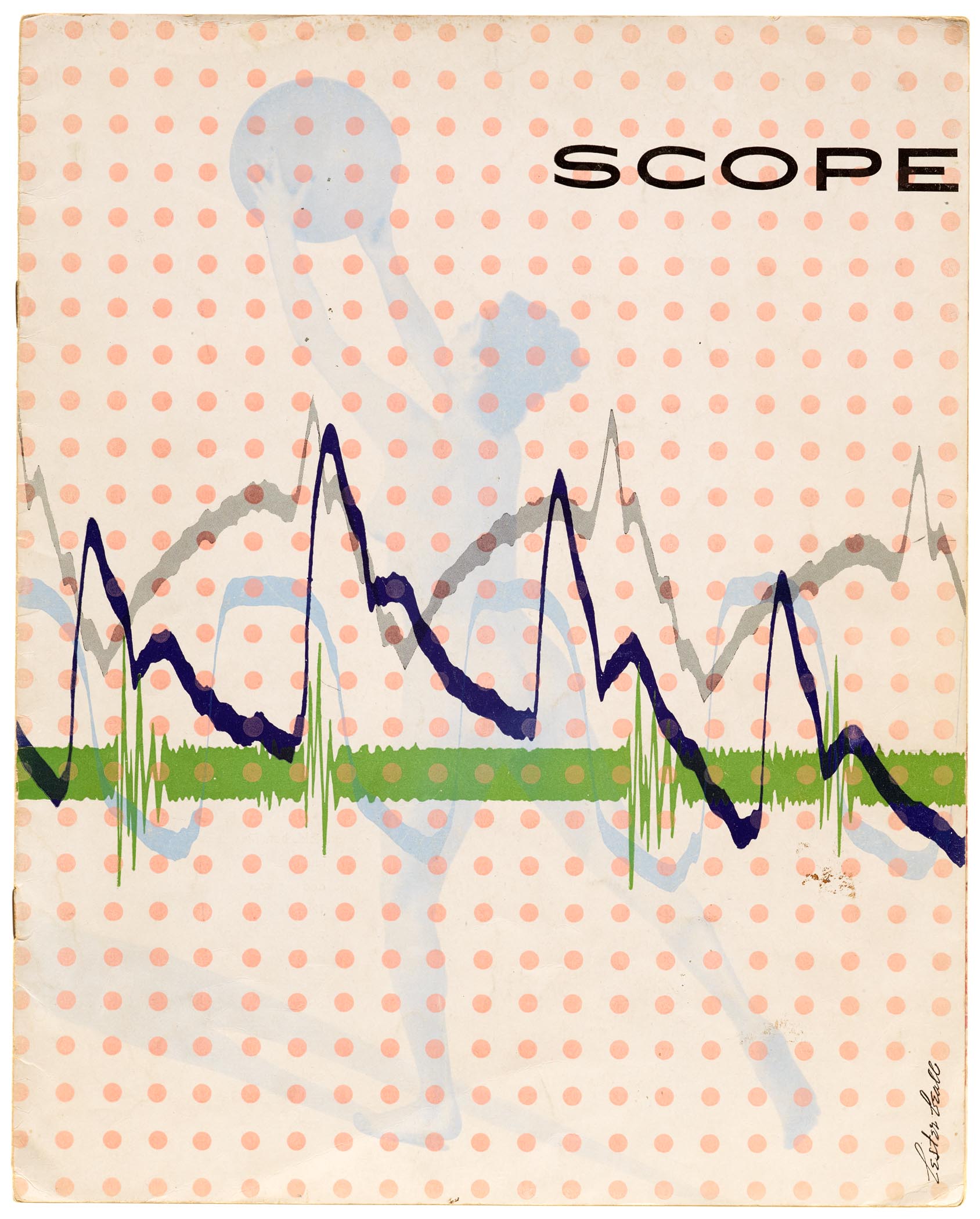
You know, when I fell down the aforementioned design rabbit hole, I had been sort of trained in the archaic sentiment that art and design were two separate entities. Nothing feels further from the truth, and the Archive played a big part in dispelling that myth for me. Not only does the collection have a vast amount of conceptual art in the traditional sense – a burgeoning collection of concrete poetry & visual language, works by household names like Josef Albers and Max Bill, sculptural objects by Jiří Kolář – there is so much more to be found in the collection that blurs those lines. Work like Lester Beall’s covers for Scope, for example, or the massive collection of type specimens, are such an incredible resource and inspiration, not only formally, but in their unique utilization of conceptual thinking within certain constraints. There is truly something for everyone here.
“I love art and design because it brings so much meaning to mundanity. I have this attachment to making things romantic, and I think that’s what really moves me about design specifically; it’s beauty paired equally with functionality and purpose. It’s poetic practicality.”
Before your tenure, the Archive’s social media content had various editors over time, with different ways of presenting the collection. How did you approach that role?
I don’t think there was anything that needed to be improved – it was more about building on the existing ideas and creating a more robust and consistent presence that could really demonstrate the breadth of the Archive’s collection. It just felt like such fertile ground, and a really exciting platform to potentially build the Archive’s notoriety as well as take on a curatorial role and get to know the collection. The fact that it took off like it has, and the following has grown so exponentially (from 4,000 to 47,000 on Instagram!) has been one of the most rewarding parts of my time here.
What it is it about the Archive’s photography standards that stands out to you?
Being able to capture the multitude of textures in the work is what makes the photography so special. The magic of different paper stocks and the exquisite details of hand-painted or calligraphic work become so illuminated with the use of raking light, and it really allows you to experience the material almost as if you were seeing it in person.
By now you’ve led dozens of intro tours. Any particular visitor experience or reaction stand out? What was your favorite thing to show?
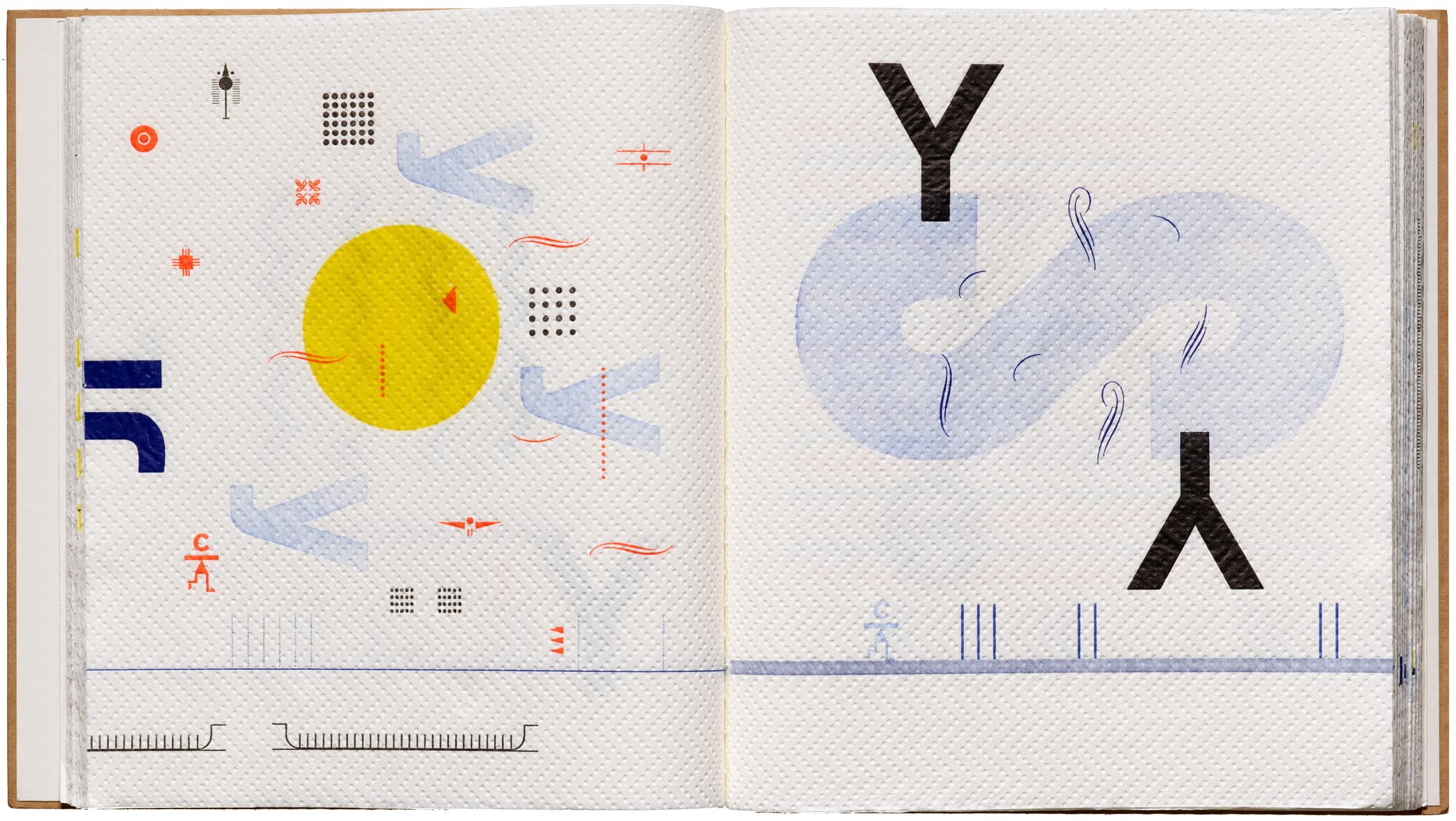
The excitement of first-time visitors will never get old – I feel like I’m saying a lot of cheesy things in this interview, but I swear they’re all true. Much like the big passion I mentioned within our staff, our visitors share that same passion. In every tour, there is at least one item per person that just blows them away. Whether it was something they’ve always wanted to see or something they’ve never heard of, it’s an unparalleled feeling of pure excitement and inspiration. I think my favorite thing to show would have to be Romano Hanni’s Typo Bilder Buch, made up of letterpress-printed paper towels. Everyone, no matter their interests, is in awe of it.
What was your favorite part of the job?
When people ask me about what I do, I often say that my job feels like an artist residency. To be able to come to a place like this and learn every day and be inspired every day is the ultimate privilege. I felt genuinely lucky to work here, not to mention being surrounded by some of my favorite things in the world. And the staff. You are my family.
How will your experience here inform what you do next?
Letterform Archive came into my life and gave it meaning at a time when I felt it was lacking. Not only have I gained a wealth of technical knowledge, my time here has solidified my deep love for this world of design, and given me the clarity to know that I want to continue in this field. There aren’t really words to explain how the Archive has changed my life. I will take this place with me everywhere.
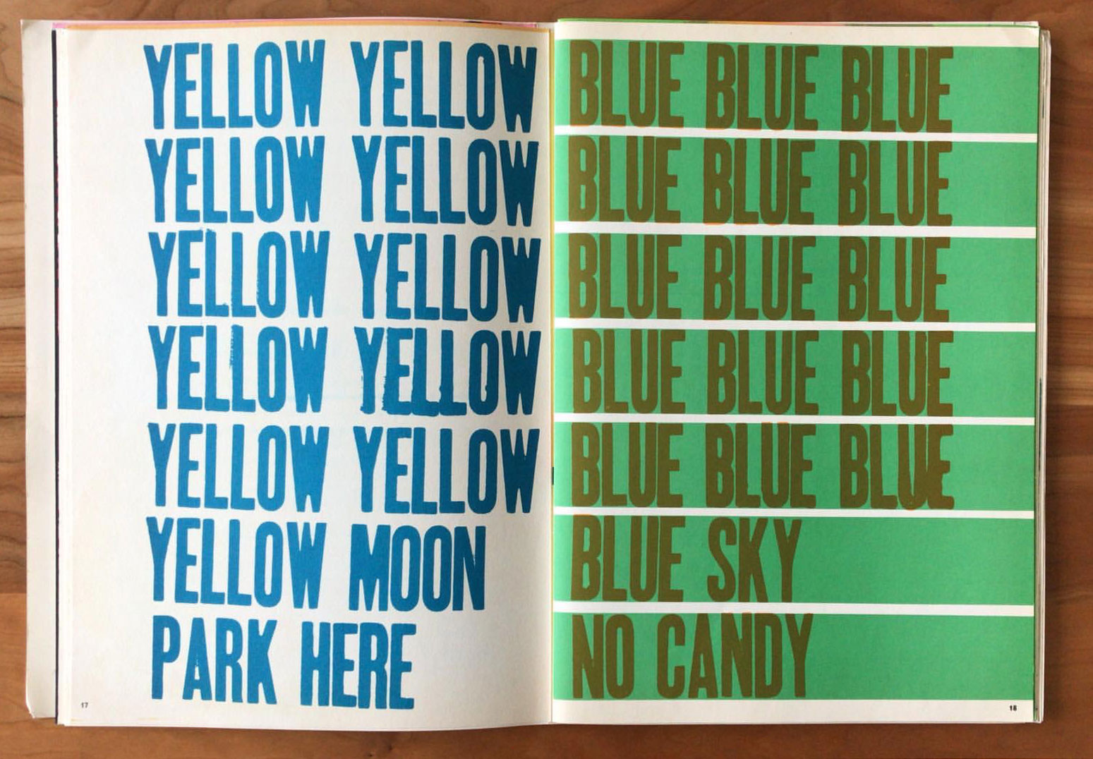
A Few Popular Posts from Camille’s Tenure