News
This Just In: Hunter Saxony III’s Calligraphic Response to the Murder of Nia Wilson
“The Last Black Calligrapher in San Francisco” combines traditional calligraphic virtuosity with vintage photography to speak to contemporary issues.
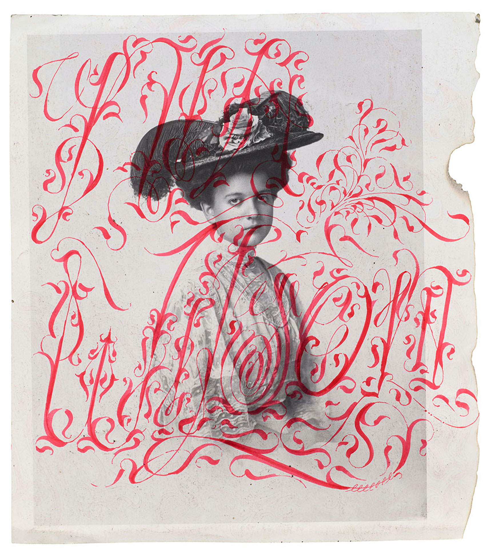
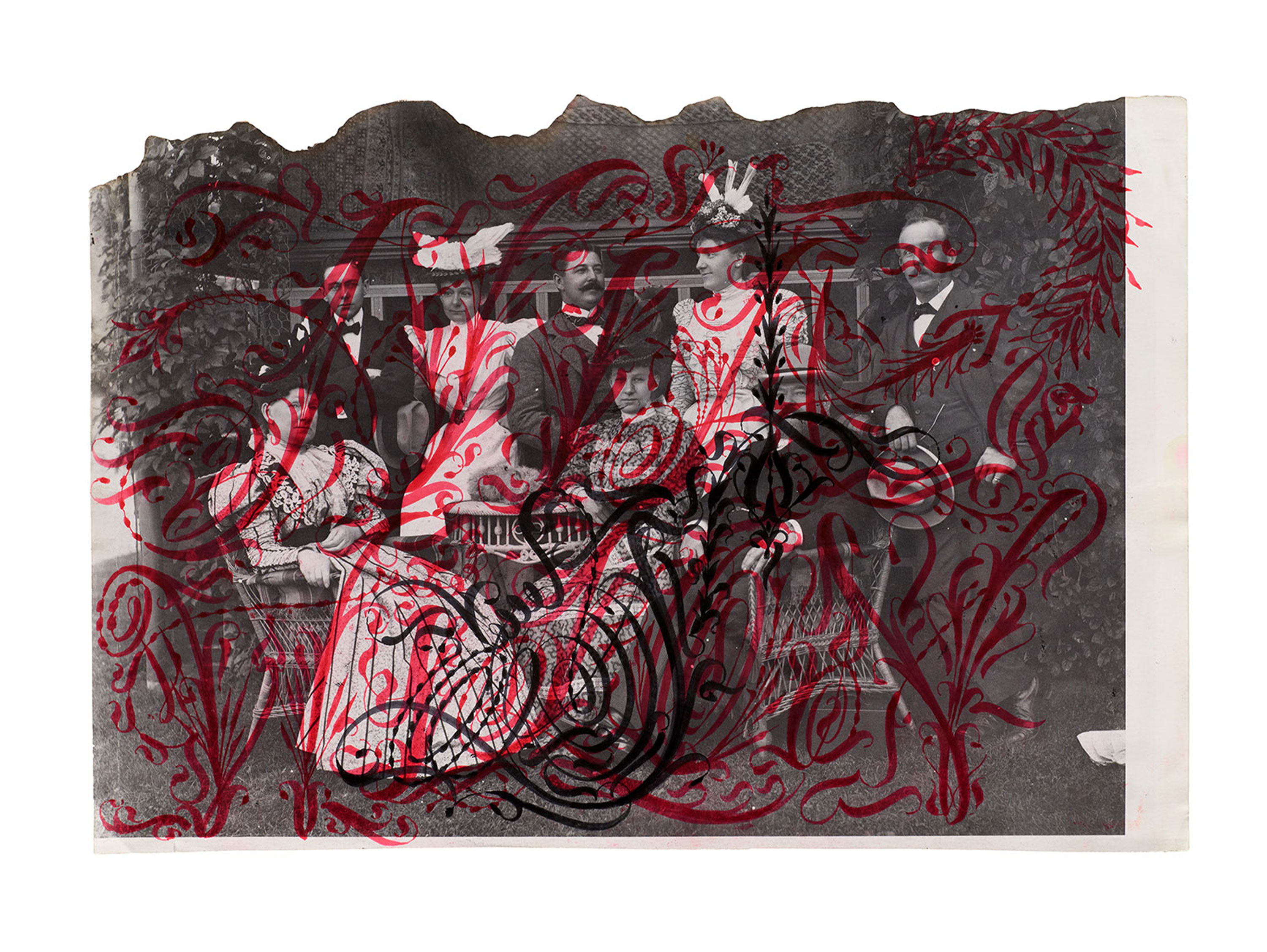
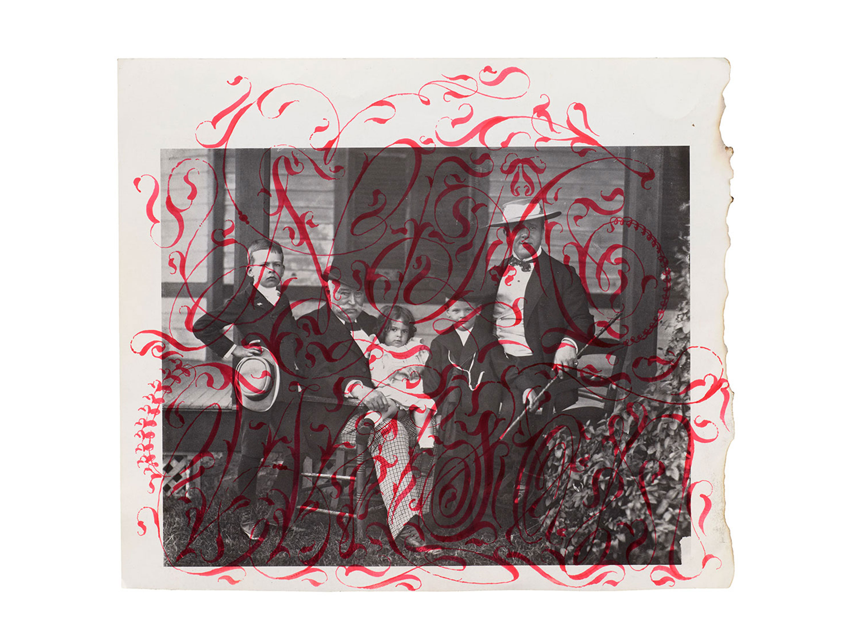
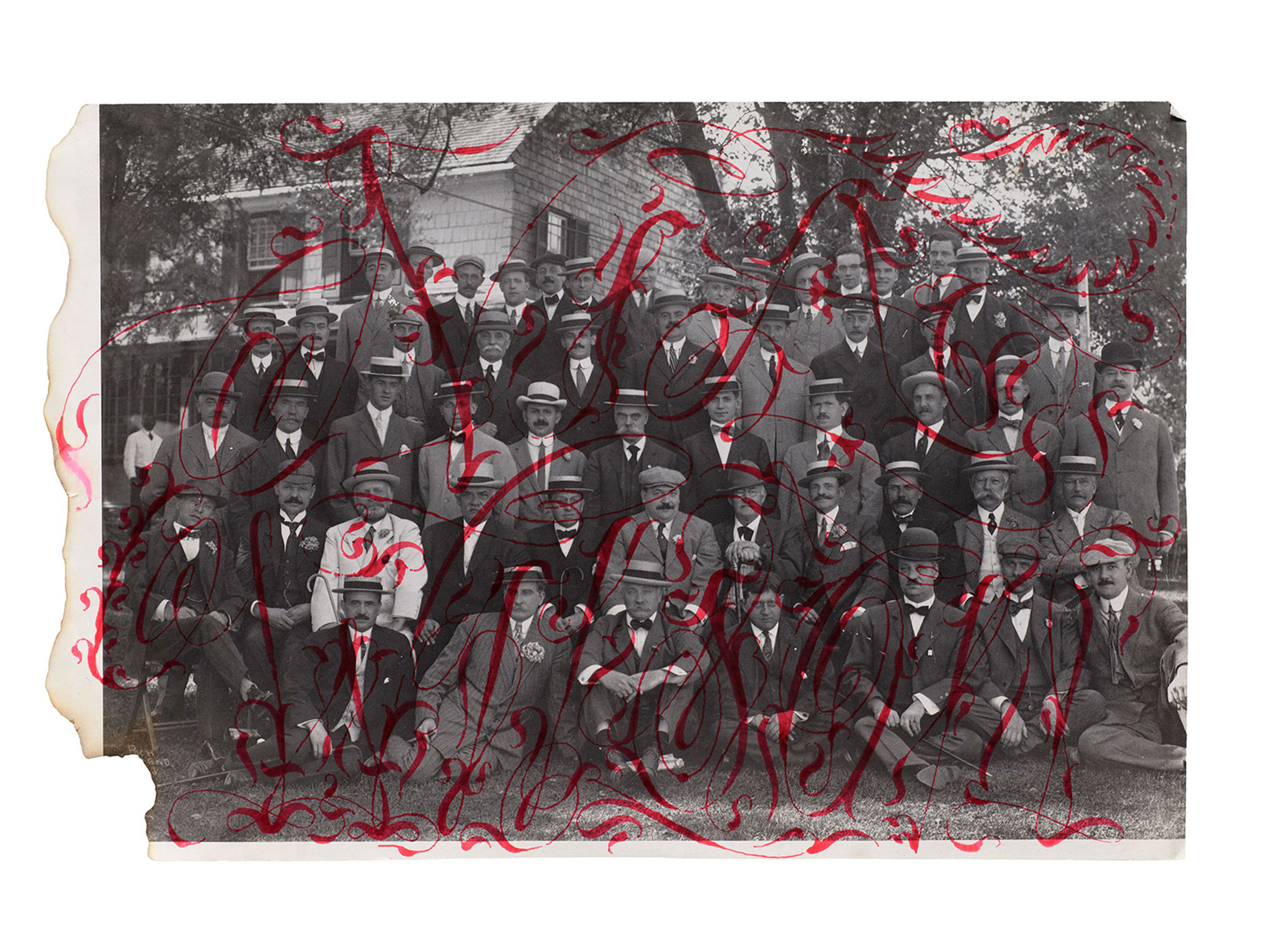
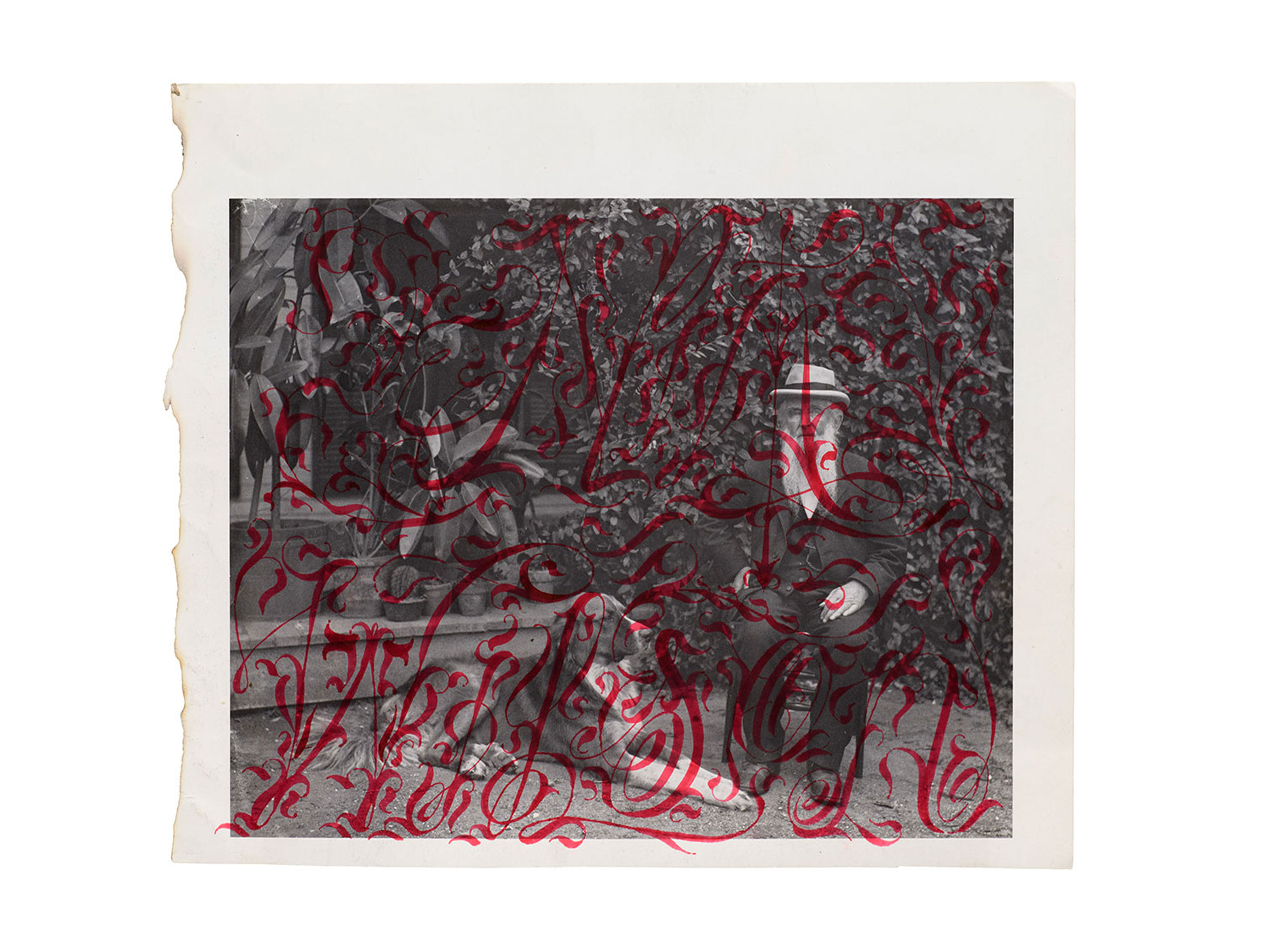
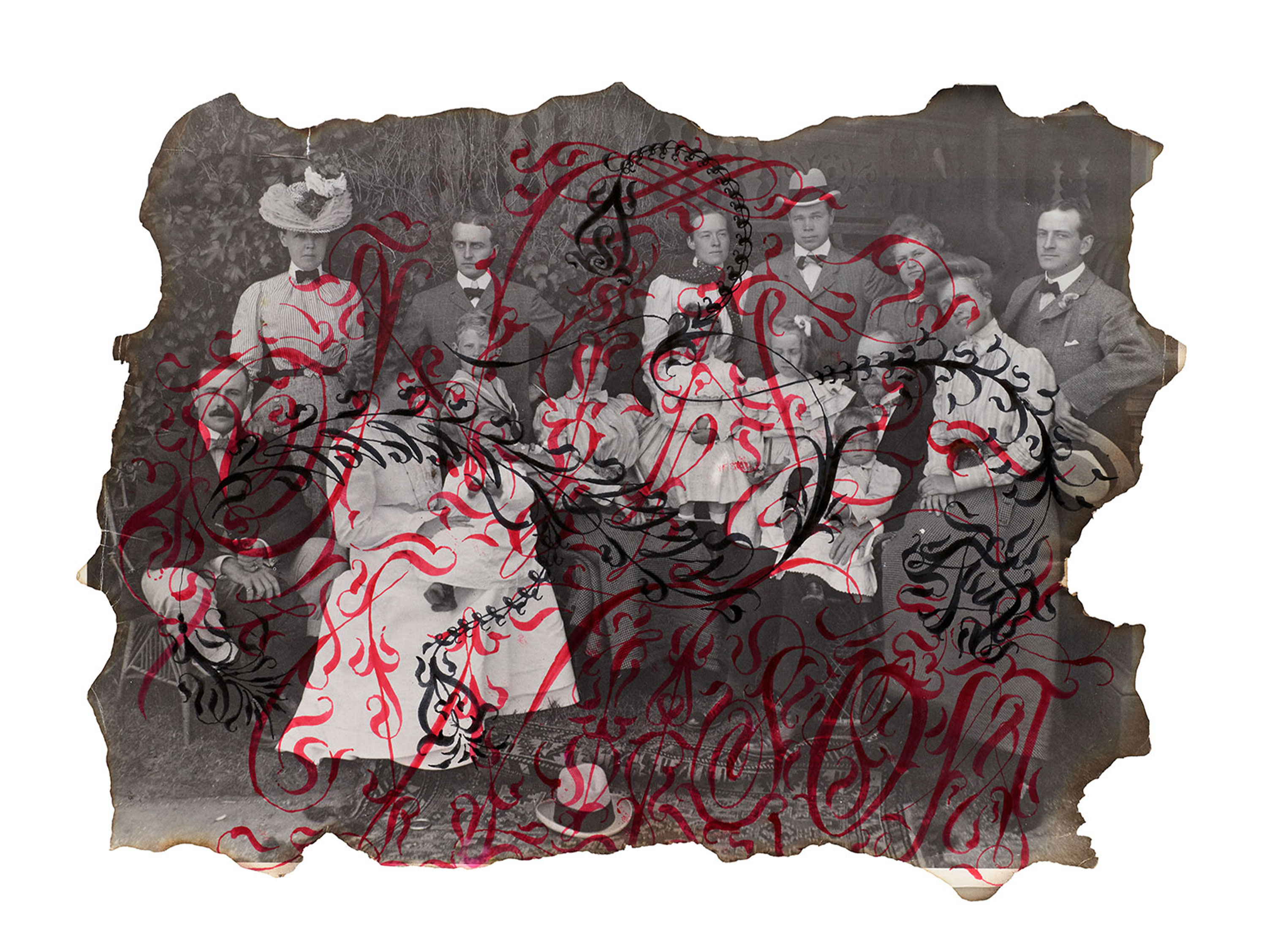
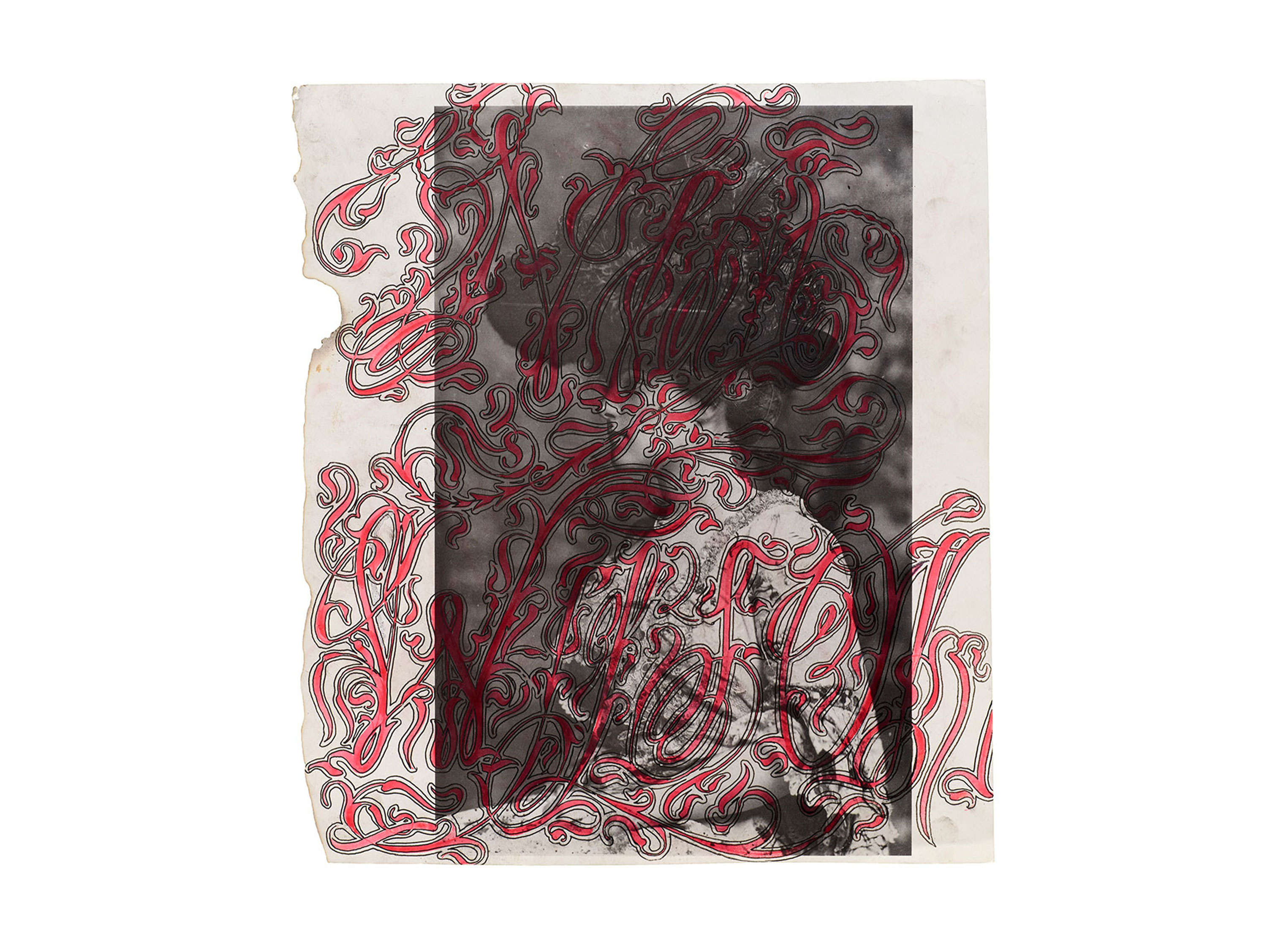
In 2018, Nia Wilson was murdered by a White man at the MacArthur BART (Bay Area Rapid Transit) station in Oakland, California. The attack was racially motivated, and representative of ongoing anti-Black sentiment and action in the US. In the aftermath of murders like Wilson’s, many media outlets try to reframe or minimize the narrative of the victims, scrambling for justifications. Nationwide protests and vigils followed Wilson’s passing, while individuals memorialized her in their own ways. Bay Area artist Hunter Saxony III (AKA The Last Black Calligrapher in San Francisco) created a series in her memory titled Nia Wilson / Say Her Name / No Silence.
The series alters vintage photographs of Southern gentry, writing over them with Wilson’s name. At first glance it is the unfamiliar faces that pop out in these portraits, before the foreground ornately written in bright red ink comes into focus. Both elaborate and haunting, the lettering interrupts the prim and proper portraits. While at first it may seem like the photographed individuals have no connection to Wilson or contemporary events, they represent a lasting structure in which power, privilege, and inequality continues its hold over generations. Our interview with Saxony is below.
You are a self-taught calligrapher. When did your relationship to calligraphy begin? What have you learned about yourself and the practice?
I’ve had an interest in letters/words since I was a teenager in Rhode Island, where I grew up and moved through the hardcore and underground hip-hop scenes in the mid-’90s. It was in that scene that I also discovered and developed a deep interest in mysticism and the occult. All of these things showed me the power of words. It has always seemed like “the way”. Generally, I think my work is an examination of self. I have learned how to use calligraphy as a tool in presenting those narratives.
Are there historical materials, such as an era of art or ornamentation, writing manuals, or specific calligraphers that have influenced or provoked the way you approach your practice?
Research has informed the way I approach being a calligrapher. I believe the most important thing to being a talented calligrapher, next to practice, is researching past masters. A really good book on theory and history is The Alphabetic Labyrinth by Johanna Drucker. That said, Jenny Holzer, Reader OYE, Gil Scott Heron, Yohji Yamamoto, and Pina Bausch are all sources of inspiration
My work holds the energy of my friends that didn’t make it as far in life as I have.
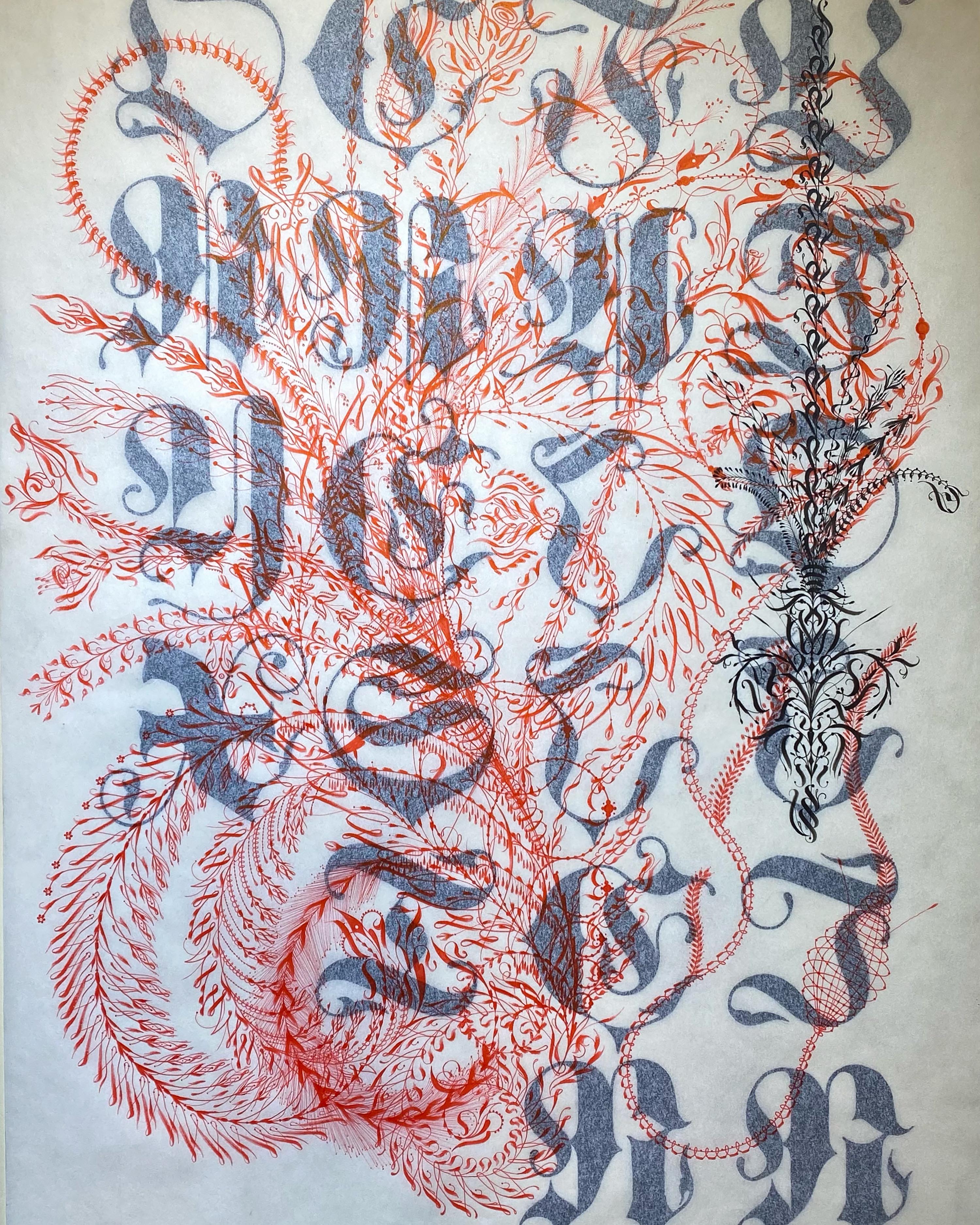
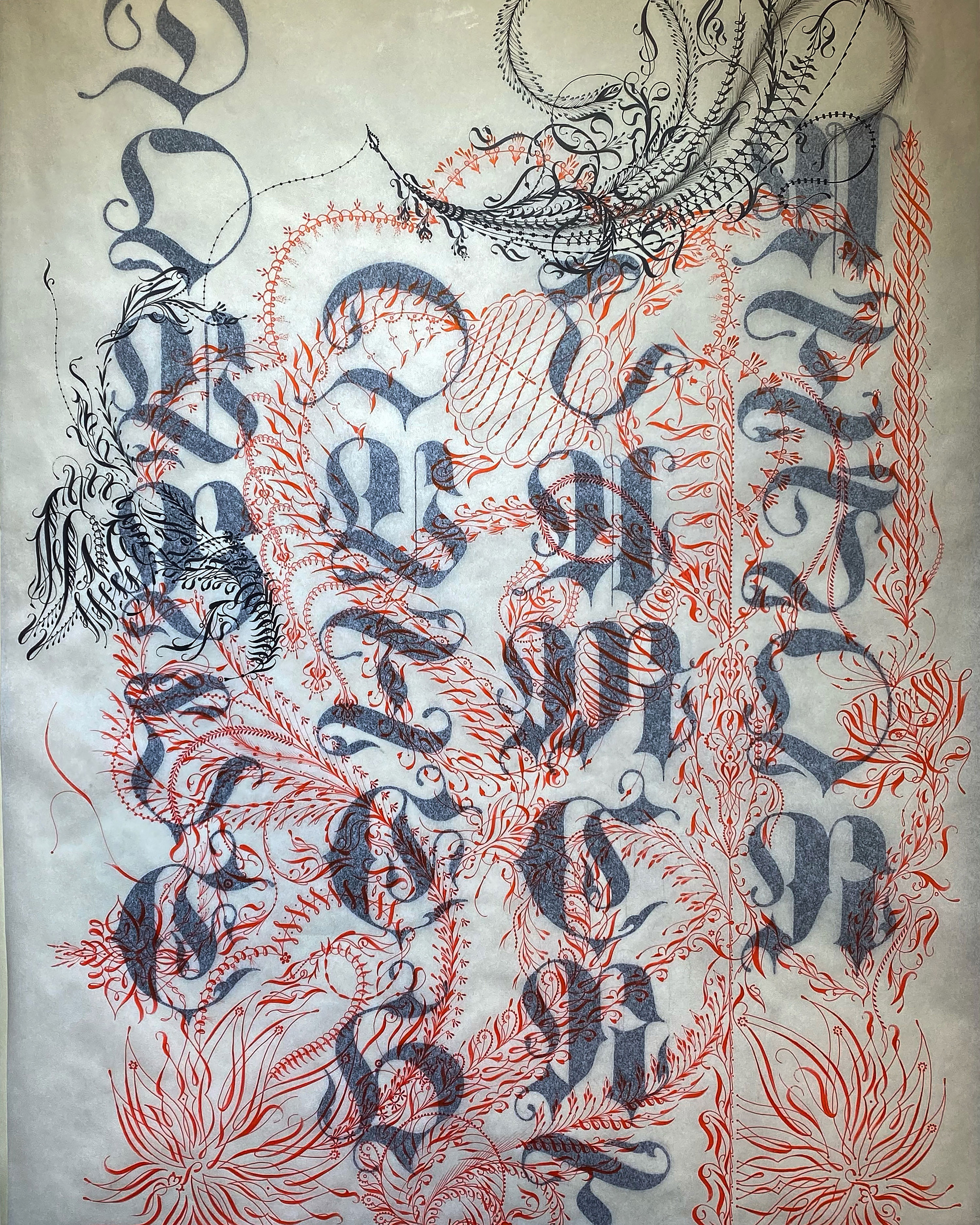
Is there a significance behind your chosen visual style of calligraphy, such as the color palette and the flourishes and symbols you include? For example, I noticed on your Instagram that you use the hashtag #bloodletters and #scarletletters.
The black and red have a historical reference; it is a pairing that is used in many cultures. I like the historical connectivity it gives the work. If I was to put a significance on the things you ask about — it would be through the lens of the creator. Being a Black calligrapher who creates work that is steeped in European, Asian, and Arabic lineages places me outside the traditional boxes of calligraphy off rip. Bloodletters… My work holds the energy of my friends that didn’t make it as far in life as I have. I am really only creating what they inspired me to. To be here in San Francisco as a calligrapher, I’ve sacrificed, learned, and unlearned a lot of life lessons to make the work that I do today. Every bit of who I am gets written down on these pages, even if there are no words. Scarlet is a pretty color and a very powerful word. I like duality.
Looking at your other body of work, there is a pattern of writing calligraphy over certain images and text. How do you choose the material and the words to respond to it?
Well, the body of work that is represented on my Instagram is kinda a mixed bag of ideas. The writing on various items involves my love of words and ephemera. Most of the earlier work includes sketches in vintage books done while riding on BART. When I started creating calligraphy professionally the content changed. Now I only post things that involve fully realized ideas, commissions, personal works, and sometimes tattoos.
Can you share more about your chosen name as “The Last Black Calligrapher in SF”?
It is not a chosen name, it is an intentional collection of descriptive words. I feel like I’m a one of one out here in these skreeets, in historical context and in a literal sense. I hope my artwork continues to reflect every bit of that truth.
Your series commemorating Nia Wilson is powerful and haunting. What led you to create this series? How would you describe the act of physically writing Nia’s name over these photographs? What feelings or thoughts came up for you during this process?
I have been riding BART as my main source of transportation since I moved to the Bay Area in the early 2000s. For a Black woman to lose her life there, and so violently, was really disturbing and disarming to me. About a month after her passing I pulled out these vintage magazine pages I had collected while living in Austin and created the series.
The burning is for societal ugliness that should have been manicured into an American Dream by now but clearly hasn’t.
Where are these images from? Why images from the 1900s instead of contemporary people or from other time periods? Who were these people?
These images are taken of plantation families and wealthy families from the deep South around the 1930s. There is a high possibility that these people kept or partook in slave labor of some kind. So they themselves play a very important role in this piece itself. The life they live in these photos and the repercussions of that life on the Black community hundreds of years later is of utmost importance. I think that can be applied to the death of Nia Wilson.
The act of burning photographs often suggests an act to forget a memory, making an object physically disappear. The photographs seem to have been burned just along their edges. Could you share more about this decision?
The burning of the paper speaks to the history that shouldn’t be told. The dots we’d like to disconnect. I shouldn’t have to look at these photos knowing they are slave owners or sons and daughters of them, but it is what it is. The burning is for societal ugliness that should have been manicured into an American Dream by now but clearly hasn’t. The poet Saul Williams once said, “I didn’t burn everything but I know I probably should have.”
By marking over these historical photographs, you’ve produced a new image. Does this new image have a new meaning, narrative, or story in your point of view?
I’m constantly collecting vintage ephemera then writing on it, or maybe destroying it … depends on who I’m explaining my intentions to I guess. There is meaning in just the act of writing on such old pieces of time. The only reason I write on these objects is to restructure their message and to make my own. The object and the article together is the art. Generally I don’t like to really say that my artwork means a certain thing. In relation to my Nia Wilson series, I do think that there is a history of violence in this country against Black people that is looking straight at you in those photos — not only by who’s depicted there in all their splendor but also by what is written down in all its pain.


We are honored to hold four pieces of original artwork from Saxony’s Nia Wilson series. Two are on display in the Online Archive, along with other examples of calligraphy, old and new. Join our mailing list to be notified of additions to the collection and more interviews with artists, designers, and calligraphers.
Florence Fu is a writer and type designer in New York. She holds a B.A. in Art History and a B.S. in Journalism from Northwestern University, and is a graduate of Type West’s year-long type design certificate program. She is a contributor to Letterform Archive and Sharp Type Co.