News
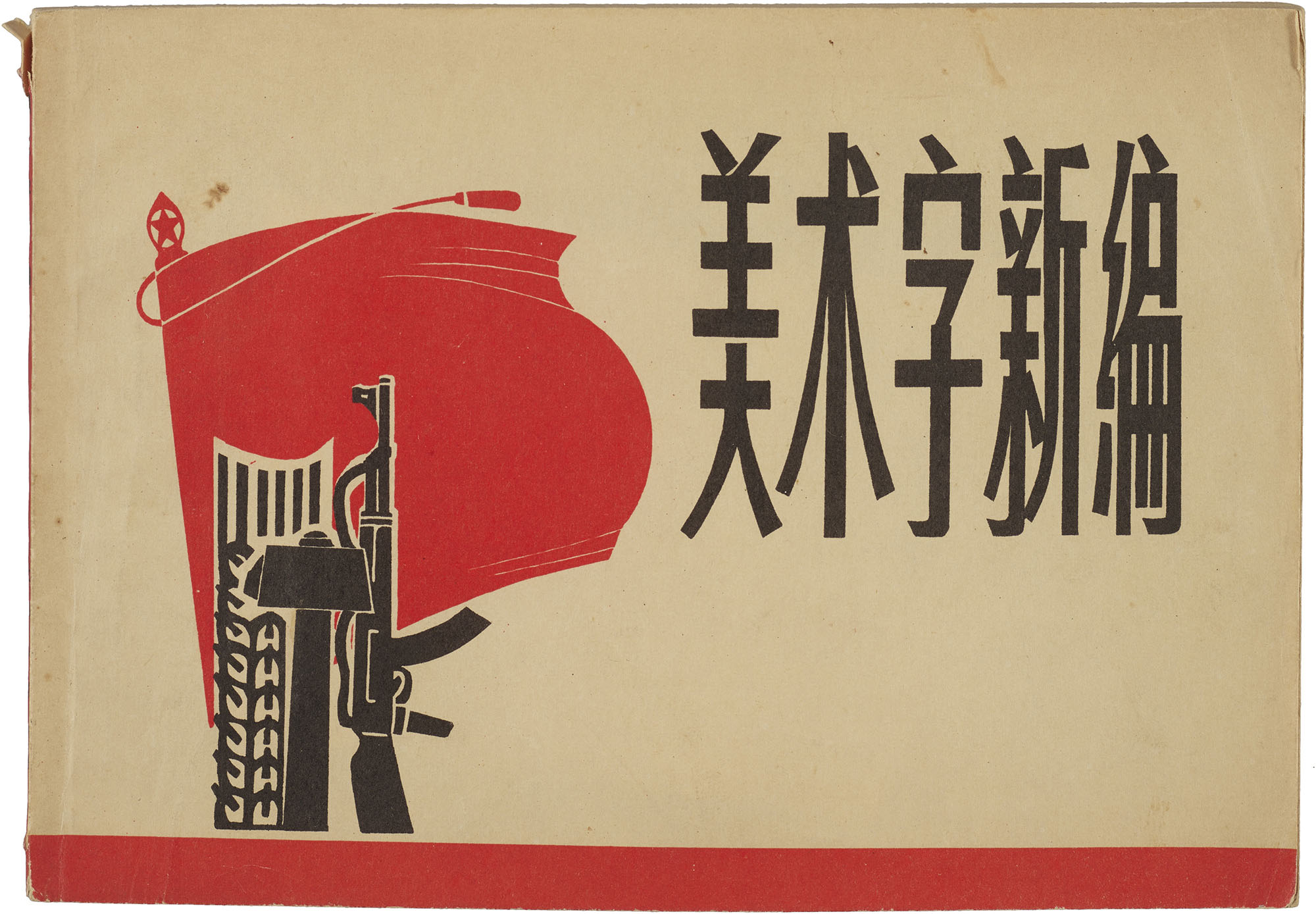
This Just In: Chinese Lettering Manuals, 1930–1971
Our new meishuzi collection reflects a period of significant cultural change in China, and provides an uncommon source of inspiration for contemporary lettering artists and type designers.
In our ongoing effort to expand the story of graphic design beyond the Western canon, Letterform Archive continues to collect objects that illustrate the development of the world’s writing systems. This means consulting with experts in those scripts, as we recently did with Synoptic Office, a design firm working internationally with a focus on cultural heritage and archival collections. Their research into the landscape of Chinese typography appears in The Bloomsbury Handbook of Global Typography. We asked their team to source Chinese lettering manuals that are otherwise inaccessible in the West. The resulting collection, gathered from bookshops and flea markets in China, is unusual for an American institution — and one that we were unlikely to acquire any other way. In this guest post, Caspar Lam and YuJune Park of Synoptic Office tell us what they discovered.
At the start of China’s Republican era in the early twentieth century, a unique form of lettering called meishuzi (美術字), or “art lettering,”1 emerged that was distinctly different from both classical calligraphy and historically printed forms. Hastened by encounters with the West, Japanese imports, and shifting ideas about tradition and modernity, meishuzi developed alongside illustrated magazines, advertising, and the adoption of Western-style printing presses. Its newness afforded its practitioners wide latitude to experiment with novel typographic forms while retaining core ideas drawn from China’s long scriptorial tradition.
Through Western missionary activity, the nineteenth century saw the reintroduction of the printing press in China as well as the establishment of early arts and craft schools that offered instruction in Western methods. In neighboring Japan, the Meiji Restoration brought an end to military rule by the shoguns and initiated profound societal change as the country rapidly modernized and adopted Western ideas. The early twentieth-century appearance of meishuzi is an inflection point in Chinese art and design history where traditional ideas of arts and crafts diverged from methods of artistic production imported directly from the West and indirectly by way of Japan through both printed matter and Chinese students studying abroad. As a result, terms like “commercial lettering” (guanggao wenzi) and “design lettering” (tuan wenzi) were borrowed from their Japanese equivalents to describe an emergent typographic form which by the 1950s was commonly referred to as meishuzi. The subtle shifts in language reflect an ambiguous relationship between traditional and modern notions of art and design that remains contested today.
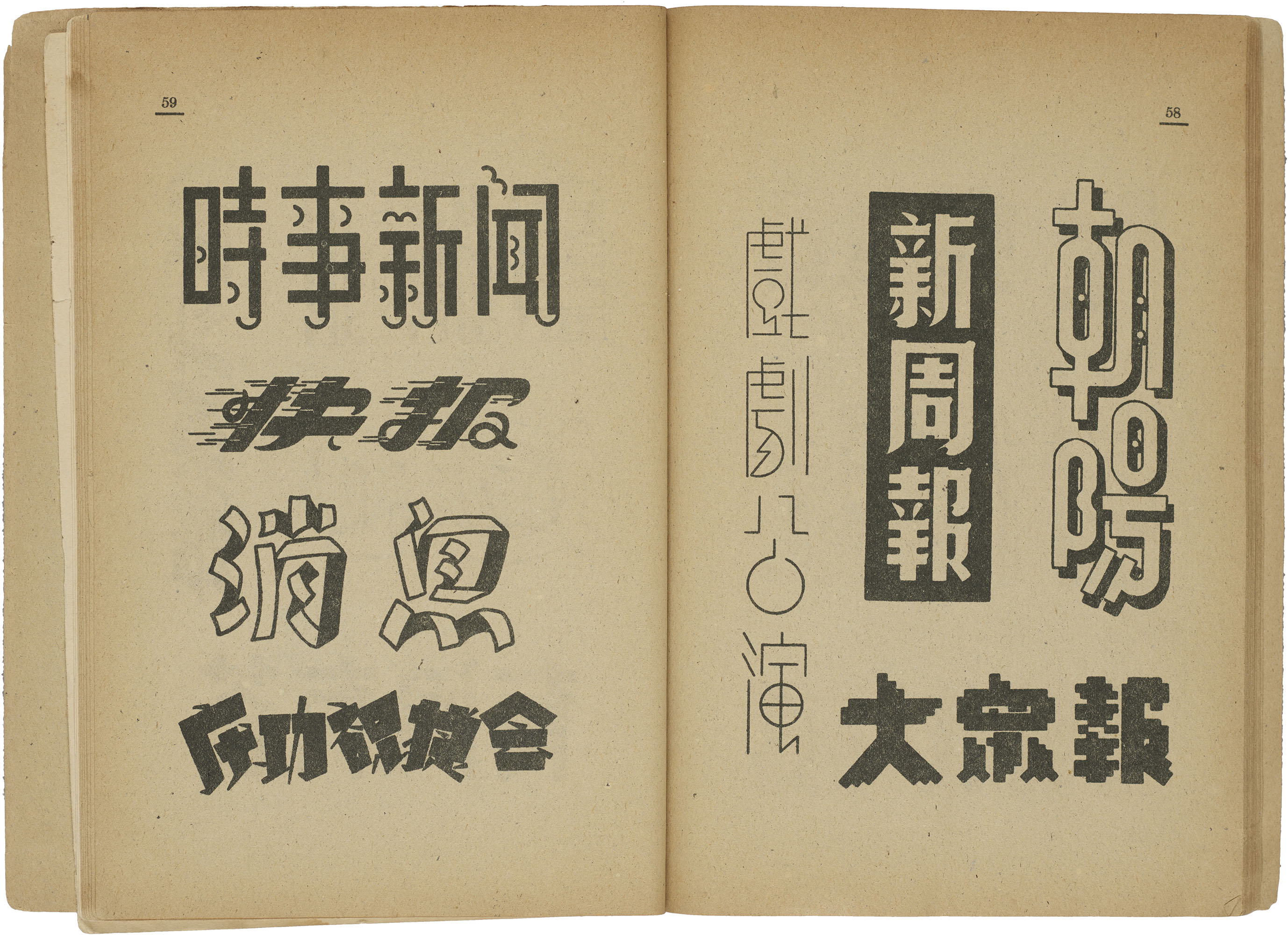
Meishuzi occupied a similarly ambivalent position among the existing calligraphic and printed traditions from which it emerged. Refracting the script through the lens of image making, its forms oscillated between uninhibited experimentation and restrained approaches to appeal to the public—first in service to commerce and later in service to politics. Presenting a limitless variety of meishuzi, practical manuals provided inspiration and instruction for a burgeoning industry of early 20th-century Chinese commercial artists. As the practice of meishuzi spread to a more general audience, it transformed from a specific aesthetic to a set of practices for creating eye-catching forms with multiple meanings that suited the nation-building priorities of a new China.
From Script to Image
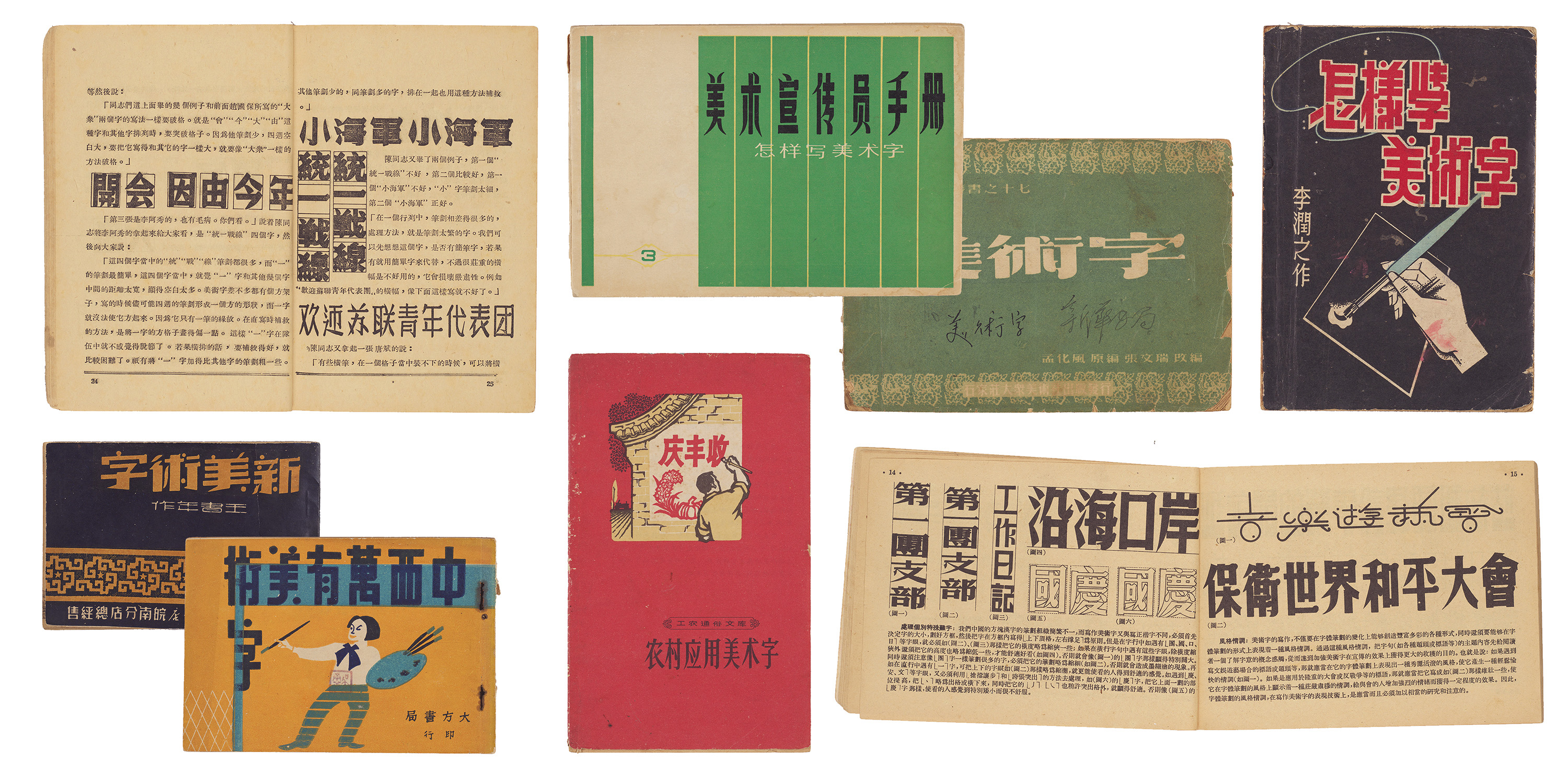
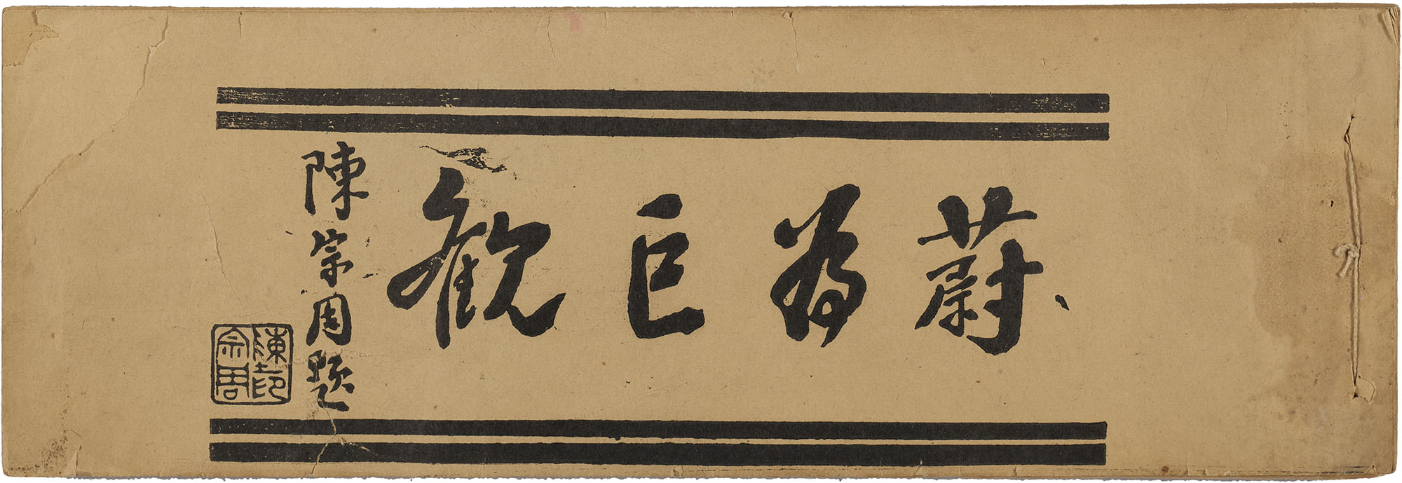
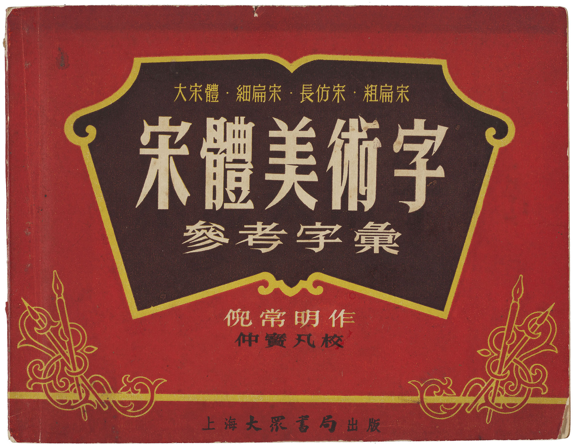
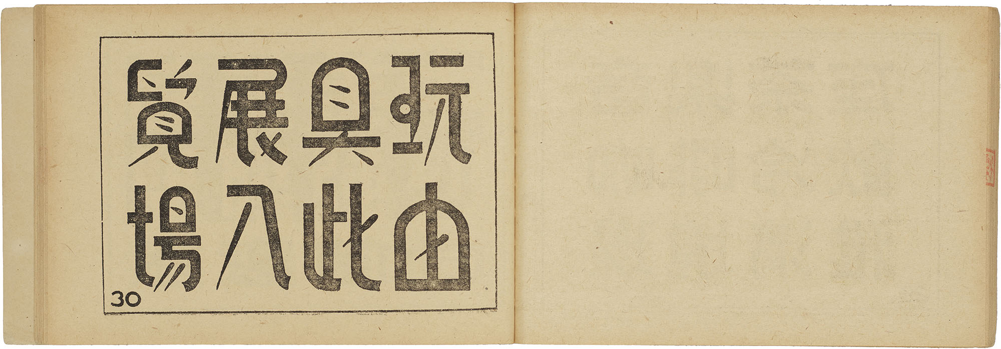
Early meishuzi manuals functioned like pattern books with little to no instructions. Small and pocket-sized, these horizontal booklets were thread-bound, sometimes using traditional Chinese stitch-binding techniques, or stapled. Sample lettering was printed on one side of the thin, fibrous paper typical in Chinese books.
All images in the gallery below are hi-fi captures. Click an image to enter fullscreen view, then click or pinch to enlarge.
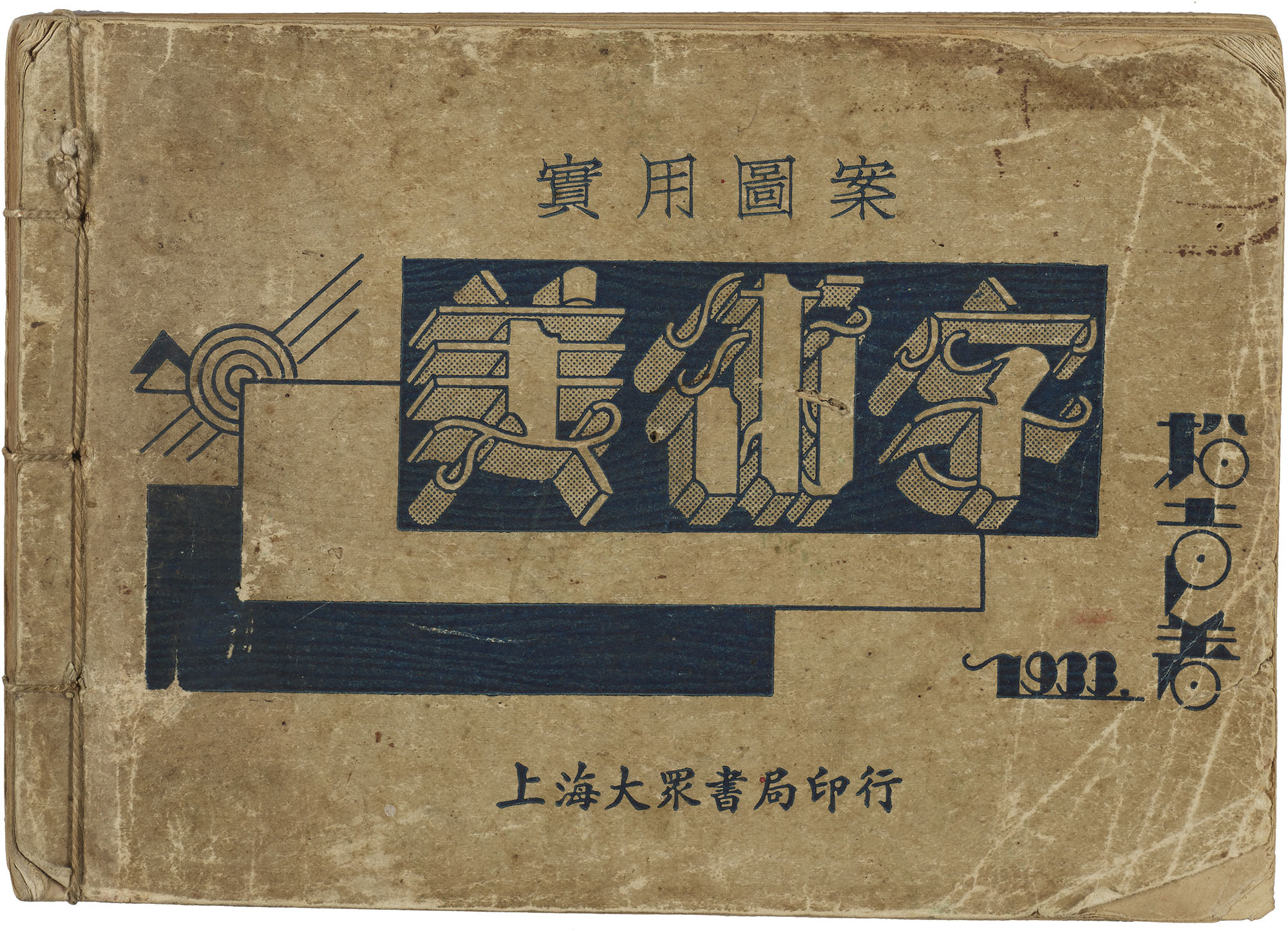
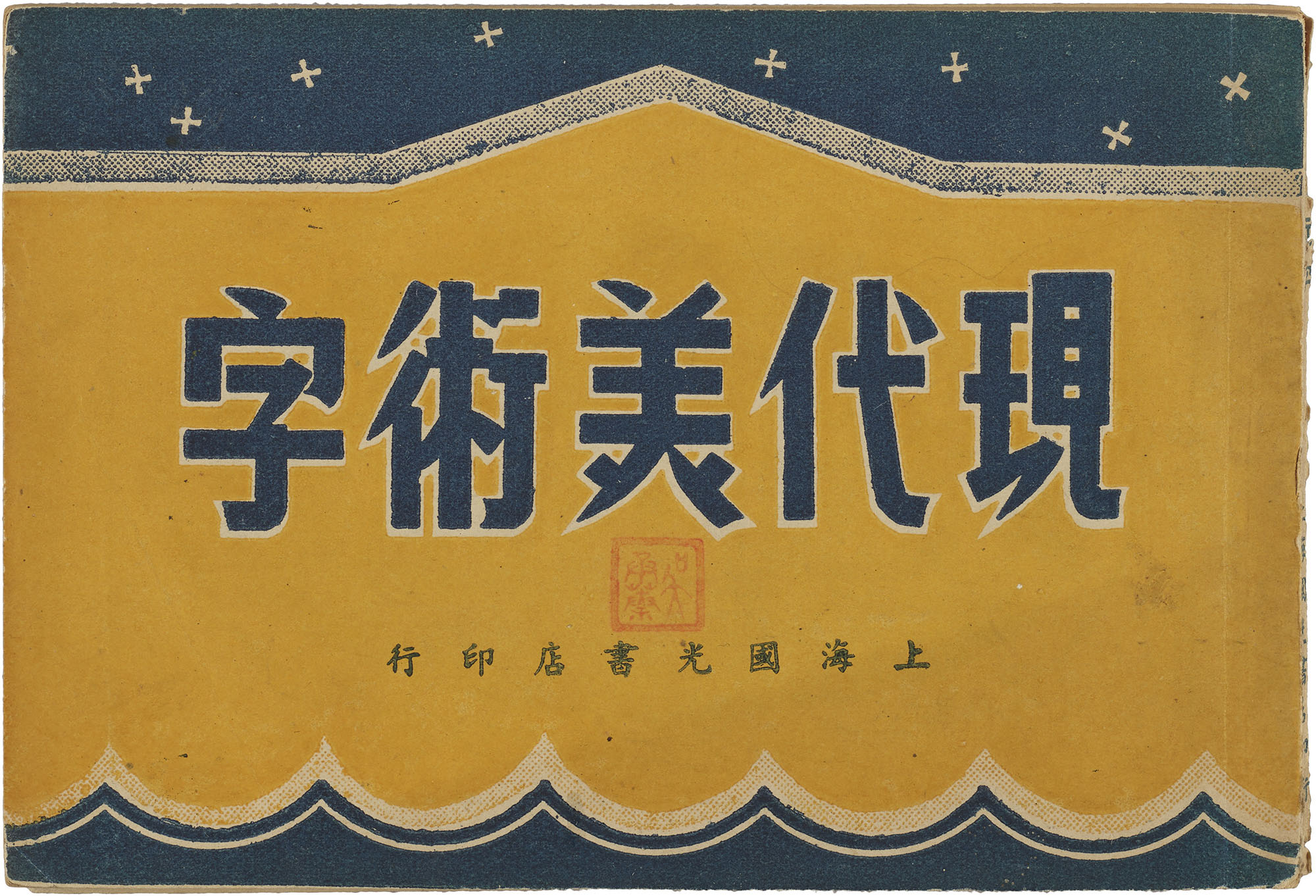
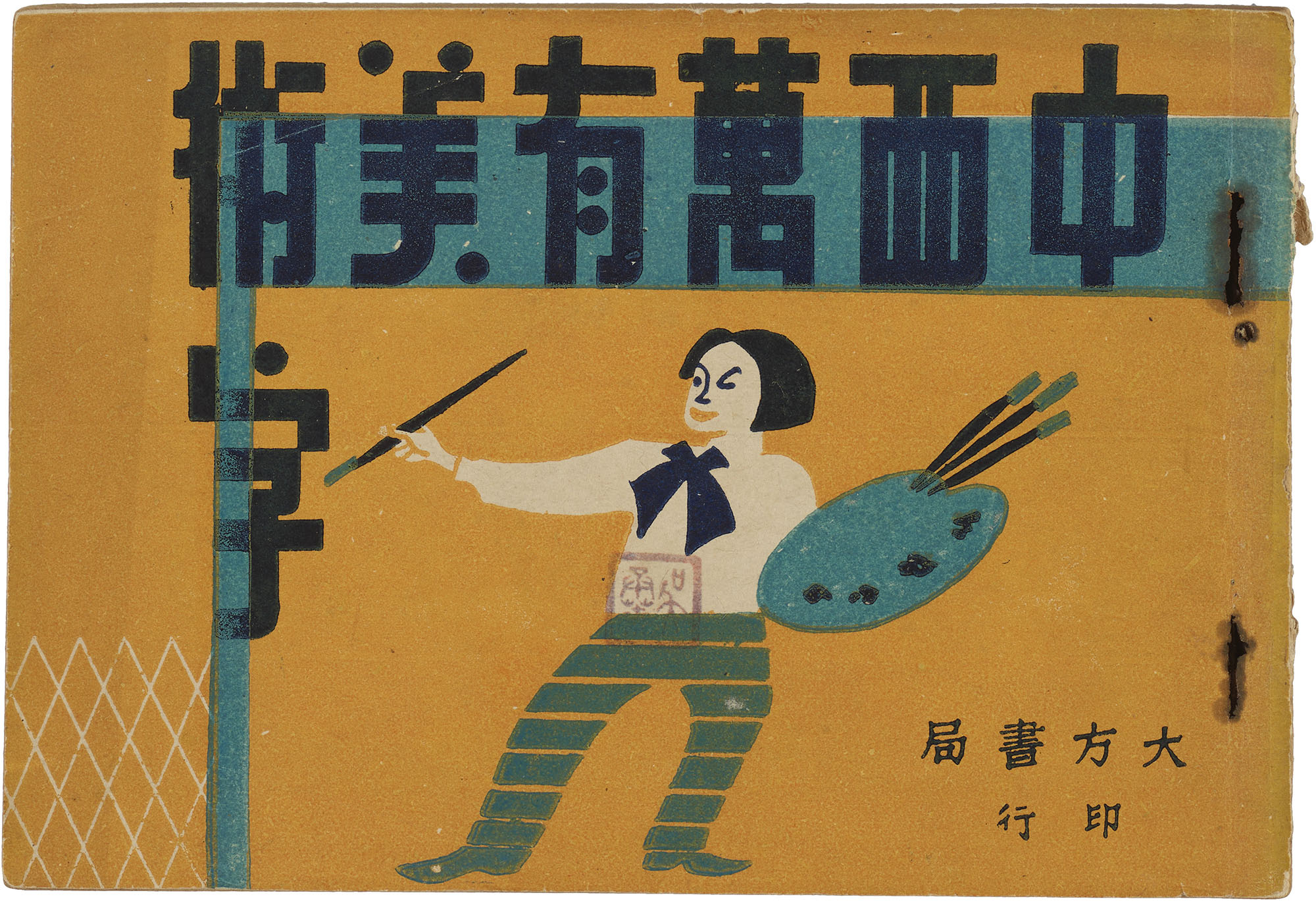
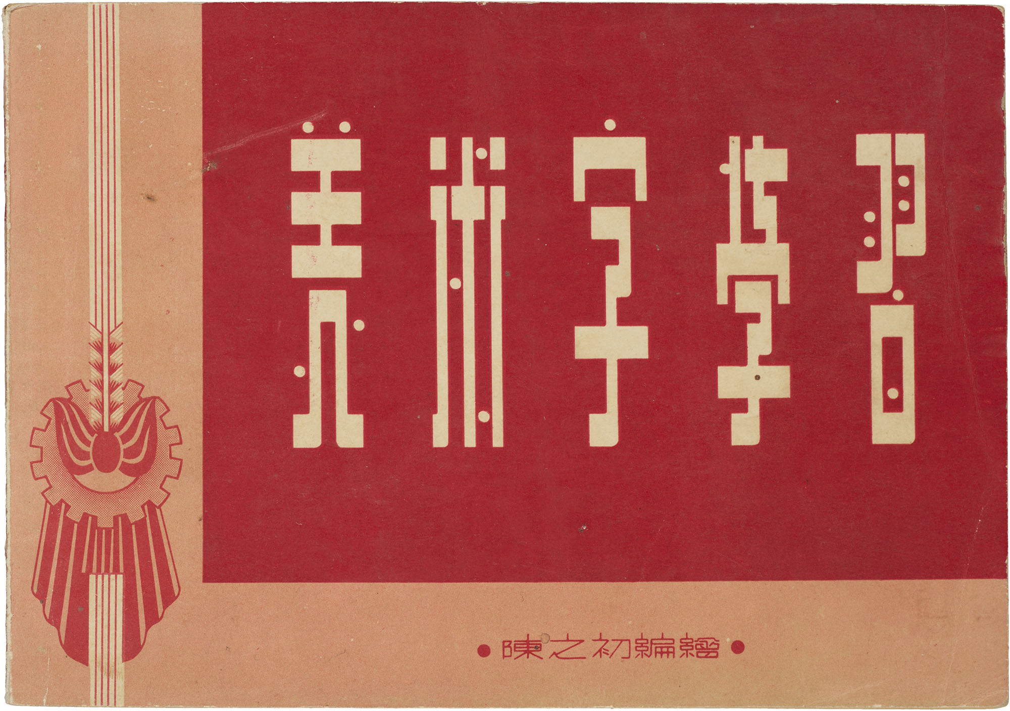
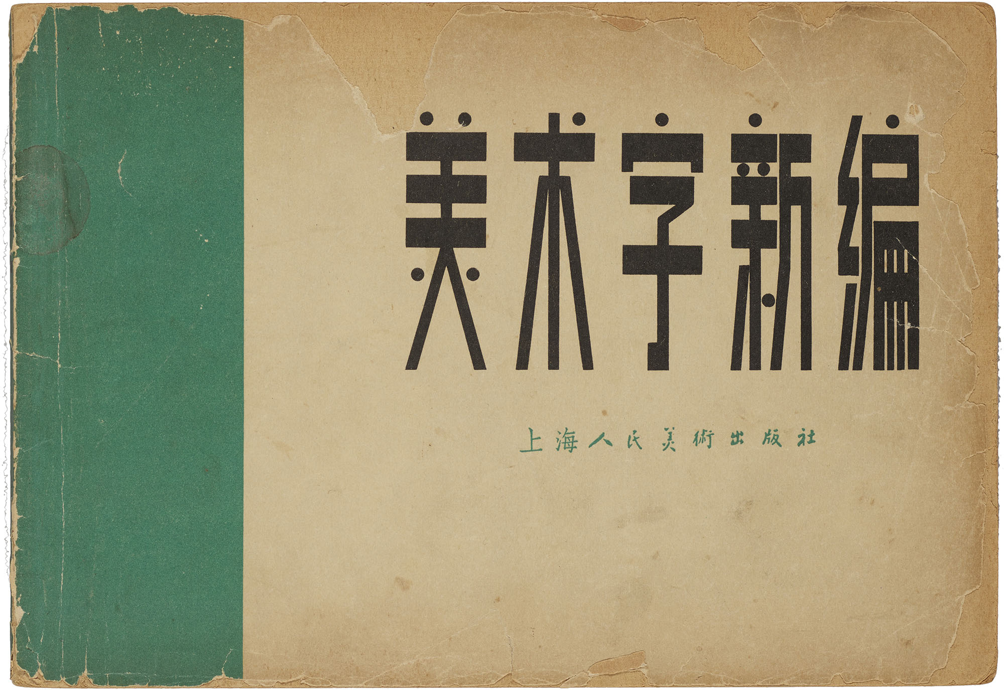
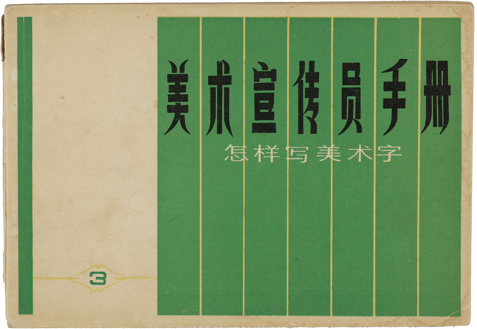
During the Republican era (1912–1949), books were generally printed in traditional Chinese and read vertically from right to left, though variations in reading orientation highlighted the era’s experimental attitudes towards language reform. These characteristics continued well into the mid-1950s when the Communist government implemented a simplified Chinese script that reduced the number of strokes for many characters and introduced a left-to-right reading orientation. By then, manuals increased in size to accommodate longer instructional texts, and vertical formats emerged with duplex-printed leaves.During this period, the visual forms of meishuzi coalesced, and these remain relatively unchanged today.
All images in the gallery below are hi-fi captures. Click an image to enter fullscreen view, then click or pinch to enlarge.
Whereas the vertical book format found throughout Chinese print history reinforced the primacy of the written script, the horizontal orientation of early meishuzi manuals was a subtle nod to pictorial tradition and suited meishuzi’s ability to function as both script and image. Manuals routinely described meishuzi as words that are formed through a process of appropriate transformation and decoration,2 positioning meishuzi as a form of design rather than simply a means of conveying information.3 In words of one 1955 manual, meishuzi are words that “follow the meaning and form of language but undergo a process of embellishment. They can be called patterned or designed words.”4 Underlying these ideas was a persistent tension between the message and its messenger: the former tending towards the mundane and the acceptable, and the latter tending towards the new and the strange.
Mass Appeal
For meishuzi practitioners, acceptability centered on popular tastes—a volatile mix of the old and the new. Throughout the first half of the twentieth century, China’s elite calligraphic and aesthetic traditions were being called into question by the New Culture Movement, imported visual vocabularies, and anxieties about the future of the Chinese script. China wrestled with spoken and written language reform in a bid for modernization, national unity, and literacy. Strains of these debates, particularly the Chinese adoption of simplified characters in 1956, made their way into meishuzi manuals.
While some manuals like New Meishuzi (1951) were not opposed to using simplified characters,5 others like Songti Meishuzi Reference Dictionary (1954) advised against them, arguing that simplified characters were less formal, less tasteful, and would introduce the risk of misunderstanding.6 Interestingly, all sides of the debate made arguments that advocated for the public’s ability to easily understand what was communicated through meishuzi.
Implicitly, appropriateness was a flexible response to an imagined public taste rather than a purely canonical approach. Manuals regularly asked readers to take stock of the letterforms in their environment and encouraged beginners to carefully observe where meishuzi lived—whether in newspapers, advertisements, posters, or in the urban environment—before picking up the brush.7 This focus on mass appeal was fundamentally different from the formal approach of receiving visual wisdom from ancient calligraphic masters. Consistent with the medium’s overall approach, manuals presented meishuzi as a derivative of not only common calligraphic styles but also printed typefaces.
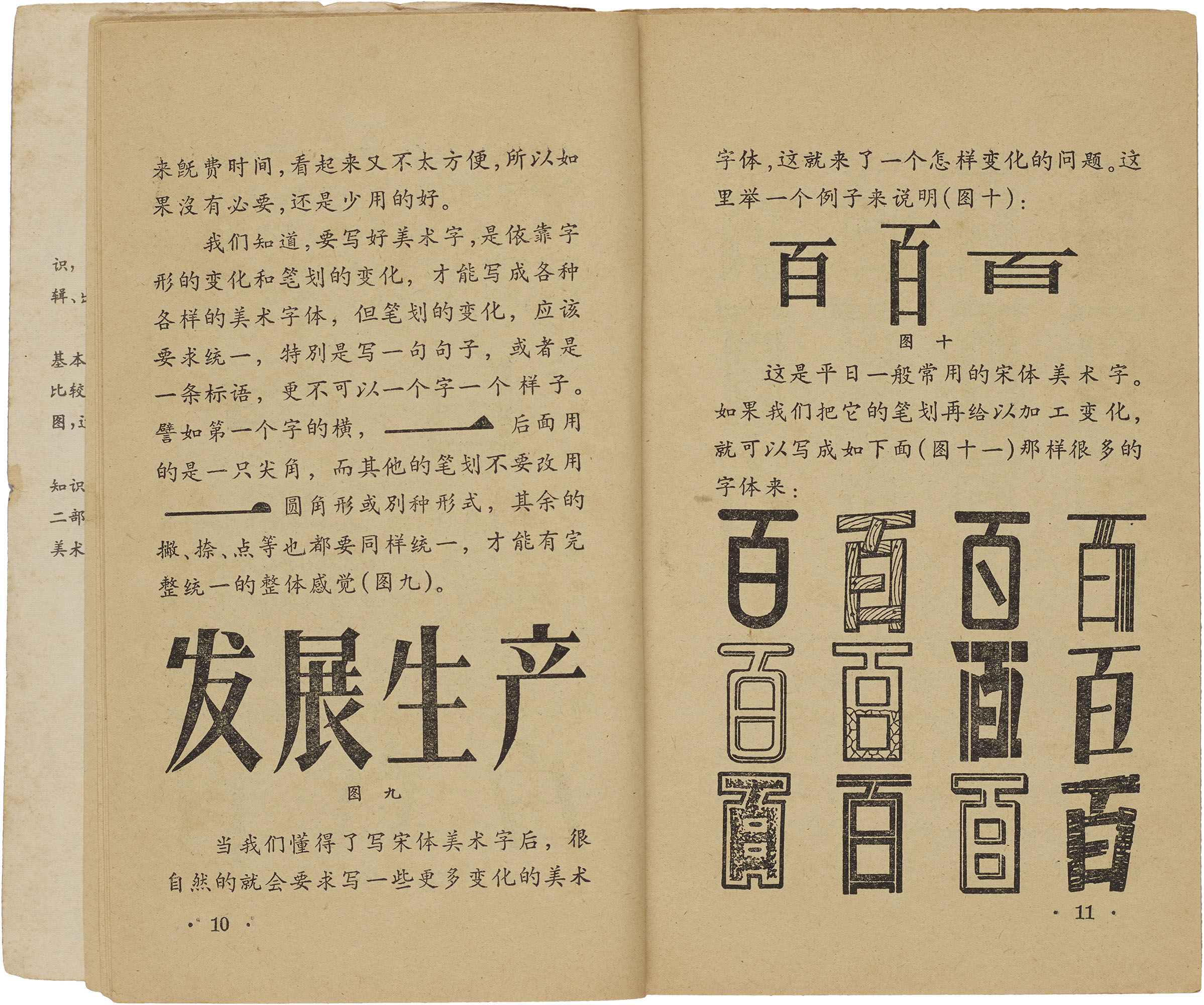
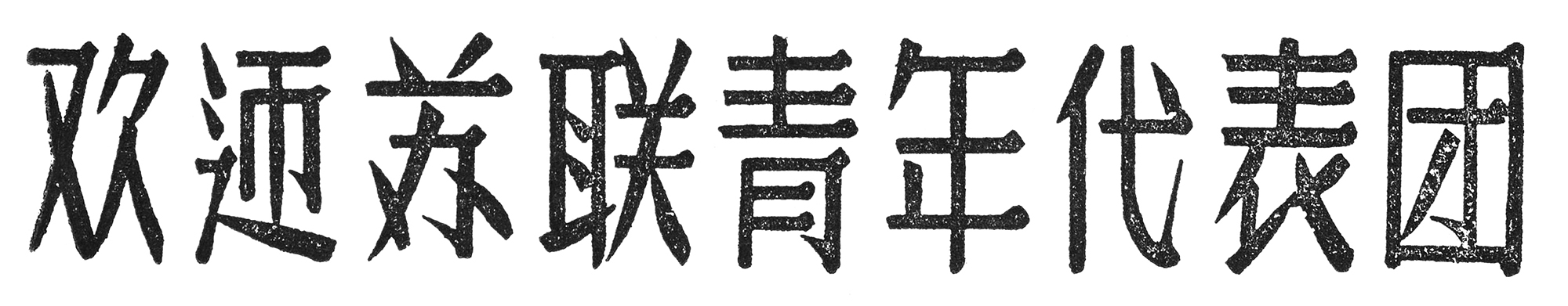
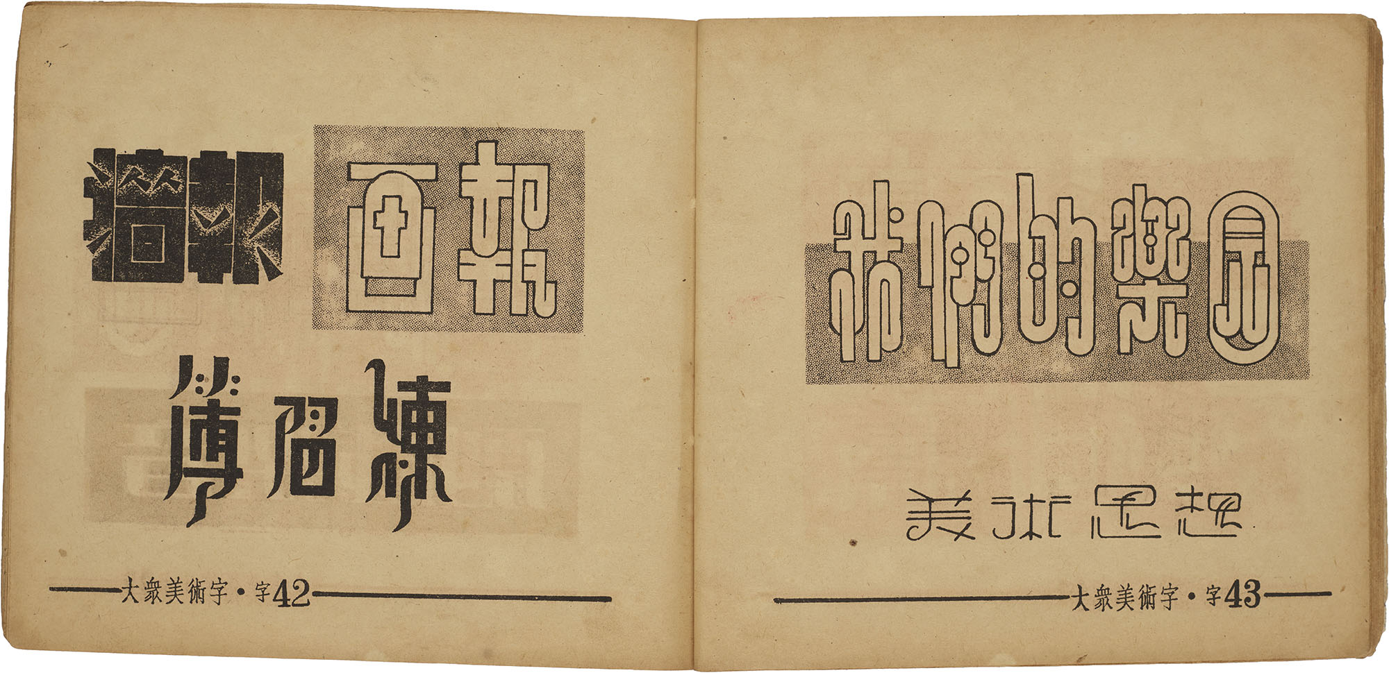
Through the 1950s, there was an increased emphasis on using printed type—particularly songti—as the foundation for the creation of meishuzi’s typographic form. Being the first style of printed type that evolved during the Song Dynasty, songti occupies a special place in Chinese print history. Maturing from the eleventh to the sixteenth century, songti emerged from a calligraphic style called “regular script,” and is characterized by a rectilinear structure of thick verticals and thin horizontals with triangular terminals. Historically, it has defined the textual appearance of books and continues to enjoy widespread use across the Sinosphere. Despite its popular appeal, many Chinese literati considered songti to be an inferior style made by illiterate and semi-literate craftsmen and criticized its harsh appearance and lack of graceful movement conveyed by traditional calligraphy.
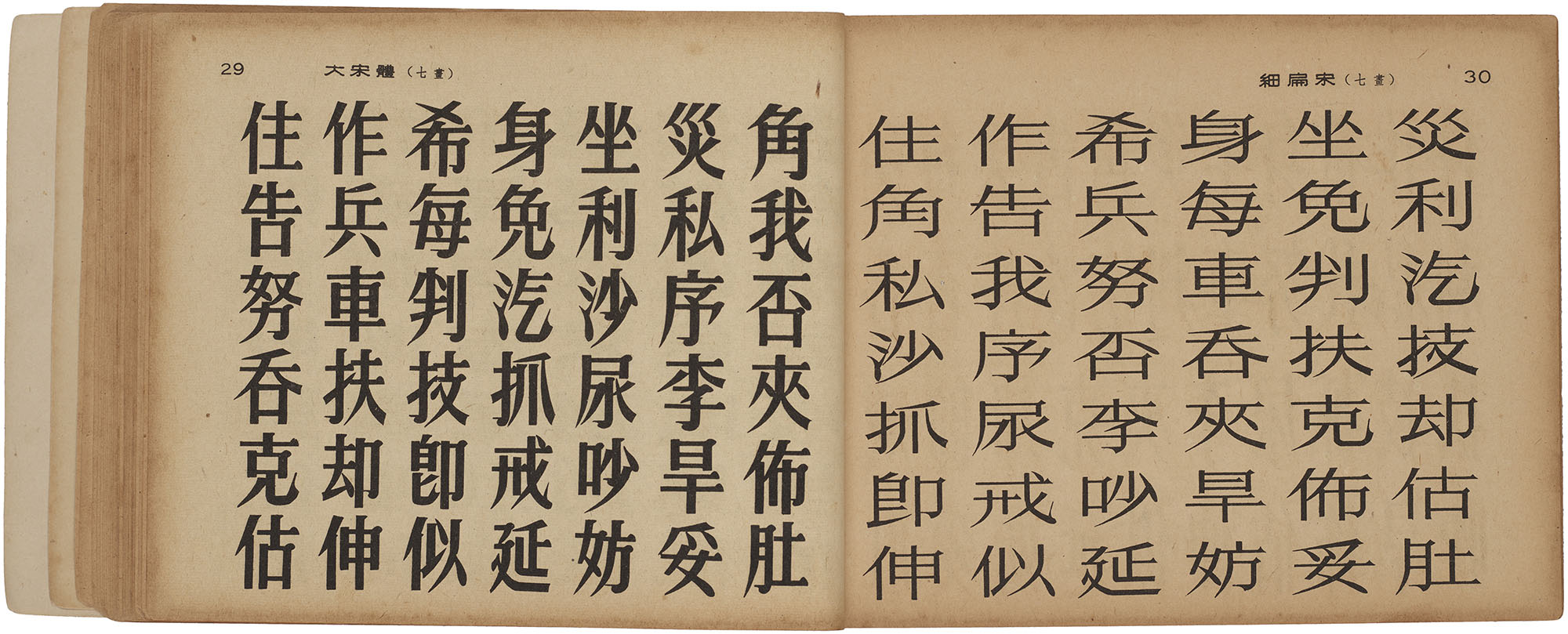
Meishuzi manuals of the '50s side-stepped such historic criticism by using songti as a bridge between meishuzi and the calligraphic tradition represented by regular script. Core principles such as harmony and stroke placement were regularly emphasized as criteria for acceptability. However, unlike calligraphy, meishuzi prioritized regularity and incorporation of design elements that could greatly affect color, spacing, and ultimately readability. Whether seen up-close in a magazine or from afar on a poster, recognizability was a central concern and was a response to unspoken assumptions about how a character was normally written and read.
Capturing the Eye
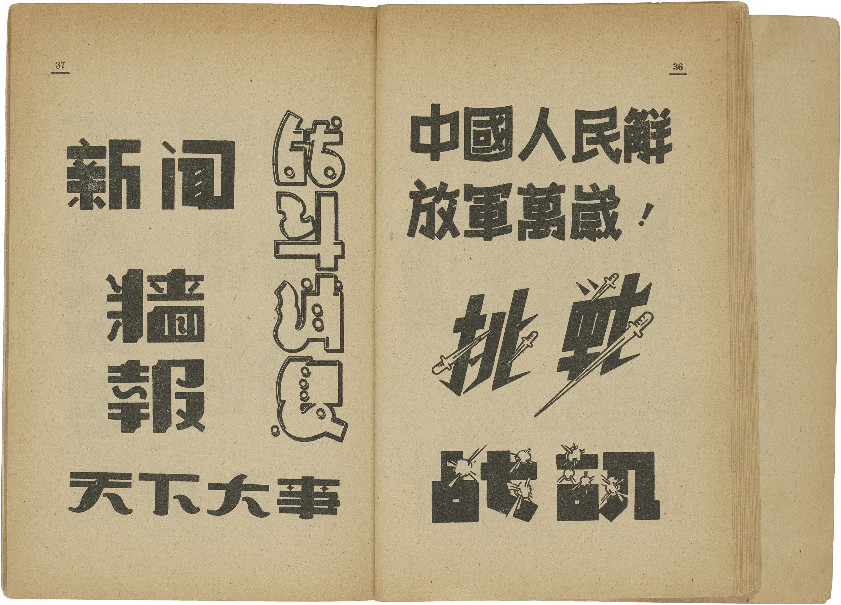
Meishuzi’s need to grab attention tussled with its principles of acceptability. For celebratory signage or in classroom settings, meishuzi simply needed to convey importance and distinction. In illustrated magazines and advertising, meishuzi was a form of spectacle that complemented imagery. On posters and signage, meishuzi competed with the textual landscape of the early twentieth century. For instance, in the dense, urban environment of Shanghai, signs covered every available surface and spilled into the air above.8 In conversation with other forms of media, meishuzi blurred distinctions between the unique, the new, the modern, and the strange.
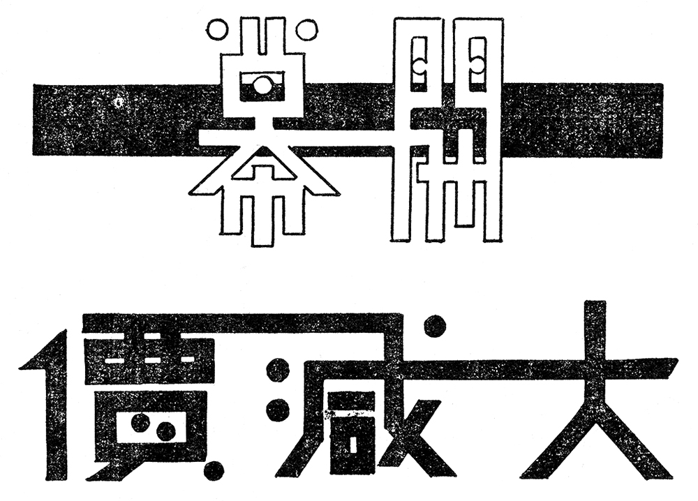
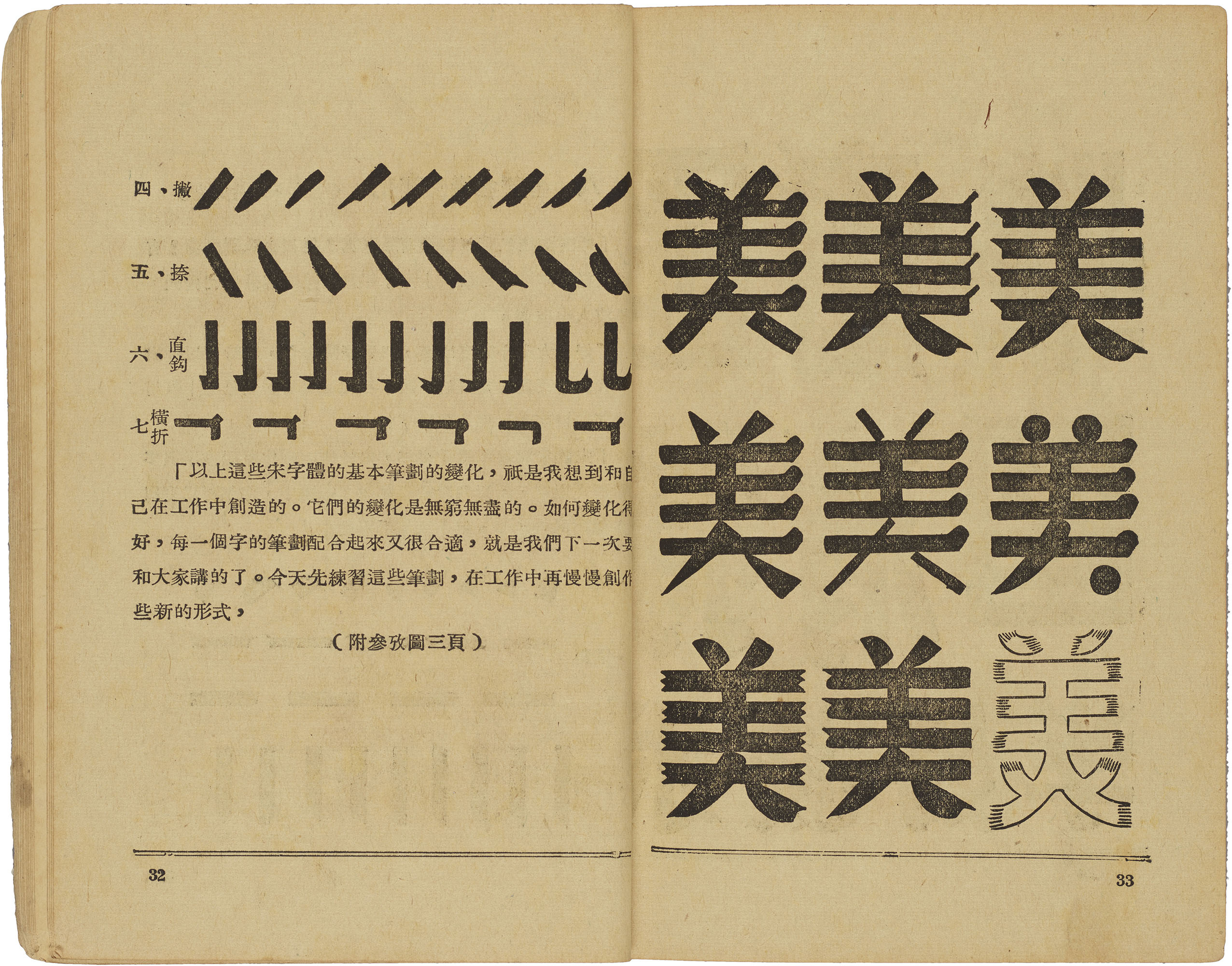
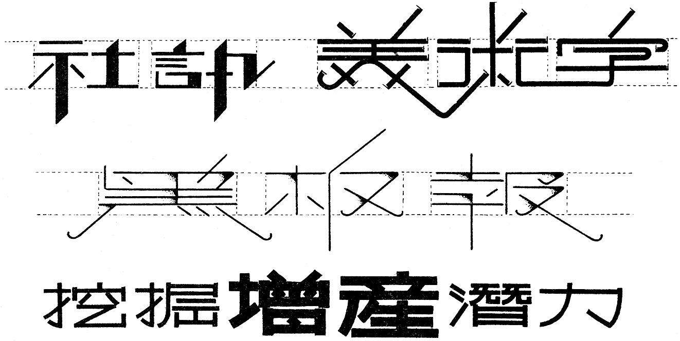
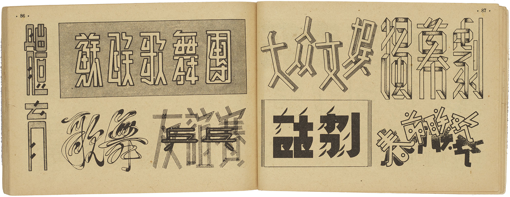
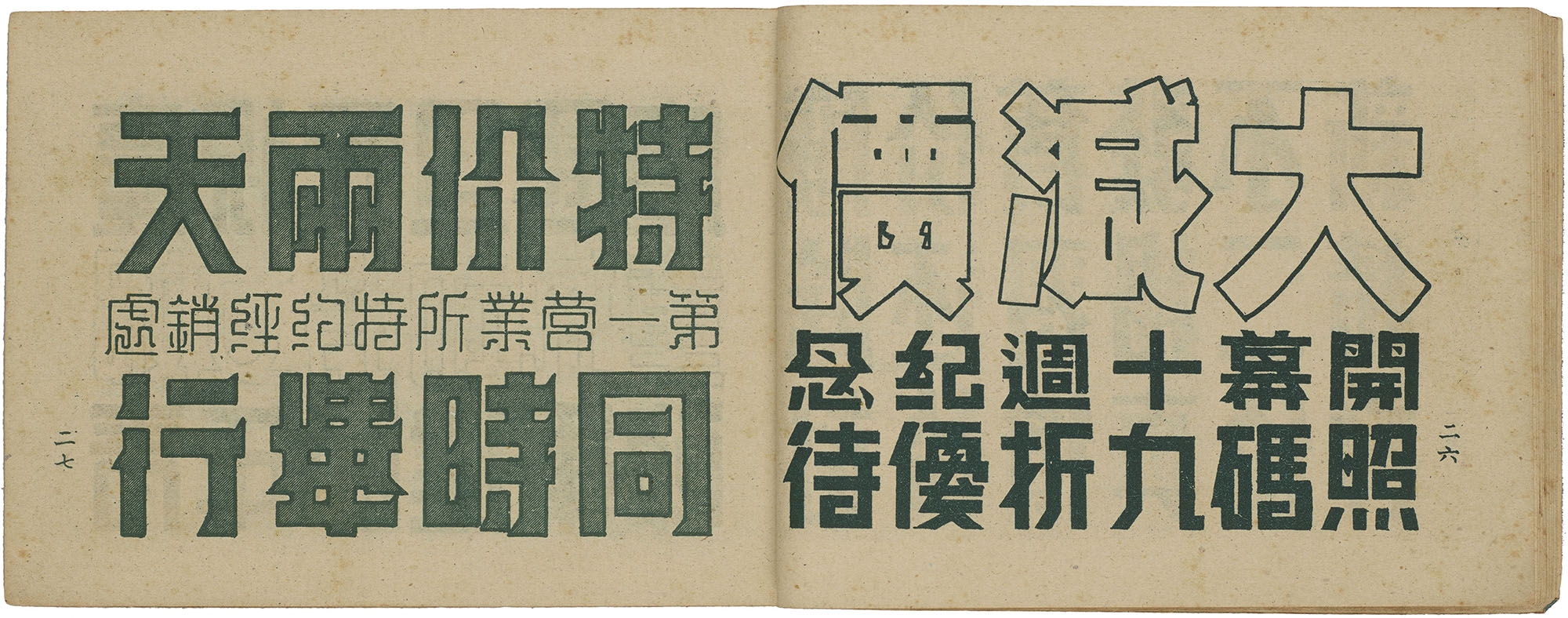
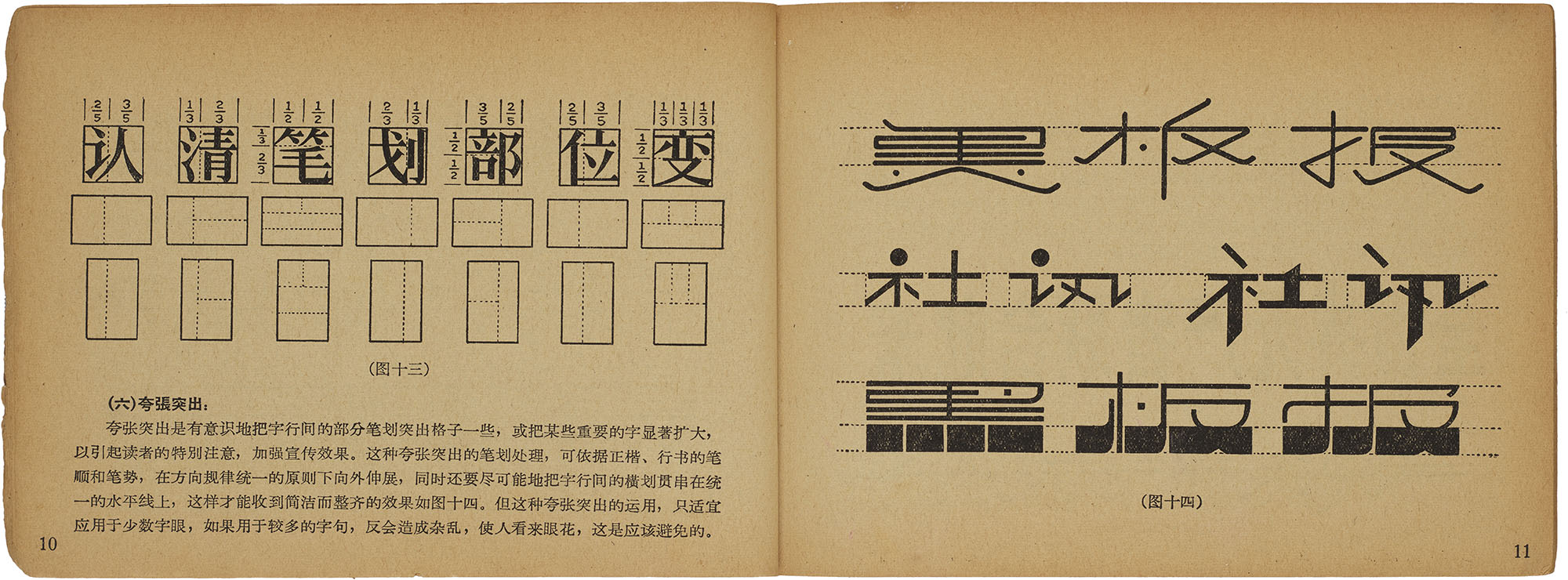
Freewheeling meishuzi experiments in the early decades of the twentieth century quickly yielded to the codified approach of the ’50s. By then, manuals primarily emphasized the creation of letterforms through the decoration, modification, and even addition and removal of strokes. While the possibilities for play were endless, the resulting forms were strikingly consistent thanks to the emphasis on using songti as their starting point. The focus on recognizability derived from established calligraphic forms ensured that the structural bones of the letterforms were the same even if they wore different clothes.9
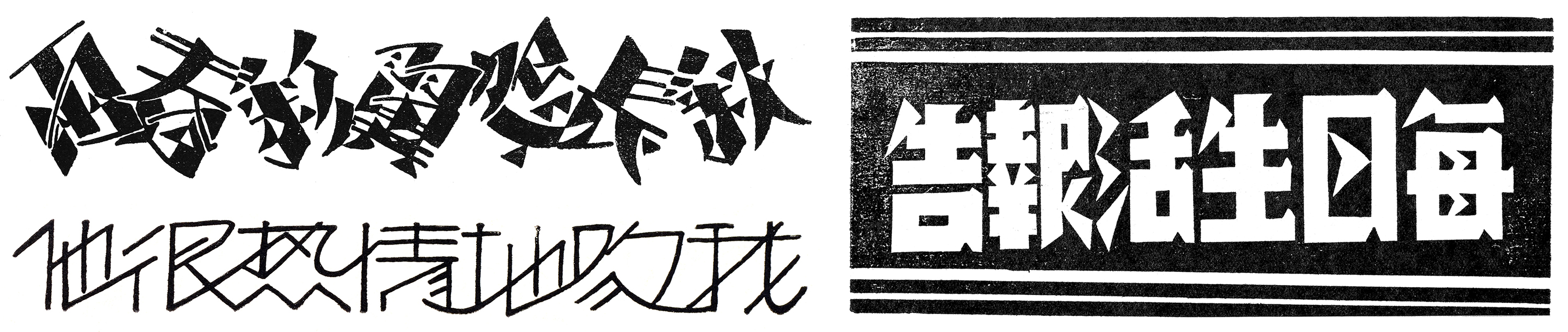
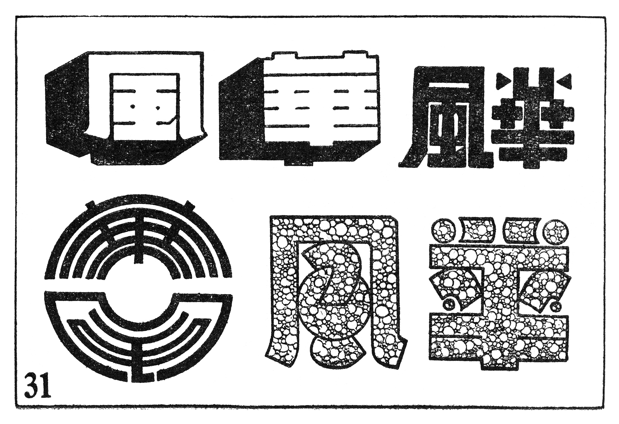
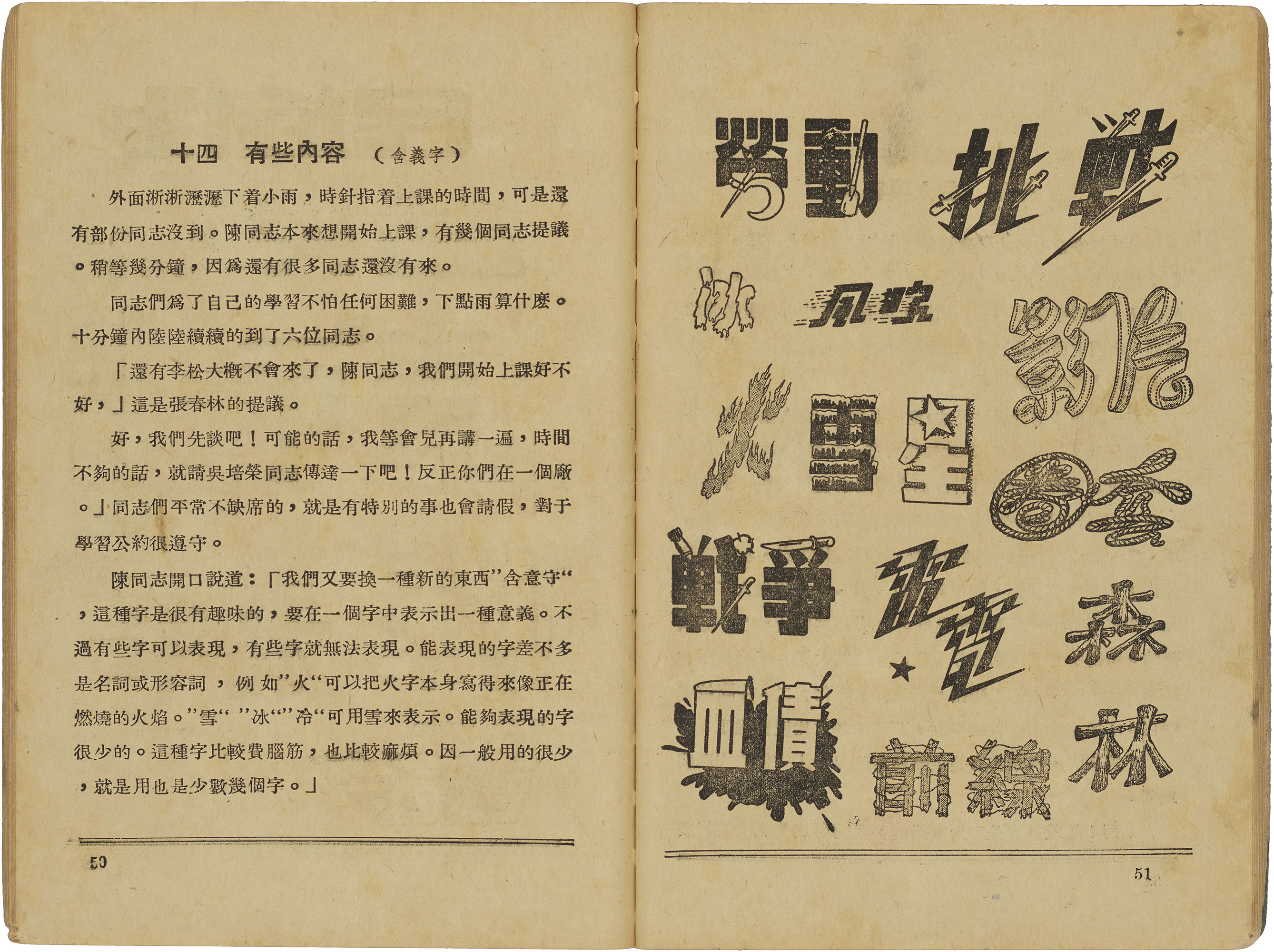
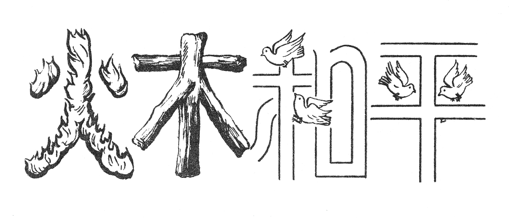
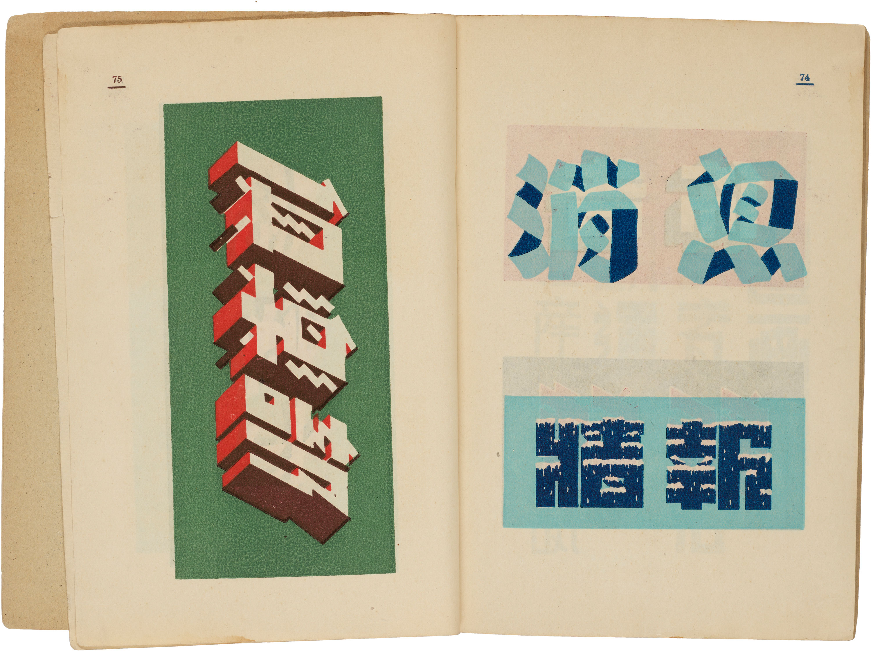
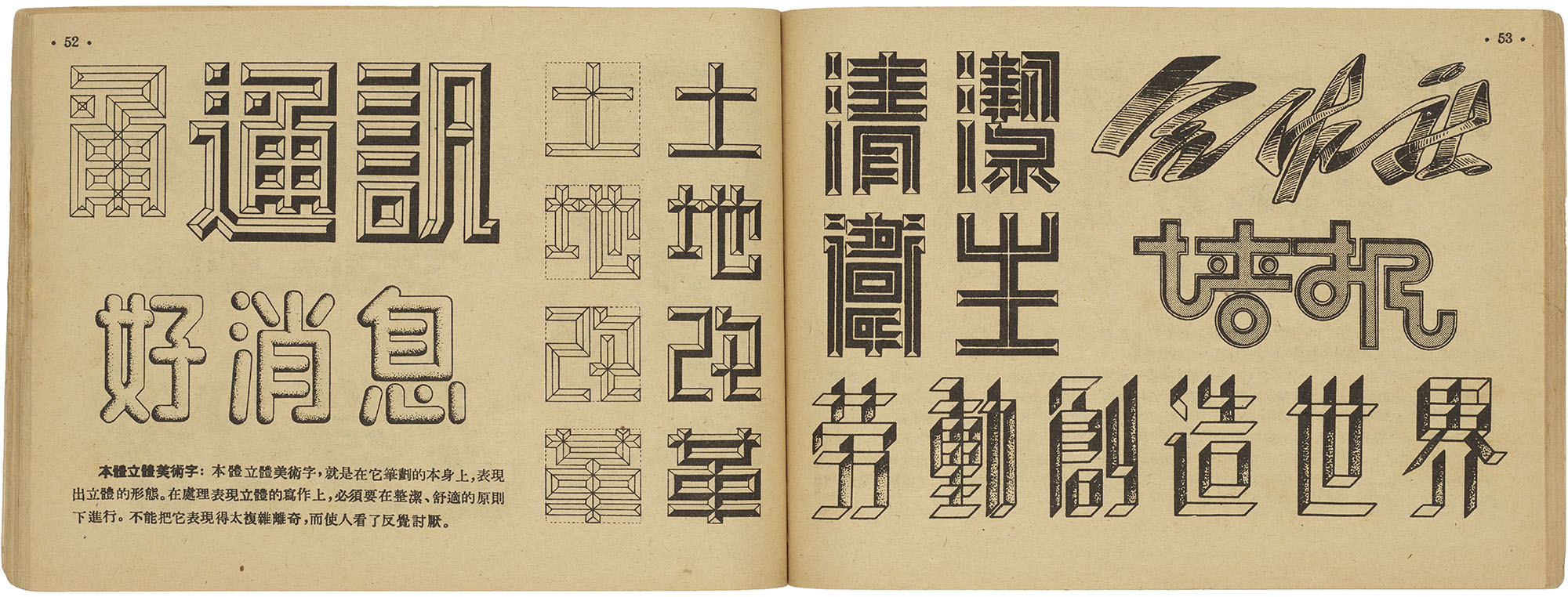
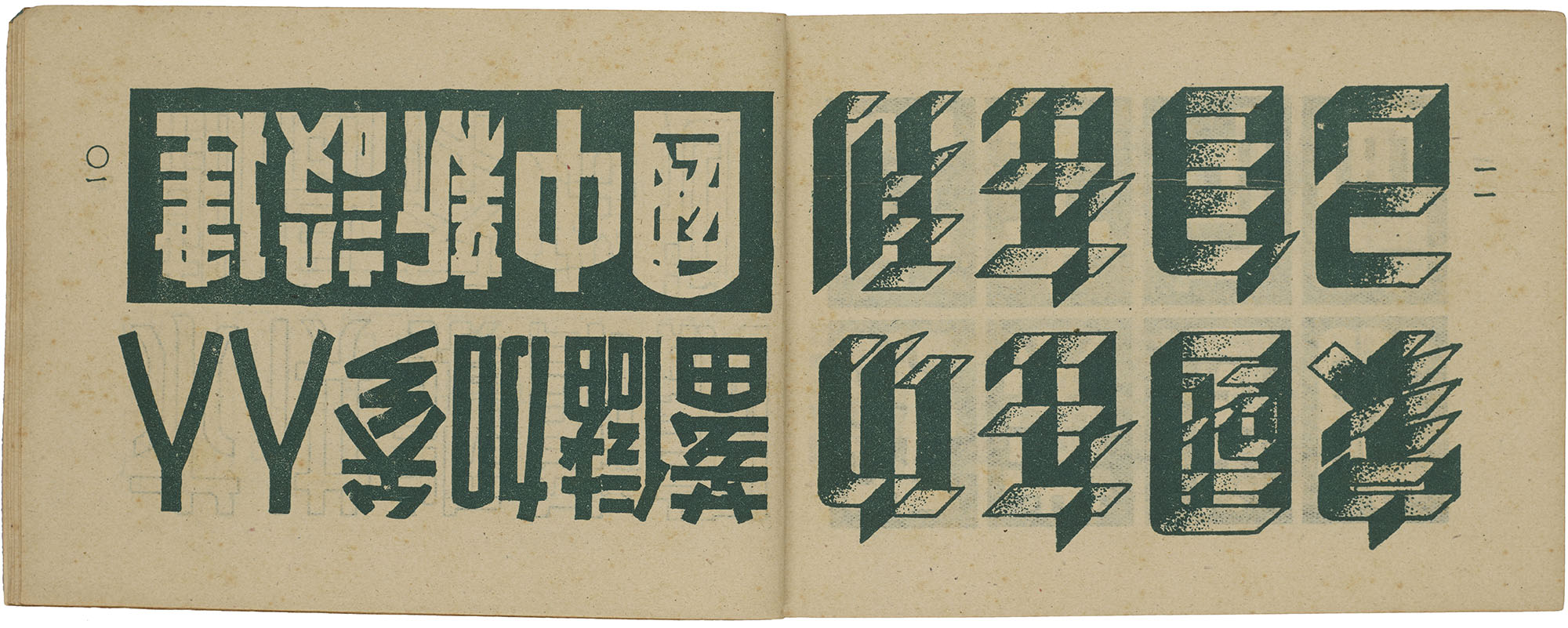
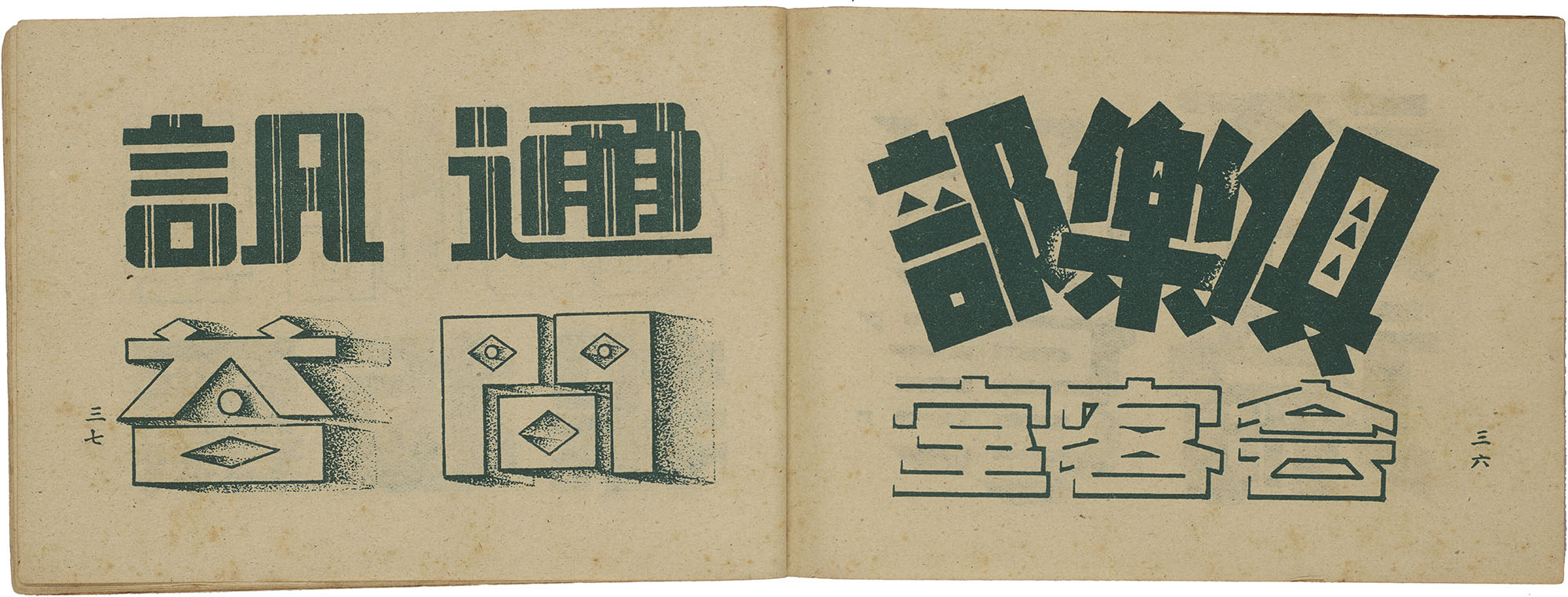
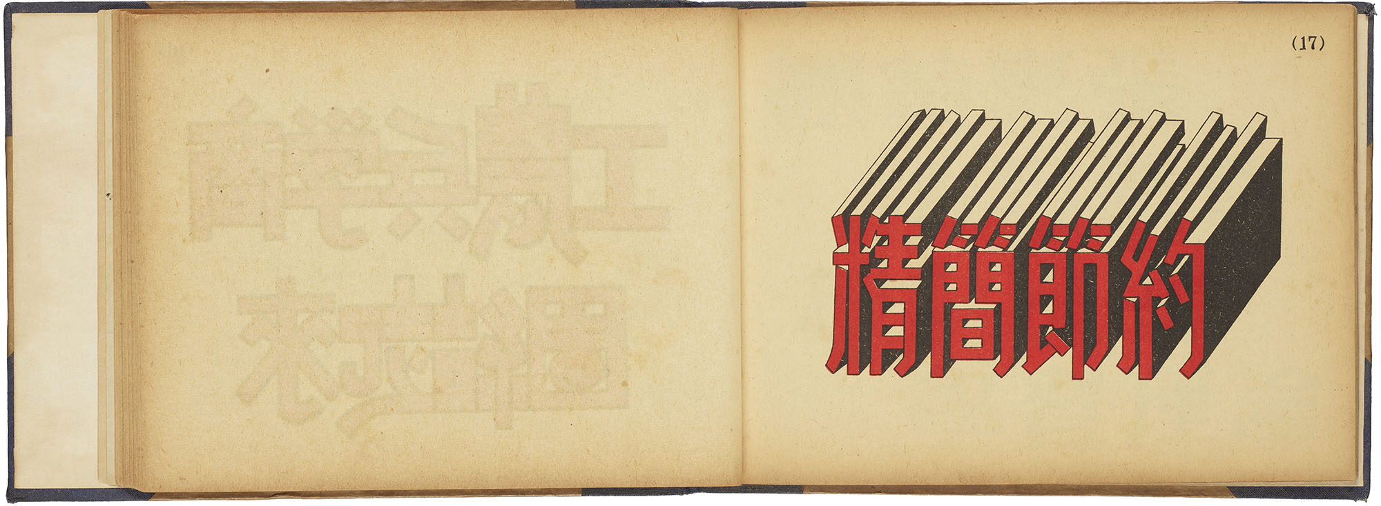
To make sense of all of its visual possibilities, kinds of meishuzi were commonly broken down into broad groupings based on their original typographic point of departure like songti, long songti, or imitation song. Meishuzi was usually categorized based on superficial visual characteristics. Manuals frequently distinguished between two-dimensional meishuzi and their three-dimensional counterparts that applied one or two-point perspective. Another popular grouping consisted of meishuzi with implied meanings. Here, characters took on the illustrated form of the objects they represented. The character for fire might be drawn with flames ablazing or the character for ice might be adorned with icicles.
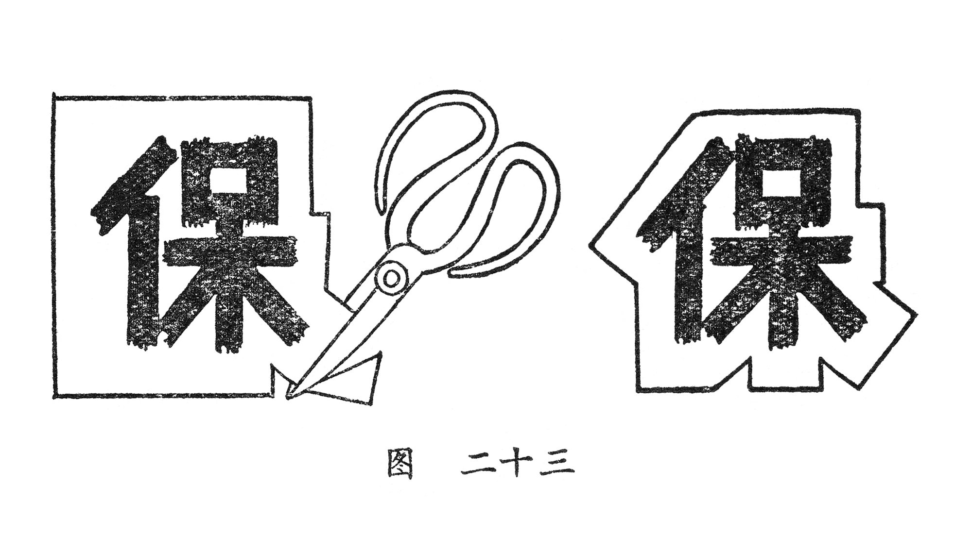
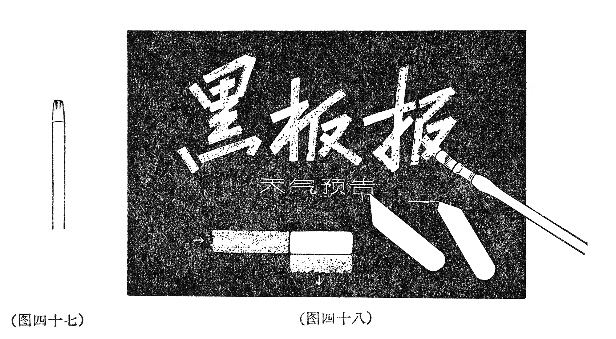
Still other manuals characterized meishuzi according to the type of medium and application. These included cut-out characters, blackboard writing, or even colored printing. Such typologies were consistent with a populist approach that came to characterize the practice of meishuzi in mid-twentieth-century Chinese society and reflected the elision of aesthetics and technology often found in graphic design history.
For the People, By the People
If the ancient traditions of calligraphy represented the classicism of Chinese culture practiced by an elite literati, then meishuzi, informed by commerce and a non-traditional set of tools, represented an emergent modern, popular consciousness. The first wave of meishuzi, moderated by commercial artists, was directed towards a mass audience, eventually paving the way for a second wave where the public began to assume creative agency. Written at the conclusion of the Second Sino-Japanese War, one manual from 1948 provides an almost mythological origin story of meishuzi as the product of resistance artisans that fanned a democratic revolution against the invading Japanese.10 Another manual proclaimed that old meishuzi was associated with the whims of capitalism that hijacked words for visual play, producing strange forms unhealthily divorced from their true application of enhancing a message. Departing from its commercialized past, new meishuzi needed to serve workers, peasants, and soldiers.11
Meishuzi’s newly populist image resonated in the highly charged political climate following the Communist Revolution that consumed China between 1945 and 1949. Meishuzi was considered an authentic, popular form that could be made by anyone in the service of a new China. Books stressed that beginners did not need to know complicated theories of drawing and painting,12 nor did they assume that learners were familiar with major calligraphic styles.13 Requiring little beyond basic literacy, manuals of this period primarily emphasized observation and practice. Framed as a broadly democratic method of visual communication, meishuzi was positioned as a medium of political consciousness that focused its power of mass appeal towards the goal of a new China. The transformation represented the final erasure of boundaries between commercial artisans and the public, and the popularity of meishuzi clubs composed of local workers reflected such interest.14
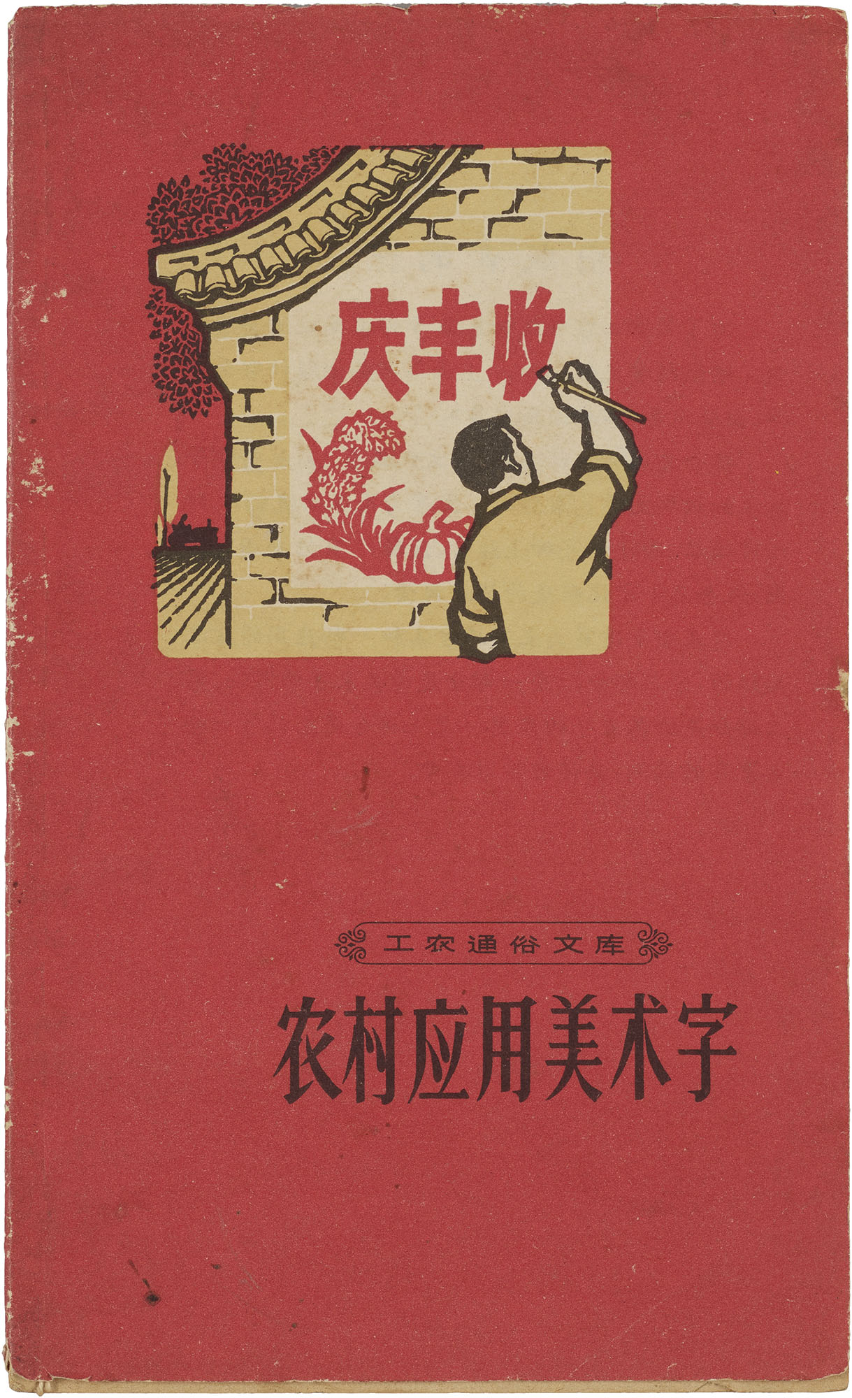
Marking the beginnings of the Cultural Revolution in 1966, a manual called Applied Meishuzi for Rural Villages was part of a series of booklets aimed at increasing political, scientific, and cultural knowledge for farmers, workers, and public servants. These applications for meishuzi were truly practical and taught readers how to create meishuzi for banners, cut-out characters, and wall slogans using common materials like flatheaded paint brushes, scissors, and strips of wood in lieu of rulers. Rules on visual proportion took a back seat as the manual advised using squat or condensed characters to squeeze more words onto the surface. Of particular note was a section that taught readers how to write meishuzi on blackboards for everyday use, stressing that meishuzi needed to be practiced in order to write it quickly and to obtain visual feedback from the public.15 Incidentally, meishuzi’s broader use further pulled its typographic forms from the image-making tendencies of commercial artists and towards common visual interpretations of the script.
Afterimage
Touted as the visual language of a new China, meishuzi filled a void created by existing type technology and changing cultural expectations. Creating lead type was demanding and time-consuming. Its dependence on immense capital and labor meant it was only viable for institutionally backed media like newspapers and books. In contrast, meishuzi was exclusively used for short phases and messages and could be adapted and created with simple, everyday tools. And while calligraphy commanded the moral high ground of the Chinese aesthetic imagination, meishuzi staked a claim in the new and the expedient.
Letterform Archive holds 42 twentieth-century Chinese writing manuals, spanning 1930 to 1971. You can see them in person by requesting a guided tour or research visit.
All images in the gallery below are hi-fi captures. Click an image to enter fullscreen view, then click or pinch to enlarge.
Despite its promises, meishuzi still stood awkwardly against printed type and calligraphy. Meishuzi’s internal tensions between image and script were strained against the pulls of these historic legacies. As if pitting one against another, one manual rhetorically asked: If meishuzi is an activity akin in spirit to calligraphic writing, why should one study printed type?16 Due to its reliance on existing forms, meishuzi could be seen less as a distinct style and more as a set of practices that sustained opposing notions of the new and the familiar. As meishuzi shifted from commercial to political contexts and changed from traditional to simplified character forms, manuals rarely attached meanings to specific formal qualities except in a very general, abstracted sense.17 With the exception of visual techniques that adorned words with pictorial, implied meanings,18 the roster of meishuzi’s stylistic variations remained constant even as its practice acquired new meanings and was applied to different communicative goals. Ultimately, the medium’s flexibility allowed its practitioners to dial up and down its visual exuberance in the face of commercial or political interests. Indeed, the extraordinary malleability of meishuzi’s meanings did not emerge from its visual form alone, but from the form’s interaction with the rapidly changing cultural and political landscape of twentieth-century China.
— Caspar Lam and YuJune Park
Special thanks to Naiqian Wang and Stephanie Winarto for their extraordinary contributions to this curatorial project, which would not have been possible without their assistance.
Join us in our mission to expand the graphic design canon: become a member and subscribe to be notified about other collections.
Bibliography
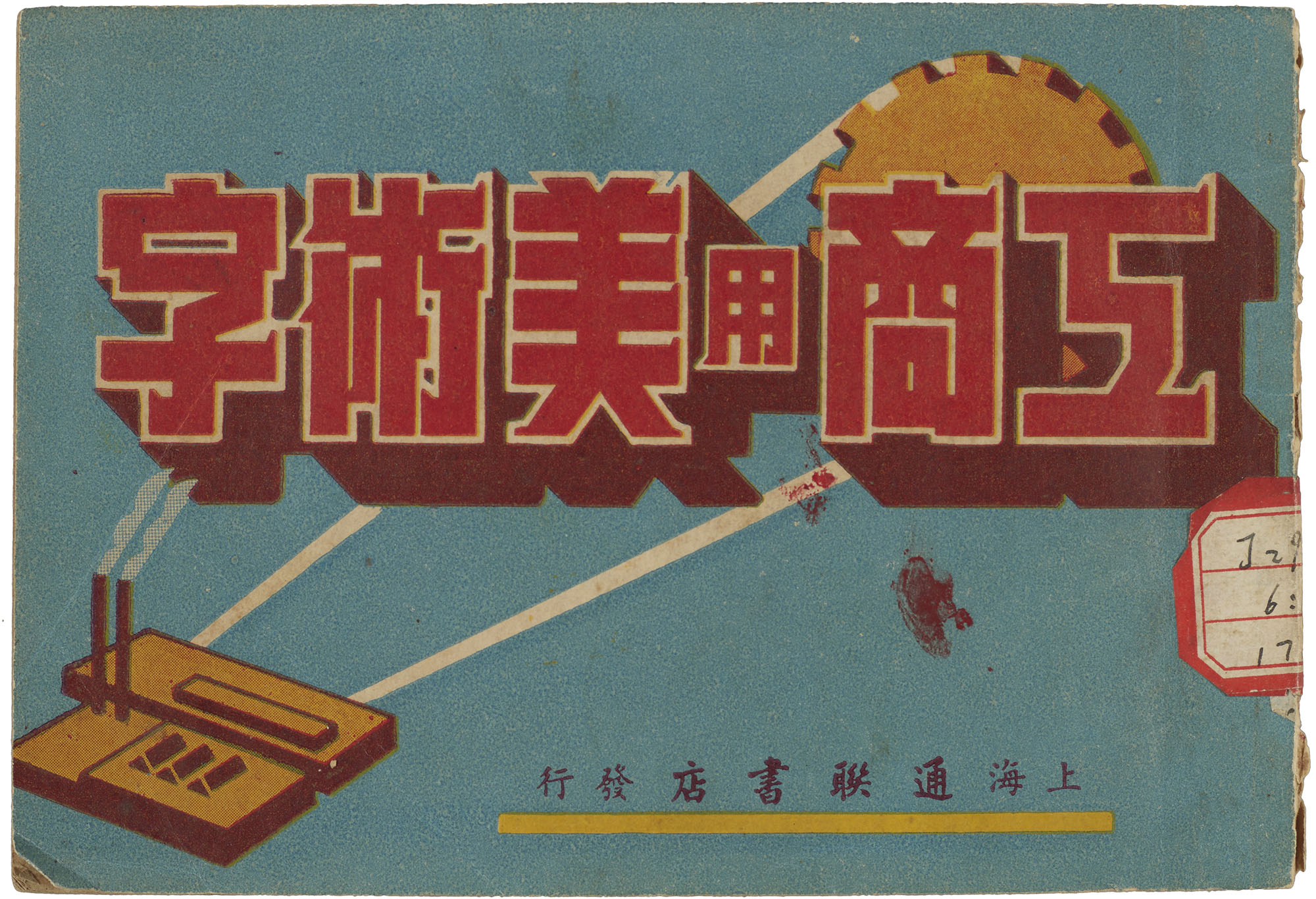
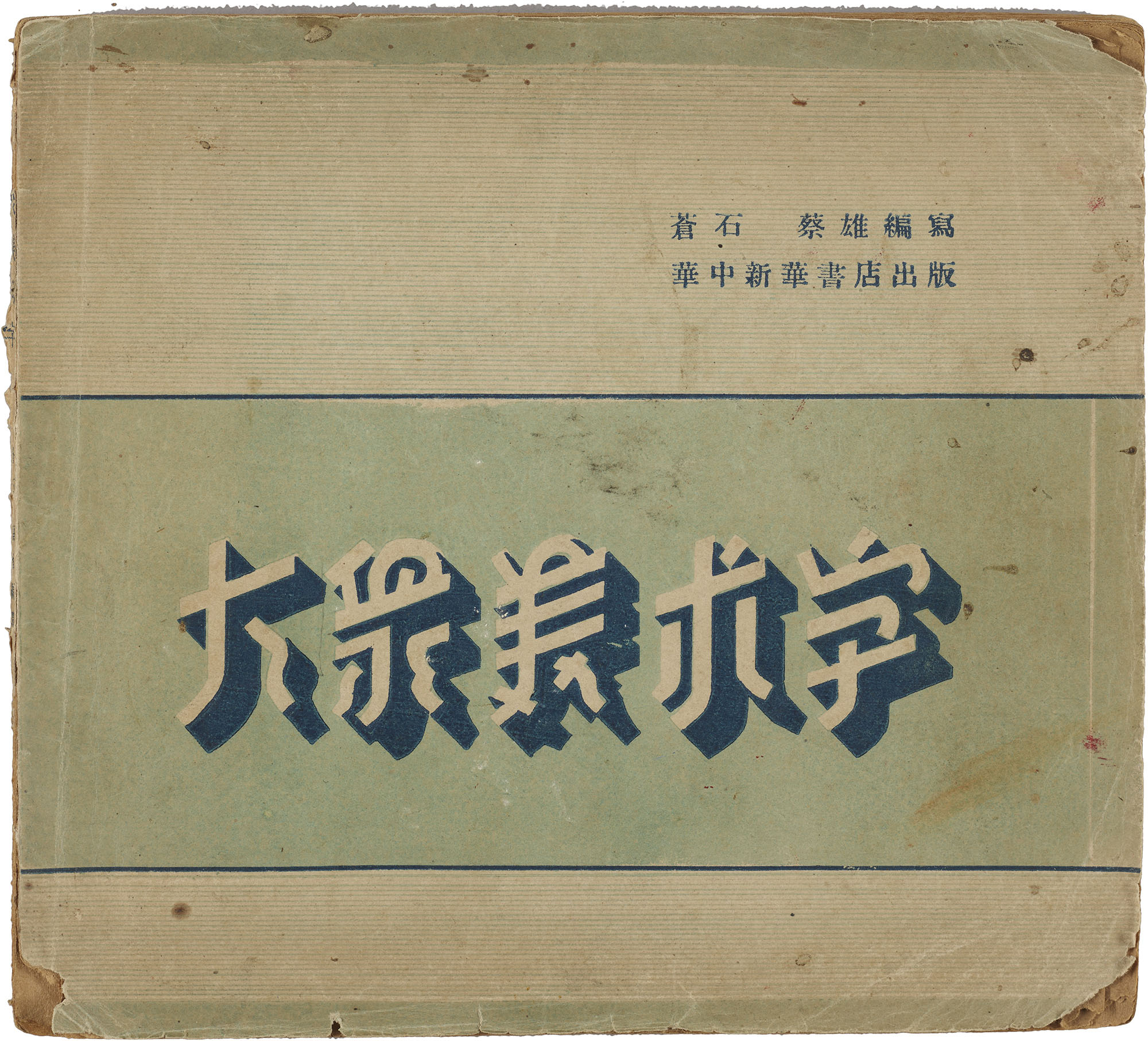
- Cang, Shi. Dazhong meishuzi [Popular Meishuzi]. Wuhan: Huazhong Xinhua Shudian, 1948.
- Cang, Shi. Zenyang xie meishuzi [How to Write Meishuzi]. Shanghai: Dadong Shuju, 1951.
- Fang, Jiqing. Yingyong meishuzi ziliao [Applied Meishuzi Resource]. Shanghai: Xin Yishu Chubanshe, 1955.
- Hay, Jonathan. “Notes on Chinese Photography and Advertising in Late Nineteenth-Century Shanghai.” In Visual Culture in Shanghai 1850s-1930s, edited by Jason Kuo (Washington, DC: New Academia Publishing, 2007), 95-119.
- Jiang, Baoquan. Yingyong meishu wenzi bian [Applied Meishuzi]. Shanghai: Shanghai Wanye Shudian, 1951.
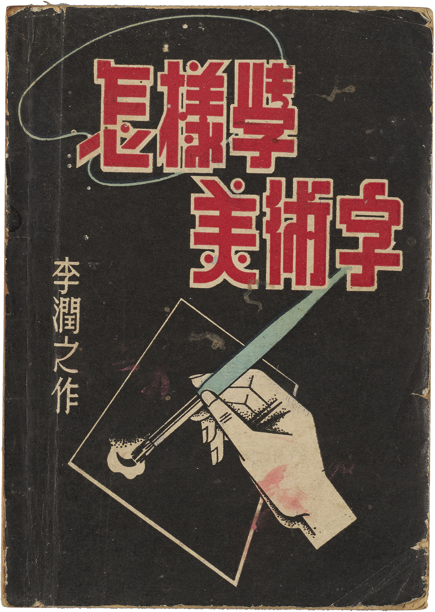
- Li, Runzhi. Zhenyang xue meishuzi [How to Learn Meishuzi]. Shanghai: Lukaiji Shudian, 1953.
- Ni, Changming. Songti meishuzi cankao zihui [Songti Meishuzi Reference Dictionary]. Shanghai: Dazhong Shuju, 1954.
- Shanghai Renmin Meishu Chubanshe. Nongcun yingyong meishuzi [Applied Meishuzi for Rural Villages]. Shanghai: Shanghai Renmin Meishu Chubanshe, 1966.
- Song, Shi. Meishuzi jianghua [Discussing Meishuzi]. Jiaoyu Shudian Yinxing, 1950.
- Tao, Yinpei. Meishuzi shouce [Meishuzi Handbook]. Shanghai: Shanghai Wanye Shudian, 1951.
- Xinhua Shudian Shandong Zongfendian. Shiyong meishuzi shouce [Handbook of Practical Meishuzi]. Jinan: Xinhua Shudian Shandong Zongfendian, 1950.
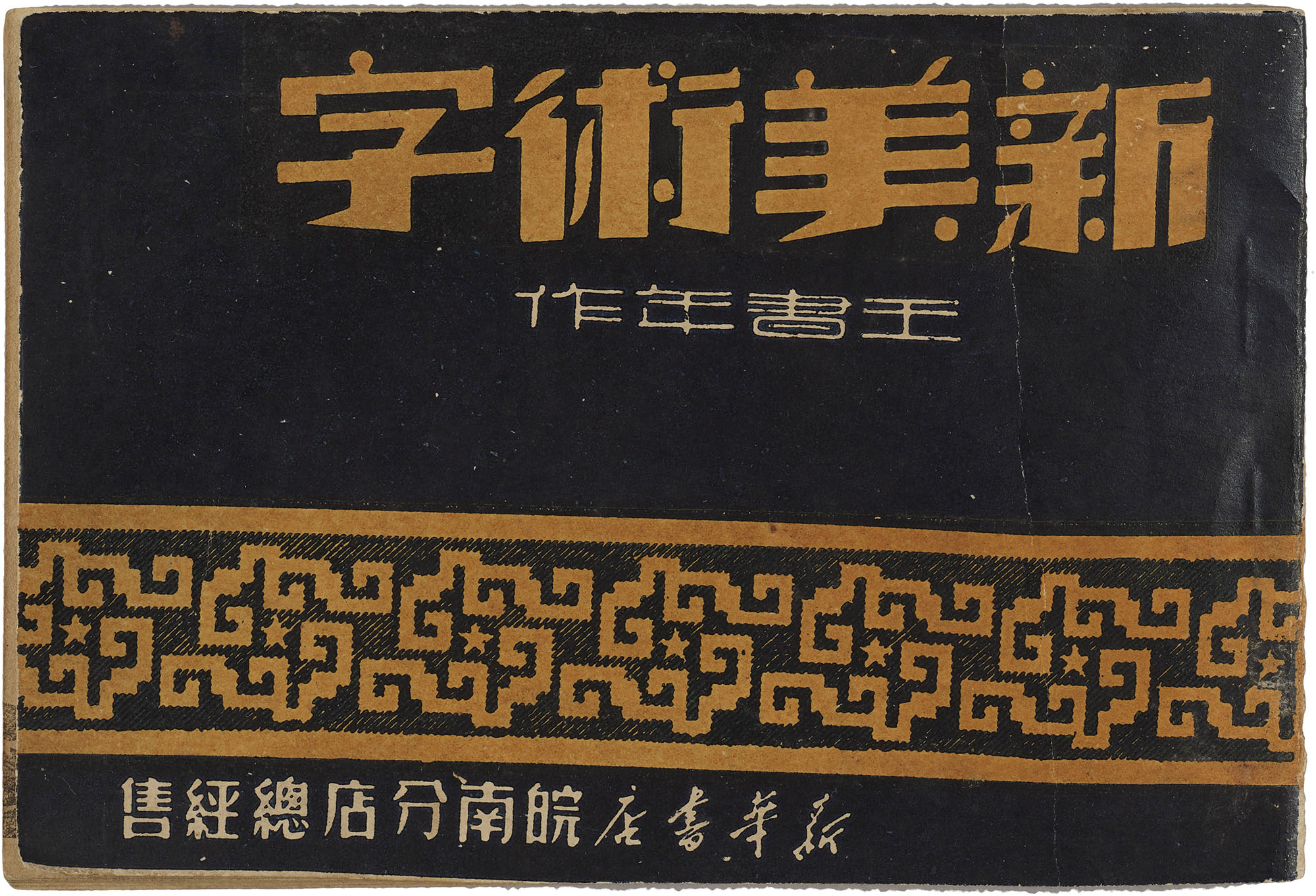
- Wang, Shunian. Xin meishuzi [New Meishuzi]. Wuhu: Xinhua Shudian Wannan Fendian, 1951.
- Wu, Xianchun. Meishuzi zuofa ji yingyong [The Practice and Application of Meishuzi]. Jinan: Shandong Renmin Chubanshe, 1952.
- Zhou, Bo and Liu Chang. “Ziti fuxing” [Type’s Rejuvenation]. In Chinese Type Modern, edited by Bo Zhou, 3-11. Beijing: CITIC Press Group, 2017.
Footnotes
- According to Zhou and Liu, the term meishuzi seems to be Chinese in origin. See Bo Zhou and Liu Chang, “Ziti fuxing,” in Chinese Type Modern, ed. Bo Zhou (Beijing: CITIC Press Group, 2017), 7. ↩︎
- Early definitions were nearly identical in phrasing. See Shi Cang, Zenyang xie meishuzi (Shanghai: Dadong Shuju, 1951), 2; Xinhua Shudian Shandong Zongfendian, Shiyong meishuzi shouce (Jinan: Xinhua Shudian Shandong Zongfendian, 1950), 1; Shunian Wang, forward to Xin meishuzi (Wuhu: Xinhua Shudian Shandong Zongfendian, 1951). ↩︎
- Fairly detailed explanations about the relationship between design and meishuzi can be found in Shi Song, Meishuzi jianghua (Jiaoyu Shudian Yinxing, 1950), 1; Runzhi Li, Zhenyang xue meishuzi (Shanghai: Lukaiji Shudian, 1953), 36. ↩︎
- Jiqing Fang, Yingyong meishuzi ziliao (Shanghai: Xin Yishu Chubanshe, 1955), 1. ↩︎
- Author Shunian Wang makes a distinction between simplified and economized or shorthand characters and argues that such characters must be evaluated according to how an audience would understand them. Overall, the Wang notes that this topic needs to be further explored. See Wang, Xin meishuzi, 13. ↩︎
- Changming Ni, Songti meishuzi cankao zihui (Shanghai: Dazhong Shuju, 1954), 9. ↩︎
- Wang, Xin meishuzi, 1. ↩︎
- Jonathan Hay, “Notes on Chinese Photography and Advertising in Late Nineteenth-Century Shanghai,” in Visual Culture in Shanghai 1850s–1930s, ed. Jason Kuo (Washington, DC: New Academia Publishing, 2007), 108. ↩︎
- The process of creating meishuzi from existing forms was likened to an actor donning clothes and make-up to get into character. See Yinpei Tao, Meishuzi shouce (Shanghai: Shanghai Wanye Shudian, 1951), 7. ↩︎
- Cang, Dazhong meishuzi, 2. ↩︎
- Xianchun Wu, Meishuzi zuofa ji yingyong (Jinan: Shandong Renmin Chubanshe, 1952), 1. ↩︎
- Cang, Dazhong meishuzi, 3. ↩︎
- Shanghai Renmin Meishu Chubanshe, Nongcun yingyong meishuzi (Shanghai: Shanghai Renmin Meishu Chubanshe, 1966), 3. ↩︎
- Li, foreword to Zhenyang xue meishuzi. ↩︎
- Shanghai Renmin Meishu Chubanshe, Nongcun yingyong meishuzi, 23. ↩︎
- The manual goes on to expound on the reasons why studying printed type is important in the context of meishuzi. See Tao, Meishuzi shouce, 4. ↩︎
- Attention is paid to how straight and curved lines convey masculine and feminine qualities, strength and weakness, and degrees of liveliness. See Baoquan Jiang, Yingyong meishu wenzi bian, (Shanghai: Shanghai Wanye Shudian, 1951), 32; Song, Meishuzi jianghua, 1. ↩︎
- A notable exception to this would be yaoti, a type of condensed songti. Yaoti has strong political connotations and was popularized through its ubiquitous use in political posters and government documents. In early revolutionary hotspots, emboldened renditions of songti were sometimes referred to as “liberation type.” See Ni, Songti meishuzi cankao zihui, 2. ↩︎