News
Type as Modern Art: The Influences Behind Stauffacher’s Wood Type Prints
Long before Jack Stauffacher picked up a piece of wood type and used it to create one of his typographic abstractions, the printer and designer had collected lessons in his craft from across time.
Read on to learn about just a few of the many influences that informed his wood type work, which is the subject of our third book, Only on Saturday: The Wood Type Prints of Jack Stauffacher, now live on Kickstarter.
Early Experiments in Printing
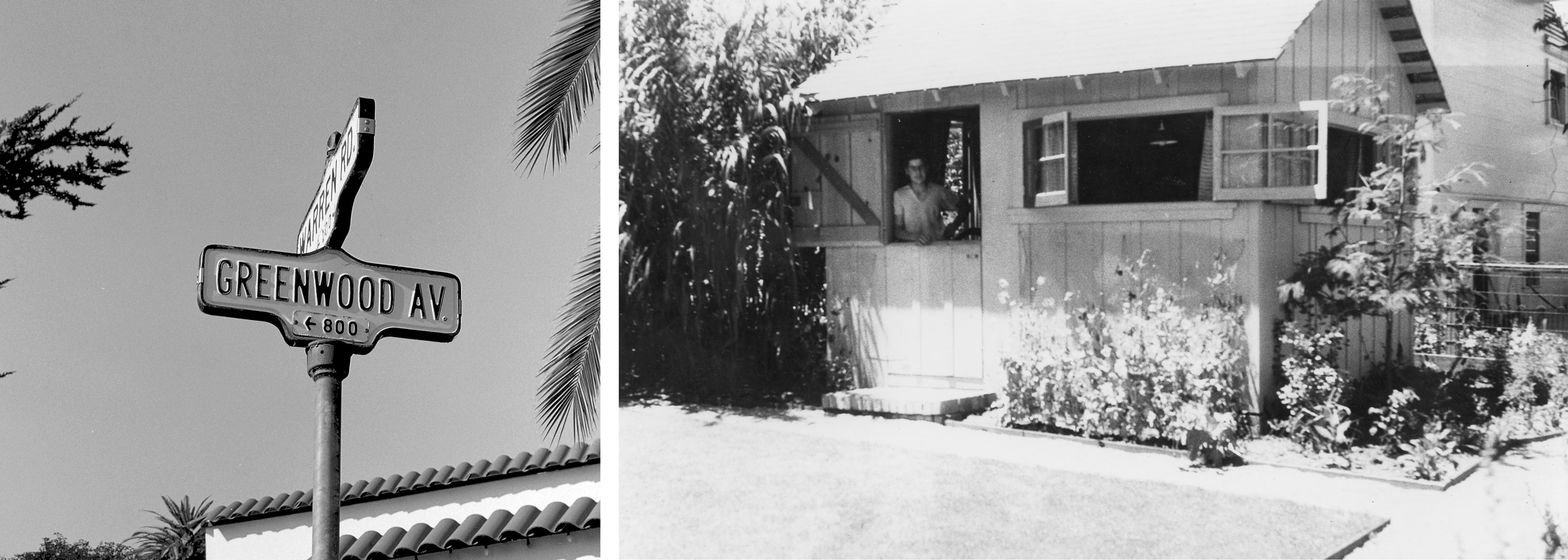
At an early age, Jack Stauffacher was practically anointed as a printer. Paging through an issue of Popular Mechanics when he was fourteen, his eye fell on a mail-order advertisement for a 3-by-5-inch letterpress, and his curiosity was permanently piqued. By the time he graduated from high school, he and his father had built a modest studio in the backyard of their home in San Mateo, California, and the tiny mail-order press had given way to a more stately Chandler & Price model. Named the Greenwood Press after the street adjacent to their home, young Stauffacher’s enterprise began to take on small commercial jobs.
“I was enthralled with the mechanical apparatus, the press itself, the rollers, the type, ink. The aesthetic, the more artistic part, came later,” Jack said in a 1993 Smithsonian interview.
According to Chuck Byrne, Stauffacher’s longtime friend and the author and designer of Only on Saturday, it was these small print jobs — replete with trial and error, with formative mistakes followed by hard-won triumphs — that became Stauffacher’s first and primary teacher in his youth. “During this period, Jack laid a foundation for himself as an experimenter,” Byrne shares in the book’s pages. “For the rest of his life, he was not afraid to venture into the unknown.… This ability proved a central factor in the success of his later wood type prints.”
Art’s Post-War Urgency
It just so happened that experimentation was in the air. In post–World War II San Francisco, where Stauffacher returned at the age of 24 after serving as a mapmaker for the US Army, the arts scene was forever reshaped by the atrocities of a war that threatened its very coast. After the Holocaust in Europe and the demonstration of the A-bomb’s annihiliative power in Japan, the art world at large would begin to see shifts from the post-representational experiments of early modernism to the wholly and wildly abstract pieces made during the Cold War. After the world had driven itself to the brink — and threatened to do it again any day — artists threw themselves into studies that challenged the idea of what art was, experimenting with tools, materials, and long-held beliefs about the two-dimensional space of the canvas.
For Stauffacher, the seriousness of this new era also triggered a solemn commitment to his chosen medium, as he expressed in a 1993 interview: “It meant asking and pondering over questions that needed to be asked — everything was in utter disorder — the bomb, the experience of Hiroshima, etc.… I needed to express this dilemma.… Since I loved the book, I would henceforth dedicate myself to this desire.”
Meeting the Modernists
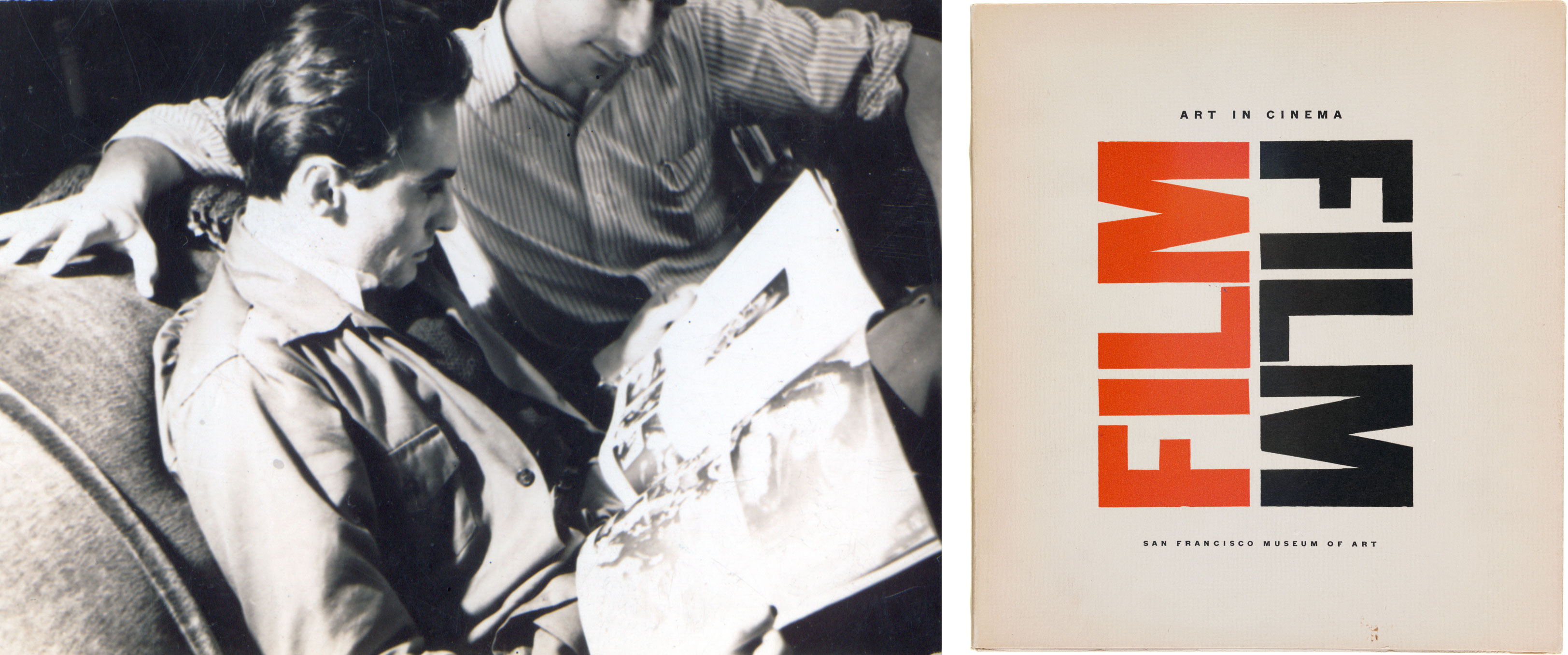
One of Stauffacher’s greatest influences in this era was his older brother Frank Stauffacher, an avant-garde filmmaker who piloted the Art in Cinema series at the San Francisco Museum of Modern Art and introduced his younger brother to the work of modernism’s greats, such as painter Piet Mondrian and painter/photographer László Moholy-Nagy. “[Stauffacher] was especially fond of recounting the 1947 trip that he and Frank took to Los Angeles to meet Man Ray, who was living there at the time, and all the hours he spent absorbing Man Ray’s knowledge of recent art history,” Byrne recounts.
More than brushes with fame, these encounters with modern art proved determinative in Stauffacher’s career. In this post-war period, he read Mondrian’s Plastic Art and Pure Plastic Art (1937) and, fifty years later, offered rare insight into Mondrian’s concept of dynamic equilibrium — an intuitive balance achieved through a rhythmic repetition of line, form, and color, sometimes within a singular plane and sometimes between multiple ones — and how it might have trickled into his typographic experiments:
If you study Mondrian, you can see his play on different planes, what does he call it? Dynamic equilibrium. He wants us to meditate and think about these things and it was a new language you were learning. It filtered back into everything that you were dealing with, especially in the book.… It wasn’t saying, “Arts and Crafts is bad.” It was just a new visual way to resolve form and content. And if Mondrian as a painter can influence the typographer, there is obviously a new way of looking at things through [these real avant-gardeists].
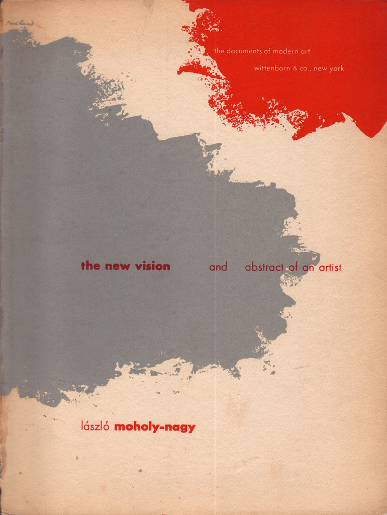
Another known modernist influence on Stauffacher’s sensibilities is Moholy-Nagy, the constructivist artist and Bauhaus professor who crisscrossed visual media to forge a new concept of space. His films and photograms (images made using photosensitive paper but without a camera), experiments with light and transparency, and use of unconventional materials in painting paved the way for other artists to reconsider the plane of the canvas. Or, to quote Moholy-Nagy’s seminal 1928 essay The New Vision (a book that was still on Jack Stauffacher’s bookshelf at the time of his death in 2017), a painting is “an interweaving of parts of space, which are anchored in invisible but clearly traceable relations, and in the fluctuating play of forces.”
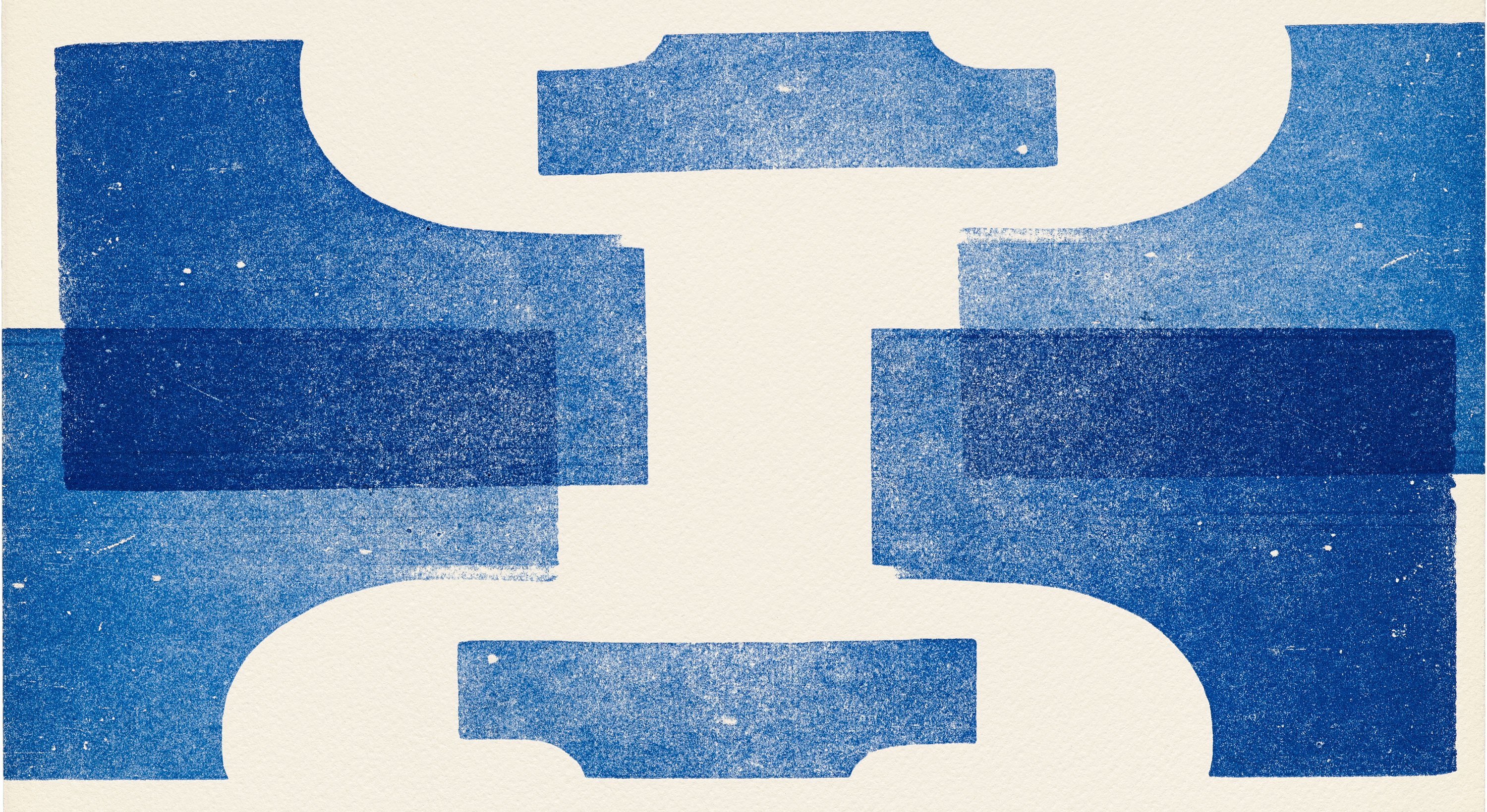
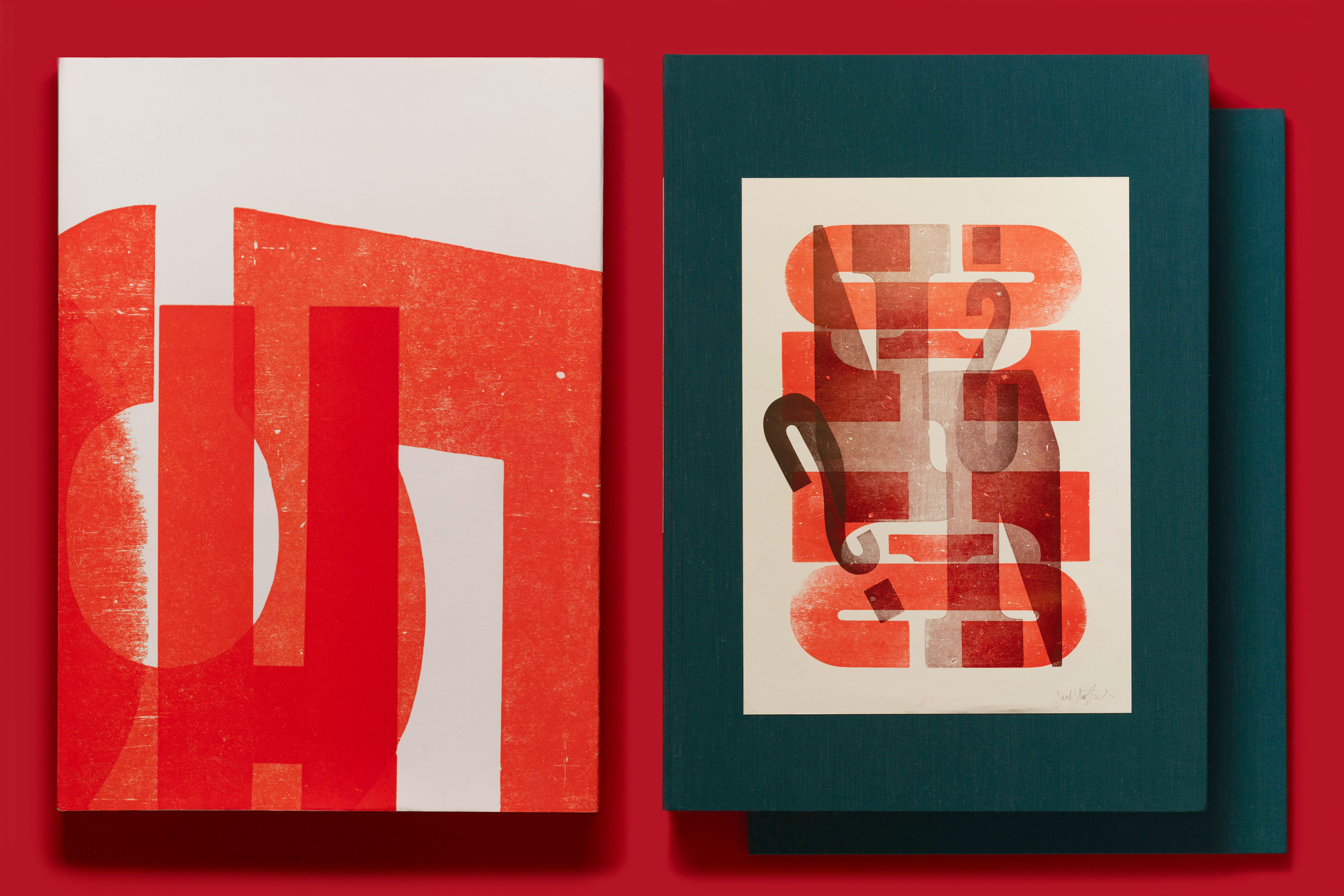
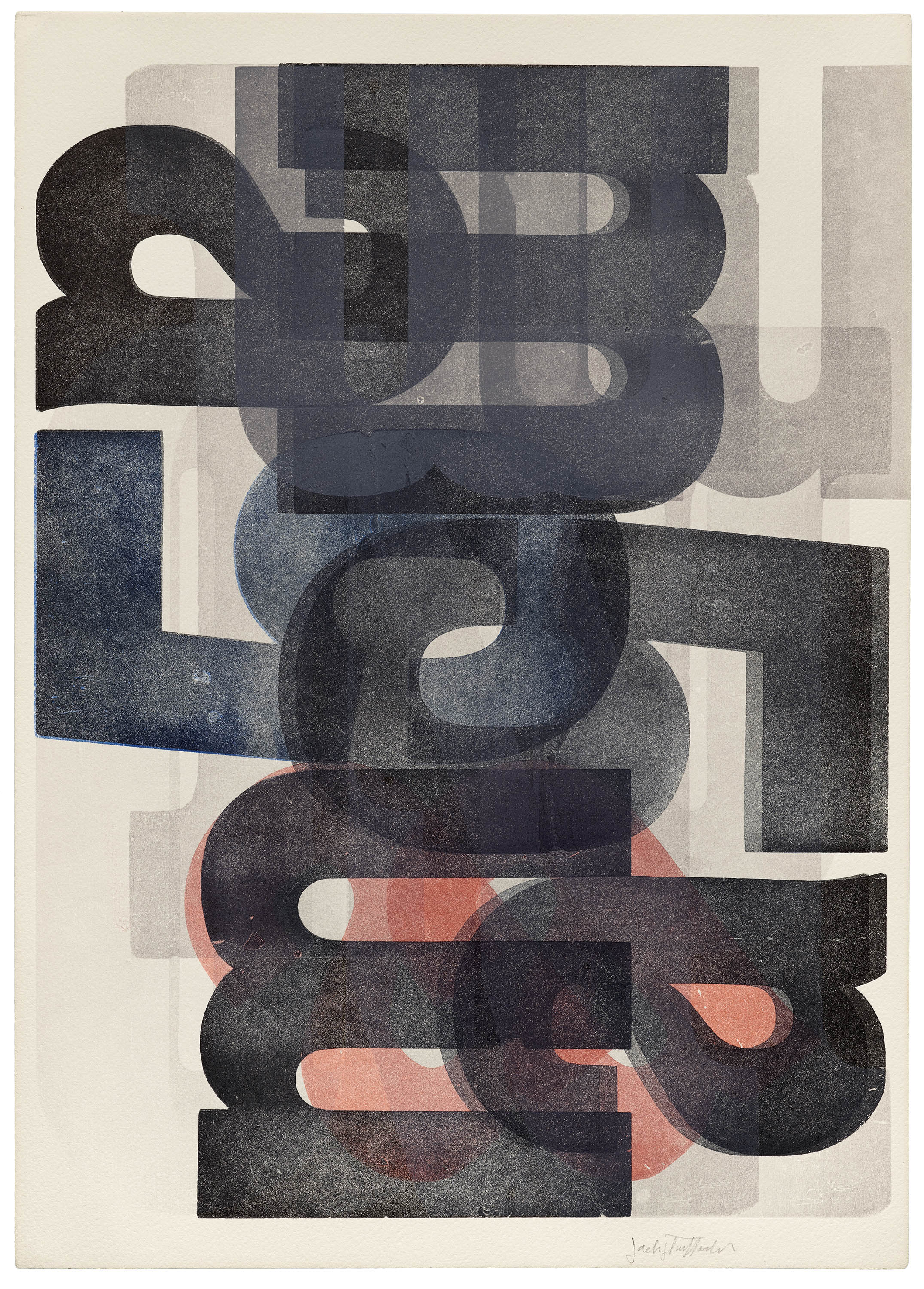
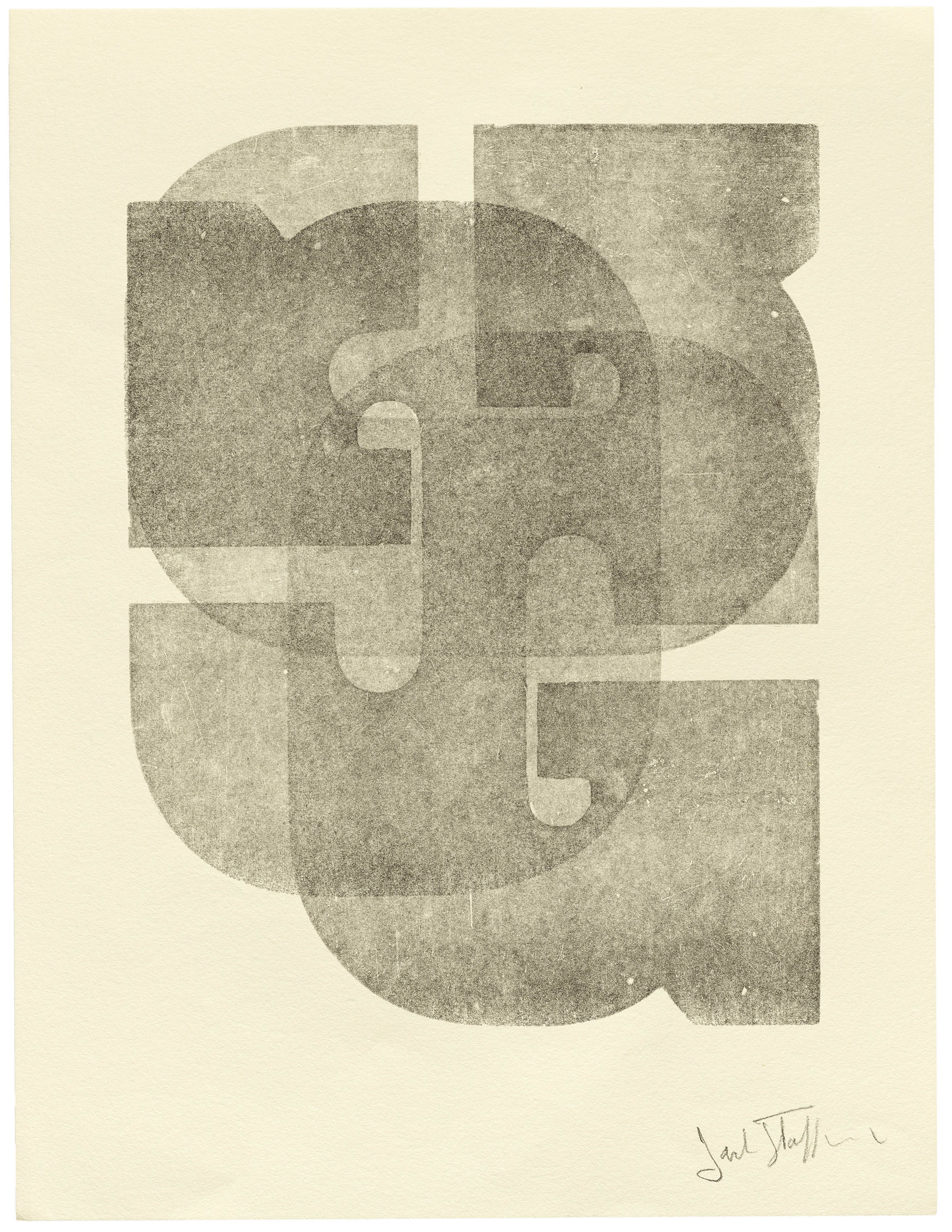
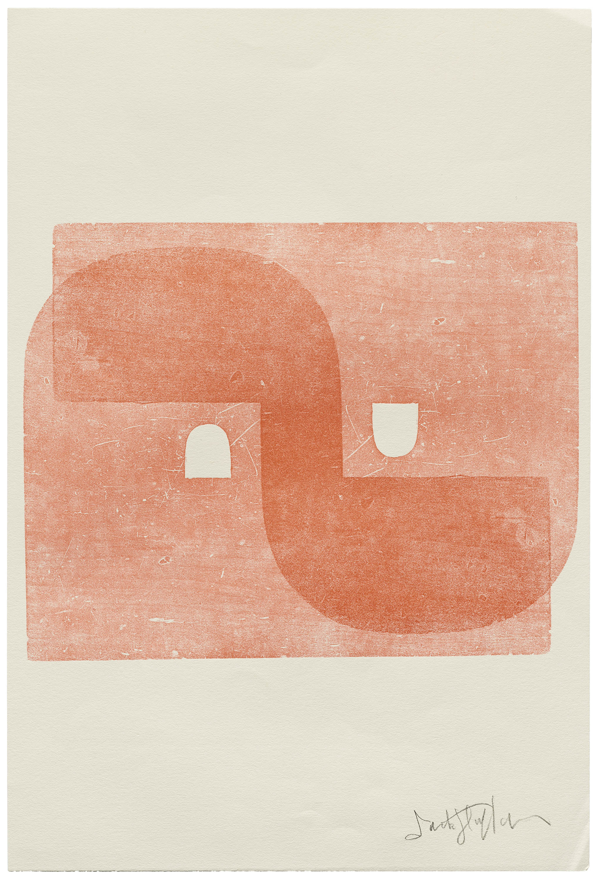
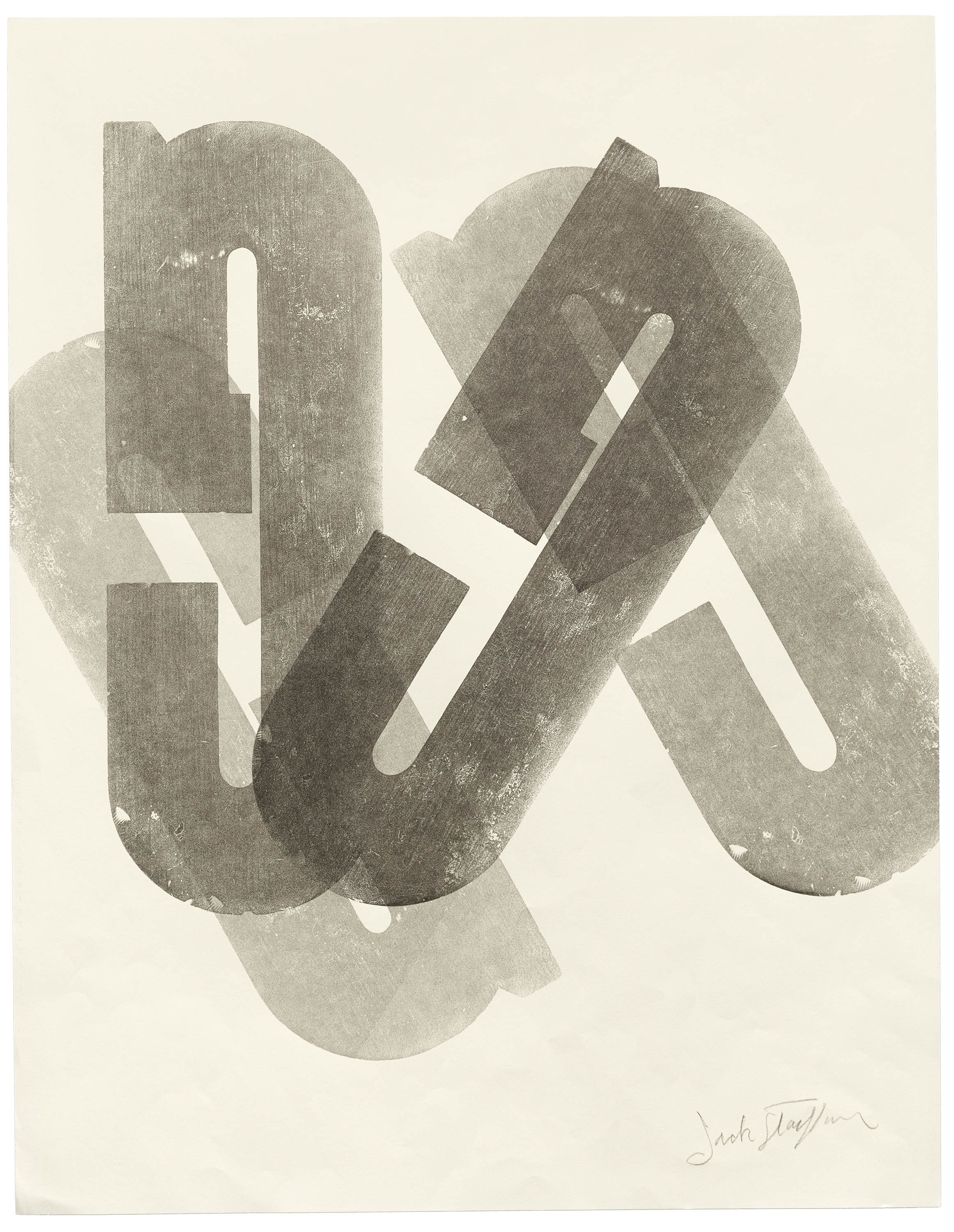
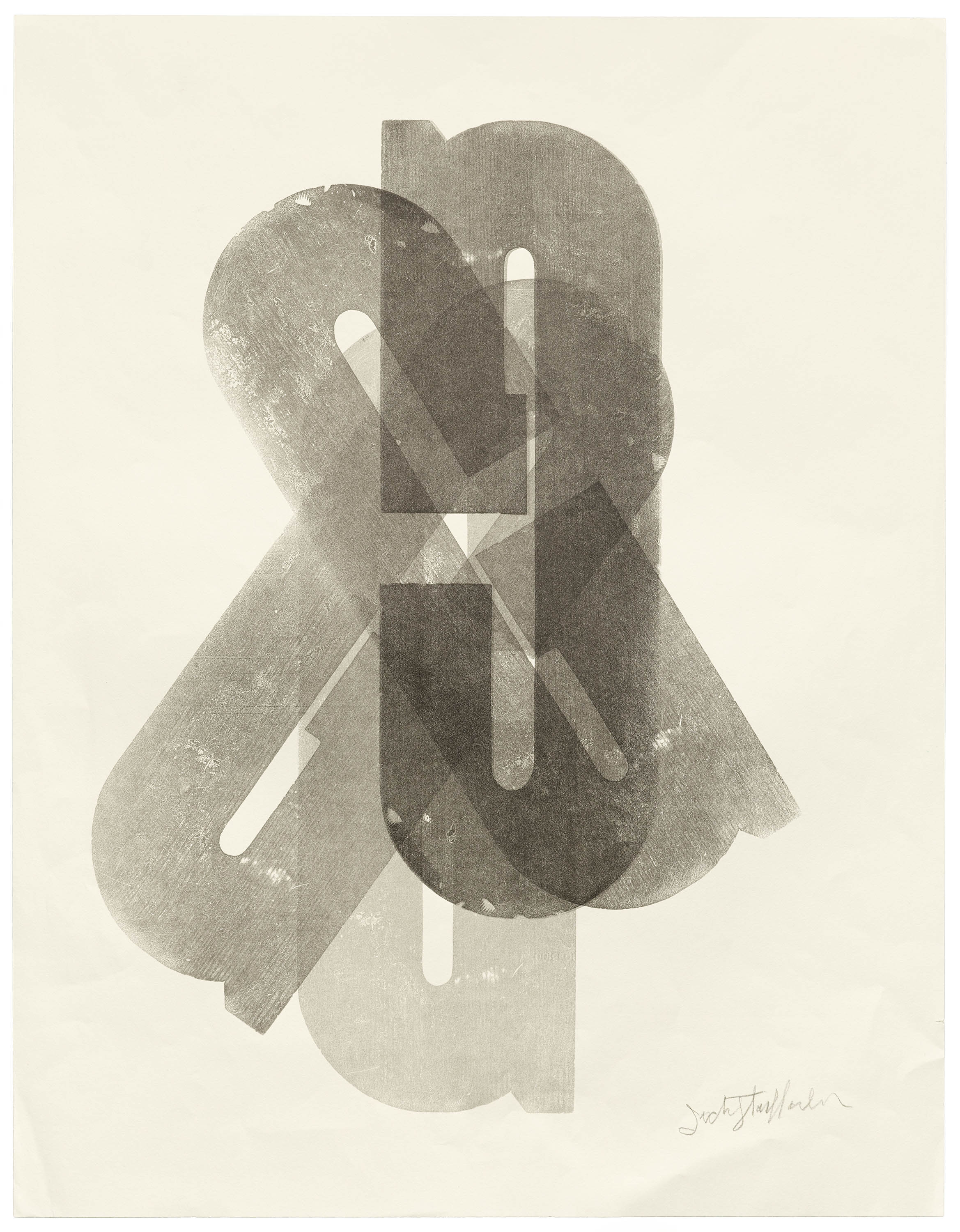
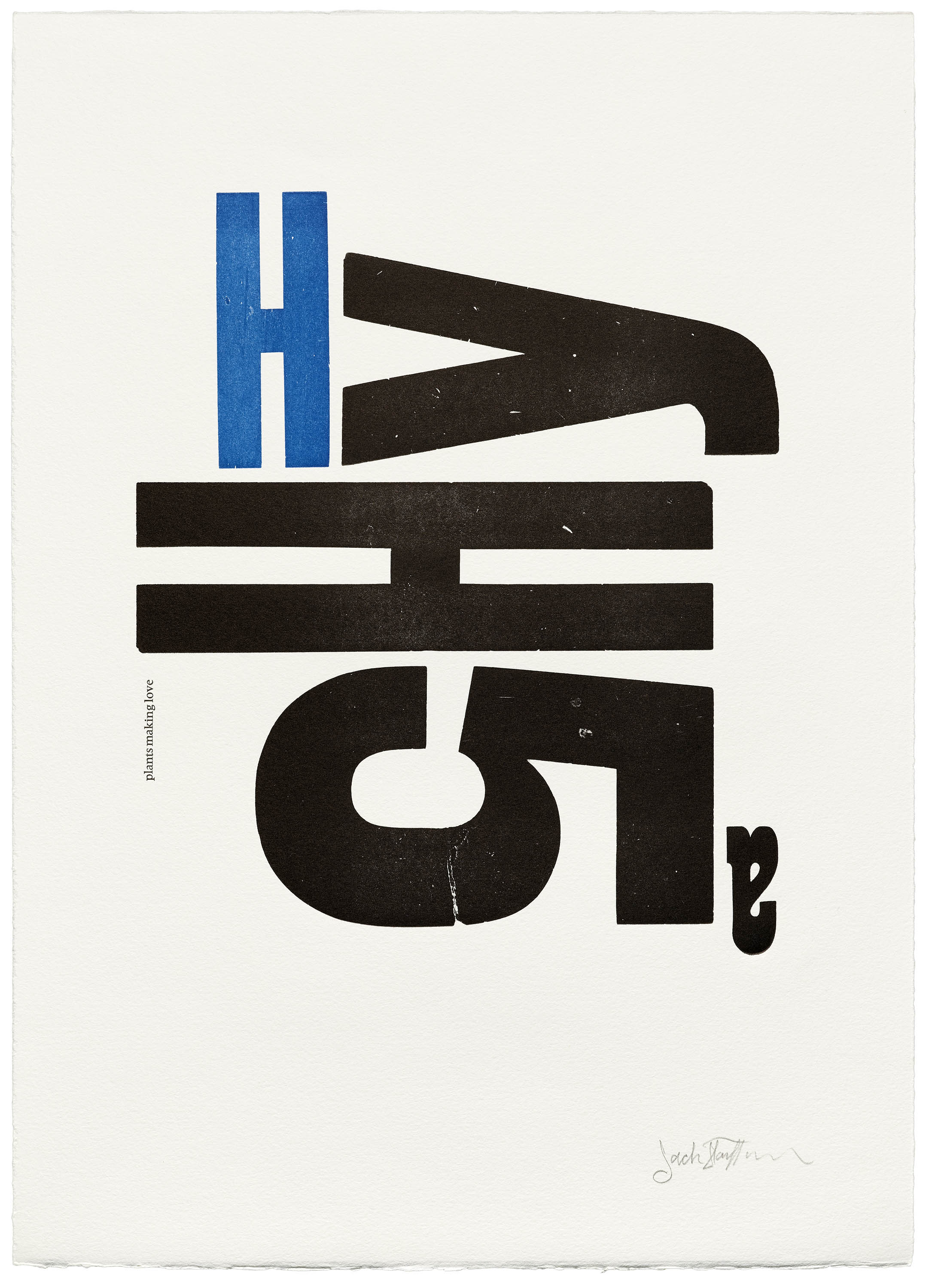
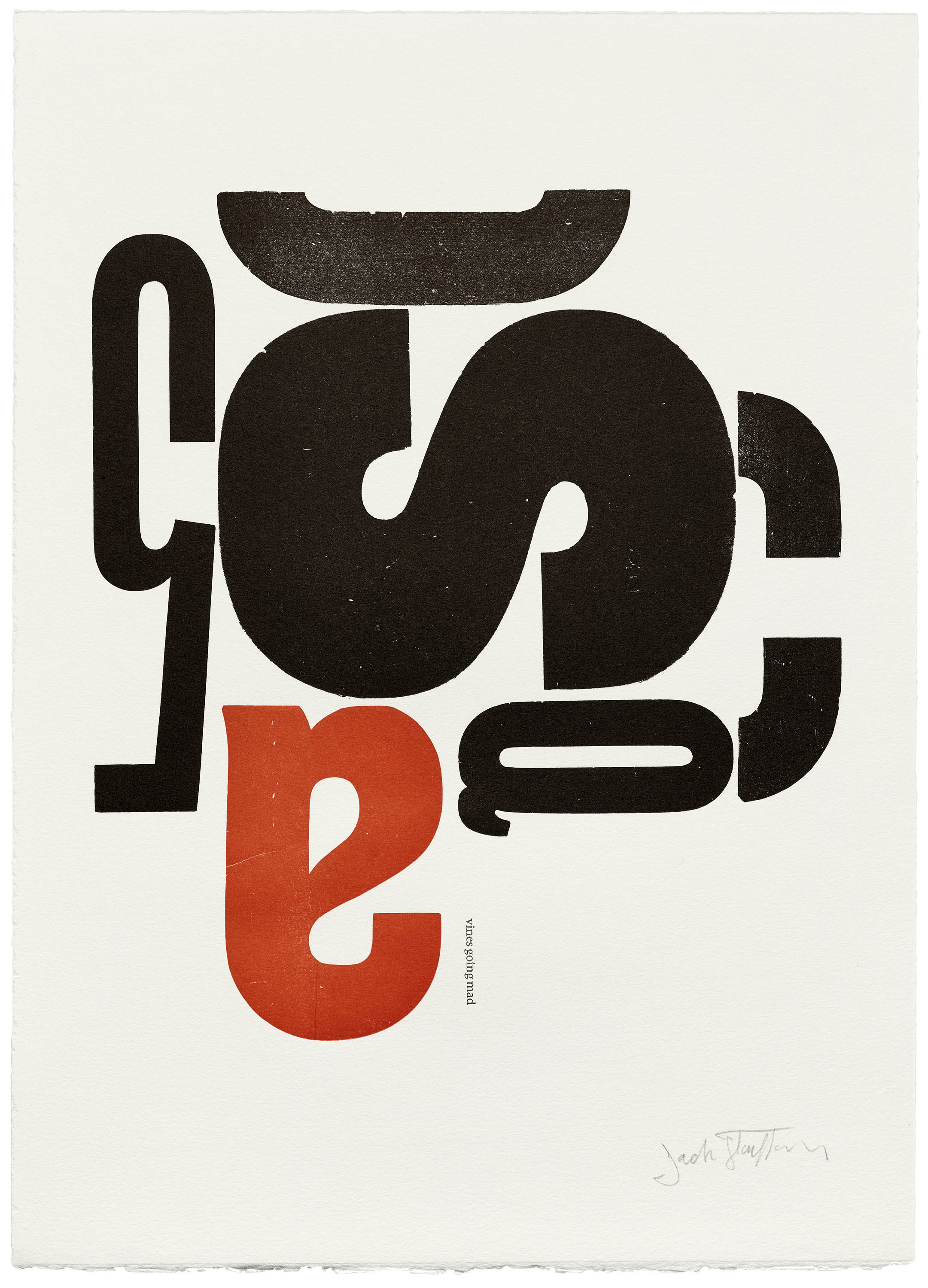
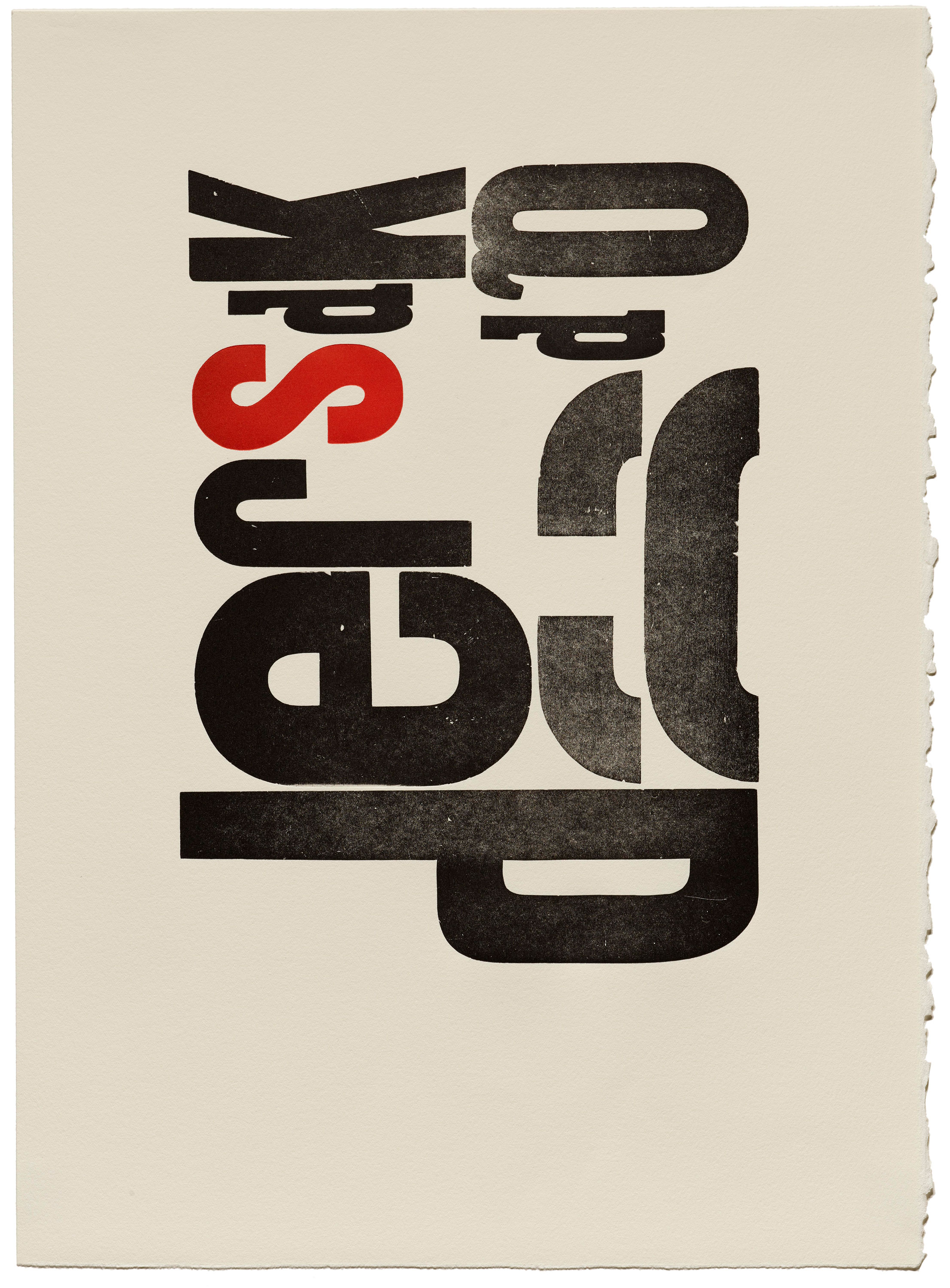
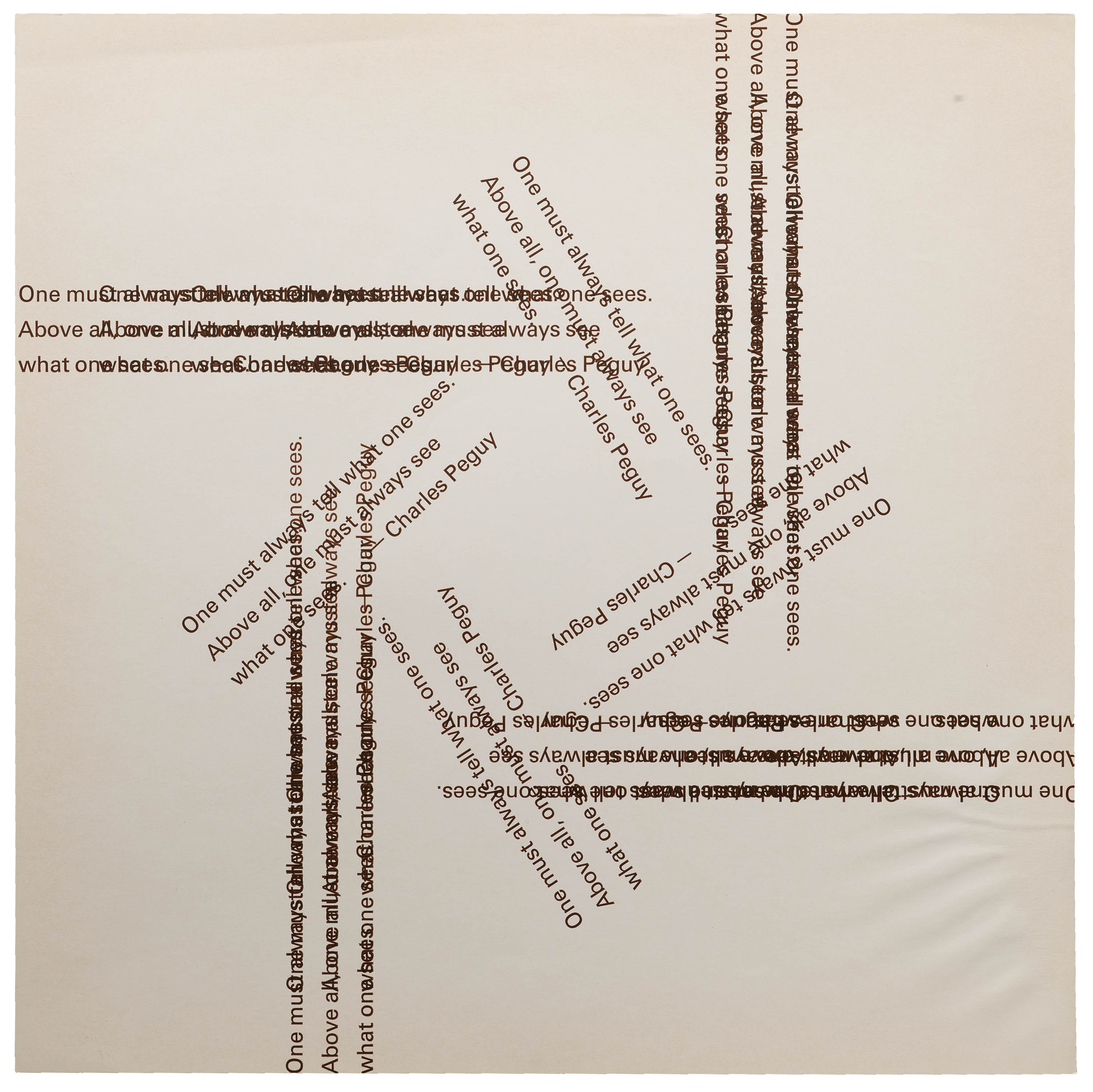
Later, in his wood type prints, Stauffacher explored such spatial relationships — probing the possibilities between figure and ground, and creating depth on the page by layering compositions with multiple passes on the press. In her essay in the book, LACMA associate curator Staci Steinberger relays, “His wood type prints had a more animated air, the brash poster-sized letters swirling across the page, activating the entirety of its surface. Seen as a whole, these compositions reveal a cinematic flair, a nod to Jack’s early interest in avant-garde film.”


Stauffacher & the Swiss
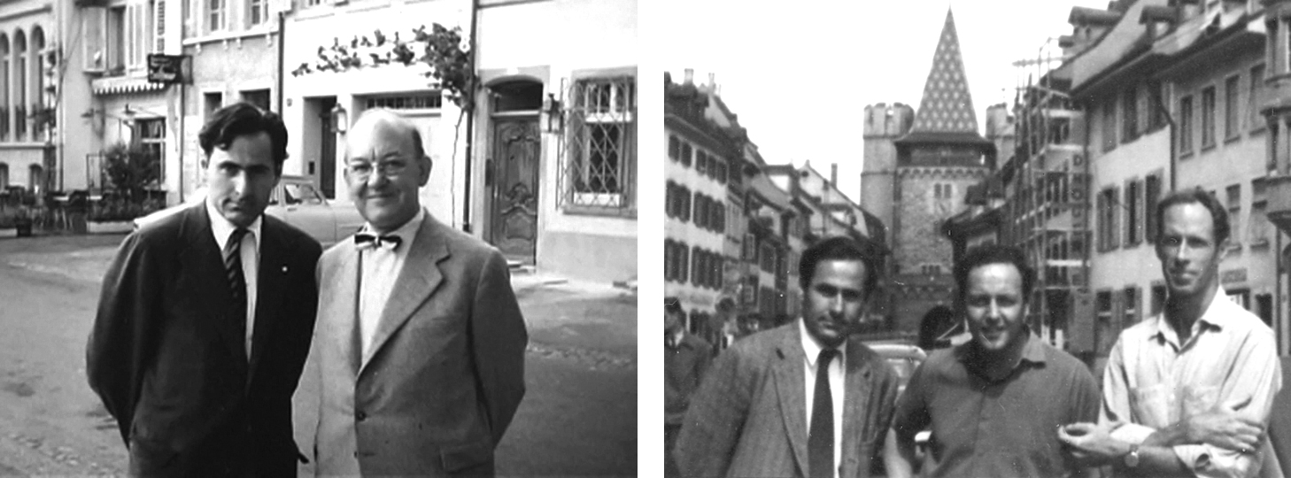
While in Italy on a Fulbright scholarship from 1955 to 1958, Stauffacher paid a visit to Basel and met several of his longtime correspondents, notably Swiss typographer Jan Tschichold. By this time, Tschichold had famously recanted his contributions to International Typographic Style, a Bauhaus-informed approach to the page that favored cleanly gridded, asymmetrical layouts and simple sans serif typefaces.
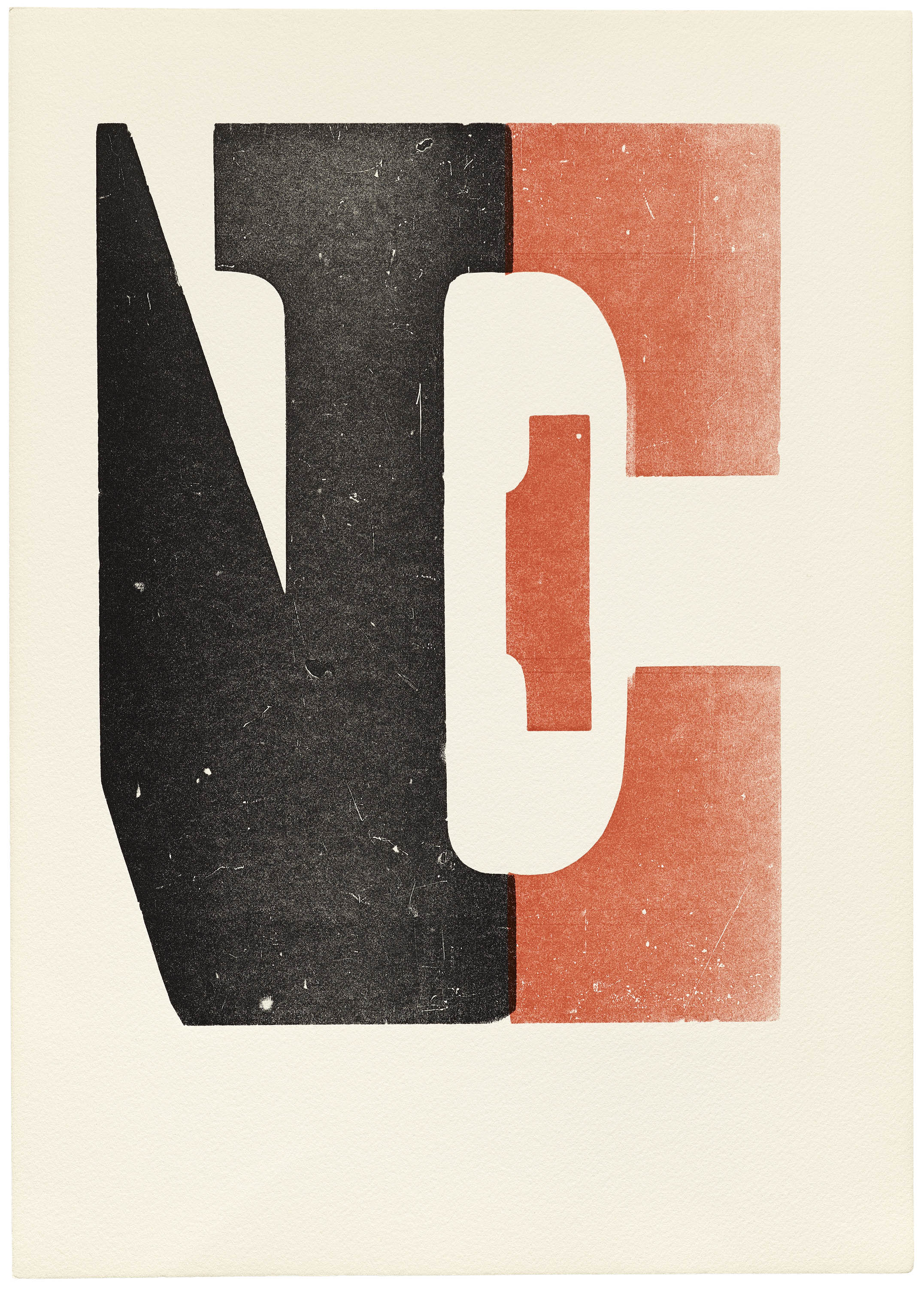
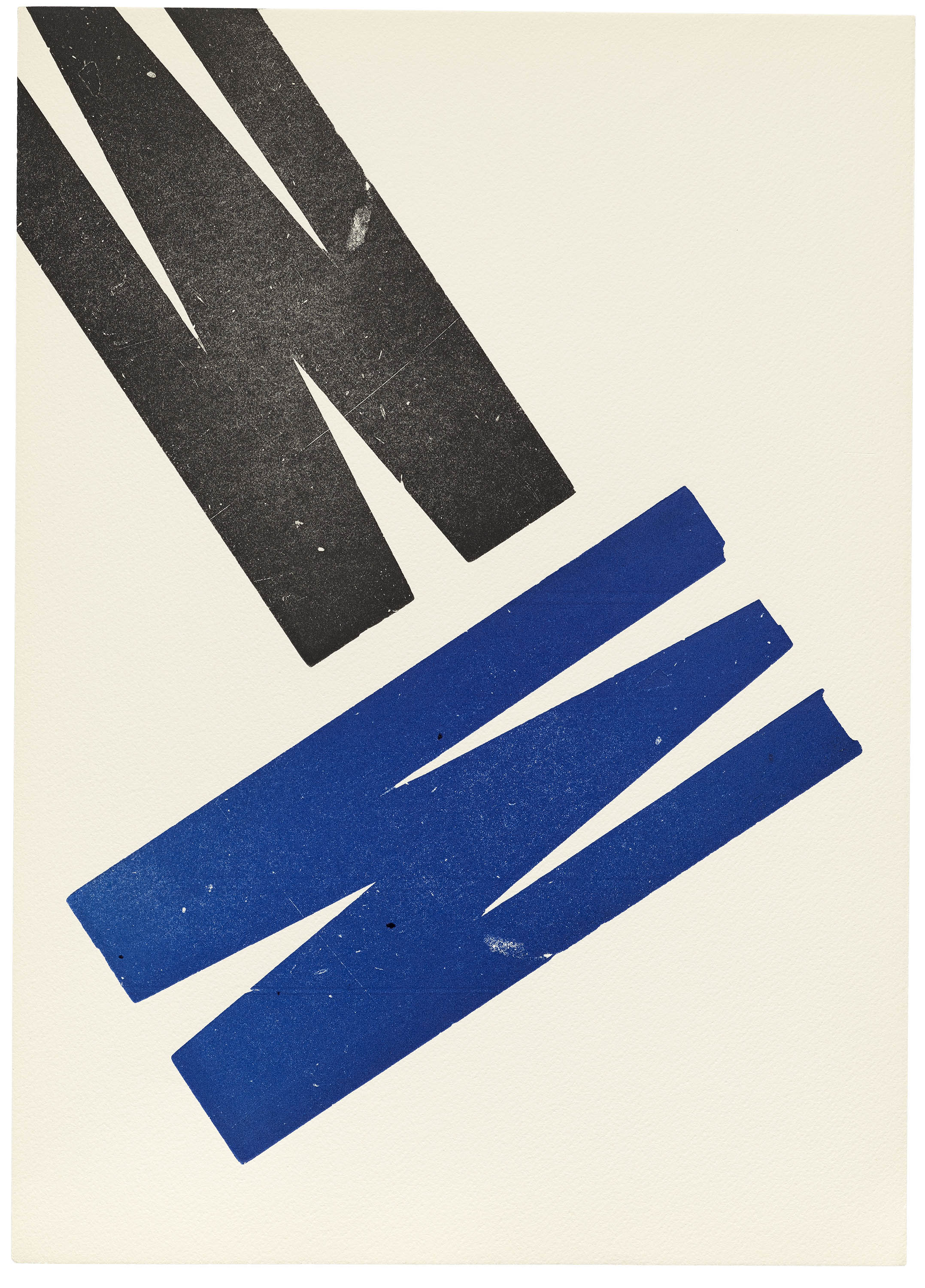
Stauffacher was fascinated by the debate raging between Tschichold and several of Swiss Style’s adherents, such as Emil Ruder and Armin Hofmann. Later, in a 1962 lecture, he shared his belief that “Tschichold’s neoclassic doctrine deserves our attention, yet so does Ruder’s opposite view. Both excite our interest in examining the diversity that typography presents to the contemporary scene.” Stauffacher in particular embraces Ruder’s use of white space, claiming that the “white areas are no longer merely a negative space but are an integral part of the structure of the pages.”
The importance of negative space would soon become integral to Stauffacher’s work in general (especially in books like his 1977 Phaedrus, where blank inches elegantly stand in for silence in the two-column layout of Plato’s dialogue). But it gains special value in his wood type prints, where the tension between form and counterform pull the eye into the field, and asymmetrical arrangements energize a once static page.

Metal Type Precursors
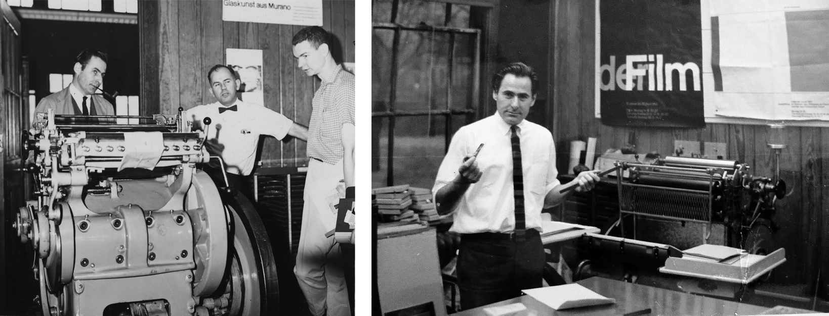
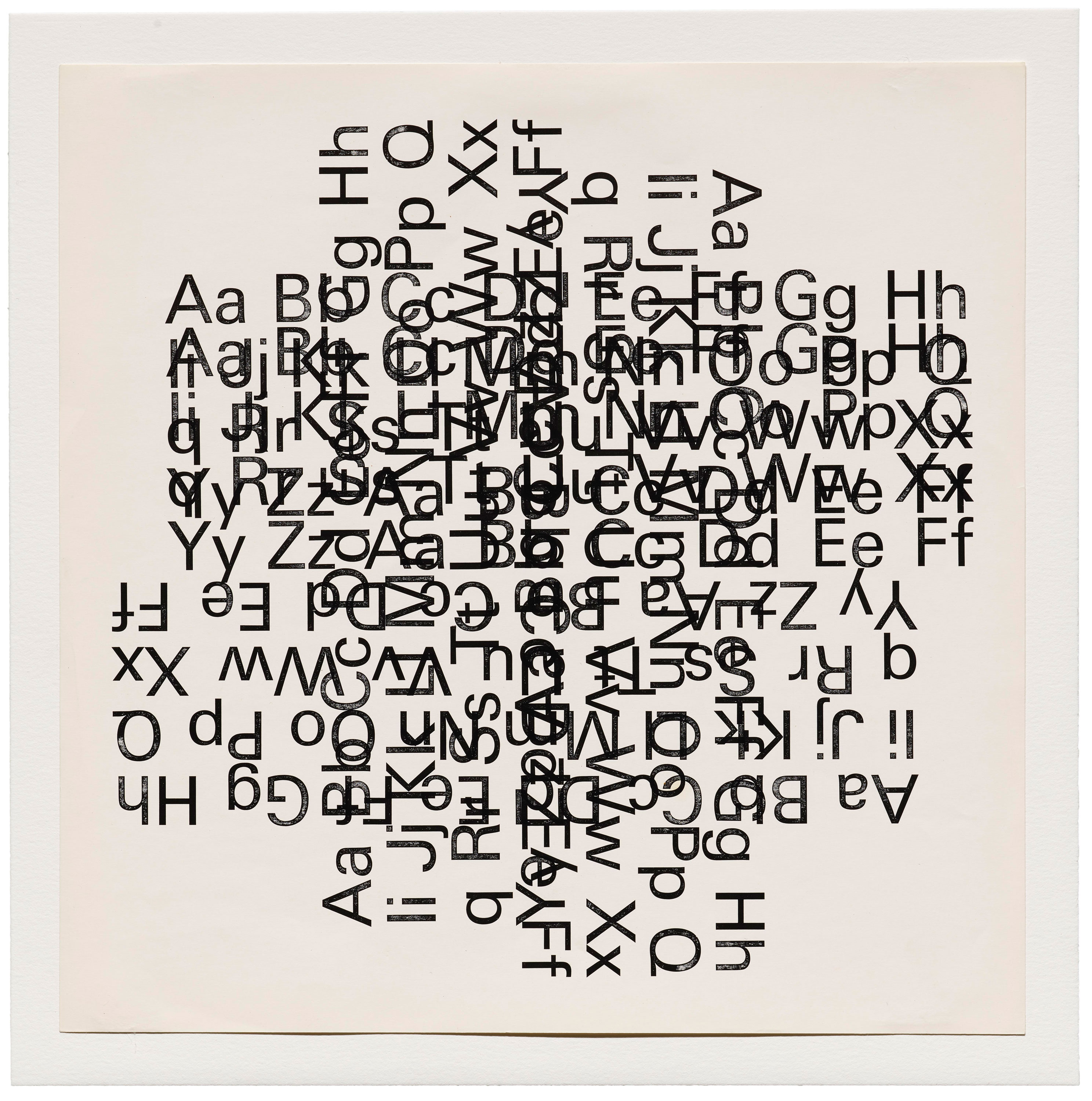
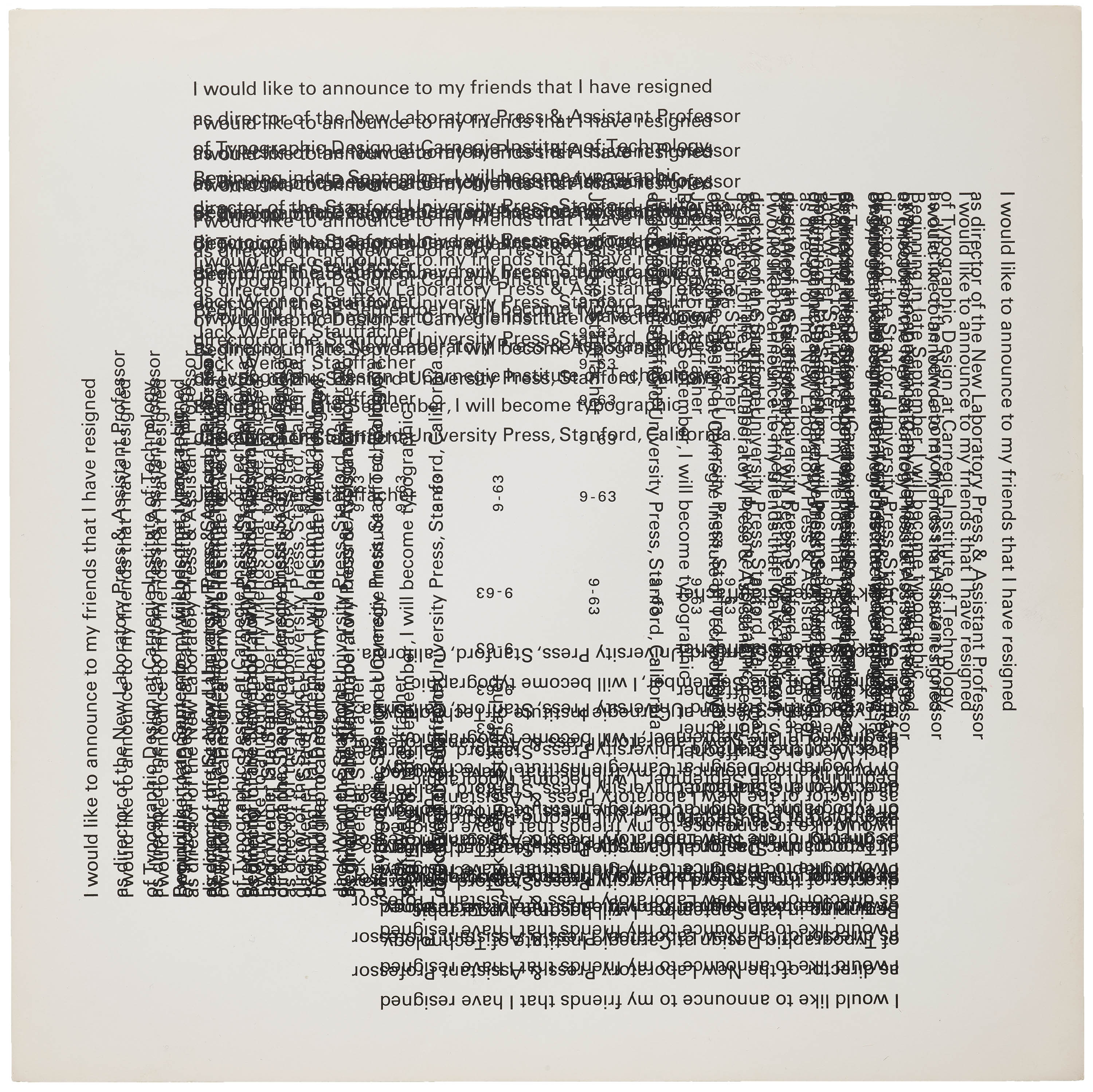
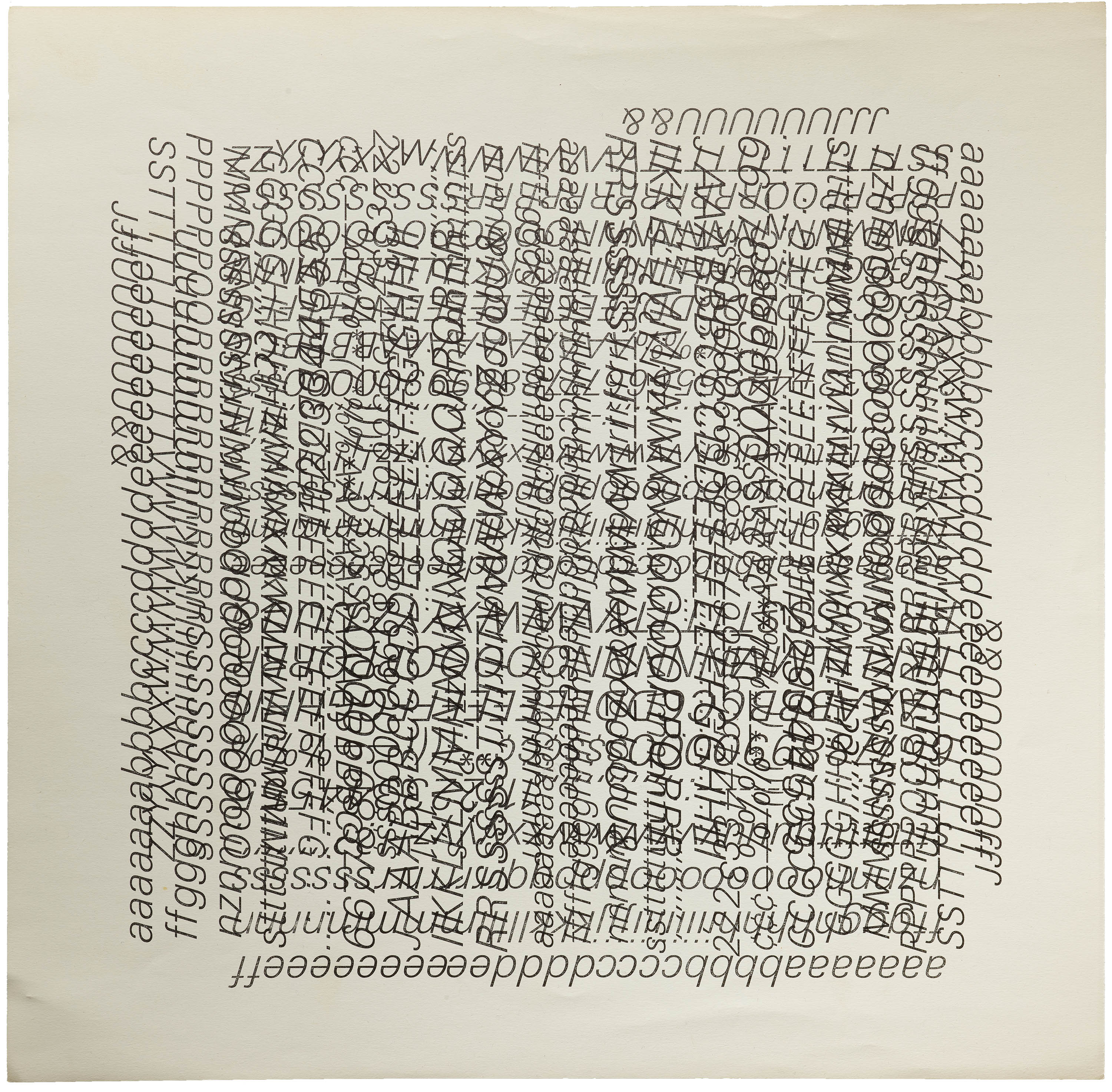
After Stauffacher’s time in Italy drew to a close, he began work as an assistant professor of typographic design at the Carnegie Institute (now Carnegie Mellon) in Pittsburgh. Here, Stauffacher conducts a series of systematic experiments with metal type, repeating and overlapping Adrian Frutiger’s Univers to nearly patternized effect. His youthful practice of trial and error had reemerged, and the effects — soon to be realized on the 1967 cover of The Journal of Typographic Research — would gather both high praise and disdain from the typographic community.
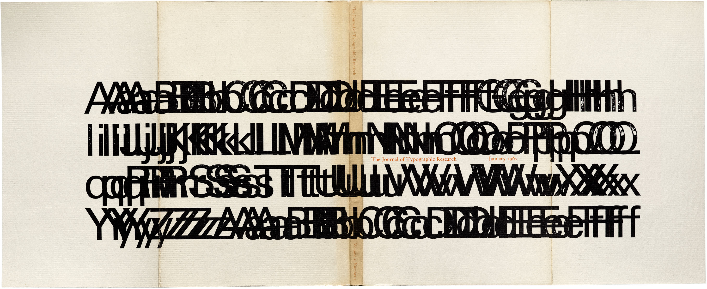
Called “an eye-wrenching smear” in an especially outraged letter to the editor, the groundbreaking experimental letterpress piece remained the journal’s cover artwork until 1970, when post office regulations forced its redesign. But for Stauffacher, it was likely an enduring validation of the magic that can happen when a traditional tool was used nontraditionally. “It testifies to his belief that, in an experiment, a tool — here, the press — can be tested beyond its normal use in a tradecraft to create something remarkable and surprising,” Byrne remarks of the early exercise.

The Arrival of the Wood Type
After his stint at Carnegie and another at Stanford, Stauffacher found himself back in San Francisco, where he reopened his Greenwood Press at 300 Broadway, a famed printers’ building. It was here, in 1966, that a retiring printer gifted him the box of unremarkable old wood type — plain and unadorned, geometric and well-worn — that would figure in the wood type experiments now collected as art by major museums. He created five portfolios with the wood type over the course of four decades (The Rebel Camus in 1969, The Wood Letters of the Greenwood Press in 1975, Wooden Letters from 300 Broadway in 1998, Vico Wooden Letters in 2003, and The Vico Collaboration in 2004), plus hundreds of individual monoprints and series prints.
Alone in his studio on the weekends, Stauffacher used this type to synthesize what he learned from key influences across his career and make something uniquely his own. Drawing from his formative years in his backyard shed, experimenting at his first real press, he approached the page with a modernist’s consideration of the spatial possibilities vibrating just beneath the paper’s surface, and with the hand of a Swiss-inspired typographer, slanting and stacking elements in a way that activates the page and honors its negative space.
And, of course, he did it all in fun, as author Byrne reminds us. “This work brought him great happiness, and you can see that happiness in the work,” he shares. Learn more about this convergence of influences, plus many more, in Only on Saturday, Byrne’s beautiful tribute to and investigation of Stauffacher’s work. It is also Letterform Archive’s third publication — please help us get it to press by reserving your copy on Kickstarter today.
— Lucie Parker, Associate Publisher