News
Periodicals as Collections, No. 2: bauhaus
Our survey of avant-garde periodicals continues with a closer look at the Bauhaus’s magazine on the school’s 100th birthday.
The second installment of Letterform Archive’s survey of avant-garde periodicals recognizes an auspicious occasion. This month marks the 100-year anniversary of the founding of the Bauhaus, one of the most significant and influential institutions in 20th-century design history.
However, this centennial occasion, and its undoubtedly wide coverage across design blogs, newsletters, magazines, and monographs, also gives this article license to shrug off a burden: attempting to recount the complete history of the Bauhaus.1 For that, see any of those aforementioned sources — or maybe all of them, since, as the critic Reyner Banham put it, “there are a million [Bauhauses] — everyone to whom the word modern has any positive meaning has fathered his own dreams on the memory of the Bauhaus”. In other words, for an institution as complicated and influential as the Bauhaus, the totality can only be approximated by engaging with the multiplicity of perspectives recorded in primary and secondary sources.
Instead, this article will explore the aesthetic program and institutional reconfigurations of the Bauhaus visible through the prism of the school’s eponymous quarterly journal, bauhaus. The Archive holds all issues from bauhaus’s first three years, from 1926 to 1929, and you can see them in full in the Online Archive.
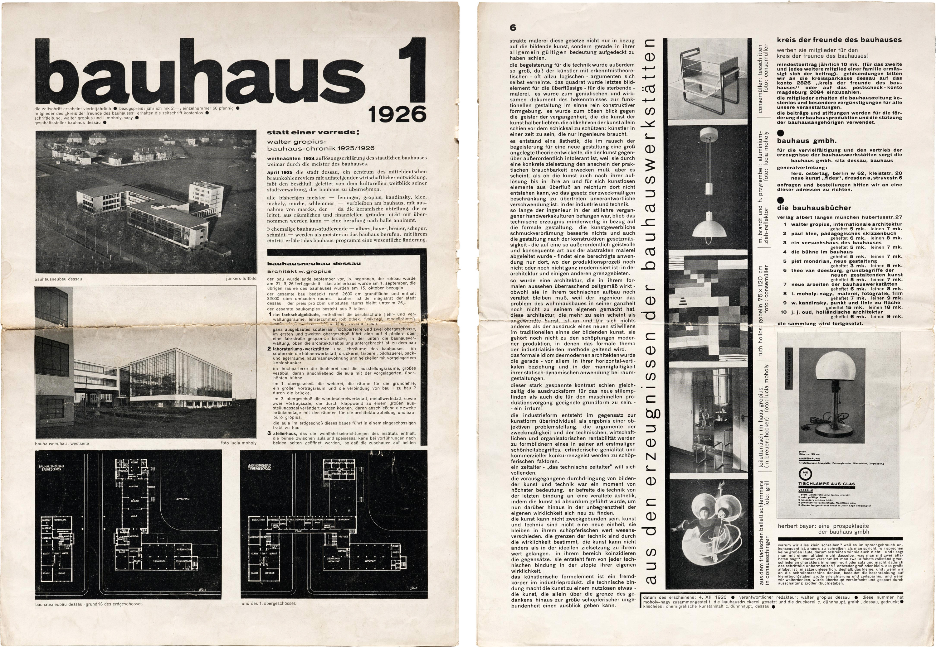
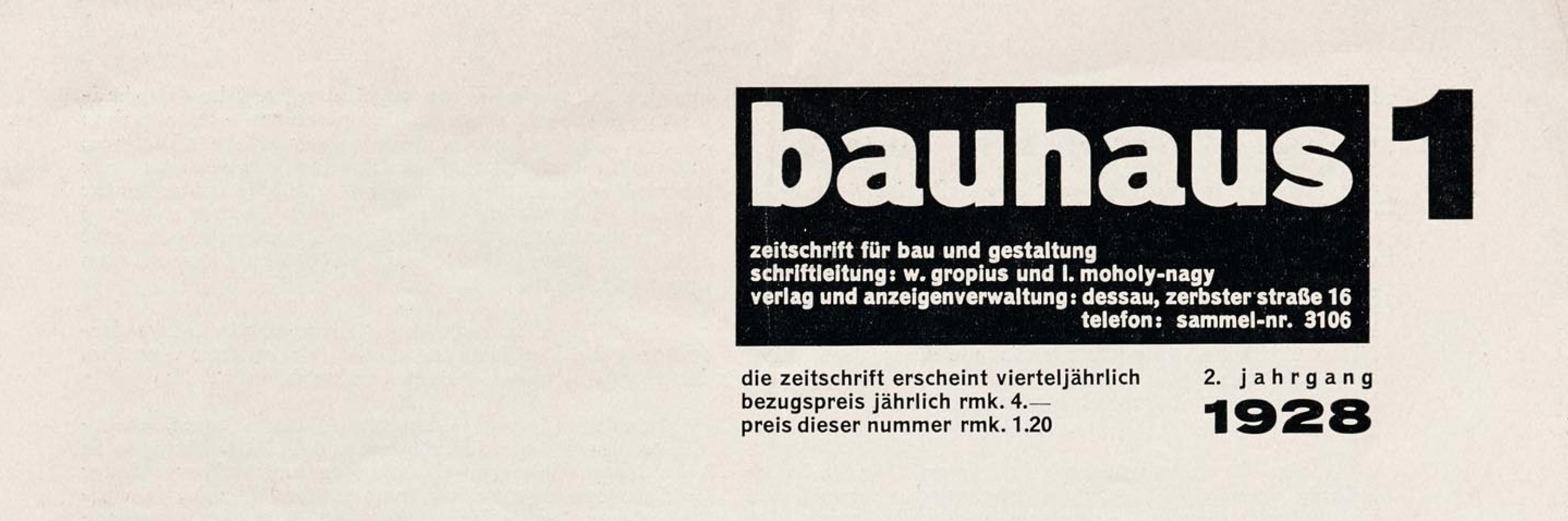
The first issue is dated December 4, 1926, and is co-edited by Walter Gropius and Hungarian artist László Moholy-Nagy, who was at that time head of the school’s metal workshop. Much of the design of the magazine in its first year is attributable to Moholy-Nagy, who had also been the unofficial guide of the typography and page design of the school’s print materials since he arrived in 1923 (there being no actual typography department until 1925), and it shows his penchant for thick rules, arrows and circles, combination of horizontal and vertical text, and asymmetric layouts. The front page (the first four issues are six-panel tri-folds) shows off the new modernist Bauhaus building in Dessau, designed by Walter Gropius. The back page features a column of images “from the Bauhaus workshops”, connected vertically like a strip of photo negatives,2 which give a good sampler of the various productions of the school: side-tables, light fixtures, textiles, interior designs, theatrical productions, and the photography itself. To the lower-right of these photographs is an image of a brochure design by Herbert Bayer, a former Bauhaus student and recently-appointed head of the new typography workshop, and below this, a short editorial statement defending the use of only lowercase letters.
Which brings us to some of the more contentious principles of the Bauhaus’s modernist typography: the liberal use of sans-serif typefaces, for both headlines and text, as well as the use of exclusively lowercase letters. In their historical and cultural context, these choices were far more scandalous than they appear to us today. At that time sans-serif type was not wholly uncommon in advertisements or headlines, and had been experimented with by earlier avant-garde movements, but its use for running text was still regarded as unorthodox, and less readable than roman or blackletter. Furthermore, in the cultural context of Germany where the Antiqua-Fraktur dispute was far from settled, electing for sans serif would represent an especially pointed leap away from Fraktur — which was not only the current national script, but would gain political valence as the preferred style of script of the ascendant Nazi party (until they officially abandoned it in 1941). On the other hand, the use of only lowercase letters, while still unconventional today in many languages, would also be especially radical in the context of German orthography, in which all nouns are capitalized. Even Jan Tschichold, polemicist of the Bauhaus-inspired “New Typography”, would include several qualifications and reservations in his recommendation of both of these typographic practices in his book a few years later.3
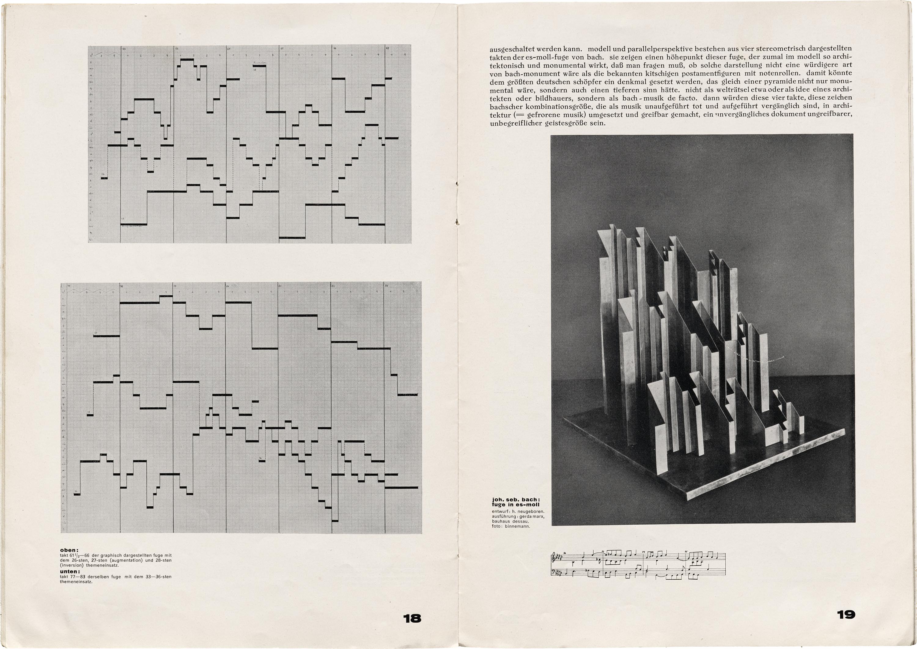
A peculiar article in the second issue of bauhaus can help make a broader point about the typography and page design of the magazine, and its relation to the modernist architecture practiced by the school. The title of the article translates roughly as “mathematical proof of the illumination of all school rooms”, and a section head is even more pointed: “calculation of light intensity at table height”. What follows is a dense series of formulas ostensibly proving the optimum quantity of light hitting the surface of each student’s drawing table. This is what those big glass façades on modernist buildings are all about: an obsession with letting in more light. But this principle of illumination can apply equally to modernist typography. The asymmetric layouts, which encourage deliberate use of unprinted empty spaces as a compositional element, serve to let in more light on the page. The “undecorated” sans-serif letterforms let in more light than dense fraktur. In this way, the design of the magazine can be seen as contiguous with the other aesthetic goals of the institution, and of modernism broadly conceived.
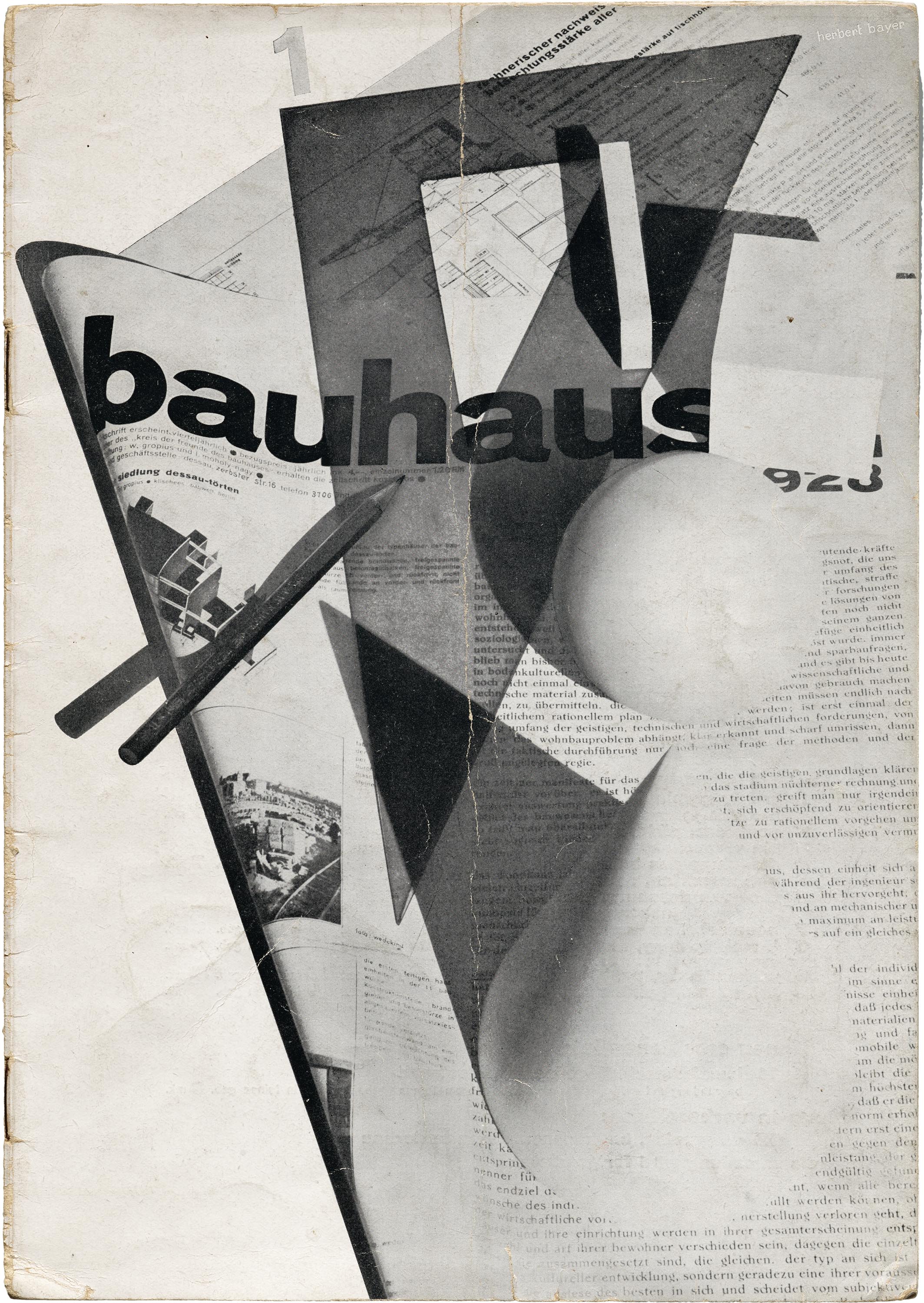
Moholy-Nagy’s last year at the Bauhaus was 1928, and typography director Herbert Bayer, who had already begun overhauling the printed face of the school in letterheads and postcards, took over design of the magazine in its second year. His debut cover design would become one of the most recognizable. It is almost entirely photographic, a kind of semi-abstract, still-life presentation of Bauhaus tools (pencil and set square) and elemental forms (cone, sphere, and cube),4 each casting dramatic shadows. These shapes and shadows are all sitting atop or overlaying a carefully placed, folded copy of the second issue ofbauhaus, with the pencil and a rectangular prism both pointing at the logotype. This technique of using photograph-of-nameplate as nameplate is not only a clever trick, but it also serves to establish continuity between the magazine of the previous year (in newspaper format) and the new one (now published in traditional magazine format). The number and year of the previous issue in the photograph are strategically covered by the cube and sphere, and Bayer’s sole typographic addition, a faint grey “1”, floats above the set square near the top edge.
During his year as designer, Bayer continues some of Moholy-Nagy’s practices (lowercase, sans serif type) while regularizing others: He uses fewer symbols and thinner rules, and makes less use of vertically set text. While still asymmetrical, the layouts are less chaotic, settling into what would become the Bauhaus’s most characteristic style.
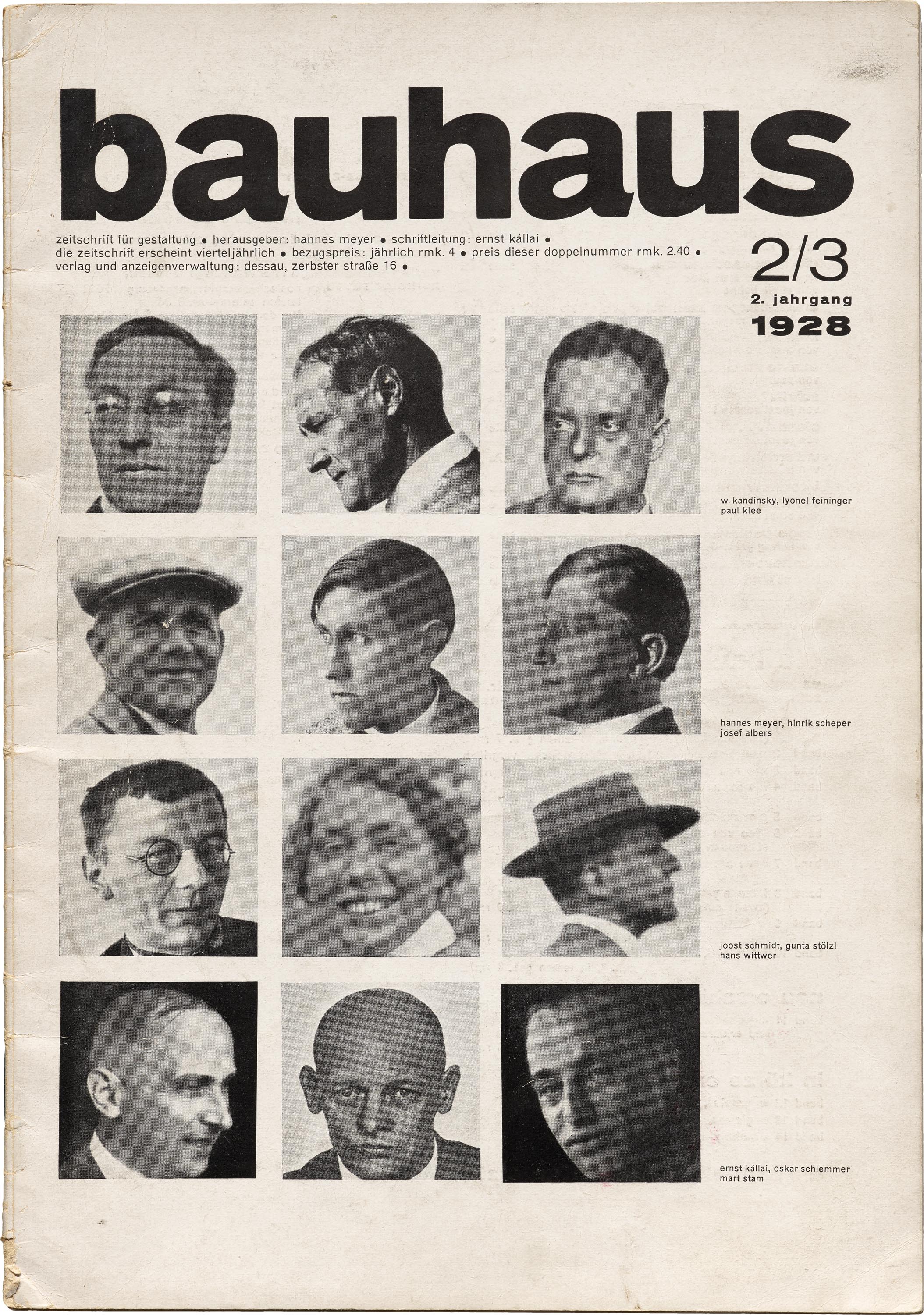
The next, double issue of bauhaus marks the change in directorship of the school from Gropius to Hannes Meyer, and the editorship of bauhaus to Ernst Kállai, who writes the leading article in that issue, assuring that “the Bauhaus lives!” However, more changes were coming to the magazine: After three issues as designer, Bayer resigned from his position at the Bauhaus, and Joost Schmidt took over as head of the typography department and designer of bauhaus.
Schmidt, who had taught lettering at the Bauhaus since 1925, promptly redesigned the bauhaus logotype after one of his own alphabets, moving the identity of the magazine toward the idealized geometric letterforms that many modernists aspired to, as opposed to the generic sans-serif typefaces that were available at the time.
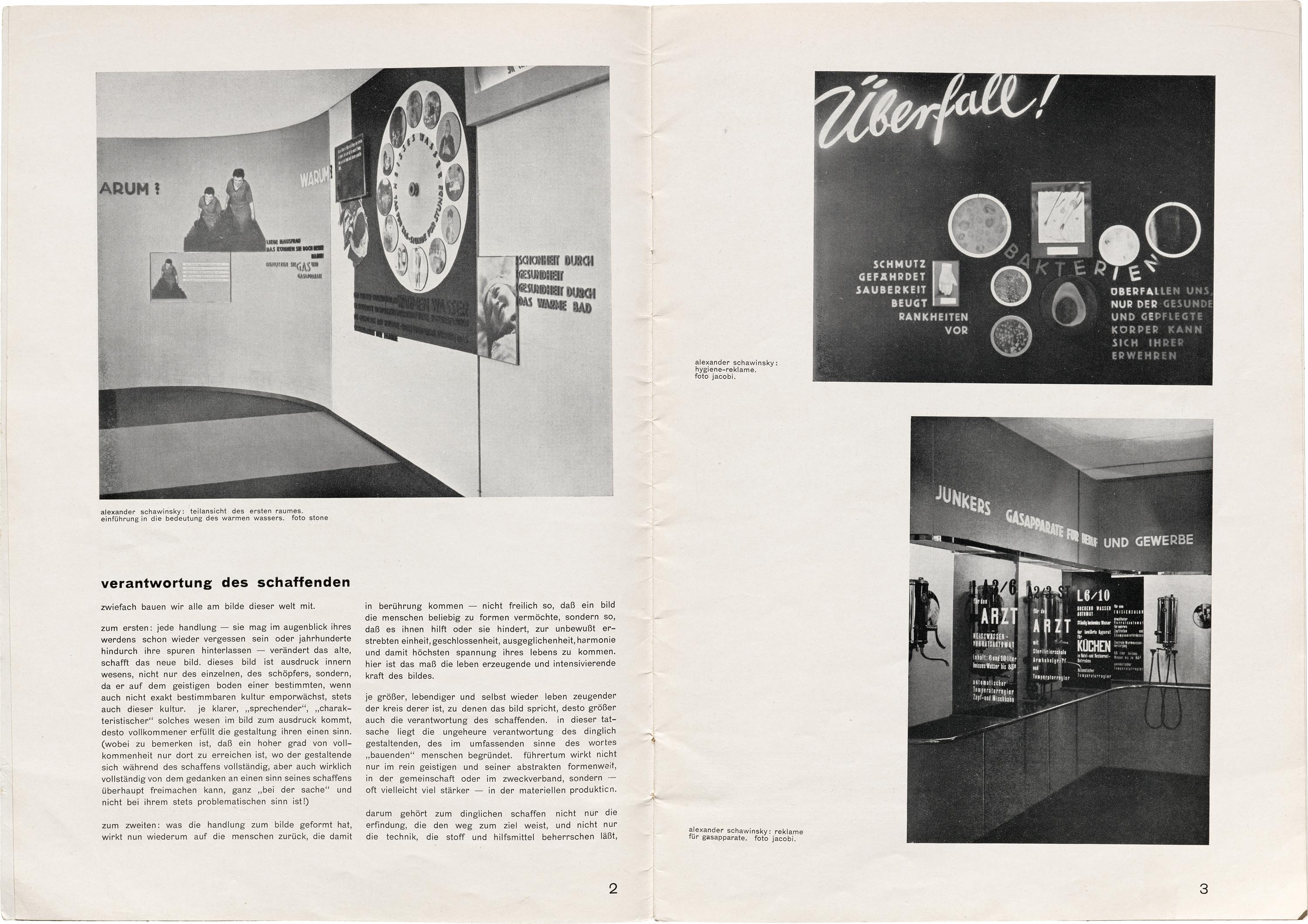
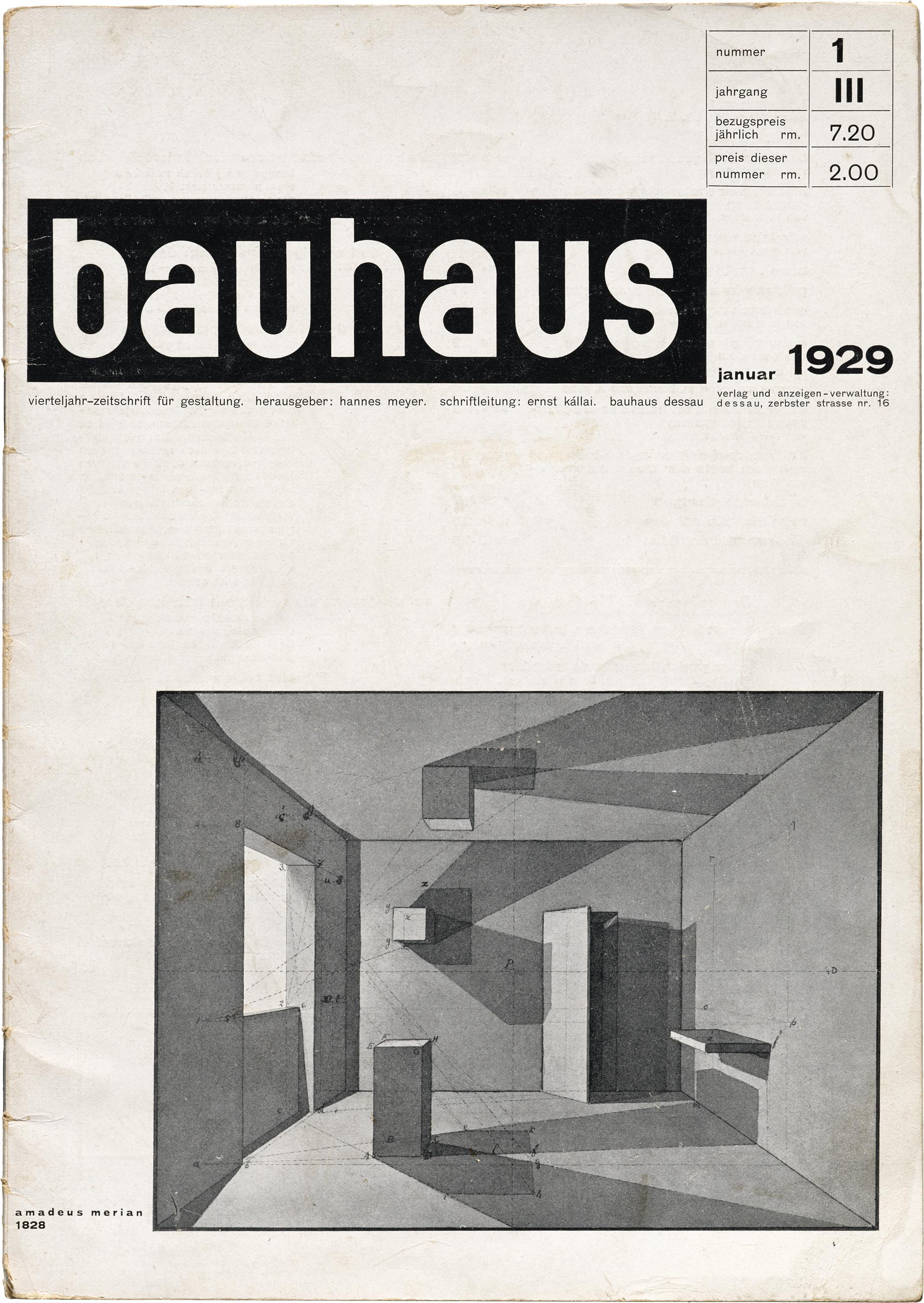
Schmidt was also one of the faculty who most fostered collaboration between disciplines, an early Bauhaus ambition. The third issue of the third year of bauhaus features several spreads dedicated to an exhibition called “Gas and Water”, held in Berlin. Schmidt had been commissioned to design the exhibit, and it was realized as a collaboration between the commercial design department and several building and sculptural departments of the Bauhaus. The resulting display is a near-ideal Bauhaus object, in that it presents a unified display of publicly accessible information about modern technological amenities, composed of type, image, paint, and structure.
Selections from bauhaus
All images in this gallery are hi-fi captures. Click an image to enter fullscreen view, then pinch or use browser zoom to enlarge.


The “Periodicals as Collections” series — and celebration of the Bauhaus centennial — continues later this month by highlighting two more periodicals that followed directly in the footsteps of the Bauhaus. In the meantime, come to the Archive for a tour and ask to see examples of Bauhaus magazines, books, and ephemera, or schedule a research visit to delve into our collection of reference books related to the Bauhaus and its legacy.
— Hank Smith, Collections Assistant
See Bauhaus journal in the Online Archive