News
Letterform Archive in Oklahoma
Our collection offers the opportunity to tell a thorough history of type. Last month we took that story on the road.
David Crismon, Director of Fine Arts at Oklahoma Christian University (OC), has been encouraging his typography students to follow Letterform Archive on Instagram since stumbling across our feed a few years ago. Coincidentally, our Assistant Librarian, Kate Long, is an alumna of OC’s Language and Literature Department. When he made the connection, he reached out to us immediately. Crismon and OC’s department chair, Michael O’Keefe, invited Kate to hang an exhibition to coincide with a typography class planned for the spring semester.
As a new member of the Archive staff, I’ve been itching to learn more about curating, exploring how a gallery can be a site of inquiry and education. Kate generously brought me onto this project and I had the opportunity to work with her for the entire ride: from selecting works and writing wall text, to hanging the works on the wall.
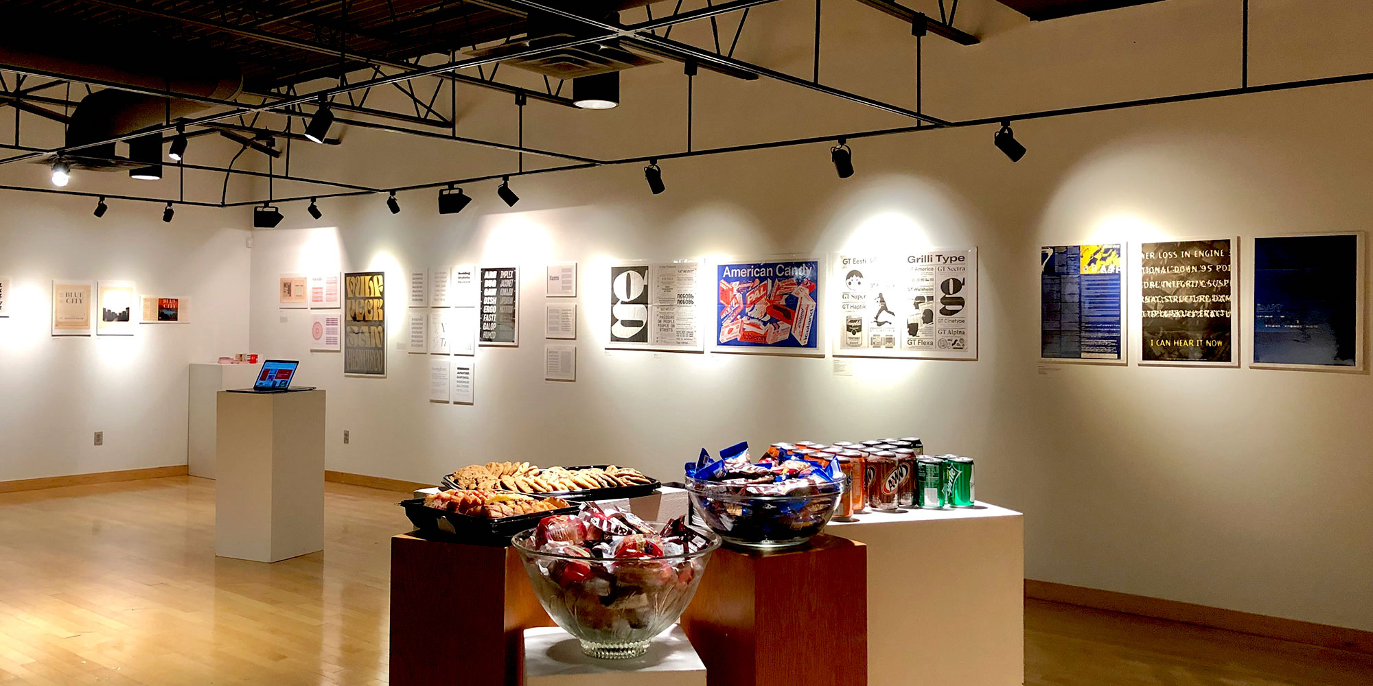
The result is an introduction to the history of type and technology ranging from Gutenberg’s letterpress in 1450 to contemporary type design in 2018. The works we selected illuminate how technologies developed in response to certain typographic needs, how they inform the shapes of letters, and how they democratized access to typesetting and graphic production.
We exhibited around 100 works, organized chronologically by era and technology, from metal type and wood type, to phototype, rubdown, and digital type. We also included sections introducing style classification, with selections from our 20th-century type ephemera and a section on lettering.
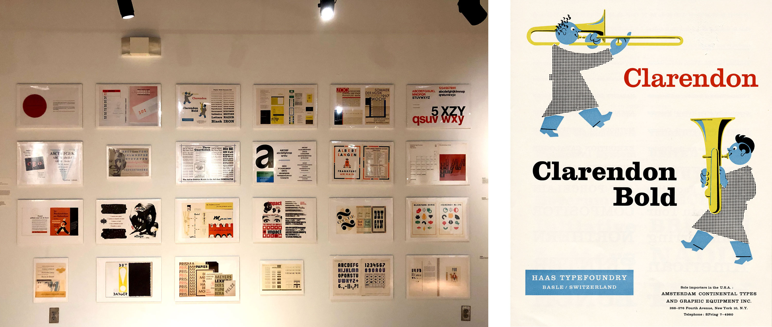
The “periodic table of type” illustrates the diverse ways foundries advertised their typefaces. The wall is organized in groupings of serif, sans-serif, decorative, script, modular, and ornamental typefaces. Our collection consists of thousands of specimens, so narrowing down the selection to 24 objects was a challenge. We included recognizable classics like Helvetica, Univers, and Impact, but we also wanted to feature specimens and typefaces that students and the general public might not have seen before. The Clarendon type specimen by Haas Type foundry, with two brass instrumentalists, was one of my favorites and was a big hit with our audience.
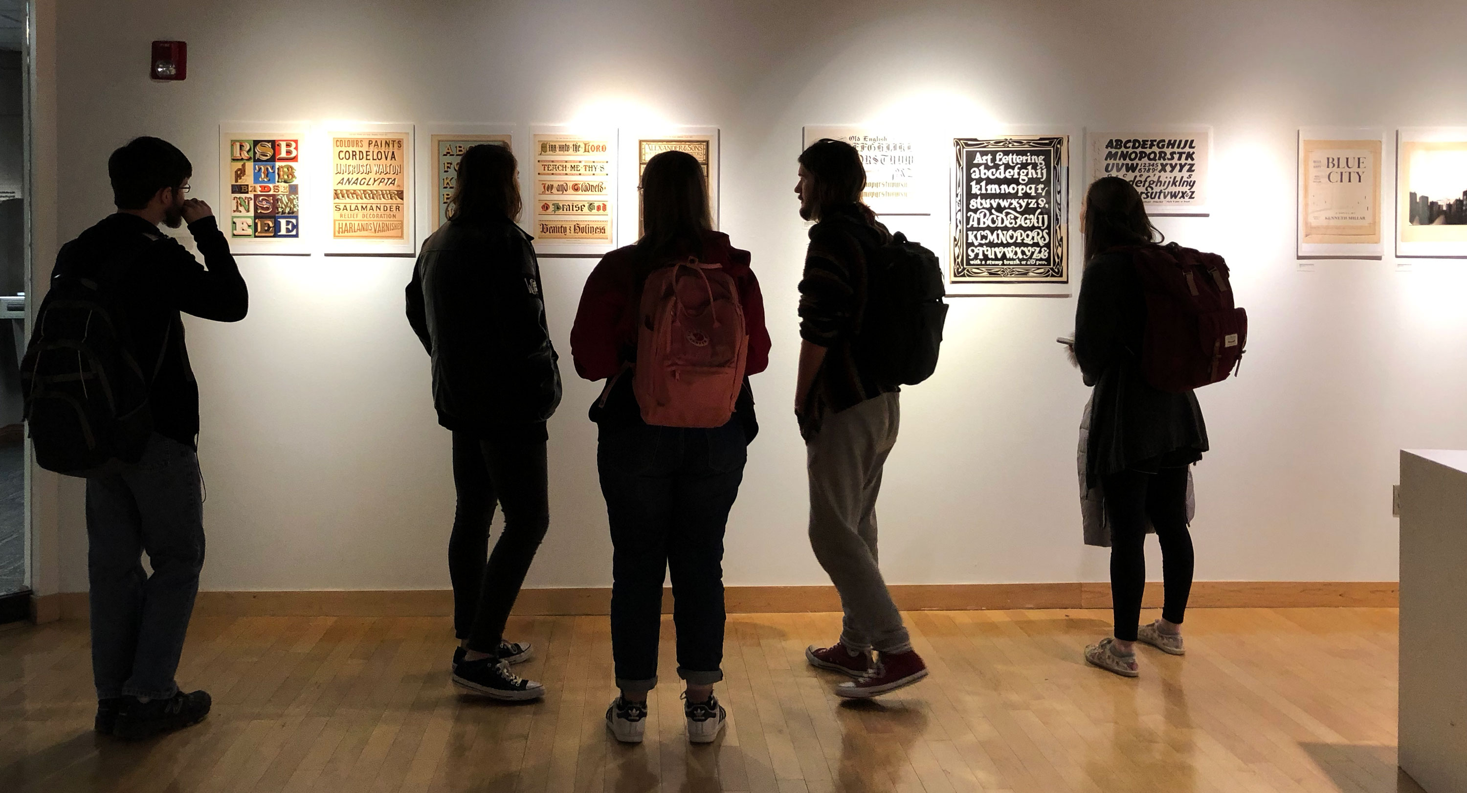
While lettering and type are two different practices, they are closely related and have influenced each other throughout history. Early type was based on the calligraphic hand, and contemporary typefaces can emulate lettering. Due to these nuances, we felt that this was a valuable conversation to incorporate in the show. The lettering side of the dialog is illustrated by W. G. Sutherland’s sign painting models, Ross F. George’s Speedball alphabets, and Philip Grushkin’s mechanicals and lettering process for the cover of Blue City.
This exhibition represents the Archive’s first time hanging an entire exhibition using photographic reproductions, making full use of our camera quality and Rachel Daniels’s excellent photography. This changed the way we approached which objects to show, as we researched copyright restrictions and focused on objects that were eligible to reproduce, but the range was deep and broad enough to convey a fairly thorough history of type.
Using reproductions expands the opportunities for sharing our collection and fulfilling our missions of accessibility and education. The lifelike images — many at actual size — allow us to exhibit artifacts that are particularly fragile, rare, or part of larger works, such as 19th-century wood type auction broadsides, Gutenberg Bible leaf, or pages from the Baskerville Bible. It was amusing and rewarding to see people taken aback wondering whether they were looking at a real Gutenberg leaf or Linotype drawing on the wall. In addition to our reproductions, Amos Kennedy Jr. and Grilli Type generously donated original works to exhibit.
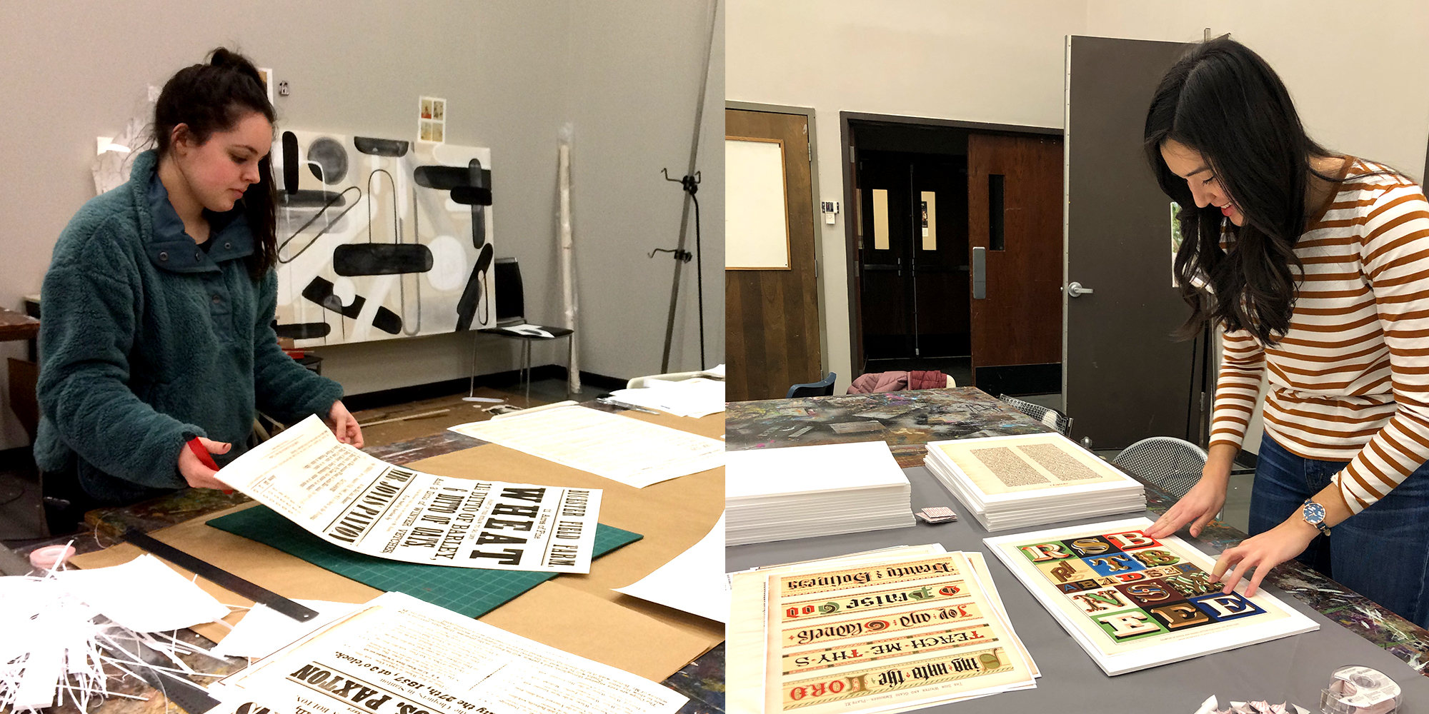
With only two days on the ground to prep, putting together the exhibition would not have been possible without the time and enthusiasm of volunteers from the school’s Art + Design Department. From cutting out prints and captions to shrink-wrapping and hanging, each volunteer was a much-needed helping hand. The students were able to get a sneak peek of the show and were excited to recognize works they had learned about in class.
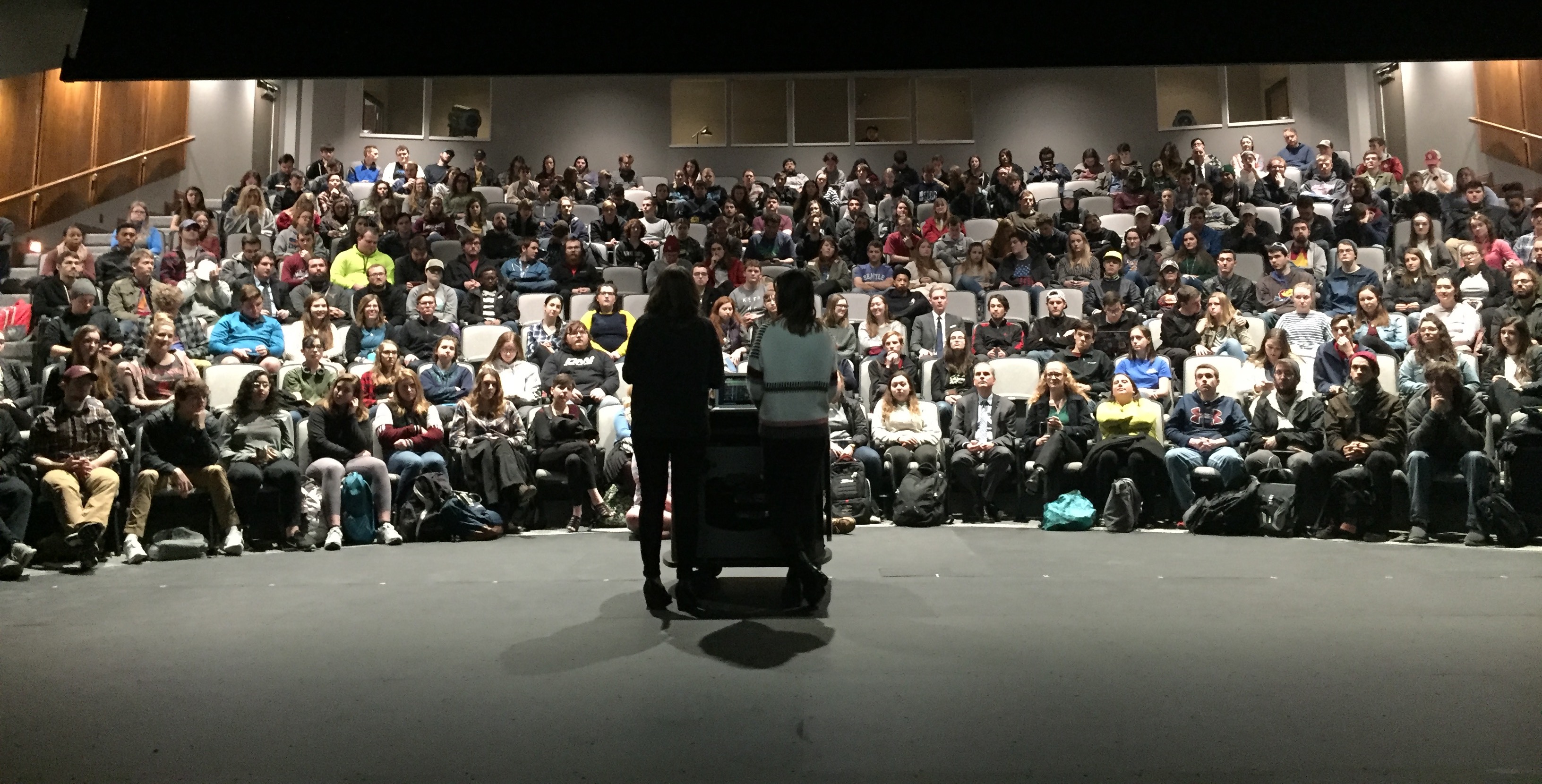
On opening day, Kate and I presented a brief talk to students and had a mini exhibition with several actual items from our collection. The pop-up supported the conversation happening on the walls. We brought wood type, metal-type ephemera, Emigre and Fuse magazines, and psychedelic concert handbills, as well as a couple of Aaron Marcus’s Symbolic Constructions prints and a copy of The Black Panther made with rub-down lettering.
Kate and I are grateful for the opportunity to visit OC’s campus and proud to fulfill the Archive’s mission of being an accessible, educational resource for a global audience. We thank David Crismon and Michael O’Keefe of Oklahoma Christian University’s Art + Design Department for inviting us, and our volunteers for their time: Megan Madison, Daniel Lawrence, Trey Gause, Carly Davis, Marcus Leonard, Meagan Folkes, Jacey McDaniels, and Stephanie Emperly. If you are in the Oklahoma City area, the exhibition continues in The Garvey Center at Oklahoma Christian University through February 12.
— Florence Fu, Editorial Associate