News
This Just In: Contemporary Design of South Korea
Florence Fu talks with Choi Sung Min about the history of Korean visual culture and our new collection of books, posters, and ephemera from over 25 studios.
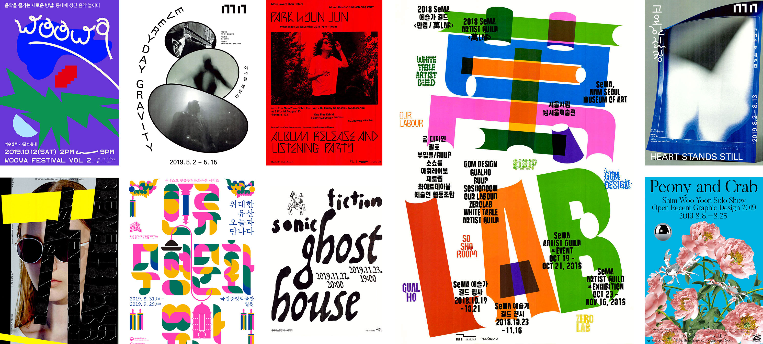
In its short history, South Korean graphic design has been a fervent force of cultural output over the last few decades — sweeping from niche circles onto international radars. Its development traces a complex political history, and while many contemporary works today are experienced first-hand online, there are few venues where South Korean graphic design is researched, discussed, and exhibited. In February 2020, chris hamamoto1 curated Around Seoul*: Independent Graphic Design at California College of the Arts — an exhibition that surveyed contemporary graphic design from South Korea and presented hamamoto’s long-standing interest in the region. Following the exhibition, a majority of the works, including posters, books, magazines, and ephemera by more than 25 studios, were donated to Letterform Archive, significantly expanding our holdings of works from Korea and East Asia.
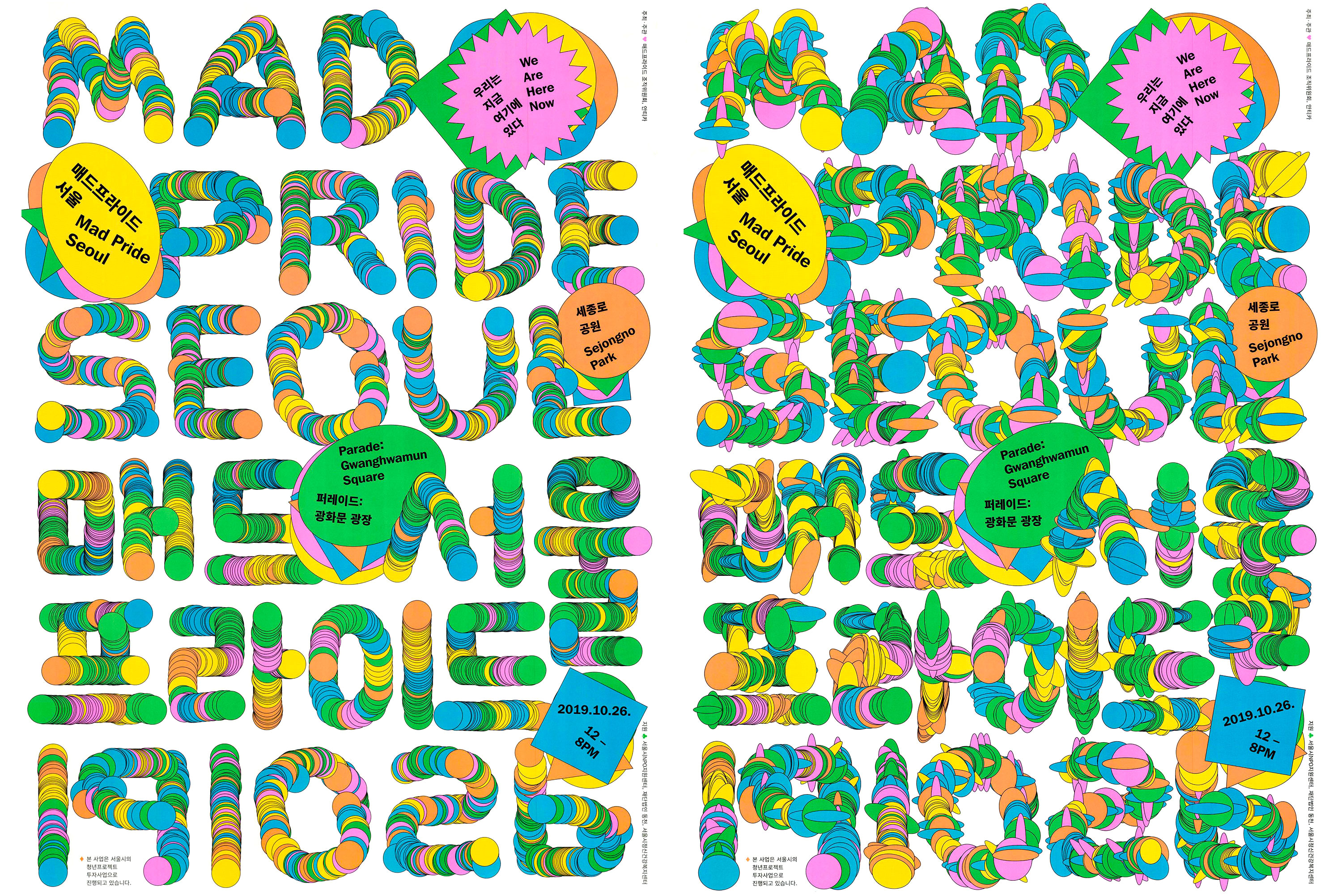
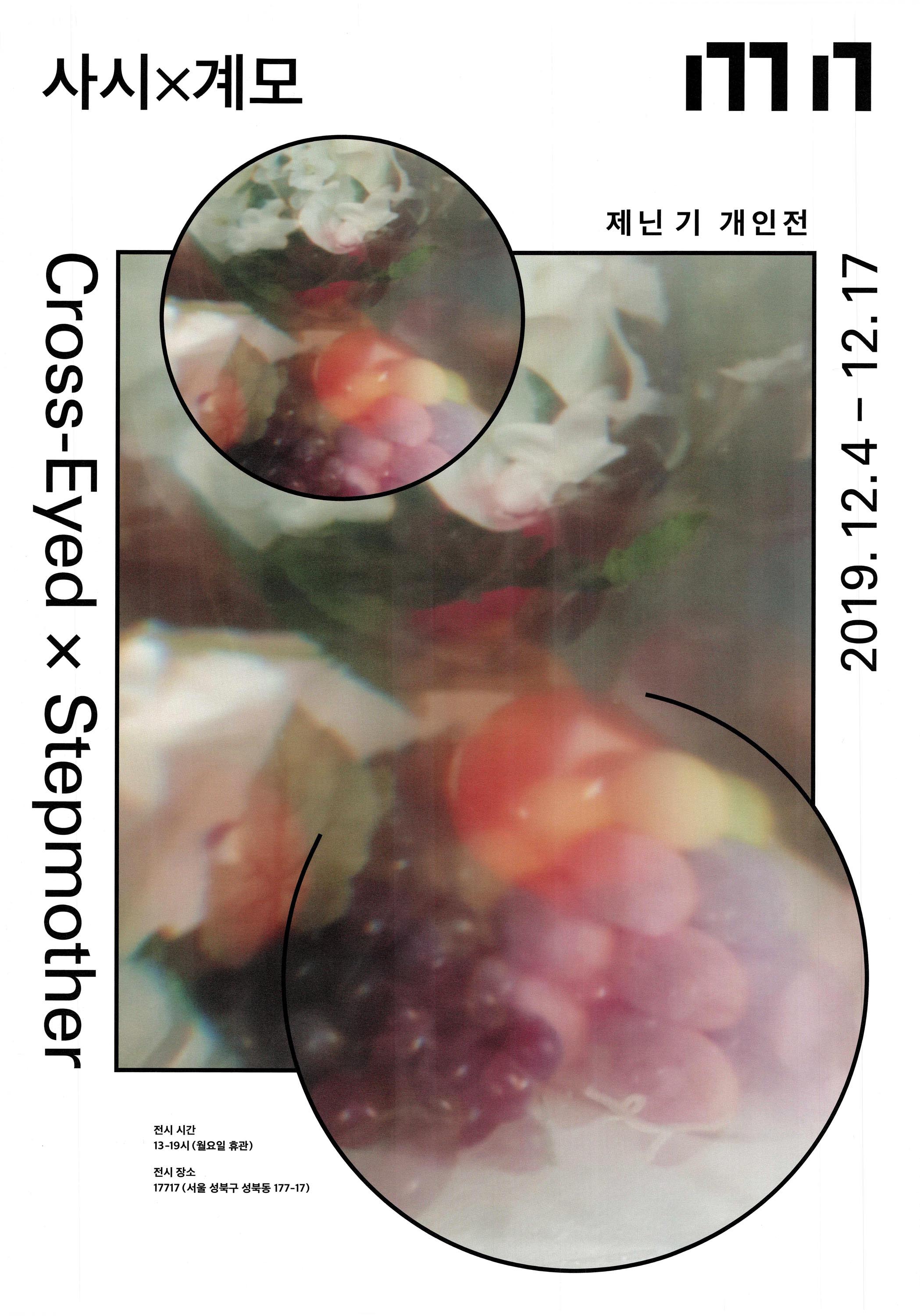
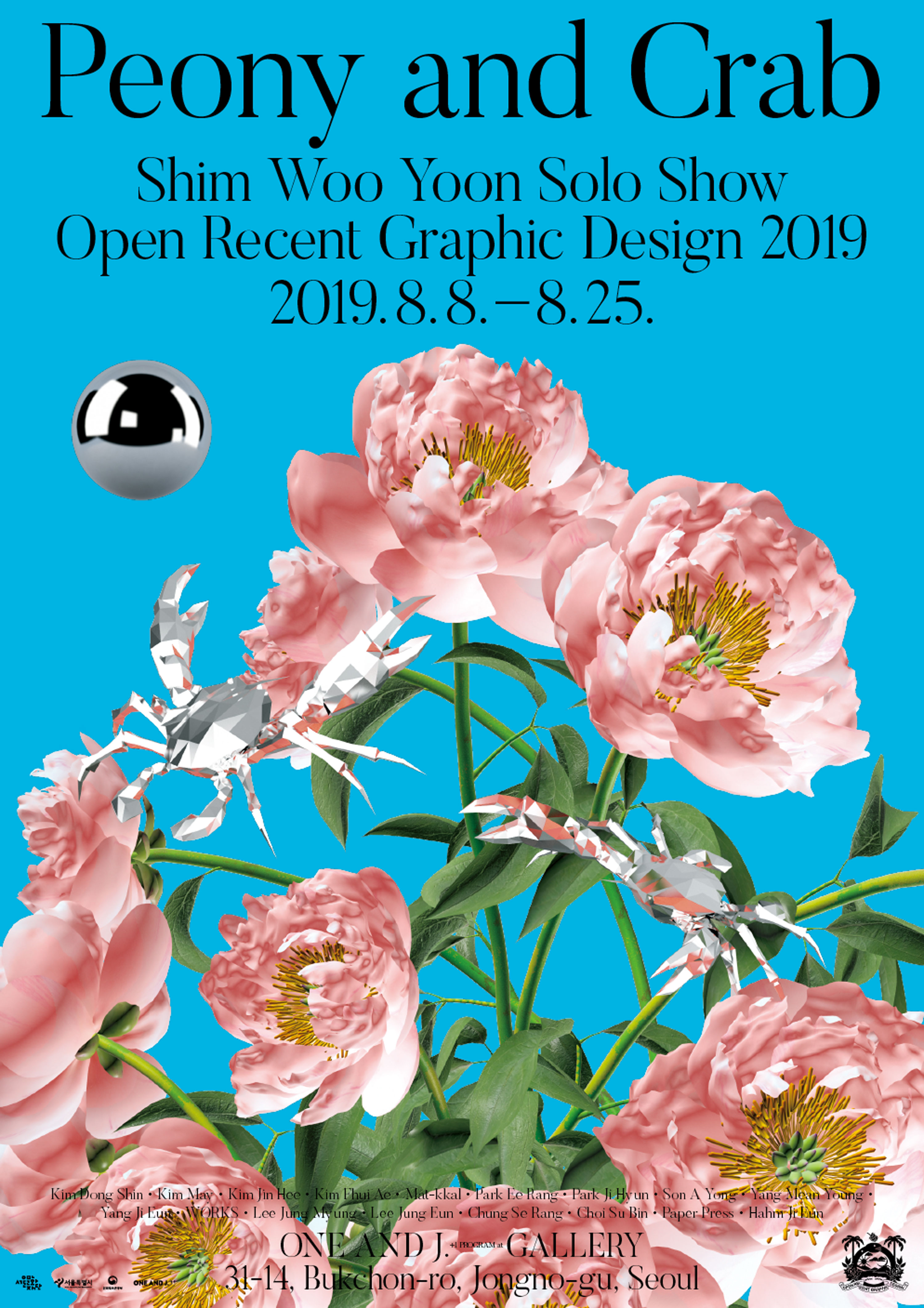
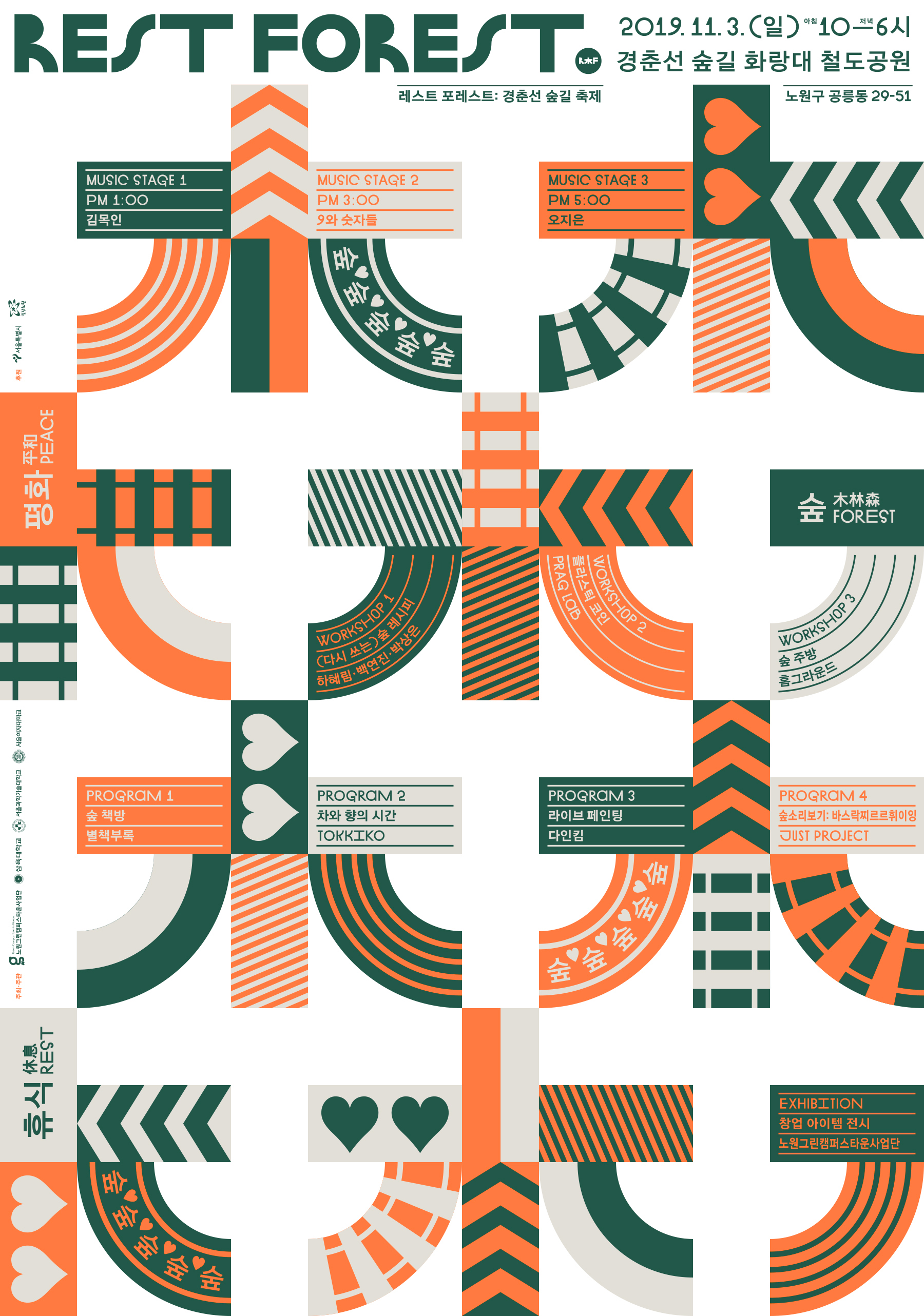
South Korean graphic design is young, confident, vibrant, and introspective, and the Archive is honored to tell this important story through the work of designers such as Bowyer, Chae Byung Rok, Chris Ro, Corners, Everyday Practice, Hey Joe, Hezin O, Hong Eunjoo and Kim Hyungjae, James Chae, Jin and Park, Jin Jung, Ju Hyun Kang, DDBBMM, Mano An, Moonsick Gang, Ordinary People, Pooroni Rhee, PRESS ROOM, Sera Yong, Shin Jaeho, Shin Shin, Sulki and Min, SUPERSALADSTUFF, The Book Society, TRIANGLE STUDIO, Yehwan Song, and Yejin Cho.
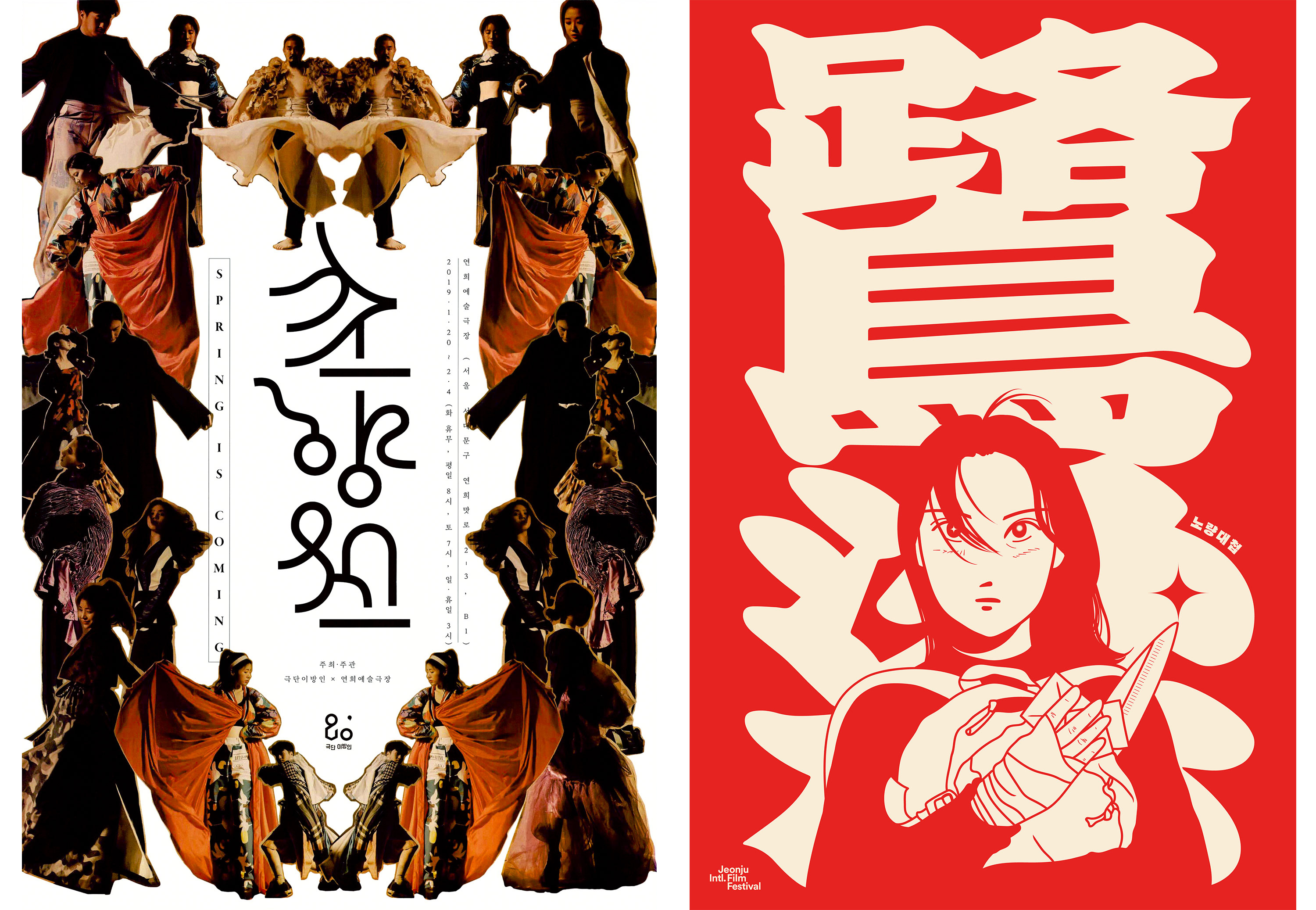
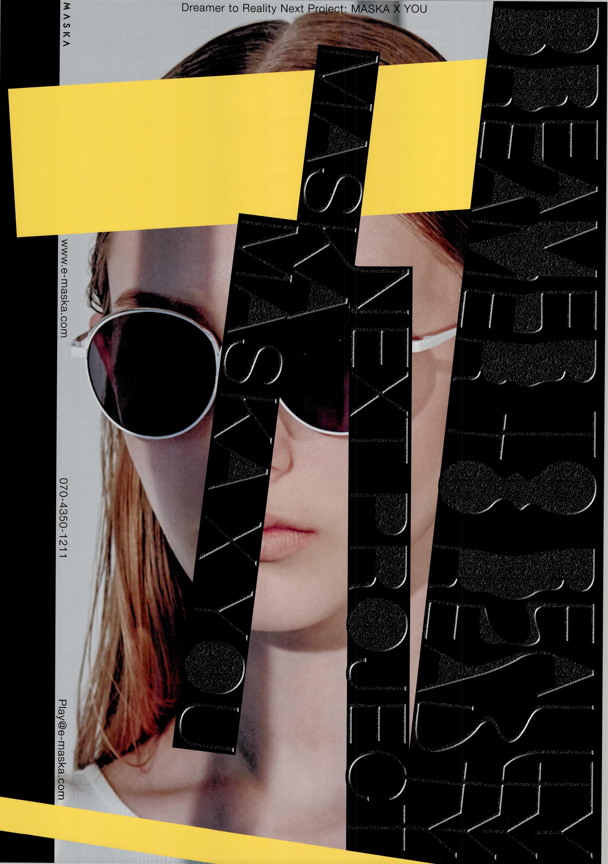
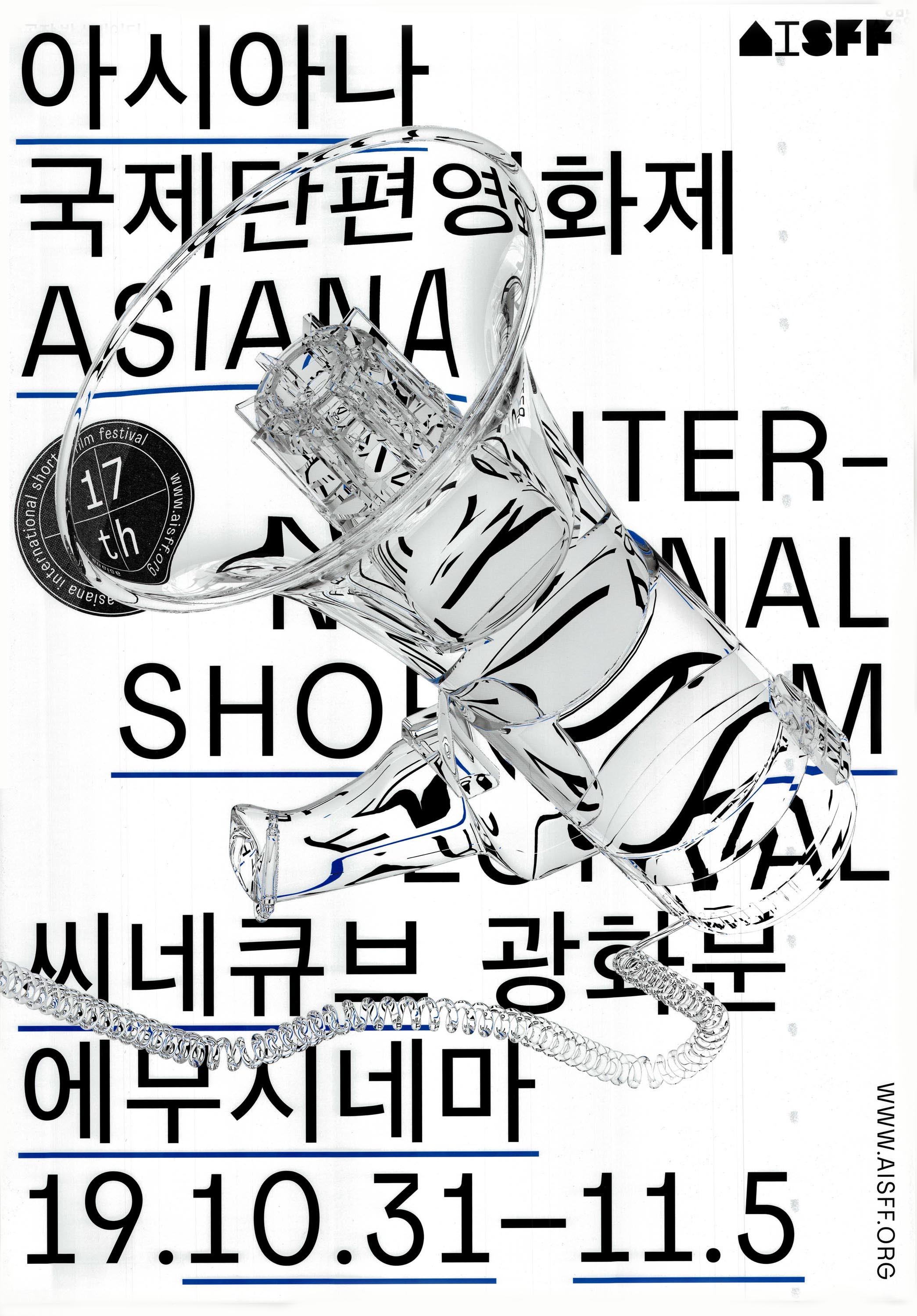
Right: DDBBMM, Noryang Battle, poster for Jeonju International Film Festival, 2019. Image from DDBBMM.
2. See Yunah Lee, “From Nowhere to Everywhere: Design in South Korea.” form, March/April 2017, 38–43.
Beginnings: A brief history of design education
While the development of graphic design as a profession in South Korea begins much earlier than what’s represented in this collection, it’s necessary to see how the country’s historical and geopolitical contexts shaped design culture, policies, and education: from the golden age of art and the invention of the Hangul alphabet in the late Joseon Dynasty (until 1897), to Japanese occupation (1910–1945), Korean independence (1945), US imperialism, and the end of the Korean War (1953).2
Formal design education was established after the War, and many teachers of this generation were trained during Japanese colonial rule or in Japan, which created an understanding of graphic design through a Japanese lens. Even after Korea gained independence, Japanese influences persisted and American forces gained strength. The government also provided scholarships for students to study design abroad in the United States. When they returned, they introduced concepts and methods from the US, reimagining what a graphic design curriculum in Korea could be.
Choi Sung Min, who runs the studio Sulki and Min with Choi Sulki, describes how his teachers were wary of outside influences due to the newness of graphic design in Korea. “They had a protective attitude towards the definition of graphic design, and sought to keep the field in a very pure form,” he said in an interview. In the late ’90s, Choi enrolled in the MFA Graphic Design program at Yale and was surprised to see what else was possible. “At Yale, it was striking and refreshing how we were not just talking about graphic design in and of itself, but also about film, art, architecture, literature, and philosophy. I learned how you can work with ideas of different origins, and open up your practice,” Choi said. Choi currently teaches at University of Seoul, and similarly encourages his students to keep themselves open to different ideas about what graphic design could be.
“At Yale, It was striking and refreshing how we were not just talking about graphic design in and of itself, but also about film, art, architecture, literature, and philosophy. I learned how you can work with ideas of different origins, and open up your practice.” — Choi Sung Min
Going Independent: Seoul’s Studio Culture

A cornerstone of contemporary graphic design in South Korea is its active community of small studios and independent designers, which was not always the norm in a corporate-dominated culture. Graphic design in the 20th century was promoted as an economic tool, but designers in the mid-’90s grew critical of the idea that graphic design was simply a tool for advertising, branding, and corporate design.
The Asian financial crisis in 1997–98 was an added blow, leading to a realization that the big business model for graphic design ran its course. Many designers wanted to approach design as a cultural activity rather than a business operation. “I felt like graphic designers were feeling kind of lost and confused. There was a desire to pursue your own instincts, and also an objective impasse where you can see that previous models were not working anymore. During this time, people were ready to start their own practice and follow their own direction,” Choi said.
By establishing and maintaining small, intimate partnerships, this new generation of designers could harness a newfound level of creative freedom and expression. “Before, even if you started as a small studio the goal was often to become a big agency, like Samsung. Koreans want things to get bigger and faster, not smaller and smaller,” Choi said. “Graphic designers were now starting small and wanted to keep it that way.” Today, small studios and independent practices have become increasingly difficult to run, as competition is fierce — making their existence worth acknowledging and celebrating.
Designers Who Publish
In the early 2000s, the focus of the economy shifted from manufacturing to information technology, which created new opportunities, but often not the ones designers sought. Instead of chasing big tech to make websites and apps, many designers seemed to want to slow it down, and venture into designing and publishing printed books. Today, South Korea has a sizable, active independent publishing market, supported by organizations like the popular Unlimited Edition Seoul art book fair founded in 2009. The Around Seoul* edition of On Publishing: Graphic Designers Who Publish, by chris hamamoto and Jon Sueda with Will Ruby and Florence Fu, features designers who share their varying points of view on Seoul’s publishing scene and their reasons for self-publishing. From zines and journals to artists books and guides, the works offer clues into motivations and inspirations found in Seoul, and beyond.
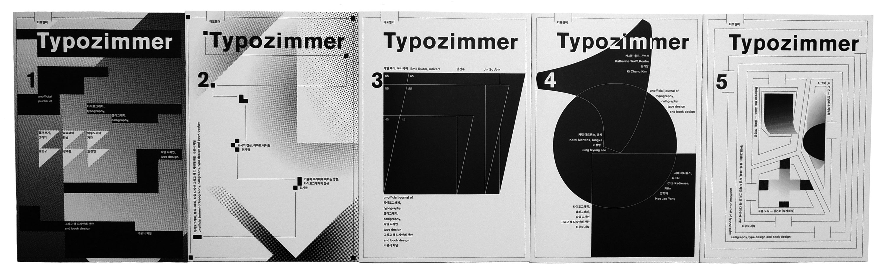
Highlights include issues of Typozimmer, an independent typography journal by Jude Kang inspired in part by the impact Typografische Monatsblätter had on Kang while he was a student in Switzerland. Typozimmer serves as a compilation of Kang’s own design experiments, addresses design needs that cannot be solved by client works, and circulates works by other designers in the industry. Jieun Yang of PRESS ROOM publishes the Open Recent Graphic Design series to encourage discourse and capture the contemporary design landscape.

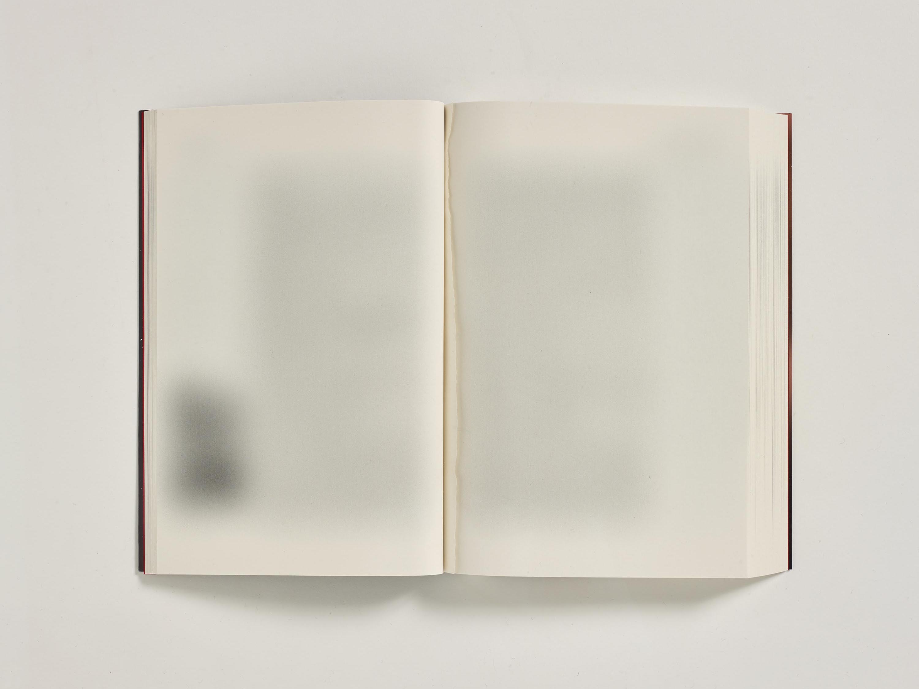
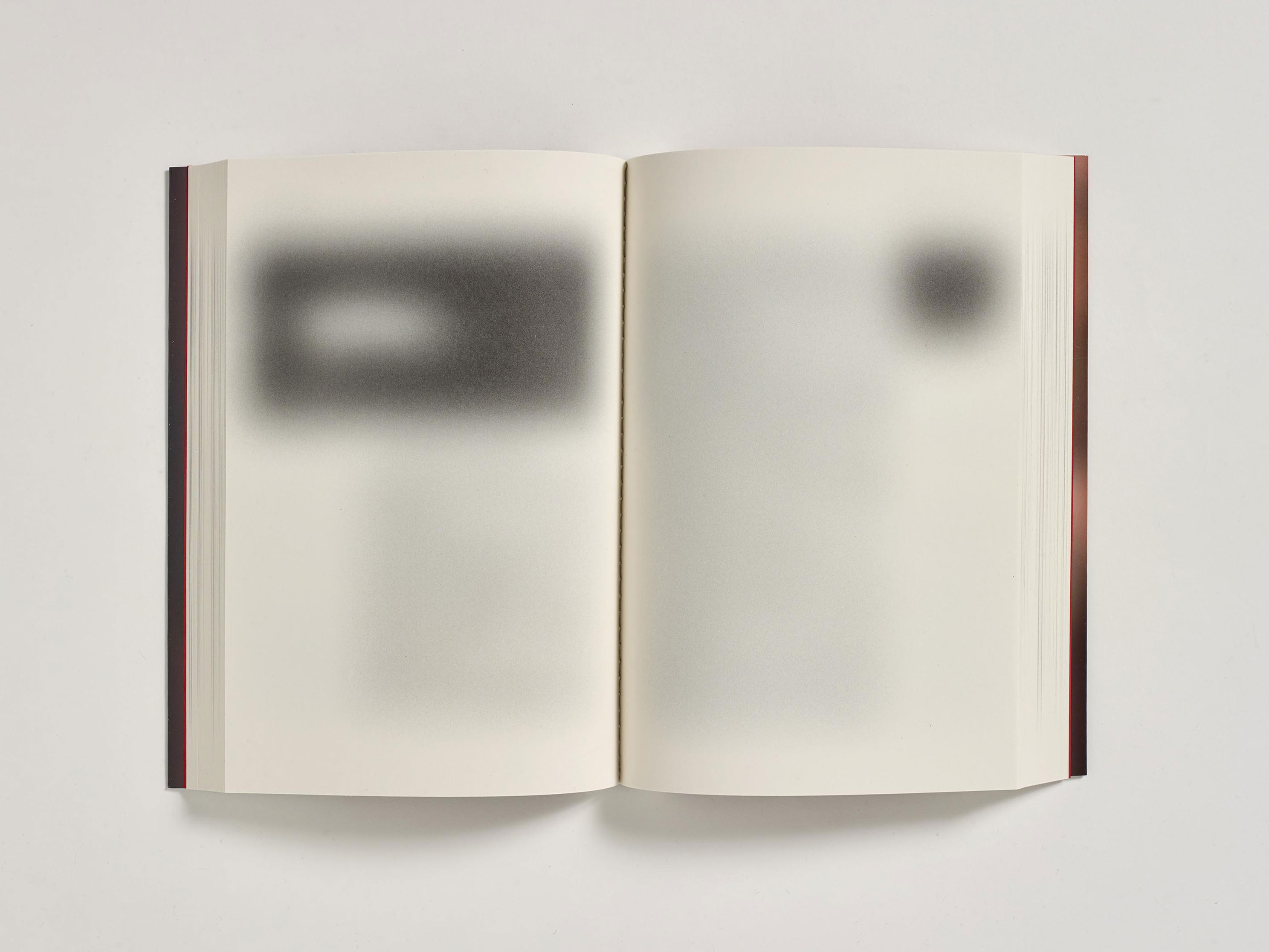
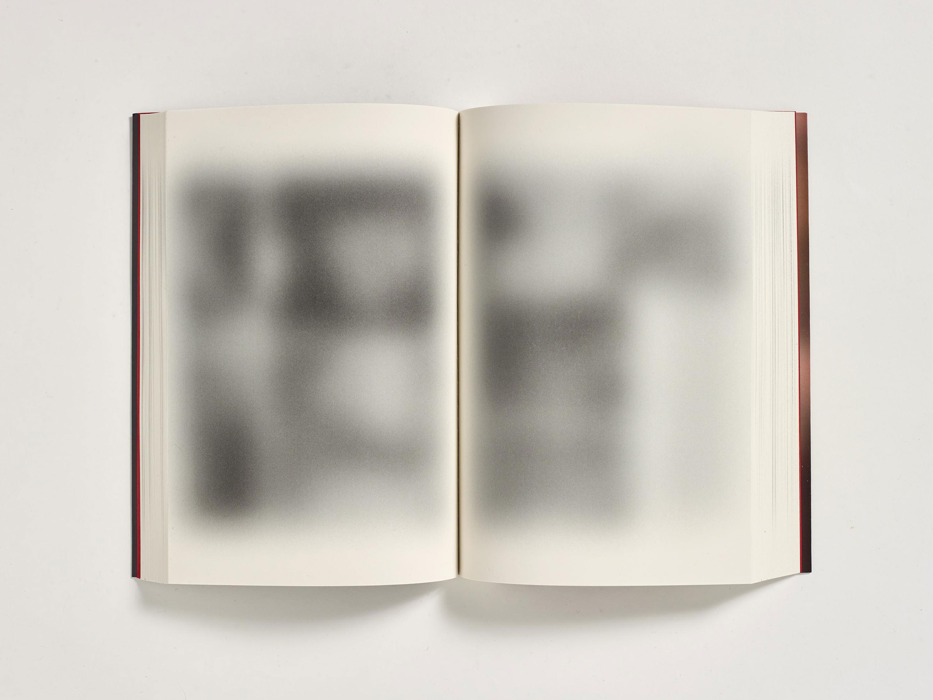
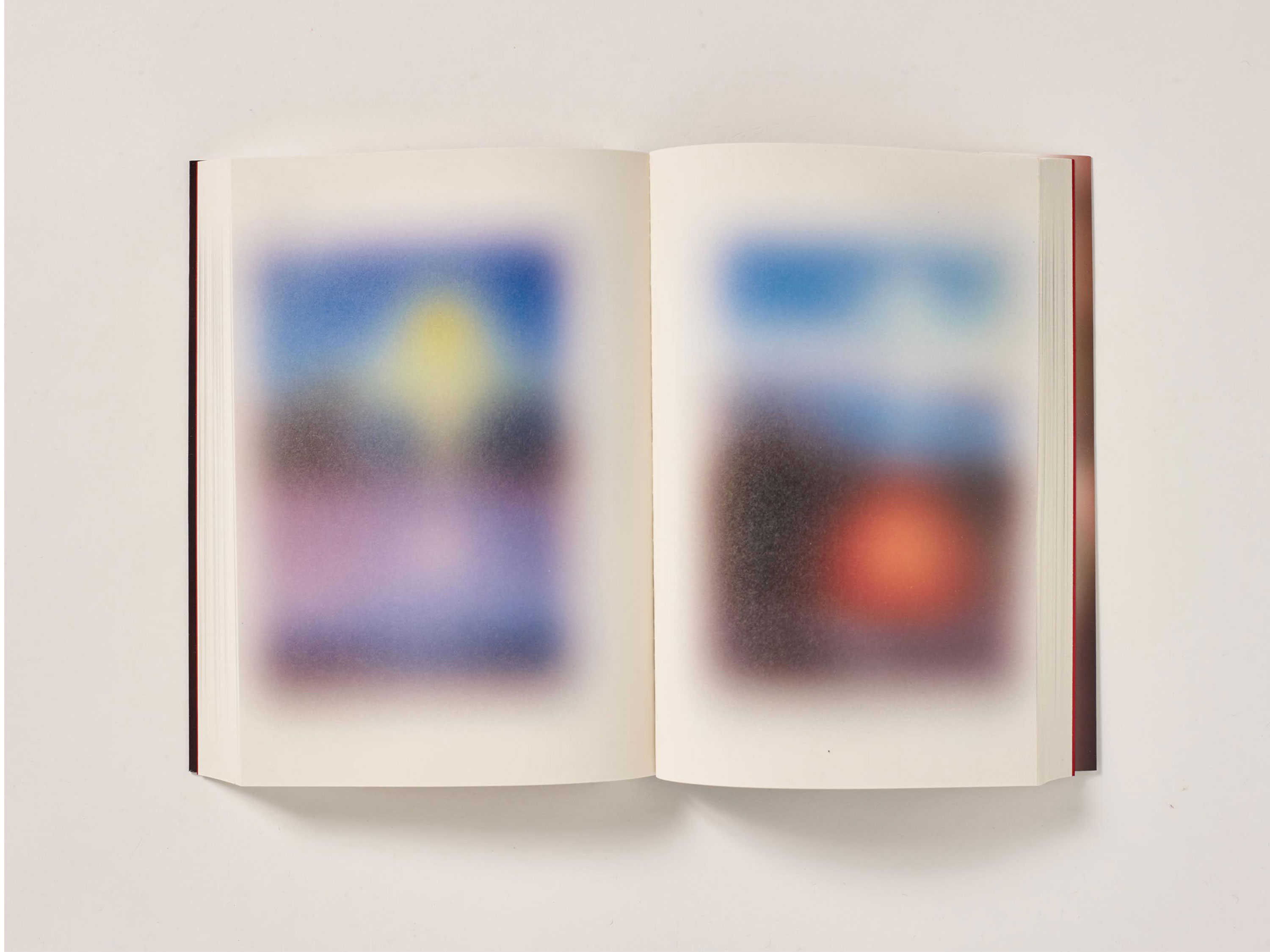
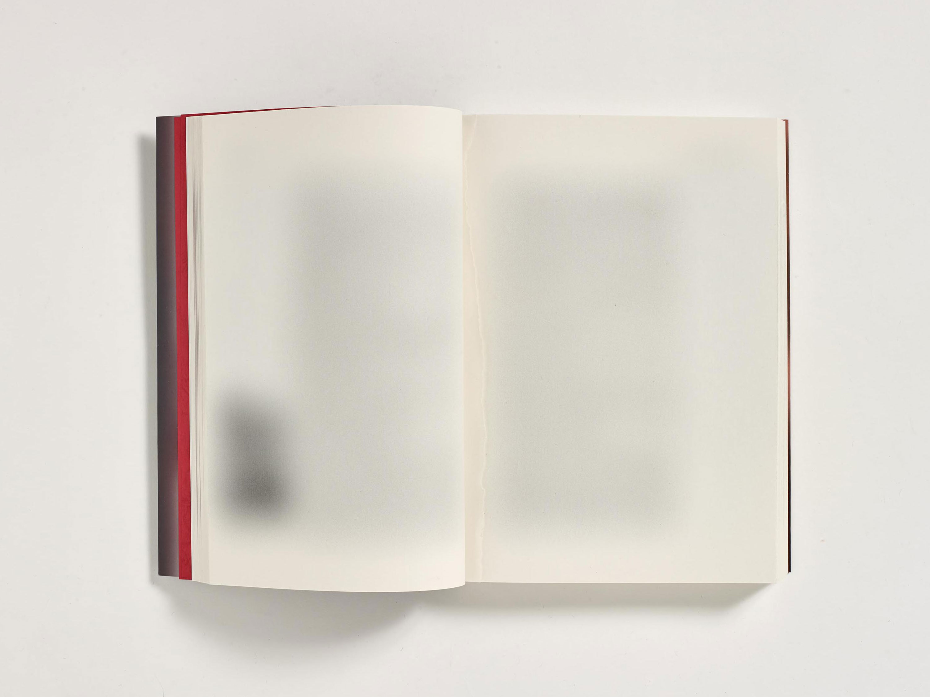


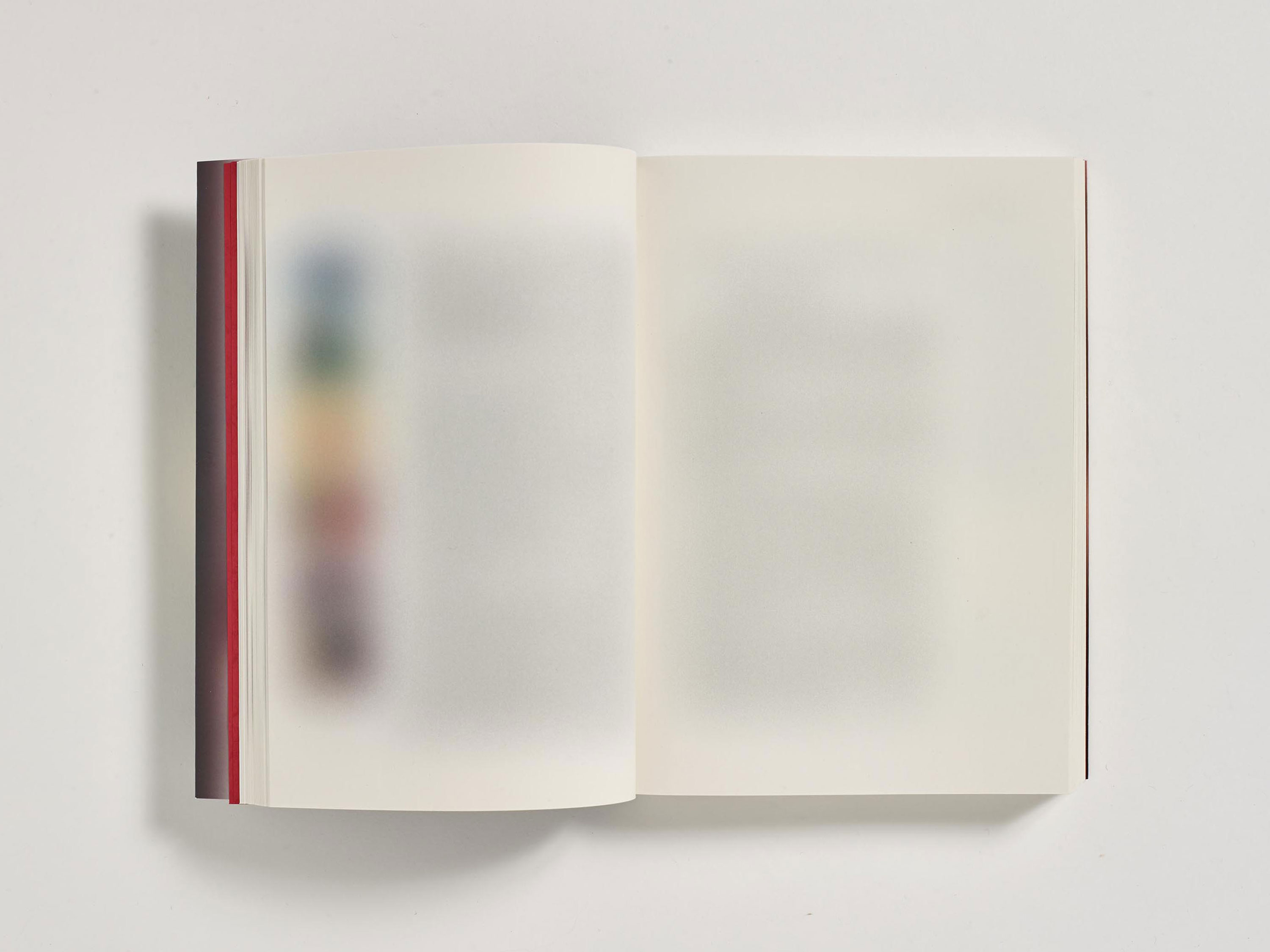
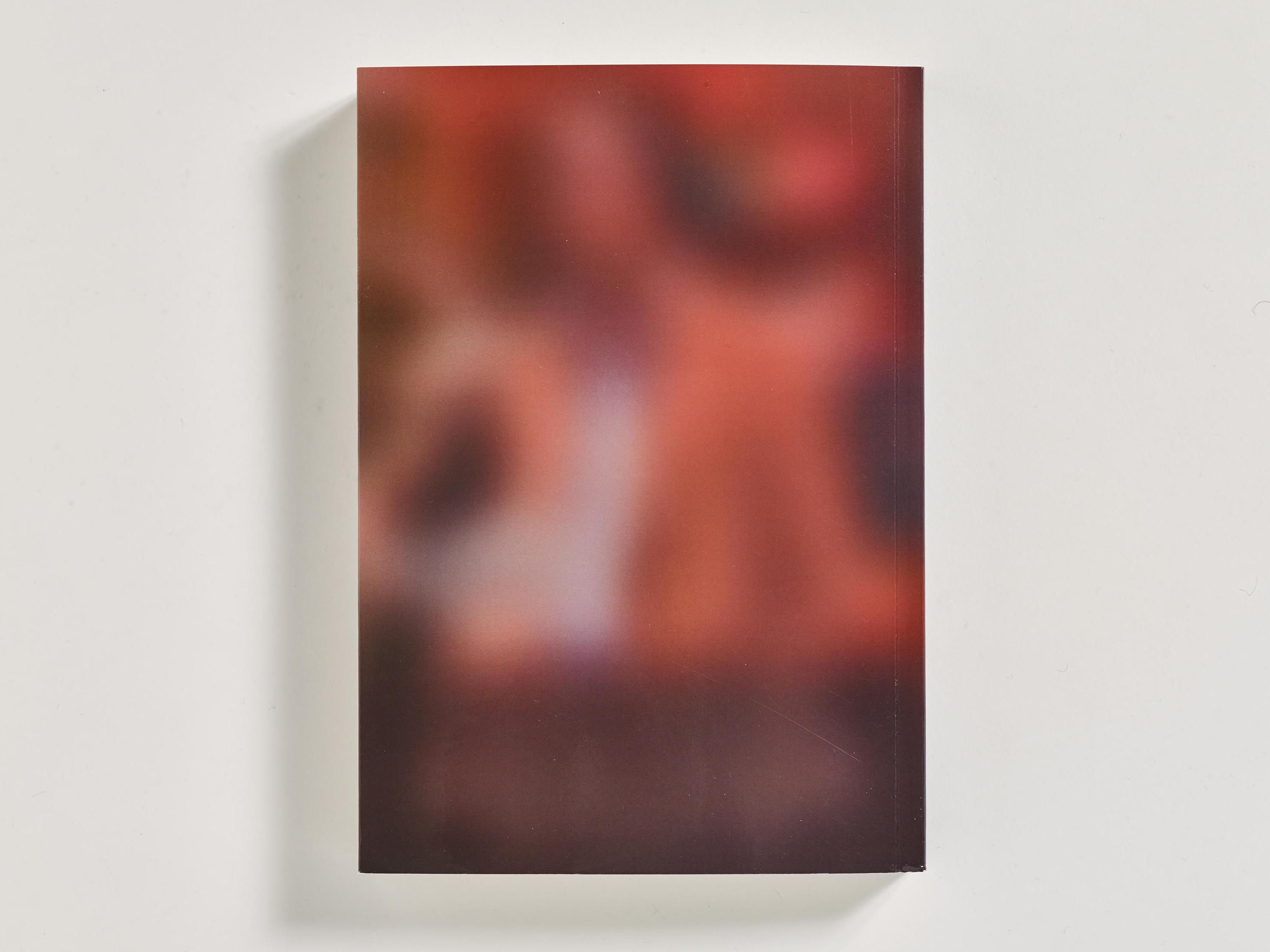
Specter Press, run by Sulki and Min, publishes books driven by the ambition to turn intangible artistic ideas into physical forms. In 2017 they published Cosmos, named after a 1981 Korean translation of Carl Sagan’s Cosmos. One major difference from the original is how all the pages are blurred to the point of being unrecognizable and illegibile. Text and images turn into soft glows that will never resolve into focus. Everything else about the book’s design, including the printing, paper, binding, and the content, is exactly the same as the original.
Hangul as identity
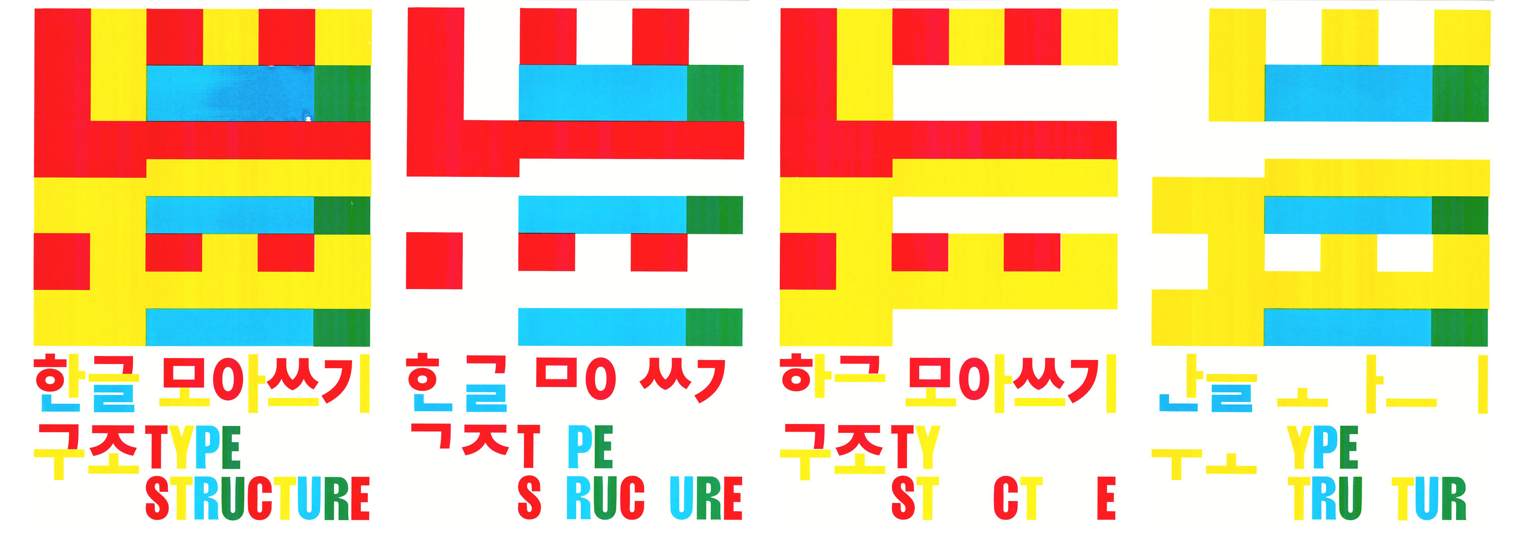
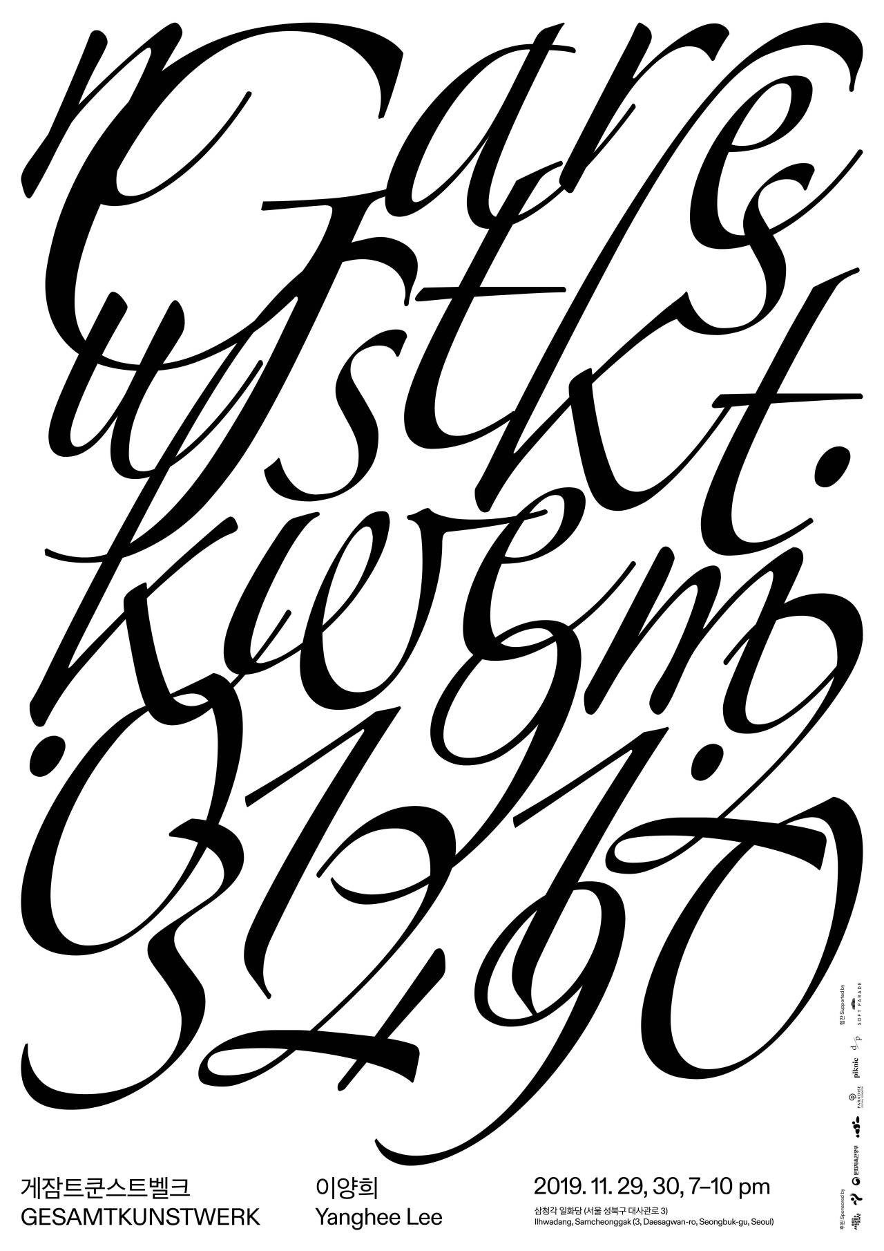
The last five years have seen the South Korean type industry bloom with young type designers and lettering artists, and new Hangul typefaces. Designing for Hangul is labor intensive, often requiring teams, but improvements in type design tools are easing production and allowing designers to set up their own shops. For graphic designers who interact with the letterforms each day there are now more possibilities for typographic expression. Above all, the young script is considered a core aspect of Korean identity, whether you’re a designer or not. As the country’s own alphabet, Hangul differentiates South Korea from its East Asian neighbors, and stands a hallmark of innovation that reverberates throughout all aspects of culture.
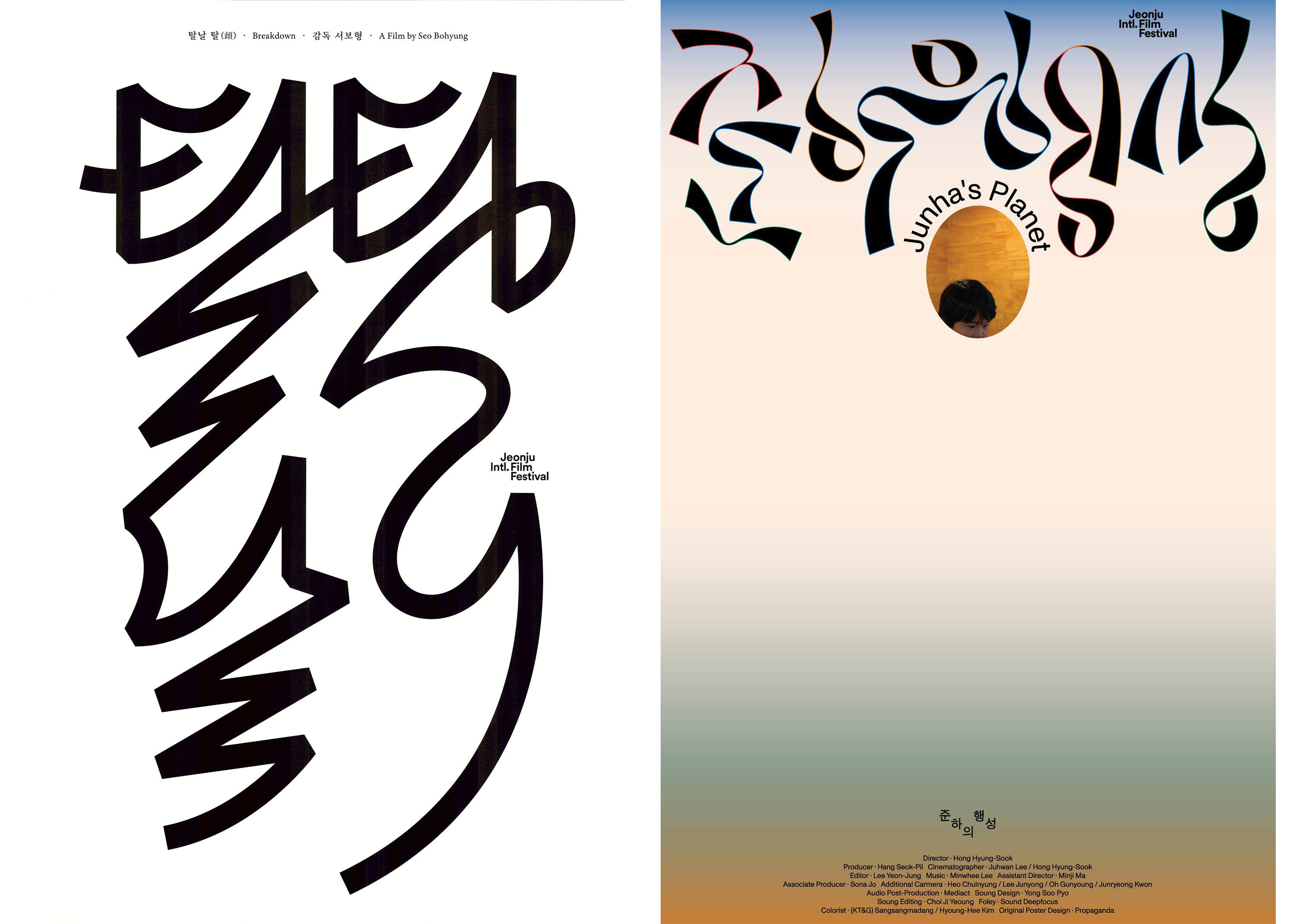
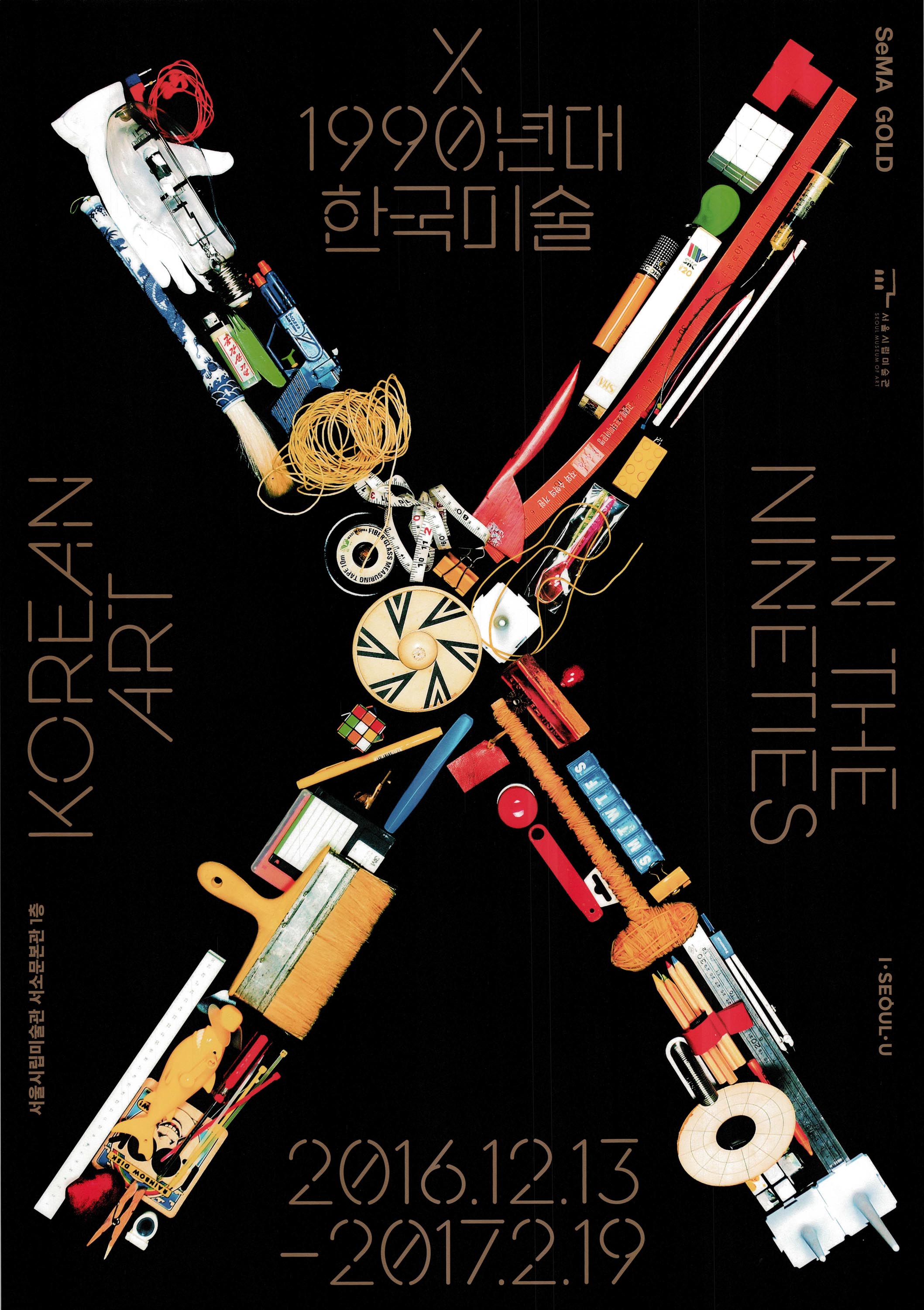
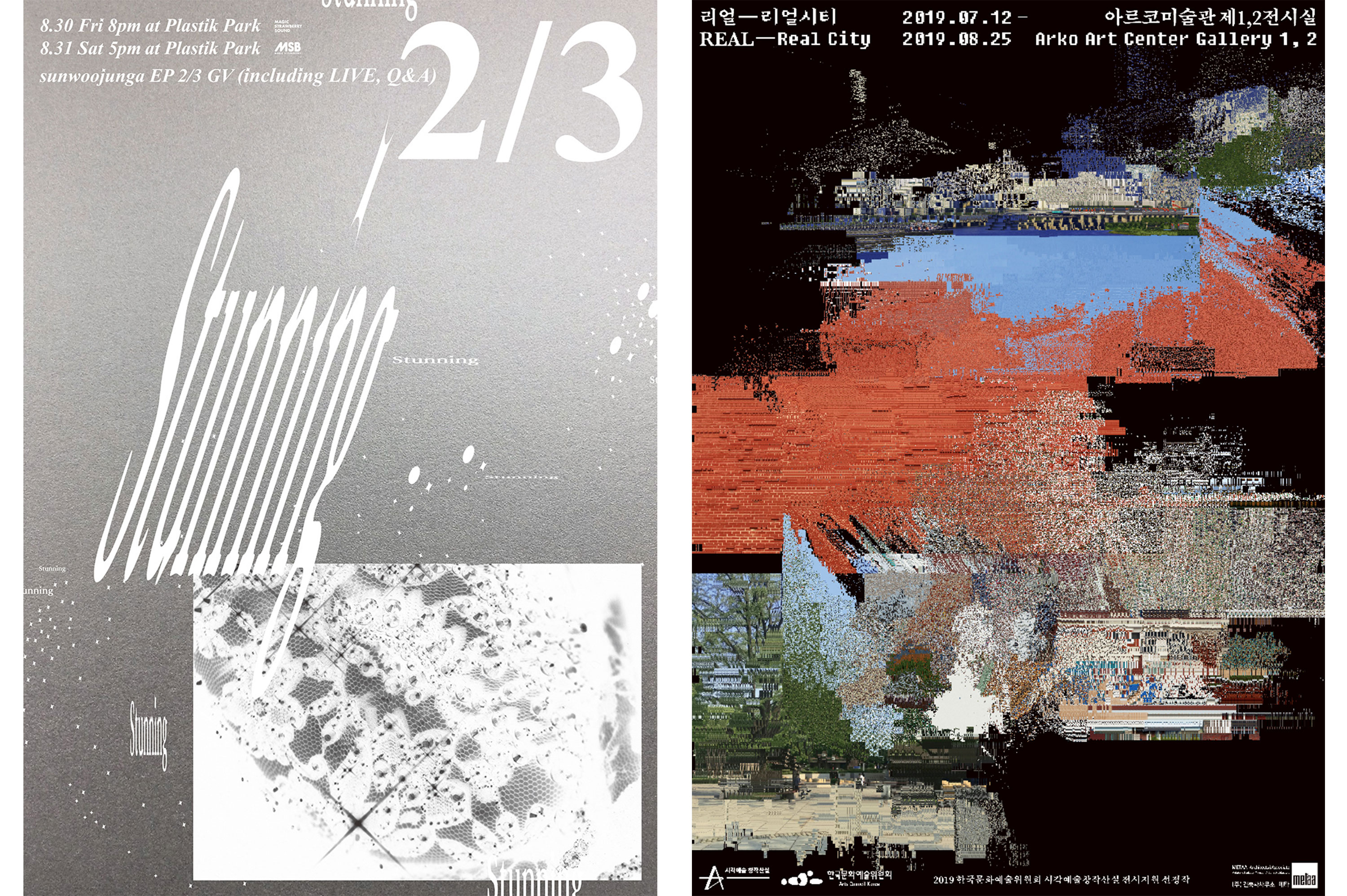
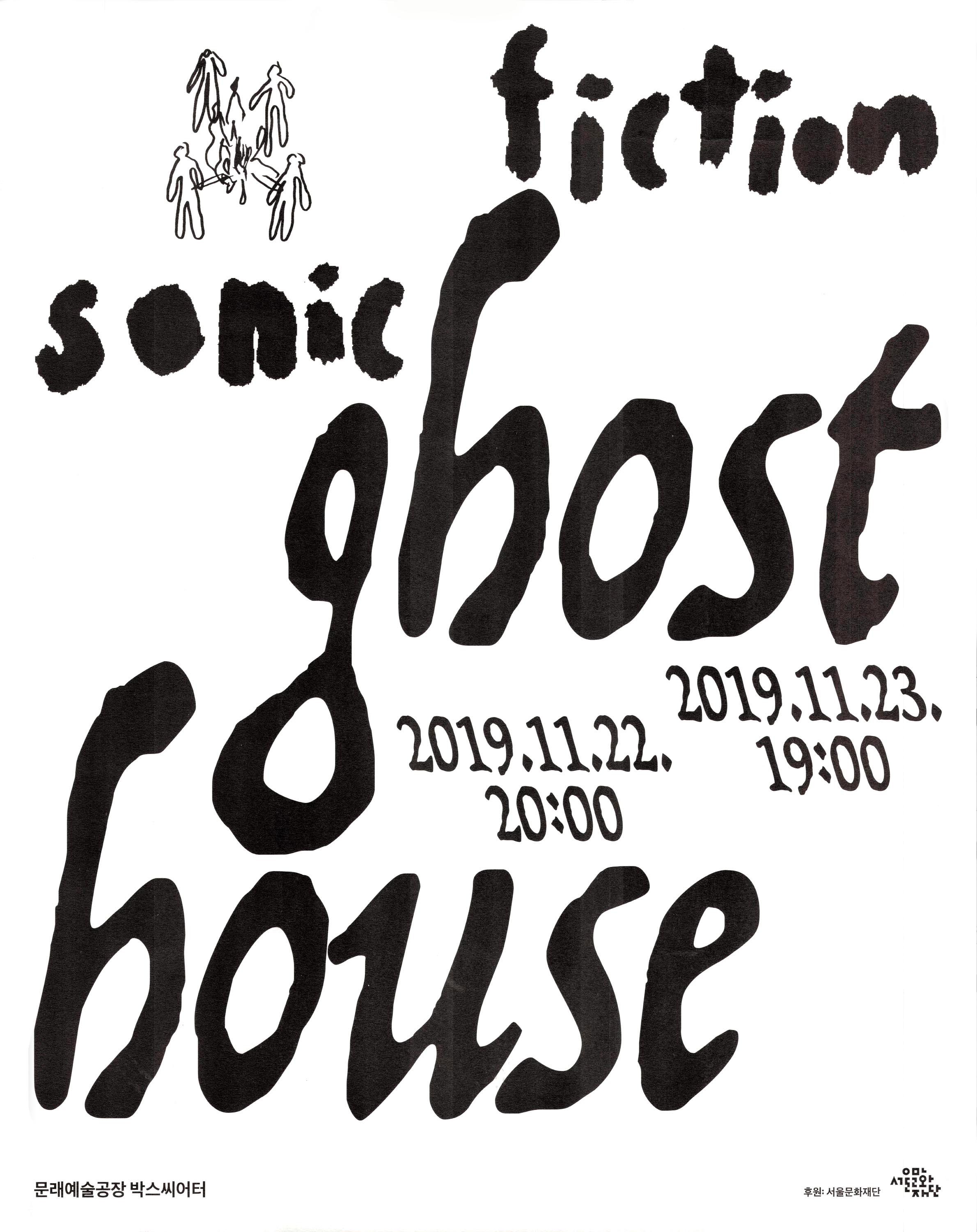
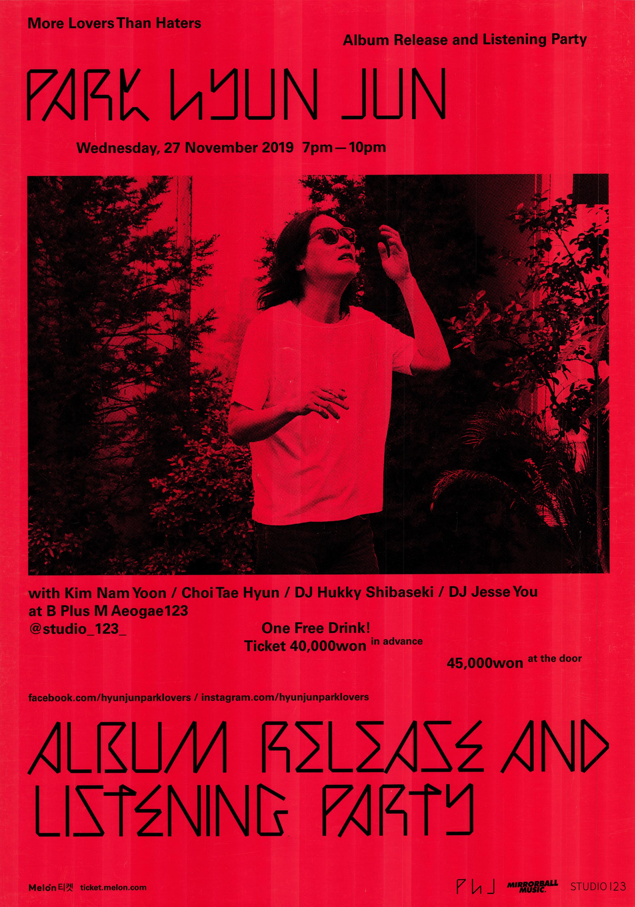
Right: Jaeho Shin, Junha’s Planet, Jeonju International Film Festival, 2019.
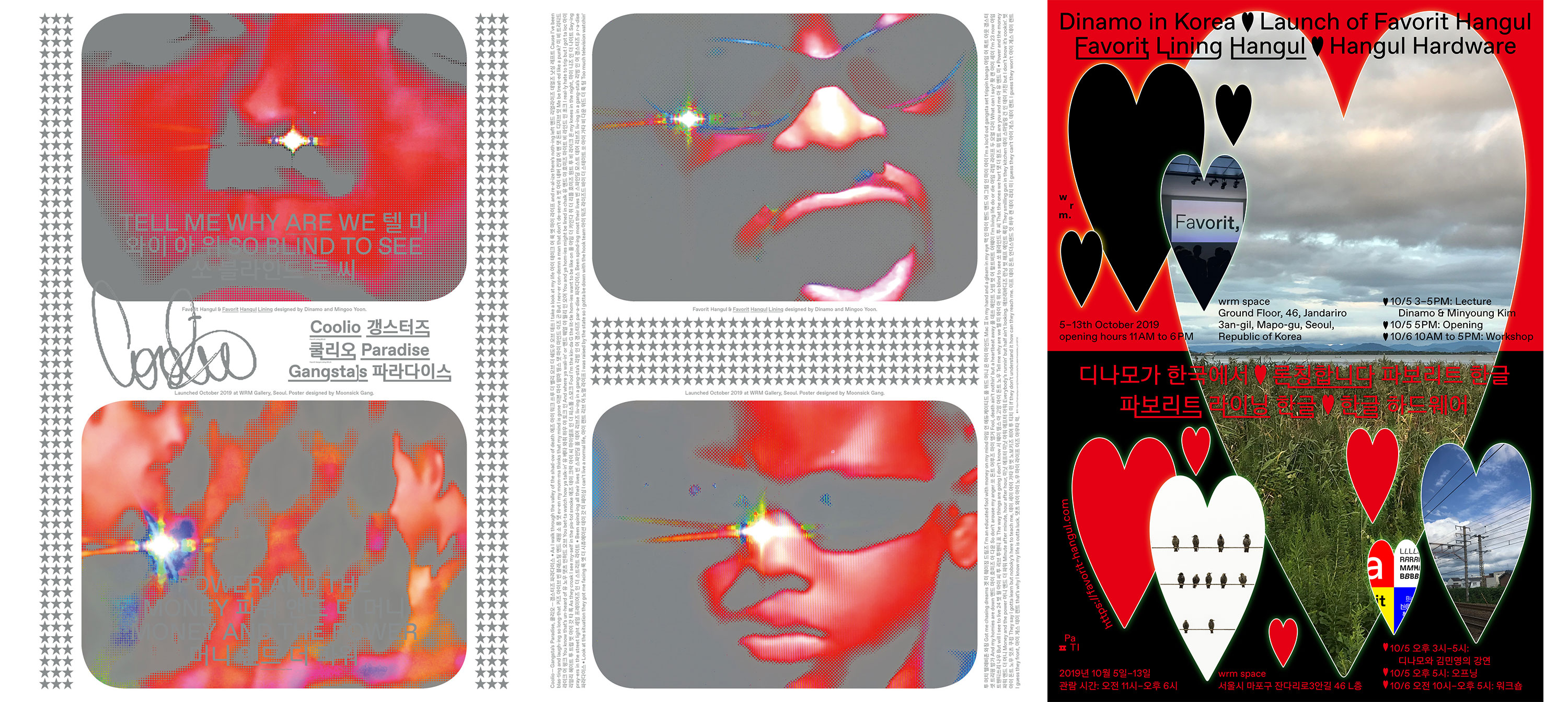
Designers today continue to explore the alphabet’s possibilities and test its limits, reshaping the modular forms or breaking out of them to reinterpret older calligraphic scripts. The global type industry is placing new emphasis on multi-script support, leading to collaborations between East and West to expand type families for a more robust library. One example is the Favorit Hangul family, designed by Yoon Mingoo with Swiss studio, Dinamo. For the launch of the typeface at Typojanchi Typography Biennale in 2019, Moonsick Gang and PRESSROOM designed posters using both Hangul and Latin styles.
Defining South Korean Graphic Design in the 21st Century
4. See Yuko Kikuchi, “Design Histories and Design Studies in East Asia: Part 1”, Journal of Design History 24, no. 3 (2011): 273-282. Lee writes, “In Korea, the term ‘gongye’, introduced through contacts with the Japanese and the West during the 1880s, was broadly used to indicate the concept of ‘design’. During the 1920s, the term ‘doan’ was adopted from the Japanese term ‘zuan’, which included similar notions of design. Since the 1960s, the term ‘dijain’ gradually replaced other terms such as ‘doan’ and ‘sanup misul’, while the meaning of ‘gongye’ was increasingly separated from that of ‘dijain’.”
5. See D.J. Huppatz, “Introduction: Asia in an expanded design history”, in Modern Asian Design (Bloomsbury Academic, 2018), 4-7.
Despite recent success and international recognition, many contemporary Korean designers feel an enduring pressure to define a unique cultural identity.3 After all, design as a profession was shaped by foreign influences, and similar to its neighbors in East Asia, South Korea even lacked a word for “design” as understood by the West.4 “Oftentimes, South Korean designers are critiqued for being too dominated by Western ideas and ’not being Korean enough’,” Choi said. “The pressure to find your ‘true self’ is part of a problematic Orientalism. I think you have to be aware of this impurity, and resist pressure from the West when they tell you to ‘be yourself’.”
These narratives can easily fall into an outdated model of graphic design history, where modernism and design as we know it begins in the West and diffuses outward to its peripheries.5 Instead, perhaps a better question to pose is how cultures and individuals are actively responsible in shaping their own modernities. “If you only see from Western context, you may feel like you’re always exporting ideas to the rest of the world. But this idea is too simple,” Choi said.
“The pressure to find your ‘true self’ is part of a problematic Orientalism. I think you have to be aware of this impurity, and resist pressure from the West when they tell you to ‘be yourself’.” — Choi Sung Min
Contemporary South Korean graphic design exists in a context where culture is increasingly globalized, transnational, and transcultural. Graphic design in the 21st century is often circulated and experienced digitally — blurring boundaries of nationhood that were once distinctly drawn. This was one of the reasons why hamamoto wanted the Around Seoul* exhibition to be a space to discuss and elaborate on works that were mostly experienced online. It’s a contrast to the previous ways that design information and trends traveled through slower media like newspapers, books, trade magazines. Choi adds, “There was a time difference between the ‘original’ (if we can call it that) and its realization, implementation, adaptation in Korea. Designers saw what was happening in the US or Japan, and might imitate them, but in fact they are seeing partial aspects and creating something different in response to that.”
“The question of cultural identity has become increasingly irrelevant to many designers, who are already busy enough exploring their own interests.” — Choi Sung Min, form magazine, 2017.
In digital spheres, borders are few, channel-flows are multidirectional, and space-time feels infinite. The lifecycle of being influenced and influencing is shorter and shorter, and even if you think you are getting the full picture, you still lose bits and pieces of understanding. “While I cannot prove how Korean graphic design has influenced the West — I don’t think that’s the point. The question is not about the ‘origin’ and where it ends up, it’s about what kind of transformation happens in between,” Choi said. “There is always a fundamental misunderstanding involved in any cultural exchange, but I think that misunderstanding is really beautiful, because that’s where creativity can happen.”
Selections from the South Korean Graphic Design Collection at Letterform Archive


This post features just a sampling of our new South Korean collection. We’re grateful for chris hamamoto’s effort in curating the exhibition and bringing the results to the Archive, and we’re excited about the opportunities for more research, inquiry, and discussion of these works. If you’re interested in learning more about Hangul and letterform design, consider registering for Choi’s workshop on Hybrid Letterforms (this October) which begins with the question, “What if we imagine a Latin alphabet influenced by Hangul?” To learn more about our holdings from East Asia, check out An Sang Soo’s Hangeul type specimens, The Complete Commercial Artist, and our collection of Tadanori Yokoo.
Florence Fu is a writer and type designer in New York. She holds a B.A. in Art History and a B.S. in Journalism from Northwestern University, and is a graduate of Type West’s year-long type design certificate program. She is a contributor to Letterform Archive and Sharp Type Co.