News
The Metal Squad Behind the Deluxe Dwiggins
Rare type and talent went into the making of the letterpress portfolio for W. A. Dwiggins: A Life in Design.
Dwiggins’s visual inventiveness was matched by his verbal wit, and he left behind a number of charming stories and playful but potent essays that helped to define the fields of graphic, advertising, and book design. The deluxe edition of Bruce Kennett’s Dwiggins biography includes a portfolio of Dwiggins’s writings, set in his own typefaces made for the Linotype machine. (The standard edition of the book includes high-fidelity reproductions of these pages.)
In his book’s acknowledgments, Bruce thanks “the Metal Squad who produced the letterpress portfolio (which also appears in the book as the Writings section): Michael Babcock, Darrell Hyder, John Kristensen, and Andrew Steeves, all of whom brought not only their experience and skills, but also their respect and admiration for Dwiggins.” As the final proofs of A Life in Design head to the printer, we look back at the efforts from this team of craftsmen and the methods, both analog and digital, which made the portfolio possible.
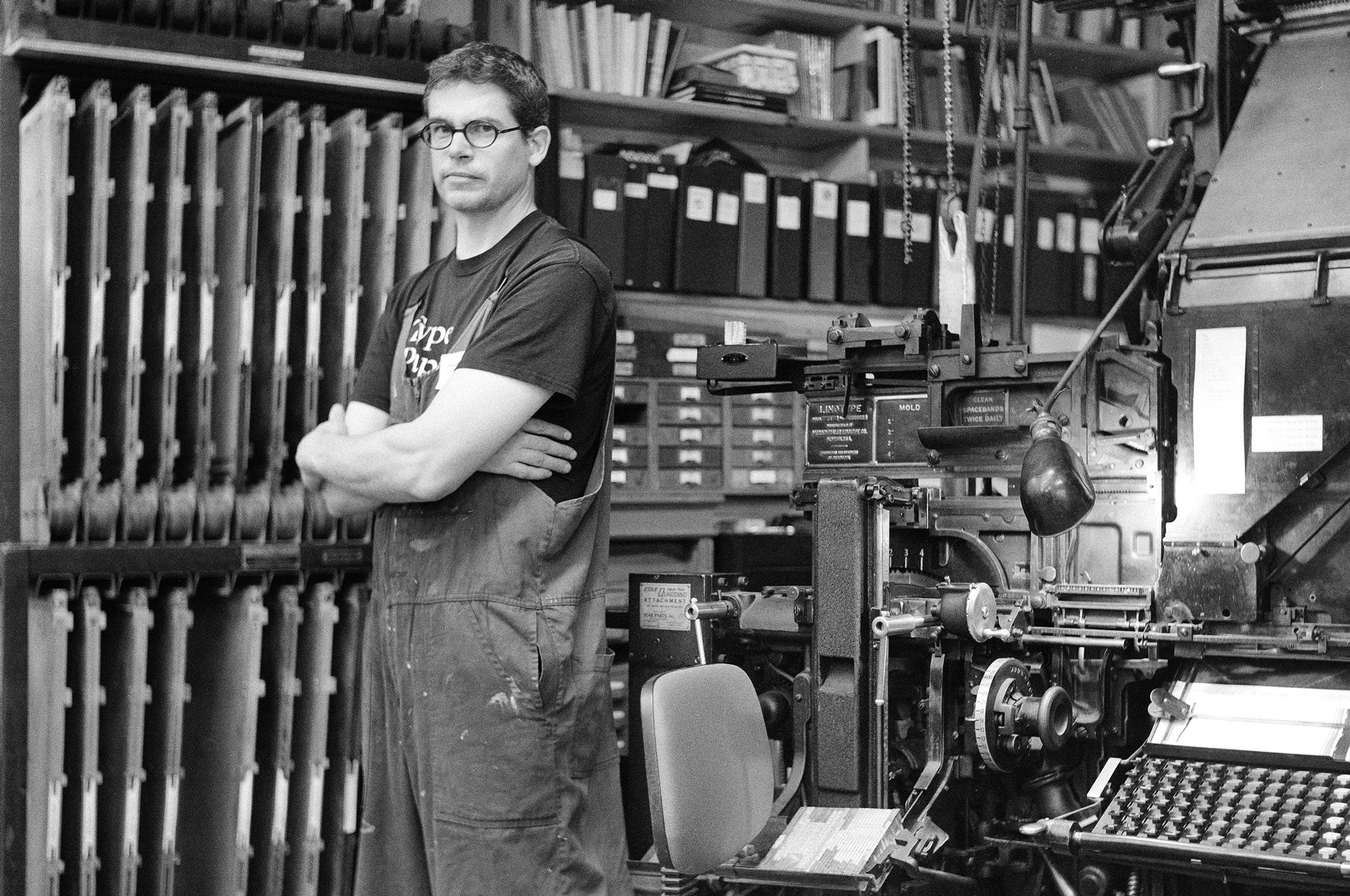
Michael Babcock
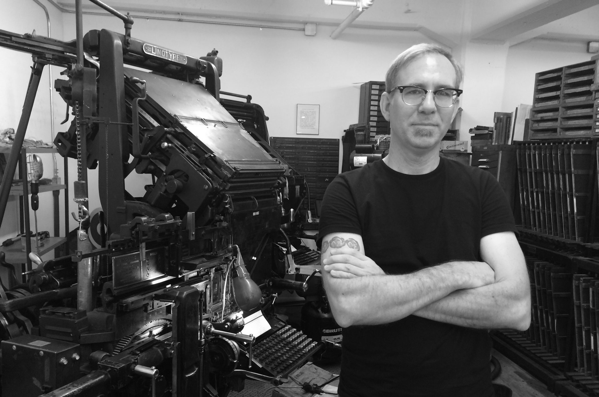
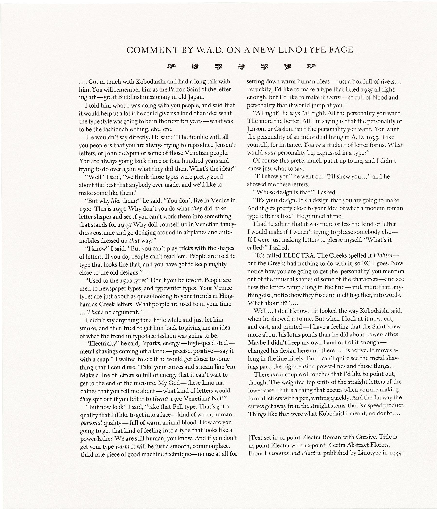
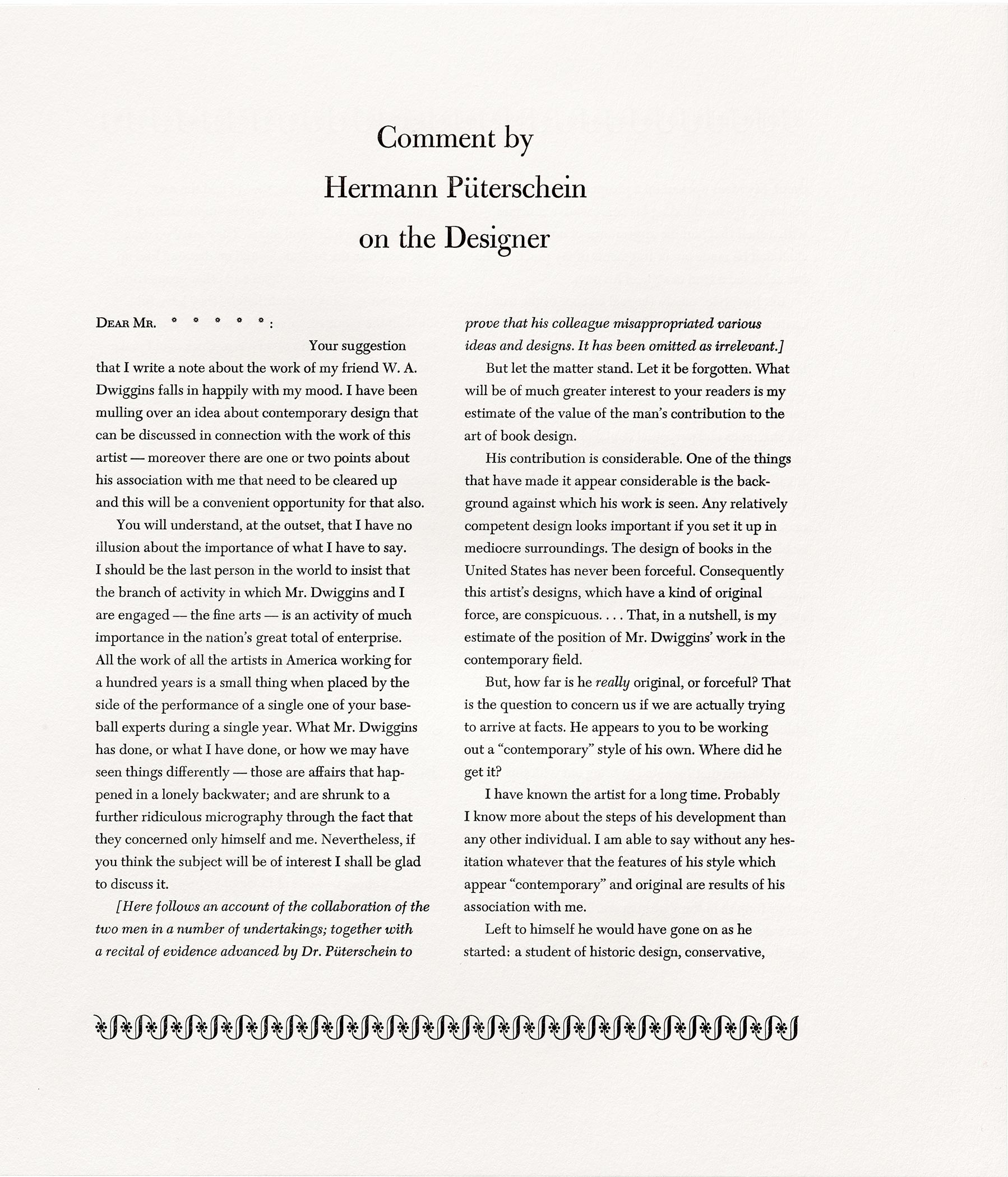
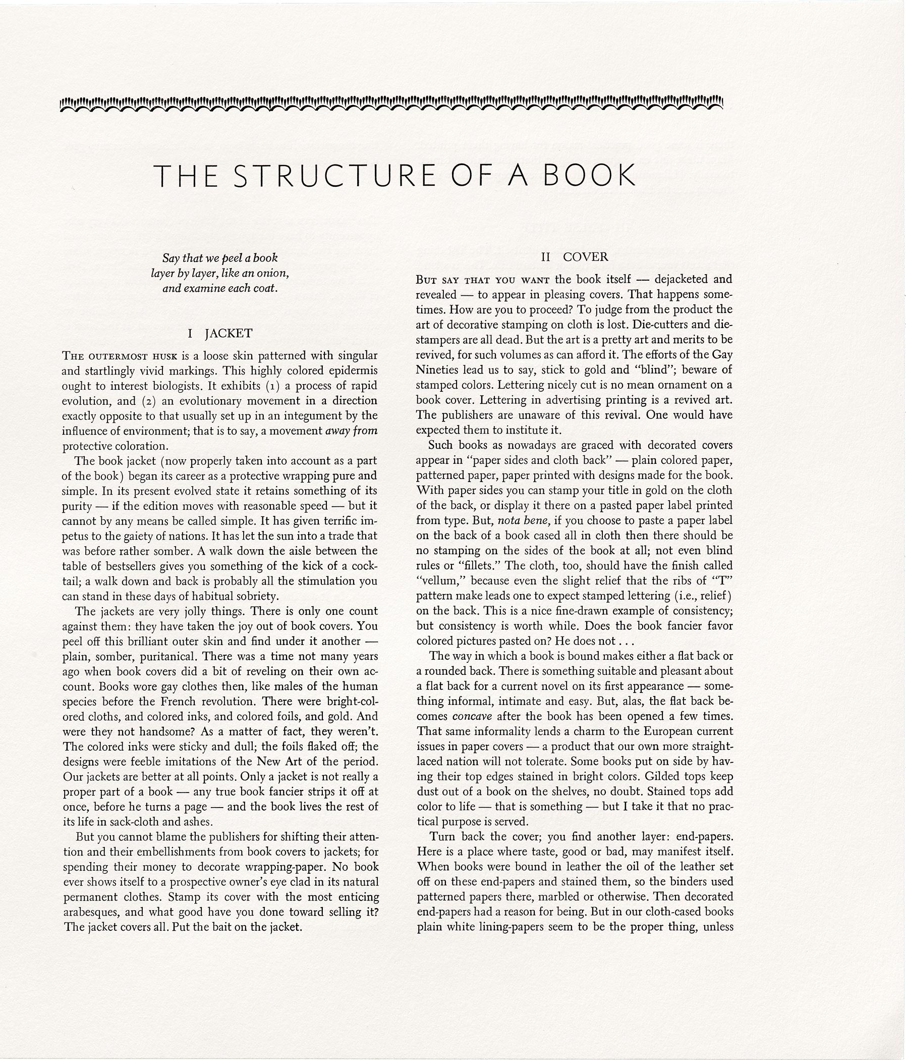
Michael Babcock (Linotype compositor) is founder of interrobang letterpress, a traditional hot-metal printing shop. He has just joined David R. Godine as Production Manager. Michael provided composition in Dwiggins’s Metro, Electra, Caledonia, Eldorado, and Caravan decorative units.
You have done all sorts of typesetting, from Robert Bringhurst’s Palatino to posters for the Society of Printers Dwiggins Lecture. What sets this job apart?
MB: The scope was much greater than any other Linotype work I’ve done in the past. The sheer number of slugs that needed to be cast. The number of settings, measures, indent values, typefaces, and point sizes. There was a lot of changing up. One of the challenges was working on somebody else’s machine. That makes me excited to have this machine, a “Two-in-One” Linotype which can run both 72-channel and 90-channel (display and standard comp) sizes. It’s an uncommon machine that helped with this project in which we set both display and text sizes.
But the whole job took longer than I imagined. I estimated far less time than it took. I figured it would take 1 and a half months but it took six. There were adjustments to make to the machine, and cleaning to do. Dave Seat, the traveling Linotype repair guy, came by and looked over the machine and made a few adjustments that made a huge difference in usability.
After a rocky start with bad metal, a maladjusted Model 31 Linotype, a too-full pot that liked to burp up molten metal, and sending some tight lines that ate mats, things settled in for a long hot summer of typesetting, and revisions.
What was your relationship to Dwiggins before the project?
In New England, Dwiggins is a hero. And once you work with a Linotype for a while you inevitably create an affinity with Dwiggins’s typefaces. The duplexing decisions are interesting to experience. Metro, especially. To see how he solved problems from a technical standpoint. Beyond type, like many people, I am smitten by his whole aesthetic, the modular ornament, his working out of forms using stencils. His blurring the line between type design and illustration.
For this project it was awesome to work directly with his writing, to read words straight from a manuscript that have never before been printed. As I was working it dawned on me, “This is the first time these words have ever been typeset!” And so sweet to do it in Dwiggins’s own type.
Andrew Steeves
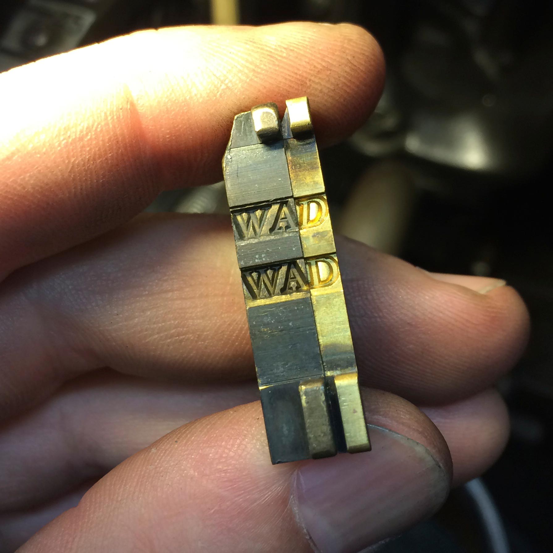
Andrew Steeves (Linotype compositor) is a designer and printer of books, a writer, and a founder of Nova Scotia’s Gaspereau Press. Andrew provided composition in Dwiggins’s Falcon types.
How did you get involved with Bruce’s project?
AS: Bruce and I were strangers when he asked me to participate in the project. I simply had not run across his work. But I knew Michael Babcock and John Kristensen (of Firefly Press) through the letterpress community, and John knew that I had these rare Falcon matrices in my shop and alerted Bruce. I was delighted to be able to help him out. It was as a consequence of this that we became friends. We really have a lot of common interests as book designers, and many of my influences as a printer and publisher (like Rocky Stinehour and David Godine) were, and are, his friends. We are also both dedicated to small town life and rural communities.
What is your personal relationship with Dwiggins’s work?
Dwiggins has been a major influence on me, for sure, as he was on twentieth-century book design generally. It may not be apparent right on the surface of my own work, but it’s there. He’s surely a Thoreauvian kind of fellow, marching to his own drummer, mirthful, mischievous, alert to the big human picture and attending to it with a myriad of small but significant personal acts of rebellion and resistance. I also appreciate how physical his process was, that he fashioned things with his hands as well as his mind. I think we would have got on.
What do you think of Falcon? Were there any particular challenges with setting the type for this piece?
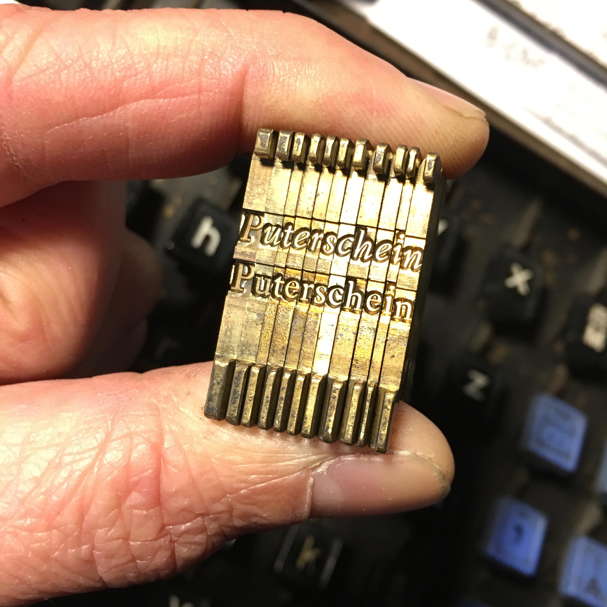
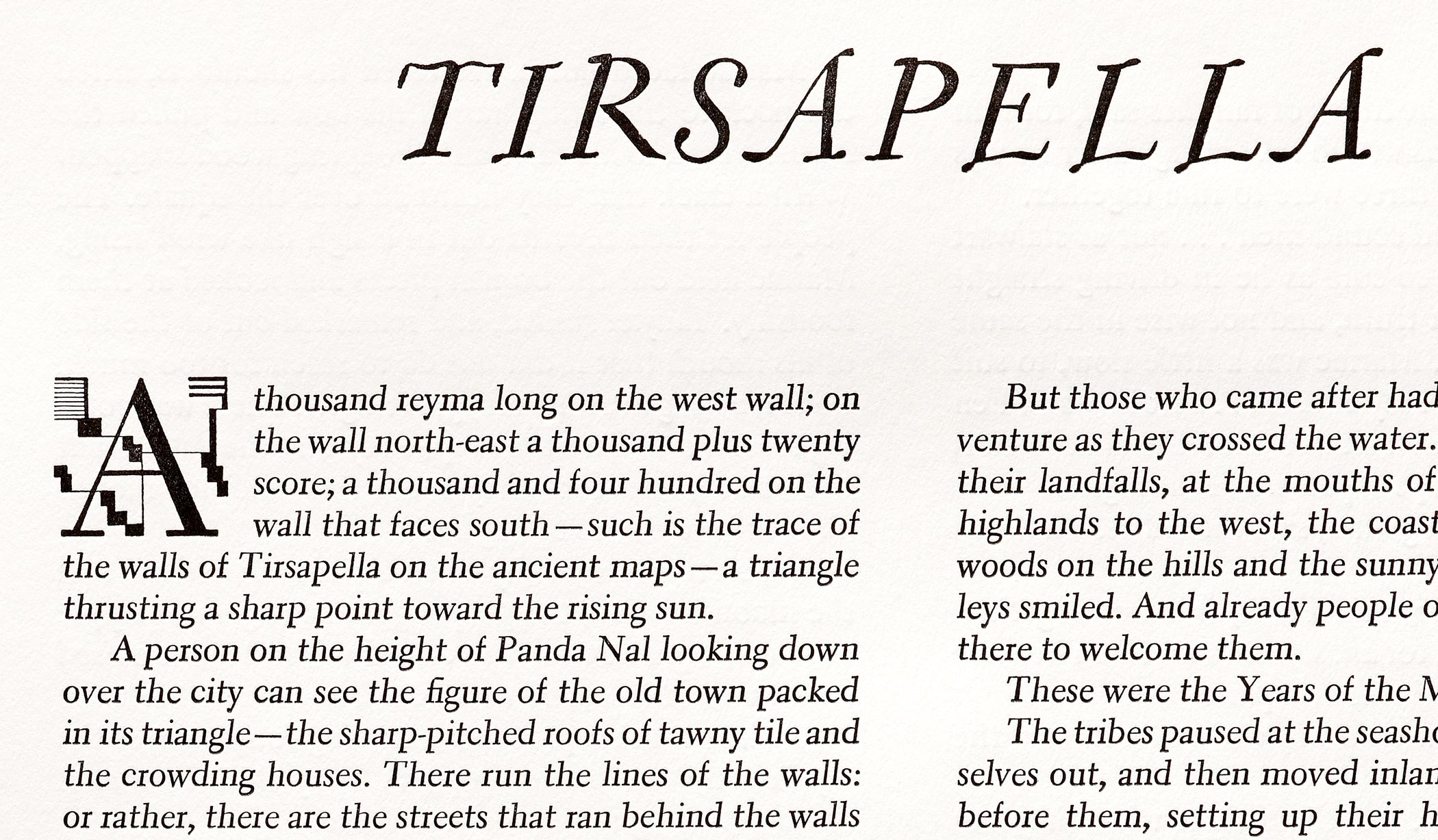
A lot of the Linotype matrices I have came from the collection of the late Glenn Goluska, who was a big Dwiggins buff. There is no record of where he acquired the rare Falcon matrices (in three sizes), but the first use I saw of the type was in a private commission book Goluska printed in memory of Samuel Bronfman in the early 1980s called My Sam. I was always impressed with Glenn’s setting of Falcon, but had not yet had a chance to make serious use of the typeface before Bruce got in touch. I have used it on some letterheads and for a business card for a beekeeper friend, but that’s about it. I actually have the 12-point Falcon matrices loaded on the Linotype right now, running test lines for a limited edition letterpress book I’ll be producing in 2018.
I am primarily a trade book publisher, and I edit and design contemporary literary books with contemporary tools. But we do all our printing and binding here in our own little shop, and mixed in with the contemporary tools I have a lot of letterpress tools as well (like Vandercook presses, handset type and typecasters). I like to mix these antiquated processes in with my trade work, and I also produce some purely limited edition letterpress books as well. I guess I don’t care for the conventional (that is, restrictive) divisions between private press and the trade work. I make what I want, how I want, with whatever tool seems right and don’t worry about definitions. It’s a great way to work and one I feel Dwiggins would feel at home with.
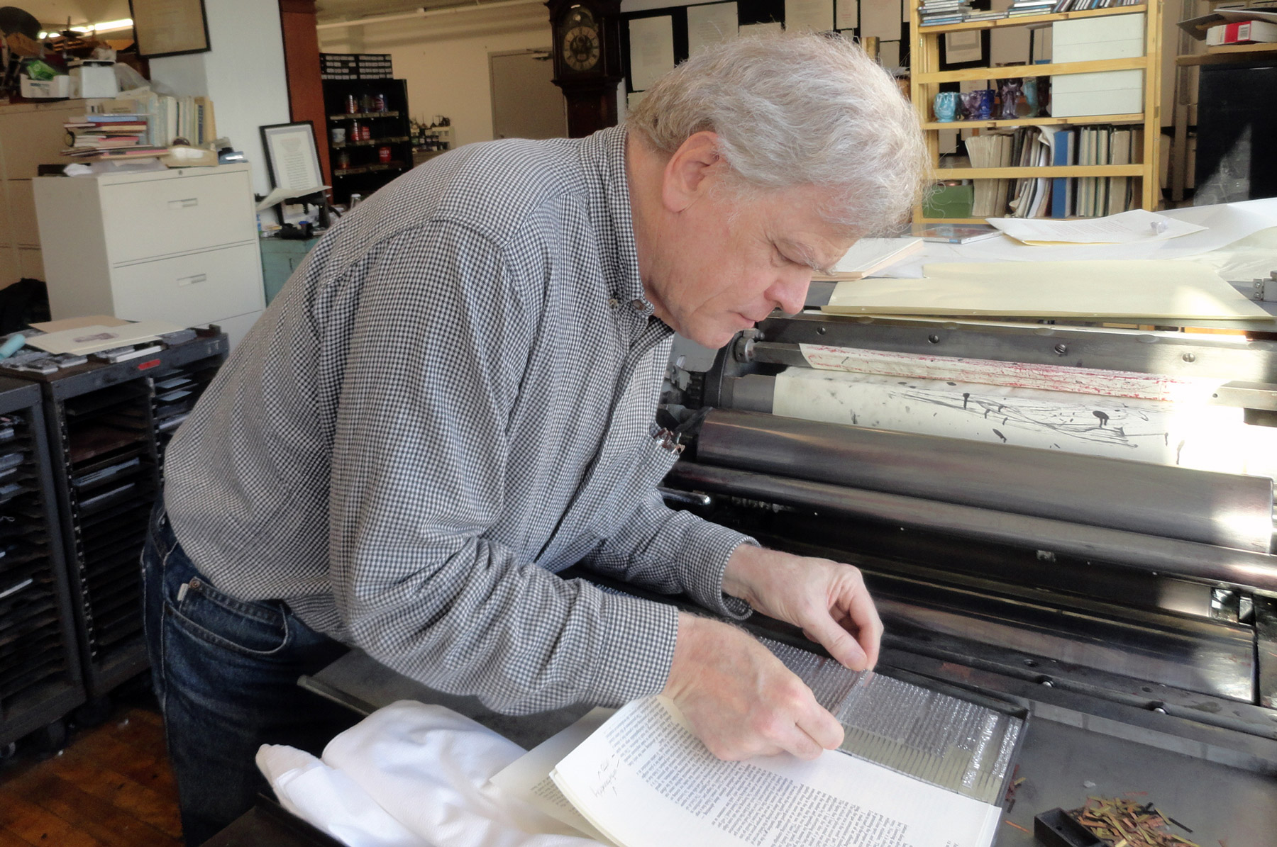
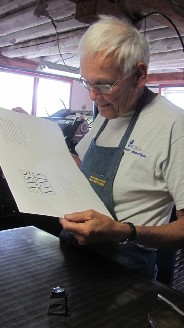
Darrell Hyder
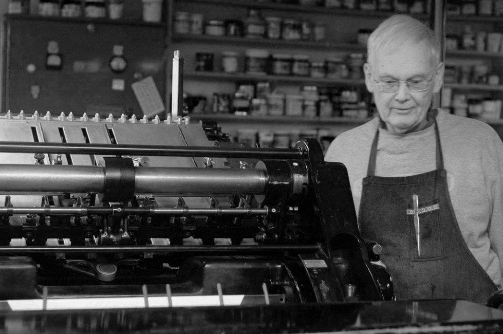
Darrell Hyder (letterpress printer) is a designer, compositor, and printer in central Massachusetts. His Sun Hill Press has worked with libraries, museums, and other cultural institutions since the 1970s. Darrell printed the portfolio on his Heidelberg cylinder press.
What’s your relationship or history with Bruce and how did he approach you for the project?
DH: Bruce and I have known each other for many years, partly through being members of the same Boston club where we’d meet from time to time. Ebullient Bruce always had plenty to share, including WAD of course, and I got to print a notice of his talk. Four (or more) years ago when this project came up Bruce announced that he wanted friends to be involved, including me as pressman. In the meantime I had quit doing outside work and would not have taken the printing on had it not been for this long-standing friendship.
Do you have any personal relationship or interest in Dwiggins’s work?
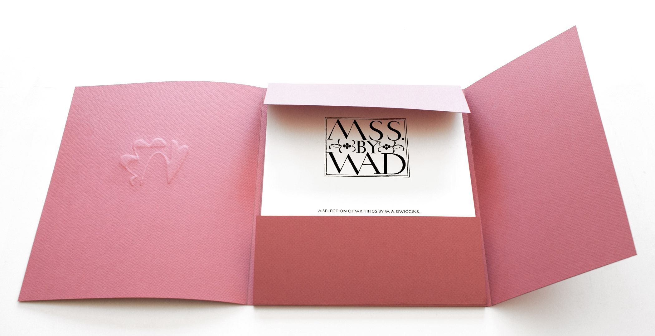
Dwiggins has for some time been one of the “cloud of witnesses” in my printing world, along with Updike, Rogers, Rollins, Stinehour, Blumenthal, (and my Swiss teacher Max Caflisch). For my very first letterpress book design job I used his Caledonia, and have been aware of his collections at the Boston Public Library. Even though I can’t be said to be a collector, I do have some of WAD’s works, including the Typophiles MSS by WAD with the selfsame ornaments I got to print.
Were there any particular challenges with this print job? How does it differ from other work you do?
In the mechanics of printing, the type slugs and plates had varying heights, requiring more than the usual makereadies, but it’s remarkable that these hot-metal faces are still available to be cast at all. The Heidelberg’s thousand-pound cylinder helped to keep them from getting too rowdy.
Preview of the Letterpress Portfolio

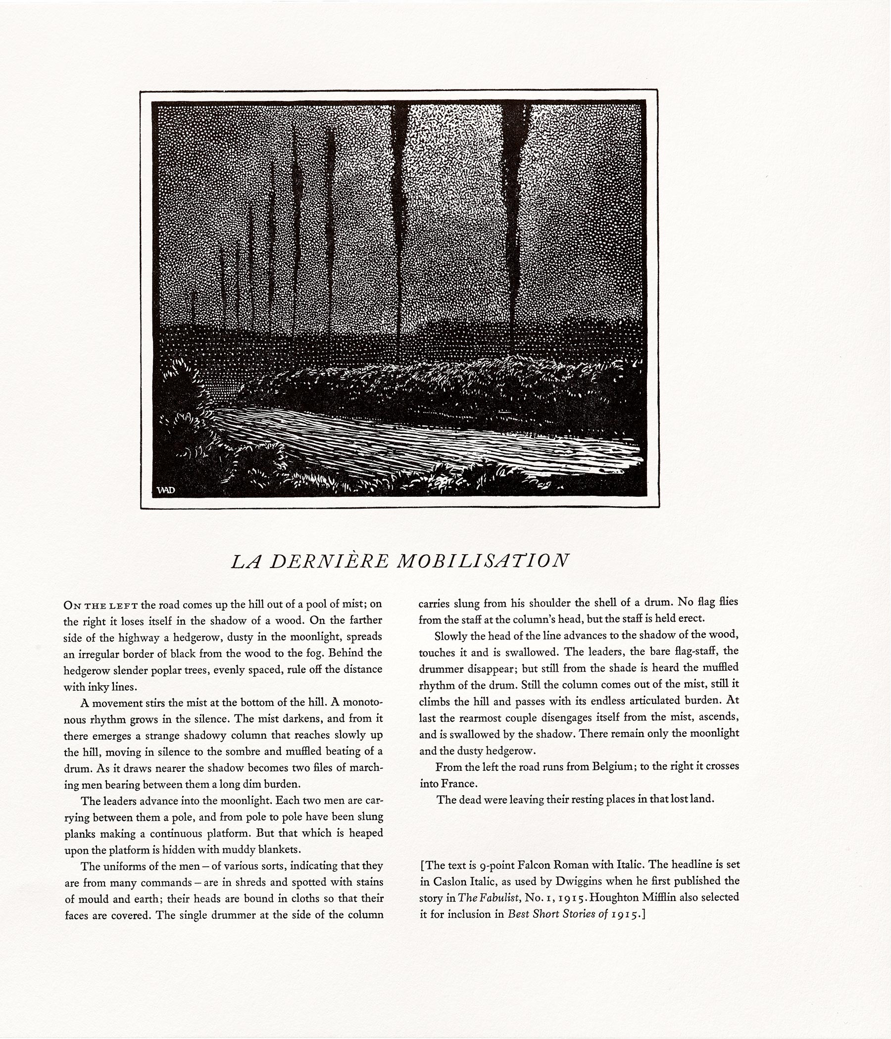
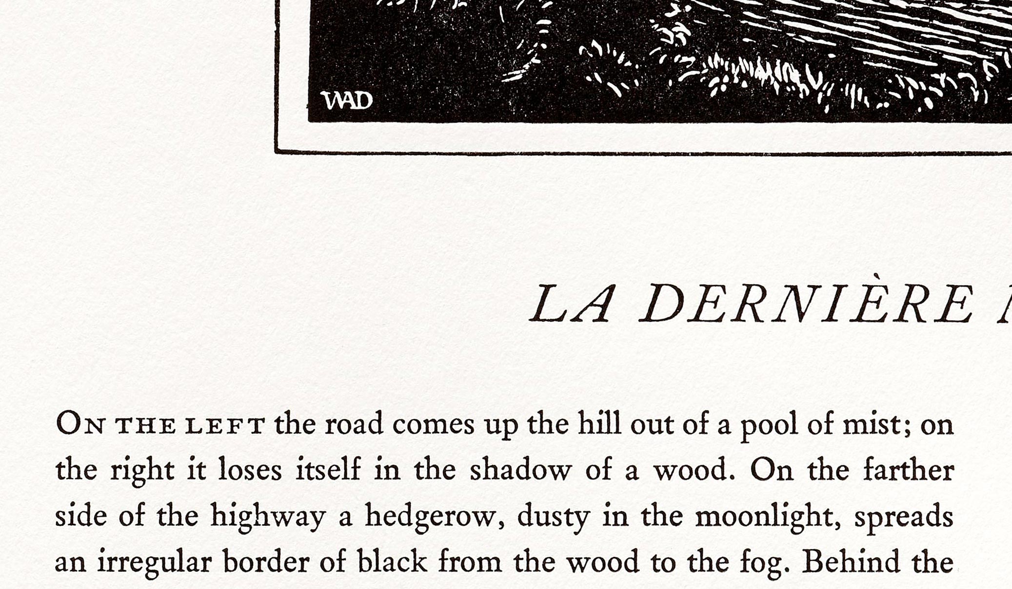
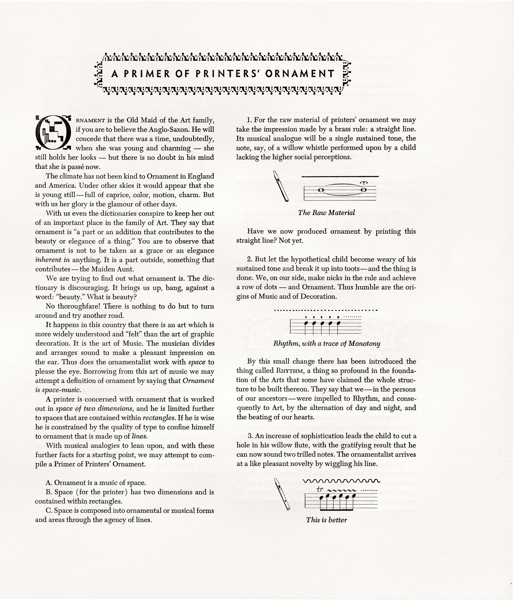
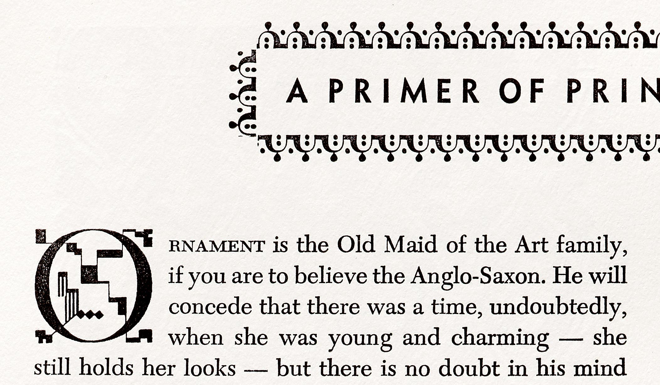
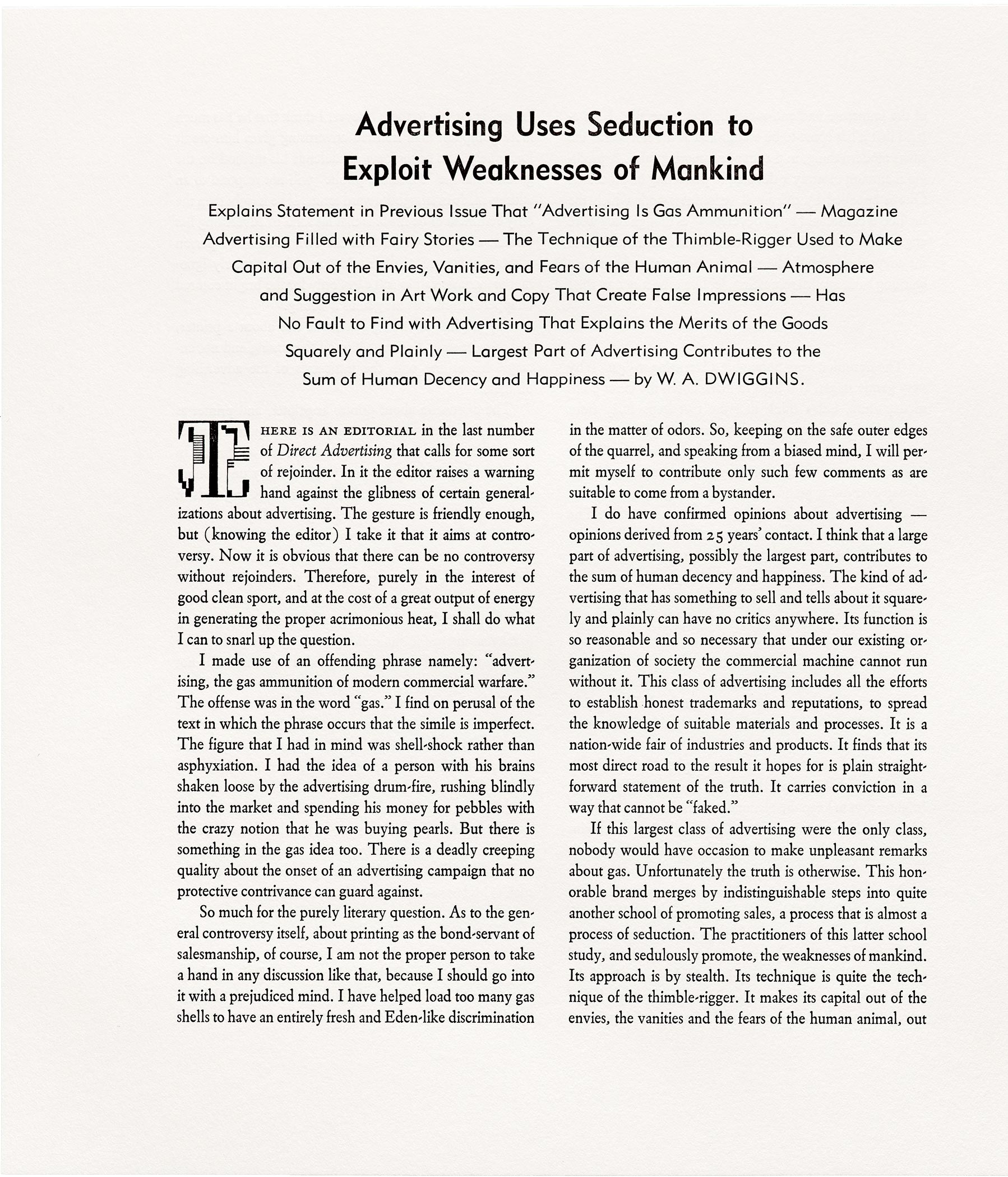

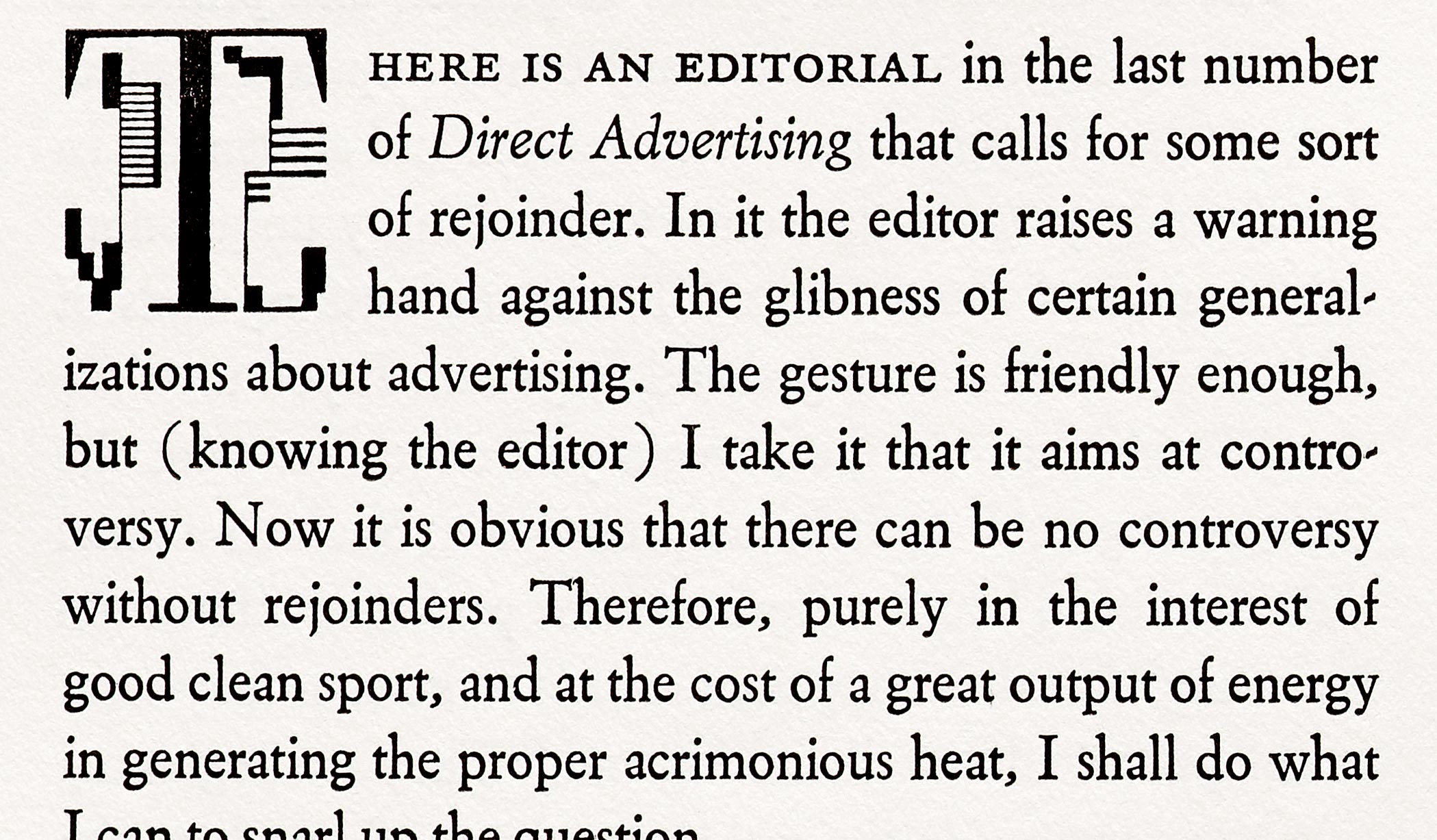
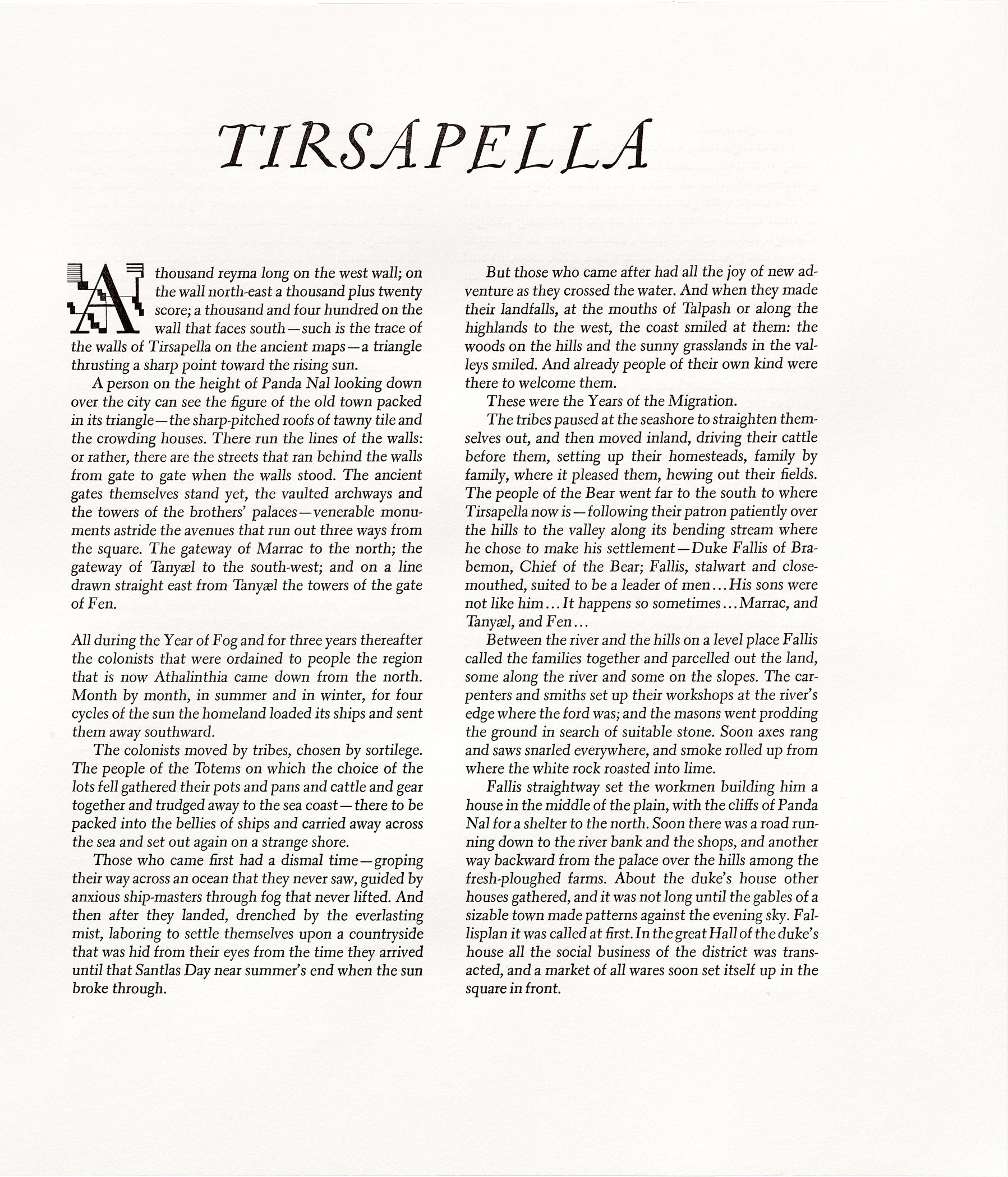


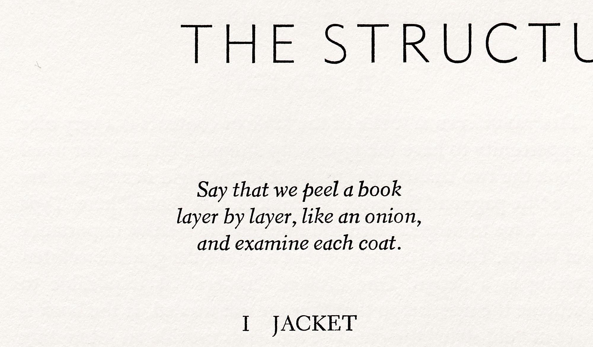
While the portfolio was produced specifically for the deluxe edition of A Life in Design, we wanted every book backer to benefit from these gems of Dwiggins’s writing. Shot under raking light with Letterform Archive’s ultra-high-resolution camera, and printed with stochastic screening, the portfolio pages will be reproduced with exceptional fidelity in the standard edition of the book.
So, whether you’re looking at the letterpress portfolio or the standard-edition facsimile, these pages offer a rare opportunity to experience Dwiggins’s type as it was meant to be seen: in metal, expertly set and printed. It’s as close as we can get to the typographic color and effect that Dwiggins intended.
W. A. Dwiggins: A Life in Design goes to press next week, but there is still time to preorder a standard edition. Deluxe editions sold out with the end of the Kickstarter campaign, but there were a couple of cancellations, so if you missed out on a deluxe, you can still order one.