News
This Just In: Emory Douglas & The Black Panther
We are honored to hold over 100 issues of The Black Panther, instrument for social justice and vehicle for the revolutionary art of Emory Douglas.
“Most popular media represents middle to upper class people as ‘normal’. Douglas was the Norman Rockwell of the ghetto, concentrating on the poor and oppressed. Departing from the WPA/social realist style of portraying poor people, which can be perceived as voyeuristic and patronizing, Emory Douglas’s energetic drawings showed respect and affection. He maintained poor people’s dignity while graphically illustrating harsh situations.” — Colette Gaiter, Visualizing a Revolution
“Young people were confronted with the same issues that they are today, police abuse, justified murders of young Blacks, unemployment, wars going on. I didn’t come in as an intellectual. Many people didn’t come into the party as scholars. They came in … wanting to change things.”
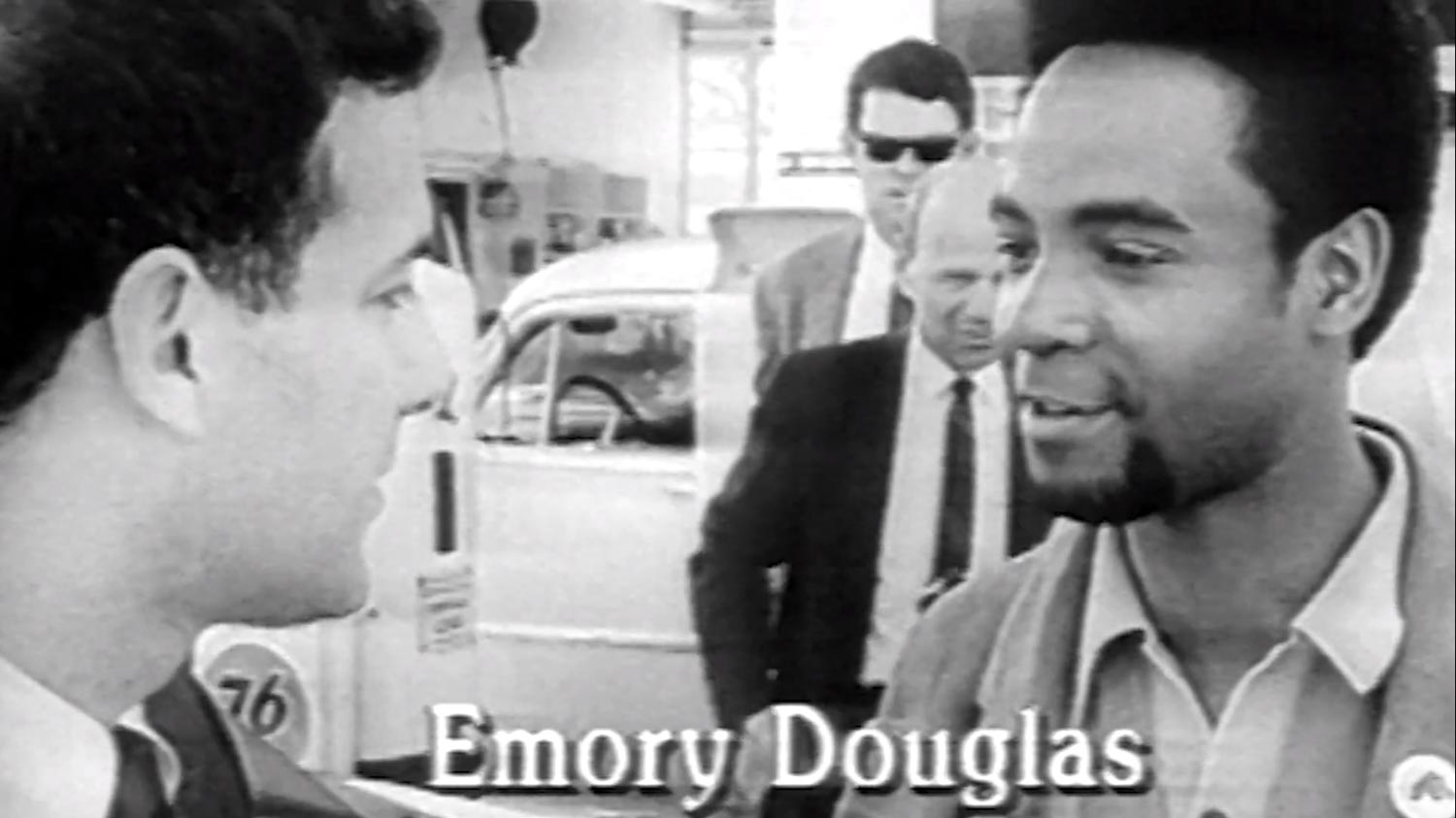
In January 1967, a 22-year-old Emory Douglas met Huey Newton and Eldridge Cleaver, the Ministers of Defense and Information of the Black Panther Party, a moment which set the course for a life in revolutionary art. Douglas strongly identified with the Black Panther’s assertive response to injustice. He respected the non-violent actions of Dr. Martin Luther King, but he was among the many young victims of racial inequality who wanted to push harder.
“In the ’50s and ’60s there was segregation here in the Bay Area and all over the country. There was a curfew for young blacks my age in the Fillmore district where I lived. It was a disturbing thing. There were civil rights movements here in San Francisco. They would show on the national news the dogs being sicced on the marchers, being sprayed with the hoses, being beaten with the batons.”
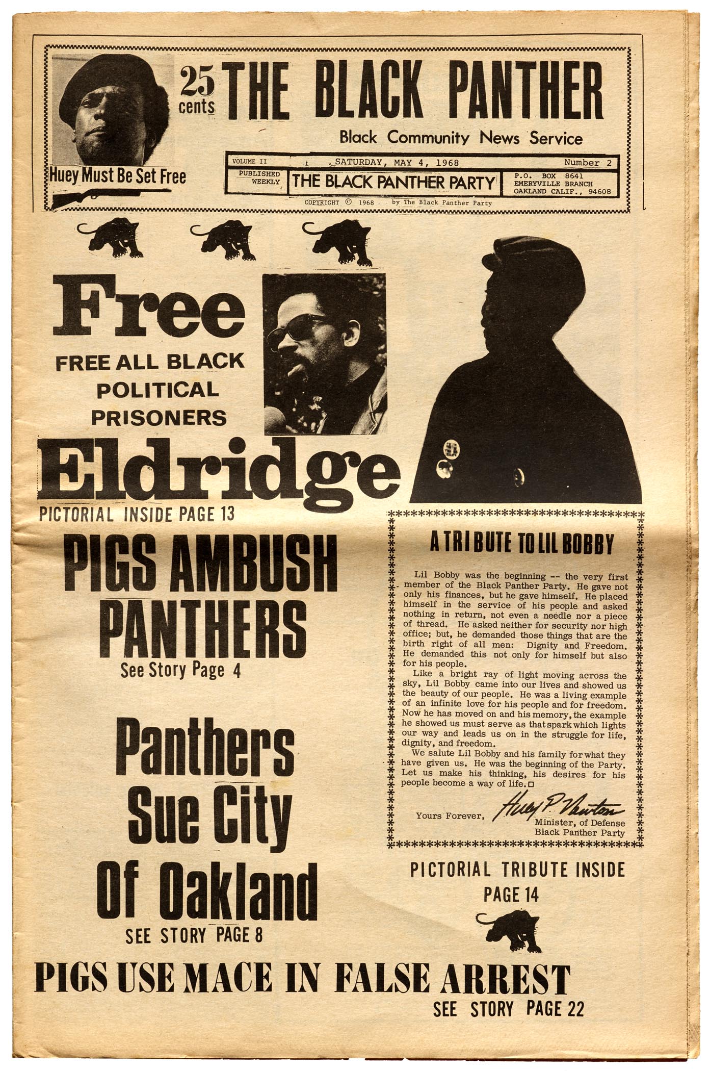
Douglas met the Panthers in Oakland, just as they were working on the first issue of the party’s newsletter, cobbling together four pages using a typewriter and copy machine.
He had been introduced to graphic design at a young age at a print shop in juvenile detention. Later, he honed his skills in the reputable commercial art program at San Francisco City College, where he learned the fundamentals of figure drawing, lettering, prepress operations, design, and filmmaking. (As a two-year school, City College competed admirably with more prestigious art programs at the time.)
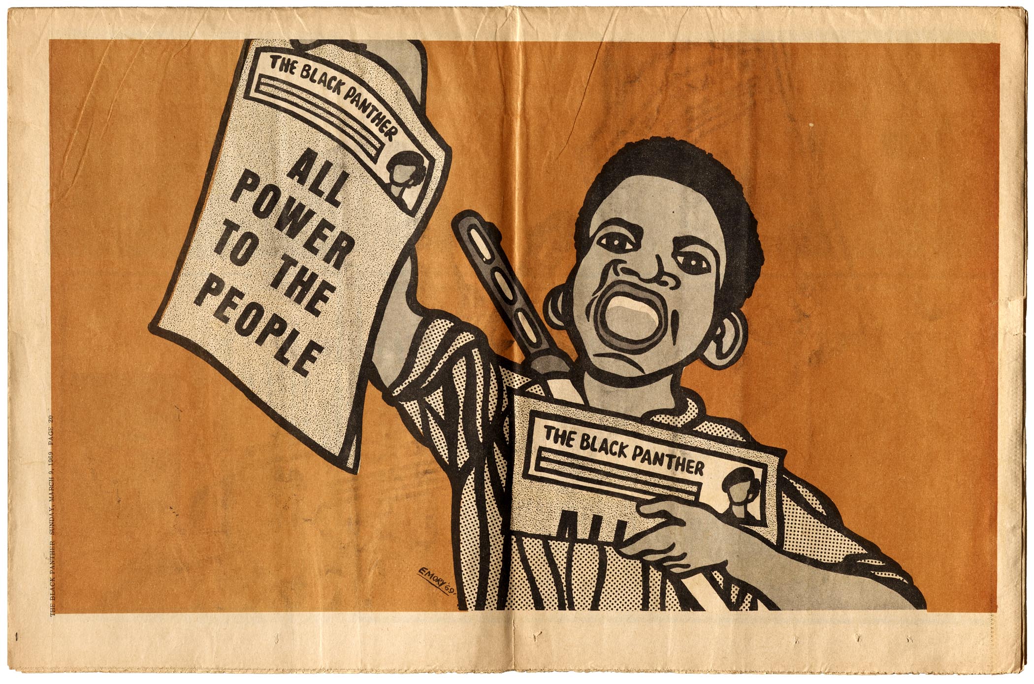
Watching that scene in Cleaver’s studio apartment, Douglas immediately saw an opportunity to take part in the movement. He offered to run home and get some supplies to help make the paper look more professional. By the time he returned they had finished that first issue, but Douglas got to work on the next one and hundreds that followed. He was soon conscripted to become the party’s Minister of Culture and Revolutionary Artist, responsible not only for the production of The Black Panther, but also the posters wheatpasted on the streets of Oakland and San Francisco, and the leaflets and pamphlets that were eventually distributed to minority communities throughout the country. His work became the visual identity of the Black Panther Party.
Letterform Archive holds significant collections from several prominent Bay Area artists, such as Emigre and Aaron Marcus, and we see Douglas’s work as an integral thread of our local fabric which impacted cultural movements around the globe. With this in mind, we are thrilled to have recently acquired 121 issues of The Black Panther from its seminal period between 1967–72, along with posters and other ephemera by Douglas.
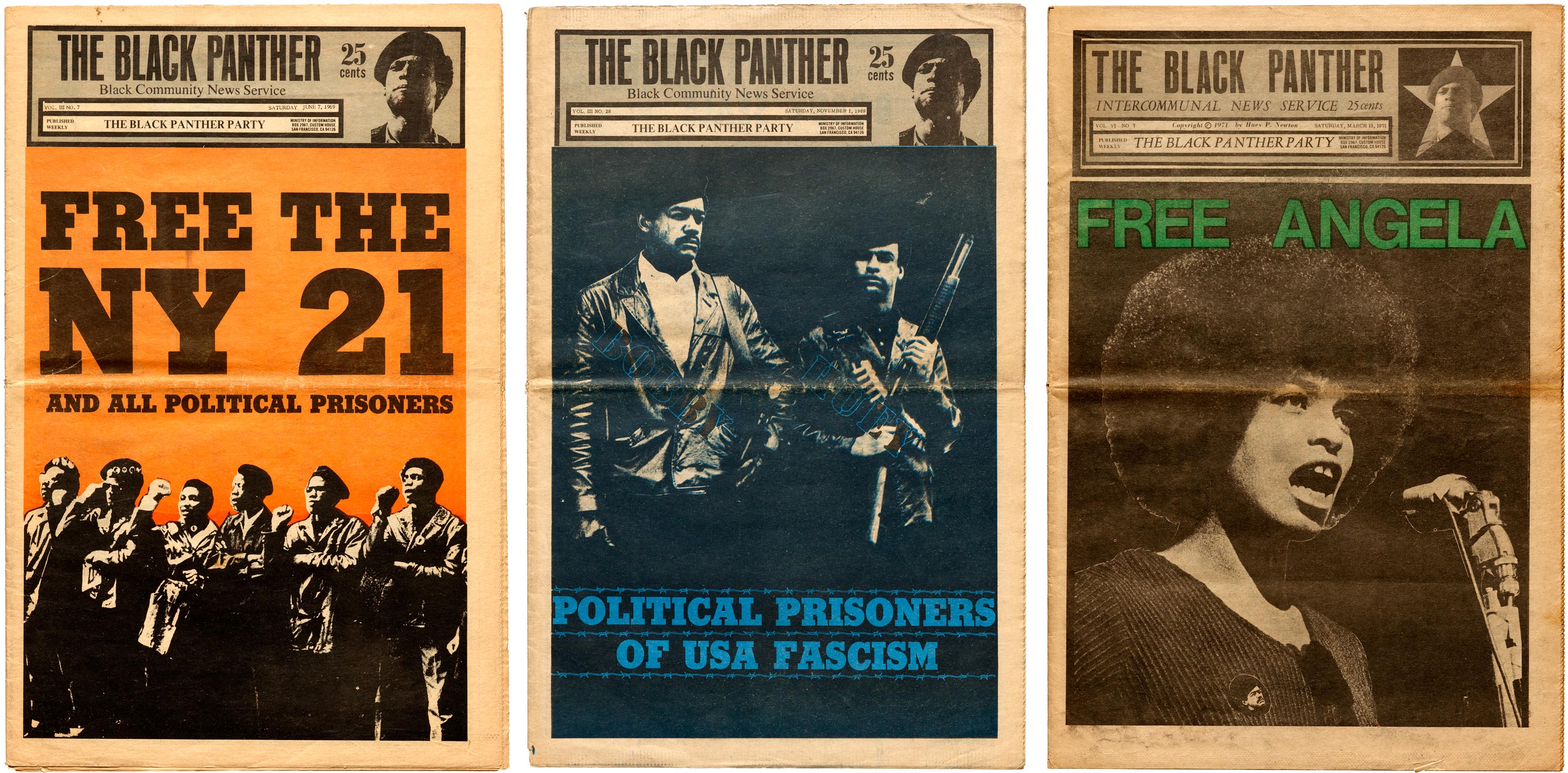
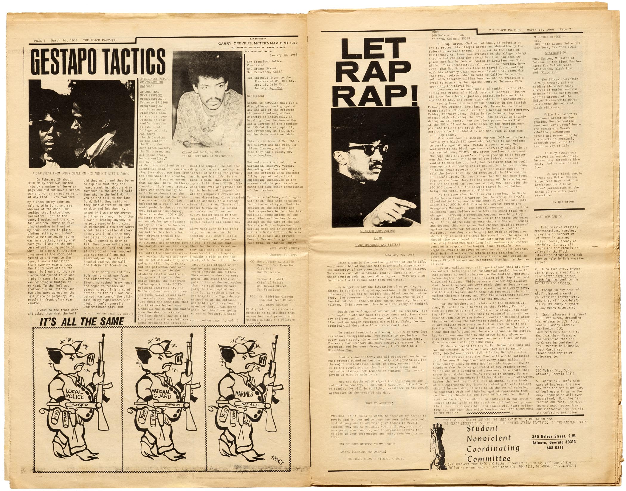
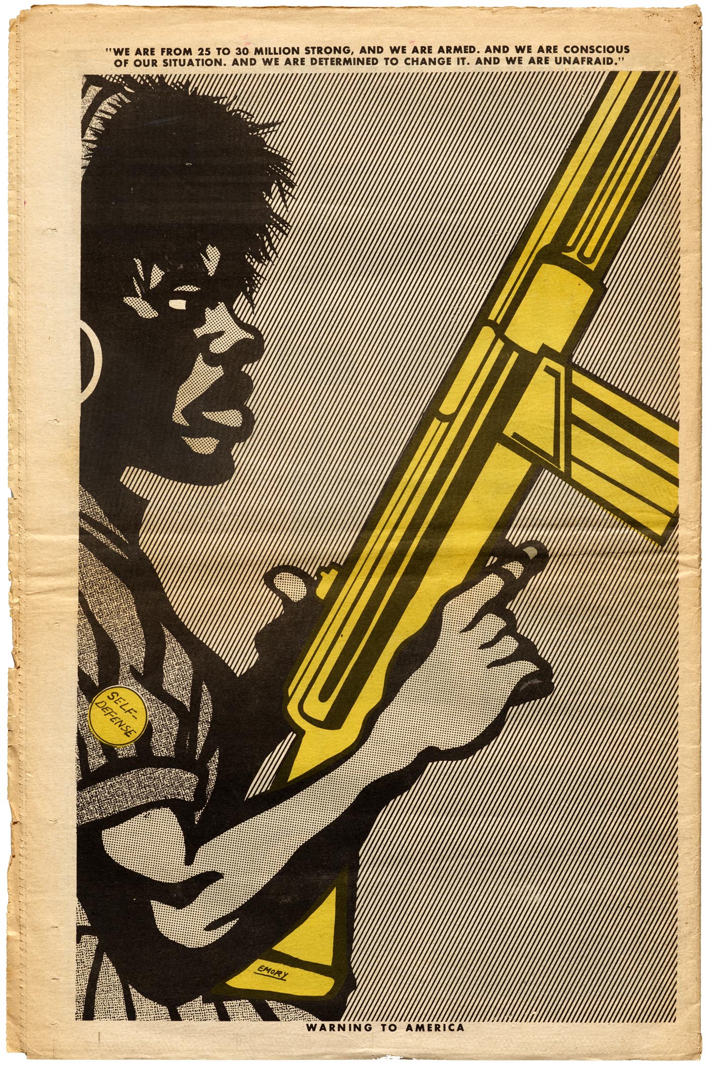
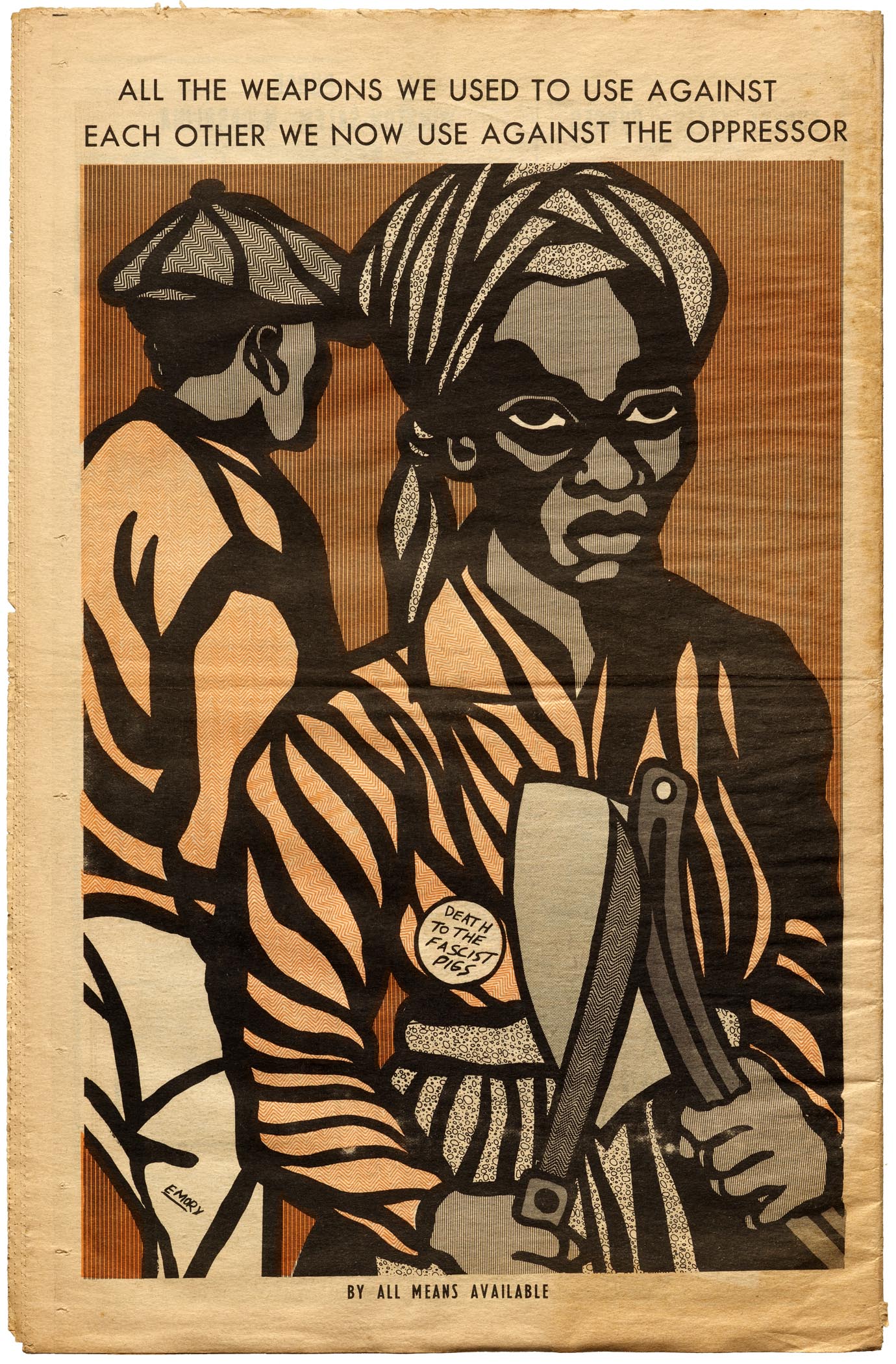
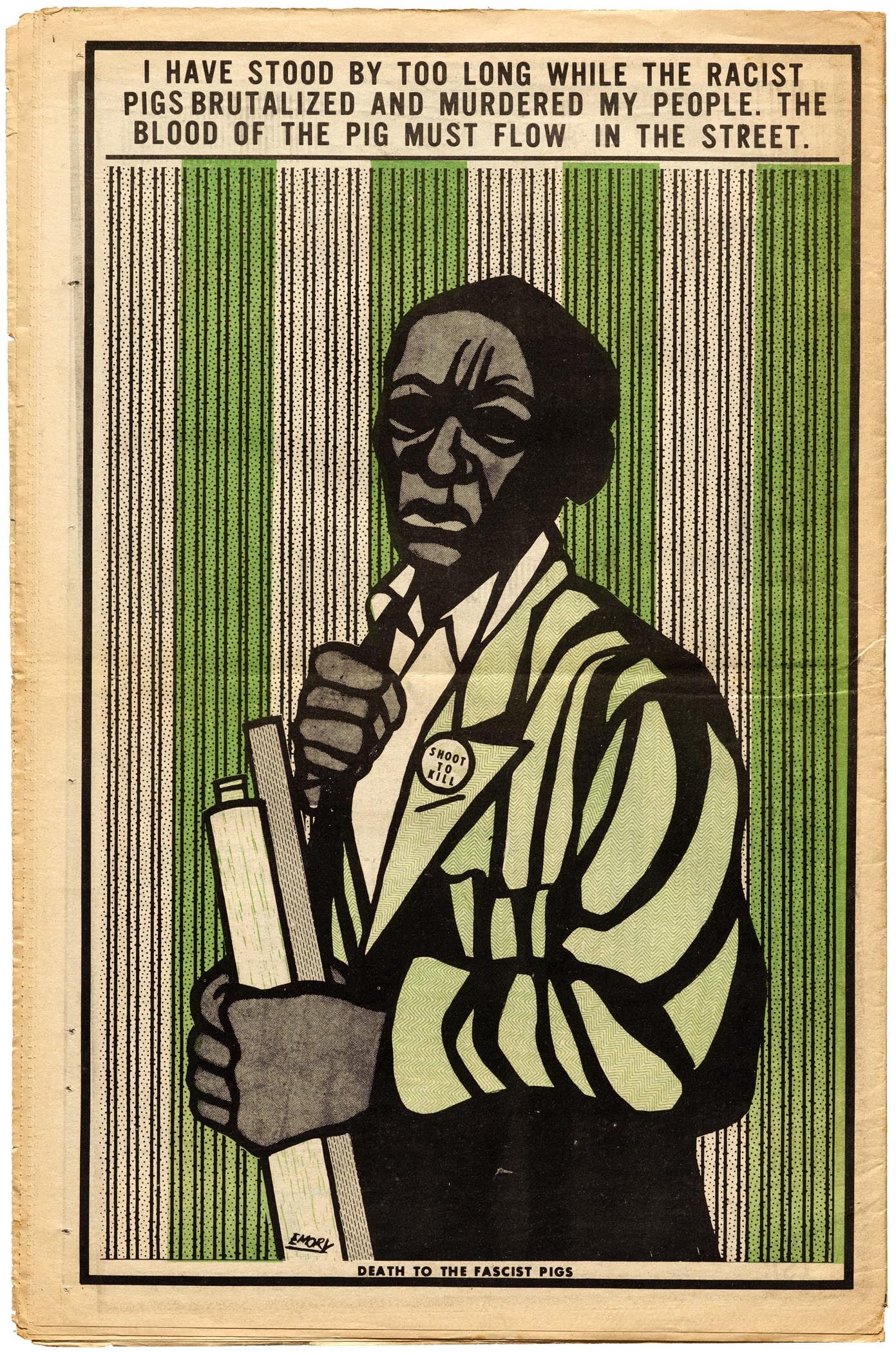
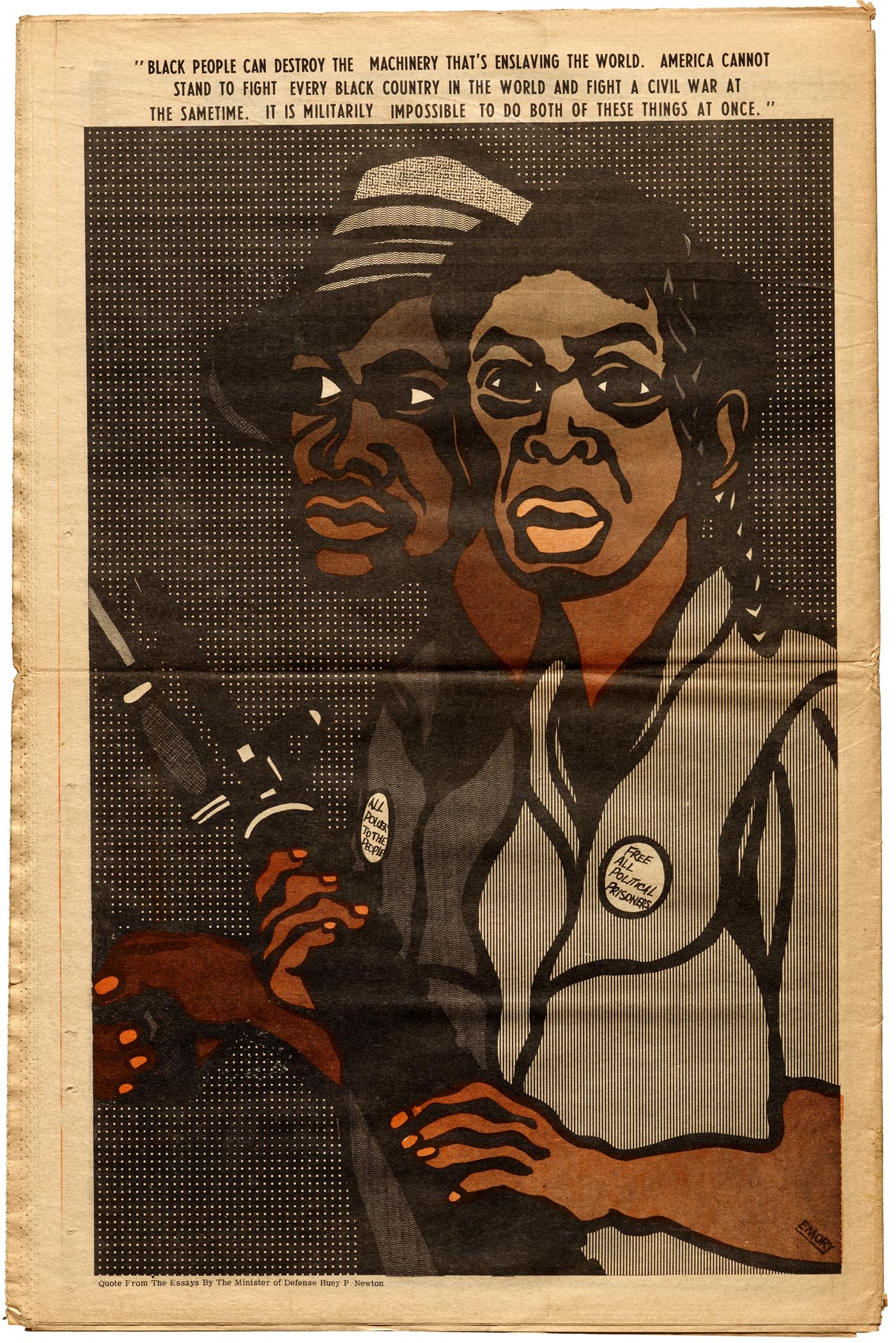
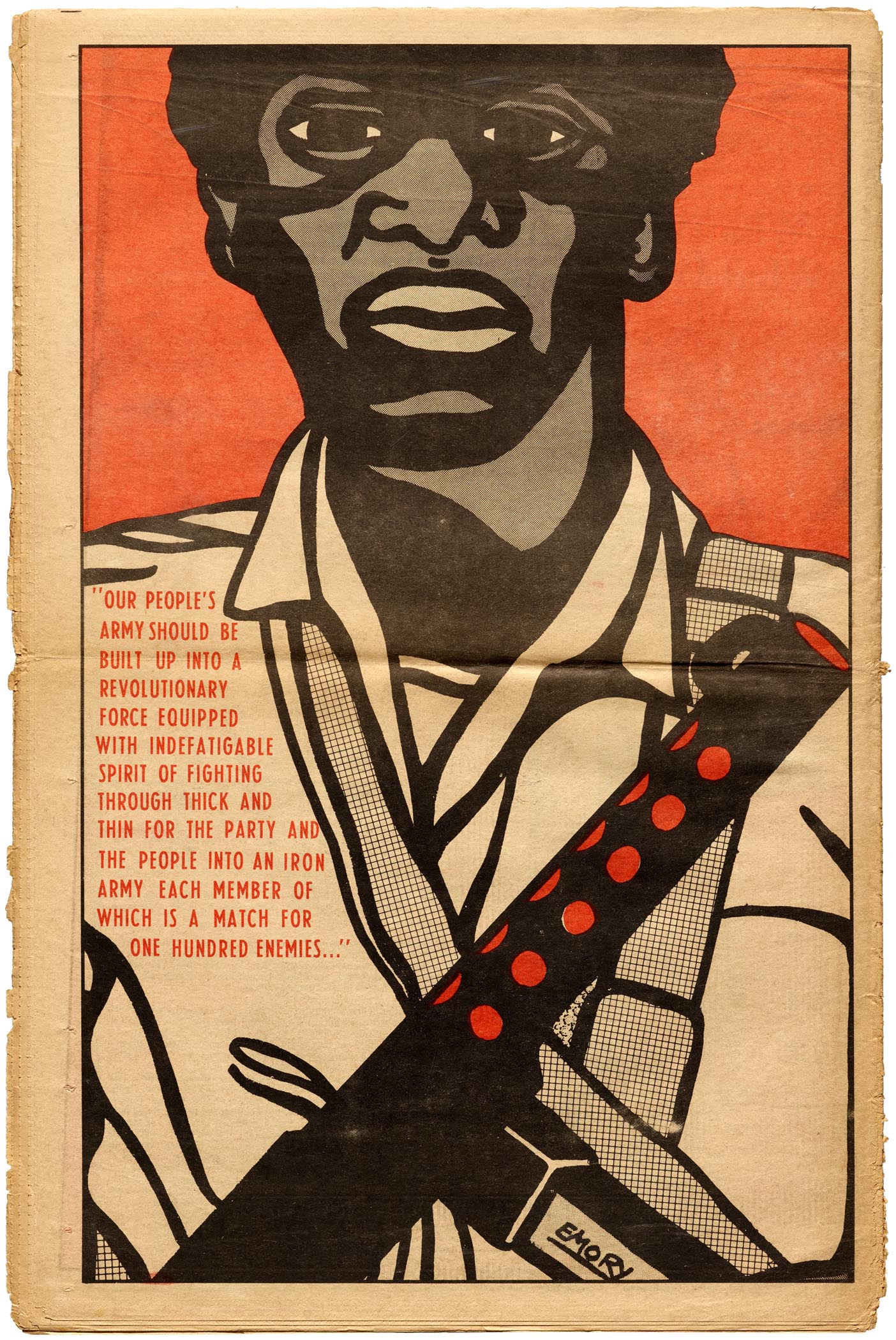
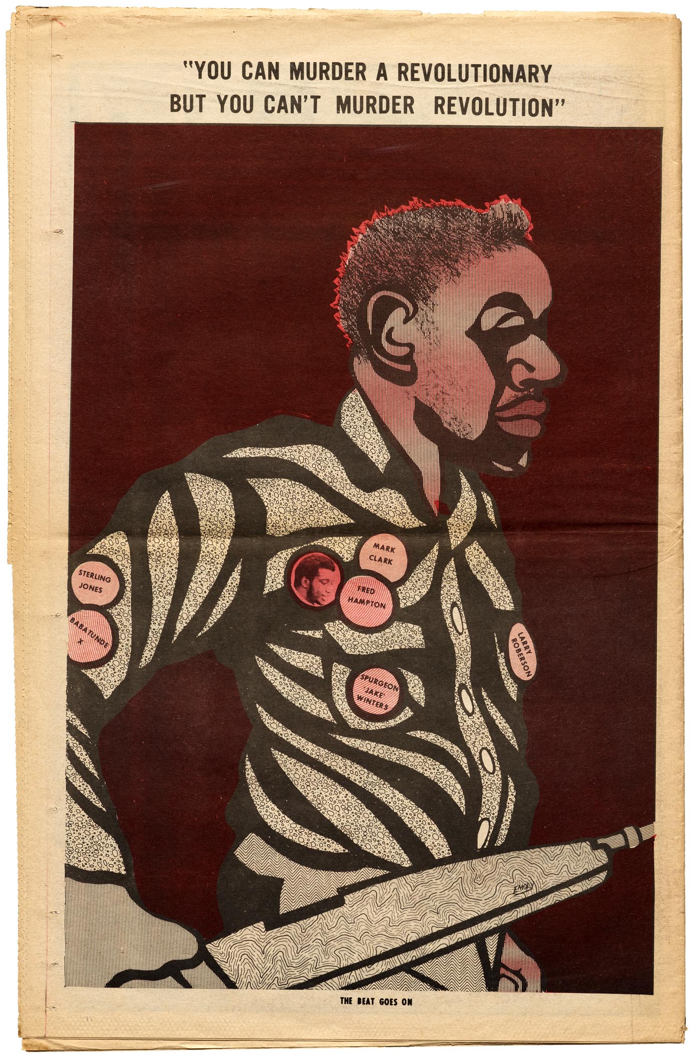
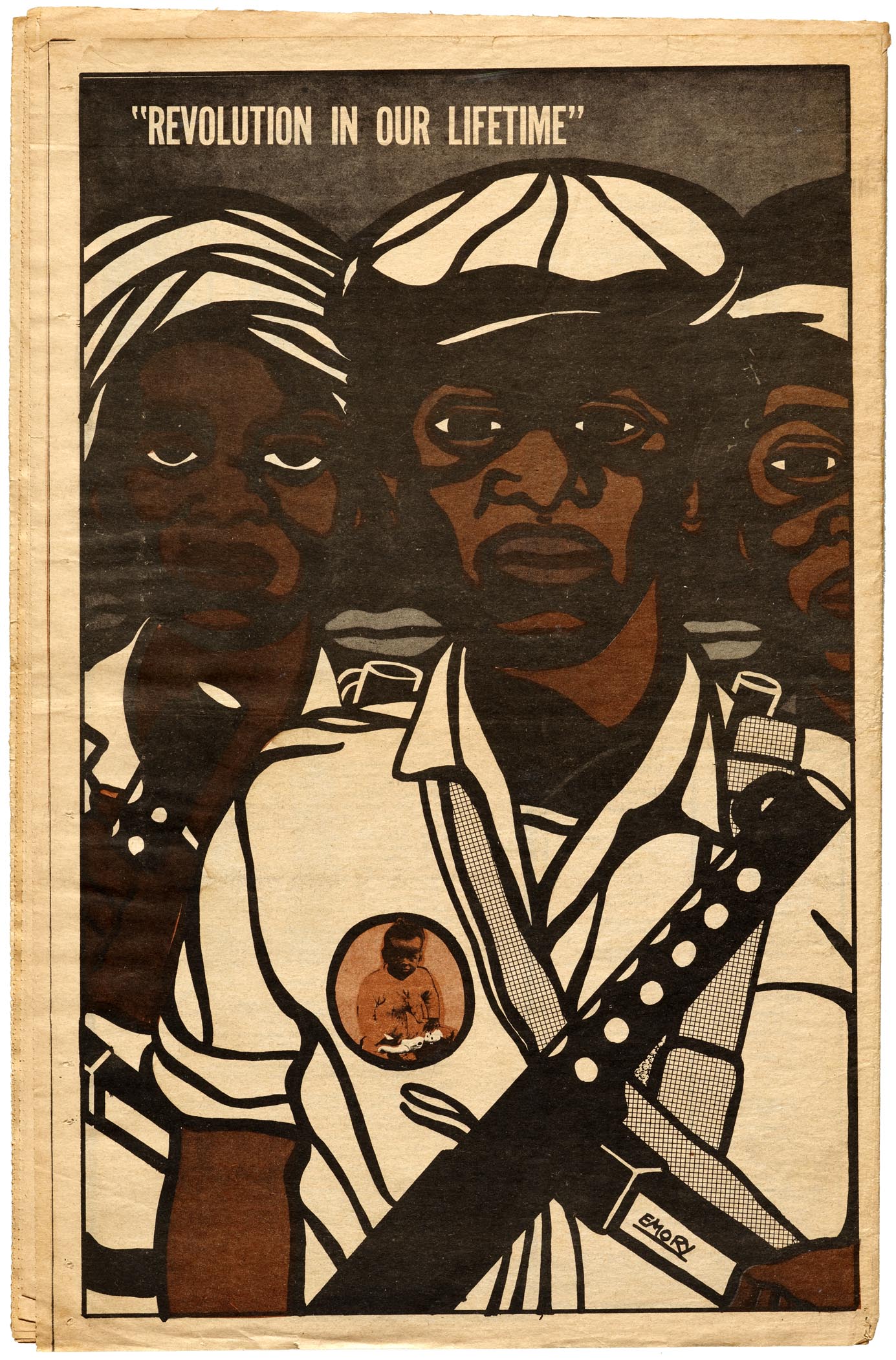
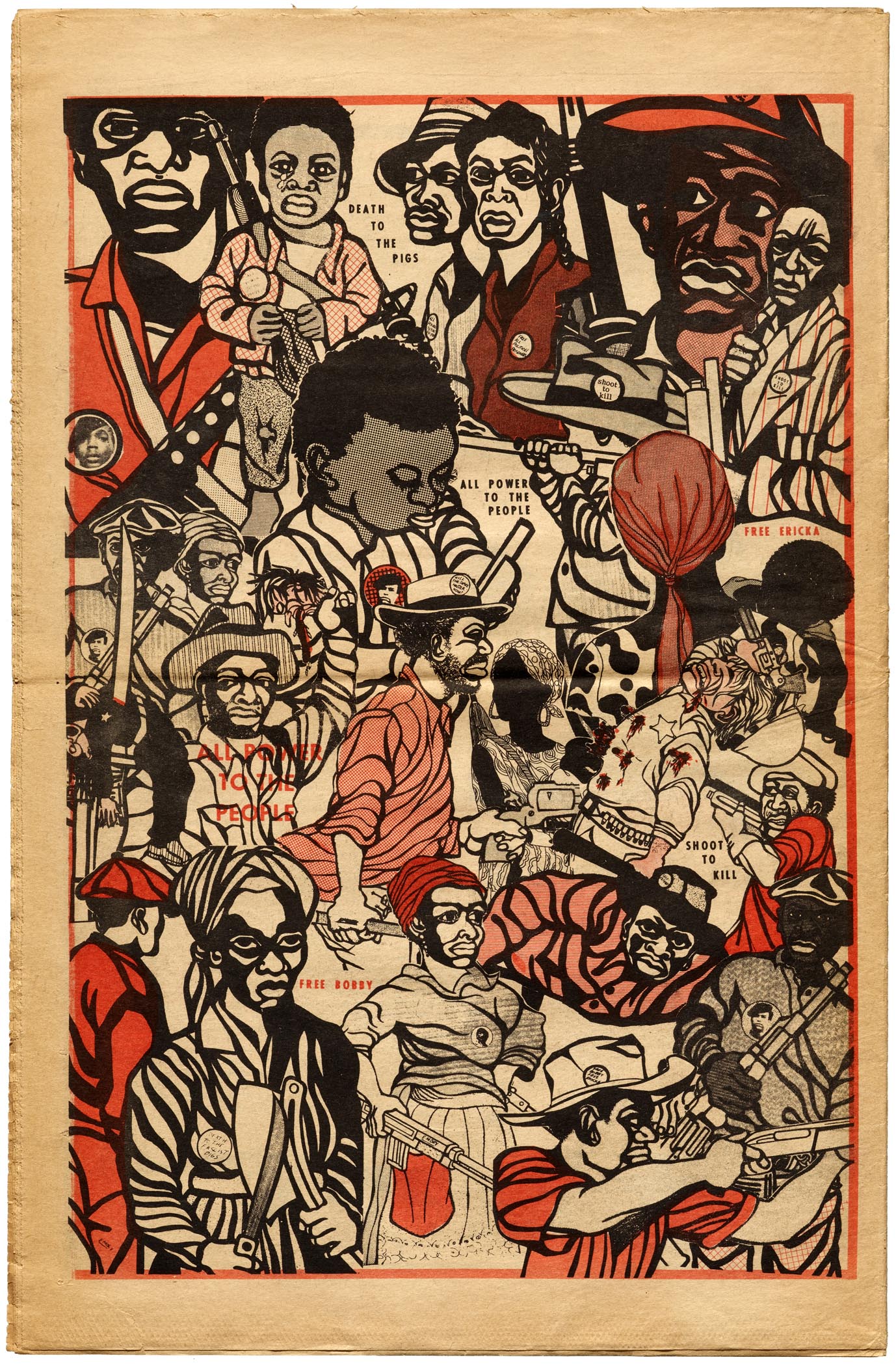
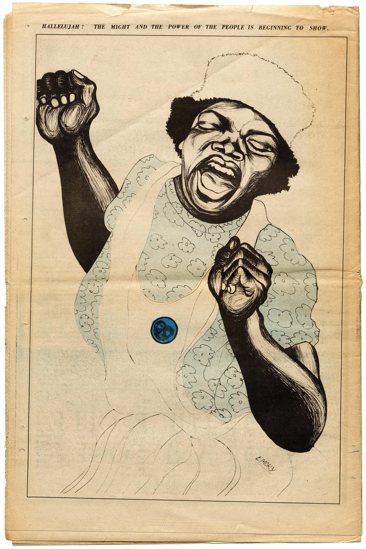
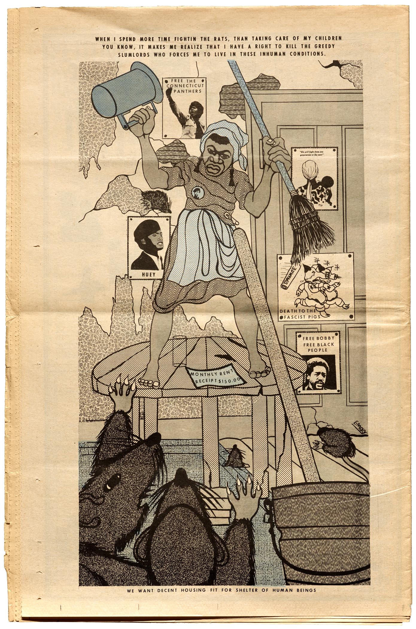
Each weekly issue of the “Black Community News Service” shone a light on the Black struggle, educated and organized the community, and promoted the party’s platform, the Ten-Point Program, which demanded full employment, decent housing, education, and health care. There were news stories and critical essays from party leaders, but it was Douglas’s graphical contribution, in the form of cartoons, collages, and a full-page illustration on each back cover, that struck a chord with the broadest audience.
“At that time the African American community was not a large reading community. They learned from observation and participation. So we had a lot of visuals that they could identify with. Photographs and short captions, as opposed to long, drawn-out essays and editorials. They were visual interpretations of the conditions people lived in. Inner cities, poor communities. Combined with revolutionary imagery. The people saw themselves in the artwork. They became the heroes. They could see their uncles in it. They could see their fathers or their brothers and sisters in the art.”
— Emory Douglas, interview with The Real News Network
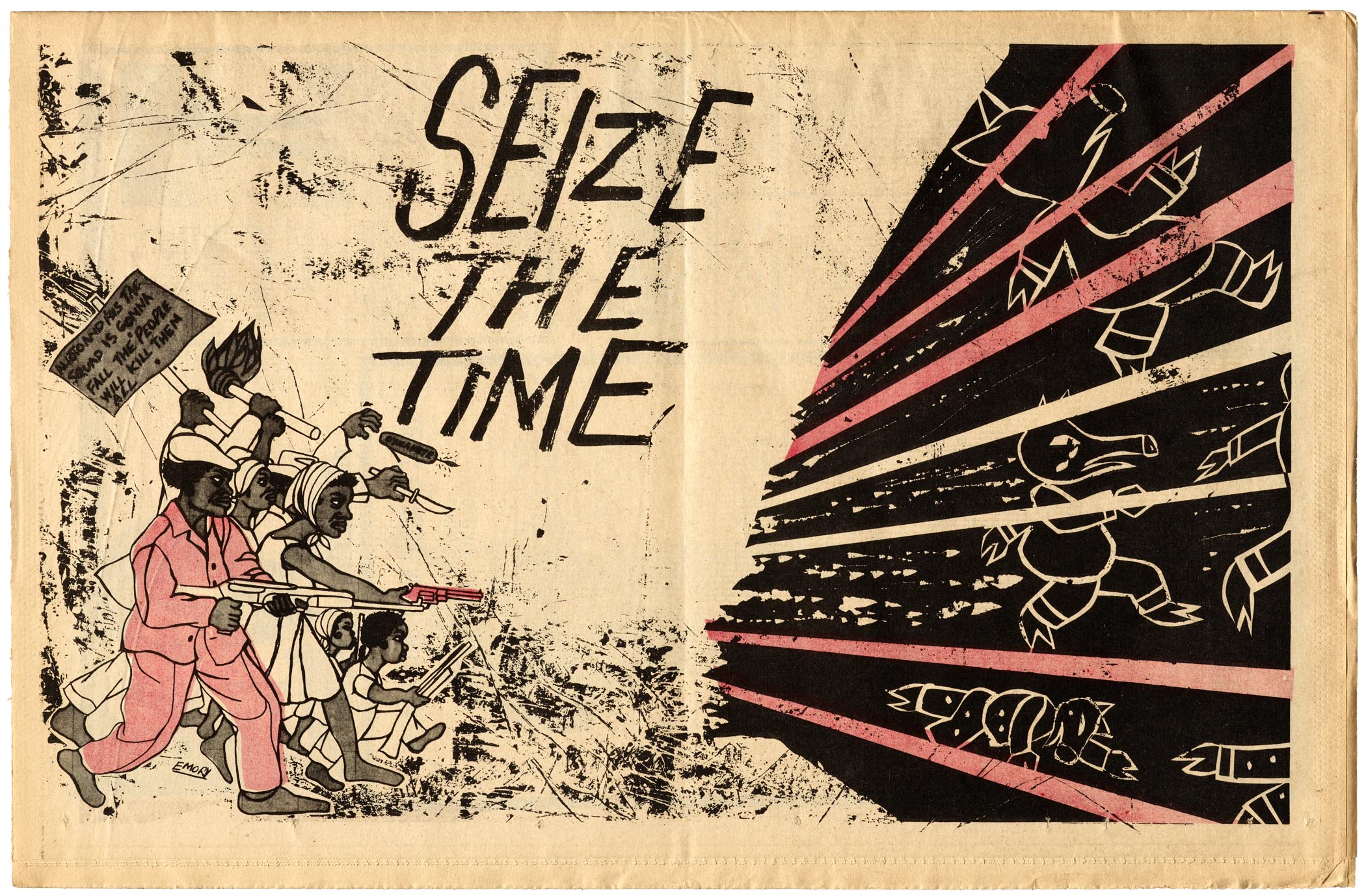
Douglas depicted those who abused their power as pigs and rats, while black people were shown as proud revolutionaries, defending their right to exist. Many of the images might strike some viewers as militant, but the objective was to convey the party’s belief in organized armed resistance as part of the solution to oppression.
“They believed in self-defense, which is a constitutional right — the Second Amendment of the Constitution gave me the right to bear arms. And they carried that out in an organized manner, a very disciplined and very organized manner. And that was the first phase of the Black Panther Party. But there’s also the phase of dealing with the social programs, the political solidarity, … and international politics as well. It was an organization for human rights.”
— Emory Douglas, interview with The Real News Network
High-res image gallery. Click to enter fullscreen view, then pinch or use browser to zoom.
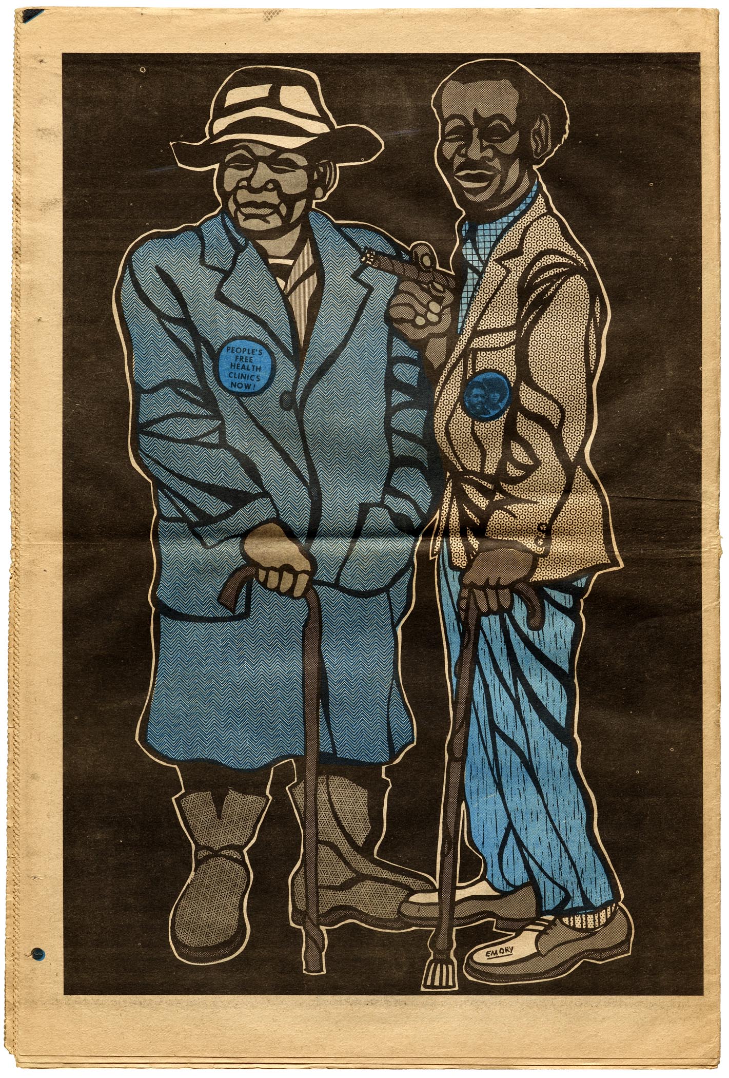
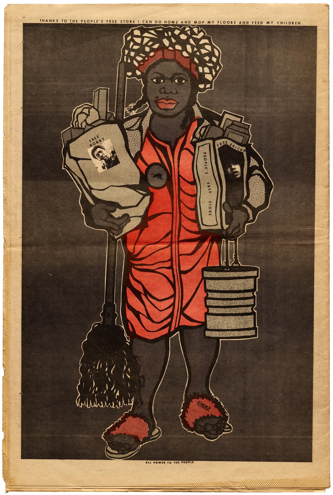
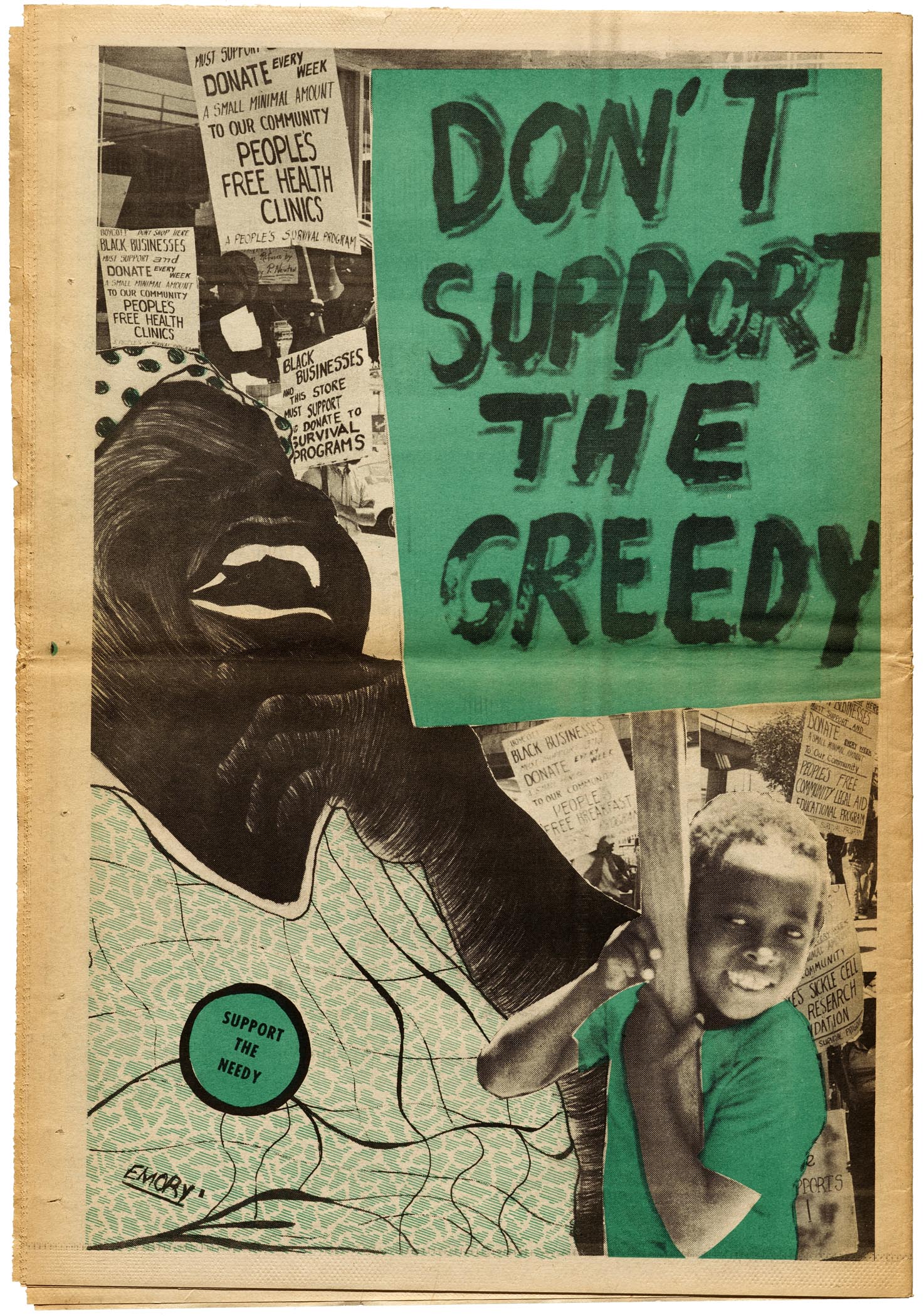
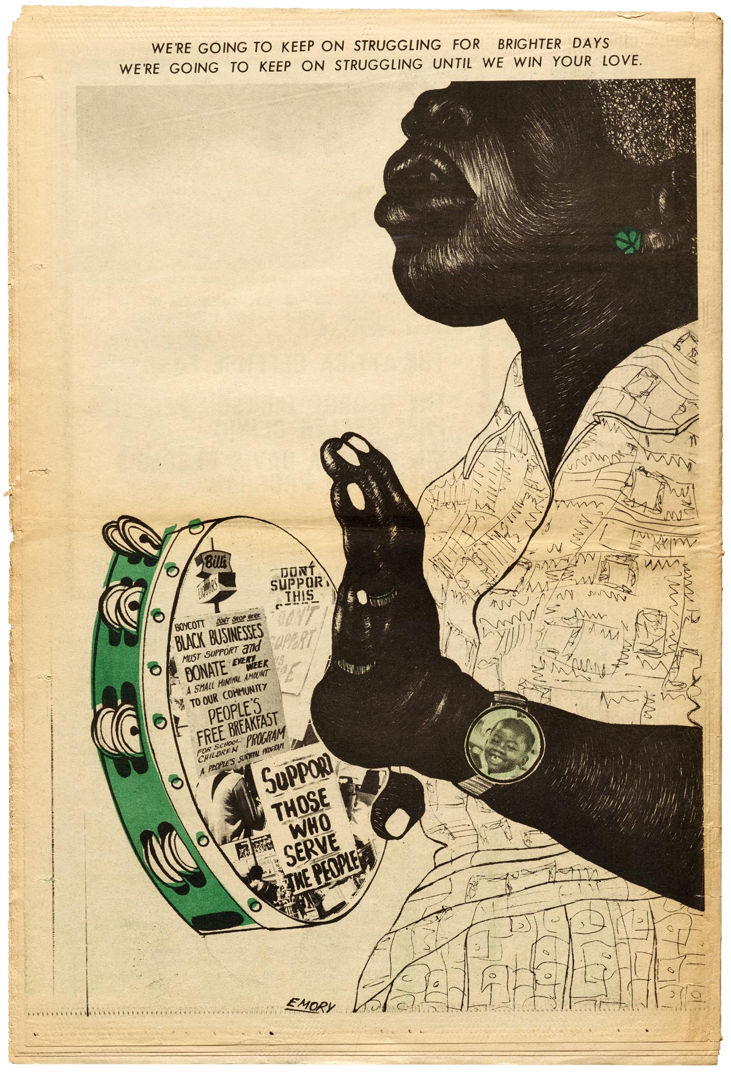
In the spring of 1971 the Black Panther Party’s message shifted from armed self-defense to community organizing. Some of Douglas’s more brutal graphics gave way to images of information, and even celebration. Douglas’s covers and posters promoted the Panthers’s political activities and social programs, like health clinics, schools, arts events, and the highly successful Free Breakfasts for Children which soon spread across the US, feeding over 10,000 kids every morning and serving as a model for lunch programs in public schools.
At its height, from 1968 to 1971, The Black Panther was the most widely read Black newspaper in the United States. In fact, it was among the most widely distributed publications of any kind, reaching a peak weekly circulation of more than 300,000, rivaling the major newspapers of most US cities. It was eventually distributed internationally, with multiple centers in the US, anchored by the main center in San Francisco. All this despite the FBI’s continued efforts to shut down the paper and the party. Douglas recalls the threats on the paper; lawyers had to accompany the deliveries from the press to the airport.
Cutting and Pasting The Black Panther: An Interview with Emory Douglas
Last week we had the honor to talk with Douglas about the production of the paper. He confirmed that the tools and materials of paste-up layout and photographic reproduction empowered their shoestring operation to get maximum impact with minimal expense.
“Initially, wherever we were set up, [usually someone’s home], that would be our production area. We used regular tables, regular lights, Elmer’s glue, rubber cement. We cut and pasted. We made up our own layout sheets. Non-repro blue markers. A lot of it was done on [an IBM Selectric] typewriter. We knew some folks in the publishing business, so every now and then we could get them to typeset the galleys. But we used pre-fabricated instant type that came on sheets from Formatt [a Letraset alternative]. It was economical, but it was also the best one because it had a line underneath the alphabet so you could set words without having to rub the letters off.”
The limitations of the production setup yielded results that came to define the visual style of the paper, especially as Douglas gained experience with each week’s issue. The thick marker lines of his woodcut-inspired drawings were not only graphically appealing, they also masked the imperfect registration of the newspaper press. Transfer film tints and patterns not only added texture to the artwork, they were an effective, low-cost alternative to multicolor printing. Most issues of the paper were one-color (black) or two-color (black plus one color).

By the early 1970s, the team was able to acquire their own phototypesetting gear: first an early paper-tape system purchased from Carlton B. Goodlett at the Sun-Reporter Publishing Company, and later a disk-based CRT machine from Compugraphic. Douglas favored basic, readable typefaces. Century for body text. Futura, Helvetica, and various gothics for headlines and posters. He continued to favor transfer lettering for full-page illustrations where the medium’s individual letters could follow the curve of a badge or weave between lines in an image.
“It was on-the-job training. We had to evolve as we went along. I had the theory, and some of the practice from going to various jobs when I was at City College, but then you had to apply that to the reality of being in charge of the production of the paper. What also helped was having the experience of working at community print shops, where you had to do high-end jobs without high-end equipment. They knew how to cut the corners and get the jobs done.”
Douglas also recruited other Black artists to contribute to the paper and taught them how to integrate messages of social justice into their work.
“Our philosophy was ‘each one, teach one.’ Some of them had even greater artistic skills than I, but they didn’t understand the political content. So [mentoring them] was my responsibility.”
Today, Douglas continues to serve as a mentor. He lectures, teaches workshops, and collaborates with artists and political activists around the world. In recent years he’s visited Australia, Argentina, Brazil, Colombia, Mexico, New Zealand, Portugal, and the UK. His work is universally relevant.
“The Black Panther still has great impact, particularly for artists who see what can be done with limited materials and black plus one color. They may not necessarily be doing the same type of work I’m doing but can relate to the aesthetics of it and the social commentary in it. You see young artists now doing work that is accessible, like silk screening. You got a lot of graffiti artists who acknowledge that the art that they do comes from the foundations of what we were doing. Because the community was the gallery then. We posted all over the neighborhoods. They see all these things as extensions of what their efforts are today.”
“Today the actual organization doesn’t exist, but it left a blueprint for people to be inspired by. The social program, being able to use my art to enlighten, and to inform, and educate – all that is part of the legacy. Art has relevancy, whether it’s to exploit you, or pacify you, or to enlighten you and inform you. It’s a legacy. That’s the power of it.”
In 2015 Douglas was awarded an AIGA Medal. The organization recognized him for “his fearless and powerful use of graphic design in the struggle for civil rights”. This week his work will join other Medalists for Letterform Archive’s exhibition at the AIGA Design Conference in Minneapolis.
— Stephen Coles, Associate Curator & Editorial Director