News
This Just In: Paul Rand
Hundreds of items from Rand’s archive, including process material and personal copies of his work, encapsulate a radiant career.
When visitors make requests for Letterform Archive tours and research visits, we hear one name more than any other: Paul Rand. We’ve always had a few special things to show them: brand guides for IBM and NeXT, packaging for Selectric font elements and Producto cigars, and some key poster and book designs. The latest addition, however, brings us a significant collection from his own archive, giving visitors unprecedented access to his work.
There is no doubt about the perfection of Paul Rand’s work. It is somehow unnatural that hardly any difference exists between his work in the beginning and at the end of 50 years. — Takenobu Igarashi
Timelessness
No American graphic designer is more documented and celebrated than Rand. Over his 70-year career, he excelled in every aspect of the field, personifying 20th-century modernism, and influencing countless designers through his work, teaching, and quotable insights. There is nothing we could say about Rand that hasn’t been said before. What we can do is highlight a few objects from our new collection that illustrate some of the principles that characterize his remarkable output.
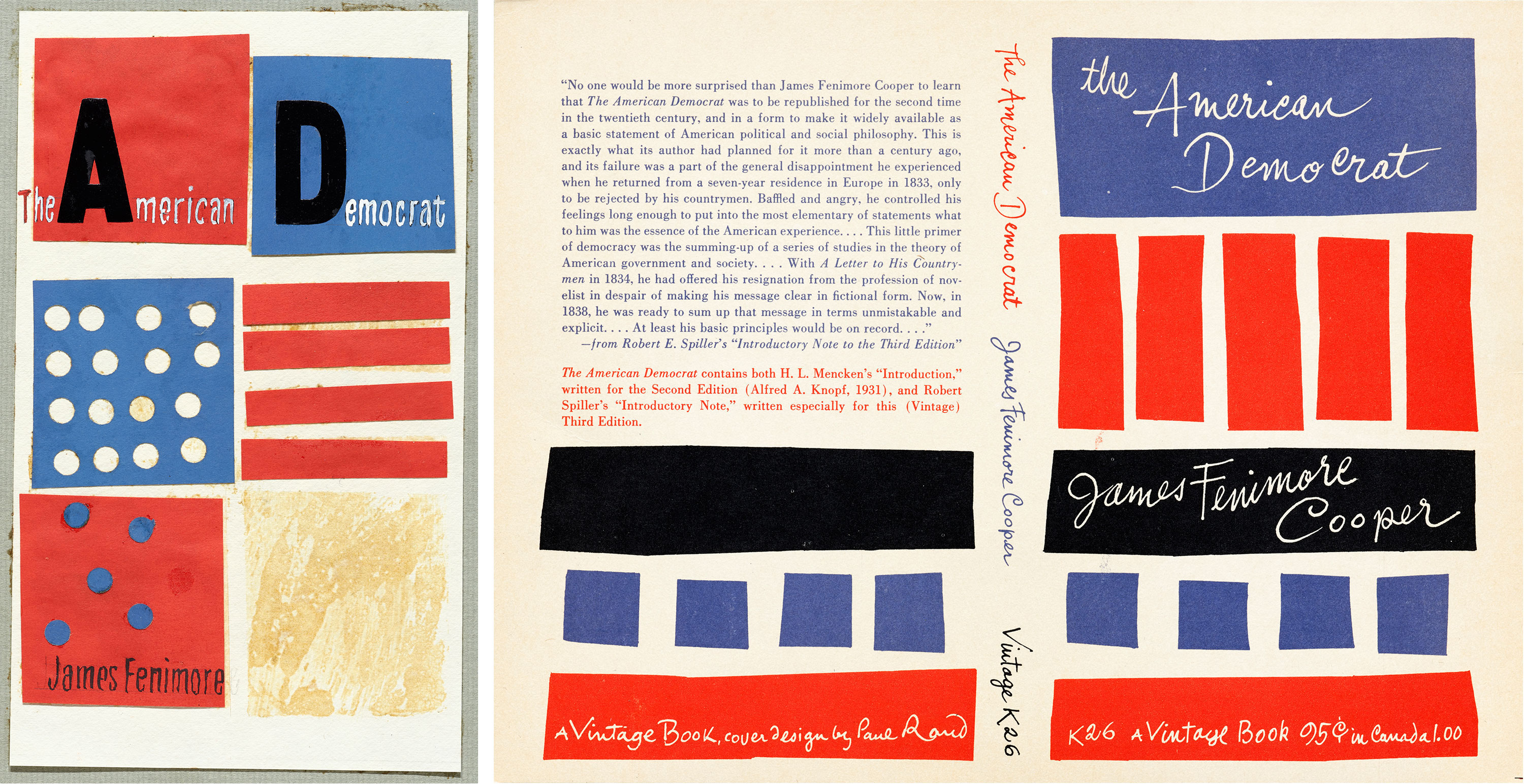
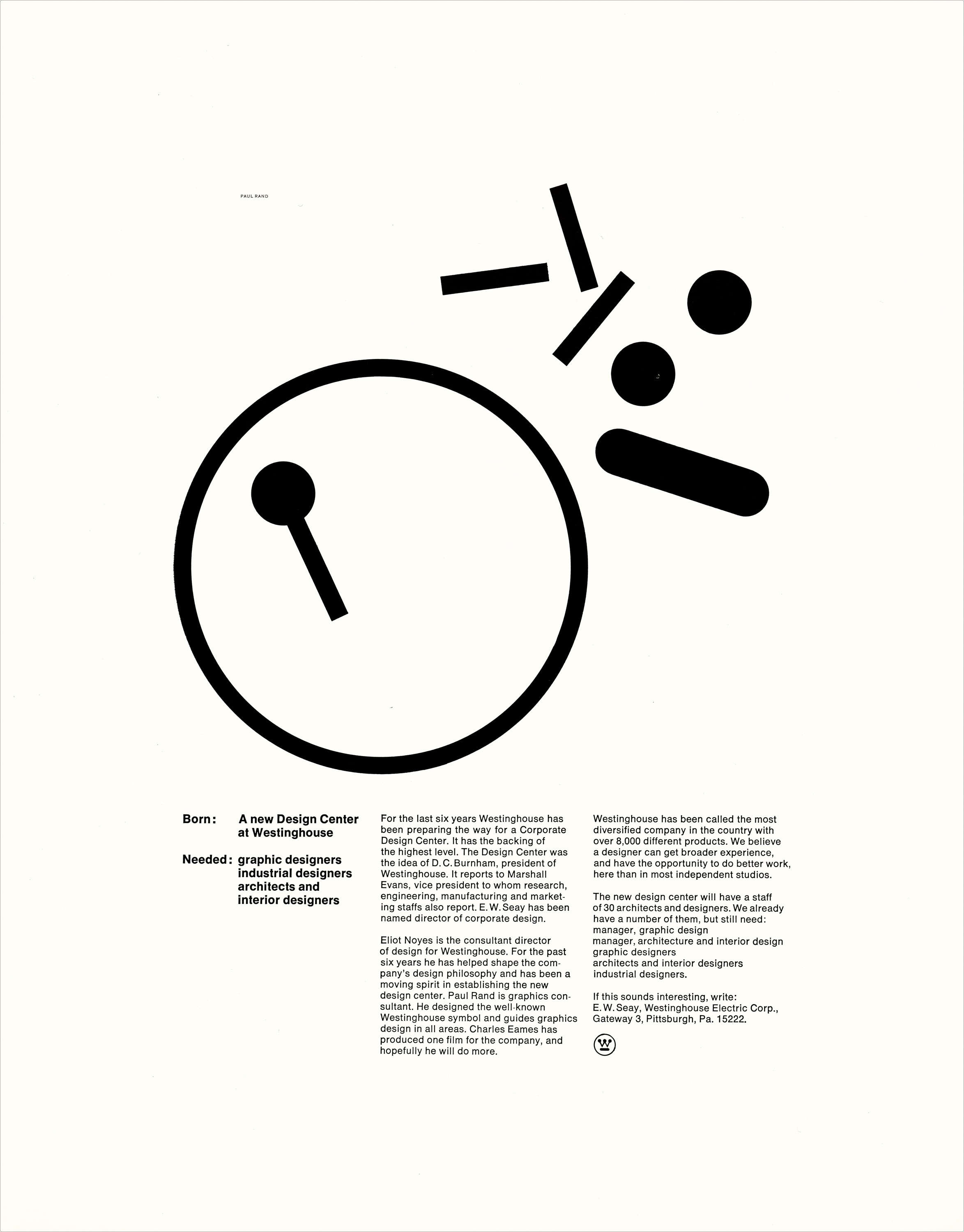
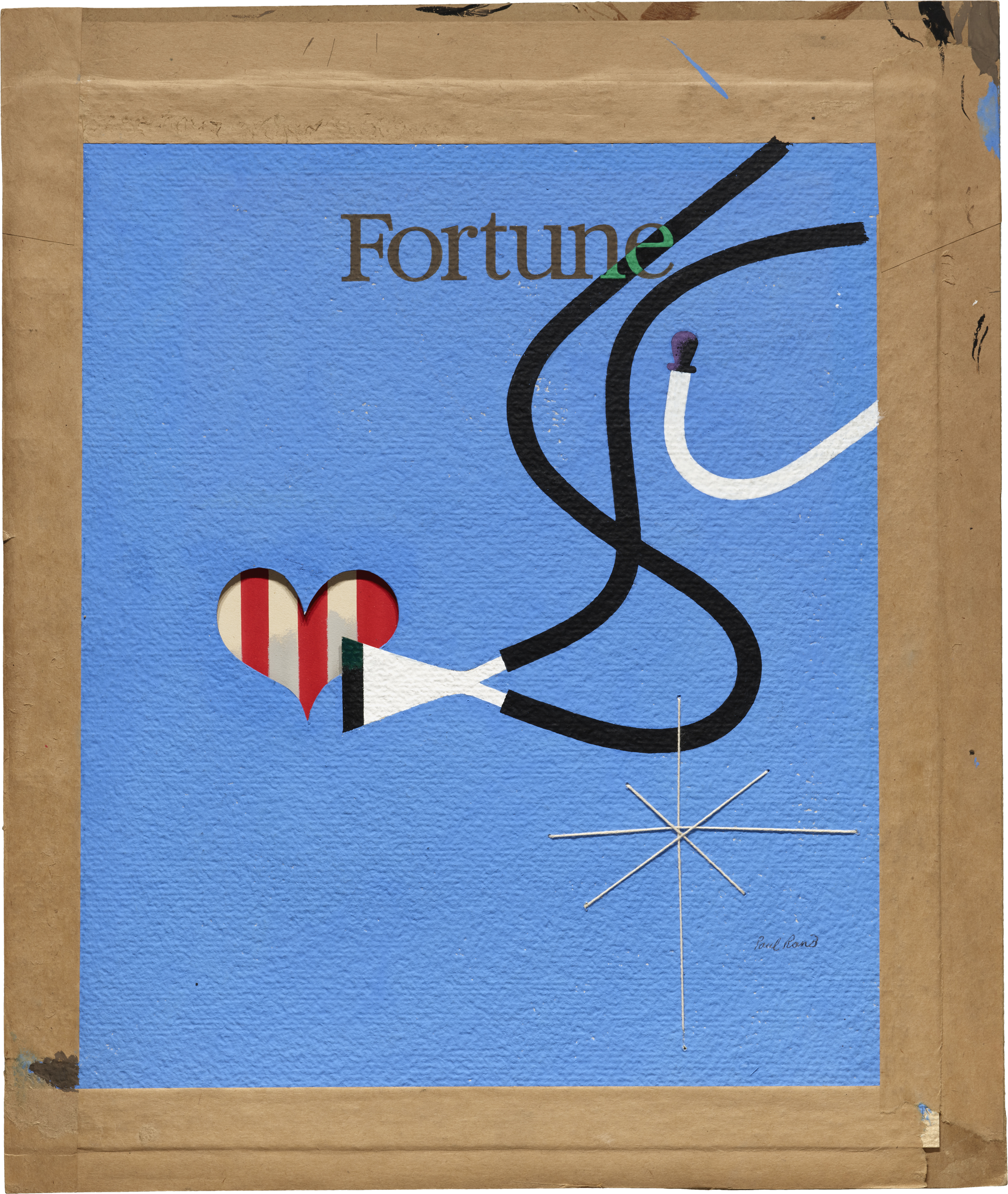
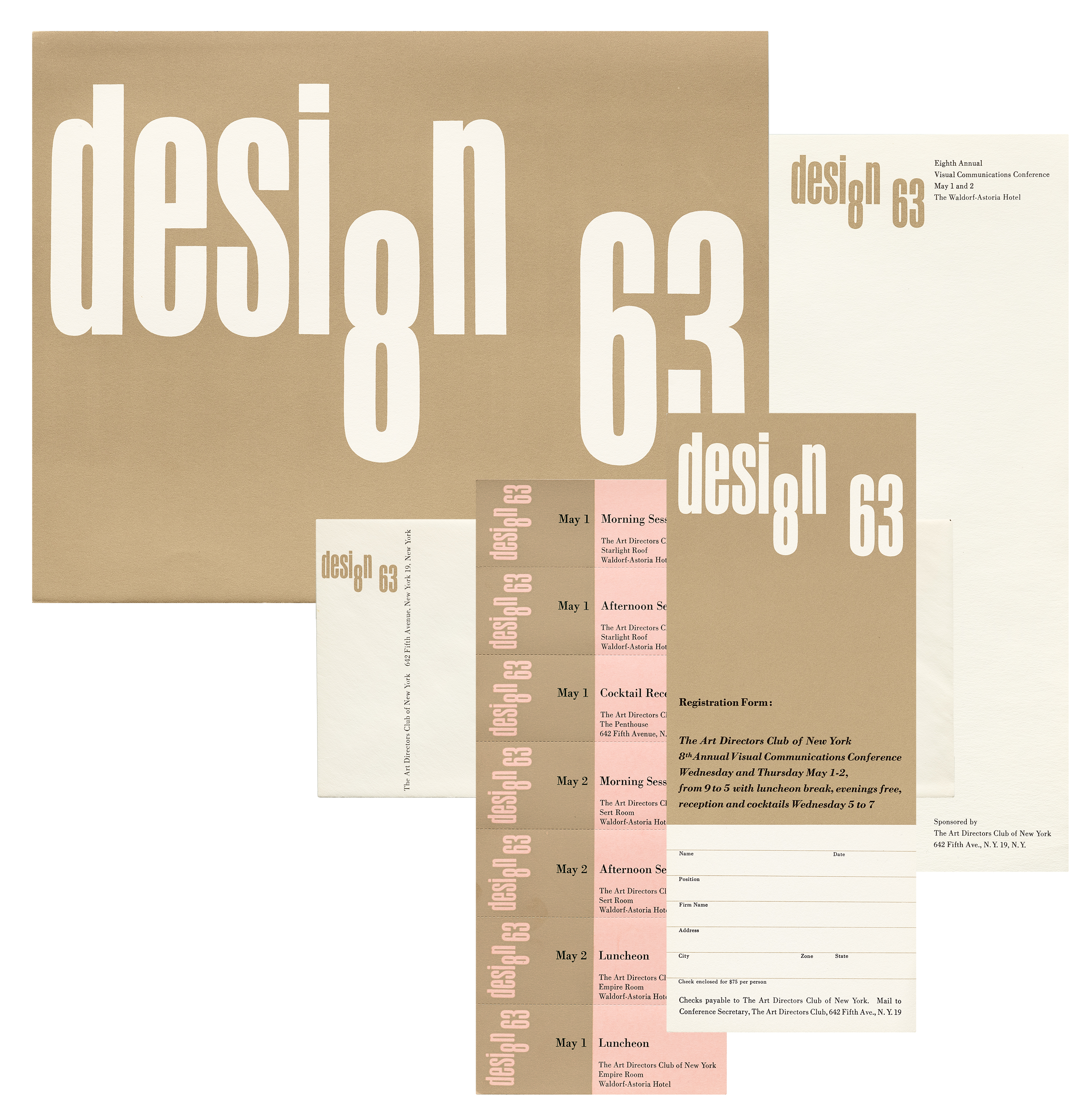
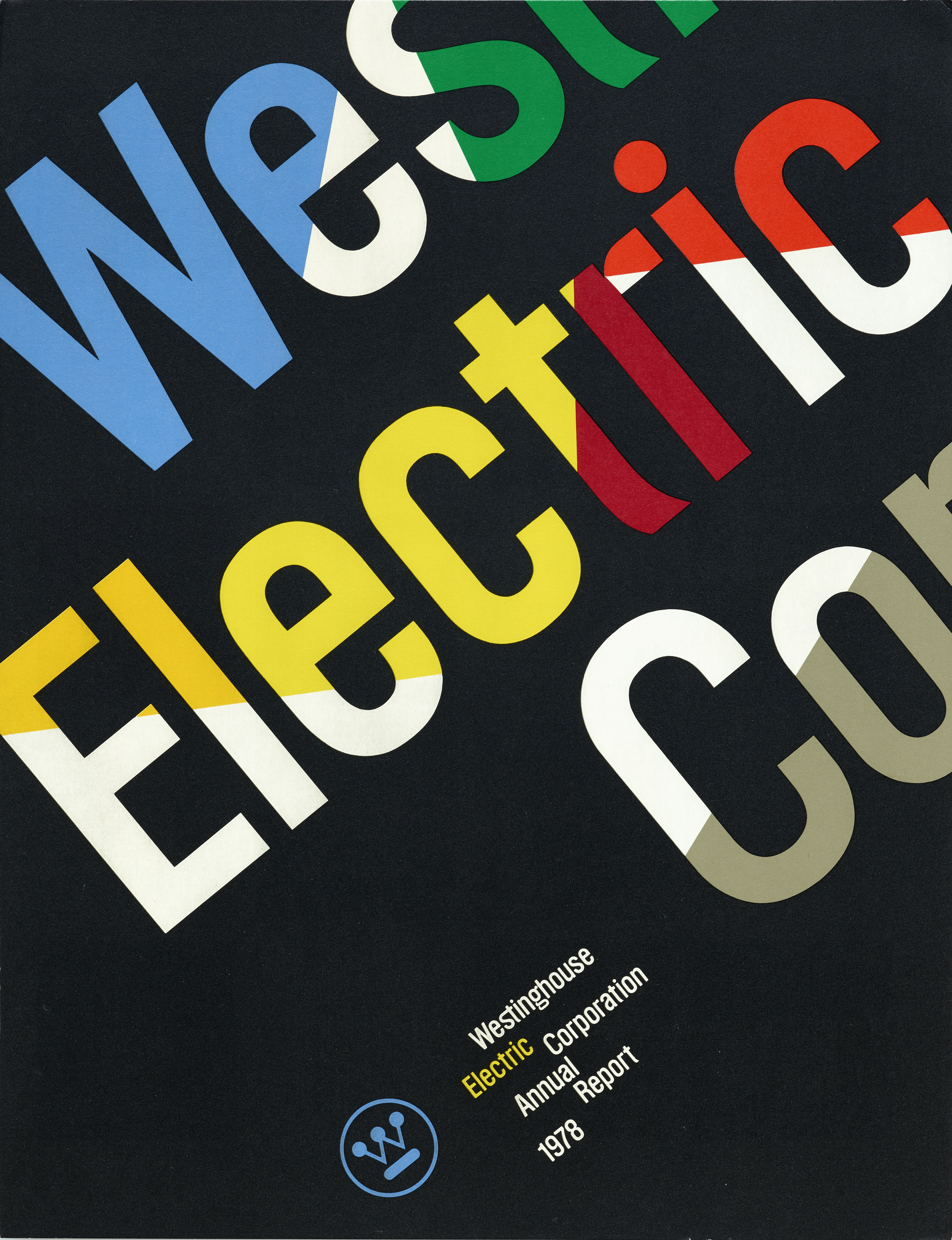
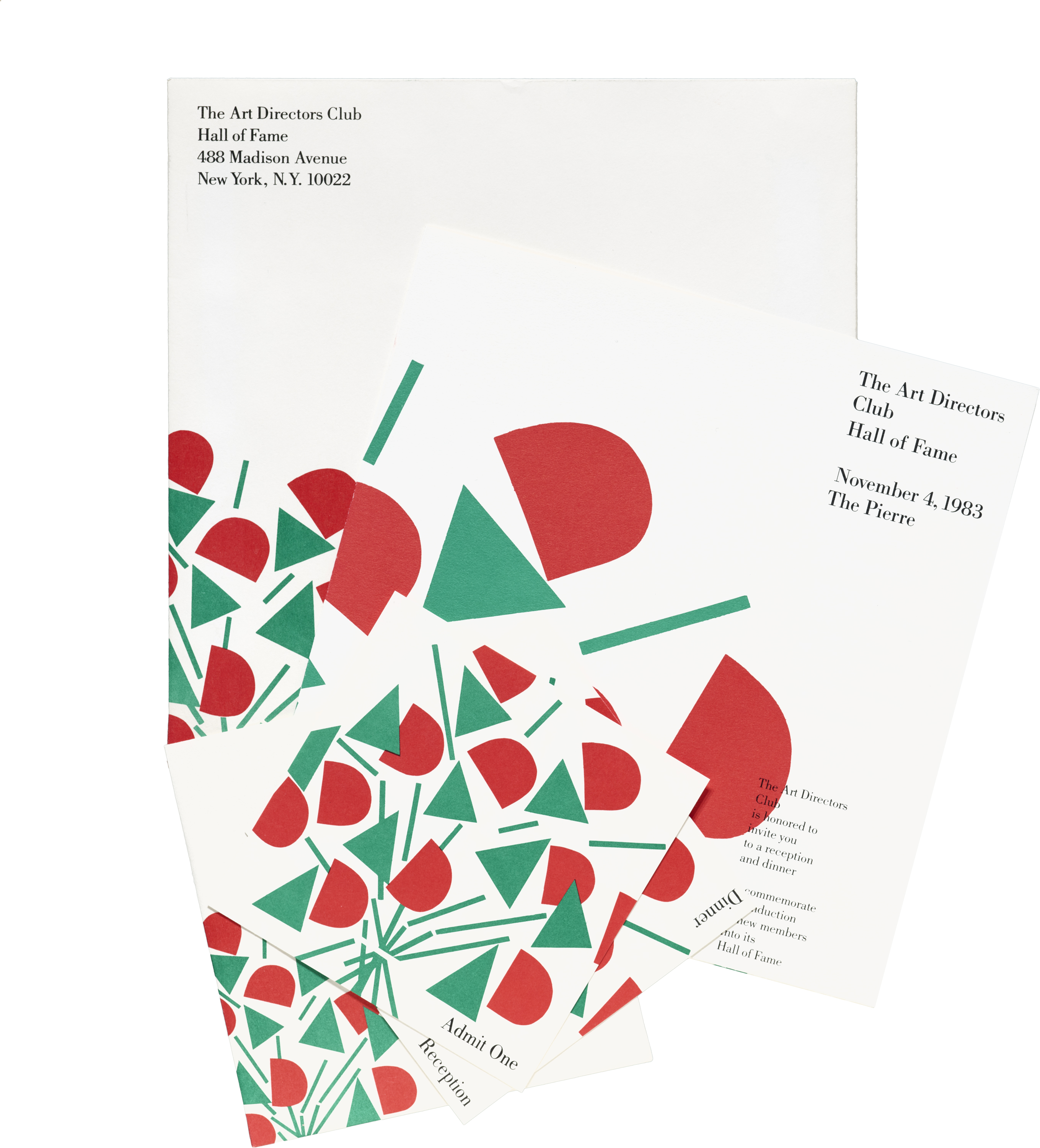
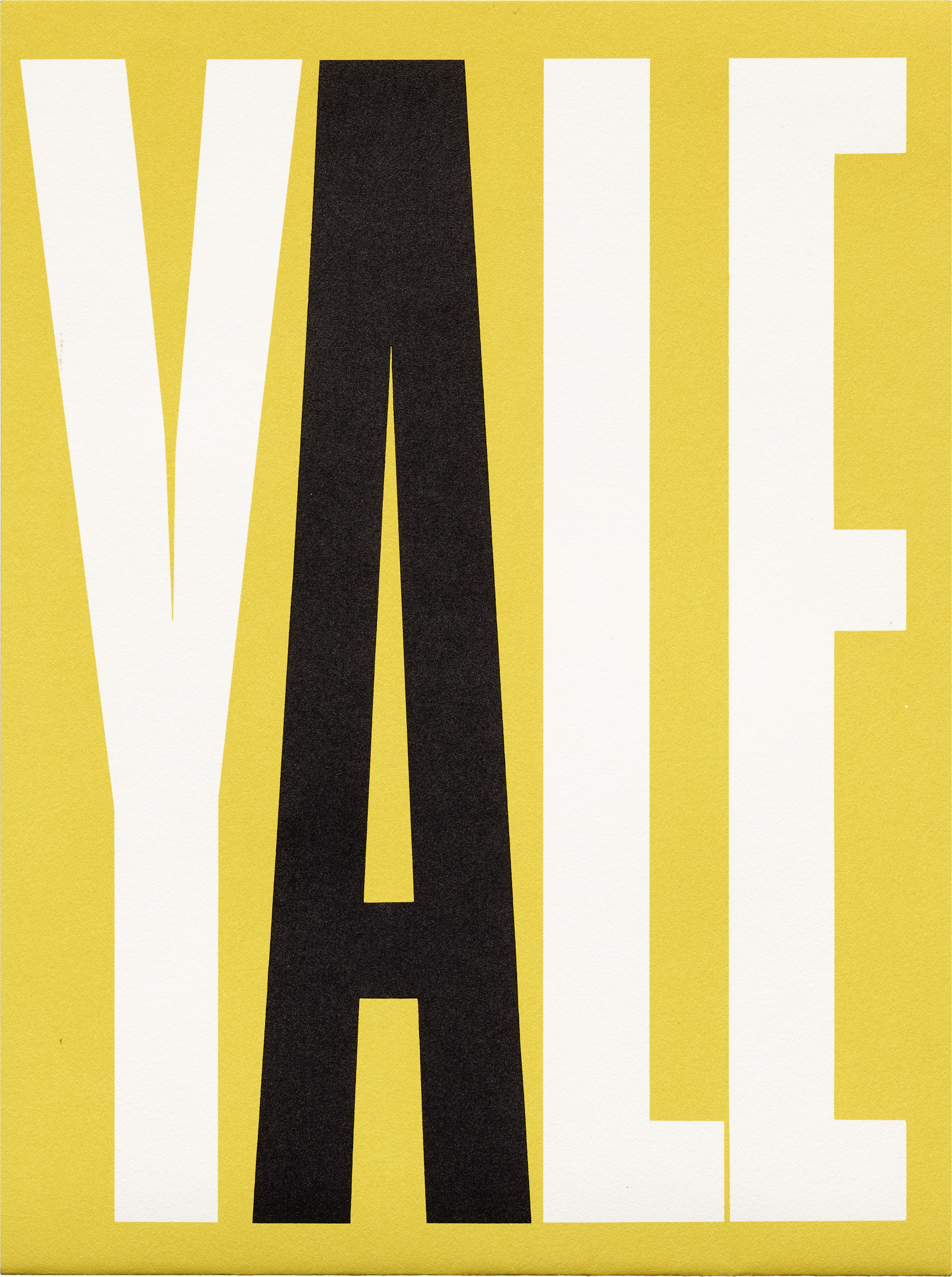
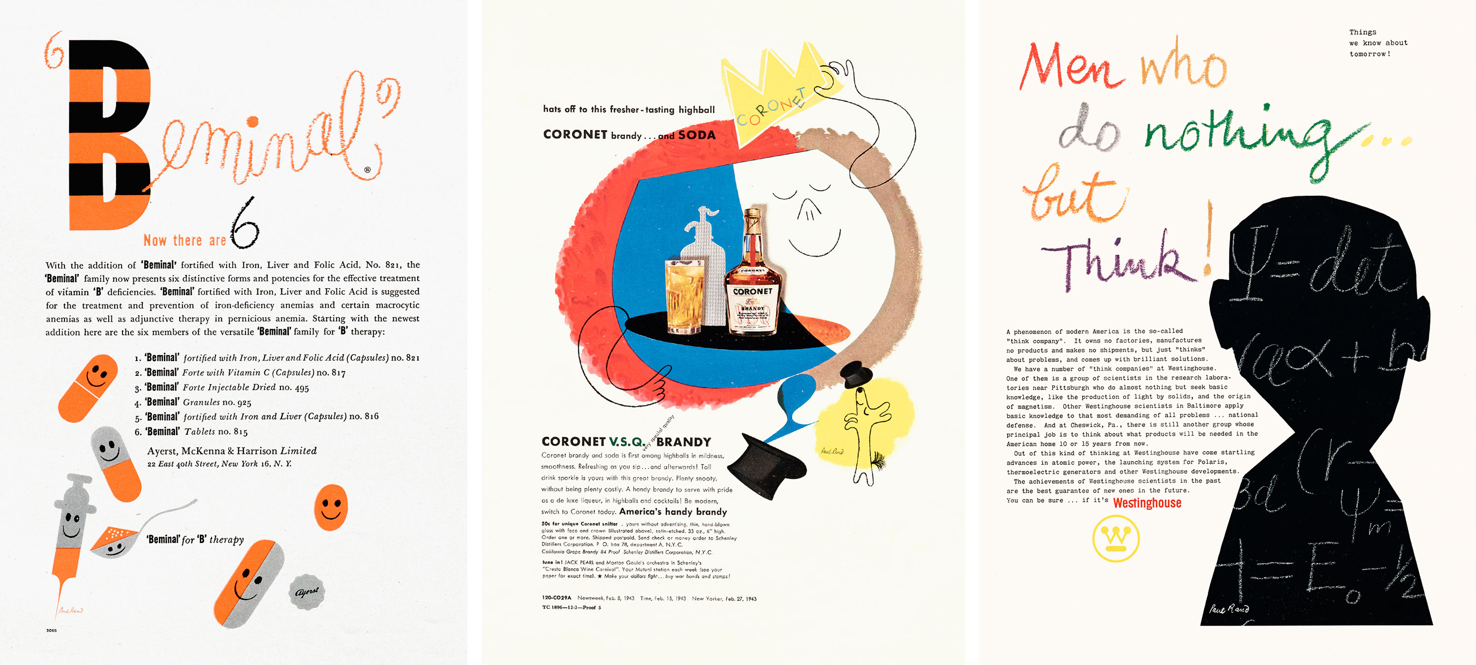
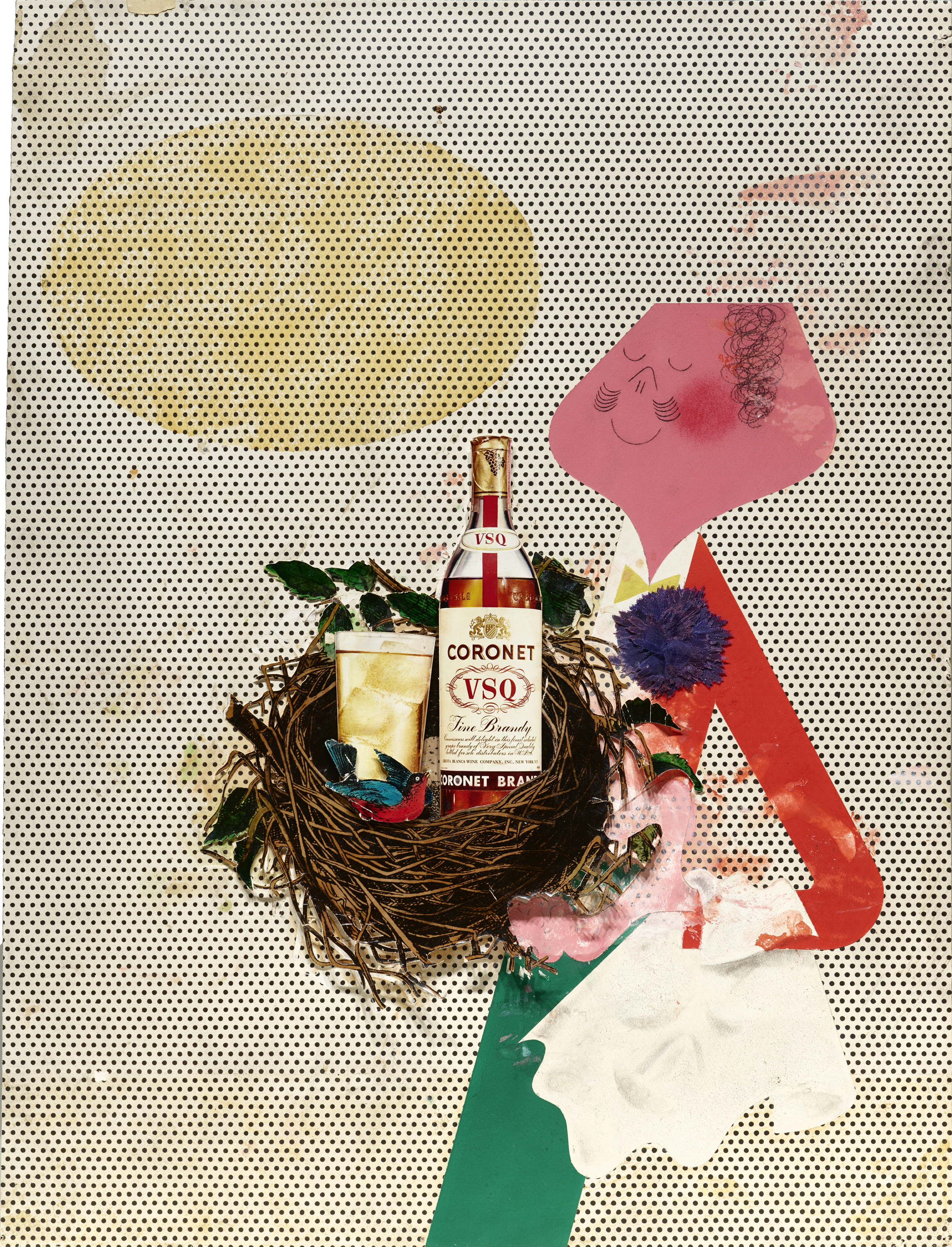
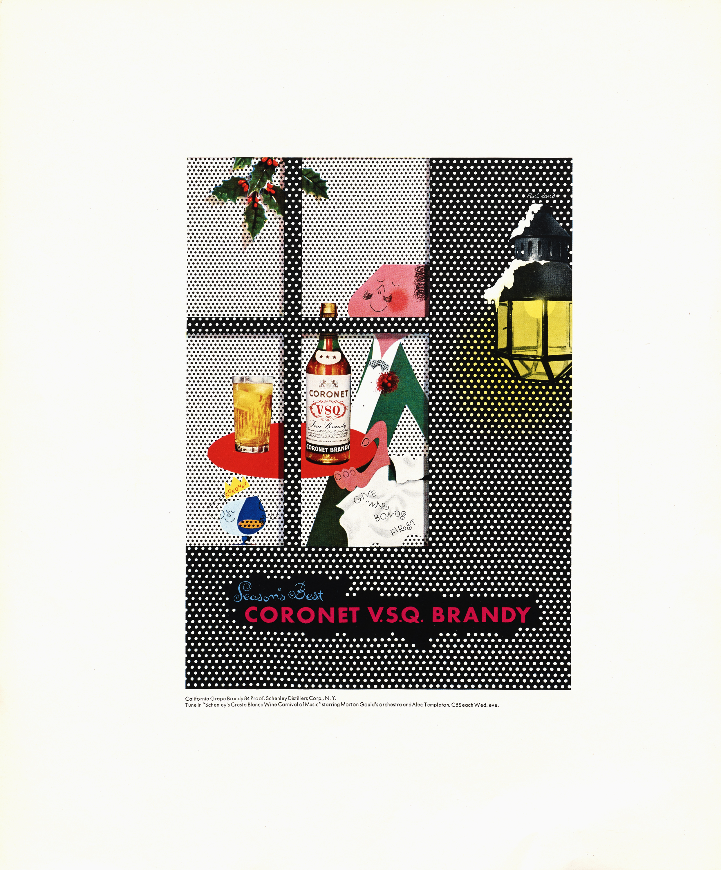
Most notable among these principles could be timelessness, an elusive ideal that is especially difficult to achieve in graphic design because the craft is chiefly about communicating a particular message for a particular time and place. Rand’s design always expresses modernity, but so much of it seems to evade an obvious date. That feeling is even more apparent to us at the Archive where we can look at a piece within a broad collection of work. You can often tell that something was made by Rand, but it’s not often clear when he made it. For example, these items for Fortune (1950), Westinghouse (1962, above, and 1978), the Art Directors Club (1963 & 1983), IBM (1972), and Yale (1994) are as striking and current today as they were when they were first published.

Simplicity is never a goal: it is the byproduct of a good idea and modest expectations. — Paul Rand
Simplicity
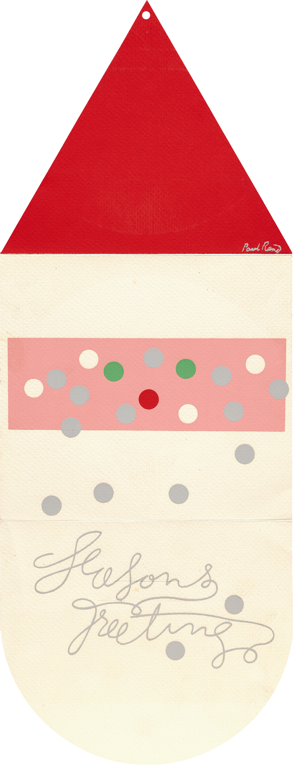
Integral to Rand’s timelessness is simplicity, a reduction to the barest necessity for immediate communication. You can find this in all his work, from book and magazine covers to packaging and advertising, but it’s most evident in his trademark design where he sought for instant recognition, for something anyone can understand — no matter their age or background. In fact, his daughter sometimes served as expert and critic on his initial sketches. This included one of his highest profile designs, the UPS logo.
“I said, ‘Catherine, what’s that?’ She said, ‘That’s a present, Daddy.’ I said, ‘Perfect.’ I am not particularly interested in those fancy solutions to trademarks, this tendency to be as circuitous as possible to attain the most ‘elegant’ kind of solution. Real elegance doesn’t scream. It’s very modest.”
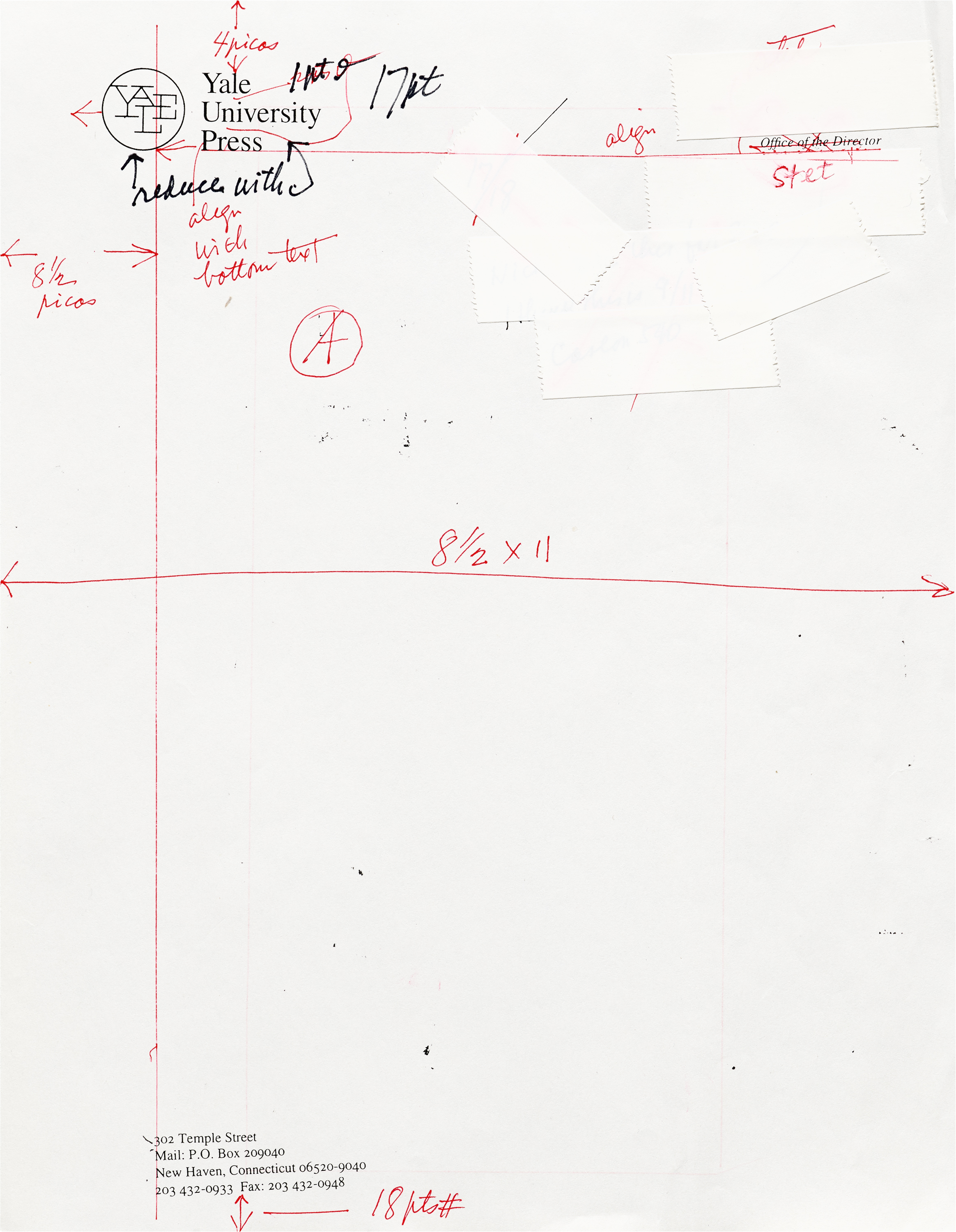
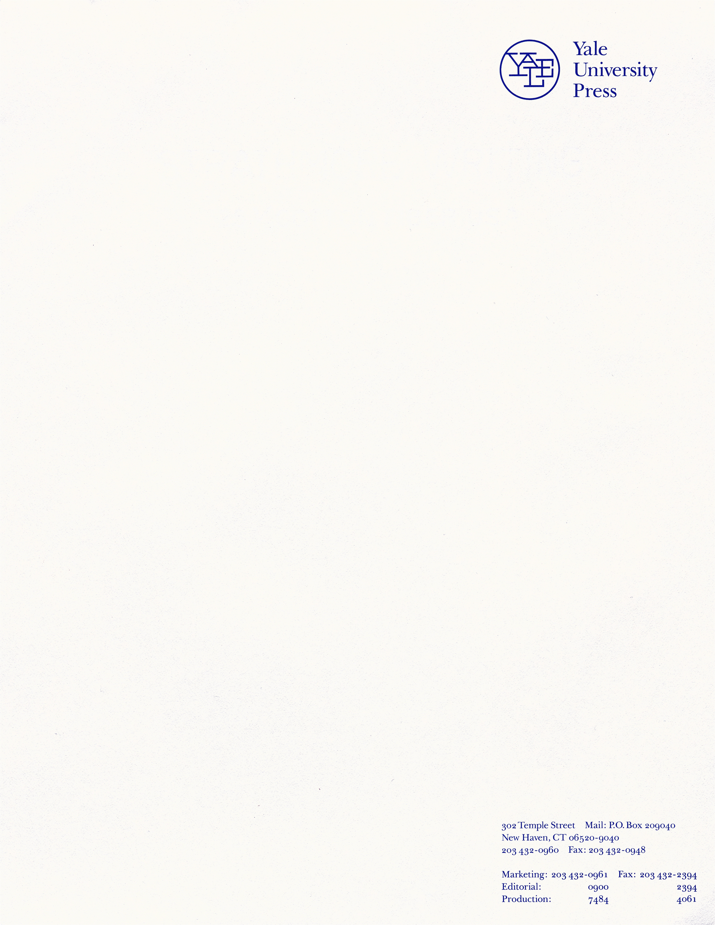
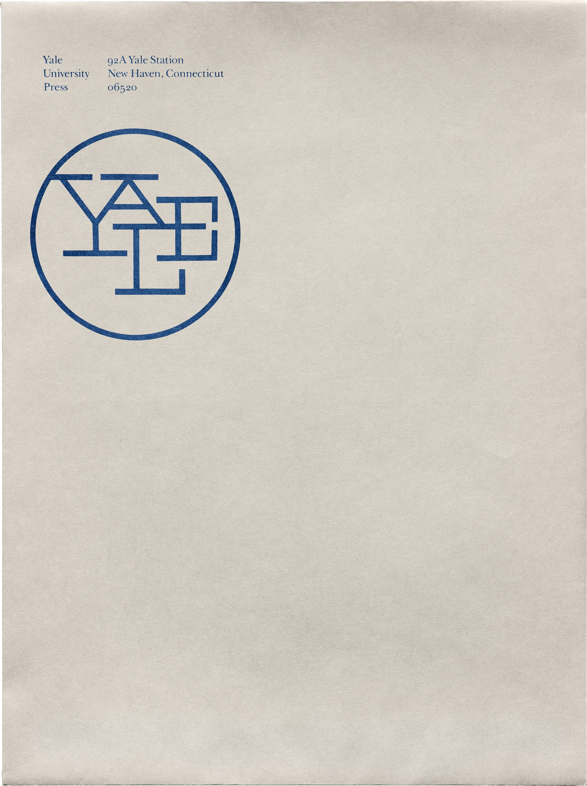
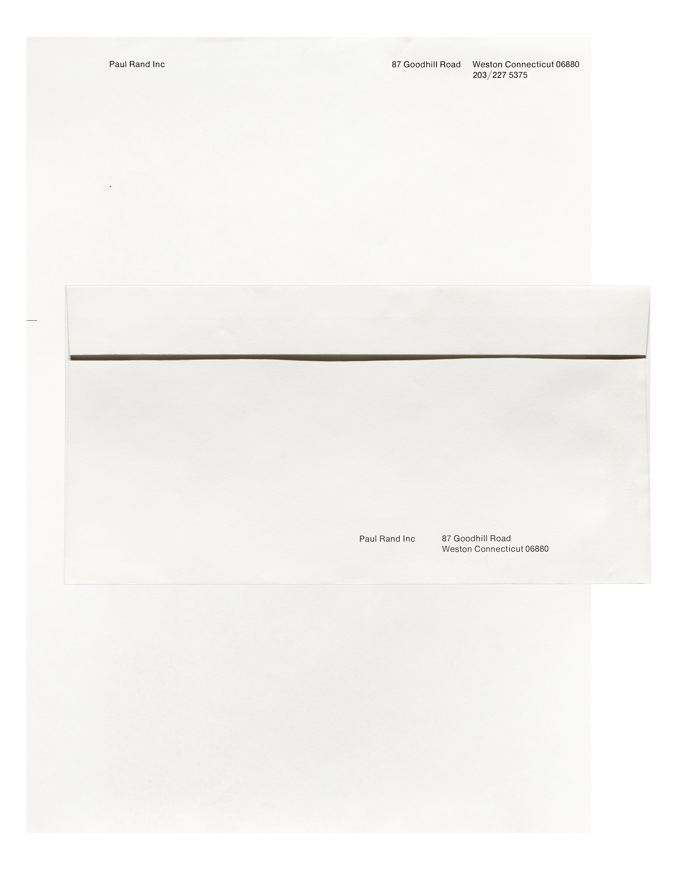
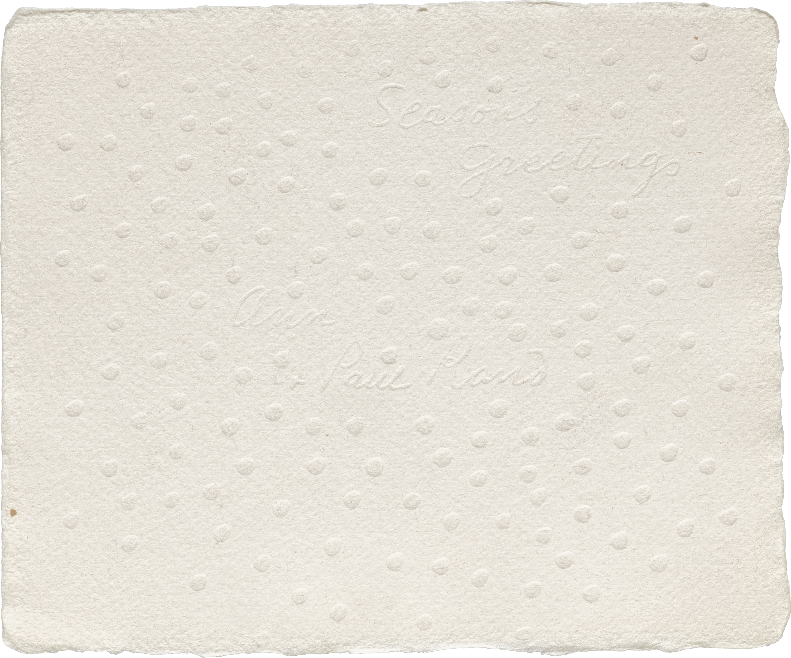
Our Rand collection includes dozens of objects related to identity design, including annual reports, brand guidelines, logo presentation books, stationery, and collateral for companies like Cummins, IBM, Mossberg & Company, USSB, Westinghouse, Yale University Press, and Yale University School of Art — as well as cards, envelopes, and letterhead for his own practice.

I steered towards humorous things. People who don’t have a sense of humor really have serious problems. — Paul Rand
Playfulness
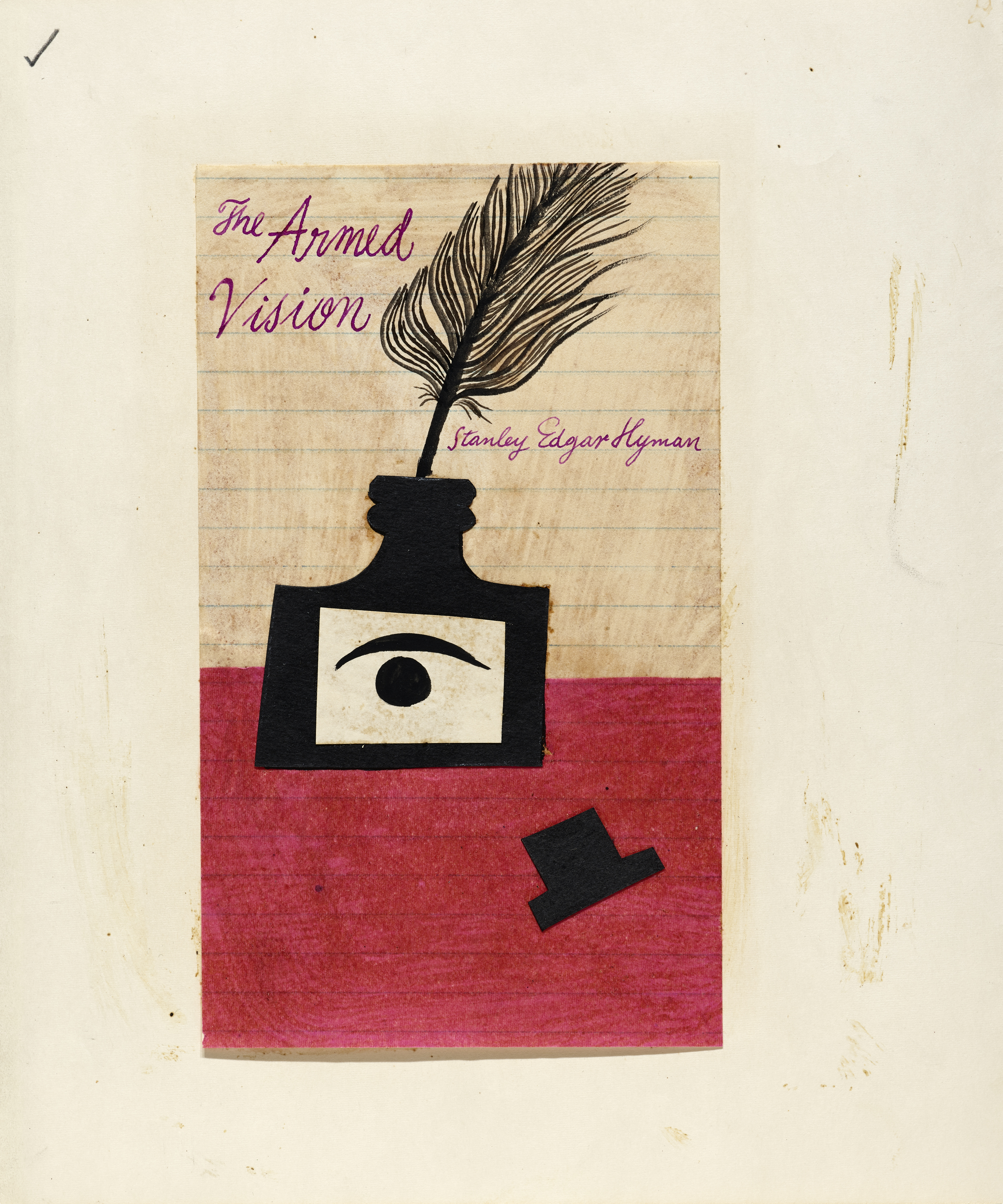
One descriptor that frequently pops into mind when looking at Rand’s design is playfulness. Rand favored bright colors. He preferred humor over sobriety. The liveliness and warmth of his work is also owed to the critical role handwork played throughout his career. He drew comical illustrations, cut organic shapes from paper, and scribbled rough-and-ready lettering. Influenced by the minimal, dynamic forms of artists like Hans Arp, Paul Klee, Henri Matisse, Joan Miró, and Pablo Picasso, he elevated graphic design to the realm of modern art. The informality of his hand work often carried through to the final printed piece, but it’s especially illuminating to see his eye and mind at work through his sketches and comps.
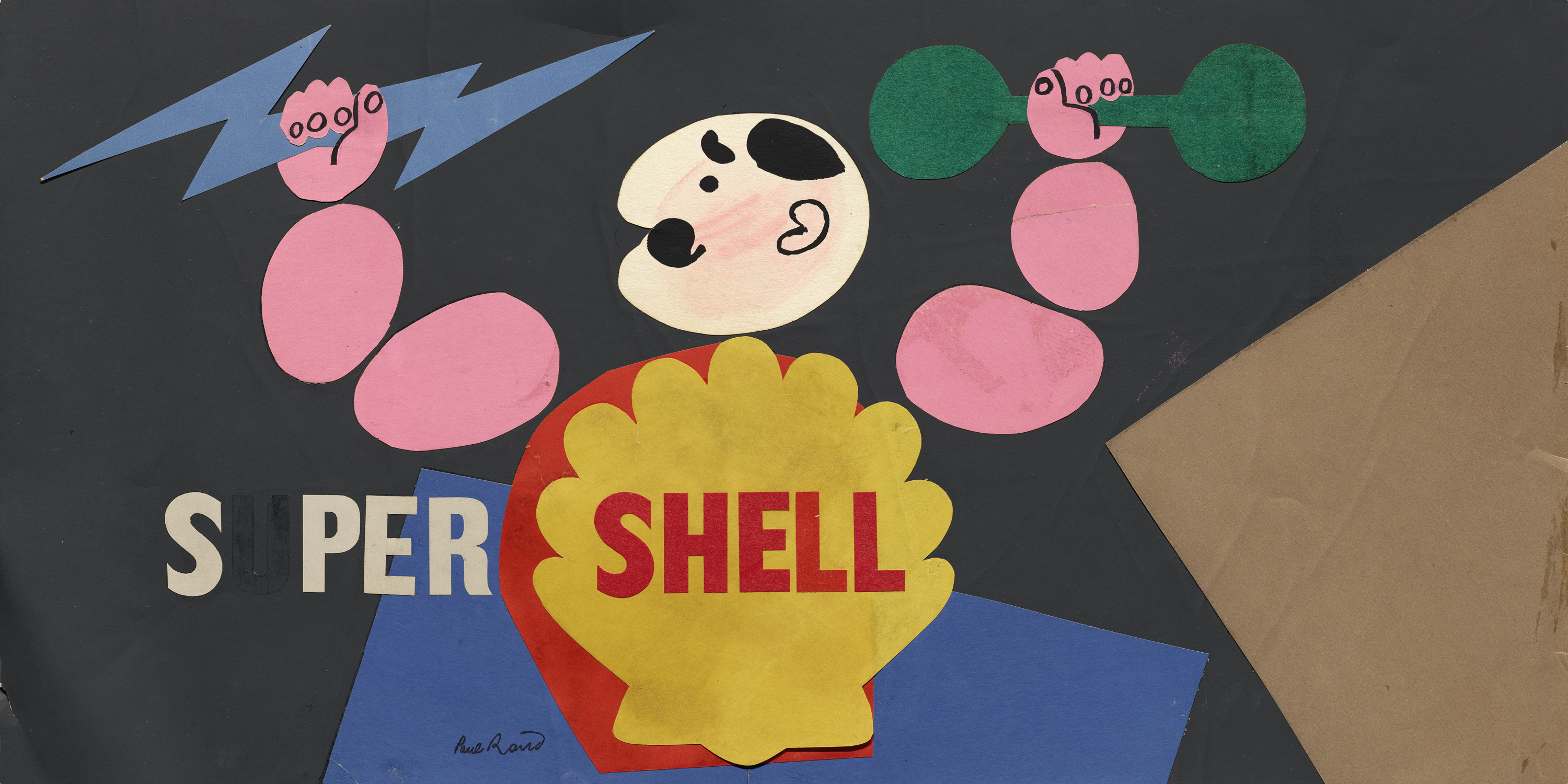
Besides the objects that are drawn or painted by hand, we’re also fortunate to have plenty of other process material in this collection, including pasteups, marked up proofs, progressive color proofs, and even a scale model for IBM building signage.


Back then you didn’t use rub-on type, or photostats. Everything was drawn. Drawing letters to make you sensitive to curves. Like [Josef] Albers used to say, “Come on, fellows, get out of your steel suits and work.” Relax and be able to move your hand around. — Paul Rand
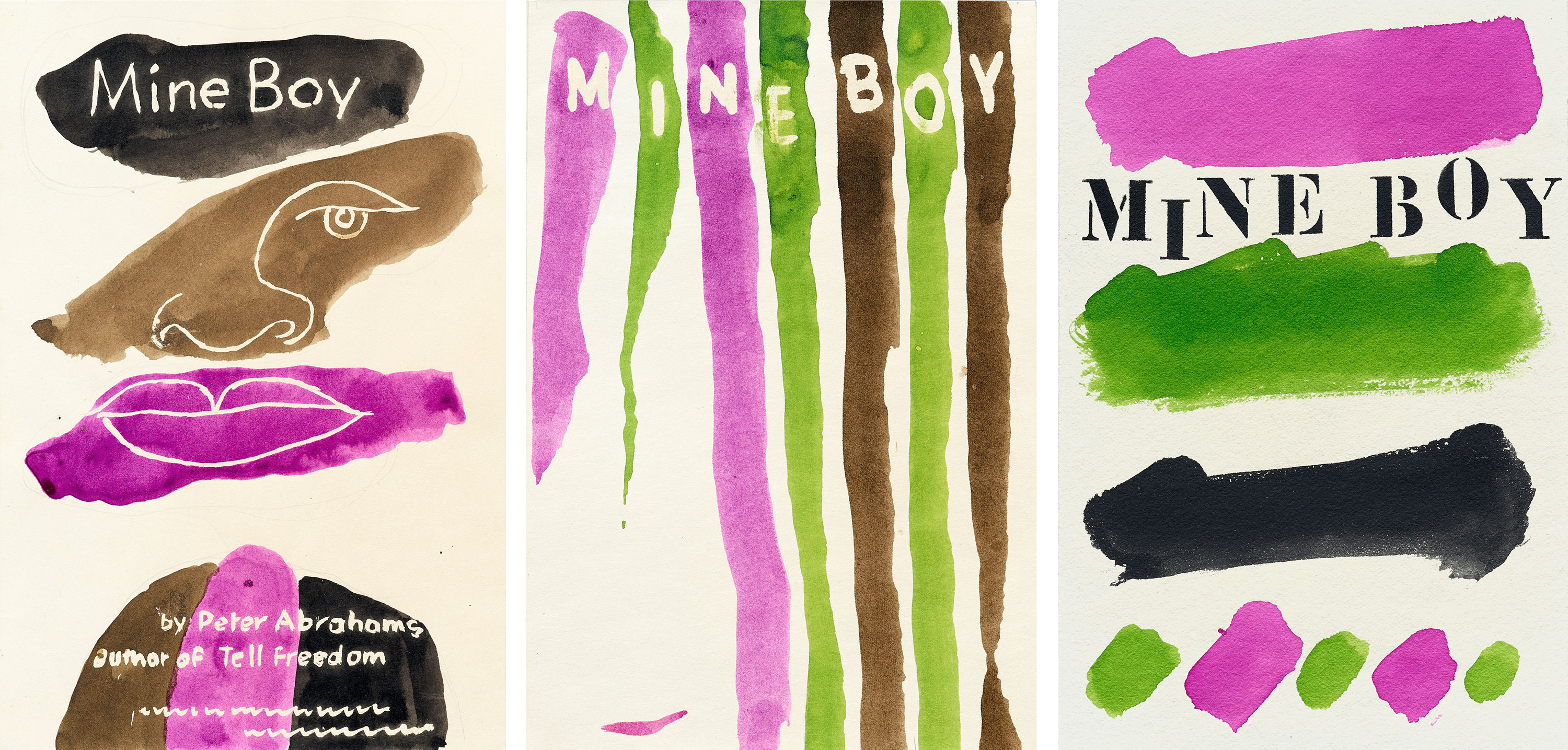
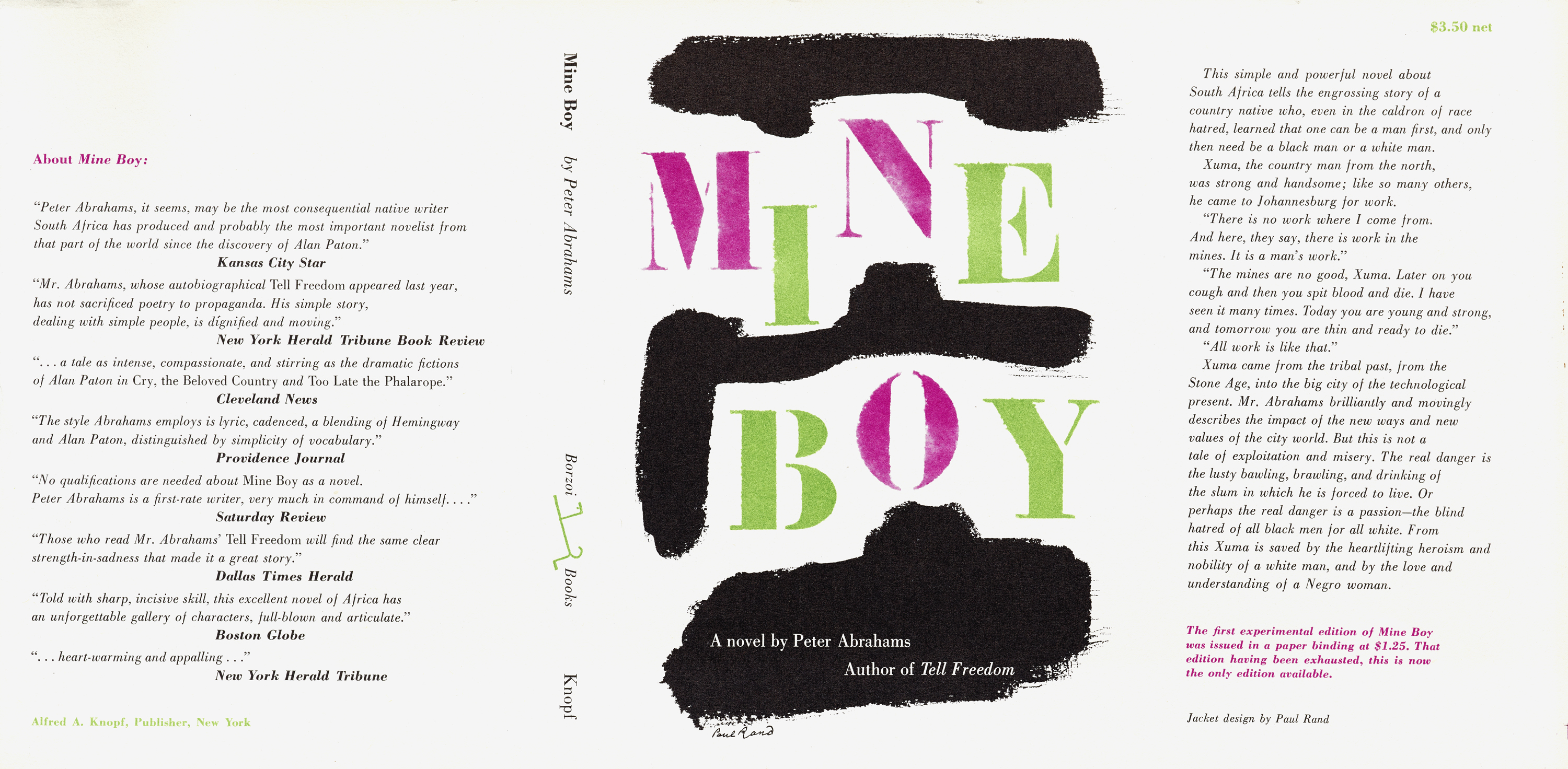
Perhaps the most intriguing evidence of Rand’s mind in action is the group of pasteups and hand-painted comps for book covers. We have several titles with multiple variations, some of which have never been published before. You’ll get a chance to see these firsthand at our next Salon where Curator Rob Saunders will show how Rand’s work fits into the Archive’s collection of jackets and covers from the early avant-gardes to the present.
This post offers just a peek at our Rand collection. There is much more to process, and we are prioritizing a large portion of it for digitization. Become a Letterform Archive member now to get immediate access to the Online Archive beta, where many Rand images will land soon. Your support helps us develop the site and share more of our collection with the world.
Over the last few months, we’ve focused our curatorial sights on designers like Ahn Sang Soo, Amos Kennedy Jr., Laini, and Suzanne Moore who are underrepresented in standard design histories. We’re thrilled to share this important but lesser-known work alongside established figures like Rand as we explore new ways to tell the story of design.
— Stephen Coles, Associate Curator & Editorial Director
Update, Jan. 20, 2020: Read about processing the Paul Rand collection.