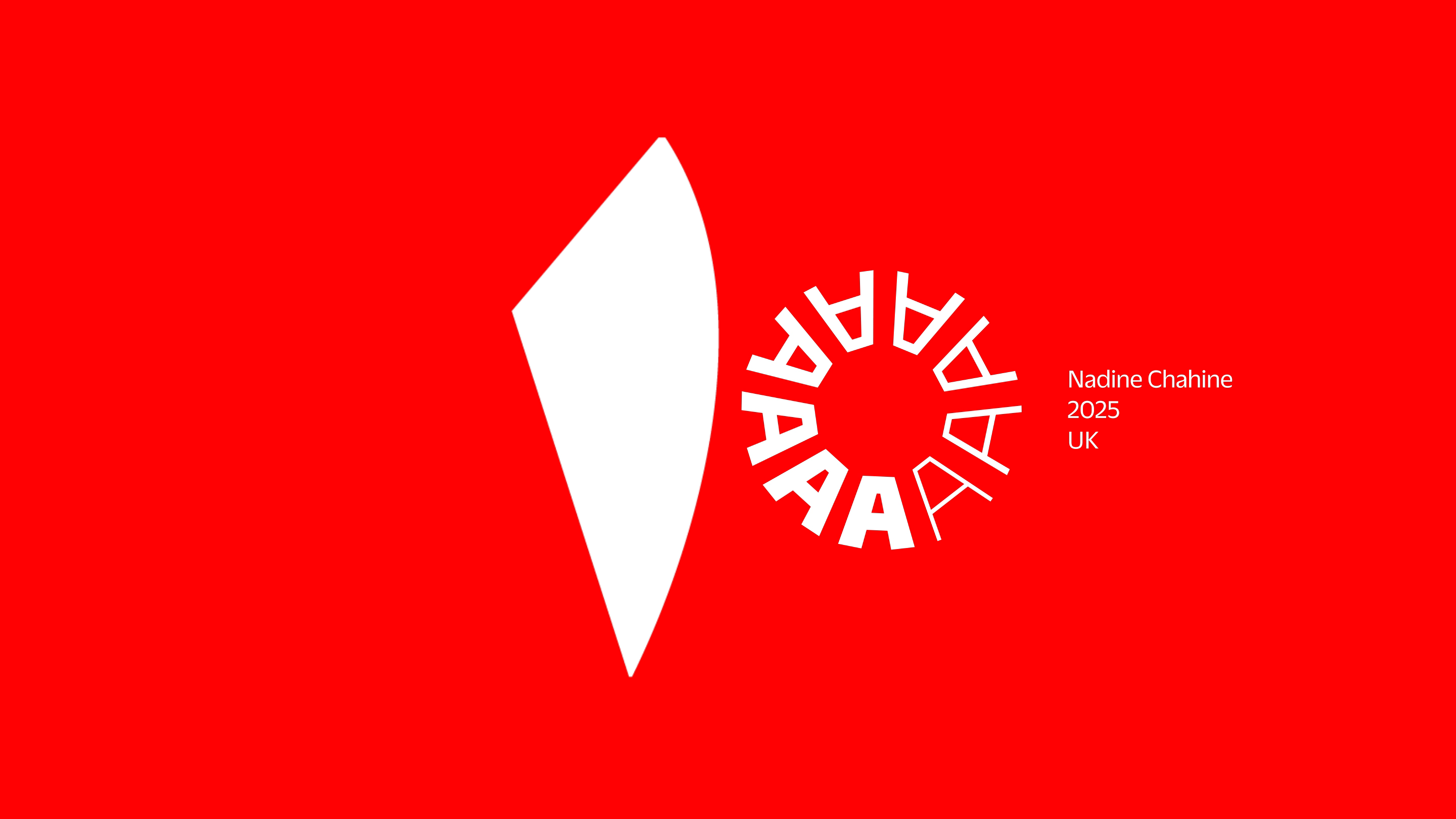
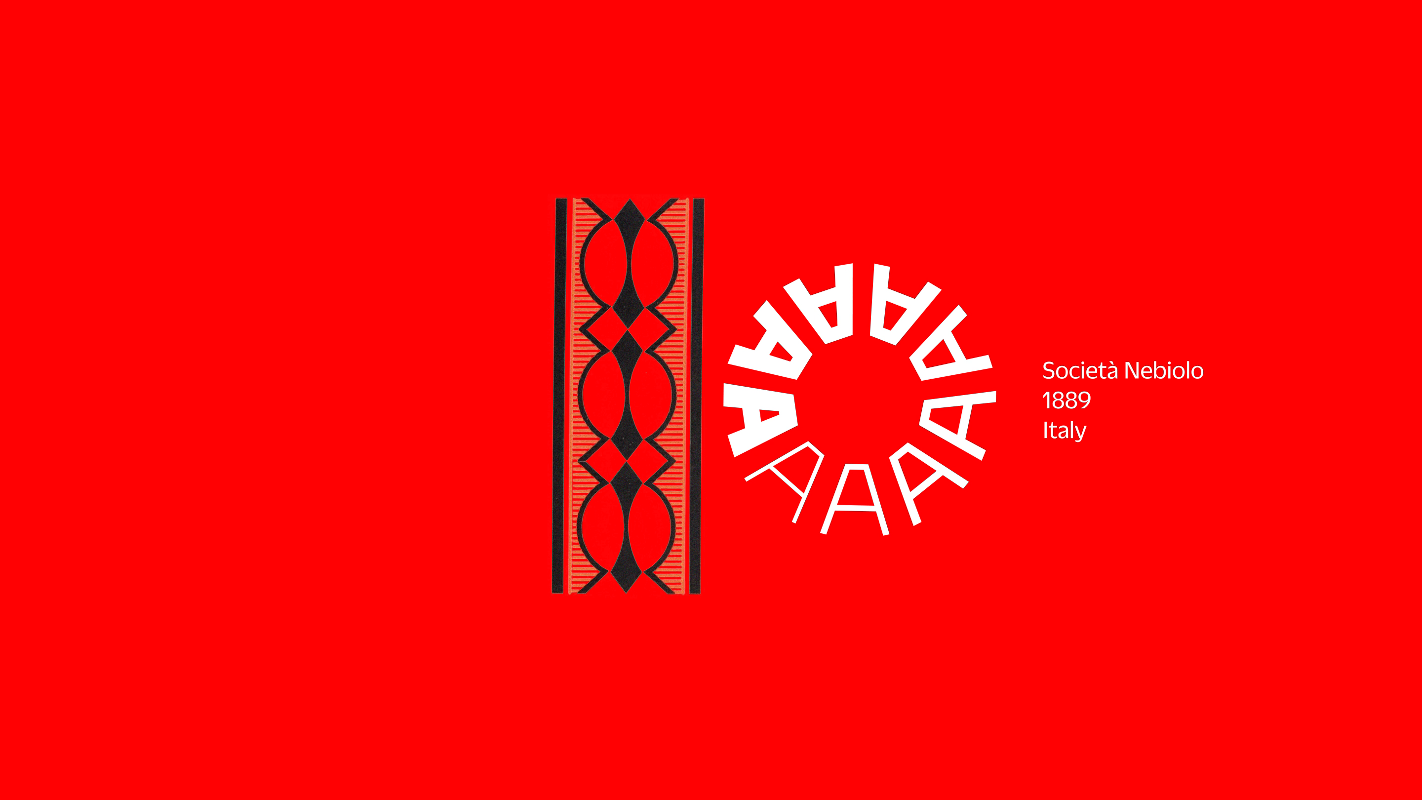
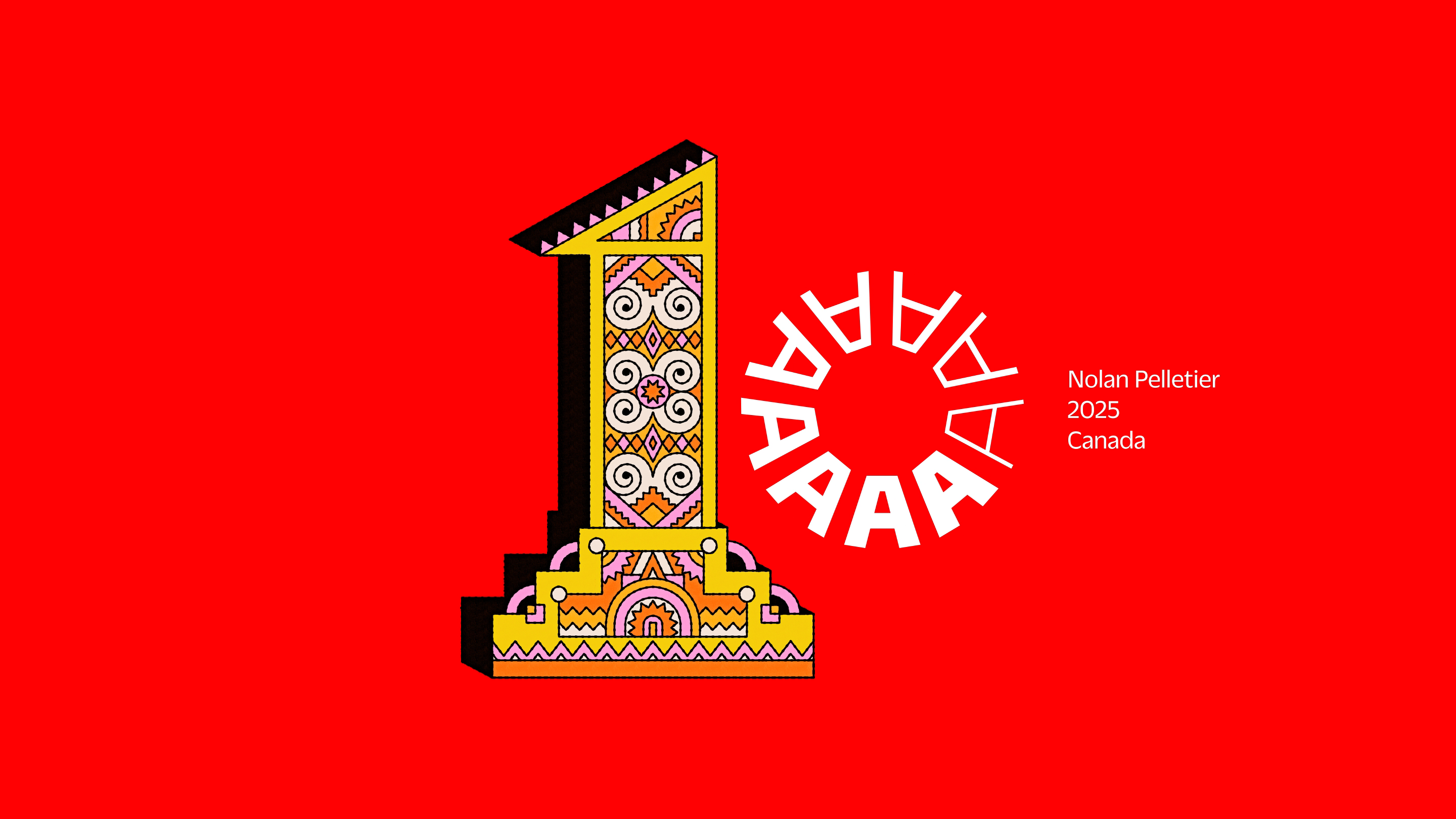
News
100 Tens Celebrate a Decade of Letterform Archive
The work of 50 living designers joins 50 historical objects from the collection to celebrate our 10th anniversary.
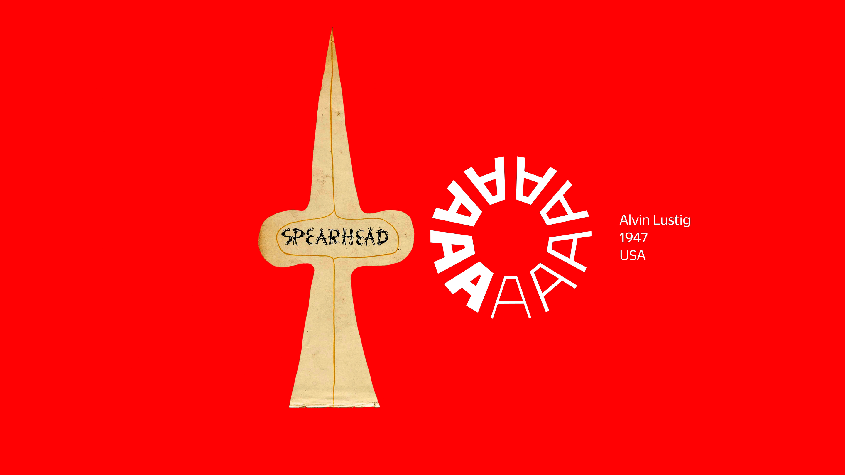
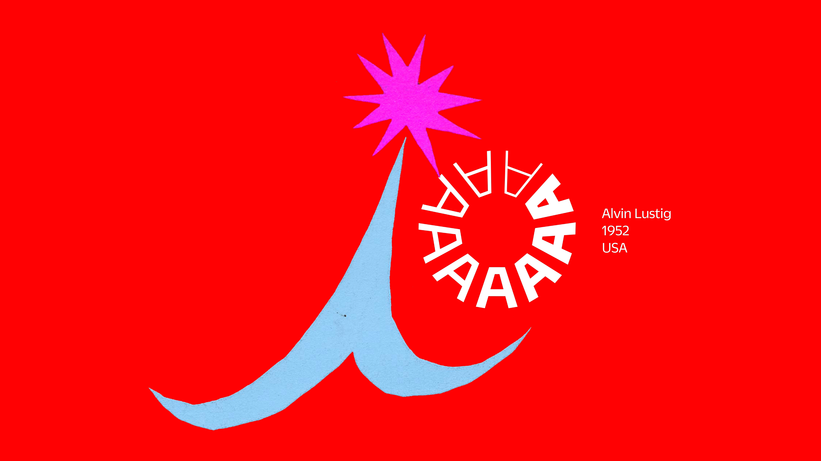
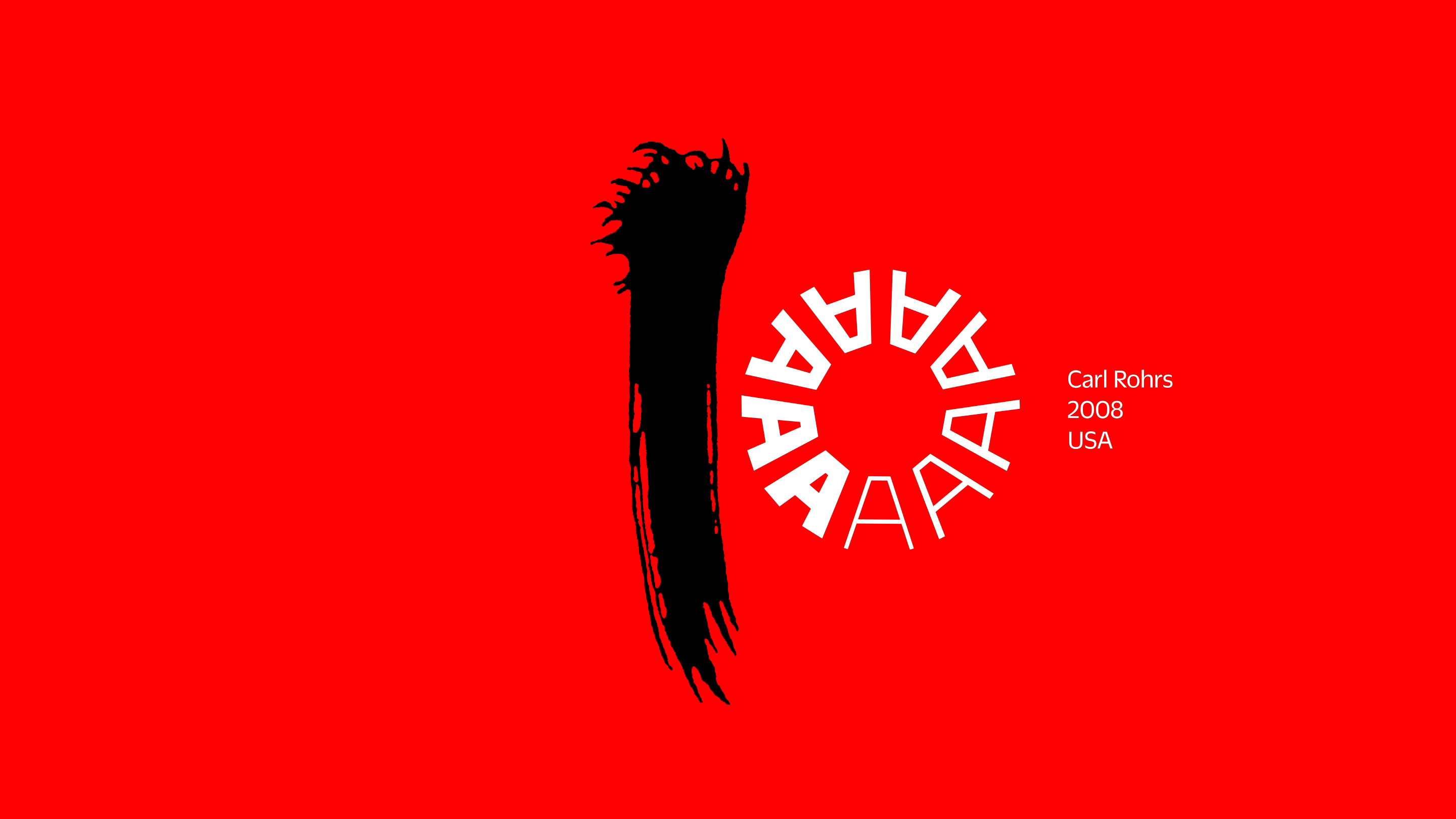
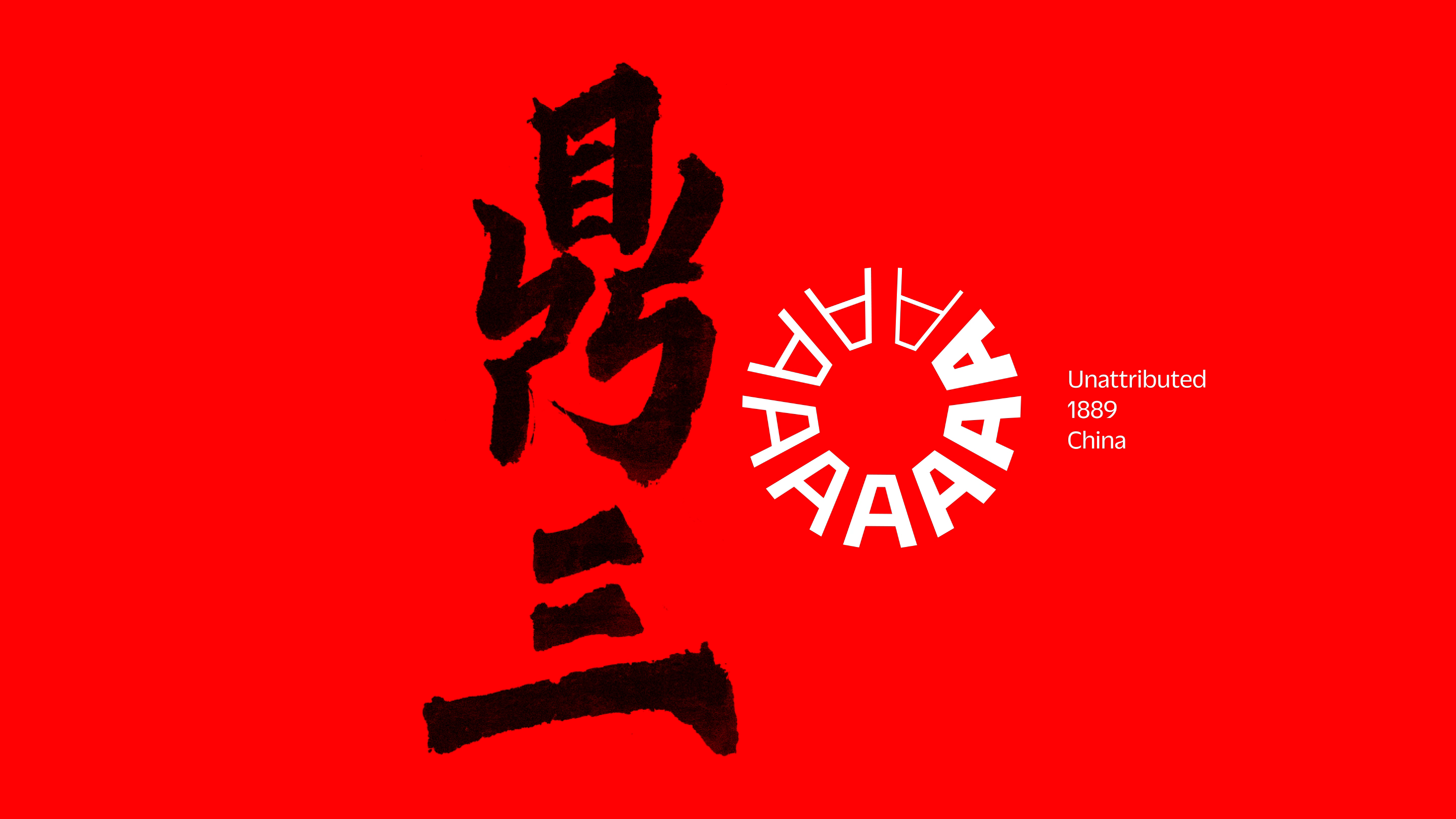
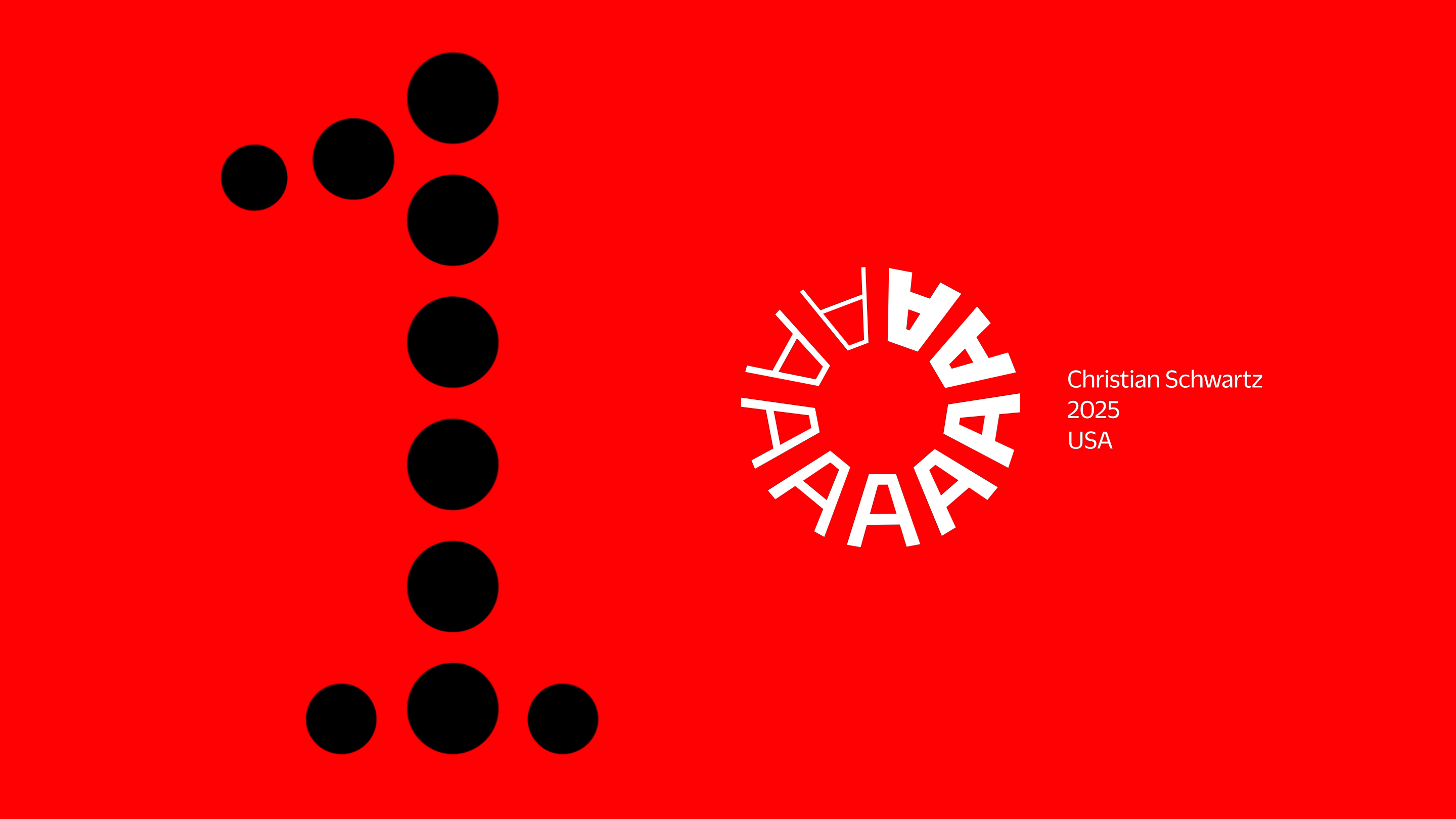
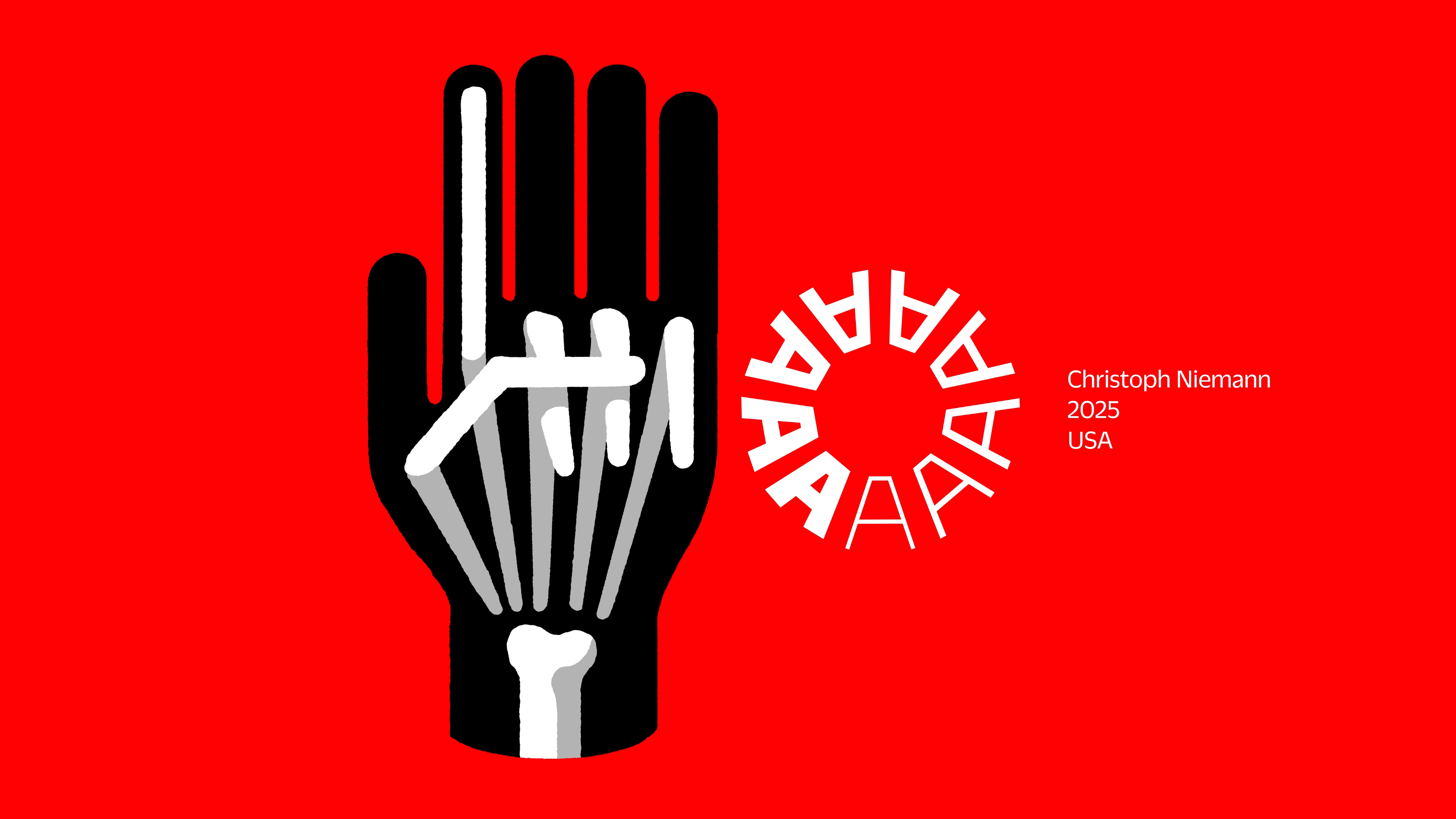
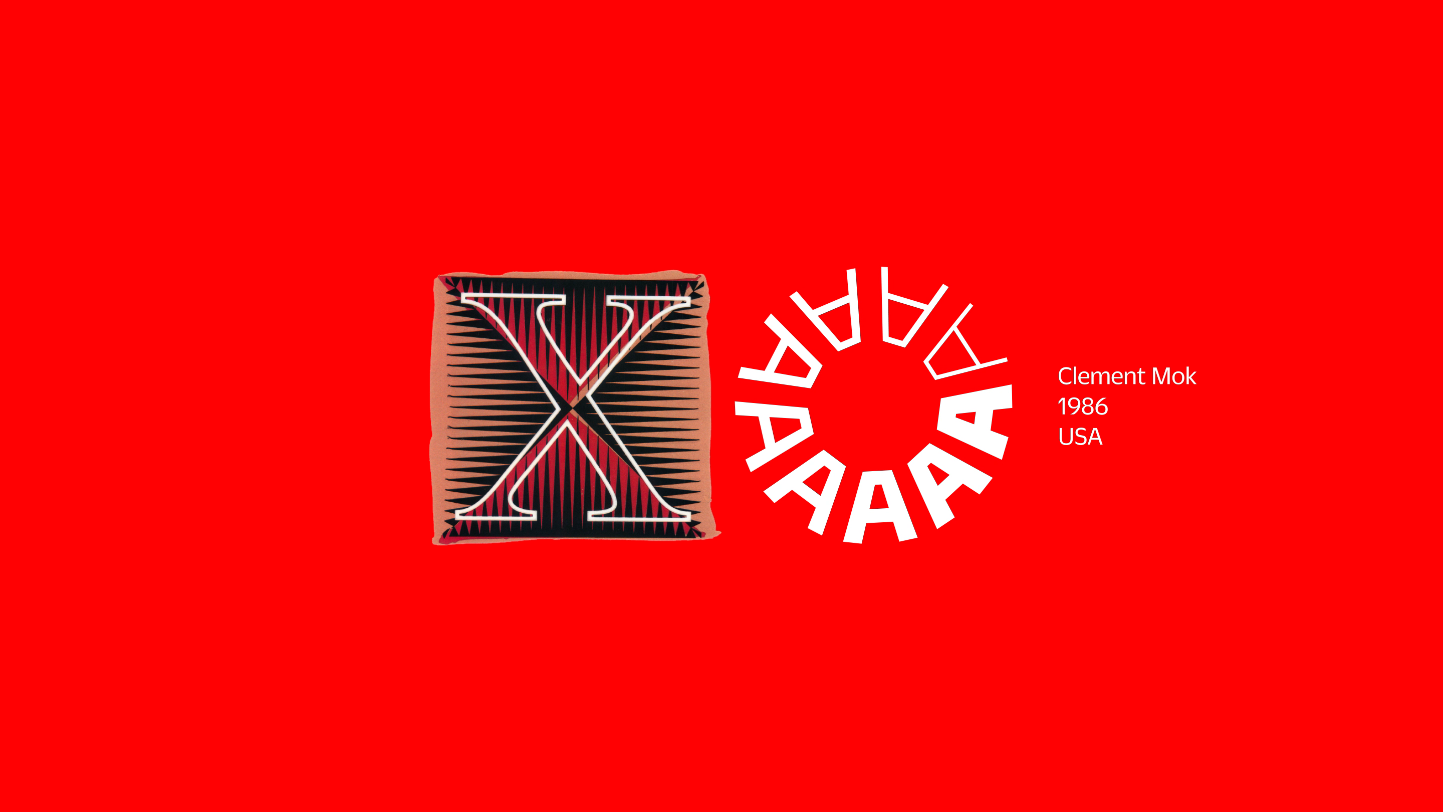
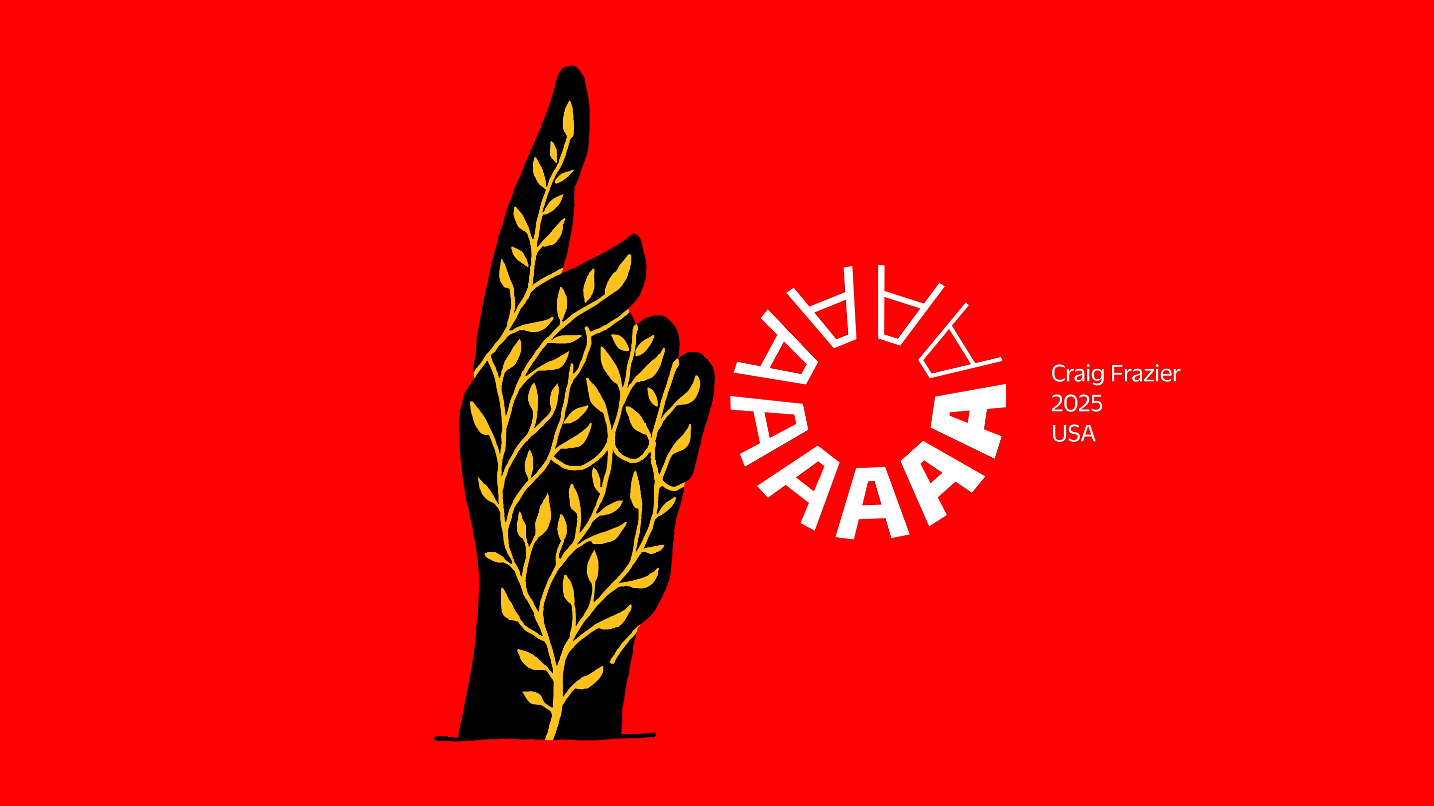
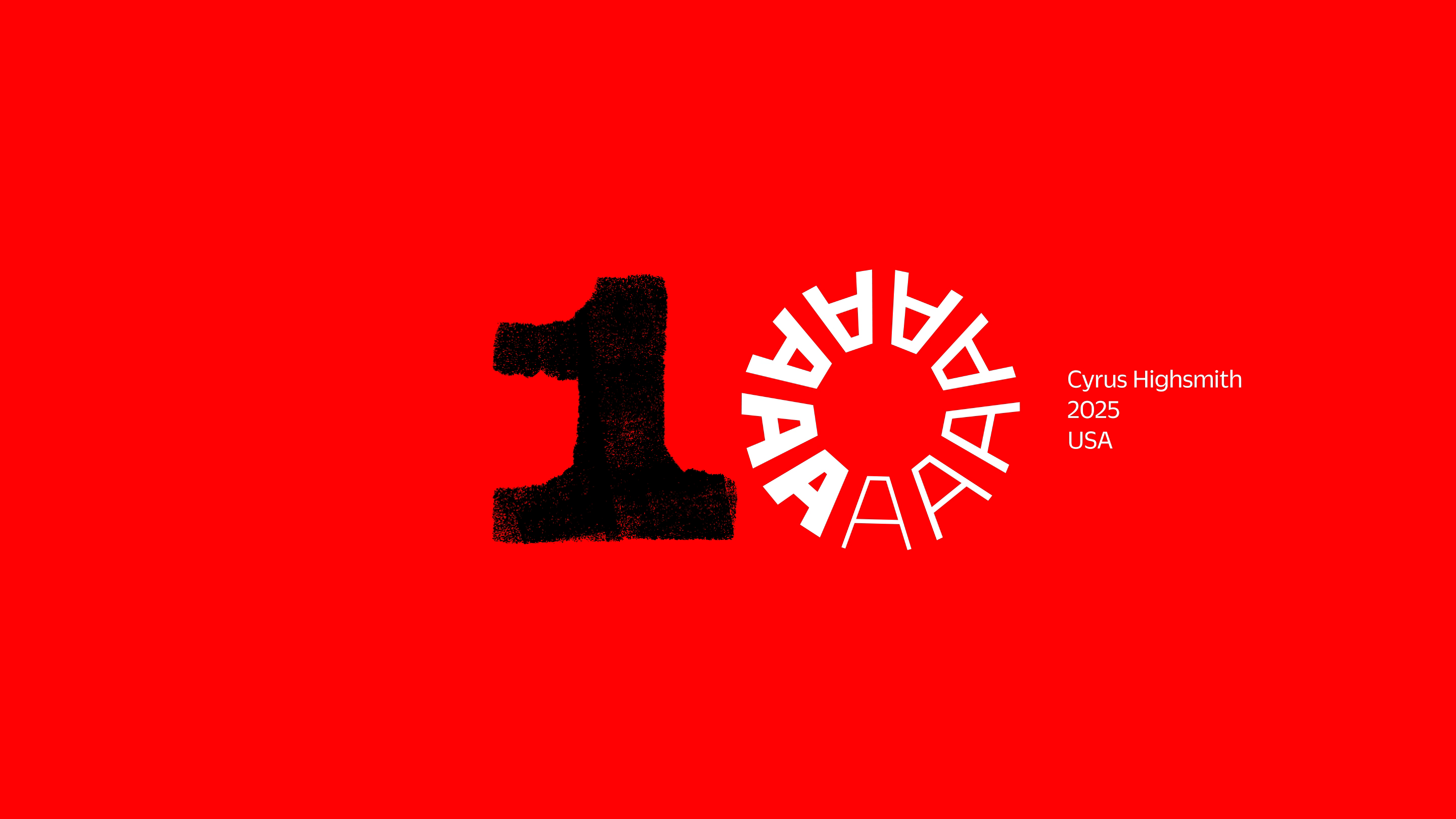
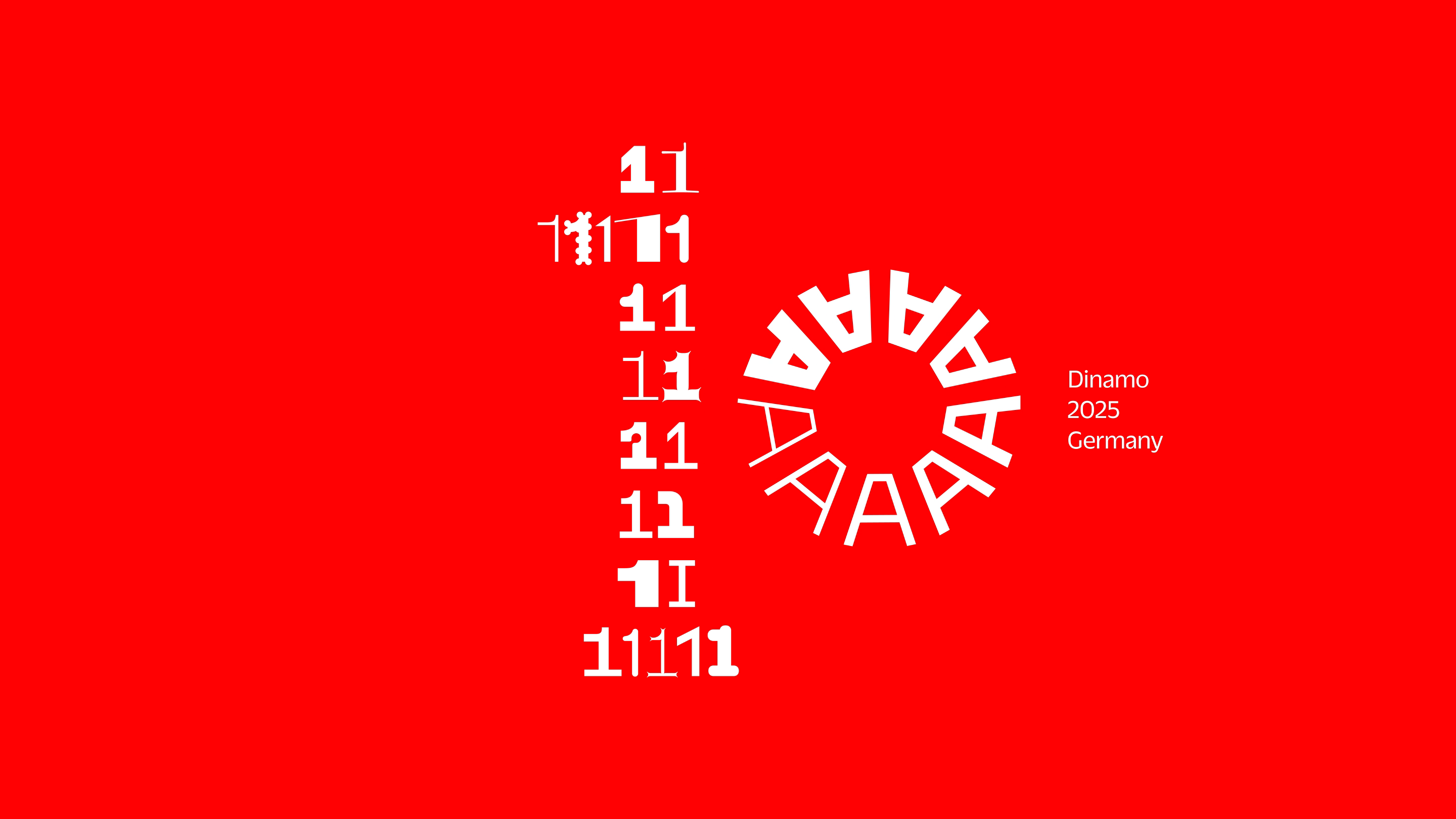
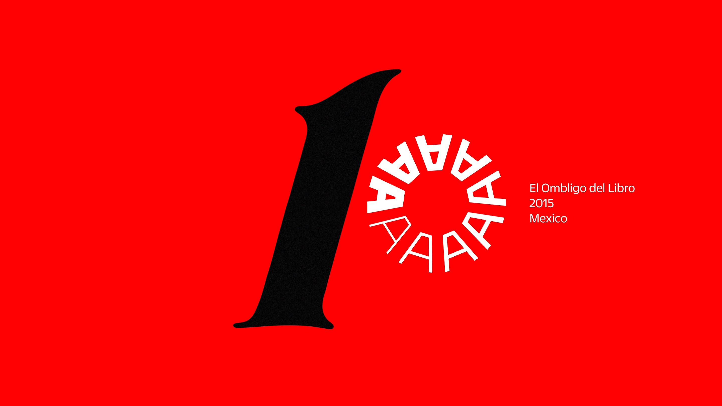
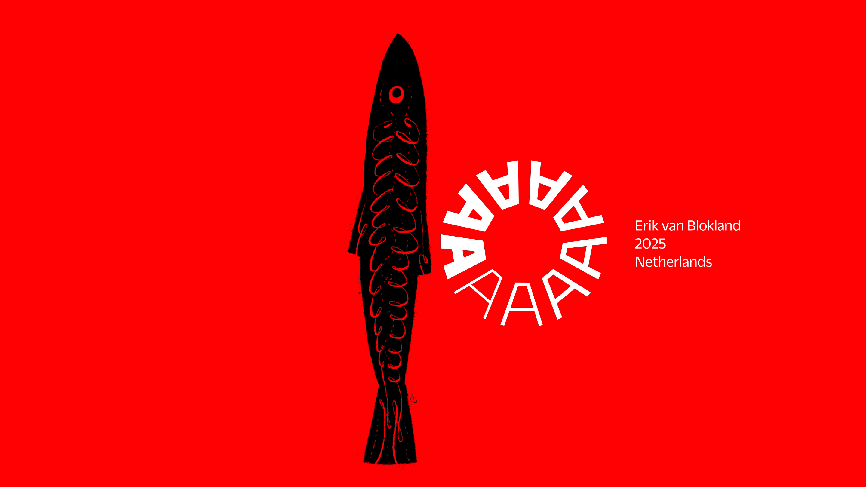
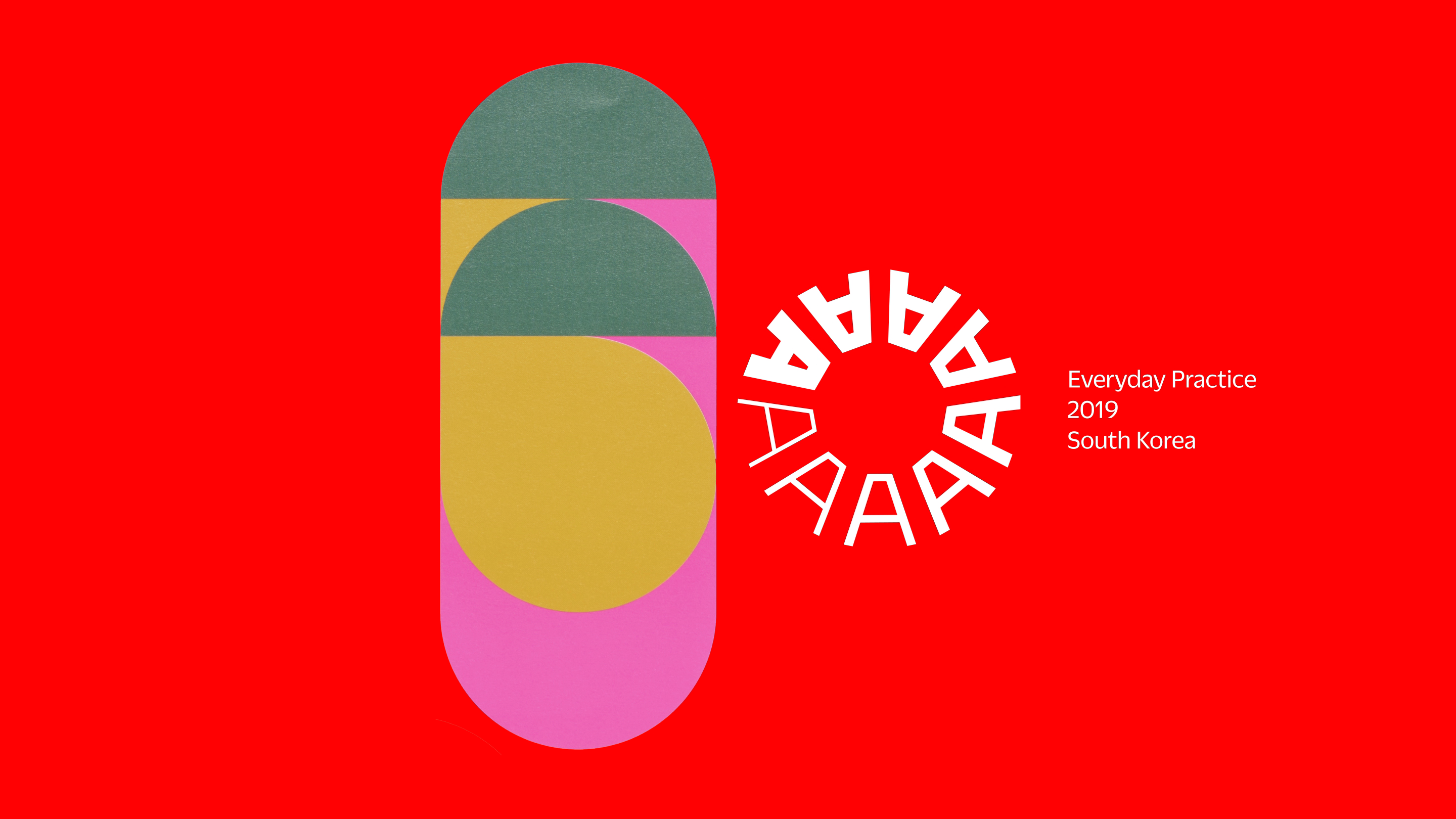
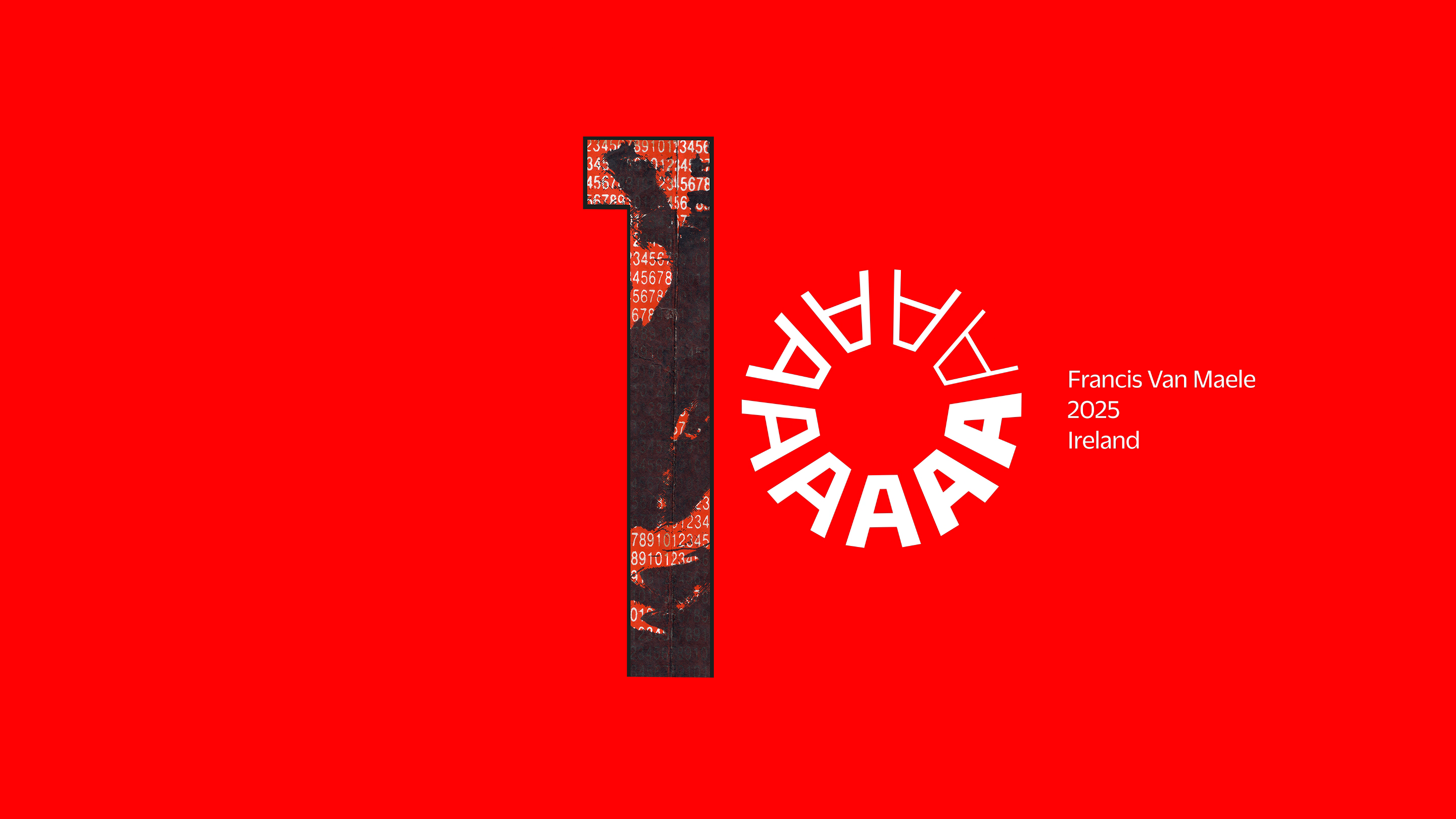
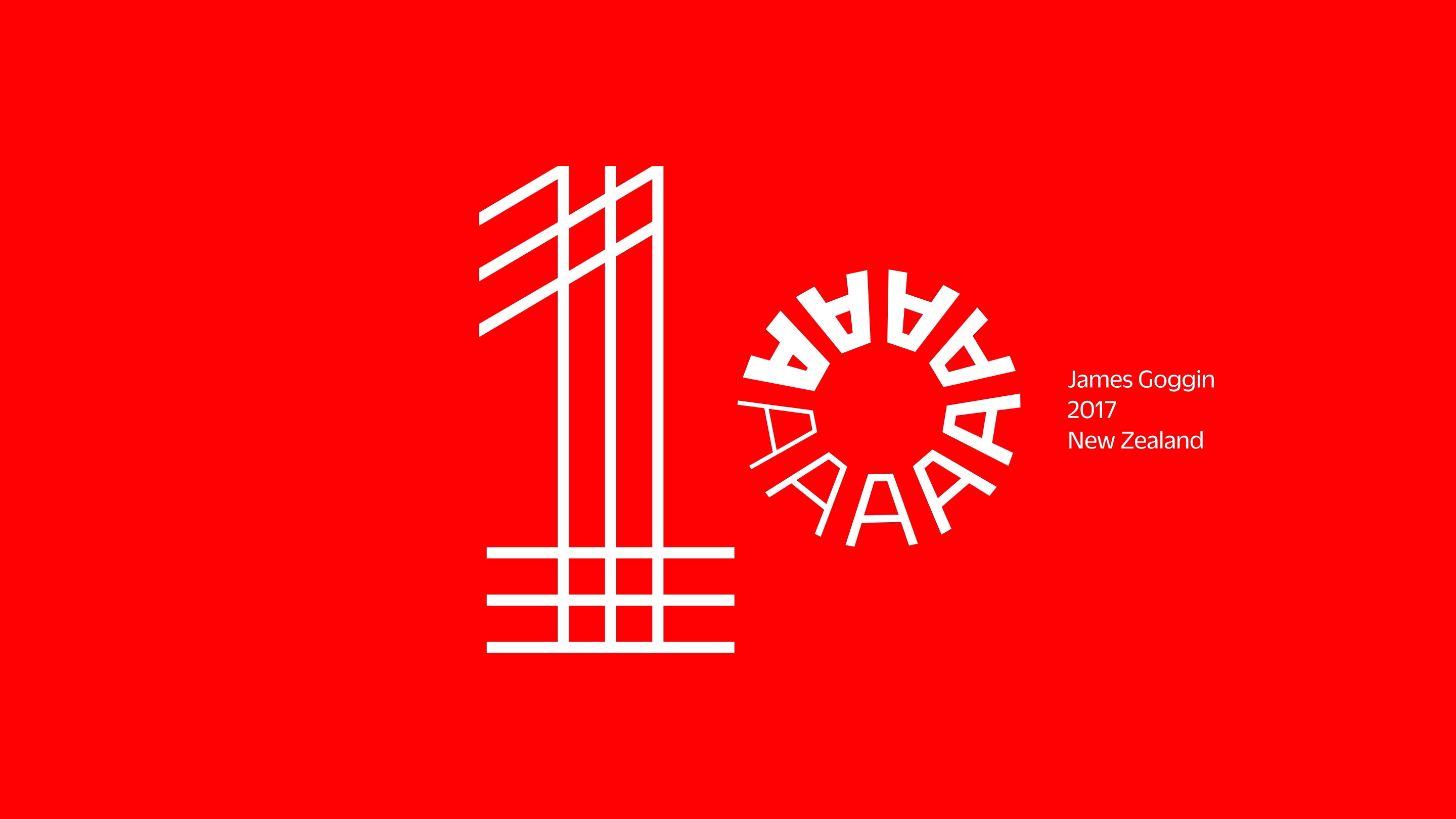
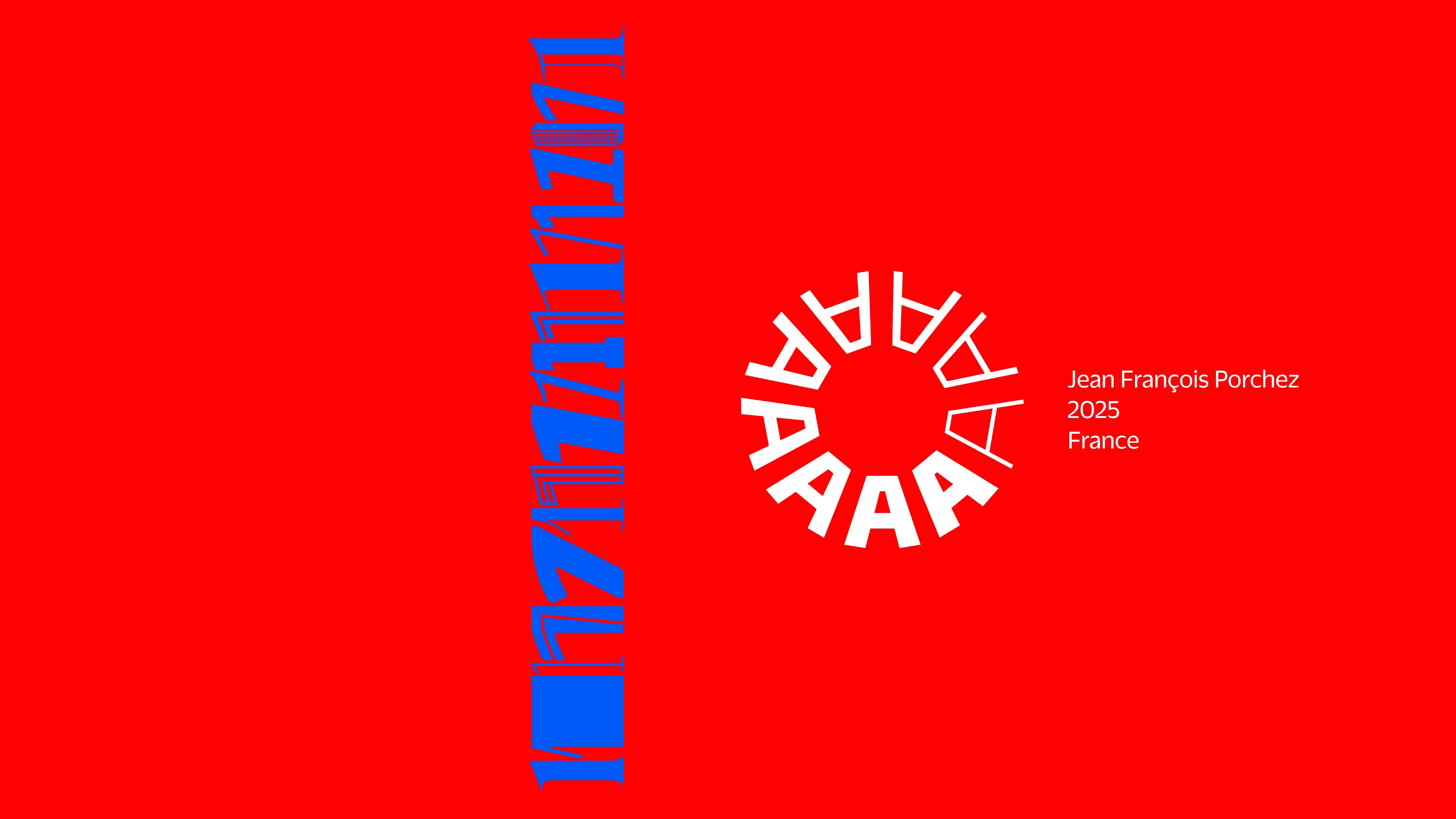
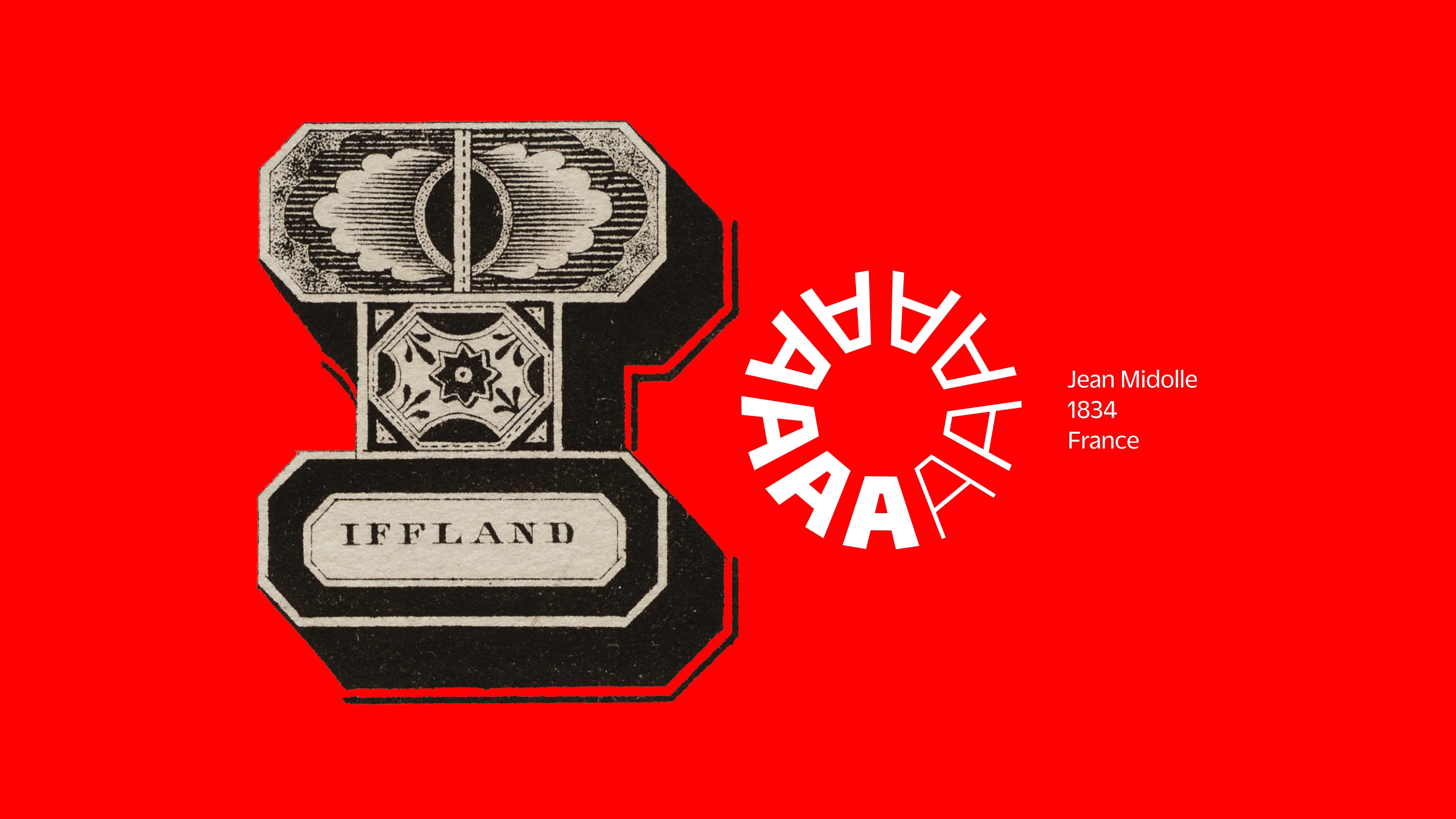
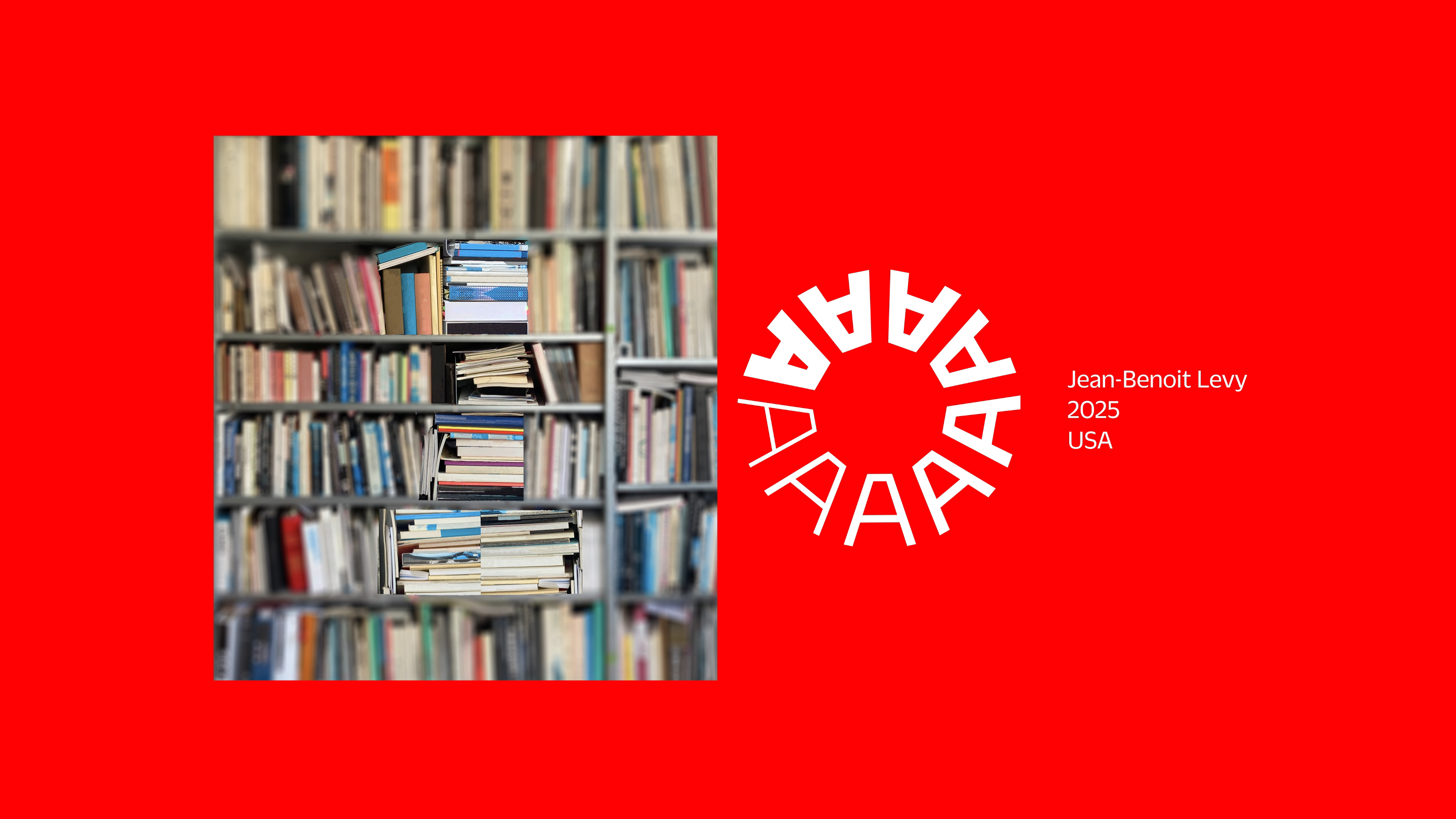
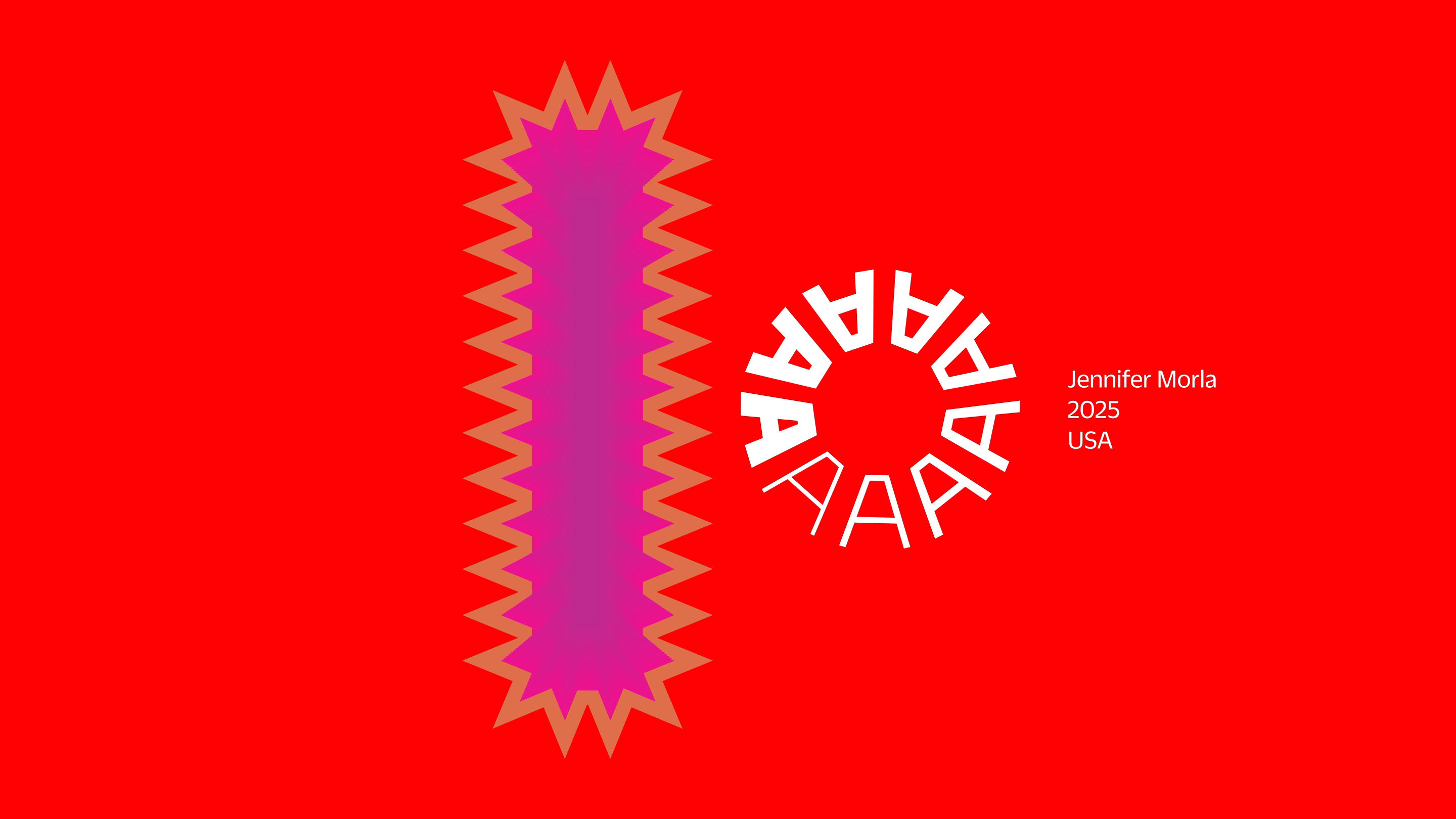
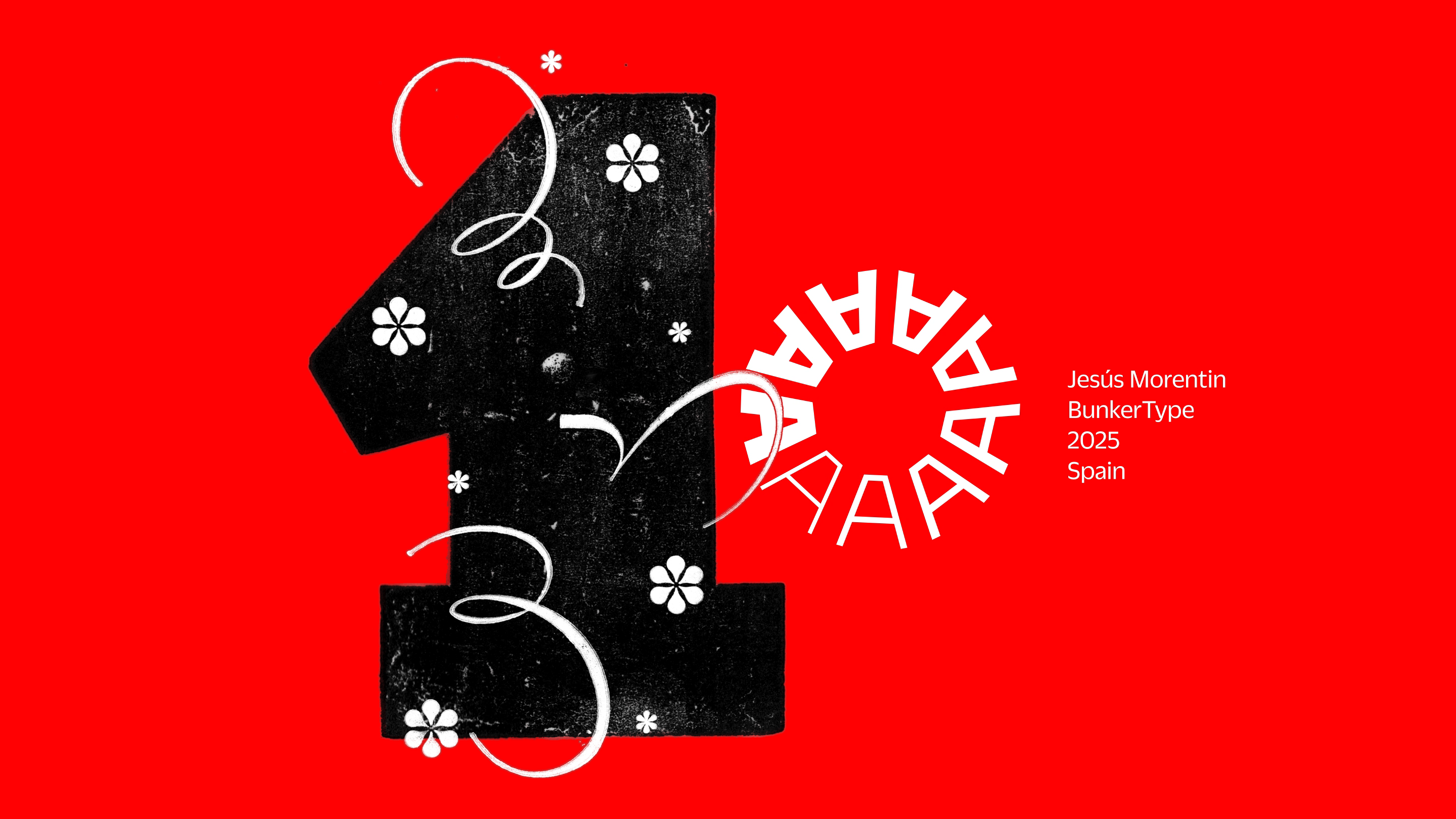
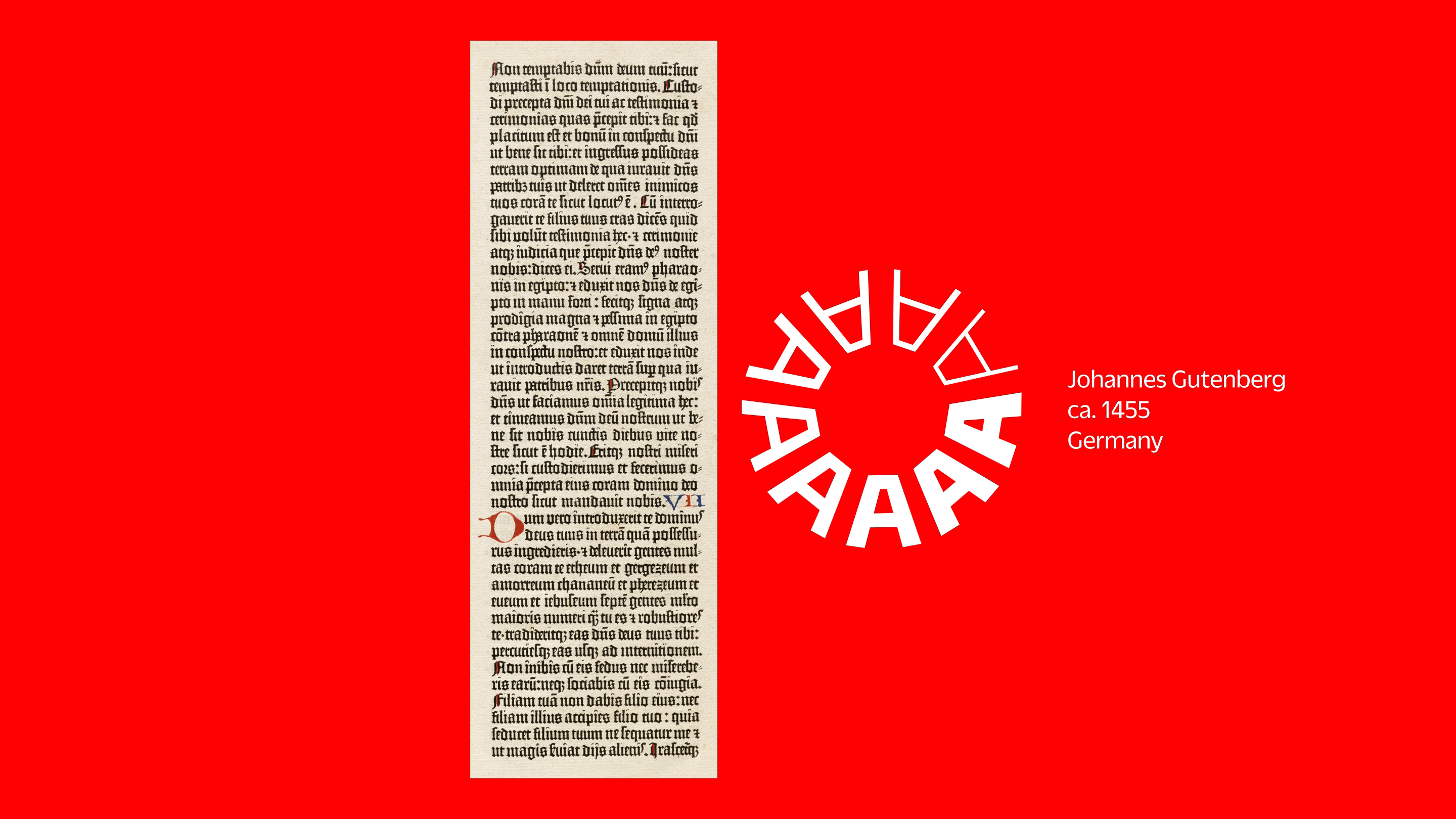
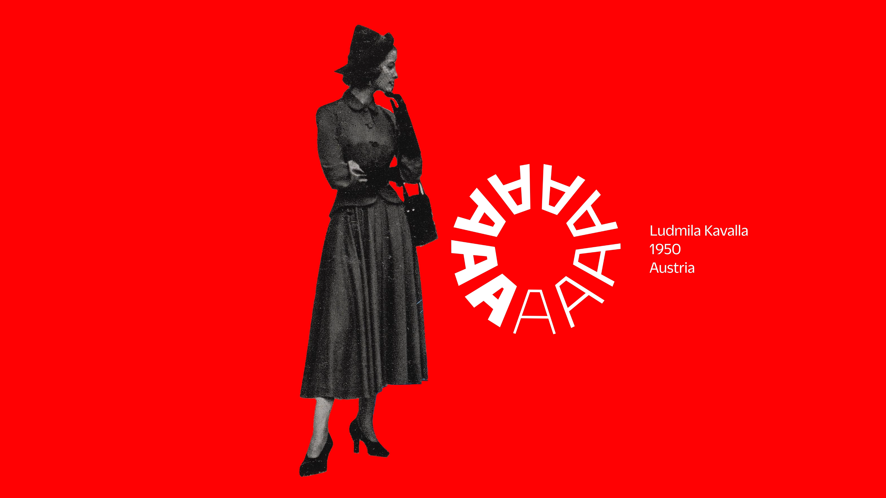
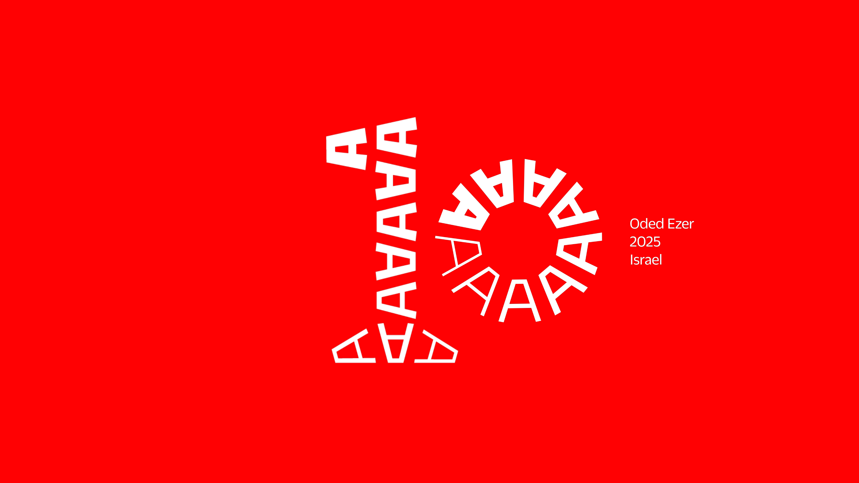
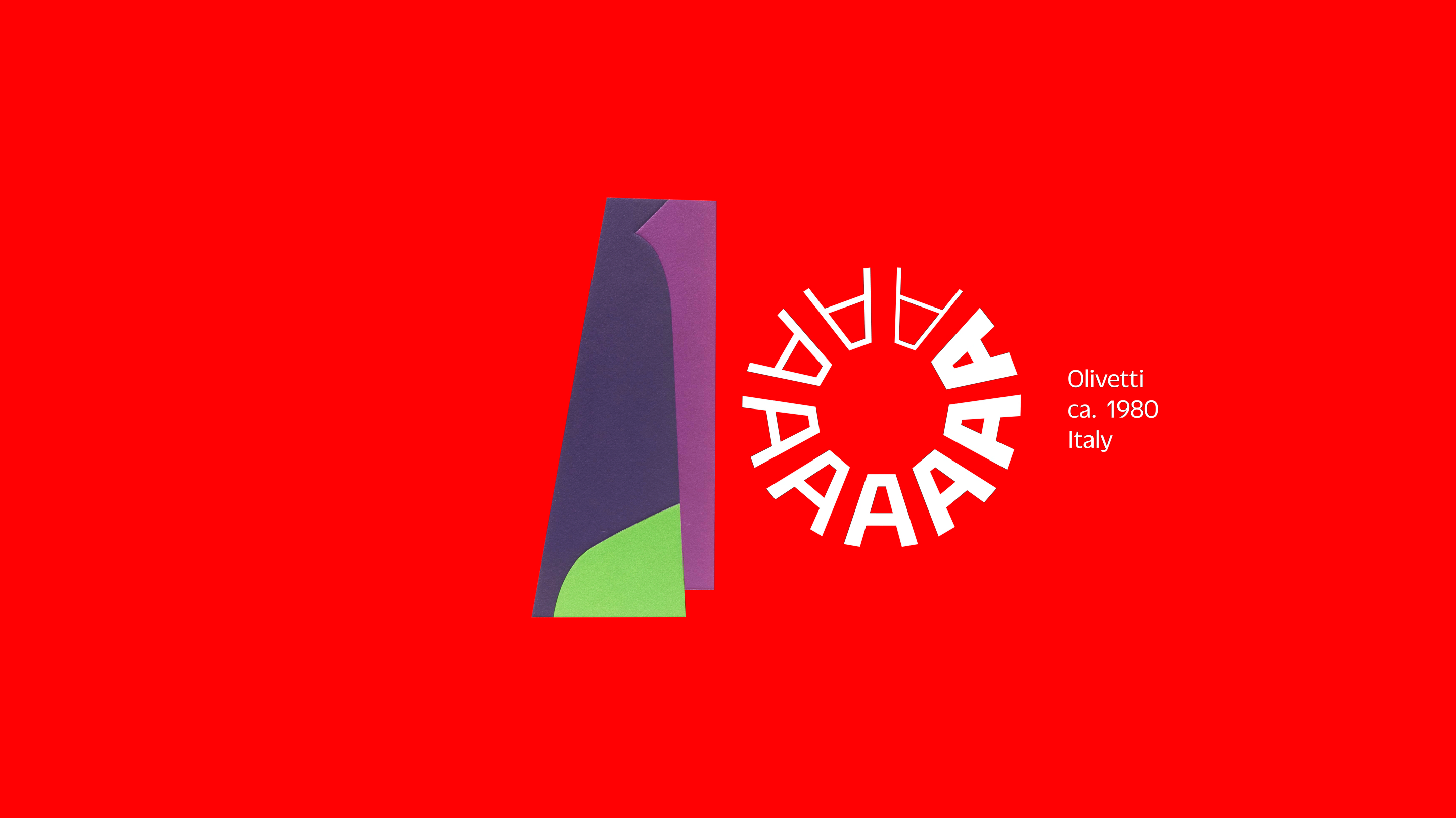
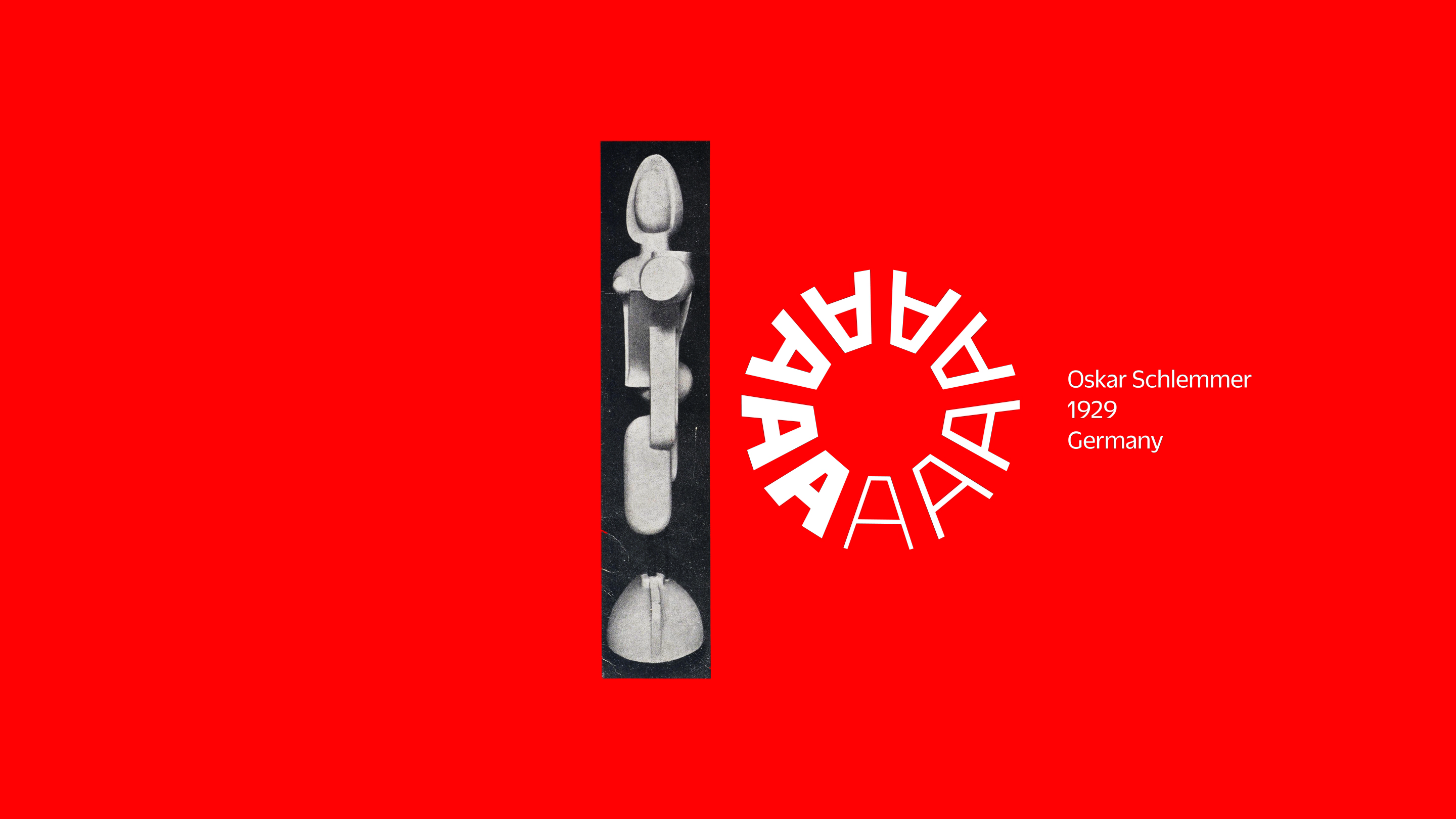
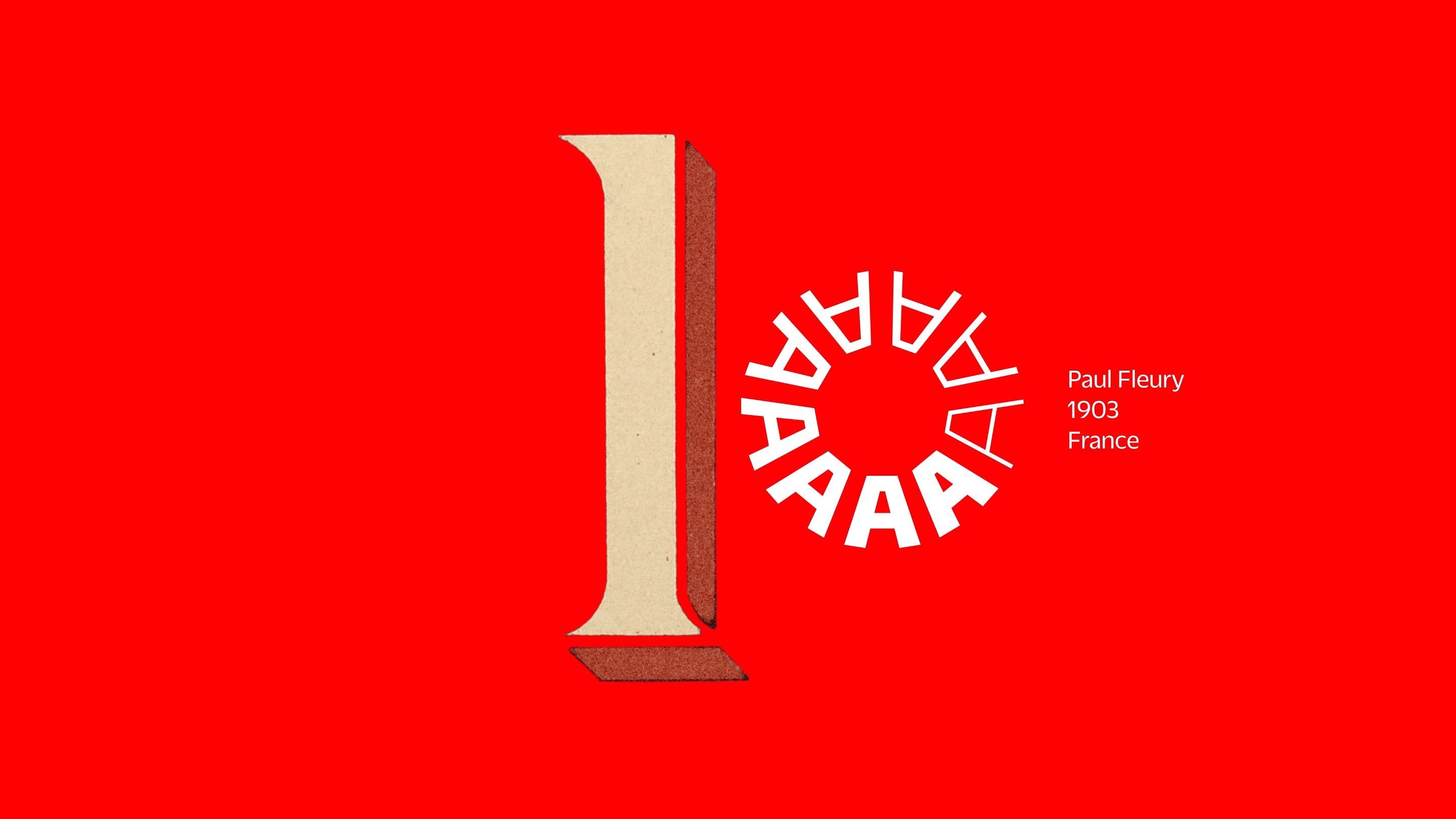
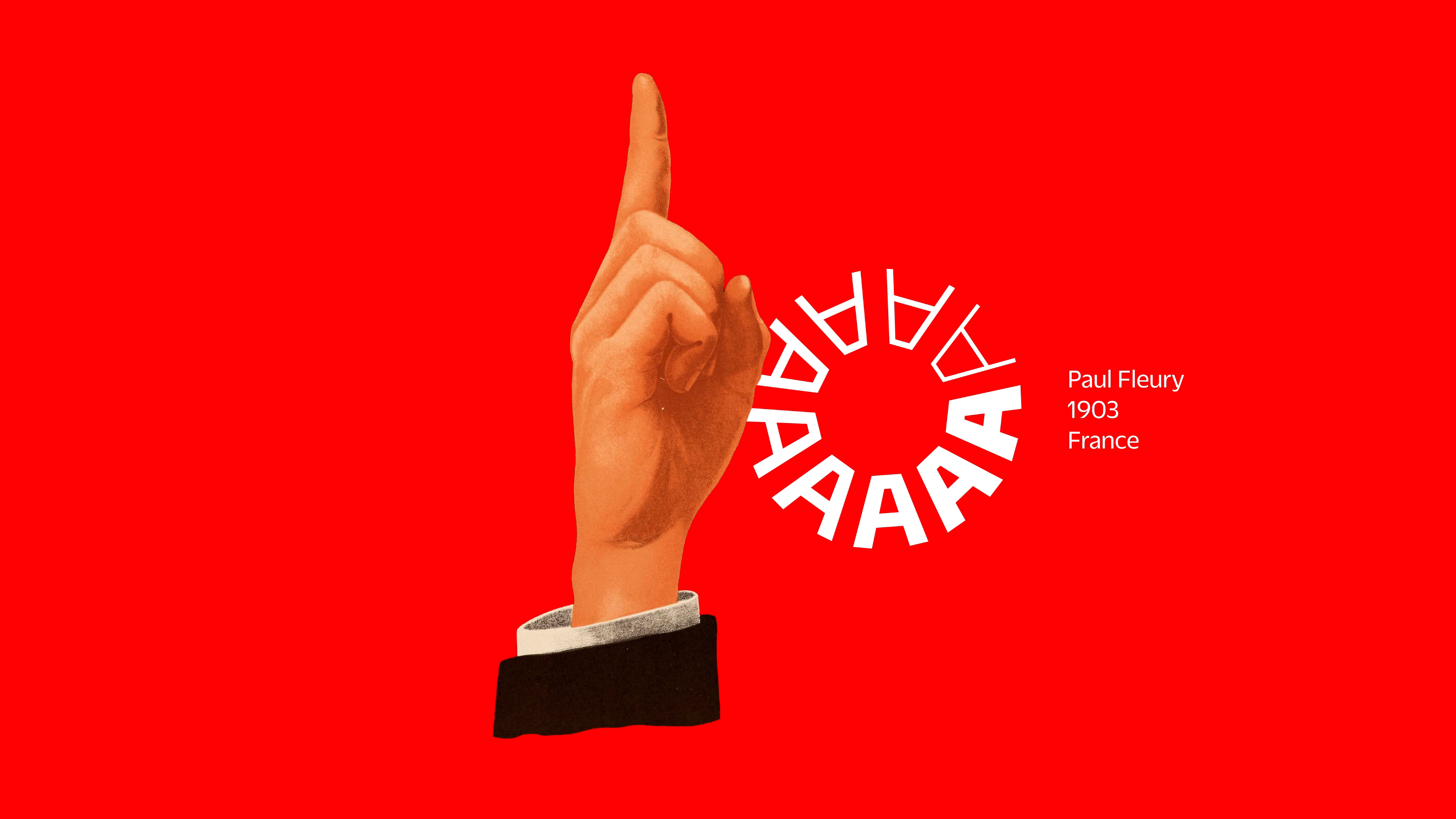
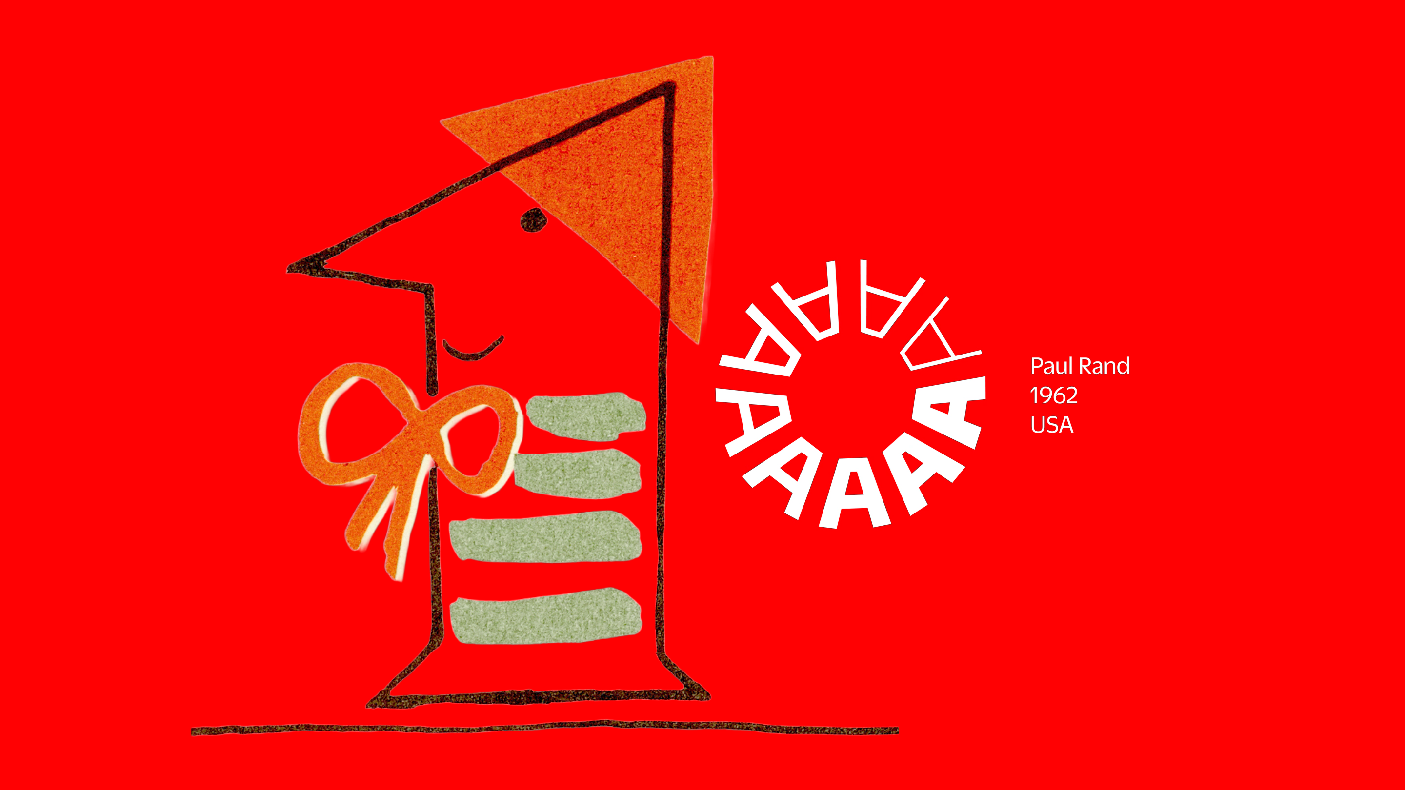
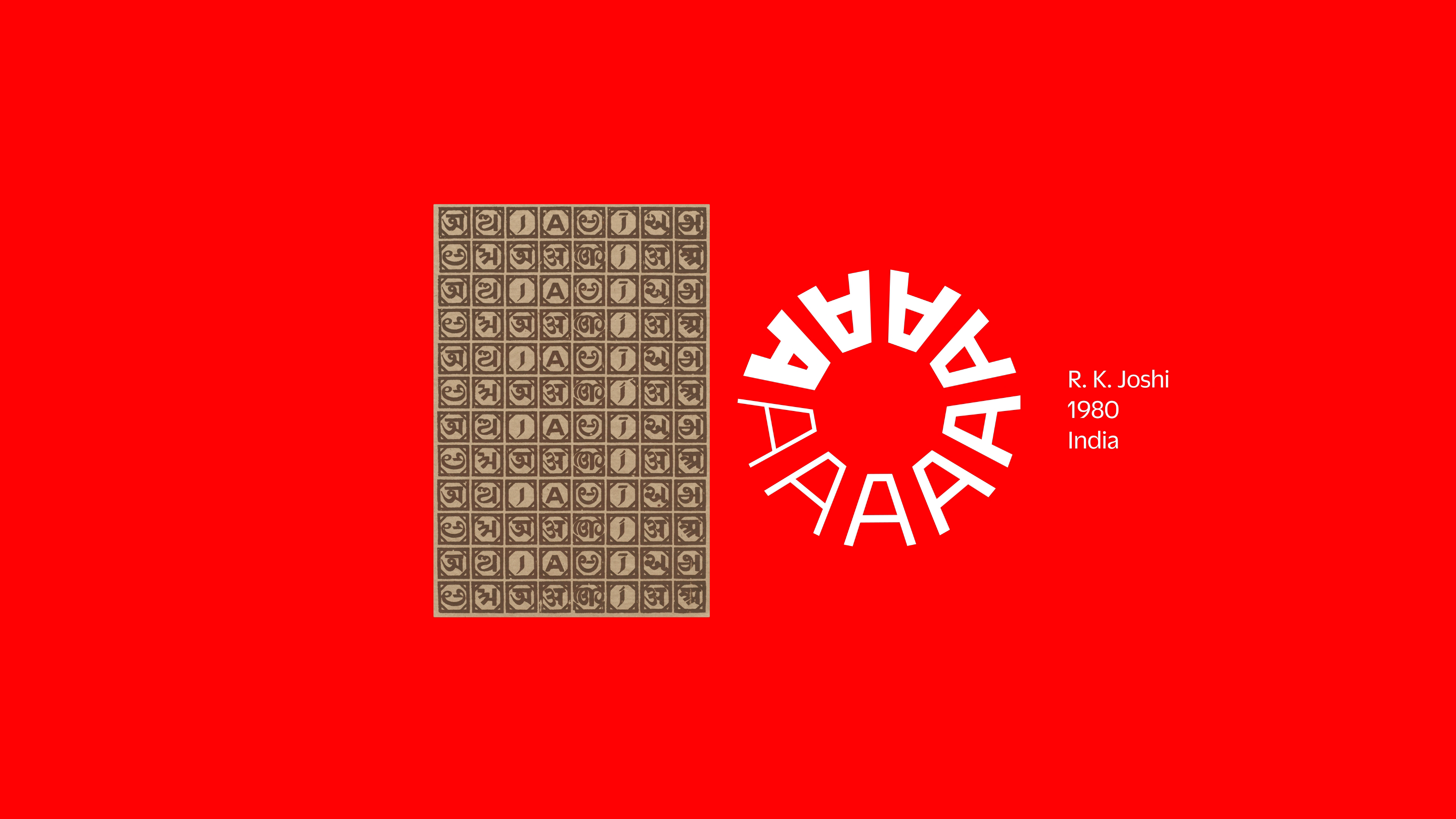
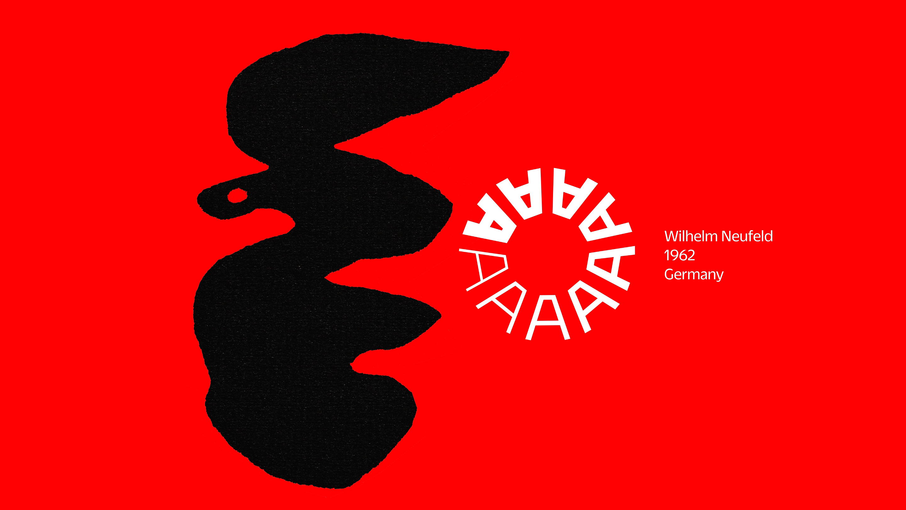
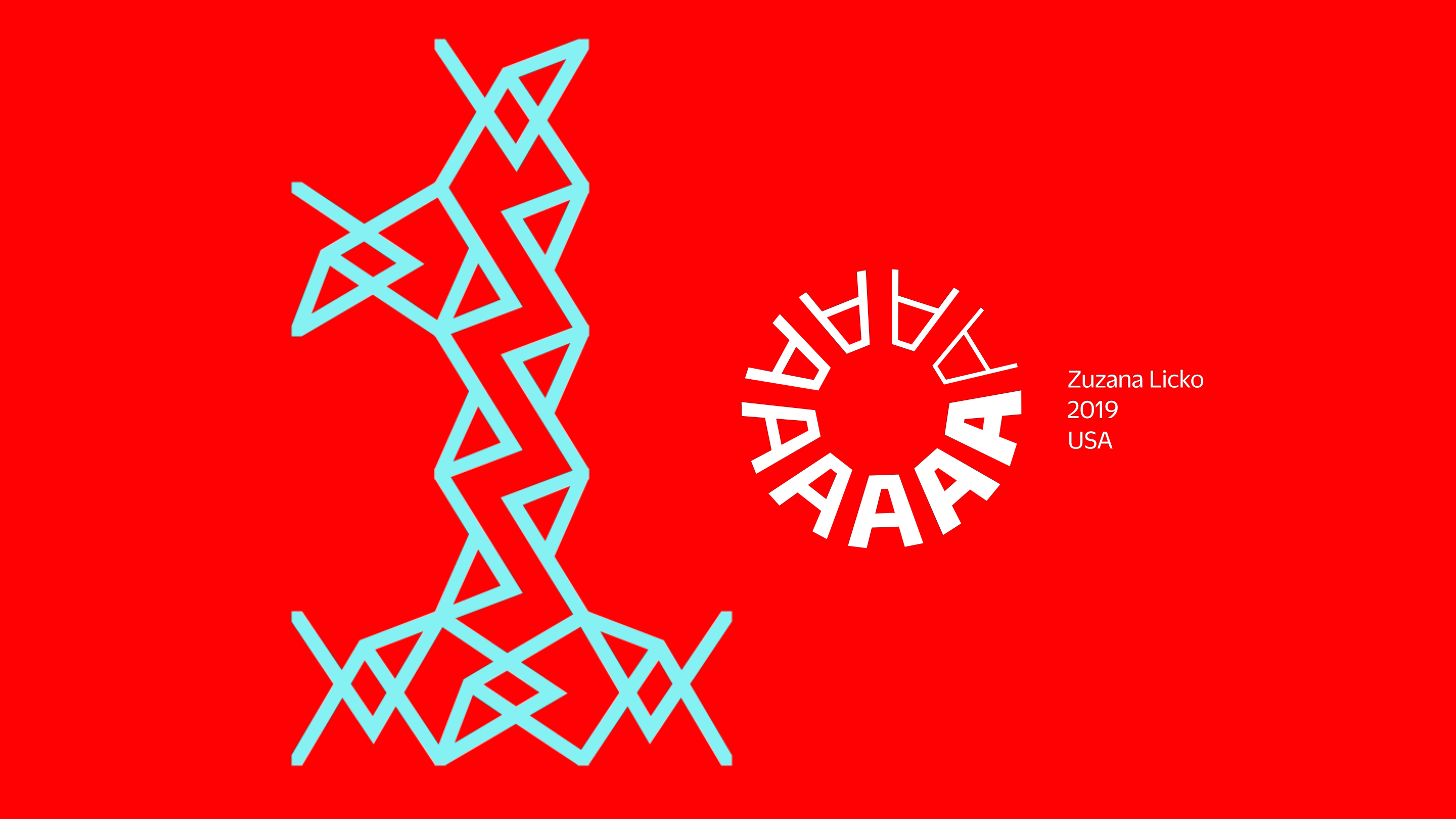
Letterform Archive is a living archive, a perpetual project to not only preserve historic design, but also inspire new work. To mark our 10th anniversary we teamed up with COLLINS to create 100 Tens: 50 interpretations of the number 1 from the Archive’s collection, paired with 50 contributions from some of the most innovative designers working today.
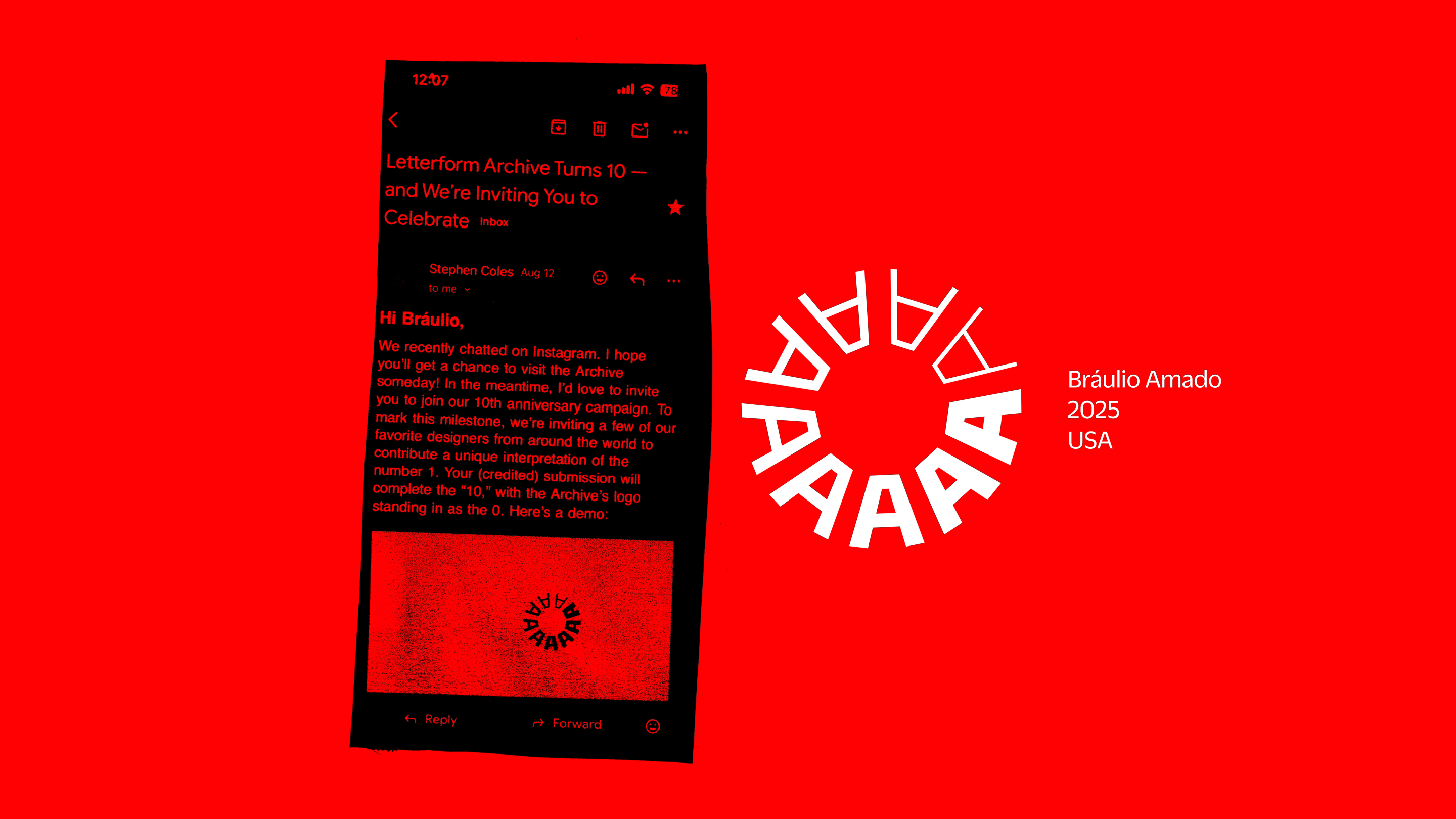
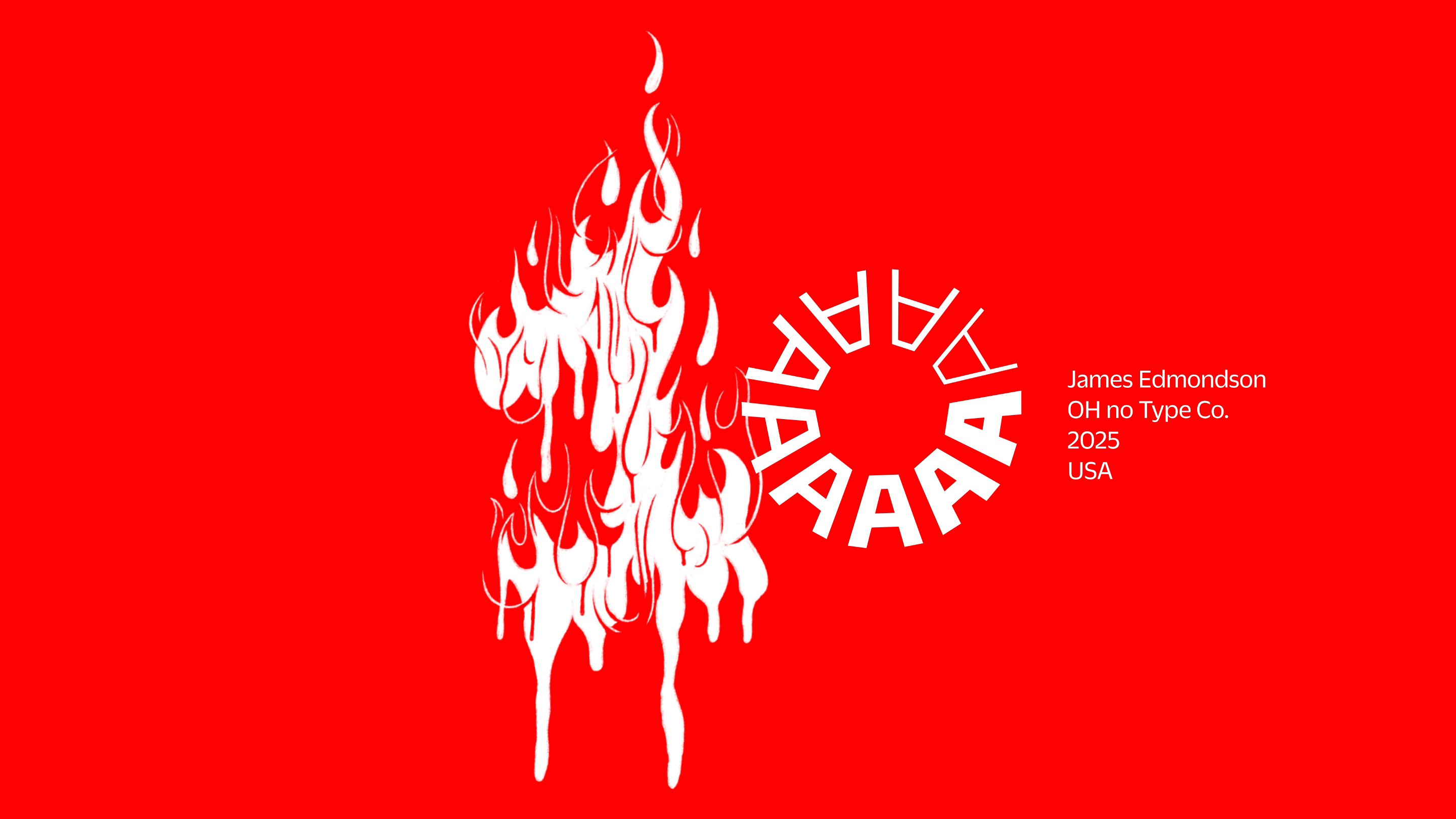
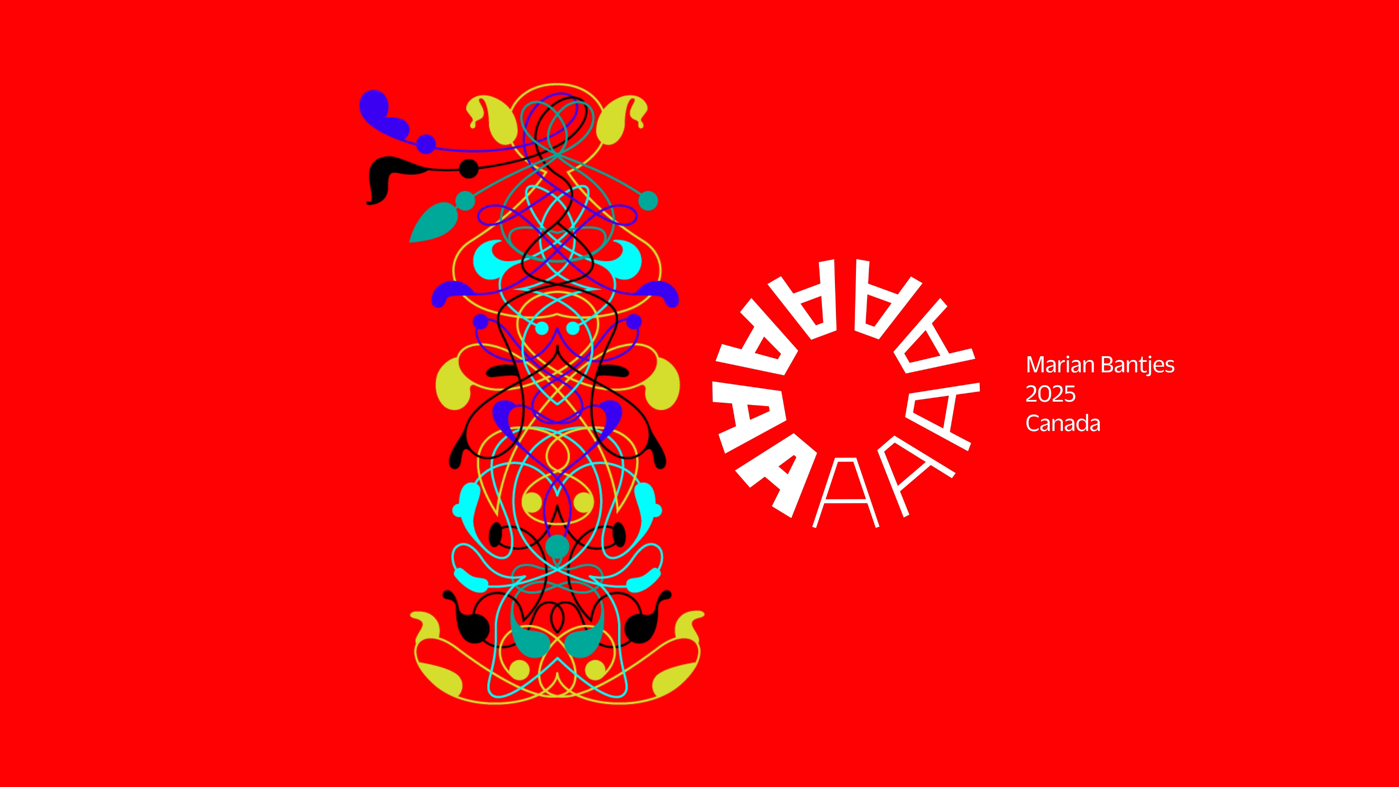
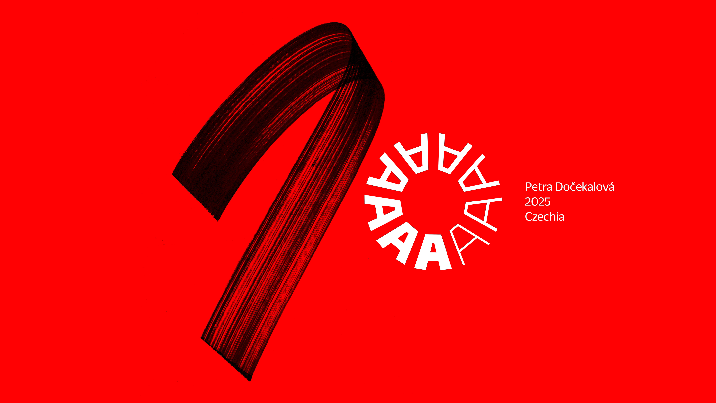
We sent out a call to folks we admire—from type designers like Zuzana Licko and James Edmondson, to lettering artists and calligraphers like Julien Priez and Petra Dočekalová, and from graphic designers like Bráulio Amado and Marian Bantjes, to illustrators like Christoph Niemann and Susan Kare. What we got back was pure delight. The creativity and range of the submissions astounded us.
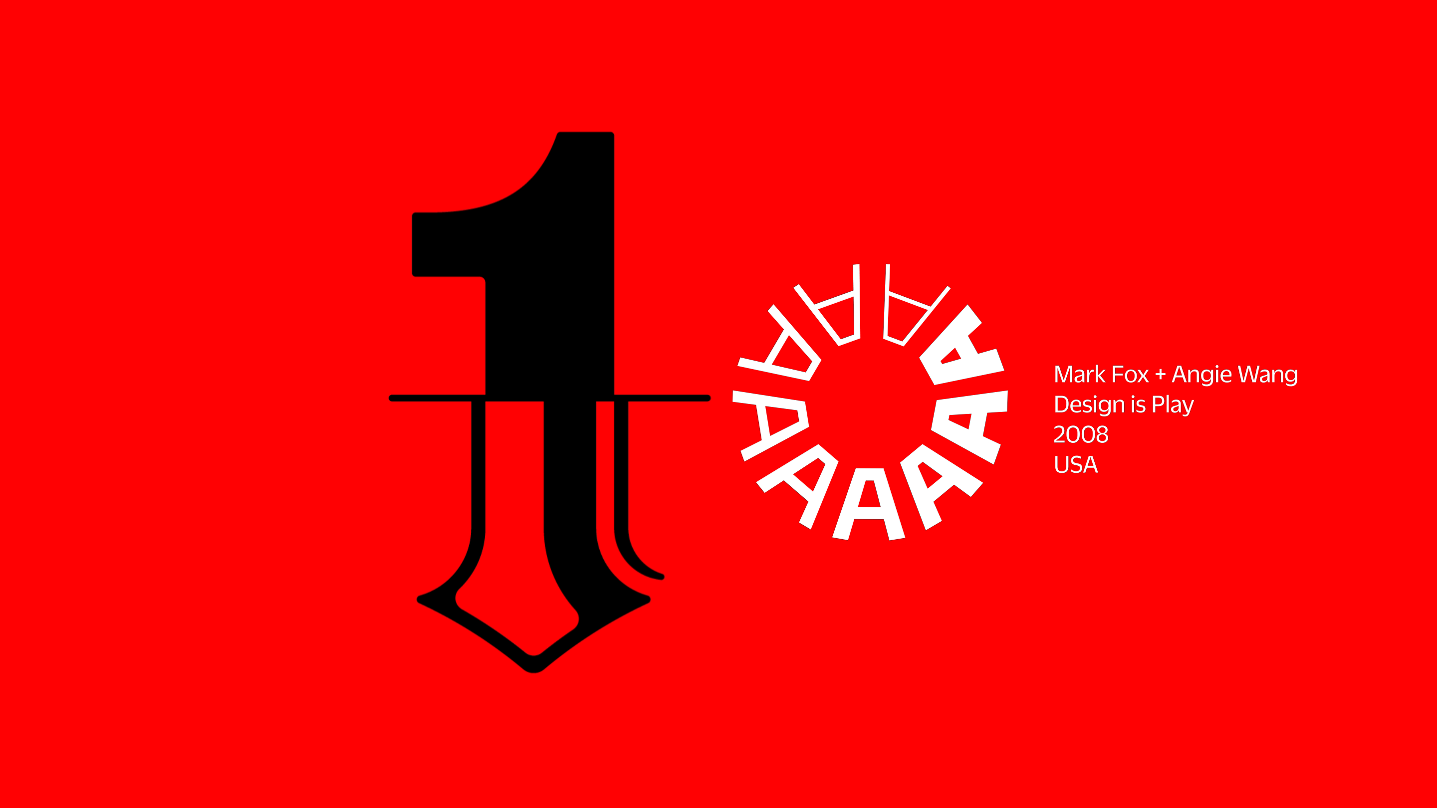
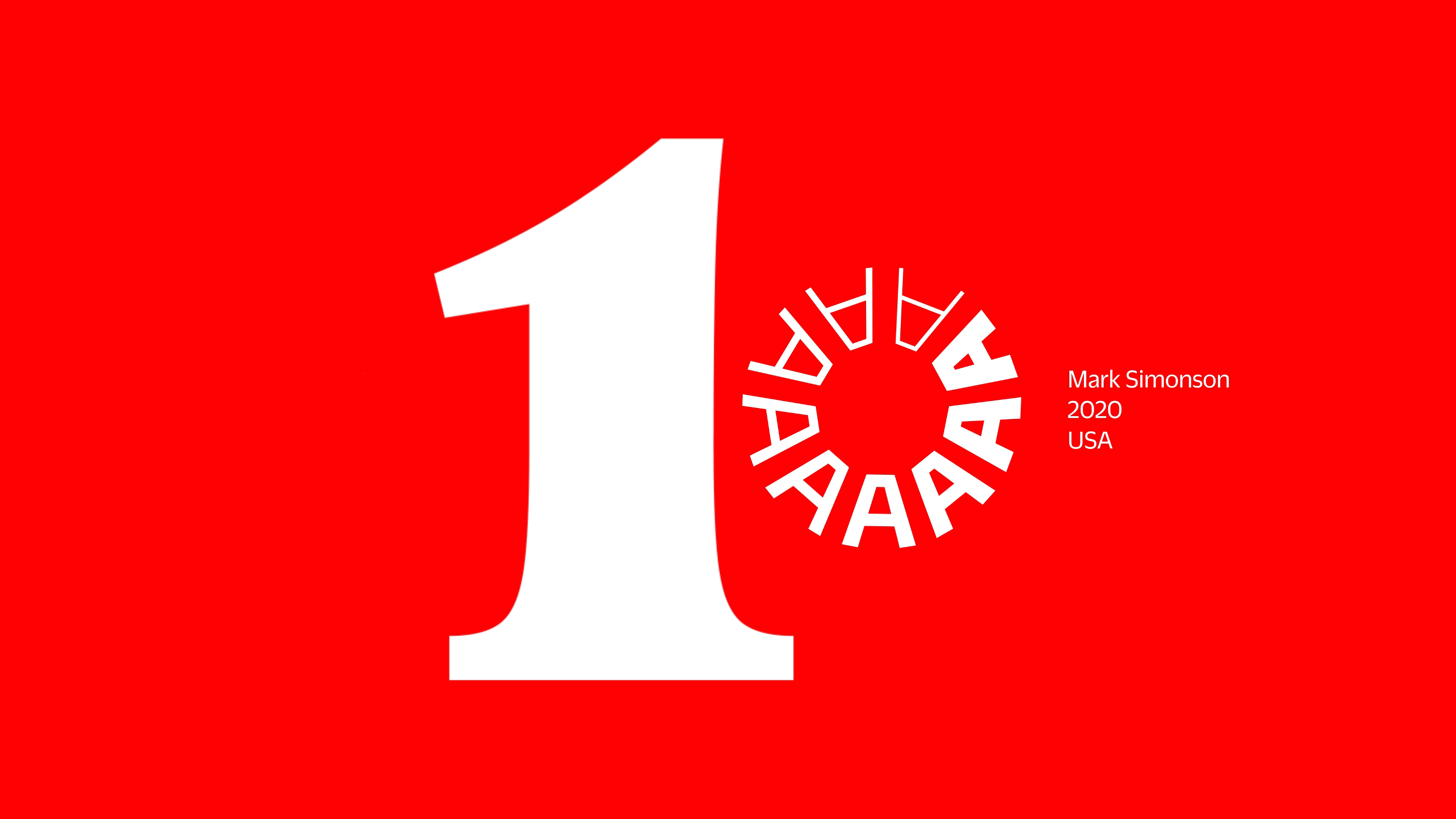
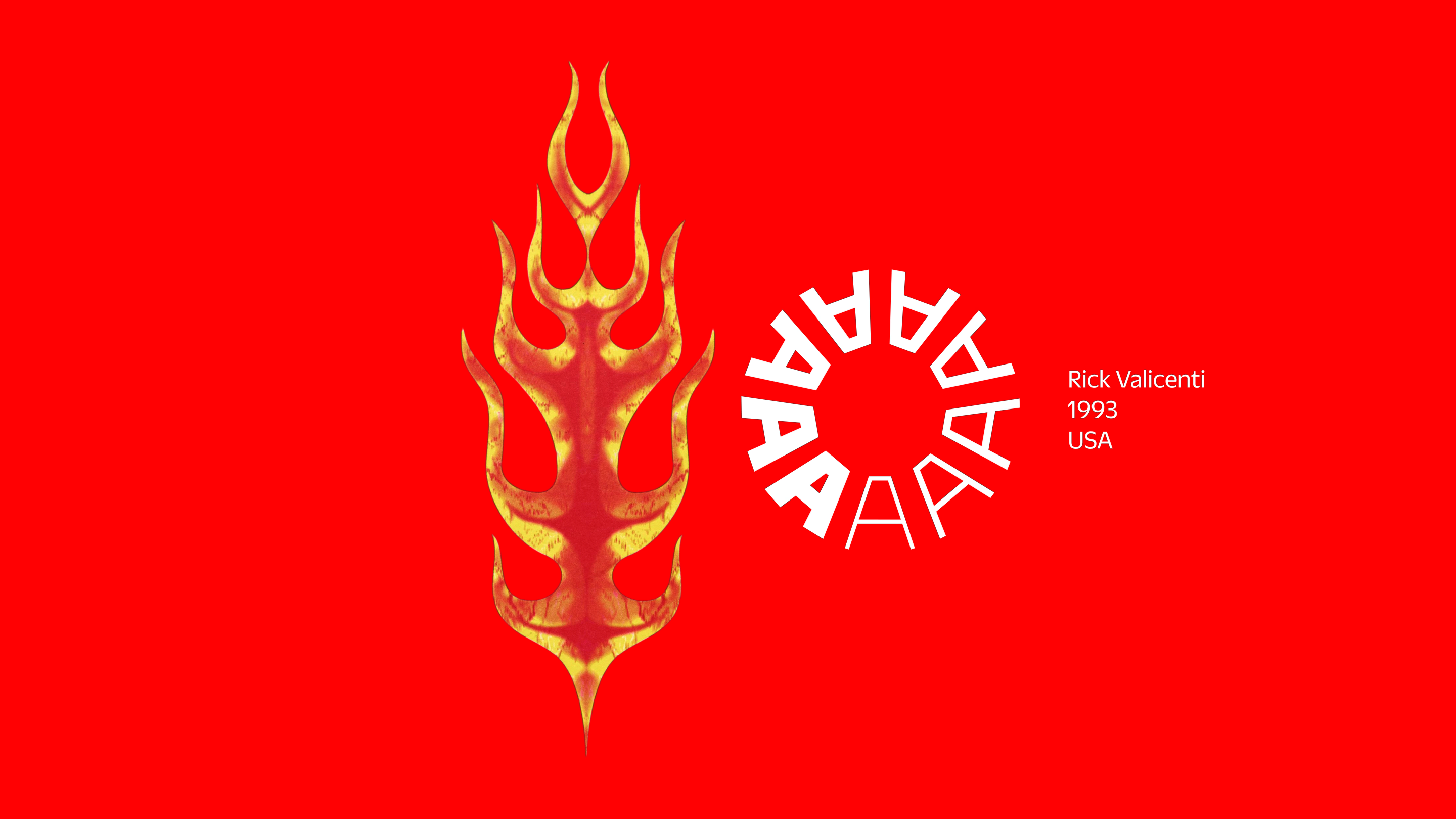
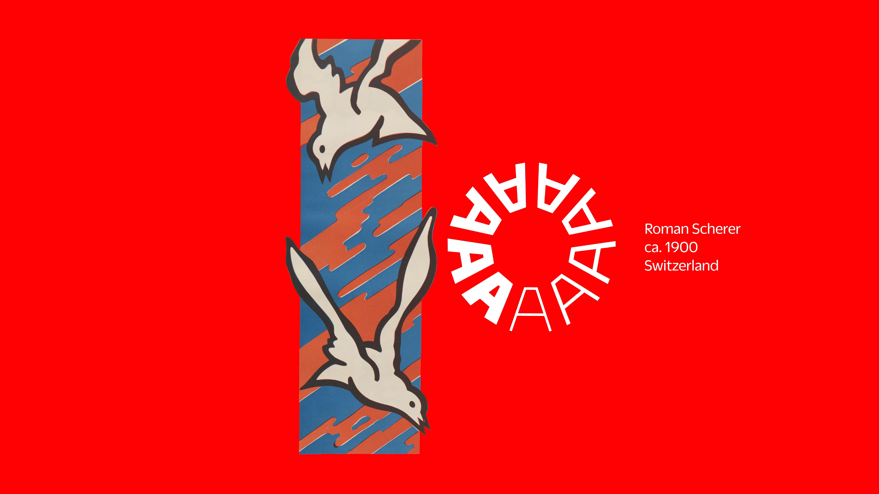
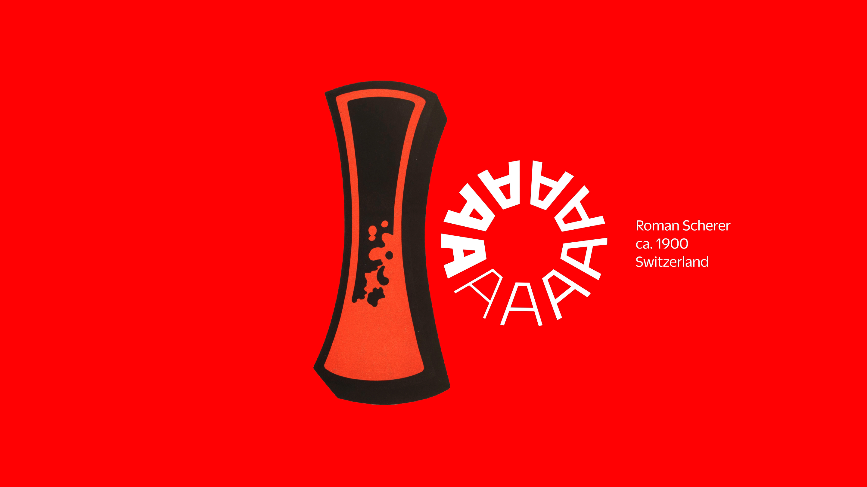
All 100 Tens
This gallery includes all the 10s designed by our contributors along with the objects from our collection. Click any image for a closer look, and a caption that links to the designer’s page, or the item in the Online Archive.

Behind the Designs
Over the next few weeks we’ll share selected process stories as told by the invited designers.
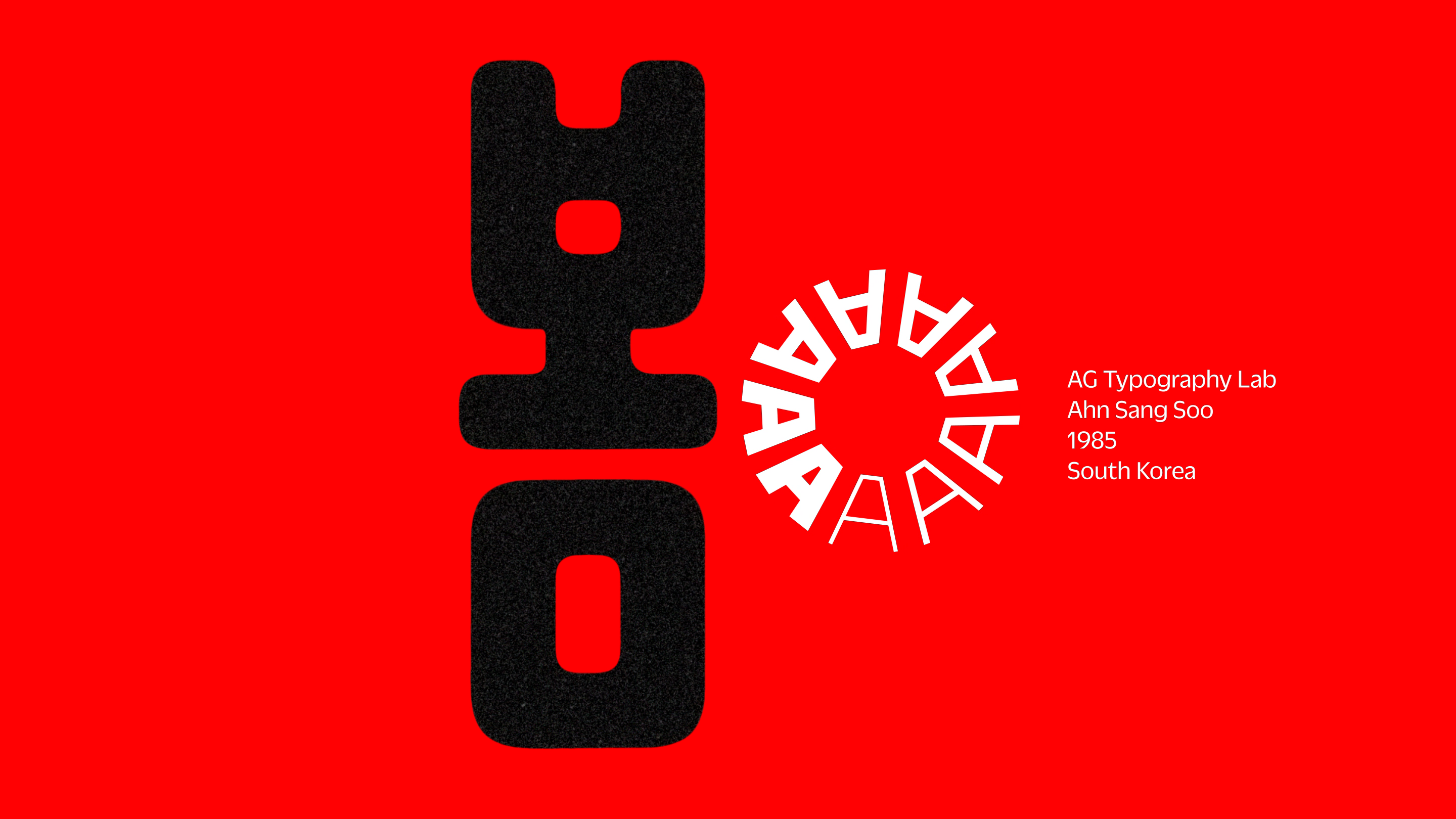
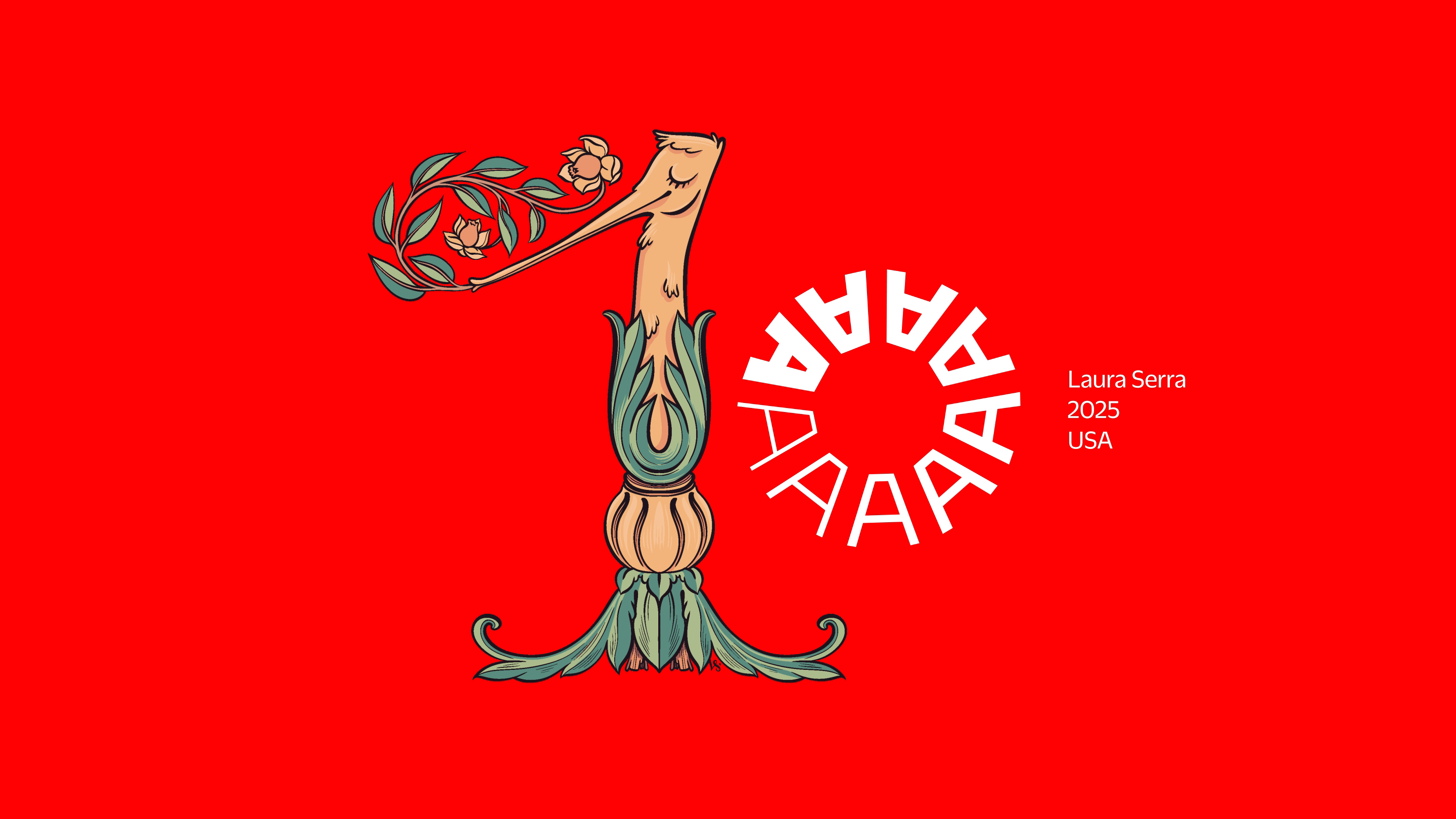
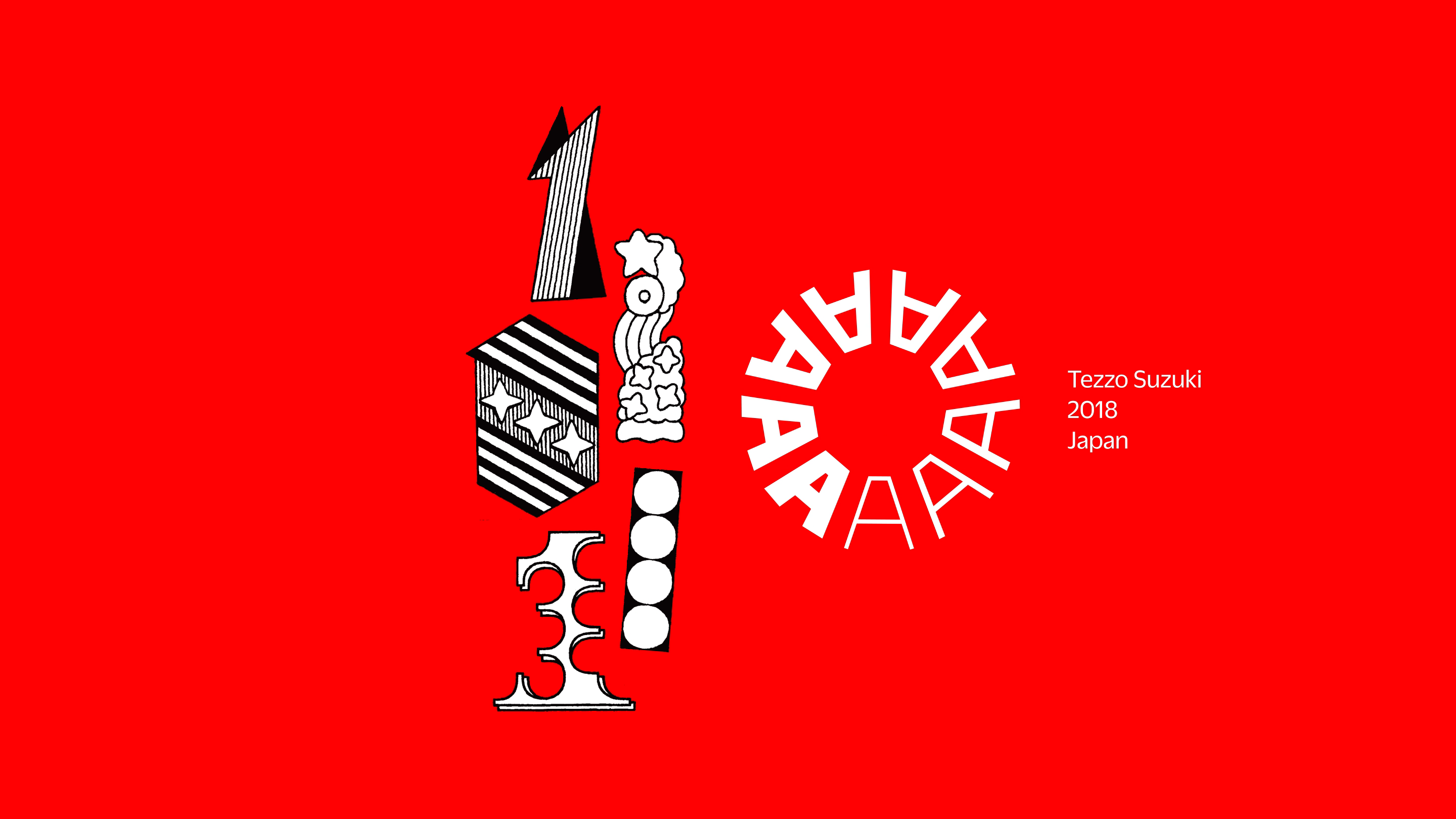
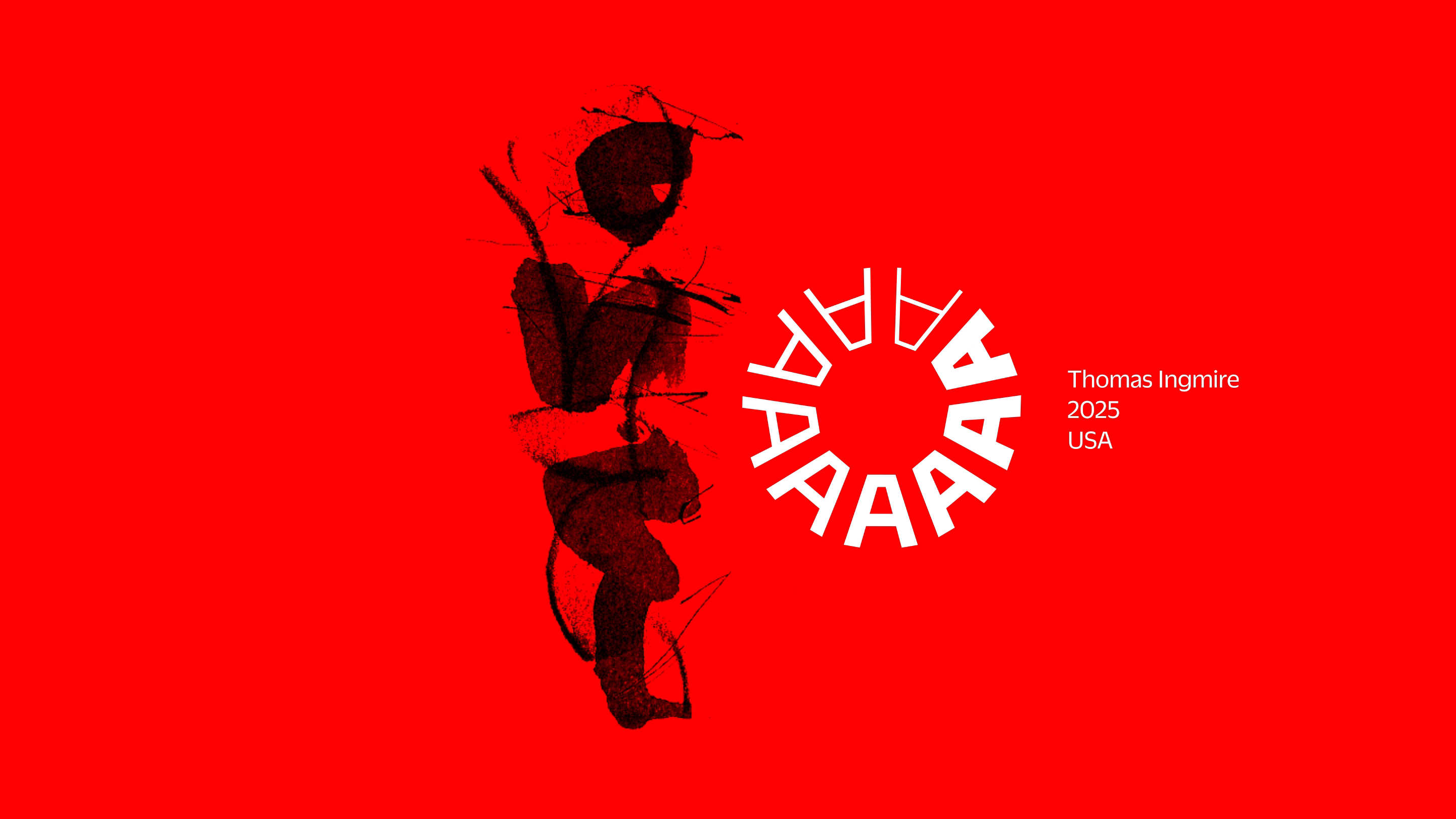
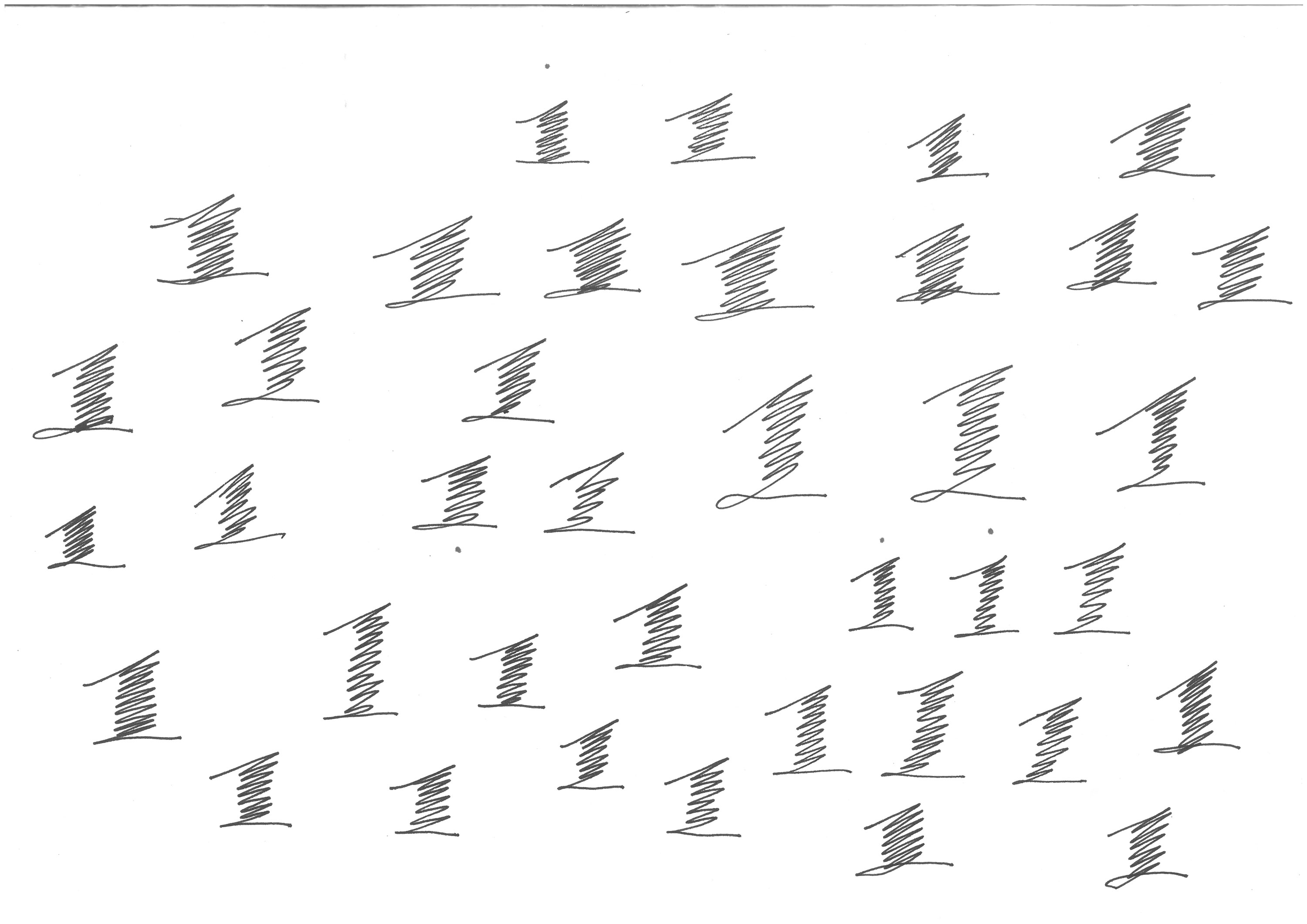
Tânia Raposo
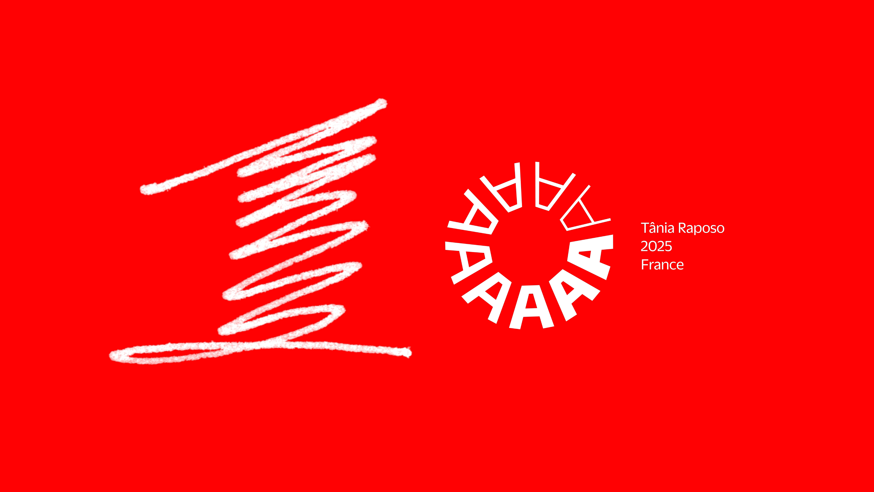
This design is the only contribution that includes both a one and a zero from the same designer. Why? Because Tânia Raposo created Letterform Archive’s logo. We’re grateful for her enduring contribution to our identity. While it got a minor tweak for this campaign and a subtle brand refresh to come, the roundel rolls on!
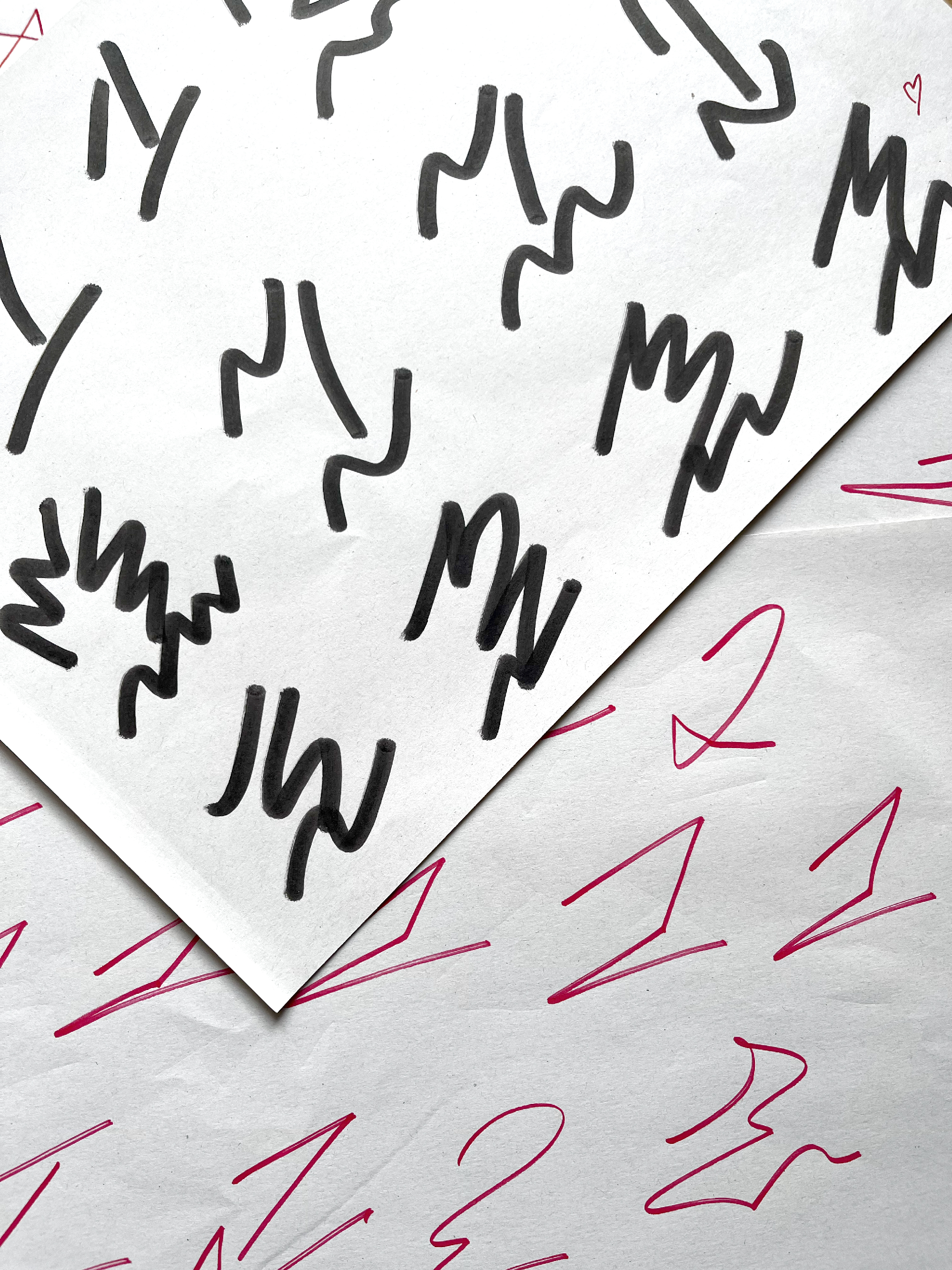
“I wanted the 1 to reflect the design process and not something finished. The most unique pieces at Letterform Archive are the process archives — drawings, sketches, correspondence — from which we can learn so much about how they worked. By doing a quick sketch like 1, it also represents that the Letterform Archive has many years ahead to grow, and that it is in constant change and evolution.”
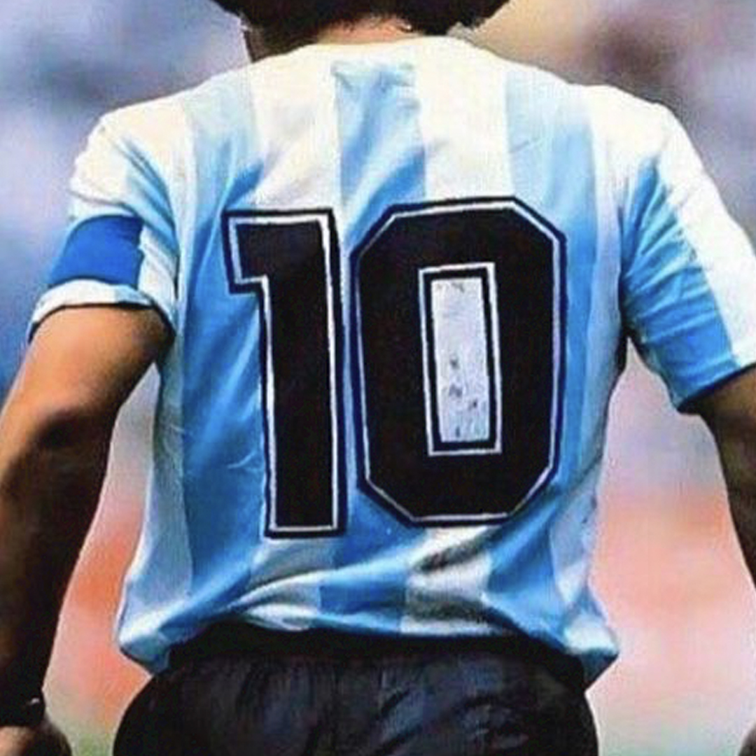
Santi Pozzi
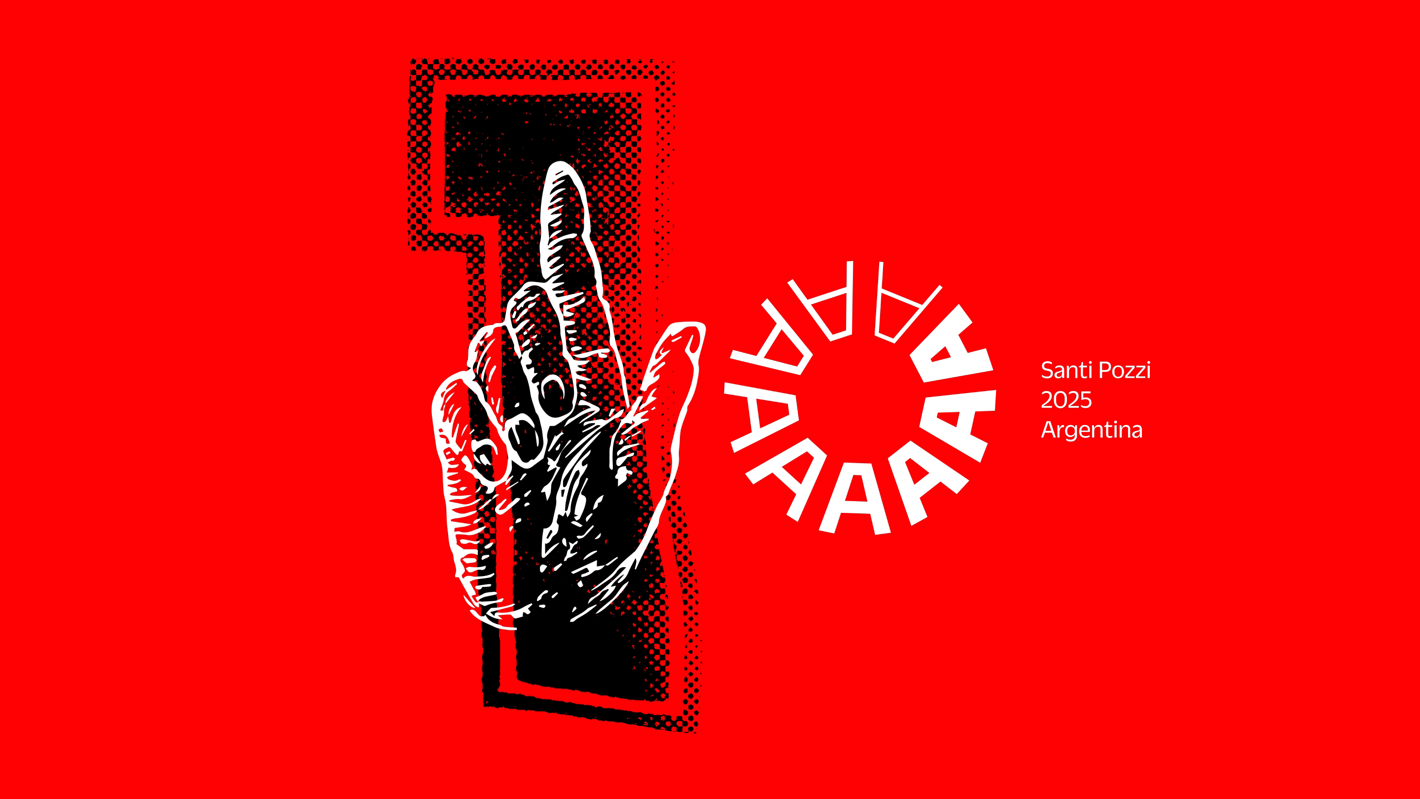
We first learned about Santi Pozzi from Pressing Matters magazine, and asked if he could send us a few of his dazzling psychedelic screen prints. They pair perfectly with our collection of Fillmore posters — a conversation between 1960s San Francisco and 2020s Buenos Aires.
“Where I come from, the number 10 is a sacred number of sorts — a national and spiritual symbol, almost alchemical. It has a very specific shape, but allows multiple approaches. I tried to, but found it very hard to avoid the jersey reference. It runs so deep and so high at the same time.”
Franziska Weitgruber
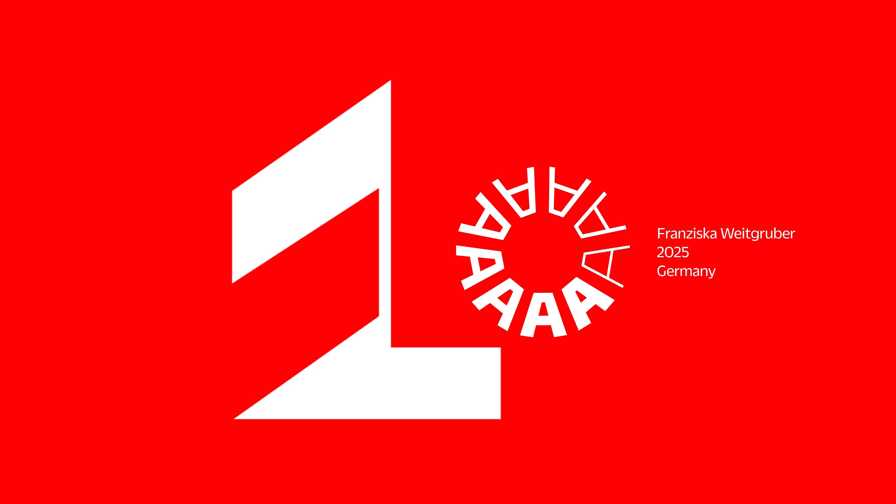
Franziska Weitgruber is one of the most innovative type designers living today. Her solution for the numeral was as inventive and thought-provoking as her typefaces.
“A series of experiments, different thoughts and points of reference merge: the gesture of writing, the construction of the number one, the work of Rosmarie Tissi. When does a one stop being a one? What are the decisive elements that define the boundary of illegibility?”

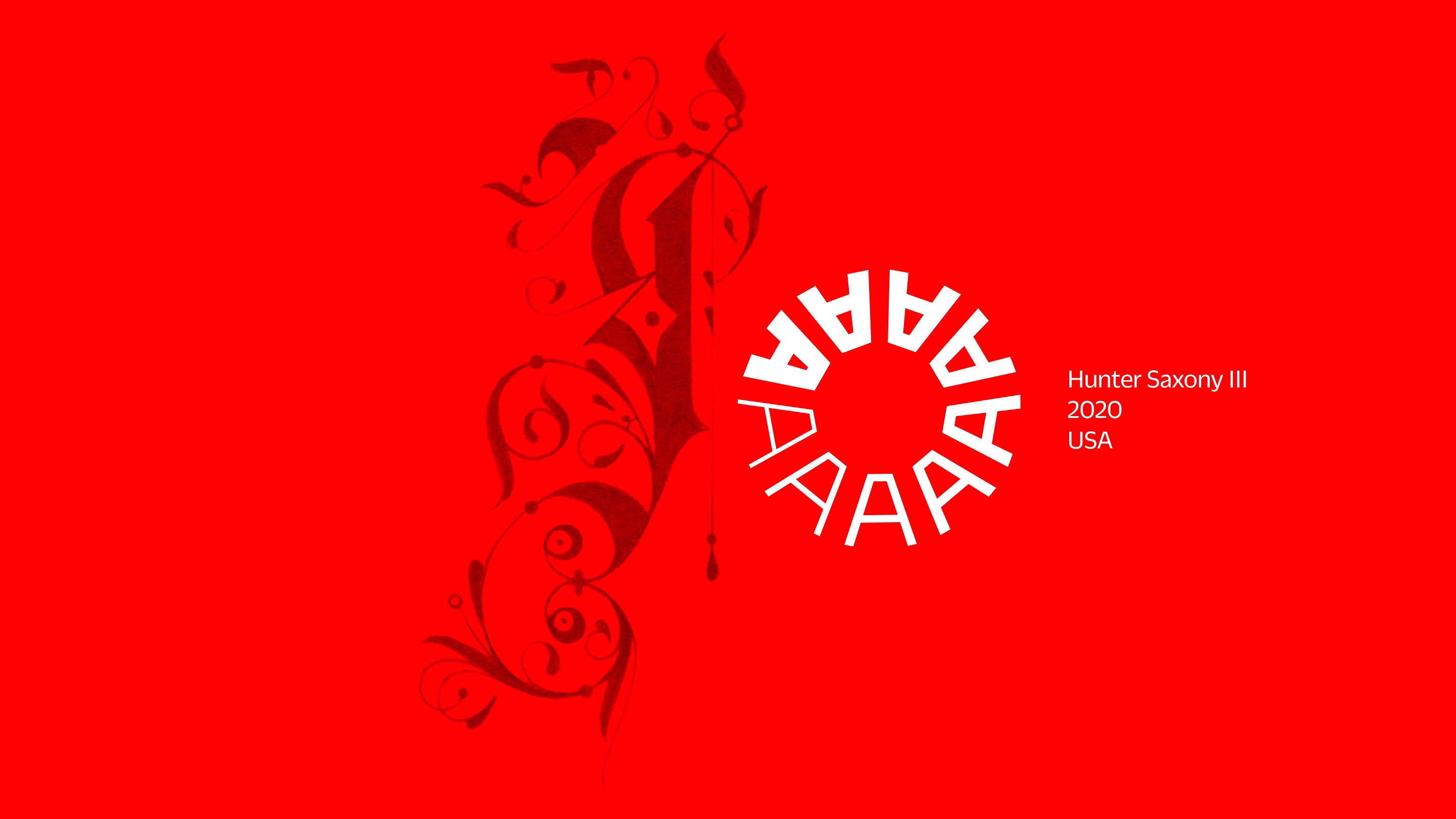
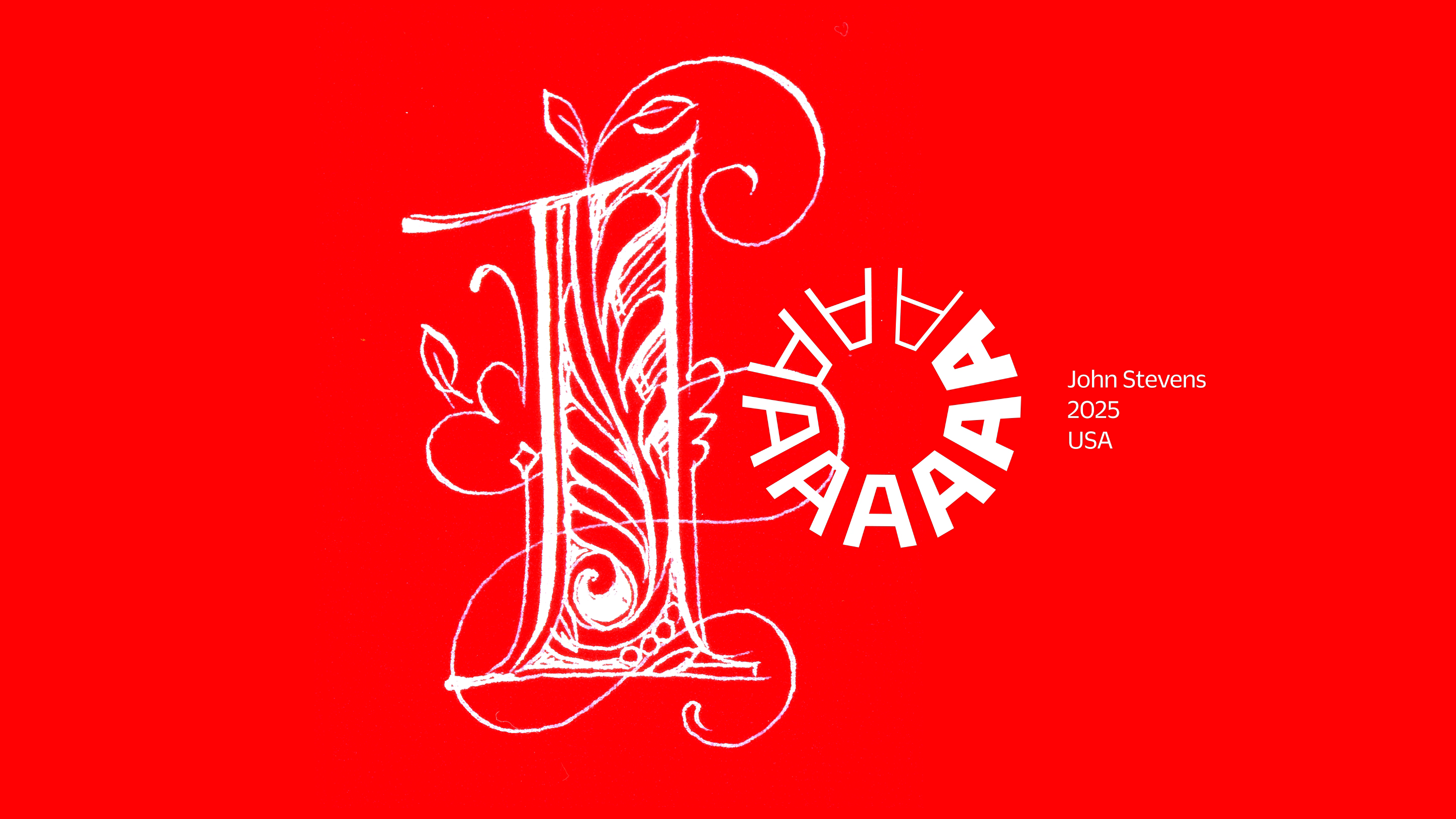
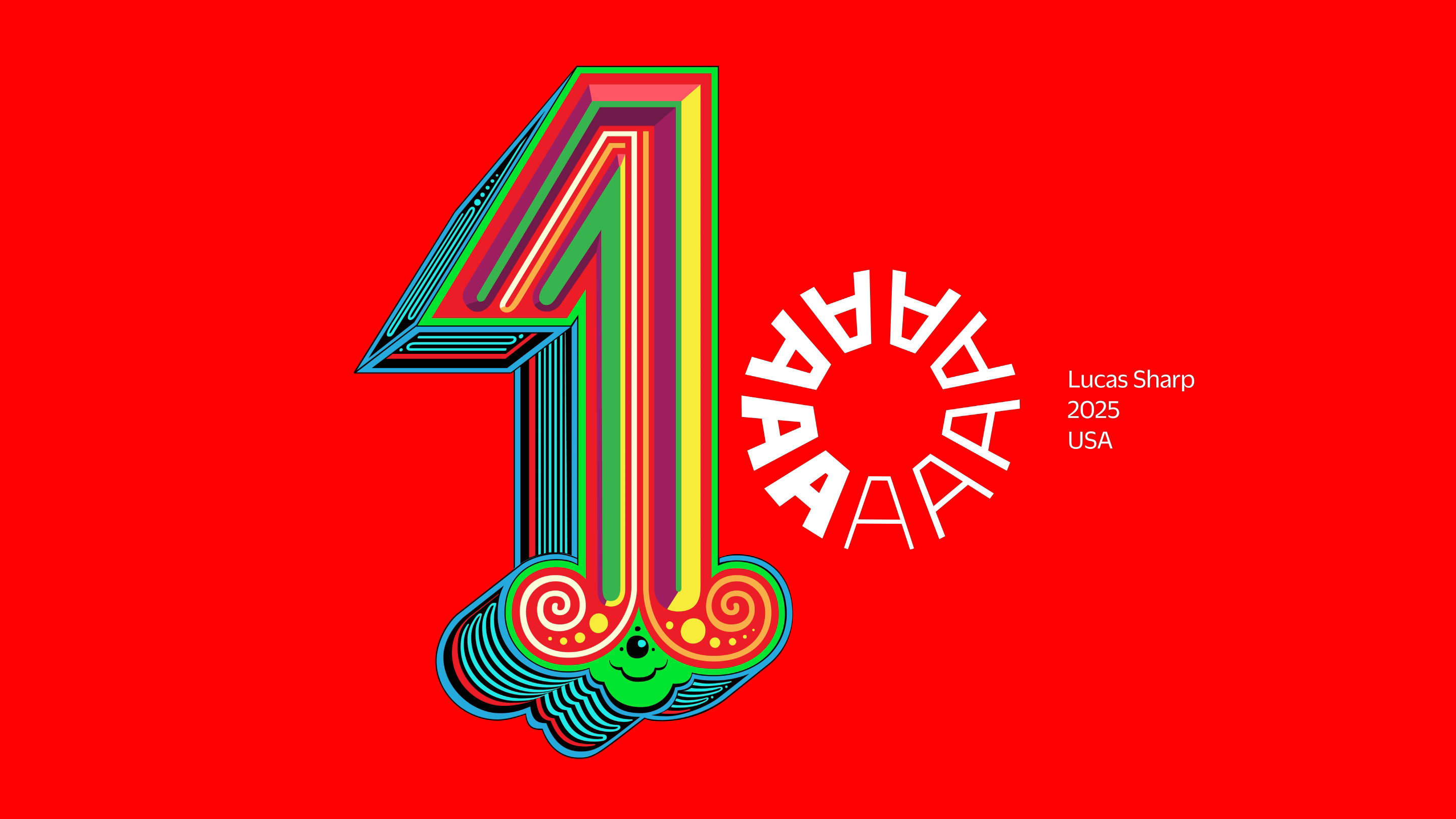
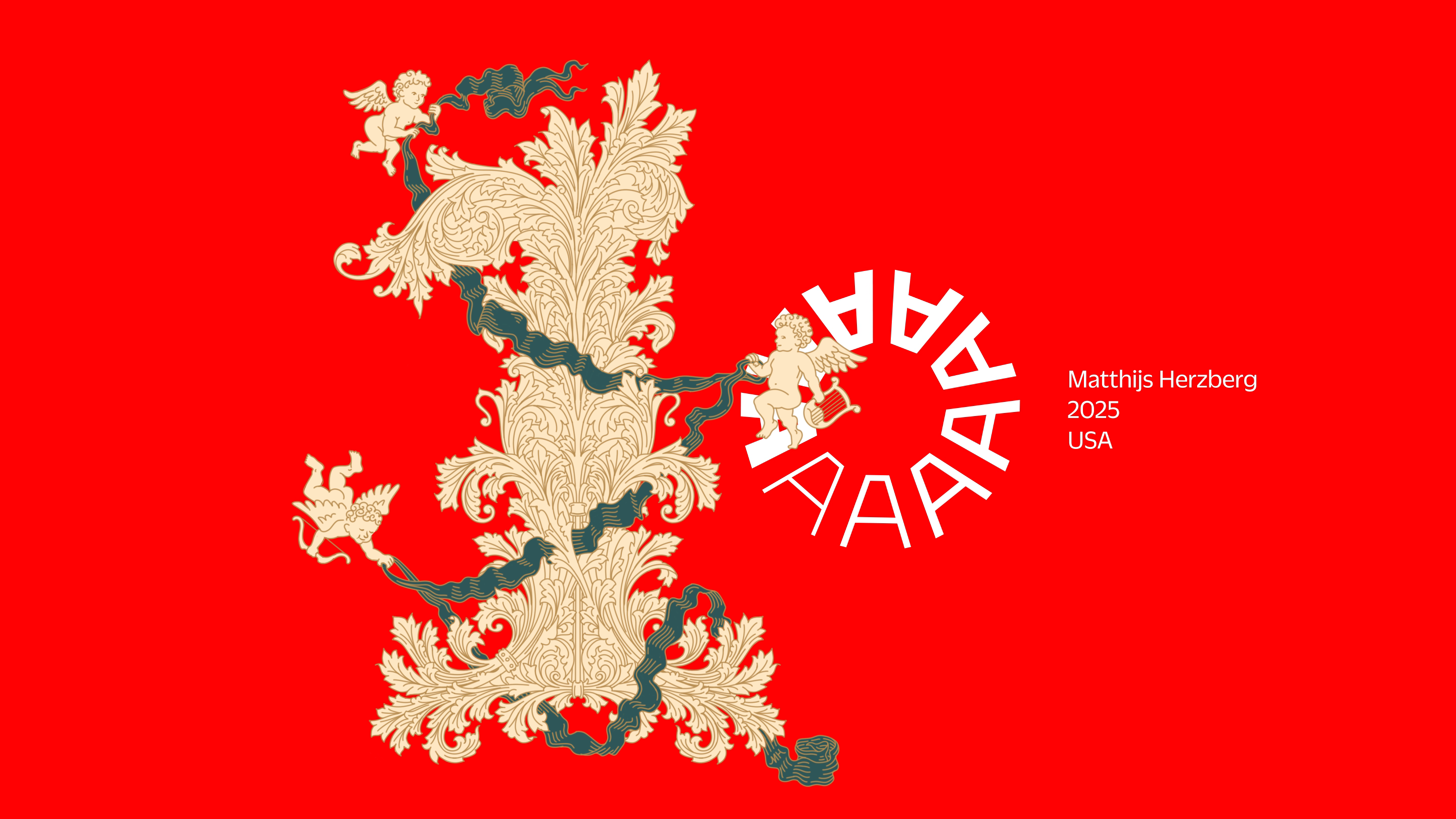
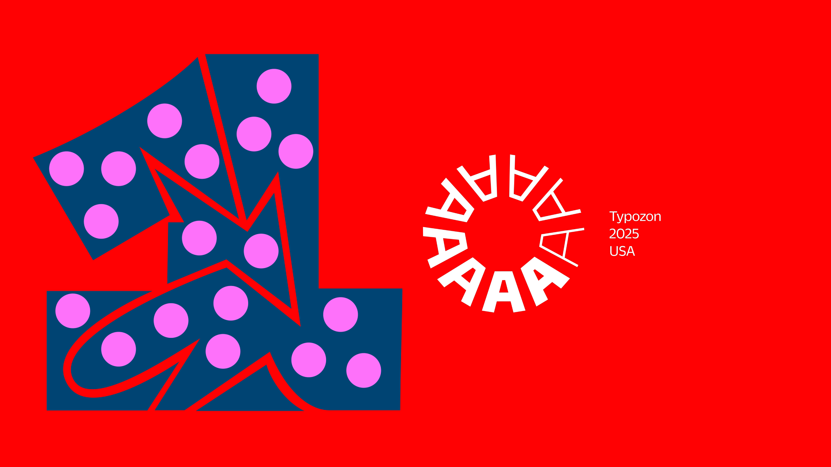
Matthijs Herzberg
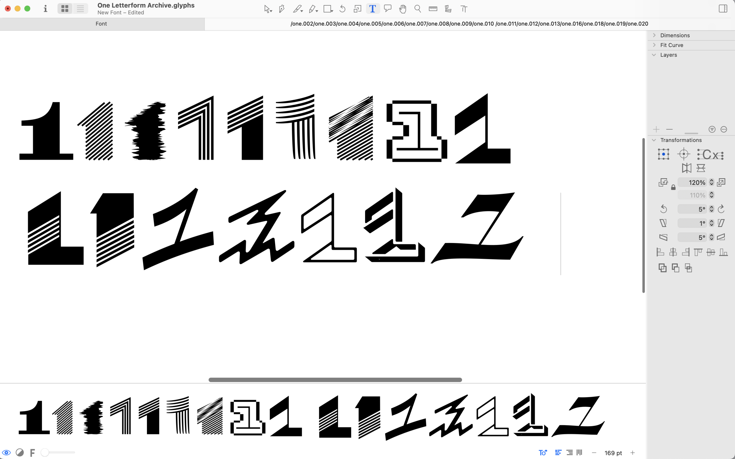
The lettering and typefaces of Matthijs Herzberg pull inspiration from art nouveau, jugendstil, and Secession styles — all favorites at the Archive — yet drawn with a distinctly contemporary hand. His contribution wins the prize for most complex linework.
“The 1 is not a particularly interesting character in form. It is a letter I with a little beak — big deal. When drawing fonts, I usually rush through it, excited to get to more interesting figures such as the noble 5. Even the 7, essentially a stretched-out 1, has more room for diversion and expression.
So what is a maximalist such as myself to do, when tasked with drawing such a simple character? Well: ornament. This 1 is formed entirely out of acanthus leaf, surrounded by impish cherubs in the midst of decorating this already decked-out figure with teal ribbon.
I drew this entirely in Procreate on the same iPad I've used for the past five years, and which has become an invaluable addition to my lettering arsenal.
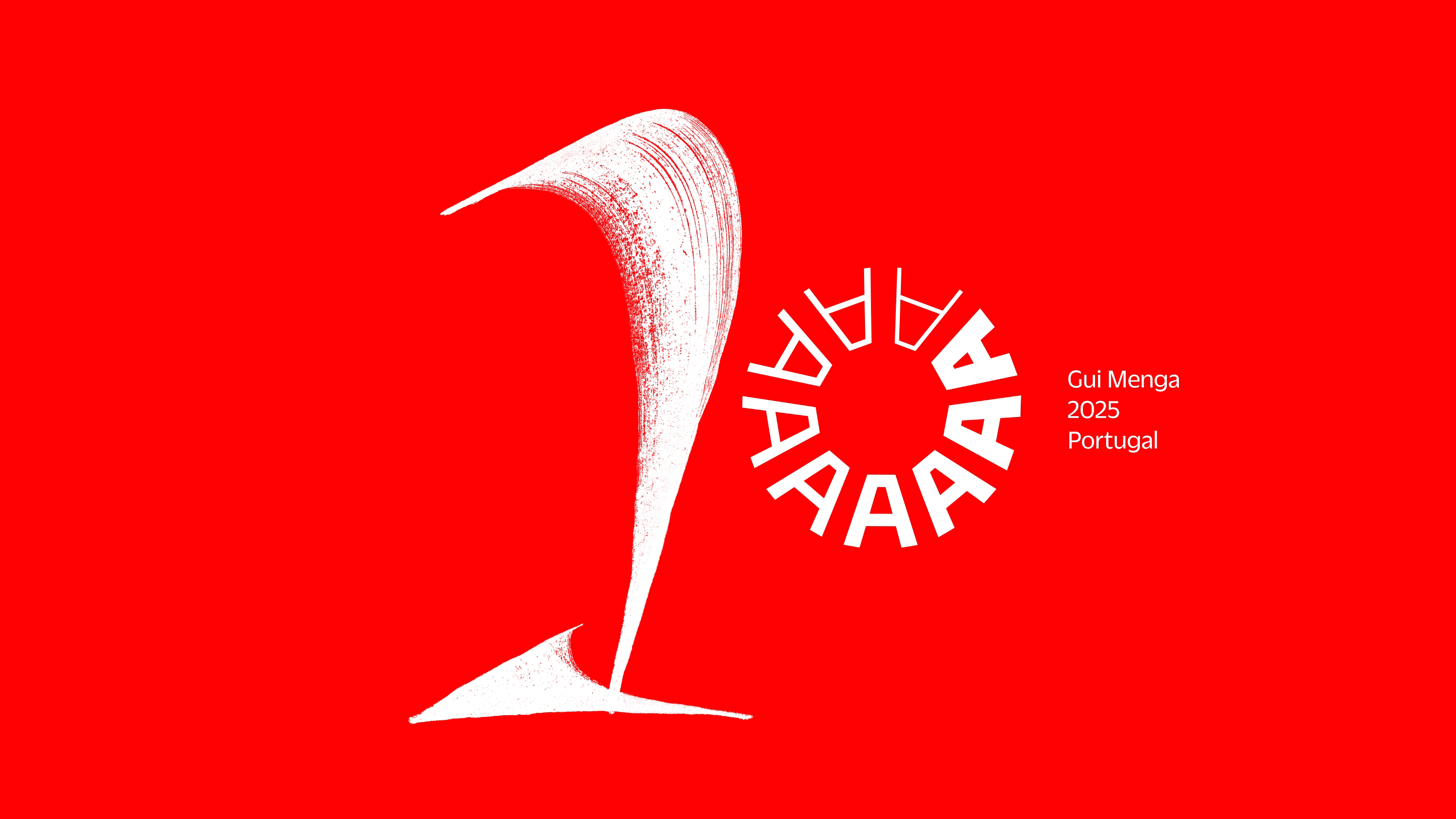
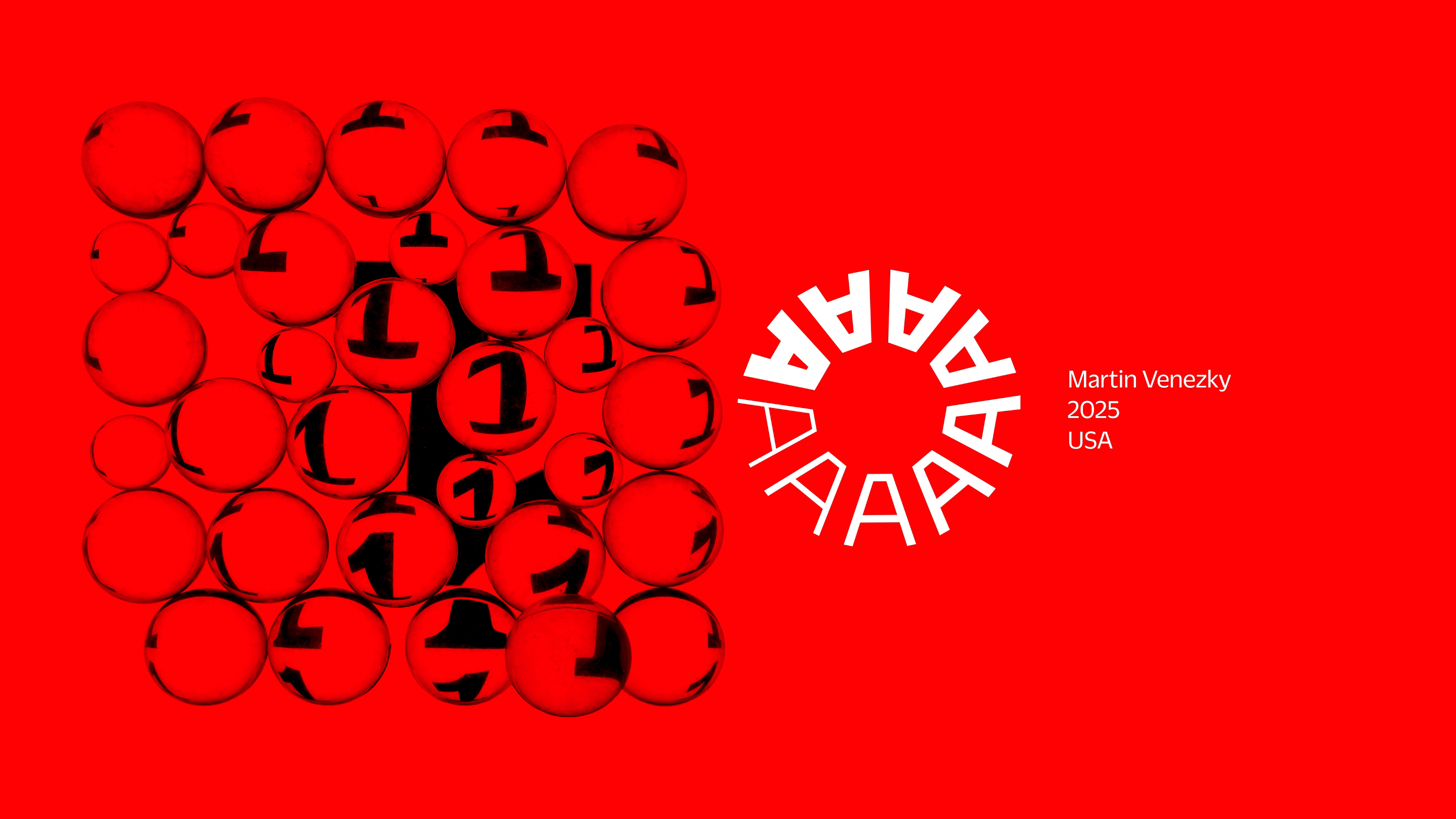
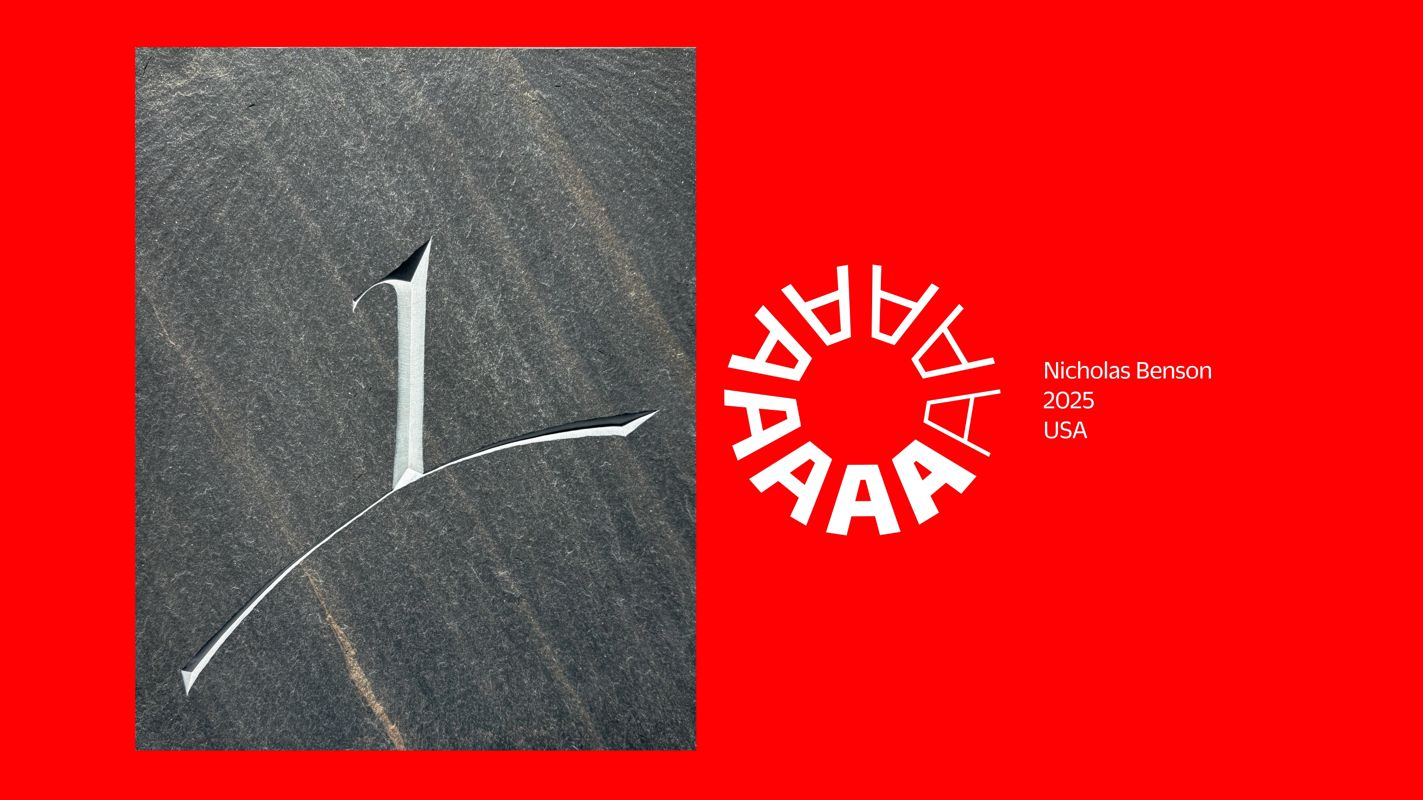
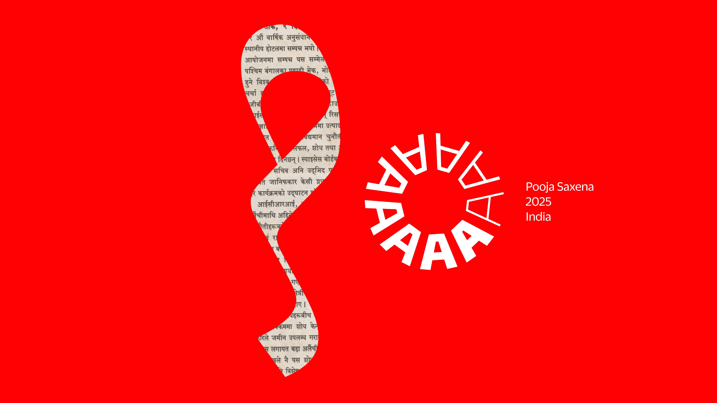
Hear directly from more contributors — stone carver Nick Benson, calligrapher Gui Menga, type designer Pooja Saxena, and designer/photographer Martin Venezky — in the recording of our October 2025 salon:
More 100 Tens process stories to come! Subscribe to our email newsletter to get notified.
This campaign was a beautiful way to mark our anniversary online. Now it’s time to celebrate in person! Come party with us in San Francisco at Letterform Live! on March 14, 2026.