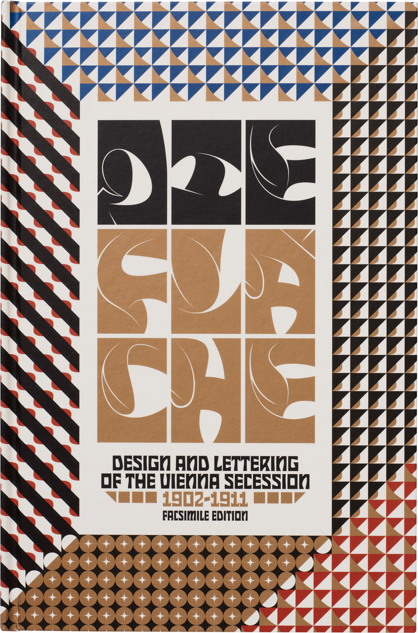
A landmark design periodical, brought to life in a complete facsimile edition with eye-opening critical essays and translations
Around 1900, leading Secessionists and their students developed a new style of graphic modernism, emphasizing flatness, expressive geometry, stylized lettering, and bold colors in an effort to transform the world of printed surfaces. Die Fläche (The Surface) showcased their vision, presenting hundreds of designs for everything from posters and playing cards to textiles and packaging.
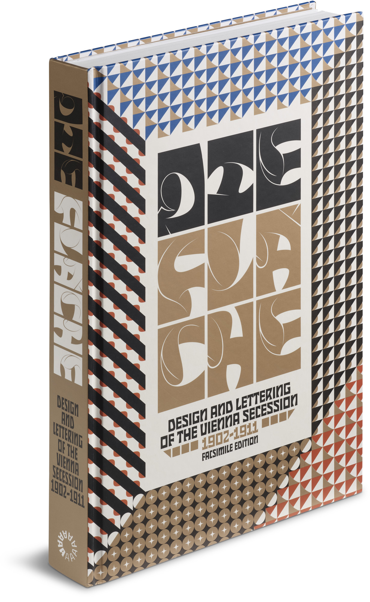
This facsimile edition of Die Fläche recreates every page of the formative periodical in full color and at original size, preserving even the accordion foldouts of the second volume. In-depth essays contextualize the work, highlighting contributions by pathbreaking women, innovative lettering artists, and key practitioners of the new “surface art,” including Rudolf von Larisch, Alfred Roller, and Wiener Werkstätte founders Koloman Moser and Josef Hoffmann. With complete translations, a glossary, and selected artist biographies, this book provides unprecedented access to a major document of design history.
About Die Fläche
Published in Vienna between 1902 and 1911, Die Fläche was one of the first and most ambitious modern design periodicals. Across fourteen colorful issues featuring work by over 100 creators—around a third of them women—an explosion of design methods, teaching ideas, and visual forms heralded a break from nineteenth-century conventions. With an aim to resurface every facet of modern life—from the smallest bookmark to the urban streetscape—Die Fläche introduced a vocabulary of expressive flatness that remains powerfully with us today.
Off the beaten paths of art and design history, Die Fläche still comes as a revelation to many contemporary viewers. Because of its scarcity, even most enthusiasts of Vienna 1900 have never been able to explore its pages. This complete reproduction of Die Fläche—the first in a series of facsimiles from Letterform Archive—offers unparalleled access to this remarkable work, presenting and contextualizing it for a wide audience for the first time.
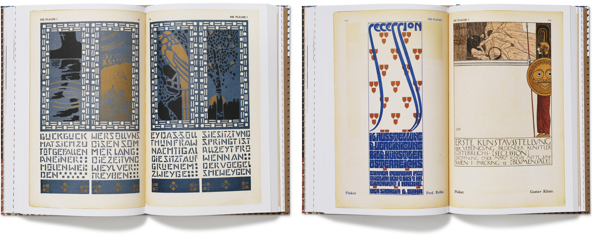
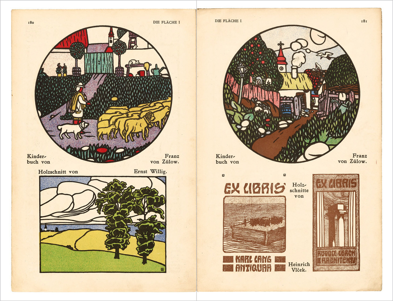
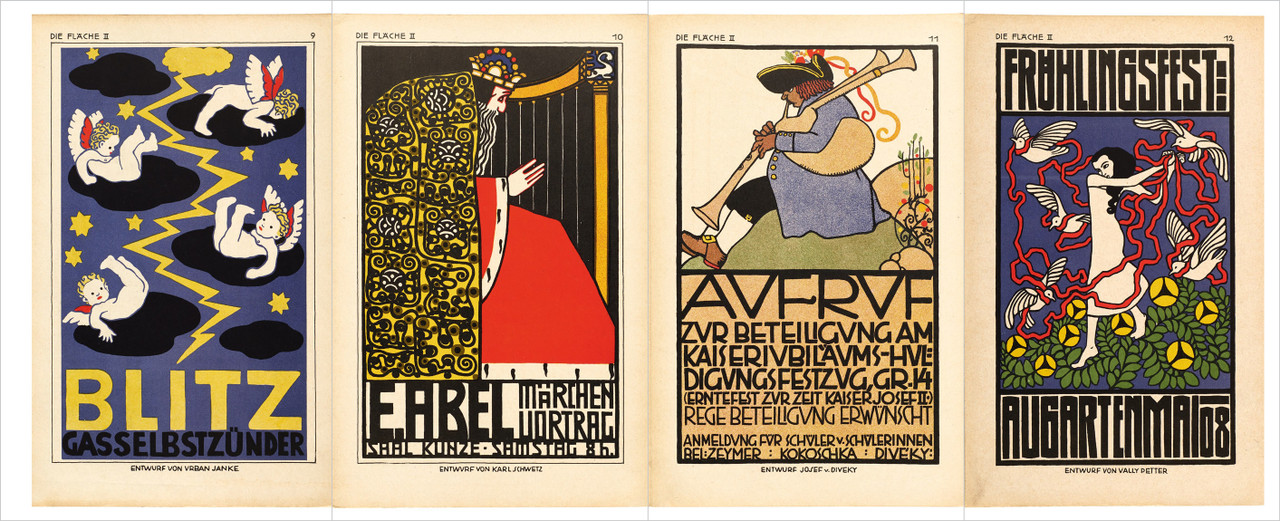
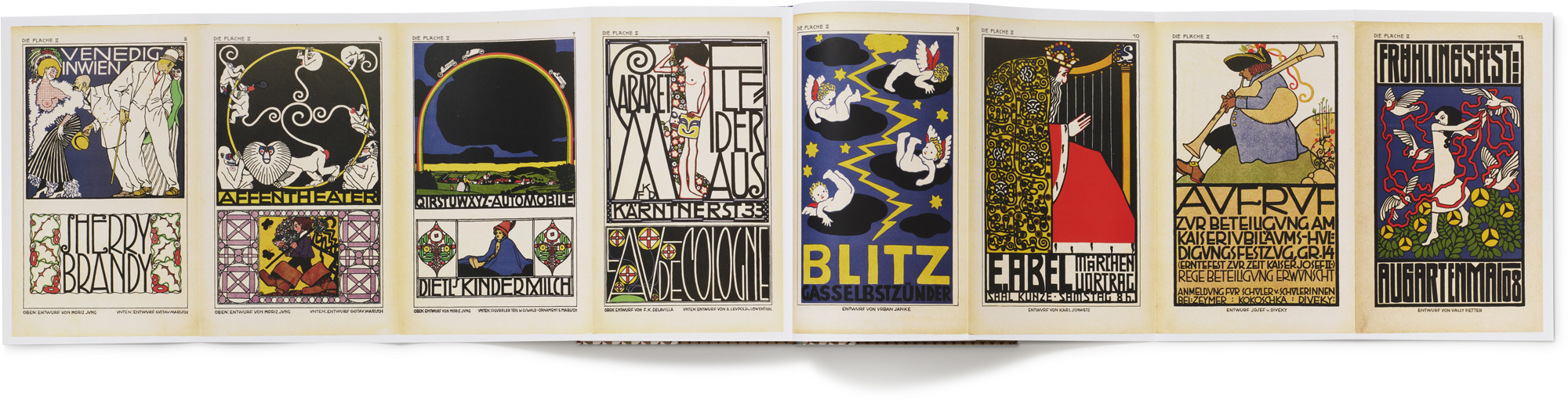
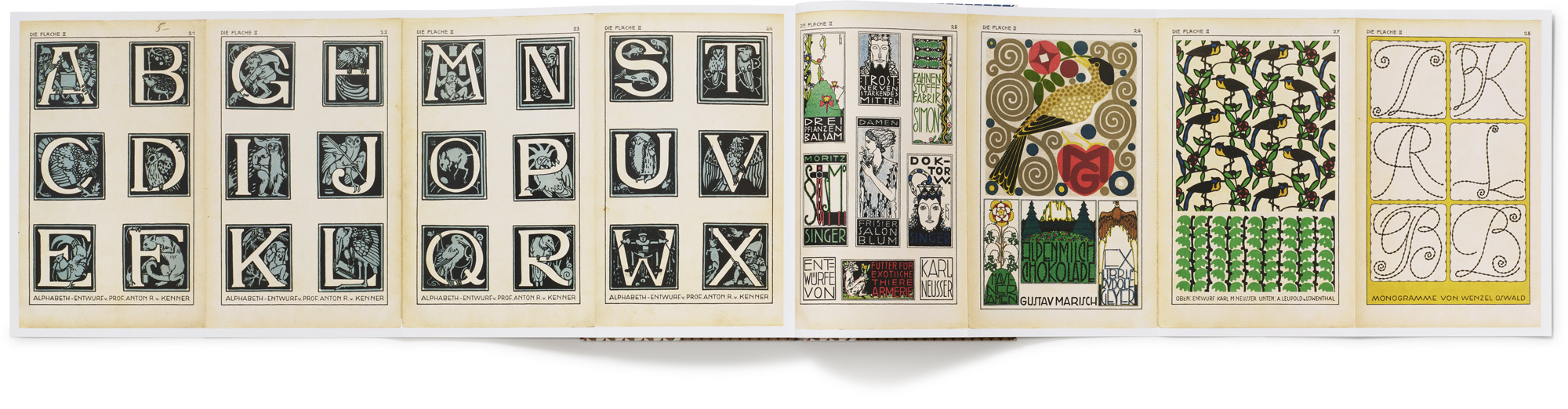
High-fidelity images of Die Fläche’s 200+ pages, all printed in full color at their original size, feature designs by legendary artists such as Gustav Klimt, Koloman Moser, and Alfred Roller, as well as many less well-known innovators. The twelve issues of volume I, published between 1902 and 1904, feature dynamic layouts that combine dazzling patterns, bold lithographic posters, playful experiments with stencils and woodcuts, and strikingly original letterforms. The two issues of volume II showcase posters from the landmark 1908 Kunstschau in four-panel accordion spreads, impressively preserved as impressive foldouts in the facsimile. Collected into a single hardcover volume, with a critical supplement and Secession-inspired cover art and chapter openers by contemporary artist Julien Priez, this elegant edition of Die Fläche makes a worthy tribute to the original.
Die Fläche offers an abundance of inspiration for all fields, including decorative painting, poster art, designs for books and printing, endpapers, covers, menus and business cards, illustrations, wallpaper, black-and-white art, textiles, patterns for printing and weaving, leaded glass, inlays, embroideries, monograms, clothing decoration, etc.... Everything can be found in it, except the superfluous.
Joseph August Lux, from the introduction to Die Fläche
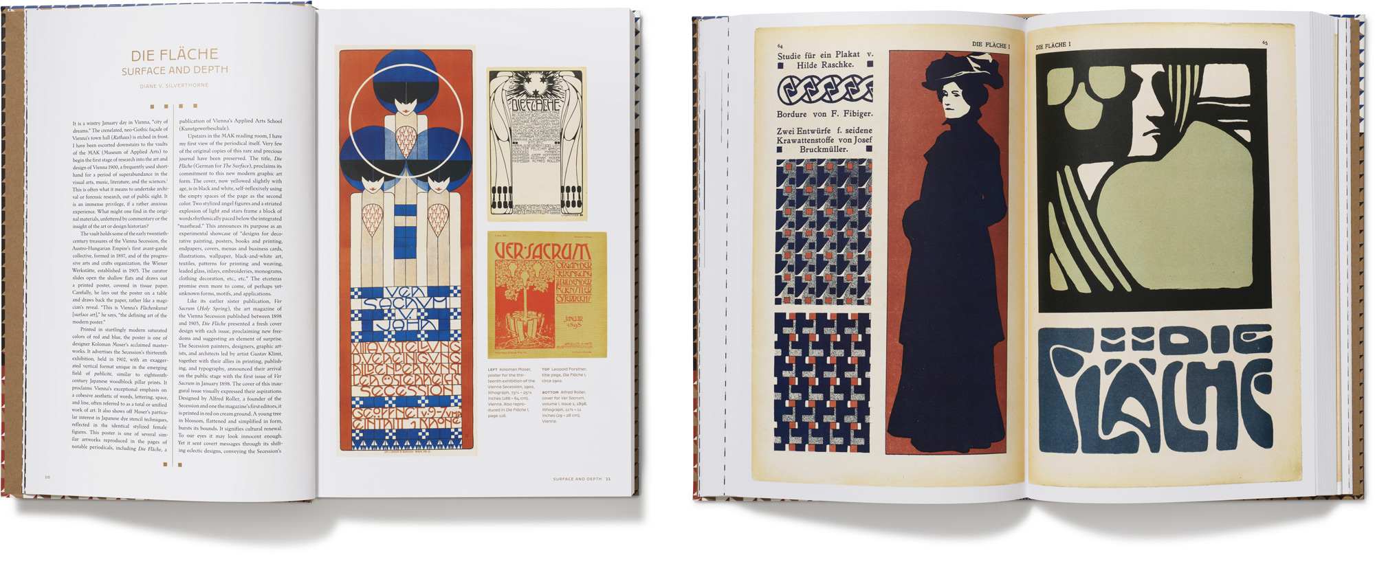
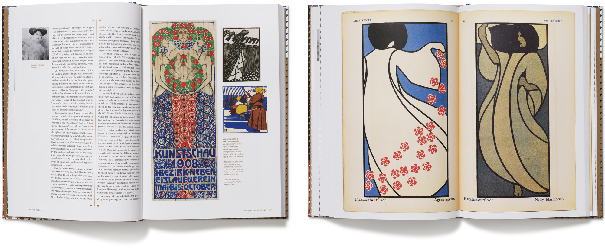
The book opens with three in-depth and richly illustrated essays on Secessionist designers, creative letterers, and women artists who shaped Die Fläche. Art historian Diane V. Silverthorne positions it in the cultural landscape of Vienna around 1900, detailing how its editors—virtuoso designers Koloman Moser, Josef Hoffmann, Alfred Roller, Felician Myrbach, and Berthold Löffler—transformed design practice and pedagogy in pursuit of a modern “surface art.” Dan Reynolds offers the first comprehensive English-language study of Rudolf von Larisch, the twentieth century’s most influential theorist of “artistic writing” and the catalyst behind innovative Secession lettering. Megan Brandow-Faller, author of The Female Secession, shines light on Die Fläche’s many women designers, showing how a feminist idea of “unlearning” fueled transformative engagements with folk, East Asian, and children’s art, as well as new approaches to stenciling and woodcut printing.
Translations of six essays from Die Fläche vividly engage debates over modern design and its methods. Penned by cultural critic Joseph August Lux, they develop theories of poster art, lettering practice, and print design that position Die Fläche at the forefront of a cultural movement. Additional resources, including a German–English glossary of labels in Die Fläche, a complete index of artists, selected artist biographies, and issue-by-issue guides, make this an essential volume for anyone interested in the history of design and its lessons for the present.
About the Contributors
Diane V. Silverthorne is an art historian and Vienna 1900 scholar with research interests in European art and design of the long nineteenth century. She has a passion for music and its impact on the visual arts and has published widely on these subjects, notably on Alfred Roller, a Secession graphic artist and opera designer. She also reviews for The Wagner Journal. She has lectured for many years at the University of London and for public audiences, recently speaking at the Freud Museum London, and presenting on “Exhibiting Music” for the music and philosophy study group. Diane’s anthology, Music, Art and Performance from Liszt to Riot Grrrl (Bloomsbury), was published in 2018. She has written on the life and art of Anna Mahler, daughter of Gustav and Alma Mahler, for a recent special issue of Sculpture Journal. She does an excellent impersonation of the young Alma Mahler from her early diaries.
Dan Reynolds is an American designer living in Germany. He teaches typography at the Niederrhein University of Applied Sciences in Krefeld. After a short time studying at the Offenbach University of Art and Design, just two blocks from the Klingspor Museum, Dan began working as a type designer at Linotype and Monotype. From 2012 until 2018, he undertook doctoral studies at the Braunschweig University of Art. Since then, Dan has devoted himself to researching type foundries active during Germany’s imperial era, between 1871 and 1914. After graduating, he started work on a database to document all the sans serif typefaces sold in Germany during the nineteenth century. In 2020 and 2021, Dan was a scientific adviser for a project funded by the Berlin city-state to digitize more than 400 type specimens in public collections and make them freely available online for viewing and reuse.
Megan Brandow-Faller is a professor of history at the City University of New York Kingsborough and also teaches at the CUNY Graduate Center. Her research focuses on art and design in Secessionist and interwar Vienna, including children’s art and artistic toys of the Vienna Secession, expressionist ceramics of the Wiener Werkstätte, folk art and modernism, and women’s art education. She is the editor of Childhood by Design: Toys and the Material Culture of Childhood, 1700–Present (Bloomsbury, 2018), author of The Female Secession: Art and the Decorative at the Viennese Women’s Academy (Penn State University Press, 2020), and coeditor (with Laura Morowitz) of Erasures and Eradications in Modern Viennese Art, Architecture and Design (Routledge, 2022). Brandow-Faller contributed two catalog essays for the retrospective exhibition Die Frauen der Wiener Werkstätte at Vienna’s Museum of Applied Arts (2021). Her newest project focuses on the dissemination and popularization of Secessionist ideas about child creativity in postwar America.
Julien Priez was born in Montreuil, France, and studied graphic design and type design between 2004 and 2010 at Eugénie Cotton Montreuil and Estienne Paris. After working for three years as a freelance typographer and calligrapher for several agencies, including Pierre Di Sciullo, Atelier Chévara (now Marge Design), and Atelier Müesli, he was employed in a type foundry for two years. He now works as an independent calligrapher, type designer, and graphic designer at Boogy Paper and teaches for several schools in France and around the world. In 2016, he won the bronze prize at the Morisawa Type Design Competition in Tokyo, and has since become a formal member of the High on Type collective.
Praise
One of the most exquisitely beautiful, expertly crafted facsimile editions I have ever held in my hands... a production masterpiece.
— Steven Heller, PRINT magazine
Die Fläche looks and feels like a sculpture…. The accepted translation is “The Surface.” Rarely has an art movement described itself so succinctly.... The Vienna Secession artists explored this aesthetic in countless compositions throughout the two periods of publication of Die Fläche: 1902–4 and 1910–11. Everything is collected and published in the Letterform Archive edition. Readers will be charmed and delighted by the accordion foldouts for the last two issues. Letterform Archive has supplied all of the scholarly apparatus a reader could want.
— Casey Smith, Printing History
This meticulously produced facsimile of Die Fläche introduces a periodical not widely known, despite its importance for the flowering of the decorative arts and design at the height of the Vienna Secession. Like the earlier and more famous Ver Sacrum, which transformed the way fine arts publications were conceived, Die Fläche showcased design in a new form, proffering an extraordinary range of graphic works. Some conform to our expectations of Viennese design, while many others show surprising and intriguing variations. Importantly, the publication includes three essays, respectively offering a full art historical context, a focused study of the lettering artist Rudolf von Larisch, and a consideration of the significant contribution of women designers for this movement. Including a complete English translation of all its texts, without doubt this publication will become a standard reference on Die Fläche. It is a magnificent achievement, destined to be enjoyed as an object of pleasure and a delight to the reader.
— Jeremey Aynsley, author of Pioneers of Modern Graphic Design: A Complete History, Graphic Design in Germany: 1890-1945, and A Century of Design
It seems almost like a fairy tale, a group of Vienna Secessionists around 1900 developed a revolutionary graphic modernism that would change the potential of design and lettering. The art movement was documented from 1902 to 1911 in the periodical, Die Fläche (The Surface), and now, Letterform Archive in San Francisco has published this facsimile edition, recreating every page with new contextualizing essays. With designs by Gustav Klimt, Koloman Moser, and Alfred Roller, this is an unprecedented collection, a mighty tome on the power of design.
— Juxtapoz
One of the most exciting graphic design books of the year.... What is instantly obvious looking at its pages is how varied Vienna’s contribution to surface design were, encompassing elements of art nouveau, primitivism, folk art, stenciling, and geometrization.... Given that copies of the original periodical are exceptionally rare, this facsimile version is a unique opportunity to see the complete volumes gathered together.
— Roberto Rosenman, theviennasecession.com
Die Fläche is a valuable compilation and rare testimony of the Vienna Secession’s creative glory and lasting importance... essential for designers, academics, artists, and art enthusiasts. Its publication in facsimile is a significant moment in the ever evolving process of the historiography of design.... Apart from the inspiring pages of designs, wonderful essays accompanying the facsimiles shed light on processes, facts, and personalities that played an important role for the Vienna art world and serve as a window into this bygone era, offering inspiration and deep understanding of the movement.
— TypeRoom
Die Fläche captured a moment in time when a progressive collective of forward-thinkers graced the world with experiments in two-dimensional space. The majority of this beautifully produced book is a faithful reproduction of both volumes of Die Fläche, preceded by essays... written with the scholarship we expect from a Letterform Archive publication.... There is something for almost every niche interest: repeat patterns, stencils, monograms, and even playing card designs.... In short, this book provides a glimpse into a cutting-edge movement that experimented with concepts of flatness, abstraction, and reduction—tools that are oft-used in the modern design toolbox—and, as such, offers many lessons and inspiration for our practice today.”
— Hope Meng, BLAG (Better Letters Magazine)
More than a rich sourcebook of early 20th-century graphic trends, Die Fläche shows the lasting impact of this movement, proving that riotous color and flamboyant forms can—with a new twist—work beyond posters, endpapers, bookmarks, and playing cards.
— Meg Farmer, PRINT magazine
A fantastic addition to any collection. It is easy enough to read that anyone can learn about the Vienna Secession without having prior knowledge, but still in-depth enough to be enjoyable to those familiar with the movement. Undergraduate and graduate students of typography, graphic design, and art history would flock to this text as it provides a grandiose overview of a niche historical period. With strong lines, unique illustrations, and bold colors, it is not a bad item to have in one’s personal collection as well.
— Shandy Frey, Art Libraries Society of North America
Pagethrough
Contents
Situating Die Fläche
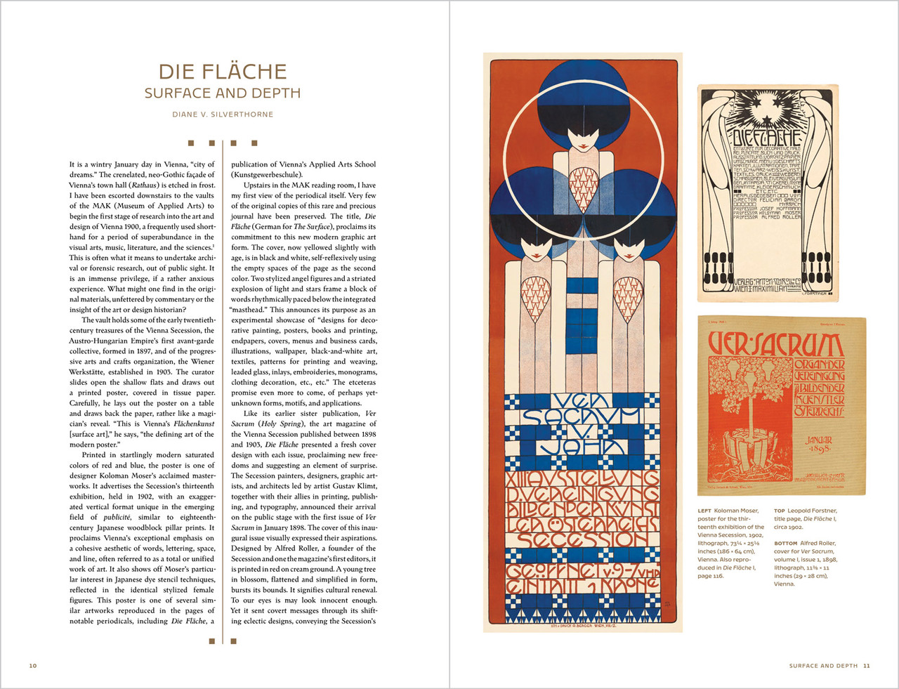
Die Fläche: Surface and Depth Diane V. Silverthrone 10
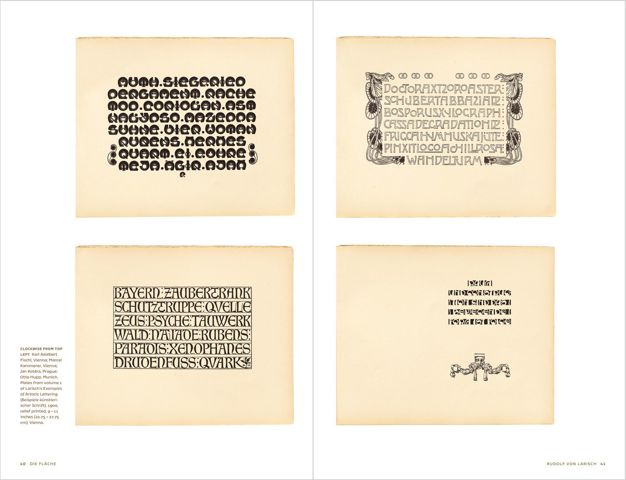
Rudolf von Larisch: Vienna’s Theorist of Artistic Writing Dan Reynolds 34
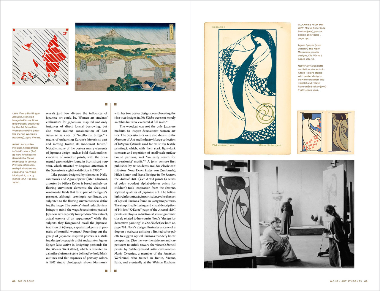
Women Art Students and the Art of Unlearning in Die Fläche Megan Brandow-Faller 60
Die Fläche: Complete Facsimiles
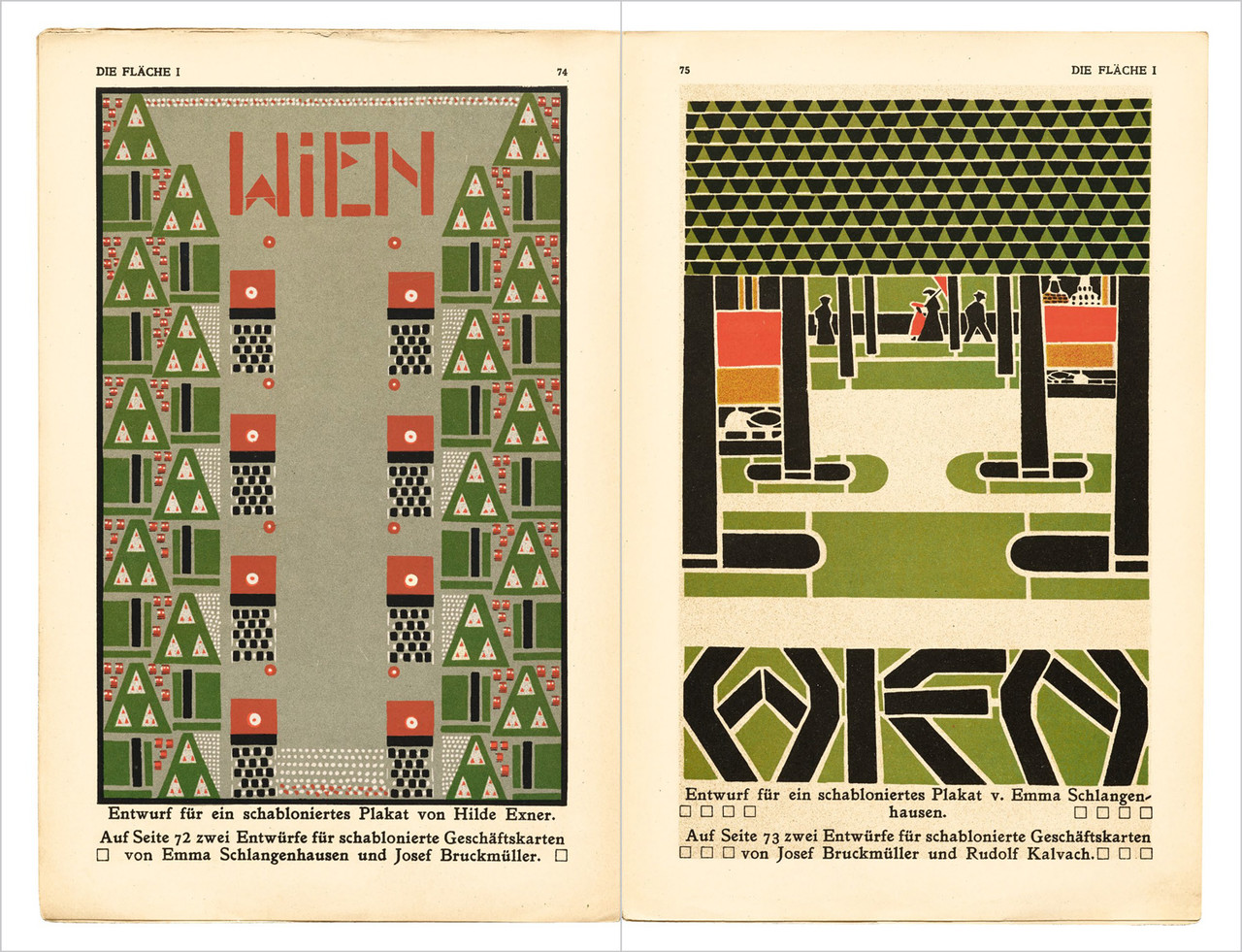
Volume I 80
Volume II 284
Resources
Translations 300
Glossary of Labels 305
Selected Artist Biographies 308
Index of Artists and Editors 314
Index 316
Image Credits 319
Contributor Biographies and Acknowledgments 320
Details
| Publisher | Letterform Archive |
| Publication date | October 3, 2023 |
| ISBN | 9781736863312 |
| Dimensions | 13 ¼ × 8 ¾ inches |
| Printing | 4 colors throughout, plus a metallic spot color throughout the supplement |
| Pages | 312 + 32 pages on 4 separate 4-panel concertina fold-outs |
Related Content
Inside Our New Facsimile: Die Fläche and the Design of the Vienna Secession
Customer Reviews
Student teaching the teacher
Beautifully produced and eluminating
Write A Review
Related Products