News
Inside Our New Facsimile: Die Fläche and the Design of the Vienna Secession
Our latest book opens the vault on Vienna 1900, sharing a graphic design showpiece of the Secession’s leading artist-designers and their students.
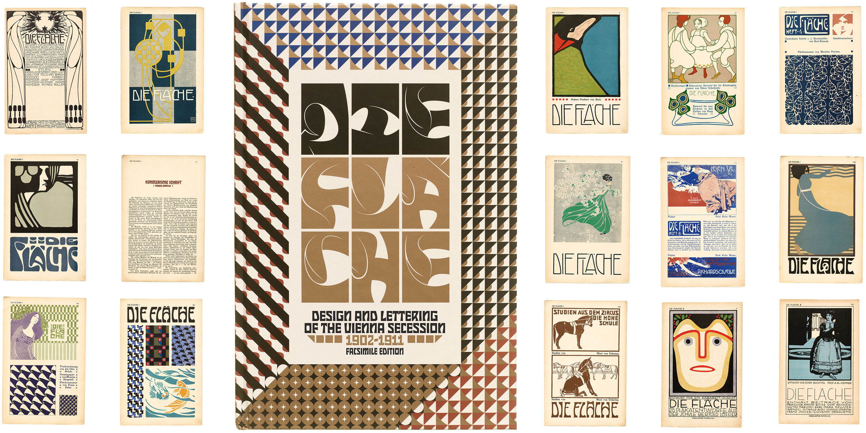

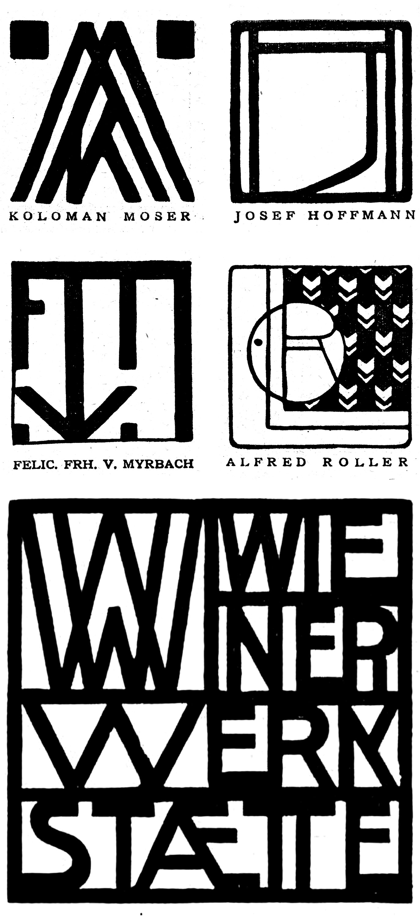
Translated in English as The Surface, Die Fläche, the first in our series of facsimiles devoted to sharing rare and significant works from the collection, sounds like it could have been made yesterday. Although it first appeared some 120 years ago, its colorful and inventive designs for everything from posters to patterns to bookmarks and playing cards make it a present-day favorite on Archive tours. Across fourteen remarkable issues, editors Koloman Moser, Josef Hoffmann, Alfred Roller, Felician Myrbach, and Bertold Löffler advanced a radical vision for the graphic arts and design education, placing themselves at the head of a movement to resurface the modern world.
Die Fläche (Facsimile Edition): Design and Lettering of the Vienna Secession, 1902–1911 reproduces this landmark magazine in precise color and exacting detail, with translations, biographies, and three richly illustrated essays that provide fresh insights into the major designers, pioneering women artists, and innovative lettering practices behind its creation. In this post, we introduce this gem of design history and the book we’ve made to share it.
Getting to Know Another Nouveau
Picture a thicket of whiplash lines and organic motifs: The visual culture of turn-of-the-century art nouveau and its German counterpart, Jugendstil, is sometimes scorned by design purists, but it has always caught the eyes of more rebellious designers in search of eccentric and ultra-expressive forms. In the psychedelic 1960s and ’70s, poster artists such as Wes Wilson, Bonnie MacLean, and Victor Moscoso found inspiration in the curvy semi-legible lettering and graphic art of Europe circa 1900, looking in particular to work by Die Fläche contributors Alfred Roller and Leopold Forstner. Today another nouveau revival has been sending up shoots, led by a profusion of what Elizabeth Goodspeed calls “Jugend-ish” typefaces.

Clockwise: Alphons Maria Mucha, La Pater, 1899; Schelter & Giesecke type specimen (Einfassung in Ein-und Zweifarbiger Anwendung), 1903; Alfred Roller, Ver Sacrum Kalender, 1903; Wes Wilson, handbill for a concert at the Fillmore (Otis Rush, Grateful Dead, Canned Heat), 1967.
Die Fläche shines among the Archive’s holdings from the hothouse years of art nouveau, not least because it enriches our understanding of early twentieth-century graphic trends. Its bright, adventurous, and sometimes bizarre pages have their share of serpentine lines and naturalistic forms, but they also revel in simplified geometric shapes, flat swaths of color, expressive woodcuts and stenciled forms, and rhythmically regular sans-serif lettering. These elements, often associated with later avant-garde art and modernist design, combine in Die Fläche with vibrant borrowings from folk art, children’s drawings, and graphic traditions from East Asia.
The result is a breakaway aesthetic, celebrated in critic Josef August Lux’s 1903 introduction as the leading edge of new design:
Those who in previous decades were used to getting their designs from Paris now demand the “Vienna Style.” Die Fläche reveals it in its strictest and most refined form…. Everything can be found in it, except the superfluous.
For Lux’s “Vienna Style,” we could substitute “Secession style.” Die Fläche’s editors were core members of this modernist art movement founded in 1897. We could also call it “Vienna Applied Art School style,” since Die Fläche features work by students of the Kunstgewerbeschule and their Secessionist instructors, who from 1901 seized key teaching positions and revolutionized the curriculum, paving the way for creative design pedagogies like those of the Bauhaus. At the same time, Die Fläche opens a window into the stylistic innovations of the Wiener Werkstätte. Editors Moser and Hoffmann, with help from many contributors, established this famed Vienna arts and crafts workshop while the periodical was in production, reinventing brand design in the process and setting a trend of clean-lined modernism. The pages of Die Fläche form a sourcebook of the diverse experiments and personal styles contributing to Vienna’s unique brand of the new.
From Magazine to Book
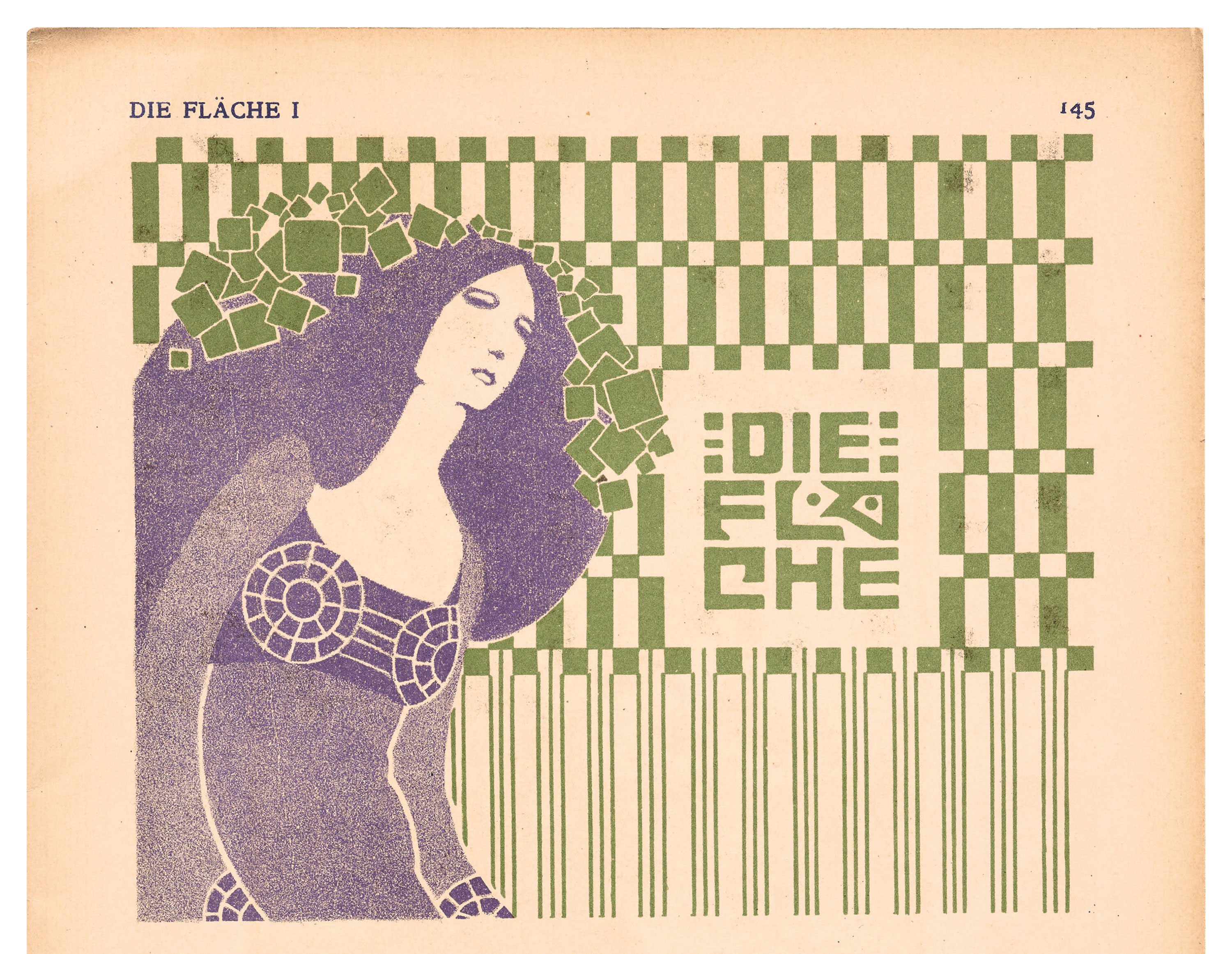
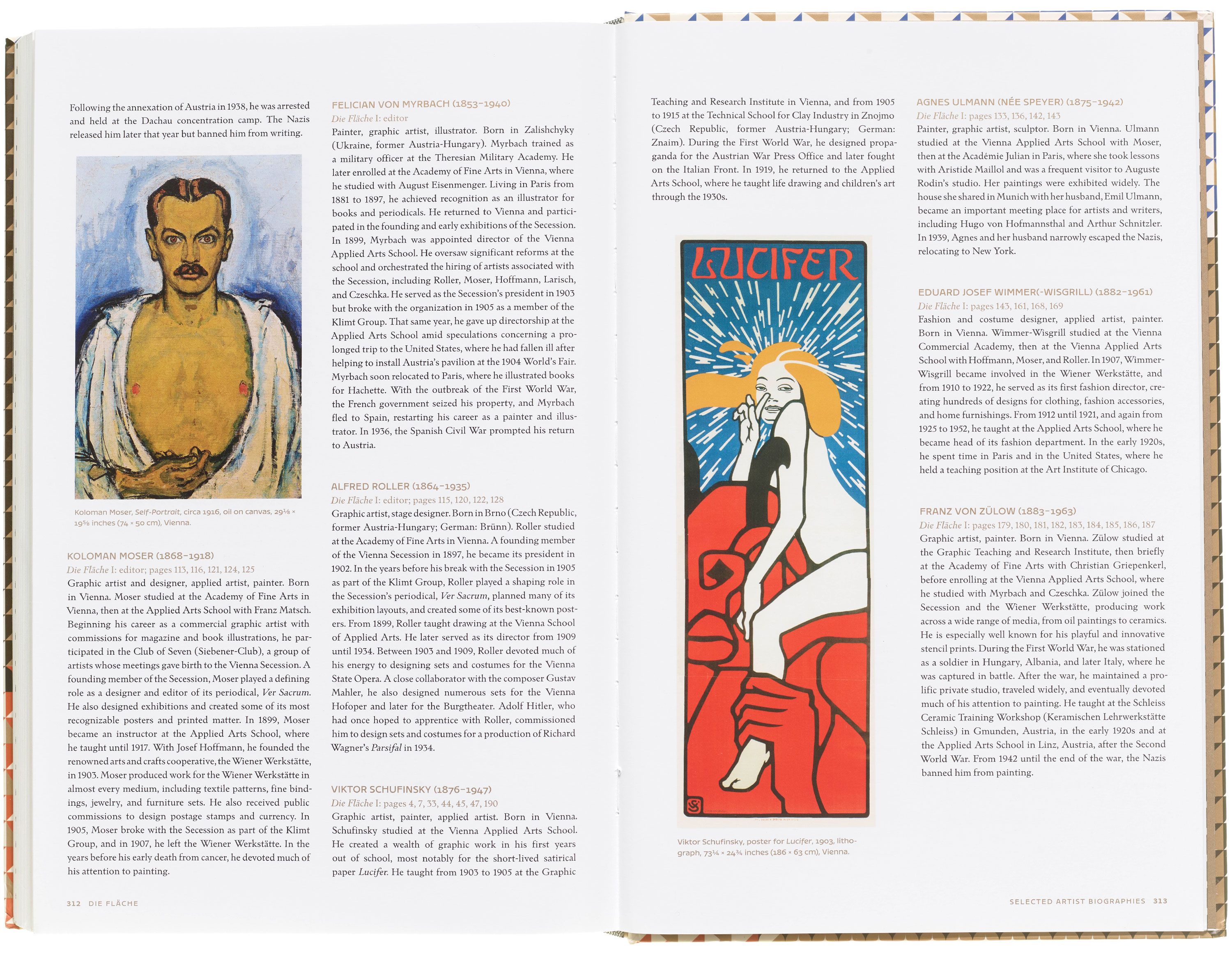
We’re tempted to call Die Fläche the first modern graphic design magazine. Originally released in fourteen large-format issues across two volumes, Die Fläche includes designs for almost every surface produced by over a hundred named artist-designers. Among them were the Secession’s leading lights (such as Gustav Klimt, Koloman Moser, and Alfred Roller), lesser-known prodigies (Bertold Löffler, Wenzel Hablik, Moriz Jung, Viktor Schufinsky, Franz von Zülow), and nearly forty intrepid women (including Fanny Harlfinger-Zakucka, Minka Podhajská, and Jutta Sika). In contrast to Ver Sacrum, the less boisterous official art periodical of the Secession, Die Fläche explodes with riotous color and usable forms, all dynamically arranged in spreads modeled on the pattern books used by designers and craftsmen of centuries past.
Across volume I (1902–1904), original designs for placards and magazines rub shoulders with mocked-up posters, endpapers, and clipart-style graphic ornaments. One issue is devoted to the Secession’s dazzling exhibition posters, while another showcases rhythmic lettering styles. Throughout, designers experiment with figure/ground relations and revive older media such as stencils and woodcuts, using these to explore rich terrains left behind with the nineteenth century’s embrace of lithography and instructional emphasis on fine drawing skills.
All images in the gallery below are hi-fi captures from the facsimile edition of Die Fläche. Click an image to enter fullscreen view, then click or pinch to enlarge.


Volume II (1910–1911), published a half-decade after the first, shows off new refinements and elaborations of Secessionist design on pages that fold out into immersive four-part accordions. Starring a series of fantastical posters that drew crowds at Vienna’s 1908 Kunstschau—the peak exhibition of Secession-era art—it attests to an exuberant vision of design in the years just prior to the First World War.
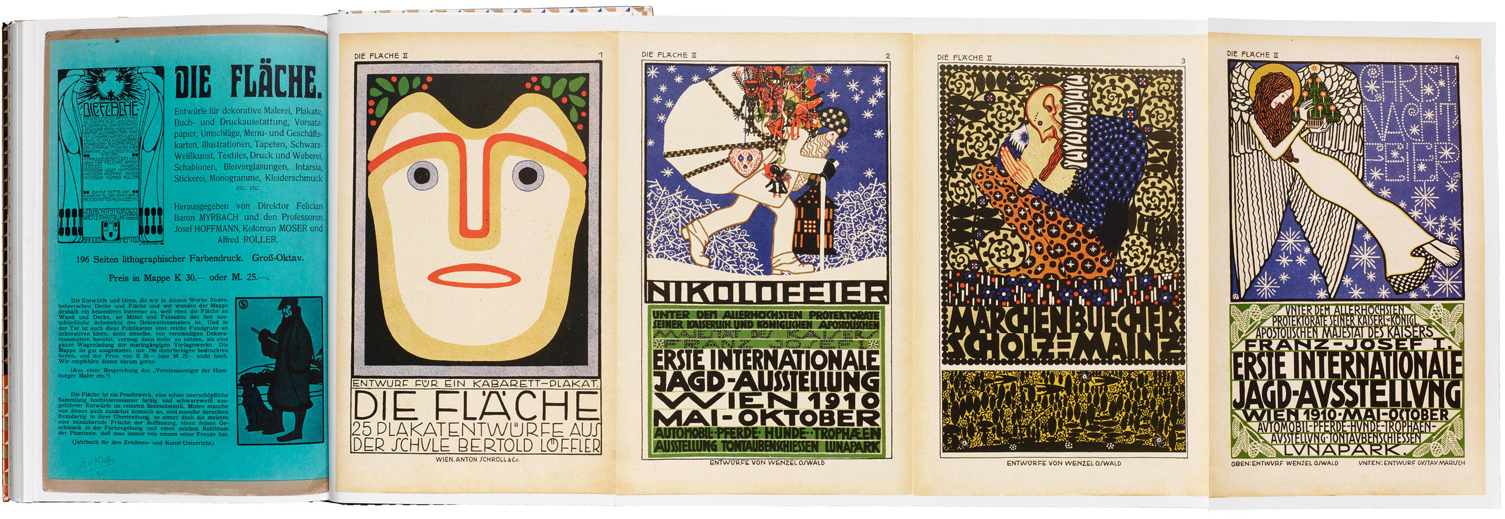
Our facsimile makes all 200+ pages of Die Fläche available to English-speaking audiences for the first time, collecting both volumes into a single book while preserving the format and character of the original as it appears today. Reproduced from the Archive collection using state-of-the-art in-house photography, stringent color-matching, and ultra-detailed stochastic printing, the book offers readers a chance to experience this extraordinary publication without booking a trip to a special collections library. Even the foldouts of the second volume are preserved in a series of two-sided accordion pages bound into the book.
Much more than a mirror of the original, this facsimile edition presents a wide-ranging original study of design and lettering of Vienna 1900, contextualizing and exploring Die Fläche with newly commissioned essays, complete translations, artist biographies, and introductory guides to each volume—all in an elegantly designed book with an original cover by Julien Priez.

“Die Fläche: Surface and Depth”
In her opening essay, art historian Diane V. Silverthorne transports readers to Vienna 1900, uncovering the cultural transformations and artistic ventures that informed the making of Die Fläche. Silverthorne situates the magazine’s editors, the Secession’s leading designers, in a whirlwind of ideas involving the likes of Gustav Klimt, Sigmund Freud, Gustav Mahler, Adolf Loos, Karl Kraus, and Alois Riegl in Vienna, and figures including William Morris, Charles Rennie Mackintosh, and Max Klinger abroad. From out of this context, she shows, editors Koloman Moser, Alfred Roller, and others developed a bold new conception of what they came to call “surface art” (Flächenkunst)—an art of impactful surface designs as opposed to illusionistic representation. Reading Die Fläche as a visual manifesto of this new art, Silverthorne explores its essential themes and its enduring legacies.

“Rudolf von Larisch: Vienna’s Theorist of Artistic Writing”
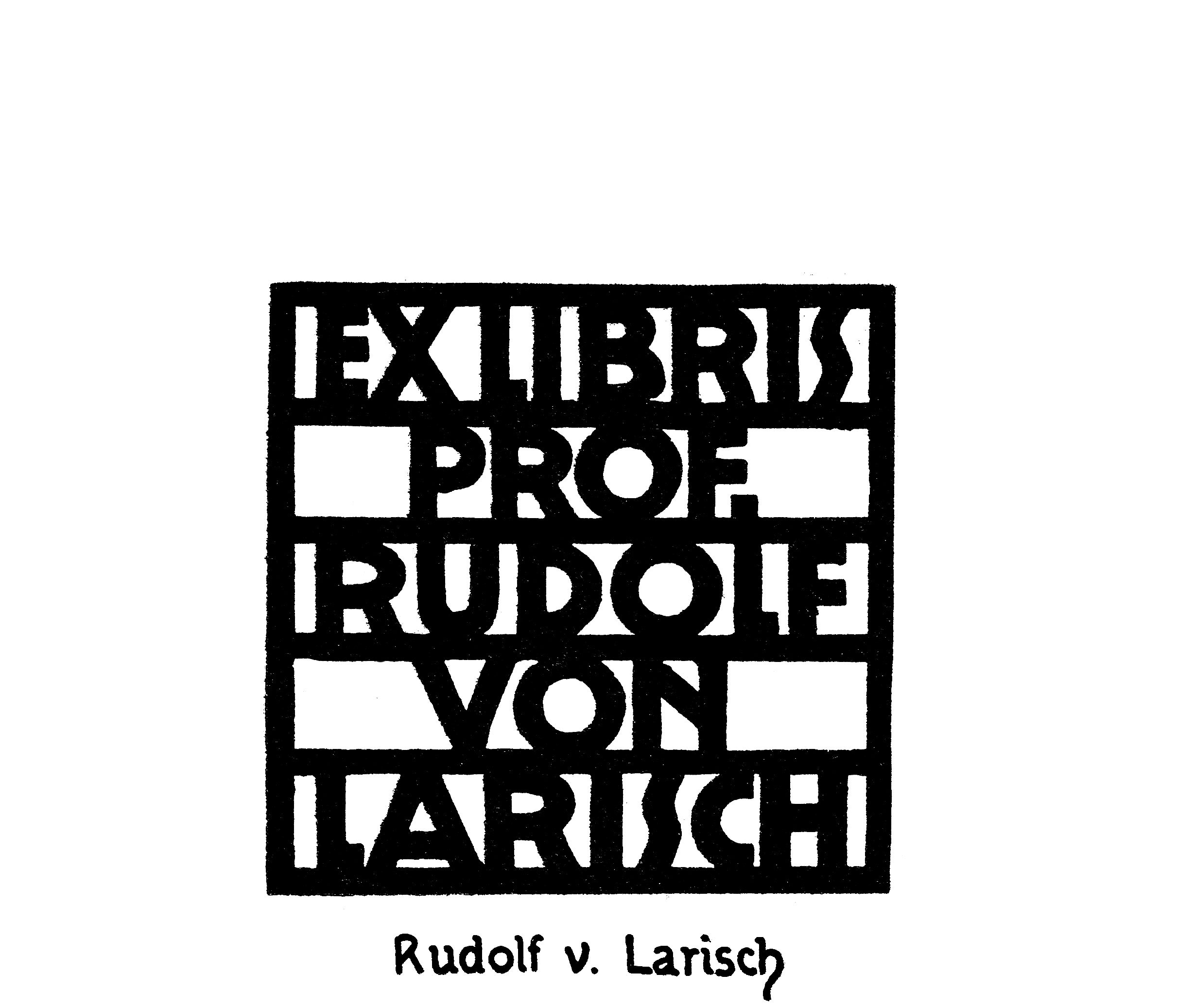
Shining light on Die Fläche’s remarkable letterforms, design historian Dan Reynolds introduces the figure behind the most innovative lettering and typography of the Secession. His essay provides the first comprehensive English-language study of Rudolf von Larisch, an eccentric teacher, theorist, and writer of popular instructional books, rivaled only by British calligrapher Edward Johnston’s work in their influence. Through close study of his treatises, standout Secessionist designs, and lettering by his students in Die Fläche—including never-before-seen classroom work by artist Oskar Kokoschka—Reynolds discusses Larisch’s fascinating ideas about letter spacing, visual rhythm, legibility, personal style, and the materials of writing—including his own Quellstift (“source pen”), a monolinear tool that influenced a generation of designers.

“Women Art Students and the Art of Unlearning in Die Fläche”
More than a third of Die Fläche’s contributors were women, yet for decades, the pathbreaking work and remarkable stories of Vienna’s women modernists have largely remained in the shadows. In her essay, art historian Megan Brandow-Faller sets the record straight, detailing how Die Fläche’s women artists drew on their Secessionist training to fashion a distinctly feminist version on the “universal artist” ideal—one that, by unapologetically embracing children’s drawings, East Asian art, and folk art, moved toward abstractionism and expressionism in both art and design. Showing how women came to adopt new drawing, stenciling, and woodblock printing practices as their own, and highlighting their art’s boundary-defying embrace of ornament and handicraft, Brandow-Faller follows their careers through the Wiener Werkstätte, the Bauhaus, the Artel toy company, and a range of feminist art and political organizations.
Translations, Biographies, and More
Full translations of all six cultural-critical essays from Die Fläche vividly locate the volumes’ artwork amid debates over modern design and its methods. Penned by renowned author Joseph August Lux, their theories of poster art, lettering practice, and print design position Die Fläche at the forefront of a cultural movement. Additional resources, including a German–English glossary of labels, a complete index of artists, selected artist biographies, and issue-by-issue guides, offer a more complete story of Die Fläche and its makers.

Book and Cover Design
At Letterform Archive Books, we aim to celebrate the work of the past by giving it new expression in the present. In the case of Die Fläche, that meant commissioning three custom typefaces informed by the era, all from lettering artist and type designer Julien Priez.
To develop the type for the main title, Priez started with a dense display face that can barely be contained by its surrounding grid, carving ornate lines into the blocky shapes to create organic counterforms. The result pairs delicate flourishes with declarative heft, referencing the detailed and overgrown floral motifs of the era’s posters and book arts.
For the subtitle, Priez drew more directly from the woodcut letterforms of the Vienna Secession, elevating the irregular and handmade shapes into an angular, polished variable typeface that expands and contracts for different design scenarios.
Priez also created a font of ornamental elements used for the gold-flecked patterns wrapping around the book’s case. They offer a modern tribute to the imaginative surface art for which the source material is named.
These typefaces and patterns reappear on the book’s interiors as section openers, carrying Priez’s contemporary interpretation through the book’s otherwise historical pages.
From Our Library to Yours
One of the Archive’s untold number of gems, Die Fläche is only the first of many objects to receive such extensive efforts in research and reproduction. Shares Letterform Archive Books publisher Lucie Parker:
With Die Fläche, we are proud to launch a major initiative in our publishing program: a line of facsimile editions that allows our community to take home high-fidelity reproductions of beloved and rare artifacts in our collection. Buttressed by scholarship developed by editor Chris Westcott, this series will revive important printed works—and the stories of their creation—for future generations, preserving their impact and even outlasting the original.
Keep on the lookout for more offerings in this program.
To add Die Fläche to your personal library, learn more about the contributors, and see a video pagethrough of the book, visit our shop at the link below. Members receive 10% off all Letterform Archive titles.
— Chris Westcott, Editor, Letterform Archive Books