The Archive’s type design program turns 10 this year! Take a look at what a half-dozen recent grads created during their time here.
It’s hard to believe it’s been ten years since the inaugural class of TypeWest (then known as Type@Cooper West) welcomed its first type design students! In 2025, we graduated 24 talented individuals from our local cohort in San Francisco and 17 other cities worldwide. The website showcasing the Class of 2025’s final typeface projects is now live!
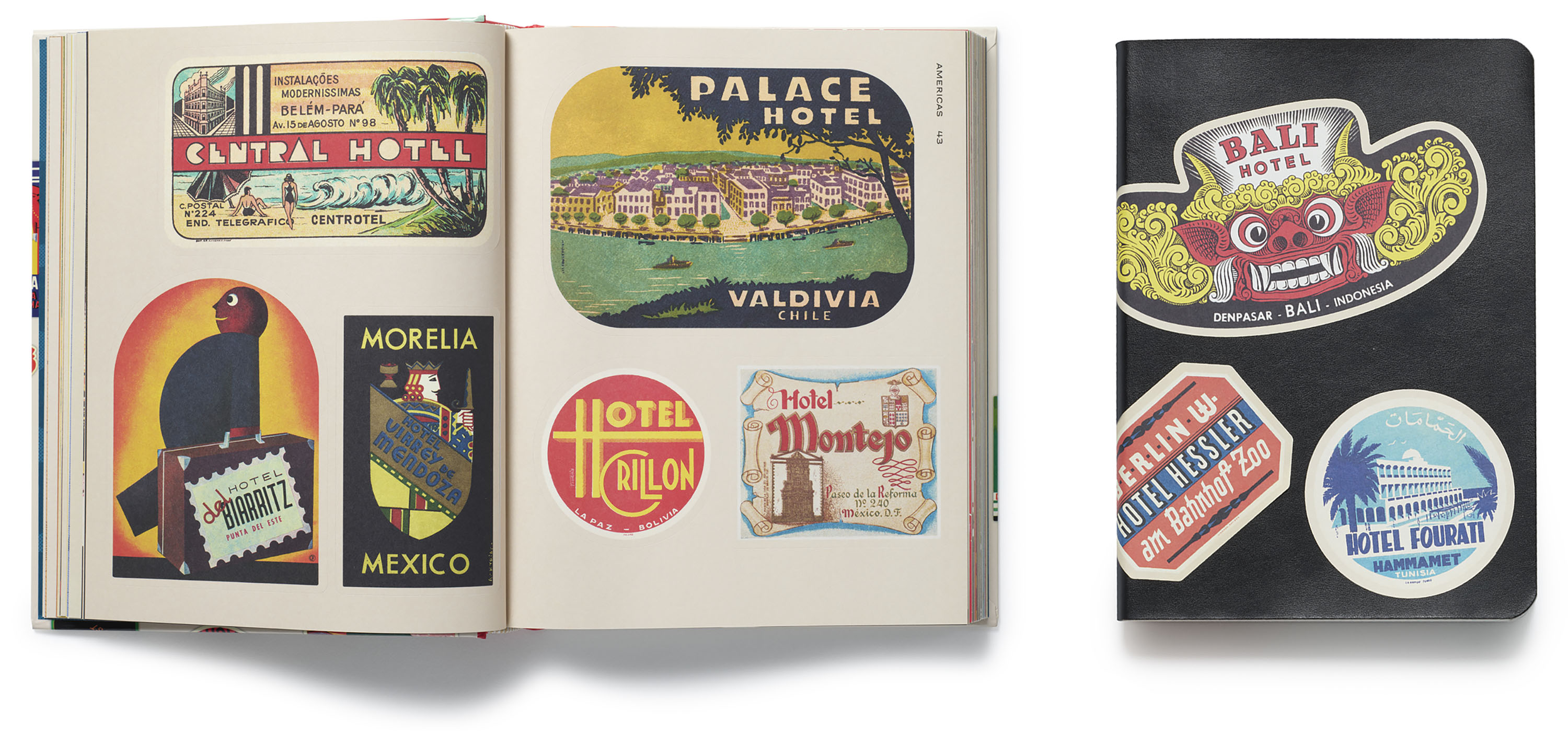
Both a feat of production and a feast for the eyes, Hotel Retro reproduces exquisite twentieth-century steamer trunk labels as hundreds of full-color stickers that readers can actually peel off the page and adhere.
Interior spread from Hotel Retro (left) and an example of the stickers in use (right)
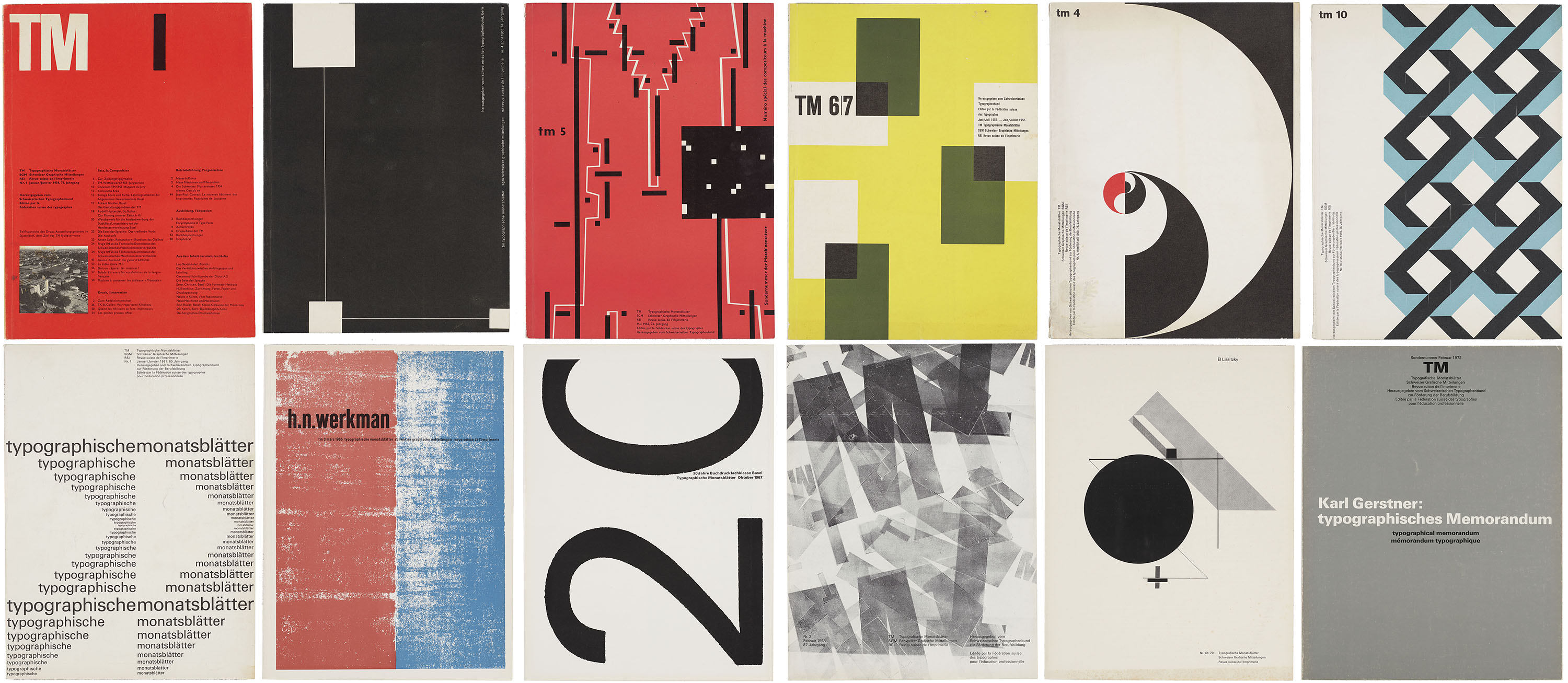
An influential trade journal reveals the origins of Swiss typographic style and provokes conversation between objects at Letterform Archive.
In 1952, the competing Swiss trade journals Schweizer Graphische Mitteilungen and Revue suisse de l’imprimerie merged with Typografische Monatsblätter (TM), a monthly periodical advertised as the leading publication of the Swiss graphic design industry. Tailored to a diverse audience of design professionals, the magazine published articles in German, French, and English under the editorial direction of Rudolf Hostettler (1919–81), with Robert Büchler (1914–2005) overseeing its initial art direction. Unlike many contemporary trade publications that focus primarily on showcasing finished work, TM combined writing on professional practice with long-form essays devoted to design theory and criticism. From the early ’50s through the ’60s, both the journal’s editorial content and visual approach were strongly influenced by contributing editor Emil Ruder (1914–70), whose tenure at the Allgemeine Gewerbeschule Basel helped to establish the foundational principles of Swiss Style.
The work of 50 living designers joins 50 historical objects from the collection to celebrate our 10th anniversary.
Letterform Archive is a living archive, a perpetual project to not only preserve historic design, but also inspire new work. To mark our 10th anniversary we teamed up with COLLINS to create 100 Tens: 50 interpretations of the number 1 from the Archive’s collection, paired with 50 contributions from some of the most innovative designers working today.
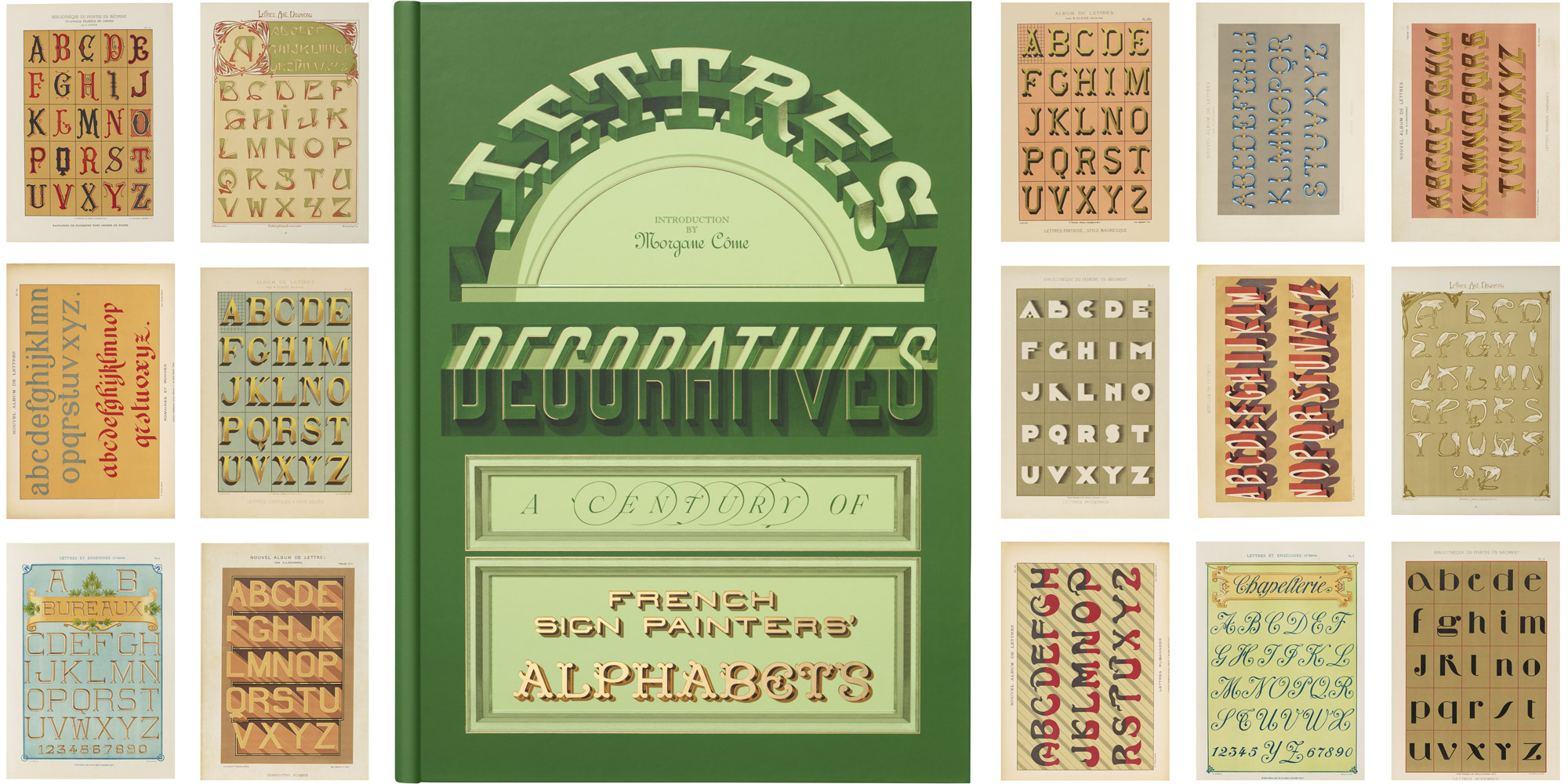
With alphabets from 12 grand portfolios that brought the sign painter’s art to the page, our new book is a trip through time to the golden age of urban lettering.
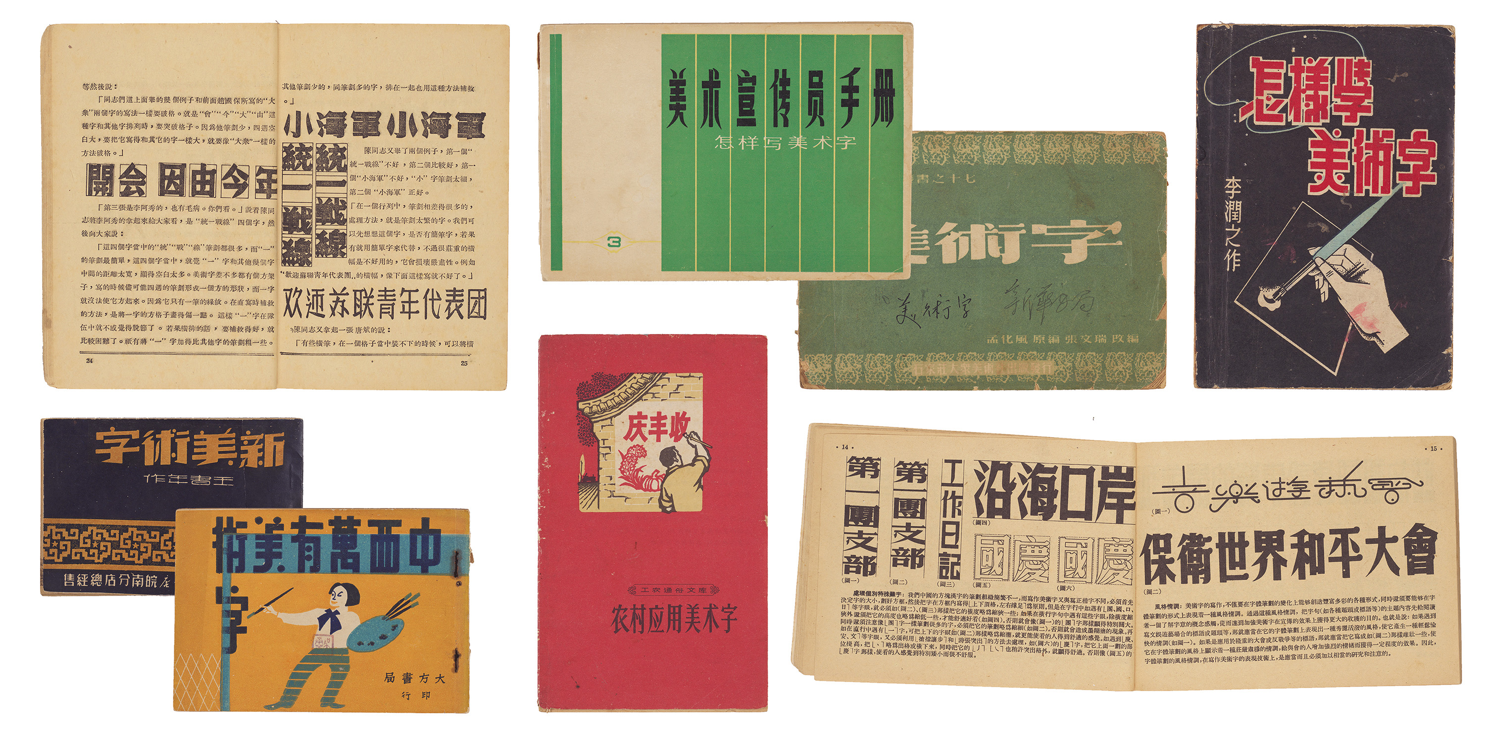
Our new meishuzi collection reflects a period of significant cultural change in China, and provides an uncommon source of inspiration for contemporary lettering artists and type designers.
In our ongoing effort to expand the story of graphic design beyond the Western canon, Letterform Archive continues to collect objects that illustrate the development of the world’s writing systems. This means consulting with experts in those scripts, as we recently did with Synoptic Office, a design firm working internationally with a focus on cultural heritage and archival collections. Their research into the landscape of Chinese typography appears in The Bloomsbury Handbook of Global Typography. We asked their team to source Chinese lettering manuals that are otherwise inaccessible in the West. The resulting collection, gathered from bookshops and flea markets in China, is unusual for an American institution — and one that we were unlikely to acquire any other way. In this guest post, Caspar Lam and YuJune Park of Synoptic Office tell us what they discovered.
Meet the Czech designer who shaped how generations of readers encountered poetry.
Sylvie Vodáková occupies a distinctive, yet largely unheralded, place in Czech design. Over several decades, beginning in the late 1950s and continuing well into the 2000s, she developed a visual language marked by restraint, clarity, and a deeply human touch. Her long-running involvement with the Květy Poezie (“Flowers of Poetry”) series made her not just a designer of books, but a quiet custodian of Czech literary culture.
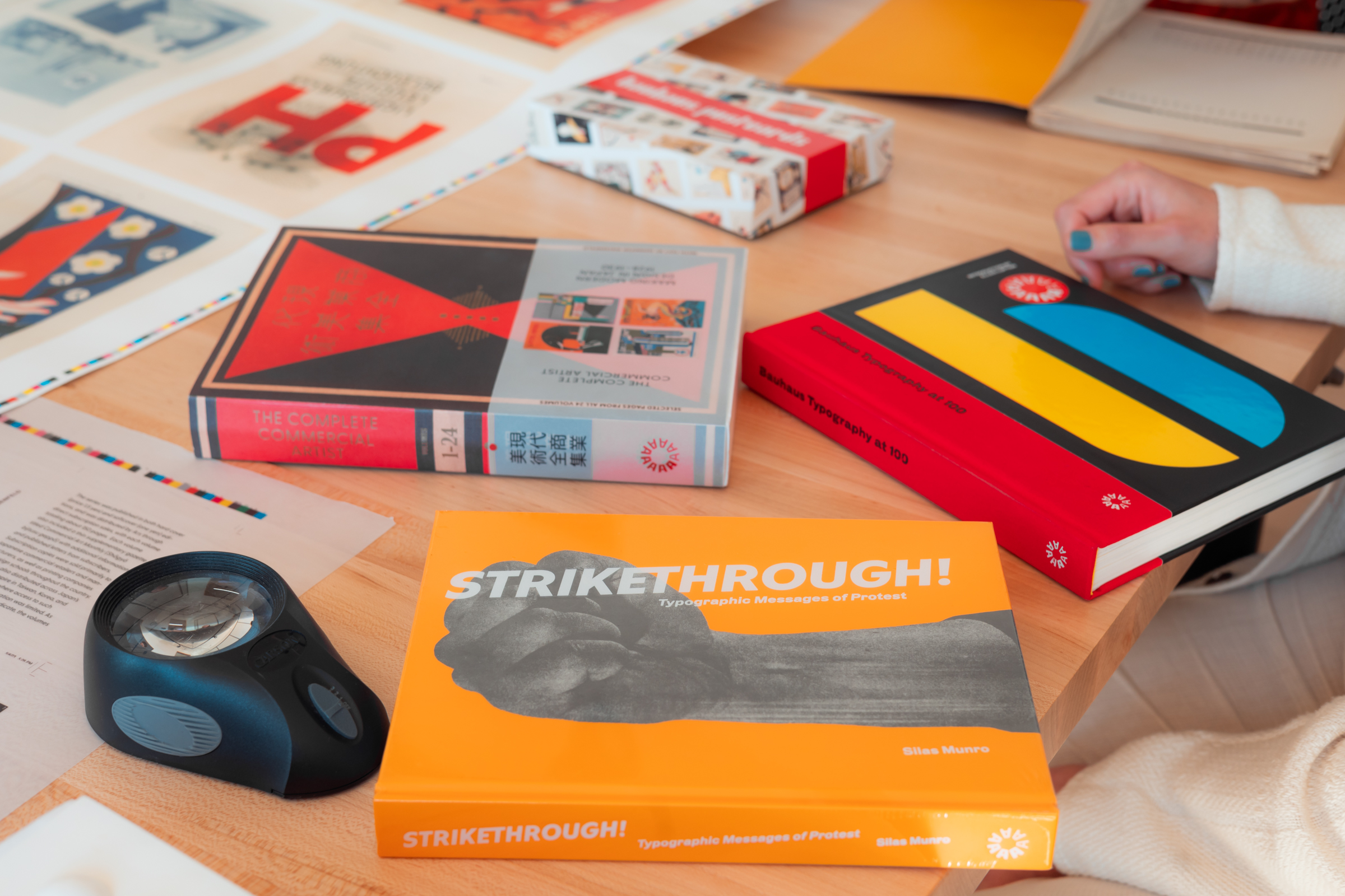
Revenue Director Grace Tsai reflects on what she’s learned about the range of titles published by Letterform Archive.
Letterform Archive is home to all who love great design. The Archive is also home to all of us who love letters, art, and books, and nowhere is that more apparent and alive than in our publishing program. I joined the Archive’s team as Revenue Director last June. Since then, it’s been a pleasure for me to learn not just about our immense collection, but about the exquisite books we publish. As a lay person new to the world of publishing, I’ve learned so much from our knowledgeable and talented Letterform Archive Books team, led by Lucie Parker.