Tânia Raposo and Nick Sherman describe how they took on the challenge of representing 40,000 objects in a single visual identity.
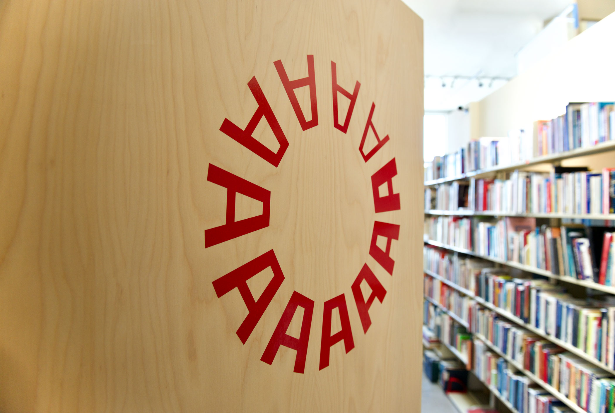
Our new logo and website have been live for a few weeks, but now, after the rush of spring events, we finally have a moment to reflect on the redesign and ask its creators about their process.
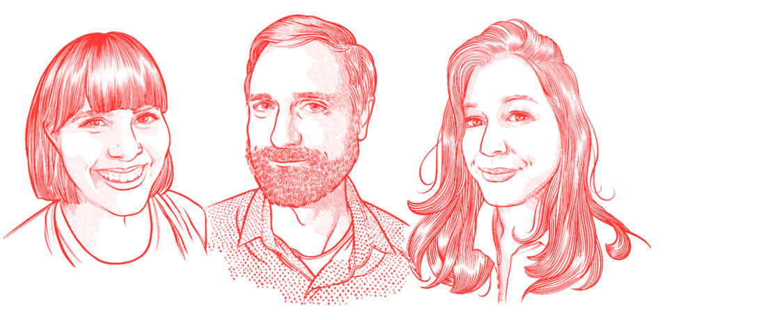
This month the Letterform Archive team grew by three, increasing our capacity to support visits, catalog the collection, and ramp up publishing efforts, in print and online.
Paola Zanol, Stephen Coles, and Elise Carlton. Portraits by Laura Serra.
A stretch goal for our Kickstarter campaign would allow us to digitize the rarest Dwiggins objects in our collection and share them in a public.
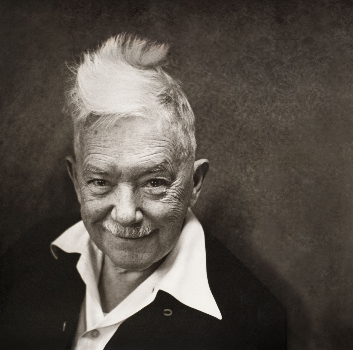
W. A. Dwiggins is the subject of our first publication, a comprehensive biography of one of the most innovative designers of the 20th century.
W. A. Dwiggins has a posse. We launched our Kickstarter campaign for A Life in Design on March 27 with the hope of reaching some of his many fans around the world. Here we are, twenty-six days later, and the community has responded in force, manifesting a genuine and widespread interest in the man and his work. While our original fundraising goal represented only a fraction of the actual costs needed to develop and produce this book at a level that does justice to Bruce Kennett’s remarkable biography, we now have received the resources needed to cover our expenses.
As a nonprofit organization, we are committed to using all proceeds to further our mission. Therefore, in response to the phenomenal outpouring of support, we feel compelled to do more. As we head into the last week of the campaign, we’re introducing a stretch goal of $175,000. The additional funds would allow us to digitize the rarest Dwiggins objects in our collection and share them in a public, online gallery of zoomable, downloadable images. While “A Life in Design” includes over 1200 illustrations, it represents only a segment of Letterform Archive’s holdings, which include process work, original sketches, typeface proofs, and other unique material rarely seen outside our doors. A rich web gallery will introduce Dwiggins to designers and makers around the globe. Here’s a sample of what’s possible.