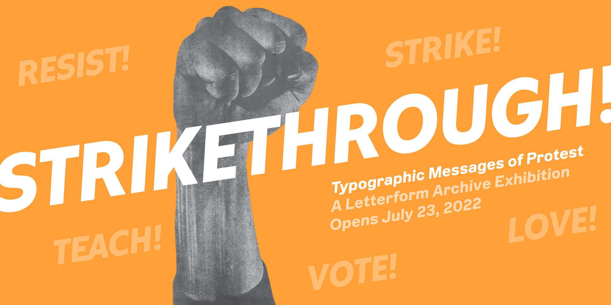
Skip to main menu Skip to main content Skip to footer content

News / Exhibitions

Typefaces Inspired by the Bauhaus

From Futura to ITC Bauhaus, our survey of Bauhaus type continues with a look at typefaces that adopted the school’s simplified, geometric ideals.

László Moholy-Nagy, cover for Bauhaus Buildings Dessau (Bauhausbauten Dessau), 1930. This late Bauhaus Book may be the only official Bauhaus publication to use a typeface inspired by the school (Futura Black), though it was perhaps lettered by hand with the type as a model.
This article supplements Archive Salon Series 29: Bauhaus Typefaces. Members can access the recording.
Watch the Video

Our first installment of this two-part series showcased the various typefaces found in official publications and other objects by Bauhaus instructors and students. We learned that the type used at the school was primarily utilitarian, readily available to printers at the time. But what about the radical geometric letterforms we connect to Bauhaus principles? Let’s look at minimalist typefaces inspired by the school, many of which live on as commercial successes long after the institution was forced to close down.

Read more

Typefaces Used by the Bauhaus

The school’s main typographic story is not about inventing radical typefaces, but using existing typefaces in a radical way.

Nameplate for bauhaus magazine, vol. 1, no. 1, 1926.

Letterform Archive’s inaugural exhibition, Bauhaus Typography at 100, displays nearly 200 objects representing the school’s influence on printed design. From its start in 1919, the Bauhaus incorporated mass production techniques in the creation of artworks across various programs offered on campus, from architecture and product design to textiles and graphics. While the school has come to be known for a simplified, geometric approach across all these disciplines, the exhibition narrates an evolution of letterform styles and illuminates the many people who developed what we now recognize as Bauhaus typography. As a companion to December’s Archive Salon, this two-part article series focuses on the core material that shaped Bauhaus typography: the typefaces.

Read more

Bauhaus Typography at 100 Opens Nov. 13, 2021

The wait is over. Letterform Archive welcomes you to our new home to experience the inaugural exhibition of our first-ever gallery.

Bauhaus Typography at 100 banner

We’re thrilled to announce the opening of our first gallery with an exhibition of more than 150 pieces from our permanent collection.

Read more

Letterform Archive and AIGA in Minneapolis

We celebrated AIGA Medalists by curating a pop-up exhibition at the 2017 conference in Minneapolis.

Archiving AIGA Medalists exhibit
The Archiving AIGA Medalists exhibit at the AIGA Design Conference in Minneapolis, October 2017. Photo: Frank Aymami Photography, courtesy AIGA.

Our local and global audience is growing steadily, but Letterform Archive is still a fairly young organization, and this year offered many opportunities to introduce ourselves to new audiences beyond the Bay Area. The last few months were particularly eventful, with a whirlwind of collections projects, hosting visits, planning exhibitions, and sending our team off to represent the Archive and show our collection at conferences all around the world. I had the pleasure of working with our curator, Rob Saunders, on a pop-up exhibit for the 2017 AIGA Conference in Minneapolis.

Read more

Join the Letterform Archive Mailing List

Learn more about our collection, including additions to the Online Archive, and get news of upcoming events, workshops, and publications.

Join the list