

News
From the Collection: Dorothy and Otis Shepard
Known for their decades-long partnership with the Wrigley Company, this creative couple helped introduce modernist design to everyday life in midcentury America.
Before design historians became enamored with husband-and-wife creative teams like Charles and Ray Eames, Dorothy Shepard and Otis “Shep” Shepard created some of the most iconic American designs of the 1930s through the mid-20th century. These two powerfully talented commercial artists spearheaded a transition to modernist aesthetics in American advertising. From chewing gum packaging and beer ads to a luxury island, they designed major brand campaigns and experiences across the country.
The duo met at Foster & Kleiser, an advertising company in San Francisco known for its attention-catching billboards. Shep hired Dorothy in 1927 on the recommendation of a classmate who was already working at the firm. Early billboards and building art were produced by artists and sign painters, but around this time, billboards were being reproduced from original art as lithographic sheets reassembled on wooden structures. The giant advertisements measured approximately three meters high by seven meters wide—Shep and Dorothy were in the business of making letters as big as they get.1
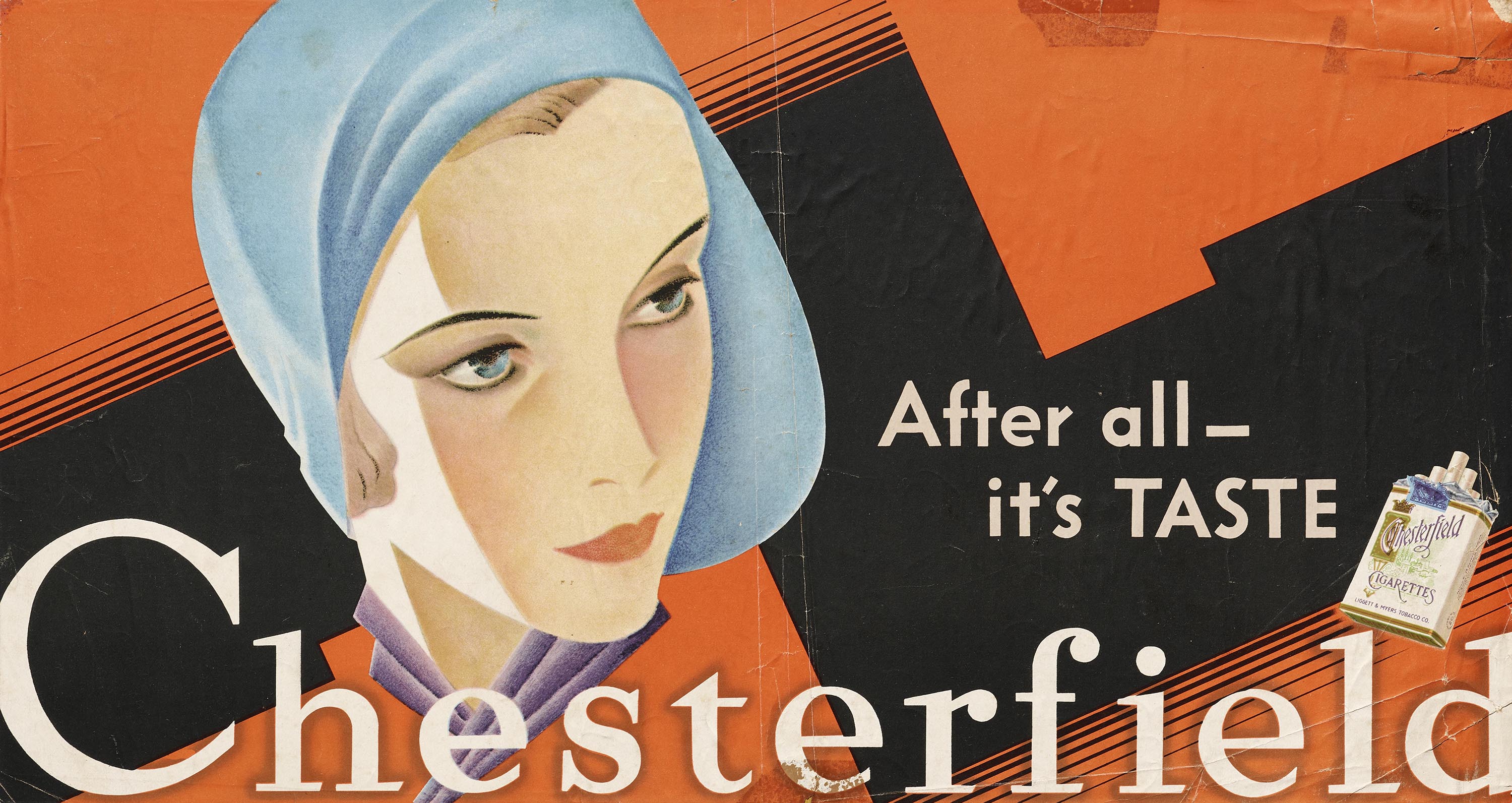
Dorothy and Shep married in 1929, and their honeymoon influenced much of the work they would create together. The European modernist designs they encountered while traveling informed the sleek, reductive style they became known for and inspired Shep to master the airbrush, which became a prominent tool in his kit. Though the new style was well received by Foster & Kleiser, Shep decided to try freelancing on the side. After a successful campaign on their first project together for Chesterfield cigarettes in 1930—featuring a woman modeled after a twenty-three-year-old Dorothy before a geometric background—the couple left the agency and moved to New York.
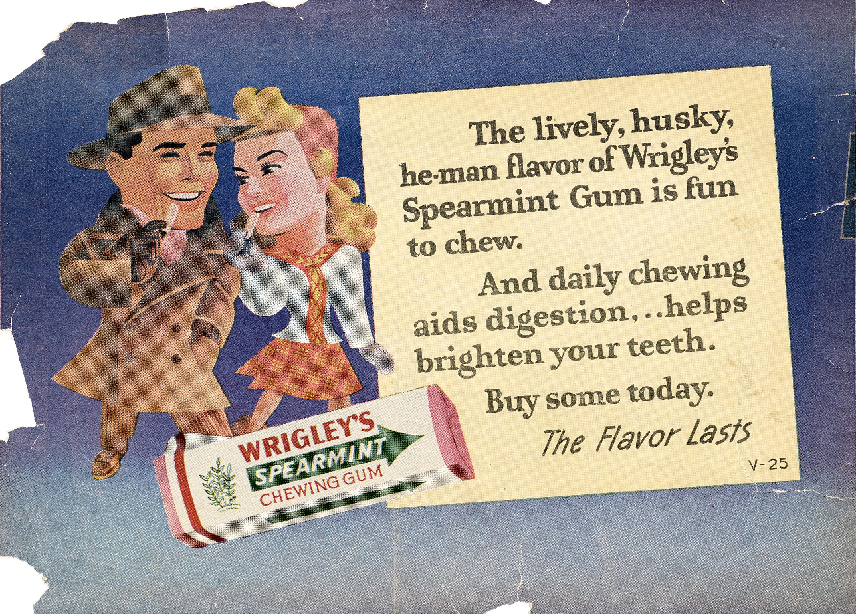
They built a new home in a Greenwich Village penthouse; Dorothy gave birth to their first son; and the couple took on big clients like Chevrolet, Pontiac, and Folger’s. They experienced financial success and won awards from the Outdoor Advertising Agency. In 1932, hearing that P. K. Wrigley (the newly instated president of the Wrigley’s Company) was coming to New York, Shep got an introduction. He had five minutes to pitch his ideas, and left the meeting with a contract to spend half of his time in Chicago. He would later take a full-time position as the art director for Wrigley’s until his retirement in 1962. Initially a department of one, he designed everything from gum wrappers and advertising pamphlets to billboards and point-of-sale displays. P. K. and Shep agreed that continuity was the best route toward effective advertising.
Shep’s contributions to Wrigley’s were as impactful as they were enduring. Gum sales soared during his tenure at the company, and his design for Doublemint gum remained unchanged until 2002. In 1939, he introduced the Doublemint Twins in a billboard design. Even though Shep probably would have preferred they stayed illustrations, the twins were brought to life in television commercials and ad campaigns from 1959 through the early 2000s. While art director, he refused to use photography in his campaigns, opting instead for illustrations that consumers could imagine themselves in.
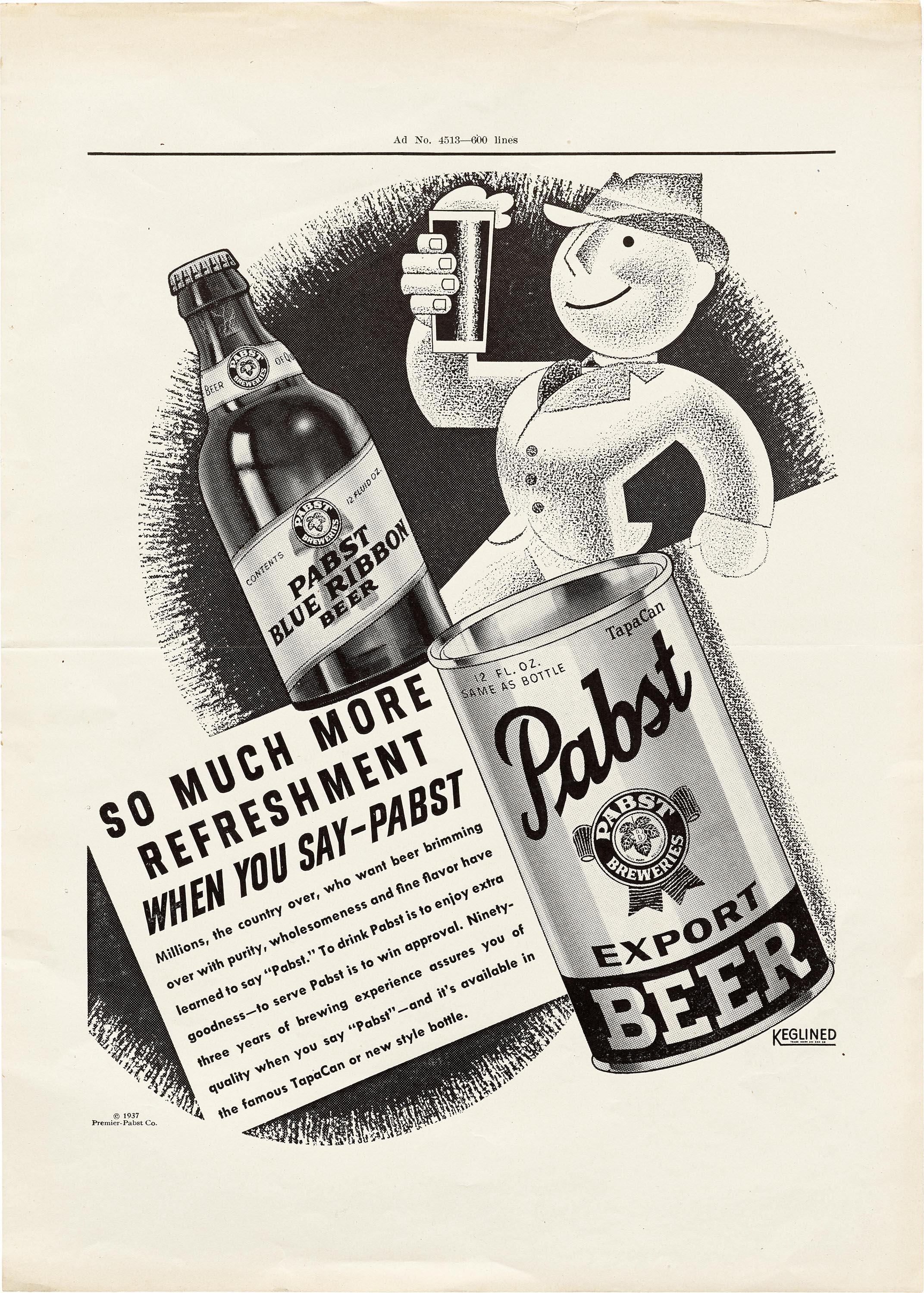
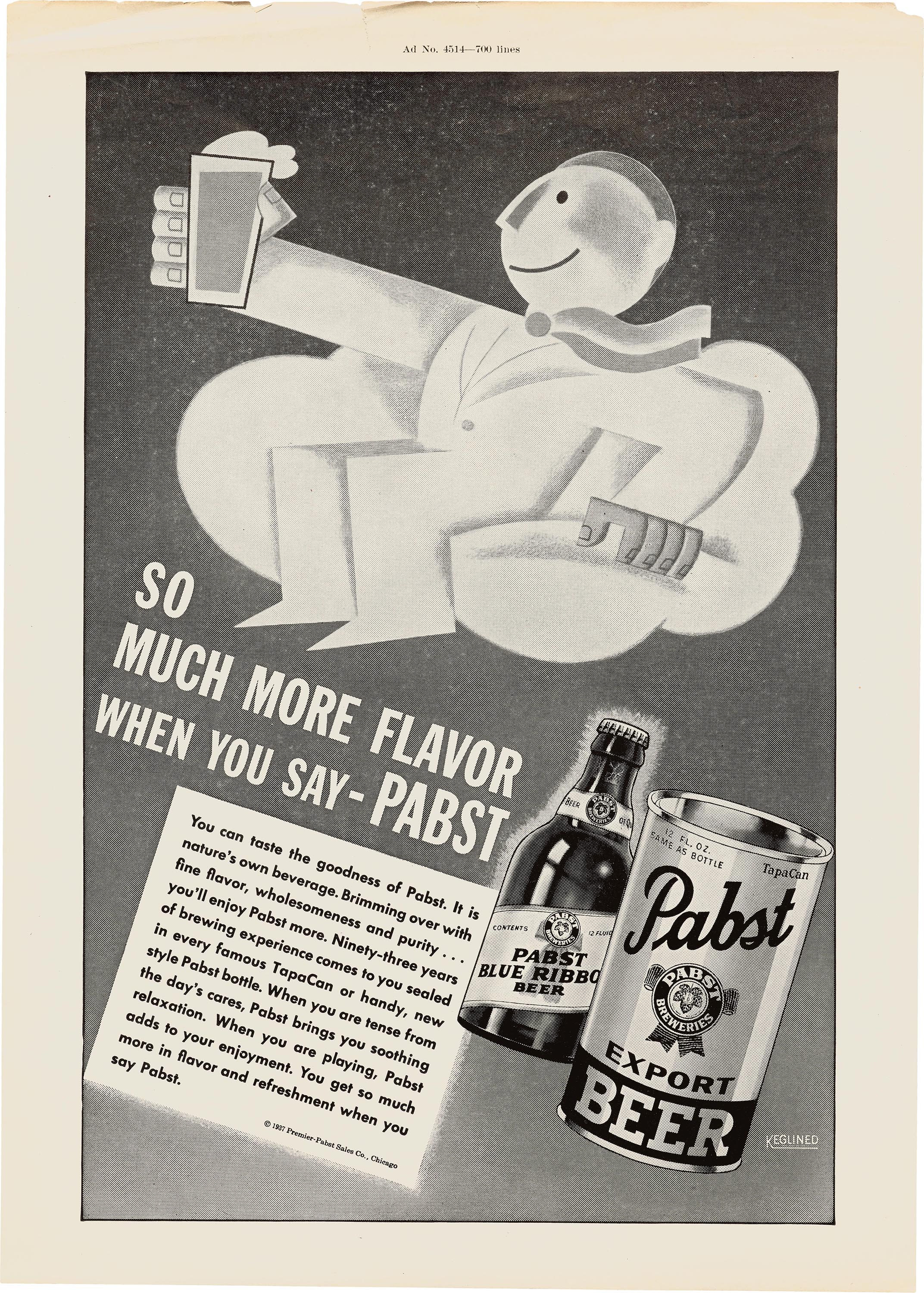
While Shep immersed himself in the world of Wrigley’s, Dorothy worked as an uncredited assistant and took on freelance projects of her own. Her notable client list included Folger’s Coffee, Underwood Typewriters, Mannings Tea, and Pabst. While her billboards were most often dramatic and geometric, sometimes to the point of abstraction, her print advertisements for Pabst were almost cartoonish. Dorothy excelled with her versatile skills and impeccable eye, but her acclaim was limited by an industry that was largely unwelcoming to women.
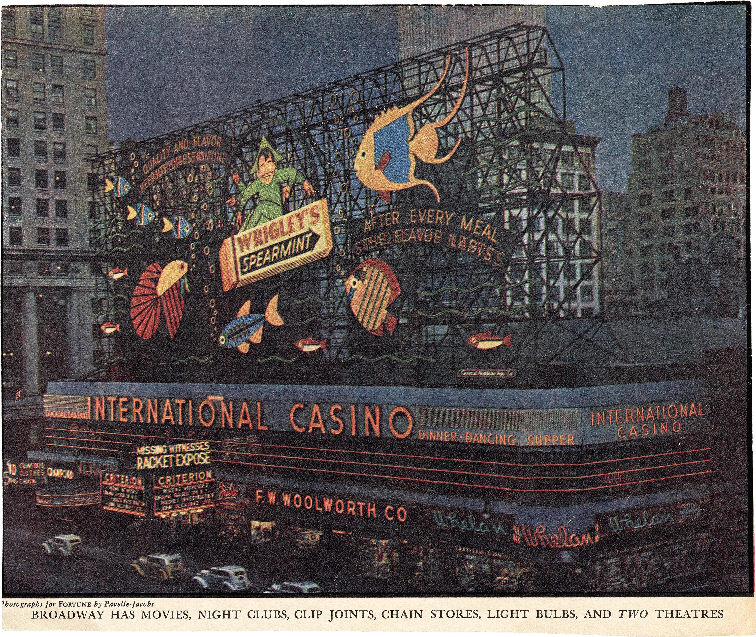
Her work for Wrigley’s was not always as an assistant, and one major project would bring Dorothy her laurels. In 1936, she designed an eight-story neon billboard spanning a full city block. Preserved today through photographs and magazine clippings, her Time Square Spectacular features Wrigley’s Spearman Elf riding underwater on a pack of gum surrounded by larger-than-life fish. With Shep’s encouragement, she pitched the idea to P. K. based on an unused drawing of hers for their work for Catalina Island. The billboard became the largest neon display in the world and landed Dorothy the National Advertising Council Award. If Shep and Dorothy were thinking big at Foster & Klesier, now they were thinking massive.
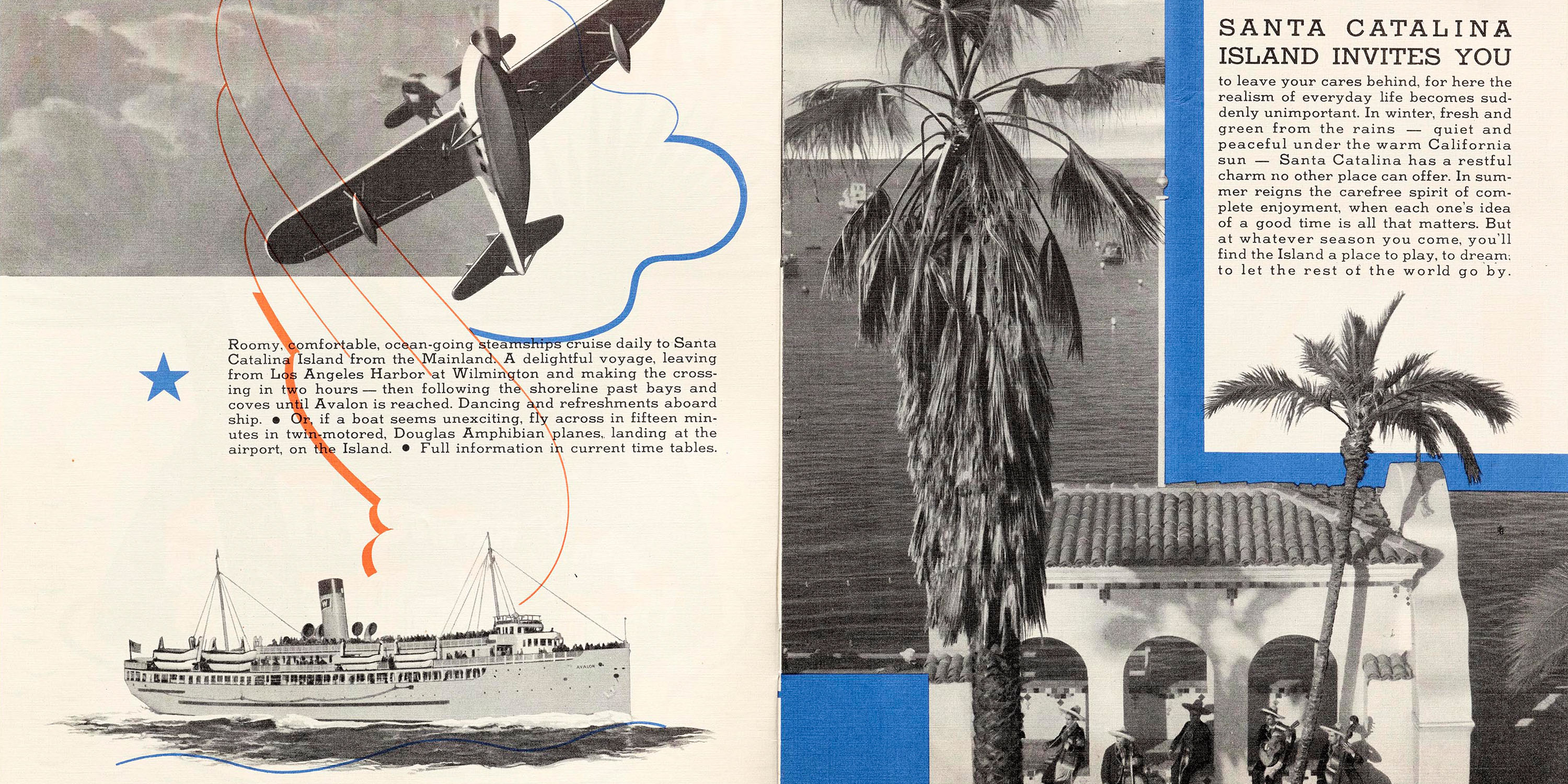
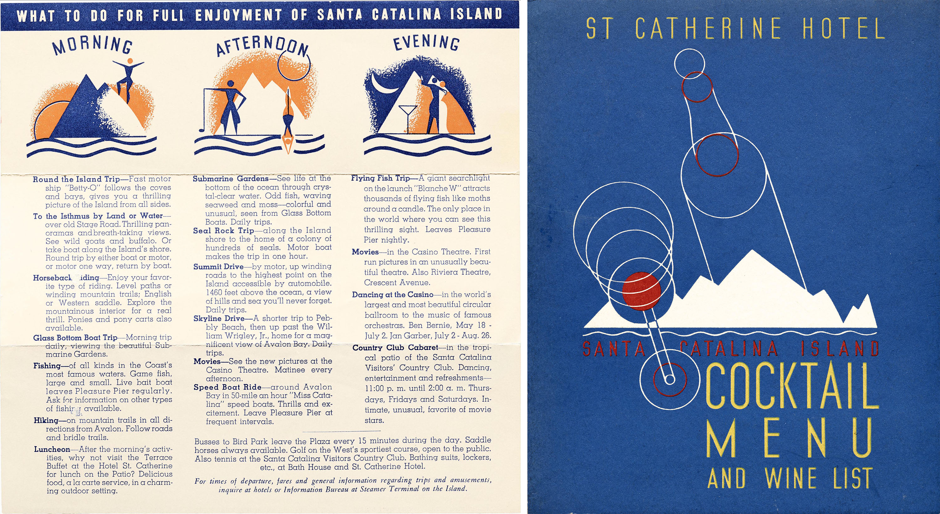
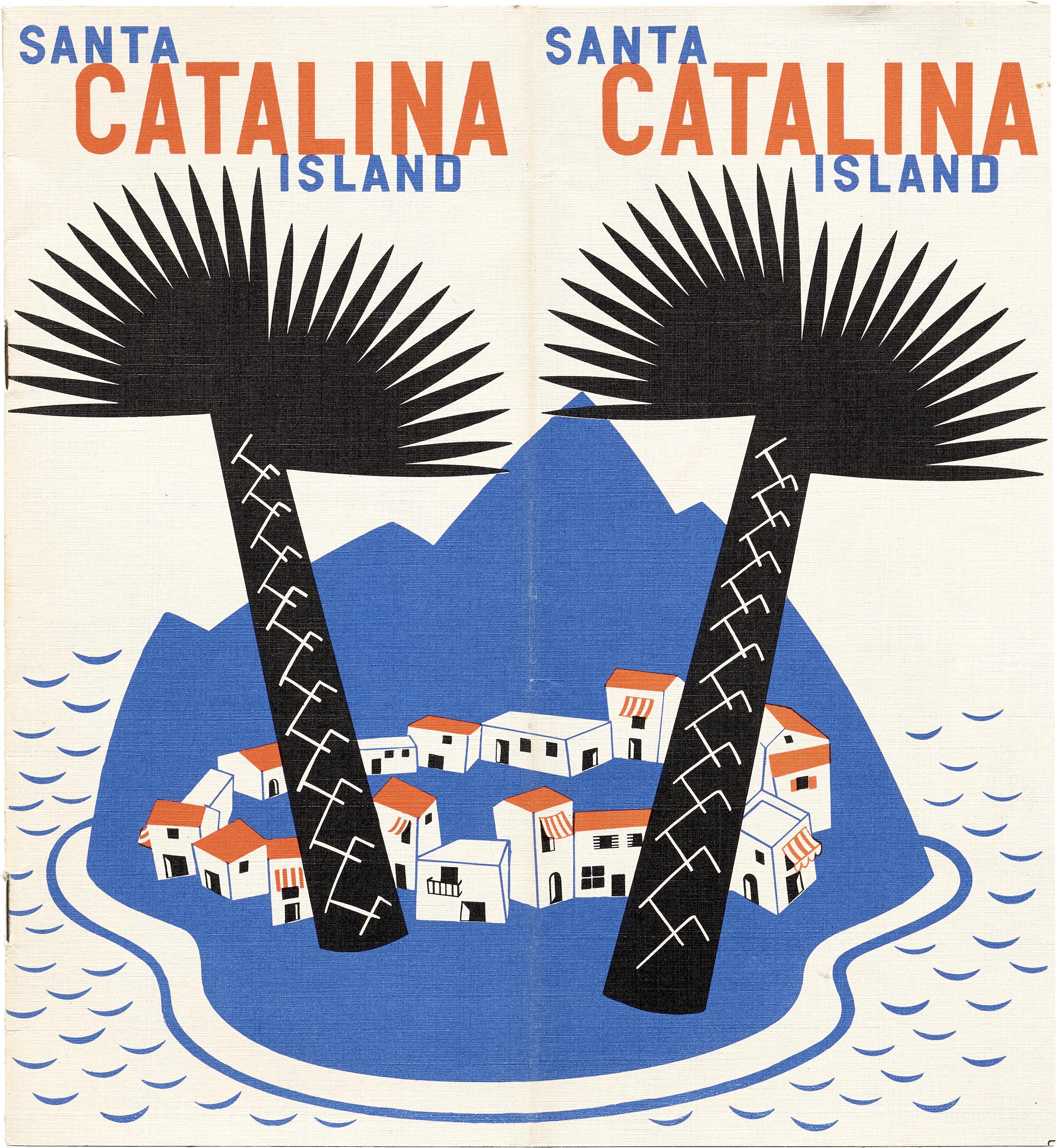
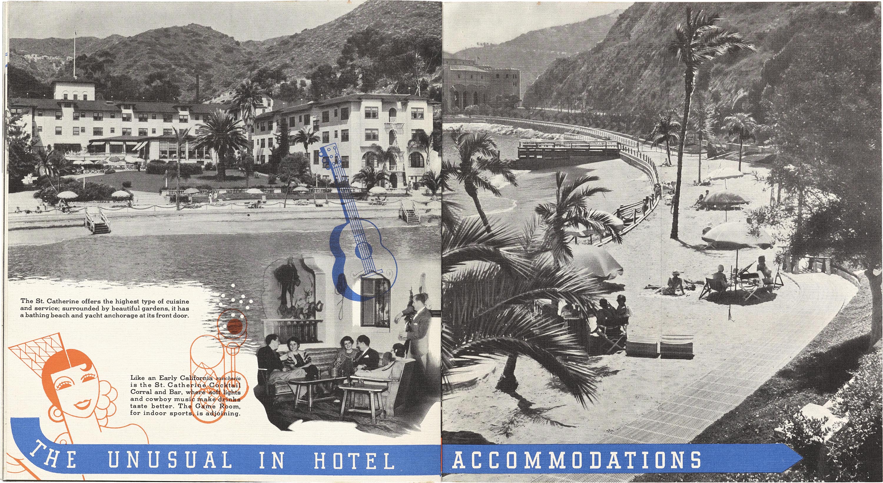
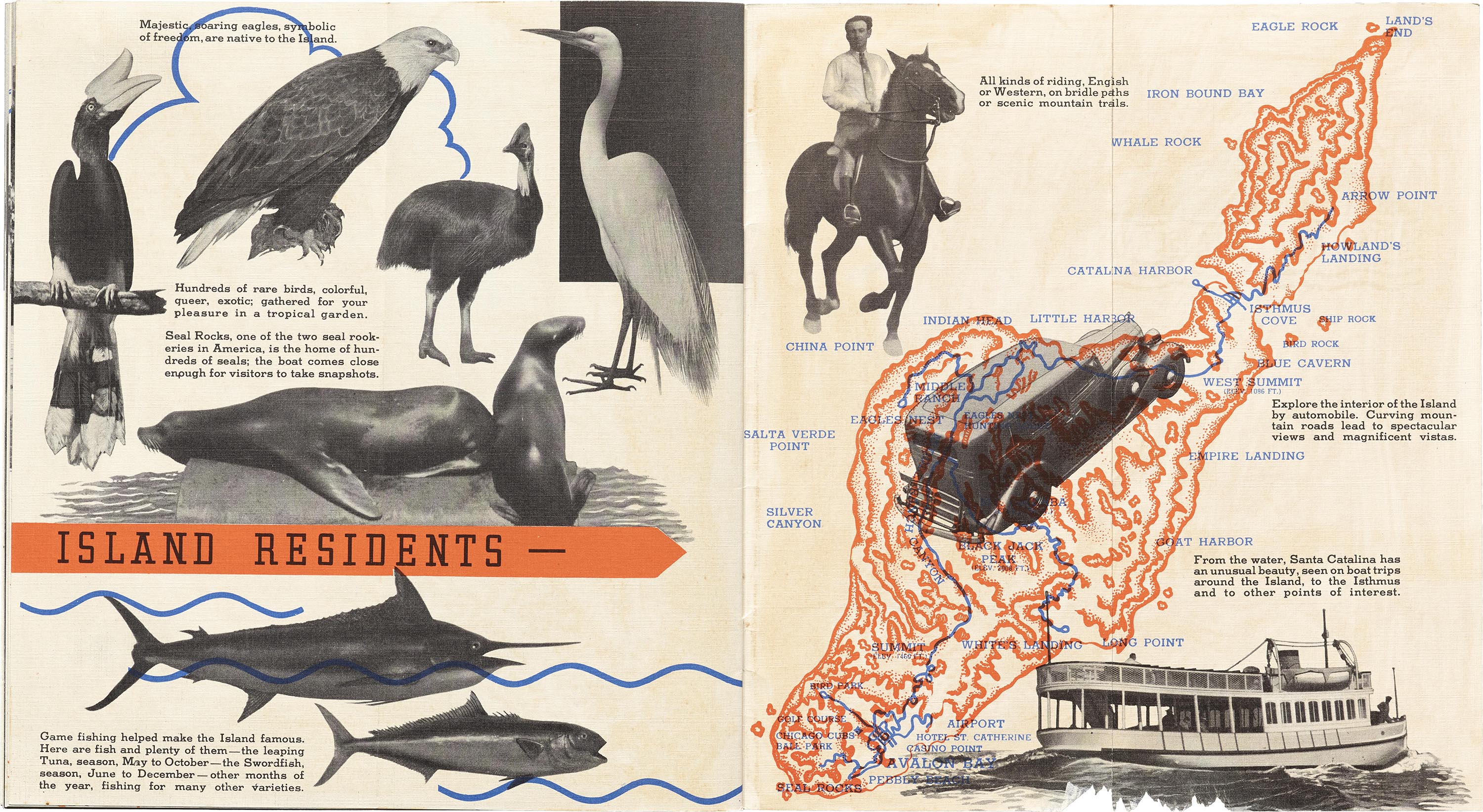
Before the undersea spectacular went up in New York, P. K. Wrigley brought the couple to an island off the coast of Los Angeles owned by the Wrigley family and reimagined as a tourist destination. Between 1934 and 1938, Dorothy and Shep worked together to carefully curate every part of the visual experience for Catalina Island’s attractions, from carpet patterns to cocktail menus. Dorothy's geometric style features heavily in the illustrations for the “Santa Catalina Island” booklet, while Shep’s outlines and airbrush are prominent in the “What to Do for Full Enjoyment of Santa Catalina Island” brochure. Despite their varied techniques, the minimalist illustrations and meticulous handlettering create a cohesive system for their work. And it was on Catalina Island that Shep would sometimes attend spring training for the Chicago Cubs.
All images in the gallery below are hi-fi captures. Click an image to enter fullscreen view, then click or pinch to enlarge.
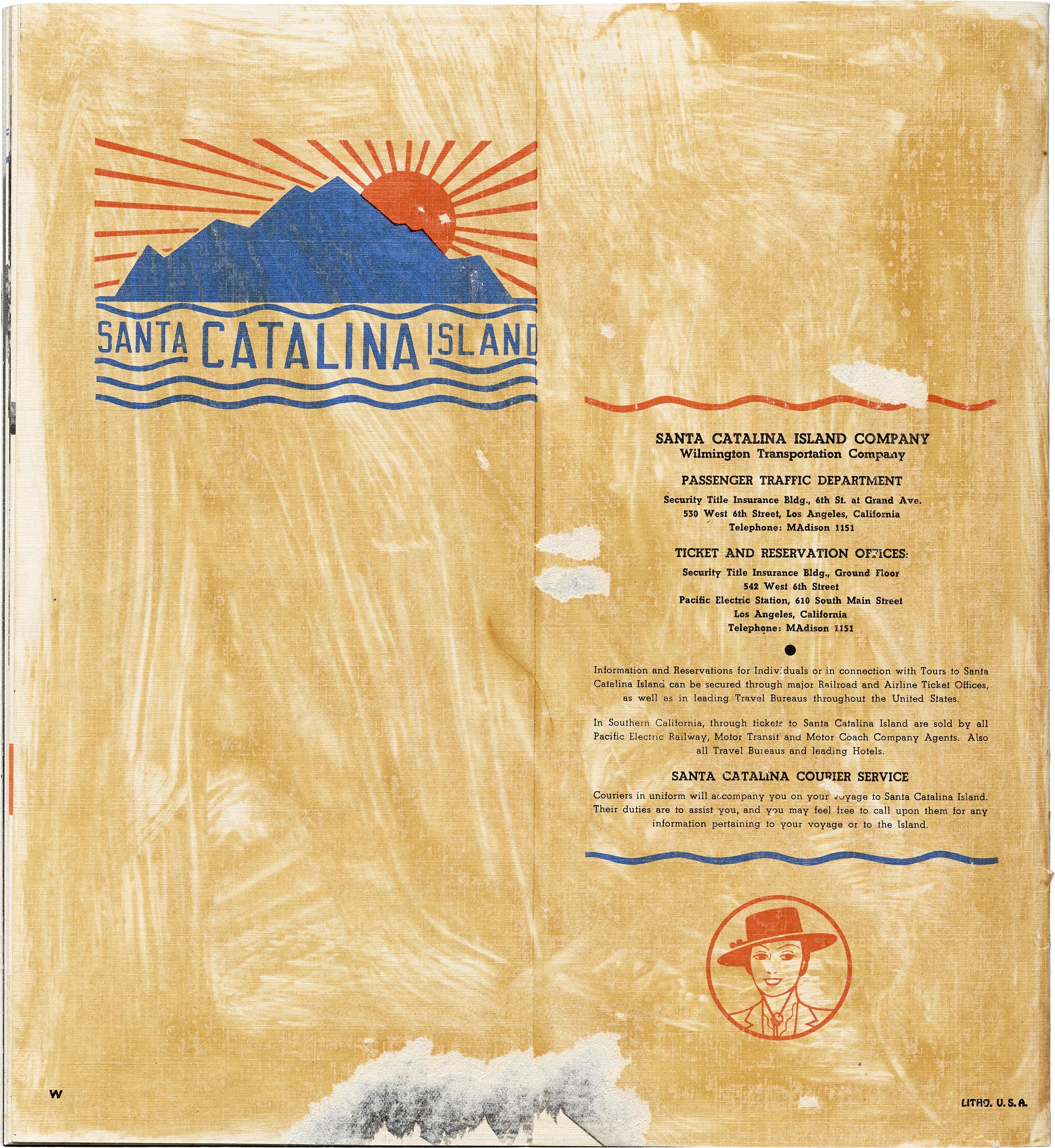
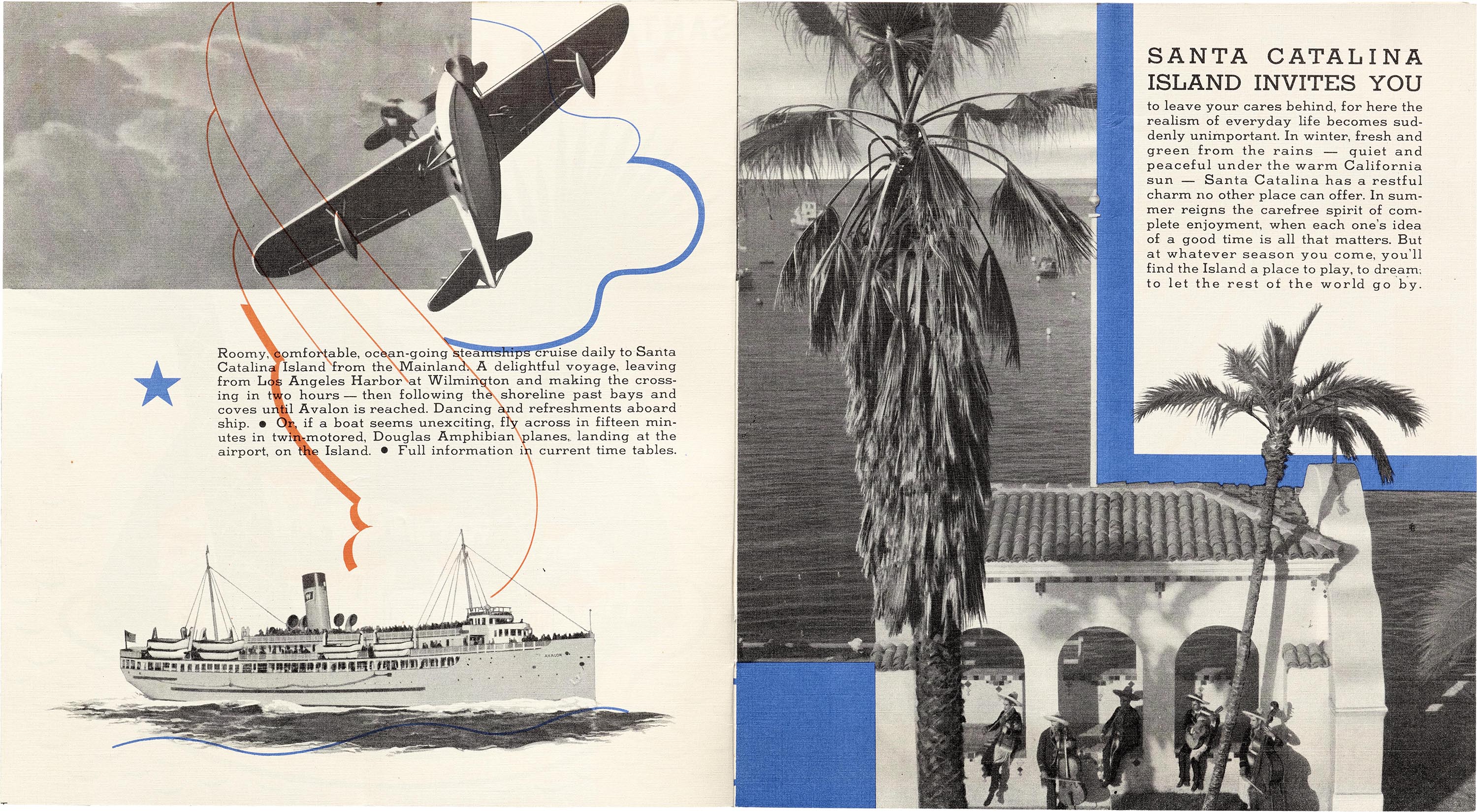
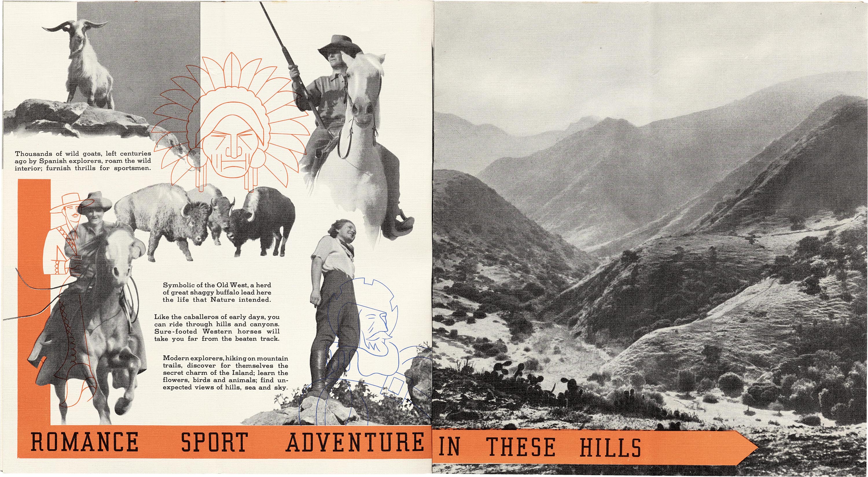
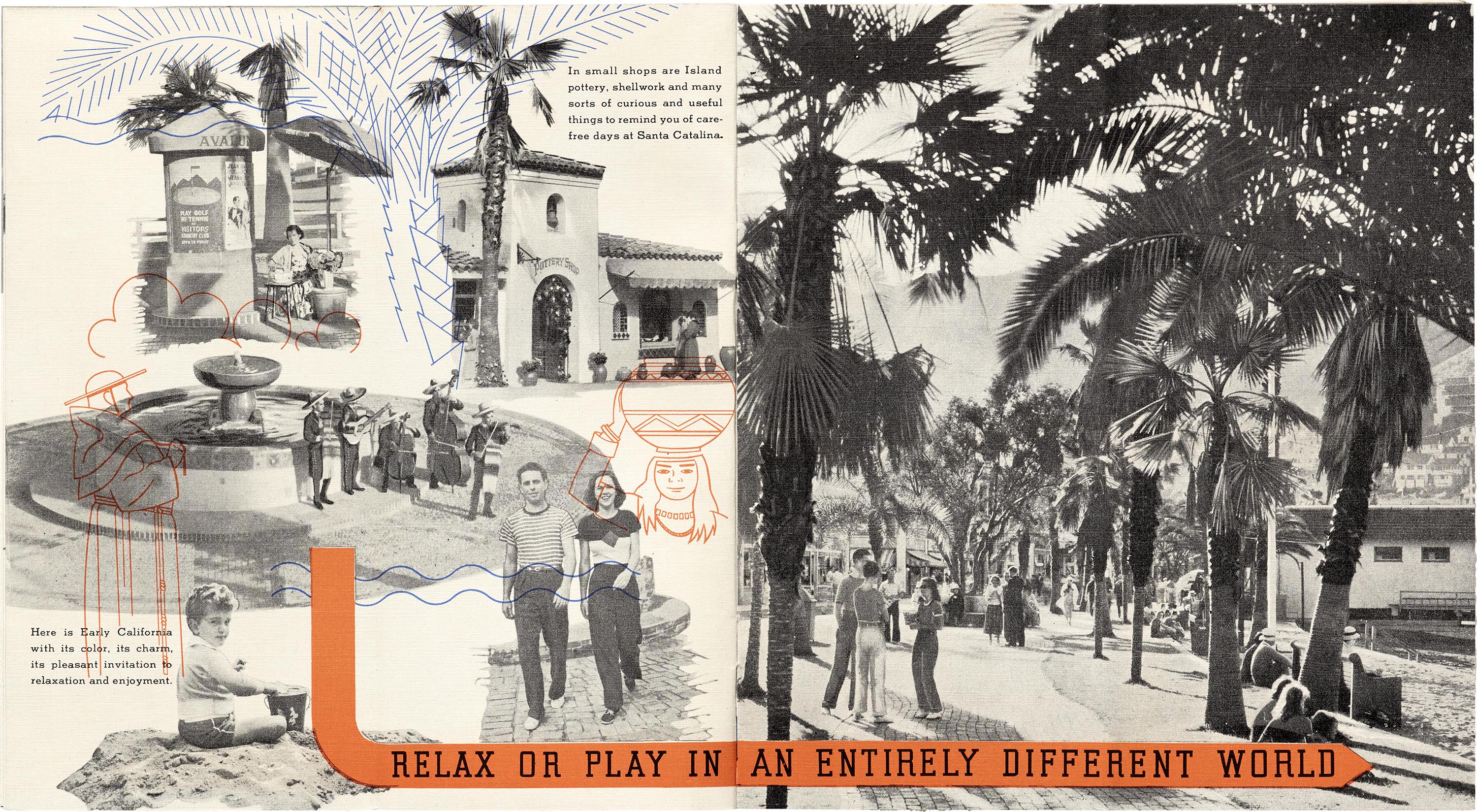
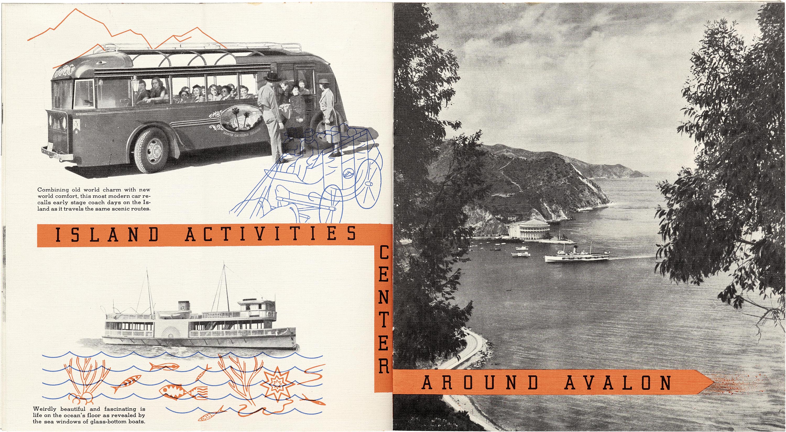
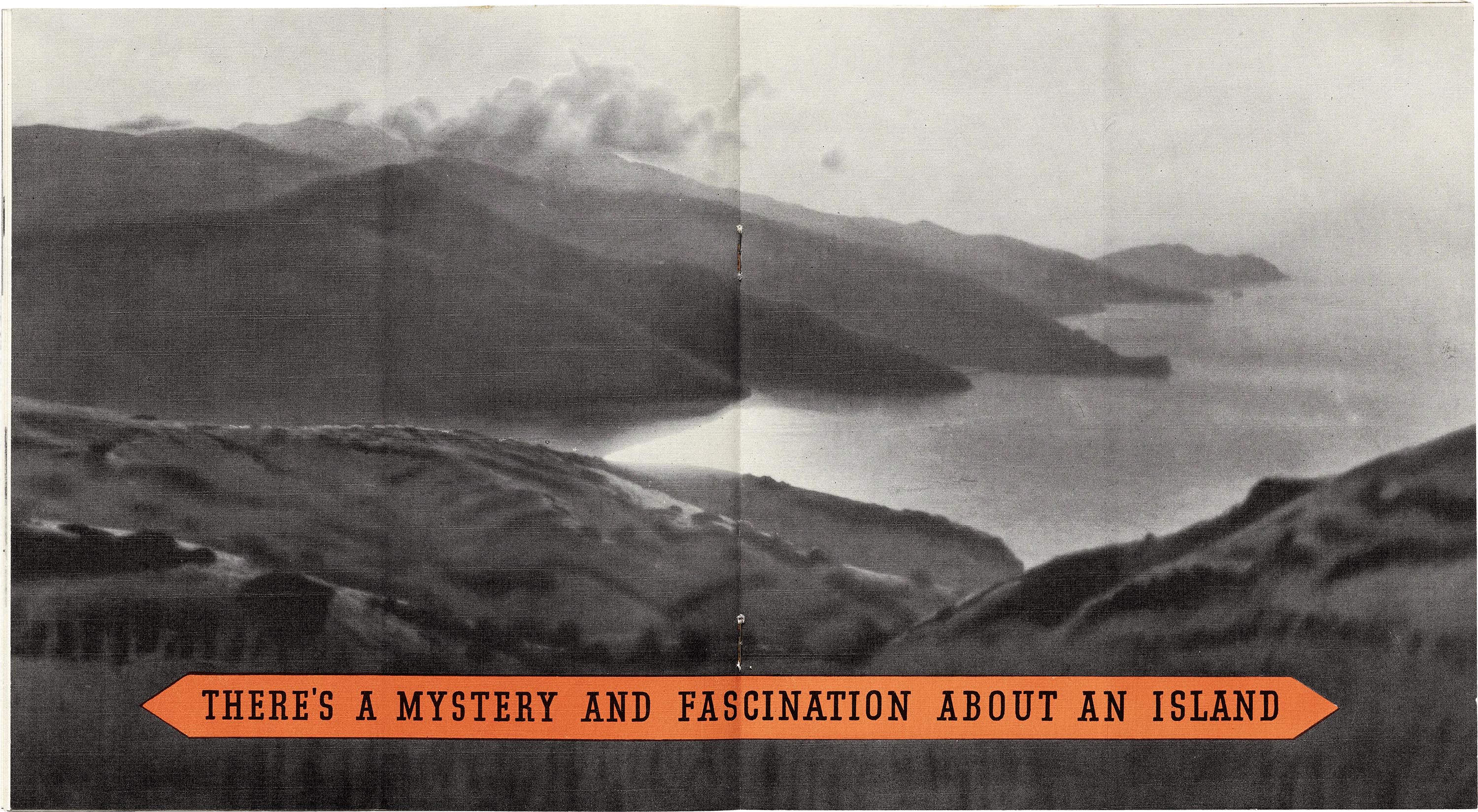
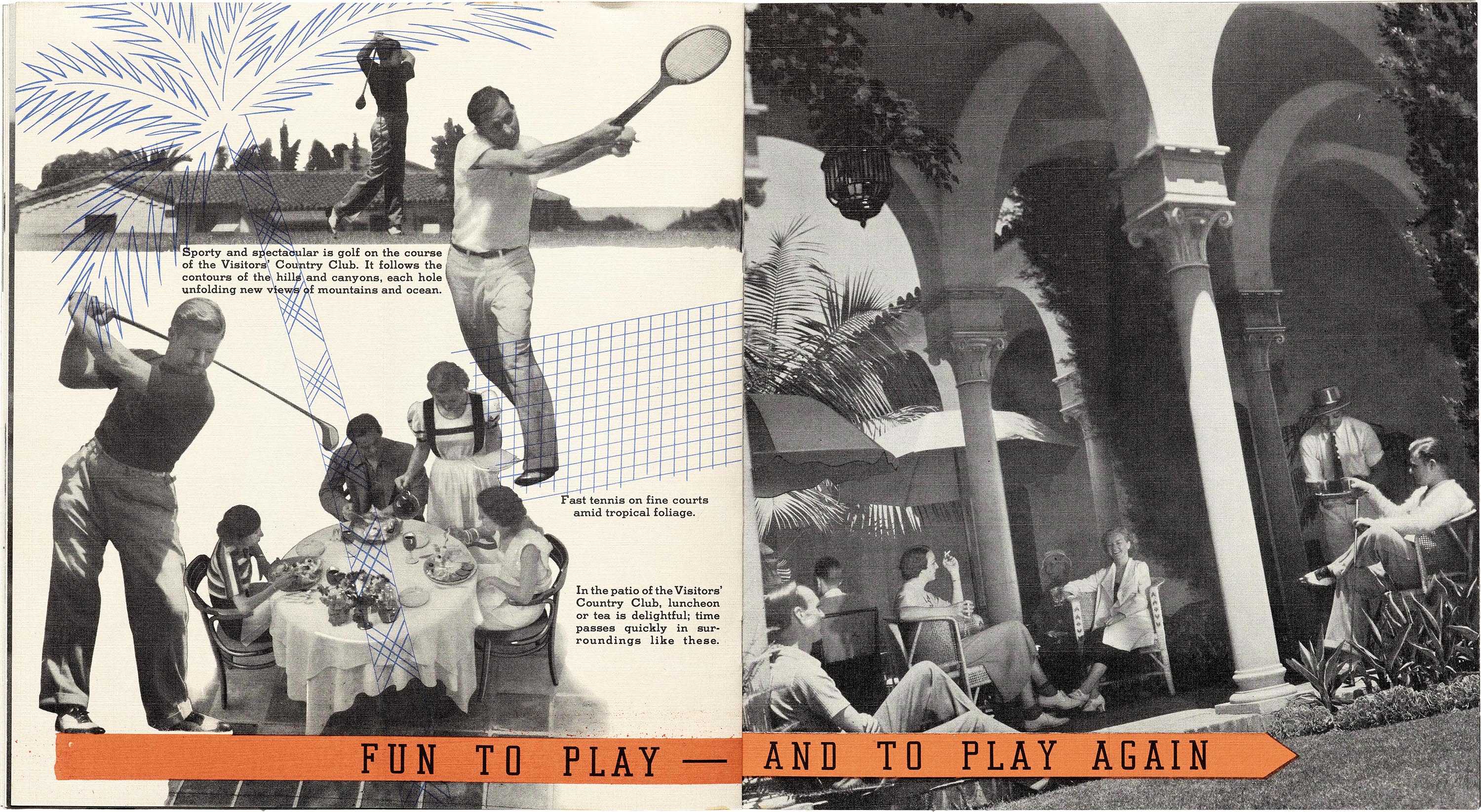
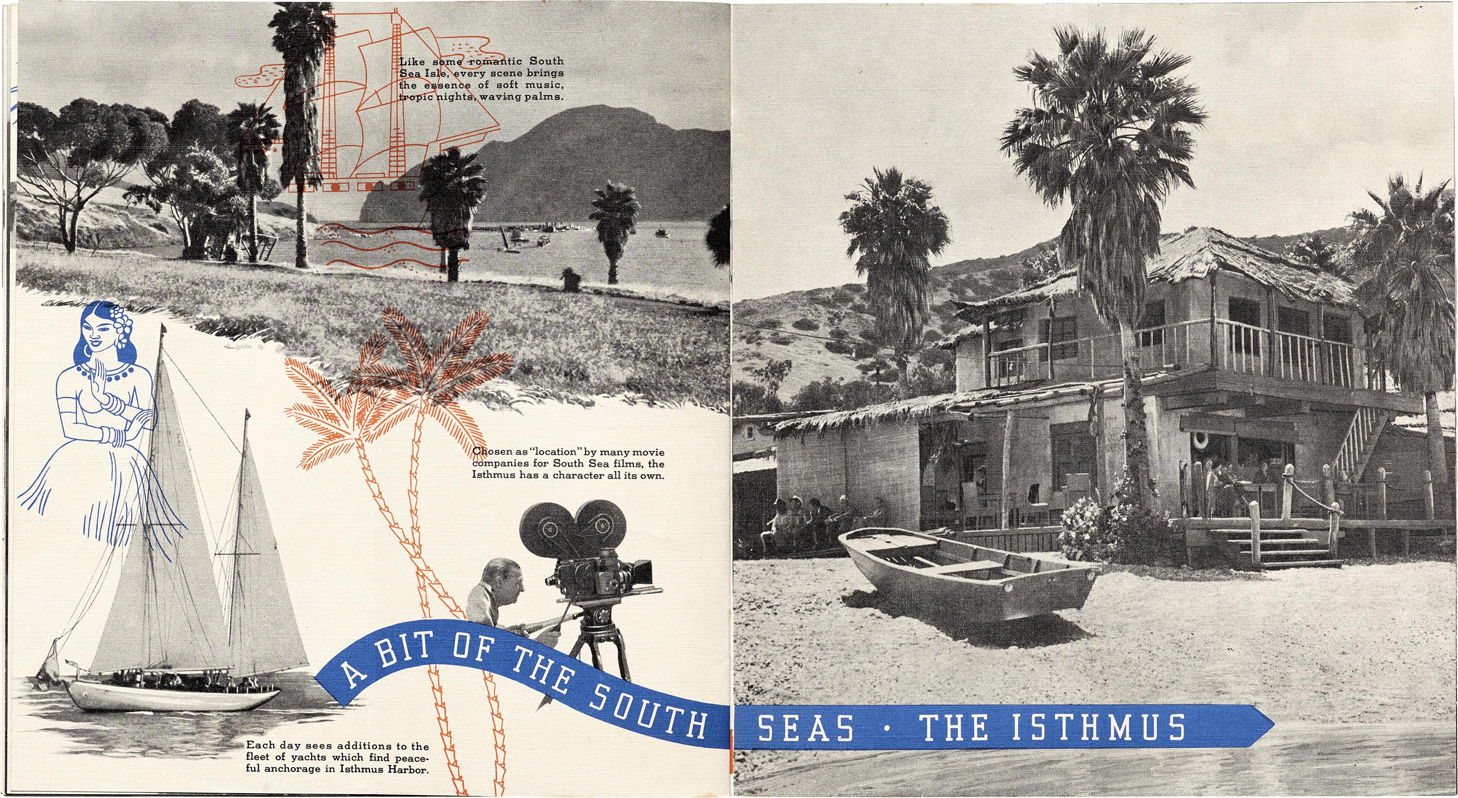

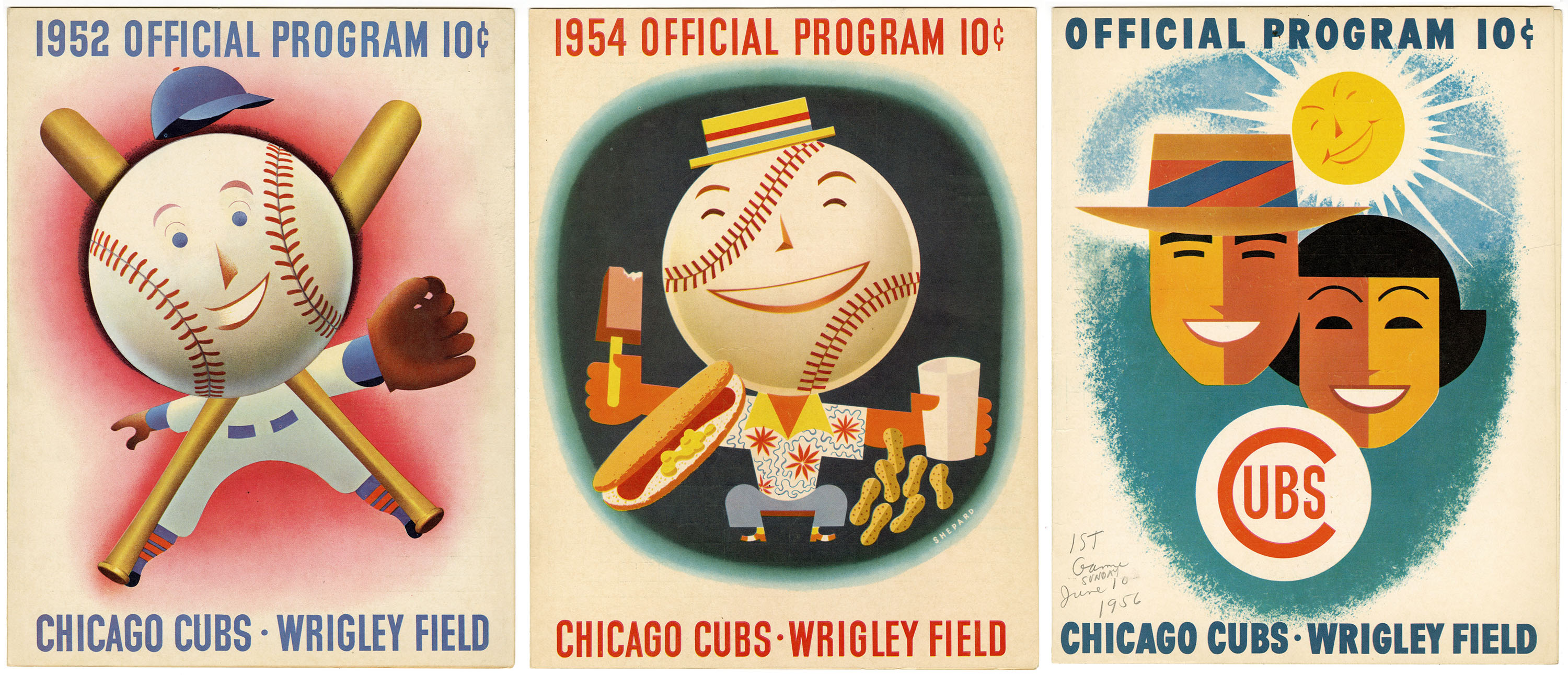
In 1936, P. K. enlisted Shep to reinvigorate the Chicago Cubs and Wrigley’s Field. Baseball was wildly popular, but its aesthetics were antiquated, and P. K. trusted one man to bring them into the modern era. Shep started with the uniforms, foregoing thin trim stripes for color blocks and old-fashioned tailoring for a more flattering style with a prominent logo. He emphasized that the details should be visible from a distance. The Cubs debuted their new look during the 1937 season, and as other teams followed suit, the league eventually updated their guidelines to ensure similar logo placement and tailoring. Shep also overhauled the stadium. In everything from tickets to bleachers and scorecards to the scoreboard itself, Shep helped realize P. K.’s vision of “fun, sun, and family” at the ballpark. Before he retired in 1962, he had illustrated the patriotic and family-friendly covers of thirty scorecards.
While the couple maintained separate clients and worked for non-Wrigley’s campaigns as well, the Shepards’ relationship to Wrigley’s offered them national reach, varied projects, and a chance to design at every scale. Shep and Dorothy enjoyed success in their careers, but family life was not always so smooth. They welcomed their second son in 1939, but separated in the early ’40s. Although the couple would divorce in the early ’50s, they were reunited and remarried after Shep’s retirement. Thanks to a gift from the Shepard family, Letterform Archive is honored to preserve and share a wide-ranging collection of their work that includes sketches, final designs, and Shep’s airbrush pen used for many of their commercial projects, as well as personal drawings, student work, greeting cards, and family photographs.2
—Kate Long Stellar, Collections Director
- Norman Hathaway and Dan Nadel’s monograph Dorothy and Otis: Designing the American Dream (Harper, 2014) has been a valuable resource for this survey of the Shepard Collection. ↩︎
- For more on Dorothy and Otis, see Stellar’s article in BLAG (Better Letters Magazine), no. 8, 2026. ↩︎