The richly illustrated story of a design marvel that made printers into artists and brought movement to moveable type
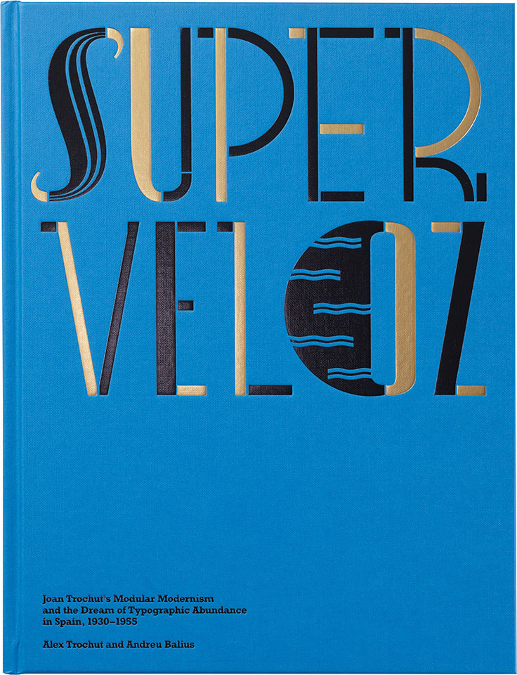
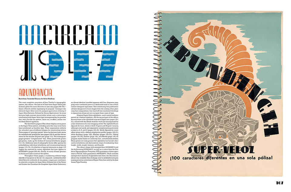
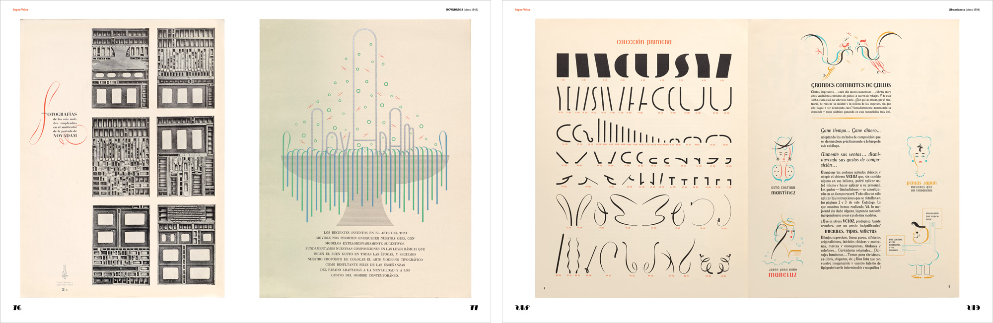
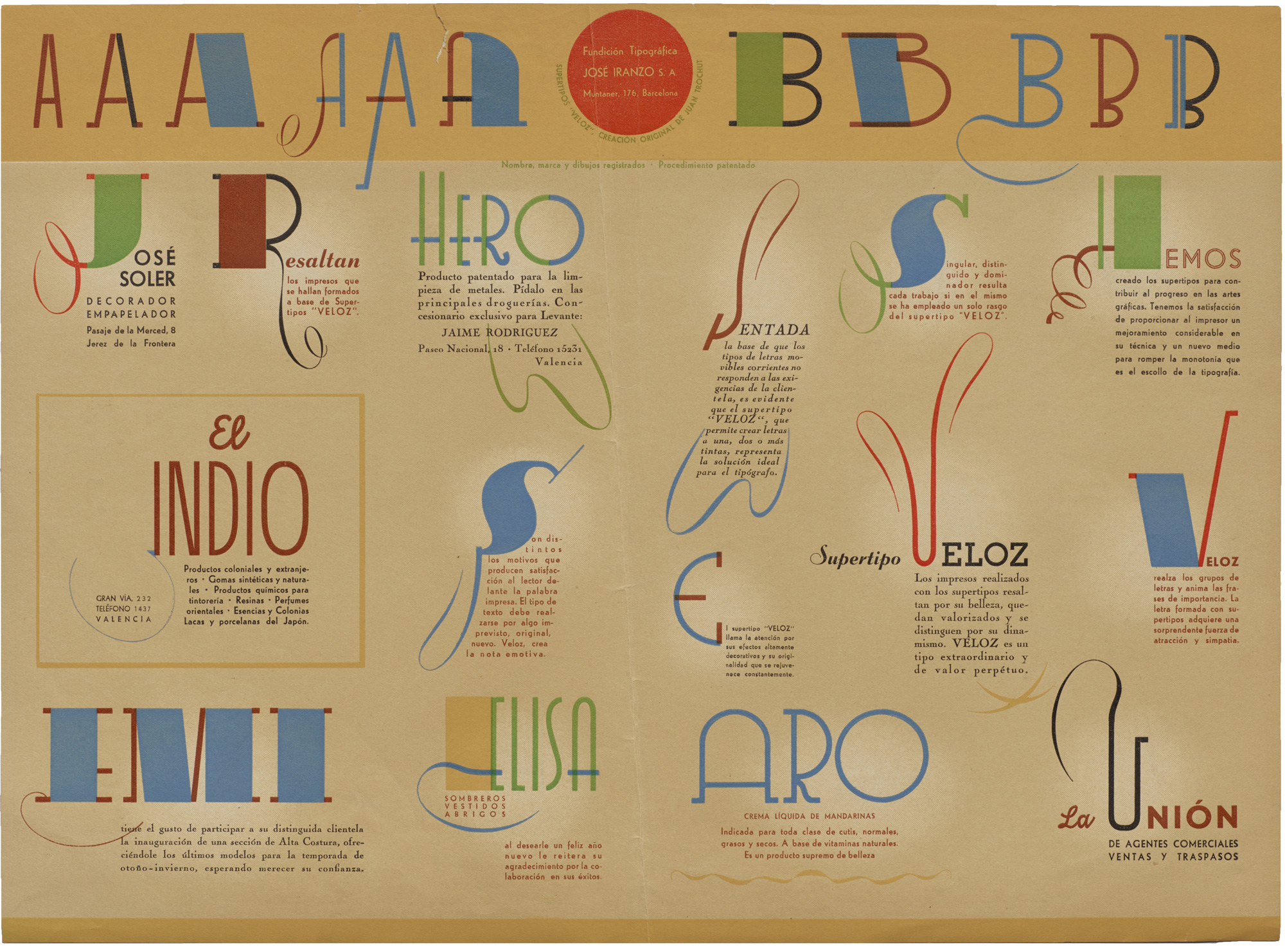
In late-1930s Barcelona, young designer Joan Trochut and his father, a visionary printer, reimagined the medium of letterpress for an age of speed and creative flexibility. Inspired by modern art, Joan devised a typeface unlike any other—one made of hundreds of elements that could combine to form myriad new alphabets, infinite illustrations, and an endless range of original ornaments. Called SuperTipo Veloz (or simply Super-Veloz), this modular system was a midcentury hit in Spain and, later, an international cult classic. It also gave life to a run of dazzling albums called NOVADAM, in which Joan and his father explored a charmingly playful yet profound visual language that holds lessons for designers and artists today.
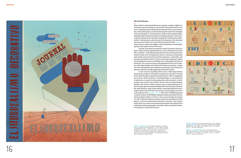
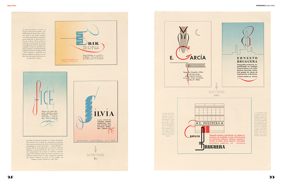
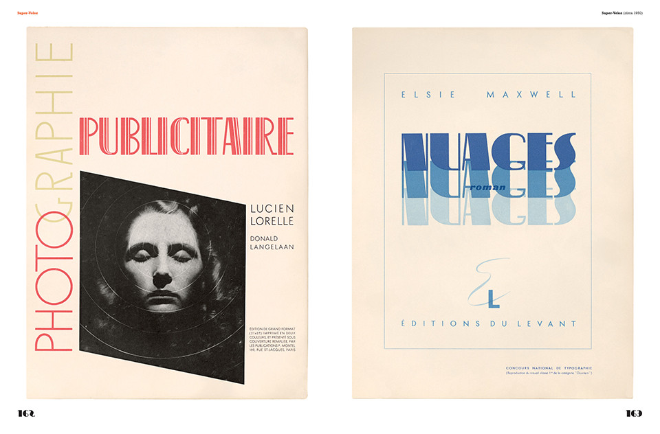
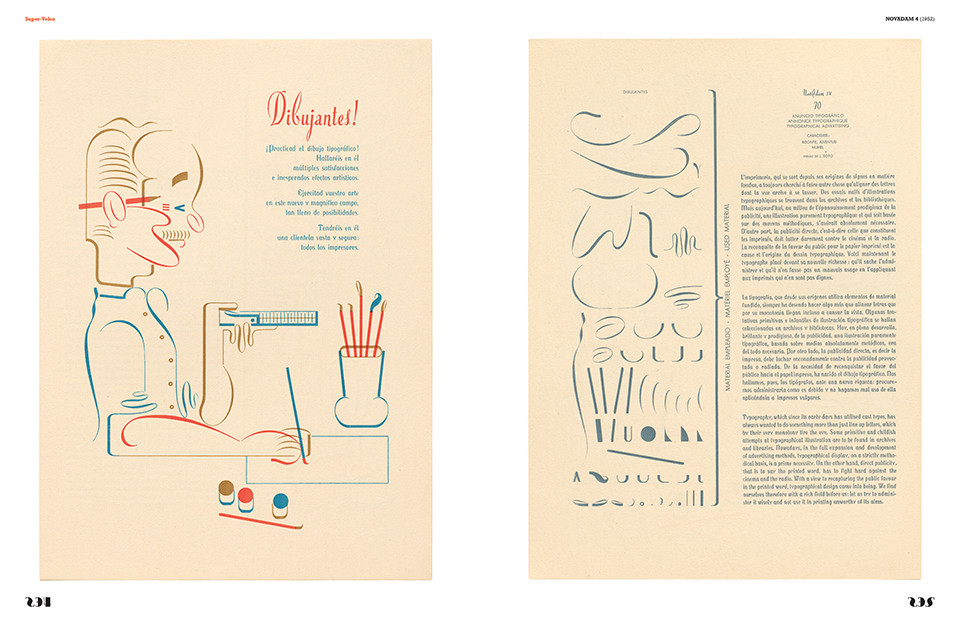
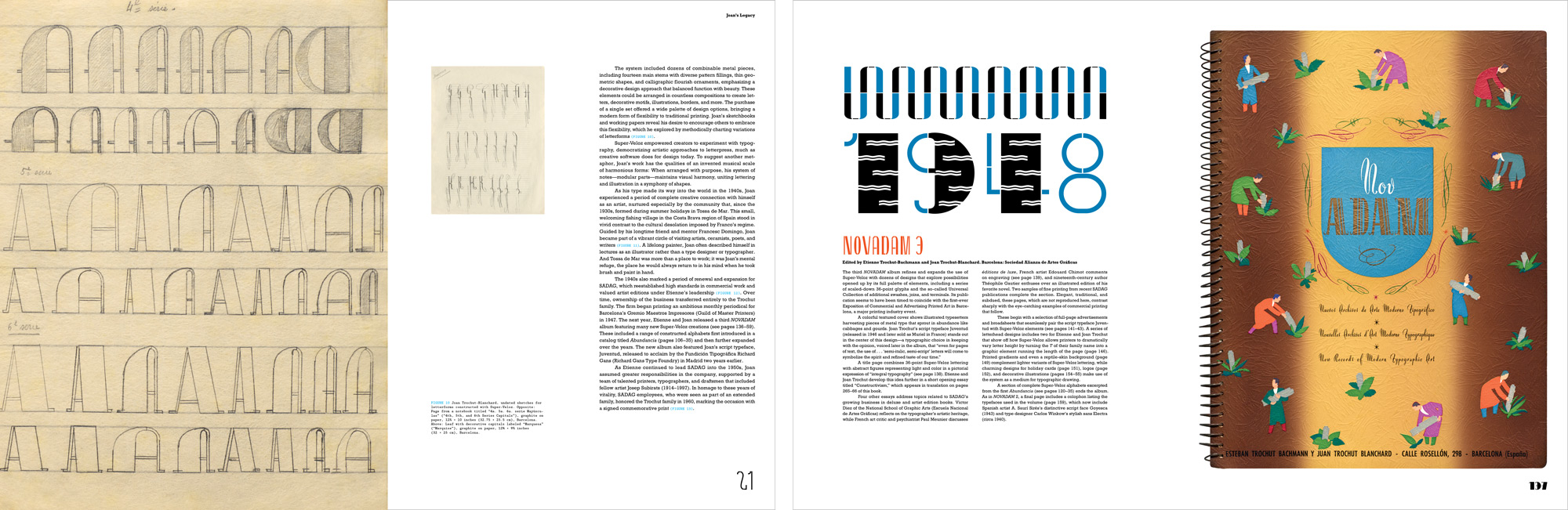
In this book, Alex Trochut (designer and grandson of Joan Trochut) and Andreu Balius (type designer and researcher) tell the fascinating story of Super-Veloz alongside more than 150 reproductions from the Trochuts’ albums of the 1940s and ’50s, plus never-before-seen drawings and sketches, foundry ephemera, and archival photographs. With a foreword by Alexander Tochilovsky, translated type manifestos, and carefully researched guides to the reproductions, Super-Veloz is the definitive work on the twentieth-century’s most multitalented typeface.
From the Foreword
I first stumbled upon the fourth volume of NOVADAM when I was a student exploring the Lubalin Center collection at Cooper Union. I didn’t know what to make of this strange masterpiece of the Super-Veloz type system in use, but the book made a big impression on me. It was unlike anything else I’d seen then. Nearly thirty years later, I still haven’t seen anything like it.
Super-Veloz shines light on SuperTipo Veloz, the ingenious system of combinable parts for printing. But it also explores the NOVADAM albums, a series of volumes in which the system’s creator, Joan Trochut, and his father, Etienne, gave printers the perfect blueprint for how to dream. Their pages demonstrate what you can achieve when you privilege type in design. Using not only Super-Veloz but a wide range of modern typefaces, these albums form an incredible body of work, produced in a relatively short period of time, that showcases the brilliant artistic skills of both father and son. Either the Super-Veloz system or the albums alone would be a considerable achievement, but the two together represent a remarkable, if until recently little remarked, vector in design and print history.
The modular elements of Super-Veloz ask you to slow down, to pause and take stock of the shapes, and then to dream. It’s a radically different proposition than working with regular metal type—or most digital type, for that matter—where you are focused on making words. Here you are drawing with shapes. I find the process poetic, and its results are often electrifying.
— Alexander Tochilovsky, Director of the Herb Lubalin Study Center of Design and Typography
About Joan Trochut

Son of pioneering Barcelona printer Etienne Trochut-Bachmann (1894–1978), Joan Trochut-Blanchard (1920–1980) grew up in the printshops where his father published the influential Archivos Documentarios de Arte Moderno (ADAM), a series of albums that helped introduce print modernism to Spain. Taking night classes at the Llotja School of Art and Design and studying with Catalan artists Joan D’Ivori and Francesc Domingo, Joan worked for the Sociedad Alianza de Artes Gráficas (SADAG) printing house from the time of its founding in 1935.
During the Spanish Civil War, while still in his teens, he began designing an original type system that aimed to bring a new level of creative freedom to letterpress printing. Released in 1942 as SuperTipo Veloz, this collection of dozens of modular metal type pieces was widely adopted in Spain and became the subject of an extensive body of work preserved in the NOVADAM albums that Joan published with his father.
Two typefaces by Joan followed: the casual script Juventud (known in France as Muriel; 1947) and the distinctive sans serif Bisonte (1952). As a leading figure in Spain’s graphic arts scene, Joan published essays and presented work internationally, and he served as the Spanish delegate and board member of the global typographic forum ATypI. He was also a talented painter, practicing his art in private while sharing responsibilities as a director of the SADAG workshop. The company, which earned renown for vibrant commercial work, as well as for fine press and artist editions with the likes of Picasso and Miró, ceased operations a few years before Joan’s death.
Praise
“Joan Trochut’s innovative typefaces and typography were way ahead of their time. Without doubt, he’s among the greats. It’s a joy to see this publication, which brings long-overdue worldwide attention to his work. Super-Veloz is the kind of book that will be welcomed in any designer’s library, as a delight to see and a creative reference. Suffice it to say Joan Trochut’s work has inspired me endlessly.”
— Tony Dispigna, type designer and lettering artist
Pagethrough
About the Authors
Alex Trochut is an illustrator and lettering artist based in Northern California. Trochut has created custom lettering and illustrations for prominent clients including Nike, the Rolling Stones, Paul McCartney, and The New York Times. His work, which focuses on the potential of language as a visual medium and on the intersection of text and image, has been recognized with several D&AD Pencil awards and a Grammy nomination. He holds a degree in graphic design from Elisava and a bachelor of arts from the University of Southampton. His work is the subject of the monograph More Is More (Index Book, 2011), authored by Dani Navarro. Previously a member of the Apple design team, Trochut is currently a visual designer on the Future Design Team at Meta.
Andreu Balius is a typographer and type designer based in Barcelona. He designs retail and custom typefaces at Typerepublic and has been honored with several Excellence in Type Design awards from the Type Directors Club. He is a member of Alliance Graphique Internationale (AGI) and Association Typographique Internationale (ATypI). He holds a PhD in design from the University of Southampton (UK) and teaches typography and type design at Eina University School of Design and Art in Barcelona. His research focuses on the history and development of type design in Spain during the twentieth century.
Alexander Tochilovsky (foreword) is a researcher, graphic designer, curator, and educator. Born in Odesa, Ukraine, he graduated with a BFA from The Cooper Union and holds an MFA from Cranbrook Academy of Art. He is currently the director of the Herb Lubalin Study Center of Design and Typography, a vast graphic design archive at the heart of Cooper Union, where he has curated a number of exhibitions. Tochilovsky devotes a large portion of his practice to researching the history of visual communication, focusing on the lesser-known practitioners and regions of the world. He lectures frequently on the history of design and typography. In 2010 he helped cofound Type@Cooper, the postgraduate program in typeface design, and in 2015 he helped create the annual Typographics conference and festival. He lectured on Super-Veloz as part of the Letterform Lecture Series for Type@Cooper West in 2018.
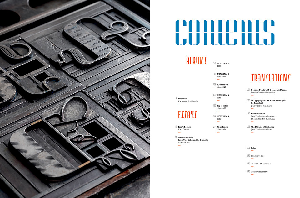
Contents
Foreword Alexander Tochilovsky
Essays
Joan’s Legacy Alex Trochut
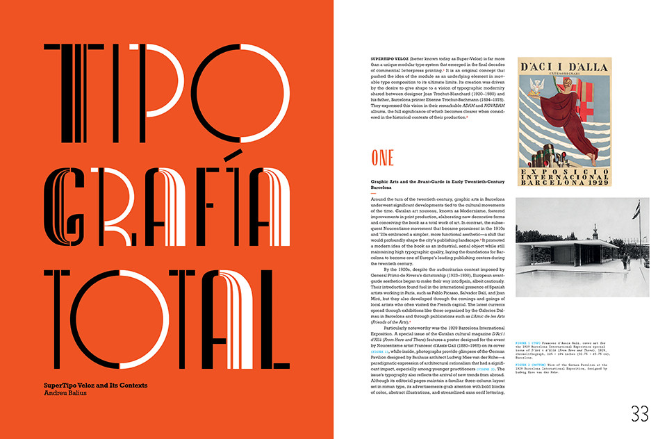
Tipografía Total: SuperTipo Veloz and Its Contexts Andreu Balius
Albums
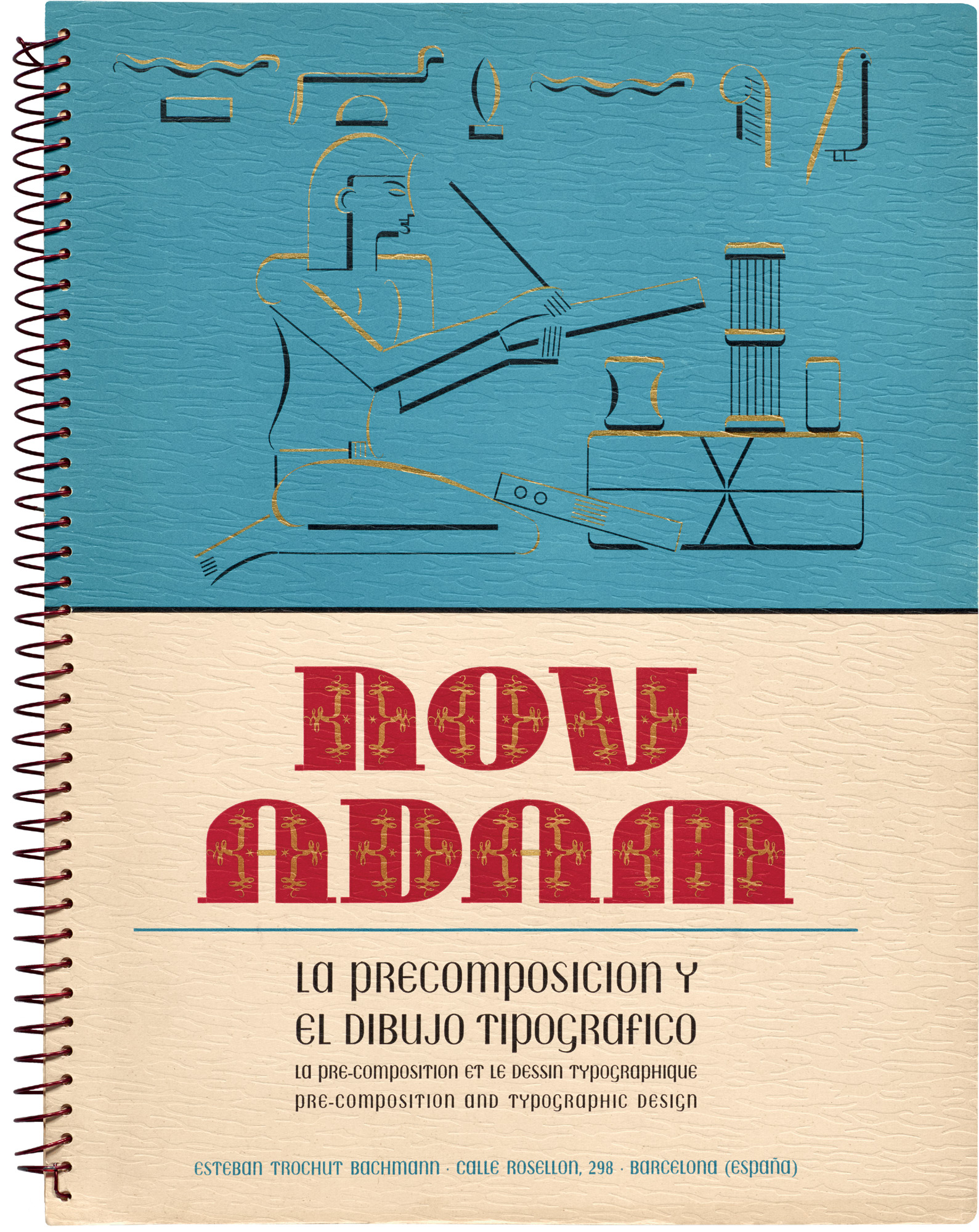
NOVADAM 1 (1936)
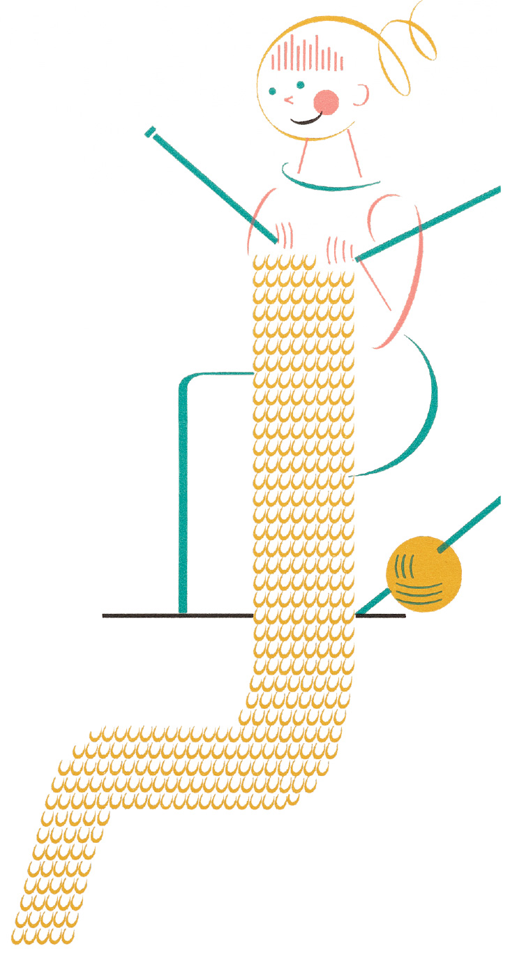
NOVADAM 2 (circa 1942)
Abundancia (circa 1947)
NOVADAM 3 (1948)
Super-Veloz (circa 1950)
NOVADAM 4 (1952)
Abundancia (circa 1954)
Translations
Dos and Don’ts with Geometric Figures Etienne Trochut-Bachmann
In Typography, Can a New Technique Be Invented? Joan Trochut-Blanchard
Constructivism Joan Trochut-Blanchard and Etienne Trochut-Bachmann
The Miracle of the Letter Joan Trochut-Blanchard
Index
Image Credits
About the Contributors
Acknowledgments
Details
| Publisher | Letterform Archive |
| Publication date | December 8, 2026 |
| ISBN | 979-8-9916212-7-4 |
| Size | 9½ × 12½ inches |
| Printing | 4 colors throughout |
| Pages | 256 |
| Format | Hardcover |
Related Posts
Super-Veloz: Modular Modern with Alexander Tochilovsky (Letterform Lecture)
Write A Review
Related Products