News
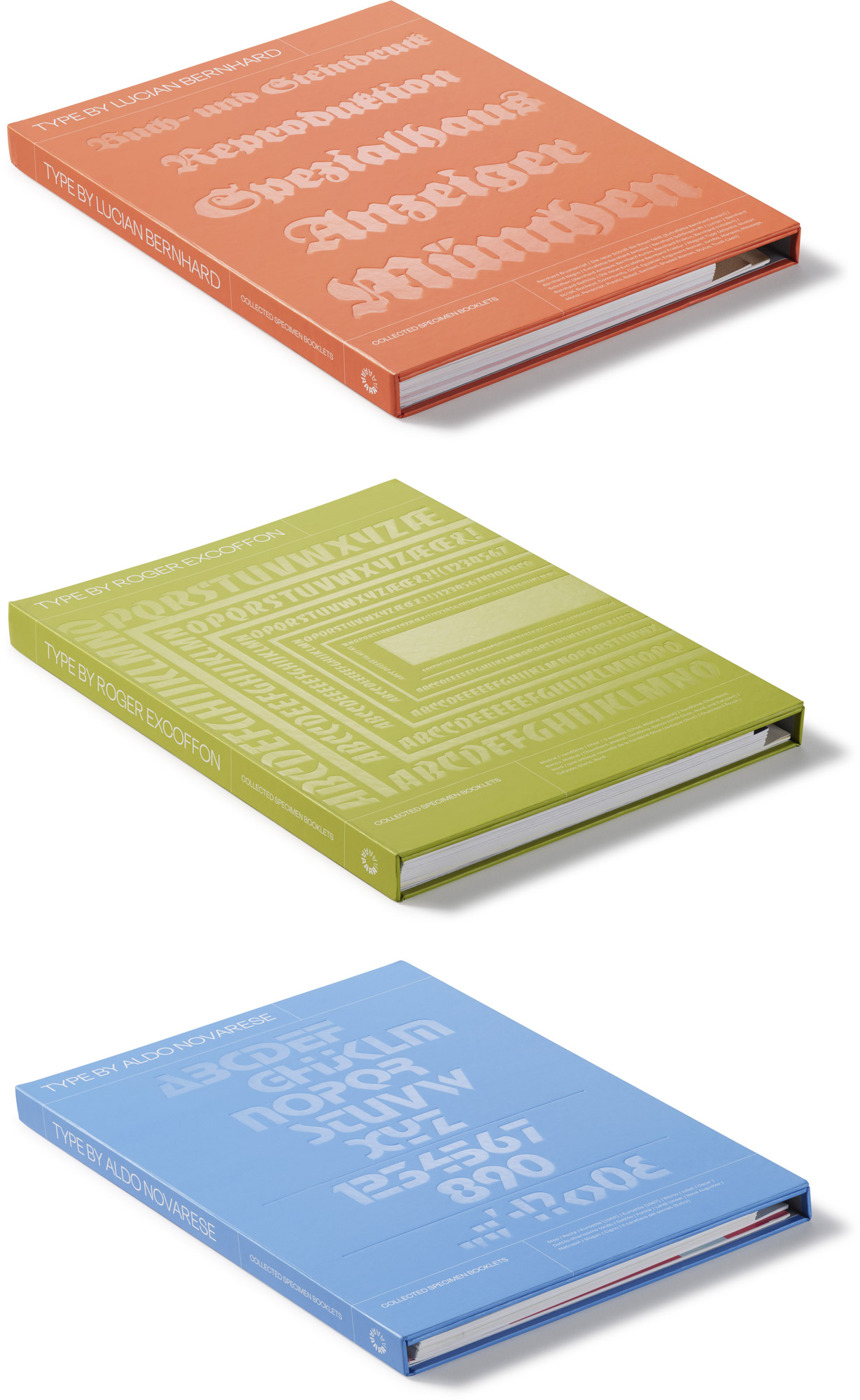
Inside the Type By series: Bernhard, Excoffon, and Novarese
Three volumes of rare specimen facsimiles lift the curtain on twentieth-century type, gathering essential documents of trendsetting faces as they were first meant to be seen.
Type by Roger Excoffon
Type by Aldo Novarese
Hardcover, 9.5 × 12.5 inches, 206–242 pages.
Typefaces like to float free of their beginnings, into font menus or assorted typecases, then into previously undreamed-of designs. Letterform Archive’s extensive collection of type foundry specimens helps reconnect the dots of type history by showing how faces debuted in print. Thousands of rare booklets (including many viewable online) reveal original character sets and sizes, showcase exemplary layouts, and offer surprising details about the designs, providing key resources for designers and researchers, and a rich trove of design inspiration.
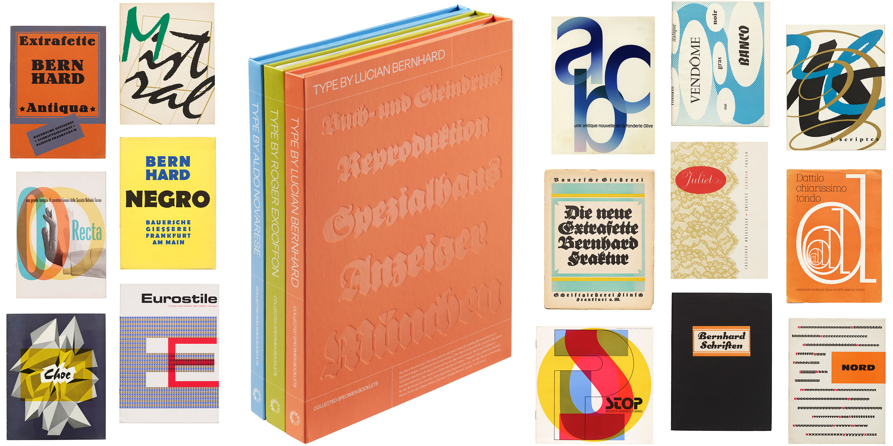
The new Type By series from Letterform Archive Books brings the best of the specimen collection to type fans everywhere. Gathering facsimiles of classic specimens of work of metal type major designers and foundries, titles devoted to Lucian Bernhard, Roger Excoffon, and Aldo Novarese provide close-up and comprehensive deep-dives into the world of twentieth-century type.
To celebrate their release, today we take a look at the art of the specimen and the three storied designers that inspired the series.
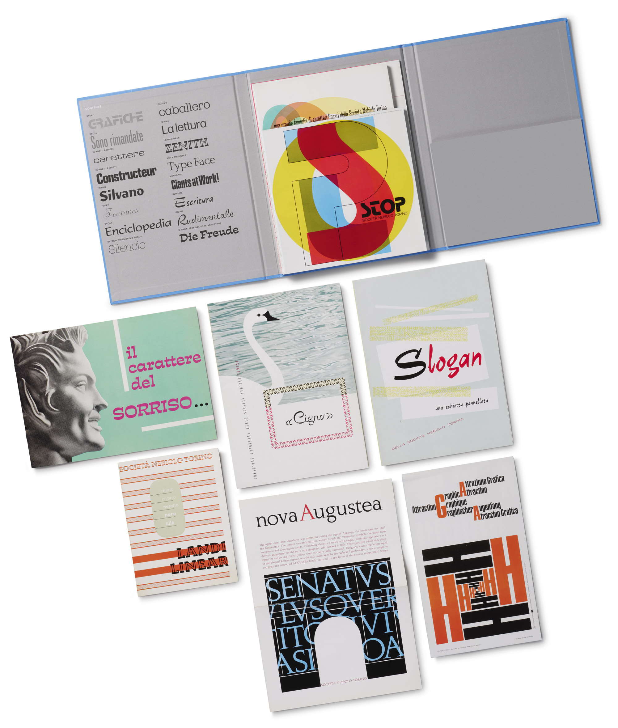
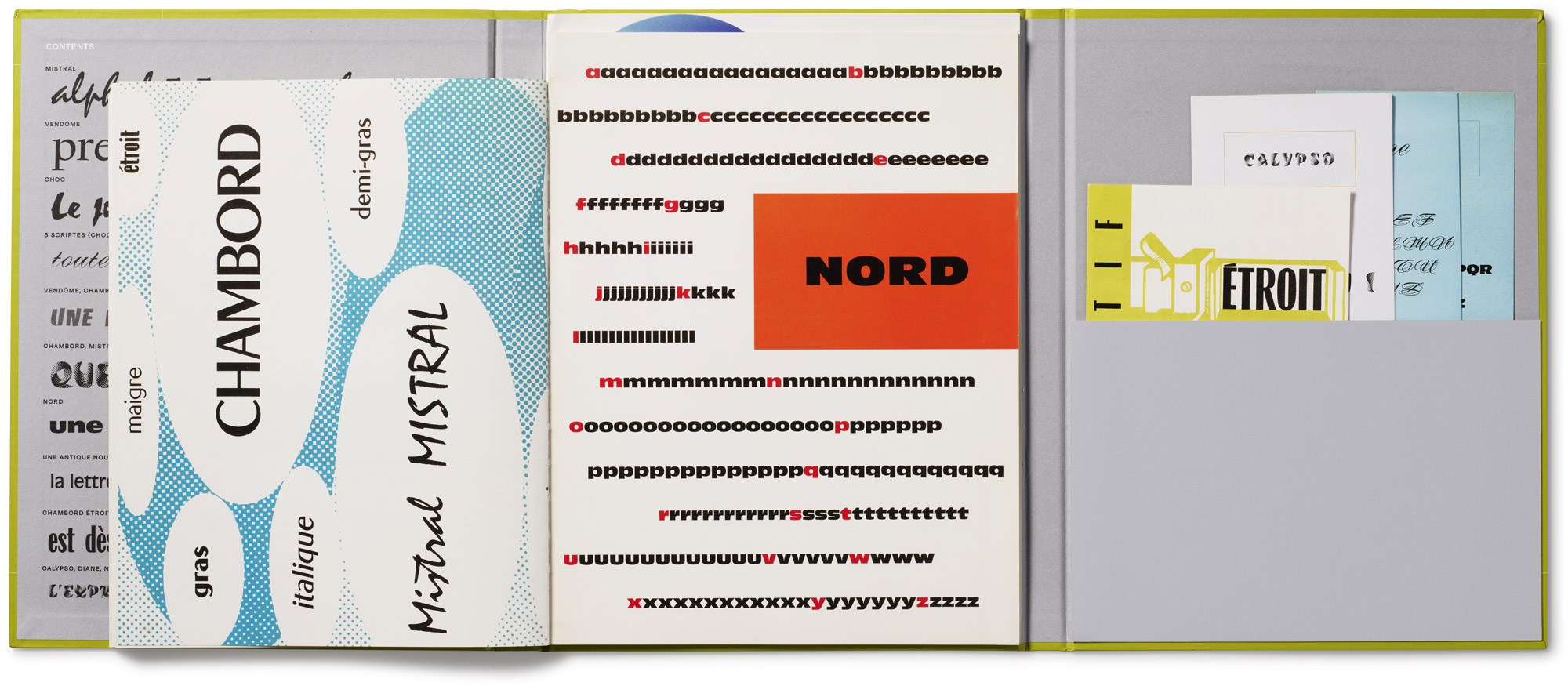
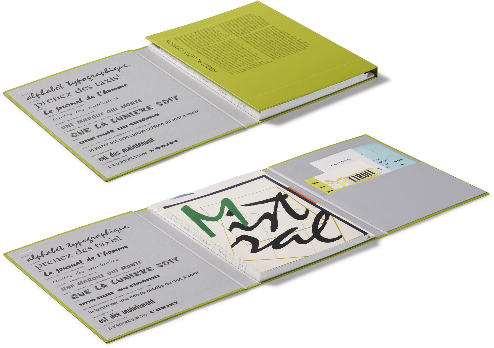
Below: The table of contents (left), bound collection of specimen facsimiles (center), and pocket with additional loose facsimile booklets (right and bottom) of Type by Aldo Novarese.
Ephemera Made for Keeps
Movable type goes back centuries, but the modern type specimen begins as a twentieth-century affair. Designed for competitive times when longwearing catalogs no longer keep pace with the accelerating rhythm of foundry releases, these small booklets broadcast fresh typefaces directly to customers, allowing them to pore over fonts in detail before adding new metal, film, or files to their stocks.
Freed from the catalogs, new type designs had to convince printers of their special usefulness and value. By the turn of the century, they started assuming memorable names and appeared in elaborately themed publicity. Well-known lettering artists and designers including Lucian Bernhard, Paul Renner, and A. M. Cassandre, brought their talents to typemaking, anchoring the always collaborative (and typically uncredited) foundry work of drafting, refining, and engraving in personal expressions of style and skill.
Foundry specimens brought their creations to life, realizing for the first time the new visual textures they made possible and sounding out the expressive ranges opened up by their use. Designed and published by and for the printing community, many tested the heights of the medium. Dynamic compositions, unique papers and effects, and exquisite presswork made them something more than throwaway advertising. At times, type designers themselves oversaw their creation, and more than a few specimens contained manifesto-like prefaces or enclosed small flurries of samples ranging from business cards to posters.
Distributed free of charge and scrapped by many who received them, type specimens nevertheless became prized productions of the type world, collected by some as defining typographic statements. By the 1930s these “covetable treasures for bibliophiles,” one commenter wrote, could “bring prices which make the first edition values of the majority of modern novelists look very small cheese indeed.”1
Beatrice Warde, Monotype’s long-time publicity director best known for her essay, “The Crystal Goblet, or Printing Should Be Invisible,” was one such admirer of the genre. “A collection of these,” reads a 1959 article by Warde featuring works by Excoffon, Novarese, and others, “deserves an honored place in any school of the graphic arts.” “A new typeface,” she writes, “is essentially a new way of saying something graphically—a new ‘tone of voice’ in which printed words can shout or sing or murmur their messages.” In the uniquely un-invisible genre of the specimen,
just for once it is of little consequence what the “copy” is saying; what matters is the difference of atmosphere created by the graphic images…. [Specimens] will be collectors’ items in years to come; and meanwhile serve as exercises in typographic atmosphere, and revelations, to the jaded production man, of what new things can still be done with type and ink.2
The Type By series aims to preserve these type-and-ink treasures for a new generation of design enthusiasts. Moving from Germany and US to France to Italy, three new volumes show how specimens helped shape the stories of three masters of metal type.
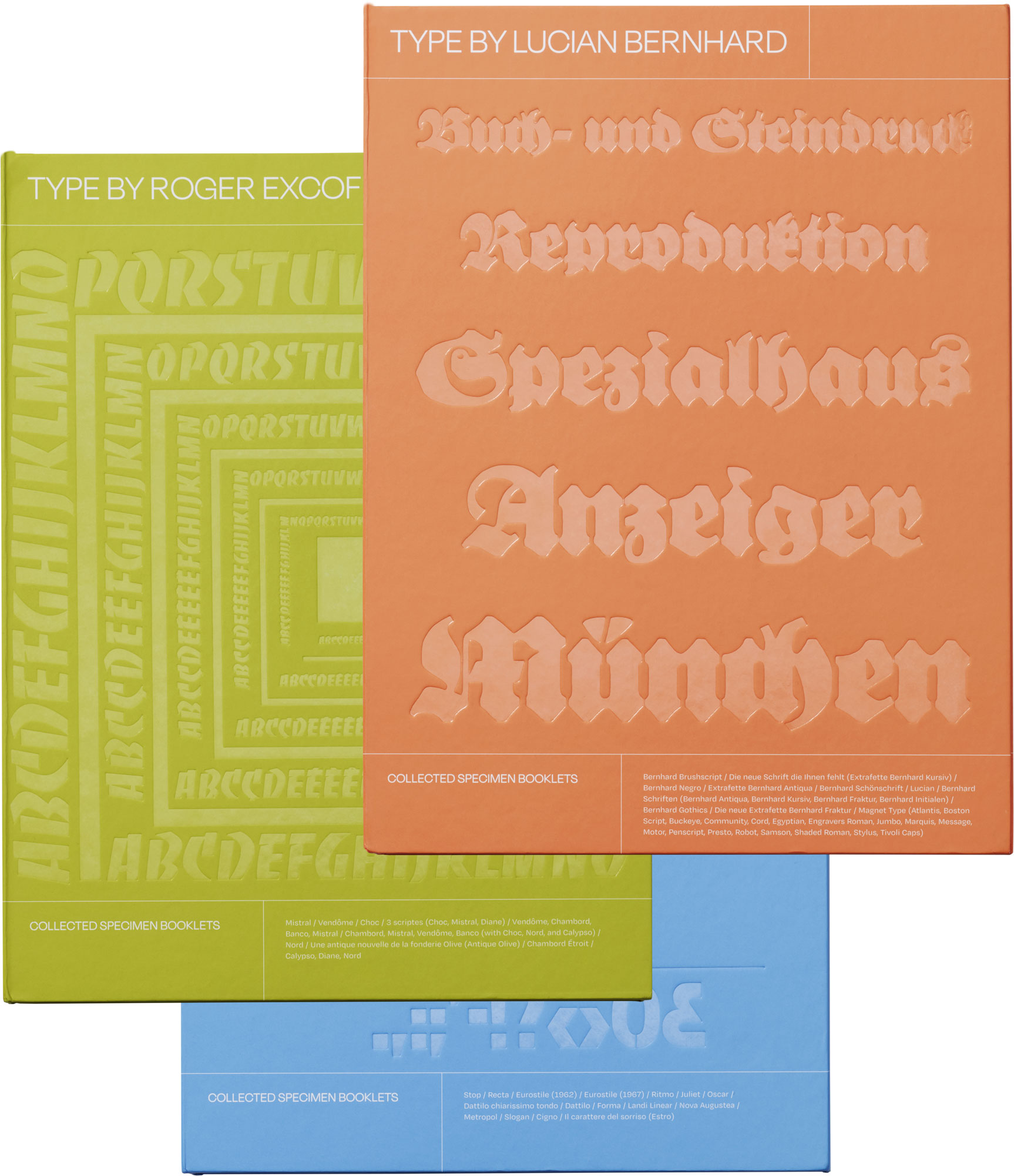
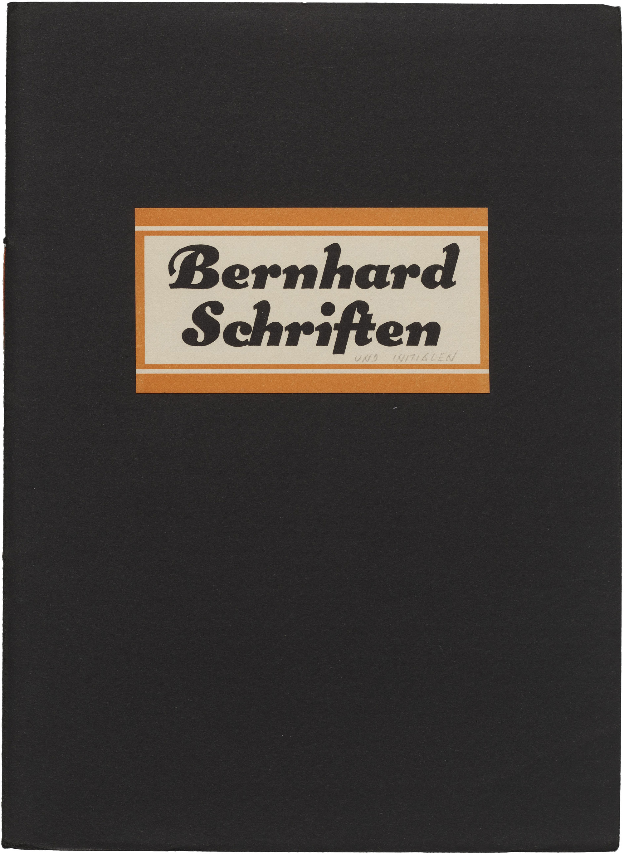
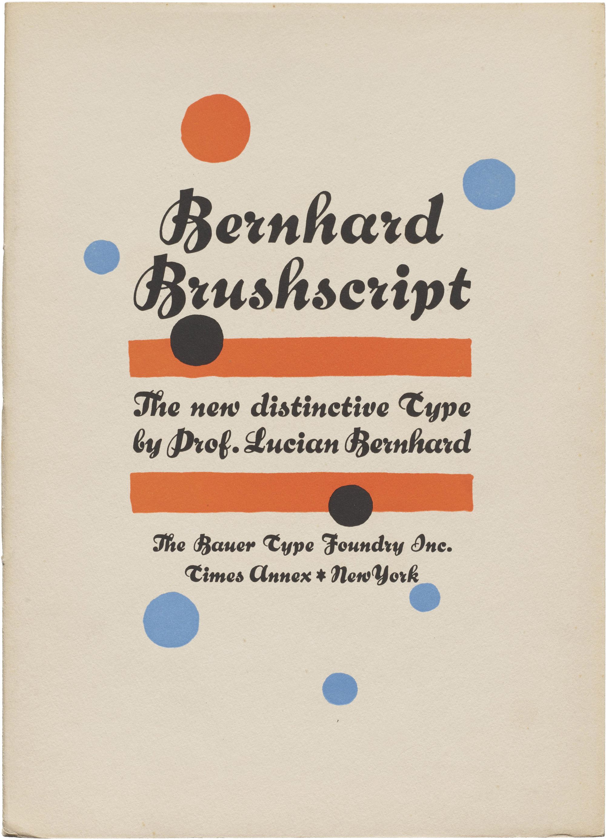
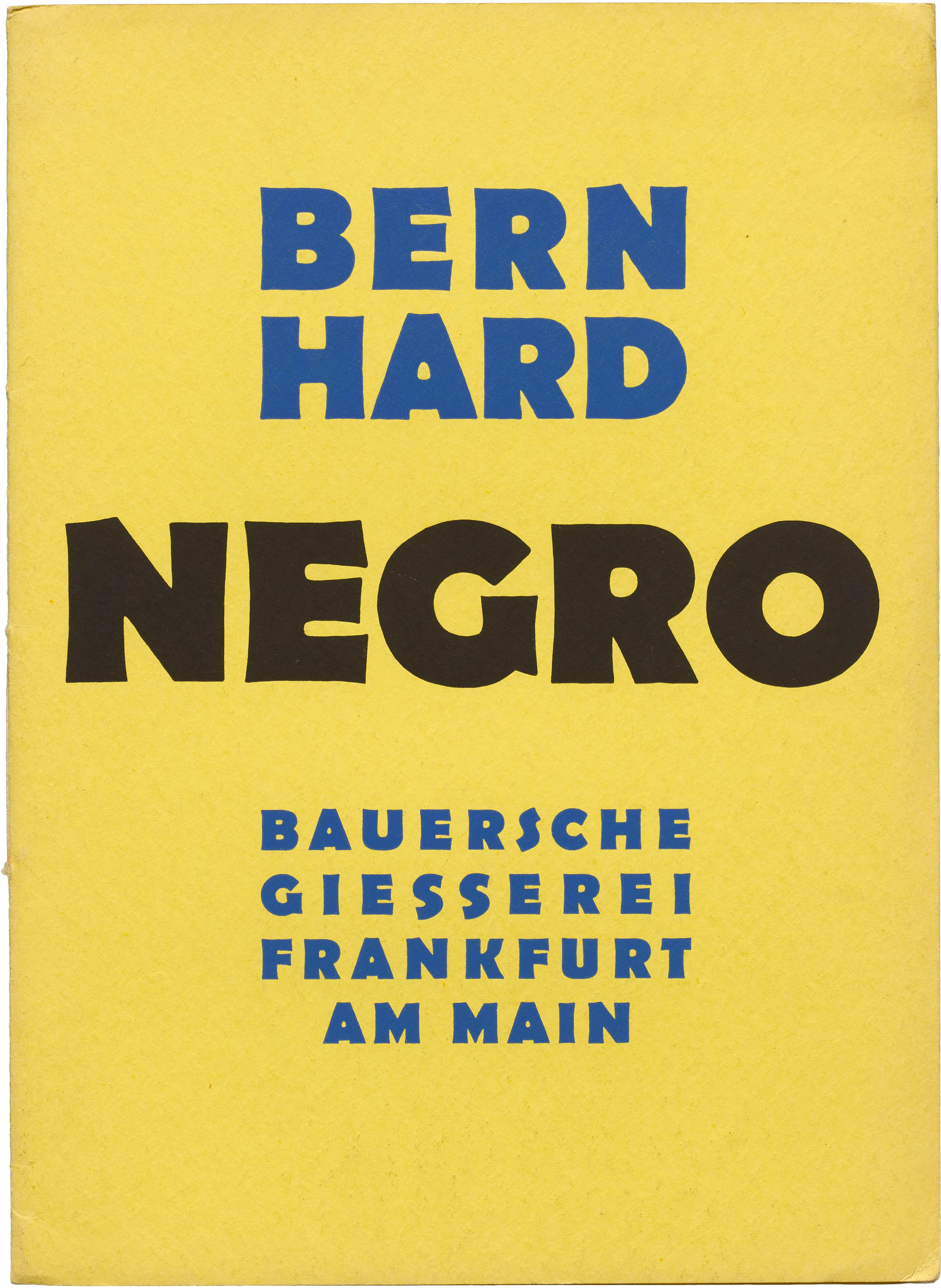
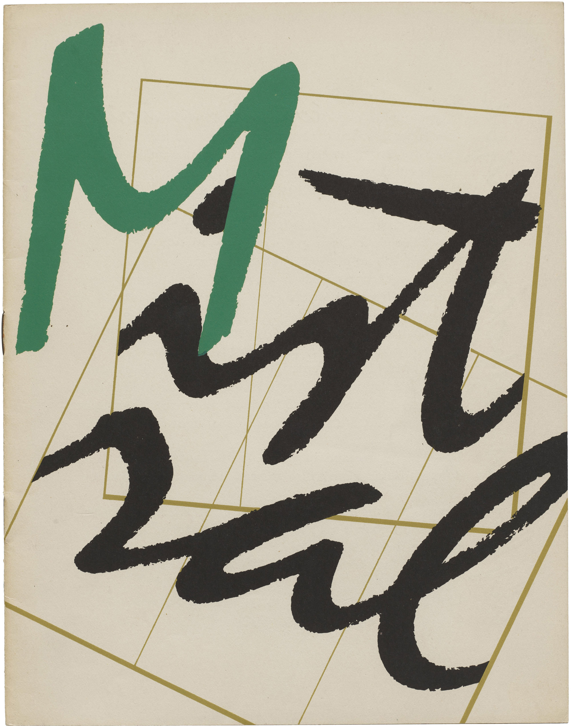
Type by Lucian Bernhard

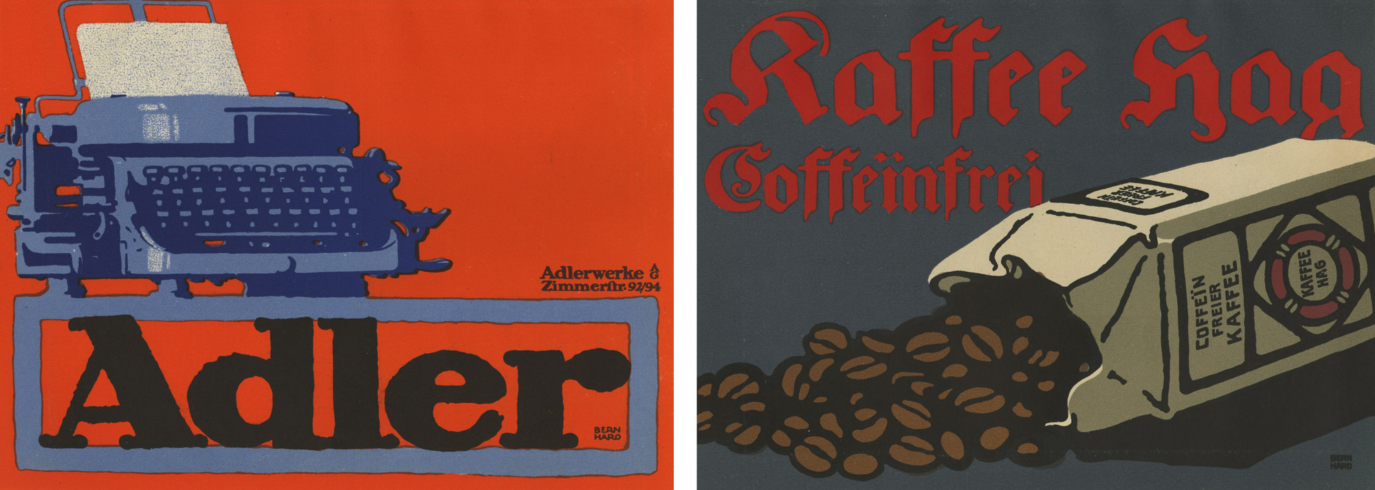
In 1901, eighteen-year-old Emil Kahn stepped off a train in Berlin with a new name: Lucian Bernhard. In a matter of months, he began to explore a new visual grammar that transformed the look of the poster. Bernhard’s famed Sachplakat (object poster) style used simplified product images done up in strong colors and combined with buoyant large-scale lettering to make even unassuming products unmissable. By 1911, his advertising success with brands such as Preister matches, Stiller shoes, Adler typewriters, and Kaffee Hag coffee inspired one writer on visit from Prague to quip, “All Berlin is one big poster by Bernhard.”3
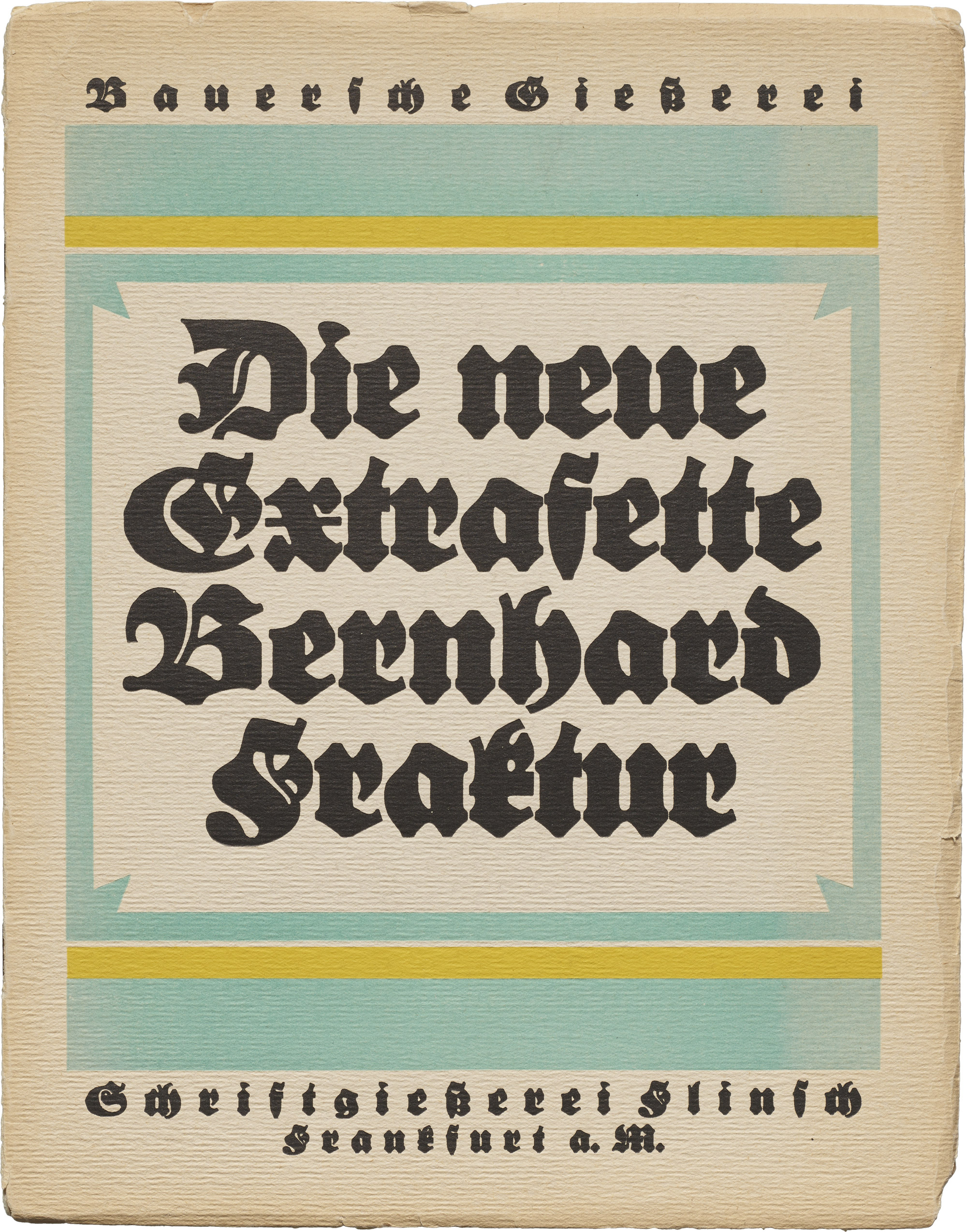
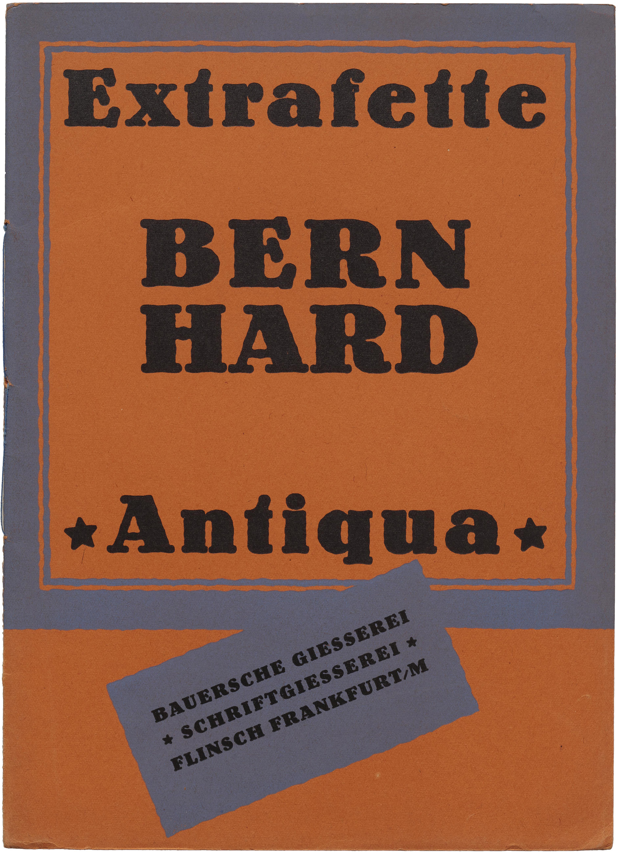
That same year, Bernhard’s signature lettering made its first leap from posters to letterpress printing. For the Flinsch Type Foundry in Frankfurt, Bernhard designed an all-purpose roman typeface with soft, wavering contours that gave a warm, hand-drawn quality to upright serif forms. The result, Bernhard Antiqua (1911), found immediate success, and even today, its schmalfett (bold condensed) style remains a widely familiar thanks to a phototype comeback in the 1970s.
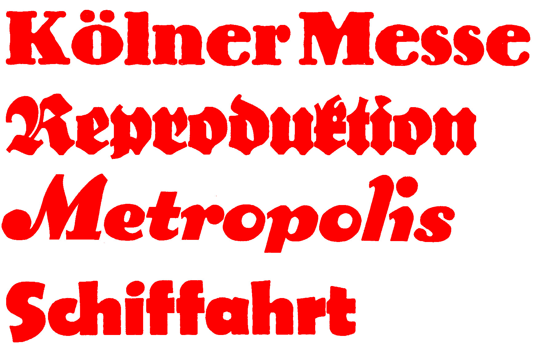
Following blackletter and italic companions to his Antiqua, Bernhard expanded his first type family by translating his maximalist lettering for posters into the extra-bold display faces Extrafette Bernhard Antiqua (1924), Extrafette Bernhard Fraktur (1921), and Extrafette Bernhard Kursiv (1927). Later with Bernhard Negro (1930), he continued the trend, pushing bold contours to extremes without toppling off the legibility cliff.
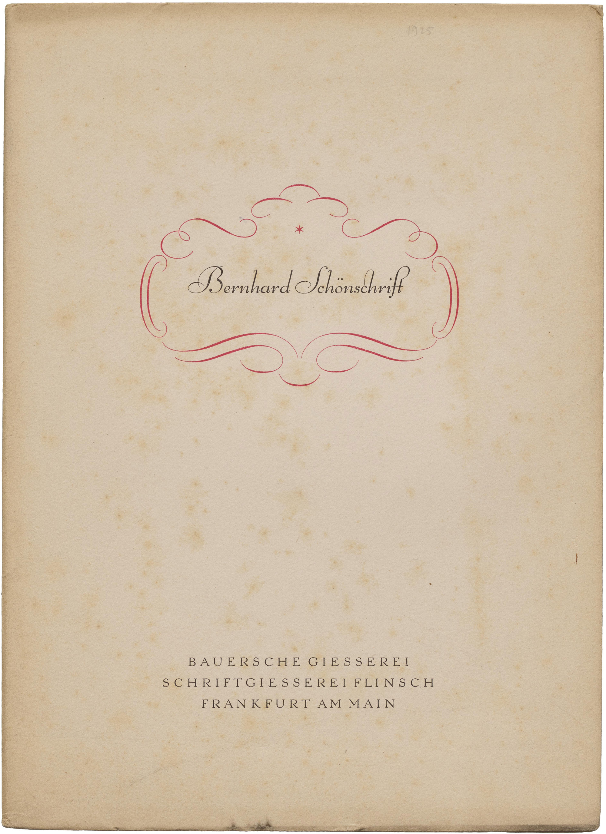
Exploring the other end of the scale, Bernhard realized delicate script and roman faces with Bernhard Schönschrift (1925) and Bernhard Roman (1927, followed by a complimentary bold, Lucian, in 1928). The latter, first designed for a fine-press book illustrated by Rockwell Kent, reveals Bernhard’s range beyond the realm of commercial faces.
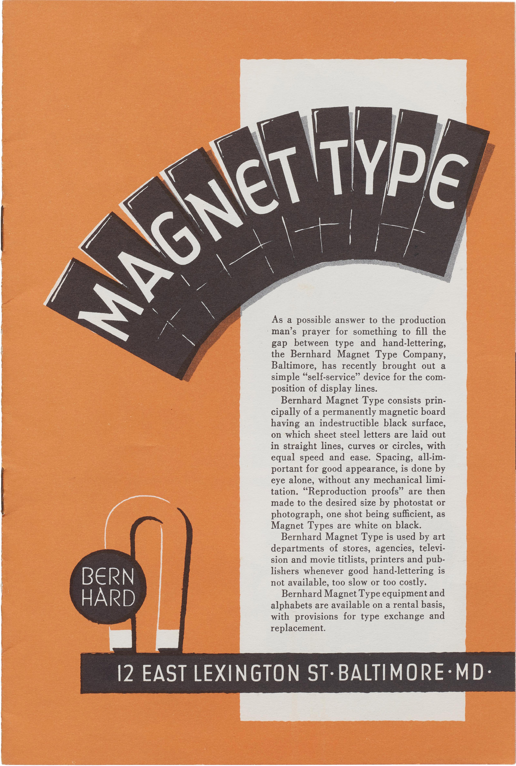
Bernhard relocated to New York in 1923 but maintained connections with Germany's Bauer foundry for the better part of the decade. In the late 1920s, he signed over to the American Type Founders and started a new series of popular faces, including the personable sans serif Bernhard Gothic (1929). Always an ambitious designer whose activities extended into furniture design, architecture, and even the invention of a new universal script, Bernhard’s late career saw the completion of several dozen little-known typefaces for Magnet Type, a novel typesetting system of his own invention.
Covering the breadth of Bernhard’s career, the ten specimens in Type By Lucian Bernhard offer an unparalleled picture of his typographic oeuvre. Full character sets and waterfall displays of type sizes introduce classic faces in detail, accompanied by rare ornaments, initials, and less familiar work. Meanwhile, dozens of bold and colorful layouts, including some for Bernhard’s longstanding clients, reveal how his unmistakable aesthetics shaped graphic design over decades.
The gallery of hi-fi captures below includes covers of every type specimen in the volume. Click an image to enter fullscreen view, then click or pinch to enlarge.
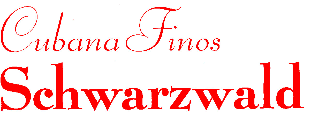
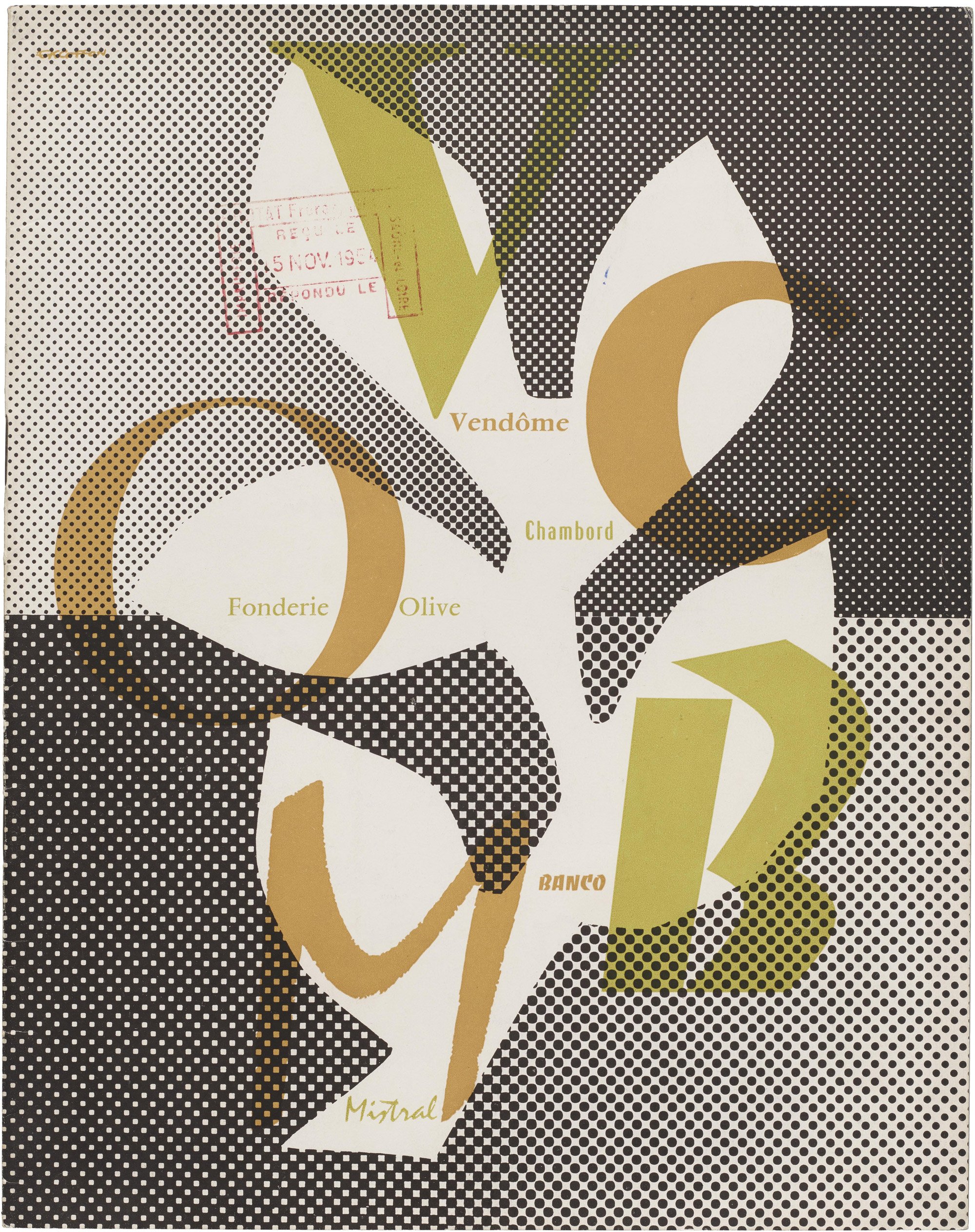
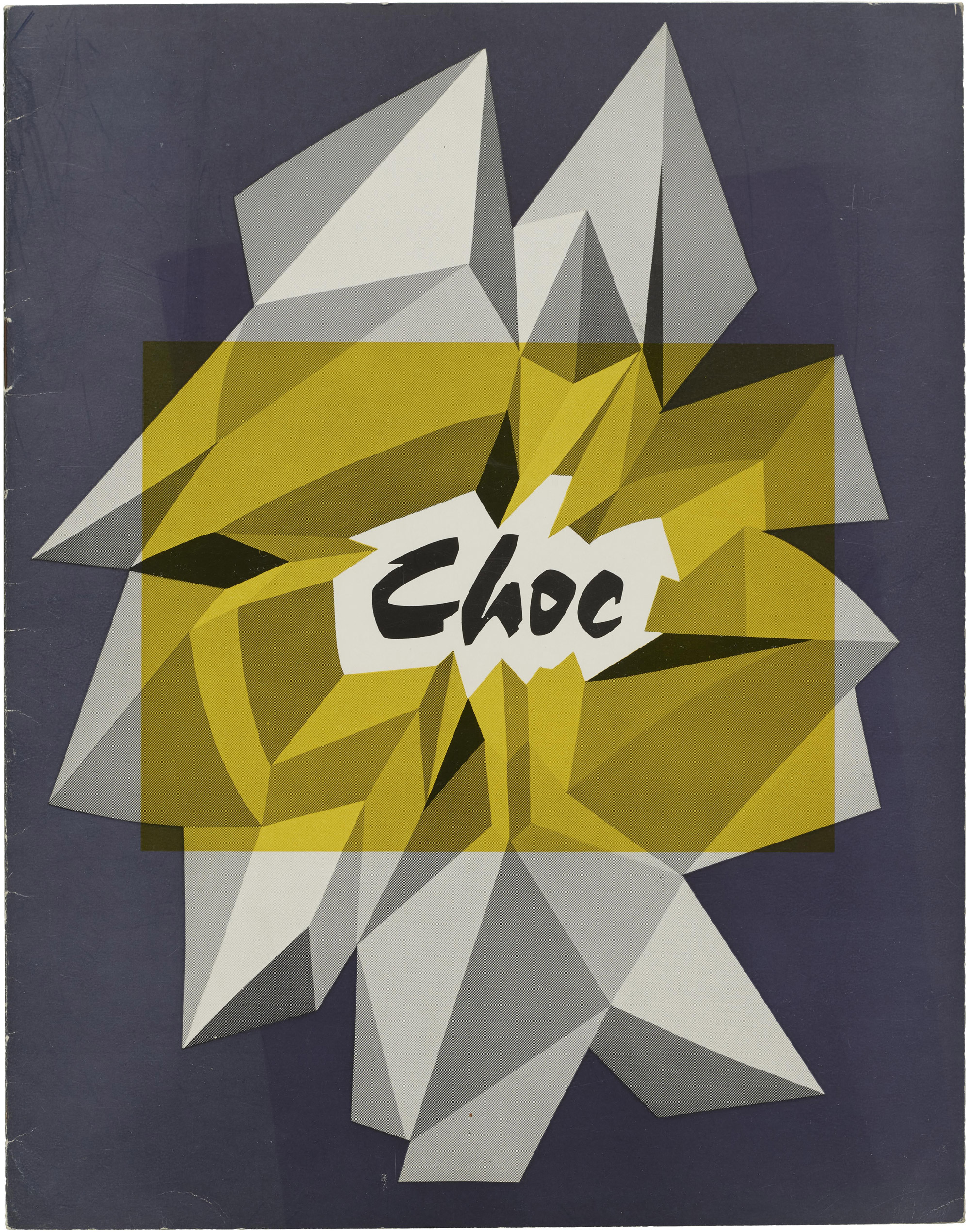
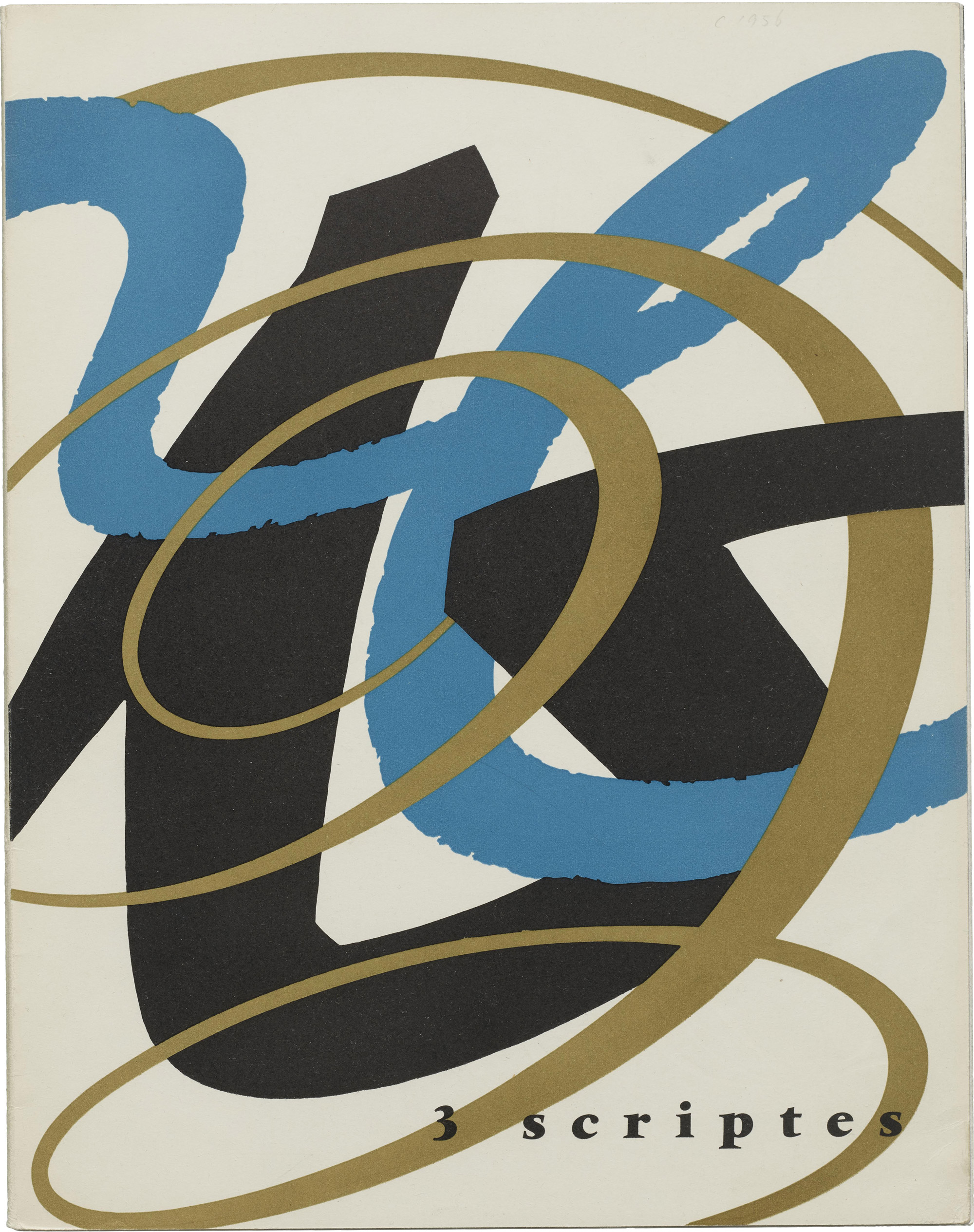
Type by Roger Excoffon

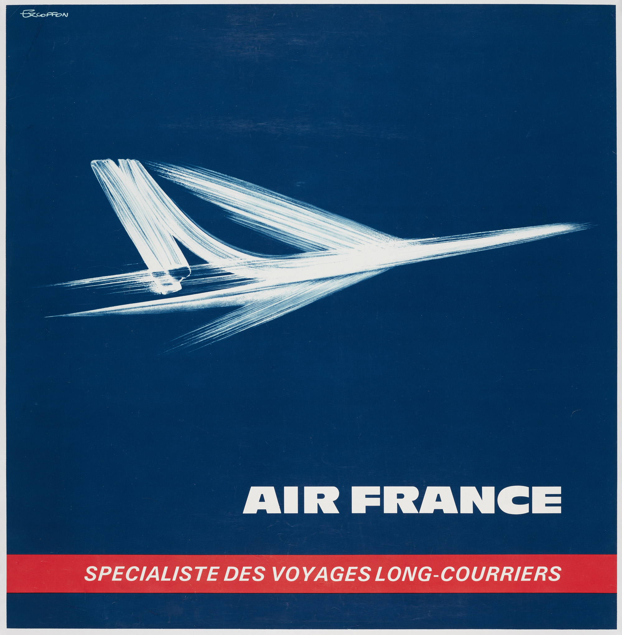
When, just after WWII, thirty-five-year-old Roger Excoffon joined the art department of his brother-in-law’s Marseilles-based foundry, Fonderie Olive was a small operation with few original faces to its name. Starting with little type experience, Excoffon made the company an icon of midcentury design. His inventive typefaces of the 1950s and ’60s became international ambassadors of French style, and his daring print work for Olive set a course for high-profile commissions, including famous designs completed as art director for Air France.
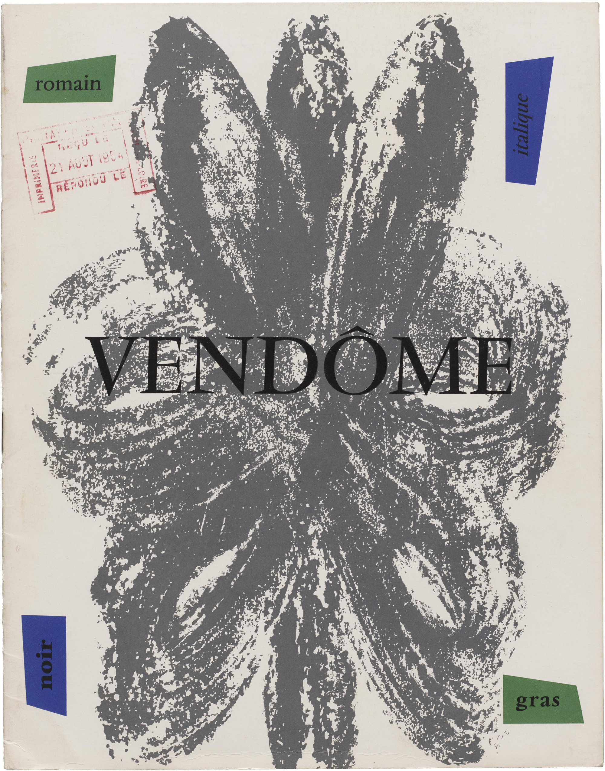
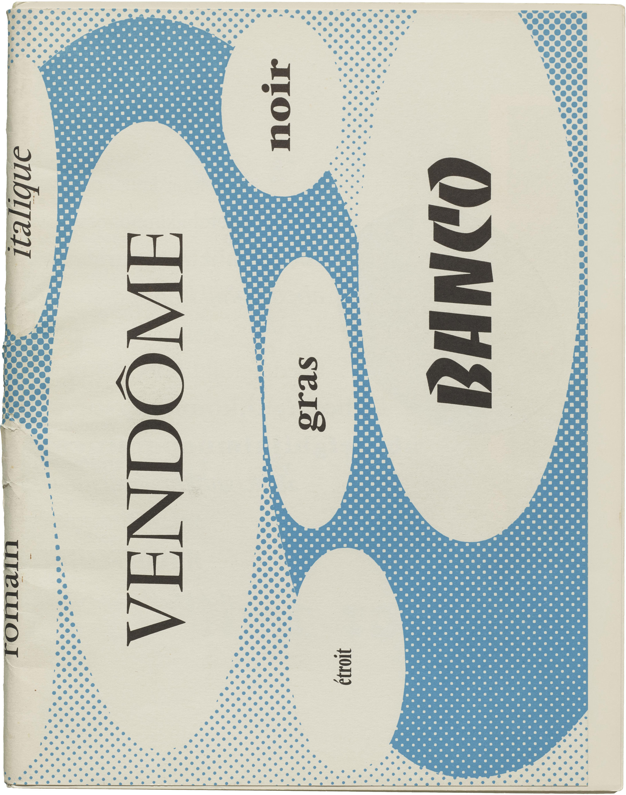
Excoffon’s first rendezvous with type resulted in Chambord (1947), Olive’s contrasted sans-serif that one-ups A. M. Cassandre’s popular Peignot with elegantly balanced and readable forms. His hands-on training in type refinement continued into his next project, directing the design of a Garamond-style roman by artist François Ganeau. The resulting Vendôme (1950), with sharp triangular serifs and a distinctive slant credited to Excoffon’s influence, projects a sense of dynamic movement and rhythm that would pervade his subsequent display and script releases.
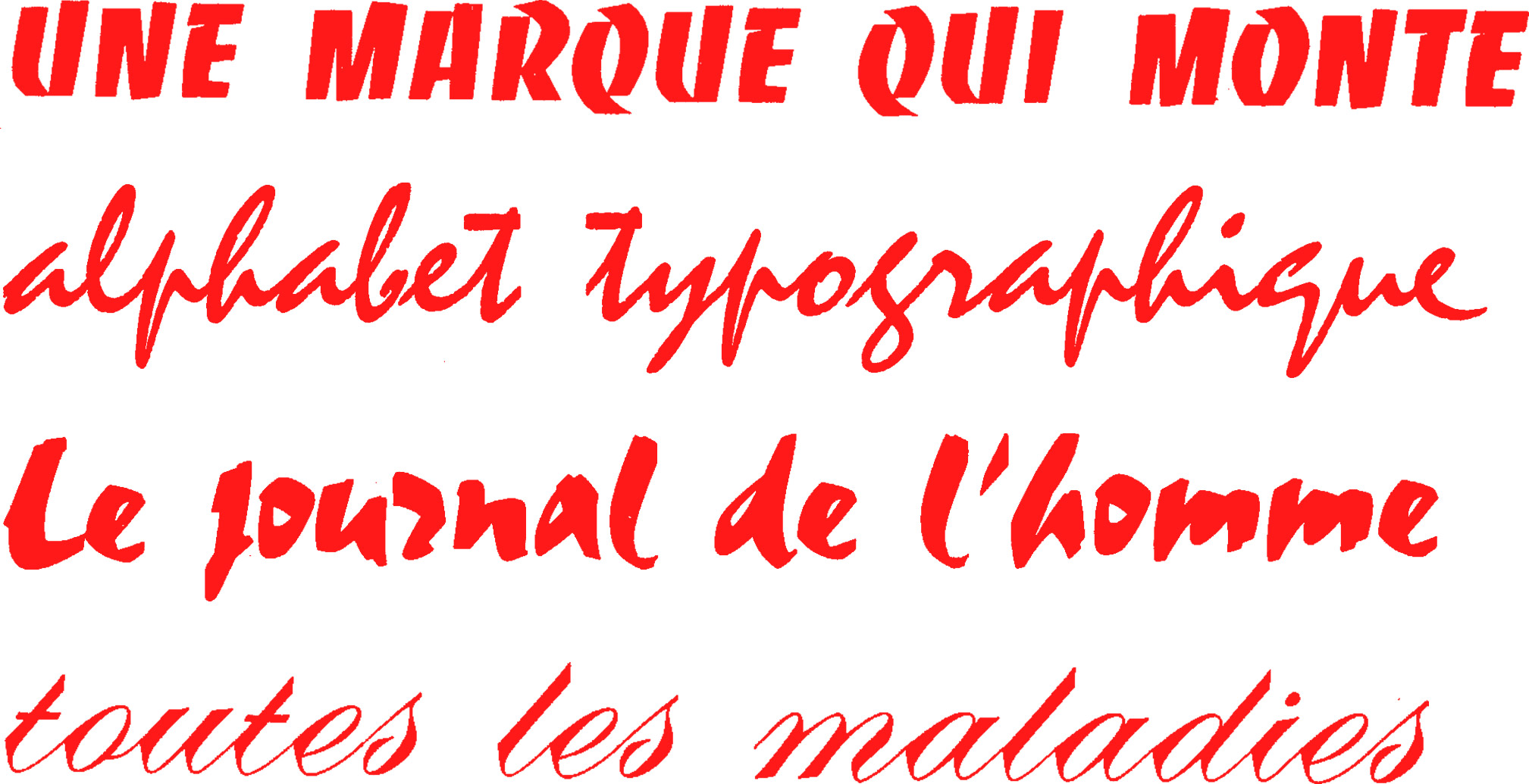
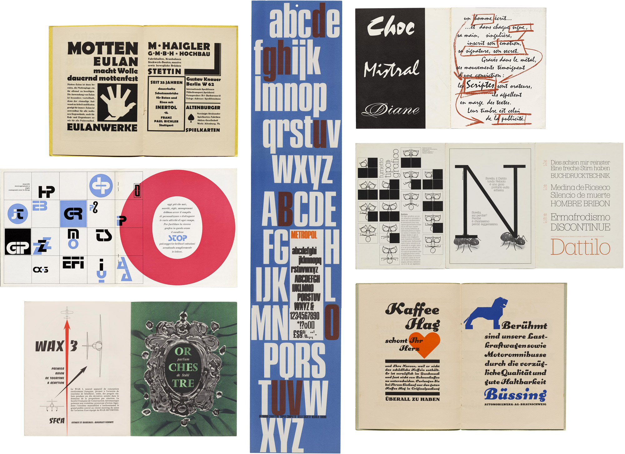
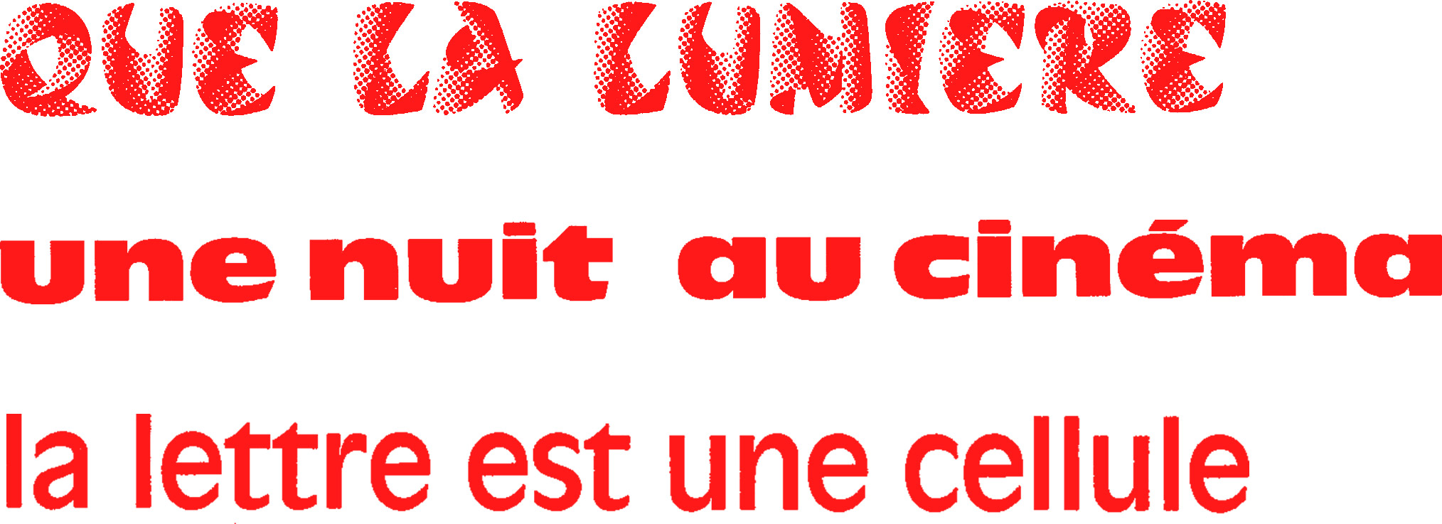
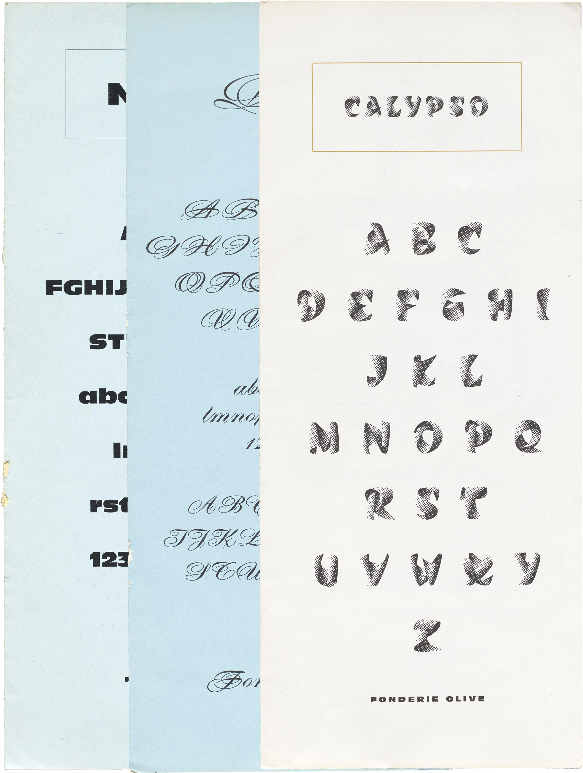
First came Banco (1951) with bombastic all-caps letters that evoke sign writing with a flat brush or palette knife. Next, Mistral (1953), Excoffon’s most-used typeface, presented printers with a means to emulate off-the-cuff informal handwriting. The casual style of its deftly varied stems and textured silhouettes made it a publicity favorite and a signature face for shop signs worldwide. Excoffon completed Olive’s script offerings with Choc (1955), a muscular brush display script, and Diane (1956), a sharp modern copperplate with a classic slope and dramatic swash capitals.
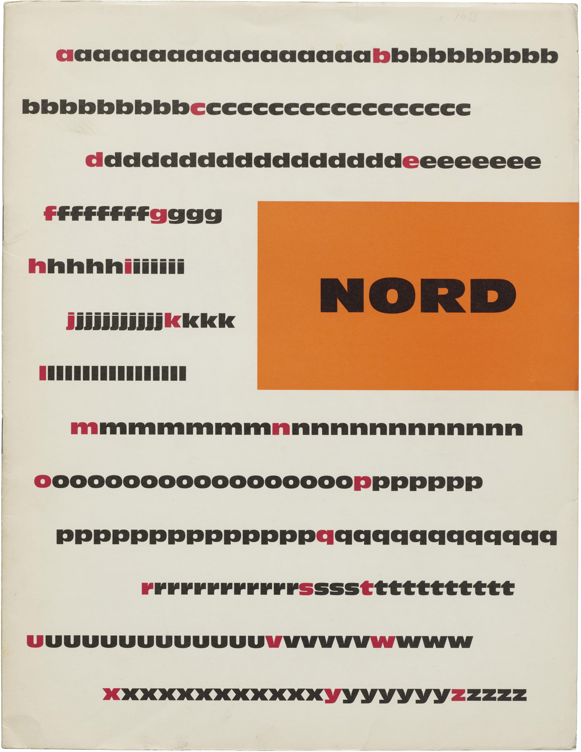
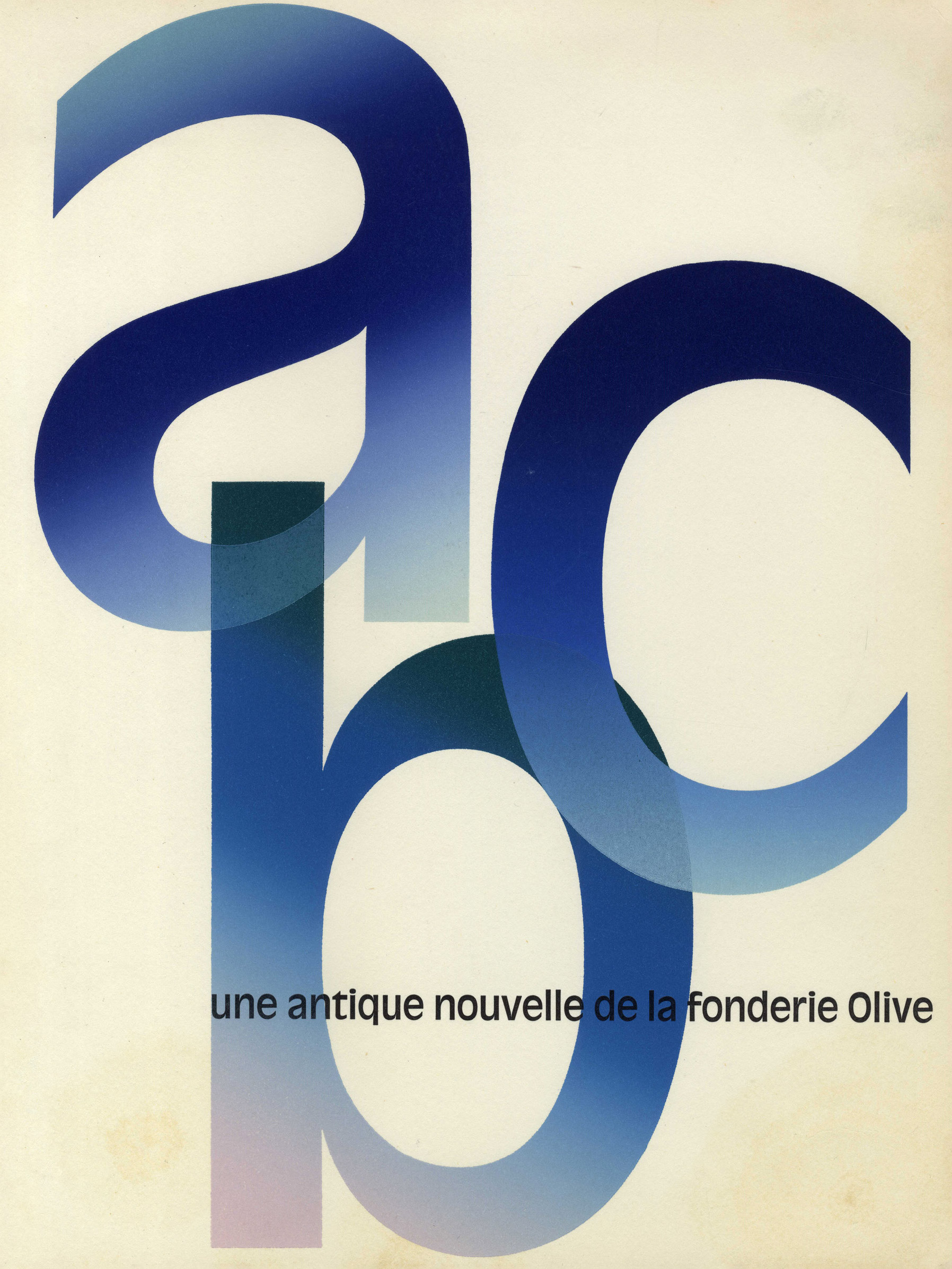
Excoffon’s two final Olive projects radically rethought the conventions of visual contrast in type. Calypso, an experimental display face finished in 1958, uses halftone shading to suggest internal shadows cast by surfaces twisted and bent into three-dimensional forms. Meanwhile, the sans serif family Antique Olive — first introduced with the Nord (1958), its boldest weight — distributes visual weight and emphasis toward distinguishing elements of letterforms in pursuit of enhanced legibility. (The result, an intriguing alternative to more neutral sans serif competitors, inspired the sketches for Christian Schwartz’s Duplicate, the type used for Letterform Archive’s identity and website.)
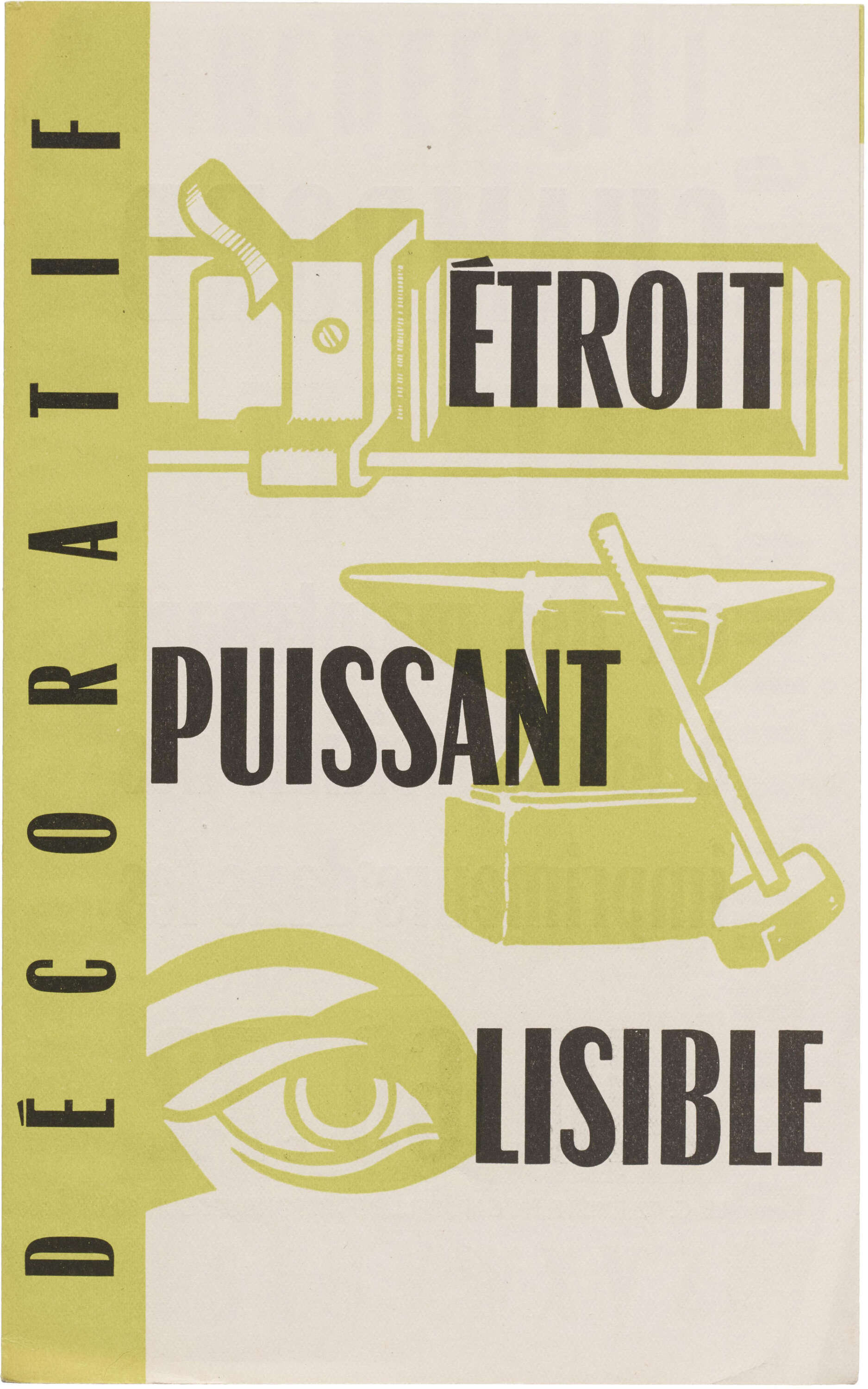
The ten specimens reproduced in Type by Roger Excoffon offer a complete record of Excoffon’s activities at Olive, as well as a masterclass in editorial design. The collection includes spiral displays of Excoffon’s typefaces in all sizes, as well as booklets that shed light on revisions made over time. Excoffon’s own varied cover designs and bold interior layouts incorporate original brushwork and an astonishing range of techniques, including two vellum overlays preserved in the facsimile.
The gallery of hi-fi captures below includes covers of every type specimen in the volume. Click an image to enter fullscreen view, then click or pinch to enlarge.
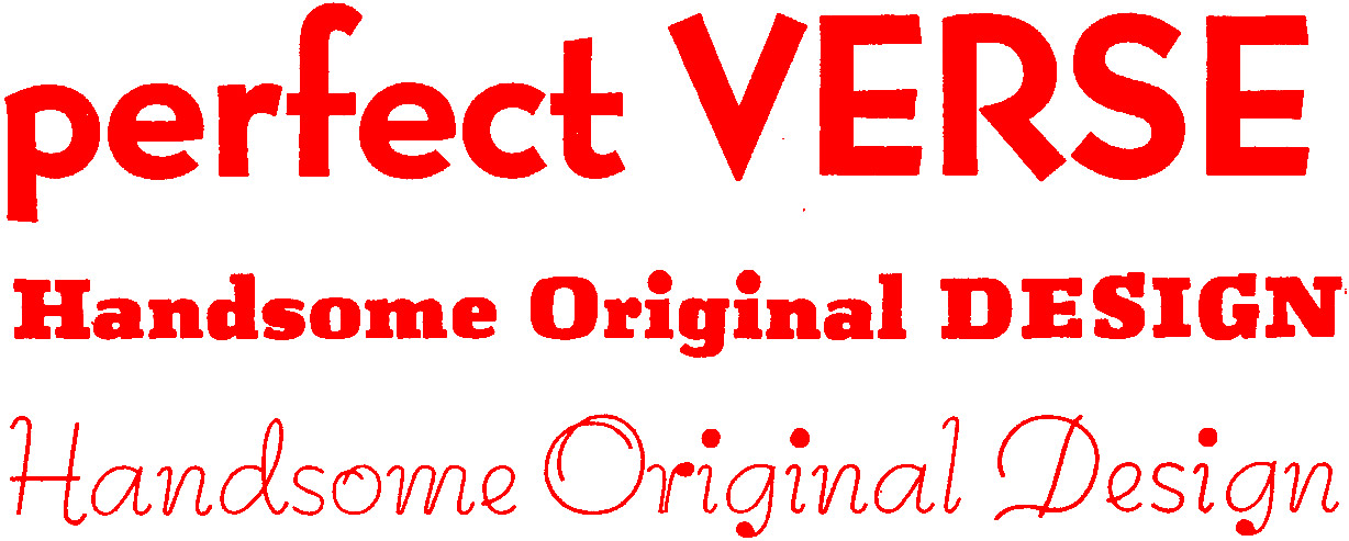
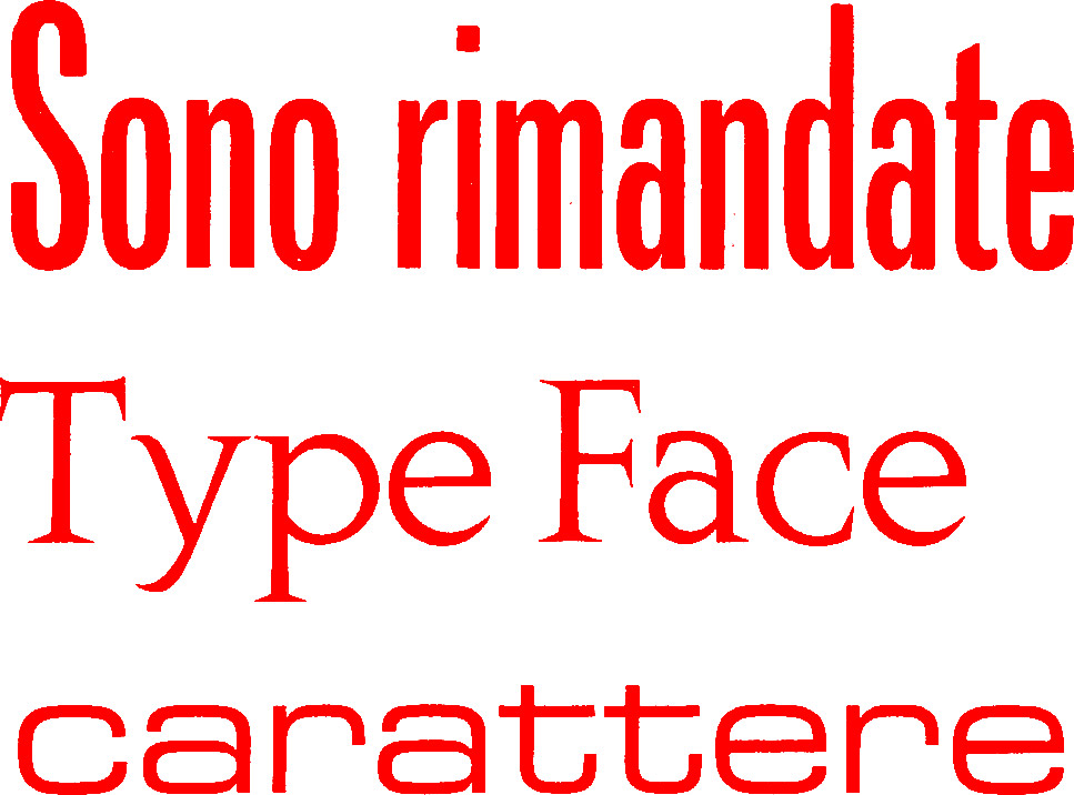
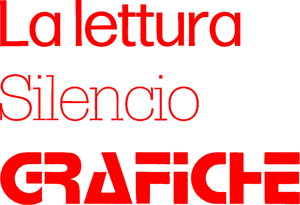
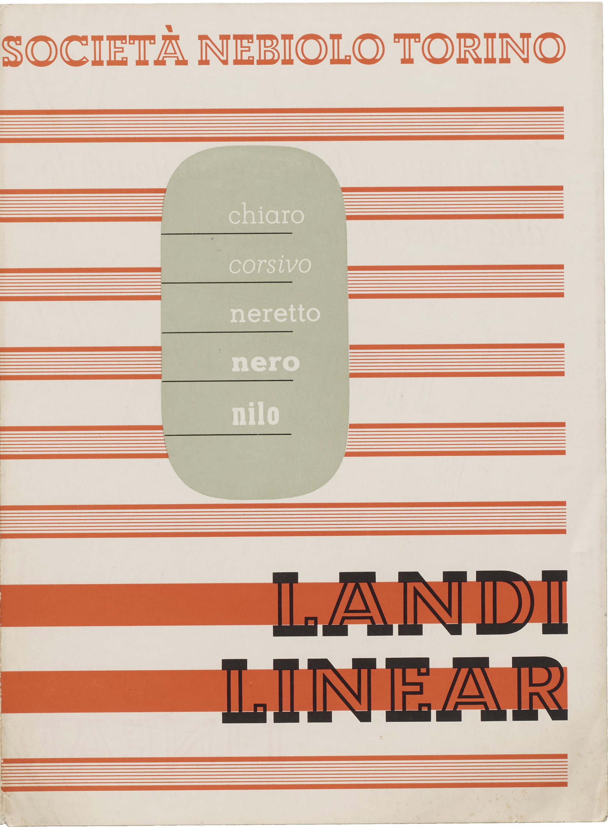
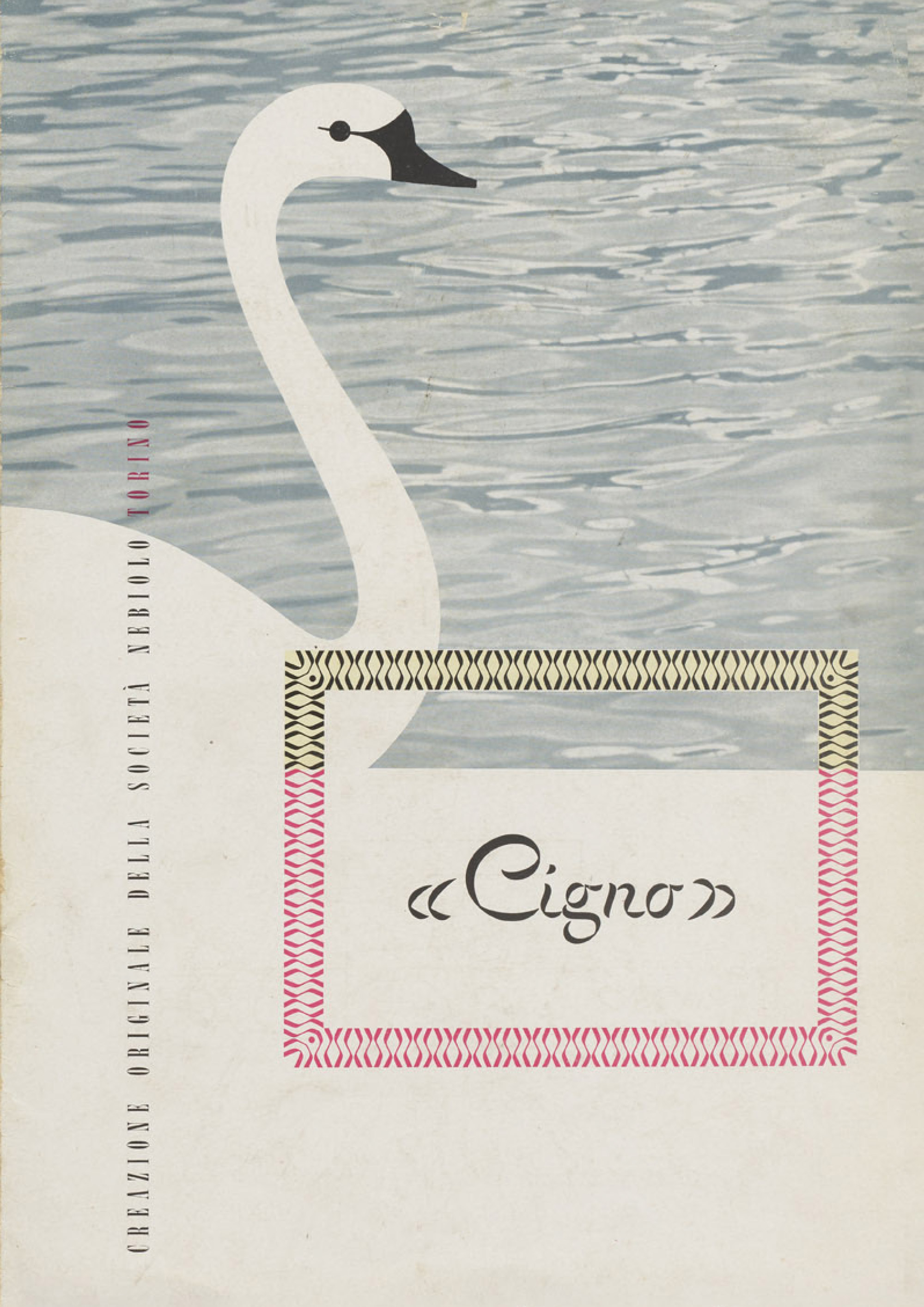
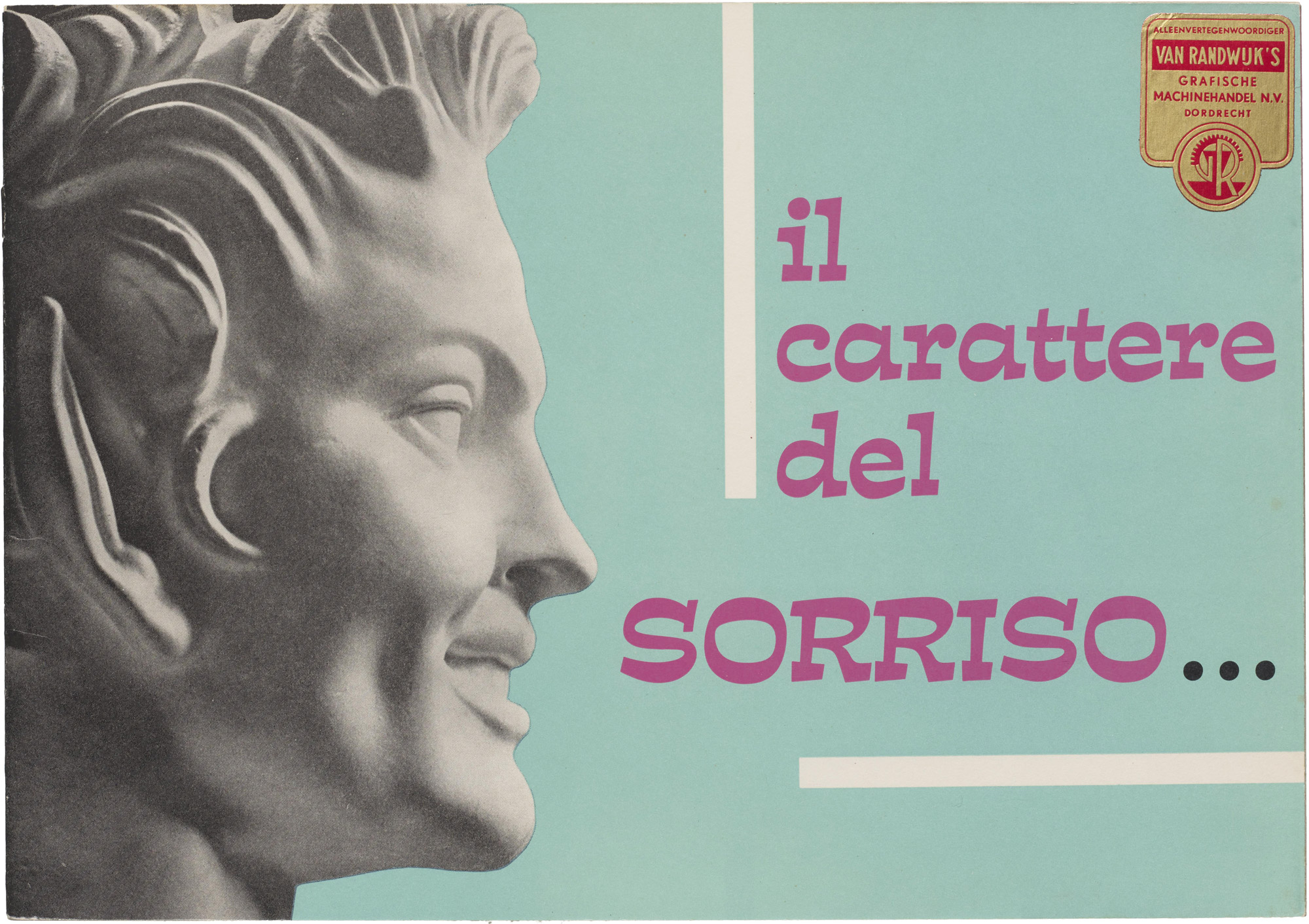
Type by Aldo Novarese
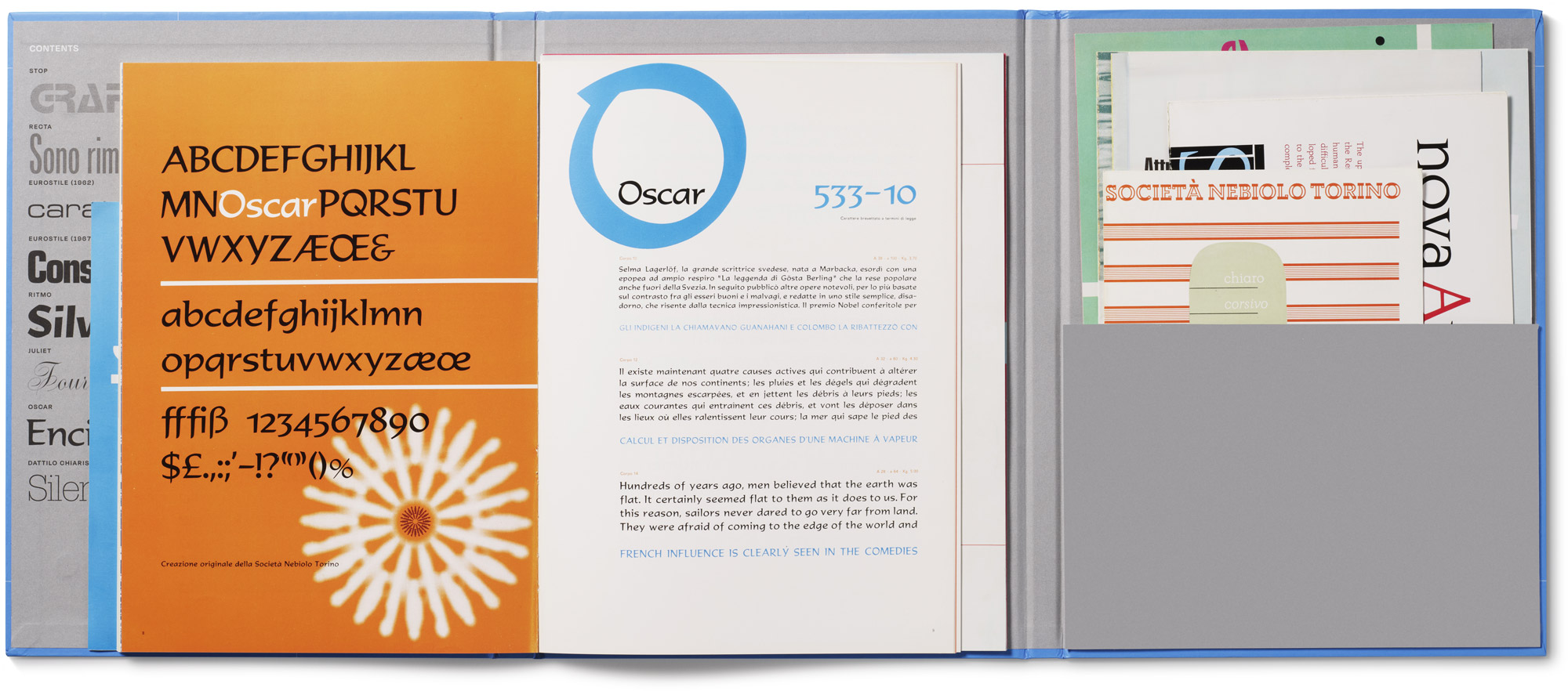
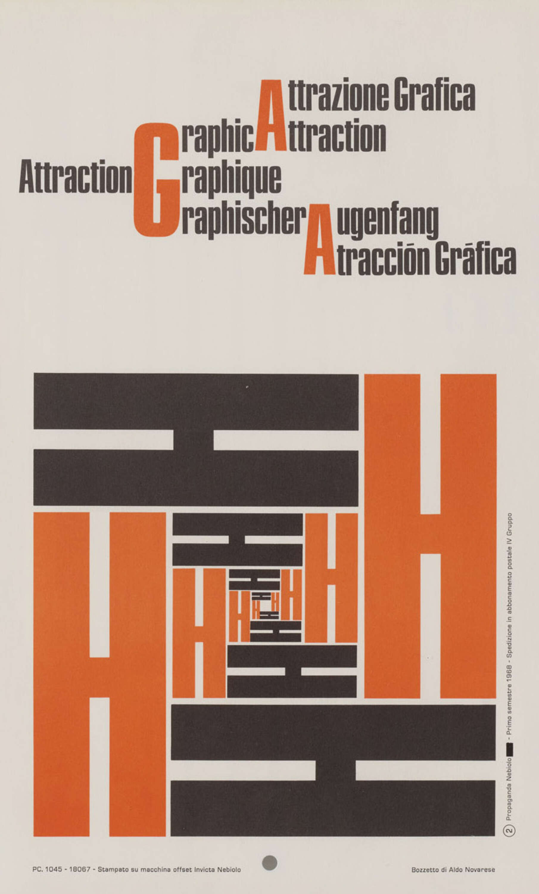
Hired at sixteen into the studio of Società Nebiolo, Italy’s largest type foundry at the time, Aldo Novarese started his career as an assistant to director Alessandro Butti in 1936. Over almost four decades with the company, Novarese became the first name in Italian type. As the leading light of Nebiolo’s Studio Artistico from 1952 through the early 1970s, he not only brought dozens of faces to completion but released two renowned type books and designed countless company specimens, which he regarded as personal “graphic essays” on the craft.4
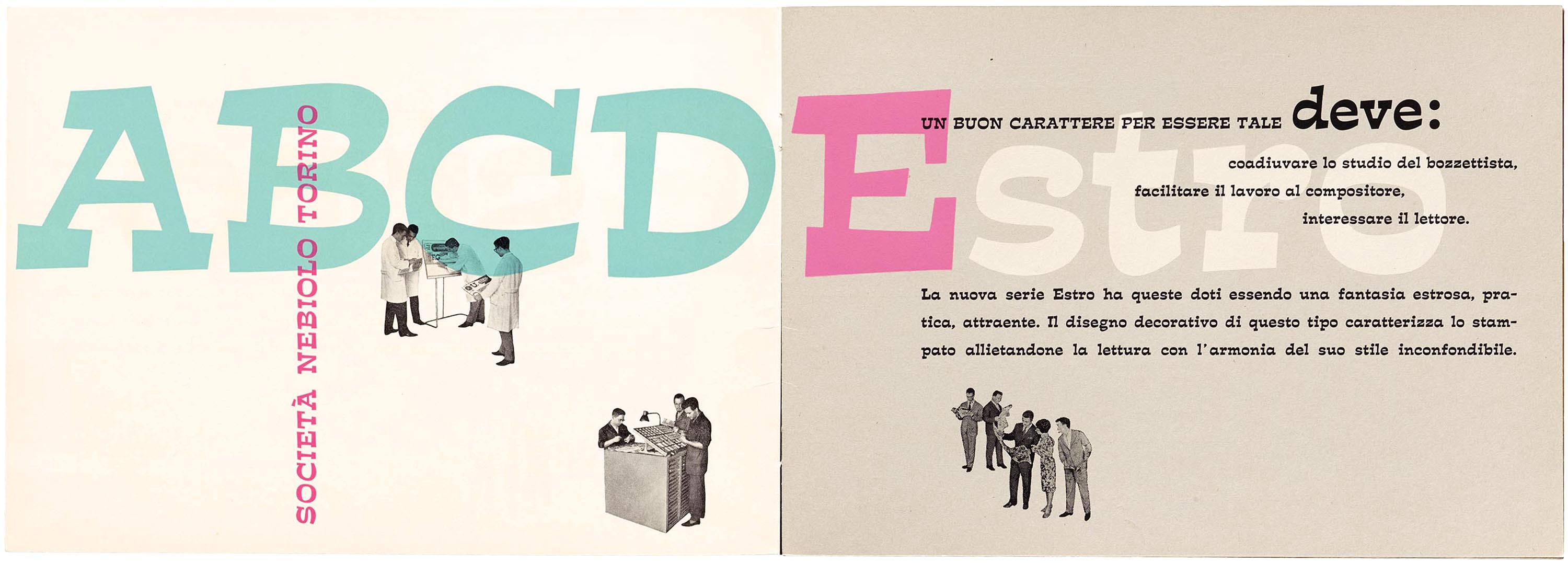
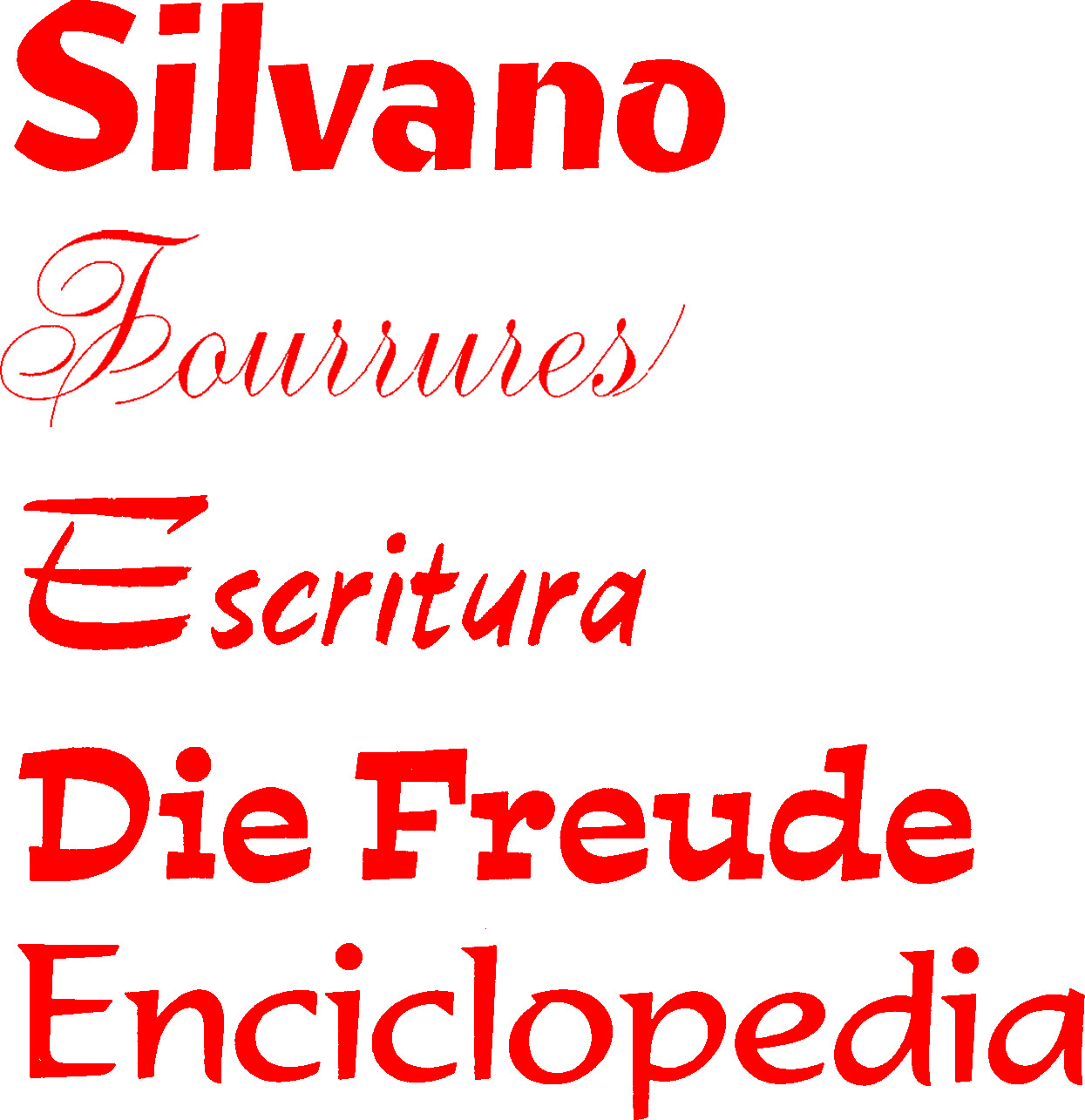
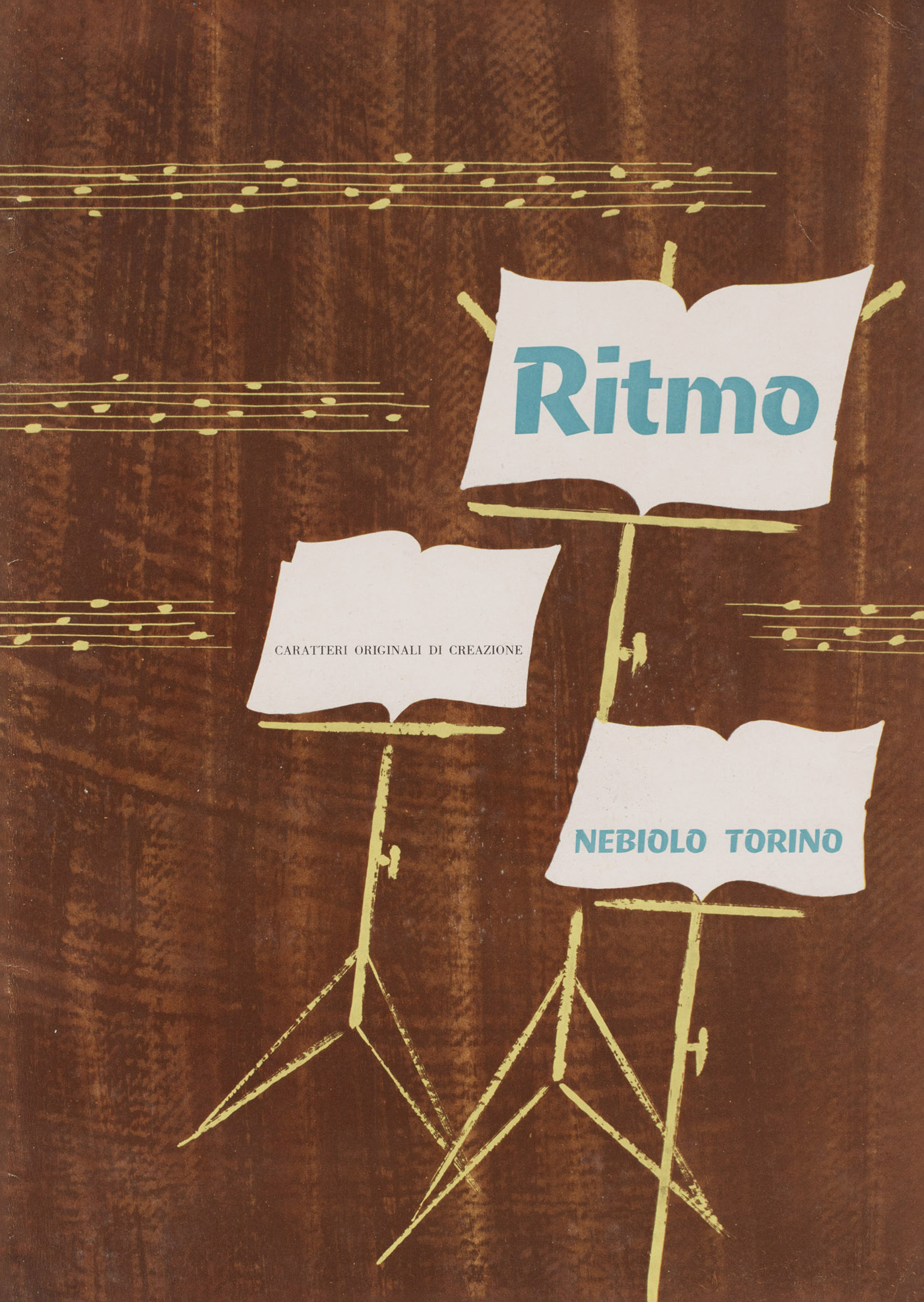
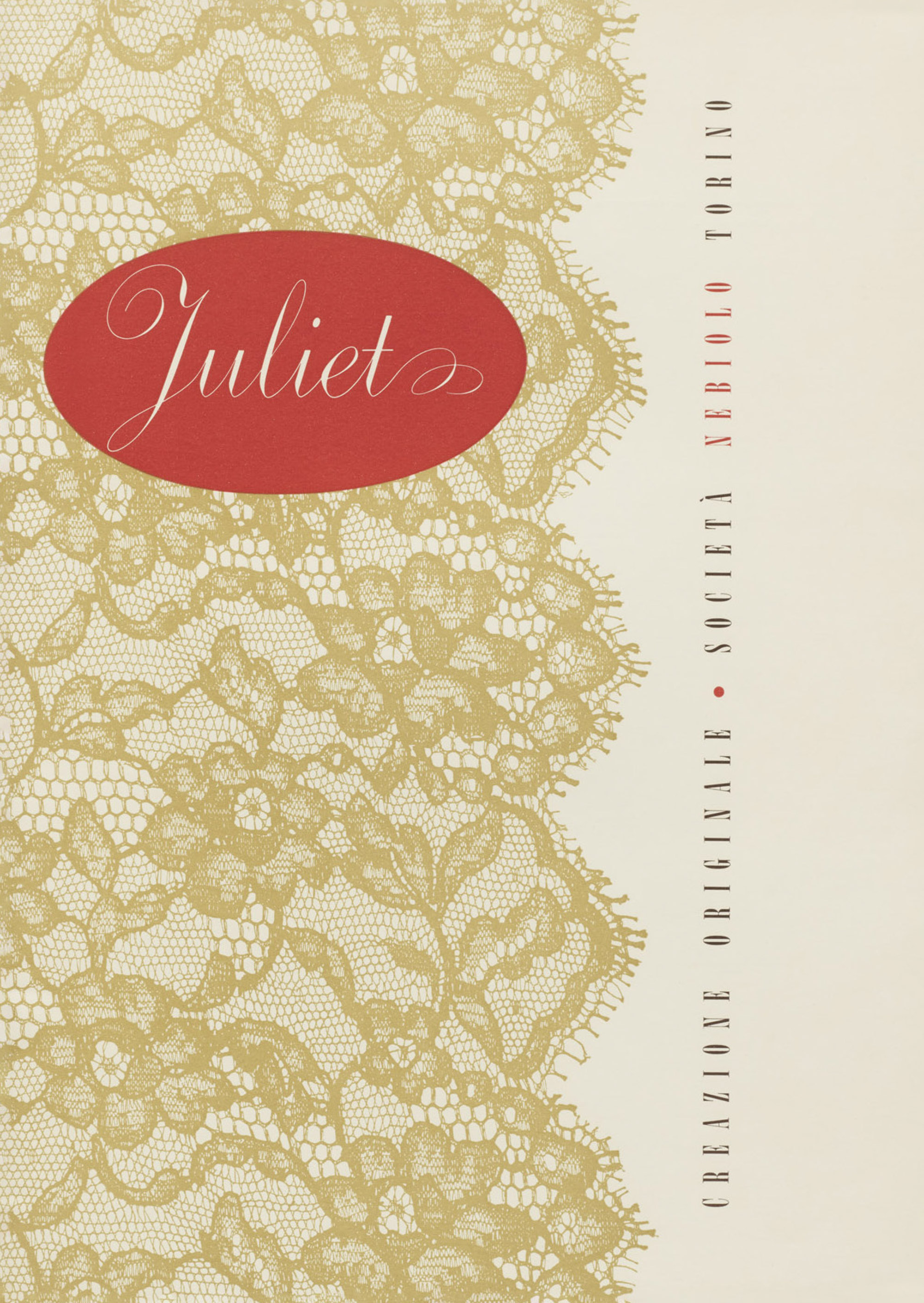
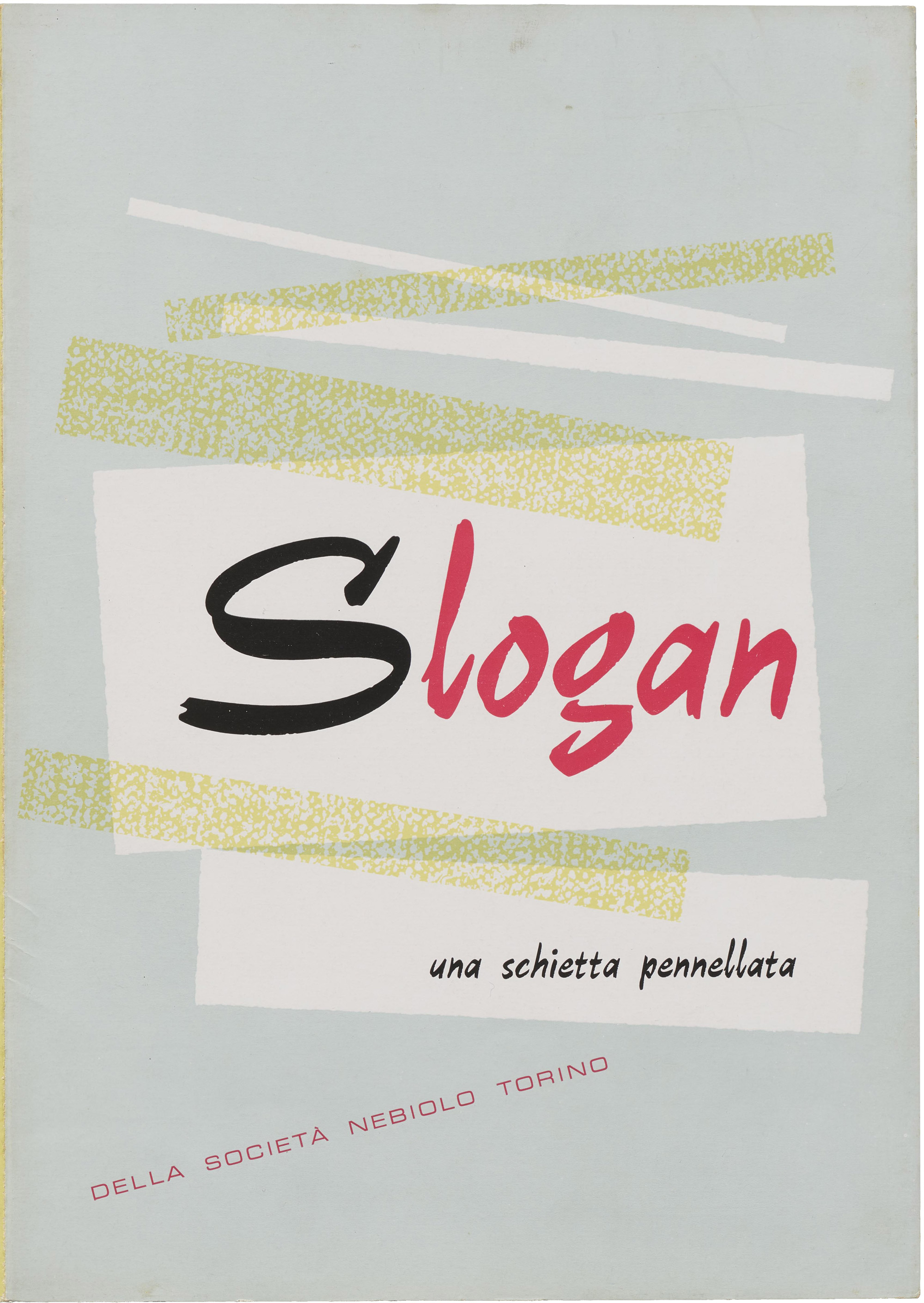
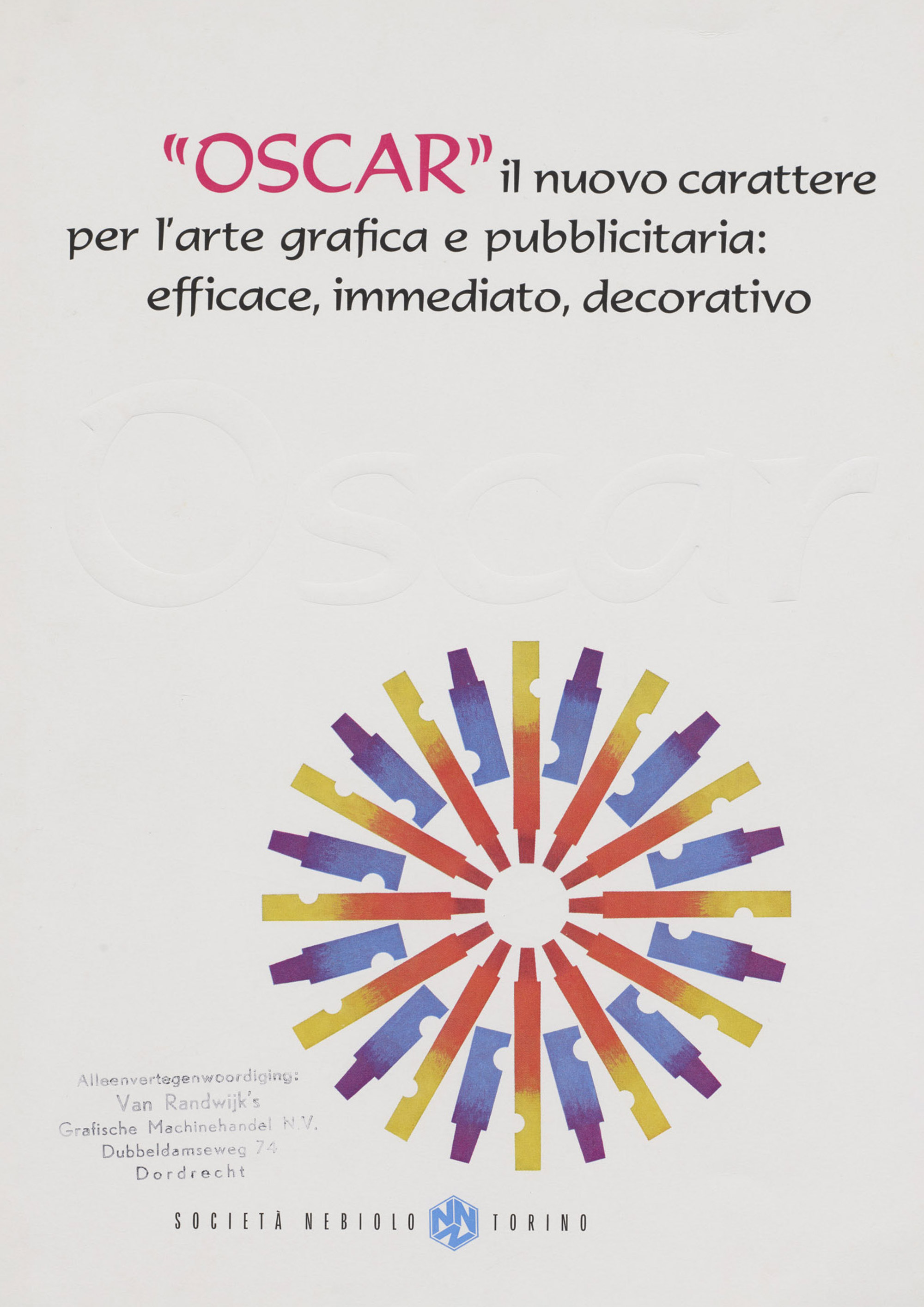
The best releases from Novarese’s early years as Nebiolo’s director play with the expressive possibilities of type for advertising. His bold display sans serif Ritmo (1955), formal script Juliet (1955), and brush script Slogan (1957) seem to go head-to-head with Excoffon’s Banco, Diane, and Mistral, proposing new solutions to shared midcentury design problems, while later entries Estro (1961) and Oscar (1965) break new molds with their irregular slab serif and modern half-uncial designs.
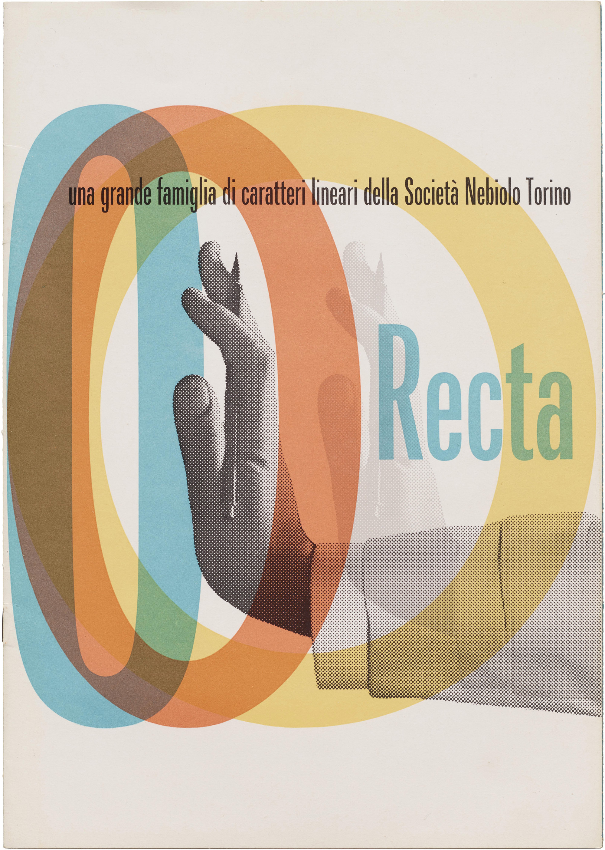
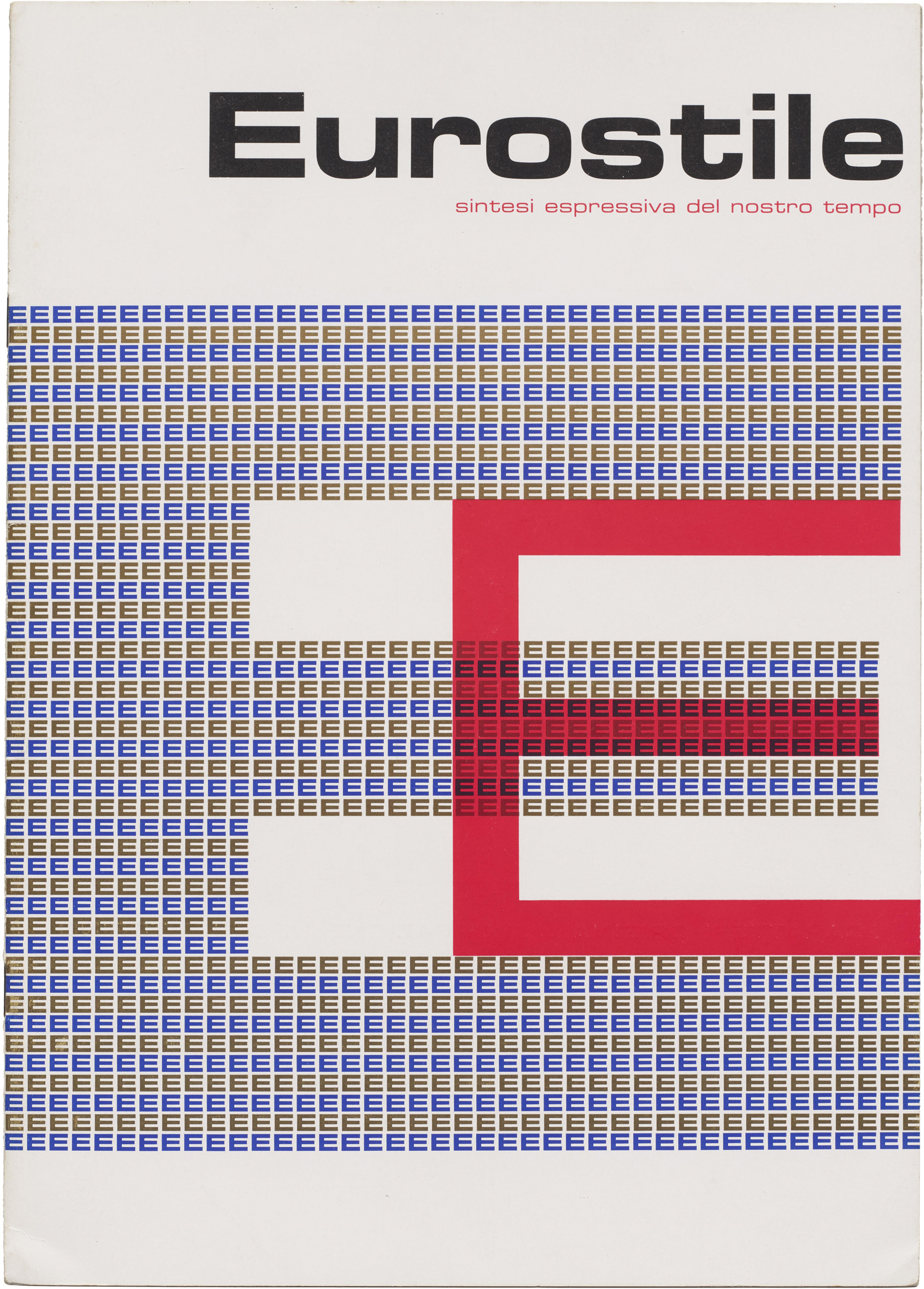
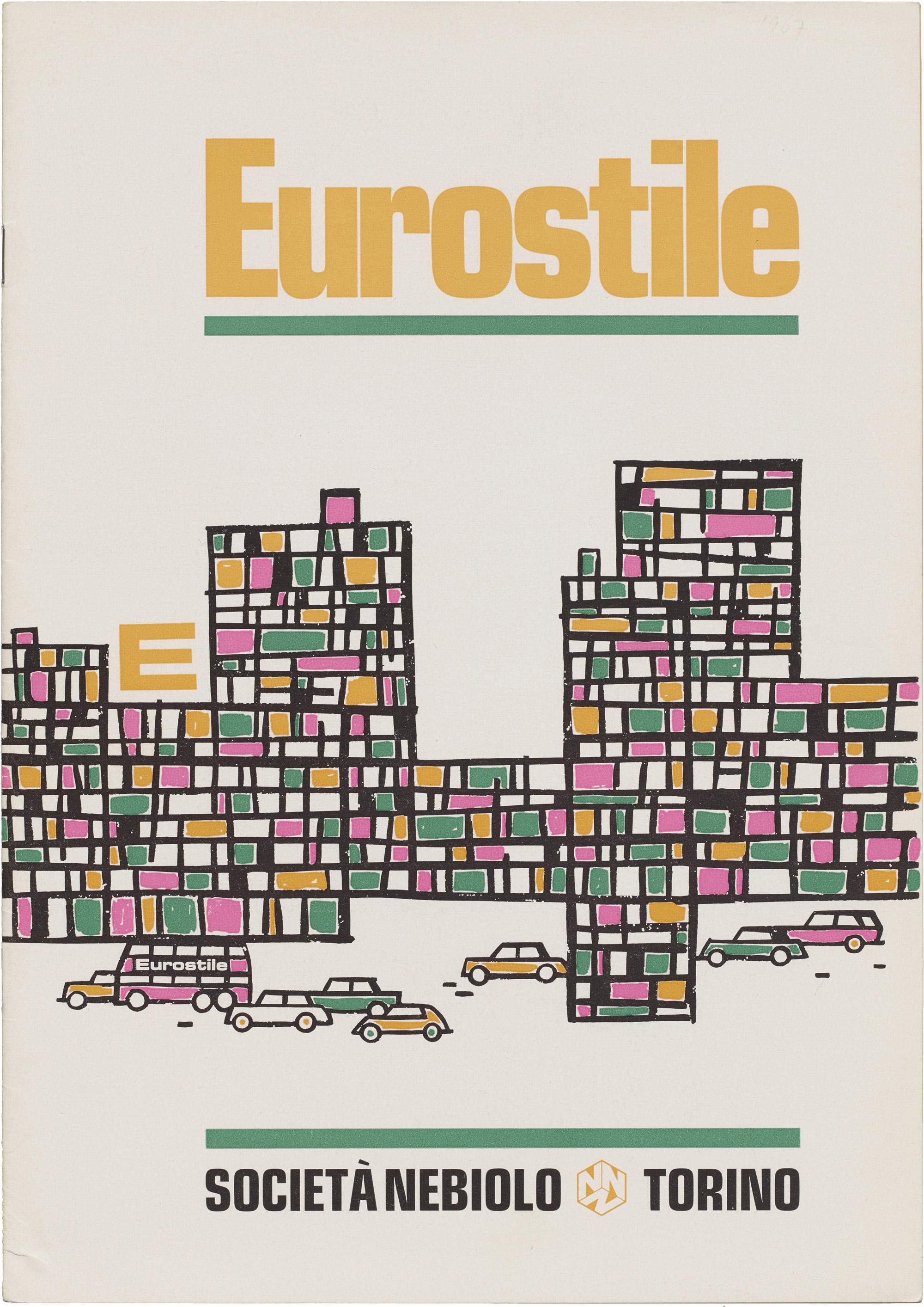
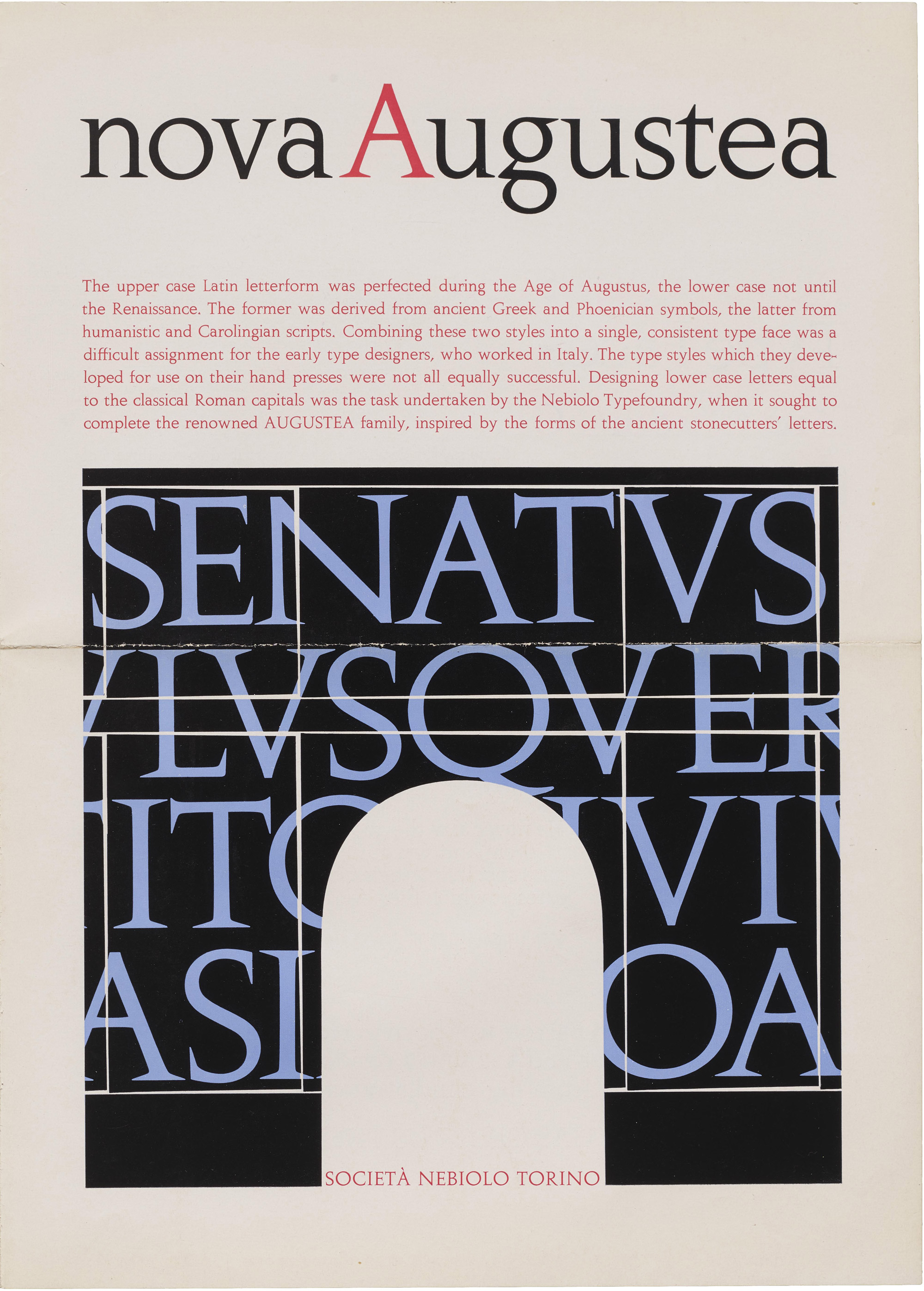
By the early 1960s, Novarese also completed a series of all-purpose faces, some of which were initiated by former director Alessandro Butti. While his spirited neo-grotesque, Recta (1963), and his compelling take on Roman inscriptional lettering, Nova Augustea (1964), never received the full attention they deserved, his quadrate sans serif, Eurostile (1962), took the world by storm. With its rounded square construction formed on the basis of Butti’s 1952 all-caps Microgramma, Eurostile matched up with the architectural and industrial spirit of the day, fashioning itself (in the words of its first specimen) as an “expressive synthesis of our time” in type.
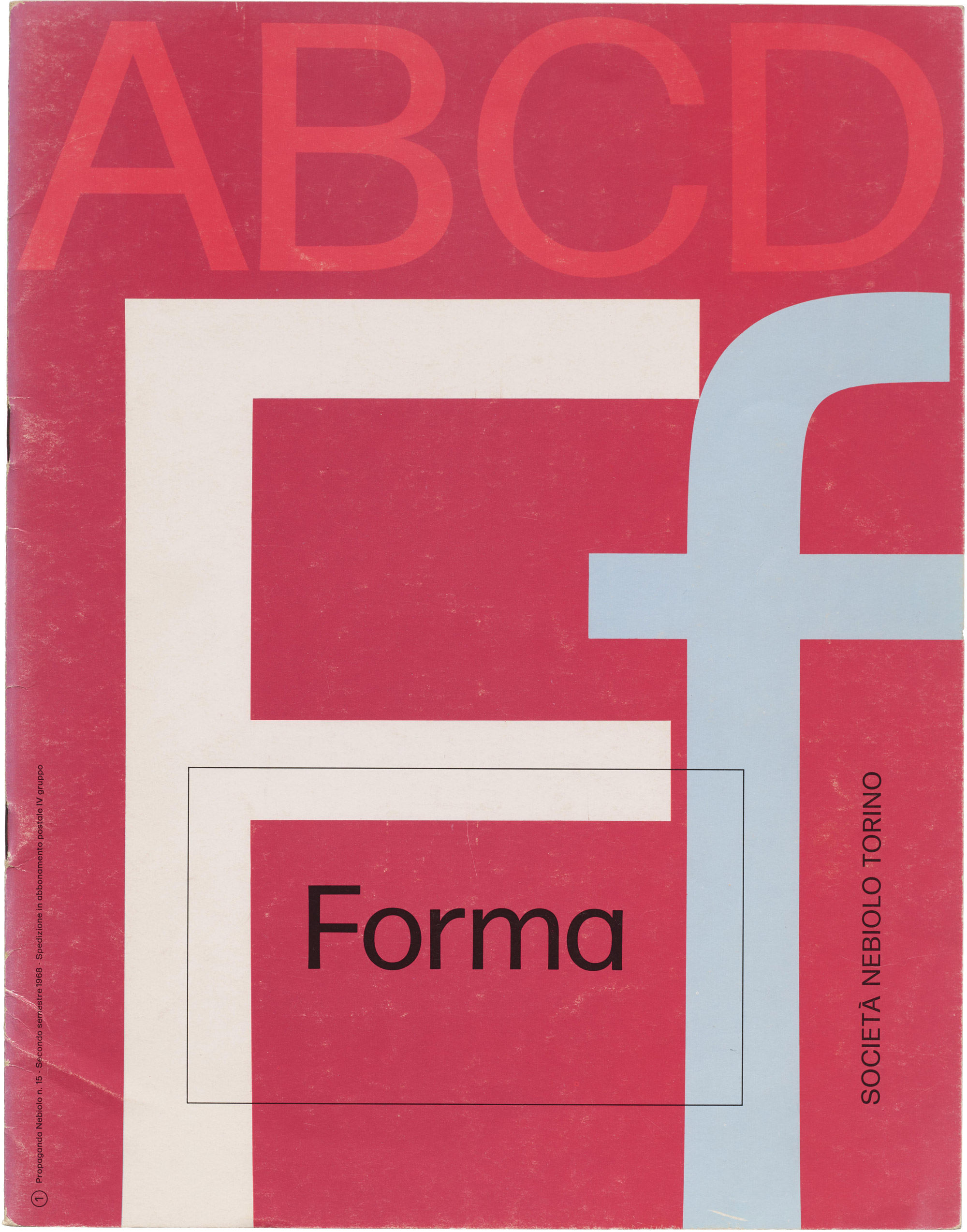
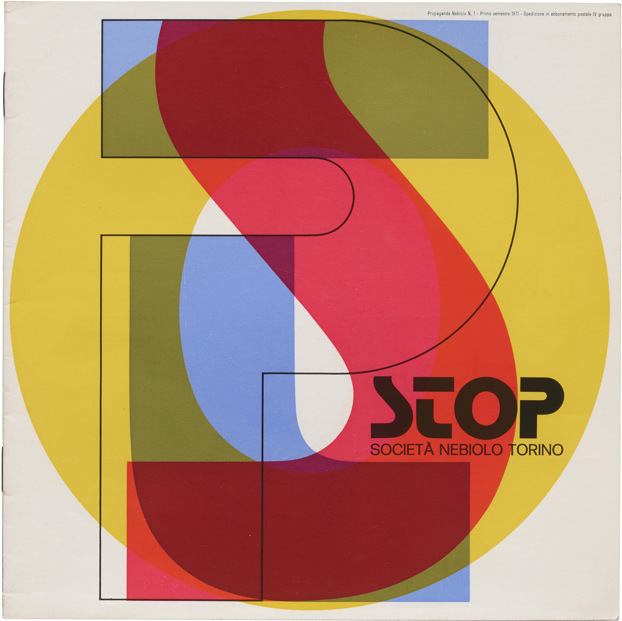
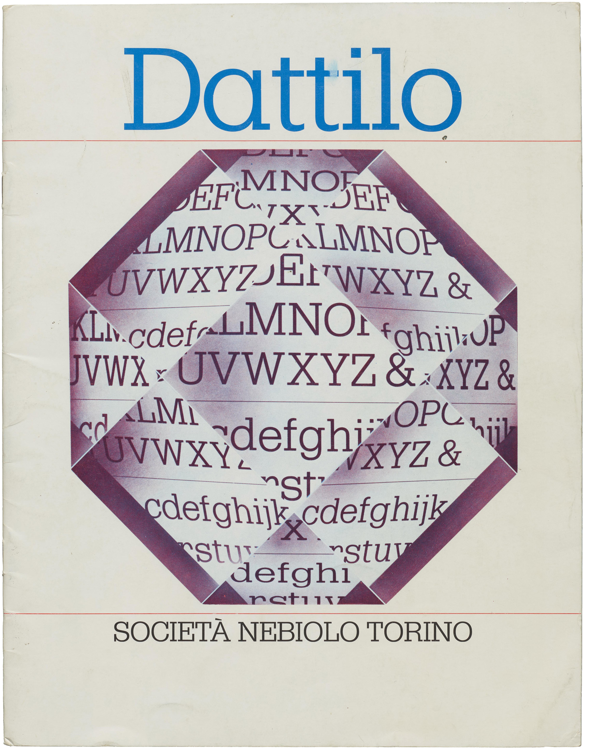
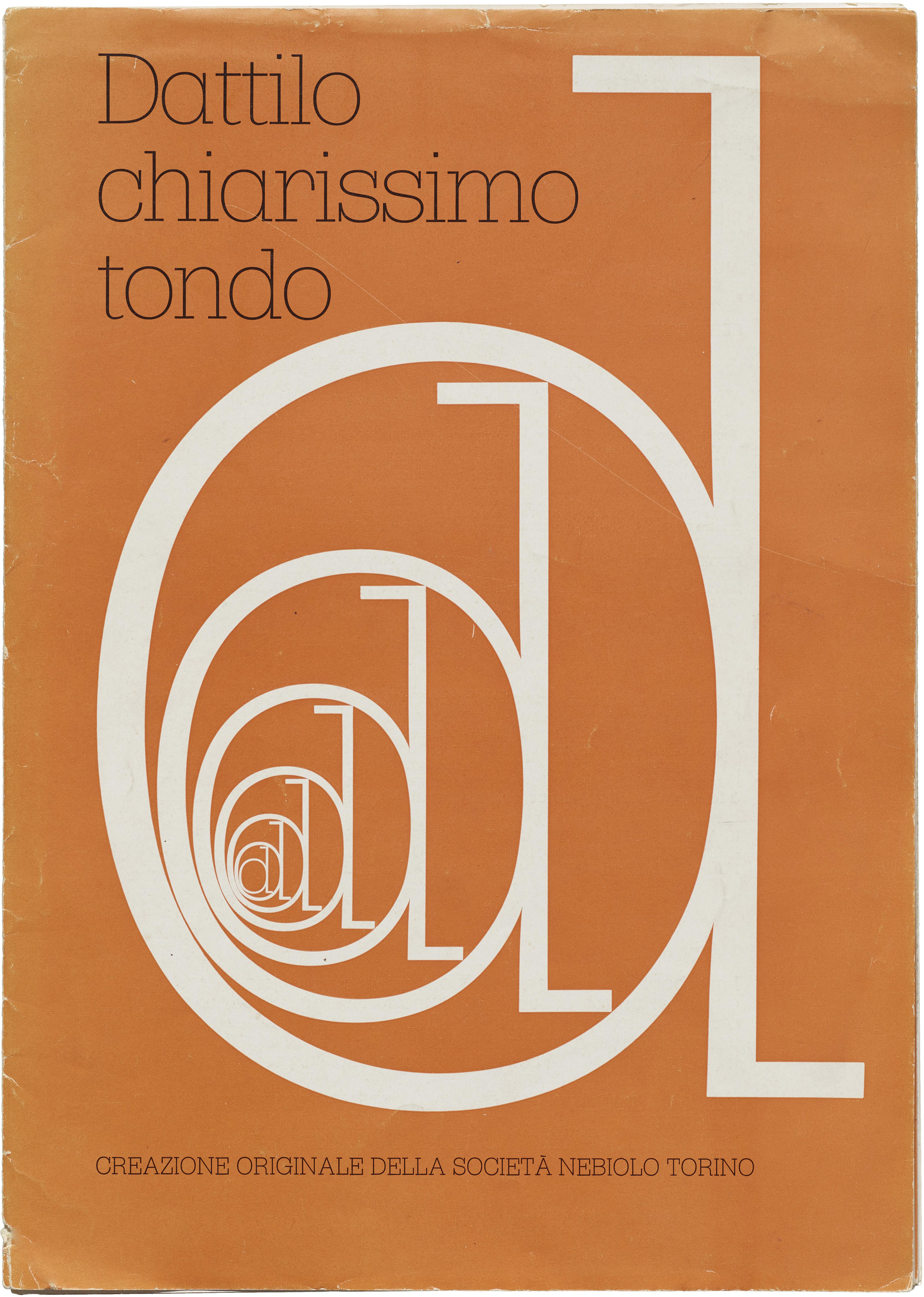
In his final Nebiolo years, Novarese led efforts to create a definitive multi-use sans serif, as well as a perfected slab serif complement. Made with input from a research team of leading designers, Forma (1968) and Datillo (1972) are widely seen as neglected masterpieces in their genres. Stop (1971), Novarese’s last Nebiolo display face, landed with more immediate impact, offering a sleek vehicle for computer-age futurism and sci-fi with its radically reduced and stencil-like forms.
Type by Aldo Novarese collects sixteen original specimens traversing Novarese’s entire career at Nebiolo. Documenting faces not widely seen by global type communities, as well as definitive versions of international hits, they also reveal Novarese’s editorial design brilliance in spreads that put his own type through its creative paces. One colorful trifold unfurls into a three-foot-tall poster, while another specimen weaves commissions from star Italian designers into a stunning portfolio of experimental graphics.
The gallery of hi-fi captures below includes covers of every type specimen in the volume. Click an image to enter fullscreen view, then click or pinch to enlarge.
The Series Design
Conceived by Alice Chau, Art Director for Letterform Archive Books, the format and design of the Type By series elegantly encases diverse specimen styles and trims in a collectable contemporary package. Part book, part portfolio, each volume features a trifold hardcover kept in place by a hidden magnetic closure. Front covers pay subtle homage to the specimens with reflective blind-debossed art that echoes one of the pages within. Each inside cover sports an informative biography that tells the story of its featured designer and cast and crew supporting the type.
These covers open to reveal a boldly designed table of contents and a neatly stacked collection of actual-size softcover facsimiles centrally bound inside the volume. To its right, an interior pocket accommodates additional small and irregularly sized loose specimens. At the back of each bound collection, short texts share illuminating details about the type and specimens, including credits, distinctive features, and important backstories.
Miniature research libraries in print, the books of the Type By series give enduring form to the type world’s essential ephemera.
By adding these volumes to your design bookshelf via the shop link below, you can support our efforts to preserve design history and help us realize future titles. Members receive 10% off all Letterform Archive books, stationery, and gift products.
Notes
- Robert Harling, “Typefounders and Their Publicity,” Commercial Art and Industry 20.118 (April 1936): 144. ↩︎
- Beatrice Warde, “The Promotion of Type Faces,” Graphis 15.84 (July/August 1959): 339. ↩︎
- Max Brod, quoted in Christopher Long, Lucian Bernhard (Prague: KANT, 2023), 71. ↩︎
- Aldo Novarese with Mario Piazza, “Novarese e la vocazione,” TiConUno 9 (February 1991): 14. ↩︎
— Chris Westcott, Editor, Letterform Archive Books