News
This Just In: Jacob Jongert for Van Nelle
A large collection of objects by the Dutch modernist demonstrates the branding power of lettering + color.
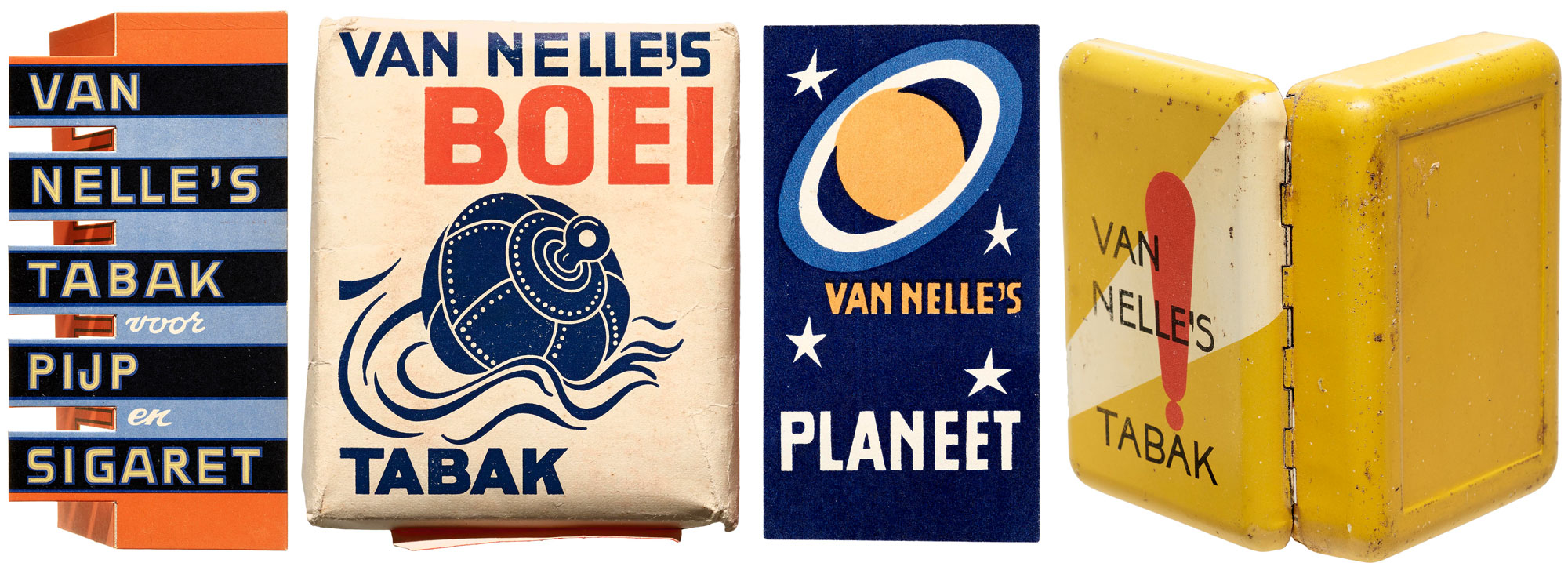
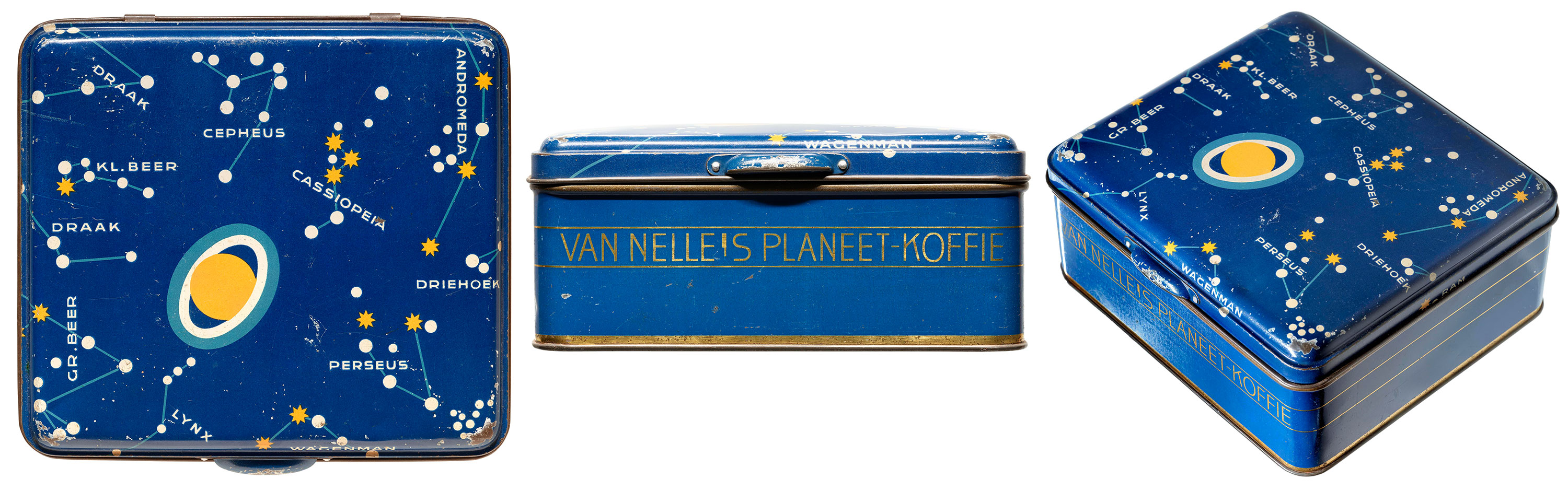
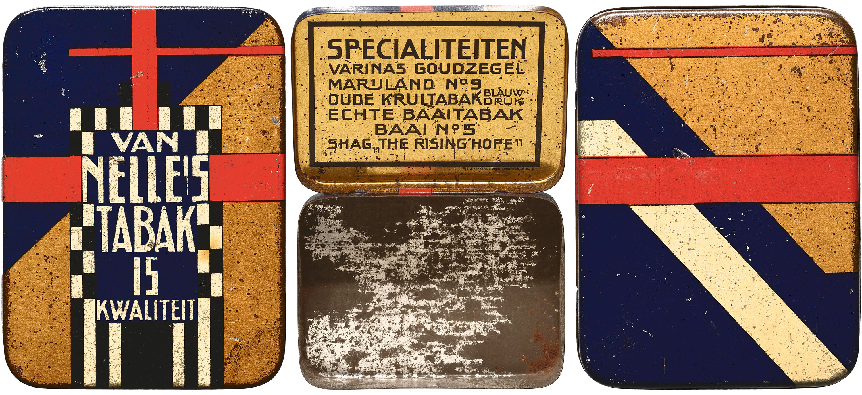
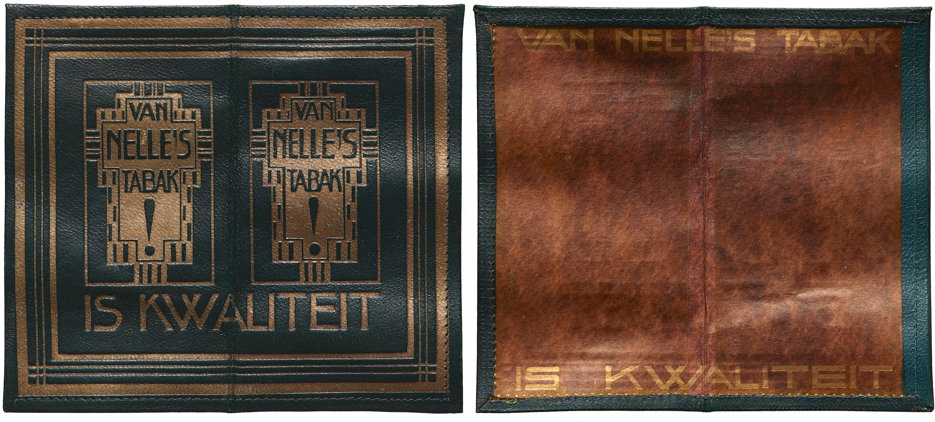
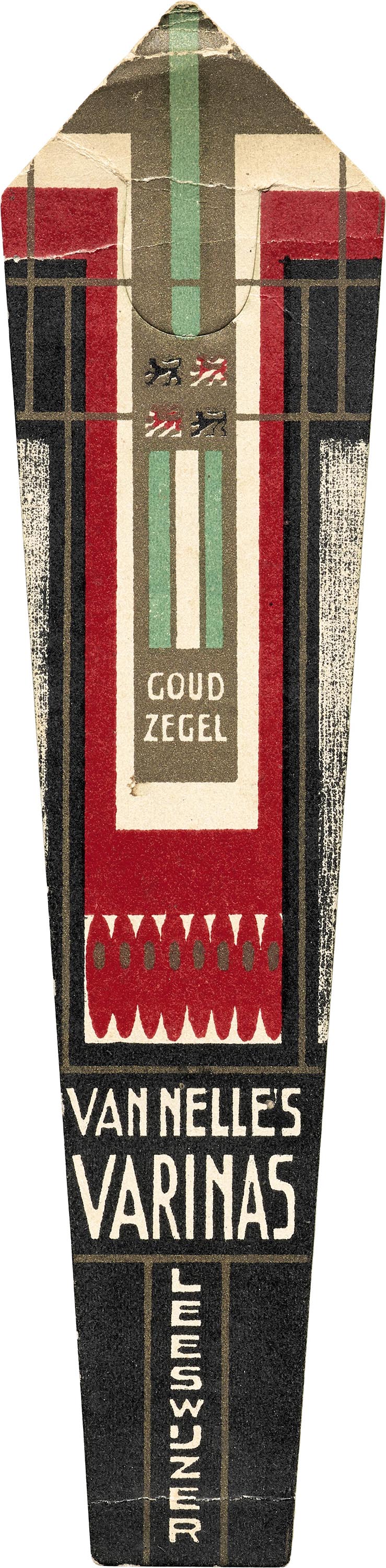
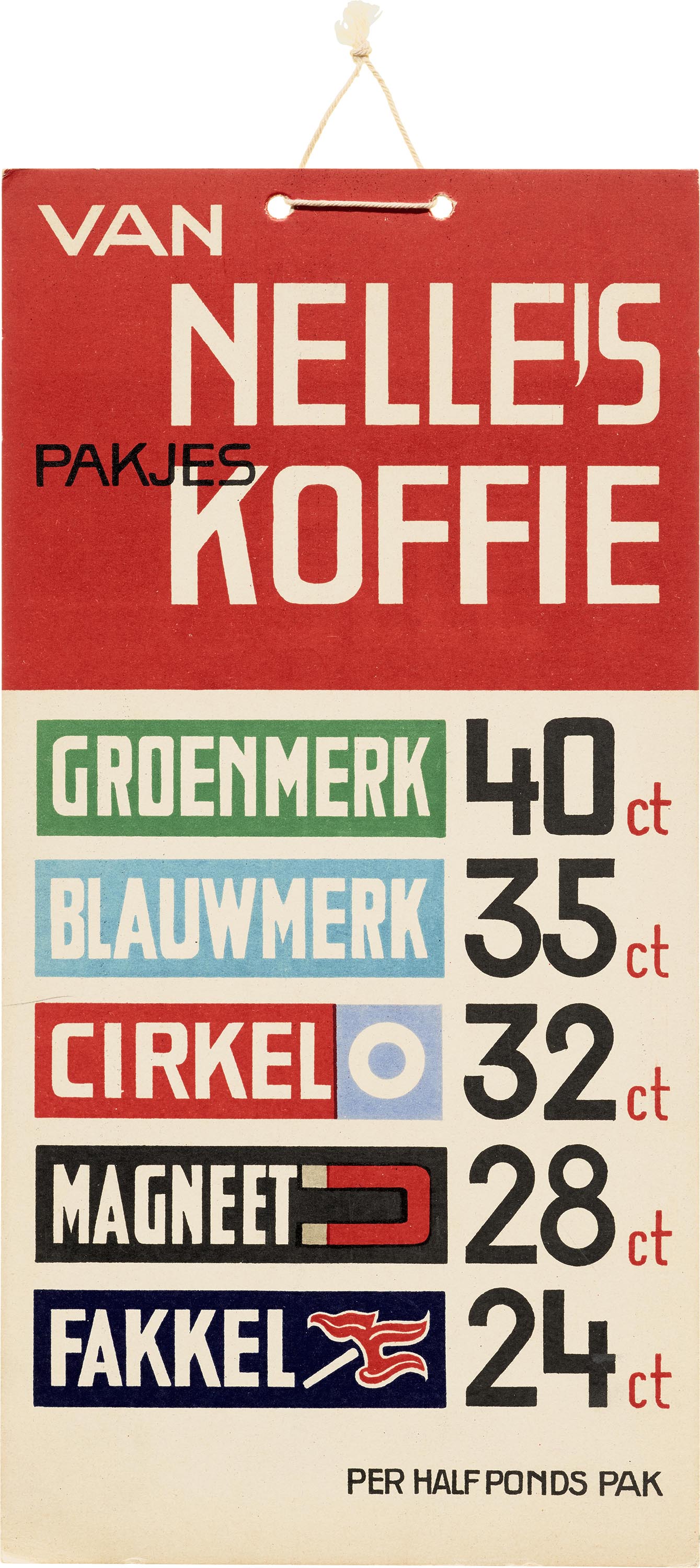
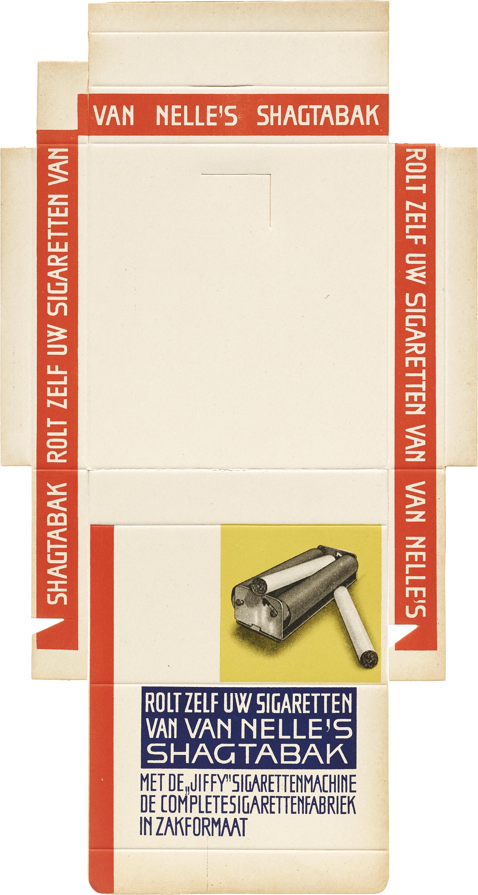
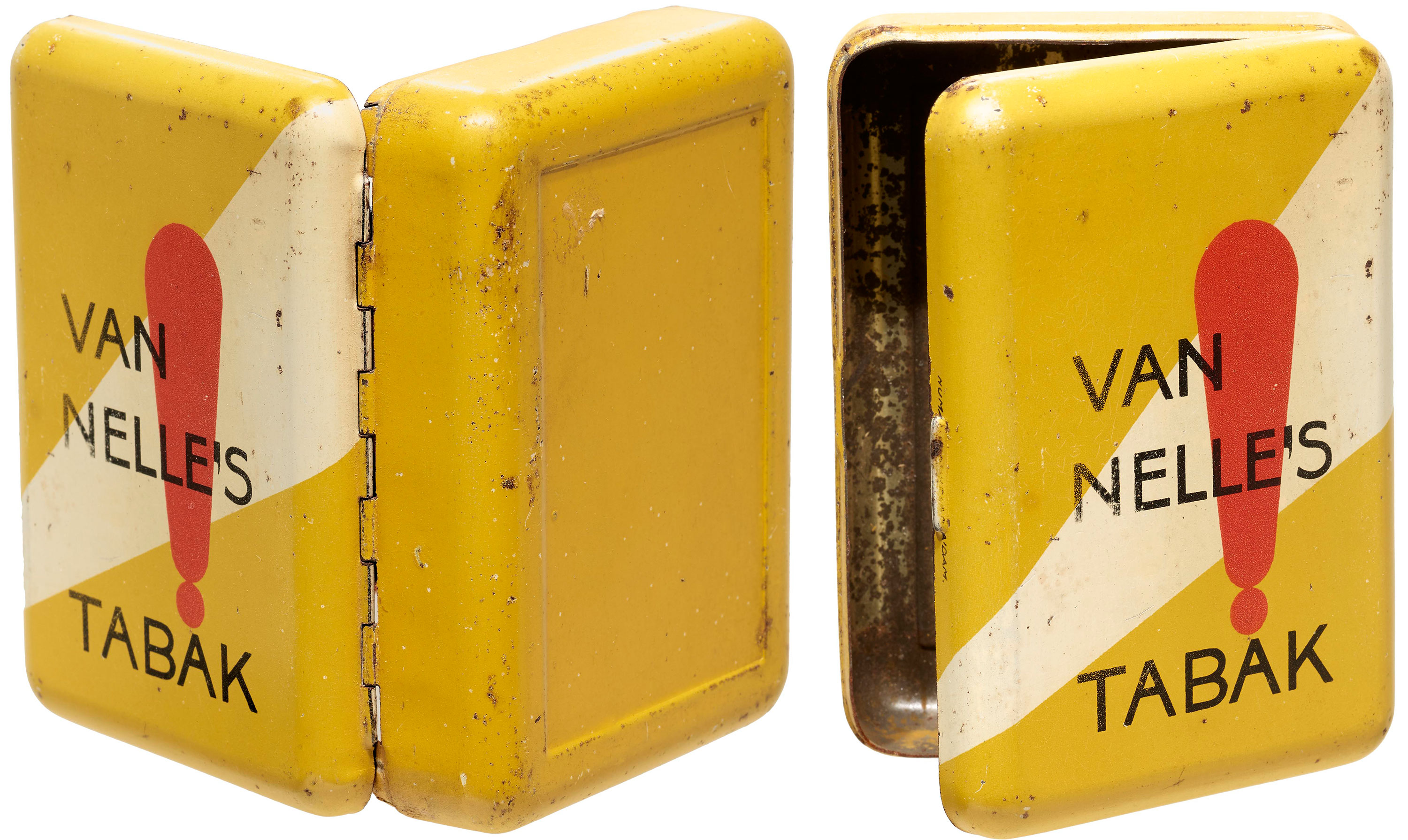
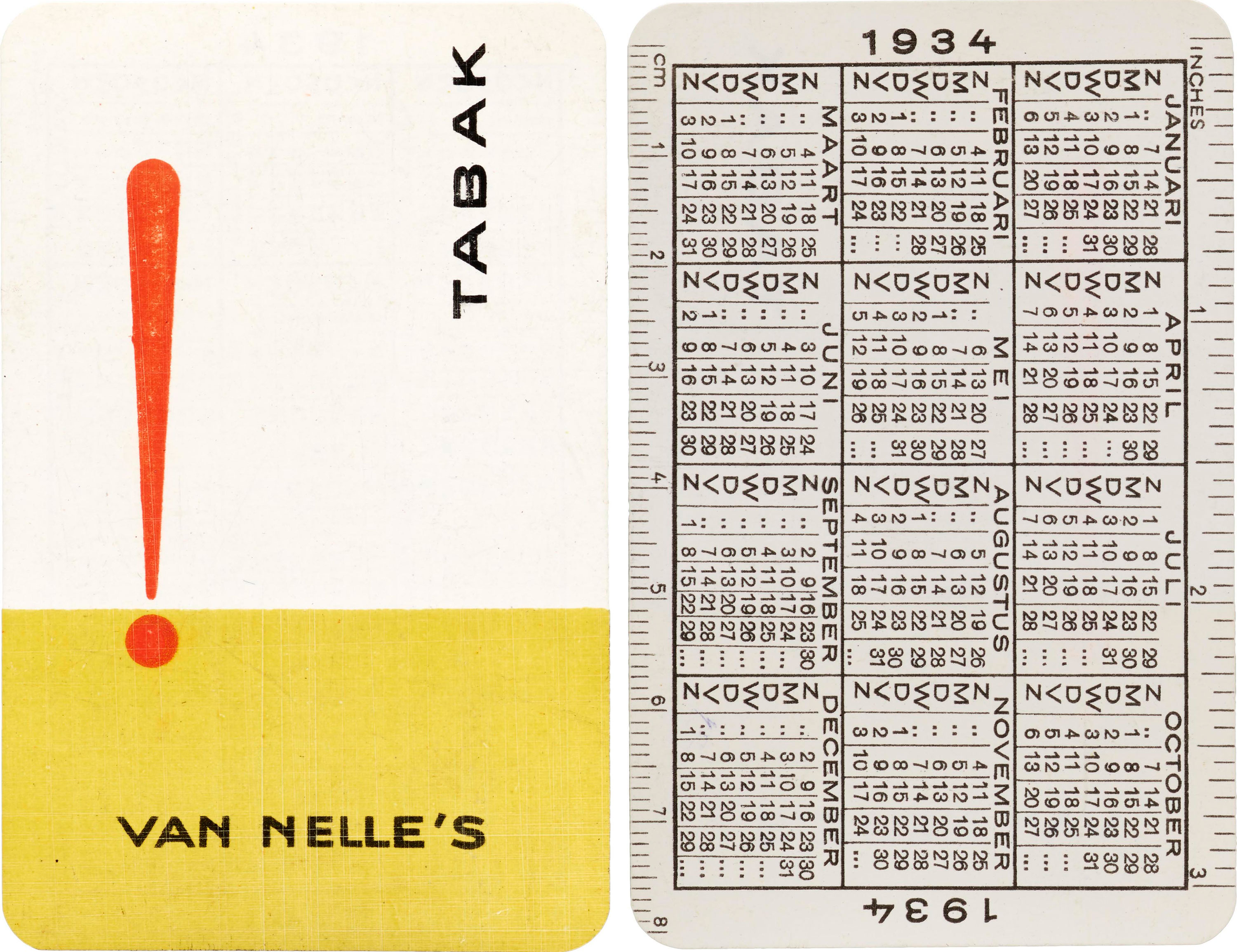
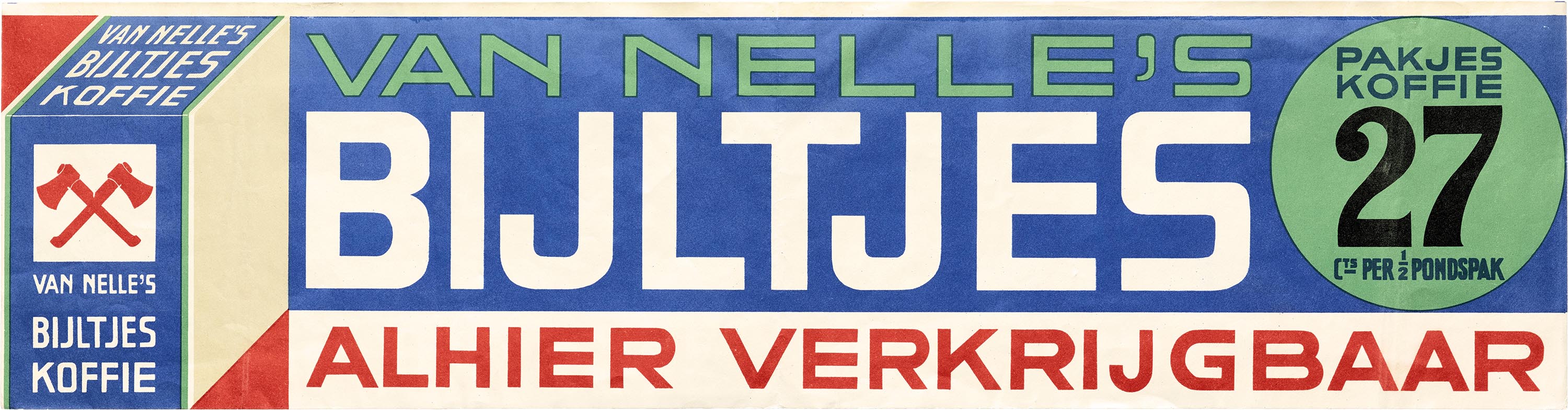
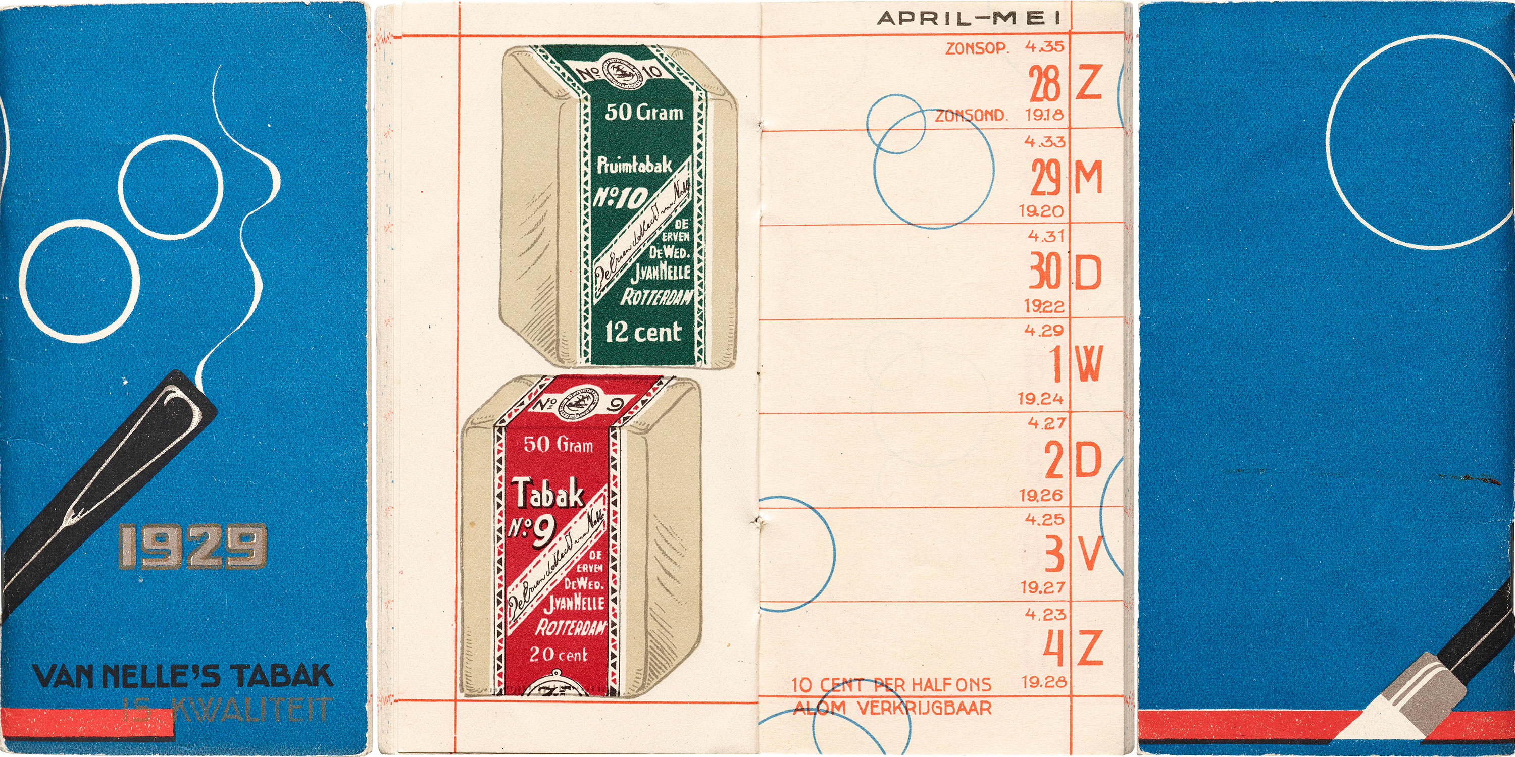
Our holdings of packaging design recently got a significant boost with the addition of several hundred objects created by Jacob (commonly signed “Jac.”) Jongert in the 1920s and ’30s for Van Nelle, a Rotterdam-based manufacturer of coffee, tea, and tobacco. The extensive and varied collection includes labels, boxes, tins, in-store displays, posters, advertising, and other collateral, like pocket notebooks and calendars.
The work exemplifies a historical shift in architecture and design from ornamentation to functionalism, and represents the peak of Jongert’s long career in commercial art. Jongert’s artistic life started at the beginning of the 20th century studying and working with the renowned artist and designer Richard Roland Holst. Holst’s William Morris-inspired woodcuts, posters, and paintings followed the Arts and Crafts ideal of clean form, but were still full of ornamentation, and Jongert’s work initially followed suit. Much of his lettering from the period had the serifs, curves, swashes, and other decoration we associate with Art Nouveau. His transition to more functional design started sometime in the early 1920s in the advertising department at Van Nelle, a well-established company whose trading roots went all the way back to the early 19th century. Within a few years he led their advertising department and transformed a very traditionally designed brand into a modern program of marks and packaging.
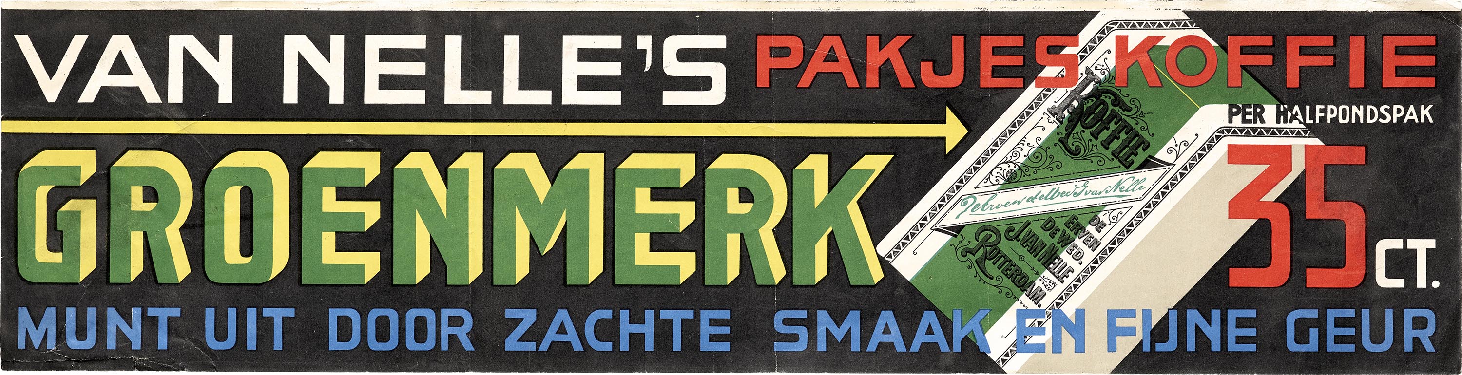
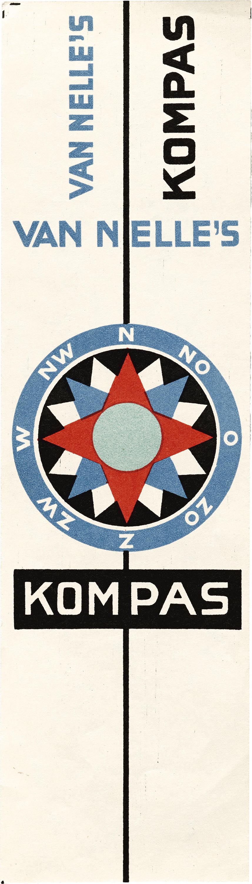
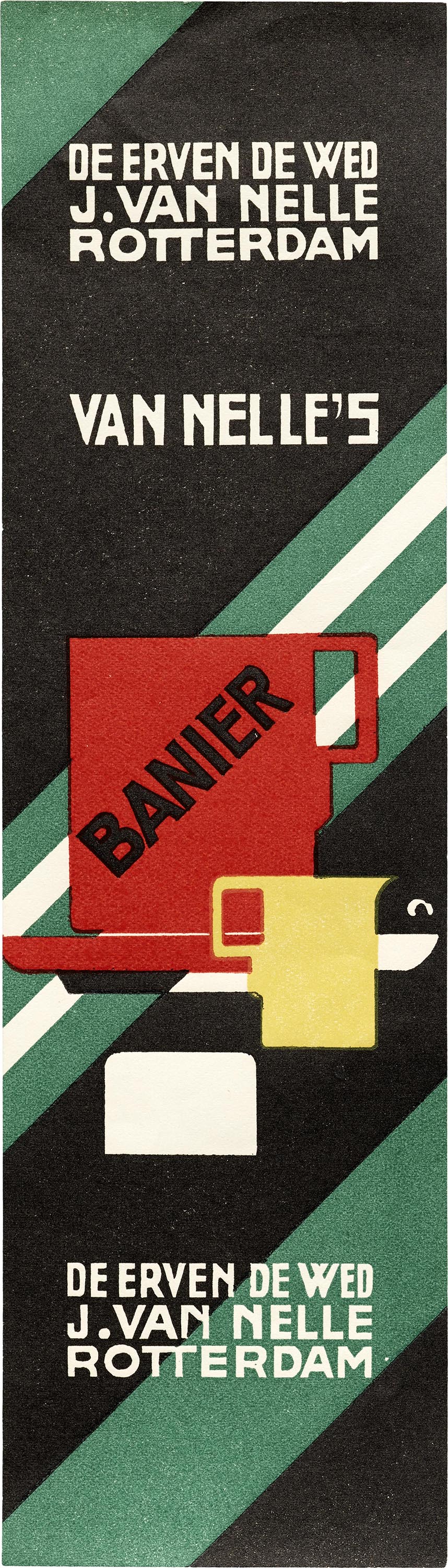
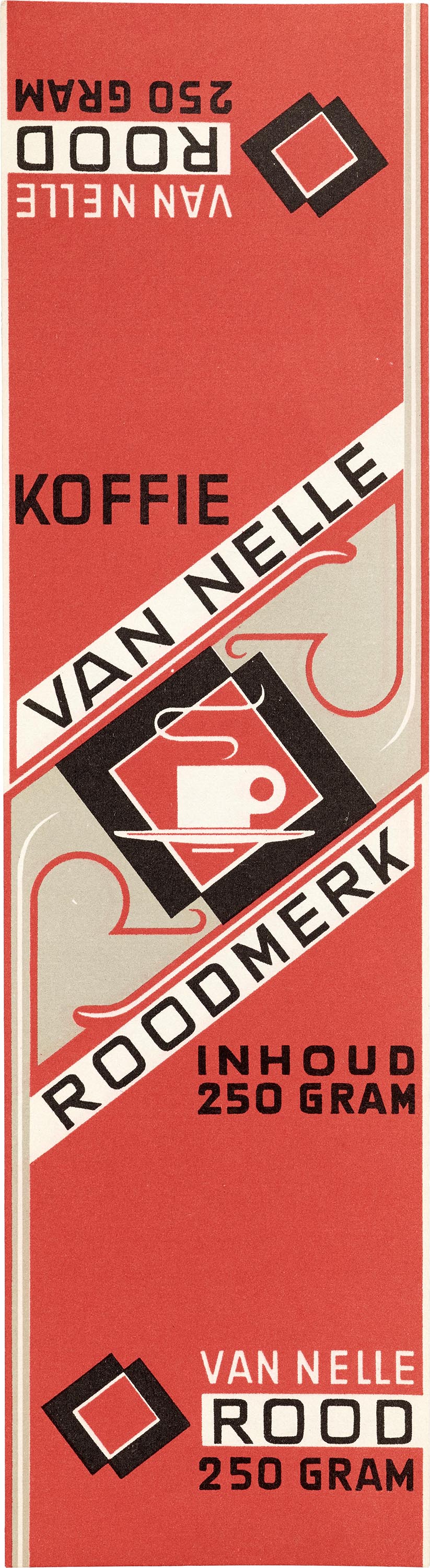
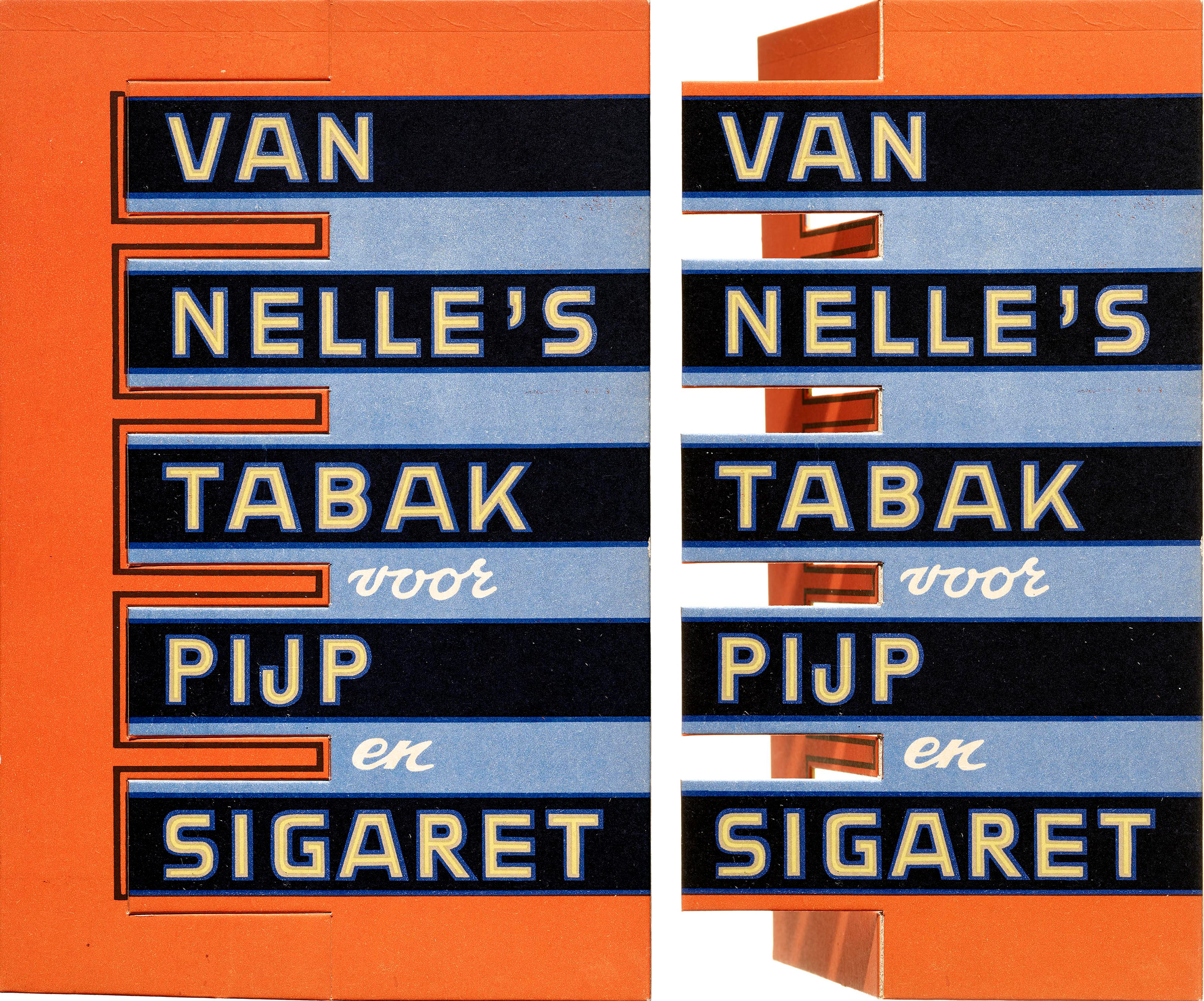
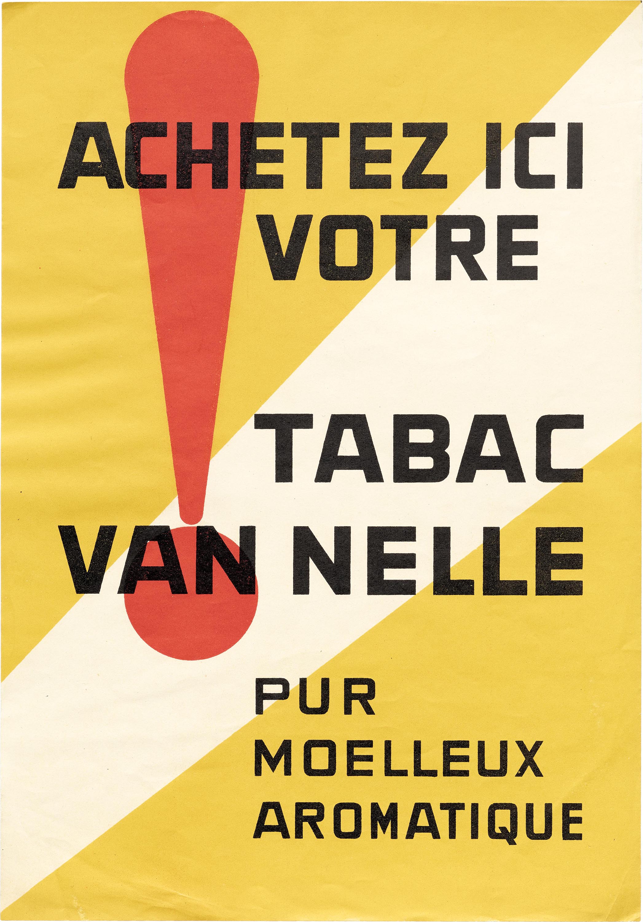
Jongert’s Van Nelle system is characterized by large fields of mostly primary colors, geometric shapes, and minimal illustration. The design perfectly complements Van Nelle’s short and simple brand names like Cirkel (circle) coffee, Kubus (cube) tea, and Boei (buoy) tobacco.
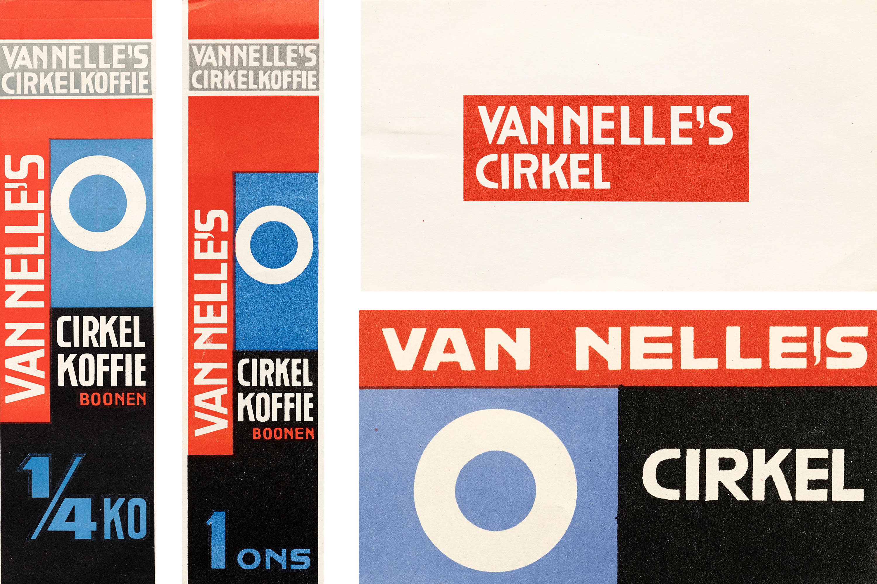
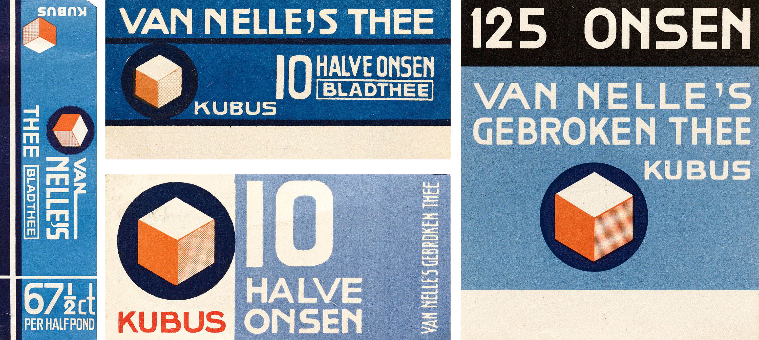
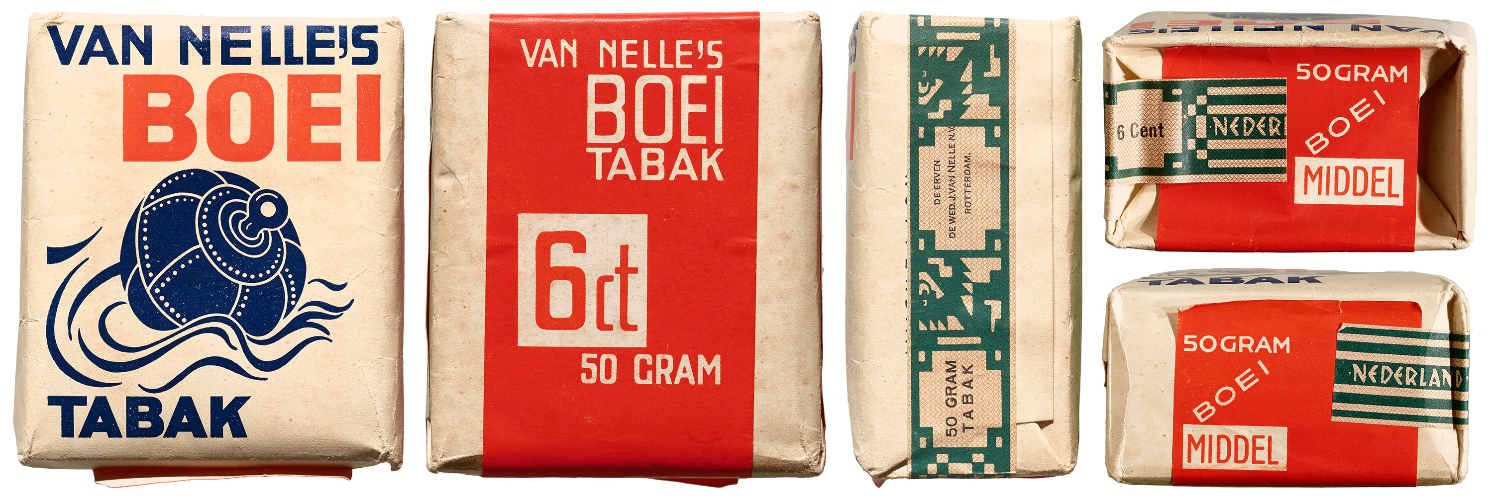
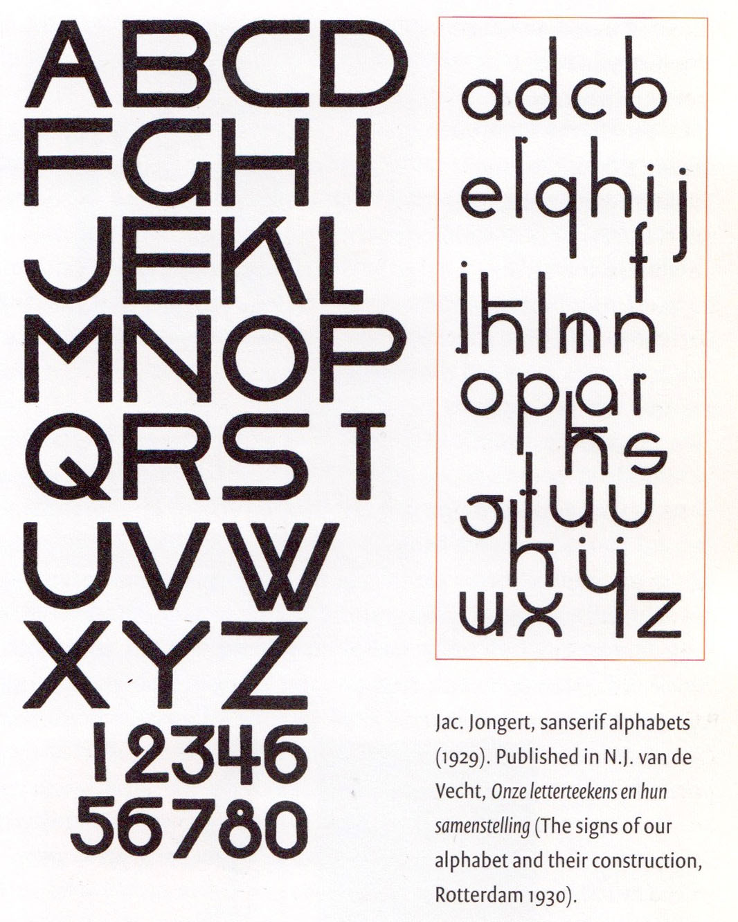
The lettering, however, is the driving force that ties it all together. The style is straightforward: a set of plain, monolinear, sans-serif capitals in a mode that started to come into fashion in the late 1920s and early 1930s with the rise of functionalism, as well as geometric type like Erbar, Futura, Johnston, and, more specifically, Breede Schreeflooze from Dutch foundry Enschedé. Yet, while these ideas were already in the air, the systematic and cohesive way Jongert implemented his lettering was unusual at the time. The square and minimal construction of the forms allowed the letters to contract and expand to fit any situation, yet maintain a consistent and recognizable appearance throughout the Van Nelle line. (It’s intriguing to reexamine this system amid the current advancement of variable-font technology which brings a similar kind of flexibility to typeface design.)
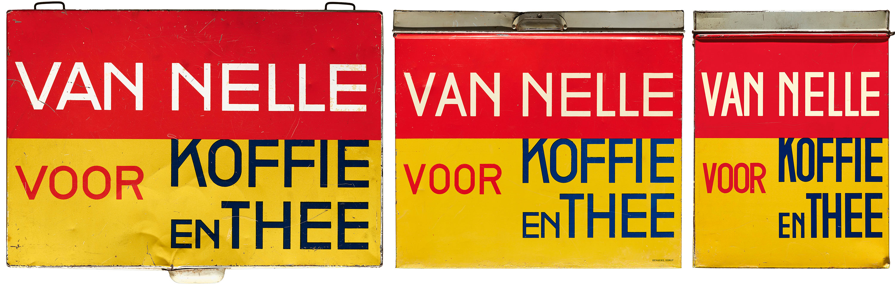
All of these elements, expertly executed, are a triumph of identity design. The moment you saw an ad in the paper, a display in a shop window, or a box on a shelf, you knew it was Van Nelle. Despite the minimalism and geometry of the Van Nelle packaging, it has a warmth and joyousness that is often desirable in a consumer brand. In Dutch Graphic Design (V+K Publishing, 1993), Kees Broos and Paul Hefting say Jongert proceeded from “an idealism based on fruitful cooperation between artist and industry in bringing good and functional design to everyday life.”
As an example of early modernist design for commercial goods, the Van Nelle material is an interesting companion to our collection of Piet Zwart’s output for the Bruynzeel lumber company and NKF (Netherlands Cable Works). Both designers’ work for these brands was strikingly modern and typographic, dominated by simplicity and straight lines, yet Jongert felt Zwart’s avant-gardism to be too stark and dogmatic. Zwart’s early work for Bruynzeel and NKF is constructed primarily with type, set in structured frameworks with limited color and photomontage; Jongert’s, in contrast, is based on variable lettering amid a broader palette of bright hues and illustration. It’s fascinating to compare the two collections of groundbreaking identity work from the same period, with so much to appreciate about both approaches.
Selections from the Jongert / Van Nelle Collection
All images in this gallery are hi-fi captures. Click an image to enter fullscreen view, then pinch or use browser zoom to enlarge.


Jongert may not be as well known as other Dutch modernists, but his work immediately grabs you, just as it must have grabbed a shopper’s eye in 1930. We are excited to hold and share such a complete range of a single brand. Join us Thursday, September 27, for Letterform Archive Salon Series 09 when our curator Rob Saunders will explore much more from the Van Nelle collection.
— Stephen Coles, Editorial Director and Associate Curator