News
Letterforms / Humanforms
The interaction between letters and bodies is a recurring theme in art and design history. Our newest team member, sair goetz, shares what they’ve discovered in the Archive’s collection and beyond.
The Body, the Screen, and the Letter
Readjust your posture. Please hydrate. You are part of your body, a human body, in messy three dimensional space, and you should care for yourself while you look at these letterforms in front of you in what has become their natural habitat, the screen. Content warning: mention of ethics violations against women and people of color.
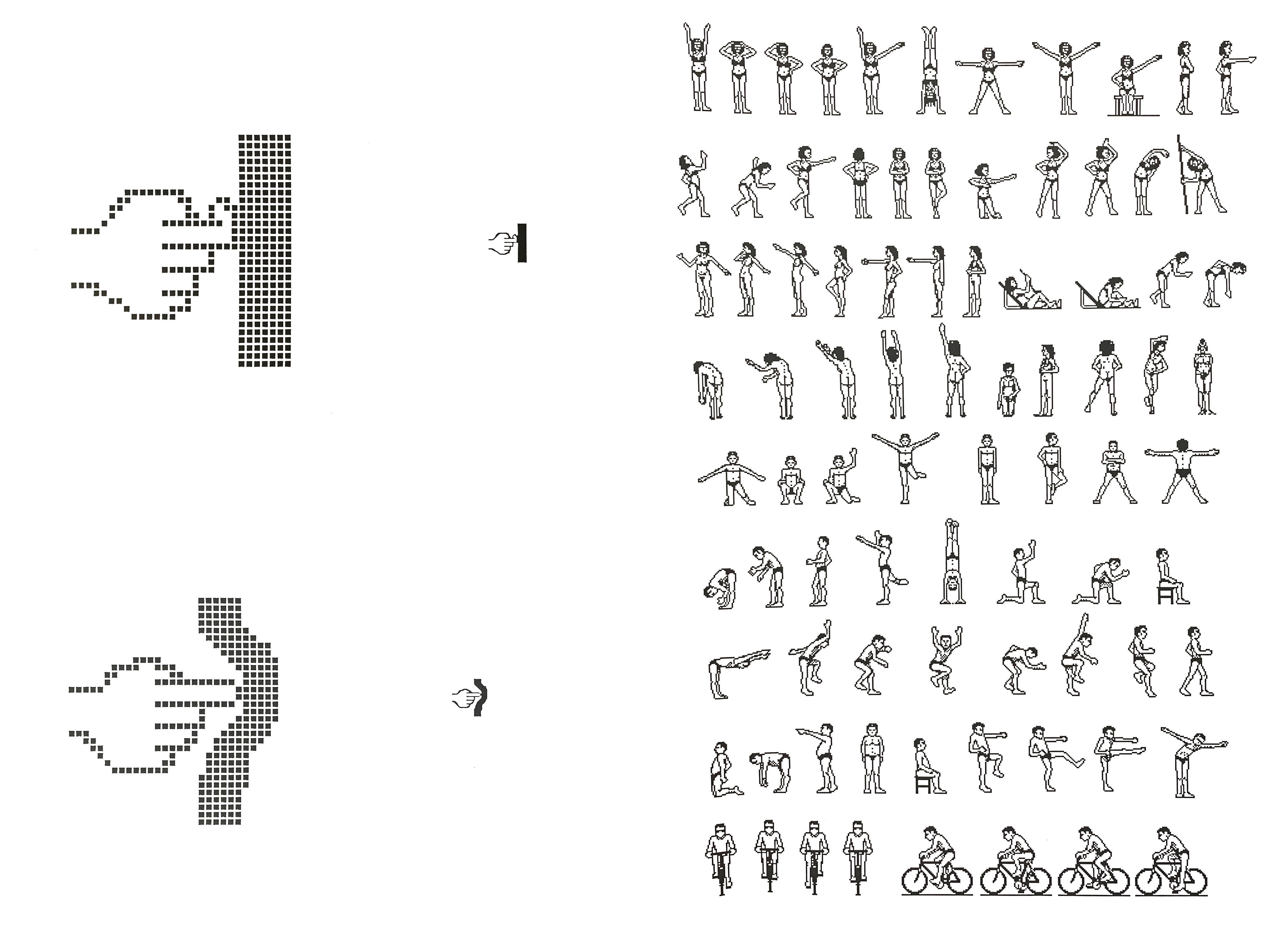
Designer Clement Mok was among those working for Apple in the 1980s and ’90s who imagined a computer world that moved beyond text, beyond letterforms and numerals. Among the papers he generously donated to Letterform Archive a few months ago, there is a set of 1985 bitmap drawings. These are enlargements of tiny images, demonstrating how pixels are used to create recognizably human forms. There are many hand gestures. There are even a set of men and women doing exercises, a series reminiscent of the motion studies produced by cinema godfather Eadweard Muybridge a century earlier.
Right: Printout from an early version of VideoWorks (predecessor to Macromind Director), ca. 1986. Clement Mok Collection at Letterform Archive.
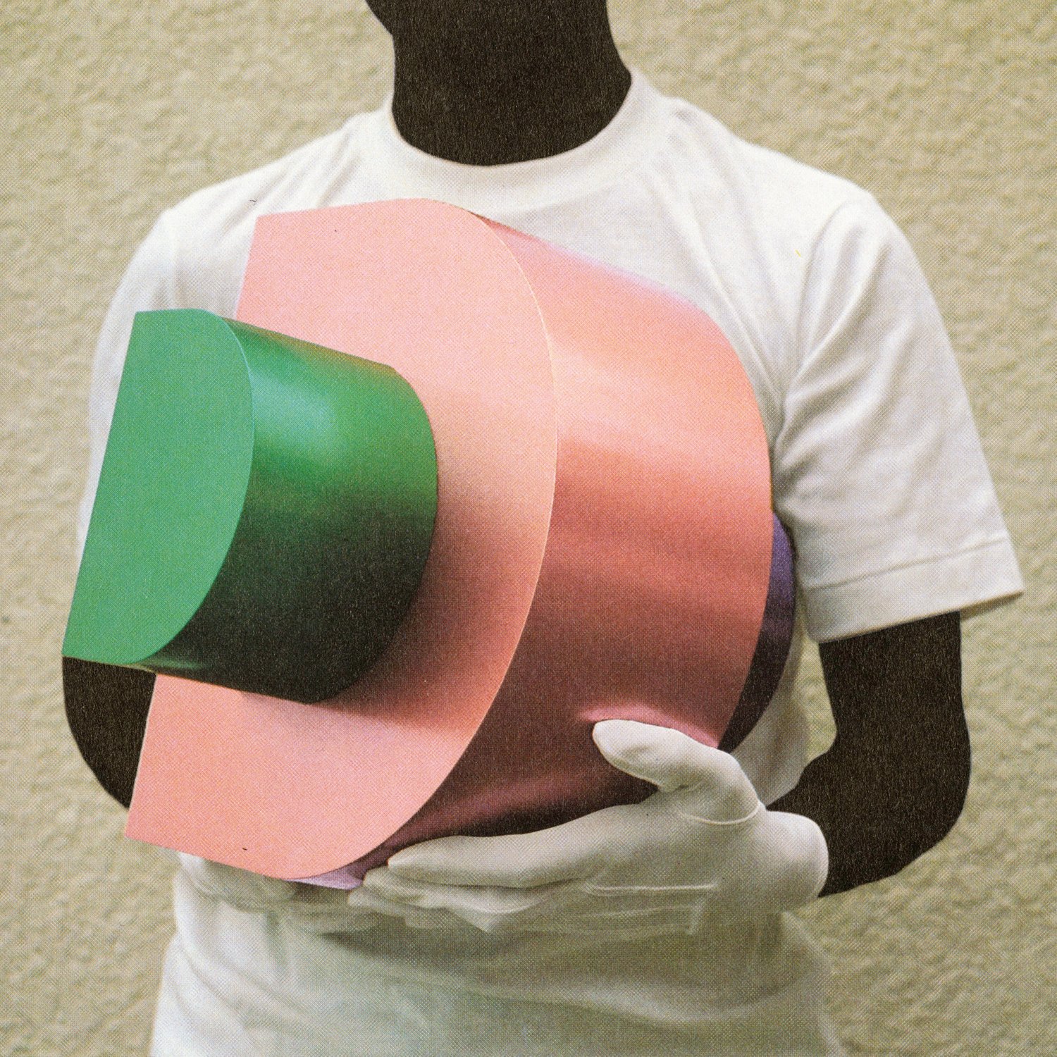
Two of these small bitmaps stand out: one illustrating a human finger bending as it comes into contact with a surface, and the other illustrating a human finger pushing into a surface that gives way. The first demonstrates the relationship between the human body and the computer screen in 1985: the body is flattened, reduced in accuracy, and bent out of shape. The second is what has become our reality; we push the bodily world into (and out of) flat screens with pixel-dense displays, using VR to mimic depth perception, racially biased facial recognition software to track and control populations, motion capture to interface with the same devices that deliver the news.
A few other excellent examples outside our collection may be found here: The Grotesque Alphabet, Horae, Tudor book.
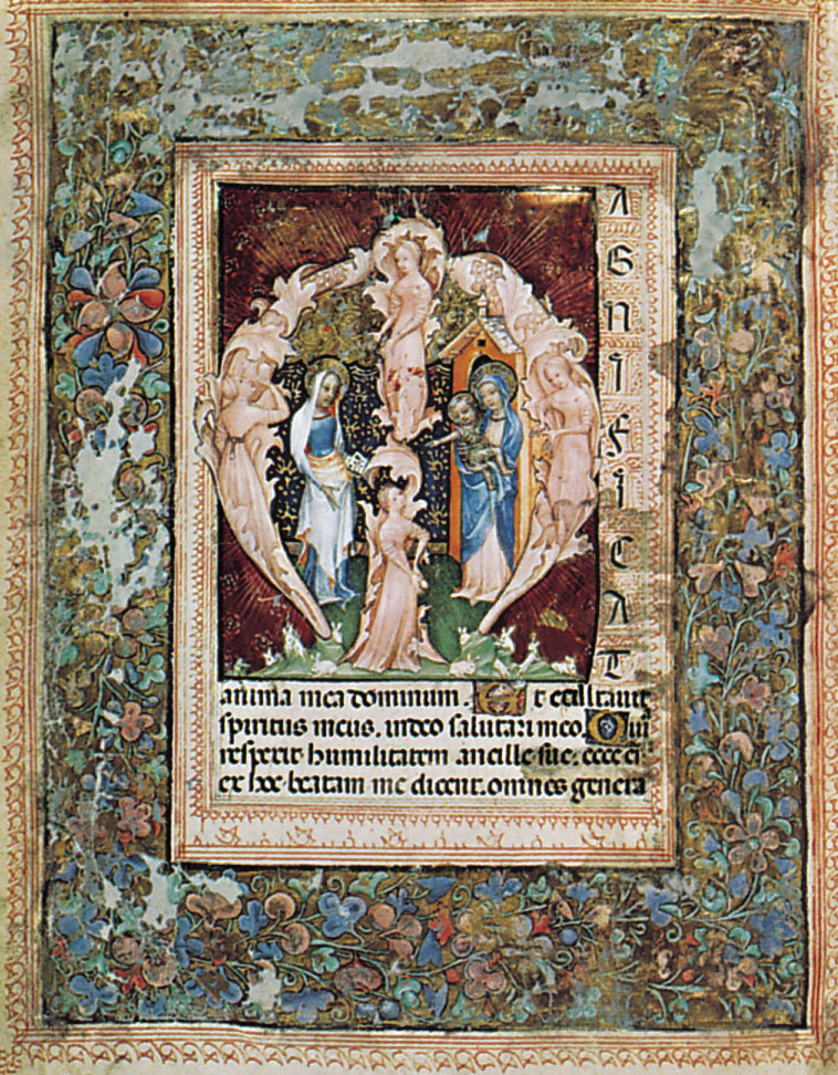
Long before the computer screen, however, putting human bodies into letterforms has been a way in which designers and artists have tried to merge the human body and with the flat forms of disembodied communication. Some of the earliest examples of these mergers are found in illuminated manuscripts created when religious imagery was used to educate, although the wealth required to own such a manuscript was likely accompanied by literacy.
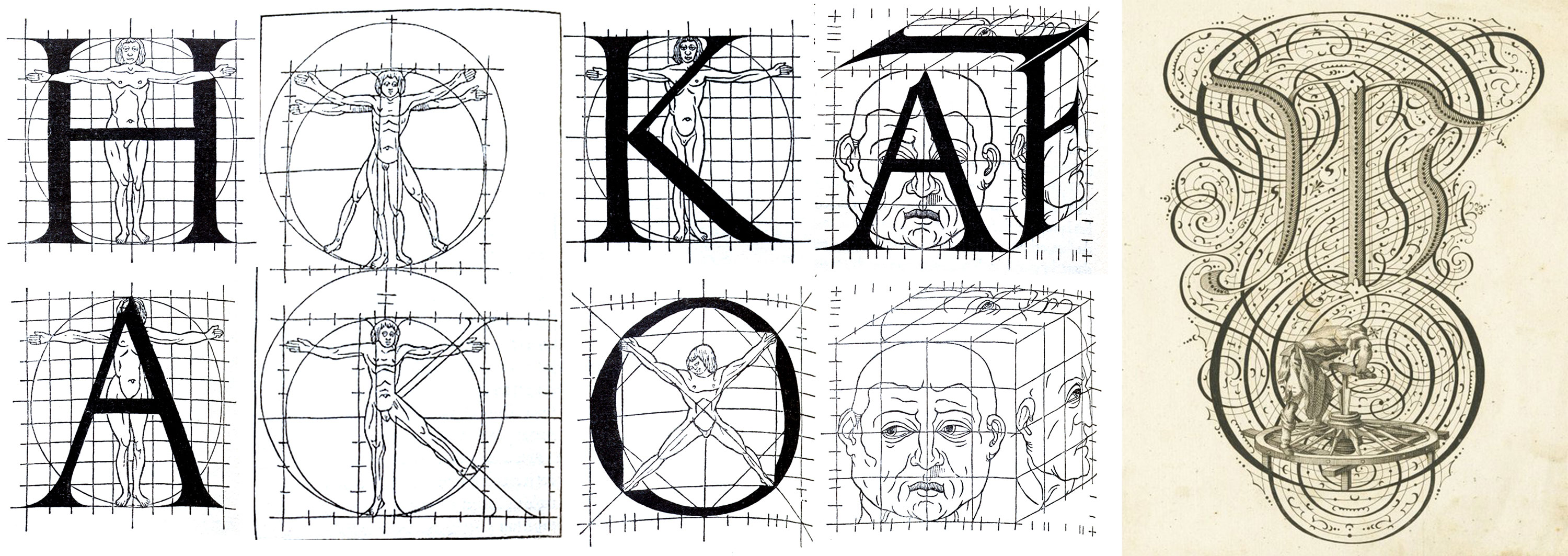
While vividly conveying religious stories may have been an early motive for merging body and letter, mathematical ideals soon became a reason. Frederic W. Goudy, type designer and author of the 1918 book The Alphabet, outlines a lineage of Renaissance scholars who attempt to define an ideal letterform based on the “proportions of the human form combined with geometric figures”, beginning with Paciolus, and moving through Leonardo de Vinci, Albrecht Durer, and Geoffroy Tory. In his 1527 book, Champ Fluery, Tory illustrates the use of an idealized human model based on DeVinci’s Vitruvian Man to determine the proportion of letterforms.
Goudy goes on to write that “The hypothesis that there is an ideally correct form for each letter of the alphabet is just as erroneous as Geoffroy Tory’s simple assumption that there is a relation between the shapes of the letters and the human body; erroneous, because the shapes of letters have been in constant process of modification from their very beginnings.”
In 1443, (over 100 years before Tory worked with an idealized human form to construct his ideal alphabet) Korea’s King Sejong the Great was commissioning a writing system that would link the body and written language in practice, rather than just theory. Hangul, which directly mimics the shapes of the mouth while speaking, is said to be so intuitive that one could learn it in one morning. South Korea’s literacy is currently reported at 97.9% of the population due in part to this phonetic alphabet. (Learn more about Hangul in Lars Kim’s Letterform Lecture and Florence Fu’s article on Ahn Sang Soo.)
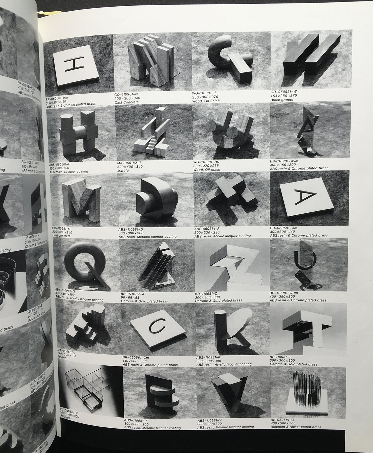
In the Archive, one can find many approaches for merging letters with bodies: body parts (faces and hands) used to anthropomorphize a letter, single bodies contorted to form letters, groups of bodies joined to form letters, and letters formed in bodily space. (For examination of the ways that people often use many words or letters to create images, see Kate Long’s post about concrete poetry.)
Personification: Letterforms with Bits of Body
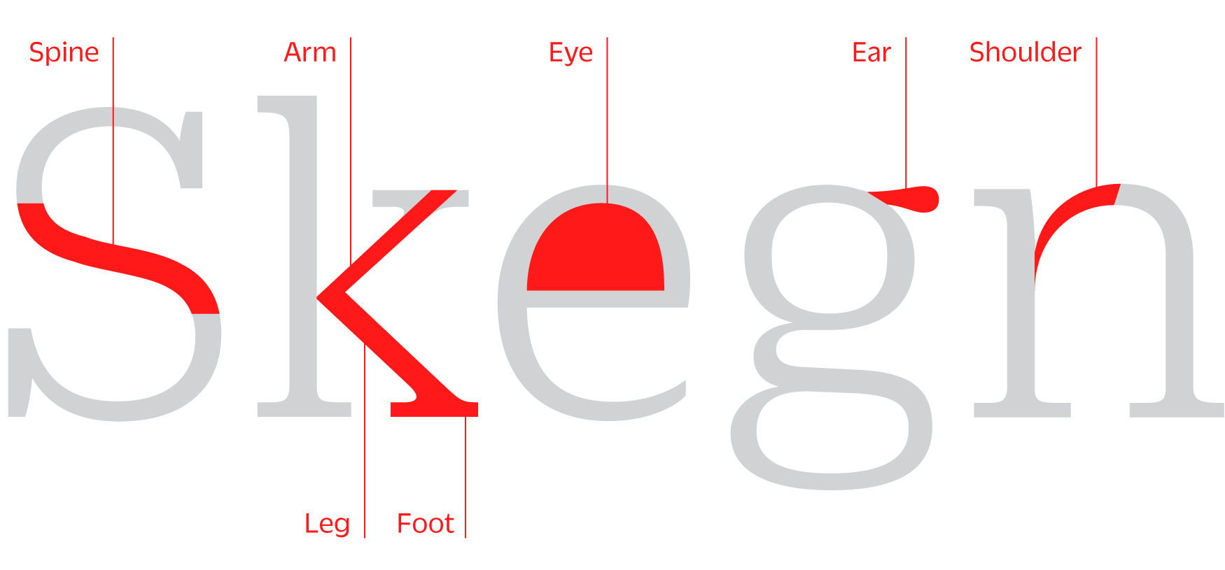
Calligraphers, lettering artists, and type designers have always used human anatomy to identify and explain the parts of letters, such as the spine of an S, arm and leg of a k, ear of a g, eye of an e, or shoulder of an n.
This anthropomorphizing language is just the starting point for personification. Many designers take these words literally by putting the anatomy of humans into the anatomy of letters.
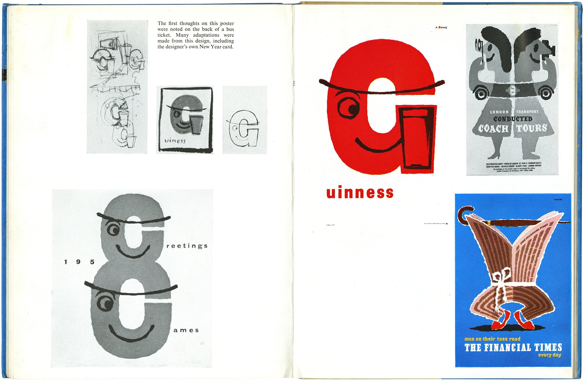
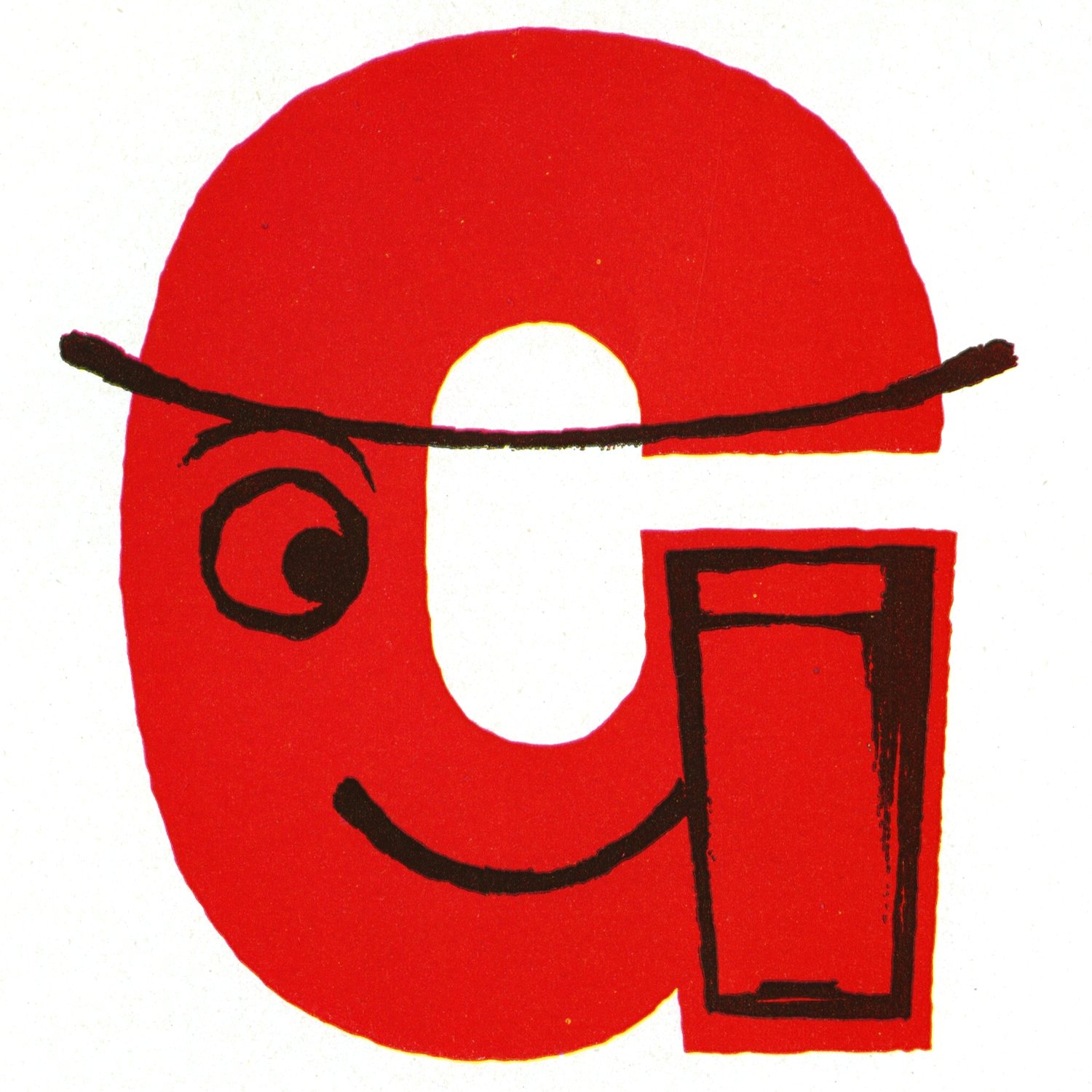
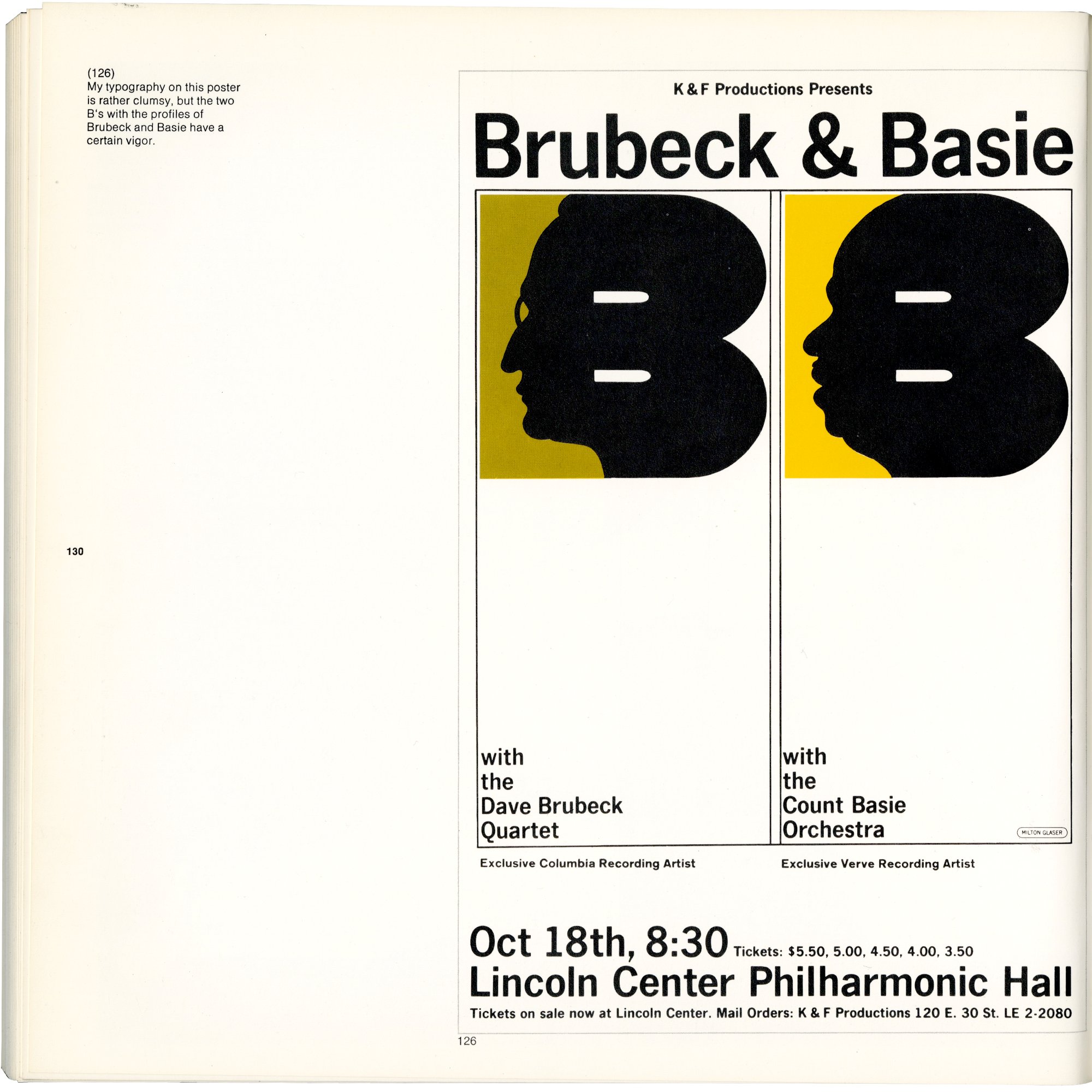


Abram Games’s Guinness poster takes the simplest approach: add an eye, a smile, and a beer, and a G becomes a model of the happy Guinness customer. Milton Glasser’s Brubeck & Basie poster merges the silhouette of the musicians’ faces with the spine of the B. It is noteworthy for being one of the few images I have found that identifies a letter with specific people rather than an abstraction from an idealized human. They are documentary letterforms. These Bs are real individuals.
Michel Dattel’s number illustrations use another tactic. Append a face and hands onto the ends of numbers, and you have a personified character designed to aid children in constructing mnemonic narratives.
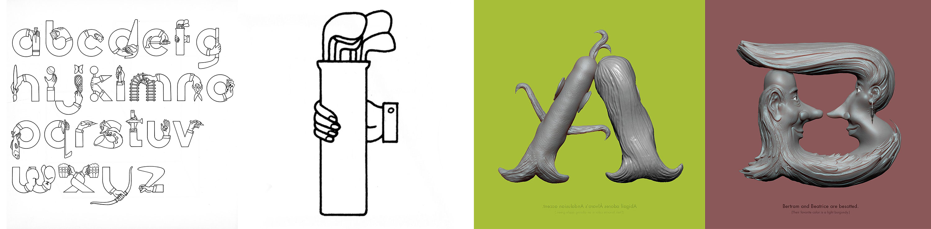
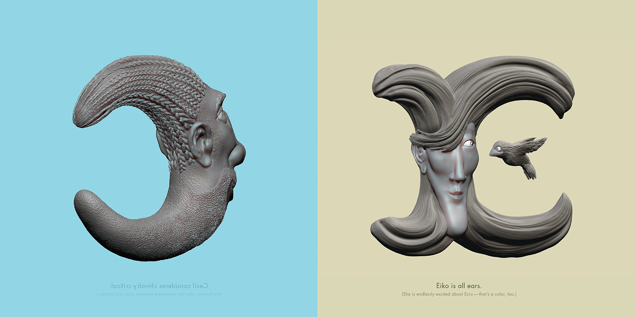
Limbs are even more integrated in Alan Clarvis’s Pasttimes alphabet, with the arm creating all the necessary curves of the letters. Rather than use individual features to make a human face, Stefan G. Bucher’s Letterheads take on the whole head, using coiffure to add serifs. Both Pasttimes and Letterheads also employ a technique popular in full-body letter imagery: feature exaggeration or bodily contortion.
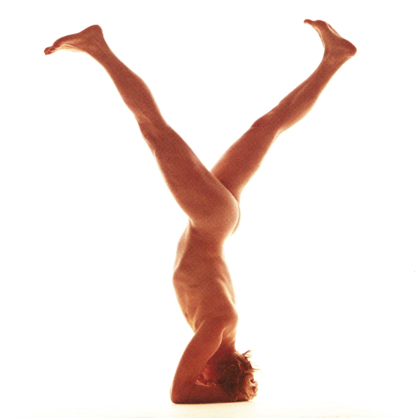
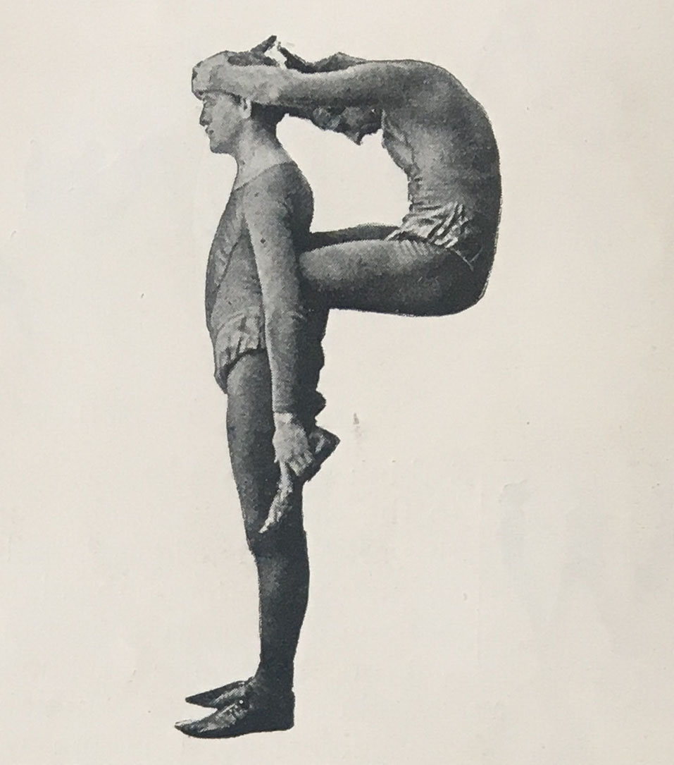
Single Bodies Contorted into Letterforms
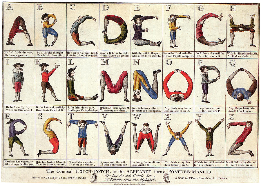
The purposes of advertisement and education provide clear reasons to merge body and letterform: the viewer/reader can personally identify, and thus remember. Yet most of the body-letterforms in our collection have a motive that is not so obvious. These are artistic works, not made for commercial purposes, and many are most certainly not made for children.
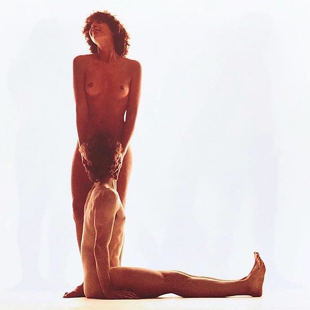
Just My Type is a video in which designer Rick Valicenti hired an online sex worker known as “AliceWorld” for an intimate virtual interaction. Rather than proceed with a typical sexual interaction, he instead directed her to create letterforms with her body, later animating screenshots into a 9-minute movie.
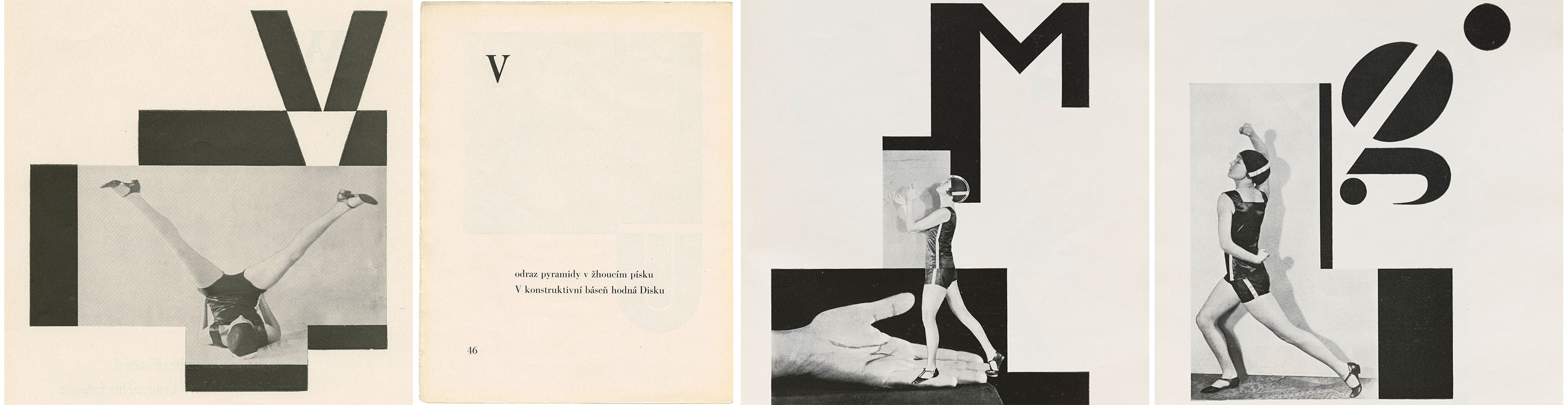
Vítězslav Nezval’s Abeceda partners poetry, type, dance documentation, clothing, and informed consent to create a much less controversial alphabet. Like Just My Type, however, Abeceda uses one woman’s body to create letterforms via photography. In both pieces, the women’s bones prevent perfect legibility, so, perhaps acknowledging this limitation, the paragraphs are positioned next to the letterform they are meant to emulate.
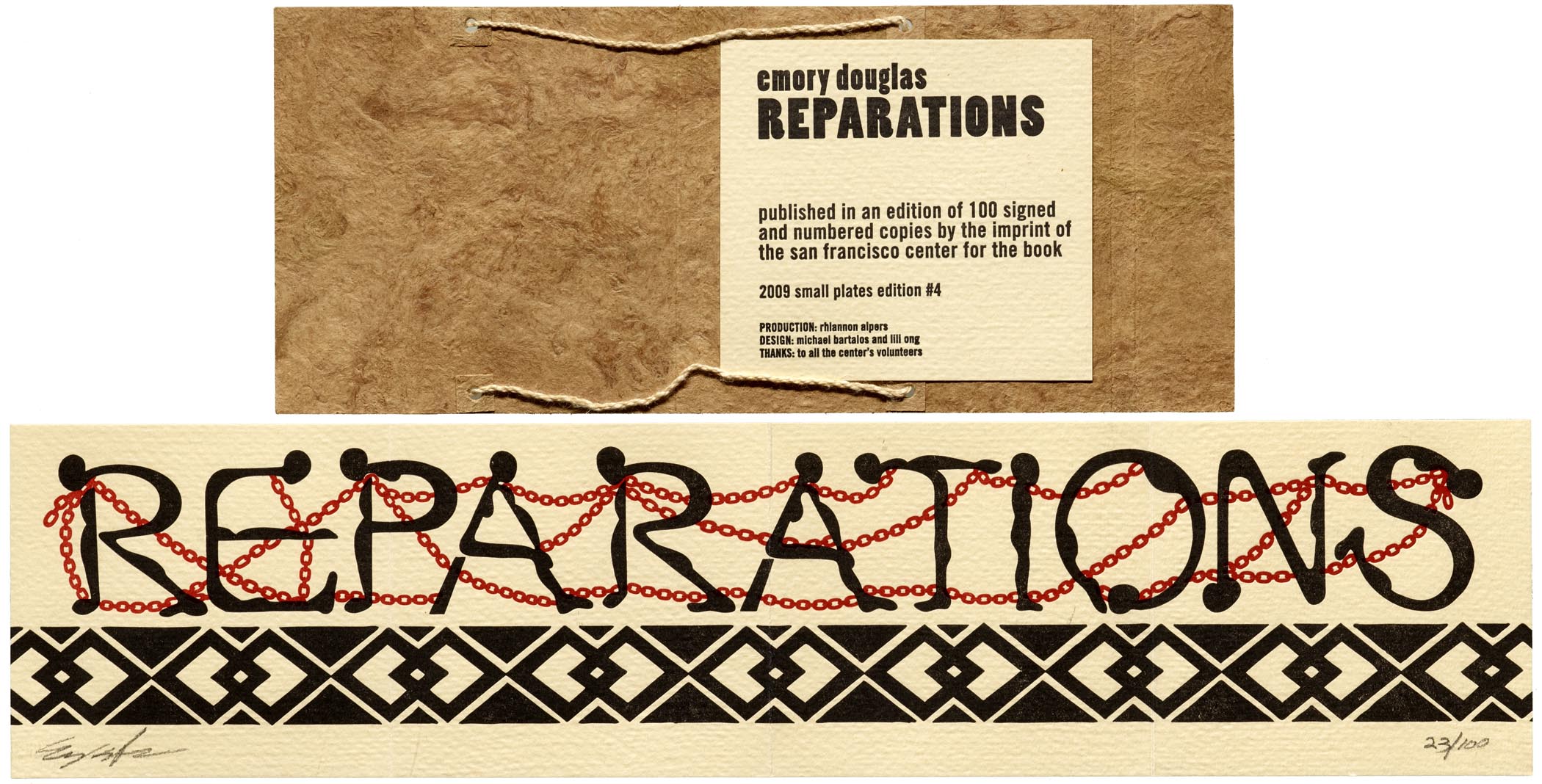
There is a fine line between personifying letters and dehumanizing people that comes into consideration when a body is objectified as a letter. In Emory Douglas’s Reparations, the implicit harm toward human bodies is topical, not incidental. The people he depicts are demeaned by systemic racism and slavery. These degradations are made vivid, even amplified, by the human body’s painful contortion into letterforms. These individuals, bent into letters, speak loudly from the page. They persuasively insist on one restorative action to the horror we see: Reparations.
Bodies Grouped into Letterforms
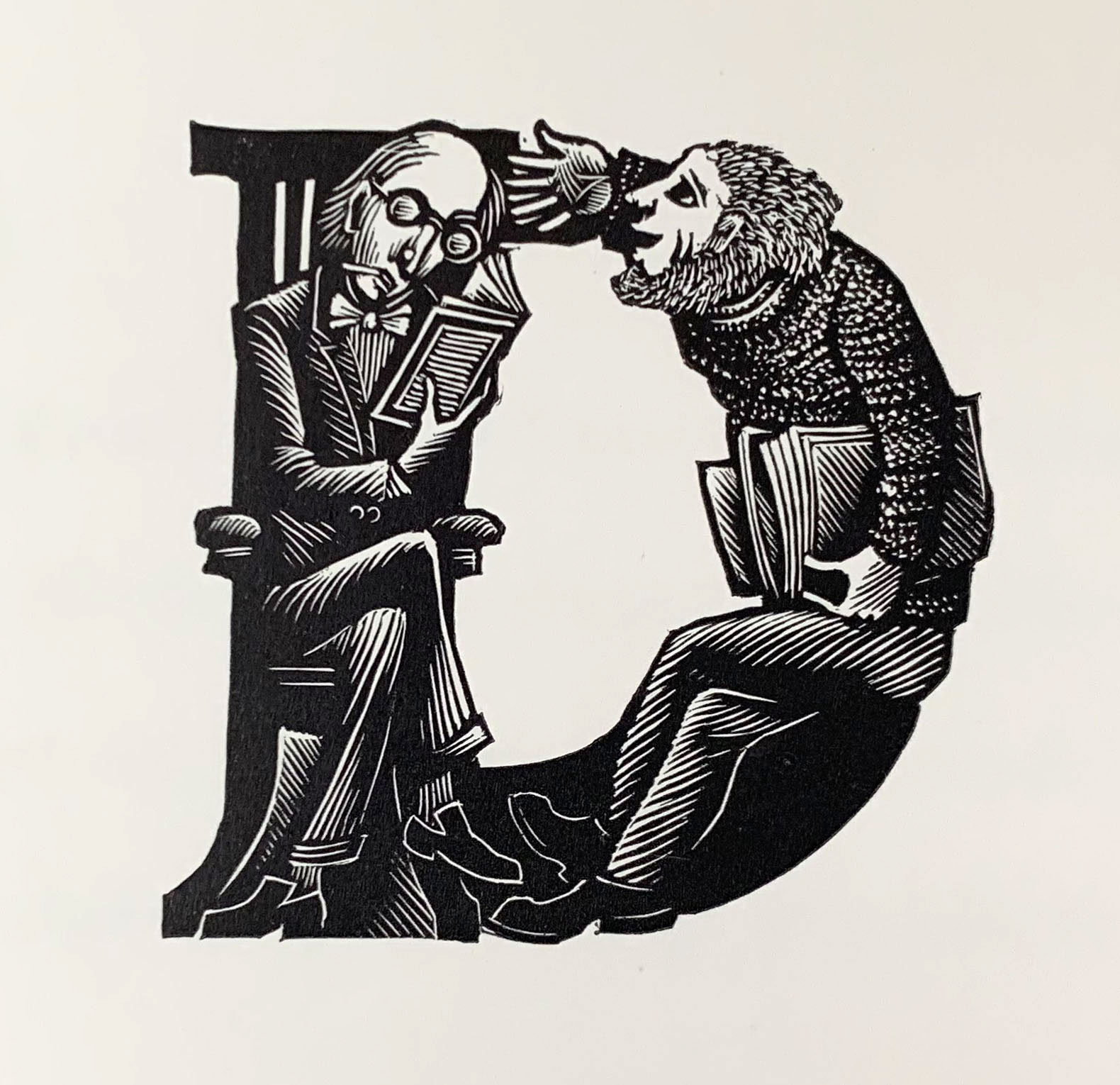
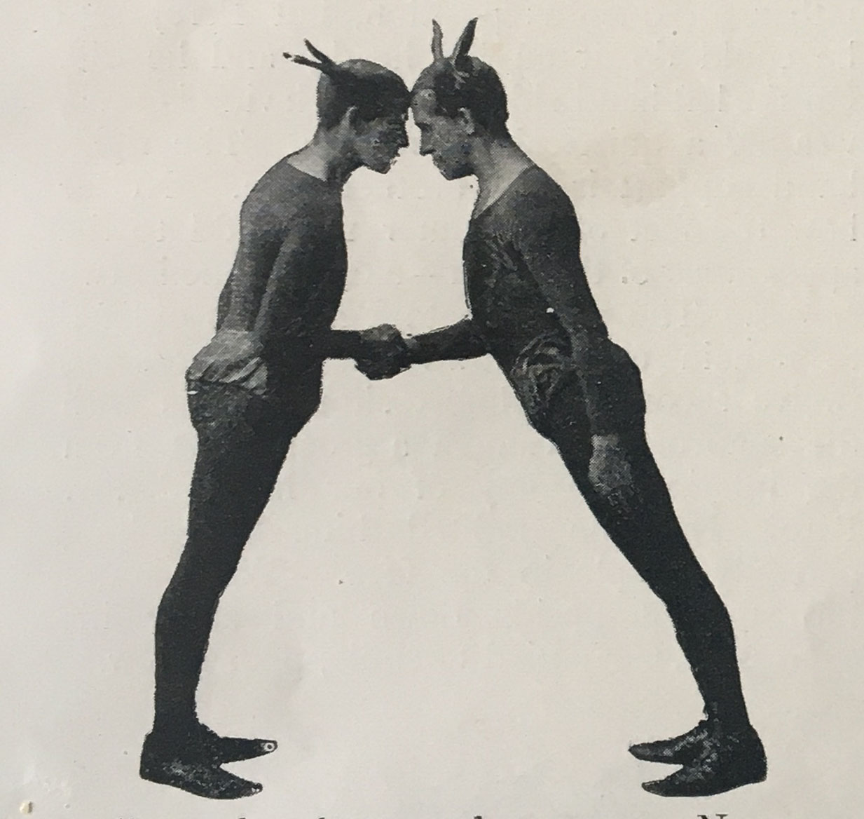
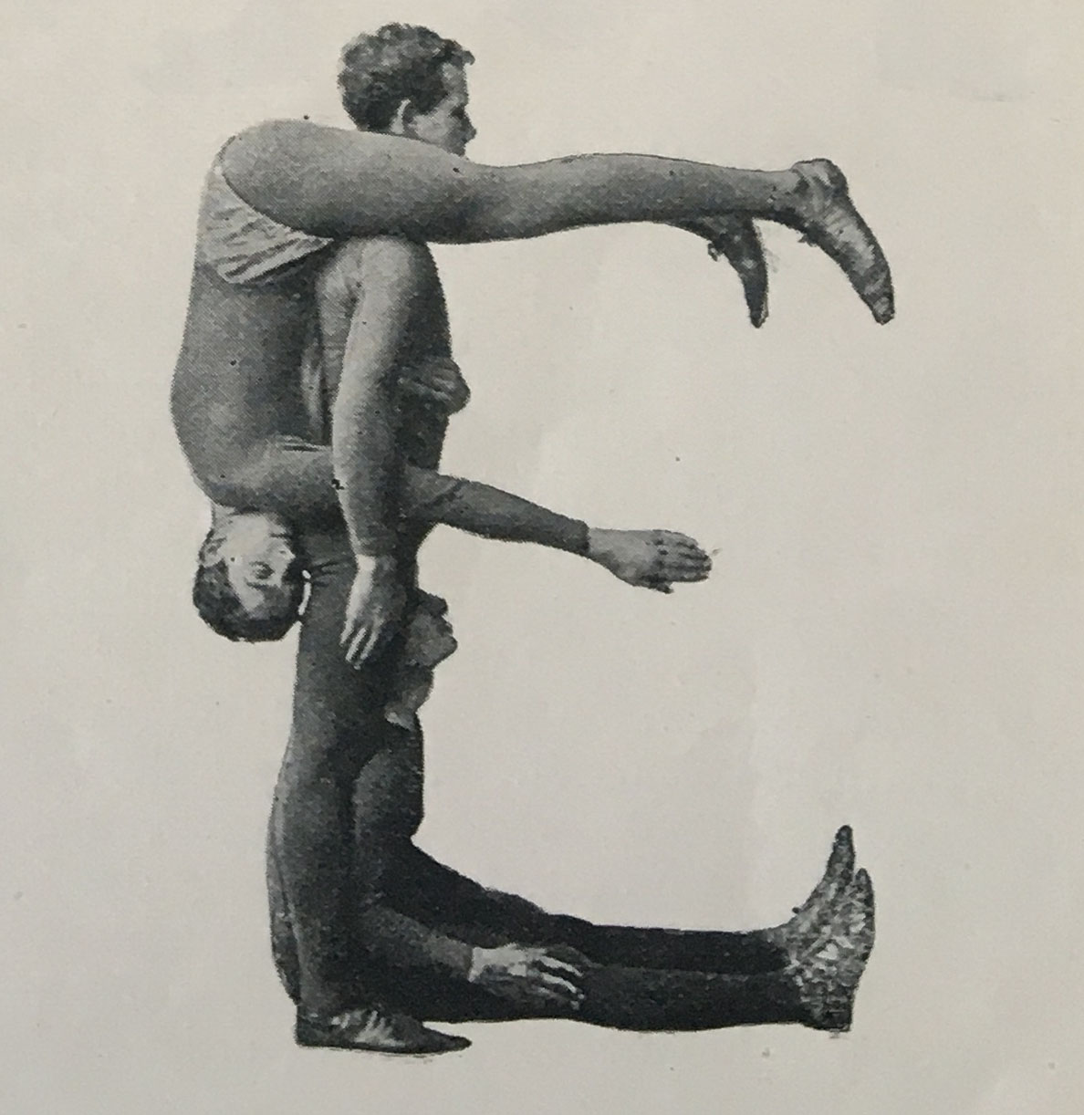
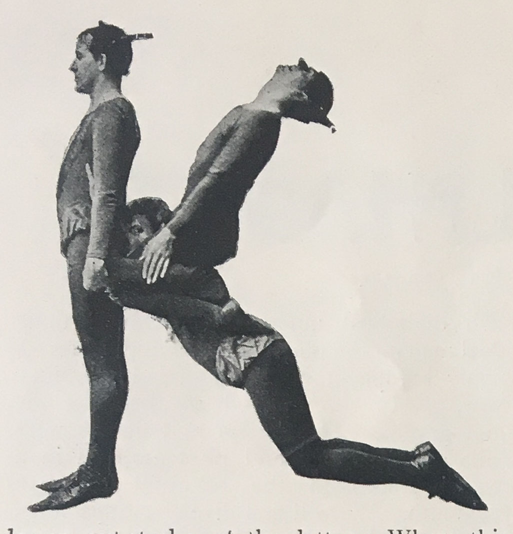
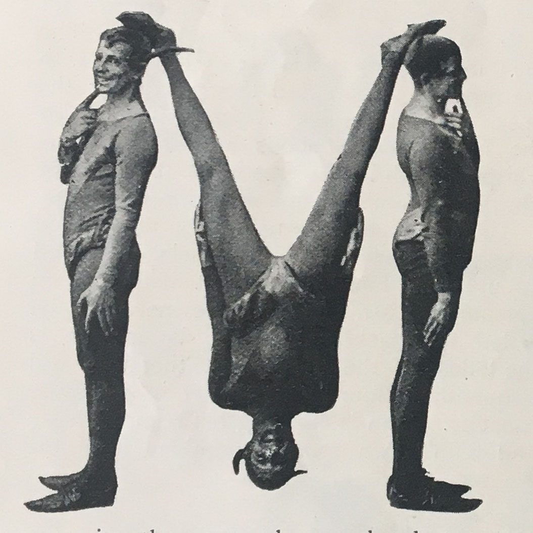

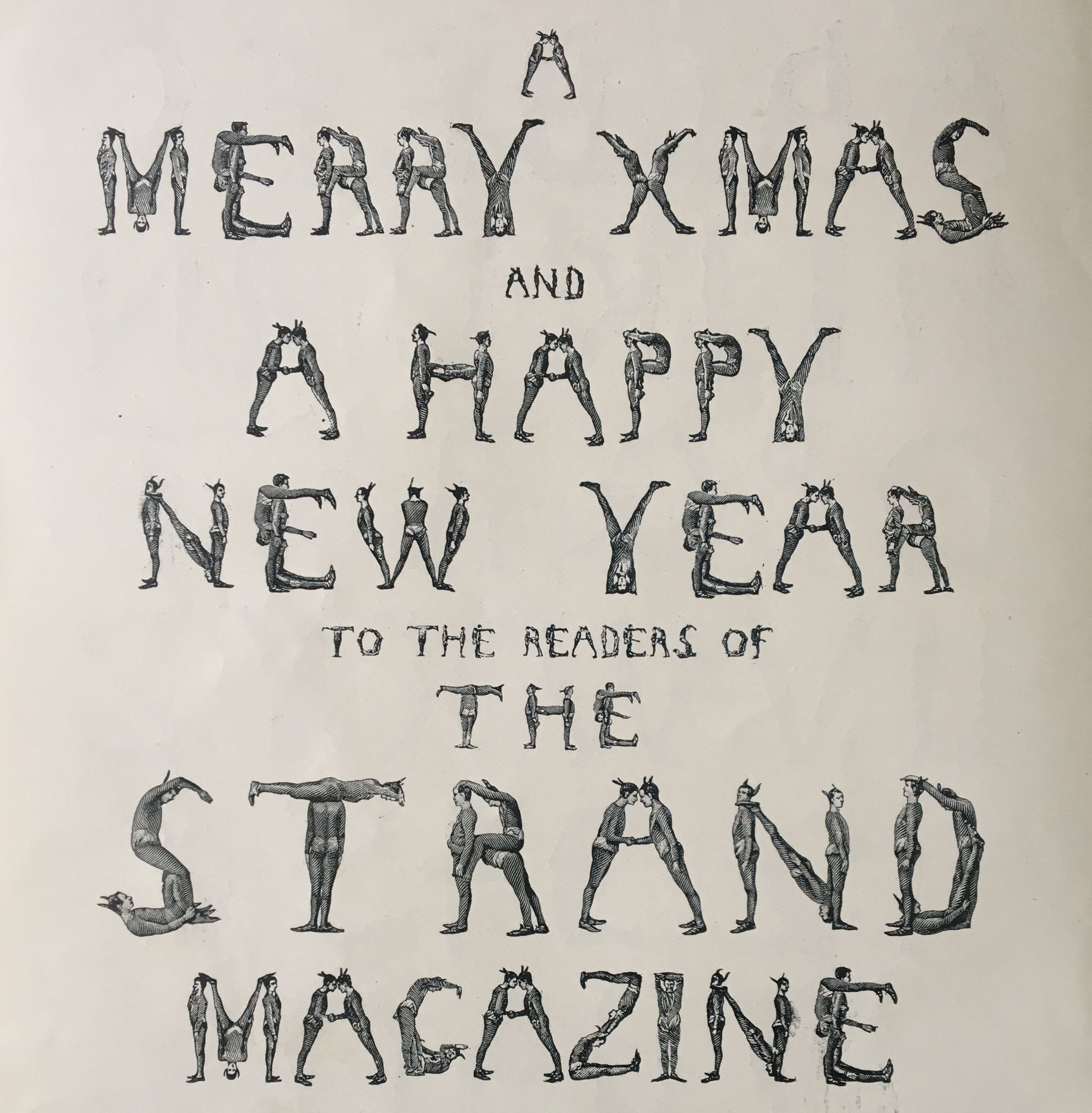
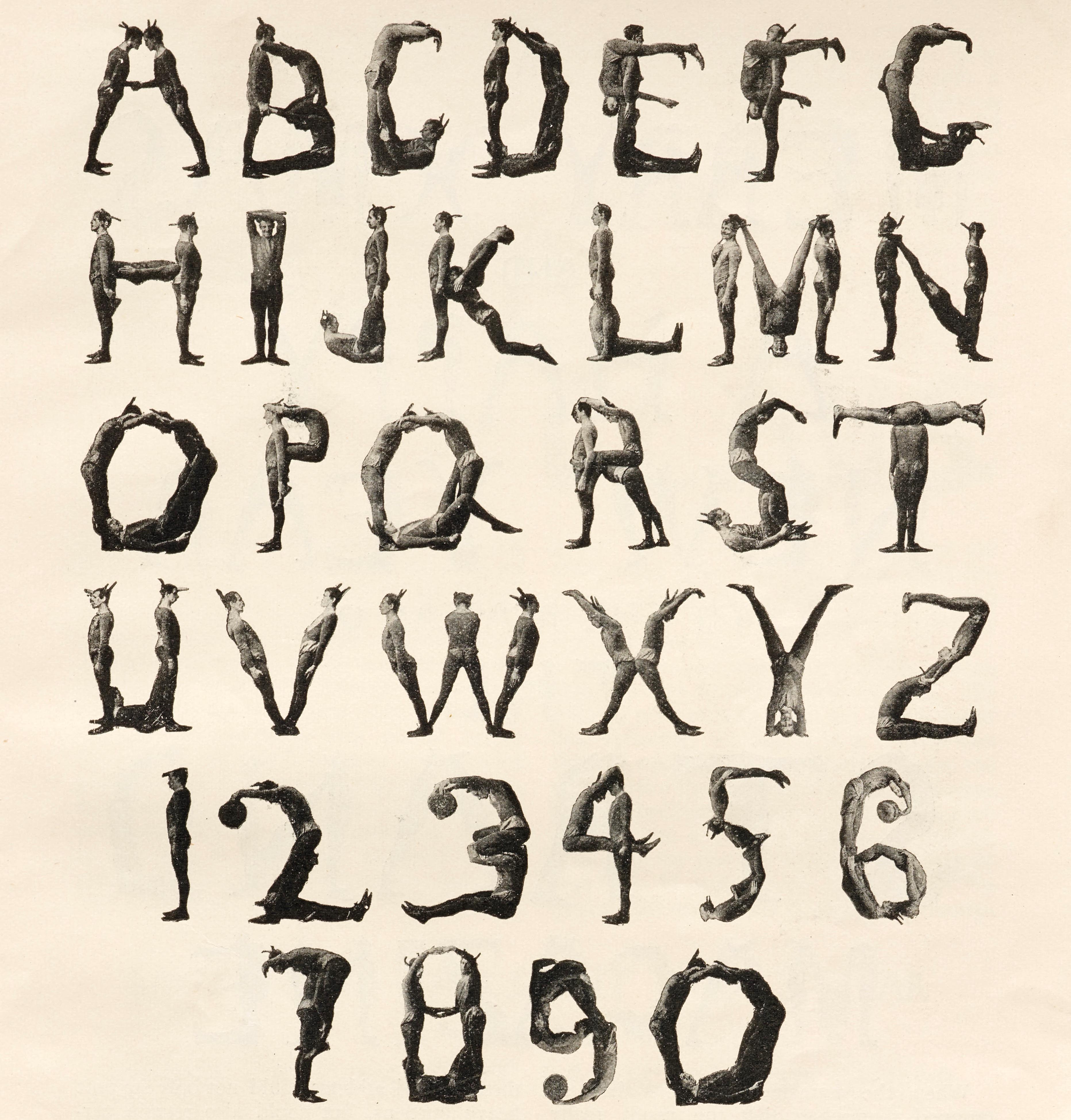
With distortion as the only method of creating legible letterforms with solitary human figures, the use of multiple bodies has attracted interest as an alternative approach. This also brings with it the relationship between figures, and thus far more opportunity for narrative. In Scherman’s 2008 Love Letters, the intimate relationship between human bodies in unusual bodily configuration is the very subject matter of the alphabet, sexuality at its core. Pam G. Rueter’s Van A tot Z is an unwitting portrait of the Letterform Archive which houses it. The illustrations show teams working together to create, discuss, organize, and read books. In the The Human Alphabet (1897), by The Three Delevines and William FitzGerald, the narrative is a bit more of an editorial stretch: “It would form an excellent design for a Christmas card, with seasonable greetings printed below… The crosspiece is simply formed by the men shaking hands, and as it were, whispering Christmas greeting” (FitzGerald).
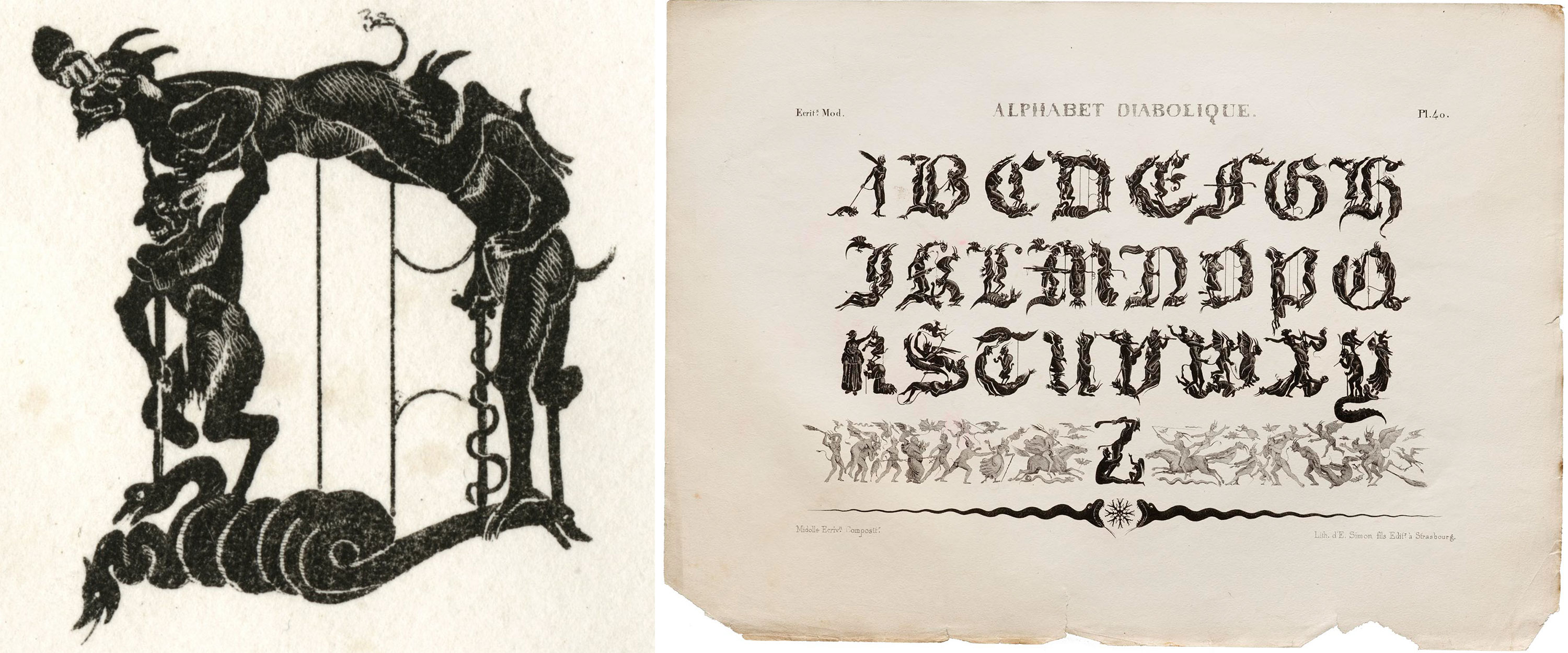
Diabolique, one of Jean Midolle’s highly complex alphabets, is far more irreverent. Despite the fierce religiosity of France at the time, Midolle uses humanesque devil forms to create a blackletter-style alphabet that challenges both the eye and the peace of the viewer. Glancing over Diabolique is a bit like wandering through the landscape of Milton’s Paradise Lost or a Bosch painting; the detail of bodily interaction (devils piercing snakes in D) overwhelms orientation. You may not know where you are or the reason behind the horror of the scene, but you know you don’t want to be there.
Another grim body alphabet — a precise, though abhorrent, recreation of the 1768 typeface Baskerville Old Face — spurns narrative entirely, at the cost of the humans who make up its forms. Anthon Beeke’s original Body Type of 1969 consisted only of young White “girls” (Beeke’s words) from a nude dance troupe. In 2008–2009, Beeke decided to “update” his alphabet with a set of numerals created by apparently younger White girls and adult Black men. Conflating numbers and humans is uncommon in human alphabets, for good reason. Numbers diminish individuals to one variable of our lives: our age, our income, our zip code. Relating numbers to multiple people reduces their humanity even further: numbers imprisoned, numbers killed, numbers infected. They reduce the human being into a body only.
While the Dutchman’s use of nude women’s bodies for the original alphabet is thinly rationalized as a reflection of the 1969 “free love” era, the basis of his decision to use Black men in 2009 leaves one stunned. He describes this nauseating numerizing of Black men as his response to the “great exodus from Suriname” that started 10 years after the original alphabet. He does not mention the history of Dutch colonialism that triggers such diasporas.
I include this work because I do not want to present human alphabets as immune to systemic racism. For some reminders of Black personhood and the strengths of African Diasporic Communities, please check out Emory Douglas’s work.
Letterforms in Bodily Space
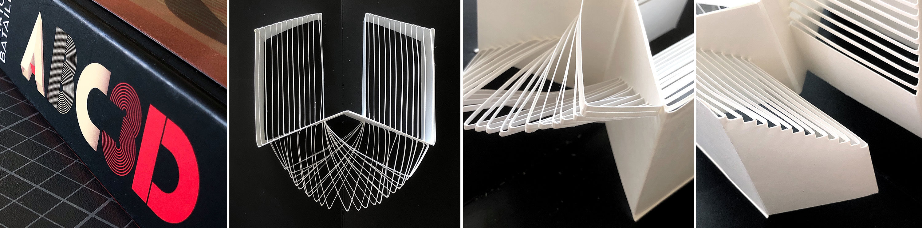
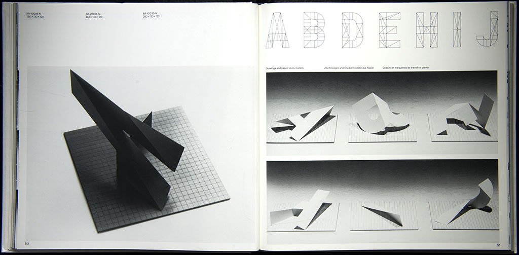
While personified letters, bodies contorted into letters, and letters made from multi-body relationships all put bodies into the flat world of text, there are a number of items in our collection that do the reverse; they put letterforms into bodily space. Marion Bataille’s 2008 ABC3D is the most literal. A pop up book alphabet, it makes a U a physical object. The letters are activated only by the human touch, and seen only by the human ability to change perspective.
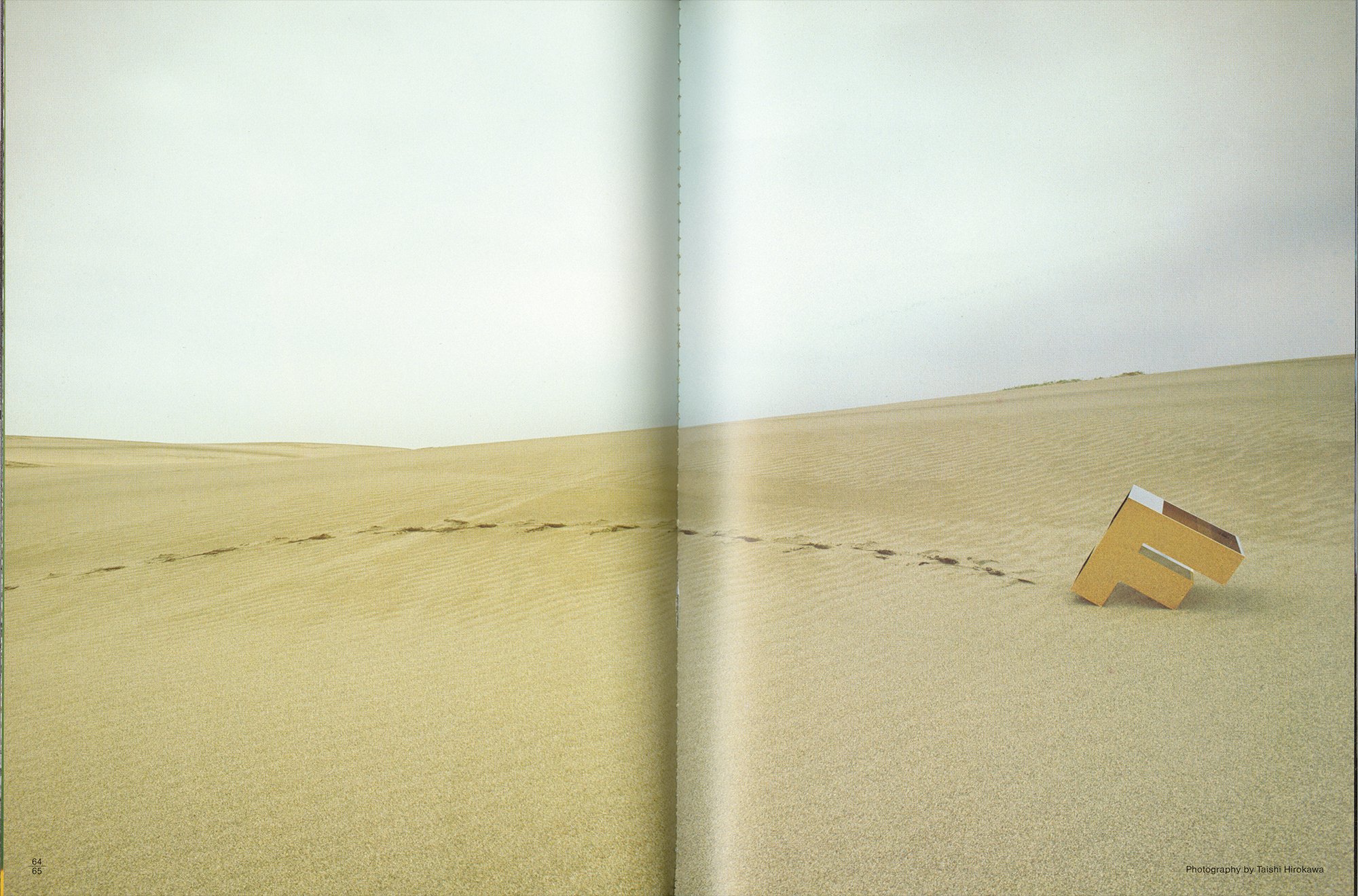
Like ABC3D, some of Takenobu Igarashi’s “environmental alphabets” require the human ability to change bodily perspective: An E created by a child holding half an E on a mirror, shot from the perspective of an adult. Igarashi’s work also features a wildly different approach to personification, that of human action rather than human form. His “F crossing a desert” (my title) is not simply a footprint but a gait, a migration, an internal volition, a reason to walk.
A student of Igarashi, Toshifumi Kawahara similarly imbues relatively straightforward letterforms with human ability, this time not just to walk, but to dance. In Homage to Fred Astaire, part of a larger project called Dancing Alphabet, Kawahara uses 3D animation software to create an F and an A that mimic the forms of Fred Astaire and Cyd Charisse as they perform Dancing in the Dark in the 1953 musical movie The Band Wagon.
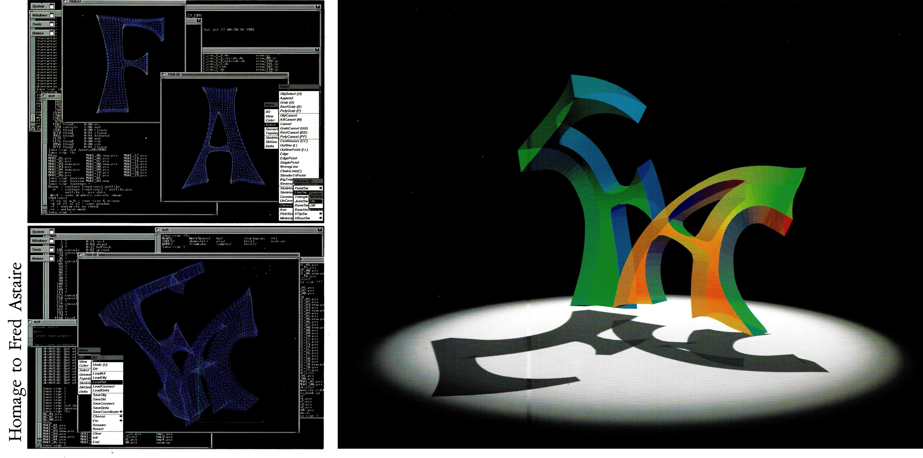
While these works do not create a clear path to align humanity with its text, push into the screen, or repair the damage caused by centuries of mind-body dualism, they do open a space of play, and of wonder. They can change how we see the plain, utilitarian typeface on screen. It is Kawahara’s work and another 3D digital-native project, Letterheads, that demonstrate a true likeness between human forms and letterforms. When in 3D space, Letterforms have a back side, which, like human backsides, are less legibile than their front. So next time you type the letters f and a in sequence, picture Kawahara’s Fred Astaire, then get up and dance.
— sair goetz, Guest Experience Coordinator