News
Now Online: Guest-Curated Tables
We love to set tables for guests. Now we invited them to set their own. Custom collections by Levit, Levée, Morla, Sandhaus, and Weefur weave threads of design history, style, and meaning.
Last fall, when we introduced Tables, a tool for creating sets of typographic artifacts from our Online Archive, we asked a few friends, board members, and staff to put the tool to use. The results demonstrate the myriad ways members can use Tables to build collections of inspiration, research, and resources for use in the studio or classroom.
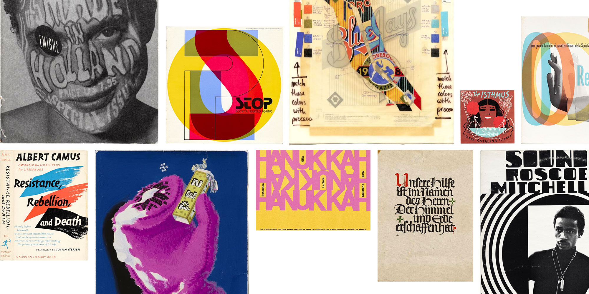
Graphic Means by Briar Levit
This table of artifacts focuses primarily on the production processes of graphic design done manually, with a few items showing early digital type design and page design (Emigre). Included are fonts, type specimens, sketches, mock-ups, paste-up mechanicals, and a proof.
Briar Levit is an educator, designer, and director of the excellent film, Graphic Means, which documents the methods of design in the period before digital desktop publishing. Her Table is a useful companion to her documentary and illustrates how important process material is to our collection. We also recommend the animation clip she recently posted from Graphic Means showing the many steps involved in pre-DTP production.
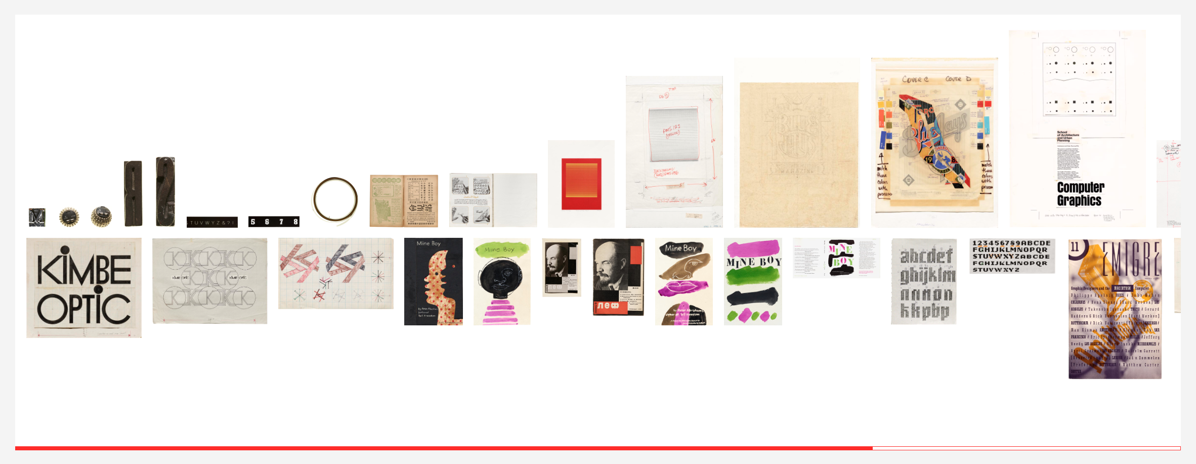
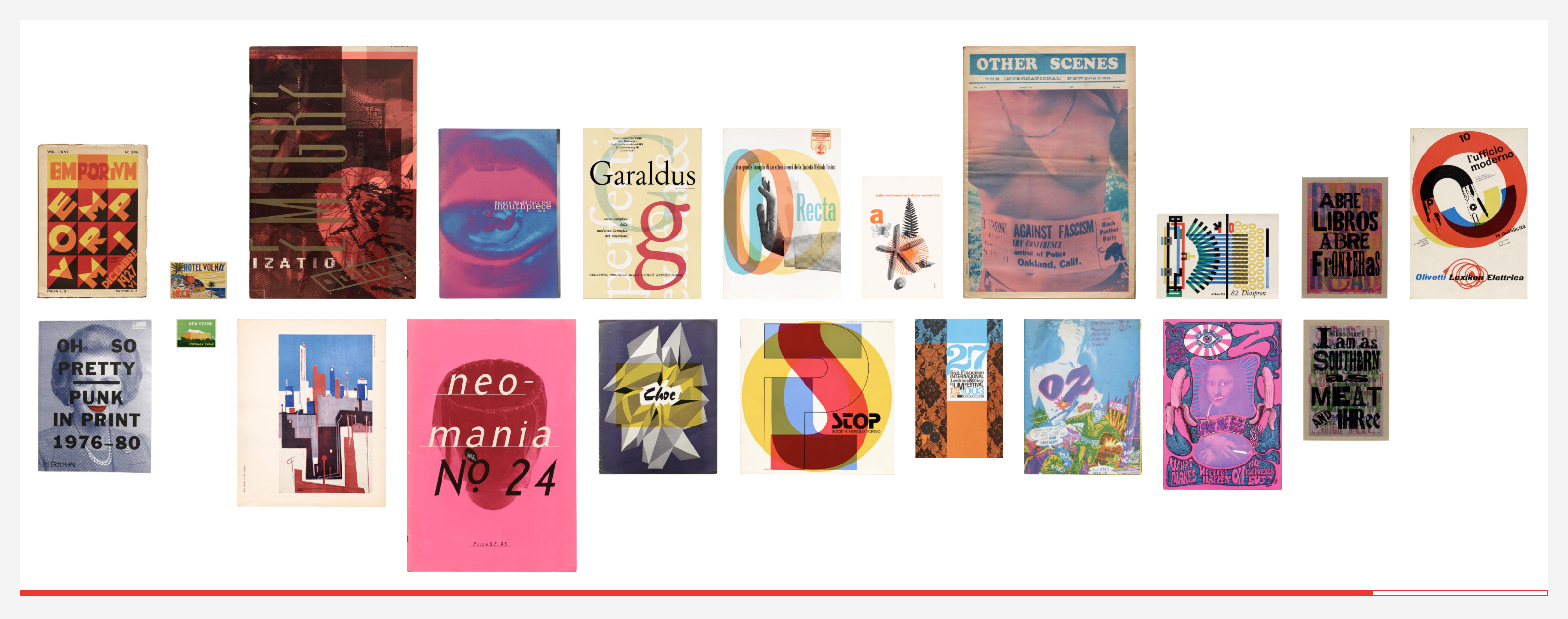
The French Connection by Jean-Baptiste Levée
A collection of various France-related items. With critical texts by French authors, works of fiction(s), but also writing manuals, type specimens, and ephemera.
Jean-Baptiste Levée is the founder of Production Type and longtime supporter of the Archive. He has designed over a hundred typefaces for industry, moving pictures, fashion, and publishing, and his designs are featured in the permanent collections of the Printing Museum in Lyon (France) and the Klingspor Museum in Offenbach (Germany). He is also a board member at ATypI (Association Typographique Internationale).
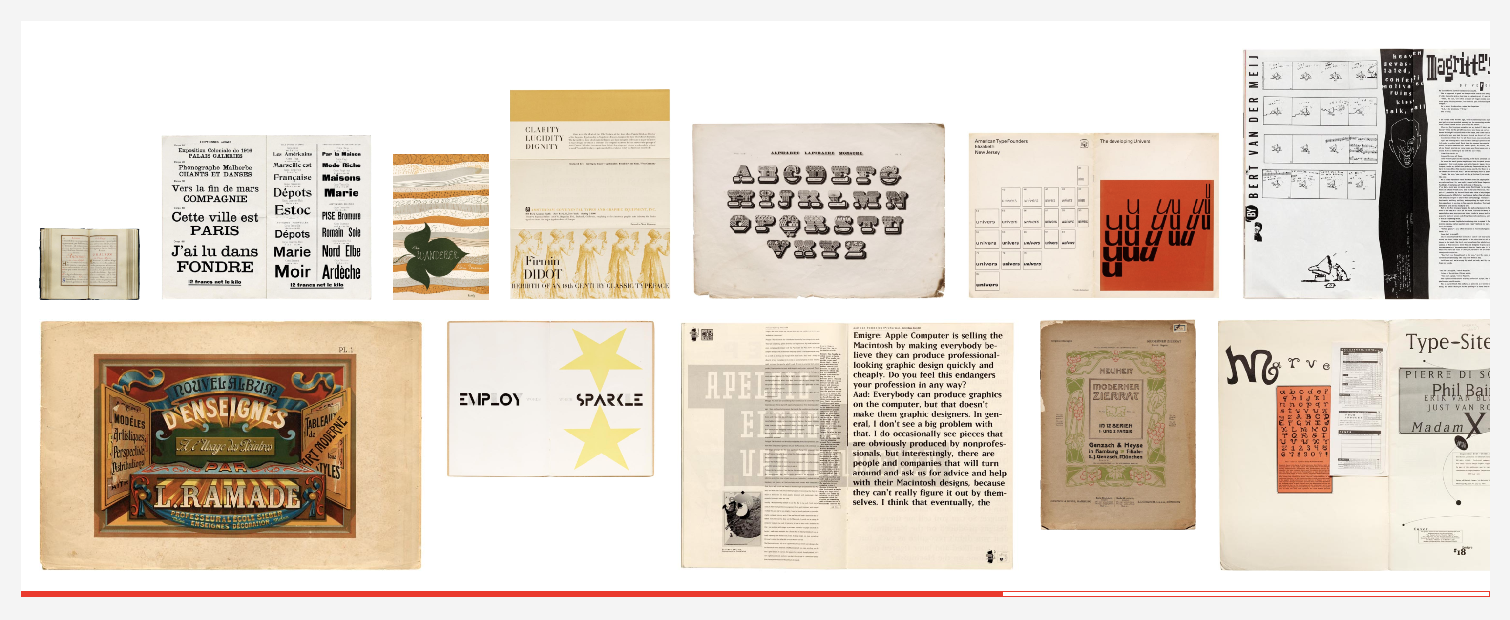
{my 25} by Jennifer Morla
24 examples of great design, and 1 poster that was breakthrough in my design development, assembled in chronological order.
Jennifer Morla is a Letterform Archive board member, President and Creative Director of Morla Design in San Francisco and author of the book Morla : Design. With over 300 awards of excellence, her work is part of the permanent collections of MoMA, SFMOMA, the Smithsonian Museum, the Denver Art Museum, and the Library of Congress.
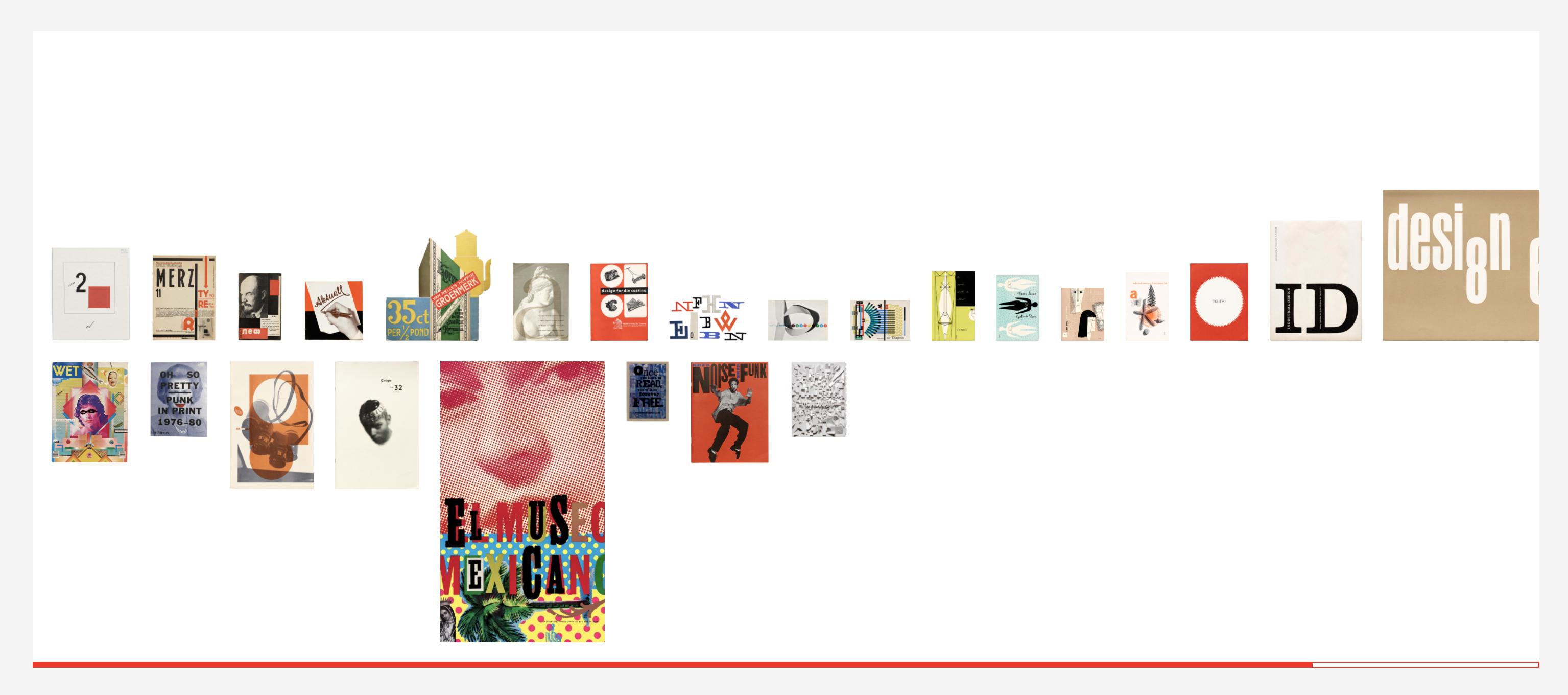
Overprinting (#accidentallyRiso) by Louise Sandhaus
Both of my parents were graphic artists. My first encounter with their work was output from a woodcut printing set-up on the basement ping-pong table. The process was magical to me, but of particular fascination was when colored ink blanketed another colored ink to create new colors. These experiments produced wondrous surprises, since there was no guide to the outcome. It would be just a few years later, in the early 1960s, that I would encounter my dad’s prized Communication Arts Color Guide. This extraordinary volume was the first color guide that showed examples of the colors that could be produced by combining percentages of cyan, magenta, yellow, and/or black ink. Designers then had the formulas for predictable results. Gone was the element of surprise.
At about the same time, however, Communications Company or Com/Co, the printing and communications arm of the San Francisco-based utopian collective, the Diggers, was hacking a Gestetner duplicating machine to produce colorful graphics by overlaying inks. The follow-up to the Gestetner process was the Risographic printer, which offered addition automation. But it was in the 2000s that I began to witness the return of that early experimental impulse of printing, ink, and color, manifest in deliciously rainbow-hued revelations.
These examples show the use of color overprinting throughout the 20th century, capturing some of the delight that I fondly remember and continue to witness.
Louise Sandhaus is a Letterform Archive board member, graphic designer, and faculty at California Institute of the Arts. She founded The People’s Graphic Design Archive and directs it along with Briar Levit and Brockett Horne. Louise is also author of Earthquakes, Mudslides, Fires and Riots: California and Graphic Design, 1936–1986; coauthor of A Colorful Life: Gere Kavanaugh, Designer; and a former AIGA board member.
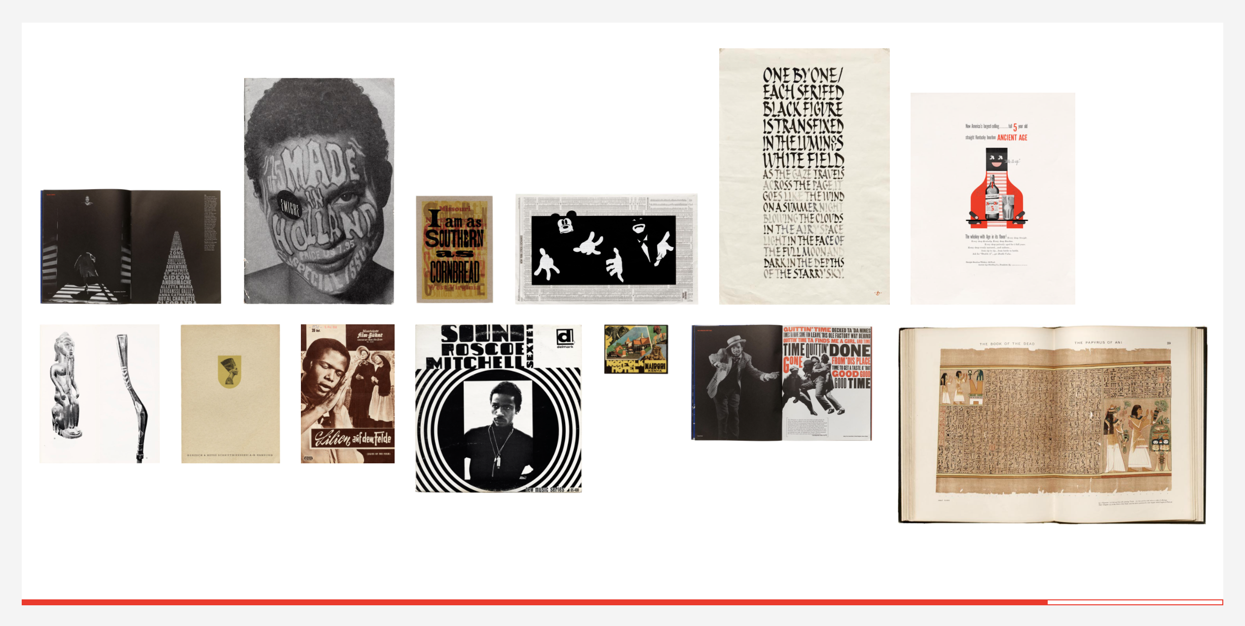
Blackness in Italics by Leila Weefur
In many visual formats, the existence of Black culture is often visible in the periphery, hidden in between the lines, and mirrored in the shape of a letter. This table highlights the displays of blackness, both explicit and implicit, to be discovered in the archive.
Leila Weefur, a Letterform Archive board member, is a trans-gender-noncomforming artist, writer, and curator based in Oakland, CA. Weefur has has worked with local and national institutions including SFMOMA, The Wattis Institute, Berkeley Art Museum and Pacific Film Archive, and Smack Mellon in Brooklyn, New York. They teach at the University of California, Berkeley and California College of the Arts, and participate in the curatorial collective, The Black Aesthetic.
Tables from Archive Staff
Our own team was also deep into Tables over the last few months. The Online Archive has been a vital tool during the pandemic, and Tables help us prepare and present material for virtual tours, online class visits, and lectures like our Salon Series. Here are are a few highlights from our staff:
- Back in Black(letter) — Grendl Löfkvist
- Oh, Hair There — Molly O’Neil Stewart
- Modular Type Joy — Murray Grigo-McMahon
- Draw Your Circles — Paola Zanol
- You’ve Got Mail — Sally Beale
- Women You Don’t Learn About in Design School — Stephen Coles
The ability to link to these Tables is made possible by Table Sharing, a beta feature we’ll roll out to all members soon, giving you the option to make any of your Tables publicly viewable. We’re also working on ways to discover Tables as you browse the Online Archive. In the meantime, please feel free to share these featured Tables with friends, colleagues, and social media, and encourage them to become a member so they can set their own.
Update, March 2022: Table Sharing is now available to all members!