From the Collection: Tadanori Yokoo
Our growing collection of posters by the avant-garde Japanese designer are portals to universes never before imagined.
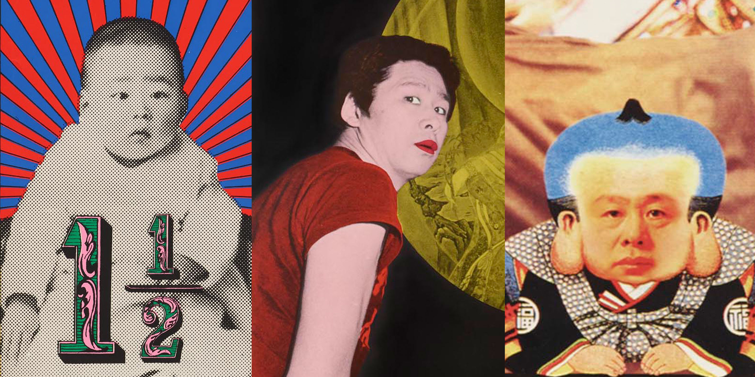
Post-war Japan was a catalyzing backdrop that shaped a generation of artists and designers, including the renowned Tadanori Yokoo (横尾 忠則). Over the span of two decades, the Emperor’s divinity had been absolved, the nation was demilitarized, and US military troops had occupied cities. In 1960, at the age of 24, Yokoo traveled 300 miles from Kobe to Tokyo, to the epicenter of this cultural whirlwind. Tokyo, now home to a rapidly increasing population of over 10 million, was preparing to host the 1964 Summer Olympics while reckoning with violent student protests and riots. There, Yokoo’s practice took root and would earn him a reputation for bridging high and low, pre- and post-modern, and Eastern and Western cultures, and challenging conventions by charging posters with intense emotion. Trailblazing across multiple media, Yokoo responded to absurdities of signs and symbols, tensions between seemingly opposing worlds, and existential questions of the self to offer works that are humorous, chaotic, and deeply autobiographical.