The Archive at LetterWest & Typographics
We’re on the road this June, meeting friends and breaking news at conferences in Salt Lake City and New York City.
Hundreds of items from Rand’s archive, including process material and personal copies of his work, encapsulate a radiant career.
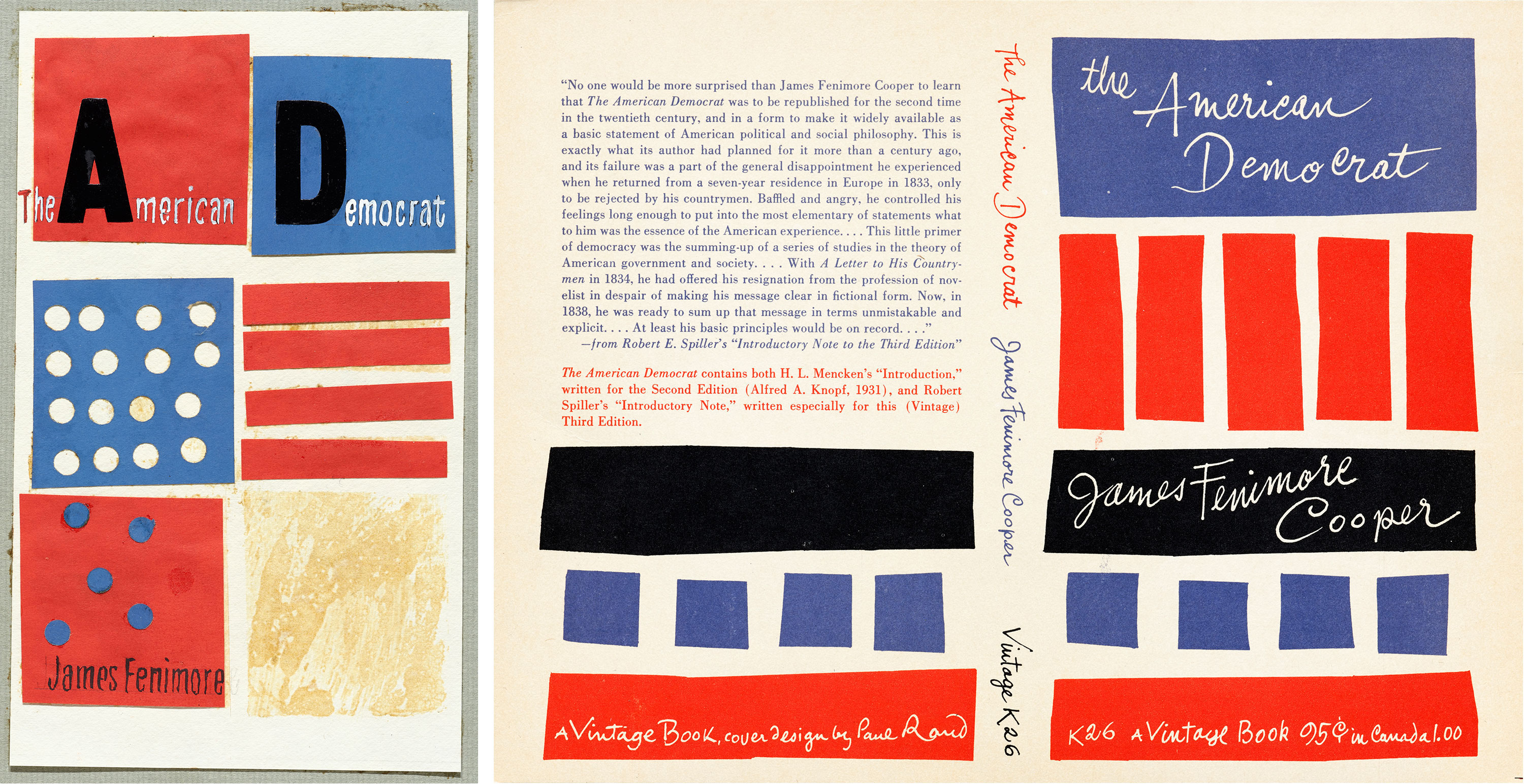
When visitors make requests for Letterform Archive tours and research visits, we hear one name more than any other: Paul Rand. We’ve always had a few special things to show them: brand guides for IBM and NeXT, packaging for Selectric font elements and Producto cigars, and some key poster and book designs. The latest addition, however, brings us a significant collection from his own archive, giving visitors unprecedented access to his work.
Dating back to 1985, specimens of the Korean’s digital type represent the origins of exploration and play found in Hangul design today.
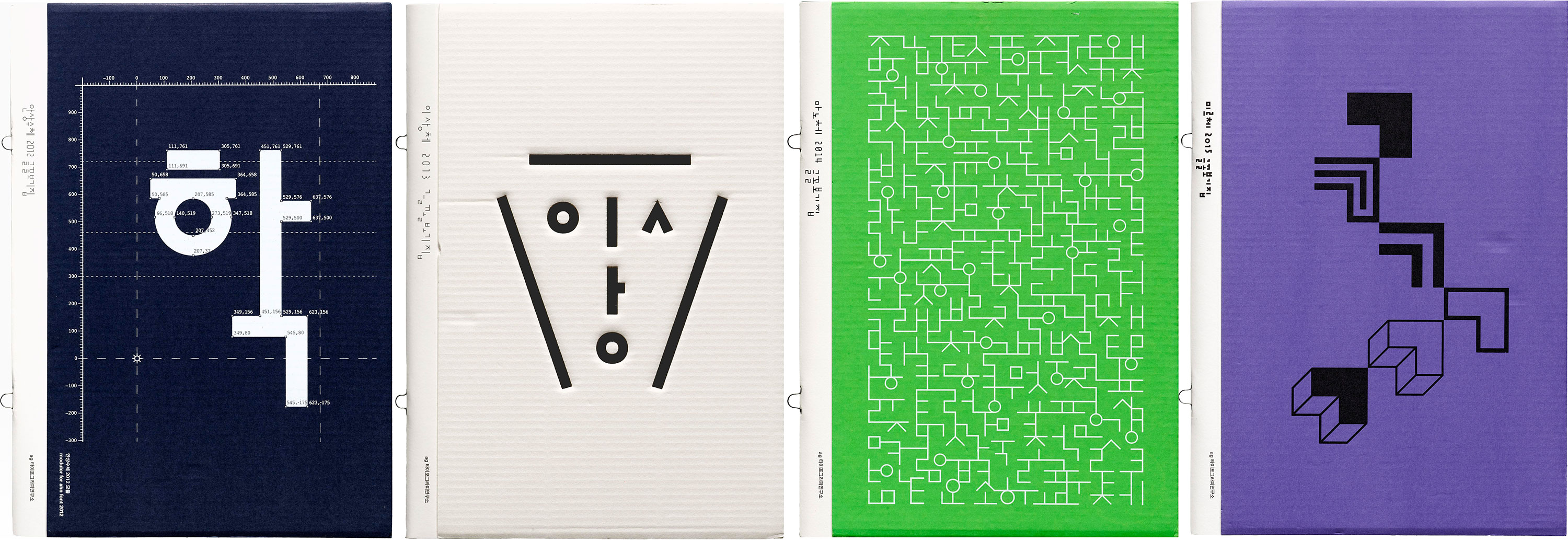
Ahn Sang Soo is often recognized as the father of contemporary Korean type design, and for good reason. His first typeface designed in 1985 broke the molds of Hangul’s traditional design and paved a path of experimentation for the young script. An alumnus and now a professor and Head of the Graphic Design department of Seoul Hongik University, he’s made major typographic contributions in both design and discourse. In 2012, he founded the Paju Typography Institute (PaTI), an alternative design school, as well as AG Typography Institute, an organization that’s dedicated to not only the design of new typefaces, but research, writing, exhibitions, and book design. He’s also published several design books and translated seminal works on typography by Jan Tschichold and Emil Ruder into Korean. Since AG’s founding, Ahn’s original designs have expanded and new faces have been developed. Throughout his career, his typographic lens has also been applied to print magazines, visual arts, photography, poetry, architecture, and more — altogether representing Ahn’s legacy, and his emphasis on the importance of design, research, and play.
Our survey of avant-garde periodicals continues with two magazines that represent the enduring influence of the Bauhaus through the 20th century.
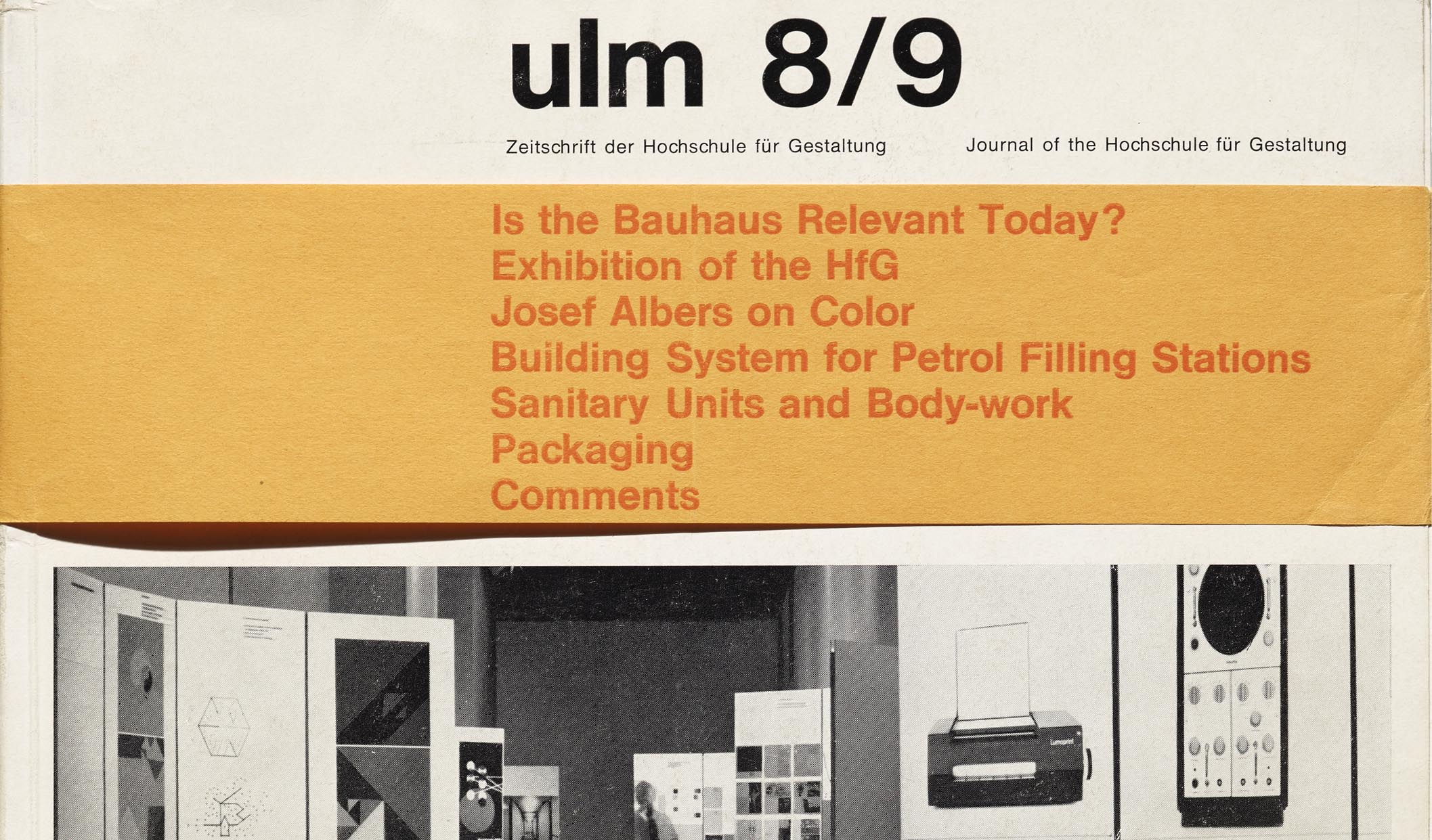
Two weeks ago, our “Periodicals as Collections” series featured bauhaus magazine, the quarterly journal of the German art school that was founded 100 years ago this month. Today, we will explore two more magazines that together weave a narrative about the enduring influence of the Bauhaus through the 20th century. It is also the story of how a particular Bauhaus student would have a hand in continuing the school’s legacy.
Our survey of avant-garde periodicals continues with a closer look at the Bauhaus’s magazine on the school’s 100th birthday.
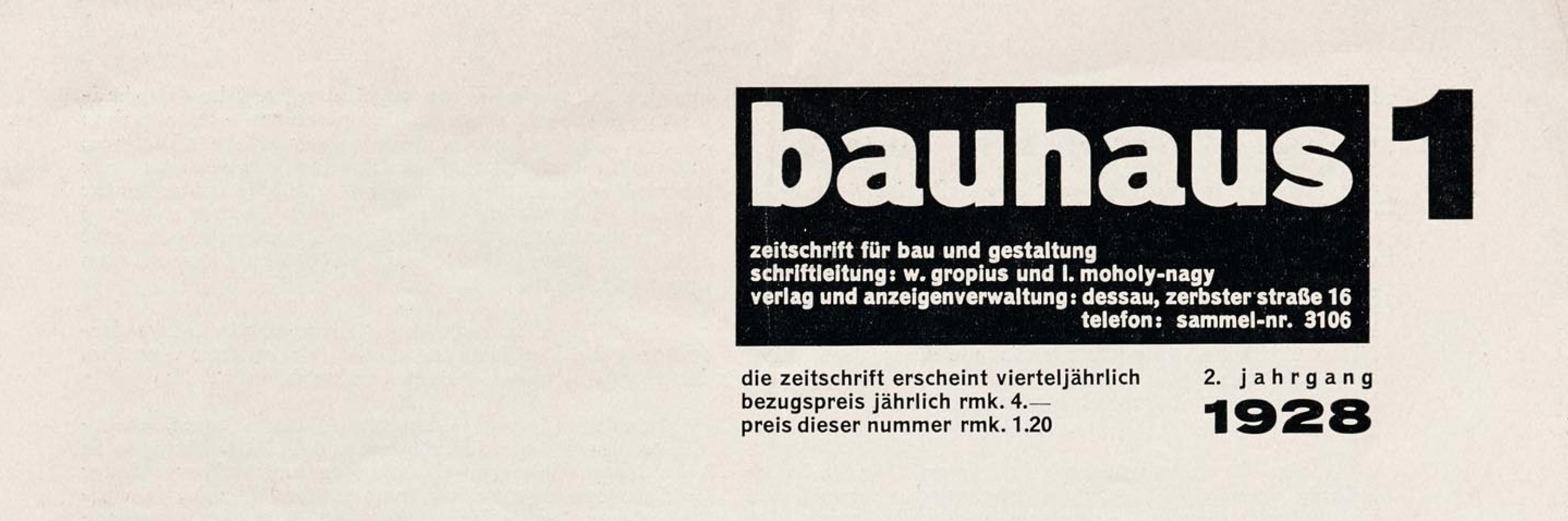
The second installment of Letterform Archive’s survey of avant-garde periodicals recognizes an auspicious occasion. This month marks the 100-year anniversary of the founding of the Bauhaus, one of the most significant and influential institutions in 20th-century design history.
The Chicago-based activist’s dynamic album covers of the 1960s expand our sense of design history.
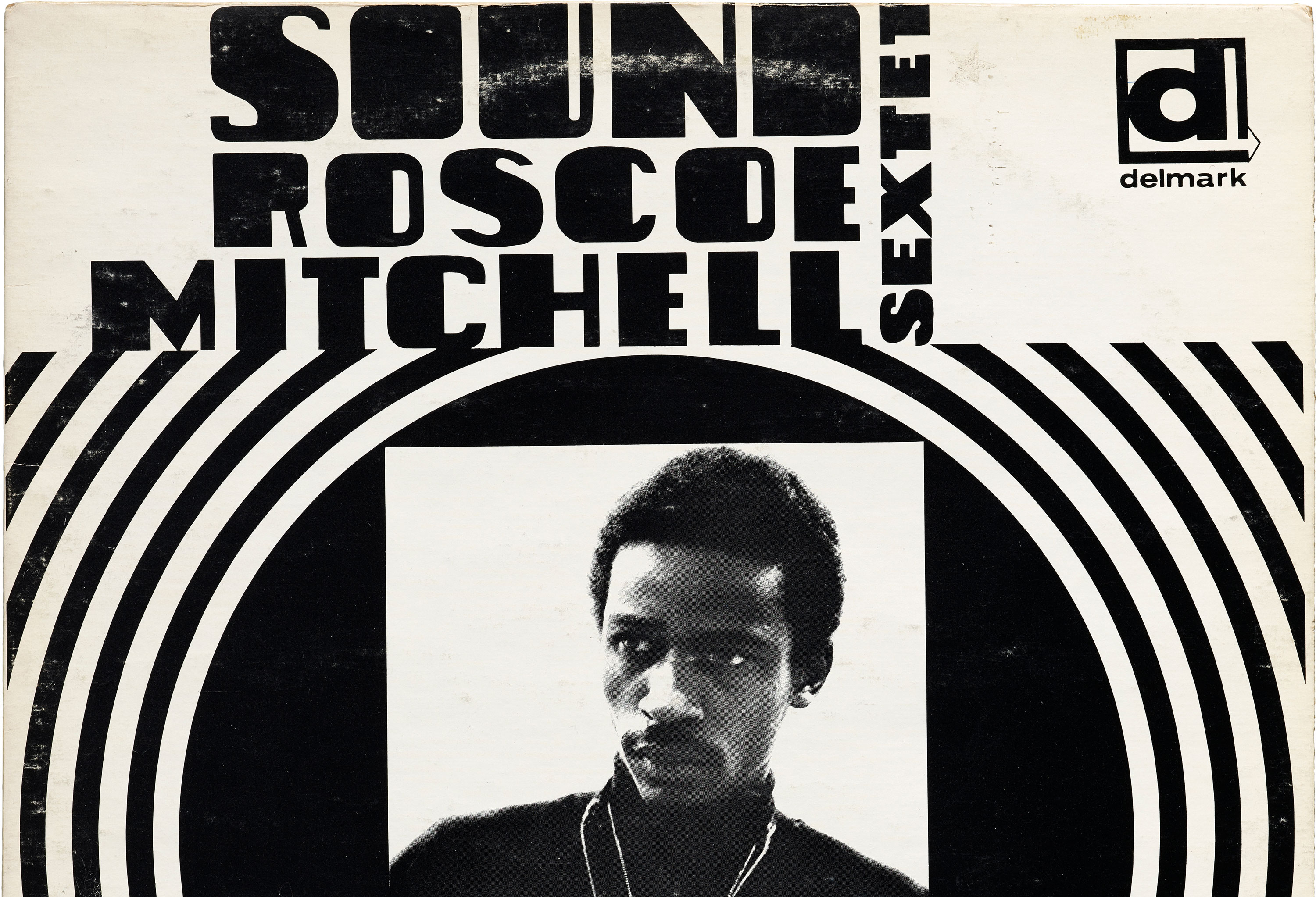
In late 1960s Chicago, Sylvia Abernathy was all at once a college student, activist, and graphic designer. Having later changed her name to “Laini”, Abernathy is best known for working on the Wall of Respect, a community mural in the South Side on 43rd and Hayward Streets. The effort was collaborative, a creative orchestration by the Visual Arts Workshop arm of the Organization of Black American Culture (OBAC). During these years, Abernathy was also designing album covers for jazz musicians under Delmark Records. Four of Abernathy’s albums live at the Archive and hold a special place in our collection. They represent a part of her work that has yet to be researched extensively, and they demonstrate a way of combining type, image, and color that sets her apart from her contemporaries.
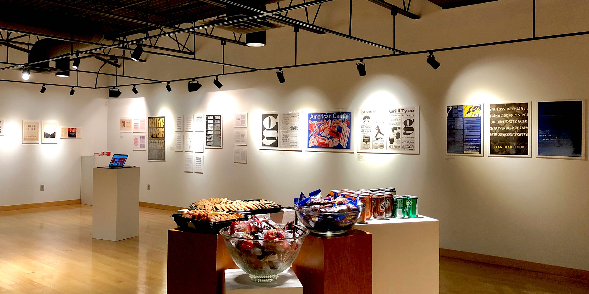
Our collection offers the opportunity to tell a thorough history of type. Last month we took that story on the road.