News
Periodicals as Collections, No. 1: Het Overzicht and Wendingen
A magazine is a microcosm of collecting and curating. Our new series explores the connections within and between our collection of avant-garde periodicals.
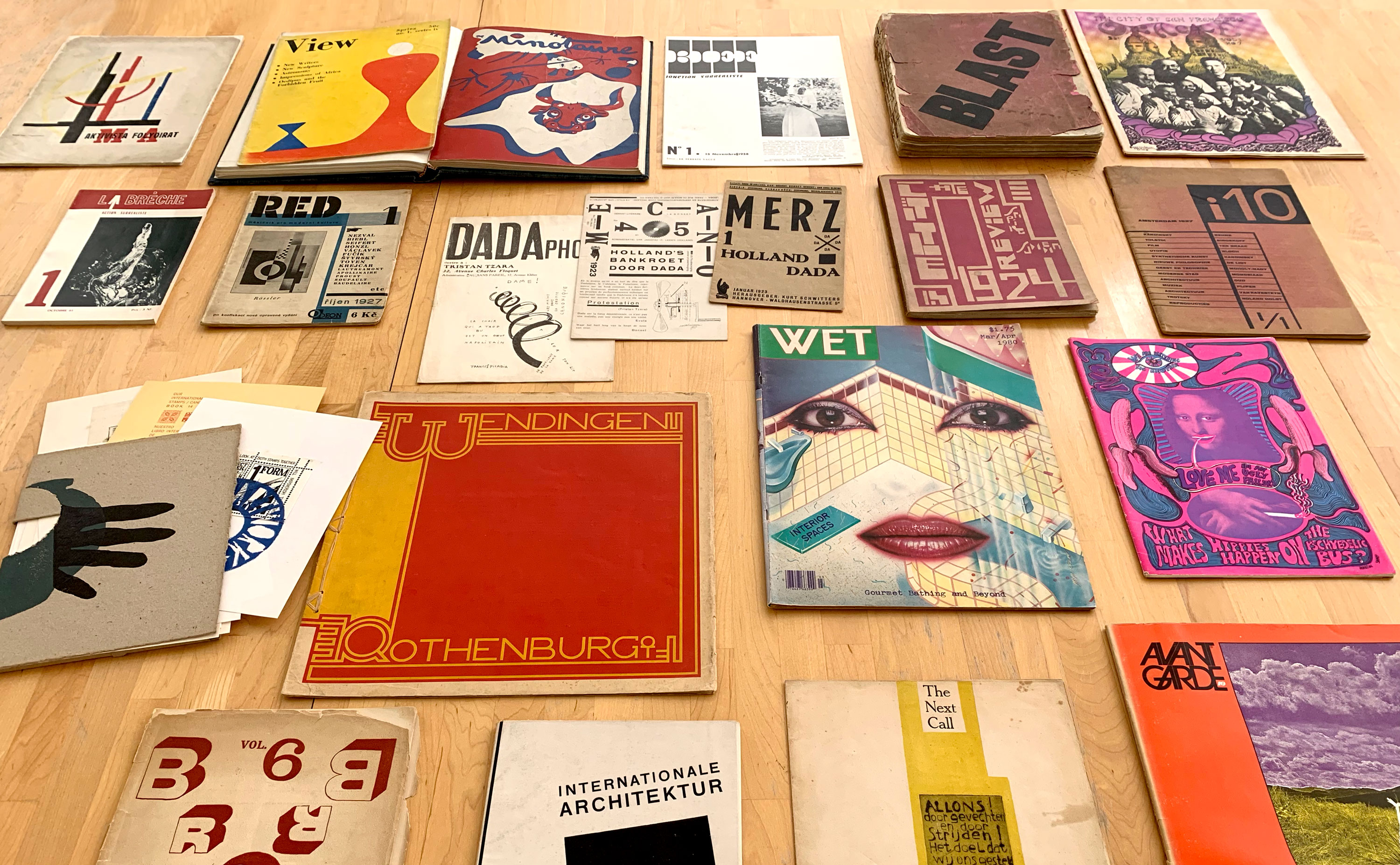
The most radical ideas and techniques of the avant-garde movements of the 20th century were perhaps nowhere better expressed than in their prolific explosion of periodical publications. Not only were these the most frequent vehicles for manifestos and early research and experiments in literature, visual art, and design, the process of editing an avant-garde magazine itself often utilized tactics like montage, juxtaposition, collaboration, and free-association, which are hallmarks of modernist art practice. The best periodicals of the avant-garde embody a spirit of total freedom, experimentation, community, and eclecticism.
In a way, the impulse behind periodical editing of this kind is not so different from the curation* of a collection such as Letterform Archive’s. Like a periodical, a curated collection is a place where a diverse array of materials is united under a unique mission statement or communal project. At the same time, both periodicals and collections are constantly in flux, adding new material and contributors, and making new connections between them. In addition, at the Archive, our collection houses not only finished works and standalone objects, but sometimes the drafts, process work, documents, and research behind them. Similarly, a magazine, because of its periodical and serial nature, is a format better suited for experiments, works-in-progress, and provisional investigations than the final product of a book, poster, or painting hung on a wall. Collections and periodicals are relieved of the burden of having to stand in isolation and speak for themselves, since all the neighboring materials and information each do their part to illuminate and support one another in a world they share.
So, periodicals, like collections, can be technologies of anti-entropy. If things and ideas have a tendency to drift apart and become lost to one another, periodicals and collections help bring them together, to bind them to contexts and to catalog and solidify their relationships and juxtapositions. And, if one knows how to “read” a collection or periodical, it is possible to recover and help preserve these relationships.
To that end, Letterform Archive launches this new series to survey our collection of avant-garde periodicals and the network of connections within and between them. In the process, we hope to demonstrate the ways in which diverse materials can be related to one another, how to find these relationships, and open the door for researchers and visitors to the Archive to make their own connections within the collection, and from the collection to the outside world.
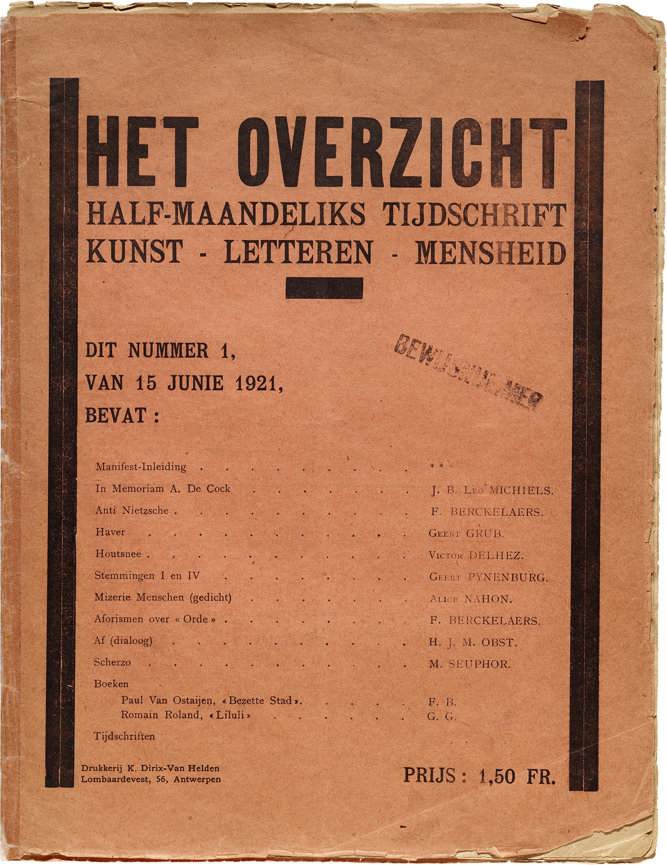
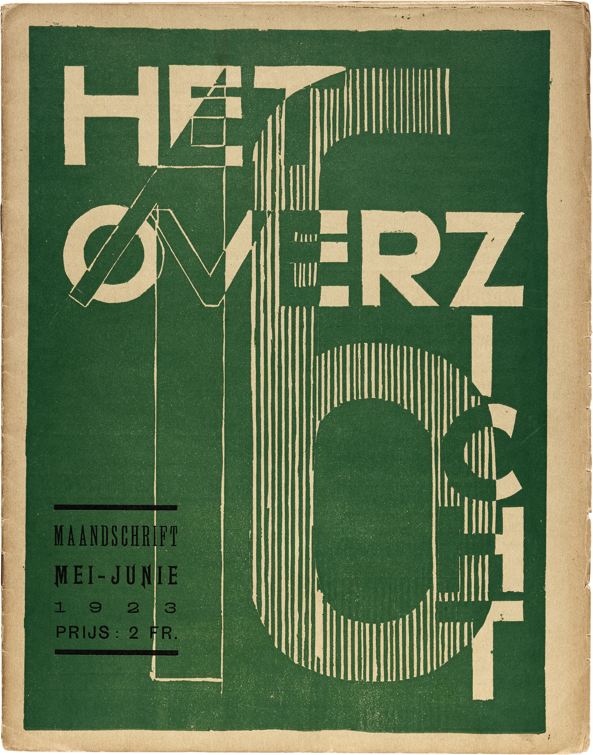
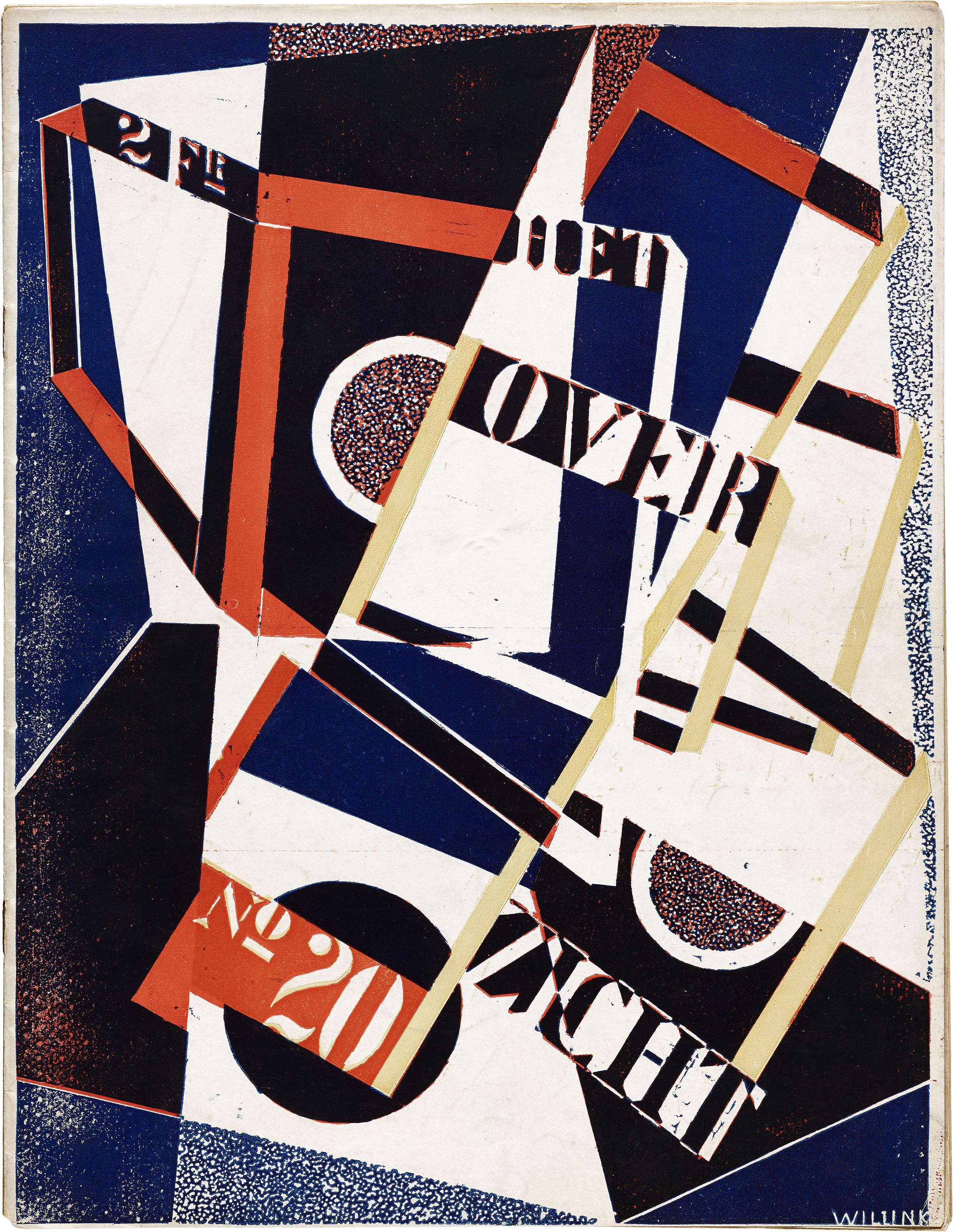
To begin the series, we’re featuring two Dutch-language periodicals that exemplify the spirit of eclecticism and connection, and help foreshadow some of the other magazines to come. The first, Het Overzicht (“The Panorama” or “The Overview”), was a Belgian periodical published in 24 numbers from 1921 to 1925 under the primary editorship of painter and poet Fernand Berckelaers (pseudonym Michel Seuphor), and initially co-edited by Geert Pijnenburg. Het Overzicht shows how the dialogue of some artists and editors with the avant-garde serves to broaden the scope and horizon of their works.
Het Overzicht
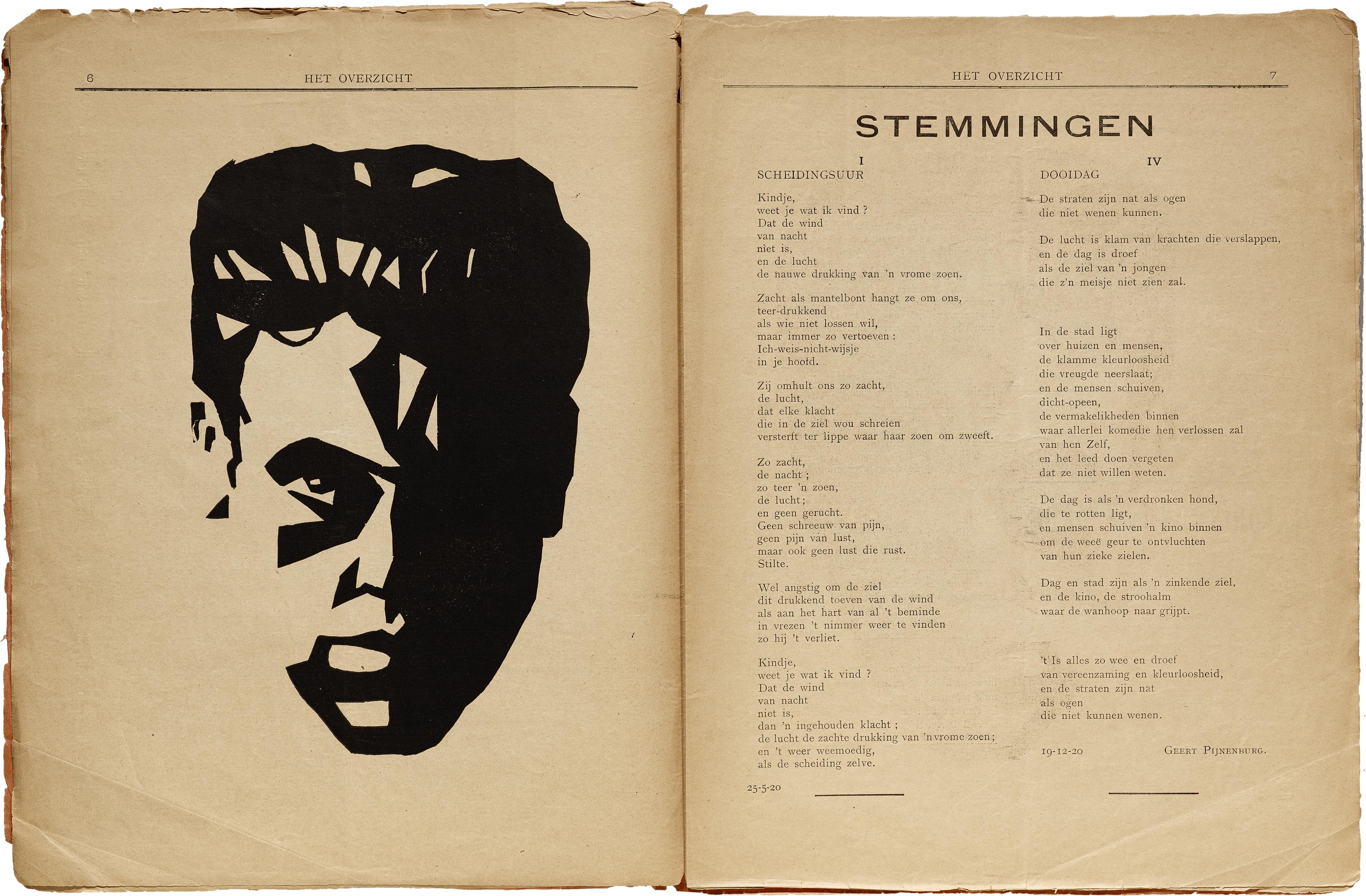
Displaying only vague hints of what it would become in the latter half of its run, Het Overzicht’s first 12 issues sported a consistent and relatively modest cover design, and contents that bear as many traces of 19th-century proto-modernism as the 20th-century avant-garde. The poetry frequently rhymes, and the visual art is often representational lino- or woodcuts. In this earlier stage, Het Overzicht also promotes a politics of Flemish nationalism, and was originally distributed outside meetings for the “flamingant” movement.
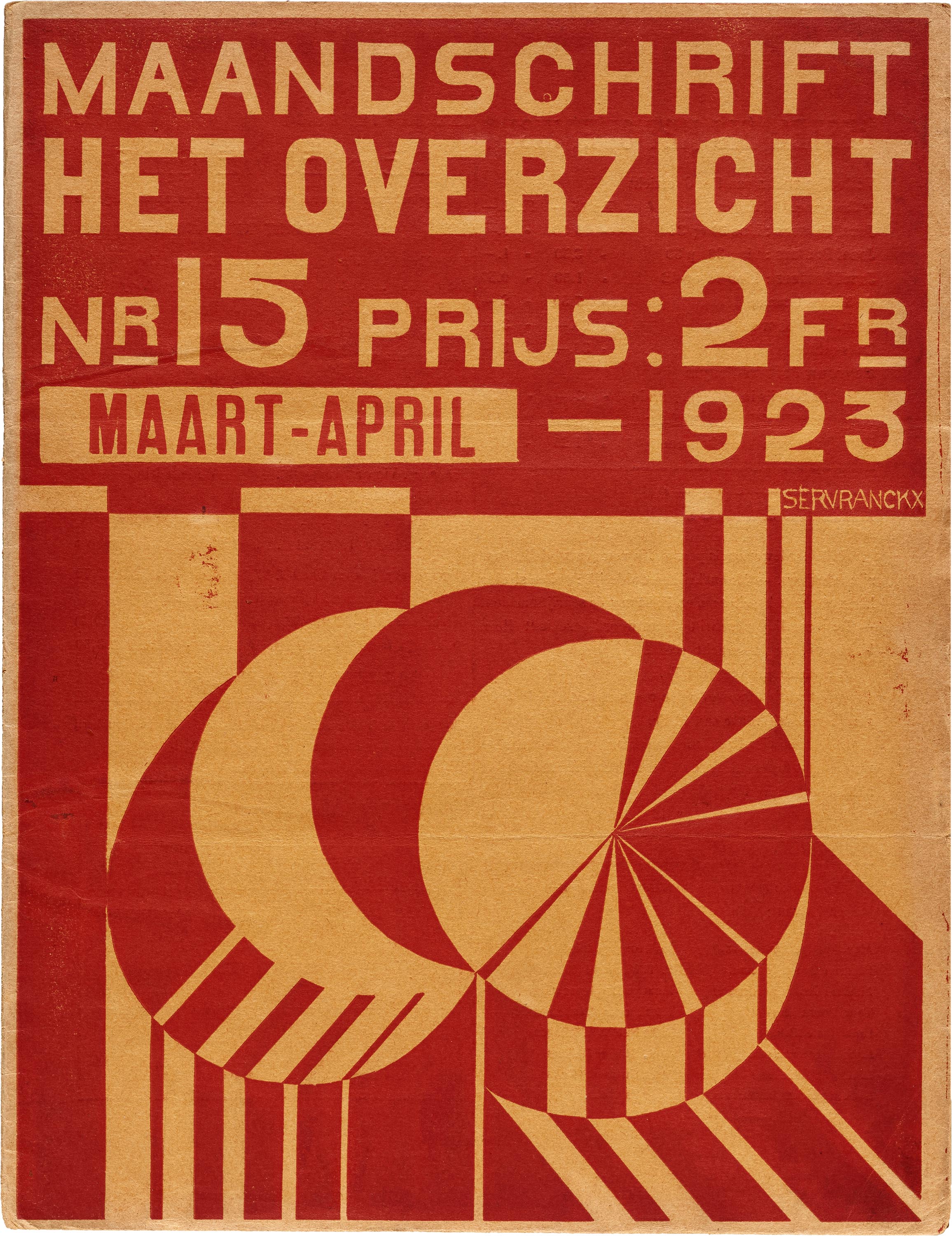
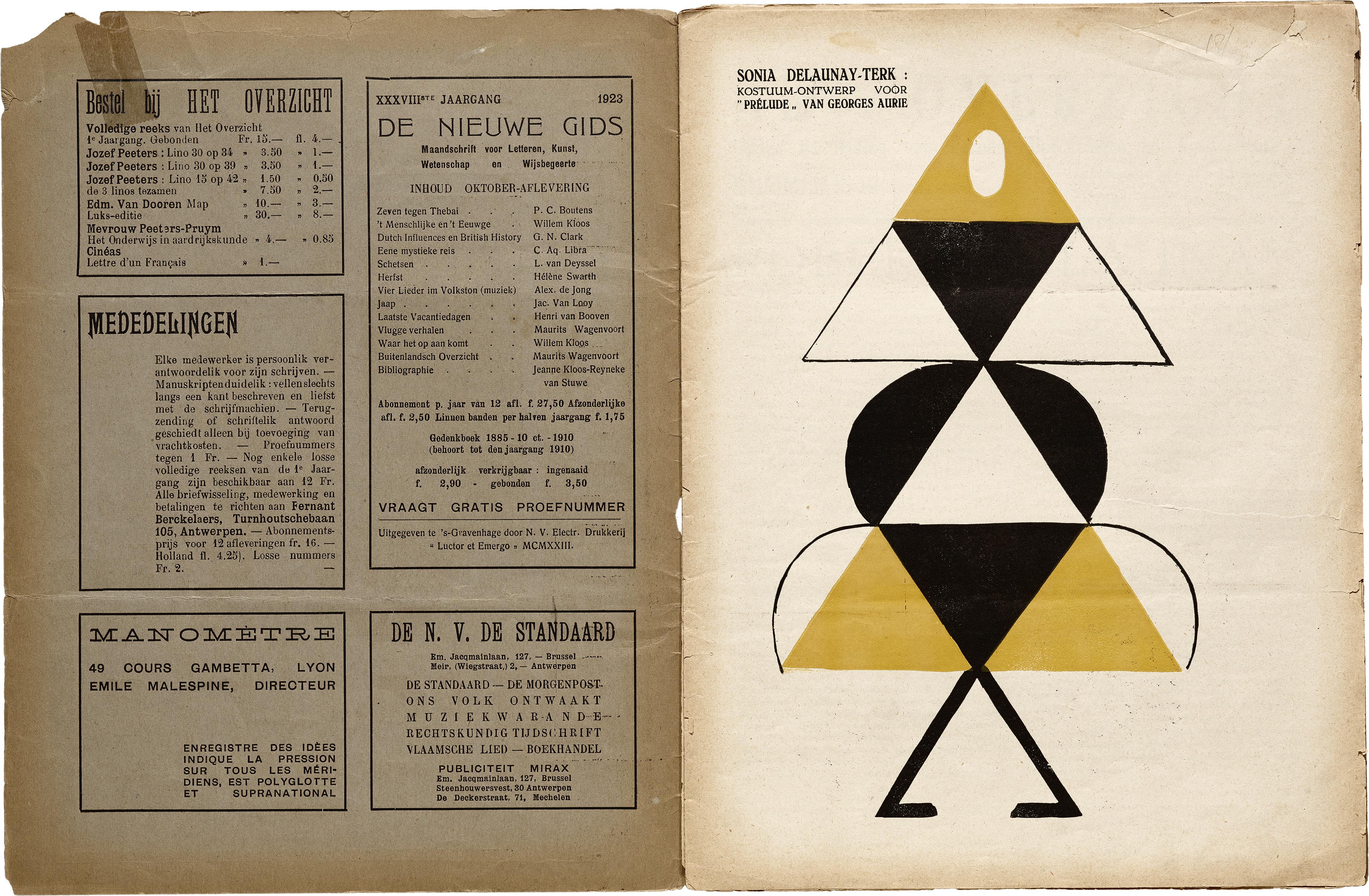
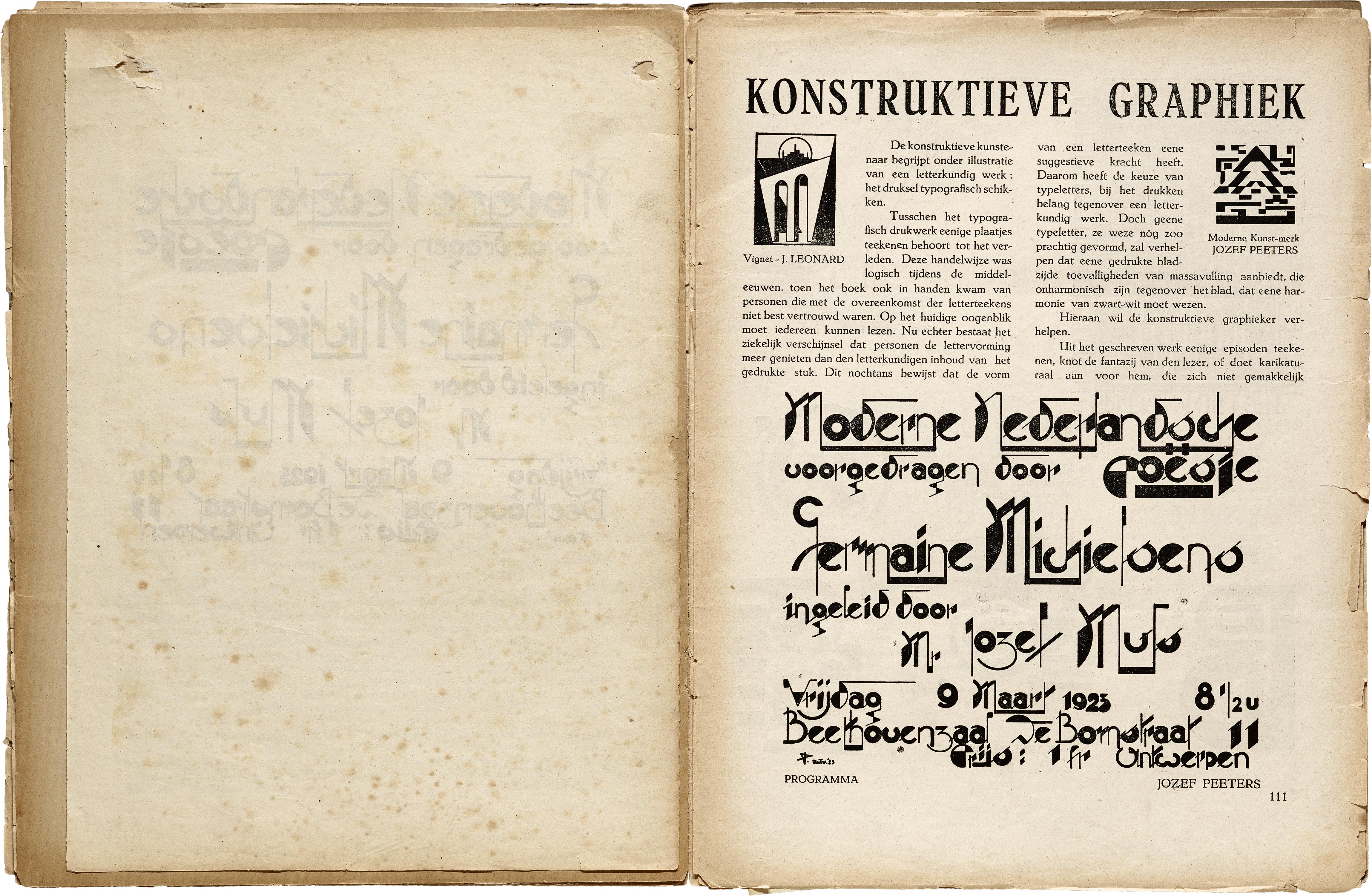
However, by the double issue 9-10, Berckelaers had met Jozef Peeters, an early-adopter of abstract painting in Belgium who also had ties to Marinetti’s futurism. Peeters’s influence grows in issue 11-12, graphically and editorially, until in issue 13, the first of Het Overzicht’s “second series”, he has taken over co-editorship as well as cover design of the magazine. From this point on, the magazine quickly abandons what was left of its nationalism and traditionalism to embrace the more international European avant-garde movements, signaling a desire to forge connections between the Continent’s radical experiments in art and literature. This realignment is seen in both its poetics, which shift more to the free verse and sound poetry of cubism and dada, as well as its visual art, which takes on explicitly futurist and constructivist aesthetics.
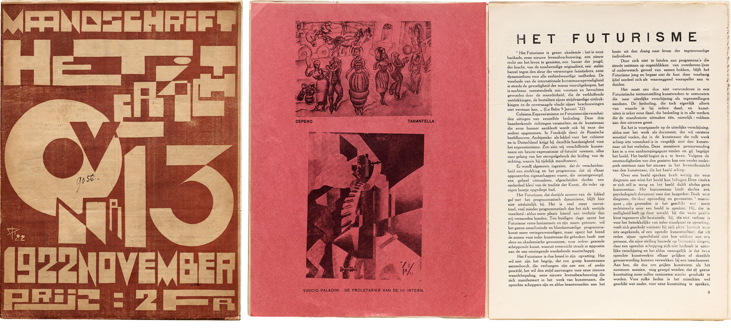
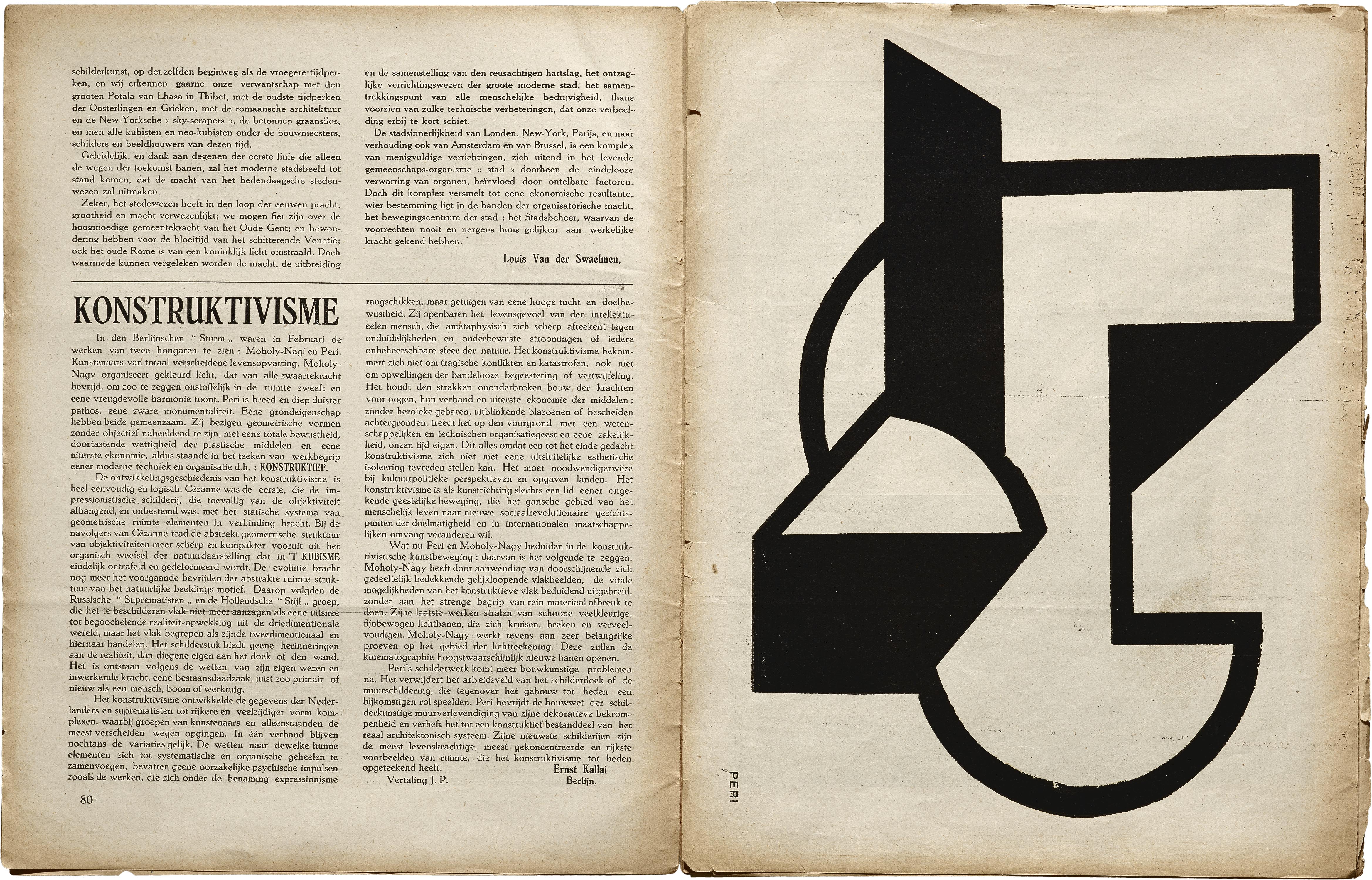
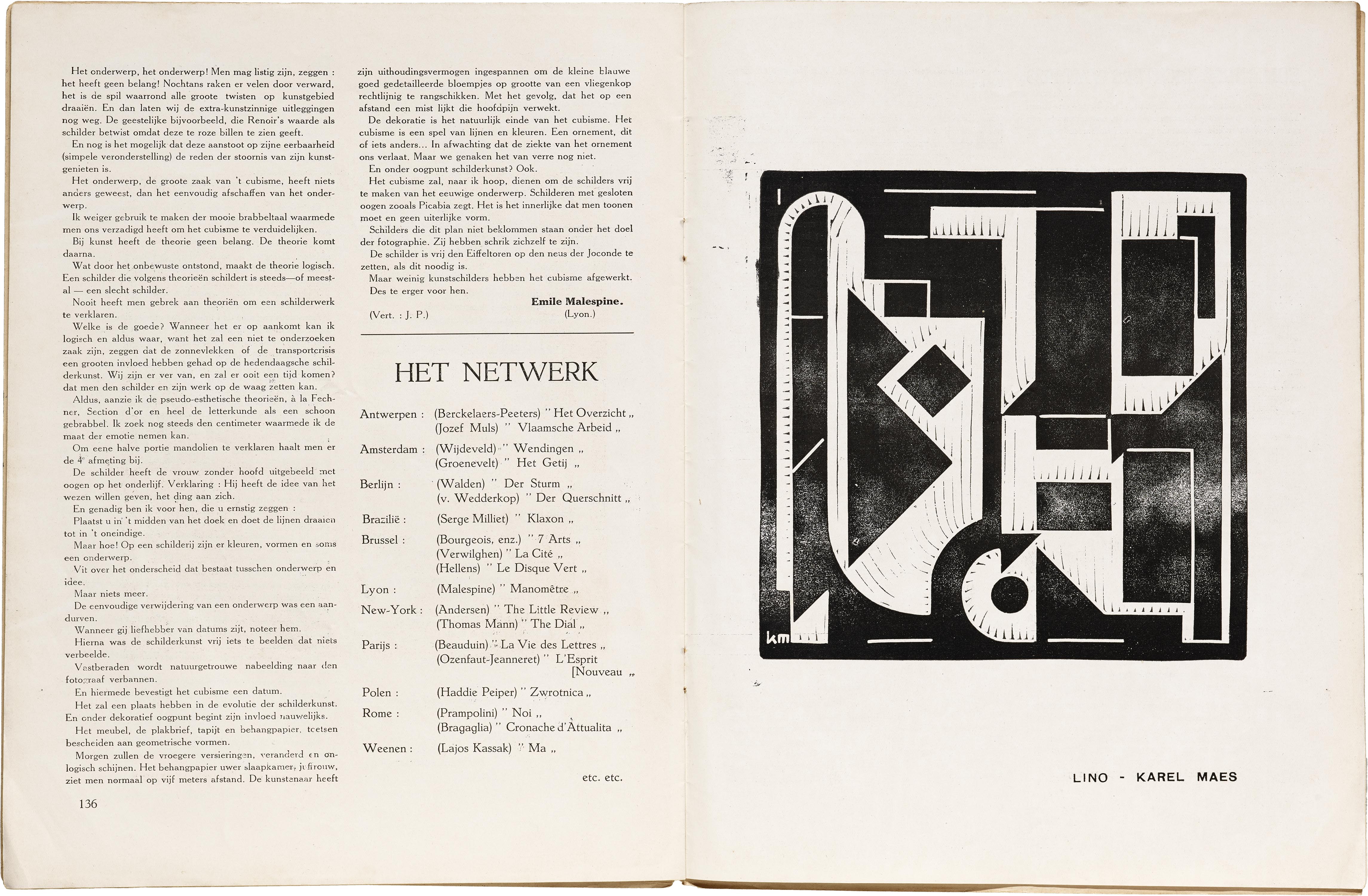
In addition to futurism, Het Overzicht’s latter numbers also catalog an engagement with the abstract geometric and architectural avant-gardes such as De Stijl (e.g., with linocuts by Belgian De Stijl representative Karel Maes), constructivism (e.g., in an article “Konstruktivisme” by Ernst Kállai, who would later edit six numbers of the journal bauhaus), and early Bauhaus (Kállai, plus a couple appearances of works by Moholy-Nagy).
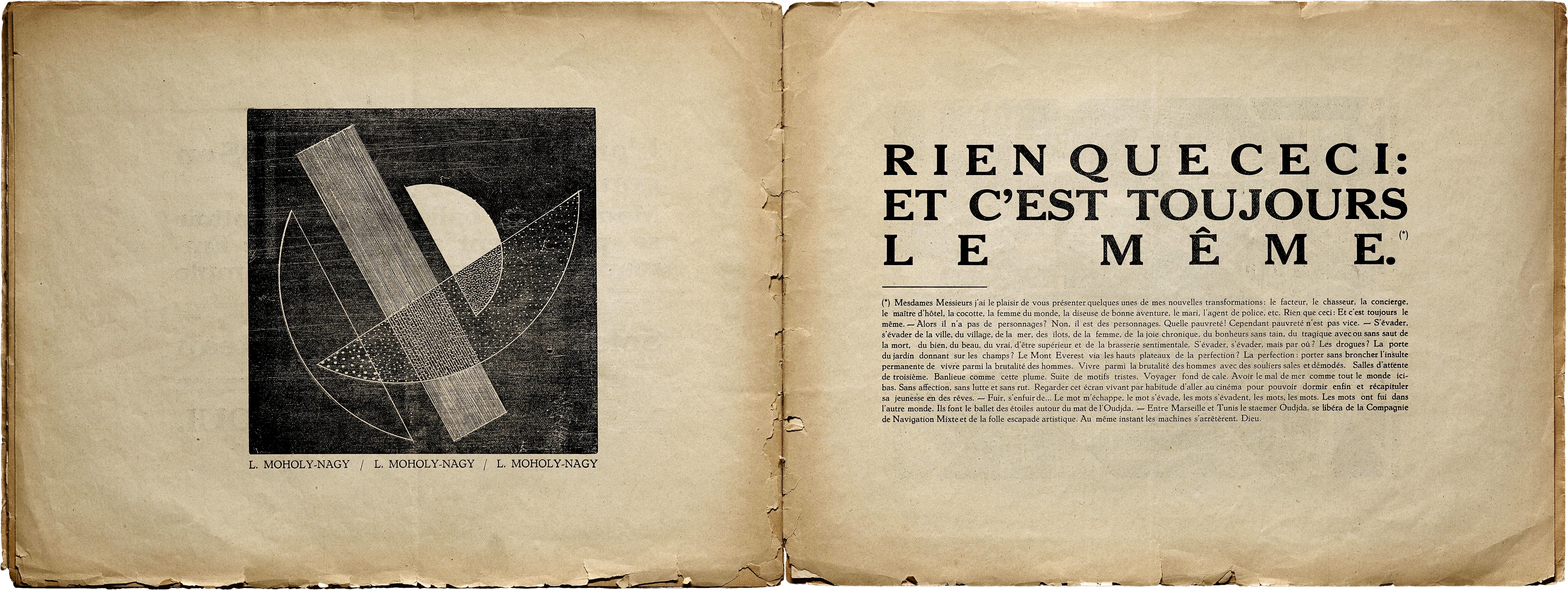
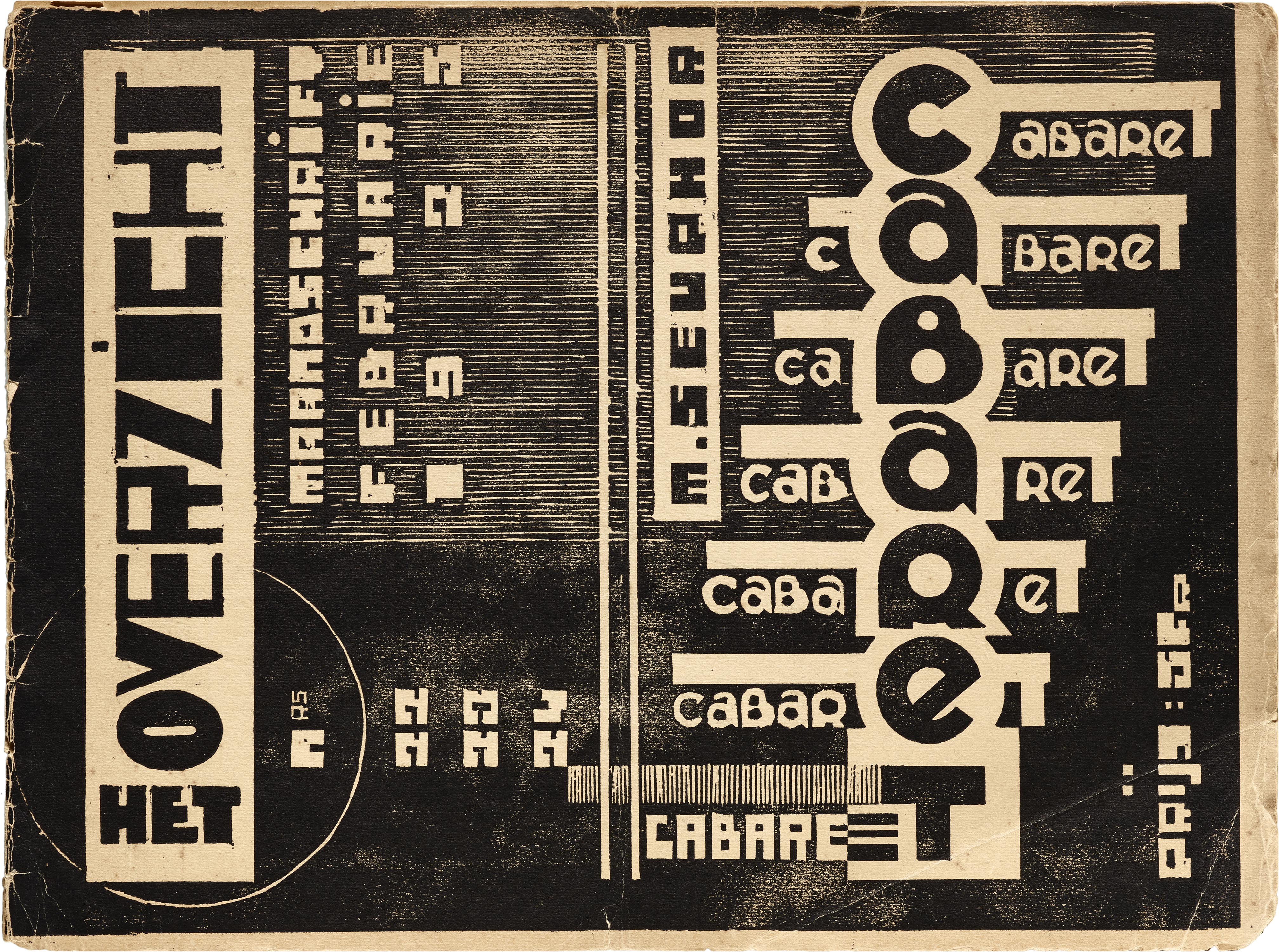
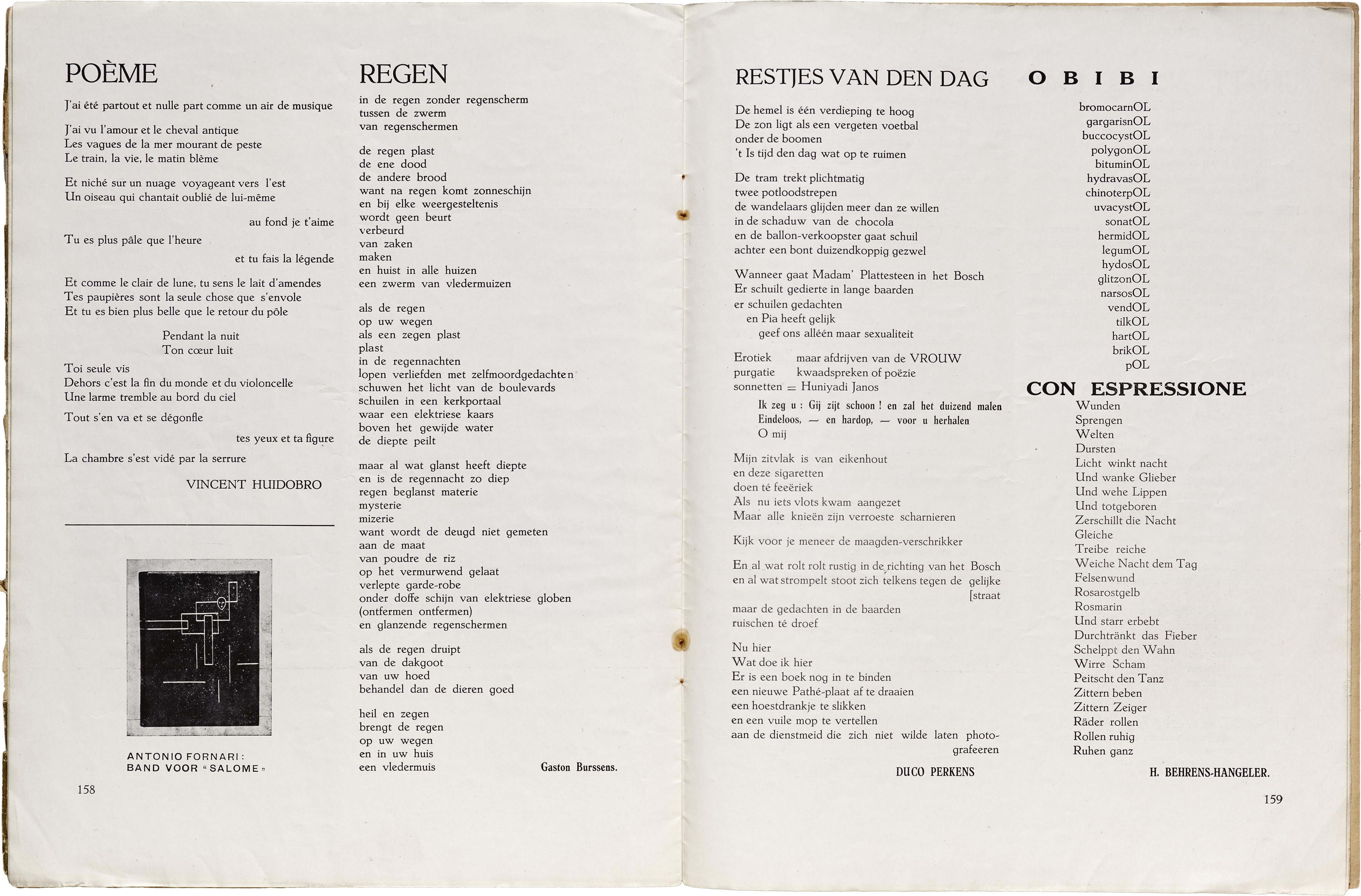
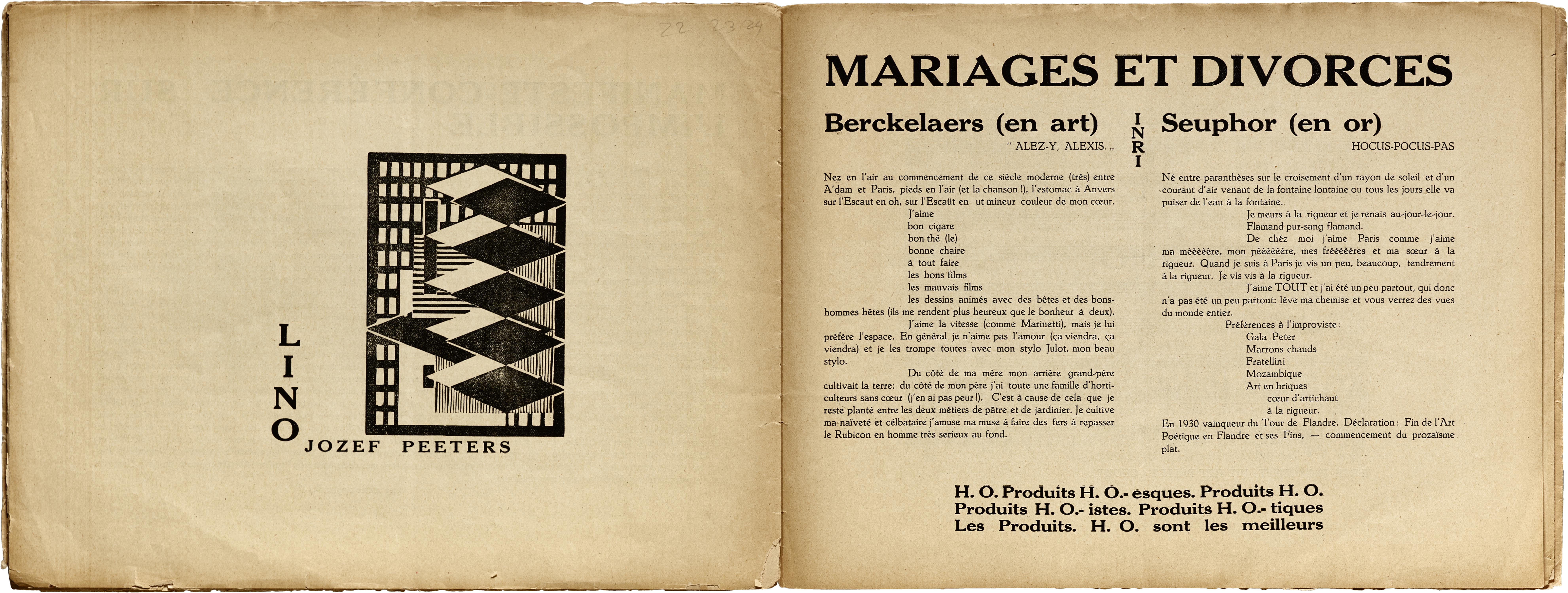
Readers of the magazine’s full run can observe what seems to be Berckelaers’s gradual radicalization. From the beginning of the magazine, he tends to publish his editorial contributions under his given name, and his poetic contributions as Michel Seuphor (the surname is an anagram of “Orpheus”). In issue 15 Berckelaers writes skeptically in the book reviews section about Dutch artist Theo van Doesburg’s flirtation with dada, “entirely in opposition to his own ‘Stijl’ theory”, emergent in Doesburg’s Mecano and in his involvement with Kurt Schwitters’s Merz. Under his poetical pseudonym however, Seuphor begins to conduct his own parallel dada experiments, as well as in his editing (a poem by Tzara is featured in issue 17, and many issues contain dada-esque poems by artist H. Behrens-Hangeler). This culminates in the final triple issue of Het Overzicht, titled “Cabaret” (evocative of the dada nightclub “Cabaret Voltaire”), an absurdist “complete film/manifesto-conference on the impossible” in French rather than Dutch, which also happens to feature a contribution by Kurt Schwitters. After ending Het Overzicht, Berckelaers moved to Paris to pursue abstract painting full-time as Seuphor, and would found a group of abstract painters called “Cercle et Carré” (Circle and Square) and publish a short-lived journal of the same name.
Selections from Het Overzicht
All images in this gallery are hi-fi captures. Click an image to enter fullscreen view, then pinch or use browser zoom to enlarge.
Wendingen
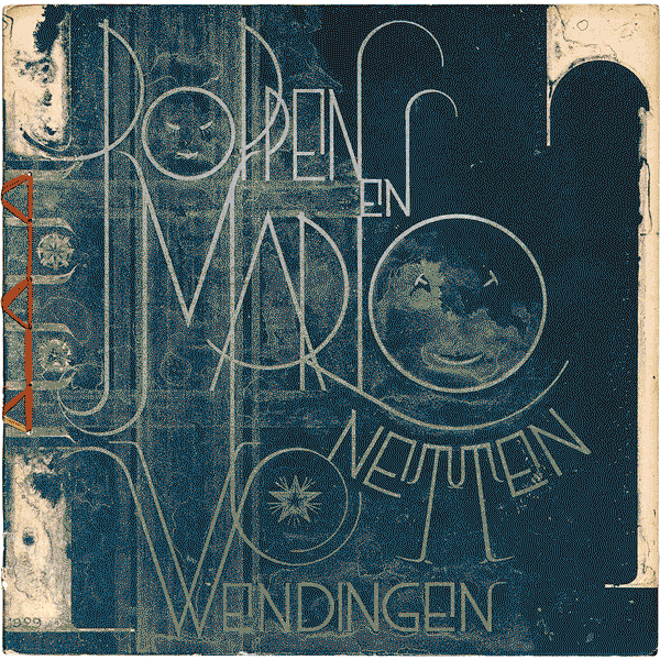
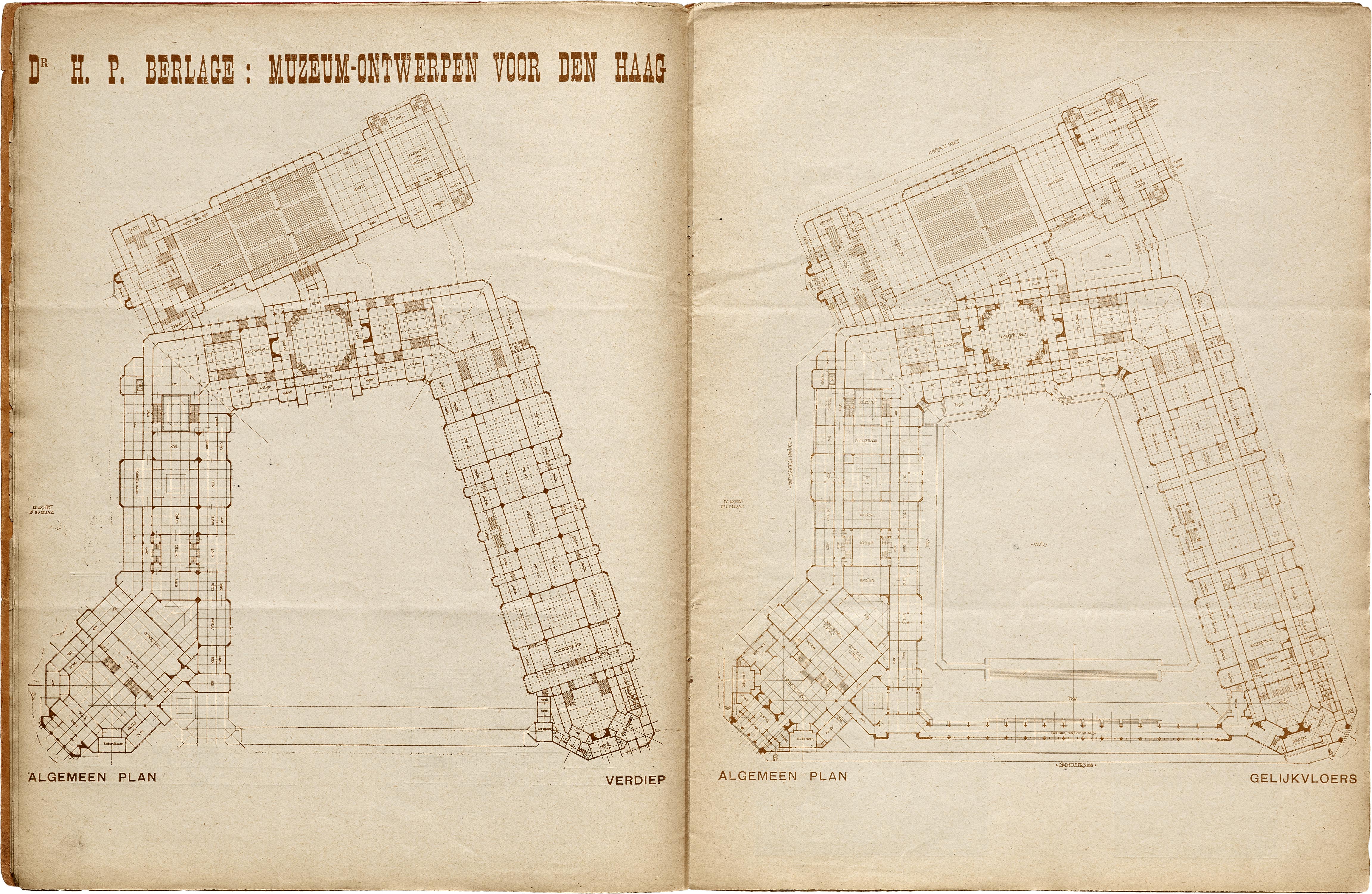
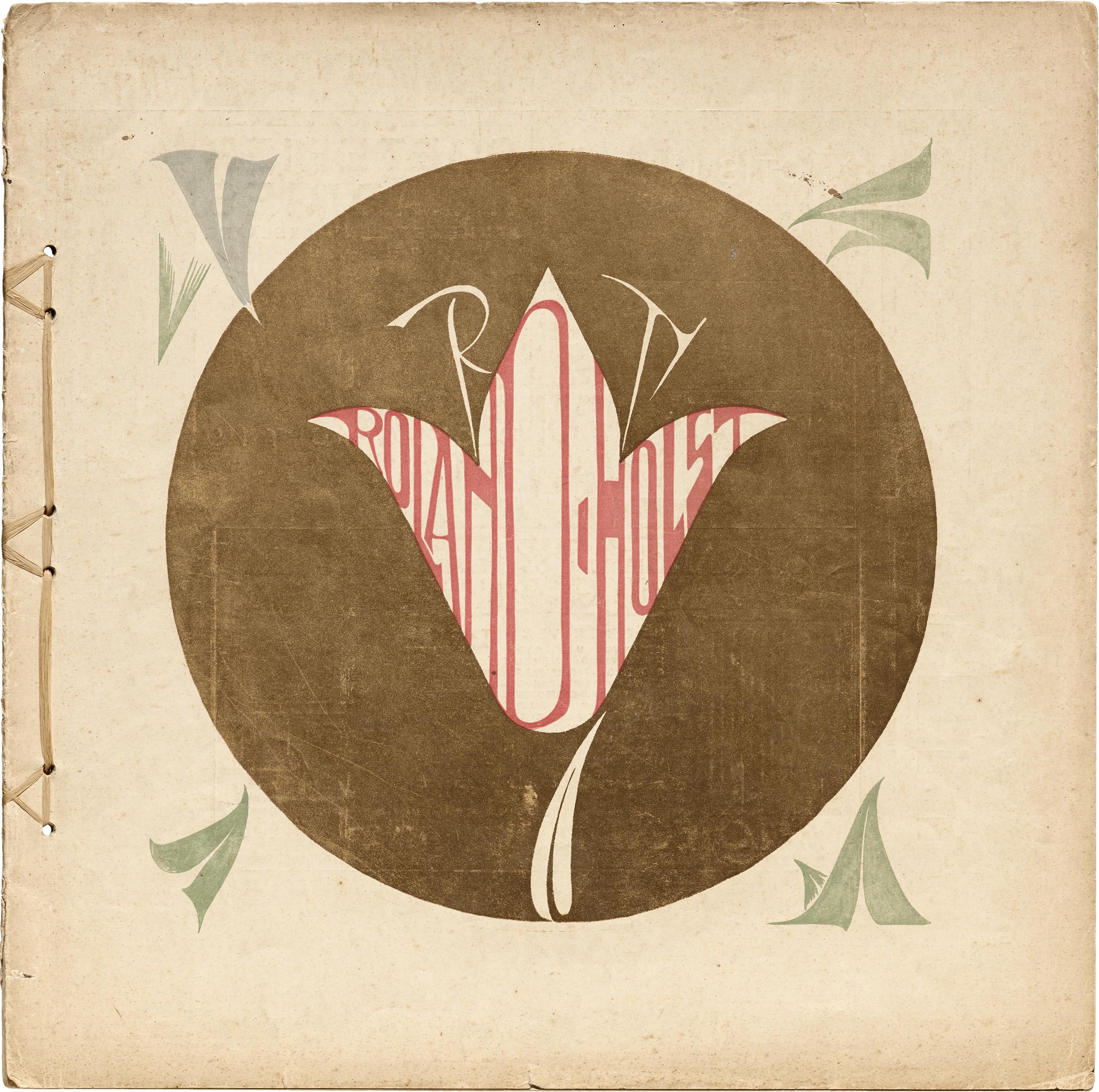
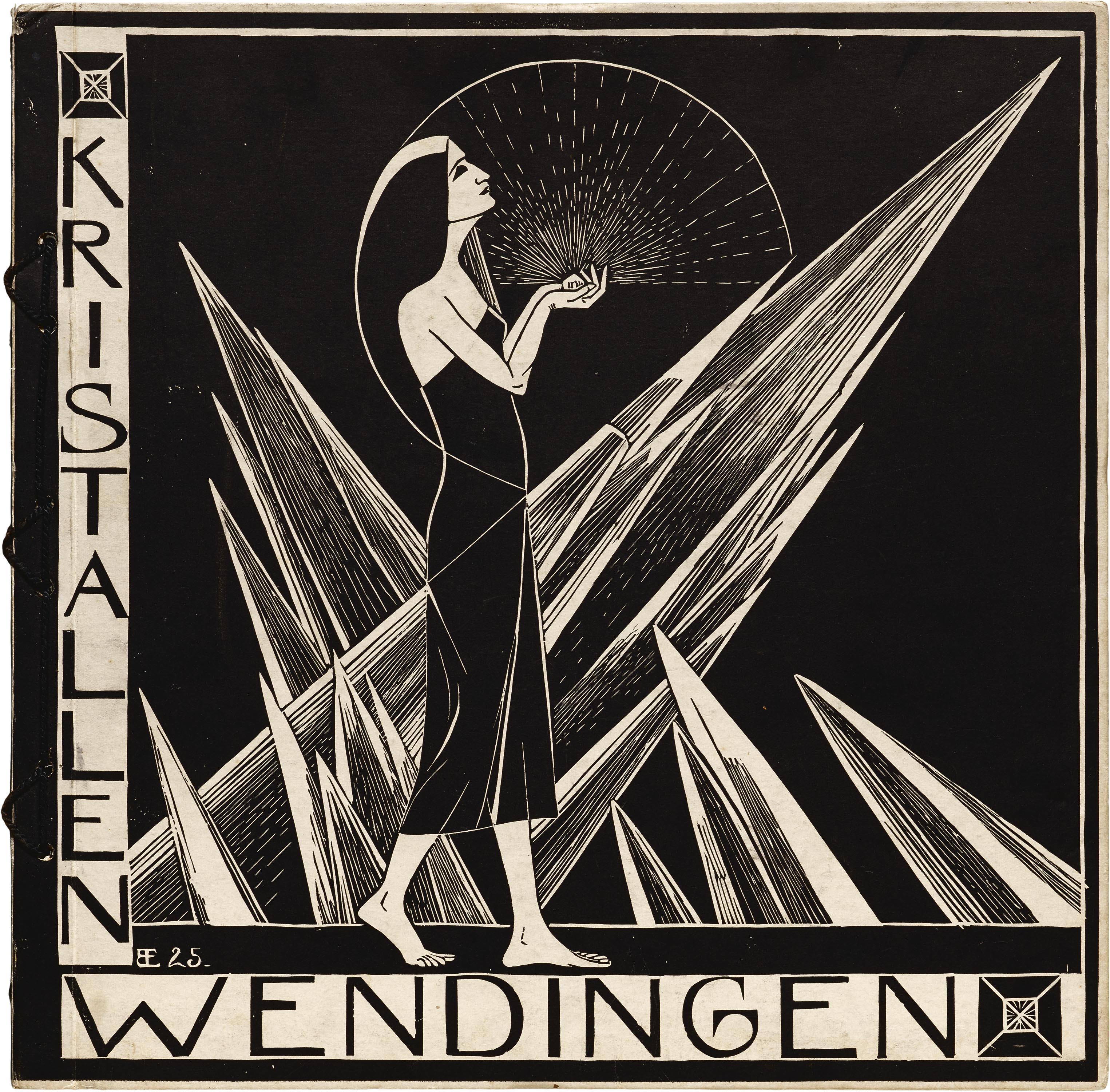
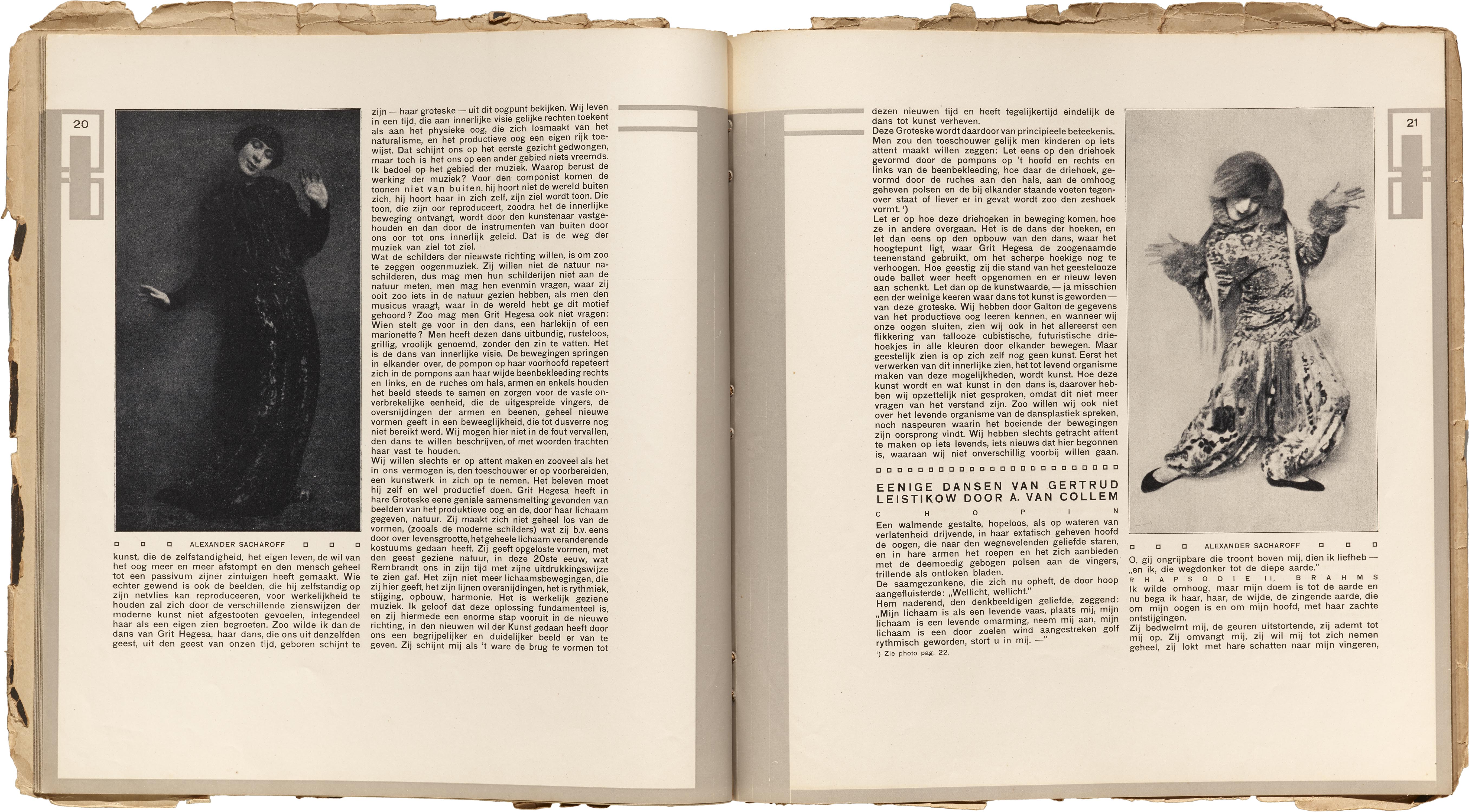
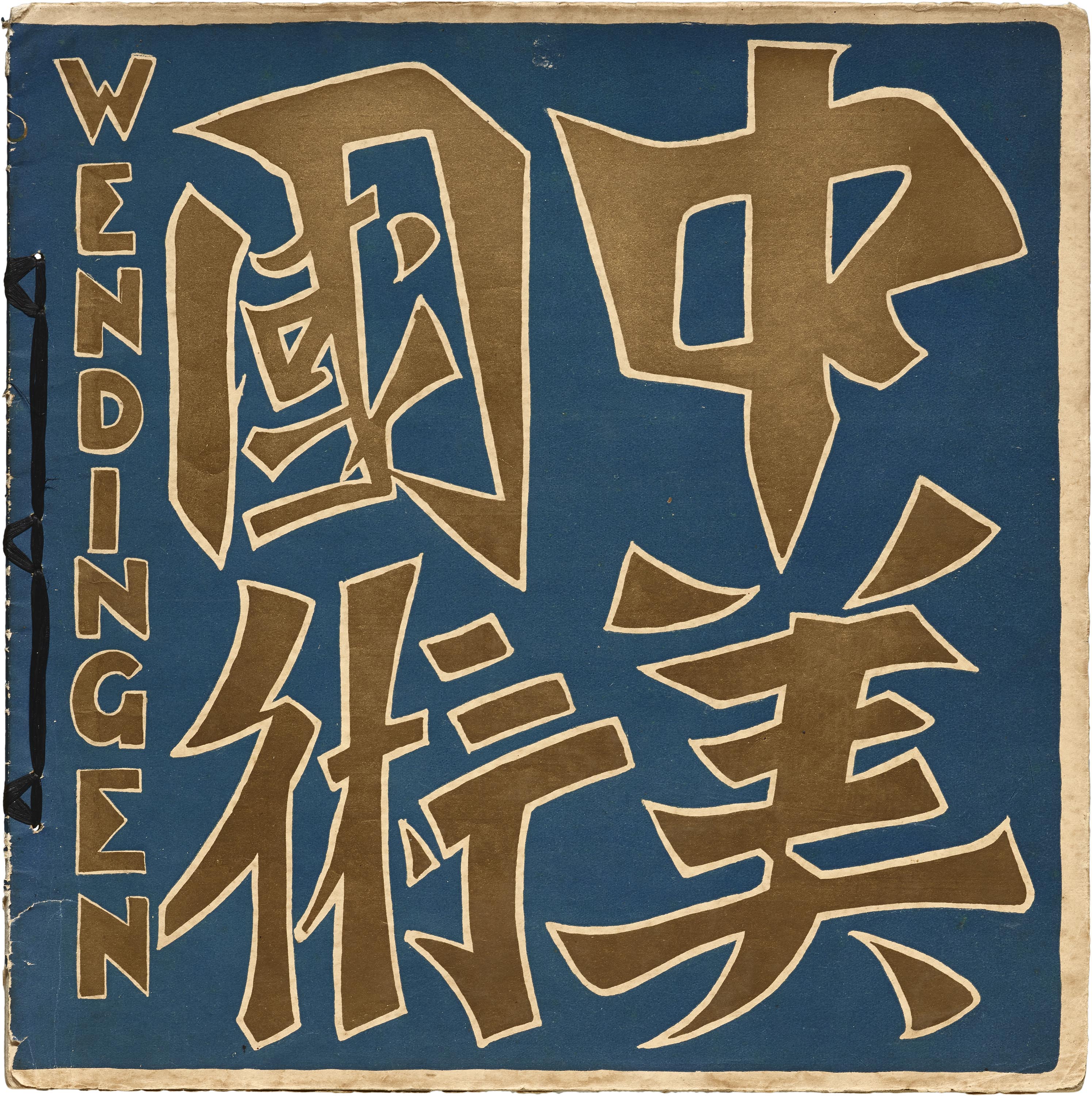
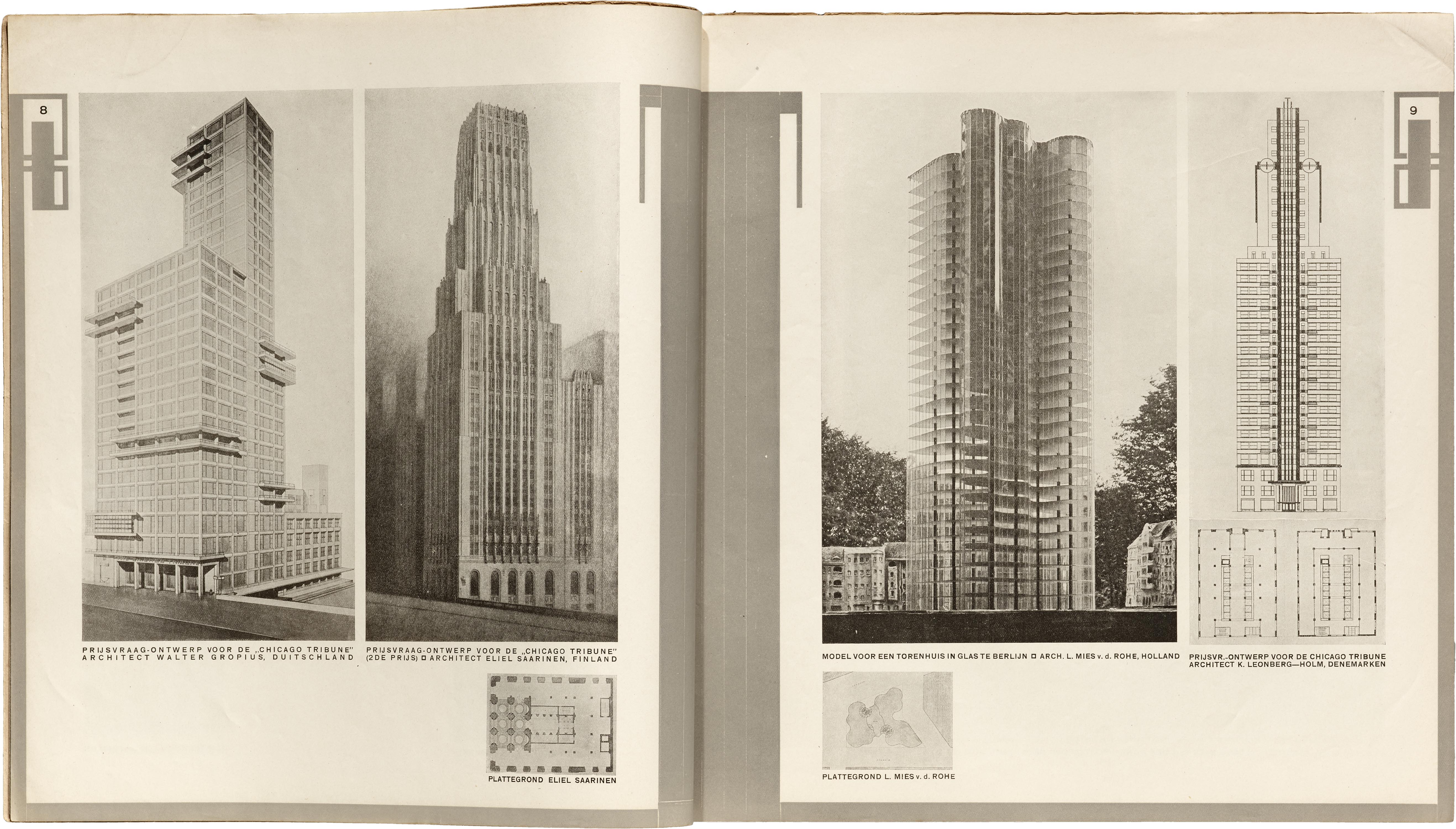
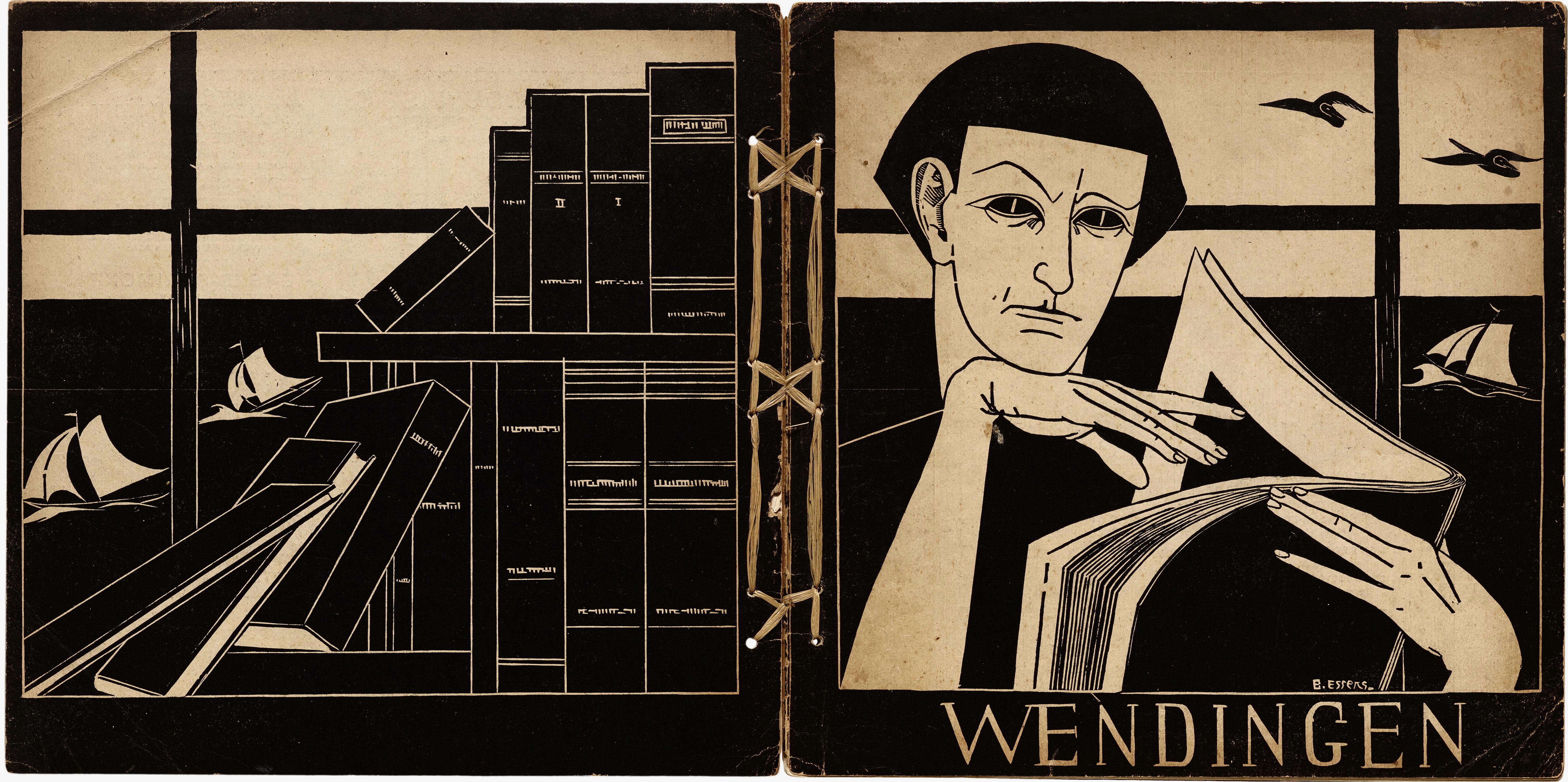
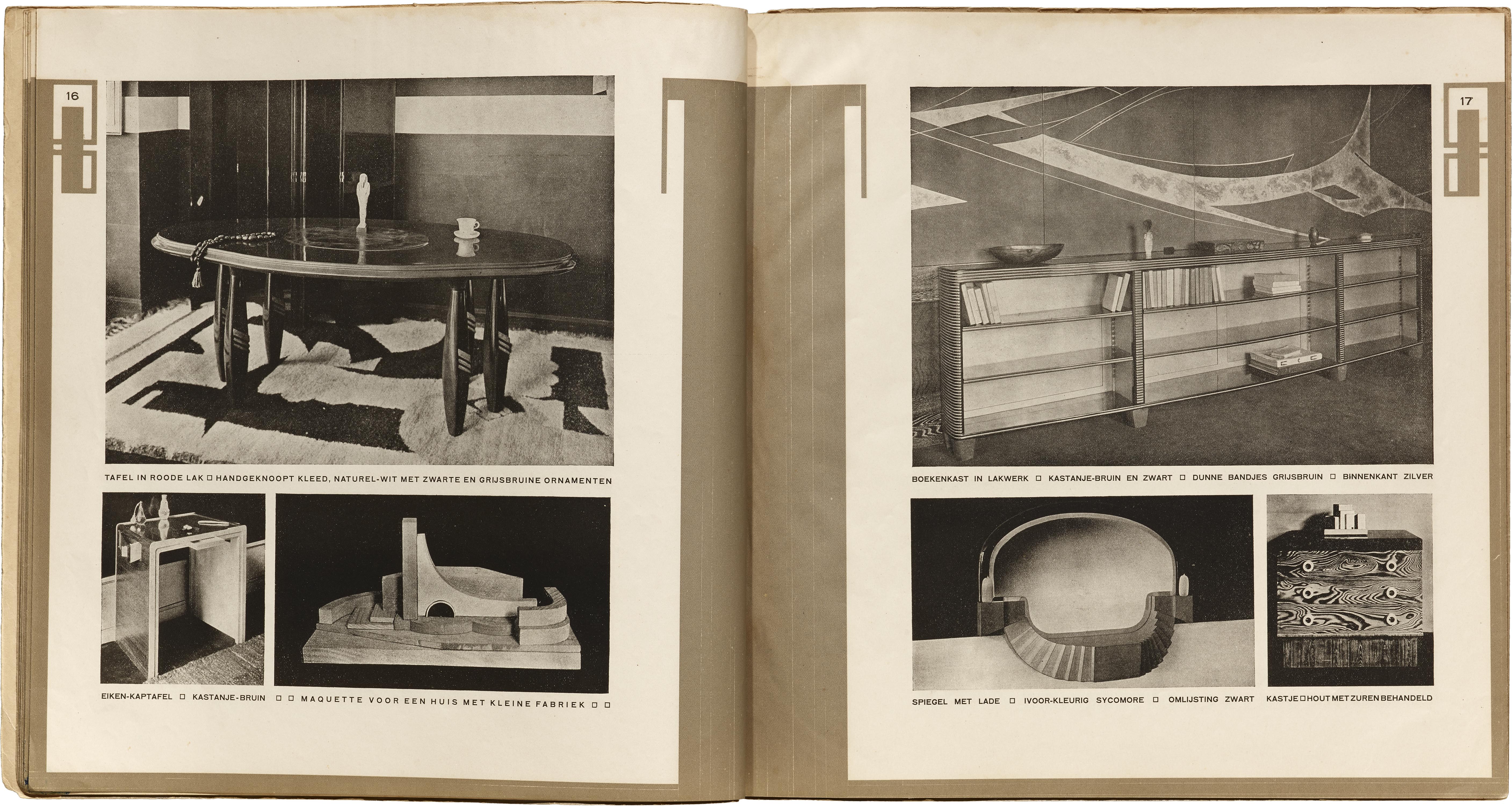
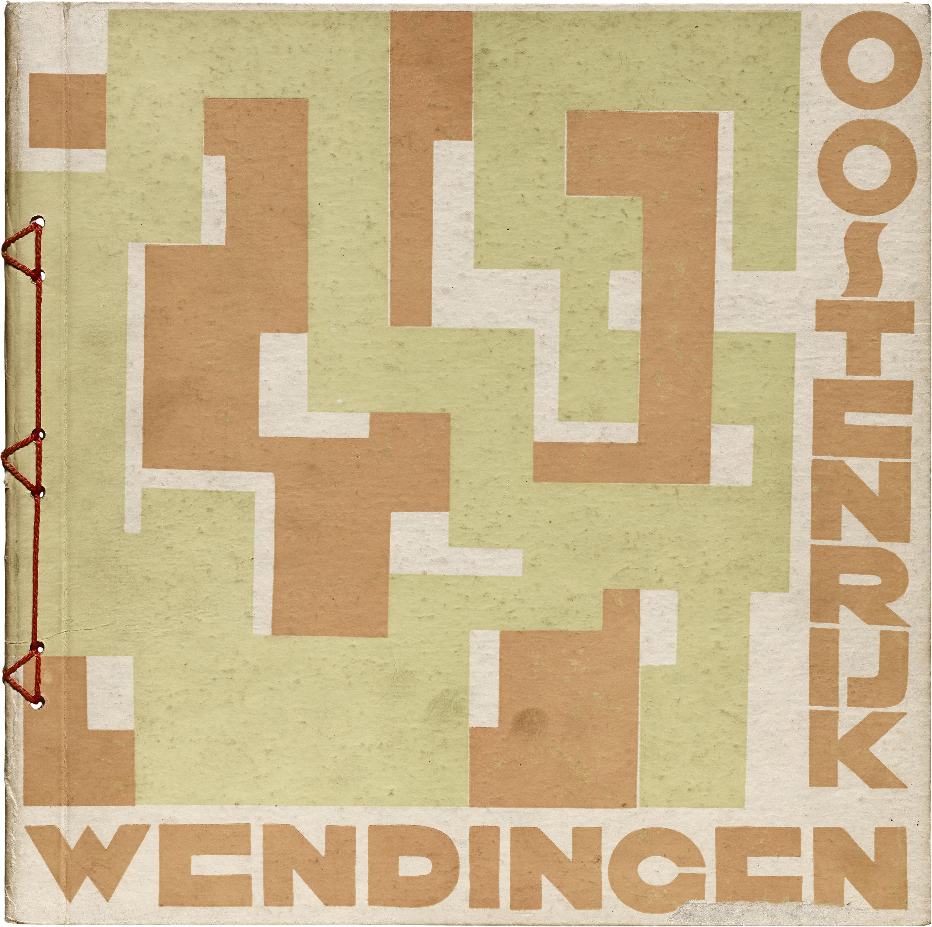
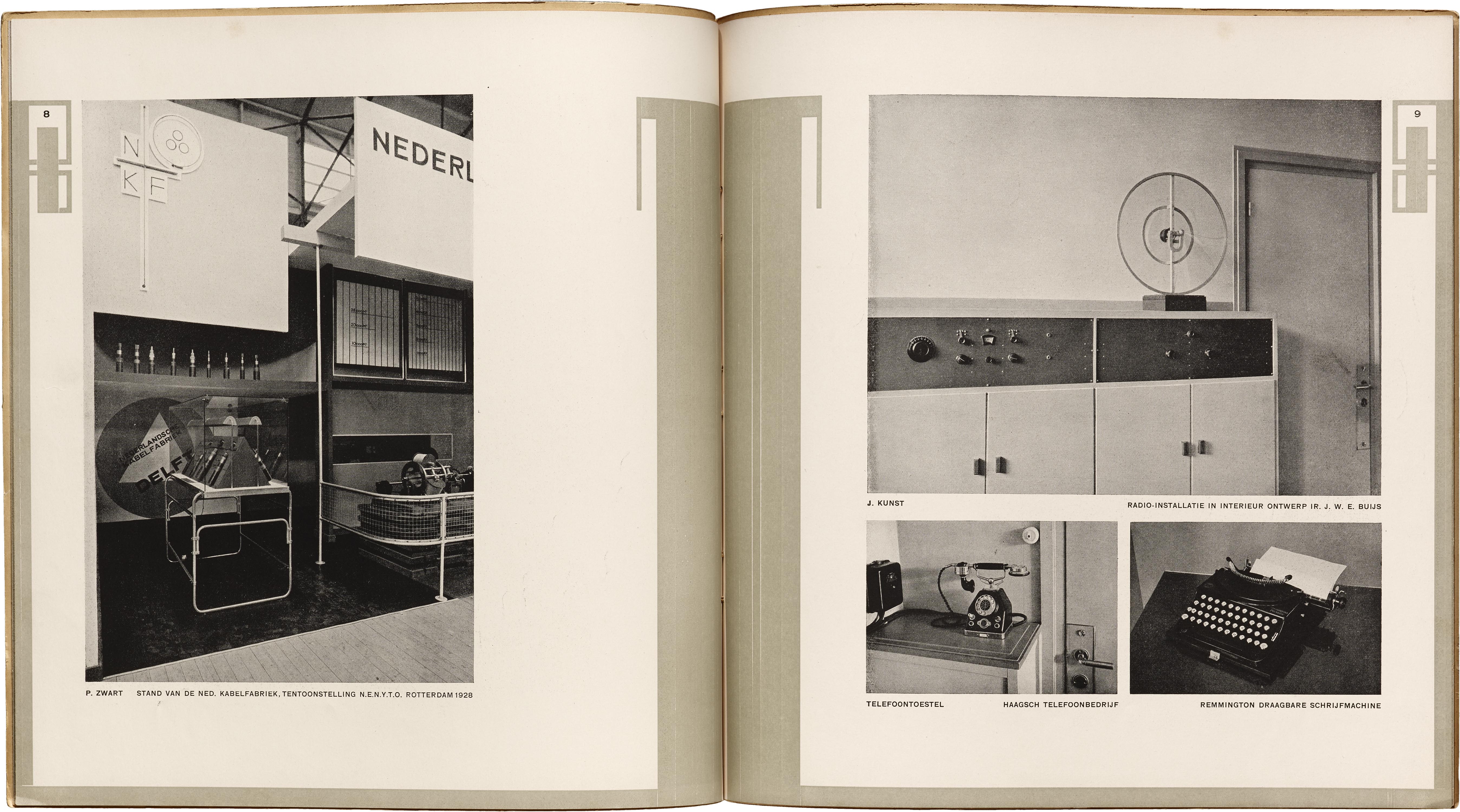
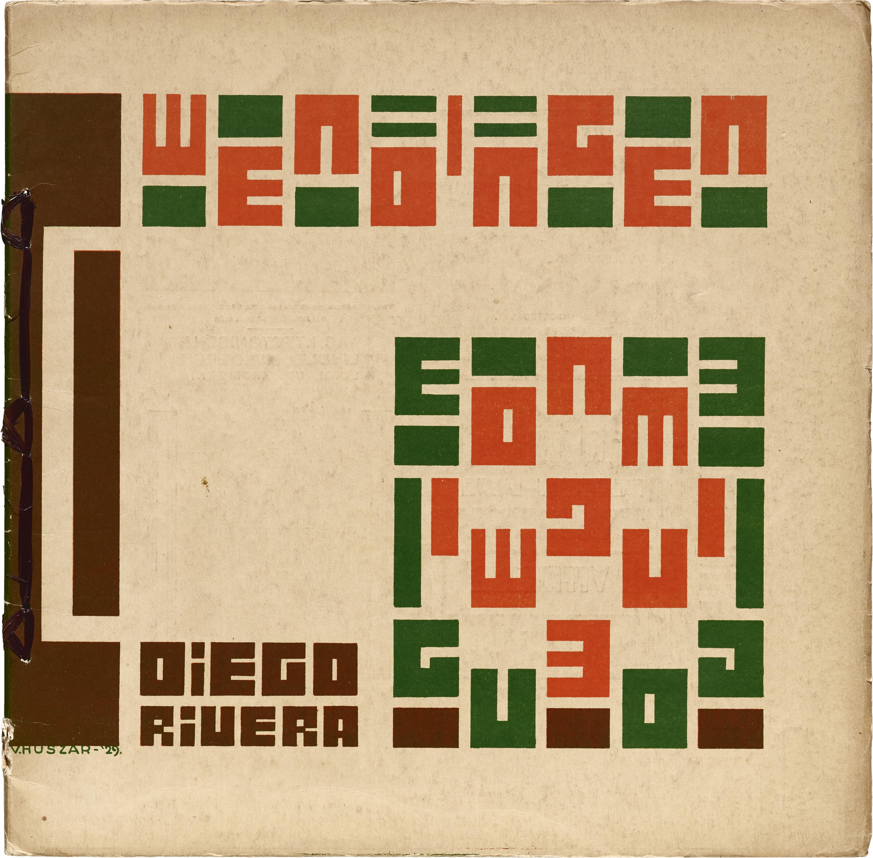
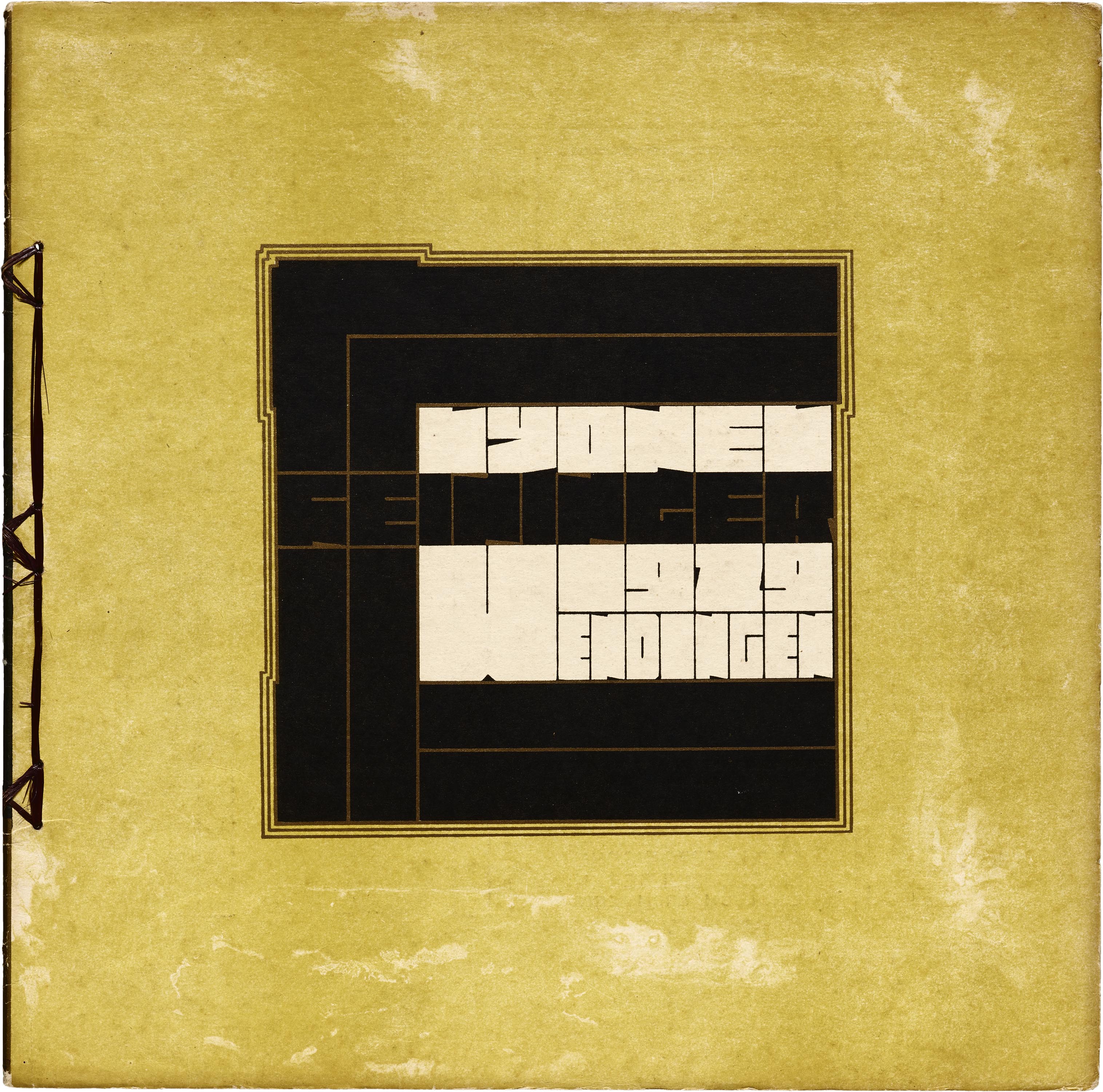
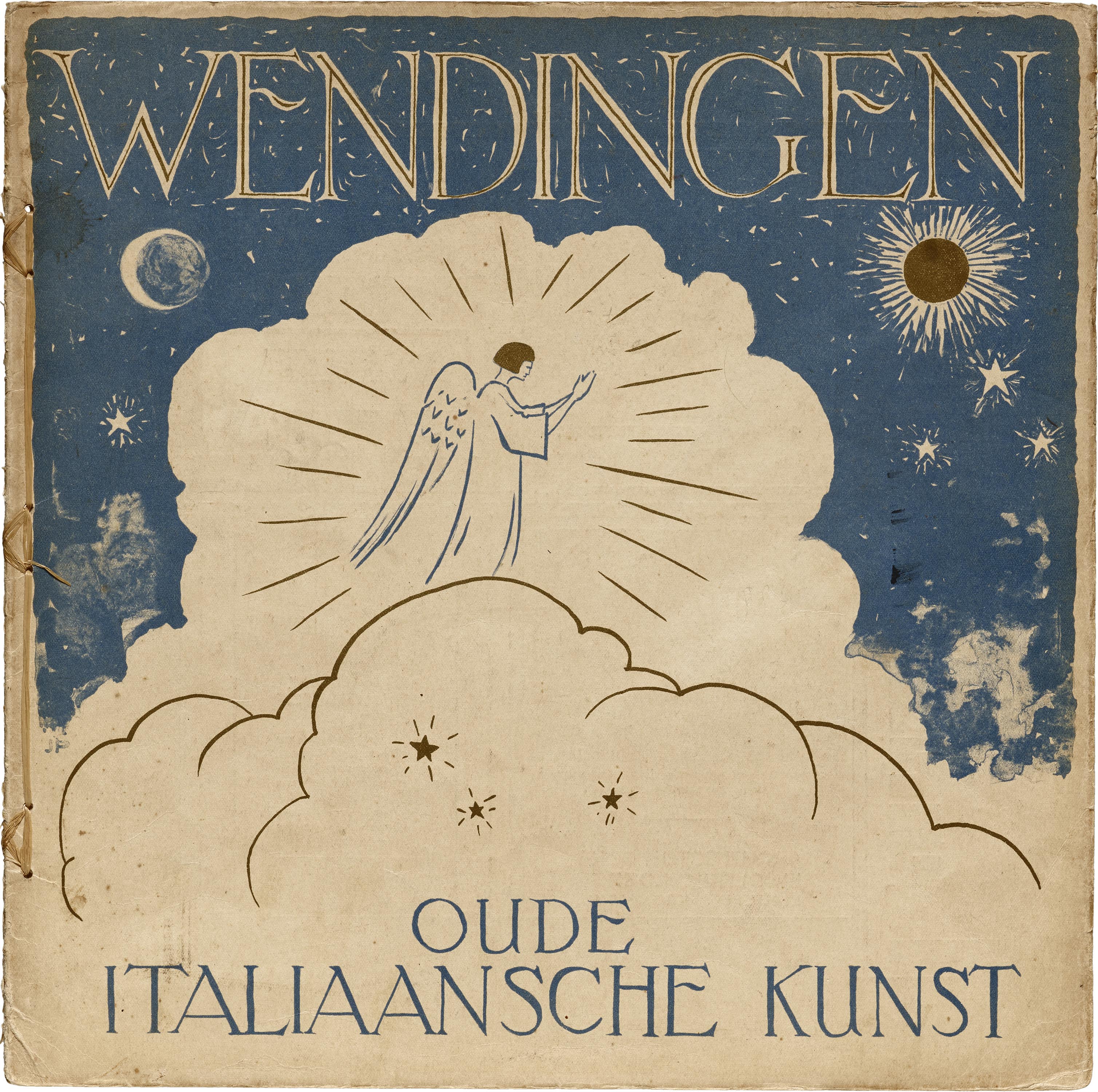
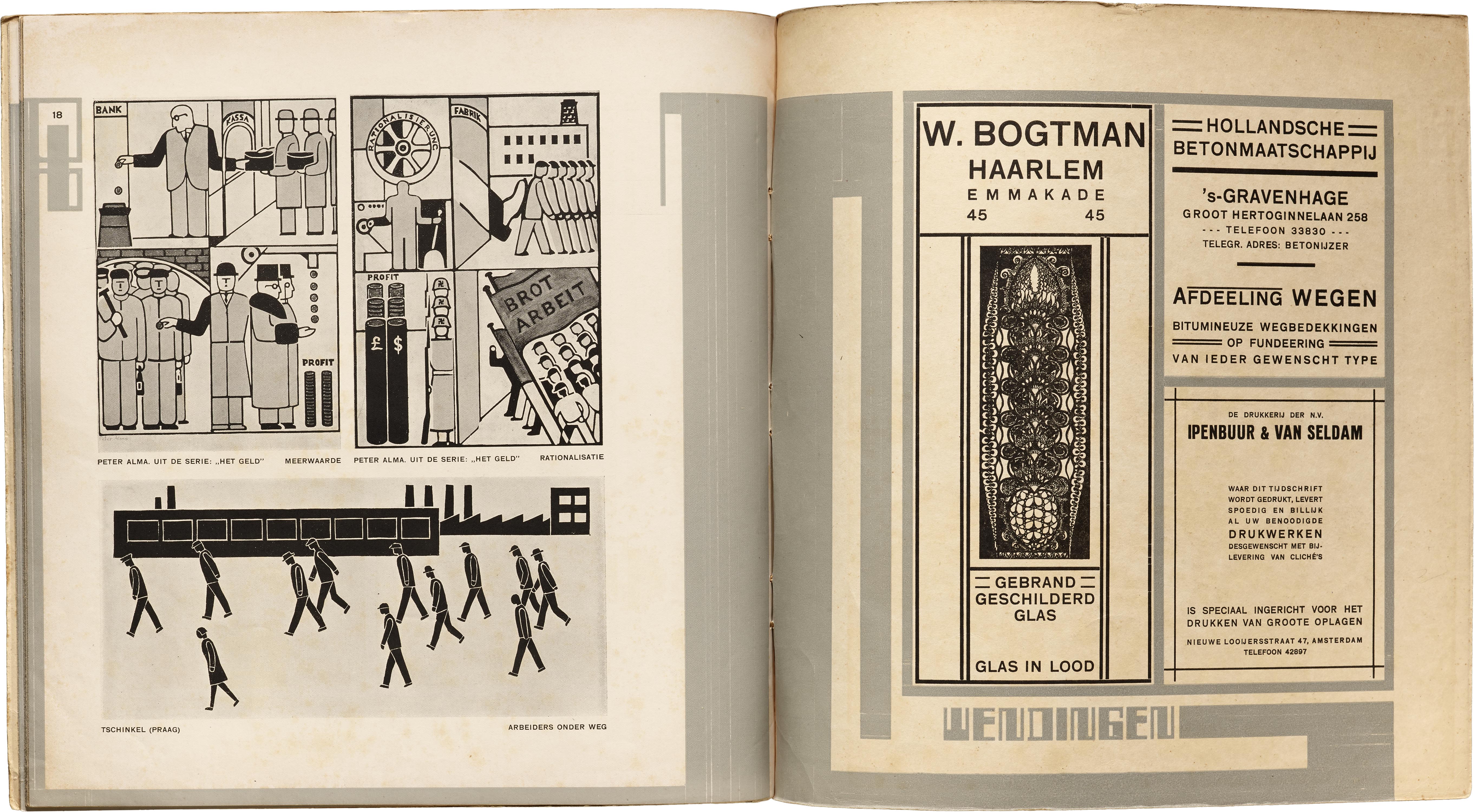
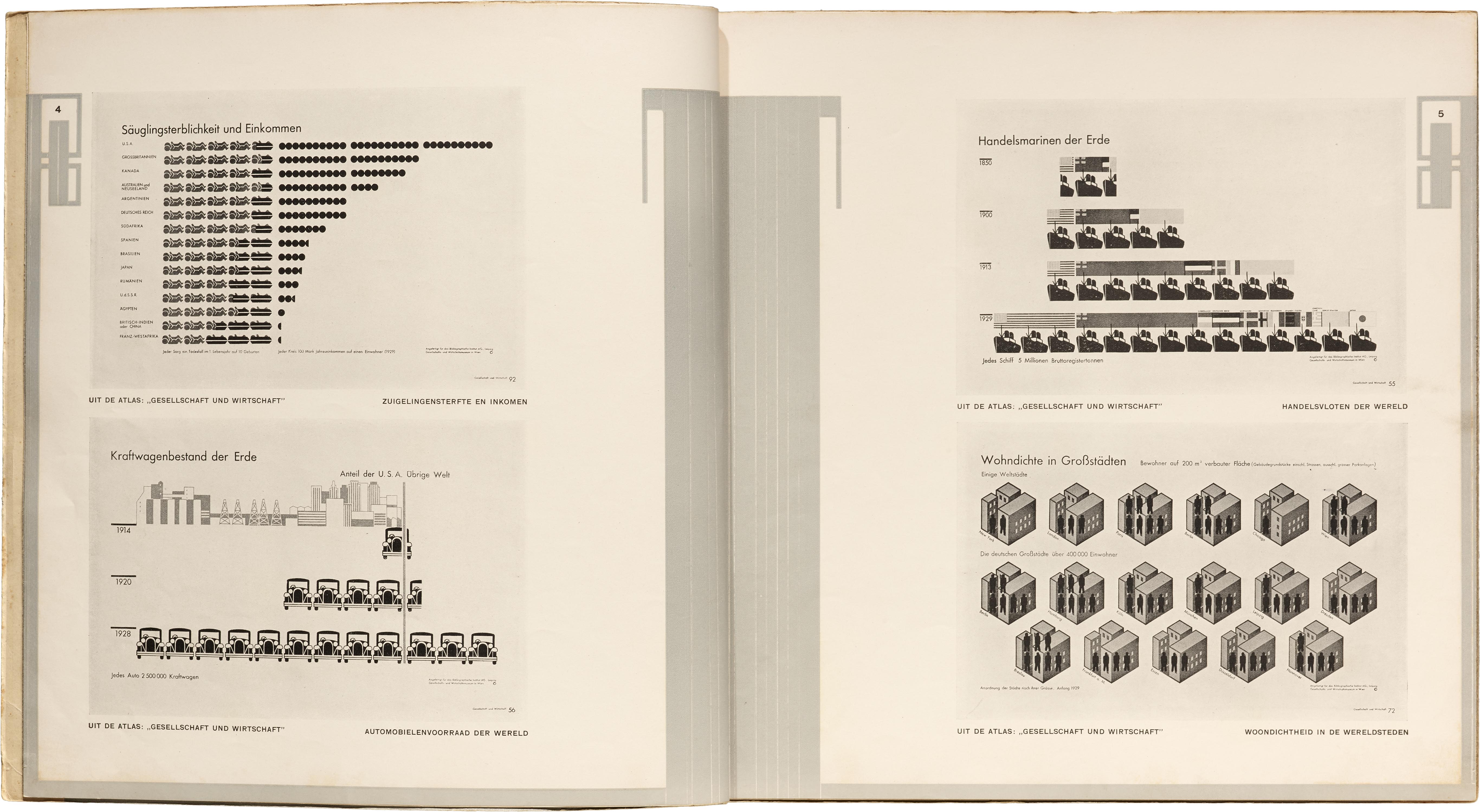
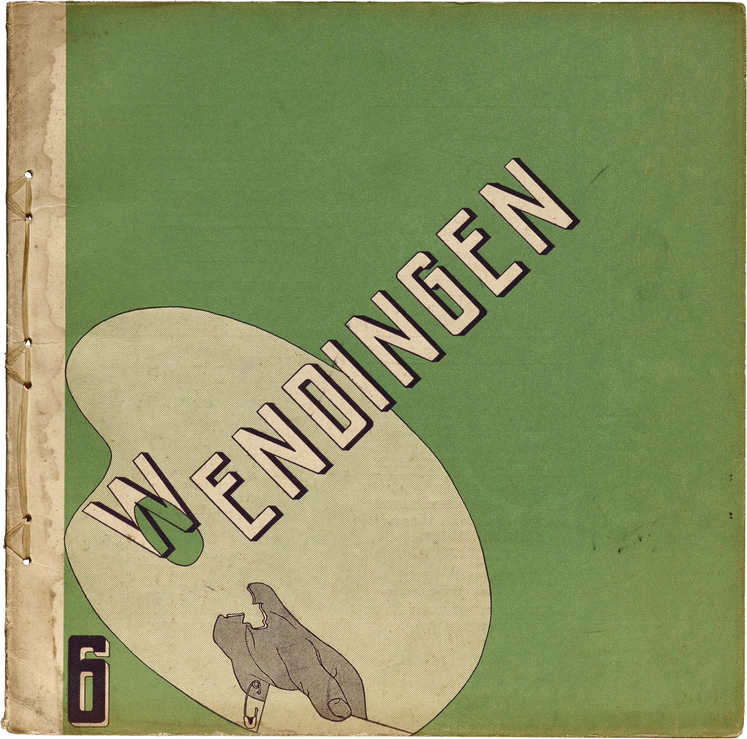
If Het Overzicht takes half its lifespan to find its way to its mature eclecticism, Dutch periodical Wendingen (1918–1932) was founded on it as its central principle. True to its name (“Upheaval” in English), Wendingen varied widely throughout its 116 issues (itself an impressive feat relative to other avant-garde magazines, where it is not uncommon for the full run of issues to be in the single digits). Practically the only constants were its large square format, stab binding, and the unique typography, apparently constructed from non-alphabetical type elements by editor and architect Hendrik Wijdeveld. Otherwise, each issue features a unique cover design solicited from a wide range of artists in an equally wide range of artistic styles. The contents of the magazine are just as diverse, with each issue devoted to a single topic, which might be anything from public housing, to magic realist paintings, to Russian theater, to seashells. Many other issues serve as a monograph introduction to the work of a single artist, designer, or architect.
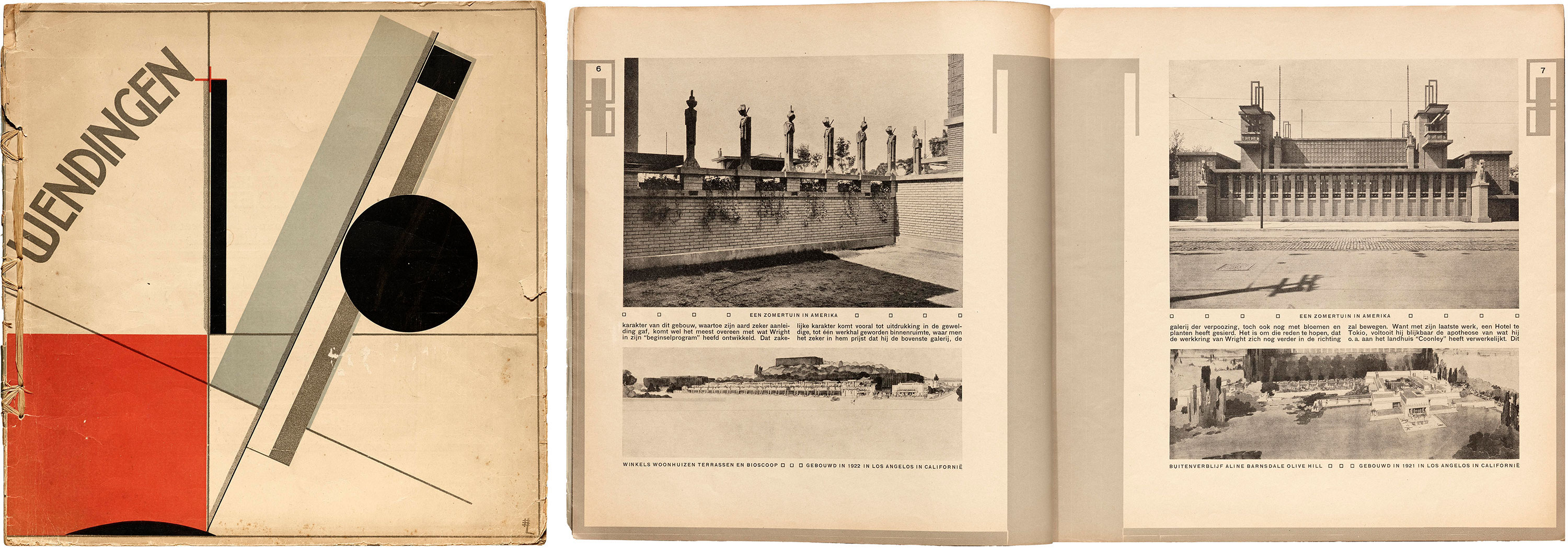
If there is an “all-star” issue of Wendingen, it might be series 4, number 11, with a cover design by El Lissitzky, and interior devoted to architect Frank Lloyd Wright. As it happens, this is only the first issue dedicated to Wright’s work, as later Wendingen would run a more comprehensive series of seven consecutive issues on the American architect, with covers and a glowing prose introduction by Wijdeveld himself (certainly one of Wright’s most enthusiastic European champions).
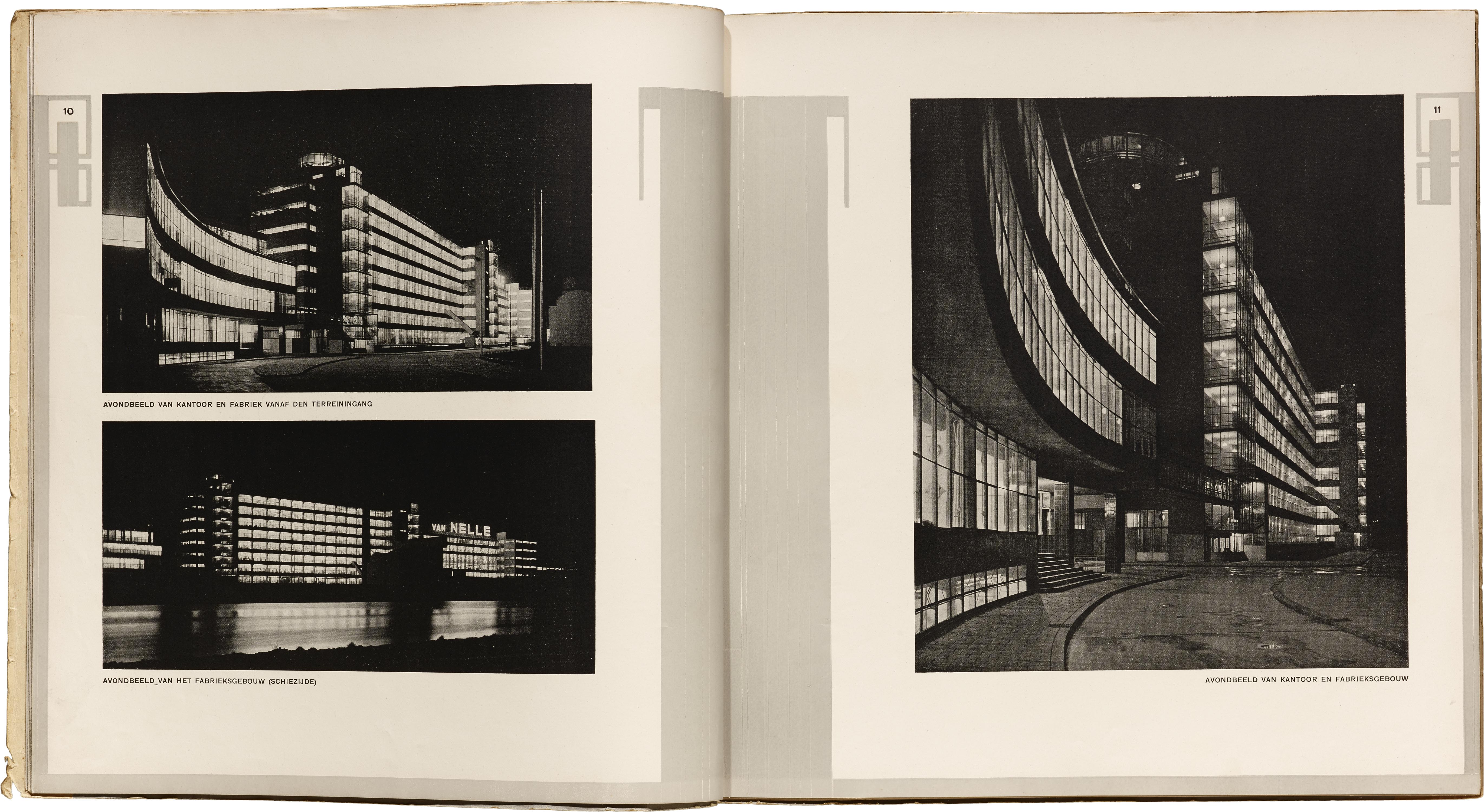
Another issue is dedicated to the architecture of the Van Nelle Factory in Rotterdam. In addition to being a UNESCO World Heritage Site since 2014 and a fine example of modernist architecture, the Van Nelle Factory was also the manufacturer for which Jacob Jongert designed his spectacular coffee, tea, and tobacco packaging and advertising, of which the Archive holds a major collection. Incidentally, Jongert himself appears several times in Wendingen: twice as cover designer, and once writing an article titled “Advertisement” in an issue dedicated to Dutch poster design and featuring two of Jongert’s own early posters. Many more connections like this to other items in the Archive collection can be found in the pages of Wendingen, as illustrated by some of the spreads in the gallery below.
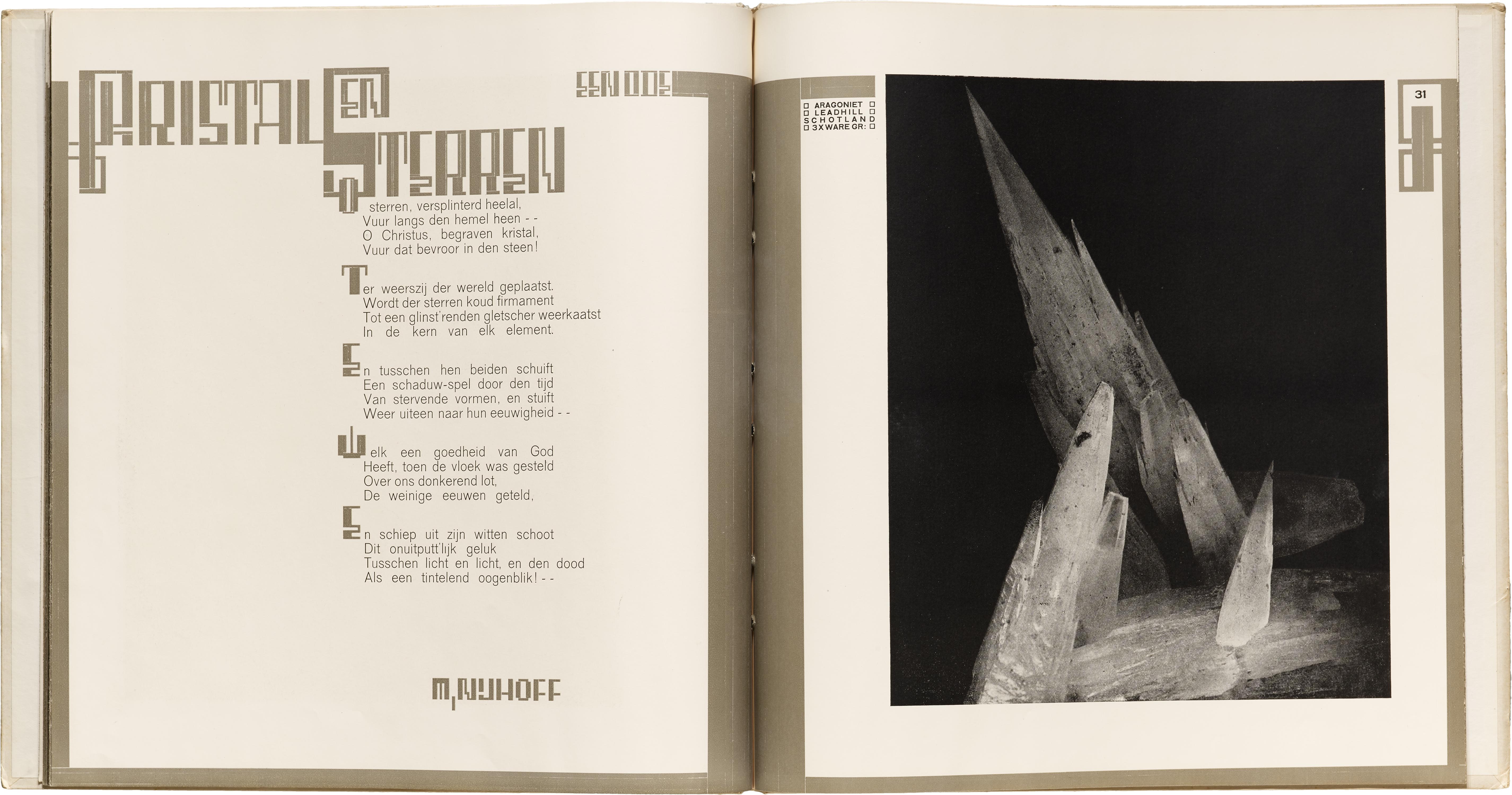
Because of its editor’s profession, the contents of Wendingen focus primarily on architecture and interior design, though as mentioned before, many other artistic media and styles are also represented. The magazine is perhaps at its most decadent, however, in issues which focus on subjects beyond art and design, such as series 6, number 11-12, dedicated to “Kristallen” (Crystals). It is in these purely thing-oriented issues (another, equally breathtaking, is designated the “Schelpennummer”, the “Seashell number”) in which the large format and high-quality paper are put to the most unselfconsciously indulgent use, and the natural forms on which so much modernist design was modeled are given center stage with minimal or strictly poetic commentary. This is magazine editing as lyric ode.
Selections from Wendingen
All images in this gallery are hi-fi captures. Click an image to enter fullscreen view, then pinch or use browser zoom to enlarge.
Stay tuned for explorations of other avant-garde periodicals. As this series continues and the connections between different magazines become clearer, we will update articles with relevant hyperlinks to other installments, simulating the very network of relations which actually existed between these various periodicals at the times they were published. In the meantime, ask to see Het Overzicht and Wendingen at your next visit to the Archive.
— Hank Smith, Collections Assistant
The Online Archive includes several issues of Het Overzicht and Wendingen, with hi-fi images of front and back covers. The site is now in beta. Become a member for early access.
Periodicals as Collections
- No. 1: Het Overzicht and Wendingen
- No. 2: bauhaus
- No. 3: Information and ulm
- No. 4: Counterculture Newspapers